The first prototype was rather messy as I was totally clueless to what can be created with my limited amateur knowledge in motion graphics. It was frustrating to end up with two different directions – from abstract to neon typography when there are so many things I want to explore!
Due to time limitation, I’m stuck with ideas (that I envisioned) that are kind of impossible to execute. I decided to go back to start afresh by creating key compositions on Photoshop.
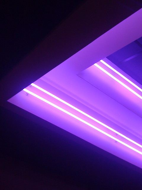
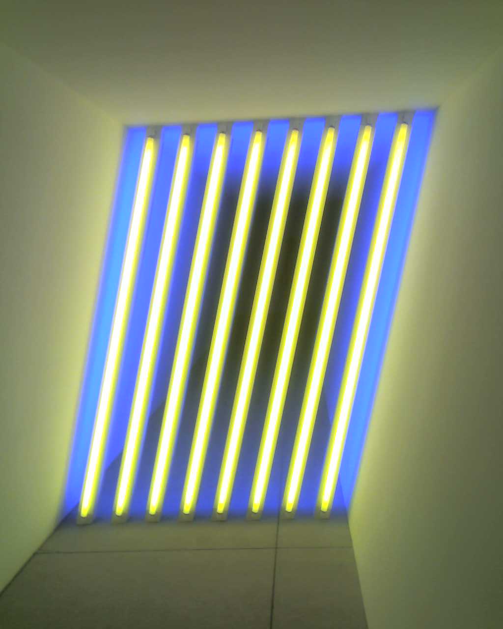
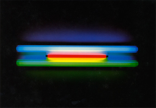
Anchored by the theme of mystical illusion of space, I continue to use neon glow (truly in love with it) to accentuate the colours. Here the shapes are layered and aligned to emulate 3-dimensional forms. The challenge was to make relations of these independent compositions with movements and transitions.
Research and References
Some inspirations I’ve found, while on the other hand, finding the right song piece:
On Tuesday we headed down to Harvey Norman in Millenia Walk to check out the current products on the market. Here are some observation I’ve made:
Compare: Dyson hair dryer VS alternate brand hair dryer
I have been hearing about the hype of Dyson’s hair dryer, simply for its higher pricing ($599!!!) and iconic form – circular tube mounted on a pedestal. Testing out the product myself was a m a z i n g (i felt so cool using it :>).
Dyson Supersonic Hairdryer
A simple form accentuates with futuristic element for its sleek and metallic material. Colour palette goes monochrome – black, white and silver. Heads for different functions are interchangeable with magnetic attachments. The act of attaching those heads with just a click enhances the user experience greatly. Heat shield technology allows the body surfaces to stay cool. With such a small engine running, it produces a pretty strong gush of air!
(4/5 would buy for I know that it’ll last for a very long time (by Dyson) and it’s small enough to carry when travelling. That is, if I can afford)
Hair dryers from the other brands take on a conventional route to compete with price or addition heads that helps with curing hair. Apart from the body that contains the engine, rest of the parts are slim and vary with curvature forms. Black and white are essential colours with a touch of red/ pink specially for their feminine consumers.
The difference: Design for hairdryers in general are dominant on functionality – different level of warmness and wind velocity. Dyson supersonic design chooses to take on the emotion dominance node with its revolutionary form. While advancement in technology and research have given confidence to the consumers, it revises on how a hairdryer can look like. The emotional appeal here is based on our knowledge and impression of the technical specifications in Dyson products – the hollow circular tube that reminds us of ‘that cool bladeless fan’. It is a product of innovation catered to tech lovers indulged in high-end lifestyle.
Discover: Current trends on the market
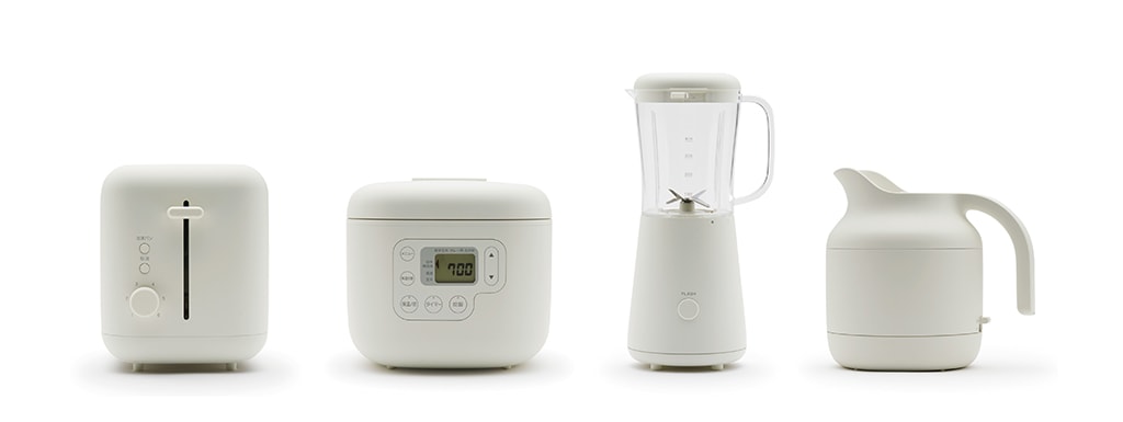
Upon the entrance of Harvey Norman, most notable trends on popular kitchen appliances are pastel colour palette and retro theme. Smeg catches the wave of retro revival craze with its 1950s pastel toasters and kettles.
Smeg Retro Style Aesthetic Kettle
Morphy Richards has a range of retro inspired kitchen appliances too, but with a neutral muted range of colours.
Morphy Richards Traditional Kettle
A common characteristic from the home appliances and speakers is the oraganic form. The curvatures in their body forms and round edges allow the products to look less rigid and uniquely different.
Samsung Radiant 360 R7 Wireless Speaker
Samsung Series 7 55″ SUHD 4K Curved Smart LED TV
Samsung 8kg Eco Bubble Washer
Bosch Series 8 VarioPerfect 9kg Front Load Washing Machine
Explore: Novel Functions
+ Found this interesting build-in sink from one of the washing machines that emulates the natural form of water ripples.
Samsung 13Kg Activ DualWash Top Loader Washing Machine
Thought it was a confusing and unnecessary add-on until I went back to do some research:
+ Dyson’s vacuum is designed to have a curved body with low centre of gravity. This helps the vacuum to roll back upright with gravitational force. What drew my attention was its sci-fi looking form with those small kinetic cyclones. Once again, the brand surrounds its product aesthetic to the technology advancement – an emotional appeal.
Dyson Cinetic Big Ball Vacuum
+ Some vacuum brands seem to distinguish themselves with a different colour, which I thought it’s a smart move. Companies can reduce manufacturing cost with minimal selection of colours and consumers are able to recognize and differentiate brands visually.
Overall thoughts
It’s been awhile strolling through Harvey Norman, I am still as fascinated as I was a kid looking and running my hands through products. Items on the current market tend to skew towards design that has emotional dominance, expanding on wider range of colour selection to novel shape forms.
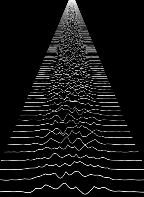
The first prototype is to test the movement of abstract lines and use of words. It was to create 3-dimensional space using simple white strokes of lines against the black background.
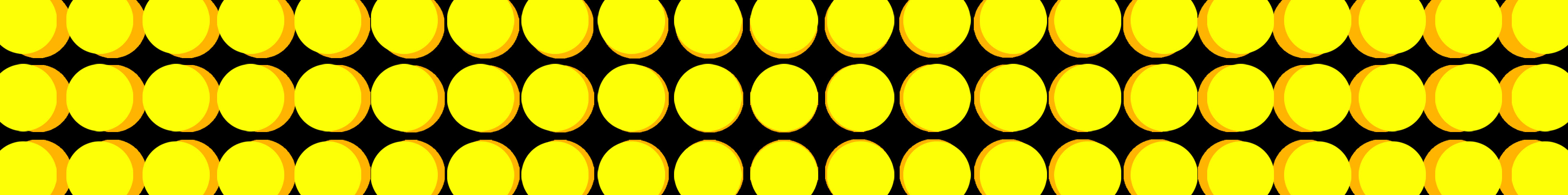
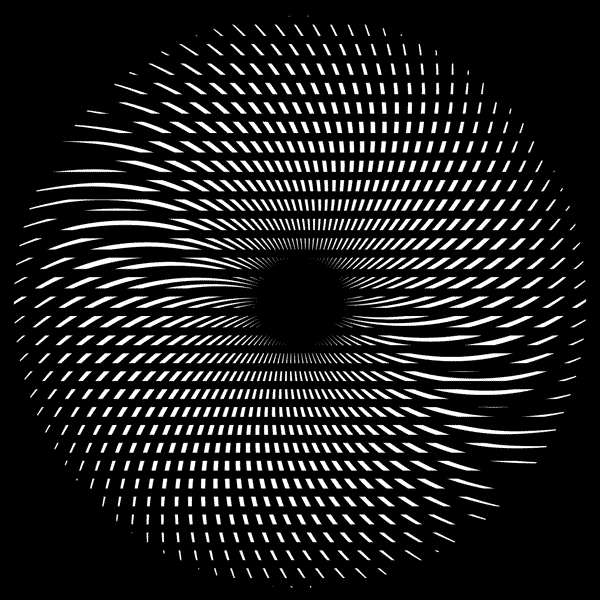
A very simple animation was done in week 5 since the theme was still undecided. Composition mainly uses vertical lines and radial rings of circles, in symmetrical harmony.
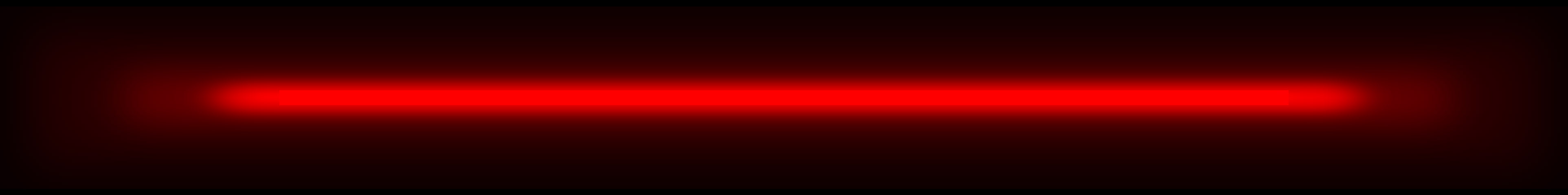
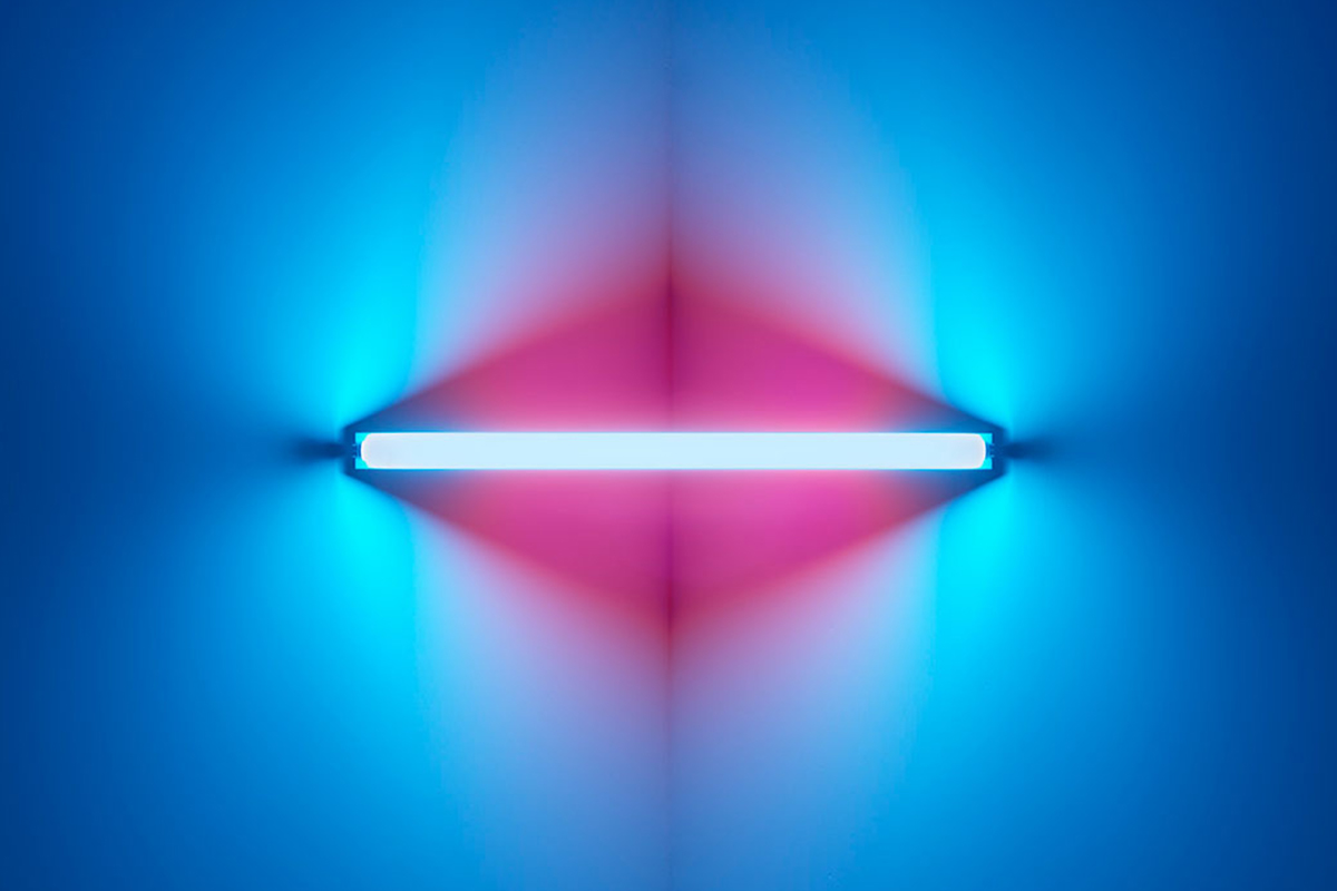
While looking for more inspirations, I was attracted to neon light signs. Without movement, its flickers and glow have made its presence significant in the darkness. A silhouette of letter is made out of simple lines and curves. It can easily create a certain mood from what we are familiar with – street signs that represented the vibrant city nightlife. Prosperous, lavish or even lonely. I find neon light a powerful tool to tell story.
First prototype was rather scattered with different concepts:
00:00-00.12 | syncing entrance of each stroke of lines according to the music.
Feedback: stops at an awkward position, could have ultilized the remaining space on the right.
00:15-00:21 | flashing of words across the screen. Neon light effect
Feedback: speed of movement too fast to read the words, would look better if font size is big enough to fill up the height of screen.
00:22-00:33 | moiré effect with vertical moving lines
Feedback: calming to watch (very positive :D)
00:36-00:40 | horizontal lines shooting across horizontally
Feedback: abstract, gives a sense of movement (yess)
00:44-00:47 | ‘Media Art Nexus’ neon sign
Feedback: generally positive
+ Sudden flashes of white on the screen are painful to watch (sorry passerby).
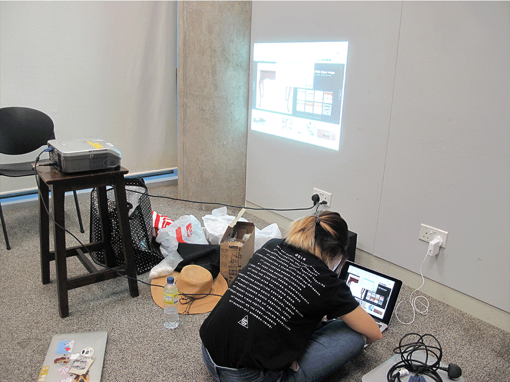
Here’s how it looks like on the wall!
Interaction with Environment
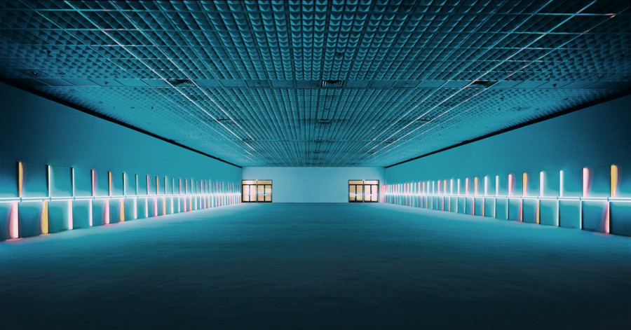
The first screening has proved that a simple abstract play of lines can look impressive on the huge nexus wall! Since the walkway has no addition lights on the ceiling at all, nexus wall is the only light source to bring this dark space to life – use of colours on the screen is very important to create mood. I find the reflection on the floor fascinating – direct consequential reflection on the ground could be part of design?
Moving on to second prototype
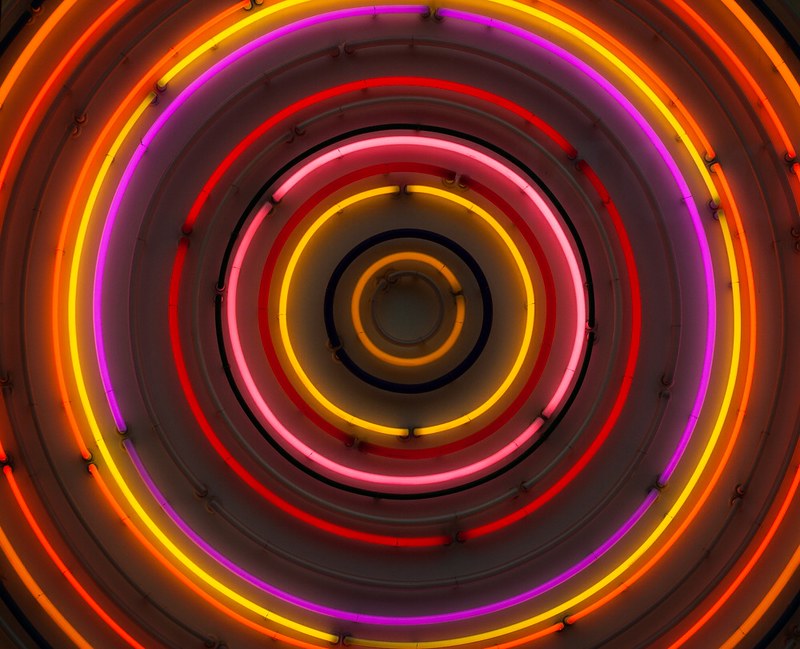
Ina has suggested to study neon light artist, Dan Flavin, who uses neon lights of different colours to suggest depth and movement.
It is a tough decision between going abstract or using neon-lighted typography. Ina recommended me to use poem or song lyrics (like a jukebox machine) if I were to go for the latter option. However, interpretation of words can be subjective and therefore misleading to individual’s understanding. It can be restricting as to what I can do with the visual reference too.
I’ve decided to play abstract with more possibilities to venture in. The mood to go for is mysterious and obscure, traveling viewers into an alternative reality within the few seconds passing by the walkway. This prototype will hopefully be more or less be the finalized version!!
As discussed in the previous lecture, there are three main nodes that influence the design aesthetic of a product – Function, Human Factor and Emotional.
Function
Functional based products are necessary items to help users in completing a task. Little or no emotional appeal is required for these products since its functionality is what consumers are buying for. They are usually tools and equipment that require mechanical precision for high efficiency. It can be considered as a mature product with stable demand, where an ideal design is mainly of utility purpose. Examples are screwdriver, clock, fan, can opener and rice cooker.
And the origami-inspired Fold Bike that folds into a super compact size:
Designers: Tim Gerlach & Eason Chow Wai Tung (2015)
Despite every designer’s effort to push the boundary of its structure, a bicycle ultimately has to help user complete his/her task — ease of transportation.
Human Factors
Products are designed with priority to the use of conduct. On average to last for a period of time per use, it is important for users to feel comfortable enough to grip, hold or touch. Body and form have to be intuitive enough for user to know how to use without any instructions. An ergonomic product will fit the human body measurement in maximizing the comfort of users while interacting with it. Examples are backpack, spectacles, sofa, chair, earpiece and mattresses.
+ The Bath Pouch aims to bring convenience for mothers to bathe their babies with getting backache, pretty cool! Baby will not be as afraid to take a bath in his/her familiar space of a cradle. Mothers don’t have to worry about accidents of submerging baby’s head into the water.
Designers: Yihao Tsai & Yu Ting Cheng (2013)
Emotional
To evoke user’s emotion, the aesthetic of product wants to project a certain mood or impose a certain status to the user. It has to activate a personal connection from our memory and experience, relating to feeling of happiness, nostalgia or fear. Relevant motifs/forms associate users with what they find (un)familiar. Use of colours, scent, texture enhances the visual aesthetics too. This type of design has high reliant on consumers’ taste, perhaps targeted specifically to a selected group of consumers. They tend to be luxury products, if not with unconventional visual. Products tend to be more innovative when designers push boundaries to entice consumers for its novelty. Examples are jewelry, clothes, branded footwear (yeezy, nike, adidas), and children’s toy.
+ High end speakers Bang and Olufsen use a minimal and sleek form to distinguish itself in the market. Smooth and shiny steel surface gives an edgy look. The effort to ‘hide’ the head speakers blends product into the living space like a decorative piece. Neutral cool colour palette brings out a modern and timeless theme.
A good product will immediately communicate its intention through the aesthetic. It gives user a sense of trust to commit to – in both practical and emotional way.
Three nodes can be interchangeable depending on the stages of product in the market. Below is the transformation of aesthetic value of Mini Cooper over the decades, from functional to emotional appeal.
When resources were scarce after the Suez Crisis (1956), there was a need to reduce fuel usage from the public. In 1959, Alec Issigonis designed Mini Cooper which has became the iconic British small car loved by avid collectors worldwide. This is one interesting product, in my opinion, that shifted its aesthetic quality from functional to emotional node. Its initial selling point was to save fuel while at the same time, introduce the space-saving front-wheel-drive layout that freed 80% of the car space. In this present day, driving a Mini Cooper around gives driver a unique persona – hip, retro and quirky. It could evoke a strong sense of sentimental value to someone from the older generation. Or garner interest for its round and bulky form, a fresh look from the mainstream 21st century design.
Good Read: Visceral, Behavioural and Reflective Design
Here’s something I found relevant to explain the 3 nodes. Extracted from the book ‘Emotional Design: Why we love (or hate) everyday things’ by Donald Norman. Read it here!
Visceral Design
“You can find visceral design in advertising, folk art and crafts, and children’s items. Thus, children’s toys, clothes, and furniture will often reflect visceral principles: bright, highly saturated primary colors. Is this great art? No, but it is enjoyable…At the visceral level, physical features—look, feel, and sound— dominate.”
Behavioural Design
“Good behavioral design should be human-centered, focusing upon understanding and satisfying the needs of the people who actually use the product…understanding the user’s needs, ideally derived by conducting studies of relevant behavior in homes, schools, places of work, or wherever the product will actually be used… This iterative design process is the heart of effective, user-centered design.”
Reflective Design
“Attractiveness is a visceral-level phenomenon—the response is entirely to the surface look of an object. Beauty comes from the reflective level. Beauty looks below the surface. Beauty comes from conscious reflection and experience. It is influenced by knowledge, learning, and culture…reflective-level operations often determine a person’s overall impression of a product. Here, you think back about the product, reflecting upon its total appeal and the experience of using it.”
Going with the theme ‘illusion’, here are more visual references that represent bits of my ideas. I am currently looking at a possibility to create an enclosed area with several subjects moving on loop.
Artist Sena Oh made use of the door movement to create optical illusion with moiré effect. This gave me an idea to flash moving words onto the horizontally long nexus wall. Speed and direction of movement could be influenced by the viewer walking across the walkway maybe?
Considerations – overused of this effect will be uncomfortable for viewers to look at for a long time! Complimentary colours contrast too strongly to be shown on a big screen. Apart from slowing the speed of movement, use of harmonic colours can prevent dizziness while one is watching at a close distance.
Here are the multimedia inspiration I have found in relation to my past work!
1 // Illusion
One of my previous assignment was to build a reverse gravitational bridge. This is an exploration of the subject’s movement that works against the law of gravity. Illusional act can only be seen at the specific perspective.
Moiré effect was part of my research in building a portable screen from last semester’s module. It is a visual perception when a set of lines/dots superimposed onto another. A new ‘moving’ pattern is created.
Idea #01: To construct an illusional world that is constantly evolving.
Research
Methodology: Build rough composition on Illustrator, import into After Effect. Generating randomised command from Processor to alter lines independently/dependently.
2 // Nature Inspiration
A more abstract approach is to emulate organic lines and shapes from nature, wood grains for instance. Since nexus wall locates along one of the busiest walkways in school, it would be a refreshing aesthetic contribution to the space
Idea #02: A visual composition that invites a mood with therapeutic calmness.
Research
Methodology: macro videography of sculpture/object, process in After Effects.
More research will be done on the softwares/methodologies before working towards a more specific theme!
Graduated from Tama Art University in 1980, Fukasawa is an industrial designer from Japan. He works on furniture, home appliances and lifestyle accessories. His clients include Issey Miyake, Muji and Danese Milano.
With the minimal details, the products stand out for its body form. And I love Muji.
Muji home appliancesPlusMinusZero Steam HumidifierHiroshima chair
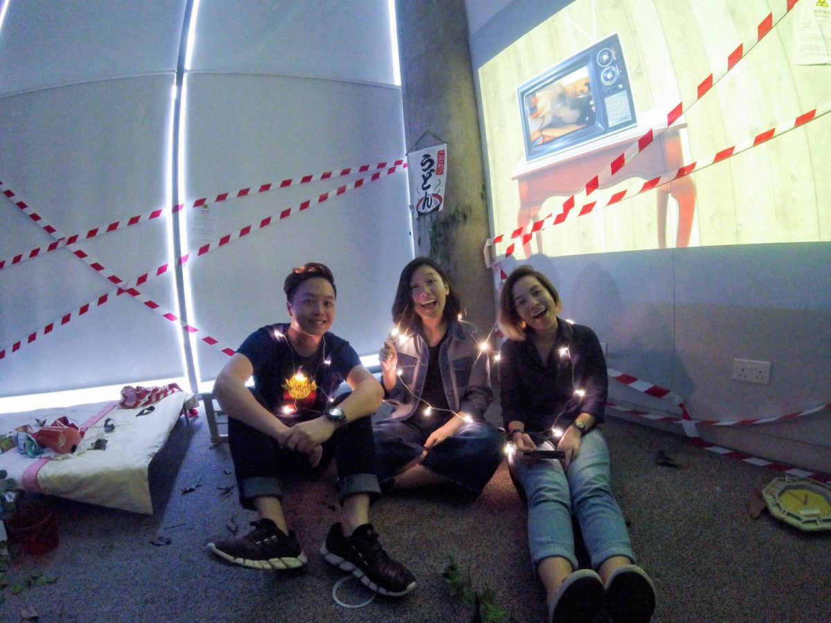
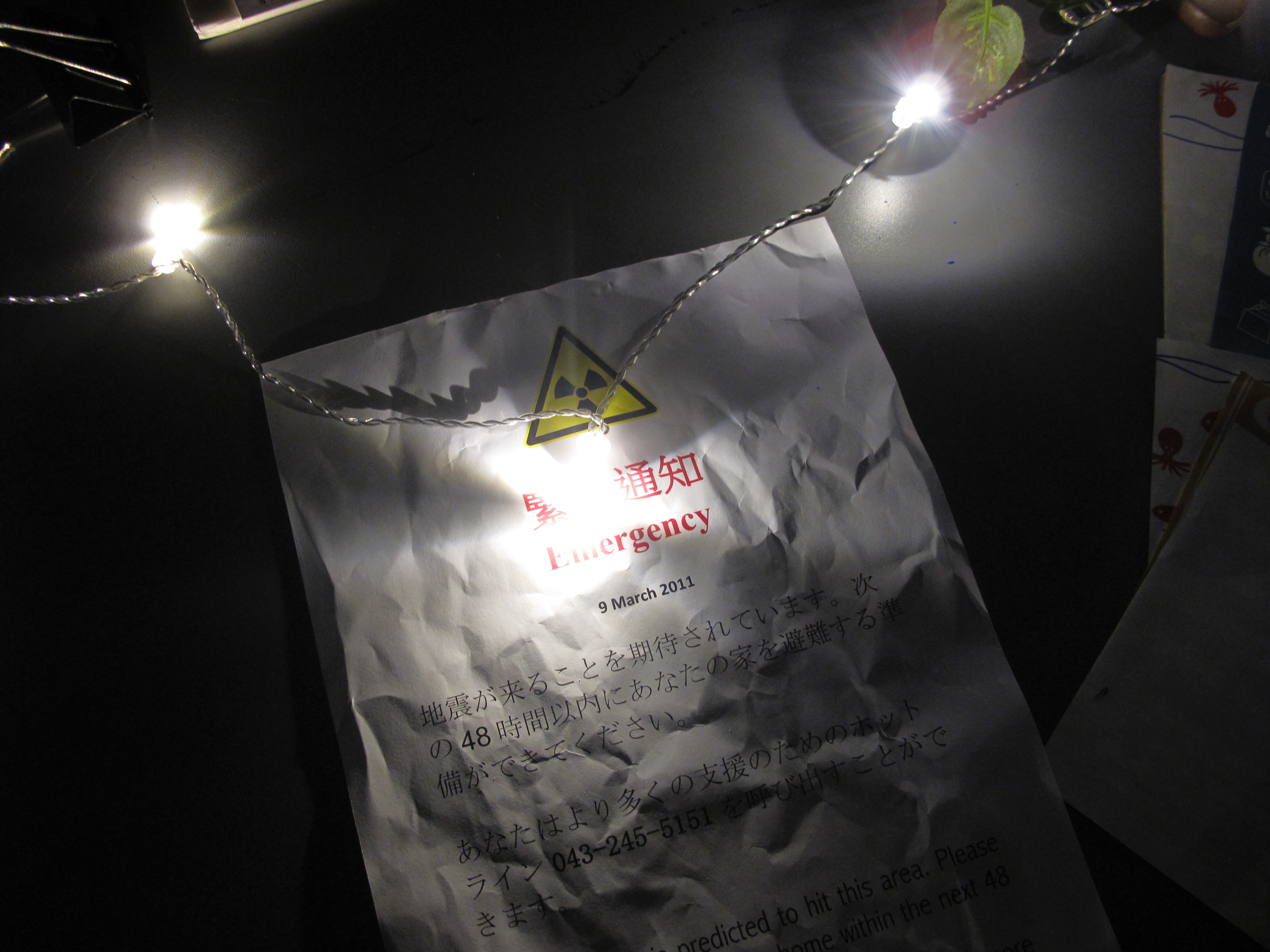
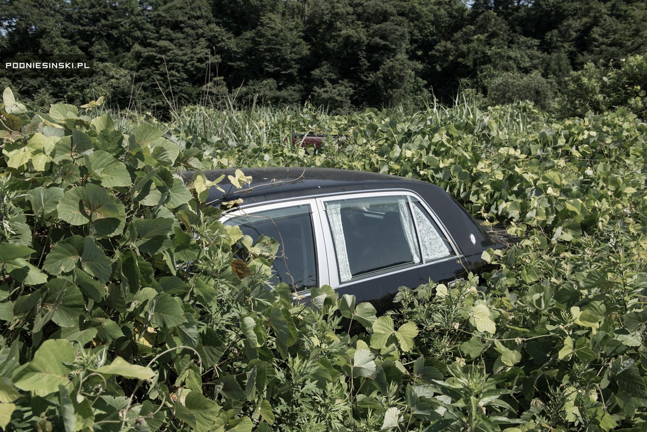
The artists picture the space installation as their responses to the aftermath of Fukushima nuclear disaster in 2010. Residents were forced to evacuate from their homes when nuclear radiation spread across the town, abandoning every possession they had. This room captures the moment of emergency, anxiety and fear of the evacuees. Marking its fifth year as an exclusion zone, the time capsule flourishes with nature. Inspired by an installation located right in the prohibited area, Don’t Follow the Wind (2015) will only open to public in years when radiation is completely cleaned up. This artwork aims to resurface the forgotten disaster and provoke discussion between humanity and authority rights.
Reflection
Creating an installation has expanded my horizons in discovering the possible ways to craft a narration within an art piece. Unlike short films, we had to really dive deep into the essence of our focused story. Why do we want to expand on this topic? How do we tell story in a non-linear way? How can audience relate to your story? It was a nerve wracking start, for just deciding on medium and location. Many ideas were infeasible due to resource constraints. Soon we realized that we were clouded with so many considerations, and it was not going anywhere.
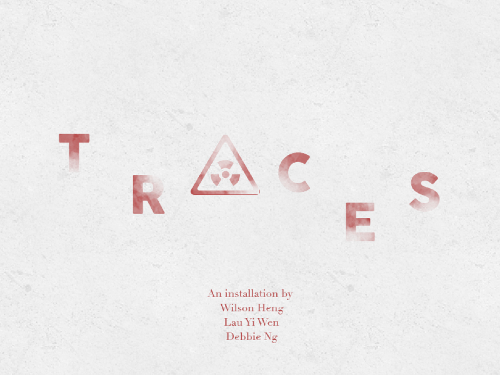
Our installation, Traces, derived from our fundamental interest to revisit someone’s memory/ dream/ experiences (from our first ideation process). Fear was an emotion we would like to explore, and an idea struck when we chanced upon a documentary video called “Don’t Follow the Wind”. It is the juxtaposition between human and nature, a contrast between life (overgrown plants) and death (abandonment home).
I am too amazed by the other groups’ installations, inclusion of performance and interactive art. It was interesting to understand their thought process and execution, that would definitely help me to better plan and express my works in the future installations (hopefully?).
The 2011 Fukushima earthquake led to the world’s biggest nuclear disaster since Chernobyl. It’s been five years, and citizens are still unable to return to their contaminated homes. The radiation levels remain dangerously high, and will probably stay this way for a long time. We were intrigued by the state of homes in the Fukushima prefecture left by citizens who were forced to evacuate. The untouched homes within Fukushima now serve as a time capsule, capturing the moment of anxiety when disaster struck. This is inspired by an installation called “Don’t Follow The Wind” (2015), where a group of artists entered the exclusion zone and placed their works in abandoned homes.
In our installation, the audience steps into a room belonging to a former Fukushima resident, and gets an intimate look into her daily life before she knew what was coming. We invite viewers to think about the power of inanimate objects and the stories they can hold. At the same time, there is a slight nod towards the relationship between man and nature — when man leaves, nature flourishes. Finally, we hope to generate discussion about the nuclear meltdown and its ongoing repercussions.
CONCEPT
The idea for TRACES came about when we chanced upon a documentary about an art installation held within the exclusion zone of the Fukushima prefecture, called “Don’t Follow The Wind”. In 2015, a group of 12 artists including Ai Weiwei and Trevor Paglen created works that were placed within three buildings in the exclusion zone (Muñoz-Alonso). The thing is, the works will not be open to the public until the area is free from contamination, possibly in a couple of decades. “In this way it will serve as a monument to the disaster, and its ongoing consequences,” says one of the participating artists, Franco Mattes.
Although the Fukushima Daicii nuclear disaster happened in 2011, citizens are still coping with the effects five years on. Many of the 300,000 people who were displaced are still seeking answers as to when they can return to their homes. Because they weren’t allowed to bring their belongings with them for fear of contamination, their homes are filled with memories, sentimental treasures and daily essentials, a time capsule of their lives before they knew about the tragedy that was to come.
Immersive space
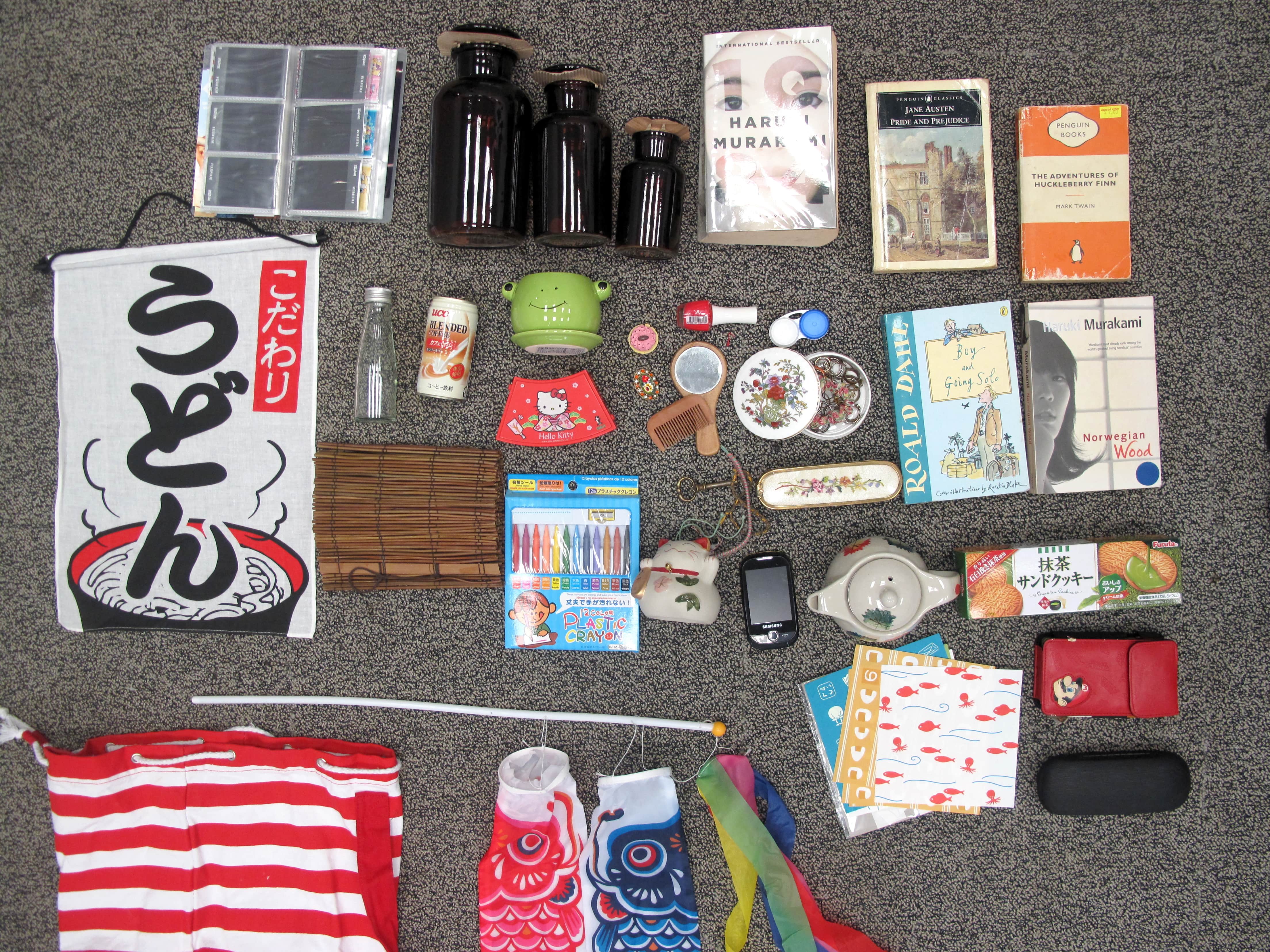
We decided to create an installation space that explored the use of inanimate objects in a room, and how the combination/placement of items could tell a narrative, or paint a picture of emotions when disaster struck. Making use of what we learned in class about characterisation, the idea was to suggest a presence instead of physically having one in the room.
Video
We also implemented the appropriation of videos, piecing together news clips, citizen captured videos, documentaries and interviews as a timeline for the audience to get a sense of how the past five years have been in Fukushima. Appropriation is a useful tool for shedding light on social issues. By extracting the original imagery and rearranging them using pattern, repetition and juxtaposition, artists create new meanings in the work (“A New Order: Appropriation Art In The Digital Age”). The video not only serves as a concise recap and informative source for audience, it also brings about more discussion and awareness of what is going on. For example, the interviews in the video revealed a lot more insightful details, such as how a family of six is squeezing in a child’s room, likely to be even smaller than our installation room size. Another interview then pointed at the government not being truthful towards the locals, not telling them accurate details about the radiation levels as well as being unable to give them an answer as to when they can go back to their homes.
Our appropriated video compresses the five years into a single clip saturated with sadness and fear, further highlighting the severity of the Fukushima nuclear disaster. In the installation, it plays on loop on an old television.
EXPERIMENTATION
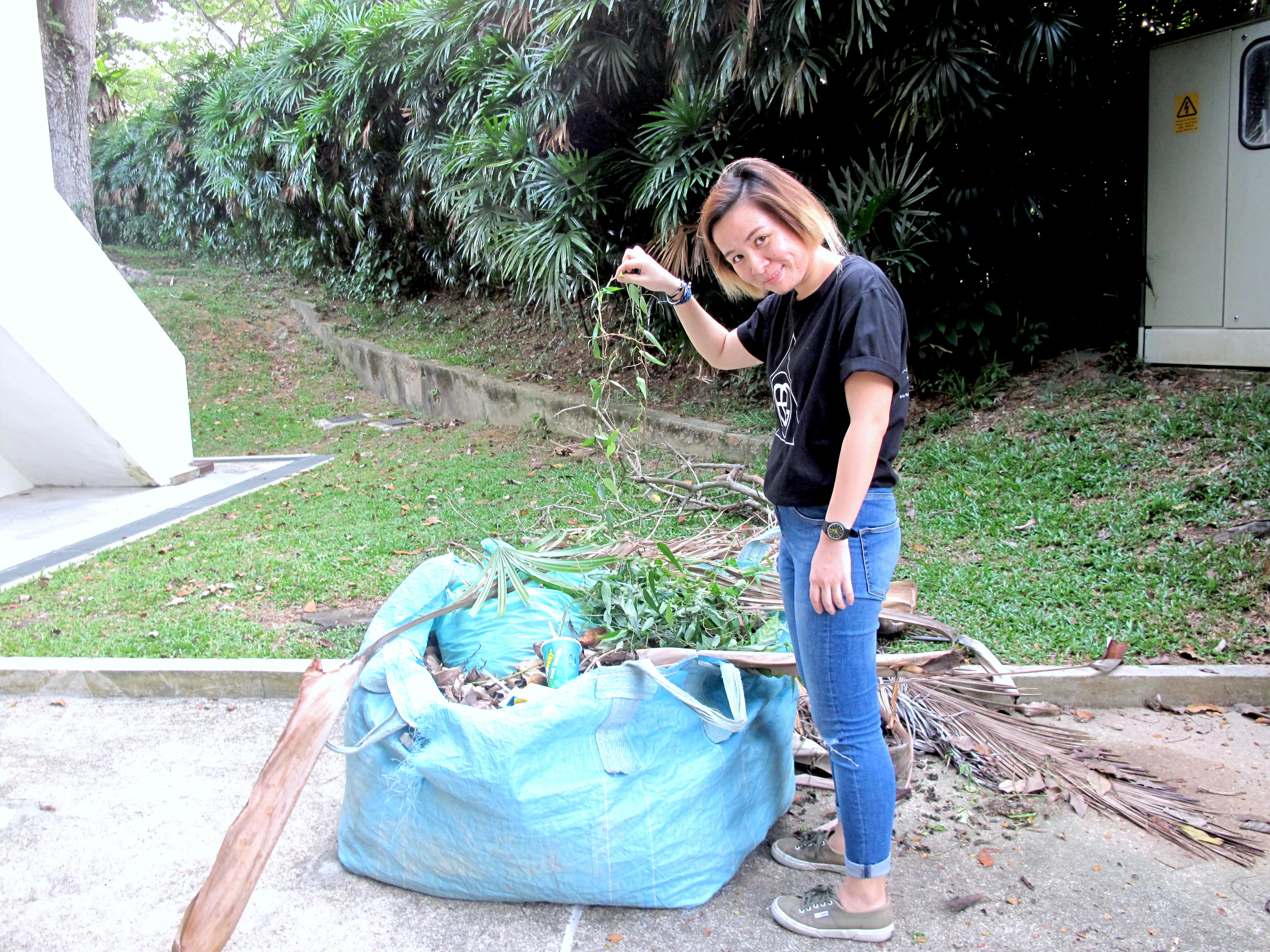
Throughout our execution of the installation, there were countless times our ideas did not turn out as well as we had expected, and were thus improved on or scraped, changing along the way to our finalised installation.
Video
The initial appropriated video was more than 7 minutes long and we felt would be too draggy for audience to view if it was on loop. If they missed the start, they would have to wait for a long time for it to restart, causing it to be a bit boring. We had also intended to add in more thought provoking ideas by localising it, asking what would the audience feel if the nuclear disaster hits Singapore, or even turn into a global disaster.
In the end, we decided to do away with these and cutting it down to 5 minutes, just to bring across the key points of recapping as well as some important details. The clips were clustered based on the similarity of events, just as how we were showed an appropriation artist once clustered clips of gunshots and made this his own installation.
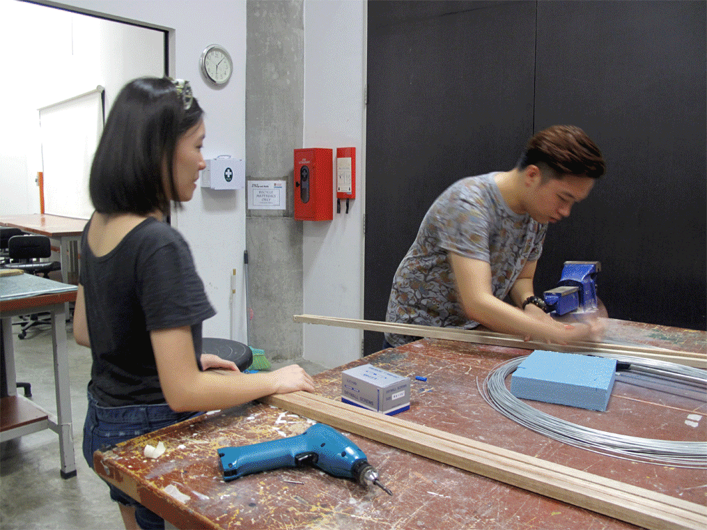
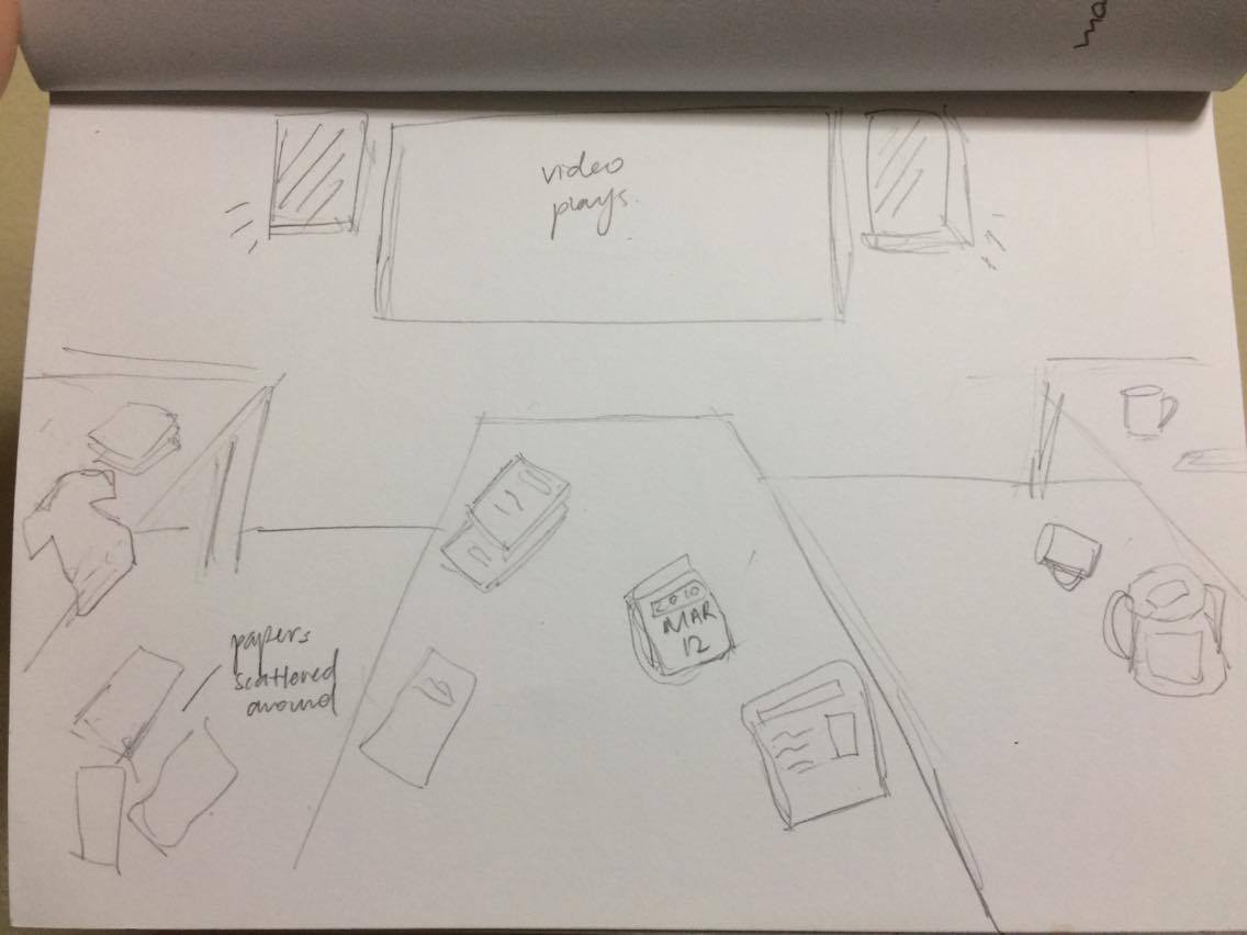
Space and Objects
Our initial set up of the room was also different. While facing the main projection, the bed was initially on the right, the table on the left, which could be seen in our video documentation of the setting up. We later felt that this layout could not bring out the “room” kind of feeling we wanted, together with some concerns on the placement of projectors and projections, we decided to swap it around, ending up with a table against the wall, and the bed along the glass windows on the left. This way, we could also use the projection of a window above the table to provide a light source.
For lighting wise, we felt that the entire setup was nice in very very low light conditions when we tried out our initial setup on Sunday night, where we worked through the entire day to see what problems we might encounter (which turned out we had a lot). This was initially inspired by how The Future World exhibition has everything in darkness such that the main objects are in focus, drawing the full attention of audience.
Nonetheless, there has to be sufficient lighting for everything to be seen, to make sure the objects add value to our installation instead of just being there. We switched the lights on and off multiple times in a dilemma to whether the lights should be on or off, before coming up with the idea of making use of the projections as a source of light, as well as getting fairy lights to highlight certain important areas. This way, the room would be slightly dark to give a haunting feeling or being deserted, yet the lights could help out the original warmth of the room as well.
FINAL PRESENTATION
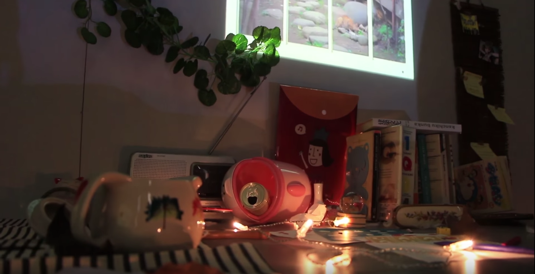
We invited our audience to enter the room without giving away any details. They were allowed to touch and feel the objects, crafting a story in their own interpretations. Here are the key elements to guide audience in enveloping an intimate understanding of an unidentified persona in her abandoned room.
Entrance
The door of the room was decorated with caution tapes stuck across the door, together with an emergency notice of the evacuation to give a context and ambience even before the audience steps into the installation. A smaller piece of notice was also partially exposed from beneath the door to seem as if the notice came from inside the room.
Study Area
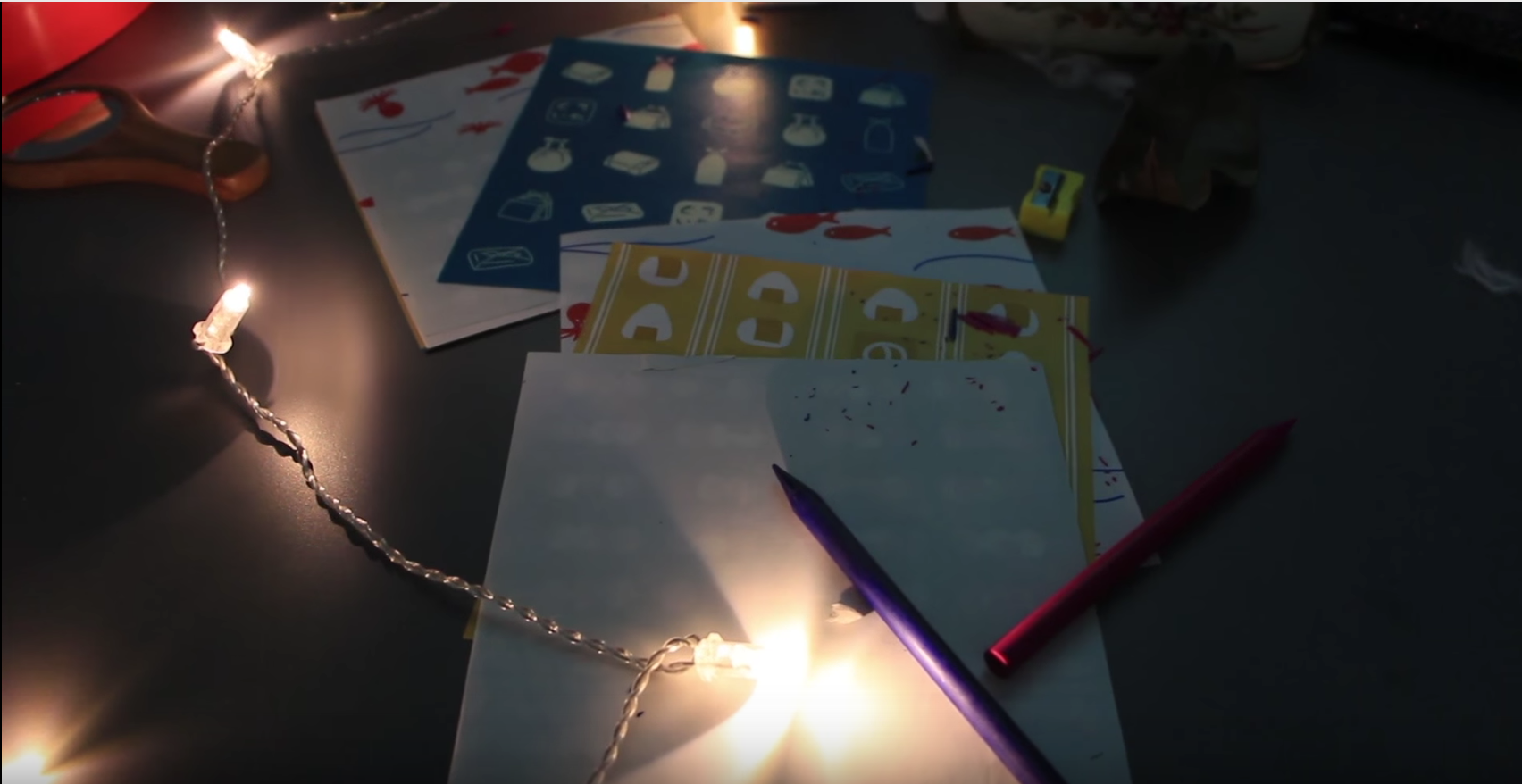
Personal items were scattered across the table to reflect the aftermath of Fukushima earthquake. Books relating to life, death and psychology tells us how emotionally affected she was for living within the nuclear zone where natural disaster could easily struck. Also, you could see photos of her with friends hanging right under the window. This portrayed her to be someone who is warm and cherishes her loved ones very much. A childhood photo album laid beside the table, leaving trails of her memories living in this room since young.
Window Projection
We casted a window above the study table, showing a Japanese street view outside. This helped to emphasize on the context, as well as adding more realism to the room. It also provided an alternative light source to bring attention towards the study table.
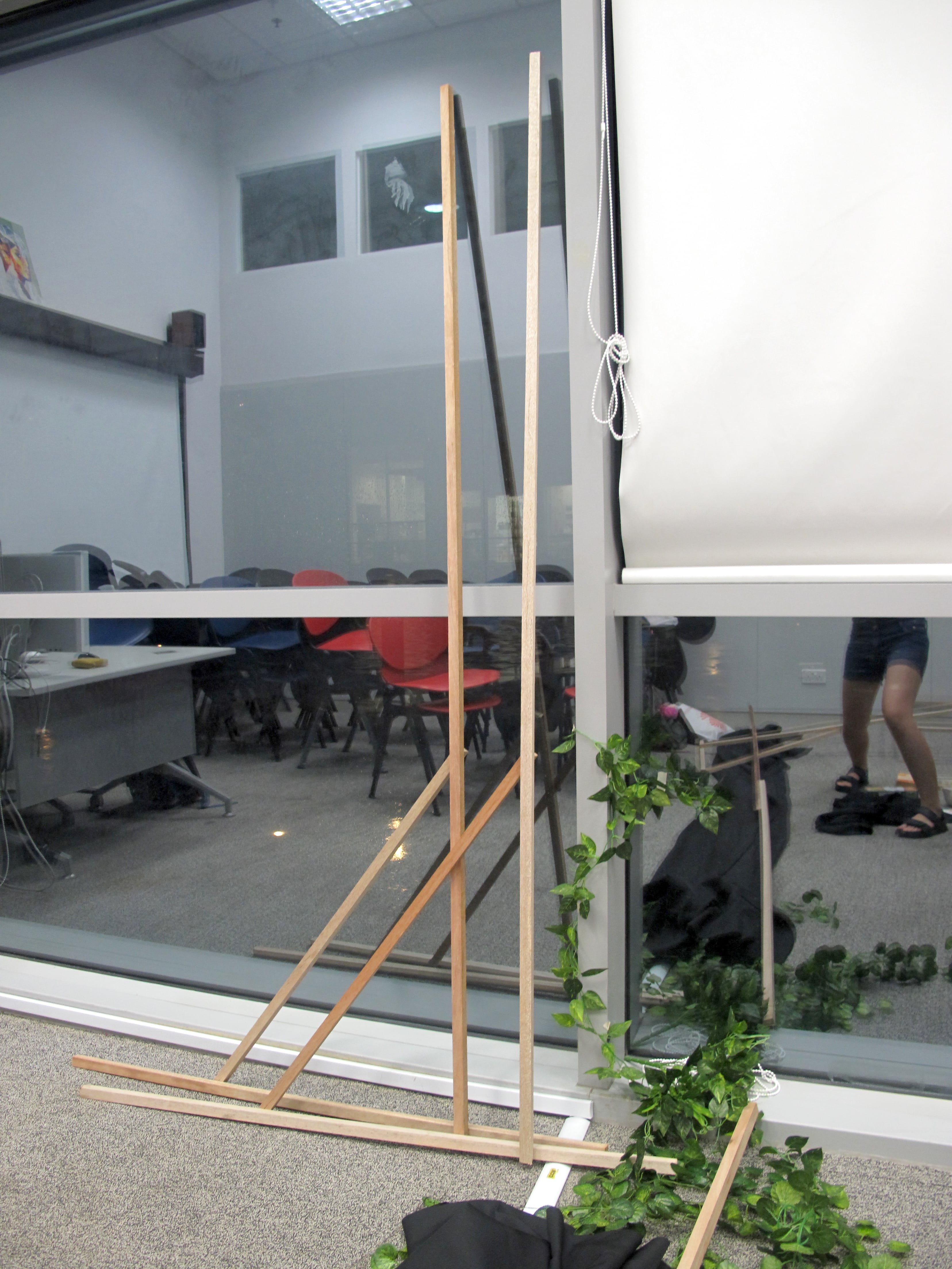
Partition
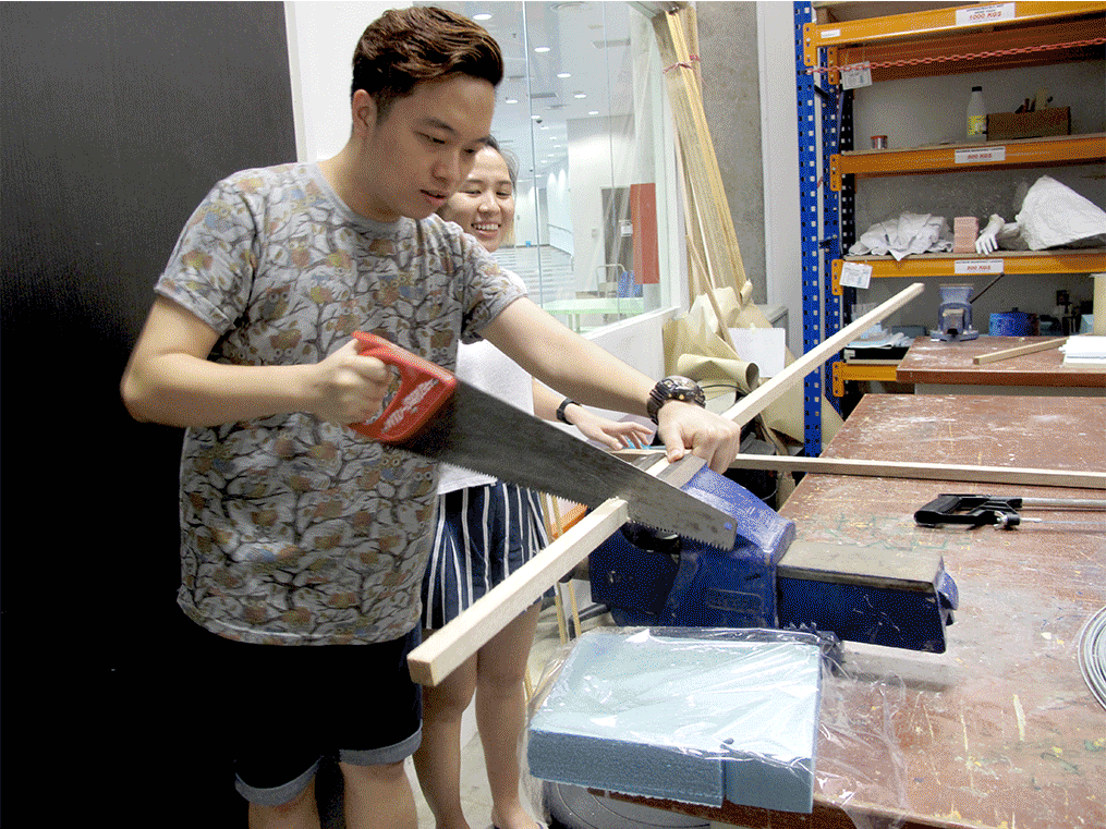
We decided to scale down the classroom by half, to how a regular bedroom would look like. The use of black cloth darken the room, provoking a sense of mysterious. Due to the limited budget and resources, we dug out wooden planks from the 3D studio and black cloth from the student club storeroom to construct the partition.
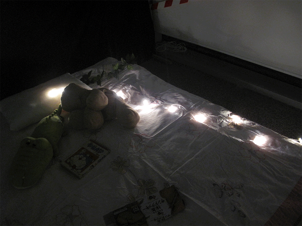
Fairy lights
Using the fairy lights, we aim to draw attention to the specific areas (mainly the study table and bed) amidst the chaotic room.
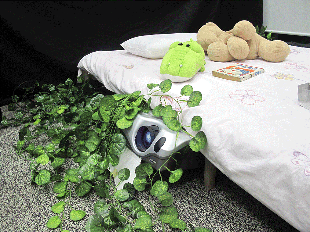
Bed
To enhance the ambience of a bedroom, we all decided that a bed was necessary. However, we could not find a bed frame and bed that we could easily bring into the room, thus we had to make one by ourselves. Same thing, we gathered wooden planks from the 3D studio and constructed a simple frame that was sturdy enough to hold a quilt as a thin mattress, but definitely not for use. We used a quilt to lay it over, supported by a huge wooden board used as a backing for Foundation Drawing classes.
Pillow and soft toys were added to make it more real and personal, further enhancing the persona of the girl who used to live there together with food wrapping and a book. This also ties in well with the slight messiness of the room. There was also a small broken wooden chair toppled over next to the bed to add on to this.
Wall Projection (television that never stops playing)
The main projection showed a wooden background with a table and a television, where the television displayed our appropriated video on loop. Projection is used to create a homely feel, where the video in the television would seem more realistic as compared to projecting the video on the entire wall. This was also the closest we could achieve to displaying the video on a real television in a room. At the same time, it provided the room with most of its lighting.
Overgrown Plants
We used vines that seem to grown from the entrance and under the bed to show how nature has taken over and flourished with the absence of human. They suggest the overgrowth of nature from outside into the house. Dried leaves are also littered around the floor as a signifier that time has passed and also add to the deserted and disaster theme.
Here is the video documentation to bring you through our process and final installation:
WORKS CITED
Muñoz-Alonso, Lorena. “Artists Install Works In Fukushima – Artnet News”. artnet News. N.p., 2015. Web. 22 Apr. 2016.
“A New Order: Appropriation Art In The Digital Age”. Montserrat College of Art. N.p., 2004. Web. 22 Apr. 2016.
An installation space uses various mediums and techniques used to convey messages/stories. We decided to narrow down into two main directions:
Immersive Experience – exploration of certain natural environment through large moving image projection and sound, rather abstract.
Narrative Stories – filming from a person’s point of view / pick an interesting group of people to document / stringing our personal stories with a theme (eg. family)
Here are our top 3 ideas:
Critic on Fukushima disaster | Whether the construction of nuclear power plant is viable in populated cities. (Chosen idea)
Appropriation video – gathering news report/documentary/commentary footages of the Fukushima disaster in Japan, its aftermath (particularly the affected residents), and the worsening situation 5 years on.
Immersive experience – a room simulating an abandoned home, residents’ belongings lying around haphazardly
As the video plays on loop, the audience can walk around the room and visit the families’ belongings, who were forced to vacate their homes immediately after the nuclear disaster. Household items will be scattered around the room, emulating the chaotic mess that were left behind.
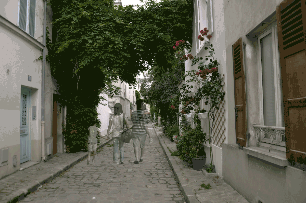
Image of a newspaper projected on the walls, showing a scene with empty streets, simulating an abandoned town, families forcibly removed (something like the gif below)
Proposed setting:
Research and References
A group of artists risked their life to enter the radiation contaminated neighbourhood to set up their installation in abandoned homes.
An organisation that is funded by the public, to post news that is not on mainstream media. This article was one of the key findings that prompted us to carry out our finalised idea. Although the credibility is questionable, the issue raised was not impossible, but in fact highly probable. The worsening of the nuclear problem was something that could affect the public badly, and could even escalate to be a worldwide issue. The fact that the situation and news at the Fukushima is being less and less reported and slowly forgotten and neglected is worrying. Thus, we decided to tap on this finding to highlight the concern.
Connected | Revealing personal stories of people living in a community
Many of us live in public housing. Hundreds of families are living closely in the same block, but everyone has their own unique story to tell.
Construct a HDB building model.
Sound recording of each household’s everyday life (radio playing, couple quarrelling, family watching tv etc.) can be heard as they light up individually.
Research and References
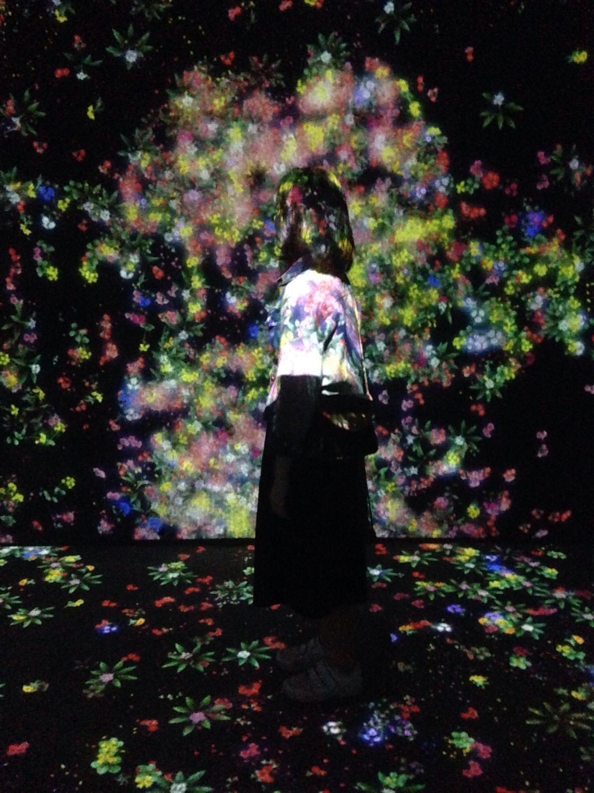
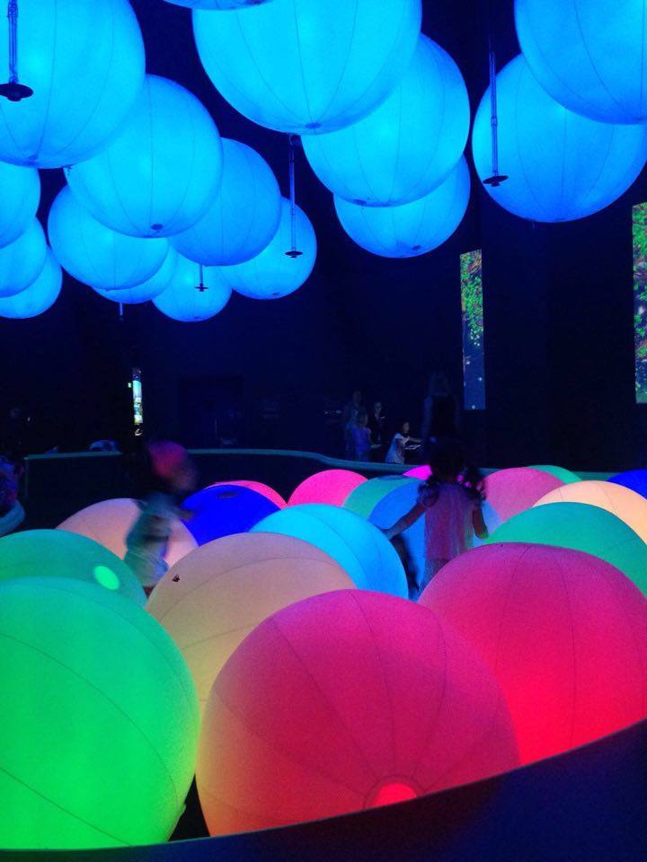
Taken from art science museum trip
Use of light and reflections create dramatic atmosphere, inviting audiences to immerse in another dimension.
Immersive experience | Invoking fear and phobias
Environments that make you feel uncomfortable – drowning, falling off from staircase, losing yourself in the human crowd etc.
Multiple projections of the same environment across the room
Sound effects from the environmental settings (water, human talking and walking)
Could be enclosed space to confine only one audience to experience at a time.