I had very little knowledge on the different art styles and the colour schemes and harmony that were introduced for this project. All were very new to me, so I was pretty lost and had no idea for this project ):
Therefore, I first looked up on the net for the different art styles from digital artists i could possibly adopt while researching on the colours.
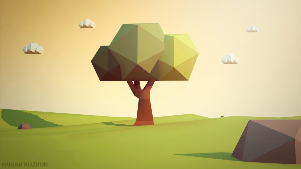
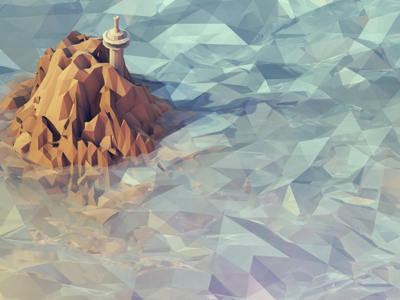
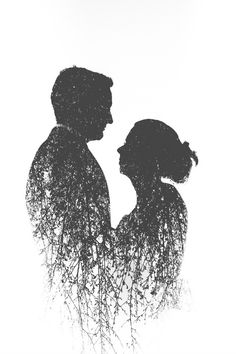
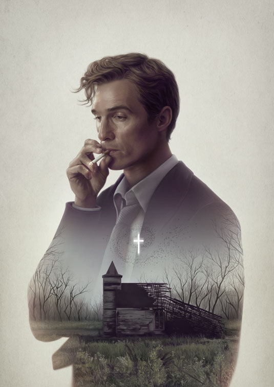
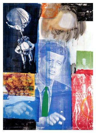
Research & references

I loved it!
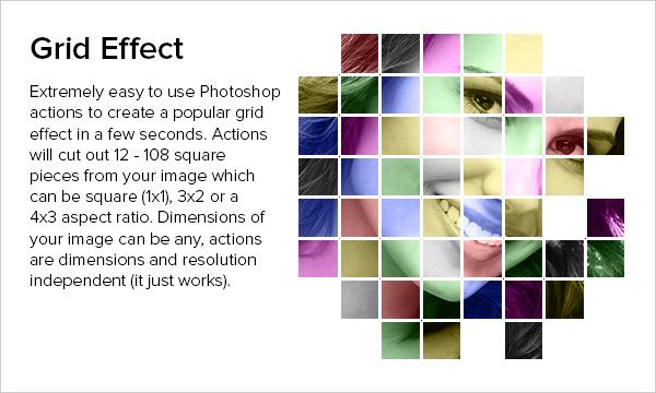
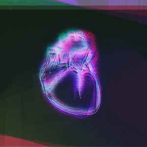
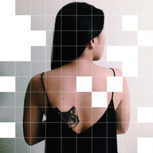
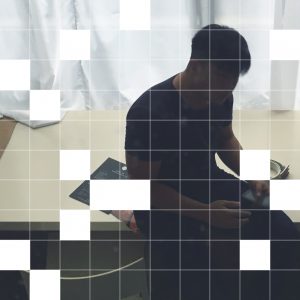
I learnt how to apply double colour exposure and the grid methods from tutorials to help develop my raw photos into more meaningful ones:
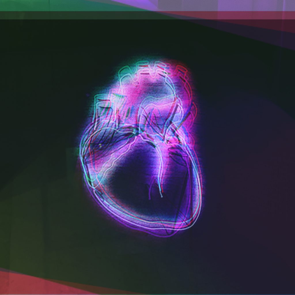
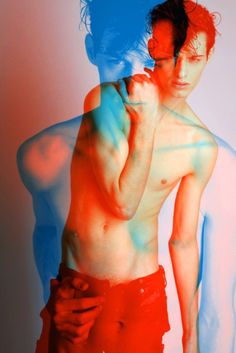
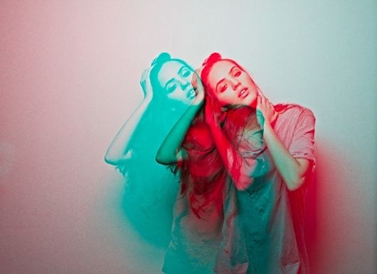
different colour exposures to show a thrombing/electro effect
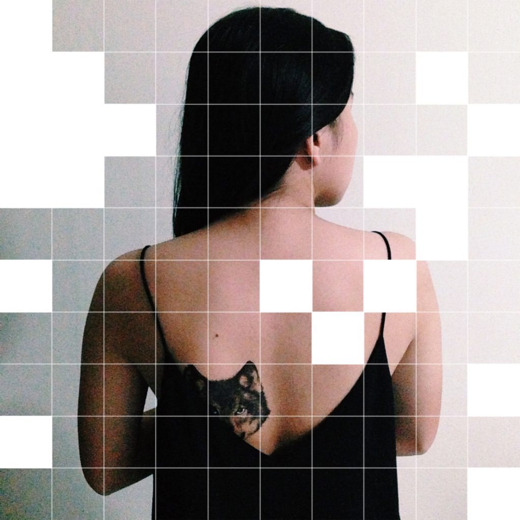
grid effect to give a meaning of an incomplete me
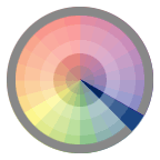
In The Making
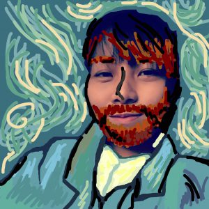
My final idea was to have 2 equations showing the imaginary scenarios which happen in my head, while the other 2 depicting real-life situations.
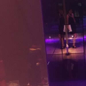
The imaginary scenes would be portrayed using digital drawing and applying really fun colours, whereas the real responses would be photo-based.
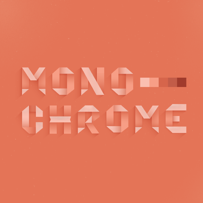


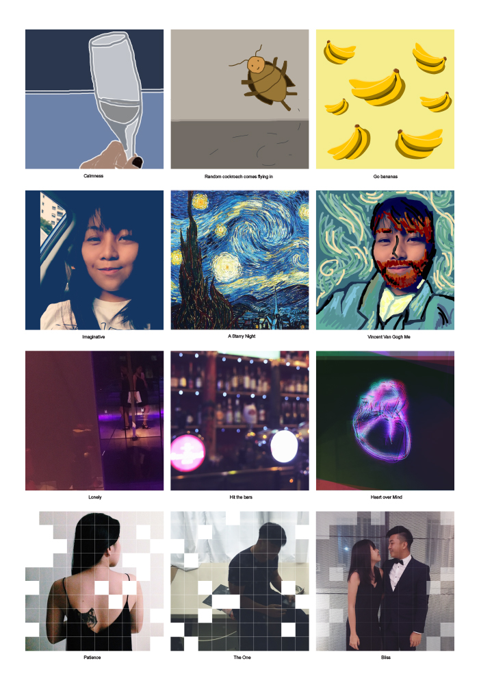
 I researched and I loved how monochromatic colours schemes work so well and I decided I would use the monochromatic colour harmony throughout an equation or even within a frame.
Continue reading