After discovering Project 1 will be mainly on typography, I was a little excited, but also panicking slightly!
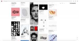
I didn’t have much knowledge on TYPOGRAPHY so I googled and went on pinterest to know more about it, and for inspiration!
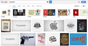
Typography basically a style of arranging text. It can come in so many different forms such as arranging different icons/visuals to form text and even creating a whole new style of font. 
Visual References
I quickly brainstormed for my job ideas and looked up for visuals that could be associated with.
Lawyer
Hairwig | Balance | Hammer | Books | Court
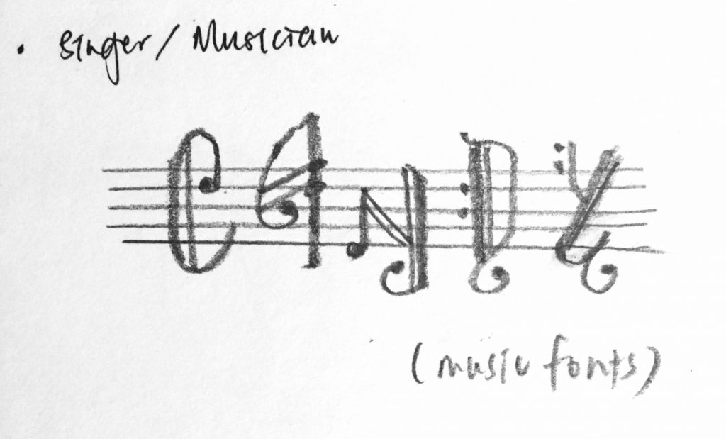
Singer/musician
Musical notes | Piano | Music score sheet | Multi-instrumentalist
Doctor
Stethoscope | ECG | Medicine | White uniform | Organs | Blood Vessels
Director
Director’s chair | Slate | Camera Equipment | Studio Lighting | Loudspeaker
TaiTai
Poodle | Make-up | Bags | Nail Polish | Heels | Mahjong | Car Keys
Astronaut
Galaxy | Spacesuit | Rocket | Mars Rover | Moon | Asteroids | Satellite
Yoga Instructor
Yoga Poses | Zen | Clean
Forensic Scientist
Matrix | Fingerprint | Lab
Wine taster
Wine bottles | Cork | Corkscrew | Wine Glass | Lips | Tongue | Eyes
Sleeper
Bed | Counting sheeps | Zzz | Snoring | Pillows & Blankets | Dark Eye Circles
Dealer
Poker cards | Casino | Chips | Dealer gloves
Reference Artists/ Inspirations
For further exploration, I looked up different font styles and below are few which inspired me!
Typography on music notes
http://luc.devroye.org/music.html
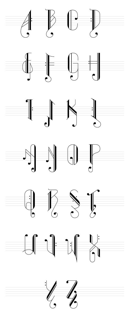
Kuala Lumpur, Malaysia-based art director who made the music note-inspired typeface
I was then inspired to try and spell my name with this font!
Human Typography
https://djstormsblog.com/2013/06/21/pinch-martin-tremblay-human-typography/
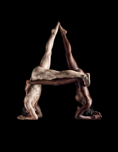
I am really passionate in film and photography, and when I first saw this I was so amazed. I love it! This is really creative, to use just our natural bodies to form alphabets. A great idea, and this has inspired me to include bodily gestures (in yoga).
Type Photography
https://www.visualnews.com/2013/03/08/architecture-b-c-a-photographic-alphabet/
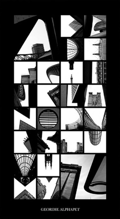
Peter Defty produced amazing typography through the framing and composition of architecture in his photographs
(Yes this was introduced to the class in my group’s presentation)
This piece is inspiring to me as it made me realise that alternatively to creating new fonts, we can make fonts out of already present things, and in Peter’s case, architechture. He makes use of negative space to create alphabets, opening many of our eyes to appreciate things in another way now 🙂