Creative Process
First lesson, was being suggested to just always do sketches. or Thumbnails. I never had the habit but in the process of brainstorming I decided to just sketch out the graphics which appear in my mind.
Ideation
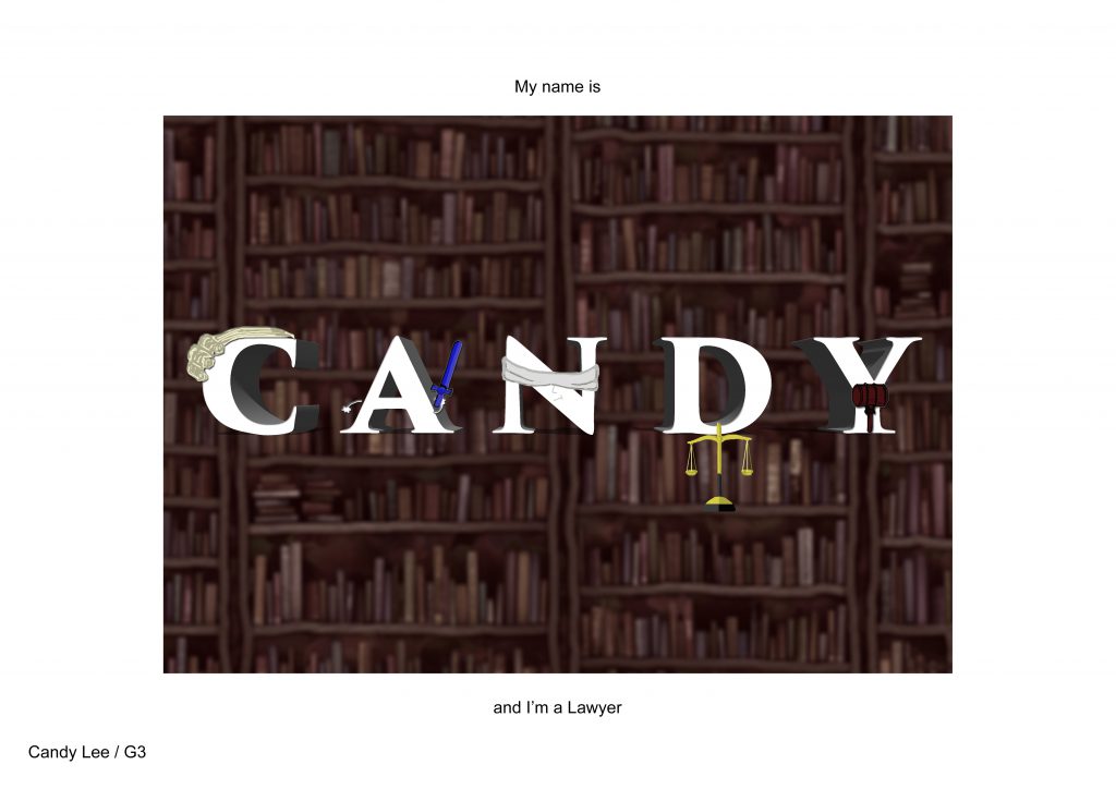
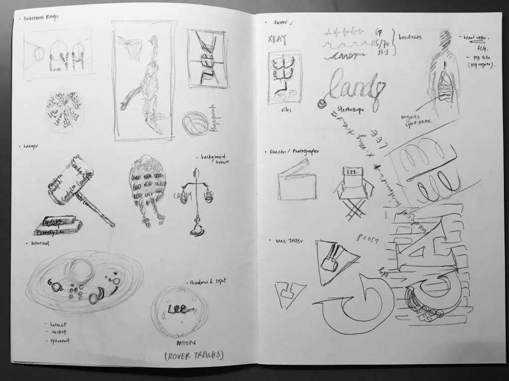
Lawyer
Hairwig | Balance | Hammer | Books | Court | Lady Justice
I thought of Lawyer, because I used to write it as my ambition when I was younger. I didn’t score too badly for my PSLE and then my parents had their hopes high that maybe I could really be a lawyer. Yet, I decided to study film in uni. I guess I will always mind that I may have disappointed them in not pursuing law study…
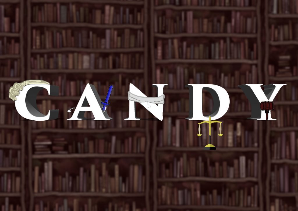
C: Lawyer’s hairwig
A: Sword on Lady Justice, signifying the power and strength of justice
N: Blindfold, symbolising objectivity
D: Balance, the fairness of justice
Y: Judge’s hammer
The background is full of books. This suggests that to be a lawyer, you probably would have to read a lot about law and cases 
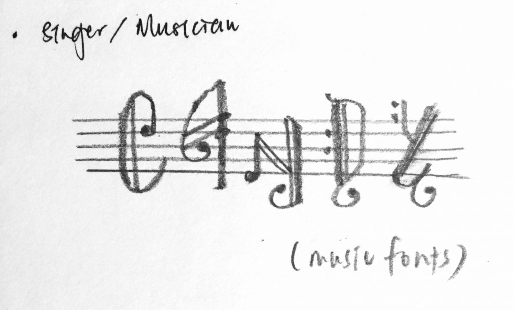
Singer/musician
Musical notes | Piano | Music score sheet | Multi-instrumentalist
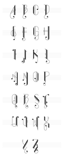
I did my online research and interestingly discovered music fonts! They were aesthetic and I wanted to try it. But it was just too simple a concept… 

In an effort to improve my idea of a musician. I thought of a multi-instrumentalist!! This gives me more to explore and play with if I abandoned the idea of using just one musical instrument.
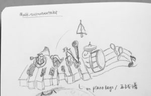
I am horrible at drawing/sketching, so I referenced and drew out the best I could of differing instruments which can form my name (Candy). I made use of piano keys and music score to connect them together and add ‘colours’ to the piece.
Honestly, I am pleased with myself for the effort shown above 🙂
Doctor
Stethoscope | ECG | Medicine | White uniform | Organs | Blood Vessels
Director
Director’s chair | Slate | Camera Equipment | Studio Lighting | Loudspeaker
TaiTai
Poodle | Make-up | Bags | Nail Polish | Heels | Mahjong | Car Keys
Astronaut
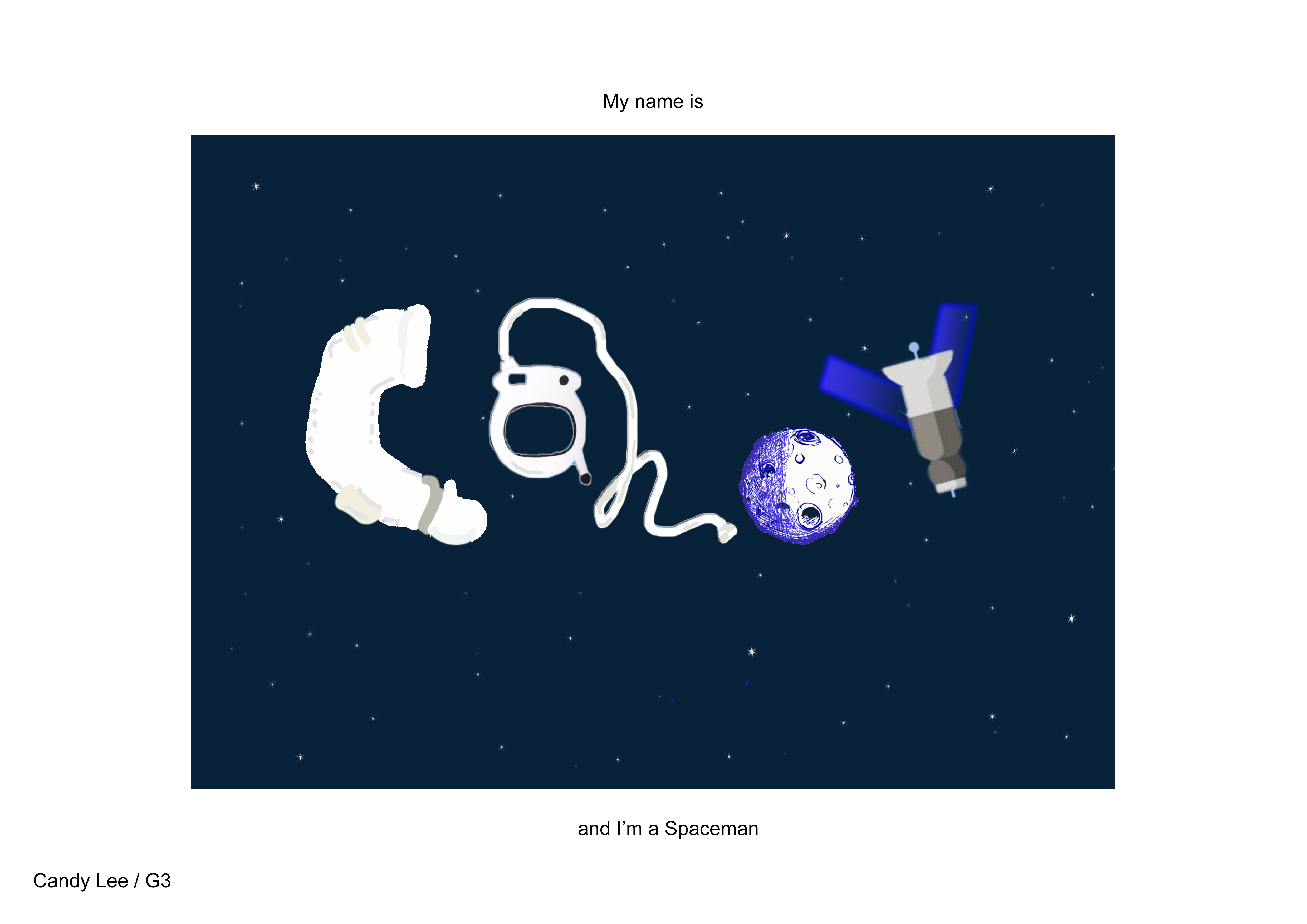
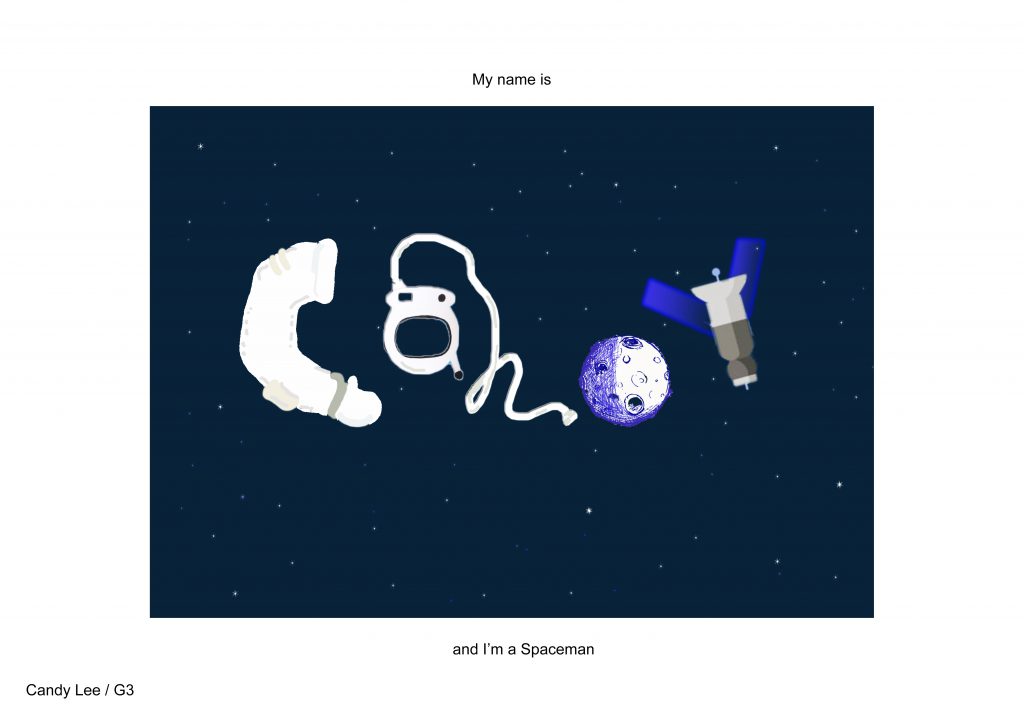
Galaxy | Spacesuit | Rocket | Mars Rover | Moon | Asteroids | Satellite
I have always been curious and interested in the space. The galaxy… I feel it’s a very beautiful and amazing space and if not for my fear of heights and my motion-sickness, I probably would have considered studying astronomy and probably one day visit outerspace. 
The production of this piece took the most time and it is very interesting as I decided to try to use mark-making.
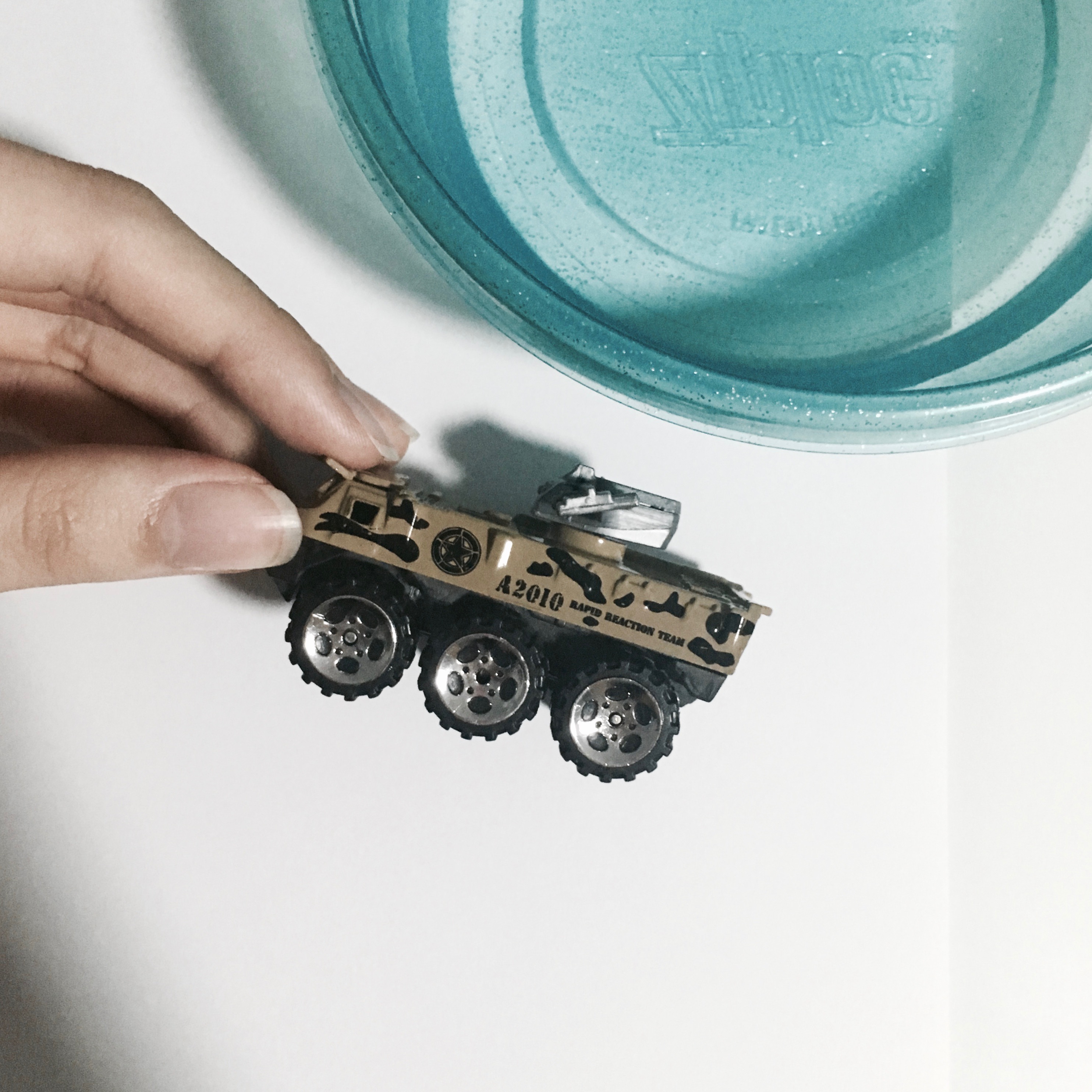
^ This was my alternative concept towards translating astronauts: Having the tracks of the mars rover on the moon spell out my name. I liked this idea a lot so I experimented.

1. Buy a toy car with rover-like wheels
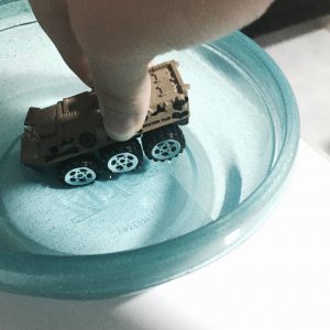
2. Dip the wheels in water
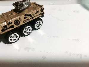
3. Play and make marks on white paper
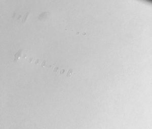
4. Collect the marks and scan the paper for digital enhancement
5. Scanning failed horribly so just use the original photograph
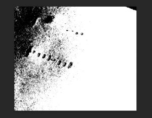
6. Crop and make it B&W, and then increasing brightness and contrast, make it grainy…
I LOVE THE EFFECT. I think the image is convincing enough as rover tracks on a moon surface However, it’s a pity that it would be a little too plain and flat to merely use the tracks to spell out my name. Nevertheless, it was a great process and learning experiment!
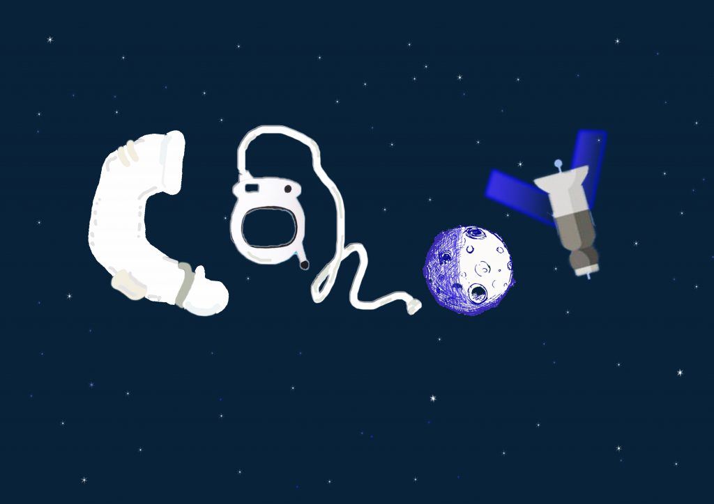
C: Arm part of the space suit
A: Space helmet
N: Connecting cables
D: The moon being cast shadow
Y: Satellite
I was going for a cute and animated style while using the associated items to form letters!
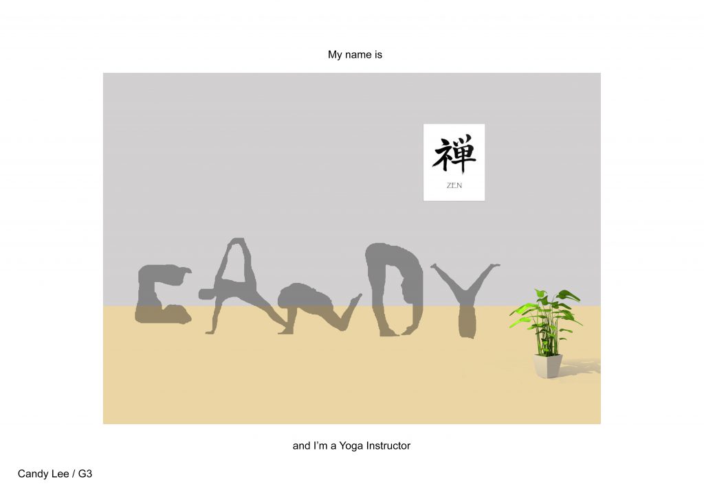
Yoga Instructor
Yoga Poses | Zen | Clean
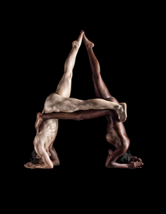
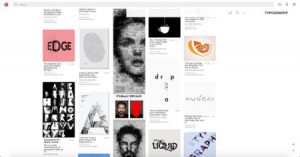
I looked up human typography and I came upon these stunning images in which humans pose with their naked bodies to form alphabets and come up with fonts. And I want to share this with all of you 🙂
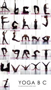
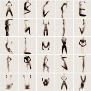
There are so many ways of posing yourself (arranging/differing your own postures) to create unique fonts of your own. I wished I had started this idea sooner so I could create poses myself and photograph and use them.
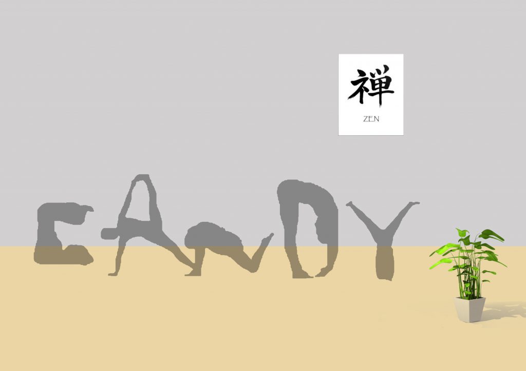
Eventually, I used silhouettes and added potted plants and the ZEN to contribute to the calming mood of the exercise.
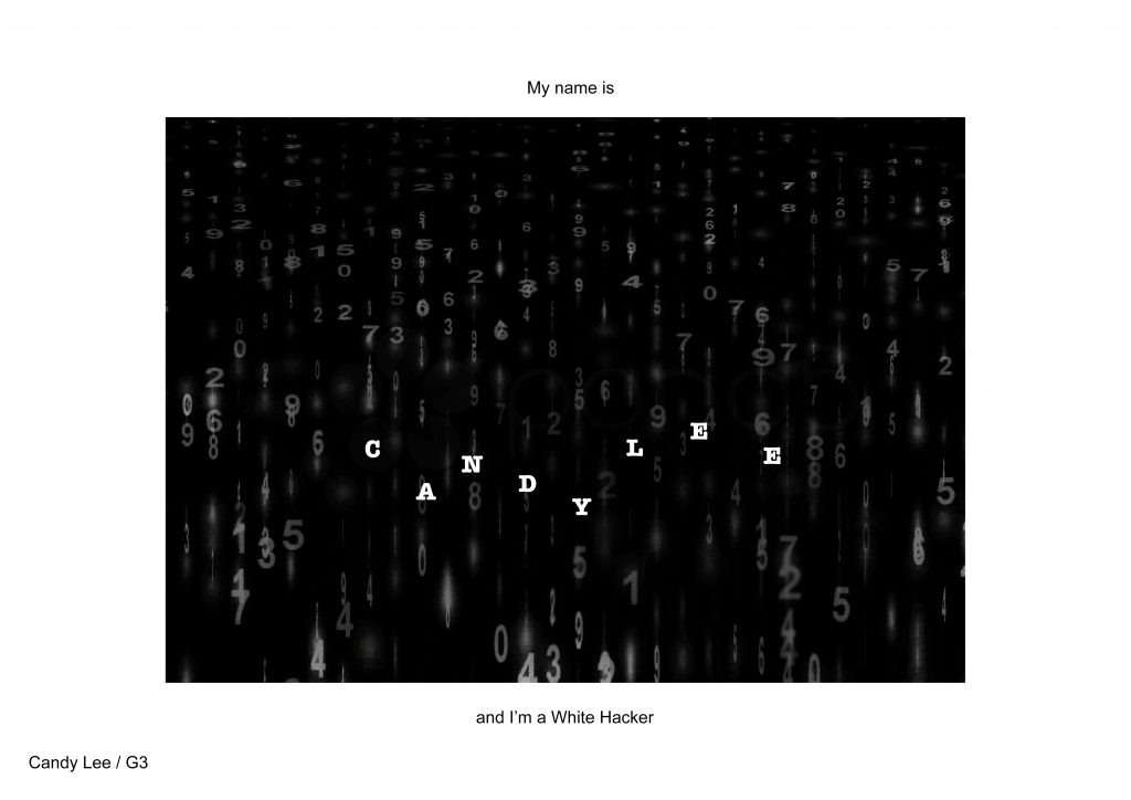
Forensic Scientist → White Hacker
Matrix | Fingerprint | Lab
This work is pretty interesting too. In another attempt to include mark-making, I wanted to try to use my fingerprints and then highlight the lines which appear to be my name.
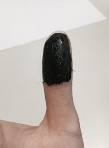
Covered my thumb well with some paint
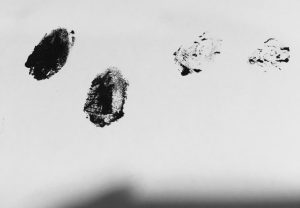
And…
Apparently, it didn’t do well and I looked for other possible ways to go about on this project. After my futile research on a forensic scientist, nothing caught my eyes except for the matrix. I then finalised the idea of a white hacker!
I watched the tutorial and learned to make a matrix background of my own!! 
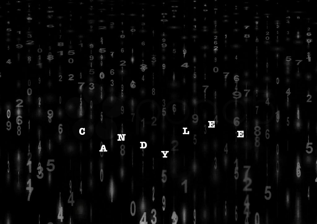
How did the idea of white hacker come about?
As I search for images, most of the matrix images were mostly either in green or blue. Then it struck me to change the ‘fixed colours’ to white. WHITE in this case, symbolises the profession of a white hacker, while the matrix coding naturally gives association with programming.
Wine taster
Wine bottles | Cork | Corkscrew | Wine Glass | Lips | Tongue | Eyes
I let my imagination loose… And I pictured a sea of red wine (depicted by waves in layers) with the tools we drink wine with such as the corks, corkscrew, wine bottles and wine glasses, floating in the sea. It was a great image in my head and I even wanted to submit this as one of my finals but…
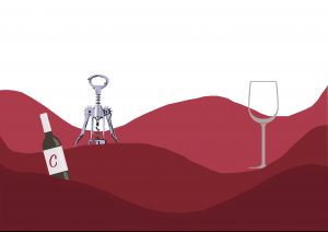
But the difficulty I didn’t manage to overcome in this piece was to finding/ tuning the tools to form the shape of the alphabets of my name. The corkscrew was meant to be an ‘A’ and the wine glass ‘Y’. But I sought opinion from my friends and they couldn’t tell the alphabets effectively, hence resulting in me scraping the idea. 
Sleeper
Bed | Counting sheeps | Zzz | Snoring | Pillows & Blankets | Dark Eye Circles
Dealer
Poker cards | Casino | Chips | Dealer gloves