Content
Prologue
Chapter 1: Introduction
Chapter 2: Research
Chapter 3: Experimentation
Chapter 4: Discussion
Chapter 5: Final
Chapter 6: Conclusion
Epilogue
Prologue
“Waa…waaaaaaa” The line I just drew was crying.
“What?!” My eyes widened as I saw my lines were moving into different waves. “What are you?!”
“I am your new friend for this 3 to 4 weeks. You have a quest to help me to find back my emotion 🙁 I lost 5 of them and left with sadness.”
Chapter 1
Introduction
First project of the class is “My line is emo”, taught by Shirley Lim. Yeah… project from first lesson! First lesson! (I am not complaining) “My line is emo” means line can be a tool to express emotions. To learn how mark making techniques express different emotions, I would be doing some own research and experiment different techniques for a few weeks.
Chapter 2
Research
I have done some research about mark making and how each line can represent the six emotion. The research is in here.
Chapter 3
Experiment
I have done some experiment of mark making tools at home and in school.
At home ——————————————————————————————————————
Ingredients and materials used at home are:


- Small card
- String
- Needle
- Shattered glass
- Golf ball
- Tooth
- Toothpick
- Snail shell
- Moisture absorbent
- Plastic
- Aluminium foil
- Clay


*Those items in picture I did not mention because I did not use them in the end.
The experiment at home:
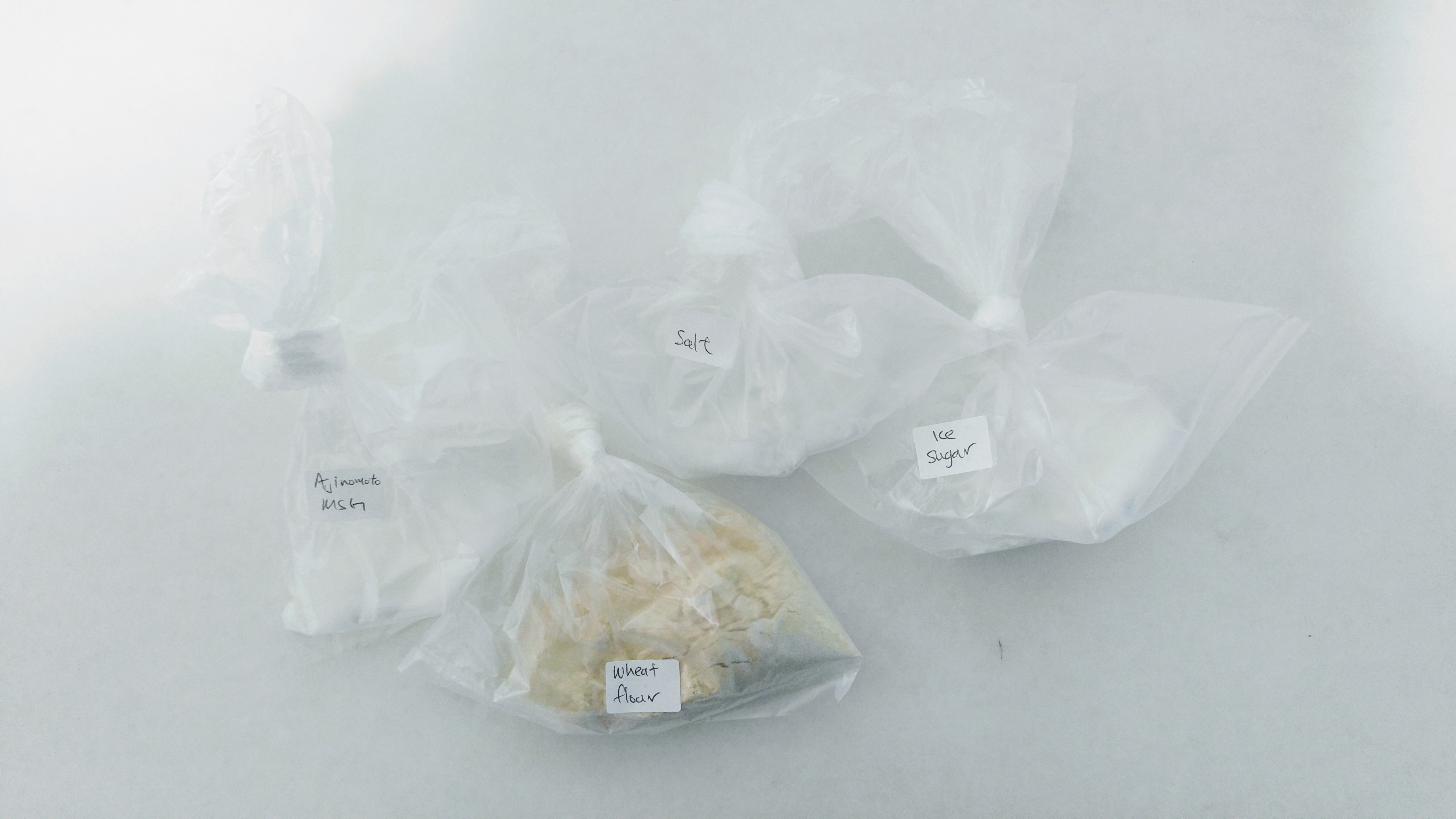
First experiment was using salt and it was dissolved partially in ink. Then I used paint brush to dip in this salt solution and drew 2 long lines down (At the right of figure 1). I could not see any texture of the salt so I tried using my finger. It was not smooth because of the salt particle but the effect is not strong enough. Most probably the salt was too fine that roughness of line was not show.
Next, the fourth line counted from right in figure 1, I used salt itself, placed the salt on the paper and used brush to drip/brush ink over the salt. When the ink was dry, I rubbed away the salt. It became messy and uneven. So the next two lines I drew by using clay covered with salt (show in figure 2) and dipped in ink. There were rough texture and the result was better than using finger because the texture was more obvious and the lines were more even. I tried brush, finger and ink over particle method for MSG, the result were similar.
I find that using salt or MSG for drawing line is messy with lines uneven. In my opinion, they are suitable to use as background effect.

Figure 1: Ingredient used, salt and MSG.

Figure 2: Clay covered with salt.
Second experiment I used wheat flour. As I mixed wheat flour into ink, the texture of the ink became thicker. However, the texture was not obvious when applied on paper. See figure 3 and figure 4.

Figure 3: [From right] Finger dipped in ink mixed with wheat flour for first line. Toothpick was used for second line and the last line was using syringe to spray the pure ink and sprinkled wheat flour over it.

Figure 4: [From left] Using syringe to spray the ink on paper and then sprinkled wheat flour over the ink.
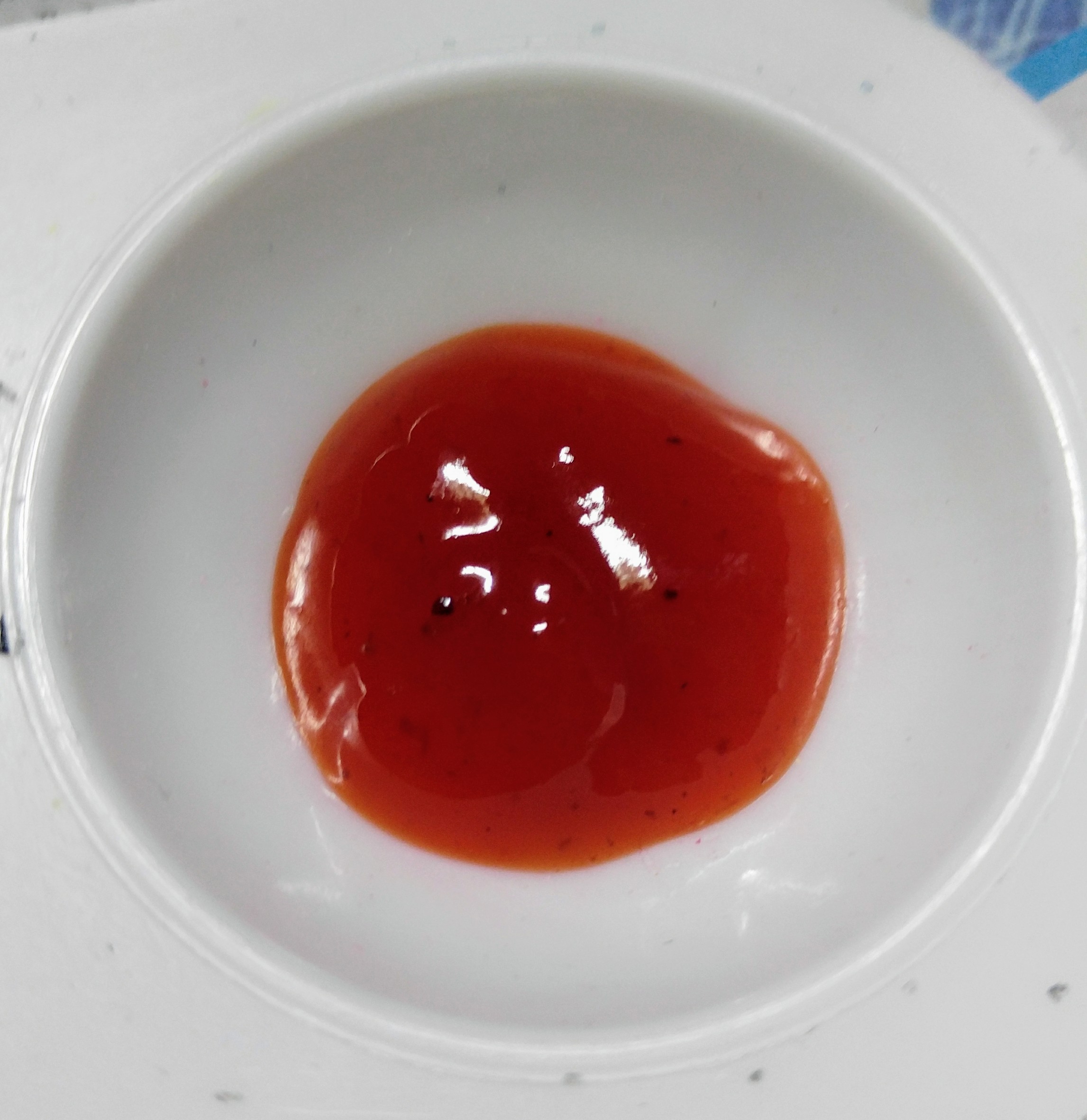
Third experiment was using chili sauce mixed in ink. I used paint brush and shattered glass to draw lines. The texture of the mixture was smooth and thick. Compared to normal ink, the line of mixture still showed bit of roughness because of friction but the line showed more bold than normal ink.

Figure 5: Chili sauce.

Figure 6: Ink mixed with chili sauce compared with pure ink.
The next experiment I used direct print from original object method. The material I used were plastic, aluminium foil, snail shell, golf ball, moisture absorbent, small card, tooth, toothpick, needle, string and shattered glass. See figure 7 to figure 10.

Figure 7: [From left] Material used are plastic, snail shell, aluminium foil (printed by flat side), aluminium foil (printed by thin side), golf ball.

Figure 8: [From left] Material used are moisture adsorbent, small card, tooth, toothpick and needle.

Figure 9: Material used is string.
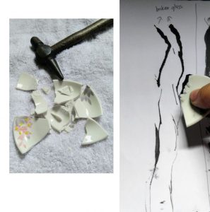
Figure 10: Material used is shattered glass.
Last experiment was using water diluted the ink and sprinkle over salt particles. It has little rough surface and as the water spread out, it shows some tone. Refer to figure 11.

Figure 11: Black colour water sprinkled over salt particles.
Figure 12 shows overall result what I had experiment at my home.

Figure 12: All experimental result.
In School ——————————————————————————————————————————–
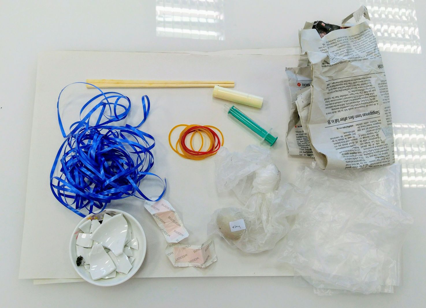
 Materials brought for experiment in school were ribbon, shattered glass, plaster, chopstick, rubber band, clay, syringe, lip balm, newspaper and plastic. However, I only used some of the materials; All except newspaper, lip balm and syringe.
Ink material provided by school were Chinese ink and Pigment ink.
First experiment was using a tool I made which was rubber band wrapped the chopstick then dipped it in Chinese ink. Blotted excess ink from the tool before create marks on paper. The result is shown in figure 13.

Figure 13: Rubber band was wrapped around the chopstick covered with Chinese ink. [From left] Create marks on paper by rolling. On the next picture, marks created by pulling.
Next experiment was using ribbon and dipped in Chinese ink to create marks on paper. Refer to figure 14.
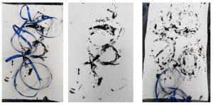
Figure 14: Ribbon covered with Chinese ink.
I used plastic again but this time the plastic was braided and pigment ink over it. I also tried to use it like a brush to make stroke effect. Refer to figure 15 below.

Figure 15: [From left] The plastic was braided and used pigment ink to create the mark. The last picture, I used the top of plastic to create stroke effect.
Fourth experiment was using plaster with different techniques. First was using roller covered with pigment ink and rolled over a white paper and under the white paper was the plasters. Next was plasters covered with pigment ink and printed on white paper when pressed. Figure 16 shows the result of each technique.

Figure 16: [From left] Pigment ink rolled over the plaster and white paper pressed on inked plaster to get the mark. Next picture, I used a side of plaster to make a continuous mark. Last picture is the plaster was not ink but covered with white paper, I used roller stained with pigment ink and rolled over the white paper.
In figure 17, I used my finger wrote over pigment ink and printed on white paper.

Figure 17: Using finger wrote over the pigment ink and printed on paper.
With same concept as rubber band wrapped around chopstick, I used ribbon to wrapped around chopstick. The effect is shown in figure 18.

Figure 18: Ribbon wrapped around chopstick and used Chinese ink to create marks.
I used clay for the experiment. It was a moist clay so I could shape anything I wanted. I shaped it into a ball and covered it with Chinese ink. The result is shown in figure 19.

Figure 19: Clay ball covered in Chinese ink and made different lines.
Last experiment was using wood knives to create zig-zag lines and straight lines. Each group of three lines belong to one wood knife. Refer to figure 20.

Figure 20: [From left] First 4 lines belong to first knife, followed by next 3 lines belong to second knife and last 3 lines belong to last knife.
Chapter 4
Dicussion
Experimental —————————————————————————————
I have picked a few pieces from experiment to discuss their shapes, lines and what is the feeling I felt when I see it.

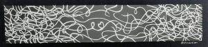
Firstly, there are curvy lines that bents higher. However, the curvy line is not sharp, it has fuzzy line. The curvy lines are overlaying each other that makes them seem interesting and happy. In my opinion, it shows optimism because the lines bent higher to show positive feeling or in research figure 3 it shows progressive. Furthermore, the thick line give a feeling of certainty. However because it has fuzzy line, it also gives some insecurities. Definition of optimism is tend to belief goodness in pervades reality [1] . Hence, line like a person, he strongly belief of goodness in uncertainty of the situation. Fuzzy line to indicate insecurities, the thick progressive line represent his strong belief of goodness will not stop. Thus, optimism.

The lines are parted and it is in swirling effect. There is no fuzzy line and no sharp edges. However, it does not give me positive feeling because of the line flowing downward and the broken line shows a sense of weakness. It does not give an angry vibe because no sharp edges. Therefore, when I stared at it quiet long, I feel a sense of giving up. I feel disappointment. I see the small black parts as effort but something pull the big black parts down to shows failure. Gradually, many failures lead to disappointment and the tone of the line faded at the end. It indicates lesser effort was shown.

It is round in shape but not a perfect full round shape. It does not have sharp edge. I feel calm because of the roundness and circular movement created inside each shape. I also feel the anticipation because of inside the shape has different tones. Therefore, I conclude it is a feeling of liking.

The broken line indicate weak and the gap between each line is wide which show the feeling take longer time to be connected. The line is thin and fuzzy. I feel fear inside the line because it is unsure and weak. I describe it as “timid” though the word is not in the list of emotion given.

The line is thin with sharp edges. Although the line is thin but it does not show fragile due to the sharp edges. The sharp edges like thorns wanted to pierce someone or something. It gives a negative feeling and I feel irritation from this line. When I feel irritated, I would endure until my limit, similar to this thin line indicates the limit. Hence, in my perspective, this is irritation.
I could not find any lines represent “surprise” from my experiment. There is no explosive marks. Hence, I would need to experiment more for my final work.
Draft —————————————————————————————
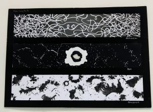
After experimented on tools for mark making, I have came out some ideas for each emotion. In addition, I received valuable advise from Shirley and classmates during critic session. Figure 21 shows all the draft for each emotion.

Figure 21: Draft for each emotion.
Let’s talk the work piece from top to bottom. First piece is “Terror” (a zoom in picture is shown below, figure 22).

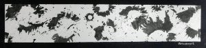
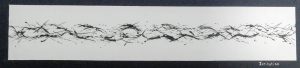
Figure 22: Terror. Method: Syringe pumped the ink out on white paper and let the ink flow downward.
I used syringe to create the splash. The first splash was accidental. It was a big splash so I turned the paper vertically to let the ink flow downward. It looked nice and creepy so I did a few splashes and let the ink flow downward. The outcome was good. Terror [2] in dictionary means extreme fear. In my definition, it is extreme fear and this fear can possibly last for amount of time. Hence, when I see this piece, the big splash is represent sudden fear and slowly as the line went through the paper like time, the fear would not disappear, the fear still creep in with no warning.
Next is “Fear”, the definition of fear is an unpleasant emotion due to there is something dangerous/threatening you are worry or frighten even it may not happen [3]. In my definition, fear is I am scare of unknown because I will not able to control my life if unknown happens.
Based on Shirley’s review, she said my fear is consistent (up and down throughout the flow), see figure 23. It is systematic. I agreed with her opinion. When I did this, I thought fear is not a extreme emotion that have to be messy because my fear do not make me want to scream. It is a silent emotion that creep inside me. Hence, systematic flow. After Shirley asked if I experience fear all the time, then I realised I actually experience it most of the time. Hahaha. The systematic flow shows the constant fear I experience. I used to the fear which is why it did not show erratic flow. The reason I always feel fear probably, almost everyday I am stepping out of comfort zone. For example, during working I hope no unexpected bad situation happen. Or when chatting to my friends, I hope I would not make the atmosphere bad. I think my comfort zone is staying at home alone doing my own stuff.
I amended the white background to messier background to shows uneasiness and frightening of stepping out of comfort zone (figure 24).

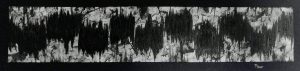
Figure 23: Fear. Method: Used brush paint the lines and wood knife to make the white marks. The paint is mixture of Chinese ink and chili sauce.

Figure 24: Fear, amended. Method: Background was painted using round clay tapped around on white paper. In addition, tooth was used to make sharp lines. The dark lines are using same method from figure 23.
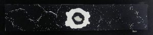
Figure 25 shows “Disappointment”. Disappoinment means something/someone is not what you hope it would be [4]. For example, if I put so much effort to make it succeed but in the end it is not what I expected, I definitely feel devastated and disappointed with myself. At first I do not know what to name this piece. When I see the dark part flowing lesser and lesser, I thought maybe it could be disappointment because as I felt disappointed, my energy level just like this dark part, could not flow further anymore, just want to stop my progress. However, from review, many commented the white part is taking a lot of space. If disappointed, the dark part needs to eat away white part. Then I learnt, dark part to audience is indicate negative energy while white part is indicate positive energy. I need to be careful of dark and white part.

Figure 25: Disappointment. Method: Using round clay tapped on white paper. The ink is Chinese ink.
Now, my favourite part. Burning papers! The first try was disaster. I could not control the fire to burn a shape I wanted. Slowly, I get the hang of it. I have the video of how you control it but it is not clear because I film with one hand… The method is easy, burn a part and quickly blow off the fire and let it burn slightly. Repeat the step. [Burning paper]
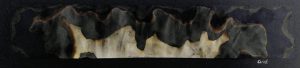
Figure 26 is my first piece about “Grief”. Grief in dictionary means extreme sadness especially by someone’s death [5]. My definition is same with the dictionary. The original idea was the white part at the top, followed by grey and black. To show that the dark side eating away the white part and at the same time, the burn mark is pointing downward to indicate the sadness.
However, classmates think that white part should be at the bottom (see figure 26.1). The reason is that the dark part seem much heavier and stopping white part to spreading outward. I could not see the reason initially when they suggested to put white part at bottom. I just kept staring until I got it. I had experienced grief before so I tried asking myself many questions such as if my positive energy is at bottom, what is the different from putting it at top.
Then I came out with figure 27. I created the white smaller and more dark part. The time I experienced grief was after funeral of my grandmother. It was a sudden realisation that my grandmother was not in this world anymore. Like the dark part, it slowly crawled towards me. My positive energy was low indicate by white part, it could not shine in darkness. Although I looked fine on the outside that time, I felt so sad inside as she not here anymore and my life looked so different without her.

Figure 26: Grief. Method: Burning of papers.

Figure 26.1: Grief. Method: Burning of papers.

Figure 27: Grief, amended. Method: Burning of papers.
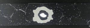
Next, “Hope”. It is shows in figure 28. The meaning of hope is to want something to be true or happen and normally have good reason to think it might happens [6]. When I feel hope, it is something that shine through darkness. However, this hope is merely just a expectation of something to be happened but it may not happen in the end. So the white circle is not fully white.

Figure 28: Hope. Method: Tear the papers. Used correction pen for dots.
I cut a hole for lights to shine through (figure 28.1) to shows the brightness of hope.

Figure 28.1: Hope shining.
Happiness is the feeling of joy [7]. The feeling of happiness is like bubbles floating upward and content (see figure 29). Hence, each circle is filled with marks. However, according to Shirley, it feels like I was trying to happy because the circle is not smooth and systematic. After she told me this, my perspective changed. A happy person would not walk in orderly manner, he will just walk around because he could not hide his happiness. Also, I learnt a positive feeling is better to be as clean as possible. While negative feeling is as messier as possible.

Figure 29: Happiness. Method: Round clay printed the inner circle and used bottom of small plastic bottle for circle. Ink is Chinese ink.
Surprise is a feeling for unexpected event [8]. At first, I want to show the progress of surprise (shown in figure 30). A straight line for idle emotion, then suddenly there is spark and after that a happy feeling. However, I feel it weird because it is not pure surprise in this work. Hence, I re-do my work and named it Amazement which means extreme surprise [9]. To me, amazement is mixture of surprise and thrill or excitement because if I was in museum, I would feel amazed by the artworks and get thrill over it. In figure 30.1, there are many sparkles to show my surprise and there is white line circling around to show thrill or excitement.

Figure 30: Surprise. Method, paint brush for lines and ribbon for the small marks. The sparkle is formed by the bottom of small plastic bottle and the “splash” effect of sparkle is pulled by broken glass.

Figure 30.1: Amazement, amended. Method: The sparkle is formed using same method from figure 30. Correction pen is used for the white curvy lines.
I used water marbling method for infatuation. I like the waves spreading outward. Infatuation is a strong feeling of attraction but it does not last long [10]. Thus, the wave is cut short by the dark line (figure 31). The attraction of someone can be repeated but it does not last long for each time.
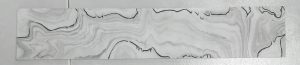
Figure 31: Infatuation. Method: Water marbling. Maker is used for drawing the dark lines.
There is room for improvement for infatuation. Hence I focus on attraction. Attraction means a person or thing draw your attention [11]. Furthermore, in rare case, both parties draw each attention, there is attraction between them. This may not last long, so the connection can break easily. On other hand, if the feeling of attraction lasted quiet long, more connections are form and these connections will form a strong bond. This strong bond is called love. See figure 31.1.

Figure 31.1: Attraction. Method: Paper cutting for white lines. The background was painted from dark to light using mixture of Chinese ink and water.
Hate, to dislike someone very much [12]. Hahaha, I like how Shirley and my classmates described it when they saw this piece. Actually I worked this piece based on my experience. It is not a very good feeling. The background is drew like broken glasses to show the irritation and being hurt. Then the dark “flowery” (it is not supposed to look like this :[ …) is indicate the ugliness of hate. I burned black felt cloth to make the “flowery”, actually I wanted it to look sticky weird black thing. But nah, seem more like flower. Then the sewing part is to show the feeling of hate would disappear even if wanted. Refer to figure 32.
Well, the comment I got was, my hate was beautified. Lol. A psychopath feeling of hate. Kill the person with hate but enjoy it. LOL.
My inner voice: “I am not psychopath!”

Figure 32: Hate. Burning of the felt cloth, sewing and using ink pen to draw background. String was also used to mark the background.
Next irritation, it is a feeling of slightly angry or annoyed [13]. Yes, when I feel irritated, I would not exploded to anger but slightly angry. I would control my temper until it reaches my limit. Hence you will see in figure 33, there is systematic flow to show controlling, and the sharp line penetrated the flow to show annoyance. Negative feeling suppose have messy background but for this, I keep it clean because it is not a strong emotion and focus the flow that it wants to explode but control.

Figure 33: Irritation. Method: Used broken glass to create the marks.
Lastly, there is one missing piece I did not discuss because I still could not find the emotion for it and it was last minute to create hence, I find meaningless to discuss on it. Refer to figure 21 above, the last third piece.
Chapter 5
Final
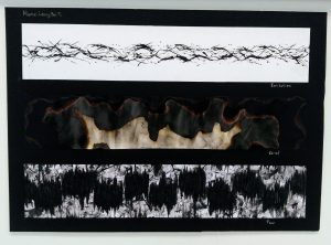
After critics session, I went back to change some pieces. The final works are here.
Chapter 6
Conclusion
All in all, I have learnt there are many methods beside ink to create mark making. From this project, I become a crazy curiosity artist. I had fun burning stuff and using weird tools such as my childhood’s tooth to create sharp marks. In addition, I am more aware things related to lines or mark making. Questions myself about what they want to show through this mark making.
Previously in my secondary school days, I did abstract art but our abstract art could still tell what it is. However, this project could not tell what I want to express easily. At first I had difficult to get the feel from my experimental marks. I kept referring to my research to interpret what should this mark be. To overcome this difficulty is after critic session, I listened to Shirley’s suggestions to others and classmates’ suggestions to myself. Slowly I picked out the knowledge and tried apply to my feeling and questioned will classmates get what I want to show.
Another lesson I learnt about advertisement is not about myself, getting audience advise is importance. Advertisement is to send message to target audience so beside my experience I need to add on audience experience too.
Overall it is interesting project but time consuming hahaha. It trained me to be better in time management!
Epilogue
“Thank you Beii!” Said the lines, “You have helped me to capture all the emotions! Now I am feeling completed.”
Meanwhile…
“We’ve been caught again…” Love said sadly.
“And whose fault is it?” Anger was furious.
“I was trying to help… you know, I am lovely emotion” Love replied in guilt.
“Never mind! We try again next time!” Joy said optimistically.
-End-