90 images

Statement

The theme that I set for this sequence of images is “personal growth”. The sequence starts off with me in a blank state, progresses by showing myself going through different life events, and ends with me as a developed person

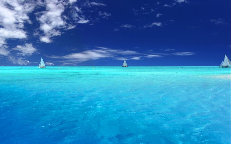
The first set of images shows my progression from being an empty person into a person with different interests, hobbies, and life experiences.

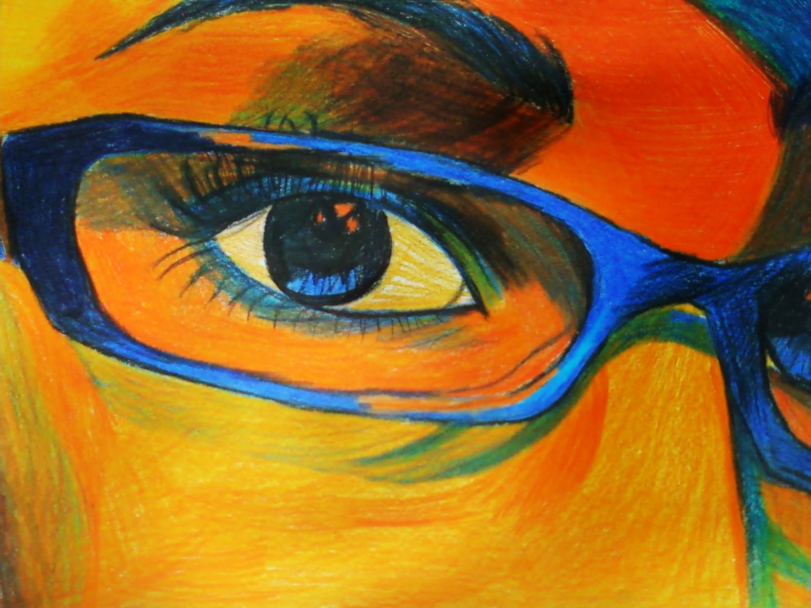
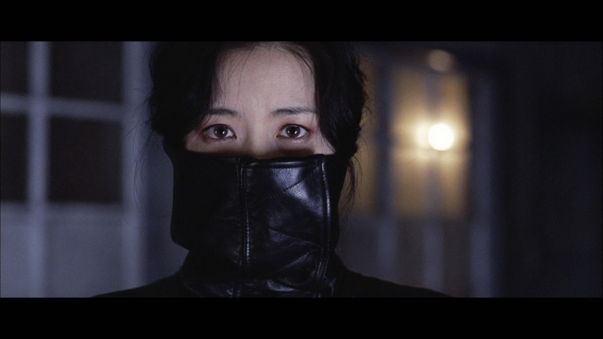
The second set draws inspiration from the commonly heard phrase, “we are our greatest critic”. In the beginning, I show that I see myself as a flawed person, wanting to remove the stained shirt. However, I learn to acknowledge and accept my flaws, resulting in me willingly putting on the stained shirt.

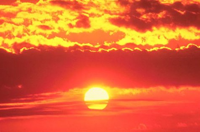
The last set shows my discovery of love. I meet my significant other and we go on adventures together. I try to imagine life without her (I got inspired by a similar question that she asked me when we first started dating), but everything is blur and bleak. She helps me see clearly again, and we are happy with each other.

And finally, I go back to sleep acknowledging all that has happened.

References

I was inspired by a series of photos that my friend took a while back.

976867_10151448959567607_1750179306_o 286159_10151448959577607_354761002_o

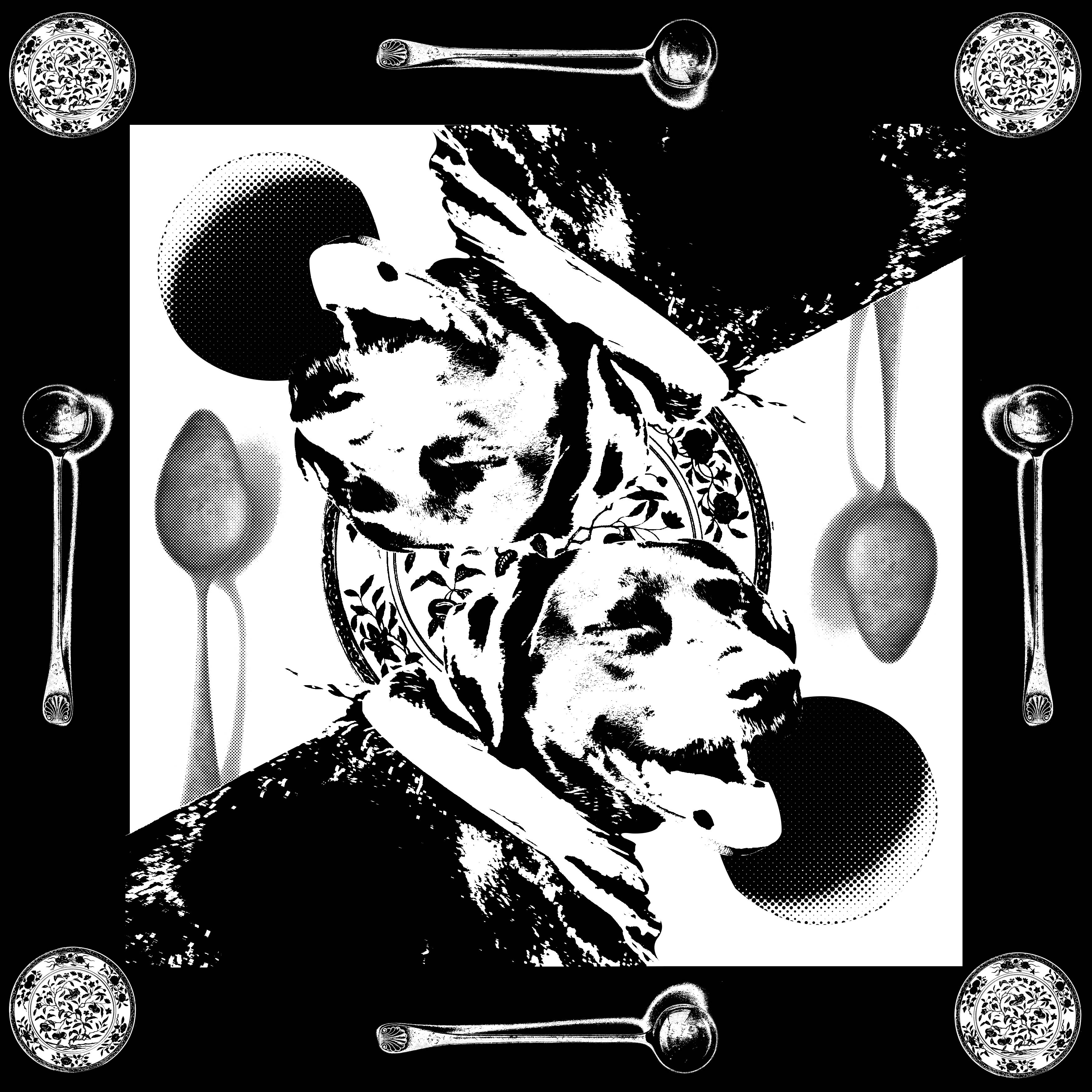
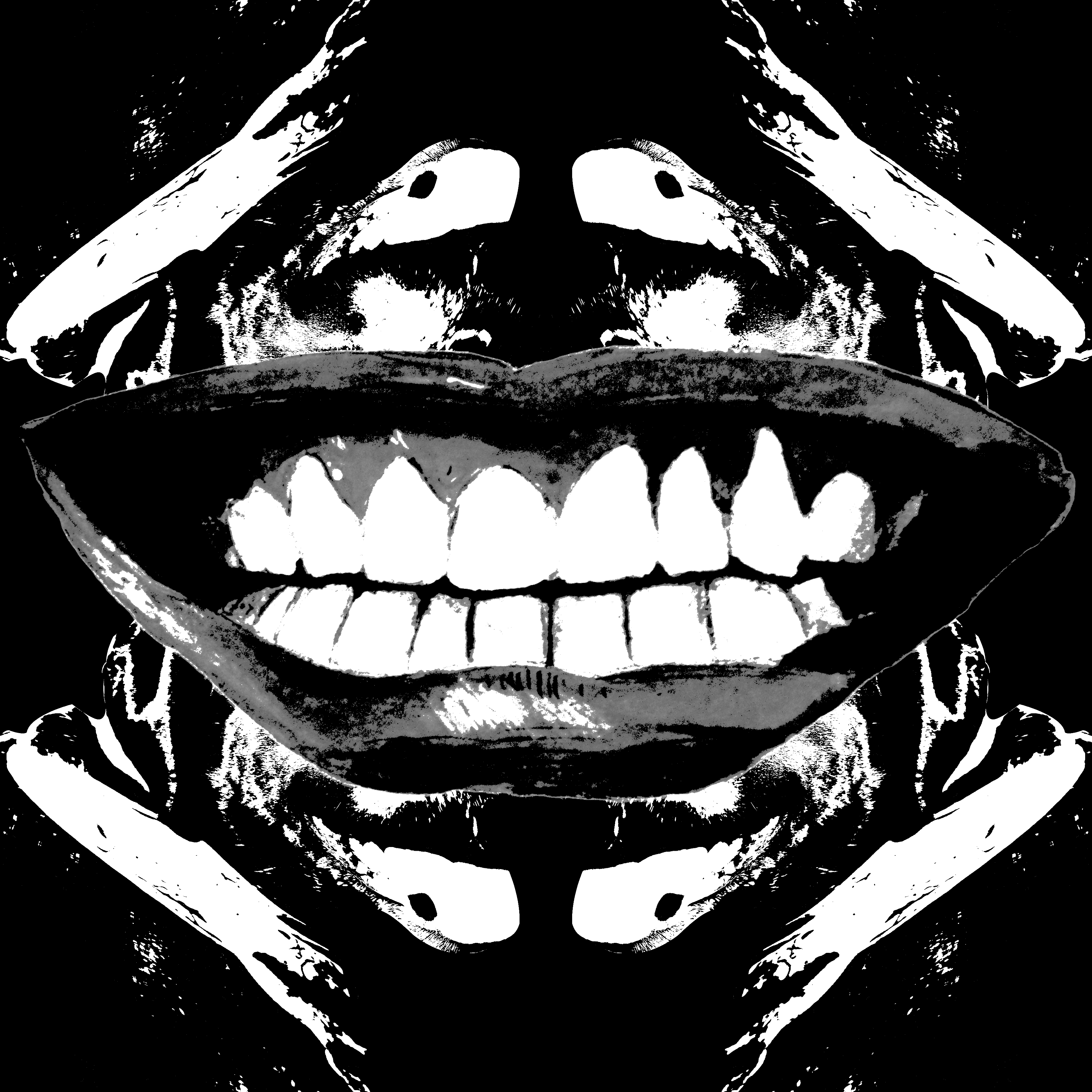
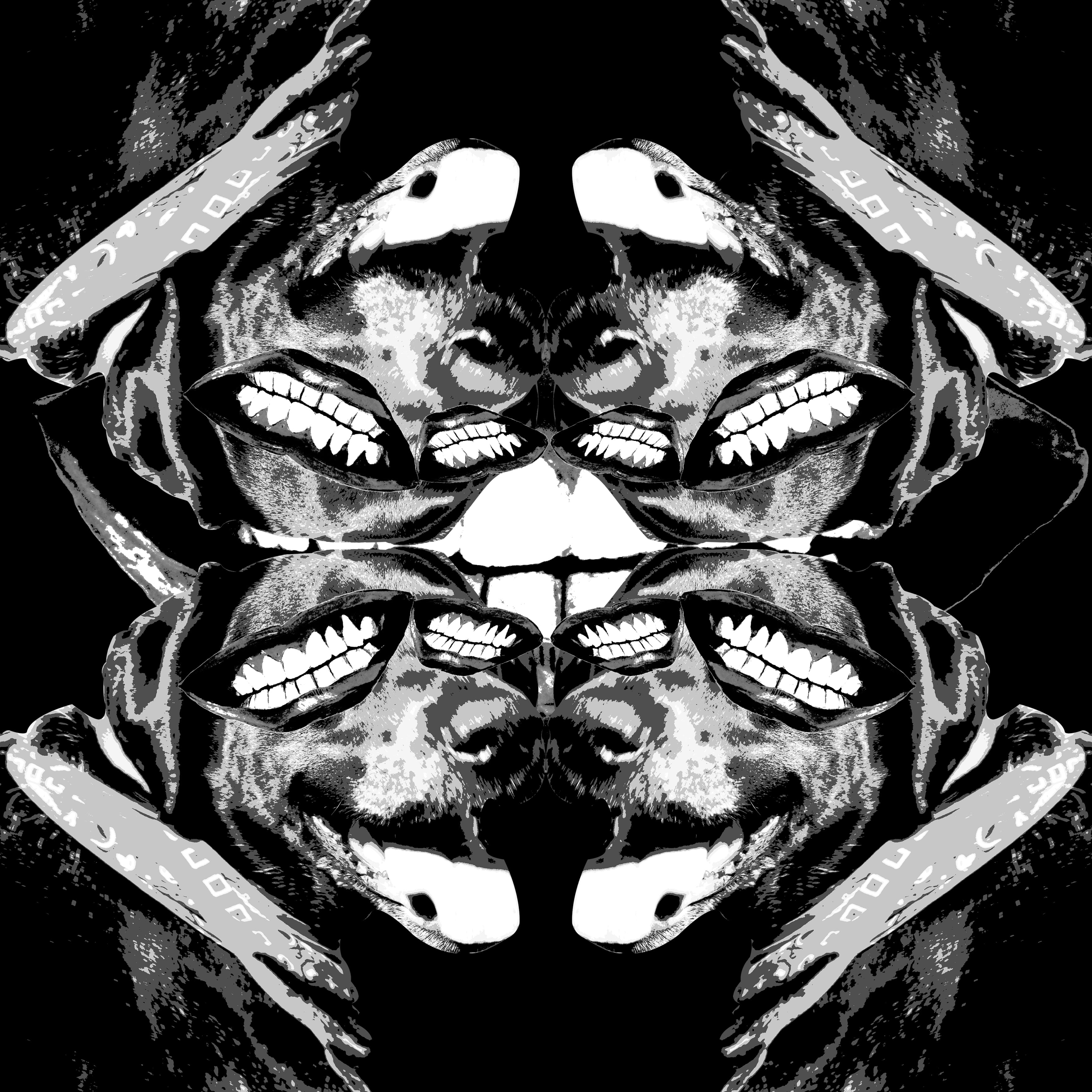
While not every single photo references this style, I did make this “symmetrical” style a main focus to show how time passes in relation to my character.

Learning points

I realise that while it is easier to do a “stop-motion” style of photography to fill up the 90 image requirement, the result would probably be less interesting and authentic. Rather than using the 90 images as a storytelling medium, I think it is more interesting to try and use the difference between each image to tell a story, if that makes sense. Trying to make each of the 90 images have a certain meaning to it was pretty difficult, but I learned a lot from it and honestly, I wouldn’t mind doing it again.

These colours be scheming.

Here are the various colour harmonies/schemes.

MONOCHROMATIC

monocromatic_template

Colours that are the same-ish

12697719865_fd396ad2af_k

COMPLEMENTARY

complementary_template

Colours that are opposite each other on the colour wheel.

ferragamo-menswear-milan-fashion-week-ss-2013

SPLIT-COMPLEMENTARY 

split-complementary_templat

One hue plus two others equally spaced from its complement.

tumblr_muj4427pTt1rnolxfo1_1280

DOUBLE COMPLEMENTARY

dbl-complementary_template

Two complementary color sets; the distance between selected complementary pairs will effect the overall contrast of the final composition.

5740ea0a88c93dad03da747f4fbd609d

ANALOGOUS

analogous_template

Those colors located adjacent to each other on a color wheel.

1

Triad 

triad_template

Three hues equally positioned on a color wheel.

IMG_4293

Reference: http://www.worqx.com/color/combinations.htm

Nursery Rhymes

1.) The cow jumped over the moon.

Here’s my first design.

PATTERN 1

The initial pattern only consisted of one moon surrounded by four cows, but I decided that it looked too plain. I was thinking about floor tiles and how multiple tiles form a unique pattern when out together, which inspired me to multiply the initial pattern.

PATTERN Y

Before this design, I did something that was a literal interpretation of the rhyme, but I decided that I needed to train myself to think more abstractly.

PATTERN X

2/3.) Hey diddle diddle, the cat and the fiddle.

I feature this line twice in my designs. The first of which looks like…

PATTERN 2

The pattern in the middle of the… pattern, is actually made of multiple “treble clef” symbols put together. I wanted to use something that people recognise to make something that’s not immediately recognisable, and I’d like to think that I succeeded.

flair-music.note-400

The second interpretation of the line goes something like this…

PATTERN 3

Cats are known to climb trees, so I wanted to make it look like the cats are jumping towards the fiddles, which kinda look like trees (to me, anyway).

PATTERN Z

This was my initial design, but it looked too symmetrical for my liking. I feel that my decision to make the design asymmetrical was a good one (good job, me!).

4.) The little dog laughed, to see such sport.

PATTERN 4

Inspired by the design of the court card designs in playing cards. Though the design is symmetrical, I liked the idea of using court cards as an inspiration to give it a go.

I initially wanted to do something creepy, so here are some preliminary designs (that feel pretty uninspired, to be honest).

PATTERN 5

PATTERN 6-min

Yeah… I’m glad I didn’t use these.

Don’t make me see red.

In popular media, different colours are used to represent different emotions and themes. Here are some examples:

Red: Generally used to represent anger and passion. One reason why love is sometimes interpreted as a rose is due to it being the colour red.

Closeup of a red rose.

Blue: I interpret blue as a colour that represents calmness and trust, the same emotions that I feel whenever I look at a blue ocean. It is also coincidentally my favourite colour. Go blue!

blue-ocean

Green: The phrase “green with envy comes to mind. Exactly how I feel whenever someone gets more sleep than me.

gallery_envy_gallery

But other than that, green is also known to induce feelings of harmony and growth. It is the same colour as nature, making it easy to look at.

Yellow: Seen as a colour that invokes feelings of optimism and joy.

534898_938b09d28c130c4a92306b9ca136be62_large

Orange: While similar to yellow, it conveys slightly different emotions. While yellow depicts joy, orange depicts enthusiasm.

07-12-01orangesunset

Purple: Often seen as a colour of royalty and extravagance.

The-purple-robes

Black: A very powerful and attention drawing colour; used to symbolise power and authority.

1420615

White: Like a blank canvas, it symbolises purity and innocence.

Blank paper and pen