2D: Streets

Screen Shot 2016-04-09 at 9.14.28 PM

As soon as I heard that we would be doing a magazine about anything, I immediately sprung at this opportunity to showcase some of my street photography works, hence the title: streets (I know lah, super original). I’ve always wanted to do something like this ever since I started dabbling in street photography.

Screen Shot 2016-04-09 at 9.14.39 PM copy

3

Screen Shot 2016-04-09 at 11.28.26 PM


It’s all about perspective.

For this project, I decided to stray out of my comfort zone and try out some digitally-formed compositions.

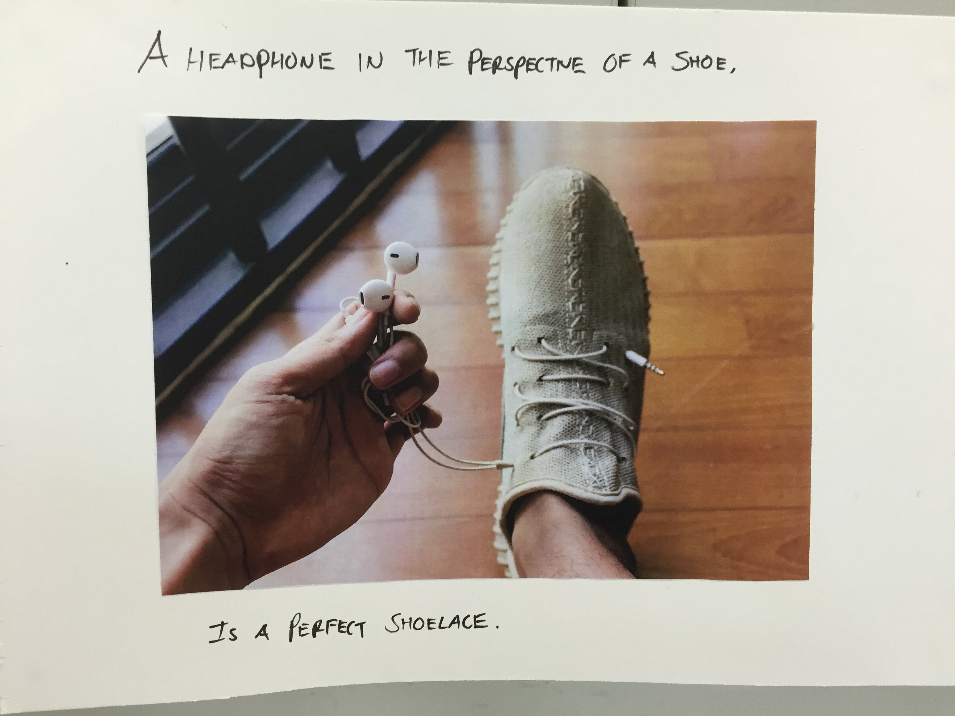
1. A headphone in the perspective of a shoe, is  a perfect shoelace

IMG_5608

Don’t you hate it when your earphones tangle up in your bag? I’ve always felt that earphones would make the perfect shoelaces due to the fact that they’re very hard to untangle, and so I decided to depict this literally. I had a tough time lacing the earphones through the small holes of the shoe, but the end result was worth it.


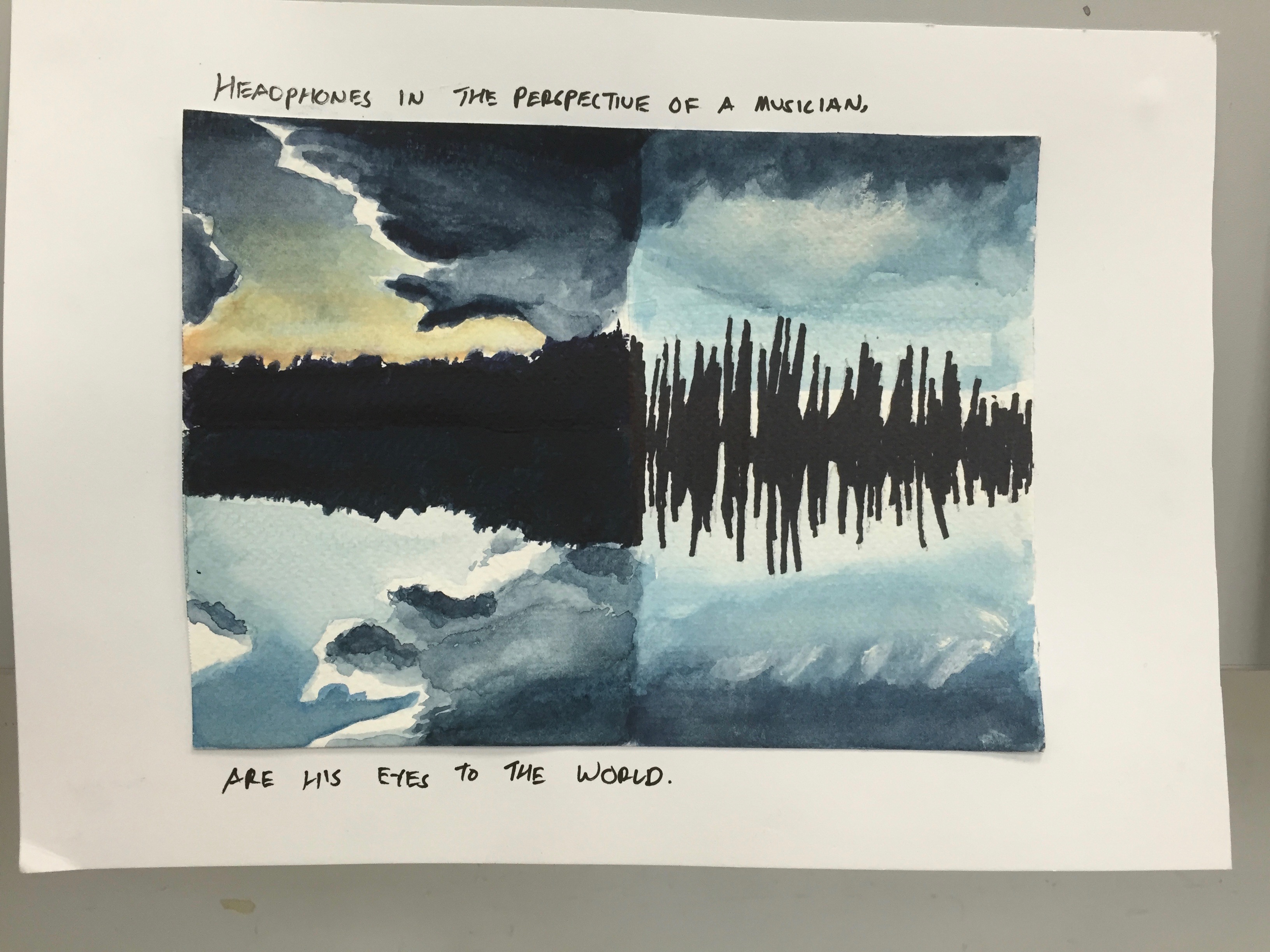
2. Headphones in the perspective of a musician, are his eyes to the world

IMG_5609

I decided to put my newly learnt watercolour-painting skills to use my applying them to this composition. I got the idea for this piece when I was looking at sunset photos on Instagram; I thought that some of the silhouettes of trees kind of resembled sound waves, and I wanted to show that comparison.


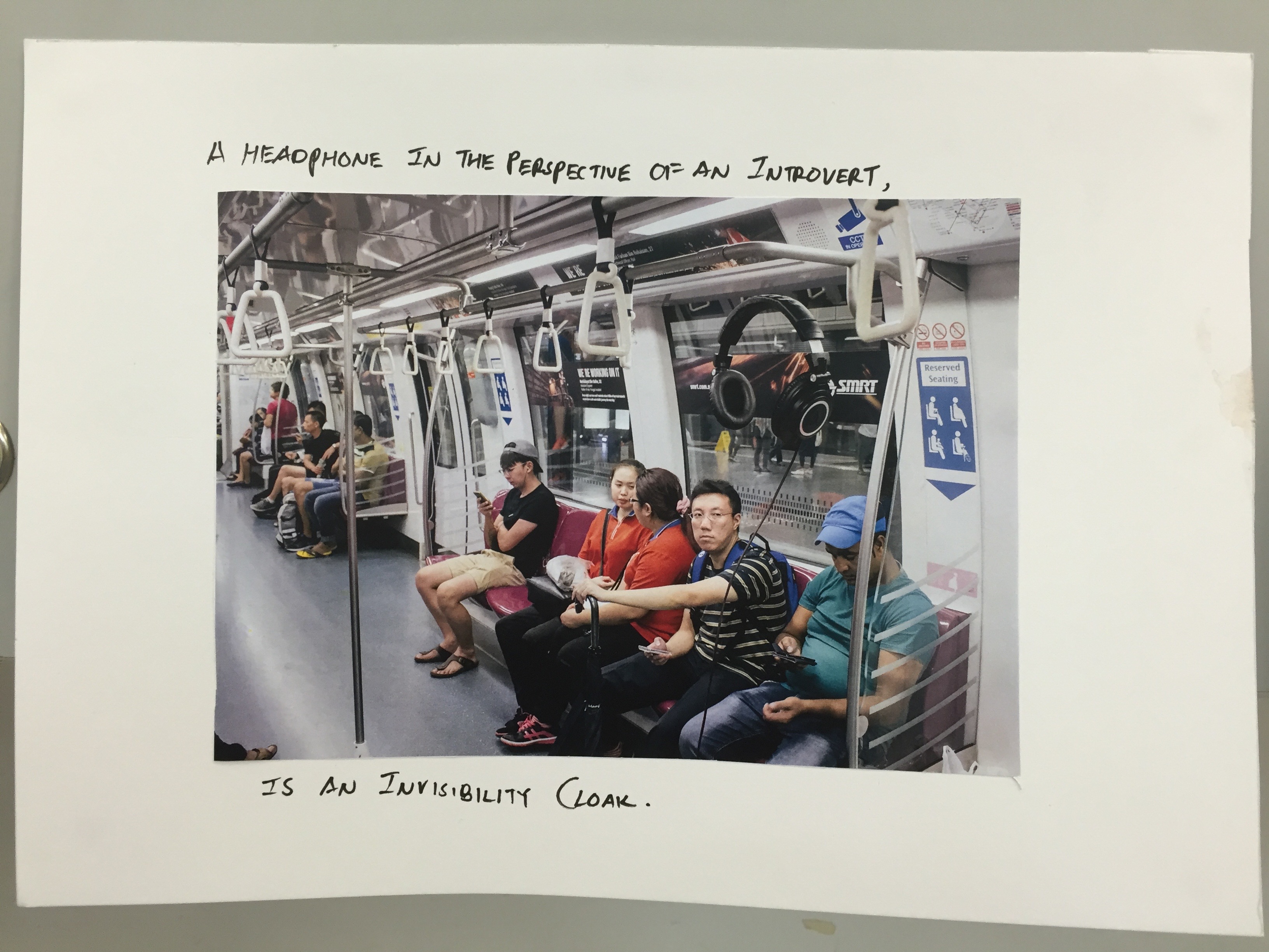
3. A headphone in the perspective of an introvert, is an invisibility cloak

IMG_5610

When an introvert puts on their headphones to listen to music, he/she shuts off the world and effectively becomes invisible. This is the one that I am most proud of, because I had to use Photoshop to manipulate 2 images together to form the illusion of a floating pair of headphones.

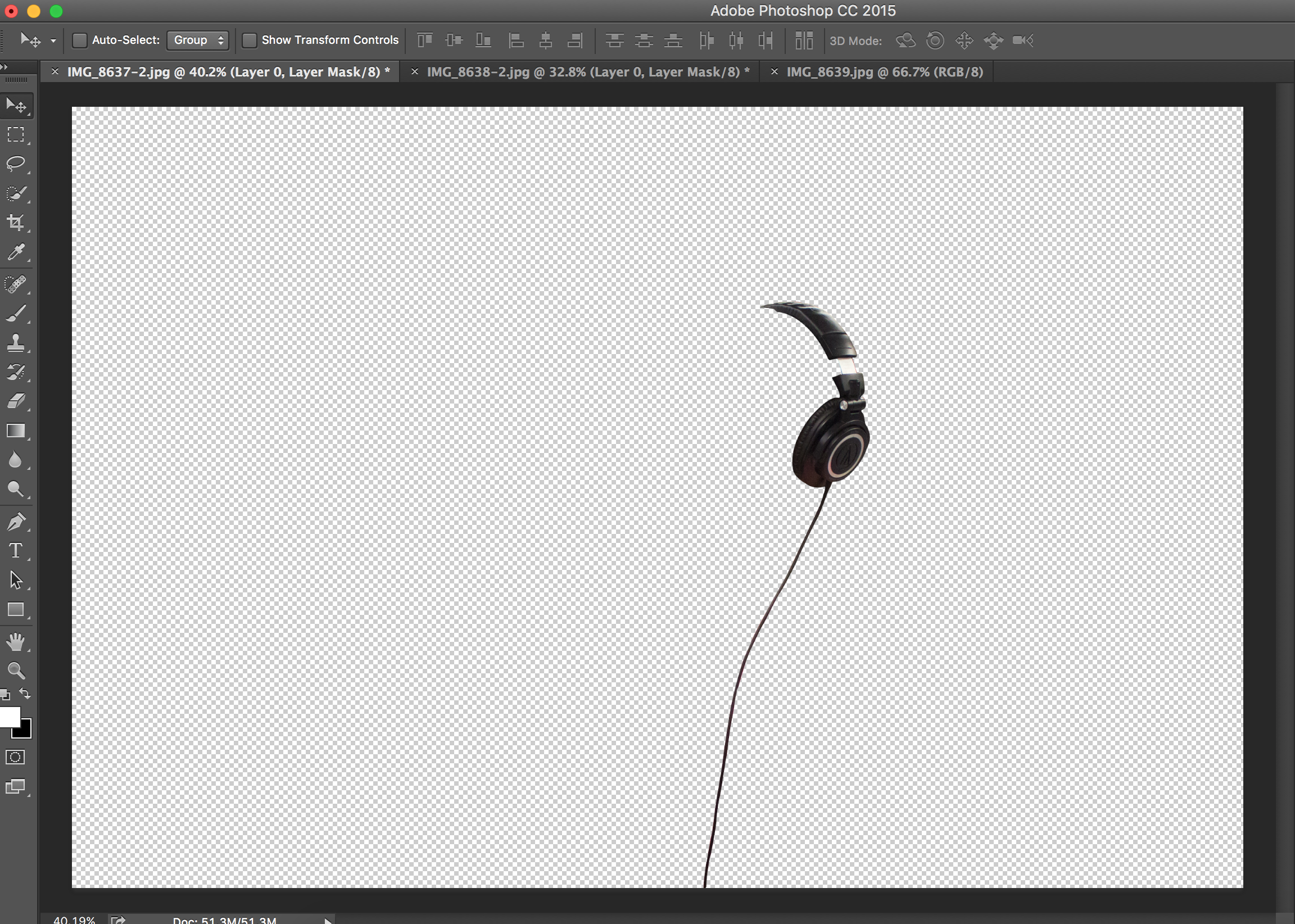
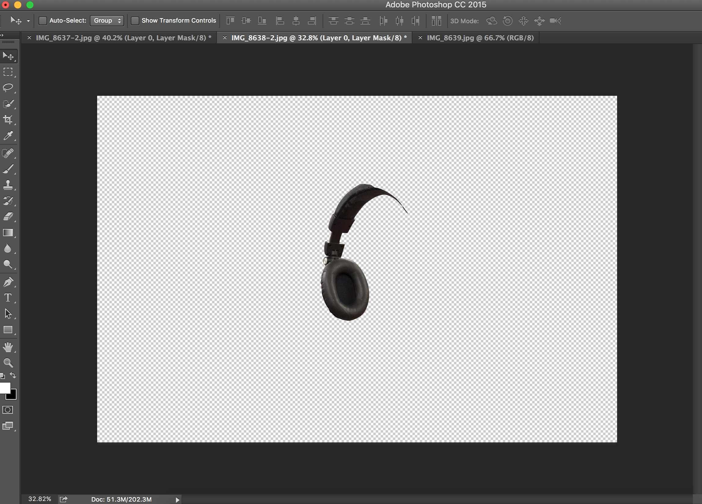
I took photos of the headphones inside the train, and cut them using the pen tool.

Screen Shot 2016-03-14 at 10.45.18 AM Screen Shot 2016-03-14 at 10.45.24 AM

It is the combination of these 2 “headphones” that formed the believable image, and because I took the photos of the headphones in the train, the lighting matches that of the train. I literally jumped for joy when I was done with this.


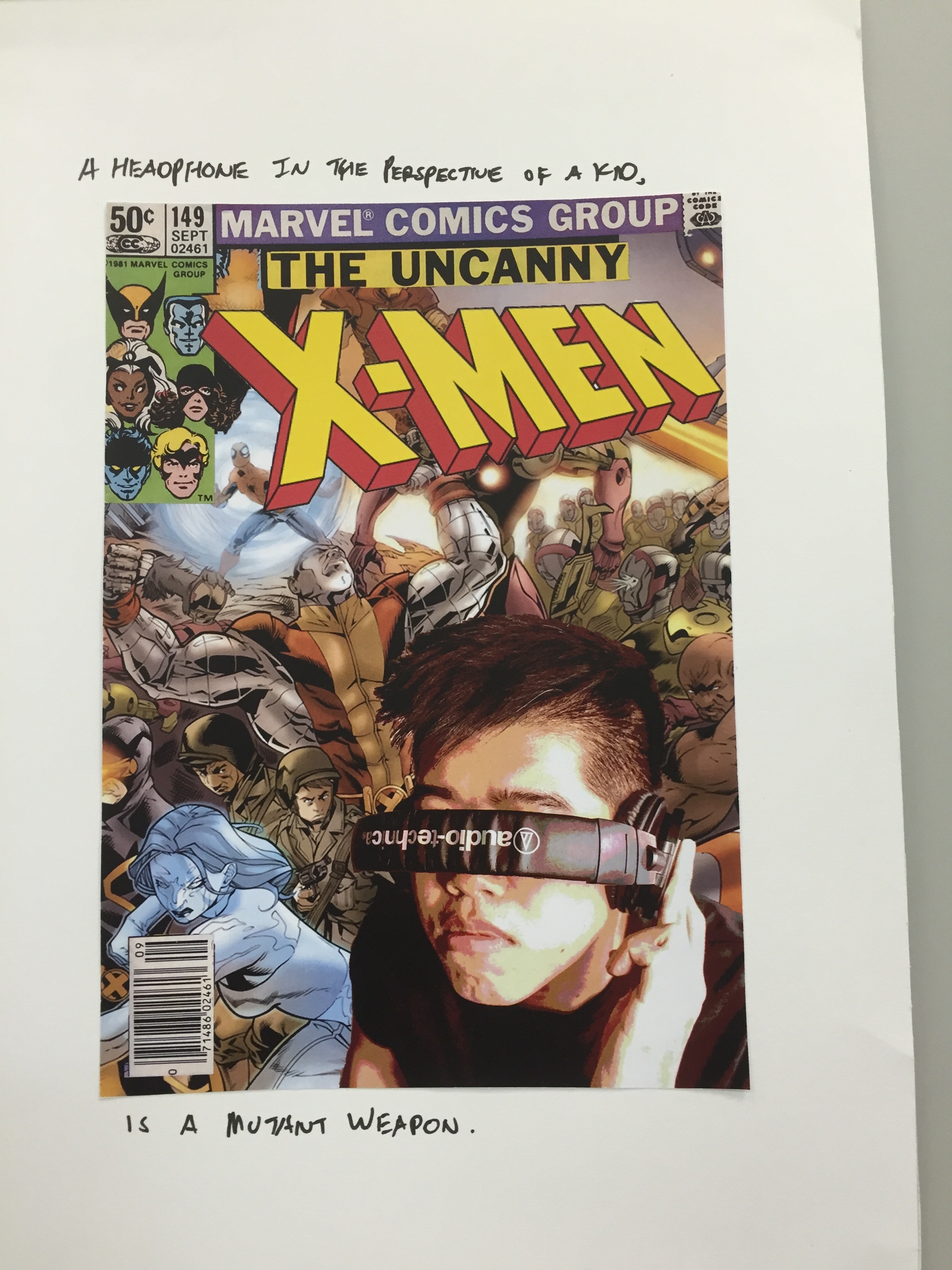
4. A headphone in the perspective of a kid, is a mutant weapon

IMG_5611

As a kid, I found that if I wore my headphones in a certain way, I could pretend to be the character “Cyclops” from the X-men comic book series, and I decided to depict this as a comic book cover featuring myself. I used the “posterise” effect to make the image of myself blend together better with the cartoon background.

5. Headphones in the perspective of a DJ, are his tools 

IMG_5612

A DJ would not be able to do his work without headphones, and he would most definitely have a few more pairs as backups. I placed the headphones in a toolbox that would normally be filled with hammers, screws etc. I thought that the juxtaposition of the 2 elements would be cool.

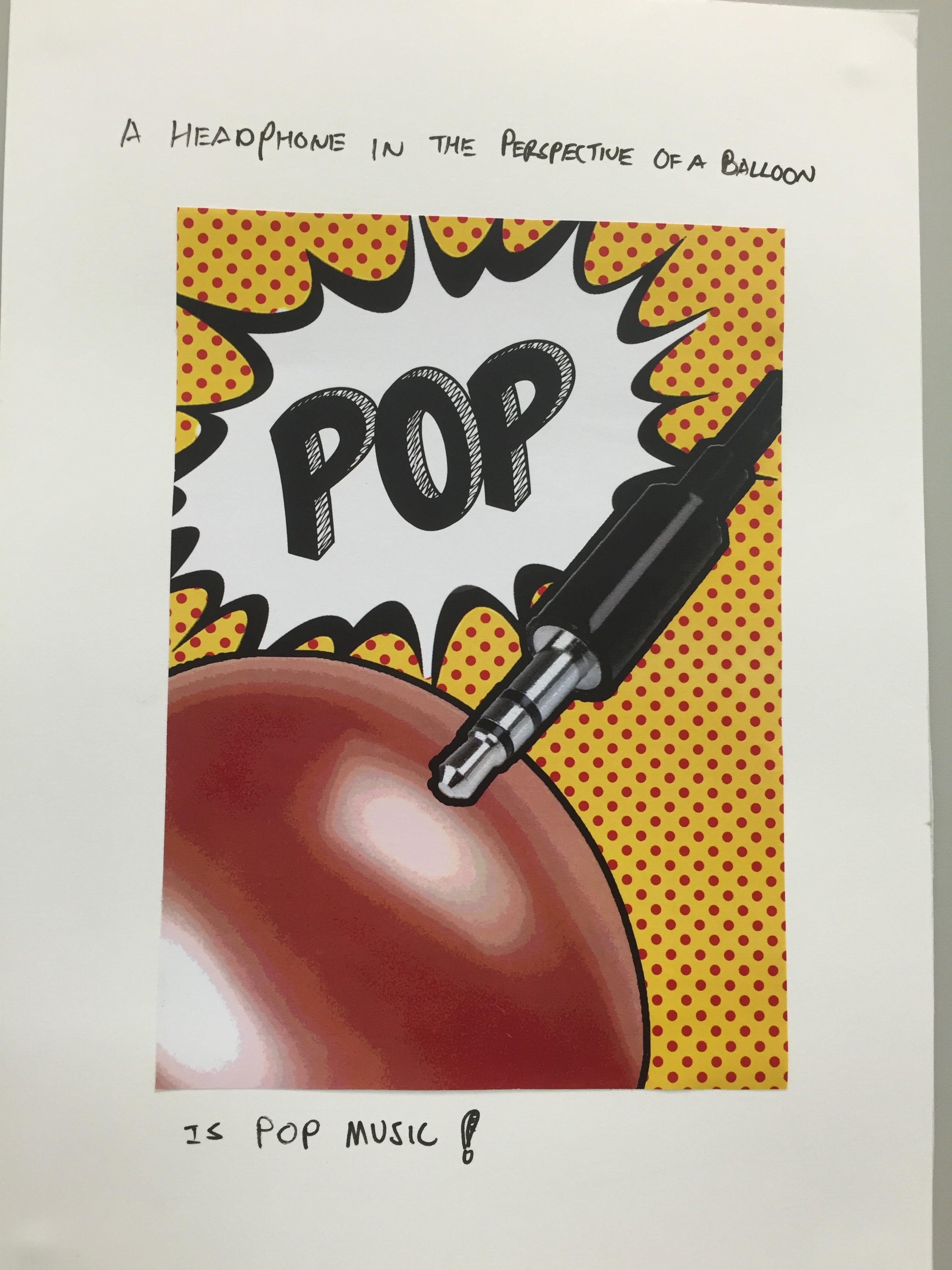
6. A headphone in the perspective of a balloon, is pop music

IMG_5613

Puns! Everyone loves puns! I used photoshop for this too!

Portraits of the Typographic variety

I actually came up with 6 designs before they changed the final submission to 4 designs. I will start with my final designs first and then show off the two other unused designs.

“I am short-sighted”

POSTCARD 1

Anyone who wears glasses will find this eyesight chart familiar. I actually find that I look really weird without my glasses now, so in a way my short sightedness has become my identity.

eye-charts-358x338

Instead of random letters, I used my full name (Leon Tai Cheng Hao), repeating it over and over. I also used a grey background instead of white to not make the text pop out too much.

“I love coffee”

POSTCARD 6

Coffee is every design student’s saving grace, myself include. Many nights have been kept awake by this beverage. My initial idea was to physically create the coffee stains on paper using a cup, but that did not turn out so well. The colours were solid, blocky, and had no character to them. I then decided to search the internet to find coffee stains to manipulate.

OSS

I then used and manipulated the many different coffee stains to make up my name. I also decided to add some random stains at the corners to fill up the negative space.

“I love soup”

OSS 2

I love drinking soups. Be it cream of mushroom, bah kut teh, minestrone, I’ll drink any soup. For this, I cooked up some alphabet soup and took out the letters of my name. Fun fact: the “N” is actually a sideways “Z” as I could not find the letter “N”.

“I love cardistry”

OSS 3

Cardistry – the art of shuffling playing cards, is a cool little hobby that I partake in. My first thought was to spell out my name by laying out many different playing cards, but I eventually found that idea to be really bland. So, I decided to think out of the box and uses the indices of the playing cards to spell out my name.

One problem I faced was the letter “N”. There’s no number from 1-10, or any alphabet in the deck of cards that can pass off as an “N”. I decided to use the “K” to form a lower case “n”. If I were to do this again, I’d probably photoshop in the “N”.

Now, here are my two other designs.

“I love streetwear”

OSS 4

I wanted to imitate the “Supreme” brand, but instead of just the logo, I decided to imitate their “Harajuku box logo” design.

kawaton26-img600x450-1158411430200609162124000

To give some variety, I decided to surround the logo with a denim material. However, in retrospect, the two materials sort of make everything look very cluttered. I think I would have gone with a plain white background instead.

“I love music”

OSS 6

This was done using my personal music collection. Okay lah, this was pretty uninspired, and I’m glad I didn’t use this for my final designs.

Museum Visit: SAM The Bellhop

A Travel Without Visual Experience: Malaysia

Tozer Park

2008

Room installation with travel photographs

My initial impression of the artwork was that it wanted to put the audience into the mind and perspective of the artist; The photos on the wall were taken using a camera flash, which was similar to the way the audience had to use their camera flash to see the artwork. It was only after reading the artist’s statement that everything made sense. I wasn’t too far off actually: Tozer Park went on a 5 day trip to Malaysia while blindfolded and taking pictures using only his intuition. What really struck me was the secondary statement he wanted to say; how people nowadays are too engrossed in taking photographs while on a holiday and not appreciating the actual experience. I’ll think twice about whipping out my phone the next time I’m on holiday.

Series: “torii”

Shitamichi Motoyuki

2006 to 2012

Photographs, C-type print

I was quite confused at first as I didn’t see the connection between the five photographs. “Perhaps something about the preservation of the planet?”, I initially thought. Reading the artist’s statement really opened my eyes, and I fell in love with the photos. He wanted to show how the Shinto shrine gates have now lost their initial meaning and purpose. I love the juxtaposition between the past and the present.


90 images

Statement

The theme that I set for this sequence of images is “personal growth”. The sequence starts off with me in a blank state, progresses by showing myself going through different life events, and ends with me as a developed person

The first set of images shows my progression from being an empty person into a person with different interests, hobbies, and life experiences.

The second set draws inspiration from the commonly heard phrase, “we are our greatest critic”. In the beginning, I show that I see myself as a flawed person, wanting to remove the stained shirt. However, I learn to acknowledge and accept my flaws, resulting in me willingly putting on the stained shirt.

The last set shows my discovery of love. I meet my significant other and we go on adventures together. I try to imagine life without her (I got inspired by a similar question that she asked me when we first started dating), but everything is blur and bleak. She helps me see clearly again, and we are happy with each other.

And finally, I go back to sleep acknowledging all that has happened.

References

I was inspired by a series of photos that my friend took a while back.

976867_10151448959567607_1750179306_o 286159_10151448959577607_354761002_o

While not every single photo references this style, I did make this “symmetrical” style a main focus to show how time passes in relation to my character.

Learning points

I realise that while it is easier to do a “stop-motion” style of photography to fill up the 90 image requirement, the result would probably be less interesting and authentic. Rather than using the 90 images as a storytelling medium, I think it is more interesting to try and use the difference between each image to tell a story, if that makes sense. Trying to make each of the 90 images have a certain meaning to it was pretty difficult, but I learned a lot from it and honestly, I wouldn’t mind doing it again.

2D Design Elements

We were tasked to talk about some design elements, and thus, I have selected 3 for your viewing pleasure:

1. Unity/Harmony

unity-1

In my opinion, a design that has “unity” is a design where multiple smaller parts combine to make a bigger whole, and no part is viewed as more important than the other.

Paper men in unity circle on a cardboard background

Paper men in unity circle on a cardboard background

2. Scale/Proportion

scaleandp

This is where a design takes advantage of the relative size of its elements. Scale can be used effectively to show a sense of “drama” in a design. As seen in the image above, a similar design with different relative sizes of its elements can have different effects.

3. Similarity/Contrast

Contrast

In a design, unique elements should stand out from one another. This is where contrast comes into play, as it makes the focal point of the design clear.