Museum Visit: SAM The Bellhop

A Travel Without Visual Experience: Malaysia

Tozer Park

2008

Room installation with travel photographs

My initial impression of the artwork was that it wanted to put the audience into the mind and perspective of the artist; The photos on the wall were taken using a camera flash, which was similar to the way the audience had to use their camera flash to see the artwork. It was only after reading the artist’s statement that everything made sense. I wasn’t too far off actually: Tozer Park went on a 5 day trip to Malaysia while blindfolded and taking pictures using only his intuition. What really struck me was the secondary statement he wanted to say; how people nowadays are too engrossed in taking photographs while on a holiday and not appreciating the actual experience. I’ll think twice about whipping out my phone the next time I’m on holiday.

Series: “torii”

Shitamichi Motoyuki

2006 to 2012

Photographs, C-type print

I was quite confused at first as I didn’t see the connection between the five photographs. “Perhaps something about the preservation of the planet?”, I initially thought. Reading the artist’s statement really opened my eyes, and I fell in love with the photos. He wanted to show how the Shinto shrine gates have now lost their initial meaning and purpose. I love the juxtaposition between the past and the present.


Ego

Statement

For this assignment, I decided not to have a recurring “character” to represent myself as my drawing skills are not that good as my peers, so I decided to approach this from an abstract point of view; there is no continuity between the equations. I figured that the main point of the assignment was to explore different colour schemes, and that was what I tried to do.

1.) Solitude + Music = Me (epic CD riding on wave action)IMG_3785 IMG_3786 IMG_3787

I depicted solitude as the ocean, as… I like music, so I portrayed it as a hand holding a CD. The combination of both elements resulted in many CDs riding on waves. For the colour scheme, I showed how 2 analogous colours combined into a complementary colour scheme.

2.) Creativity – Fear = A better me (Godly stuff making powers)IMG_3788 IMG_3789 IMG_3790

For this equation, I decided to go with a pop-art theme. I depicted “creativity” as a pair of hands, as I feel that most creative things that humans do all involve their hands. I used a triadic colour scheme (red/blue/yellow) for this. For fear, I went with a monochrome colour scheme as the way I represented fear (many judgmental eyes) calls for a black and white scheme, as fear has no colour. Finally, for the last panel, I re-interpreted the famous painting, “The Creation of Adam”, using a tetradic colour scheme (purple/yellow,red/green). I drew a parallel between “The Creation of Adam” and my own creative potential. Personally, this is my favourite equation.

3.) Playing Cards X Abstract Thinking = An ideal meIMG_3791 IMG_3792 IMG_3793

For this equation, I decided to think outside the box and attempt to creatively use playing cards. The most interesting panel is the last one, where I cut up numerous playing cards to form a star shaped pattern. The main colour scheme here is blue and orange (complementary).

4.) Photography + Dogs = Me in 5 years (making dog movies)IMG_3794 IMG_3795 IMG_3796

For the last equation, I played with analogous colour schemes for the first 2 panels (using the darker colours to portray a shadow), while for the final panel, I combined the previous 2 panels and played with a triadic colour scheme (red/blue/yellow). 

Reflections

I learnt a lot about implementing different colour schemes into my artwork. I also learnt to work around my limitations, as initially, I was quite lost on how to approach this assignment as I wasn’t really proficient in either drawing or photoshopping. I took Shirley’s advice and traced out my main elements, while adding my own touch as well. Overall, I am quite satisfied at the final result.


TERENCE – A mockumentary

Synopsis

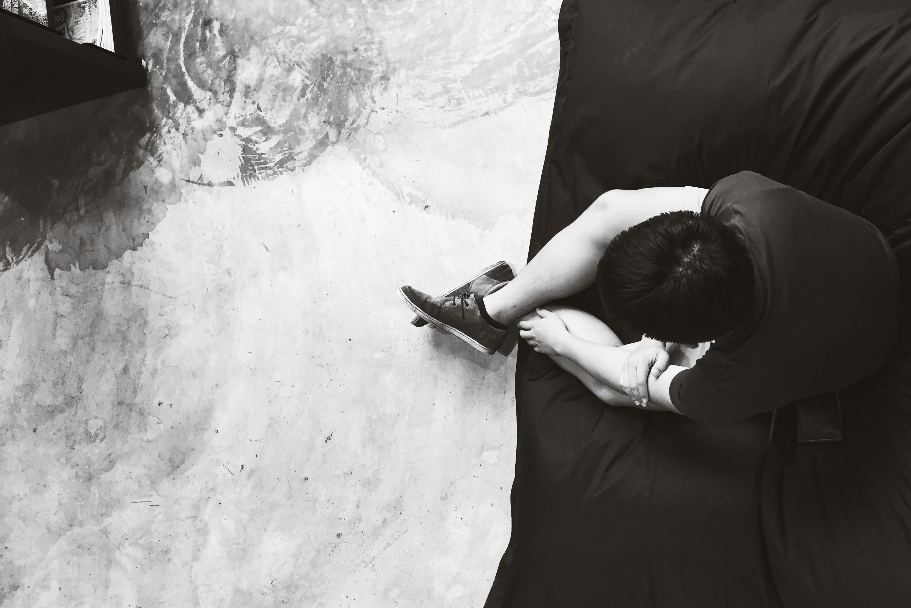
This mockumentary draws parallels to the classic fable, “The Boy Who Cried Wolf”. A prankster, played by Terence, hatches a master prank when a prankee of his tells him to “try harder lah!”. However, when things actually go wrong, his friend thinks it’s another one of his pranks and doesn’t help him. Terence comes to realize that pranking people isn’t such a good idea and changes his ways, or does he?

Development process

During the pre-production stage, we had many ideas before deciding on adapting “The Boy Who Cried Wolf”. Some initial ideas we had were stories based on “The Journey to the West”, “Midas’ Touch”, and various urban tales.

To help us decide on an idea, we used various factors that would affect the making of our short film:

  • Feasibility

Was the idea practical?

  • Manpower

Since we were only a group of three, our story had to have as little characters as possible, which led us to our final idea (a mockumentary based on the experiences of a single person).

  • Time

Having to deal with many other deadlines of other modules, our idea had to be one that would not take up a lot of time in shooting and post-production.

  • Locations

Considering the  relative short amount time, it would be best if our idea utilised a small amount of locations.

In the end, we decided to do a mockumentary based on “The Boy Who Cried Wolf”. Being a genre that gained popularity in the past few years with shows like “The Office” and “Parks and Recreation”, the mockumentary genre was chosen to give a modern twist to an old fable. Plus, it would be comedic, which is always nice.

To aid us in pre-production, I wrote up a screenplay for our short-film, which ended up taking two drafts to finalise.

Click here to view the screenplay!

Challenges faced

In pre-production, the main problem we faced was that we just had too many ideas. Instead of finalising a single idea, we were continually coming up with different ideas. We had to take a step back and tell ourselves “okay, this is going nowhere”, before actually moving on. After developing a single idea, everything else was pretty smooth sailing.

The film was shot over a span of two days. While we were shooting the scenes that happened in ADM, we faced several issues such as random people walking in and out of frame (which could potentially mess up our continuity), random sounds that messed up our sound recording (the beeping sounds from the card reader thing). 

The short shot of Terence buying the fake blood from the party store was actually shot without permission from the shop owner. We basically went in, shot the shot and got out of there. The whole process must have taken only a minute, so that was pretty exciting.

One main challenge I faced while editing the video was dealing with audio. Firstly, we recorded all our audio clips using an external recorder, which meant that I had to manually sync the audio to the video. Secondly, I had to manually add in all the ambient sounds to make the scene sound more whole. The end result is a flurry of audio tracks.

Screen Shot 2015-11-08 at 8.24.40 PM

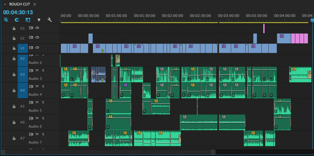
They say that if you do your sound right, the audience won’t notice anything at all, and I’d like to think that I did an okay job.

Of course, what short film is complete without a blooper reel?

Reflections and Conclusion

For Terence and Wilson, who have not had experience in making short films before, their main takeaway from this project is the knowledge and new-found appreciation for TV and films. Often times, we look at a TV show or movie and think that it’s easy to make, when in reality, a ton of thought and hard work from many parties is involved.As for me, this video project serves as a good warm-up before I begin to major in Digital Film-making in year 2.

To conclude, all three of us really enjoyed making this mockumentary, but what we enjoyed most of all was seeing our classmates laughed as they watched it. We all agreed that if our classmates laughed, we did a good job, and so we did.

GROUP MEMBERS: Leon Tai, Wilson Heng, Terence Goh

90 images

Statement

The theme that I set for this sequence of images is “personal growth”. The sequence starts off with me in a blank state, progresses by showing myself going through different life events, and ends with me as a developed person

The first set of images shows my progression from being an empty person into a person with different interests, hobbies, and life experiences.

The second set draws inspiration from the commonly heard phrase, “we are our greatest critic”. In the beginning, I show that I see myself as a flawed person, wanting to remove the stained shirt. However, I learn to acknowledge and accept my flaws, resulting in me willingly putting on the stained shirt.

The last set shows my discovery of love. I meet my significant other and we go on adventures together. I try to imagine life without her (I got inspired by a similar question that she asked me when we first started dating), but everything is blur and bleak. She helps me see clearly again, and we are happy with each other.

And finally, I go back to sleep acknowledging all that has happened.

References

I was inspired by a series of photos that my friend took a while back.

976867_10151448959567607_1750179306_o 286159_10151448959577607_354761002_o

While not every single photo references this style, I did make this “symmetrical” style a main focus to show how time passes in relation to my character.

Learning points

I realise that while it is easier to do a “stop-motion” style of photography to fill up the 90 image requirement, the result would probably be less interesting and authentic. Rather than using the 90 images as a storytelling medium, I think it is more interesting to try and use the difference between each image to tell a story, if that makes sense. Trying to make each of the 90 images have a certain meaning to it was pretty difficult, but I learned a lot from it and honestly, I wouldn’t mind doing it again.

These colours be scheming.

Here are the various colour harmonies/schemes.

MONOCHROMATIC

monocromatic_template

Colours that are the same-ish

12697719865_fd396ad2af_k

COMPLEMENTARY

complementary_template

Colours that are opposite each other on the colour wheel.

ferragamo-menswear-milan-fashion-week-ss-2013

SPLIT-COMPLEMENTARY 

split-complementary_templat

One hue plus two others equally spaced from its complement.

tumblr_muj4427pTt1rnolxfo1_1280

DOUBLE COMPLEMENTARY

dbl-complementary_template

Two complementary color sets; the distance between selected complementary pairs will effect the overall contrast of the final composition.

5740ea0a88c93dad03da747f4fbd609d

ANALOGOUS

analogous_template

Those colors located adjacent to each other on a color wheel.

1

Triad 

triad_template

Three hues equally positioned on a color wheel.

IMG_4293

Reference: http://www.worqx.com/color/combinations.htm

Nursery Rhymes

1.) The cow jumped over the moon.

Here’s my first design.

PATTERN 1

The initial pattern only consisted of one moon surrounded by four cows, but I decided that it looked too plain. I was thinking about floor tiles and how multiple tiles form a unique pattern when out together, which inspired me to multiply the initial pattern.

PATTERN Y

Before this design, I did something that was a literal interpretation of the rhyme, but I decided that I needed to train myself to think more abstractly.

PATTERN X

2/3.) Hey diddle diddle, the cat and the fiddle.

I feature this line twice in my designs. The first of which looks like…

PATTERN 2

The pattern in the middle of the… pattern, is actually made of multiple “treble clef” symbols put together. I wanted to use something that people recognise to make something that’s not immediately recognisable, and I’d like to think that I succeeded.

flair-music.note-400

The second interpretation of the line goes something like this…

PATTERN 3

Cats are known to climb trees, so I wanted to make it look like the cats are jumping towards the fiddles, which kinda look like trees (to me, anyway).

PATTERN Z

This was my initial design, but it looked too symmetrical for my liking. I feel that my decision to make the design asymmetrical was a good one (good job, me!).

4.) The little dog laughed, to see such sport.

PATTERN 4

Inspired by the design of the court card designs in playing cards. Though the design is symmetrical, I liked the idea of using court cards as an inspiration to give it a go.

I initially wanted to do something creepy, so here are some preliminary designs (that feel pretty uninspired, to be honest).

PATTERN 5

PATTERN 6-min

Yeah… I’m glad I didn’t use these.

Don’t make me see red.

In popular media, different colours are used to represent different emotions and themes. Here are some examples:

Red: Generally used to represent anger and passion. One reason why love is sometimes interpreted as a rose is due to it being the colour red.

Closeup of a red rose.

Blue: I interpret blue as a colour that represents calmness and trust, the same emotions that I feel whenever I look at a blue ocean. It is also coincidentally my favourite colour. Go blue!

blue-ocean

Green: The phrase “green with envy comes to mind. Exactly how I feel whenever someone gets more sleep than me.

gallery_envy_gallery

But other than that, green is also known to induce feelings of harmony and growth. It is the same colour as nature, making it easy to look at.

Yellow: Seen as a colour that invokes feelings of optimism and joy.

534898_938b09d28c130c4a92306b9ca136be62_large

Orange: While similar to yellow, it conveys slightly different emotions. While yellow depicts joy, orange depicts enthusiasm.

07-12-01orangesunset

Purple: Often seen as a colour of royalty and extravagance.

The-purple-robes

Black: A very powerful and attention drawing colour; used to symbolise power and authority.

1420615

White: Like a blank canvas, it symbolises purity and innocence.

Blank paper and pen

2D Design Elements

We were tasked to talk about some design elements, and thus, I have selected 3 for your viewing pleasure:

1. Unity/Harmony

unity-1

In my opinion, a design that has “unity” is a design where multiple smaller parts combine to make a bigger whole, and no part is viewed as more important than the other.

Paper men in unity circle on a cardboard background

Paper men in unity circle on a cardboard background

2. Scale/Proportion

scaleandp

This is where a design takes advantage of the relative size of its elements. Scale can be used effectively to show a sense of “drama” in a design. As seen in the image above, a similar design with different relative sizes of its elements can have different effects.

3. Similarity/Contrast

Contrast

In a design, unique elements should stand out from one another. This is where contrast comes into play, as it makes the focal point of the design clear.