The 9 Principles of Design
- Scale
- Variety
- Balance
- Contrast
- Rhythm
- Harmony
- Dominance
- Proportion
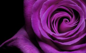
- Pattern
1. Scale
Scale is the size of elements against each other. When describing scale, it should be in relation to something else (e.g. Reality, viewer)
Some words to describe scale:
Large, small, miniature, monumental
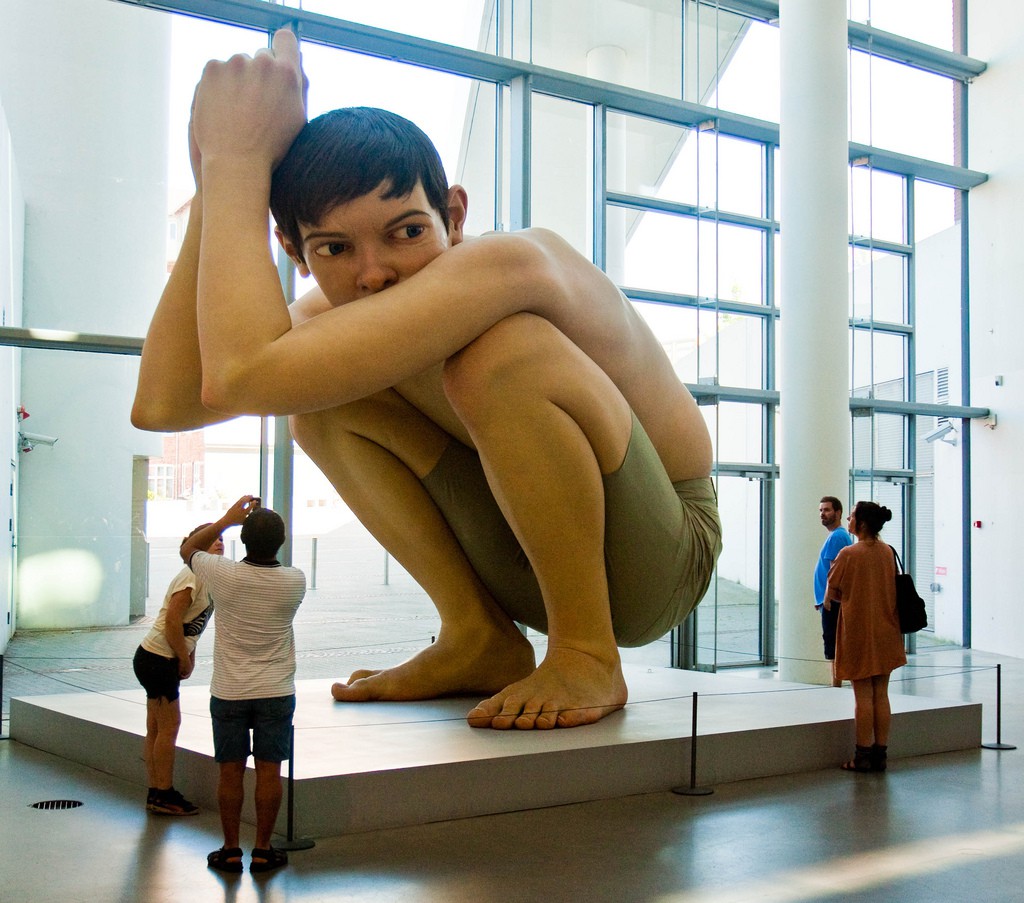
Ron Mueck, Boy, 1999, Mixed Media, 490 x 490 x 240 cm
Here, the humans are miniature in relation to the sculpture. And, the sculpture itself is monumental as compared to the humans.

Duane Hanson, Queenie II, 1988, Polychrome Bronze, with accessories, life-size
This hyper realist sculpture by Duane Hanson is life-size, creating an illusion of reality.
2. Variety
Variety is the individuality to arouse the viewer’s curiosity and hold one’s attention, visual contrast, isolation of elements and images.
Some words to describe variety is:
Visual interest is created by… or The change in texture creates variety…
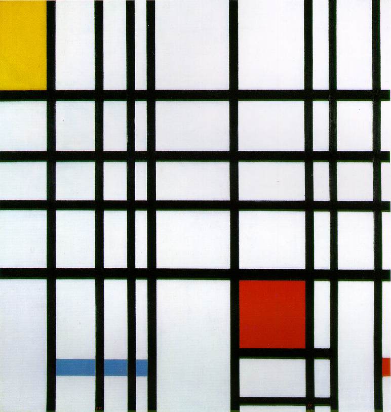
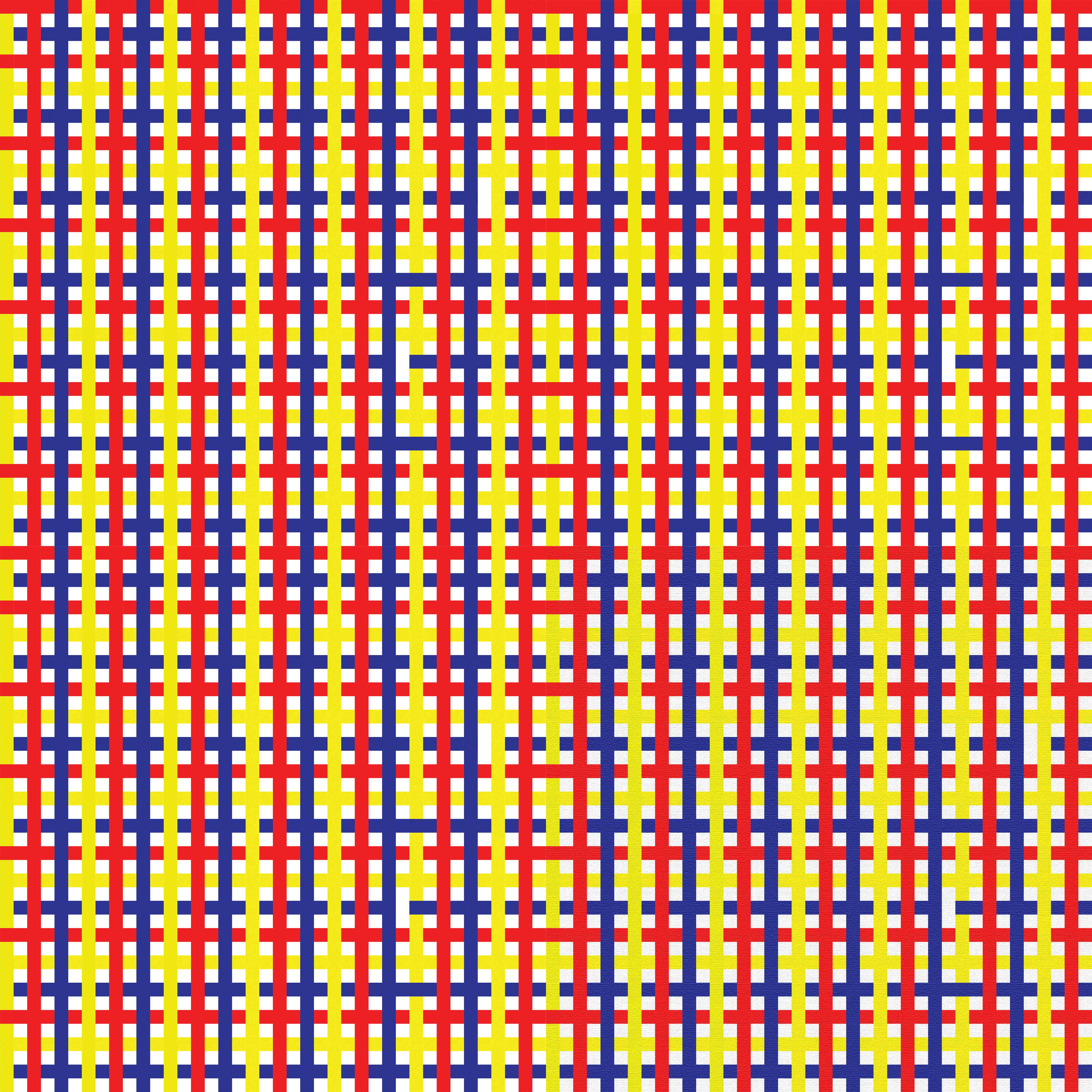
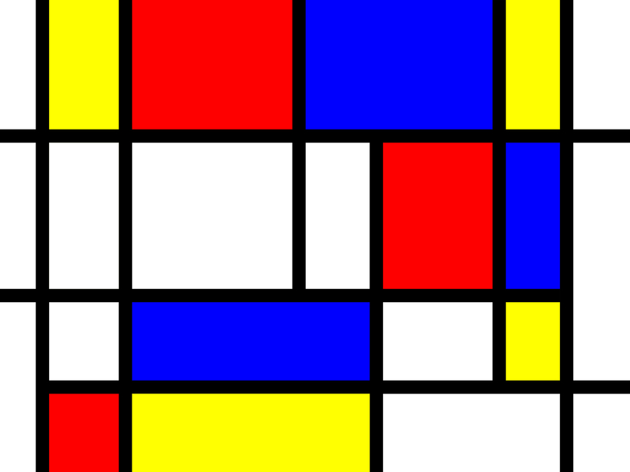
Composition with Red, Yellow and Blue by Piet Mondrian, 1921, Oil on Canvas, 39 x 35 cm
For Mondrian, he used a variety of lines (horizontal and vertical), shapes (square and rectangle) and primary colours (red, blue and yellow) to create a visually appealing design.
3. Balance
Balance is the distribution of the visual weight of objects, colors, texture, and space.
Symmetrical balance – ‘mirror image’
Asymmetrical balance – different components positioned in the same manner on either sides of the axis
Radial balance – elements are arranged around a central point
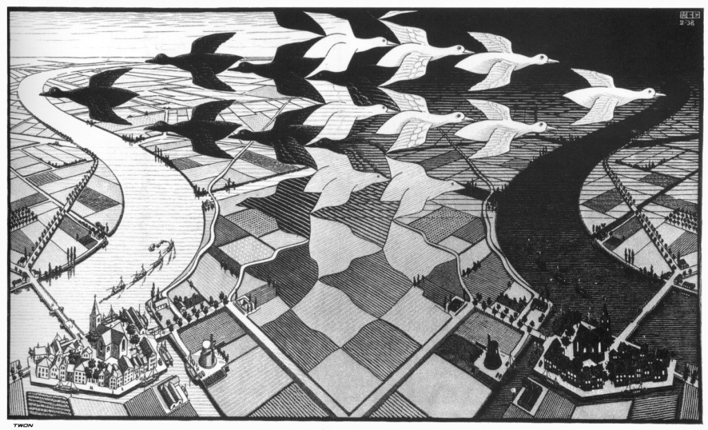
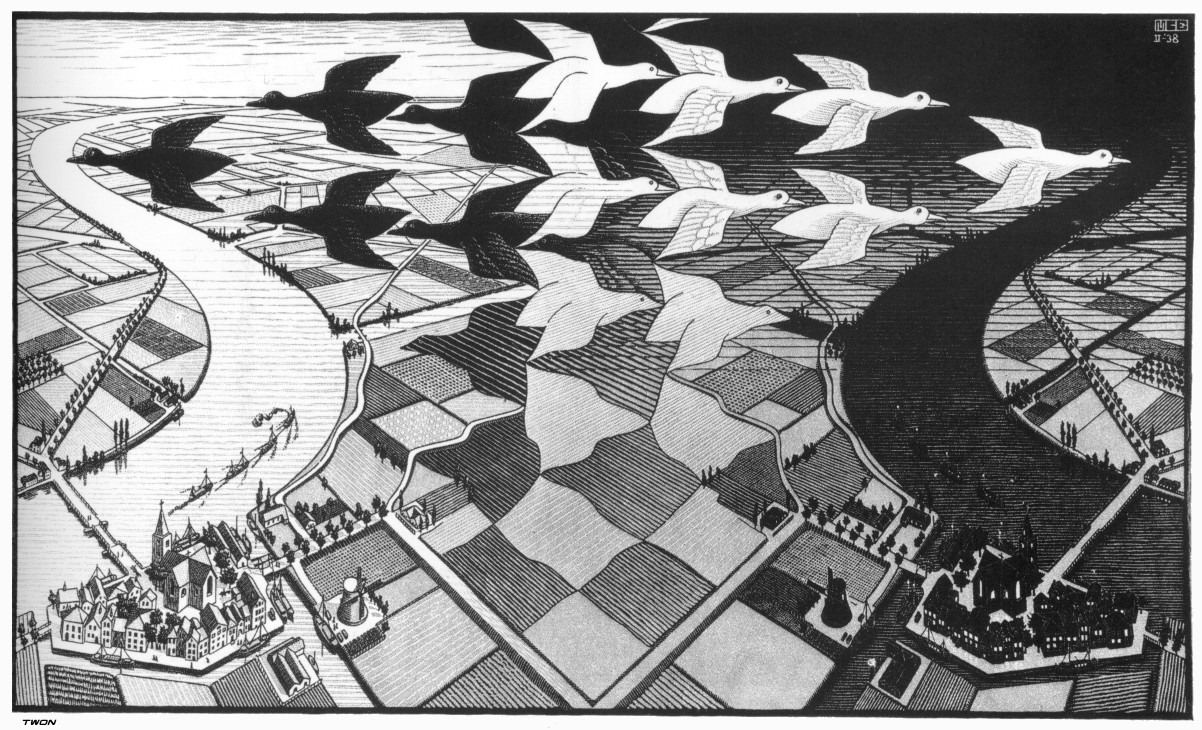
M.C. Escher, Day and Night, 1938, Woodcut in two colours
In this work, the artist has employed approximate symmetrical balance, whereby there are different components positioned in the same manner on either sides of the axis.
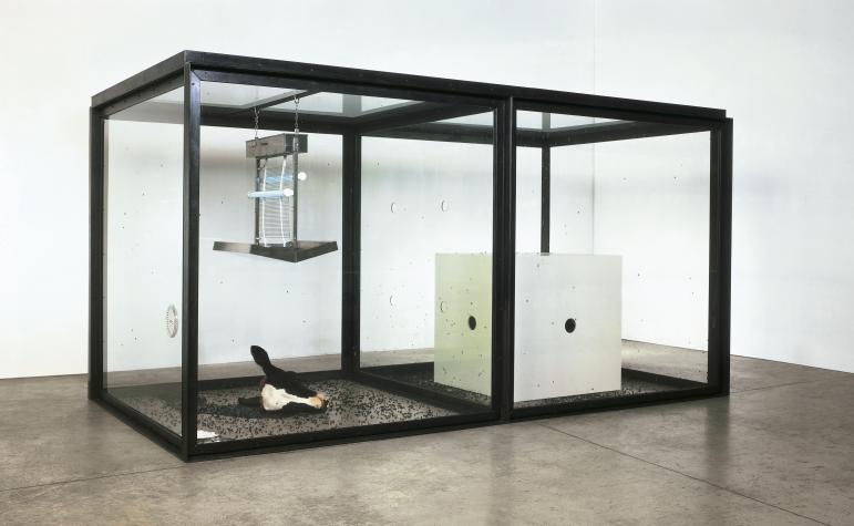
Damien Hirst, A Thousand Years, 1990, Glass, Steel, Silicone, rubber, painted MDF, insect-o-cutter, cow’s head, blood, flies, maggots, 2075 x 4000 x 2150 mm
Here, the artist use asymmetrical balance, where different objects are placed in each panels.
4. Contrast
Contrast is the placing of elements with opposing characteristics, totally unrelated.
Space – filled vs empty, 2D vs 3D, Near vs Far
Pattern – Left vs Right, Isolated vs Grouped
Form – Single vs Complex, Whole vs Broken
Structure – Organised vs Chaotic, Mechanic vs Hand-drawn
Size – Big vs Small
Texture – Smooth vs Rough, Sharp vs Dull
Density – Transparent vs Opaque, Thick vs Thin

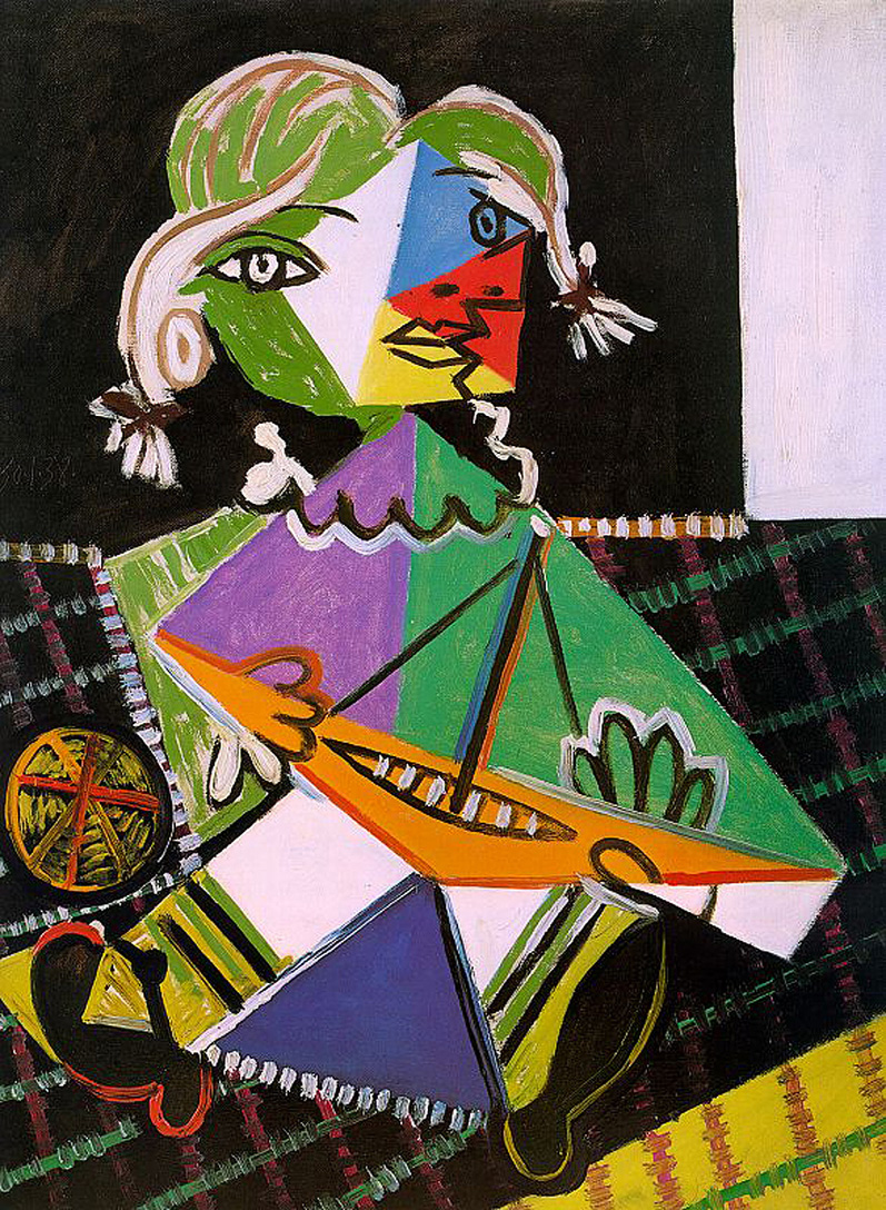
Pablo Picasso, Girl with a Boat, 1938, Oil on canvas
In this work, Picasso created contrast in forms with the use of geometric, angular shapes vs curves. Also, a contrast in colour with black and white.
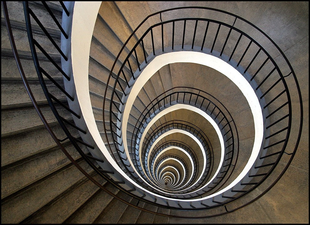
5. Rhythm
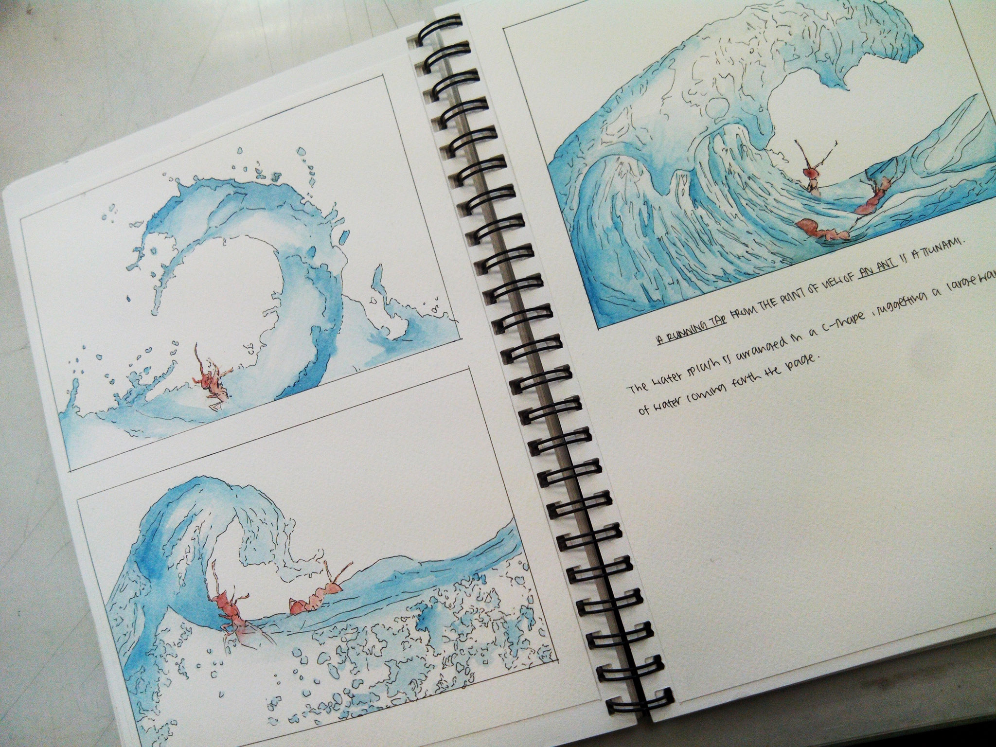
Rhythm is the sense of movement created by repeating elements.
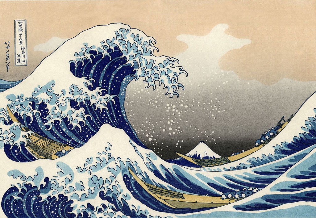
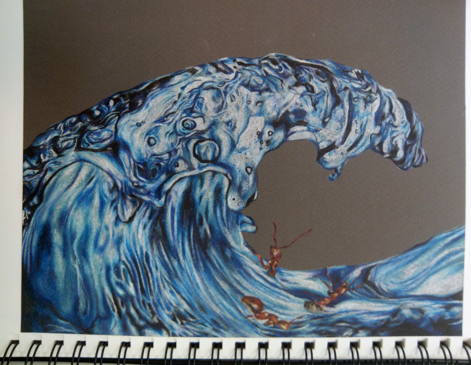
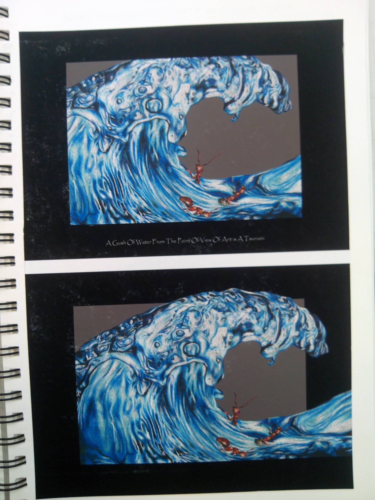
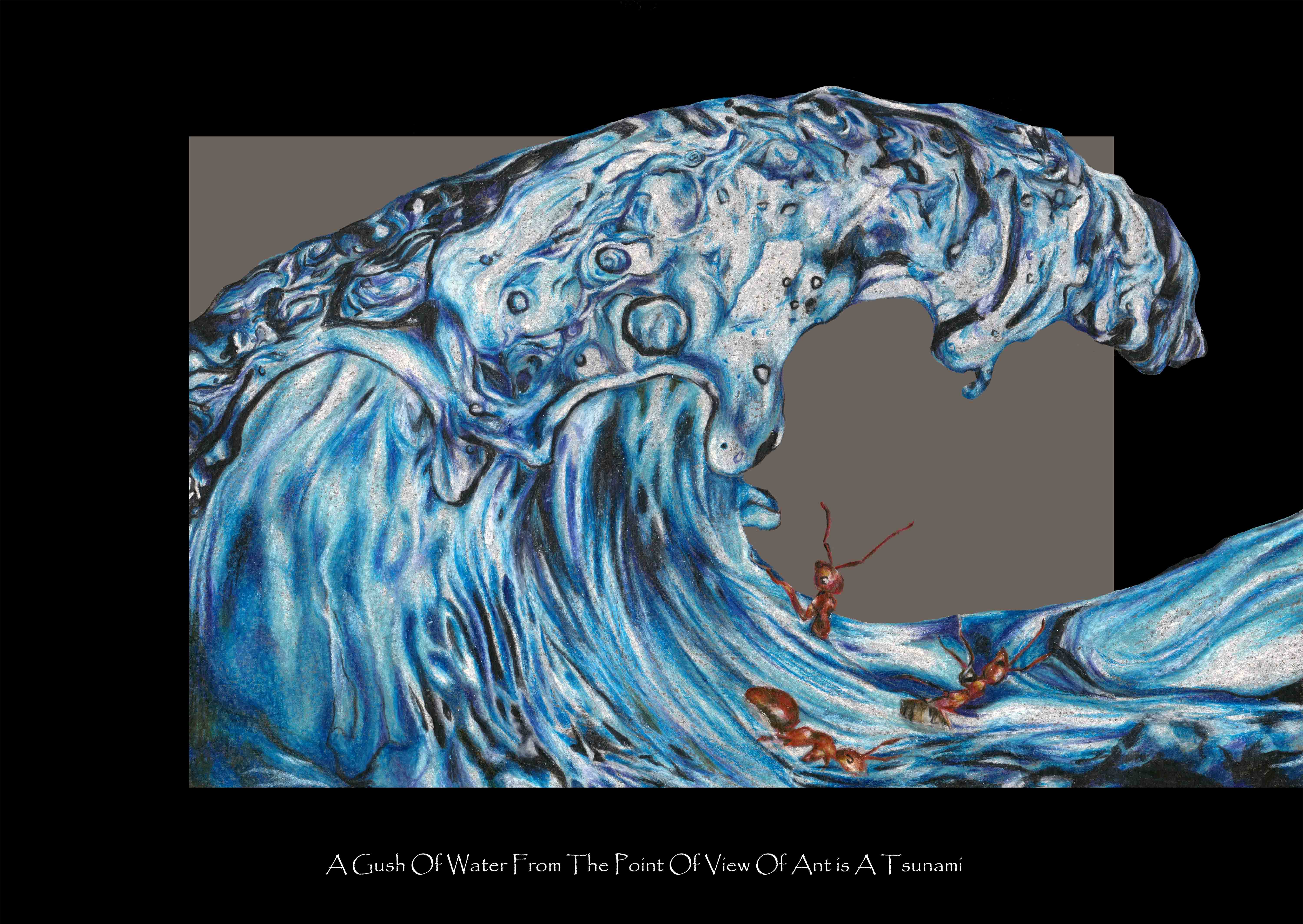
Katsushika Hokusai, Under the wave of Kanawaga, 1829-33, Coloured woodblock print, 26.7 x 38.1 cm
6. Harmony
Harmony is the feeling of unity between all parts of the work of art, which creates a sense of completeness.
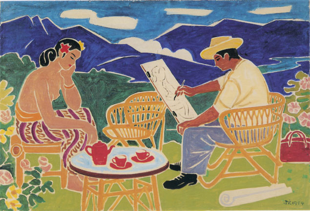
Liu Kang, Artist and Model, 1954
Liu Kang created a harmonious atmosphere with use of light colours, with no or little dark colours.
7. Dominance
Dominance is the part of the design that catches the viewer’s attention.

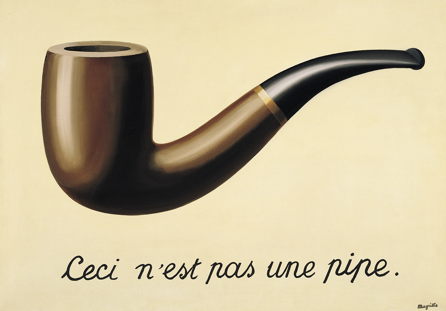
Rene Magritte, The Treachery of Images, 1929
8. Proportion
Proportion is the unity created when all parts (sizes, amounts, or number) are in relation to each other.
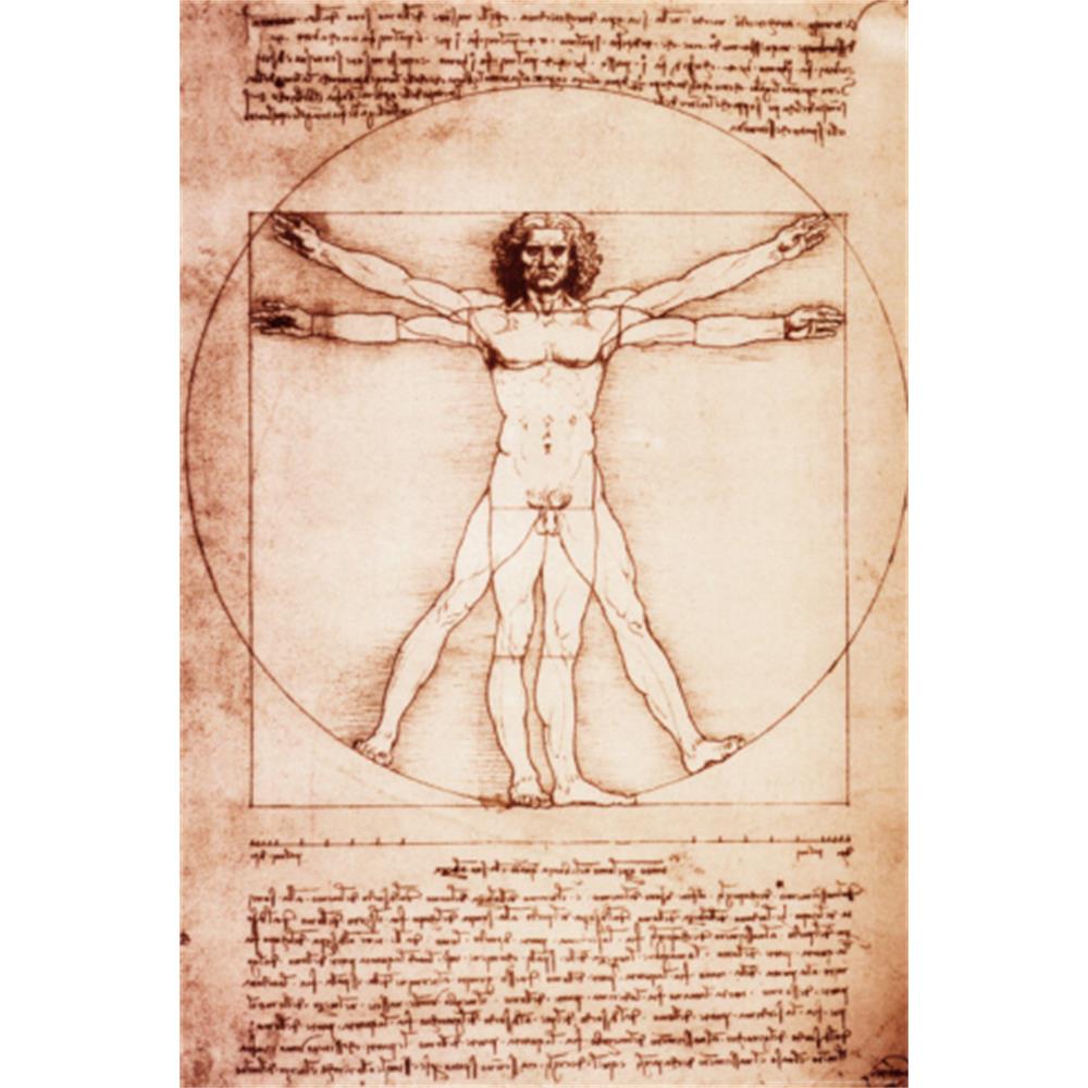
Leonardo Da Vinci, Proportion of the Human Figure, 1485-90, Pen and ink
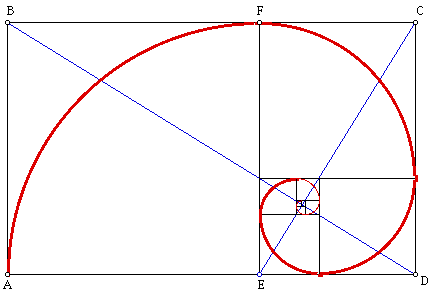
Mathematician Leonardo Fibonacci- Fibonacci series

Relationship of spiraling curve found in nature
9. Pattern
Pattern is created by repeating designs motifs or elements.
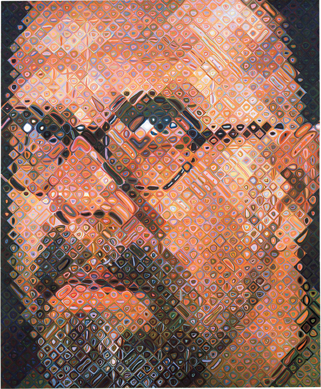
Chuck Close, Self-Portrait, 2004-2005
Patterns are created with the use of organic shapes within squares.

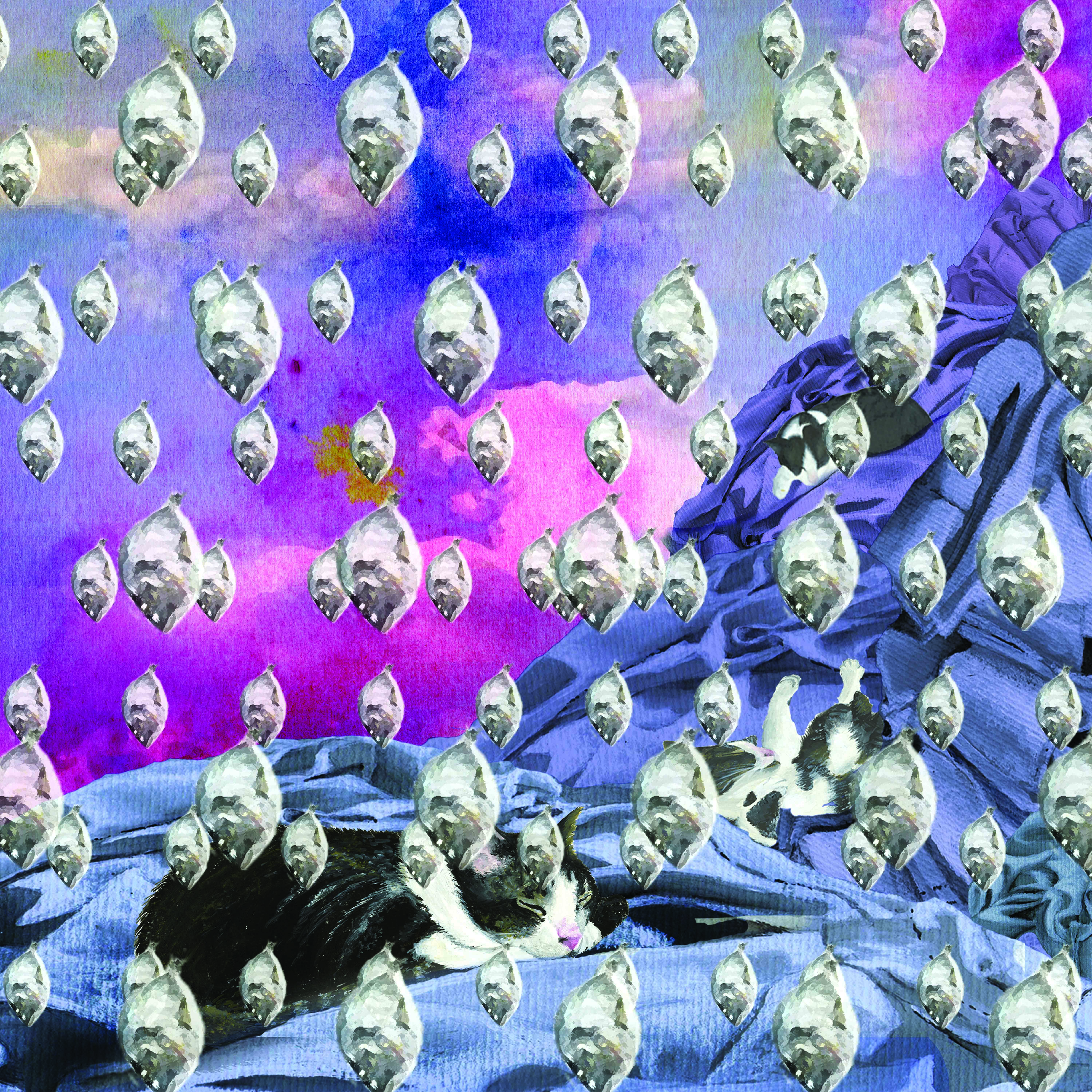
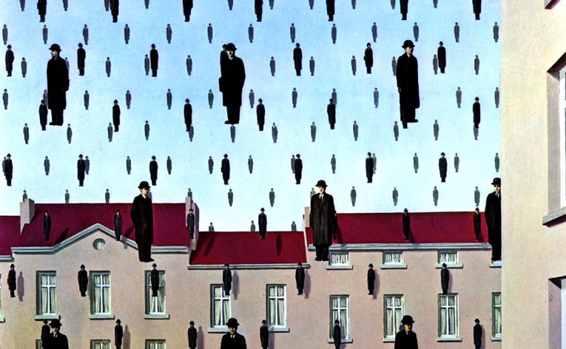
Rene Magritte, Golconda, 1953, Oil on canvas, 81 x 100 cm
By repeating the man, the artist creates an overwhelming feeling/ effect. There is also a sense of movement created with the dropping of the man as it reminds us of raindrops.


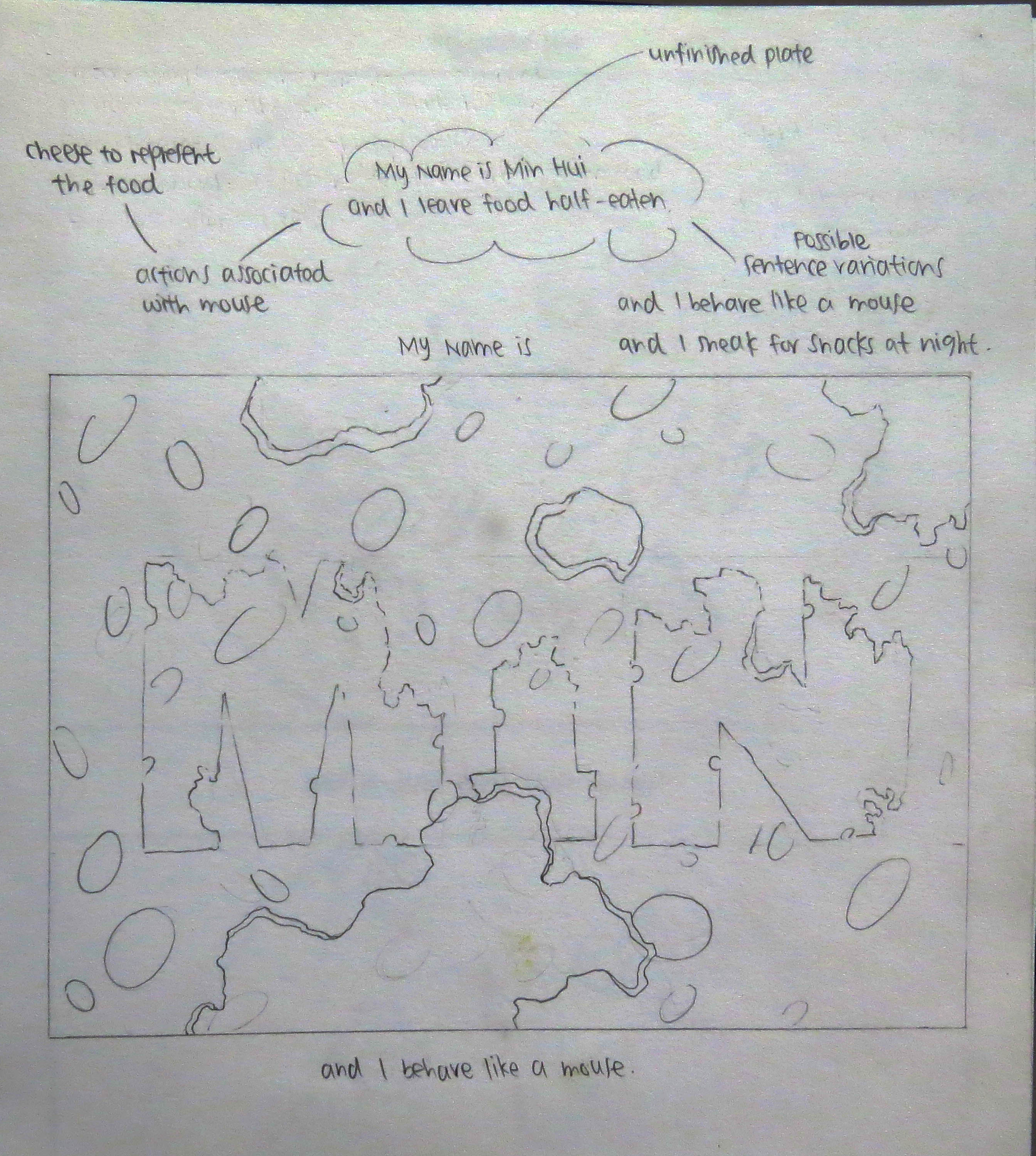


![hello [template]ToPrint](https://oss.adm.ntu.edu.sg/lewm0002/wp-content/uploads/sites/184/2016/01/Hello-Typography.jpg)
![hello [template]ToPrint](https://oss.adm.ntu.edu.sg/lewm0002/wp-content/uploads/sites/184/2016/01/Hello-Abstract.jpg)
![hello [template]ToPrint](https://oss.adm.ntu.edu.sg/lewm0002/wp-content/uploads/sites/184/2016/01/Hello-Conceptual.jpg)


