Process
Many questions and thoughts pop up during the initial idealization of my project.
What colour are you? Which colour do i want to be?
How do i view myself? What do other people think of me?
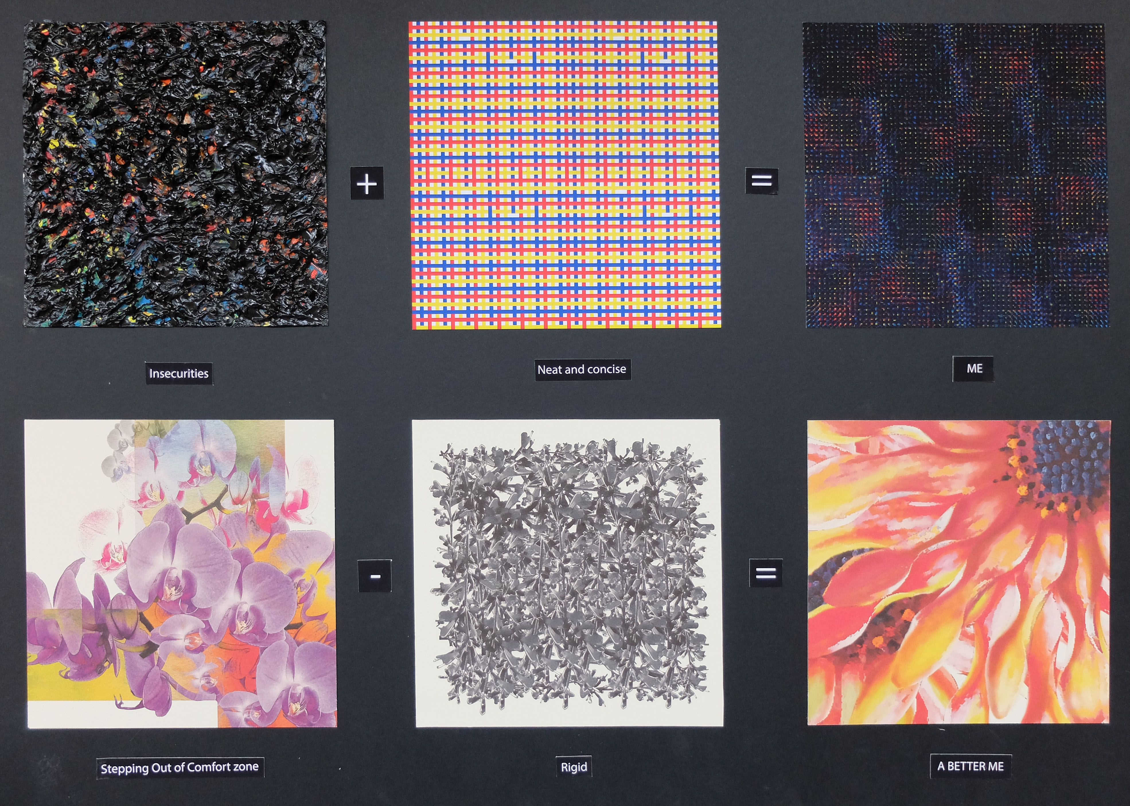
After much consideration, i decided with the following equations:
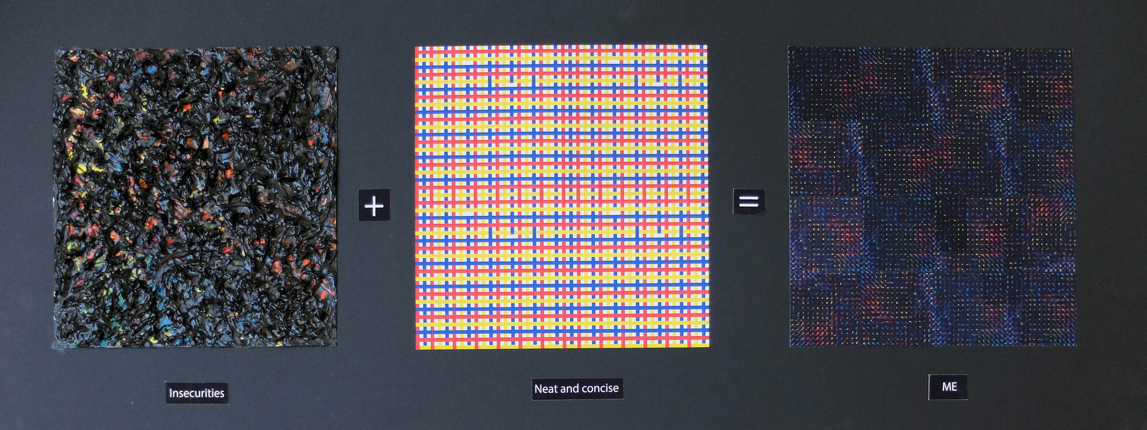
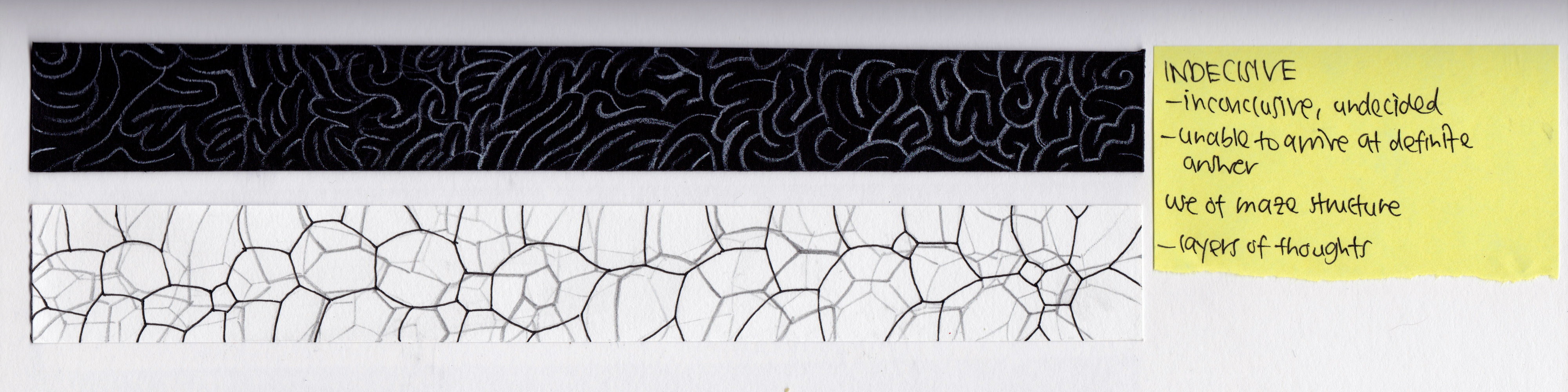
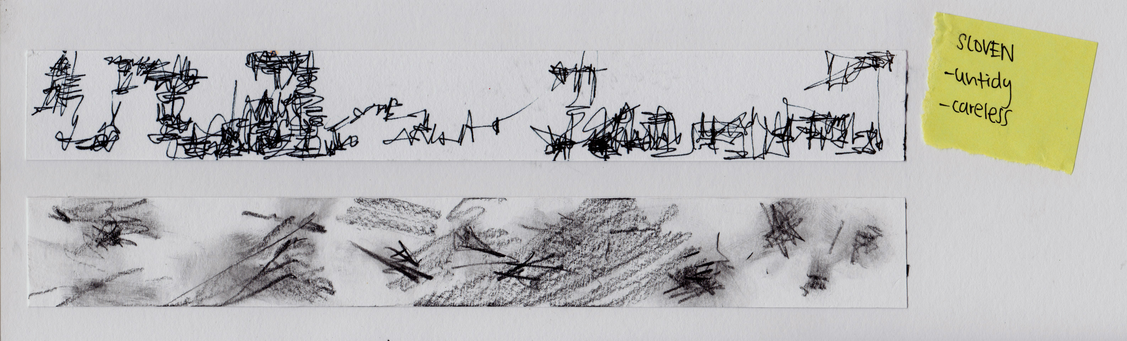
Insecurity + Neat and concise = ME
Stepping out of Comfort zone – Rigidity = A BETTER ME
Imaginative x playful = AN IDEAL ME
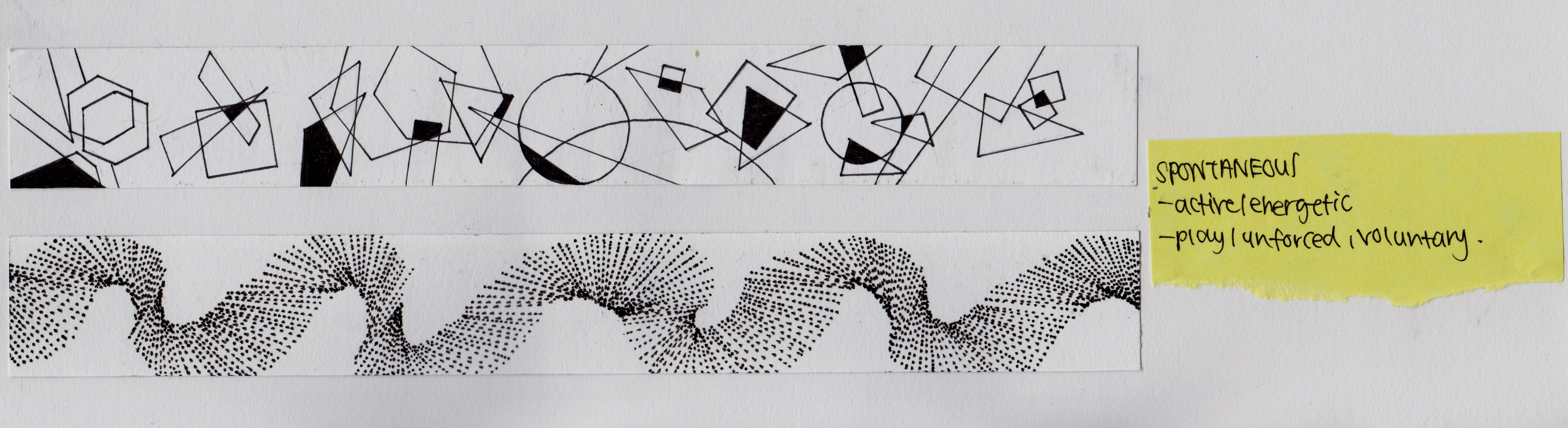
versatile + spontaneous = ME IN 5 YEARS
ME
Insecurity + Neat and concise
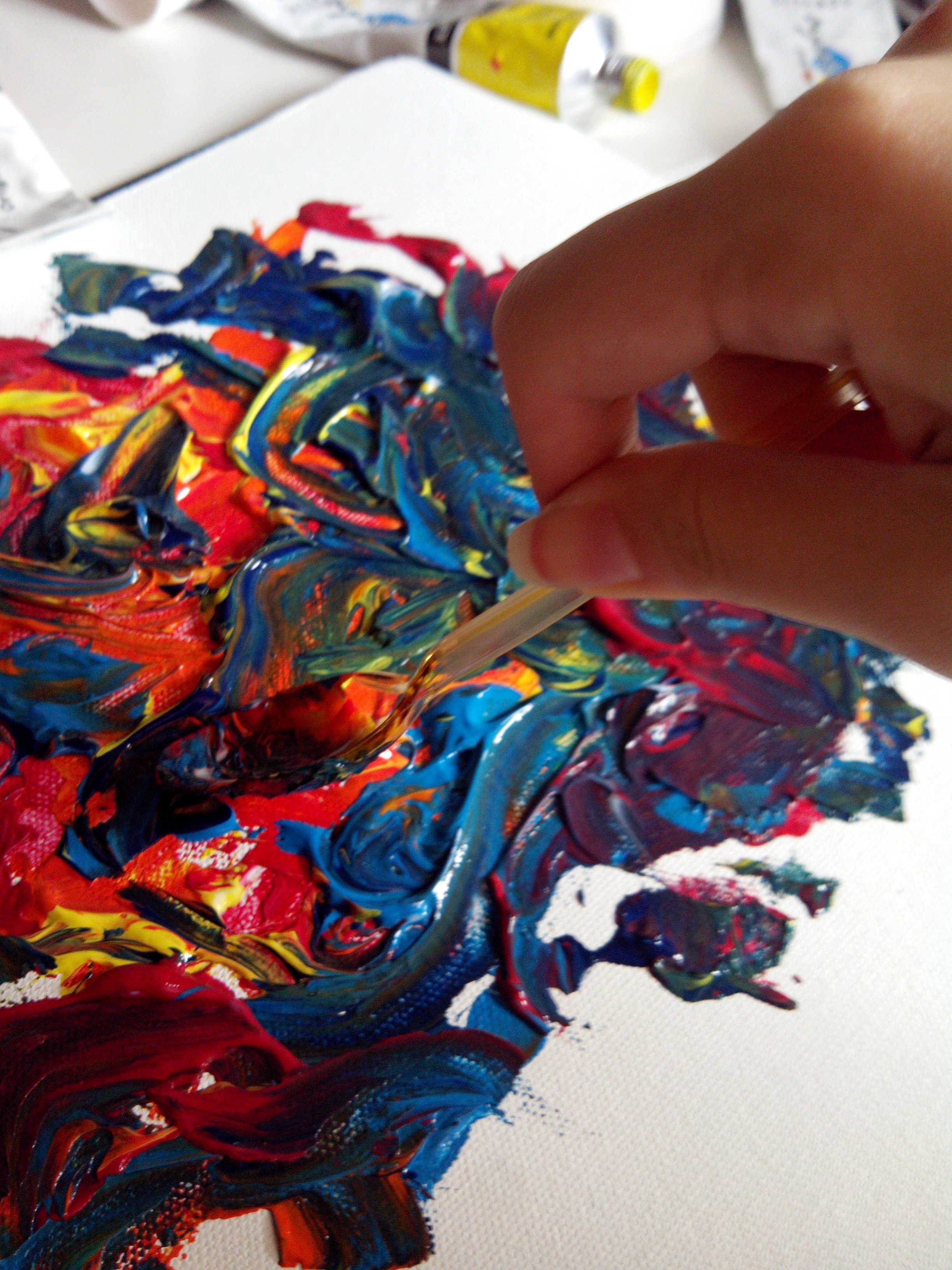


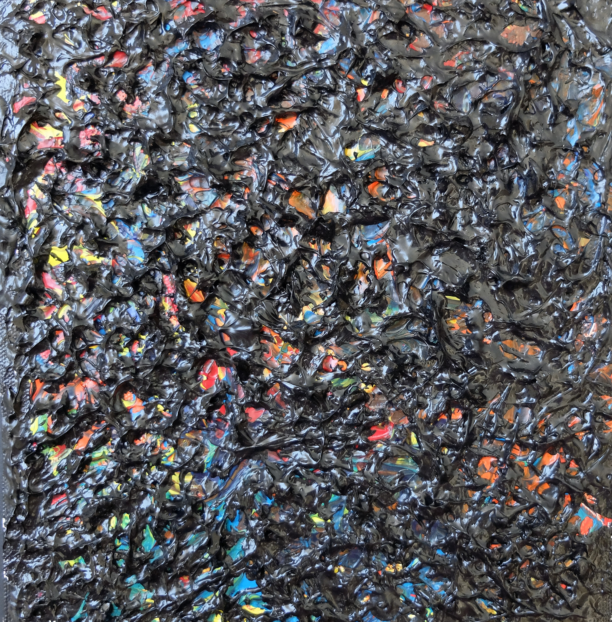
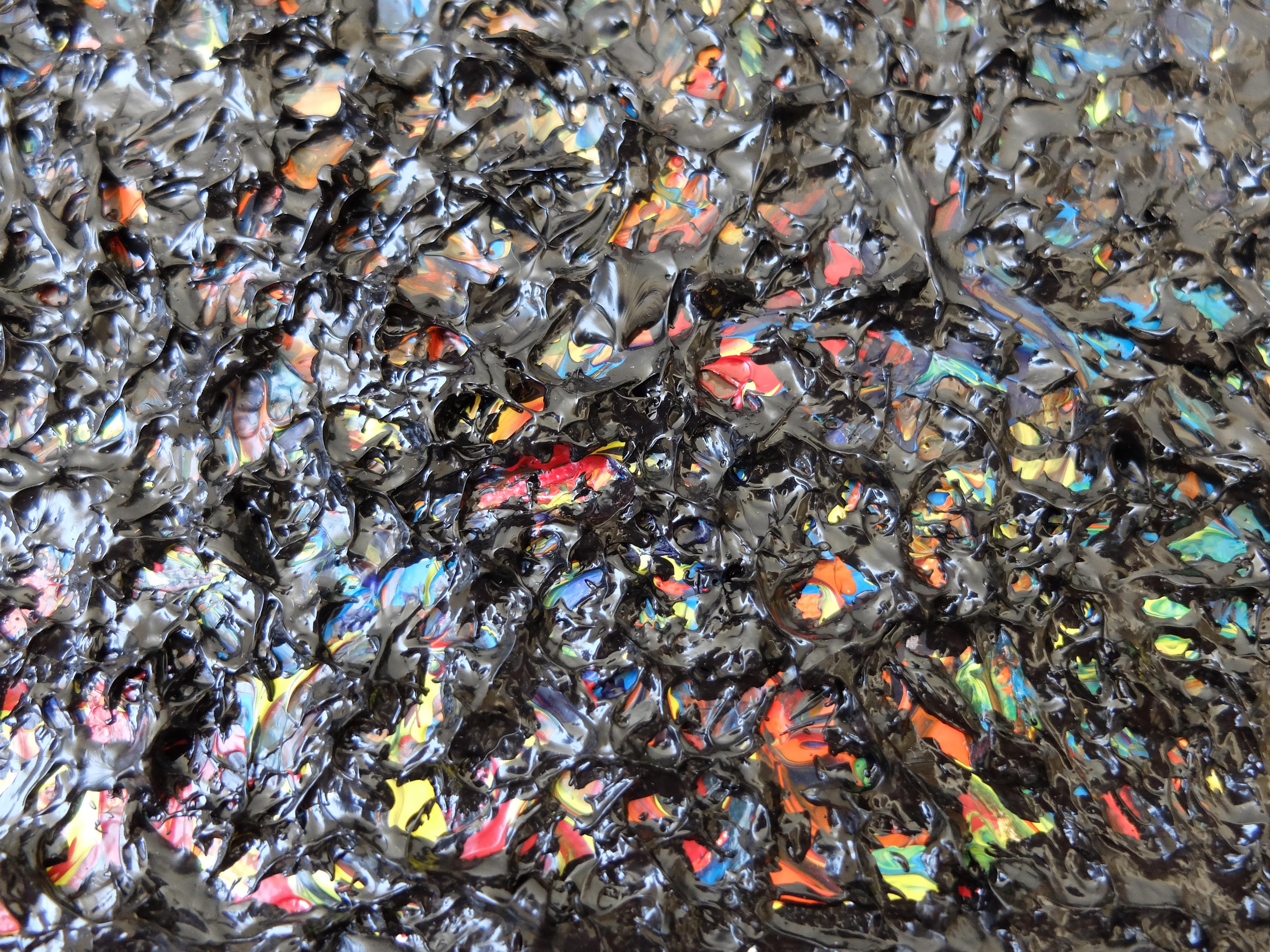
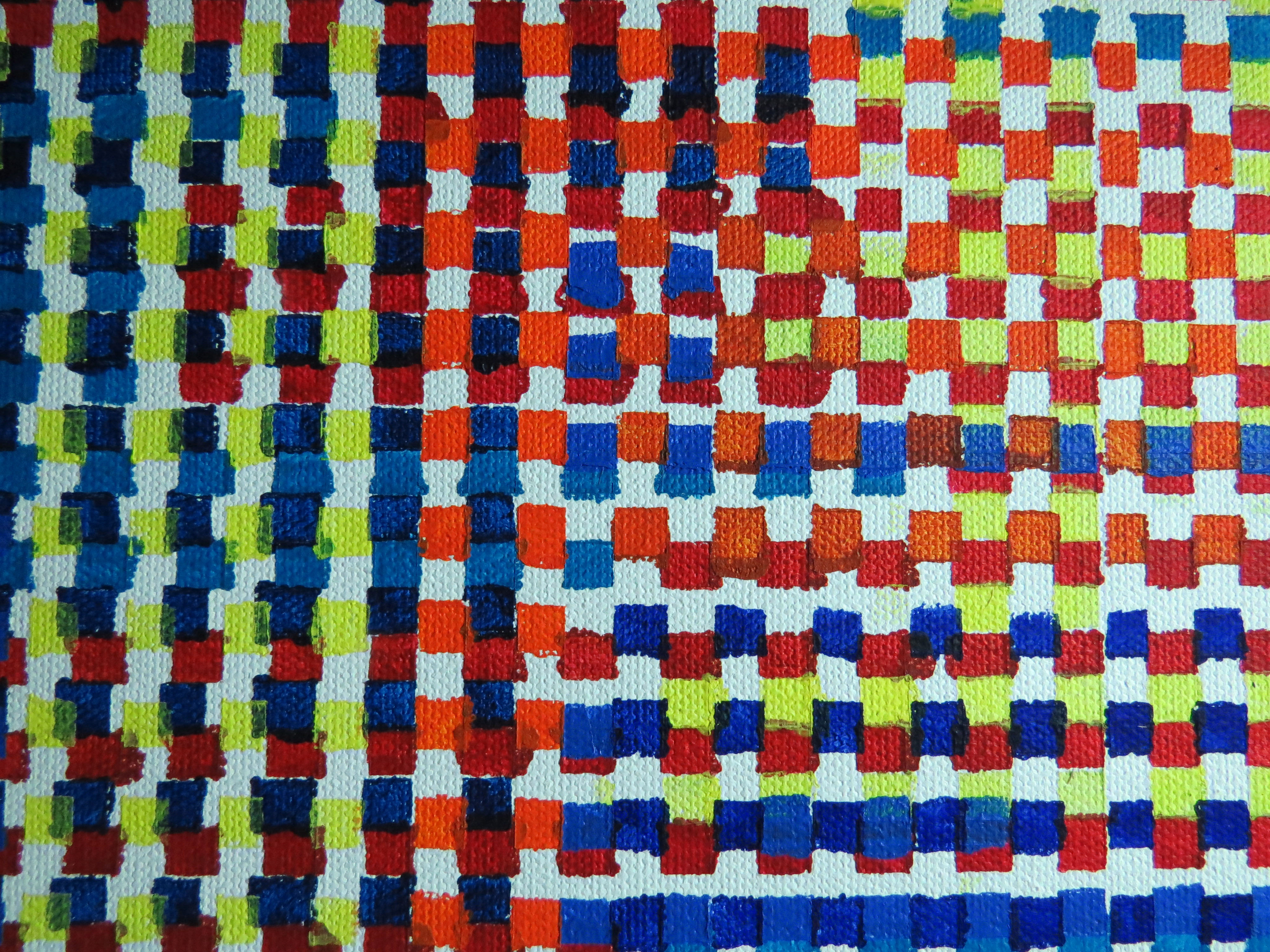
The first square depicts the many insecurities i have when faced with new challenges. I tend to have many worries and thoughts when doing things, To express this, i created uneven, bumpy and rough textures using impasto. Paint is squeezed onto the surface of the canvas, then spread with spoons to create messy swirls that represents my inner turmoil.
Also, i created 2 layers. The first layer is a coloured layer that depicts my inner thoughts. Red represents my anxiety. Yellow represents instability of my thoughts, Orange shows my frustration with things and blue depicts my over seriousness with work. The above layer over is a black surface that suggests the negative impact it has on my actions. The black layer does not totally over the coloured layer below. The coloured layers can be seen through the little holes of the black layer to suggest how my inner worries can be seen through my actions.
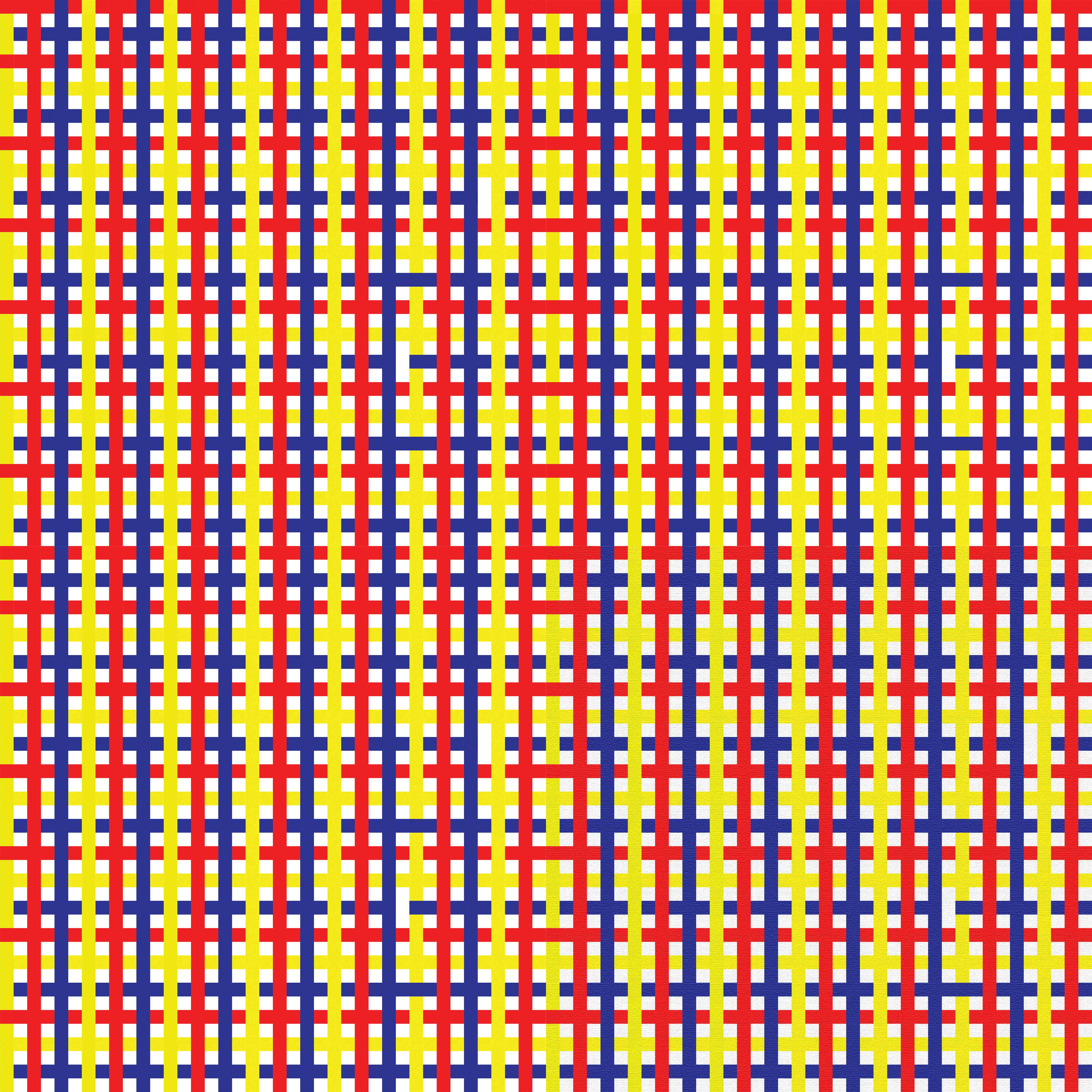
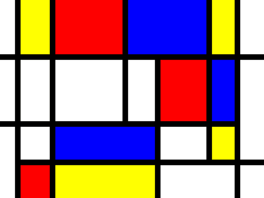
The second composition shows that i am a neat and concise person. To portray that, i decided to with a clean and orderly design that emphasis on geometry.
Horizontal and vertical lines of equal thickness are arranged systematically to suggest my hate for messiness. Also, primary colours like red, yellow and blue are used to suggest the harmony and orderliness.

The last square shows that my neat and concise personality is caused by my insecurities. If you look at the work above, you see the overall structure first then you see the colours. The structure represents my neat and concise personality and the colours are my insecurities.
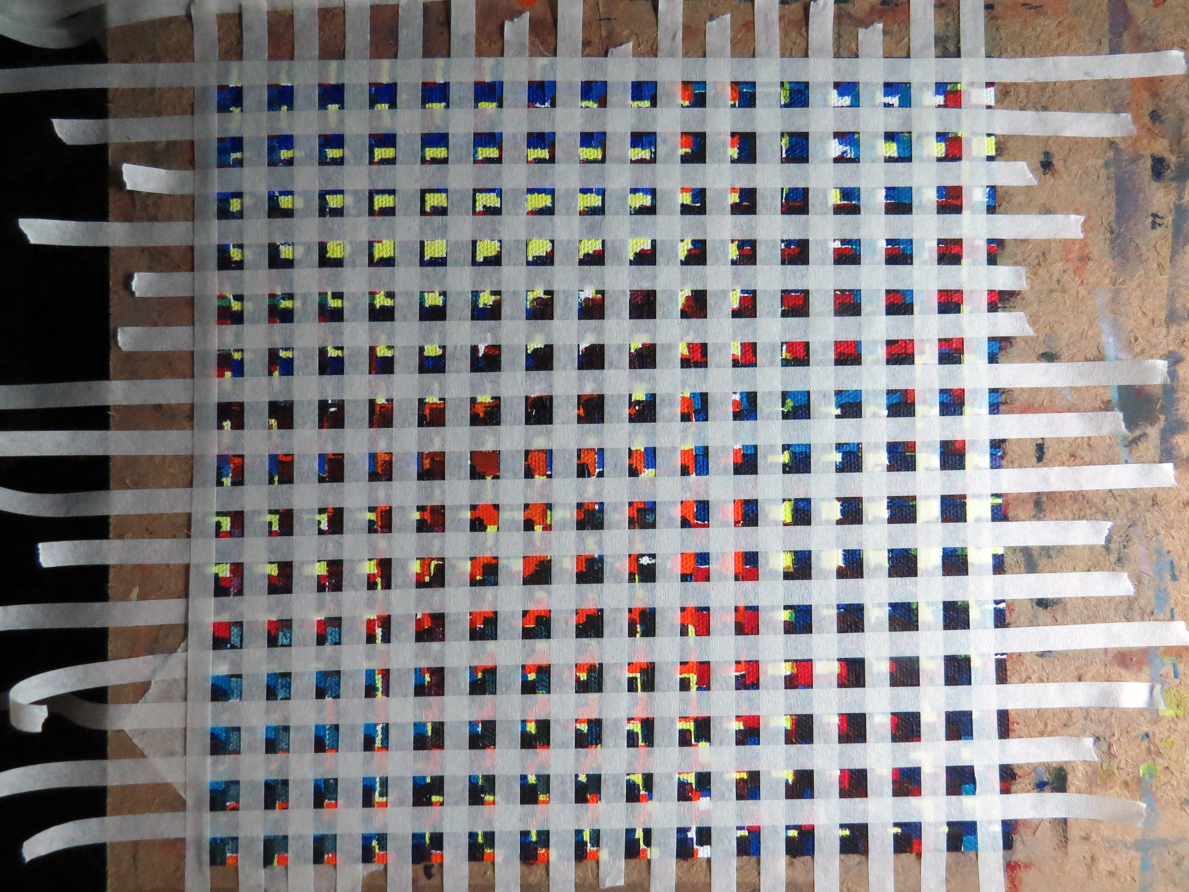
The work is created by building up many layers of coloured grid squares to the extent it looks black. The layers of square grids are constructed by taping on the canvas with masking tape then painting over with acrylic paint. Each layer of square grid is positioned differently and painted with different hues of colours.
A BETTER ME
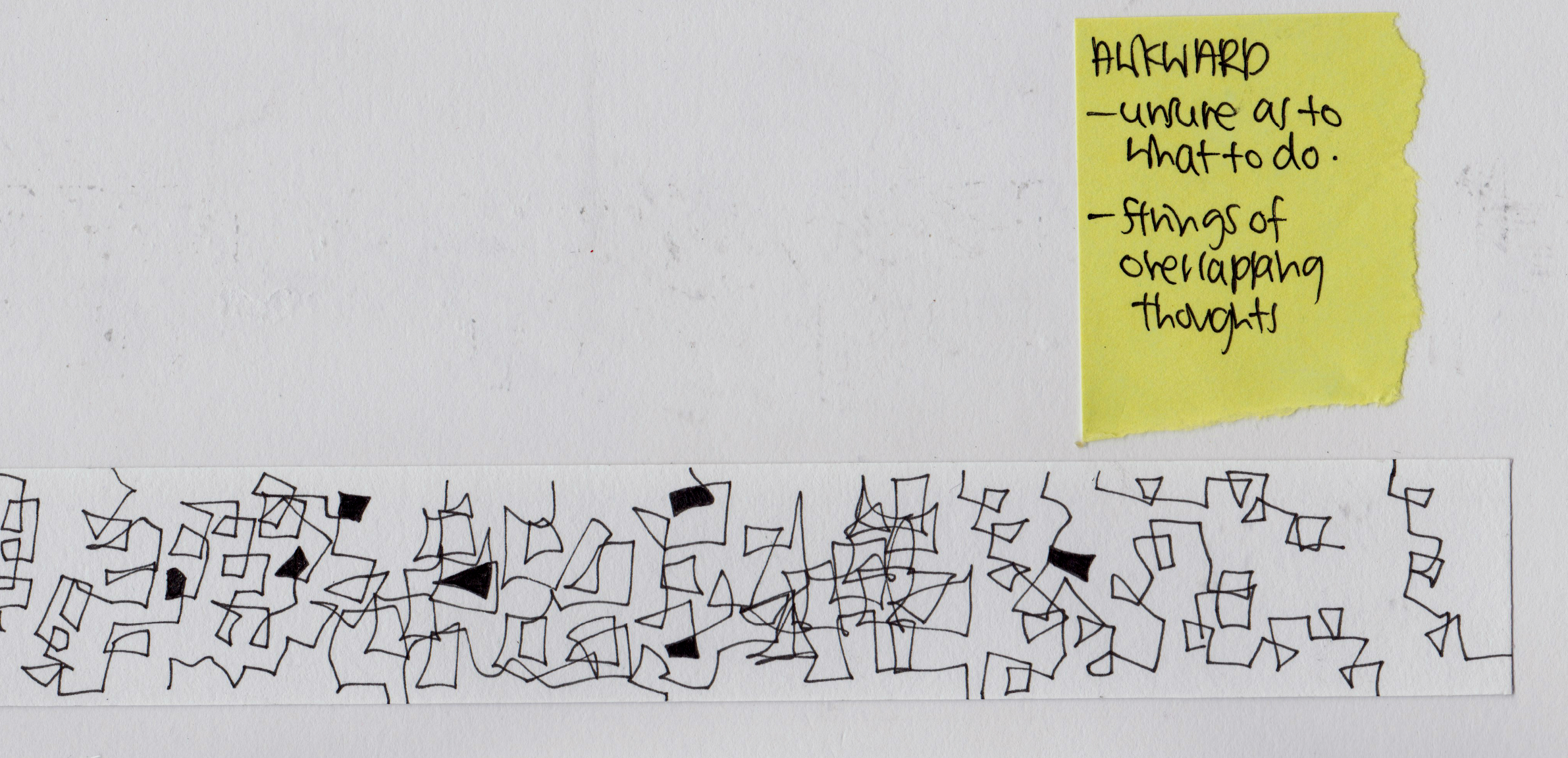
Stepping out of Comfort zone – Rigidity

As a neat person, i always keep my drawings within its boundaries. It is never messy. However, this caused my work to be stiff, rigid and somewhat lacking in expressiveness and style. For this equation, i decided to use flowers to represent a better me as they are very natural life form.
Thus, in the first composition, i depicted a better me to be someone who steps out of her comfort zone. The comfort zone is the orange, green coloured area bounded within the 3 white corners. The purple flowers are not bounded within the coloured region but grows slightly outside the borders naturally.
To become a better artist , i really need to get rid of the rigidity and stiffness in my work that constrain my development. Here, rigidity is represented by the intertwined plants in a overall square format, somewhat reminding you of a cut up bush of plants.
A better me is someone who is more expressive. Thus, i depicted a close up of a blooming sunflower that focuses on the natural and rhythmic curves of the petals. Warm colours like red, yellow and orange are employed to show the positive and energetic expression.
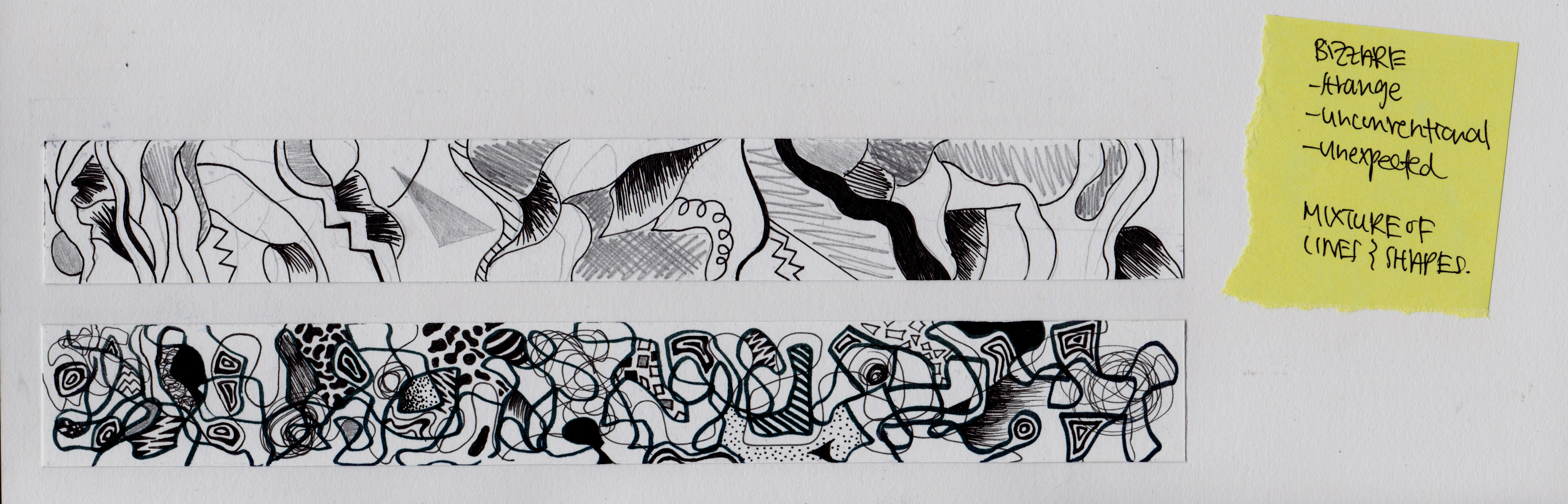
AN IDEAL ME
Imaginative x playful
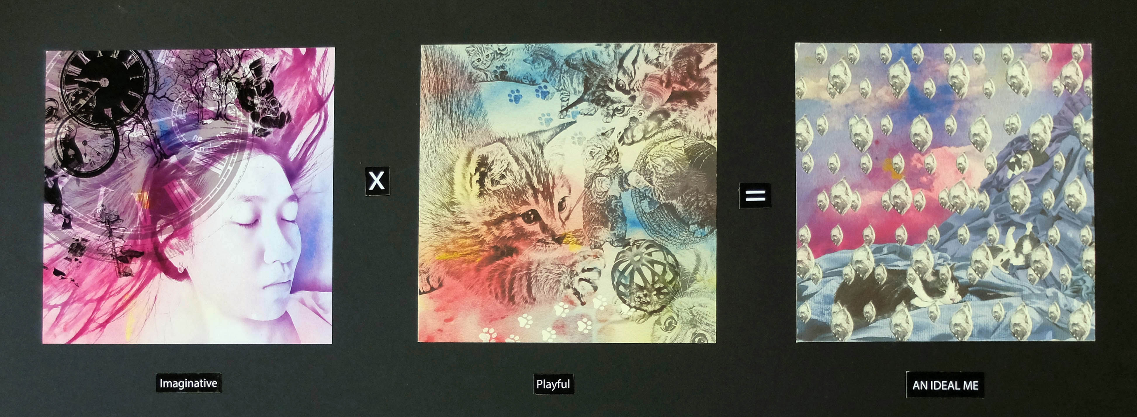
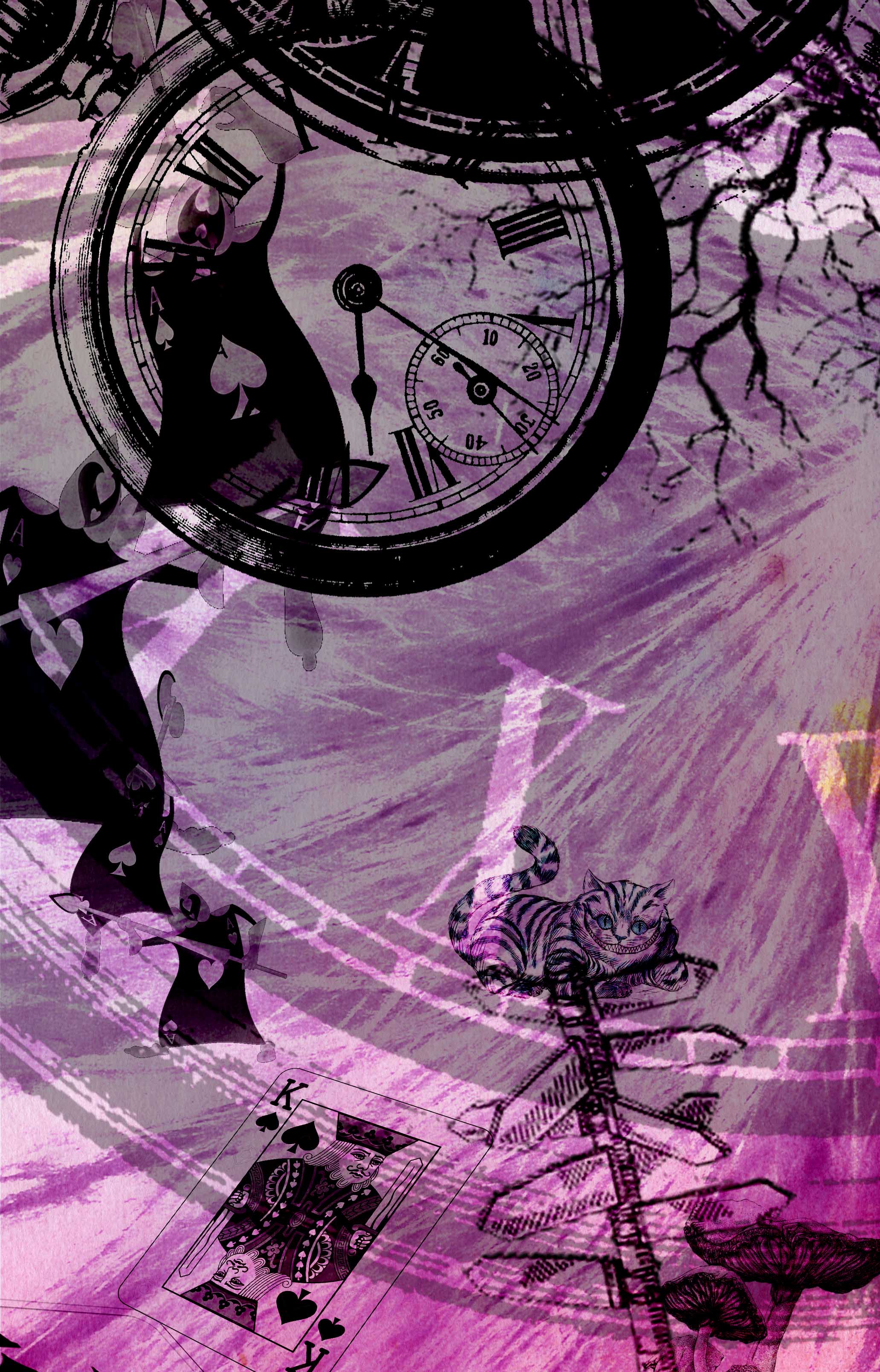
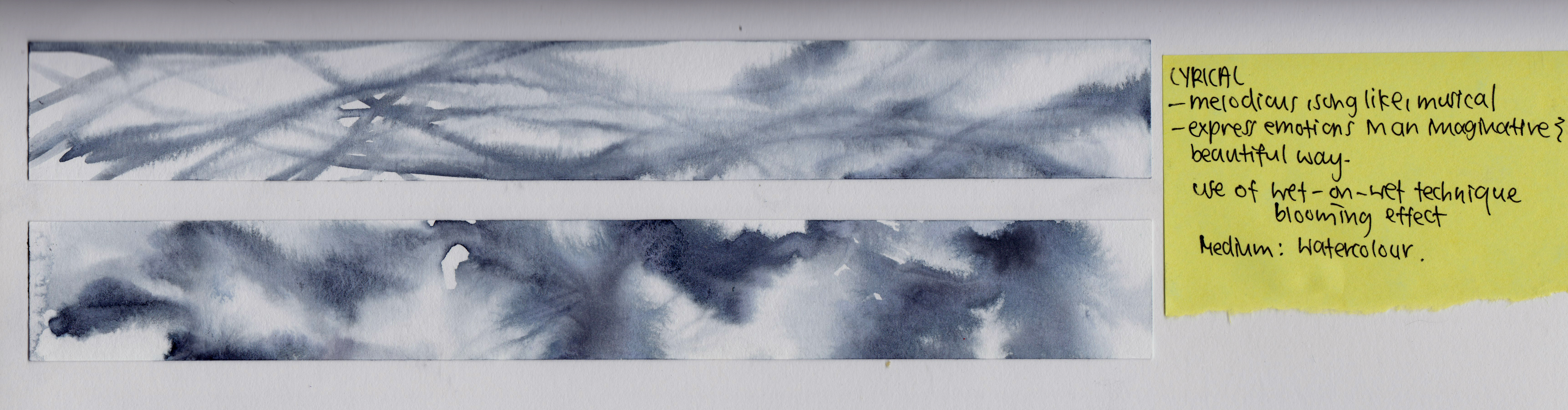
An ideal me would be someone imaginative as i find it hard to generate ideas. To me an imaginative person is someone who sees the world beyond the actual reality and challenges the boundaries of reality. To portray this, i referenced to Alice in the wonderland. Elements and characters are placed on the extending hair to show the limitless imaginations. Also, the added tint of purple gives a mysterious touch to the composition.

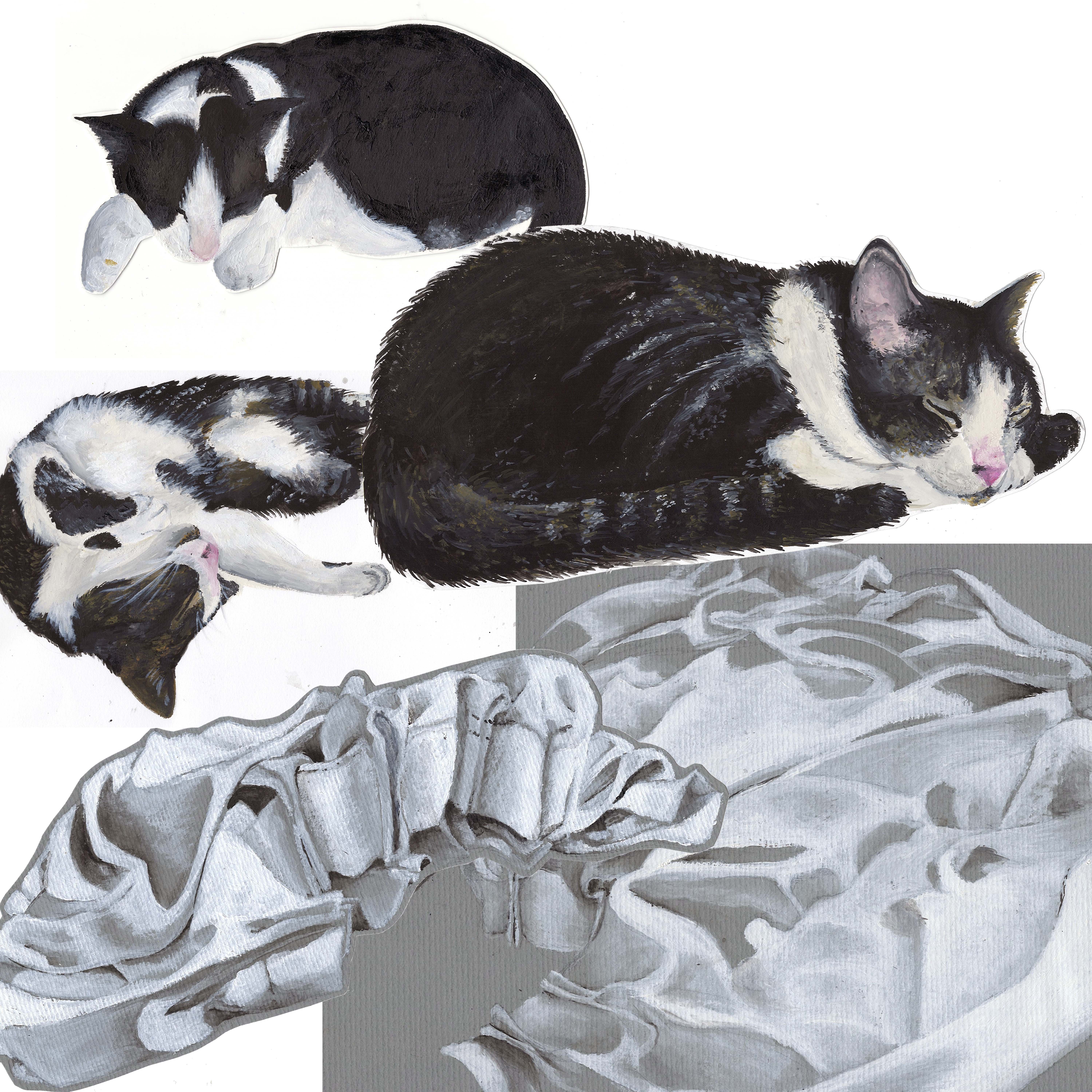
An ideal me is also someone who is fun and playful. I find myself to be a boring person as i am work oriented. So i wish to become someone who is more fun loving and not overly concerned with work.
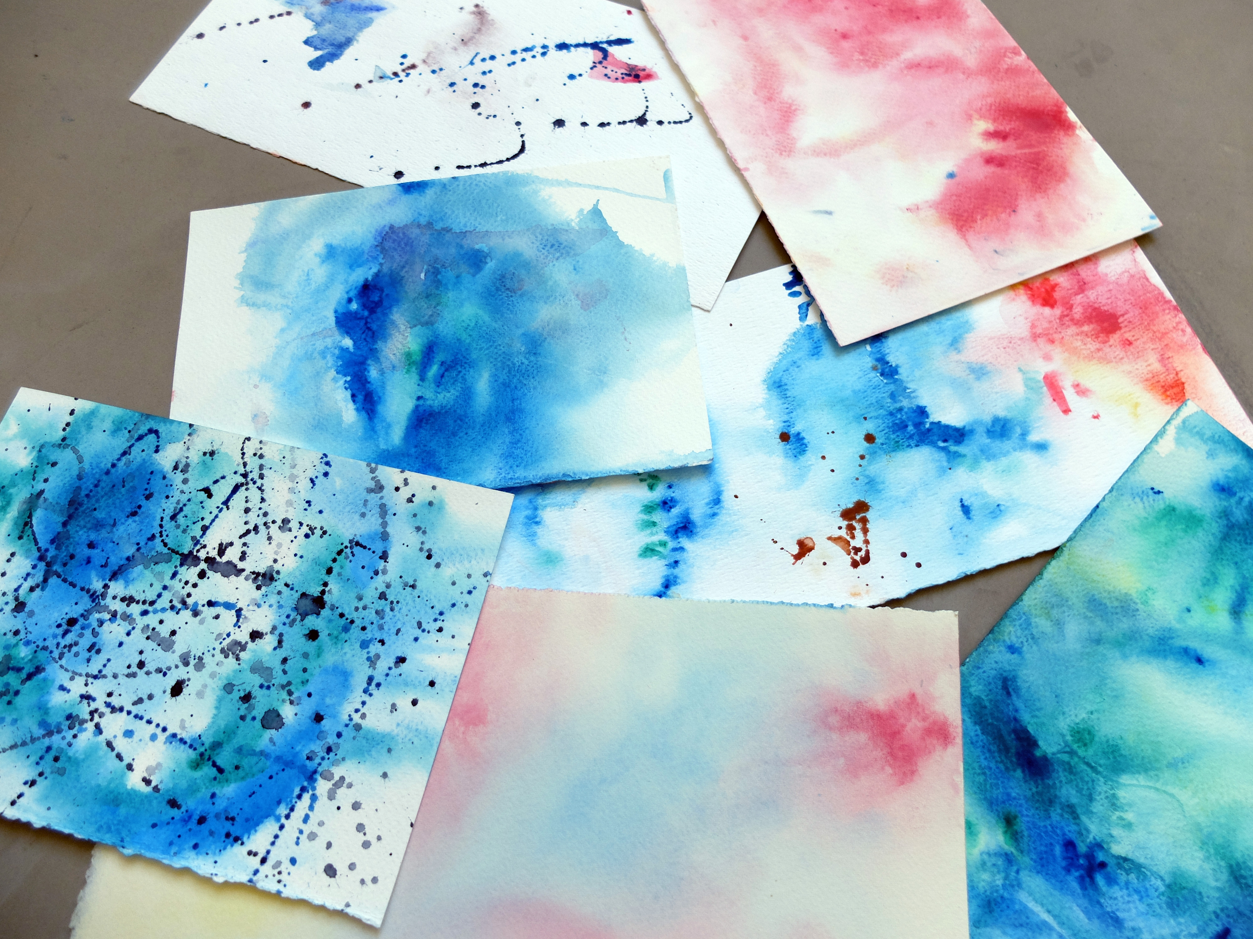
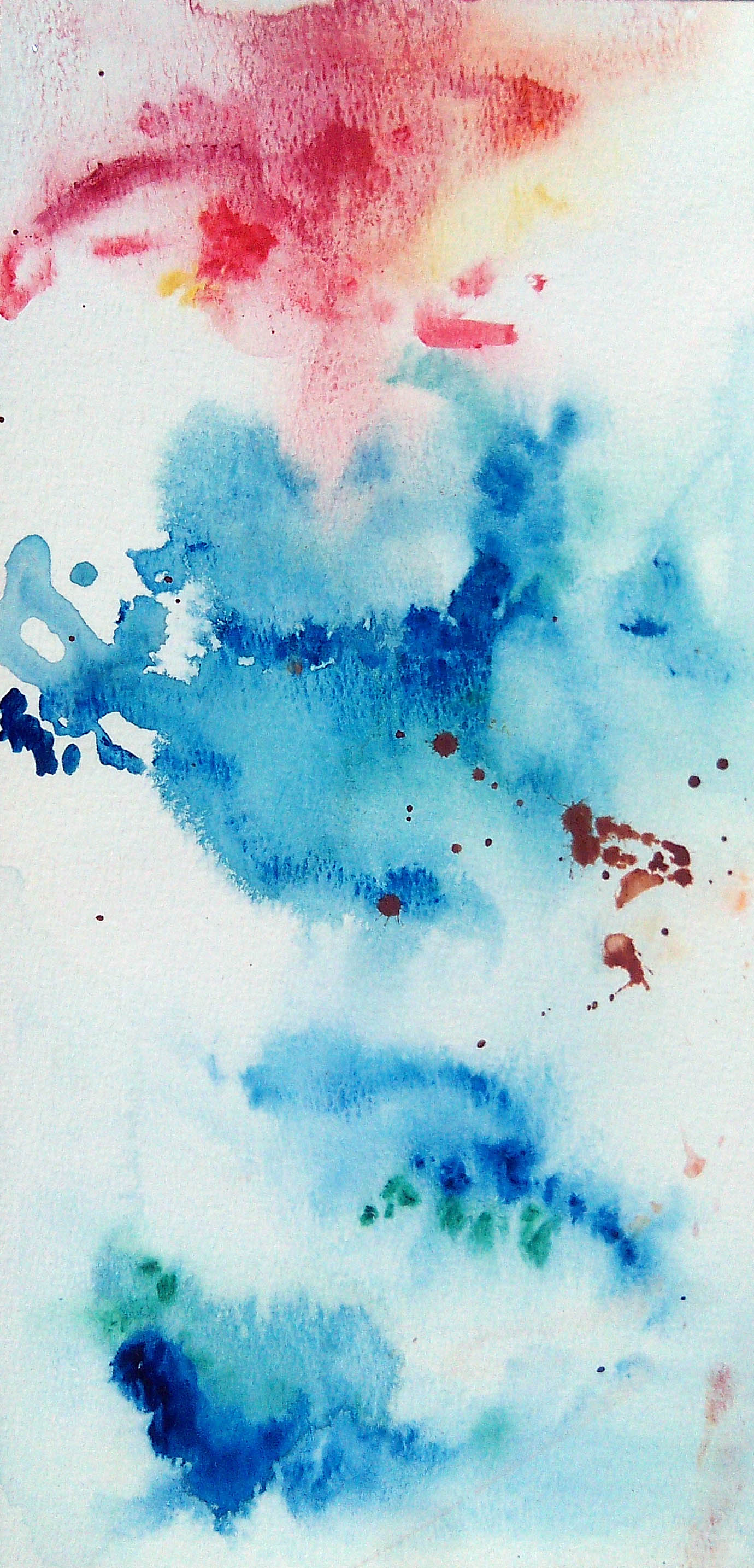
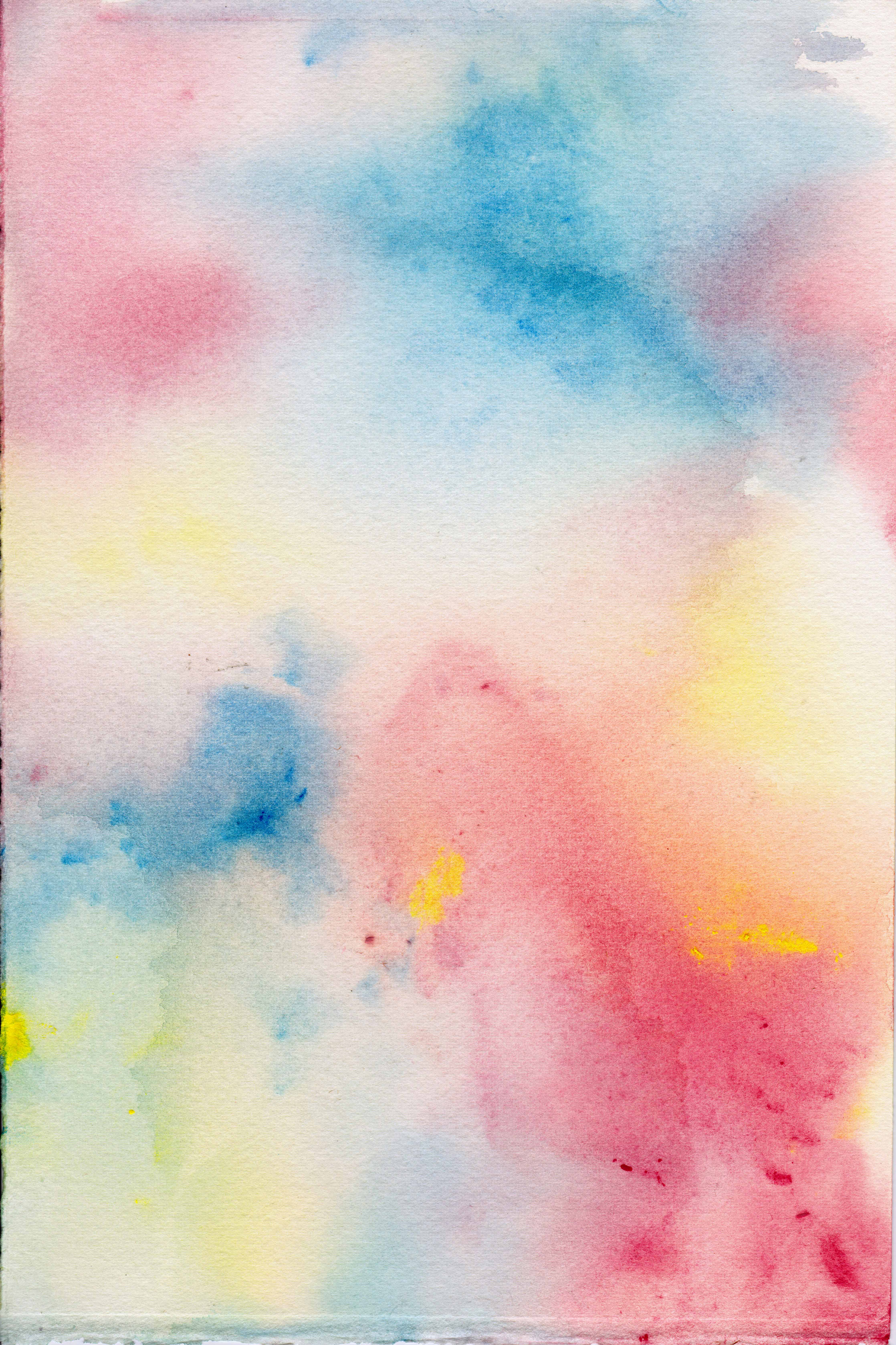
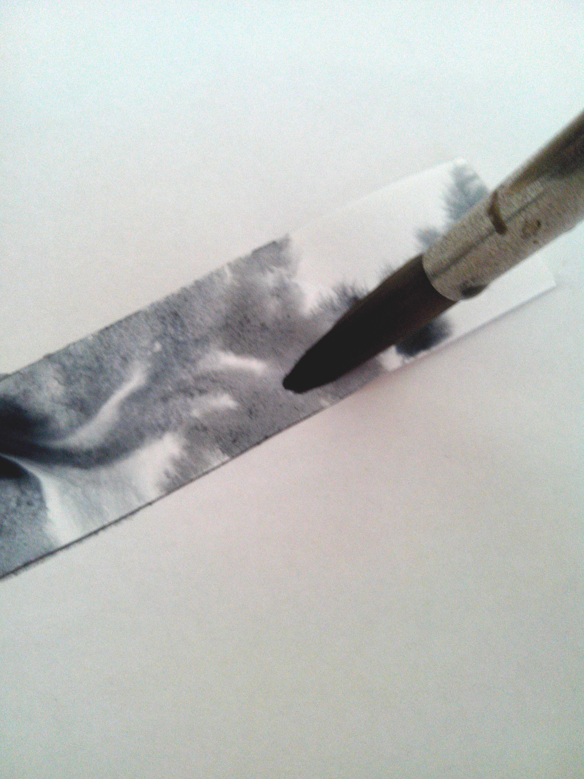
For this square, i decided to use cats,who have no worries in life and are not bounded by commitments, to be an ideal me. I wanted create a light background wash to the subjects to suggest the overall mood. So I experimented with various colours using the wet on wet watercolour technique. After trying out many combinations i decided to go with the pink, yellow and light blue combination that gives a childlike and lighthearted atmosphere.
![]()
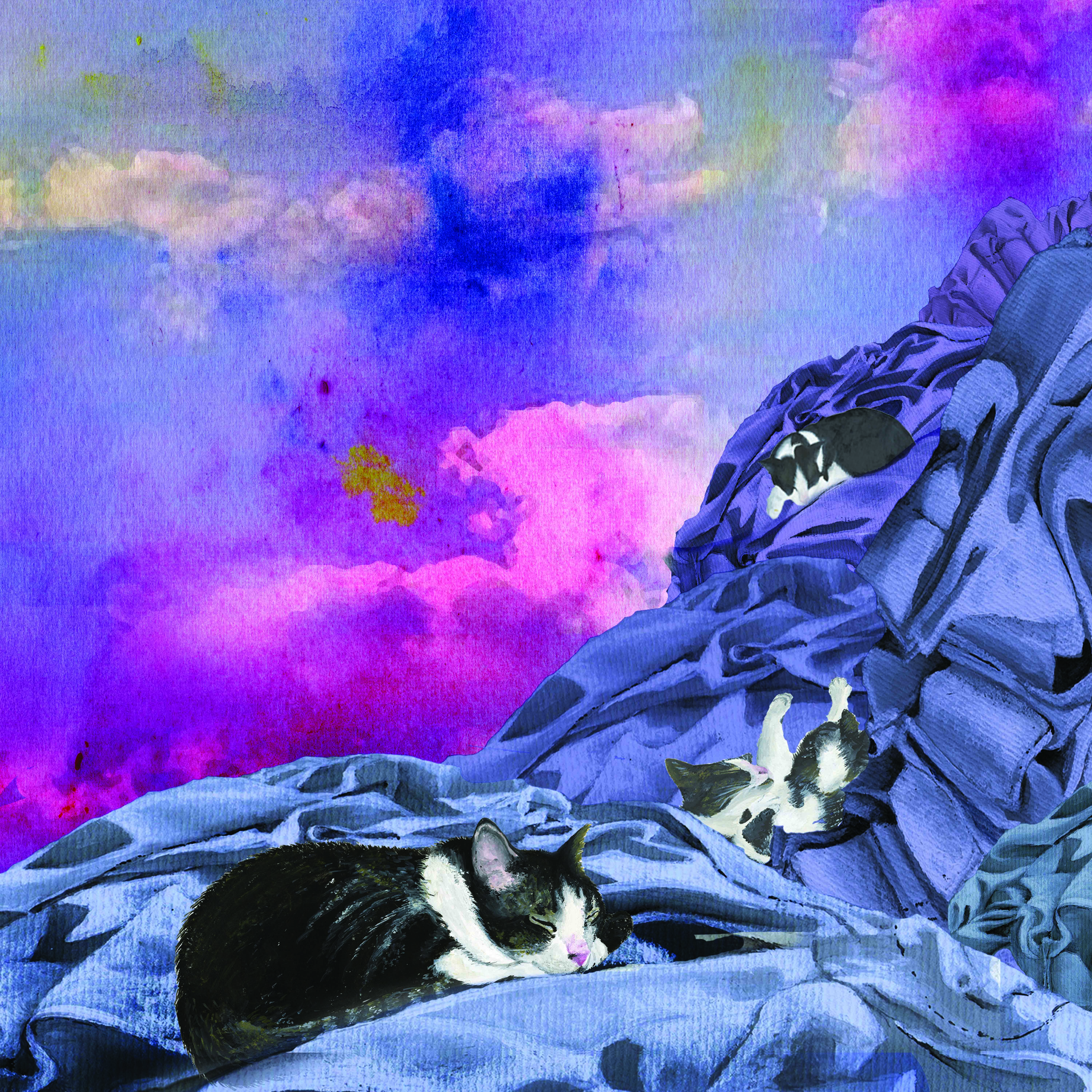
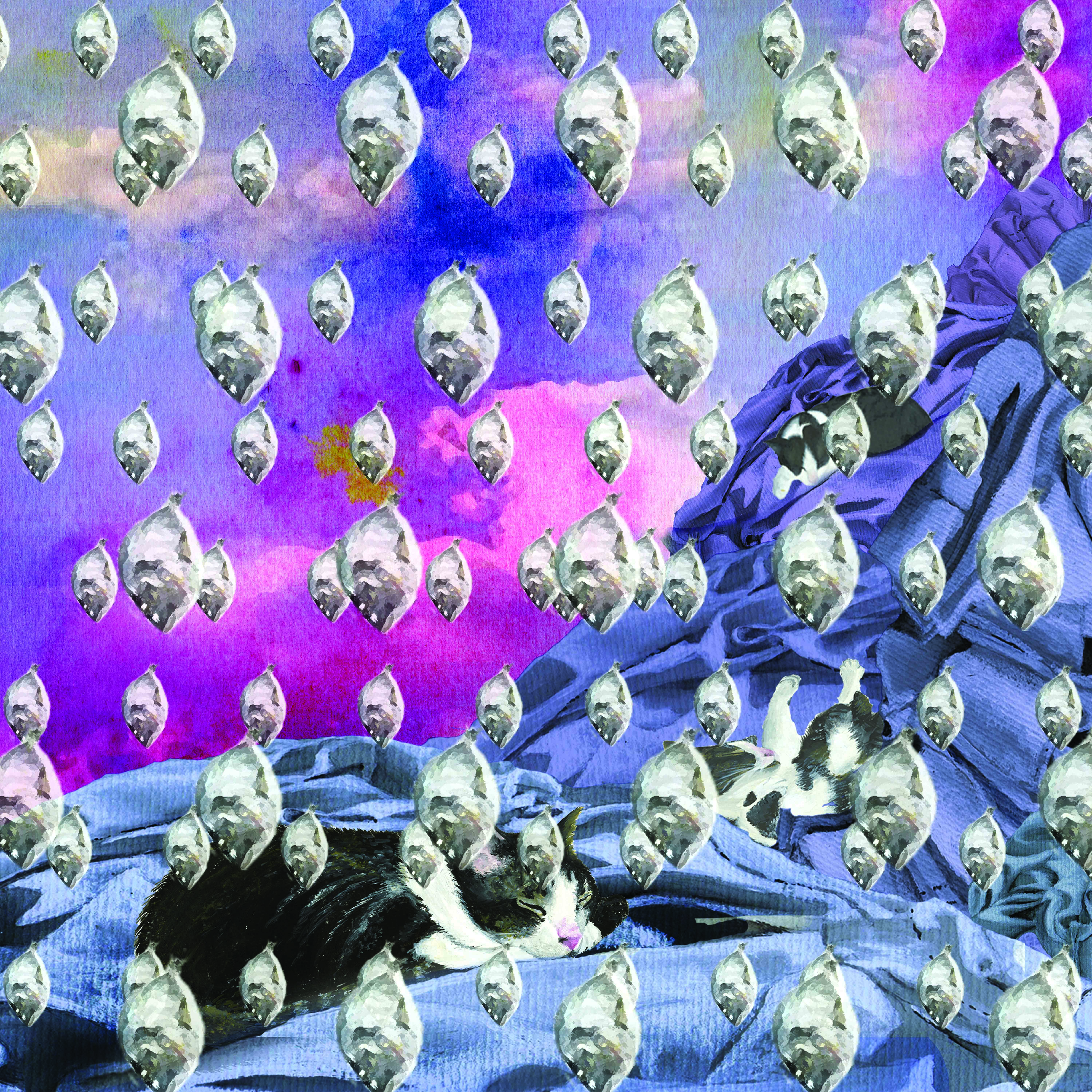
For the last composition is a surreal setting of the cats’ imagination. The subjects used in the composition are painted individually, then digitally manipulated together, Pattern and variety is created with the fishes dropping from the sky. Similar to the first one, a purple gradient is added to the skies and cloths to create a mysterious and foreign feel to the setting.
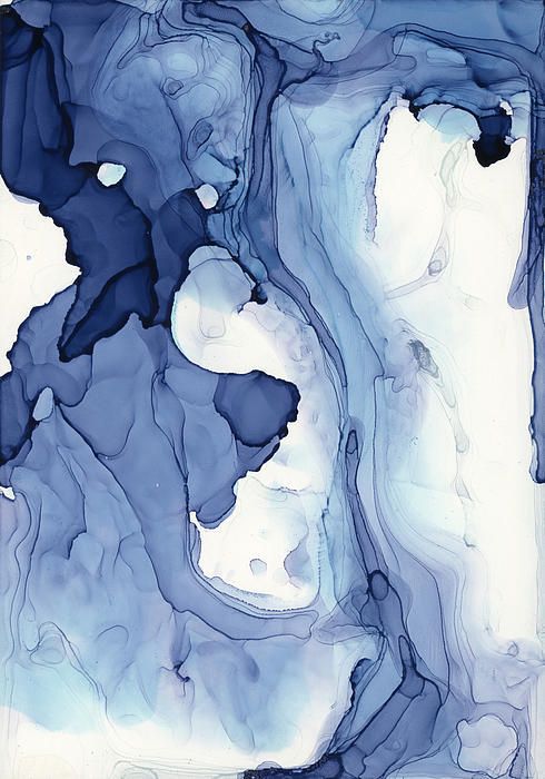
ME IN 5 YEARS
versatile + spontaneous
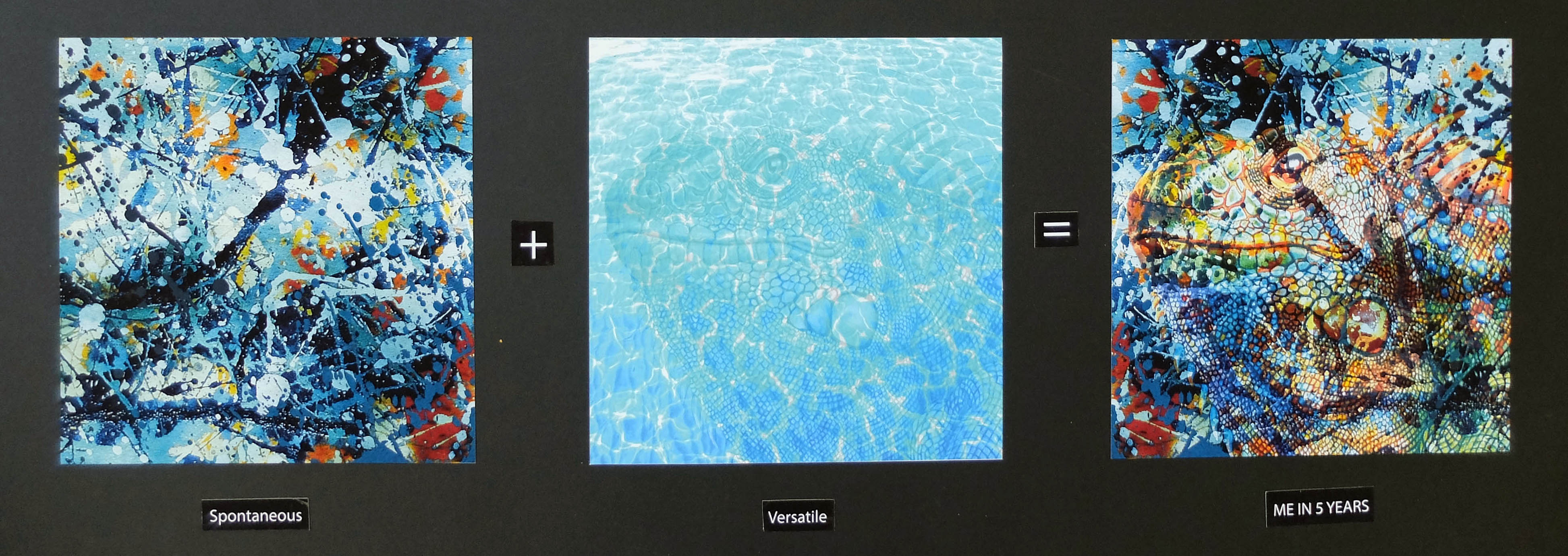

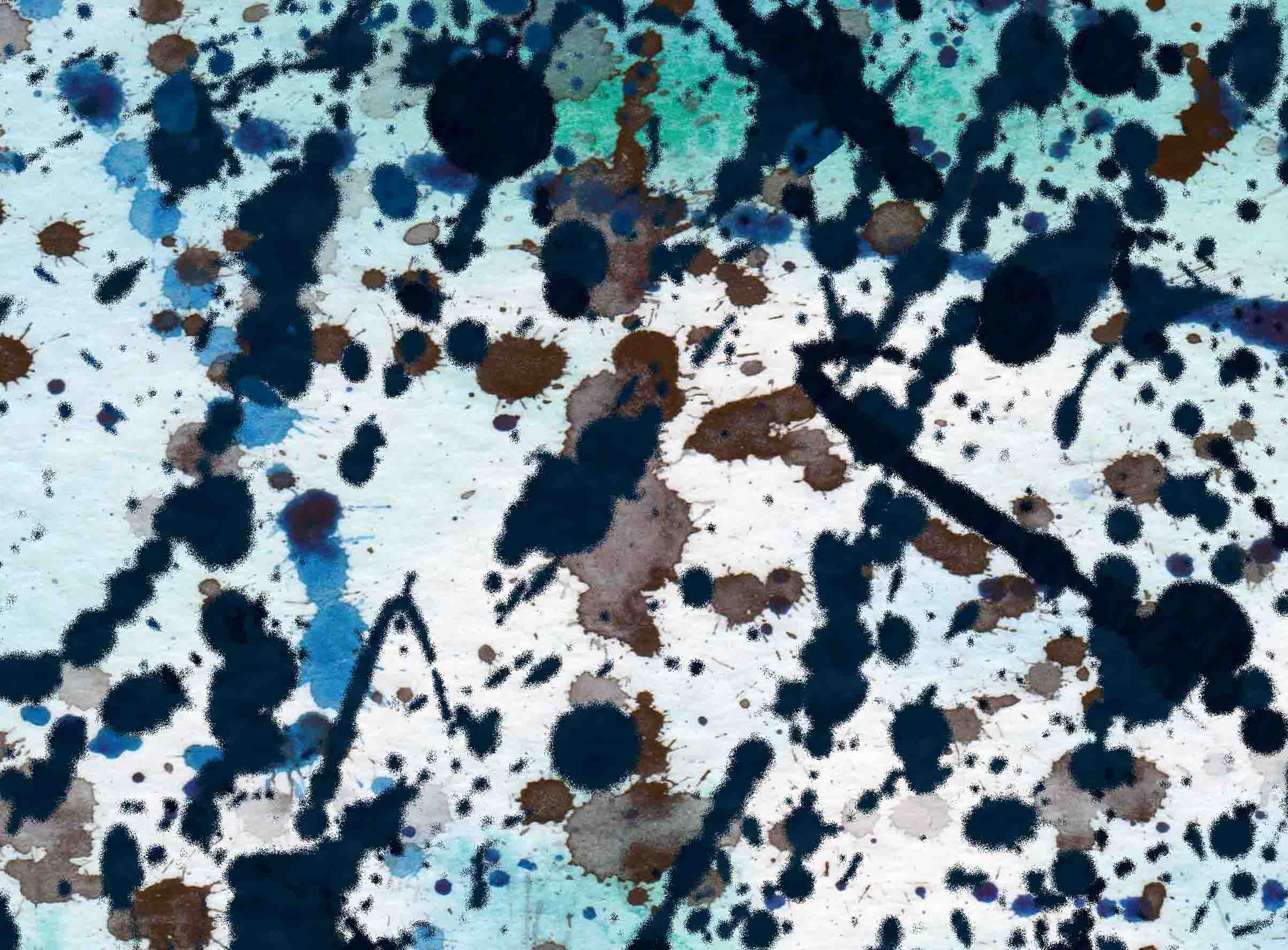

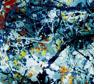
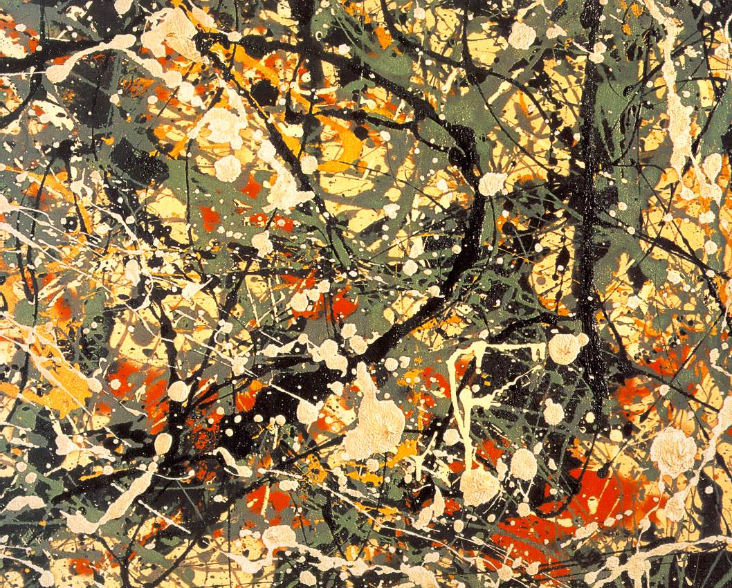
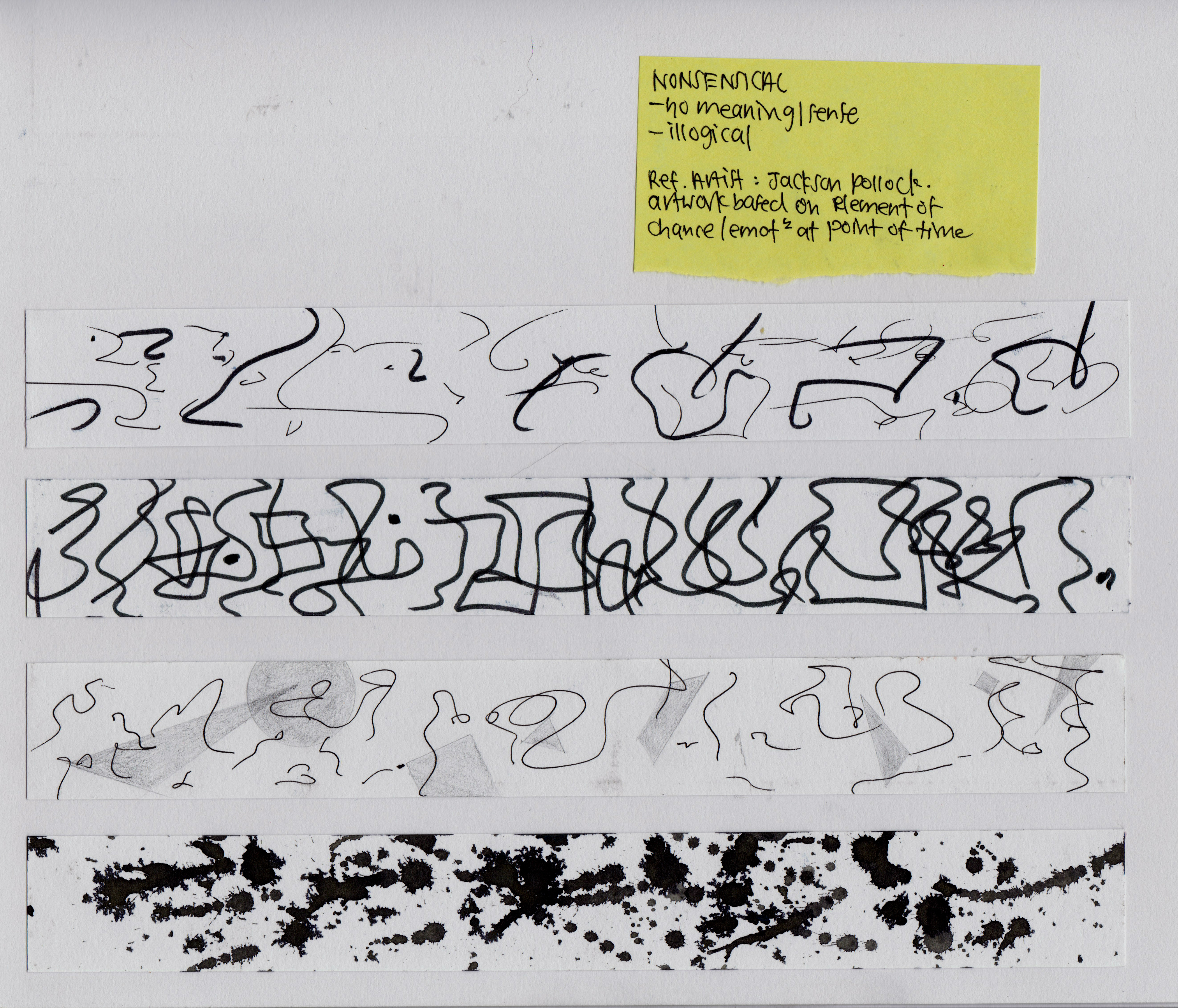
In 5 years, i see myself as a more spontaneous artist, someone whose artwork is influenced more by emotions rather than logical thinking, Thus, i did an unplanned and all over composition for the first square, I played around with the paints by splashing, dripping and flinging them onto the paper. After much experimentation, i overlaid them in Photoshop. Initially the composition only had blues and greens as i wanted to portray the idea of working spontaneously and at the same time with control. But later on, i added hints of orange and yellow to suggest the energy of a spontaneous action.
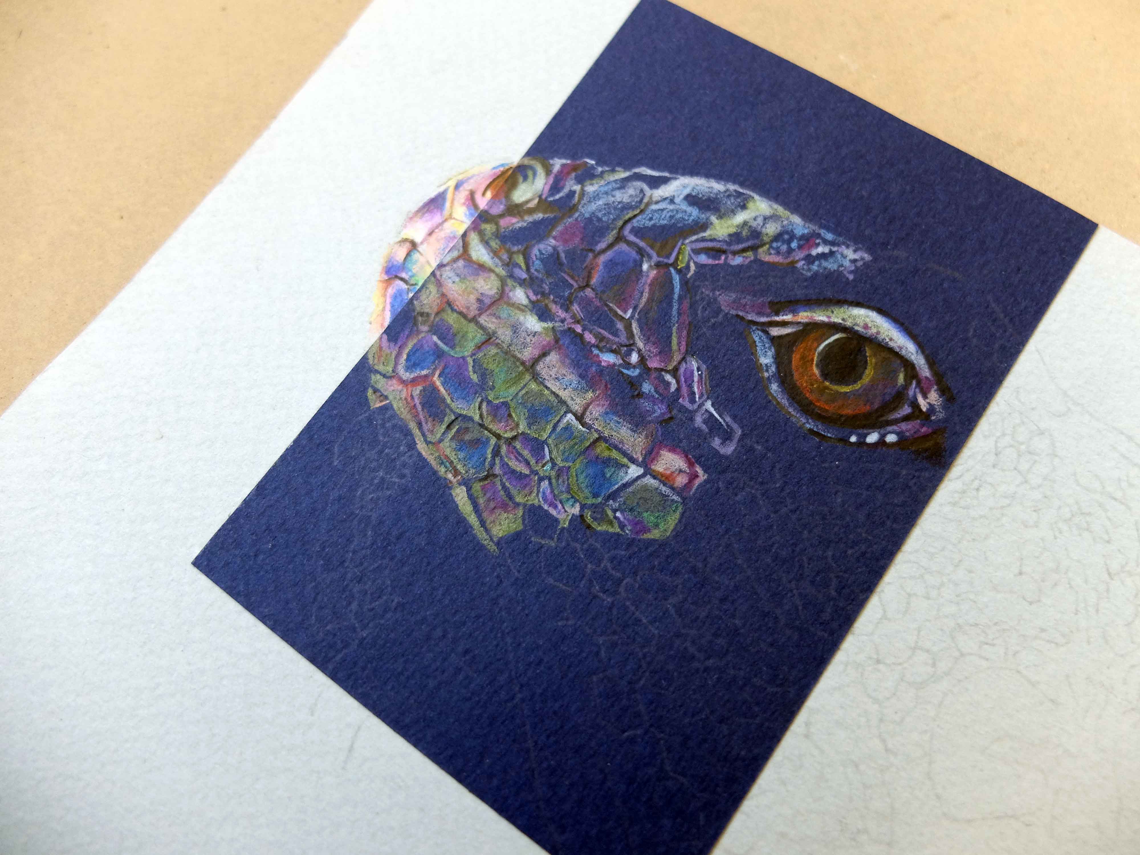
Also, in 5 years, i imagine myself as someone who is versatile. I used 2 elements to represent adaptability: water and chameleon. In the second composition, the chameleon hides itself in the waters.
Final Project

Overall, i had fun experimenting with colours. It is quite an interesting project. I have come to understand myself better and what i hope to expect from myself in the next few years.


