Hi, this post will be covering on the walk-through of my process for Zine. ![]()
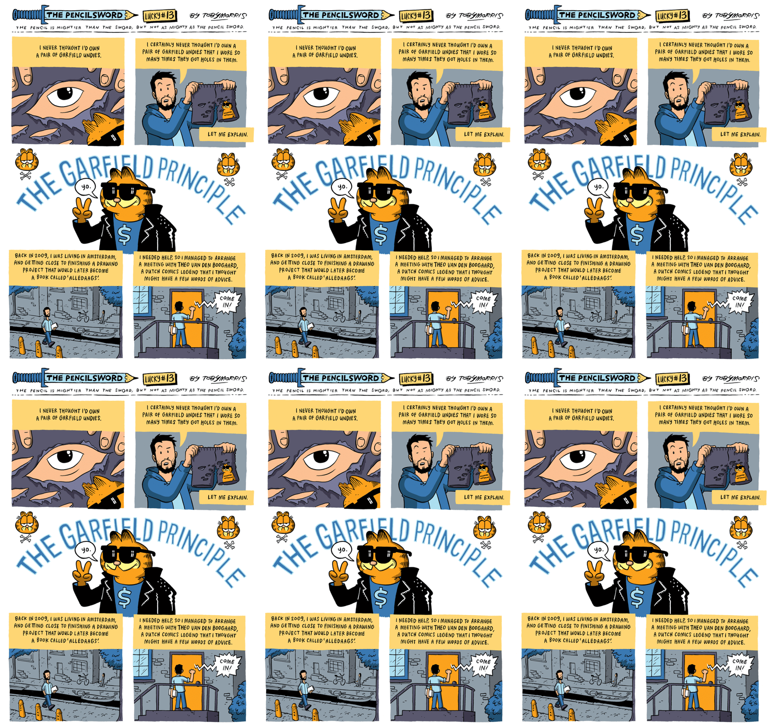
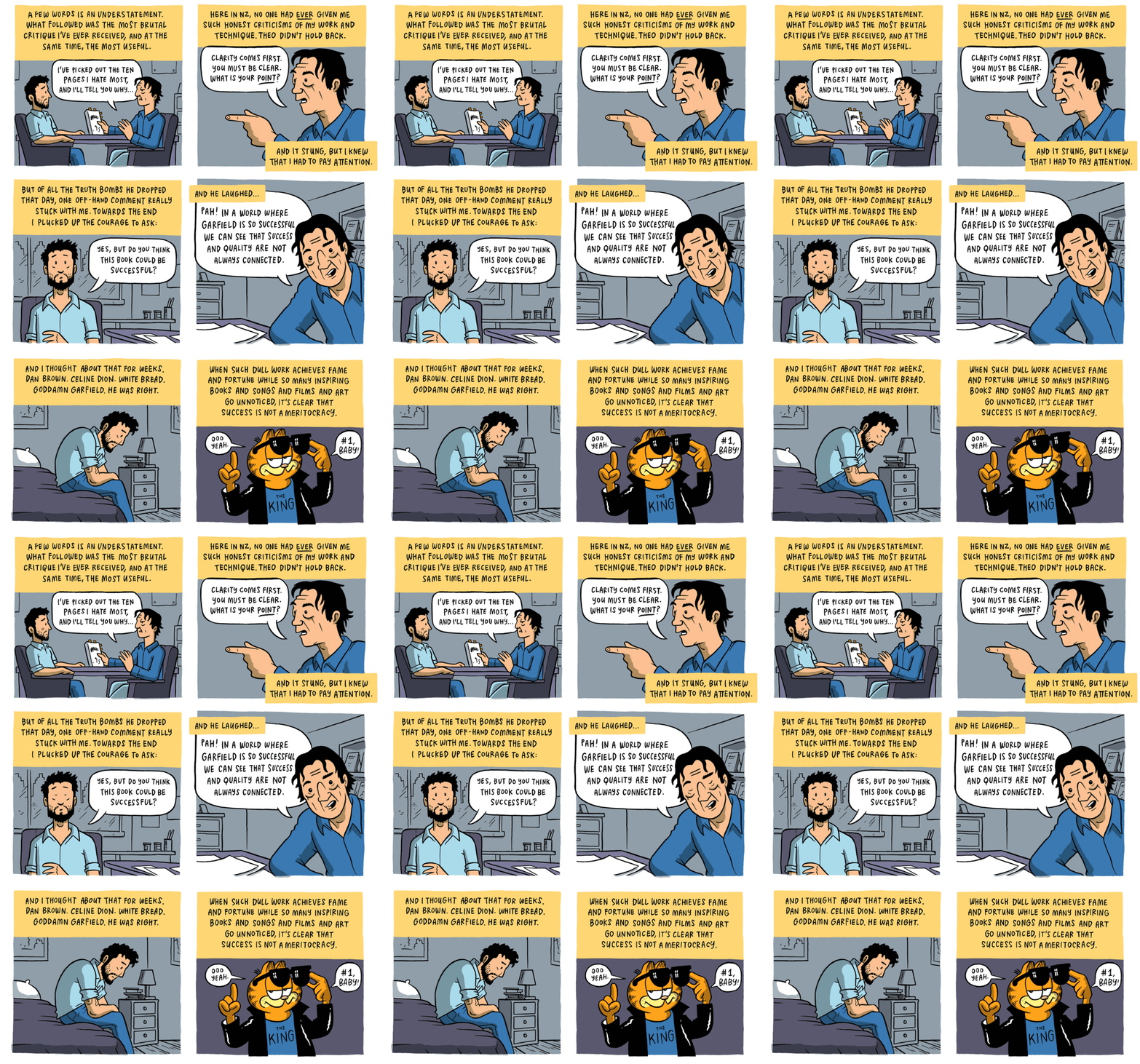
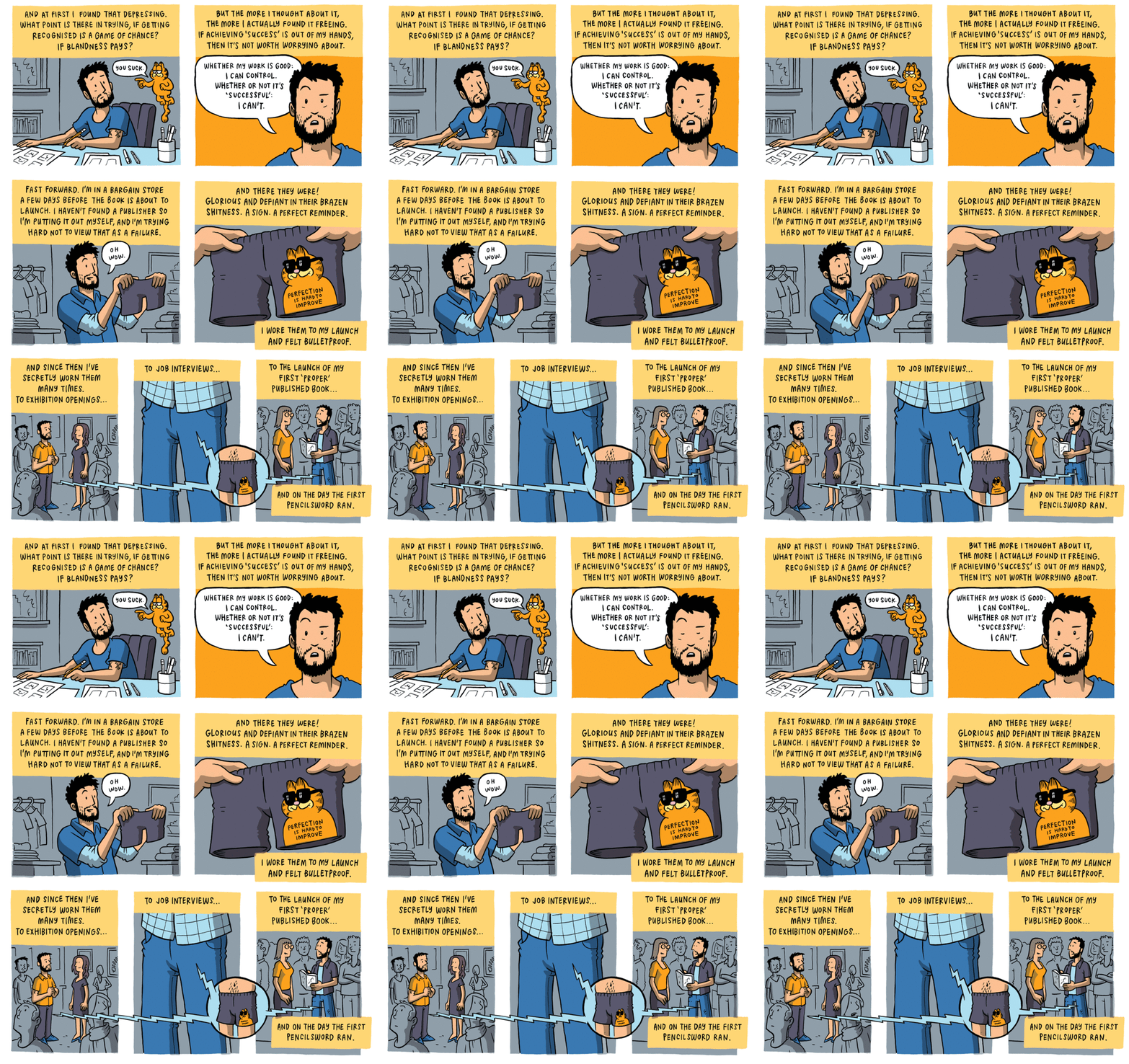
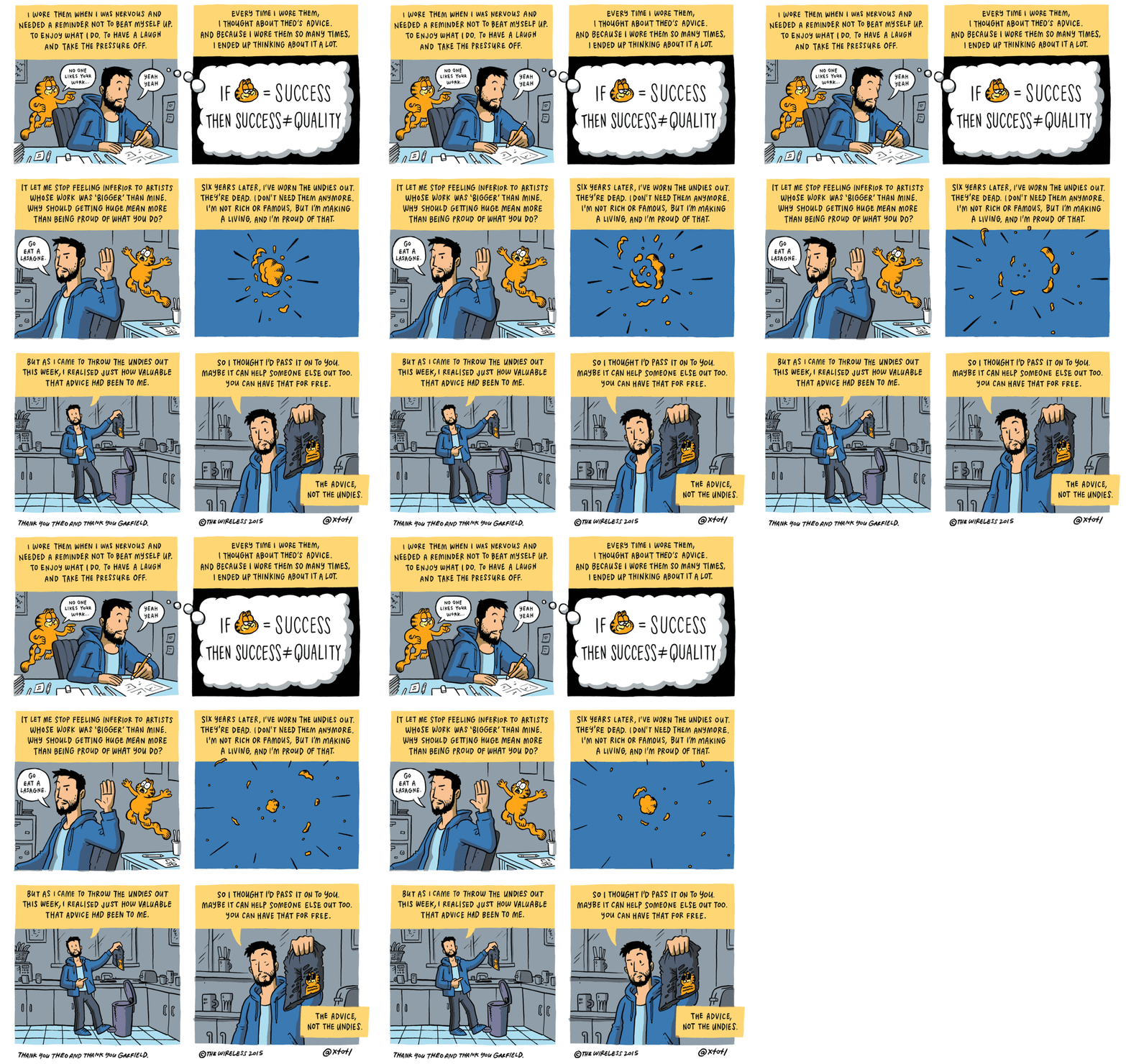
During the first consultation on week #11, I wasn’t exactly sure what I would like to have in my zine as content. Was telling professor Joy that perhaps it will be a mix on my project 1 – Workkery and project 2 – Long neck series (LNS) which is both having to do with social related issues however, professor Joy pointed out that they are each very different actually (which I didn’t thought of initially). – Workkery is about the play of chance whereas LNS on the other hand, is more whimsical. That night, I came across this comic by Toby Morris (The pencilsword series).
Which set me thinking of what exactly is my point for this project?
(1) What message am I trying to relay here?
(2) How can I better convey these thoughts and ideas in my head?
I drew up a mind map (in my journal) to sort out my thoughts. Eventually I come to a conclusion to work on something along the line of my first project. I started researching on some blue collar jobs issues which eventually leads me to my final subject, the migrant workers. I came across many interesting articles and stories which I would encourage one to spend some time to look through.
Here’s some interesting ones that I have looked at:
Some read-ups:
http://ifonlysingaporeans.blogspot.sg/2012/06/singaporean-foreigner-divide.html?m=1
http://news.asiaone.com/News/Latest+News/Singapore/Story/A1Story20120826-367701.html
https://storify.com/Eunaizeee/discrimination-against-foreign-workers
Some video documentaries/reports:
(For this 2 URL links below, you have to click on it to be directed to it.)
https://www.youtube.com/watch?v=rIMGSrJVNmo
https://www.youtube.com/watch?v=TAHoBsbJkik
Personally, I love to work on social/lifestyle related issues. I always enjoy designing lifestyle related products as it’s always satisfying/happy to witness your target users using/testing your products (moreover, it isn’t just any product but one that improves on their needs). Through those test-outs, you can better improve your designs to cater to their needs. Perhaps, this is why I always enjoy designing things in relation to social related issues in hoping to make improvements (if possible).
After reading up on articles and browsing through video documentaries, I’ve decided to work on a social commentary, however this time round, I won’t be dealing with jobs but some common typical stereotypes that was created for the migrant workers who came over Singapore to work. (was also inspired by Bernice Wong’s work , she usually deals with social issues by interviewing and understanding her subjects before she capture their daily lives. One of my favorite work of hers would be, in Limbo. It highlighted issues that was usually not seen behind the life of these workers, which leaves one with lots of thoughts (感触) after browsing through the collection. ) – However, to do something like this will required a longer time to get to know these migrant workers before documenting their life journey etc. Thus, I decided to work on something manageable within the time frame given.
Common typical stereotypes that I’ve identified during my research :
(1) Smelly
(2) Dirty
(3) Job Snatcher
(4) Cause of congestion (In public spaces/transport)
(5) Cause of more crimes
(6) Dangerous (up to no good)
(7) Foreign (does not belong here)
(8) Inflation
(9) The PDA (Public Display of Affection)
(10) Noisy
Decided to group some of the stereotypes as one since they’re quite similar. In the meantime, I scraped off some too as I will only be illustrating 6 points with a contrast each (making it 12 to suit the format of a calendar which usually consists of 12-months).
(1) Smelly
(2) Dirty
(3) Job Snatcher
(4) Cause of congestion (In public spaces/transport)
(5) Cause of more crimes | (6) Dangerous | (7) Foreign
(8) Inflation
(9) The PDA
(10) Noisy
(I have also identified some possible contrast that could be highlighted to counter in response to the common typical stereotypes given to these migrant workers. They are all listed below.) I am doing this to highlight on things and issues that we often missed out when we focus too much on the small details/perception that was being instill in our mind. In this case, generally too much on the negatives hence, why not take a look at the positive instead? (The FD professor always told us to look at the bigger picture to have a clearer image/view. Which does makes a lot of sense.)
(1) Smelly
Regarding this common typical stereotype, I’ve witnessed this many times on the MRT (Mass Rapid Transit). Scene (1) – where a commuter changed her seat to a seat away from the migrant worker as the migrant worker sat down beside her. Scene (2) – where a commuter actually pinched her nose and glared at the migrant worker when he moved beside her.
Contrast: Everyone smells after a strenuous day at work/school so before making any negative remarks, ask yourself, is there a day whereby you felt that you smell really bad yet you wasn’t being discriminated? – So how would you feel if it happens to you?
(2) Dirty
Scene (1) – There was this one time when I was at a hawker and I overheard a conversation between a mother and a child.
The conversation goes like this:
Girl: I think I will eat ‘u-mian’ (A kind of noodle).
Mother: Don’t want la, the store looks unhygienic! You see the tender is PRC (People’s Republic of China). Eat other things la.
It’s not very nice to discriminate one based on their nationality. At times, people would instill a certain perception they have seen in part of that particular country and assume everything that belongs there is similar as well. I realized that it doesn’t necessary apply to all areas of that country even though they may be living at the same country, it’s not necessary that the culture within that segment is the same as the others. (Learnt about the some of the differences from my friend who isn’t local, and it really just isn’t what it seemed to be at times.)
According to my research, I have come by videos whereby some locals make a commentary that these migrant workers actually dirty the place and leaves litter behind from places to places as well.
Contrast: Who’s the one who cleared your trash from your HDB (Housing and Development Board) ‘s rubbish chute? The one who sweep the corridors of your HDB flats?
(3) Job snatcher
Migrant workers are often being identified as job snatchers (not by all locals only some of them) and the culprits that leave a number of locals jobless.
Contrast: Before labeling the migrant workers as job snatcher, consider the jobs this migrant workers work as and ask yourself if you would take up this job at the first place? If no, how does it make sense if one were to identified them as job snatcher?
(4) The cause of congestion
The cause of congestion in public transportation was also placed onto migrant workers.
Contrast: There’s this sayings that says : it takes two hands to clap. – have one ever consider that congestion only happens when commuters don’t cooperate? So if the blame was placed onto the migrant workers, this makes all of us at fault as well.
(5) Dangerous
Some locals identified them as being dangerous. – often see some local parents telling their child not to go near to the migrant workers as the parents associate the migrant workers as being foreign thus, dangerous due to the fear of unknown.
Contrast: If migrant workers are considered as dangerous as they are foreigners (which some claimed that they don’t belong to our city), have one ever consider – What about your forefathers who actually came from other parts of Asia?
(6) The PDA
Migrant workers are sometimes seen holding their hands. When this happens, they often either get glared/judged by people and some even judged and questioned about their sexuality. (In fact, there’s a culture of holding hands back in their hometown which wasn’t known as many locals in Singapore. It is known to be a way of showing affection, bonding, and camaraderie that all men, women and children do in other parts of Asia where some of the migrant workers come from. Thus, it’s nothing to do with one sexuality!)
Contrast: If this is wrong, what about girls holding hands? – Why isn’t it wrong?
Of Concept of ‘走一步,看一步’ :
I remember something one of my lecturer once told me about. This lecturer of mine is here at Singapore to make a living to support his family while they are living overseas at UK for his daughter’s education. He was telling me how everyday (Weekends are usually being cater for your family yet to him every Saturdays and Sundays feels like any weekdays since they aren’t here.) to him makes no difference at all, it’s just the same everyday. Which I find it very relevant to the migrant workers’ life over at Singapore as well. (This reminds me of a Chinese saying – ‘走一步,看一步’ – This saying basically means to lived as it goes.)
Why a calendar? :
With this, the idea of doing a calendar strikes me as it reminds me of the above concept through counting days as it goes. It also sparked off our ideas such as every last day of the month is the welcome of a new month, on the other hand, it could also means pay-day! I was wondering perhaps, this would be the day one will be looking forward to every month, which makes me derived to..
3 initial ideas (Didn’t managed to snap a photo, all of them are in my journal). For this initial try-outs for these 3 ideas, I tested it out on soap paper, newsprint paper and tracing paper. (Also noticed that they actually have a very different surface on each side of the paper, one side appeared to be rougher than the other.)
(1) Scratch off calendar
Scratching off the dates as the day goes by and slowly as it reaches the last day of the month, you will uncover the whole bigger graphic illustration at the background for that particular month. This was designed in hoping people would better managed keep track of their schedules and dates (by using the nature of one’s curiosity).
However, there’s many things to consider for this (If the dates were placed on the graphic illustration itself with a layer coated for scratching). Some points highlighted during consultation would be the possibility of inconsistency of the placements of the dates for each month because of the differences of each graphic illustrations.
(2) Side-by-side contrast
Showcasing the contrasting images side by side.
(3) Flipping contrast calendar
Using tracing paper to create the play with the ‘disappearance and appearance of objects to showcase the effects of the contrast.
Some suggestion from the group consultation:
(1) Maybe you can do it in the form of peeling off such as perforated tabs instead?
(2) Stick the second first and second last page to your cover page for best support when it’s being switched to standing mode. (tried out but it doesn’t work.)
Of creating the general identity,
I designed the migrant workers based on how they generally look, usually in plaid collar top and moustache (Having a moustache was part of their culture back at their hometown, as it is believed that it symbolizes masculinity etc.) I seek a more subtle approach (in case, it might be sensitive) for the skin tone by using a color set for the theme of my work, for the identity of the locals, I reversed the colors so that the illustrations will look consistent as a whole. Facial features weren’t added to highlight the fact of how these migrant workers are often disregarded by some (anonymous and invisible at times).
Initially wanted to design them with a mask on to convey the message of not being recognized but I realized that it could be interpreted wrongly as technically, masks are usually used to convey the message of ‘disguise’ etc. which wasn’t what I’m going for. I thought the third design was quite interesting however it can also be interpreted as being blended in.
Of illustrations,
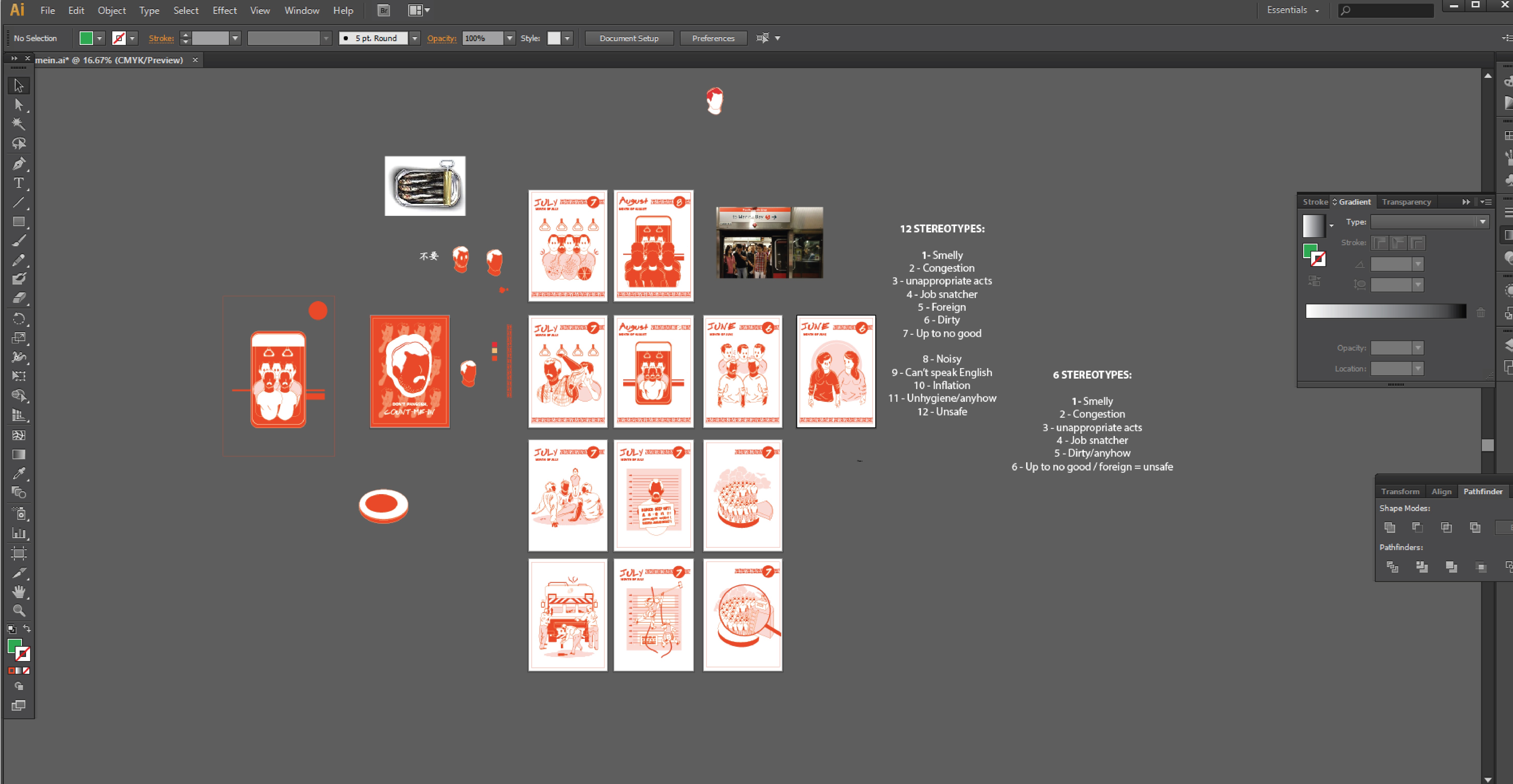
I studied human postures/figurative images (through photos that contained the particular posture I’m looking for) to better illustrate a convincing and more accurate posture. (As the illustration composition was composed by me, I have to slowly seek references parts by parts in each composition (mostly on the posture). Lines and details (such as folds on clothing and vein lines on hands) was later added in when I am done with the bigger image, this is done to ensure that the illustrations appears more convincing and dynamic.
Of style,
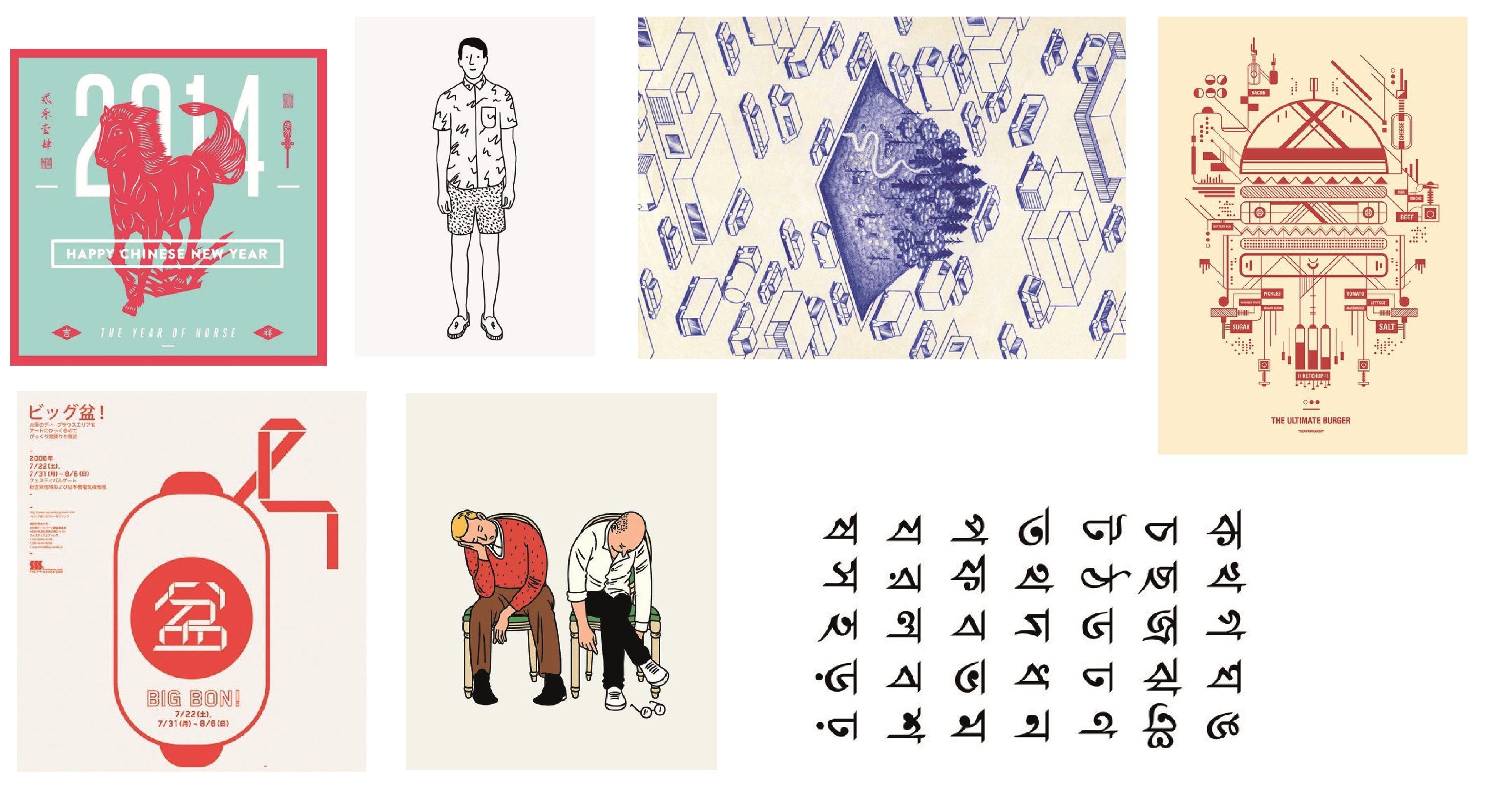
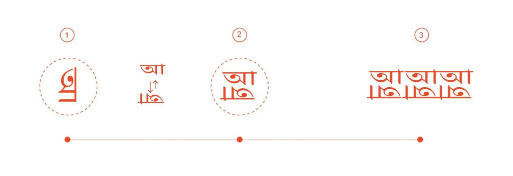
Wanted to create a calendar infused with local elements as well as a small mix of some foreign elements to highlight my concept also known as counting migrant workers into part of our culture. Which explains why reddish orange was used as the theme color. To add on this, I incorporated symbols from foreign countries into my design as well (In this case, I picked Bengali’s symbol as a general representation).
Of initial plans,

Initially, I wanted to have a fabric hard cover for my calendar. However I met several issues to get it printed. I carefully cut out this piece of fabric from an unwanted plain tote bag of mine and stick it onto an A4 sheet of paper. I tested it out by printing using my house (inkjet) printer which didn’t turn out well as traces/marks/stains was printed onto my fabric during this process. Thinking that it might be the ink leftover from the previous print, I decided to attempt on this again the next day, but it turned out the same (In fact, this time round, it’s even more messed up). Still wanting to go with this idea, I bring my material over to sunshine plaza in hoping to get it printed however I was turned down due to the fear of damaging the shop’s printers and hence, I scraped off this plan which I thought would best brings out the ‘warmth/homely’ (in relation to my topic) feel to my piece.
Tried out Japanese binding (It was really fun, hahaha I mean it!! ![]() ) It looks difficult initially but once you get the sequence, it actually quite enjoyable in terms of executing it. The only issue is that this bind does not allow one to open the book fully, which is why I decided to go with a saddle stitch eventually.
) It looks difficult initially but once you get the sequence, it actually quite enjoyable in terms of executing it. The only issue is that this bind does not allow one to open the book fully, which is why I decided to go with a saddle stitch eventually.
Of printing,

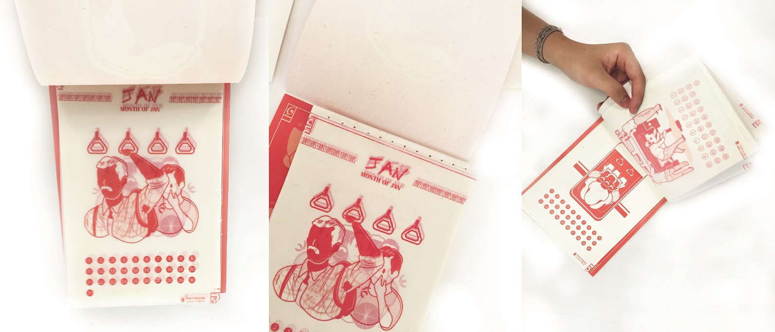
As mentioned in my final post, getting it printed in the right orientation was an issue for me which involves many try-outs. Getting it printed double sided on tracing papers was another issue as well (Mentioned in my final post). Additionally, I also tried printing on different gsm of tracing paper as well as some other papers (Such as Elefantahaut 110gsm, Muse Kaiser 105gsm and Cartacrea 220gsm), I feel that gsm between 105 – 150 would be best suited for my concept of a old school inspired calendar. The different gsm of the tracing paper actually produced a slightly different results, whereby the opacity is slightly lower for the lower gsm which makes overlaying the pieces more visible. Moreover, these tracing papers actually comes in different types as well (such as diamond, off white etc.), diamond has a higher opacity as compared to the usual. Thus, I decided to work with the usual!
Of binding,
Stitch binding was adopted as I wanted my calendar to be opened fully in order for it to work in standing mode (style 1). I did a double stitch binding, one for the pages itself and the other to stitch the covers together with the pages. This was adopted to better secure the pages. (To accomplish a more complete look of the calendar, I took off the metal hook support from my dad’s calendar to fit it on my work. hehehehe, no worries I replaced a rubber band on my dad’s calendar to fit it in place. >:D)
For the strings, I used fishing strings as they are generally stronger and more capable of withstanding wear and tear but more importantly, it matches with my concept and overall aesthetics of the old-school inspired calendar. As for functionality wise, it serves as a good support to hold the pages together. It also makes the tearing off the pages easier & clearer.
Lastly, do check out the final work over here! ![]()


