Project 3 – Zine | Final

?

Hi, here to update on the last project! Really thankful for this fun-filled and enriching 2D journey this semester which will be greatly missed! Okay, shall leave the rest of the message to the last, now back to point!


Have you ever wonder about them? – who?

Majority of the migrant workers came here to work in hoping they could possibly send back money to their family/love ones back at their hometown every month so that they could have a proper education or living. Living abroad away from their hometown and their love ones, makes everyday just like any other day. Their daily life is usually routine based every week, with little time set aside for some recreation activities.

Based on this ‘走一步,看一步’ (counting off days) living theory, where every end of the month is what they’re looking forward to each month as this is the day when their pay comes in and they could finally send them over to their love ones to ease some worries and lighten the burden, I came out with..

IMG_1116
To the left: Calendar with incorporated stand. | To the right: Old-school inspired calendar.
Print
Some images of the content.

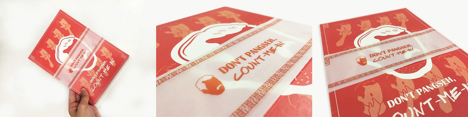
‘Don’t Pangseh (In other words, this means don’t abandon), count me in’  is a calendar designed in hoping to invite users to count the days as the days goes by, simply by peeling off the tabs with the date printed on as the day flies by. It’s the moment when you finally peeled off every possible tabs on the following month that gives you a sense of fulfillment at the end of each month. This also encourage users as well as help them to keep track of their schedule on a timely-basis.


Print
Style 1 : Calendar with incorporated stand.

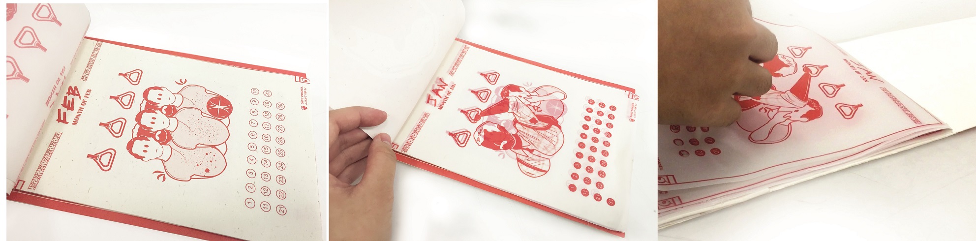
Style 1 is designed to provide a two way usage therefore on the outside, it looks like a book, whereby one could simply bring it along like your daily planner. It comes with a incorporated fold-in stand to allow users to switch between the two mode. For this style, I used tracing paper for all the content. (Forget to get a photo of the calendar in standing mode.)

Print
Style 2: Old-school inspired calendar.

Style 2 is inspired by the old-school Chinese calendars which is usually hooked onto the wall. The pages of the calendar with a particular date is usually being teared off as the day goes by. I used a mixed of paper (Tracing paper & another paper that is opaque) for the content inside. (To be further elaborated under WIP post.)


Of content,

This calendar also aims to highlight some issues faced in Singapore through graphic illustrations. As most of you know, migrant workers are often being labelled/stereotyped by the locals (not all locals but some). I wish to highlight these issues with a contrasting scenario to provoke thoughts as well as to set one thinking, in hoping that one would reconsider their actions and thoughts towards migrant workers.

Print
The covers.

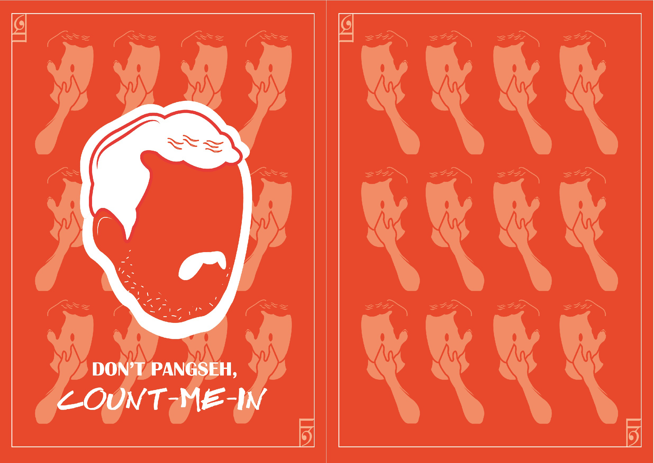
According to research, migrant workers are often being disregarded/outcast by some locals and this is often considered as ‘xenophobia(Dislike of or prejudice against people from other countries). As such, I designed my cover with  a illustration of a typical migrant worker that was deliberately designed to faceless. A group of locals was placed at the background and behind of the illustration of the iconic migrant worker to emphasize on how migrant workers are often being outcast. The locals was designed with only one eye as well as a hand held up to the eye to convey the act of judging/stereotyping (which was inspired by “one-eyed dragons” – a Taiwanese idiom which means that you only see what you want to see. – adapted from here.)

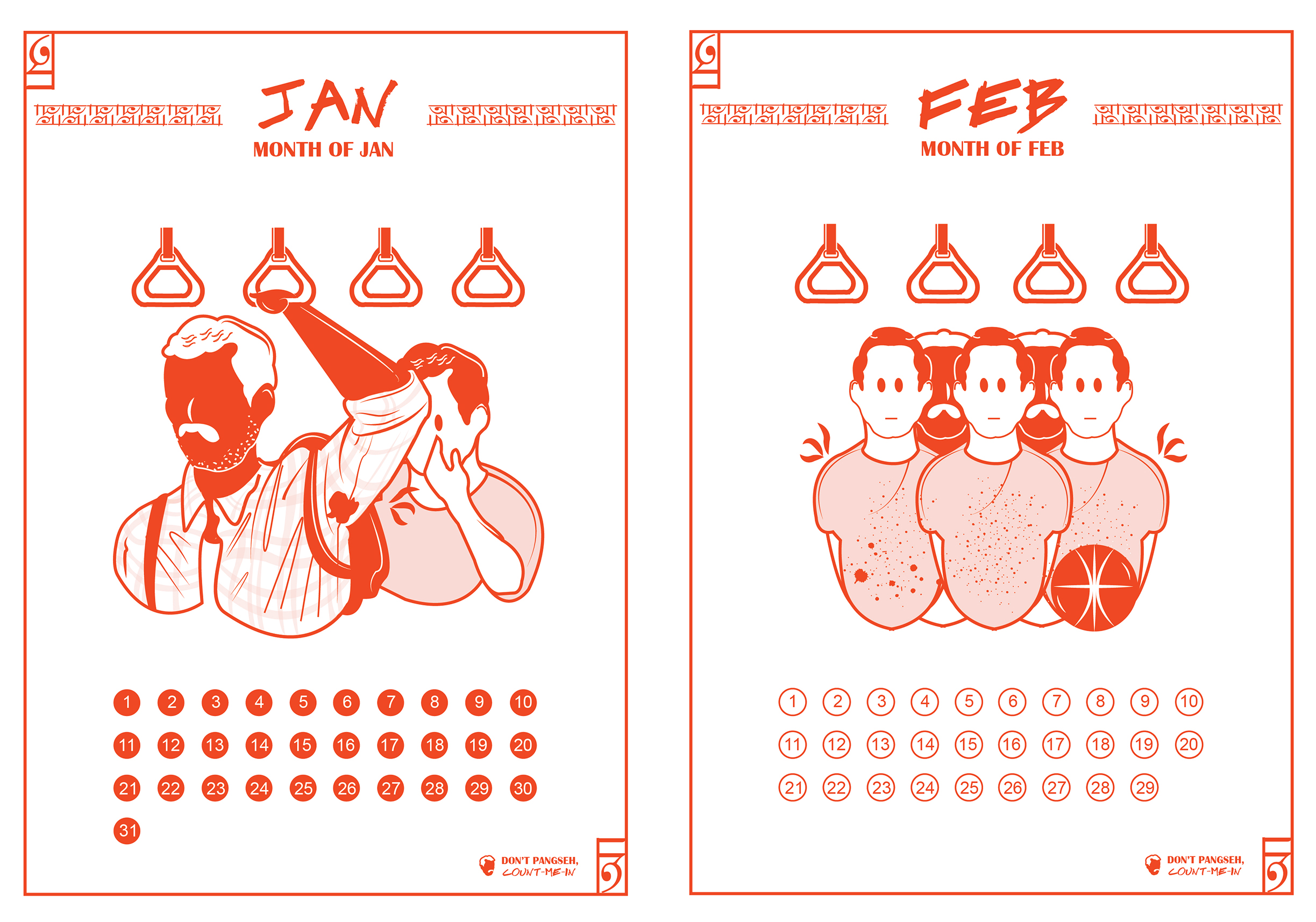
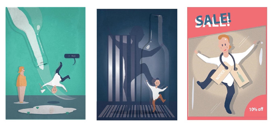
Scenario 1 depicts a local covering his nose as he stood behind the immigrant who raised his arm to hold on to a handle on the train. In response to how migrant workers are often considered as smelly by some (I’ve witnessed scenarios on the train which I will be elaborating in my WIP post). I have illustrated a contrast showing the locals after their basketball game, having stains, sweat, traces of mud and dirt on their clothes yet the migrant workers did not utter any negative remarks or behavior. – So why are we doing this to them?

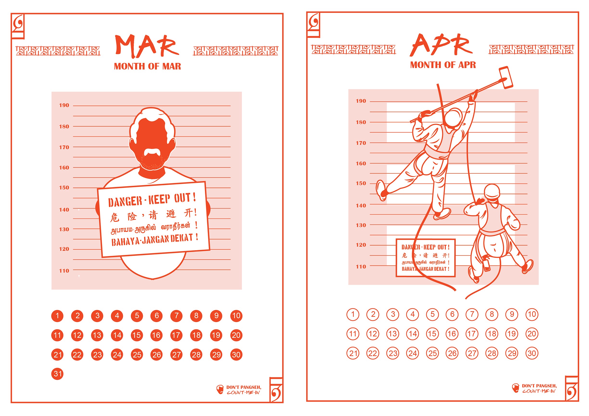
Scenario 2 depicts an migrant worker holding on to a typical danger signboard with a mugshot background (that is commonly found in Singapore construction site to warn citizens of the possible danger around the district) to showcase how the migrant workers are also often being labelled as dangerous criminals by some locals. In response to how migrant workers are often considered as the cause of the increase of crime rates in Singapore as some labelled them as being dangerous to go near to (will be elaborating in my WIP post).  I have illustrated a contrast showing the migrant workers working their way up to a building to clean the buildings, isn’t this much more dangerous than what was often being told to stay away from? -Just because they are foreign to you this doesn’t mean they are dangerous. Have one ever consider where their forefathers etc. used to come from? – So does this makes them dangerous as well?

Print
Common typical stereotype (3) : They like to PDA (Public Display of Affection).

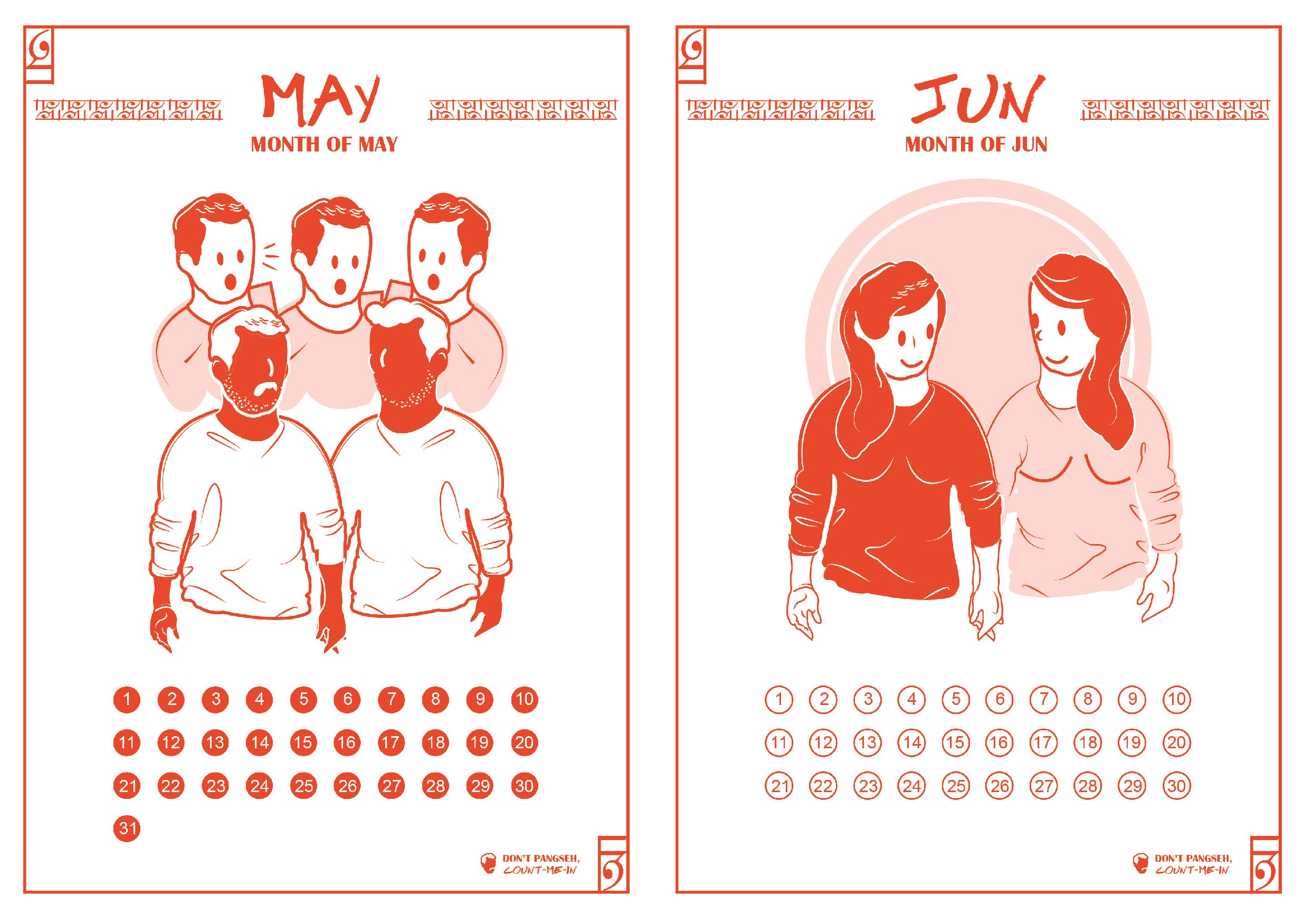
Scenario 3 depicts a pair of male migrant workers holding their hands in the public and being judged by the locals where they begin snapping image of them. (In fact, holding hands was known to be a way of showing affection, bonding, and camaraderie that all men, women and children do in other parts of Asia where some of the migrant workers come from. Thus, it’s nothing to do with one sexuality!) In response to how migrant workers are often considered as the cause of the PDA (Public dislay of affection) in Singapore.  I have illustrated a contrast showing a pair of local girls holding their hands yet wasn’t being judged (Which is really common back in the primary/secondary school days). – So why are one so quick to make judgement?

Scenario 4 depicts a group of migrant workers seated randomly out of nowhere while they enjoys casual conversations and drinks with their friends which is often being stereotyped as dirty and the cause of litters lying all over. I have illustrated a behind the scenes of these migrant workers’ job under ‘semi corp’ whereby they cleaned up litters and dirt. So doesn’t this makes them one of Singapore most important contributors for its clean & clean title?  – So why do one tend to only point out the bad point and not try to view things from another perspective to discover the good in these migrant workers?

Print
Common typical stereotype (5) : They caused congestion on public transports.

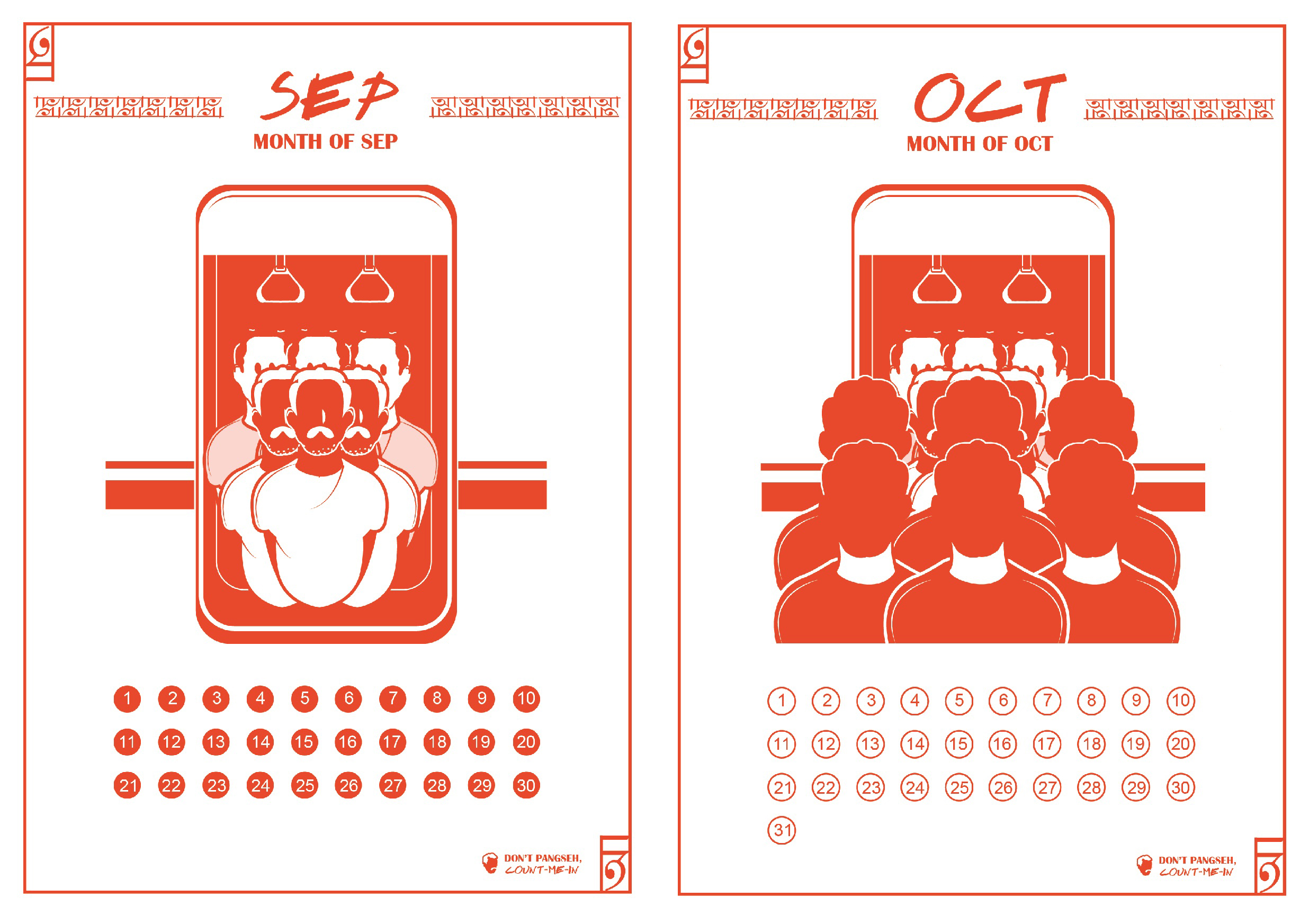
Scenario 5 depicts a a group of migrant workers causing congestion on public transport by standing by the doorway and blocking the accessibility of one. I have illustrated a contrast showing the actual underlying issues whereby the locals (kiasu spirit of some) all squeezed in front of the train door so that they can be the first to enter the train to filled up the empty vacancies which in turn caused the migrant workers to be jammed and held up by the entrance of the train. – So isn’t it unfair to push all the blame to the migrant workers? (It takes two hands to clap, thus the migrant workers shouldn’t be solely blamed for congestion of public transport.)

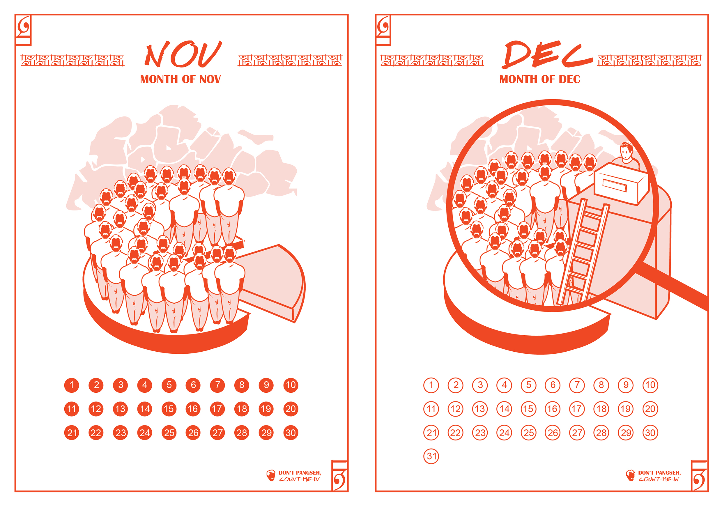
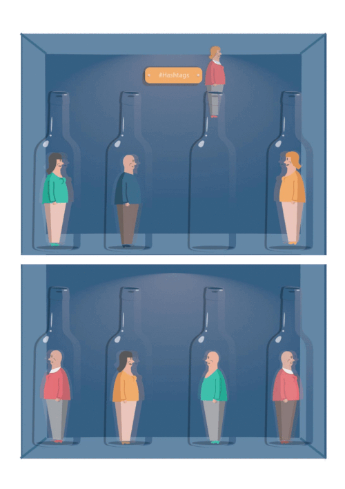
Scenario 6 depicts a pie chart which depicts how the local generally thinks of the migrant workers of taking up more than a quarter of the jobs in Singapore. n response to how migrant workers are often considered as job snatchers, I illustrated a zoom-in version of the pie chart focusing on the zoom-in portion which depicts the local seated high up to reflects the local intention and high standards when it comes to finding jobs. Generally, the migrant workers did not snatch the local’s job, instead they picked up jobs that most local abandon to seek out for a higher paid/higher-ranked job. – So how is it that they snatched our jobs?

Here’s a video attached which kind of summed up this project. (Will be re-recording the video after I get back my zine as the phone quality isn’t very clear and it’s a little messy. In the meantime, pardon the ‘sixties theme effect filter that I’ve attached in to highlight my topic!)


In conclusion, zine was definitely a fun project to work on! Faced many challenges in terms of printing and execution.

  • (1) The unusual orientation of work gives many problems when I was printing, the printer shop lady and I spent 30 minutes on test-prints to try out the orientation before it was printed onto the desired paper (can still vaguely remember the happiness within me when we finally got the right orientation after several try-outs.)
  • (2) The usage of tracing paper which I didn’t knew would be a problem became a problem when I was told by the lady that their printer couldn’t print double-sided for tracing paper. Thankfully, another printing crew (known as Jacky) discovered a solution which is to manually switched the pages over the other side as the printing on one side finishes. (Really thankful towards his patience and kind service. Hereby, I would recommend this printing shop known as ‘True colors’ for their great customer service! ? )
  • Other issues such as binding and other means of execution will be highlighted in my WIP post.

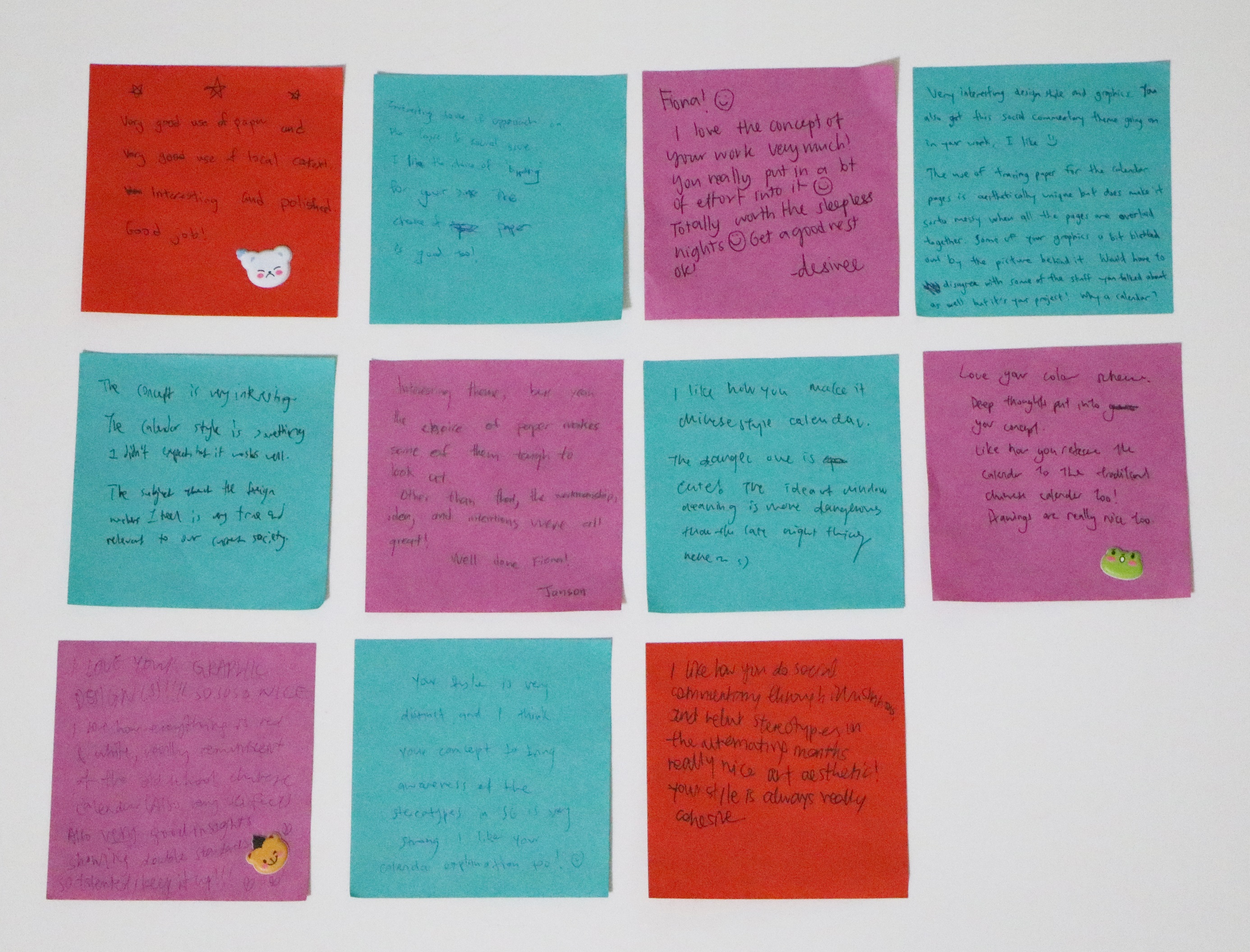
Overall, I trulyyyyy enjoyed Foundation 2D especially this semester’s class! While conceptualizing concepts for my projects, I find myself growing  in terms of my thoughts which will definitely assist me in future projects. On the other hand, I’m happy as during my executions for my projects, I’ve uncover functions and techniques on illustrator that I never knew (A recent one would be the stroke technique that actually helps to add flavor to each of your line work! It’s really useful! :)) Aside from this, I’m happy to be introduced to binding as well, which is a reallyreallllly handy technique which can be applied in other aspect! I really have fun experimenting the different binding techniques as well which really makes me consider remaking my hard-copy portfolio (by making my own binding which probably I will ?)!! Lastly, am really thankful for all the kind feed backs!

IMG_3260
Feedback from classmates.

Possible area to work on,

  • The layers of transparencies affects the audience from visualizing the visuals as the graphic illustration intercepted with one another when it’s being stacked together (In this case, style 2 works better than style 1).
Concluding this project with a photo of Desiree and I in Punjabis imported from India from another project. – Thought this is a great linkage with this project as well! One good takeaway from this project and this photo would be : ‘don’t pangseh, count them in!’ (They’re part of our culture as well :))

Last but not least, a BIG thankyou/谢谢 to Professor Joy once again for her generosity as well as the meticulous care she placed in everyone! Wishing you the best & seeya around! ?

Project 2 – Point of view | Final


LNS-03

Hi, this is Mr. Long neck (In other words, long neck also means ‘reaching out to connect’ , which is why I chose to name this project as long neck series.) Today, we will be exploring some aspects of social media , Instagram in particular. So why social media? In today’s world context, you can see how social media have impacted our lives as well as our dependency on them. Parts of social media language and actions are actually around us too hence, in this project, I wish to present them in the form of daily lives scenarios in hoping to inject some humor as well as to serve as a possible guidance (a mini introduction to some key actions on Instagram as these functions tend to be misused/over-used online at times) for new users on Instagram. Now, let’s see how these social media actions would have been in real life context.

Before I start, Here’s how the idea came about! ?


While working on the first panel, the final idea of using bottle as a metaphor crossed my mind as I was thinking how to better connect my pieces together. Having bottles in two of my composition and not the rest leads me to thinking how I could better link all these pieces together. Knowing that it would be really inconsistent and random if I were to leave the two composition and illustrate something else in the rest of the panels, I decided to relay all of my panels by using bottle as a metaphor. I tried to brainstorm how bottle could actually be used for each statements without it feeling too random and forced upon. As I work on the possible ways, I realized there are actually many possible ways than I thought and I start to visualize how I would form them visually. (Coincidentally, long neck can be used to describe bottle?) 

Here’s my final six artwork,

Final-02
Click to see the textures and details. I have incorporated layers of textures in some of the panels to suggest a different atmosphere.  – mostly grainy, grungy, subtle cross lines and noise patterns etc.
Final-03
Click to see the textures and details. I have incorporated layers of textures in some of the panels to suggest a different atmosphere. – mostly grainy, grungy, subtle cross lines and noise patterns etc.


A walk through for each pieces,

For better conveying of message, I’ve make my images into a form of small animation that roughly speaks the idea of my intended message. (PS: Some textures are not included in the animation pieces, in case you wonder why some of them looked different from the ones posted above.)
Emoticongif
Emoticon from the point of view of real life context is disguise.

Emoticon is basically a tool creates to allow us to express our emotions virtually through adorable little face icons etc. Just like the abbreviation, LOL (laugh out loud) is often used virtually even though you don’t particularly feel that way in real life. Hence, emoticon in real life context is like a form of disguise. In this case, instead of bottling up your thoughts, you bottled up your real emotion/feelings. I presented it in a form of masks (often used in context like role-playing or used to disguise/deceive), whereby layers and layers are constantly being switched/replaced whenever and wherever. The real feelings/emotion was never once shown which explains why the bottle is tinted green to indicate the transparency of one’s emotions (Generally, one can never be fully clear of one’s emotion unless it’s being expressed).

Hashtaggif

Hashtag (#) from the point of view of real life context is Classification.

Hashtag (#) is used on Instagram as a tool to categorize/classify things so you can easily locate stuffs as well as get engage and discover people who share the same common interest as you. (Such as, #HHN5 , #NDP2015 can easily link you to photos of people who had participated in these events as well.) However, nowadays hashtag are often used randomly as a trend/icon, whereby people used it as a way to gain followers etc. In the form of real life context, I will identify hashtag with sorting up of stocks in supermarkets whereby items are carefully classify under different categories to provide better shopping experience for shoppers. Another possible scenario would be, classifying peoples in different categories (stereotyping), however I find that this is not so appropriate to be used for this hence I strike off this idea.

Followgif

Follow from the point of view of real life context is affirmation/acknowledgment.

To follow someone on Instagram, might means befriending with them virtually so that you can get engage/subscribe to their updates. To be allowed to follow them also reflects their willingness to open up to you. Similarity, in real life context, I would relate this to getting consent from someone to get beyond their personal space. It’s like visiting someone’s house and getting welcome into their space. On the other hand, it could simply means getting engage in a conversation with someone. In this case, the glass bottle represents the personal space of one. To be invited into this space to engage in a conversation is similarity like the follow button on Instagram. One only allows you to follow them if they feels comfortable for you to cross their personal boundaries.

Updategif

Update from the point of view of real life context is sharing of information.

To update your Instagram, simply refers to uploading of photos/videos etc to share with your followers. Basically, sharing anything. Similarity, in real life context, I would relate this to sharing of information such as news, broadcasts, announcement or simply talking/sharing to your friend about your latest pet. In this case, sharing of information is shown through the action of emptying the bottle which also means ‘pouring your hearts out’. Similarity, to update on the other hand, is like pouring whatever content on your mind out to share.

Blockgif

Block from the point of view of real life context is restrictions.

To be blocked on Instagram, is generally most peoples’ nightmare. As this means they could no longer get access to the updates of the person they are being blocked by (In another way, it’s like being placed in a cold freezer-neglected and excluded. Hence, cool colors is used in this composition to express loneliness and segregation). It’s like literally building blocks up to form walls/barriers so as to prevents the other party from intruding into your territory/space. Similarity, in real life context, I would relate this to being locked up in places or being held up by thoughts and perspectives. To be locked up, limits and restricts you from doing anything you want. (Uses gigantic haunting dark shadow to depicts the fear of being restricted that is secretly haunting inside each of us as well as the need to be free. The bottle reflects how it feels like to be restricted, with limited space within the bottle that leaves the character gasping for air. In this case, the only way to escape is generally by breaking the glass, similarity it also means by breaking the transparent boundaries/barriers set up by the particular user.)

Taggif


Tag from the point of view of real life context is identification.

To be tagged on Instagram, can either be a nightmare or a kind of acknowledgment/recognition. I have seen cases whereby people use it as a form of recognition to recognize someone efforts such as tagging them on photos of pastries/gifts that was baked/bought by them. However, according to the developers of Instagram, tags are actually designed for users to use it to notify their friends when they upload photos or photos that includes them. Hence, to be tagged in real life context can be like a form of identification, just like the name tags that some of us used to pin on to our blouse/shirt or the brand labels found at the back of your daily apparels. It’s there serving as a form of identification/identity. It came off loud and clear even without any form of verbal communication. Thus, in this case, I presented it as a product being labelled/tagged with visuals indicating it’s on sale! Subject is also deliberately placed in a transparent package to highlight the transparency of tagging (It’s there for everyone to see). Lights are cast onto the subject itself to bring the subject to the center of attention to indicate the clarity as well as the effects of tags on Instagram.

Overall, I uses complementary colors in some of my panels (Like green and pinkish red etc). This colors was also picked with reference on the kind of colors editorial illustrators would use (usually very vibrant and saturated colors). I purposely kept white borders in these pieces to ‘frame’ them as well as to draw the viewers’ attention to my content. Referencing from my artist references/mood board, I picked up techniques like connecting of borders with objects by using similar colors so that they feels like one as well as trying my best to keep my background minimal so that the subject is clear. Lastly, shadows and contrast are also used to create volume and dynamism to my objects, not forgetting the small details such as reflections on the glass bottles are carefully illustrated with the intention to make it as convincing as possible.

Below are some photos of my work,


LNSphotos-01
Test prints on different kinds of paper. I kind of like how the wrong prints (the b/w prints) came out. Prof Joy also pointed out about unintentional lines formed when printing via inkjet printer which I didn’t notice initially.
LNSphotos-02
Close-up shot of textured effect printed onto paper as well as pieces covered with literal filters.
LNSphotos-03
Shots of the final piece printed on smooth matte cartridge paper. Uses this type of paper as it reminds me of the little postcards found in some magazine (for instance, smith journal etc) in between pages.


editorialsetup.gif
Just for visualize purpose.

In conclusion, I’m quite satisfied with the outcome of this project as it have been a really longgggggggg and slow brain baking process for me, really glad that it kind of turned out better than the possible worst scenarios I have thought of initially (while I was stuck). It took me quite awhile to pick up keywords and brainstorm ideas for each of the statement, what makes it even tougher is having to illustrate aspects of social media in real life context (but this is definitely one of the best way to convey the message more effectively). 

This project definitely stretched my brain and expanded my mind in a way. ? In terms of execution wise, I picked up a new technique of illustration ; incorporating textures in my illustration/digital painting (something that I will definitely make use of in future)! I have also slightly grown more sensitive towards contrast and colors than before (Colors was really one of my weakness even before I joined ADM as I have this tendency to use muted colors for my work, thankfully not this time round)! Not forgetting, while documenting these pieces to update, I learnt how to animate them as well (Not the best but am glad that I manage to make it :)).

However, given a chance to re-edit these pieces, I would add in more details on each character in terms of their outfit and hair (as I felt that the characters can be further elaborated). Additionally, I would include words in my other three panels and add in more bottles and human for panel 2 (#Hashtag) (both suggested by prof Joy) to make it more consistent! Last but not least, really thankful for all the kind feed backs and I am quite excited for the new project! ?


With this, I shall end off this post with one of the feed backs I got from one of my classmates, which I find amusing in particular! ?

FullSizeRender
Didn’t thought of it till you mentioned! Really so much of coincidence, hahaha! ??

Lastly, don’t forget to check out the WIP here, if you haven’t! ?

Project 1 – Typographic Portraits | Final

Hi, here to update on the final post for ‘Project 1 – Typographic Portraits’, which is officially completed! 🙂


What I observe/find out :  Blue collar jobs are often being classified as dead end jobs or underestimated in terms of knowledge and skills. But are they really what they seems to be? (Remember the scenario I shared in my previous post about purchasing fruits?)

Hence, I came up with..

IMG_556111
Here’s some photos of Workkery. ( What are some perceptions forming in your mind right now?)

Hmmm, Dirty? Simple? Dull? Messy?- No worries, just jot them all down! Before I carry on, I would like you to jot down some perceptions that was formed in your mind when you saw the above image. And if I were to tell you that each of them represents a certain profession, can you roughly guess them?

Now, scroll down and reveal! 😀


So, basically..

Workkery is a series (of four)  of instant lottery scratch card inspired’ postcards designed in hoping to serve as a reminder – ‘to give everything a chance’. This idea was driven by the idea of ‘Skin/surface/packaging’. Sometimes, we are subconsciously influenced by the media or even by our own tendency to make quick judgement towards things based on the very first impression we received, which causes us to instill certain perception towards certain things which might not actually be the truth. So, let’s take time and give everything a chance, including yourself, to learn and seek for the unknown.

Decided to work on a mini game of lottery under the coated layer to identify it with the overall concept. Lottery is like a game of chance, hope, potential and entertainment (in most countries). Jobs on the other hand, are like lottery in a way such that, we don’t know what’s ahead but working towards it might sometimes surprise us. Similarity, I believe everyone is working towards a chance (a chance to buy a house/vehicle, a chance to further study, a chance to provide for their children and family etc.), in this case, for the blue collar workers as well. (Every opportunity is a chance isn’t it?) If i were to associate myself with my work, I would say, as a major in product design/industrial design, people often misinterpret (for instance, some might think that industrial designers design industrial buildings etc.) and categorized my profession under ‘dead end jobs’ too. Hence, let’s not make quick judgement but give everything, including yourself a chance to find out the unknown!


Without further ado, here’s the instruction printed as the back of each card.

collection1-02
Some photos of the instructions printed behind the card as well as some close-up details shots.

In hoping people would take part in making an impact (by giving a chance) to the lives of the blue collar workers as well as making them feel less unwanted, I decided to drew up this concept of donating the winnings in four very different forms. (In this case, medical, Education, Transportation, Household – which are some very common forms every household faced. This four forms also showcase the chances, these workers are working towards.) 


sign1


1
Did you guess it correctly?

Outer : Painted dirty yellow for the top layer. (To be explained in WIP post.)

Using only the outline of an initial F (for Fiona),  I tried to construct an architecture for it. I arranged and stacked them in repetitive order to create an outline which resembles the incomplete building at a working construction site, where scaffolding could be seen. It is stacked in orderly manner due to the profession’s systematic nature whereby everything have to be taken seriously as they could not afford any hazards/accidents to happen within their space. Using items they are often associated with, in this case, blueprints, I make use of the nature of blueprint to create this postcard design (Which describes the textured background effect as well).


sign2


2
Did you guess it correctly?

Outer : Painted dirty green for the top layer. (To be explained in WIP post.)

For this particular piece, I played with types and initials of my name, in this case, Fiona. The types is carefully constructed to ensure that they connects to one another which resembles the function of the water pipes. (Which is to transport water.) However, making sure that water is being transported around a country is what makes it tedious whereby lots and lots of thinking is involved. Thus, I arranged the water pipe looking types in a way such that it eventually forms a shape of Singapore (on the map). This profession is probably one of the reason for us being ‘connected’ in a way. (Thus, I constructed my name among the maze of pipes, to convey the idea of me remaining ‘connected’ thankfully to this profession.


sign3


3
Did you guess it correctly?

Outer : Painted dirty brown for the top layer. (To be explained in WIP post.)

What does miners do? – They mine! (Something that I thought too.) But in fact, they don’t just mine. They build tracks inside the mine, transport extracted materials within the mine and as well as to the surface too. Thus, using hexagons (which reminded me of honeycomb, whereby the bees goes all over, from flowers to flowers to gather nectar. Similarity, the miners goes around mining/picking to in hoping to extract some useful materials out of it, some rocks mine contains useful extracts while some doesn’t), I constructed a maze-like path way and linked the tracks to form my name. Some hexagon was deliberately illustrated with white outlines to illustrate the visibility at the mining site as well as probability of locating/extracting an useful material which is often uncertain.


sign4

4
Did you guess it correctly?

Outer : Painted dirty orange for the top layer. (To be explained in WIP post.)

Using items this profession is often associated with, in this case, circuit boards, I make use of the nature of circuit board to create this particular postcard design (Which describes the textured background effect). Thus, colors such as yellow, blue, red, green and black are illustrated in the above design as they are colors commonly found in electrical wires. The colored boxes were grouped in a colored grouping as to emphasis on the job’s systematic nature. I placed a photo of my name pieced together using pvc pipes at the background to emphasis on the importance of this profession to my major, it’s basically what connects me and my major which requires a certain amount of knowledge in physics, yet it’s often not known.


FinalPhotos
Some photos of the printed postcard design.

IMG_5563
Here’s a photo of my classmates after scratching off the ‘skin’ of Workkery. Thank y’all for participating in the class presentation demo as well as the lovely smiles (even though I force you guys to smile! HAHA :D) – (Special thanks to : Left to Right: Jia Hui, Ziyaad, Leon and Zhou Hui. )

In conclusion, I reallyreallllly enjoyed myself while doing this project even though I got stuck while brainstorming for the designs of my postcard. Despite of this, I am still satisfied with the outcome of it and I am truly happy having to witness people interacting with my postcards. It’s far more exciting than scratching the coating off by myself (Maybe it’s because I already know what’s inside..)

Guess lottery does gives people a moment of excitement till the final results is revealed. Therefore, let us all treat the unknowns in our lives as a game of lottery, take time and effort to slowly find out what it actually contains. Sometimes… you will be surprised! Another thing I would like you to take away from this presentation would be: the amount of effort/time applied = the amount of things you learnt (Similar to the action of scratching off the top layer off the card)!

Last but not least, thank y’all for your kind feed backs and it was really naiseee to see everyone’s work and learn along the way. I’m also glad that Professor Joy reminded us to cut down on 3D elements and only use it to enhance our work later, I feel that this pushes me to think further of how I would like it to be executed. If not, I would have probably end up relying too much on 3D elements to present my work! (PS: for being too wordy, hahaha!) 😀

Will be posting Workkery’s WIP (will be touching on choice of paper/colors/process etc.) after this post later on, do check back later! 

 (PS: To view the WIP work, simply click here)