Project 3 – Zine | WIP

Hi, this post will be covering on the walk-through of my process for Zine.  ?

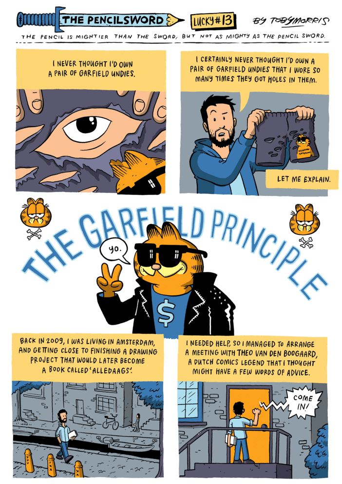
During the first consultation on week #11, I wasn’t exactly sure what I would like to have in my zine as content. Was telling professor Joy that perhaps it will be a mix on my project 1 – Workkery and project 2 – Long neck series (LNS) which is both having to do with social related issues however, professor Joy pointed out that they are each very different actually (which I didn’t thought of initially). – Workkery is about the play of chance whereas LNS on the other hand, is more whimsical. That night, I came across this comic by Toby Morris (The pencilsword series).

Pencilsword13_01 Pencilsword13_02 Pencilsword13_03 Pencilsword13_04

Which set me thinking of what exactly is my point for this project?

(1) What message am I trying to relay here?
(2) How can I better convey these thoughts and ideas in my head? 


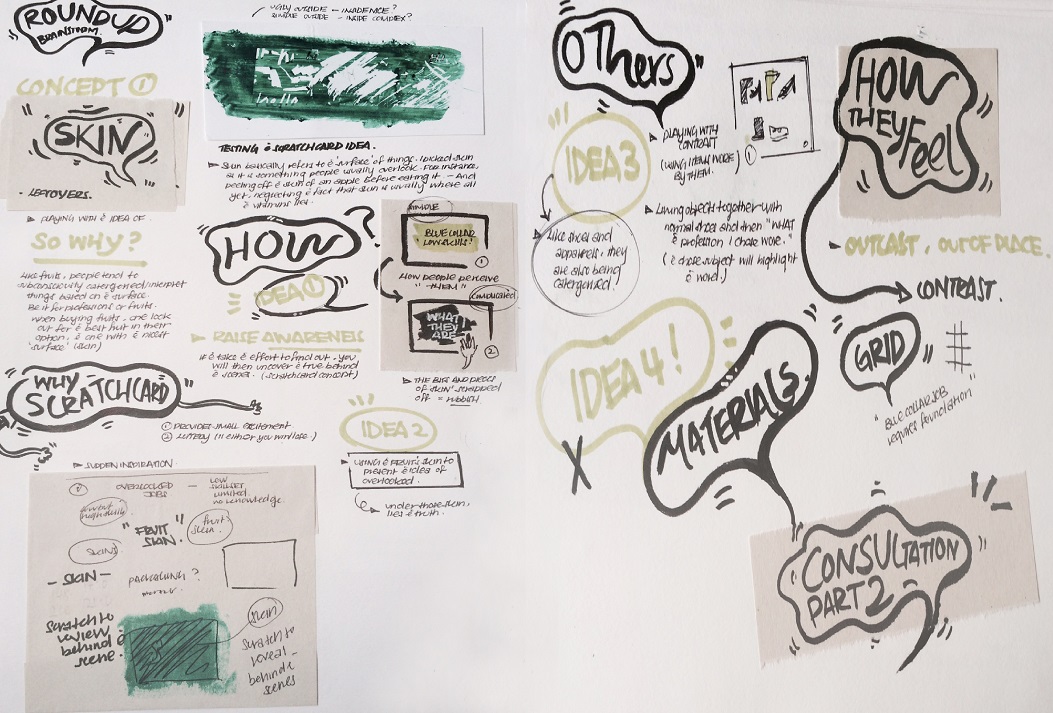
I drew up a mind map (in my journal) to sort out my thoughts. Eventually I come to a conclusion to work on something along the line of my first project. I started researching on some blue collar jobs issues which eventually leads me to my final subject, the migrant workers. I came across many interesting articles and stories which I would encourage one to spend some time to look through. 

Here’s some interesting ones that I have looked at: 

Some read-ups:

http://ifonlysingaporeans.blogspot.sg/2012/06/singaporean-foreigner-divide.html?m=1

http://news.asiaone.com/News/Latest+News/Singapore/Story/A1Story20120826-367701.html

https://storify.com/Eunaizeee/discrimination-against-foreign-workers

Some video documentaries/reports:

(For this 2 URL links below, you have to click on it to be directed to it.)

https://www.youtube.com/watch?v=rIMGSrJVNmo

https://www.youtube.com/watch?v=TAHoBsbJkik


Personally, I love to work on social/lifestyle related issues. I always enjoy designing lifestyle related products as it’s always satisfying/happy to witness your target users using/testing your products (moreover, it isn’t just any product but one that improves on their needs). Through those test-outs, you can better improve your designs to cater to their needs. Perhaps, this is why I always enjoy designing things in relation to social related issues in hoping to make improvements (if possible).

After reading up on articles and browsing through video documentaries, I’ve decided to work on a social commentary, however this time round, I won’t be dealing with jobs but some common typical stereotypes that was created for the migrant workers who came over Singapore to work. (was also inspired by Bernice Wong’s work , she usually deals with social issues by interviewing and understanding her subjects before she capture their daily lives. One of my favorite work of hers would be, in Limbo. It highlighted issues that was usually not seen behind the life of these workers, which leaves one with lots of thoughts (感触) after browsing through the collection. ) –  However, to do something like this will required a longer time to get to know these migrant workers before documenting their life journey etc. Thus, I decided to work on something manageable within the time frame given.


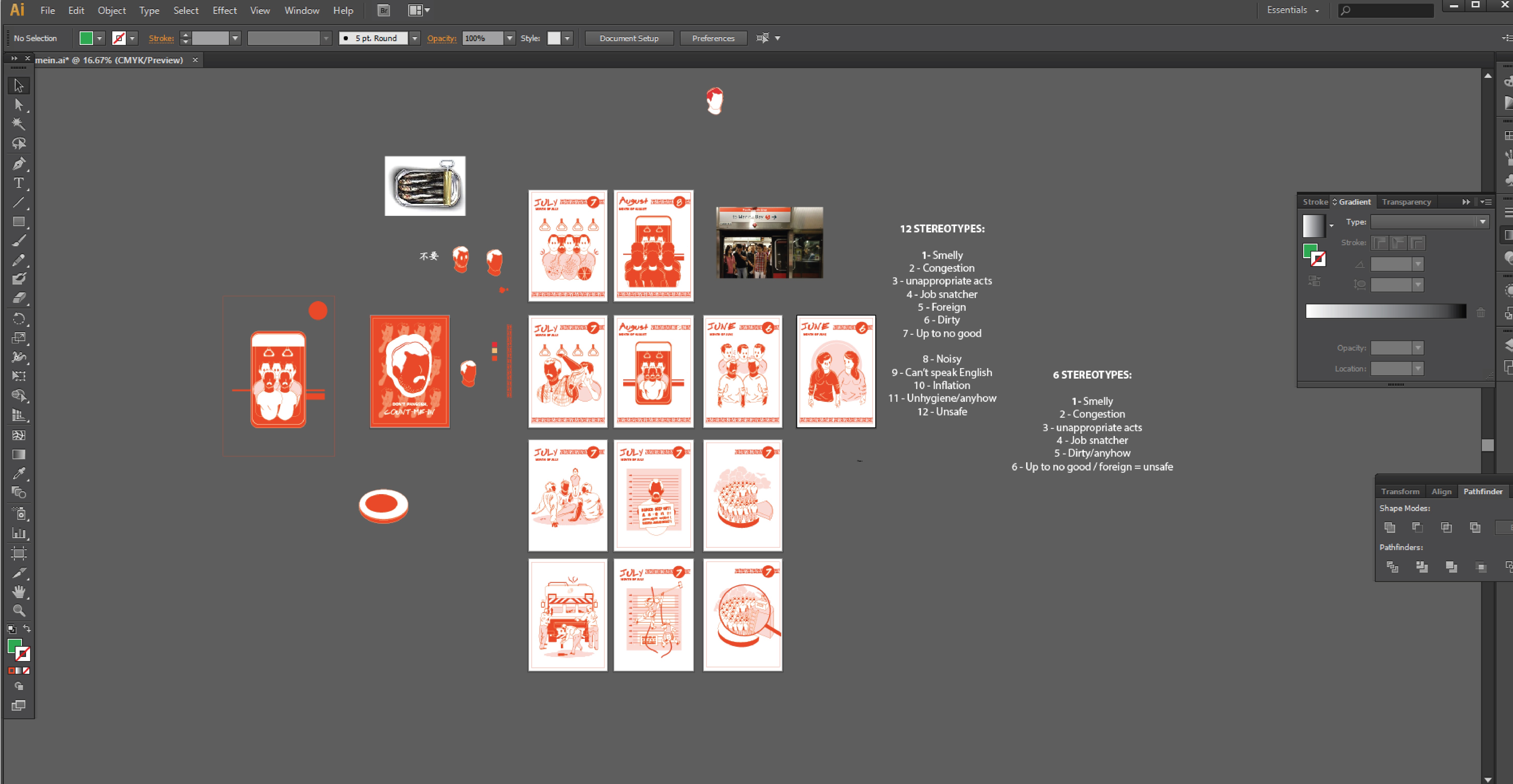
Common typical stereotypes that I’ve identified during my research :

(1) Smelly
(2) Dirty
(3) Job Snatcher
(4) Cause of congestion
(In public spaces/transport)
(5) Cause of more crimes
(6) Dangerous
(up to no good)
(7) Foreign
(does not belong here)
(8) Inflation
(9) The PDA 
(Public Display of Affection)
(10) Noisy 

Decided to group some of the stereotypes as one since they’re quite similar. In the meantime, I scraped off some too as I will only be illustrating 6 points with a contrast each (making it 12 to suit the format of a calendar which usually consists of 12-months).

(1) Smelly
(2) Dirty
(3) Job Snatcher
(4) Cause of congestion
(In public spaces/transport)
(5) Cause of more crimes | (6) Dangerous
 | (7) Foreign
(8) Inflation
(9) The PDA 

(10) Noisy


(I have also identified some possible contrast that could be highlighted to counter in response to the common typical stereotypes given to these migrant workers. They are all listed below.) I am doing this to highlight on things and issues that we often missed out when we focus too much on the small details/perception that was being instill in our mind. In this case, generally too much on the negatives hence, why not take a look at the positive instead? (The FD professor always told us to look at the bigger picture to have a clearer image/view. Which does makes a lot of sense.)

(1) Smelly

Regarding this common typical stereotype, I’ve witnessed this many times on the MRT (Mass Rapid Transit). Scene (1) – where a commuter changed her seat to a seat away from the migrant worker as the migrant worker sat down beside her. Scene (2) – where a commuter actually pinched her nose and glared at the migrant worker when he moved beside her. 

Contrast: Everyone smells after a strenuous day at work/school so before making any negative remarks, ask yourself, is there a day whereby you felt that you smell really bad yet you wasn’t being discriminated? – So how would you feel if it happens to you?

(2) Dirty

Scene (1) – There was this one time when I was at a hawker and I overheard a conversation between a mother and a child. 

The conversation goes like this:

Girl: I think I will eat ‘u-mian’ (A kind of noodle).

Mother: Don’t want la, the store looks unhygienic! You see the tender is PRC (People’s Republic of China). Eat other things la.

It’s not very nice to discriminate one based on their nationality. At times, people would instill a certain perception they have seen in part of that particular country and assume everything that belongs there is similar as well. I realized that it doesn’t necessary apply to all areas of that country even though they may be living at the same country, it’s not necessary that the culture within that segment is the same as the others. (Learnt about the some of the differences from my friend who isn’t local, and it really just isn’t what it seemed to be at times.)

According to my research, I have come by videos whereby some locals make a commentary that these migrant workers actually dirty the place and leaves litter behind from places to places as well.

Contrast: Who’s the one who cleared your trash from your HDB (Housing and Development Board) ‘s rubbish chute? The one who sweep the corridors of your HDB flats?

(3) Job snatcher

Migrant workers are often being identified as job snatchers (not by all locals only some of them) and the culprits that leave a number of locals jobless.

Contrast: Before labeling the migrant workers as job snatcher, consider the jobs this migrant workers work as and ask yourself if you would take up this job at the first place? If no, how does it make sense if one were to identified them as job snatcher?

(4) The cause of congestion

The cause of congestion in public transportation was also placed onto migrant workers.

Contrast: There’s this sayings that says : it takes two hands to clap. – have one ever consider that congestion only happens when commuters don’t cooperate? So if the blame was placed onto the migrant workers, this makes all of us at fault as well.

(5) Dangerous

Some locals identified them as being dangerous. – often see some local parents telling their child not to go near to the migrant workers as the parents associate the migrant workers as being foreign thus, dangerous due to the fear of unknown.

Contrast: If migrant workers are considered as dangerous as they are foreigners (which some claimed that they don’t belong to our city), have one ever consider – What about your forefathers who actually came from other parts of Asia?

(6) The PDA

Migrant workers are sometimes seen holding their hands. When this happens, they often either get glared/judged by people and some even judged and questioned about their sexuality. (In fact, there’s a culture of holding hands back in their hometown which wasn’t known as many locals in Singapore. It is known to be a way of showing affection, bonding, and camaraderie that all men, women and children do in other parts of Asia where some of the migrant workers come from. Thus, it’s nothing to do with one sexuality!) 

Contrast: If this is wrong, what about girls holding hands? – Why isn’t it wrong?


Of Concept of  ‘走一步,看一步’ :

I remember something one of my lecturer once told me about. This lecturer of mine is here at Singapore to make a living to support his family while they are living overseas at UK for his daughter’s education. He was telling me how everyday (Weekends are usually being cater for your family yet to him every Saturdays and Sundays feels like any weekdays since they aren’t here.) to him makes no difference at all, it’s just the same everyday. Which I find it very relevant to the migrant workers’ life over at Singapore as well. (This reminds me of a Chinese saying –  ‘走一步,看一步’ – This saying basically means to lived as it goes.)

Why a calendar? :

With this, the idea of doing a calendar strikes me as it reminds me of the above concept through counting days as it goes. It also sparked off our ideas such as every last day of the month is the welcome of a new month, on the other hand, it could also means pay-day! I was wondering perhaps, this would be the day one will be looking forward to every month, which makes me derived to..

3 initial ideas (Didn’t managed to snap a photo, all of them are in my journal). For this initial try-outs for these 3 ideas, I tested it out on soap paper, newsprint paper and tracing paper. (Also noticed that they actually have a very different surface on each side of the paper, one side appeared to be rougher than the other.)

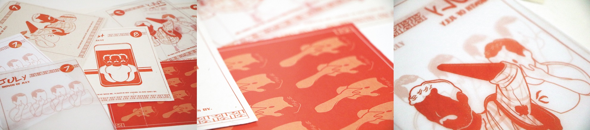
(1) Scratch off calendar

Scratching off the dates as the day goes by and slowly as it reaches the last day of the month, you will uncover the whole bigger graphic illustration at the background for that particular month. This was designed in hoping people would better managed keep track of their schedules and dates (by using the nature of one’s curiosity).

However, there’s many things to consider for this (If the dates were placed on the graphic illustration itself with a layer coated for scratching). Some points highlighted during consultation would be the possibility of inconsistency of the placements of the dates for each month because of the differences of  each graphic illustrations.

(2) Side-by-side contrast 

Showcasing the contrasting images side by side.

(3) Flipping contrast calendar

Using tracing paper to create the play with the ‘disappearance and appearance of objects to showcase the effects of the contrast.

Some suggestion from the group consultation:

(1) Maybe you can do it in the form of peeling off such as perforated tabs instead?

(2) Stick the second first and second last page to your cover page for best support when it’s being switched to standing mode. (tried out but it doesn’t work.)


Of creating the general identity,1-01

I designed the migrant workers based on how they generally look, usually in plaid collar top and moustache (Having a moustache was part of their culture back at their hometown, as it is believed that it symbolizes masculinity etc.) I seek a more subtle approach (in case, it might be sensitive) for the skin tone by using a color set for the theme of my work, for the identity of the locals, I reversed the colors so that the illustrations will look consistent as a whole. Facial features weren’t added to highlight the fact of how these migrant workers are often disregarded by some (anonymous and invisible at times).

Initially wanted to design them with a mask on to convey the message of not being recognized but I realized that it could be interpreted wrongly as technically, masks are usually used to convey the message of ‘disguise’ etc. which wasn’t what I’m going for. I thought the third design was quite interesting however it can also be interpreted as being blended in.

Of illustrations,

screenshot-01
PS: Forget to save some of the study figurative parts photos, only kept 2 of them 🙁

I studied human postures/figurative images (through photos that contained the particular posture I’m looking for) to better illustrate a convincing and more accurate posture. (As the illustration composition was composed by me, I have to slowly seek references parts by parts in each composition (mostly on the posture). Lines and details (such as folds on clothing and vein lines on hands) was later added in when I am done with the bigger image, this is done to ensure that the illustrations appears more convincing and dynamic. 

Of style,

ref-01
Mood Board referencing. – Some of the inspired style!

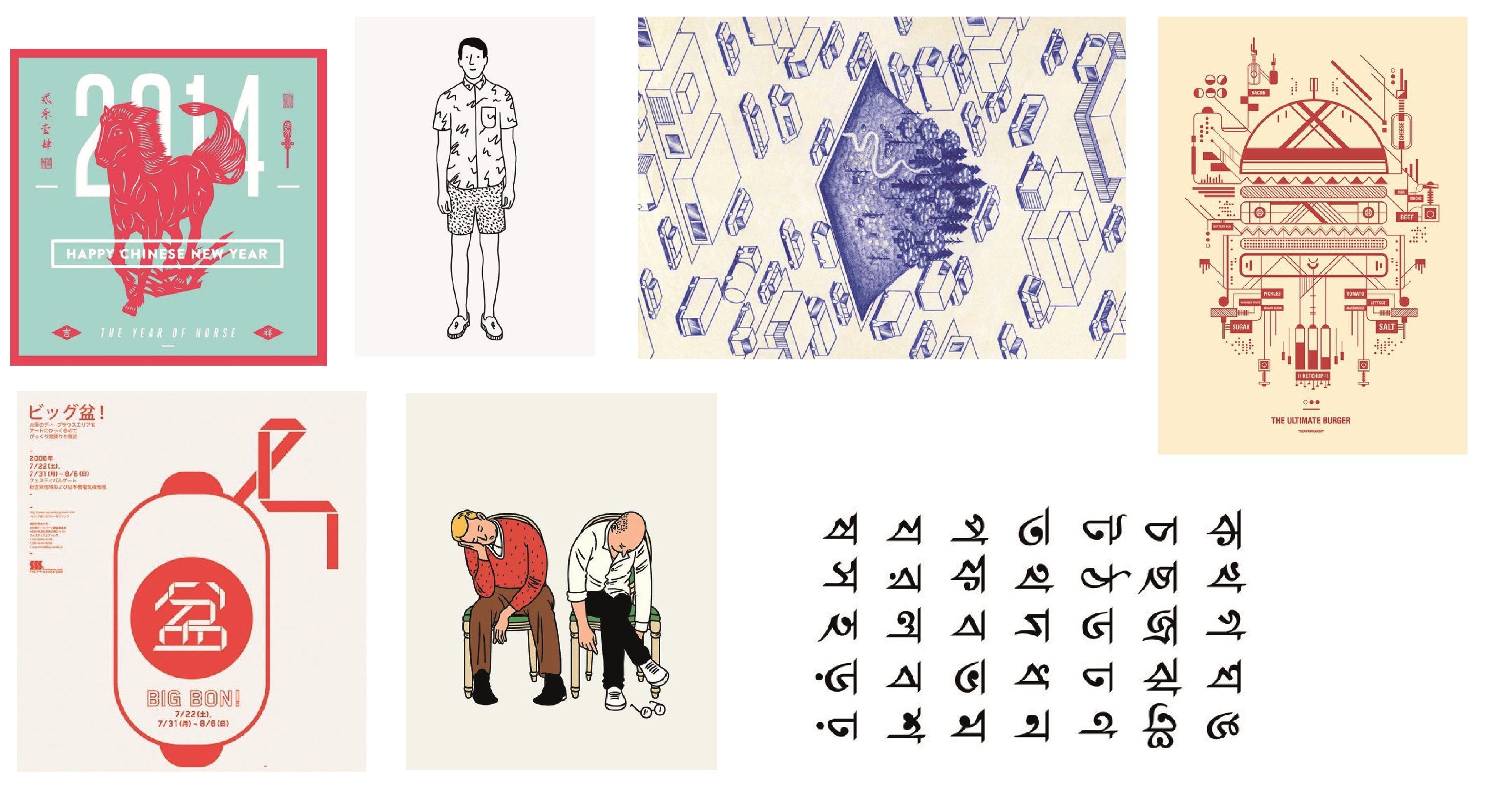
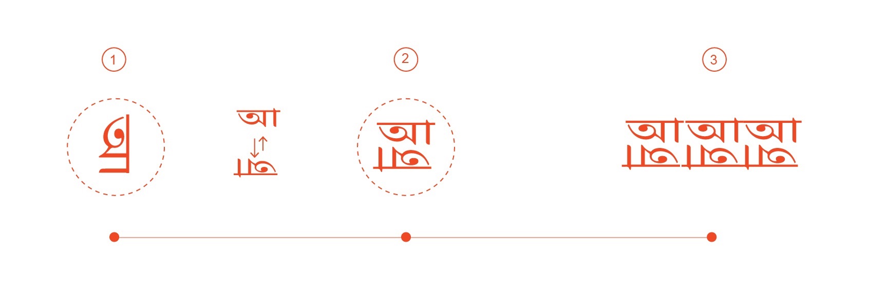
Wanted to create a calendar infused with local elements as well as a small mix of some foreign elements to highlight my concept also known as counting migrant workers into part of our culture. Which explains why reddish orange was used as the theme color. To add on this, I incorporated symbols from foreign countries into my design as well (In this case, I picked Bengali’s symbol as a general representation).

Of initial plans,

Print
Click to look at the textures of the cloth. Rough textures and faded colors to symbolize home, warmth and the down to earth nature of the jobs of the migrant workers.

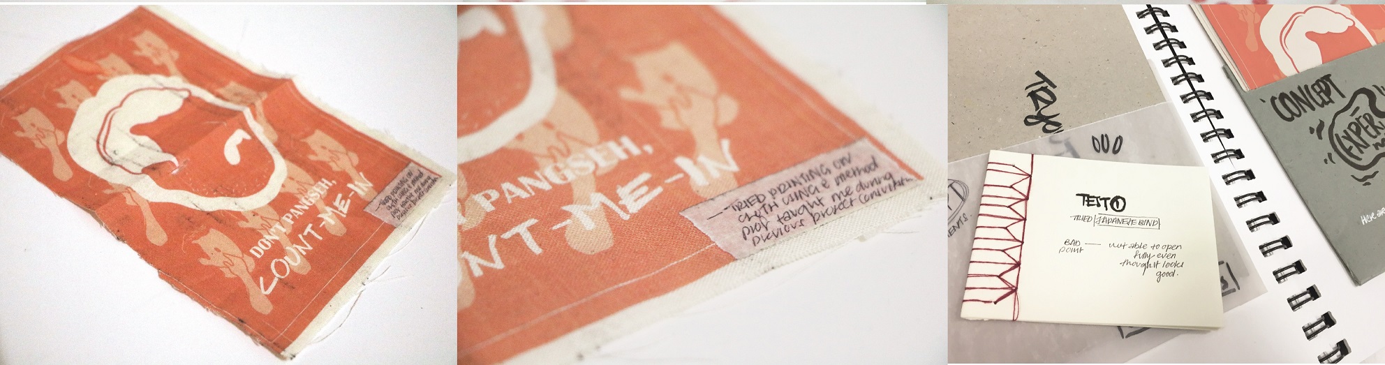
Initially, I wanted to have a fabric hard cover for my calendar. However I met several issues to get it printed. I carefully cut out this piece of fabric from an unwanted plain tote bag of mine and stick it onto an A4 sheet of paper. I tested it out by printing using my house (inkjet) printer which didn’t turn out well as traces/marks/stains was printed onto my fabric during this process. Thinking that it might be the ink leftover from the previous print, I decided to attempt on this again the next day, but it turned out the same (In fact, this time round, it’s even more messed up). Still wanting to go with this idea, I bring my material over to sunshine plaza in hoping to get it printed however I was turned down due to the fear of damaging the shop’s printers and hence, I scraped off this plan which I thought would best brings out the ‘warmth/homely’ (in relation to my topic) feel to my piece.  

Tried out Japanese binding (It was really fun, hahaha I mean it!! ? ) It looks difficult initially but once you get the sequence, it actually quite enjoyable in terms of executing it. The only issue is that this bind does not allow one to open the book fully, which is why I decided to go with a saddle stitch eventually.

Of printing,

Print
Photos of the prints on different papers.

Print

As mentioned in my final post, getting it printed in the right orientation was an issue for me which involves many try-outs. Getting it printed double sided on tracing papers was another issue as well (Mentioned in my final post). Additionally, I also tried printing on different gsm of tracing paper as well as some other papers (Such as Elefantahaut 110gsm, Muse Kaiser 105gsm and Cartacrea 220gsm), I feel that gsm between 105 – 150 would be best suited for my concept of a old school inspired calendar. The different gsm of the tracing paper actually produced a slightly different results, whereby the opacity is slightly lower for the lower gsm which makes overlaying the pieces more visible. Moreover, these tracing papers actually comes in different types as well (such as diamond, off white etc.), diamond has a higher opacity as compared to the usual. Thus, I decided to work with the usual!
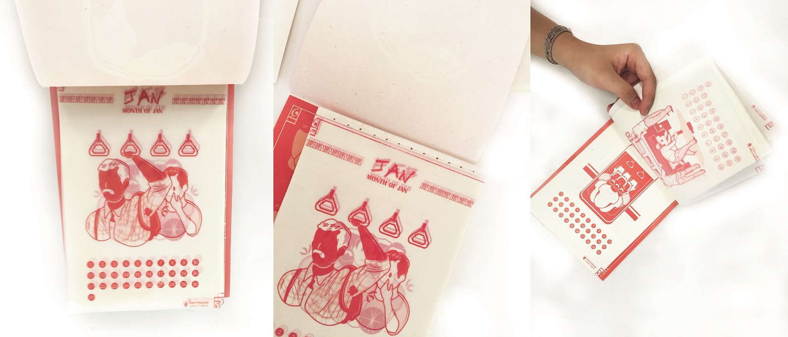
Print
Piercing holes and aligned them a cm between one another before stitching.

Print

Of binding,

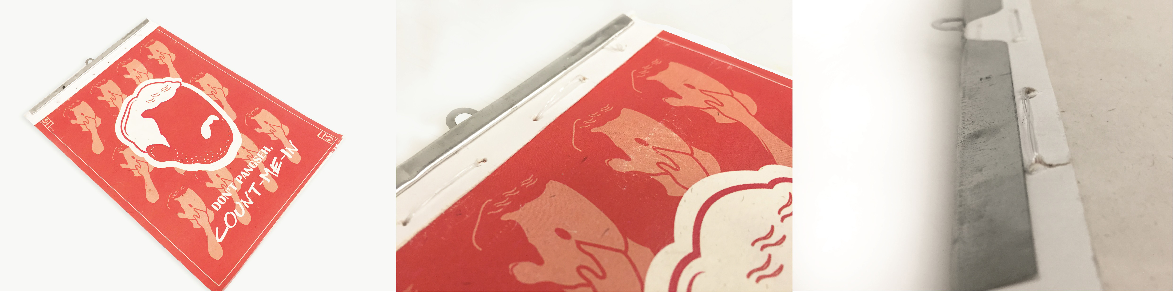
Stitch binding was adopted as I wanted my calendar to be opened fully in order for it to work in standing mode (style 1). I did a double stitch binding, one for the pages itself and the other to stitch the covers together with the pages. This was adopted to better secure the pages. (To accomplish a more complete look of the calendar, I took off the metal hook support from my dad’s calendar to fit it on my work. hehehehe, no worries I replaced a rubber band on my dad’s calendar to fit it in place. >:D)

For the strings, I used fishing strings as they are generally stronger and more capable of withstanding wear and tear but more importantly, it matches with my concept and overall aesthetics of the old-school inspired calendar. As for functionality wise, it serves as a good support to hold the pages together. It also makes the tearing off the pages easier & clearer.


Lastly, do check out the final work over here! ?

Project 2 – Point of view | WIP


Print
So.. earlier this week, I carelessly deleted one of work file for this project while replacing my dying hard-drive for my laptop but good news is .. thankfully, I still have one initial WIP file (with big shapes but no details) with me! Which makes redoing it less painful, sorry if some of the details isn’t the same as before! – Tip: remember to open up any file to check before deleting!

Back to point, just like Mr. long neck’s longggggggggg neck, this is going to be a longgggggggggg post, will be covering my initial steps in this post as well. ☺️(PS: Organized my stages of progress in segments using lines, hope it’s clearer!)


Like everyone else, I’ve my own fear too. I used to have ‘Aichmophobia’, a fear for sharp objects, but for my case, particularly penknife and stitching. I was greatly traumatized by an accident that happened when I was 9. 8 years later, I am faced in a situation whereby I have to deal with pen knives almost every week that it soon becomes a habit and eventually got me out of this trauma (hmm, a blessing in disguise probably, haha!), it was definitely a long process as whenever I held on to a pen knife, my palms gets sweaty and shaky. What adds on to this is having to hold on a pen knife using my scarred hand. Thankfully, now it’s no longer an issue anymore!  (Okay, enough of my long-winded story. Now, back to point.) ☺️

This is why I decided to start off this project with the topic on fear as fear is something everybody has experienced throughout their lives. I looked into both rational and irrational fear and came out with three concepts (being: (1) Point of view from a person who suffers from social anxiety, (2) Some irrational fears social media have caused and lastly, (3) using face which I consider as the most vulnerable part of one to portray each rational fear. After my first consultation and further brainstorming, I decided to further develop concept (2). In terms of our current context, I thought that concept (2) will be better understood by some after all it’s regarding social media! 


With this, I came out with a few sentences based on some of these popular social networking sites/applications commonly used in today’s world context. Also managed to bounce off some ideas during lunch with Desiree and Jie lin which derived me to my final concept of bringing social media context into real life. ☺️

Sentences I came out with  :

(initially wanted to create humor as to remind one that social media actions are not a big deal so there’s no need to worry/put so much stress when being excluded/neglected on social medias. As research have shown that communication/actions on social medias tend to affect users emotionally.)

(1) Blue tick is a silence form of acknowledgement.
(2) Tagging is just a label.
(3) It’s important to have your own opinions. Don’t follow.
(4) Befriending with you virtually doesn’t make us friends in reality.
(5) Virtual likes can’t buy you real likes.
(6) Emoticon is more than just an icon.


stage2-01
Initial conceptualize stages – mind map, ideas and finally, a concluding mind map.

During my second consultation as a group, some classmates pointed out that there might be ‘noises’ in my work, whereby my viewers might not be able to visualize my intended message in some of my panels, which I kind of agree as well. Was also discussing whether to use a single panel or several panels for each statement to narrate the point across as several panels tend to works better in narrating without words as audience can always look at the next panel to figure out what’s happening in the previous panel. However, there’s too many considerations/concerns to be wary of, particularly space and time constraints. Thus, classmate suggested to include sentences or words in panels to hint audience about its content. Was still in confusion after consultation, thankfully Prof Joy offered some time to clear up my doubts. Prof Joy suggested using real life situations to illustrate each social media context so that viewers can better interpret my point. She also suggested to focus on one social media, to narrow down my focus so that it will be easier to tackle them. 


Breaking down of information.

Drew up a concluding mind map to refresh my mind that evening. Decided to put my focus on Instagram, one of the widely used social networking service catered for one to record moments through capturing photos and videos to share with their friends. Identified and looked up on the functions of some of the commonly virtual actions such as tag, emoticon, hashtag, follow etc before drafting out my final point of view statements. Additionally, to avoid clashes, I picked out 6 actions that are slightly more different with one another, below are the 6 actions I’ve picked out.

In social media context,

(1) Emoticons – is to express your emotions virtually.
(2) Hashtags – is to categorize topics to allow users to engage with people of common interests.
(3) Follow – to follow is to get engage with someone’s updates or to make friends.
(4) Updates – is sharing snippet of your daily lives.
(5) Un-follow/Block – is to unsubscribe people from viewing contents you’ve shared.
(6) Tag – to notify your friends that you’ve upload images & they’ve been tagged in them.

6 finalize point of views that I’ll be looking at :

(1) Emoticon from the point of view of real life context is disguise
(2) Hashtag from the point of view of real life context is classification.
(3) Follow from the point of view of real life context is affirmation/acknowledgment.
(4) Updates from the point of view of real life context is sharing/broadcasting.
(5) Un-follow/Block from the point of view of real life context is restrictions.
(6) Tag from the point of view of real life context is identification.


Of looking at references, 

Joan cornella-01
Initial artist reference – Joan Cornella. Whereas, for my finals pieces, I further proceeded on to look into other illustrators such as John Holcroft, Emiliano Ponzi, Tom Haugomat and Malika Favre.

With the intention to portray my work in a less intimidating and witty yet thought provokingmanner , I looked into some examples of how humor was usually presented in editorial design. Why editorial design? Since my concept is ‘bringing digital context to real life context’, I thought editorial design/prints is a great reference to look into.(* Mood Board Click to view style & references I’ve gathered/referenced to.)  

Characteristics of their illustrations :

(1) Usage of color blocks.
(2) Clear focus on subject (with minimal background in some pieces).
(3) Usage of textures.
(4) Great contrast of shadows.
(5) Flat illustration style.
(6) Similar usage of color for object and border makes them feels as though they’re one.


Of designing character, 

IMG_2315
Exploring character style – to find the ‘ideal’ type that gives off a sense of humor. Picked out a particular distinct feature from some of my them to finalize my character design.
LND
Finalize Character – Mr Long Neck. (Think the neck can be longer though, hahaha ? ) 

Of brainstorming, 

Referencing from examples prof Joy suggested, I came up with some new ideas for each statement as well. 

Print
Construction of ideas – used tracing paper to trace out parts of my character to ensure that it remains consistent in all panels. The ideas were then scanned in my laptop and further enhanced.
Initial ideas for ‘Emoticon’. 

Emoticon in real life context,

Panel (1) :  is like invisible imagery of another you.
Panel (2) :  is like disguise/hiding your real emotions.
Panel (3) :  is like an act of role-playing.

initialdesign2
Initial ideas for ‘Hashtag’.

Hashtag in real life context,

Panel (1) :  are like a fashion icon/trend/accessory.
Panel (2) :   are like seasoning to your food, which adds on flavor to them.
Panel (3) :  are like an act of categorizing/stereotyping.

initialdesign3
Initial ideas for ‘Follow’.

Follow in real life context,

Panel (1) :  is like welcoming someone into your house also known as personal space.
Panel (2) :  are like shadows, the more you follow, the bigger it gets.
Panel (3) :  is like having cliques and getting engage with each other lives.

initialdesign4
Initial ideas for ‘Update’.

Updates in real life context,

Panel (1) :  is like the updates of prices in stores.
Panel (2) :  is like pouring out thoughts from your head.
Panel (3) :  is like  opening up your heart to someone.

initialdesign5
Initial ideas for ‘Un-follow/Block’.

Un-follow/Block in real life context,

Panel (1) :  is like winding down your window blinding so you don’t get distracted.
Panel (2) :  is like locking up your personal diary.
Panel (3) :  is like being left alone at home while your mum goes shopping.

initialdesign6
Initial ideas for ‘Tag’.

Tags in real life context,

Panel (1) :  are like brand name tags/labels attached onto your clothes.
Panel (2) :  are like your personalized name tags at work/school.
Panel (3) :  are like items tagged with sale. (Loud and clear!)


Of trying out, 

Initialstyle1

Initialstyle2
Digital painting test-out – Played with some textures and brushes too! Was trying to test out varies style in each panel so there’s a mix & slight differences in each panels. ( Hopefully, you can tell!)

Decided to illustrate using vector art as well to try out which way works the best. Attached below are some of my illustrated results referencing some different styles from my mood board: LNSvectorinitial-01 LNSvectorinitial-02LNSvectorinitial-03


With this, I decided to  execute my ideas in the form of vector art as I personally felt that it looks more ‘complete’ and feels more digital which can better brings out my concept of bringing the context of social media (digital) to real life context (Paper). Additionally, I seek my sister’s view on this as well, she personally feels that the latter (vector art) works better aesthetically and conceptually  if I’m going towards a clean look. Thus, I have decided to go with… vector art!

Sorry for the long-windedness but do check back for next post which I will be covering on the final pieces! ☺️                                       

Project 1 – Typographic Portraits | WIP

Hi, Below is a basic walk through of Workkery’s WIP! 

After experimenting/researching on how to do my own DIY scratch layer and some other methods of executions (can be seen in my previous post). I decided that this method of execution (the scratchcard idea) conveys my message/concept most effectively.


Of doing process,

Some additional try-outs and brainstorming thoughts for final work.
My messy WIP in illustrator. (oops)
One of my AI file of messy WIP in illustrator. (oops)
Here are some slightly different WIP designs that I have done before choosing the final four to print.
Here are some slightly different WIP designs that I have done before choosing the final four to print. Designs are inspired by simple line-cons graphics and modern visuals to appeal to my audience as a ‘lottery’ game postcard as well as conveys my message in a more playful manner.

Of printing process,

Some of my paper selection process and try-outs.
Other try-outs results. Here are some zoom-in photos, you can see that these papers I have chosen comes with a textured/grudge effect which sort of fits my concept.
Some try-outs results. – Some zoom-in photos (clearer view of the texture on each paper) , you can see that these papers I have chosen comes with a textured/grunge effect which sort of fits my concept.

Would like to highlight this point I’ve missed during presentation (Thanks Professor Joy for pointing it out). I’ve picked papers that are more earthy and pastel like as it reflects a down-to-earth nature which can be identify with my concept, the blue collar jobswhich are generally professions that are more pragmatic. Some of these papers comes with a textured/grunge effect on them, which is a bonus point especially if my designs comes embedded with a textured background digitally as well (Which three of my designs are). Moreover, the additional effect of the paper simply brings out my design, as well as the textured background done digitally, which is a great bonus to have I thought! 😀

(Credits: All papers above are purchased from fancy paper.)


Of selection of colors for the layer of coat,

(1) Painted dirty yellow for card (1), as I feel that yellow is often perceived as the color for construction (In resemblance to the yellow boots wore by the workers.)

(2) Painted dirty green for card (2), as green is another color for sustainability as well as the environment which I find could be associated with this profession as water is part of the environment.

(3) Painted dirty brown for card (3), as brown is considered as one of those earthy colors and this profession is often associated with things that are brown colored in nature (For instance, rocks and soil etc).

(4) Painted dirty orange for card (4), as orange is an energetic color which symbolize energy which I find could be identify with this particular job.

I also added a bit of dark brown into each of the color to make it looks dirty. To further elaborate the concept, I create grunge effect on the layer of coat by stamping the layer of paint with another piece of paper while it is still wet.

Of coating process,

Some photos taken while working.
stepstomaking-01
Here’s a walk through of my process of making the coat!

Some tips: After you’re done with the above. You may either paste a layer of transparent tape onto area whereby you would like to cover with the scratch layer or seek the other alternative, which is applying the layer of coat on a piece of contact paper cut out in the form or your desired shape then have it paste over the area you’d like to hide. 

(Credits: Learnt this DIY through online videos and guidance.)

*You may watch the video below for better guidance on the process.


 (PS: To view the final work, simply click here)

 Lastly, thank you and feel free to feed back! 🙂


Project 1 – Typographic Portraits (RIII).

Hi, first of all, thanks Professor Joy for the refreshments provided for the class during each lessons, much appreciated! 🙂 Now, back to update on RIII Second consultation!


After reading up on Henry Hargreaves’s inspiring projects, new ideas crossed my mind that night after asking myself several questions such as (1) What choice of medium can I use in better representation of my overall concept? (2) How can it tell a story? (3) Why?

Here’s a basic walk through of my ideas for my concept,

Print
Round up ideas.

IDEA (1) & (2) – Playing with the idea of ‘Skin’

Why skin? Reason being, sometimes we tend to examine things/situations around us just through examining the surface. For instance, when buying fruits, we tend to avoid fruits with scratches/bruises and go for those that looks almost flawless. However, is it really the best? Maybe visually it is, but taste wise, it is definitely uncertain. Similarity, we tend to categorize professions subconsciously based on things we perceive it to be.

For idealization (1), I will be playing with the idea of ‘skin’, in this case – scratch cards/ instant lottery scratchcards. (Details will be further explain.)

2
Some experimental work for (1). – Look at the image on the left, can you tell what is it? (PS: the image on the right is only a guide if you really still can’t figure out.)

For this test out composition, can you roughly guess what profession I am trying to show? – I used complex lines as the composition background in representation of scaffolding which is often found at construction sites. Playing with alphabets from my name, I ‘constructed’ a ‘house’ with a ‘tree’ at the side. I believe you know what it is now!


For idealization (2), similarity, playing with the idea of ‘skin’, however, this time I will be playing be with ‘peel’ of a fruit/vegetable. Why fruit peel? I chose fruit peel as I find that they are often being neglected in a way, such as sometimes we tend to peel them off whenever we consume a fruit. In fact, this peels contains a lot of vitamins and health benefits or even other useful purposes that we didn’t know about. Hence I thought it will be good by trying to create something meaningful with these peels.

8
Some experimental work for (2).

In this case, this piece above showcases the temporal aesthetics of ‘skin’. The condition of the banana skin oxides over a period of time, when being exposed to the air. Thus, showing that aesthetics is never forever, it shifts/changes over time.


IDEA (3) & (4) – Playing with the idea of ‘Contrast’

Why contrast? Depicting how often the ‘blue collar’ workers felt. – outcast and out of place at times.  

For idealization (3), playing with the idea of ‘Contrast’, I experimented some compositions and photographed them.

1
Some experimental work for (3).

For this experimental work, can you roughly guess what profession I am trying to show? – I start by jotting down a few obvious keywords that is associated with this particular profession. (Keywords like: darkness, limited, trapped, dangerous.) before laying out the compositions and photographing them. On the left, is what it seems like a microscopic view. Whereas, the photo on the right is what it seems like a narrow long pathway inside a tunnel with words scattered all over the tunnel.


For idealization (4), similarity, playing with the idea of ‘Contrast’, I experimented some compositions using materials that is often found associated with the chosen profession and compose them so that it roughly describes their profession. Then, I carefully documented it by photographing the composition test-outs!

Moving Composition
Moving Composition for (4).
5
Some experimental work for (4).
3
Close-up details of experimental work.
7
Some experimental work for (4).

For the above composition test-outs, can you roughly guess what profession I am trying to show? – I start by jotting down a few obvious keywords that is associated with this particular profession. (Keywords like: mending wires, complexity and dangerous.) before laying out the compositions (Thought that the complexity can be further exaggerated). I tried playing with the orientation of the PVC pipes as well. In conclusion, the orientation of the pipes does change the mood of the composition and the message being portrayed.


Lastly, here are suggestions professor Joy suggested that I could also look at,

(1) Look at what lottery scratchcards means in different countries (For instance, in Taiwan, it serves as a kind of entertainment/chance).

(2) Look into the action ‘Scratch’, the objects that were used to scratch and the marks being left behind after scratching (can try with different types of papers).

(3) Behind content? – How do your audience know that it’s for scratching? Is there any form of instruction? At the back maybe? (Like shopping vouchers, they usually comes with terms & conditions located at the bottom or at the back of the voucher). How you would like to present it?

(4) Look into the difference between ‘overlook’ and ‘not wanting to’. (For instance, you may want to consider peeling off the fruit skin as an act of not wanting to?)


Till next update, WIP! 🙂

Project 1 – Typographic Portraits (RII).

Hi, here’s a brief update on the first consultation with Professor on the given project. (Sorry for the late update on oss!)


Following up on the previous research, I have decided to focus on professions that lies under ‘blue collar jobs‘. These jobs often involves manual labor and after doing some research, I have found out that they are jobs that are often underestimated in terms of required skills/knowledge and they’re often known as ‘dead end jobs’. – Which has created a stigma in our society. Without diversification in this society, there would be plenty of jobs that people won’t do. Thus, I would like to work on this subject matter, to remind each of us to think again, as sometimes what we’ve perceive might not actually be true, isn’t it?

Print
Idealization process. – Mind mapping etc.
Print
Idealization process part II. – Some rough sketches.

After consulting Professor, below are some possible suggestions to work on..

(1) Cut down on using 3d elements. 3D elements however,can be used later on to enhance your work. (To imagine yourself being an editor for  magazine where your work will be placed in a magazine and how would it be wise.)

(2) Look into different scales, perspective and content as it tells a different story.

(3) Consider looking into what each professions usually wears as well as some of the material/things that are usually overlooked (Plastic bags etc.)

(4) Think of how I would like to convey my message.


02 | RESEARCH

Thus, I continued with my research to rethink of how I would like to convey my message/idea which leads me to..

Henry Hargreaves’s work which reallyrealllly inspires me! It forces me to think deeper, for instance, the way I would like to convey my message? The reason behind every action taken in my work. Any other way of representing them? (Which leads me to RIII of Typographic Portraits!)

Below are my favorite three projects by him/in collaboration with others,

(1) Deep Fried Gadgets

Henryhengreaves-01a
“This is a commentary about the similarities between tech culture and fast food. Quickly devoured and then discarded because of our appetite for the newest product.”

“Electronics have become almost a holy device, the way a new apple device sends people out of their minds. But as soon as the next model comes out the last is immediately forgotten.” 

My thoughts: Love the usage of using food to relate to social technology. – Like fast food, gadgets are nice to look at yet long term usage/intake can cause negative effects on us. Similarity, it’s all about your discipline and resistance towards temptations, isn’t it? – If not, be prepared to get DEEP FRIED!  


(2) The Curious Consumer

Henryhengreaves-01b
“This series follows my look at food products and how they are presented to us. Too often we don’t ask why something is the way it is.”

“After recently hearing a health professional refer to soda as “the cigarettes of our generation,” I decided to do an experiment to show what’s in soft drinks after the water is boiled away — in other words, dehydrating the hydrator. Once boiled, I took each remaining substance and poured it into a lollipop mold. After all, I figure that’s what you’re essentially getting: candy in costume as a soft drink.”

(-Behind the scenes for The Curious Consumer.)


(3) Pinata

Henryhengreaves-02b
“We disguised pork products to look like yummy candies instead. The initial result was colorful and almost happy, but after destruction became a dark, gory mess.”

“Most of Americans have a sugar coated sense of where their meat comes from and under what conditions it is raised and slaughtered. And Congress recently passed legislation to keep us even more in the dark—no longer do suppliers have to label where the meat comes from at all. We are blindly content, like a party-goer swinging at a piñata which, in and of itself, is a strange game. We blindly beat a papier-mache animal until it explodes in… candy…”

My thoughts: I just love how he disguised those pork products in candy form! -Thought that this is really a cool and smart idea to portray the idea of being sugar-coated.

(-Behind the scenes for Pinata.)


Lastly, will be back to update on my next post, Project 1 – Typographic Portraits (RIII) after reunion dinner! In the meantime, happy cny! :B