Project 1 – Typographic Portraits | Final

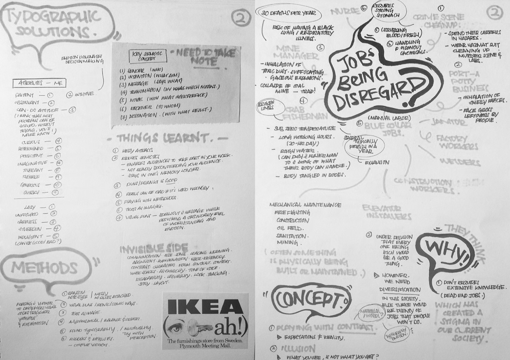
Hi, here to update on the final post for ‘Project 1 – Typographic Portraits’, which is officially completed! 🙂


What I observe/find out :  Blue collar jobs are often being classified as dead end jobs or underestimated in terms of knowledge and skills. But are they really what they seems to be? (Remember the scenario I shared in my previous post about purchasing fruits?)

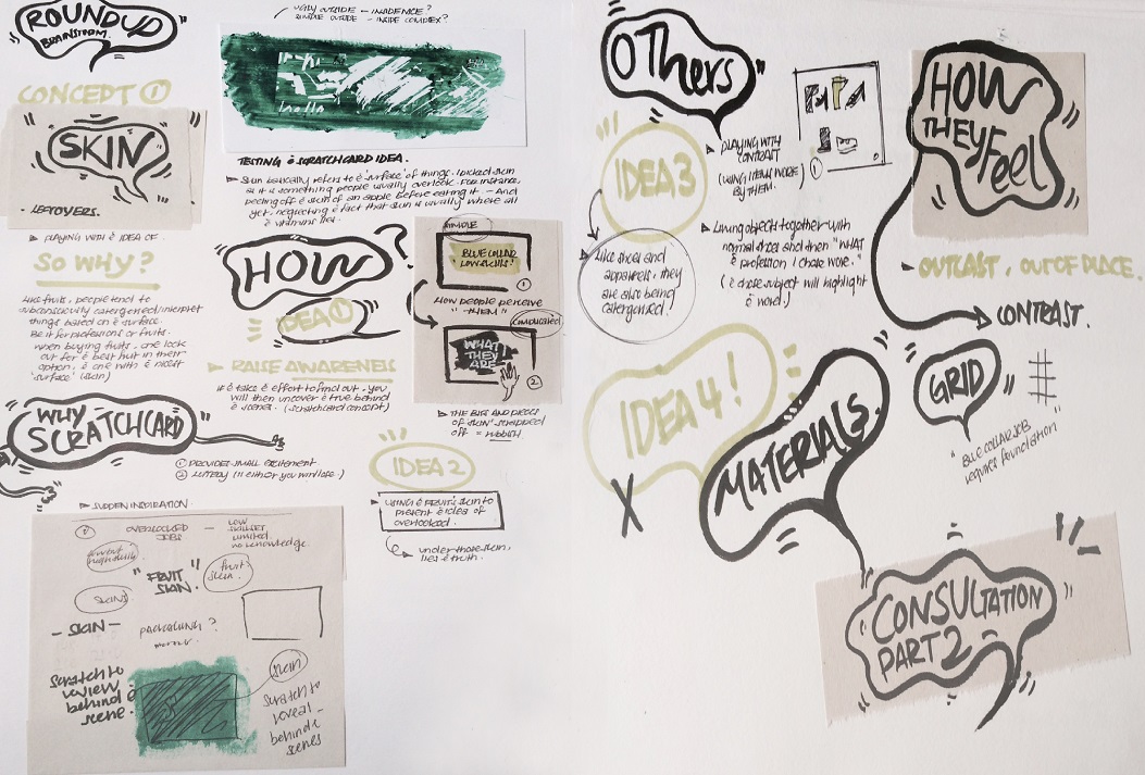
Hence, I came up with..

IMG_556111
Here’s some photos of Workkery. ( What are some perceptions forming in your mind right now?)

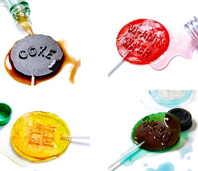
Hmmm, Dirty? Simple? Dull? Messy?- No worries, just jot them all down! Before I carry on, I would like you to jot down some perceptions that was formed in your mind when you saw the above image. And if I were to tell you that each of them represents a certain profession, can you roughly guess them?

Now, scroll down and reveal! 😀


So, basically..

Workkery is a series (of four)  of instant lottery scratch card inspired’ postcards designed in hoping to serve as a reminder – ‘to give everything a chance’. This idea was driven by the idea of ‘Skin/surface/packaging’. Sometimes, we are subconsciously influenced by the media or even by our own tendency to make quick judgement towards things based on the very first impression we received, which causes us to instill certain perception towards certain things which might not actually be the truth. So, let’s take time and give everything a chance, including yourself, to learn and seek for the unknown.

Decided to work on a mini game of lottery under the coated layer to identify it with the overall concept. Lottery is like a game of chance, hope, potential and entertainment (in most countries). Jobs on the other hand, are like lottery in a way such that, we don’t know what’s ahead but working towards it might sometimes surprise us. Similarity, I believe everyone is working towards a chance (a chance to buy a house/vehicle, a chance to further study, a chance to provide for their children and family etc.), in this case, for the blue collar workers as well. (Every opportunity is a chance isn’t it?) If i were to associate myself with my work, I would say, as a major in product design/industrial design, people often misinterpret (for instance, some might think that industrial designers design industrial buildings etc.) and categorized my profession under ‘dead end jobs’ too. Hence, let’s not make quick judgement but give everything, including yourself a chance to find out the unknown!


Without further ado, here’s the instruction printed as the back of each card.

collection1-02
Some photos of the instructions printed behind the card as well as some close-up details shots.

In hoping people would take part in making an impact (by giving a chance) to the lives of the blue collar workers as well as making them feel less unwanted, I decided to drew up this concept of donating the winnings in four very different forms. (In this case, medical, Education, Transportation, Household – which are some very common forms every household faced. This four forms also showcase the chances, these workers are working towards.) 


sign1


1
Did you guess it correctly?

Outer : Painted dirty yellow for the top layer. (To be explained in WIP post.)

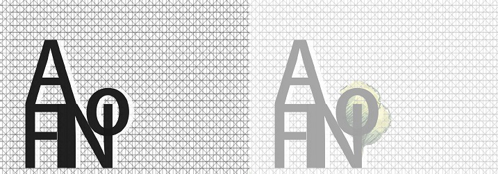
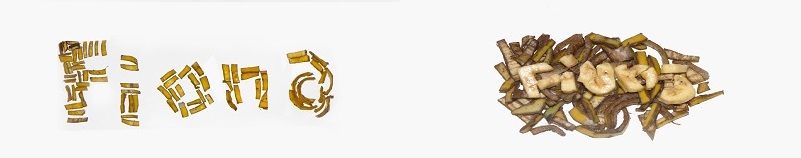
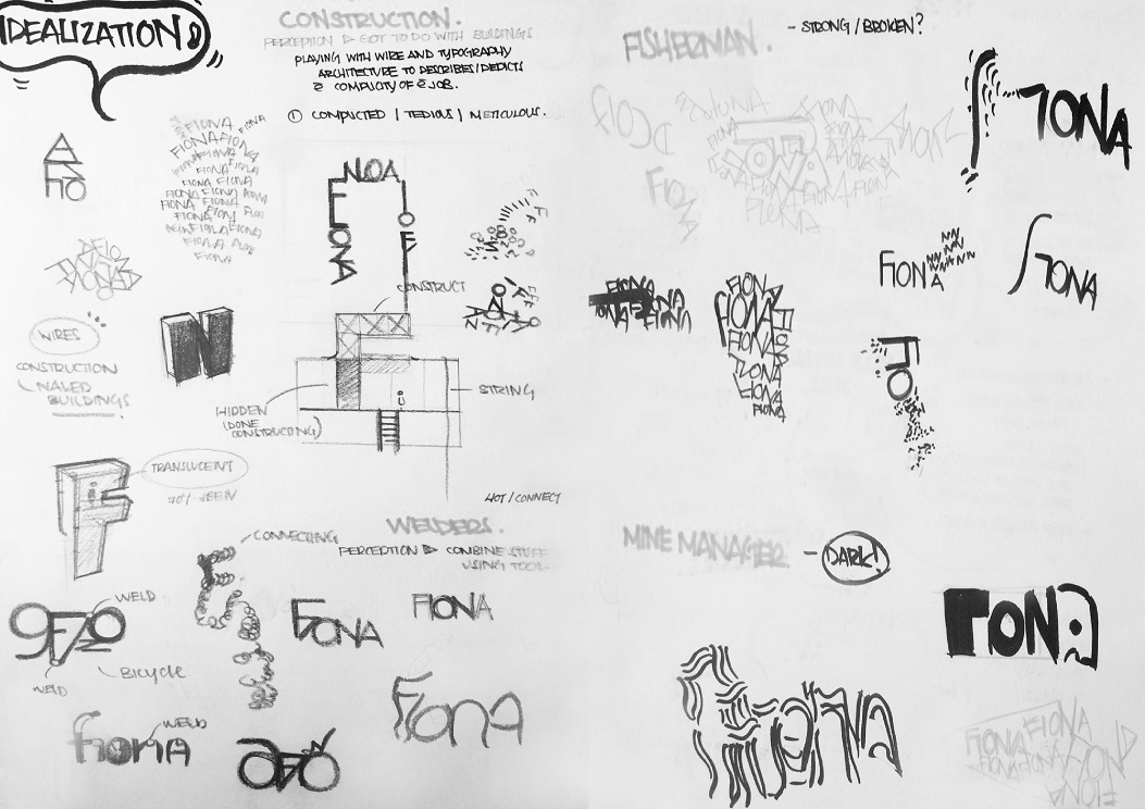
Using only the outline of an initial F (for Fiona),  I tried to construct an architecture for it. I arranged and stacked them in repetitive order to create an outline which resembles the incomplete building at a working construction site, where scaffolding could be seen. It is stacked in orderly manner due to the profession’s systematic nature whereby everything have to be taken seriously as they could not afford any hazards/accidents to happen within their space. Using items they are often associated with, in this case, blueprints, I make use of the nature of blueprint to create this postcard design (Which describes the textured background effect as well).


sign2


2
Did you guess it correctly?

Outer : Painted dirty green for the top layer. (To be explained in WIP post.)

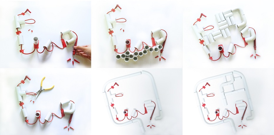
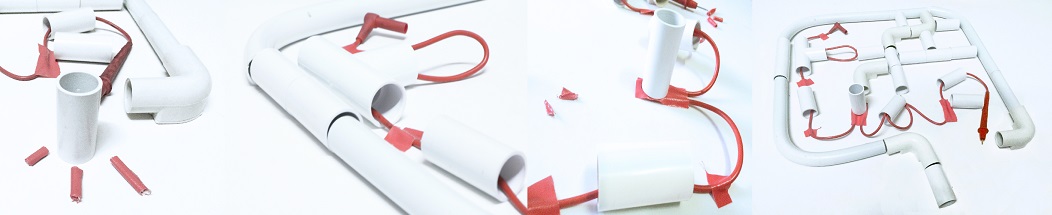
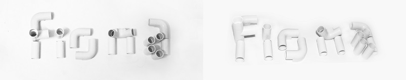
For this particular piece, I played with types and initials of my name, in this case, Fiona. The types is carefully constructed to ensure that they connects to one another which resembles the function of the water pipes. (Which is to transport water.) However, making sure that water is being transported around a country is what makes it tedious whereby lots and lots of thinking is involved. Thus, I arranged the water pipe looking types in a way such that it eventually forms a shape of Singapore (on the map). This profession is probably one of the reason for us being ‘connected’ in a way. (Thus, I constructed my name among the maze of pipes, to convey the idea of me remaining ‘connected’ thankfully to this profession.


sign3


3
Did you guess it correctly?

Outer : Painted dirty brown for the top layer. (To be explained in WIP post.)

What does miners do? – They mine! (Something that I thought too.) But in fact, they don’t just mine. They build tracks inside the mine, transport extracted materials within the mine and as well as to the surface too. Thus, using hexagons (which reminded me of honeycomb, whereby the bees goes all over, from flowers to flowers to gather nectar. Similarity, the miners goes around mining/picking to in hoping to extract some useful materials out of it, some rocks mine contains useful extracts while some doesn’t), I constructed a maze-like path way and linked the tracks to form my name. Some hexagon was deliberately illustrated with white outlines to illustrate the visibility at the mining site as well as probability of locating/extracting an useful material which is often uncertain.


sign4

4
Did you guess it correctly?

Outer : Painted dirty orange for the top layer. (To be explained in WIP post.)

Using items this profession is often associated with, in this case, circuit boards, I make use of the nature of circuit board to create this particular postcard design (Which describes the textured background effect). Thus, colors such as yellow, blue, red, green and black are illustrated in the above design as they are colors commonly found in electrical wires. The colored boxes were grouped in a colored grouping as to emphasis on the job’s systematic nature. I placed a photo of my name pieced together using pvc pipes at the background to emphasis on the importance of this profession to my major, it’s basically what connects me and my major which requires a certain amount of knowledge in physics, yet it’s often not known.


FinalPhotos
Some photos of the printed postcard design.

IMG_5563
Here’s a photo of my classmates after scratching off the ‘skin’ of Workkery. Thank y’all for participating in the class presentation demo as well as the lovely smiles (even though I force you guys to smile! HAHA :D) – (Special thanks to : Left to Right: Jia Hui, Ziyaad, Leon and Zhou Hui. )

In conclusion, I reallyreallllly enjoyed myself while doing this project even though I got stuck while brainstorming for the designs of my postcard. Despite of this, I am still satisfied with the outcome of it and I am truly happy having to witness people interacting with my postcards. It’s far more exciting than scratching the coating off by myself (Maybe it’s because I already know what’s inside..)

Guess lottery does gives people a moment of excitement till the final results is revealed. Therefore, let us all treat the unknowns in our lives as a game of lottery, take time and effort to slowly find out what it actually contains. Sometimes… you will be surprised! Another thing I would like you to take away from this presentation would be: the amount of effort/time applied = the amount of things you learnt (Similar to the action of scratching off the top layer off the card)!

Last but not least, thank y’all for your kind feed backs and it was really naiseee to see everyone’s work and learn along the way. I’m also glad that Professor Joy reminded us to cut down on 3D elements and only use it to enhance our work later, I feel that this pushes me to think further of how I would like it to be executed. If not, I would have probably end up relying too much on 3D elements to present my work! (PS: for being too wordy, hahaha!) 😀

Will be posting Workkery’s WIP (will be touching on choice of paper/colors/process etc.) after this post later on, do check back later! 

 (PS: To view the WIP work, simply click here)

Project 1 – Typographic Portraits | WIP

Hi, Below is a basic walk through of Workkery’s WIP! 

After experimenting/researching on how to do my own DIY scratch layer and some other methods of executions (can be seen in my previous post). I decided that this method of execution (the scratchcard idea) conveys my message/concept most effectively.


Of doing process,

Some additional try-outs and brainstorming thoughts for final work.
My messy WIP in illustrator. (oops)
One of my AI file of messy WIP in illustrator. (oops)
Here are some slightly different WIP designs that I have done before choosing the final four to print.
Here are some slightly different WIP designs that I have done before choosing the final four to print. Designs are inspired by simple line-cons graphics and modern visuals to appeal to my audience as a ‘lottery’ game postcard as well as conveys my message in a more playful manner.

Of printing process,

Some of my paper selection process and try-outs.
Other try-outs results. Here are some zoom-in photos, you can see that these papers I have chosen comes with a textured/grudge effect which sort of fits my concept.
Some try-outs results. – Some zoom-in photos (clearer view of the texture on each paper) , you can see that these papers I have chosen comes with a textured/grunge effect which sort of fits my concept.

Would like to highlight this point I’ve missed during presentation (Thanks Professor Joy for pointing it out). I’ve picked papers that are more earthy and pastel like as it reflects a down-to-earth nature which can be identify with my concept, the blue collar jobswhich are generally professions that are more pragmatic. Some of these papers comes with a textured/grunge effect on them, which is a bonus point especially if my designs comes embedded with a textured background digitally as well (Which three of my designs are). Moreover, the additional effect of the paper simply brings out my design, as well as the textured background done digitally, which is a great bonus to have I thought! 😀

(Credits: All papers above are purchased from fancy paper.)


Of selection of colors for the layer of coat,

(1) Painted dirty yellow for card (1), as I feel that yellow is often perceived as the color for construction (In resemblance to the yellow boots wore by the workers.)

(2) Painted dirty green for card (2), as green is another color for sustainability as well as the environment which I find could be associated with this profession as water is part of the environment.

(3) Painted dirty brown for card (3), as brown is considered as one of those earthy colors and this profession is often associated with things that are brown colored in nature (For instance, rocks and soil etc).

(4) Painted dirty orange for card (4), as orange is an energetic color which symbolize energy which I find could be identify with this particular job.

I also added a bit of dark brown into each of the color to make it looks dirty. To further elaborate the concept, I create grunge effect on the layer of coat by stamping the layer of paint with another piece of paper while it is still wet.

Of coating process,

Some photos taken while working.
stepstomaking-01
Here’s a walk through of my process of making the coat!

Some tips: After you’re done with the above. You may either paste a layer of transparent tape onto area whereby you would like to cover with the scratch layer or seek the other alternative, which is applying the layer of coat on a piece of contact paper cut out in the form or your desired shape then have it paste over the area you’d like to hide. 

(Credits: Learnt this DIY through online videos and guidance.)

*You may watch the video below for better guidance on the process.


 (PS: To view the final work, simply click here)

 Lastly, thank you and feel free to feed back! 🙂


Project 1 – Typographic Portraits (RIII).

Hi, first of all, thanks Professor Joy for the refreshments provided for the class during each lessons, much appreciated! 🙂 Now, back to update on RIII Second consultation!


After reading up on Henry Hargreaves’s inspiring projects, new ideas crossed my mind that night after asking myself several questions such as (1) What choice of medium can I use in better representation of my overall concept? (2) How can it tell a story? (3) Why?

Here’s a basic walk through of my ideas for my concept,

Print
Round up ideas.

IDEA (1) & (2) – Playing with the idea of ‘Skin’

Why skin? Reason being, sometimes we tend to examine things/situations around us just through examining the surface. For instance, when buying fruits, we tend to avoid fruits with scratches/bruises and go for those that looks almost flawless. However, is it really the best? Maybe visually it is, but taste wise, it is definitely uncertain. Similarity, we tend to categorize professions subconsciously based on things we perceive it to be.

For idealization (1), I will be playing with the idea of ‘skin’, in this case – scratch cards/ instant lottery scratchcards. (Details will be further explain.)

2
Some experimental work for (1). – Look at the image on the left, can you tell what is it? (PS: the image on the right is only a guide if you really still can’t figure out.)

For this test out composition, can you roughly guess what profession I am trying to show? – I used complex lines as the composition background in representation of scaffolding which is often found at construction sites. Playing with alphabets from my name, I ‘constructed’ a ‘house’ with a ‘tree’ at the side. I believe you know what it is now!


For idealization (2), similarity, playing with the idea of ‘skin’, however, this time I will be playing be with ‘peel’ of a fruit/vegetable. Why fruit peel? I chose fruit peel as I find that they are often being neglected in a way, such as sometimes we tend to peel them off whenever we consume a fruit. In fact, this peels contains a lot of vitamins and health benefits or even other useful purposes that we didn’t know about. Hence I thought it will be good by trying to create something meaningful with these peels.

8
Some experimental work for (2).

In this case, this piece above showcases the temporal aesthetics of ‘skin’. The condition of the banana skin oxides over a period of time, when being exposed to the air. Thus, showing that aesthetics is never forever, it shifts/changes over time.


IDEA (3) & (4) – Playing with the idea of ‘Contrast’

Why contrast? Depicting how often the ‘blue collar’ workers felt. – outcast and out of place at times.  

For idealization (3), playing with the idea of ‘Contrast’, I experimented some compositions and photographed them.

1
Some experimental work for (3).

For this experimental work, can you roughly guess what profession I am trying to show? – I start by jotting down a few obvious keywords that is associated with this particular profession. (Keywords like: darkness, limited, trapped, dangerous.) before laying out the compositions and photographing them. On the left, is what it seems like a microscopic view. Whereas, the photo on the right is what it seems like a narrow long pathway inside a tunnel with words scattered all over the tunnel.


For idealization (4), similarity, playing with the idea of ‘Contrast’, I experimented some compositions using materials that is often found associated with the chosen profession and compose them so that it roughly describes their profession. Then, I carefully documented it by photographing the composition test-outs!

Moving Composition
Moving Composition for (4).
5
Some experimental work for (4).
3
Close-up details of experimental work.
7
Some experimental work for (4).

For the above composition test-outs, can you roughly guess what profession I am trying to show? – I start by jotting down a few obvious keywords that is associated with this particular profession. (Keywords like: mending wires, complexity and dangerous.) before laying out the compositions (Thought that the complexity can be further exaggerated). I tried playing with the orientation of the PVC pipes as well. In conclusion, the orientation of the pipes does change the mood of the composition and the message being portrayed.


Lastly, here are suggestions professor Joy suggested that I could also look at,

(1) Look at what lottery scratchcards means in different countries (For instance, in Taiwan, it serves as a kind of entertainment/chance).

(2) Look into the action ‘Scratch’, the objects that were used to scratch and the marks being left behind after scratching (can try with different types of papers).

(3) Behind content? – How do your audience know that it’s for scratching? Is there any form of instruction? At the back maybe? (Like shopping vouchers, they usually comes with terms & conditions located at the bottom or at the back of the voucher). How you would like to present it?

(4) Look into the difference between ‘overlook’ and ‘not wanting to’. (For instance, you may want to consider peeling off the fruit skin as an act of not wanting to?)


Till next update, WIP! 🙂

Project 1 – Typographic Portraits (RII).

Hi, here’s a brief update on the first consultation with Professor on the given project. (Sorry for the late update on oss!)


Following up on the previous research, I have decided to focus on professions that lies under ‘blue collar jobs‘. These jobs often involves manual labor and after doing some research, I have found out that they are jobs that are often underestimated in terms of required skills/knowledge and they’re often known as ‘dead end jobs’. – Which has created a stigma in our society. Without diversification in this society, there would be plenty of jobs that people won’t do. Thus, I would like to work on this subject matter, to remind each of us to think again, as sometimes what we’ve perceive might not actually be true, isn’t it?

Print
Idealization process. – Mind mapping etc.
Print
Idealization process part II. – Some rough sketches.

After consulting Professor, below are some possible suggestions to work on..

(1) Cut down on using 3d elements. 3D elements however,can be used later on to enhance your work. (To imagine yourself being an editor for  magazine where your work will be placed in a magazine and how would it be wise.)

(2) Look into different scales, perspective and content as it tells a different story.

(3) Consider looking into what each professions usually wears as well as some of the material/things that are usually overlooked (Plastic bags etc.)

(4) Think of how I would like to convey my message.


02 | RESEARCH

Thus, I continued with my research to rethink of how I would like to convey my message/idea which leads me to..

Henry Hargreaves’s work which reallyrealllly inspires me! It forces me to think deeper, for instance, the way I would like to convey my message? The reason behind every action taken in my work. Any other way of representing them? (Which leads me to RIII of Typographic Portraits!)

Below are my favorite three projects by him/in collaboration with others,

(1) Deep Fried Gadgets

Henryhengreaves-01a
“This is a commentary about the similarities between tech culture and fast food. Quickly devoured and then discarded because of our appetite for the newest product.”

“Electronics have become almost a holy device, the way a new apple device sends people out of their minds. But as soon as the next model comes out the last is immediately forgotten.” 

My thoughts: Love the usage of using food to relate to social technology. – Like fast food, gadgets are nice to look at yet long term usage/intake can cause negative effects on us. Similarity, it’s all about your discipline and resistance towards temptations, isn’t it? – If not, be prepared to get DEEP FRIED!  


(2) The Curious Consumer

Henryhengreaves-01b
“This series follows my look at food products and how they are presented to us. Too often we don’t ask why something is the way it is.”

“After recently hearing a health professional refer to soda as “the cigarettes of our generation,” I decided to do an experiment to show what’s in soft drinks after the water is boiled away — in other words, dehydrating the hydrator. Once boiled, I took each remaining substance and poured it into a lollipop mold. After all, I figure that’s what you’re essentially getting: candy in costume as a soft drink.”

(-Behind the scenes for The Curious Consumer.)


(3) Pinata

Henryhengreaves-02b
“We disguised pork products to look like yummy candies instead. The initial result was colorful and almost happy, but after destruction became a dark, gory mess.”

“Most of Americans have a sugar coated sense of where their meat comes from and under what conditions it is raised and slaughtered. And Congress recently passed legislation to keep us even more in the dark—no longer do suppliers have to label where the meat comes from at all. We are blindly content, like a party-goer swinging at a piñata which, in and of itself, is a strange game. We blindly beat a papier-mache animal until it explodes in… candy…”

My thoughts: I just love how he disguised those pork products in candy form! -Thought that this is really a cool and smart idea to portray the idea of being sugar-coated.

(-Behind the scenes for Pinata.)


Lastly, will be back to update on my next post, Project 1 – Typographic Portraits (RIII) after reunion dinner! In the meantime, happy cny! :B


Project 1 – Typographic Portraits (R).

Through class presentations and lessons, I realized that typography is often used as an expression/tool to communicate messages across more efficiently, as one could save up a lot of shots/costs through using creative typography than communicating the whole idea by itself. Moreover, it’s ‘attractive’ & catchy which can easily catch your audiences’ attention more efficiently! There’s certainly more to typography than just being words.


Slide2
Rhythm on wires – is basically using metal wires to construct letters which was later connected to digital sources to make rhythms. The tone/sound of the rhythms is fully dependent on how the letters are constructed.
Slide3
Rizon Parein’s advertisement designed in three dimensional form specially for Nike footwear series. (It lights up. However, he decided to keep the lights off as it is better presented like this.)
Slide4
Portraits of famous football celebrities constructed using wires and tubes.

I find wires expressive in general as they allows you to create your own forms/shapes just like how pencil and paper works. Moreover, the beauty of wire is often neglected, just like how wrappers/straws etc are hence this is definitely good as it showcases the ability of creating art through wires and at the same time, add flavors to them which shines them under a different light. In the meantime, will look up on jobs that are often neglected and try to further explore and inject different kind mediums during this idealization work.

Additional notes  – ( Note (1) – electric wires are often coated with a colored tubing for different functionalities and used in different jobs and environments.)


Other possibilities,
Slide5

Slide6
Beauty in simple forms. – really amazing shadow arts which depends heavily not just on the wires but the angle/direction where the light is being cast.

Expectations ≠ Reality

new1
Happened to come across this work online, an interesting piece by Anon Pairot for this year’s Art Stage. Though, I’m scared of cockroaches but this piece of work evokes a different emotion when I first come across it, I won’t have believed my eyes that it’s cockroaches till I zoomed into the image!  Hahahaha, thought that it would be nice to share this!


In summary, I also looked up on Red hongyi’s work (reallyrealllly amazing work!) as recommended by Professor to look at. She experiments on all sorts of medium -ranges from cosmetics, food, chopsticks etc. Was really amazed by her shadow art and food art particularly where she deconstruct the fruits/veggies and laid them out in a way that they form an animal in an abstract manner..really gooooooood. Now, back to work and sorting out thoughts, hmmmm.