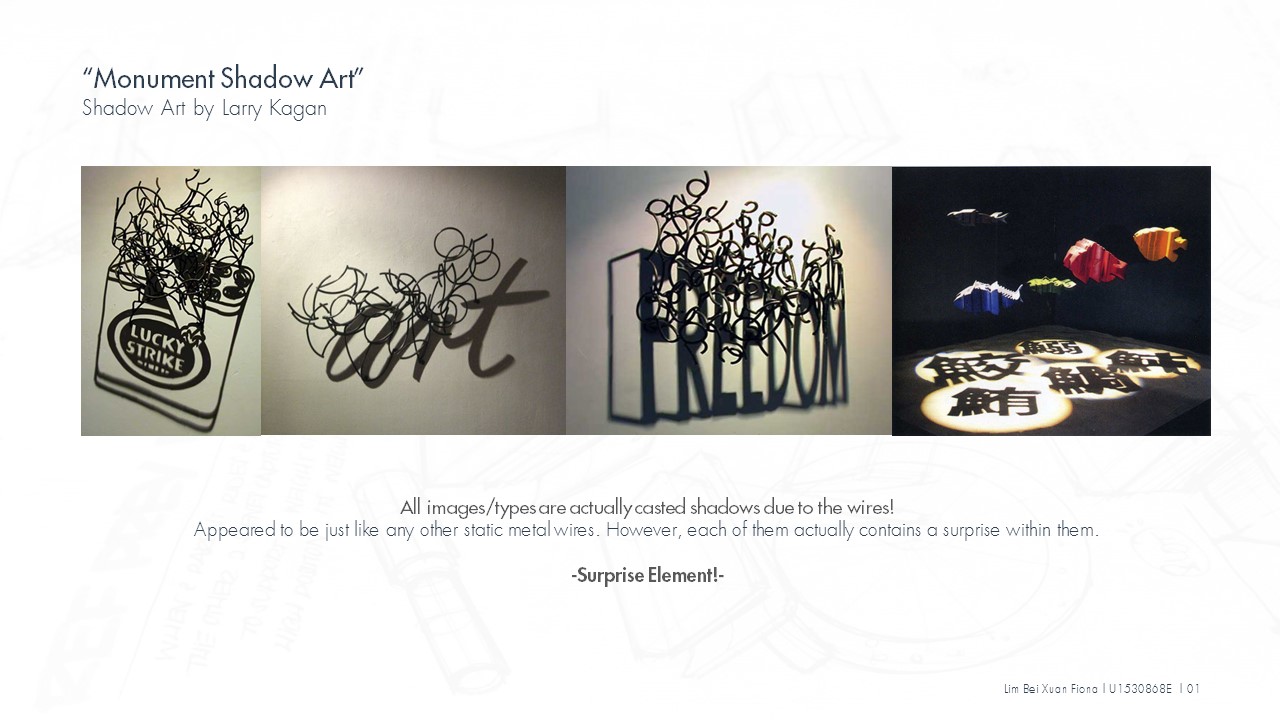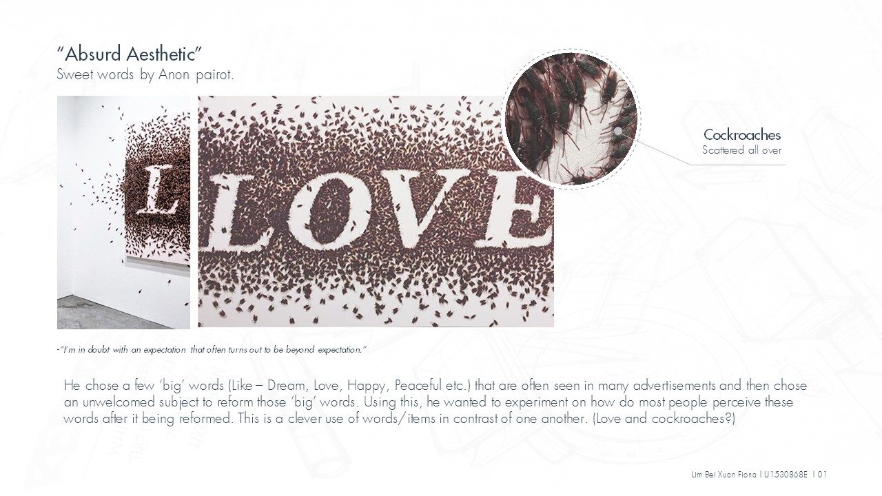


Hi, this is Mr. Long neck (In other words, long neck also means ‘reaching out to connect’ , which is why I chose to name this project as long neck series.) Today, we will be exploring some aspects of social media , Instagram in particular. So why social media? In today’s world context, you can see how social media have impacted our lives as well as our dependency on them. Parts of social media language and actions are actually around us too hence, in this project, I wish to present them in the form of daily lives scenarios in hoping to inject some humor as well as to serve as a possible guidance (a mini introduction to some key actions on Instagram as these functions tend to be misused/over-used online at times) for new users on Instagram. Now, let’s see how these social media actions would have been in real life context.
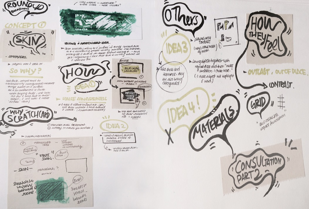
Before I start, Here’s how the idea came about! ?

While working on the first panel, the final idea of using bottle as a metaphor crossed my mind as I was thinking how to better connect my pieces together. Having bottles in two of my composition and not the rest leads me to thinking how I could better link all these pieces together. Knowing that it would be really inconsistent and random if I were to leave the two composition and illustrate something else in the rest of the panels, I decided to relay all of my panels by using bottle as a metaphor. I tried to brainstorm how bottle could actually be used for each statements without it feeling too random and forced upon. As I work on the possible ways, I realized there are actually many possible ways than I thought and I start to visualize how I would form them visually. (Coincidentally, long neck can be used to describe bottle?)
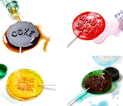
Here’s my final six artwork,

A walk through for each pieces,
For better conveying of message, I’ve make my images into a form of small animation that roughly speaks the idea of my intended message. (PS: Some textures are not included in the animation pieces, in case you wonder why some of them looked different from the ones posted above.)
 Emoticon from the point of view of real life context is disguise.
Emoticon is basically a tool creates to allow us to express our emotions virtually through adorable little face icons etc. Just like the abbreviation, LOL (laugh out loud) is often used virtually even though you don’t particularly feel that way in real life. Hence, emoticon in real life context is like a form of disguise. In this case, instead of bottling up your thoughts, you bottled up your real emotion/feelings. I presented it in a form of masks (often used in context like role-playing or used to disguise/deceive), whereby layers and layers are constantly being switched/replaced whenever and wherever. The real feelings/emotion was never once shown which explains why the bottle is tinted green to indicate the transparency of one’s emotions (Generally, one can never be fully clear of one’s emotion unless it’s being expressed).
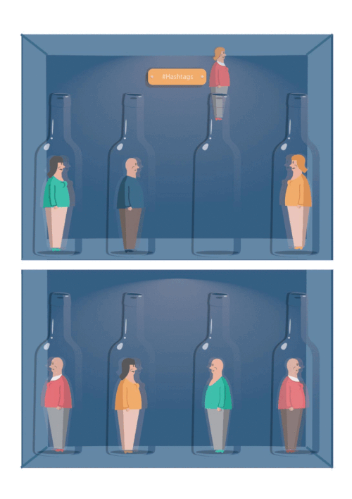
Hashtag (#) from the point of view of real life context is Classification.
Hashtag (#) is used on Instagram as a tool to categorize/classify things so you can easily locate stuffs as well as get engage and discover people who share the same common interest as you. (Such as, #HHN5 , #NDP2015 can easily link you to photos of people who had participated in these events as well.) However, nowadays hashtag are often used randomly as a trend/icon, whereby people used it as a way to gain followers etc. In the form of real life context, I will identify hashtag with sorting up of stocks in supermarkets whereby items are carefully classify under different categories to provide better shopping experience for shoppers. Another possible scenario would be, classifying peoples in different categories (stereotyping), however I find that this is not so appropriate to be used for this hence I strike off this idea.

Follow from the point of view of real life context is affirmation/acknowledgment.
To follow someone on Instagram, might means befriending with them virtually so that you can get engage/subscribe to their updates. To be allowed to follow them also reflects their willingness to open up to you. Similarity, in real life context, I would relate this to getting consent from someone to get beyond their personal space. It’s like visiting someone’s house and getting welcome into their space. On the other hand, it could simply means getting engage in a conversation with someone. In this case, the glass bottle represents the personal space of one. To be invited into this space to engage in a conversation is similarity like the follow button on Instagram. One only allows you to follow them if they feels comfortable for you to cross their personal boundaries.

Update from the point of view of real life context is sharing of information.
To update your Instagram, simply refers to uploading of photos/videos etc to share with your followers. Basically, sharing anything. Similarity, in real life context, I would relate this to sharing of information such as news, broadcasts, announcement or simply talking/sharing to your friend about your latest pet. In this case, sharing of information is shown through the action of emptying the bottle which also means ‘pouring your hearts out’. Similarity, to update on the other hand, is like pouring whatever content on your mind out to share.

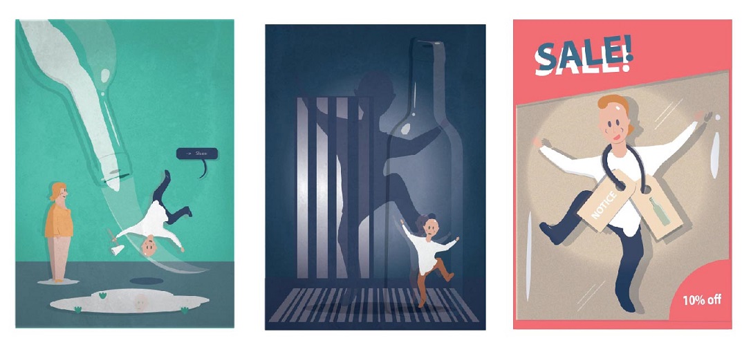
Block from the point of view of real life context is restrictions.
To be blocked on Instagram, is generally most peoples’ nightmare. As this means they could no longer get access to the updates of the person they are being blocked by (In another way, it’s like being placed in a cold freezer-neglected and excluded. Hence, cool colors is used in this composition to express loneliness and segregation). It’s like literally building blocks up to form walls/barriers so as to prevents the other party from intruding into your territory/space. Similarity, in real life context, I would relate this to being locked up in places or being held up by thoughts and perspectives. To be locked up, limits and restricts you from doing anything you want. (Uses gigantic haunting dark shadow to depicts the fear of being restricted that is secretly haunting inside each of us as well as the need to be free. The bottle reflects how it feels like to be restricted, with limited space within the bottle that leaves the character gasping for air. In this case, the only way to escape is generally by breaking the glass, similarity it also means by breaking the transparent boundaries/barriers set up by the particular user.)

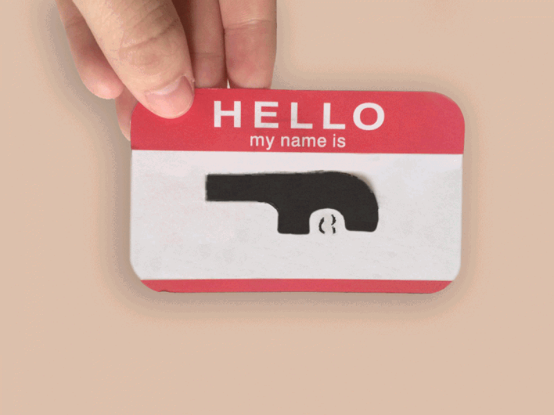
Tag from the point of view of real life context is identification.
To be tagged on Instagram, can either be a nightmare or a kind of acknowledgment/recognition. I have seen cases whereby people use it as a form of recognition to recognize someone efforts such as tagging them on photos of pastries/gifts that was baked/bought by them. However, according to the developers of Instagram, tags are actually designed for users to use it to notify their friends when they upload photos or photos that includes them. Hence, to be tagged in real life context can be like a form of identification, just like the name tags that some of us used to pin on to our blouse/shirt or the brand labels found at the back of your daily apparels. It’s there serving as a form of identification/identity. It came off loud and clear even without any form of verbal communication. Thus, in this case, I presented it as a product being labelled/tagged with visuals indicating it’s on sale! Subject is also deliberately placed in a transparent package to highlight the transparency of tagging (It’s there for everyone to see). Lights are cast onto the subject itself to bring the subject to the center of attention to indicate the clarity as well as the effects of tags on Instagram.
Overall, I uses complementary colors in some of my panels (Like green and pinkish red etc). This colors was also picked with reference on the kind of colors editorial illustrators would use (usually very vibrant and saturated colors). I purposely kept white borders in these pieces to ‘frame’ them as well as to draw the viewers’ attention to my content. Referencing from my artist references/mood board, I picked up techniques like connecting of borders with objects by using similar colors so that they feels like one as well as trying my best to keep my background minimal so that the subject is clear. Lastly, shadows and contrast are also used to create volume and dynamism to my objects, not forgetting the small details such as reflections on the glass bottles are carefully illustrated with the intention to make it as convincing as possible.
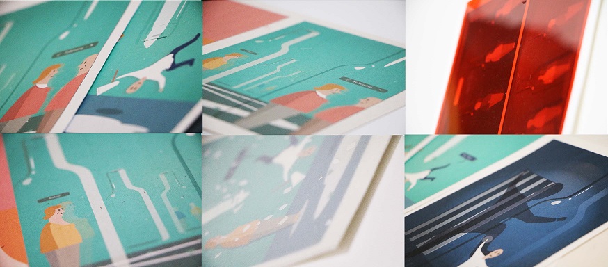
Below are some photos of my work,


In conclusion, I’m quite satisfied with the outcome of this project as it have been a really longgggggggg and slow brain baking process for me, really glad that it kind of turned out better than the possible worst scenarios I have thought of initially (while I was stuck). It took me quite awhile to pick up keywords and brainstorm ideas for each of the statement, what makes it even tougher is having to illustrate aspects of social media in real life context (but this is definitely one of the best way to convey the message more effectively).
This project definitely stretched my brain and expanded my mind in a way. ? In terms of execution wise, I picked up a new technique of illustration ; incorporating textures in my illustration/digital painting (something that I will definitely make use of in future)! I have also slightly grown more sensitive towards contrast and colors than before (Colors was really one of my weakness even before I joined ADM as I have this tendency to use muted colors for my work, thankfully not this time round)! Not forgetting, while documenting these pieces to update, I learnt how to animate them as well (Not the best but am glad that I manage to make it :)).
However, given a chance to re-edit these pieces, I would add in more details on each character in terms of their outfit and hair (as I felt that the characters can be further elaborated). Additionally, I would include words in my other three panels and add in more bottles and human for panel 2 (#Hashtag) (both suggested by prof Joy) to make it more consistent! Last but not least, really thankful for all the kind feed backs and I am quite excited for the new project! ?
With this, I shall end off this post with one of the feed backs I got from one of my classmates, which I find amusing in particular! ?

Lastly, don’t forget to check out the WIP here, if you haven’t! ?