
In this final Zine project for year 1 foundation 2D, I decided to go with cat as the motif.
Cat had always been a recurring theme in my other projects, so I think this is a good opportunity for me to make a book filled with just cat.
So I made a 8 page zine filled with cats, based on the previous point of view project, where I had miniature cats living in the household, for this project, it’s cats living in the zine.
It’s just a zine filled with cats, without any words. It’s was meant to be a simple, self explanatory zine, where I hope the reader can interact with.
Personally, I am a person who loves picture books and art books, and I have trouble reading books with lots of words. So I wanted to keep this zine simple, where people looking at it don’t need to spend too much time reading. And yet can feel happy about reading this zine.

cover page
Paper
Firstly, to set the general tone of the zine, an off-white slightly warm toned sketching paper is used to make the pages. Choices have been made between coloured paper, and other paper of various white tone, and eventually the sketching paper is the one which fit my requirement best, it’s texture, warm toned, strong and thick (300gsm). The reason I scrap the idea of colour paper is because I feel that the colours brought too much emotions and feeling to the pages which is not what I wanted it to be, also it’s tough to arrange the colour paper in this 8 page zine, as I didn’t want to stick two colour paper back to back so that each pages have different colour. Also the colour of colour paper are generally too intense.

drawings of the cats
Drawing Medium
Secondly, I wanted the zine to have this light, cute and playful feeling so I decided to use watercolour to paint everything in the zine. Choosing among marker, acrylic, ink, watercolour, watercolour was the final painting medium I picked as it have a soft tone, and its interaction with water would give the character more texture. Also, the characters are not directly painted on the pages of the zine, but painted separately. This is to prevent mistake, and also allow easier arrangement of the cats. The cats are painted on watercolour paper with a similar tone and texture to that of the zine pages so that its doesn’t stand out too much and feel detach.
Drawing process
The cats are first sketched out on another paper, and later transferred over to watercolour paper using the method of tracing. I tried to keep the style of the cats drawn same so that they don’t feel out of place.


sketches
The pencil marking are kept faint when transferred over to the watercolour paper, as I don’t want the pencil mark to stand out in the drawings. After the cats are painted, they’re outlined with watercolour again to make the shape clear. Painting was pretty tough as the cats are quite small and there’s a need to control the outlines from going too thick. The biggest different from my original draft is that the cats goes from a single pinkish tone to a more colourful range of fur pattern and colours. This was to add character to each and every cat so that people can recognise them as different individual and not the same cat.
Binding
In my original draft, the zine is binded in a brochure style, where it is folded. So it is this long stretch of paper that can be pulled open.

draft of zine
However I felt that the story telling was a bit weak and there’s less control over how the reader read the zine. So in my final zine, I decided to go with side staple. Reading works from both left to right and right to left.

Side staple
One problem I faced with the side staple was that the middle piece will tend to be popping out a little more than the cover page due to the thickness of the paper. Perfect binding might be able to fix this problem, but I want the zine to be able to open fully so I just stuck to side staple, however other binding method or paper might have to be considered if this is going to be a thicker book.
Interactive aspect
The whole purpose of this zine is to allow people who are reading to flip the book around to see the interaction of the cats inside the zine. So I arranged the zine to not be in a fixed orientation so that people who are reading it would be turning the zine around.


cats are arranged in sideways and upside down orientation
In addition, there’s also interaction across pages and within pages.

Pop-up in the centre spread + tail of the black cat from the previous page comes over to this page

Cat scratching the paper + Cat which got stuck between pages
Half of the body of the cat extended from previous page
Pop up element
Considering the thickness of the zine, I limited my self to just one spread of popup so that the zine can be closed properly. Because if there’re too many popup the zine wouldn’t stay flat.
Inspiration for the pop up page
After watching the video, I decided to use it in my zine, and in addition add the cats onto the pop up so when the reader open the book it would look like the cat is running across the pages.

cat popup
Lots of experimentation was tested to adjust the height of the popup, and also to ensure the pop up does not go beyond the boundary of the zine. Various adhesive was also tested, and eventually UHU glue was use, as it allow the pages to stay neat as it would not crumple the paper, and is strong enough to hold the popup. A small problem faced was that the UHU glue would overflow from the side and make the overflow parts looks a little less refine. In the future, spray mount might be used in place of UHU glue.
Breathing Space
I was making choice between filling up the whole book with cats so that it looks like where is wally, and leaving lots of spaces so that it gives this breathing spaces for both the cat and the reader. And in the end I chose the latter. One reason is because I want the book to stay simple, and secondly is because I want each cat to maintain their own individual spaces. However the final zine turns out to be a little too empty, so I think some improvement can still be made.
Scrape ideas
Initially I wanted to express the feelings of the cat by using the outlines, which is a play with the very first 2D project – lines. For example, a cat that had just ate a meal would have thick line to indicate the idea that it’s lazy to move, a scared cat would have very thin line and very sharp edges. However due to the tone I wanted to set for this zine, I had to scrap this idea because a pen would better express these ideas instead of watercolour.
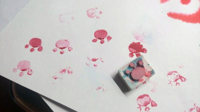
Paw shape stamp
I thought of using a paw shape stamp I carved from an eraser to make the foot print so that the texture would look more like it is left behind by a cat as compared to it being painted. However the effect wasn’t as good as I expected so I didn’t use this method.

 Some other possible interaction of the cat with the page
Some ideas was not used in this zine because of various considerations such as keeping the book neat, general tone, and storage issue.
There’s a lot of change made from the original draft but I am personally very happy with this zine.
Hope everyone had fun reading it ฅ•ω•ฅ