After somewhat a 100 tries of exporting, I finally got the video out.
After somewhat a 100 tries of exporting, I finally got the video out.
Initially, Prof Woon Lam told me to work on a few small pieces so that they will be easier for me to manage since I am still kind of struggling with the techniques. However after much thought, I felt that I should challenge myself to do an approximately A1 size one instead. I have also decided to use watercolour paper.
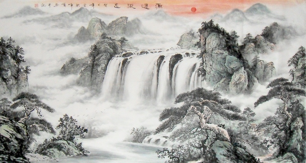
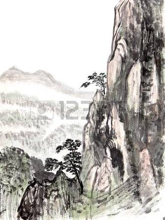
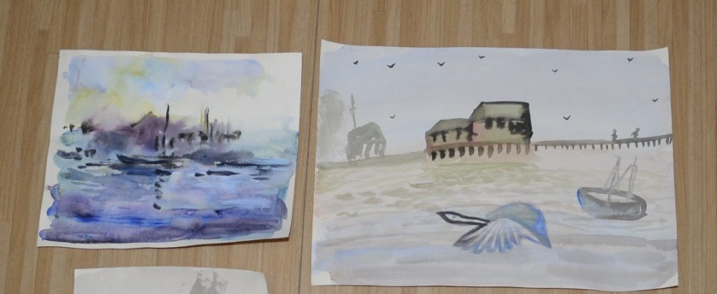
Reference Images for the final:
Combined photoshopped image and rough composition:
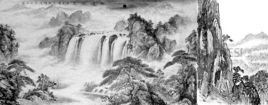
Since the A1 size is rather spacy, I found 2 paintings that can fill up the space more evenly. I could have just enlarged my previous composition but I don’t really have the confidence to work on large components yet. I found that small elements were easier for me.
Process:
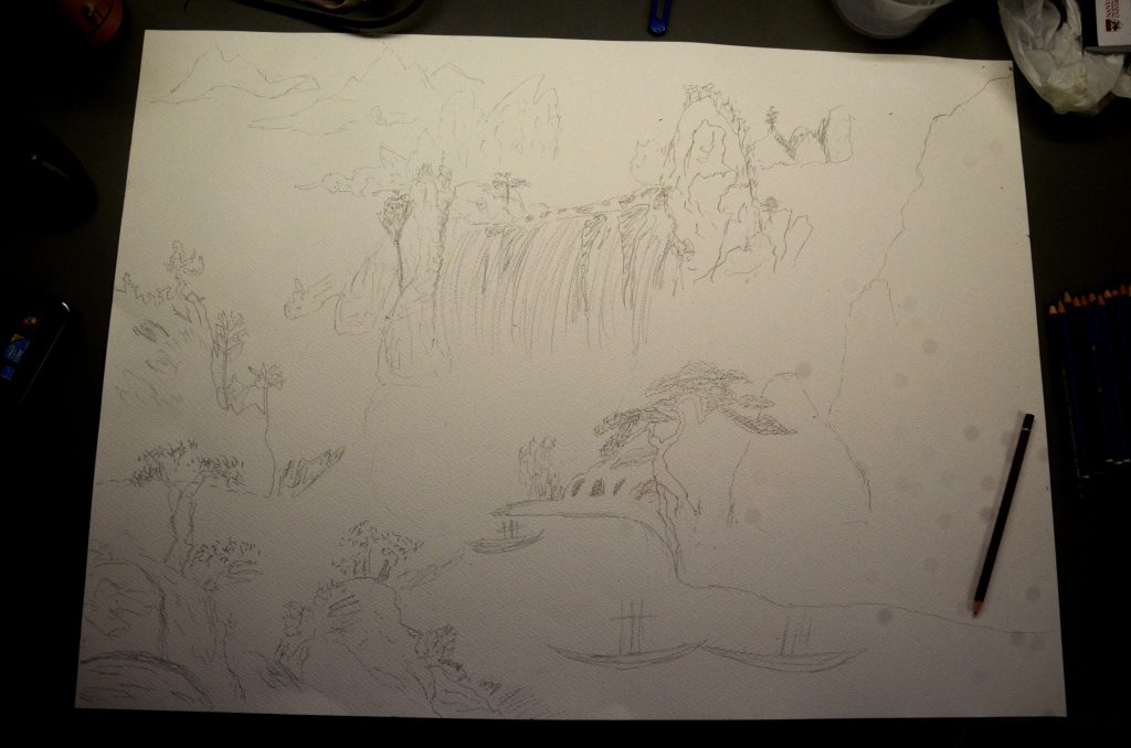
This was my pencil outline sketch of the composition. I adopted this method after Prof Woon Lam recommended that perhaps I can try to do a light pencil sketch of the objects first before painting with chinese ink so that I would not miss out details I originally wanted and the shape would not be too far off.
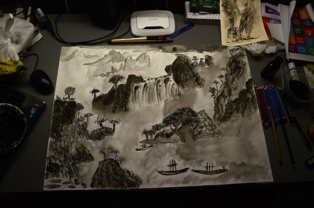
This is the final piece. I have attempted to create texture through many layers (especially through the dry brush technique), first starting off with the very light and faded tone first and subsequently making it darker gradually. I also realised that it took some time for each layer to dry on the watercolour paper. (Relatively slower than on rice paper, but the good thing is I can wash off some errors on this while I cannot do the same on rice paper) However, I have difficulties creating the smooth transition feel between each object (something I am actually conscious about).
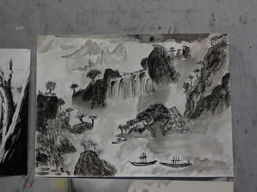
After presenting my piece in class, Prof Woon Lam did comment on the poor transition between the objects, something I need to improve on. However, he also mentioned that there were various textures created on the mountains, something I felt a little happy about (at least I have some improvements from the experiments).
Reflections:
It was intriguing and challenging at the same time, trying out a different medium, something I am not familiar with for the final piece. Personally I feel that an individual learn more while stepping out of their comfort zone and attempt something new. It was through the various experimentations and meeting “dead ends” that I roughly pick up the right techniques (still have a lot a lot more to learn) and the appropriate methods to approach the medium. Although the final piece did not turn out to be as well as expected, the learning was what made the process enjoyable and fruitful. I am extremely thankful for having a friendly and patient tutor like Prof Woon Lam who will not hesitate to guide you whenever needed. I always look forward to having FD lessons throughout the semester and I feel that each lesson was kind of filled with a little element of surprise and that I will take away something new with every lesson. It has been rather enriching semester!
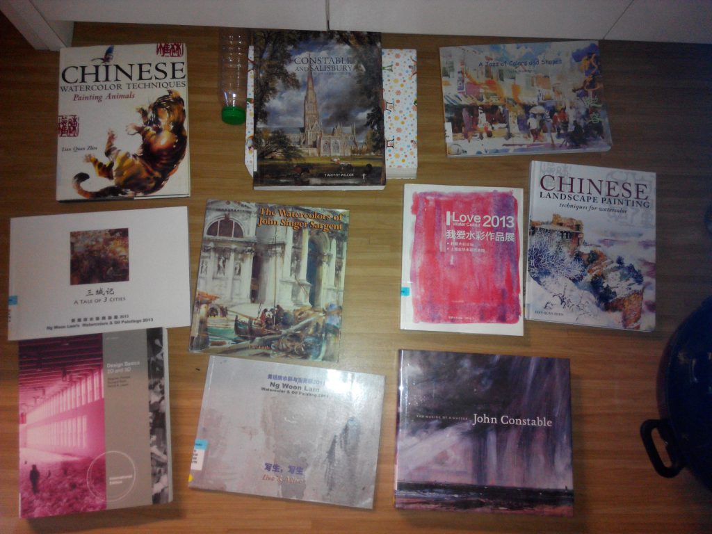
These are part A of the books I borrowed from the library as reference and inspirations for my final project.
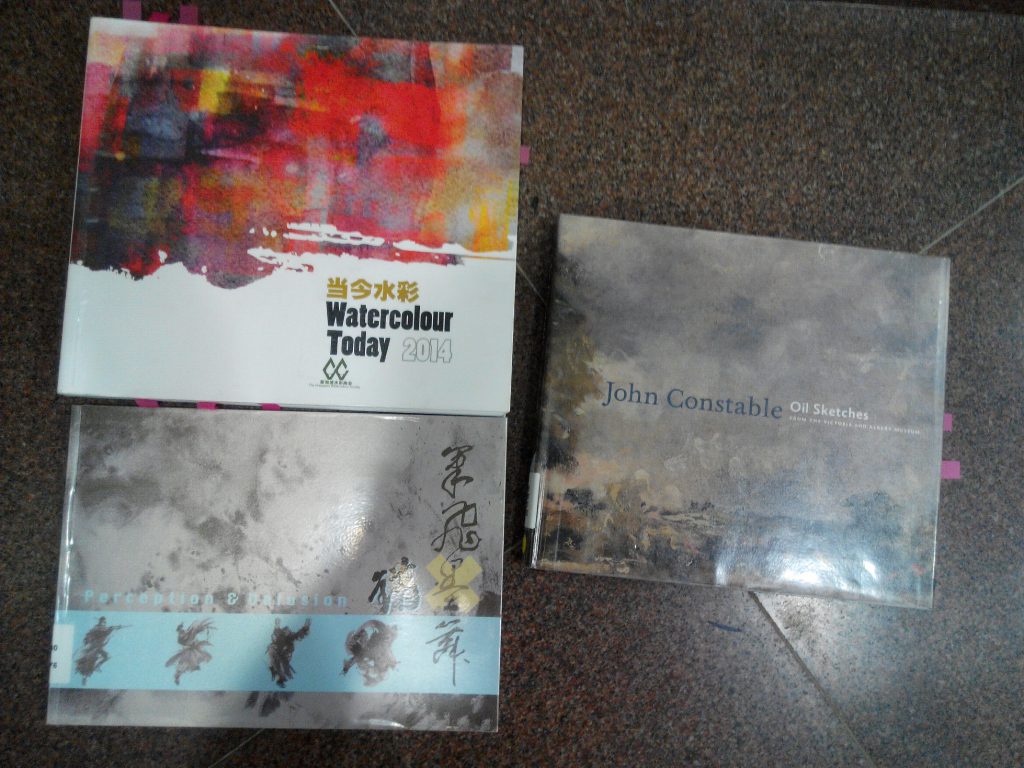
These are part B of the books i borrowed and actually based on these 3 books for the final composition.
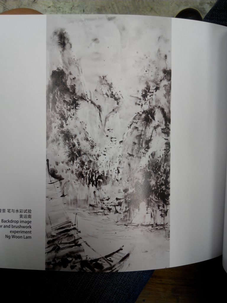
Mountains from “Perception and Delusion” and the traditional ships are from “John Constable-oil sketches”, I intended to combine these 2 for the final composition.
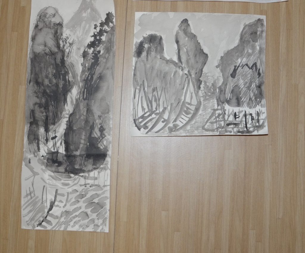
These 2 were experiments no.2. I still cannot get the hang of the brush technique and it turned out that I was still contouring the mountains. Also, the size of my ships were too big relative to the mountains and it looked weird. There was little sense of texture as well since the tones throughout the mountains were too inform. After consulting Prof Woon Lam and his help on editing on the left piece, I got a better sense of how to create texture on the mountains.
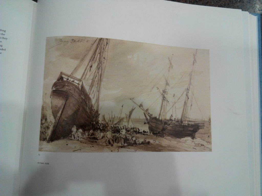
Experiments no 3. I also attempted watercolour besides chinese ink. However, the effects were horrible and techniques used were incorrect, resulting in the very light and dry look on the right. Prof Woon Lam also commented that “Dayler Rowny’s Simply Watercolour” has too little pigments and that I should use more to create enough water colour pigments for the painting. (If not, might as well get the more expensive single tube kind) Prof Woon Lam used my watercolour set to demo the piece on the right for me. I did not know that I have to wet the paper first before applying the colour, hence explaining the extremely dry look on mine. The painting I showed him from the “Watercolour Today 2013” book was done using the wet on wet technique.
After much thought, I have decided to use chinese ink as a medium for my final project.

Initially when I was introduced to the Ego project, I felt that this should be a rather interesting project since it gives me an official chance to look into myself further and search within myself to identify the character or traits I have yet to acknowledge. However, I find the process a little taxing since it forced me to see things I normally do not and that I have to identify traits from somewhat unpleasant life experiences at times. It was also difficult to choose between different scenarios and their respective equations since quite a few resonates with my experiences really well.
After much thought, short listing and consulting with friends, I have decided to shortlist the 4 of them I shown in the end. After comparing between the very hands on emotions project 1 versus a very digital project 2 which I learnt a lot from, I felt that perhaps I can take a risk and delve more into the hands on technique again since this is another good platform for learning.
After which I attempted to try out different techniques to portray the feel I wanted, for instance through paper cutting and painting. Initially I used colour construction paper to portray the characters I wanted but then I began to realise that the colours were too uniform and it as hard to achieve the blended effect I wanted, especially for the “short-fused me”. The paper kept tearing easily and since I have never attempted paper cutting with precision before, it was difficult. It did not turn out to be well since I was not very comfortable with the medium then. I then attempted to use art card to replace paper since it was sturdier but it was hard to retain the colour on it. Subsequently, I then decided to turn to just sketching and painting instead since I intention from the start was to give a simple straightforward experience for the viewer.
From portraying myself as a human figure throughout the first row, I have decided to adapt animals and animated characters to give it a more interesting feel instead. Even though the aesthetics of the final product turned out to be kind of horrendous and I was very disappointed in myself, I felt that throughout this project, I was given a chance to really look into myself and attempt to express “me” in a totally different way which is refreshing. The various experiments I had were also enriching in their own way.
I guess this marks the end of foundation sem 1. I learnt a lot throughout the semester with Prof Mimi and she was very supportive in guiding me and giving me honest opinions about my progress and art works along the way. So thank you Prof Mimi! Andddd I am going to take a break to pay off all my sleep debts accumulated throughout the final submissions period. Ciao for now!
1 ) Cut Out Colour Construction Paper:  I tried out glossy construction paper for the “short-fused” me and the matte construction paper for the “humpty dumpty”. However, I didn’t like both as the glossy one tends to break easily and both seem to be rather flat in colour since the paper itself is uniform. Even if there is a mix of colour, it was kind of unpleasant since the edges and the contrast between the 2 were too hard.
2 ) Cut Out Art Card and Paint:


I then attempted to use the cut out art card and then paint it over instead. However, due to the surface of the art card, the colour could not be retained. When my finger rub just ever so lightly, the red poster colour became chalk like and falls off. Hence I have decided to sketch on paper and paint them instead.
3 ) Sketch on paper Paper and Paint:


Final Product:

It is easier to blend the colours needed on paper as compared to the rest of the experiments.
Sketches of my characters:

Attempt to draw the frames out:

Happen to think of these that inspired me:
Ketsuekigata-kun!
Simple Thinking About Blood Type is a Korean 4-panel webtoon by art teacher Park Dong-sun under the art name “Real Crazy Man”. The webtoon is themed around blood type personality classification.


Their various interactions in a cartoony way really got me thinking and I began to realise that I did not want a very life like feature in my creations but more of a cartoony feel.
The Simpsons:


Another cartoon that got me thinking was this and how I felt like their bulgy eyes are somewhat funny and interesting and decided to adopt that into my characters as well.
The minions movie:


Personally I find that the minions are very adorable creatures and perhaps I should adapt the minions features into my characters as well since they give off a “blur” look which is quite like me hahaha. As for Agnes, I used to have this bangs cut fringe as well with the roundish face when I was younger, hence also giving me another inspiration to adapt this feature into my characters.
Gudetama:

Gudetama is a Sanrio egg-turned-mascot character with its name from a combination of the words “gude“(pronouced goo-deh), which is a Japanese onomatopoeia for describing something or someone with no energy or strength, and “tama” from the word tamago, which means egg in Japanese. I have decided to adapt this character into my first equation (the flat omelette).
Something I created using wires:

Various equations I came up with and considered:
Eventually I chose equations 13, 14, 16, and 17 for the EGO project.
Personally I find some of the phrasing of the equations to be awkward, such as 2, 4 and 7 even though they each represent something that is rather significant such as my phobias and what do i usually do when I am alone. Since I was unable to come up with a better phrasing, I “rejected” those equations for the final selection.
Colour notions and colour systems- (Trey, Zihong and Mathias presentation):
Colours are split into tangible and intangible colours. There was an introduction to the addictive colour system (RGB) (often used in televisions and theatres) and the CMYK colour system (normally used in paintings).
For colour notions, there is the Munsell colour system with 3 main attributes of HVC.
Hue: Quality by which we distinguish 1 colour from another. 5 basic colours: R, Y, B, G, P & 5 intermediate colours: 10 step colour scale
Value: Value by which we distinguish the light colour from the dark. Neutral axis refers to the gray level of colour. (White è Black) = (Scale of 1 to 10)
Chroma: Quality that distinguishes the difference from a pure hue to a gray shade. Measured radially from the centre with increments of 2. Not uniform for every hue (purple more than yellow)
Applications: Identify colour for scientific research (Munsell). While Pantone is a more accurate colour series for devices and it has specific orange and gold colours.
Colour properties- (Yu Qing and Sandhya presentation)
Hue: is broken down into 12 basic colours by which they consist of 3 primary, 3 secondary, 6 tertiary colours and infinite hues (mixing).
Pure hues are without any white, black, grey or complementary colours in them.
Mix 2 primary hues to get a secondary hue.
Broken hue: is a combination of unequal properties
Tint: add white to it è pastel è can even change primary hue to secondary hue. ( normally used in marketing and designing)
Shade: Darken by adding black to it.
Tone: 1) Broader Tones: Mixture of pure colours with any neutral / grayscale colour including 2 extremes- white and black.
2) Narrow Tones: without black and white.
Saturation: (also known as intensity or chroma) refers to the dominance of pure hue (pure colour = 100% and grey=10%)
Value and Lightness: HSV model

Colour illusions and emotions- (Veron, Xu Han, Eu Chian presentation)
Colour illusions: images where surrounding colours trick the human eye into incorrect image.
Complementary colours: e.g. red and green è green may seem brighter when placed next to each other
Simultaneous Contrast and Successive Contrast
Edges: increase contrast to create depth
Colour emotions: they gave examples of how different colours evoke different emotions in people. (e.g. white represents purity and peace where yellow represents energy and happiness.)
Tay-irteen:
You have always been here for the past 13 years of my life, until then. With everything else changing, thankfully this place still remains the same. Everything is still where they are supposed to be and these never fail to remind us of your presence, something I treasure deep down.
“Tay-irteen” is a short documentary exploring him as a person back then and his various interactions with the people around him.