Japanese sound artist, Mamoru Okuno, transforms everyday objects and practice into musicalinstruments.
Okuno’s artistic practice crosses over sound/music and visual art. He looks into the simple gestures and the complex social condition of the everyday life at the same time, and brings out the “beauty” of the sound that derives from there. It results as the live performances, where artist becomes the host to invite and guide the guests introducing the subtle sound that they might have heard but never intentionally listened to. It is a type of relational art in a sense that he interacts with audience to create and share the experience in time and the environment on spot. The video works crystallize the ritual aspects of the performance and stresses more of his visual and conceptual ideas. It is also realized as the installation works consisted of the ordinal furniture and everyday objects with the visual/written instructions for the audience/visitor to explore the sound by themselves. In his latest project entitled “etude for everyday life”, he started to highlight and incorporate the everyday objects and practices as the main material to create intimate listening experience. The objects such as plastic straws, food wrap, ice, steel hanger, instant noodle, electric kettle, and microwave are employed to make the sound. He also integrate everyday practices such as purchasing products, eating food, drinking into his work as means to create his art work. He extracts the essence or forms and rearrange them in a different way in order to create the unexpected sound experience. His affirmation goes towards the things that our highly rationalized society would ignore or regard as worthless. He looks at them from a different perspective, also listen to them, and present the opportunity for the audience to rediscover and live their lives creatively.
I tried to change the way I pressed the tap in the toilet:
Tap 1:
Tap 2:
2) Interesting Finding: Bruno Zamborlin
Bruno Zamborlin is a technologist, researcher, musician and designer. He’s been working on a joint PhD in computational technologies between Paris and London, exploring new methods for gestural interaction and its applications in performing arts and the creation of new musical instruments. Bruno is interested in the topic of Interactive Machine Learning and the possibility of allowing the artist to interact with the entire supervised learning process and the creation and design of his own gesture vocabulary. The early results of this research is Mogees, which uses contact microphones to turn any touchable surface into a musical instrument.
3) SOUND SEMIOTICS OF THE KITCHEN: MARTHA ROSLER
Semiotics of the Kitchen is a feminist parody video and performance piece released in 1975 by Martha Rosler. The video, which runs six minutes, is considered a critique of the commodified versions of traditional women’s roles in modern society.
Followed by this is something done by Robin James with Rosler as the reference.
This project is a sound- and social-media-based reperformance of Martha Rosler’s 1975 video “The Semiotics of the Kitchen.” Rosler’s work is one of the foundational texts in what was then the brand new genre of video art. It was also an early-ish participant in the tide of feminist art that would sweep the artworld in the late 1970s and early 1980s. In the video, Rosler dissects the gestural semiotics of common kitchen and culinary tools, one for each letter of the alphabet (except u-z). Her gestures are exaggerated and often violent (e.g., the stabbing with the fork or the ice pick); this suggests the patriarchal “violence” that relegates women to kitchens, to “second shift” domestic work, and so on.
There are sounds in the video, but, because it’s a video, its focus is on the gestures and motions Rosler’s body makes while using the kitchen implements. I wanted to focus on the sounds themselves. And not the sounds of kitchen labor, but the sounds that kitchen implements can make when used in non-standard, non-utility-driven ways. In 2012 we generally recognize that the kitchen is the studio in which culinary artsare made (Modernist Cuisine, sugar art/sculpture, cake art, etc.). But what about the sound art potential of everyday kitchen gadgets, furnishings, and pantry items? I basically used the kitchen as one big concret gamelan, so to speak. Can the home kitchen be something other than a site of sheer drudgery and “second-shift” labor?
I guess because I come from a more third-wave feminist perspective, I don’t see the kitchen or domestic labor that’s traditionally gendered feminine as inherently or necessarily oppressive. Patriarchy makes it that way; even so, women have always found ways to exercise agency, to make something interesting out of their drudgery. (I disagree here with Beauvoir—and with Elaine Miller’s reading of SdB on this—I do think repetitive, domestic labor can, when twerked/reworked/remixed, be the site of transcendence rather than just immanence.) I wanted to consider the implements as something more than just tools or labor-saving devices. I wanted to play around with their purely sonic properties—so, I generated sounds by doing things with them that weren’t generally part of their intended functioning. So, for example, I blew through the teensy holes in the zester; I often played things like percussion instruments (the Pyrex dishes, the measuring implements, the dish rack, the knife). I did not generally use the objects as intended: I treated them as sound-producing objects, manipulating them to maximize sound output.
Because Rosler focused on objects, I focused mainly on objects. I am considering doing a second alphabetic series dedicated mainly to the sounds of actions (specific cooking techniques, etc.).
The 27th tweet in the series is really important: if you watch Rosler’s video, you see that at the very end she shrugs her shoulders. It’s like she breaks character for a minute, inserting some humor and levity into an otherwise very serious, even dour, performance (or, a performance she knows will be interpreted as dour, because of sexist expectations that women are always uber-cheerful). So, I ended with a sting/rimshot/ba-dum ching.
Tools
I stuck as closely as I could to Rosler’s original list of implements. I changed a few (E, H) because I didn’t already own the devices she used; I added letters u-z. I followed her format of using the tool, then saying its name. It
My departures from Rosler’s list, as well as the differences between, say, my measuring implements and her measuring implements, reflect the vast changes in American kitchens, diets, and culinary culture (foodie culture) in the 35-ish years since Rosler’s video was filmed. For example, it was really easy for me to find something for the letter W: most middle-class white people have woks in their kitchen, and they’re sold at Wal-Mart and Target. Similarly, my fancy measuring cups from Crate & Barrel clearly function as both design objects and utilitarian ones (that’s why one buys something like this from C&B, rather than just some perfectly functional ones from Wal-Mart or the kitchen supply store). This reflects the aestheticization of food into foodie culture.
Rosler
James
Apron
Apron
Bowl
Bowl
Chopper
Chopping
Dish
Dish Rack
Egg Beater
Egg
Fork
Fork
Grater
Grater
Hamburger Press
Heating Element (on an electric stove)
Icepick
Ice Cube Tray
Juicer
Juicer
Knife
Knife
Ladle
Ladle
Measuring Implements
Measuring Implements
Nutcracker
Nutcracker
Opener
Opener
Pan
Pizza Cutter
Quart Bottle
Quiche Dish
Rolling Pin
Rolling Pin
Spoon
Slotted Spoon
Tenderizer
Torch
Utensils
Utensils (in a drawer)
V
Vermouth
W
Wok
X
PyreX Dishes
Y
Yogurt
Z
Zester
Method
1. Audioboo—It was easy, intuitive, and free.
a. I recorded one or two sounds every day (or so) for about three weeks. I published each individual “letter” as I recorded it, so the initial publication of the project unfolded over a few weeks.
2. Twitter—This initially grew out of SoundingOut’s #tweetasound project. (Here‘s their round-up.) I used twitter because, well, when I started tweeting kitchen sounds—initially, the sound of the first three speeds on my mixer, or the crust of a loaf of bread I just baked—I didn’t have this specific project in mind. But, I think there are good reasons for using twitter (see #4 below).
3. Storify—collects and organizes items across social media platforms. This was an easy way for me to collect each individual tweet and publish them together with this blog post. Basically, Storify is like my editing suite.
4. Why these social media tools?
a. Well, I wanted the technology to be as easy, intuitive, and widely available to the average user as, say, a fork and a knife, or a set of measuring cups are. Women are socialized to “just know” how to use basic kitchen tools; they’re not usually socialized to “just know” how to use more than the most basic consumer-grade audio technology. I wanted to use technology that was already in the kitchen—smartphones, social media, etc.
b. This also goes back to Rosler’s original: video is a consumer technology that is used in people’s domestic environment. This is why we have, for example, Bill Wegman’s dog videos, or Sadie Benning’s early video work. It’s not an expert technology. It’s something people use to record, document, and facilitate their daily routines.
c. Of course what social media does is complicate public/private distinctions: I’m broadcasting from my kitchen in my pajamas (seriously! I made most of these recordings right after breakfast, before I even showered.) Jasbir Puar talks about the ways neoliberalism reworks public/private distinctions (using a reading of Lawrence v Texas). Similarly, neoliberalism has found ways to extract surplus value from care and service work, from social relations, from all those things that used to be women’s work, domestic/private, etc. By using social media like twitter, Instagram, Audioboo, etc., I do the same thing, turn what was once private and domestic into something that’s neither “public” nor “private” in the traditional sense.
i. Relatedly: if the private/domestic was gendered feminine under classical liberalism, how is femininity different under neoliberalism? There’s both femininity as a logic or structure, and femininity as qualities, properties, etc. I suspect they both change. But how?
Next Steps
1. I may re-record some “letters” to get better sonic results. Maybe.
2. I am strongly considering doing the “verb” or activity version (this would be the “object” version).
3. I need to consider if—and if so, how—I want to “show” this work in a more official artworld-y way.
REFLECTIONS:
I feel that it is very interesting to use daily objects, something we often take granted for or have overlooked to create sounds and even make sound art from them.
As for the first artist mentioned, Mamoru Okuno, I didn’t know that such sounds can be created from blowing into a noodle. The most I could have thought of was 1) crushing the noodle 2) breaking the noodle into halves and shaking them in 1 bag 3) hitting the dry noodles together.
As for the second artist, Bruno Zamborlin, he leverages on technology as well as physical objects to create sounds from it. Although that will require some investment and skills (such as the touch-microchip detector technology placed on the bicycle), I find it a very cool invention worth sharing. Even though it may be a little high on budget for first year students, it may still be applicable for us as we advance further in ADM and perhaps we can explore a similar type of technology. (This is more so for those with interactive media specialisations, like me 🙂 )
As for the third artist, Martha Rosler, she is directional and is clear on the subject matter of her performance piece. Despite the focus on feminism, I would like to bring the attention to the kitchen tools she is using. These are also daily objects that we come across and when pieced together, can form interesting sounds. This may also be a direction I want to work for project 2.
Ideation: Initially, I thought of making a cup holder for her. (A set of 7 made from different materials with different sizes. Rationale: She can use and change 1 per day or use the one most suitable for the type of mug/cup she is using) However, after knowing more about her, I realised that a cup holder does not suit her personality. I had decided to do a gift based on the vibes she gave me. I felt that she is a pretty cheerful, positive and easy going person. She is also a nature lover. I wanted my gift to revolve around the idea of a sustainable design, something to do with recycling and reusing as well.
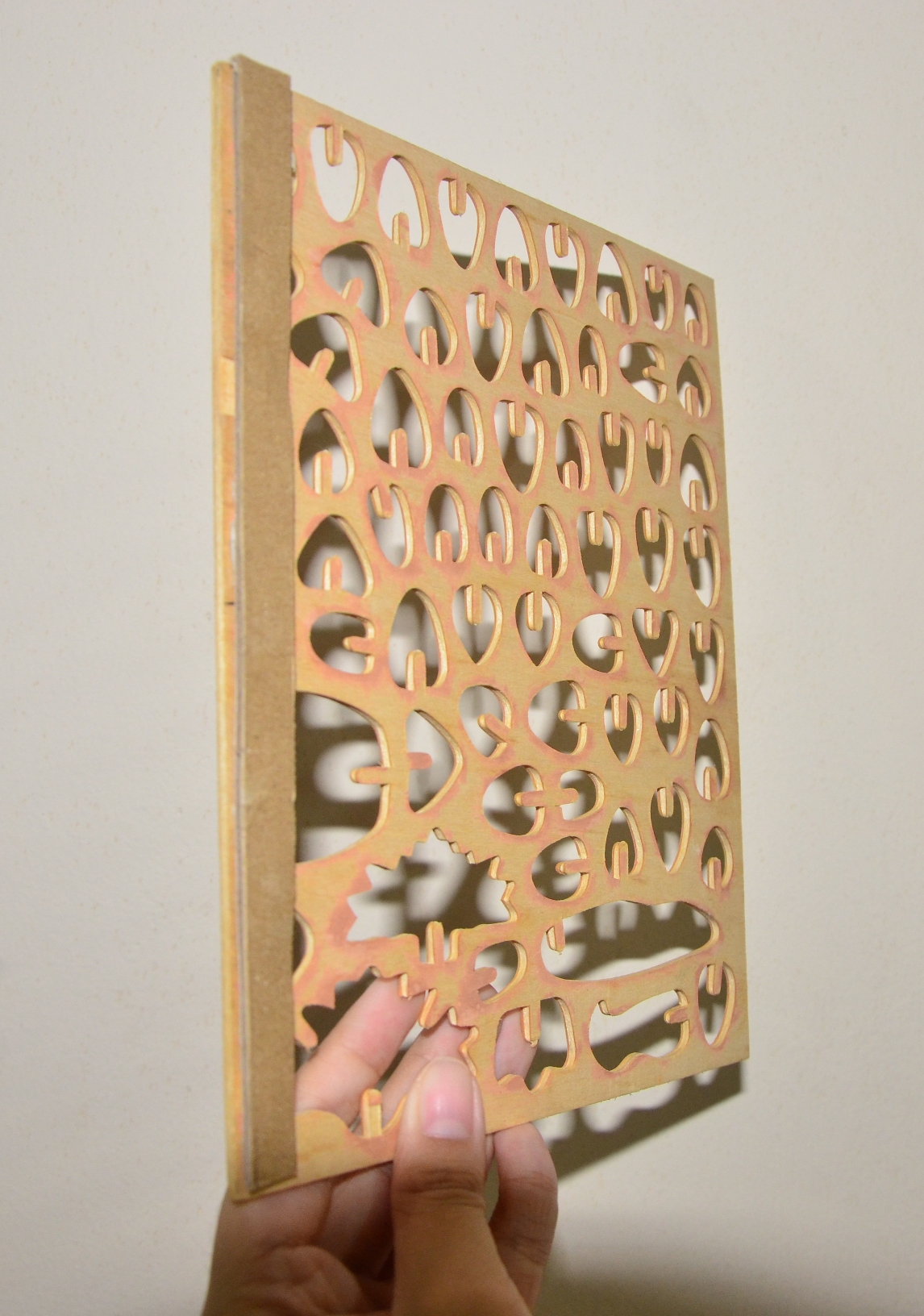
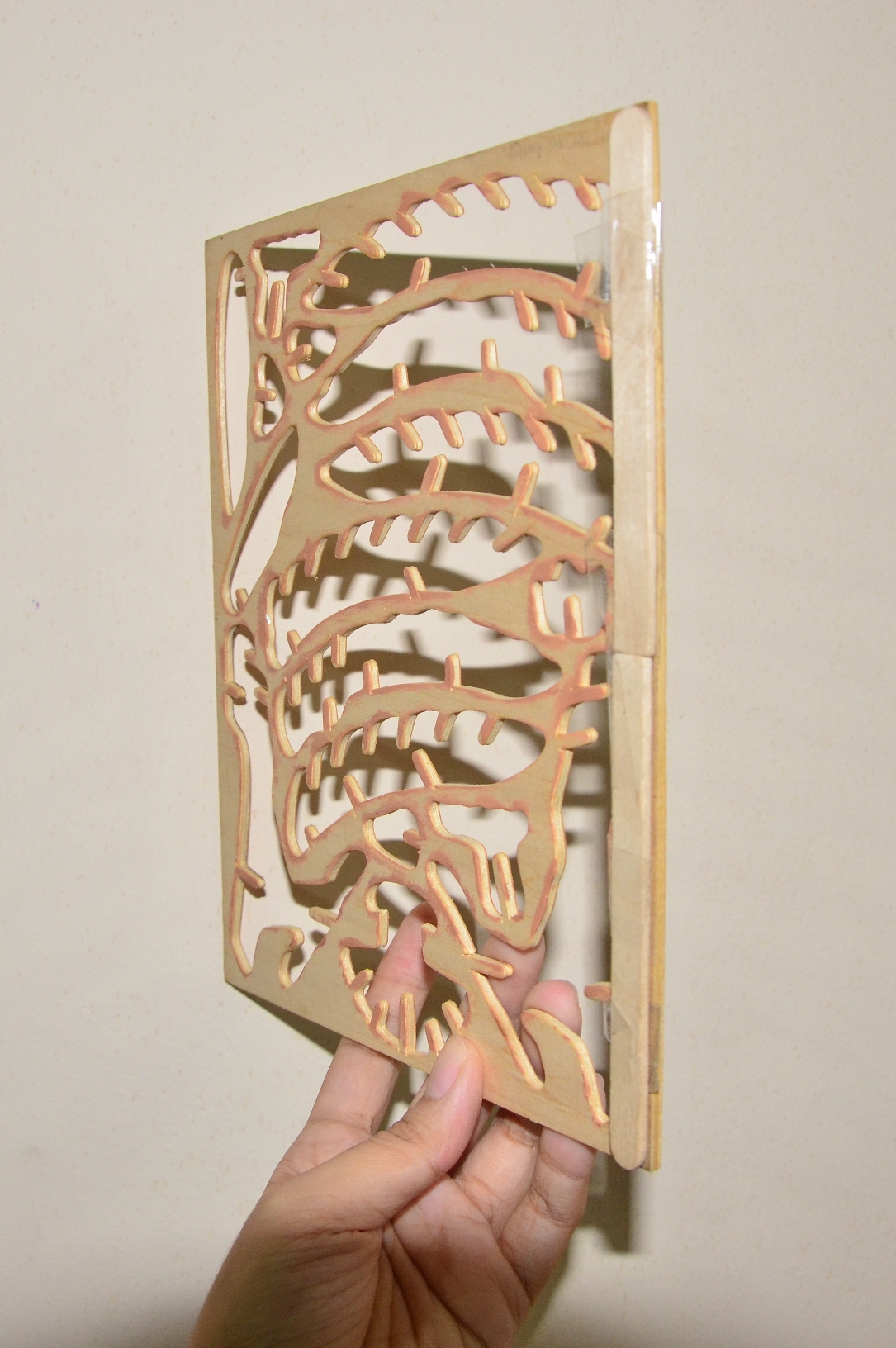
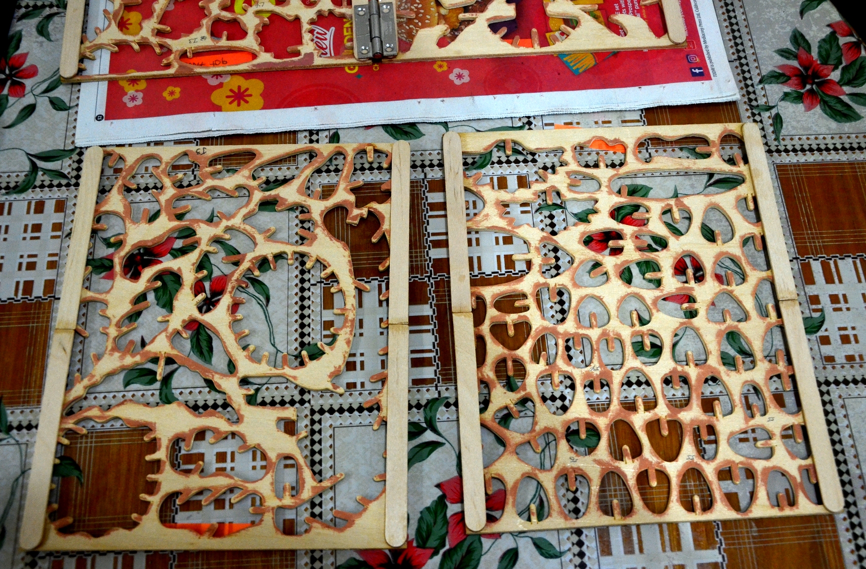
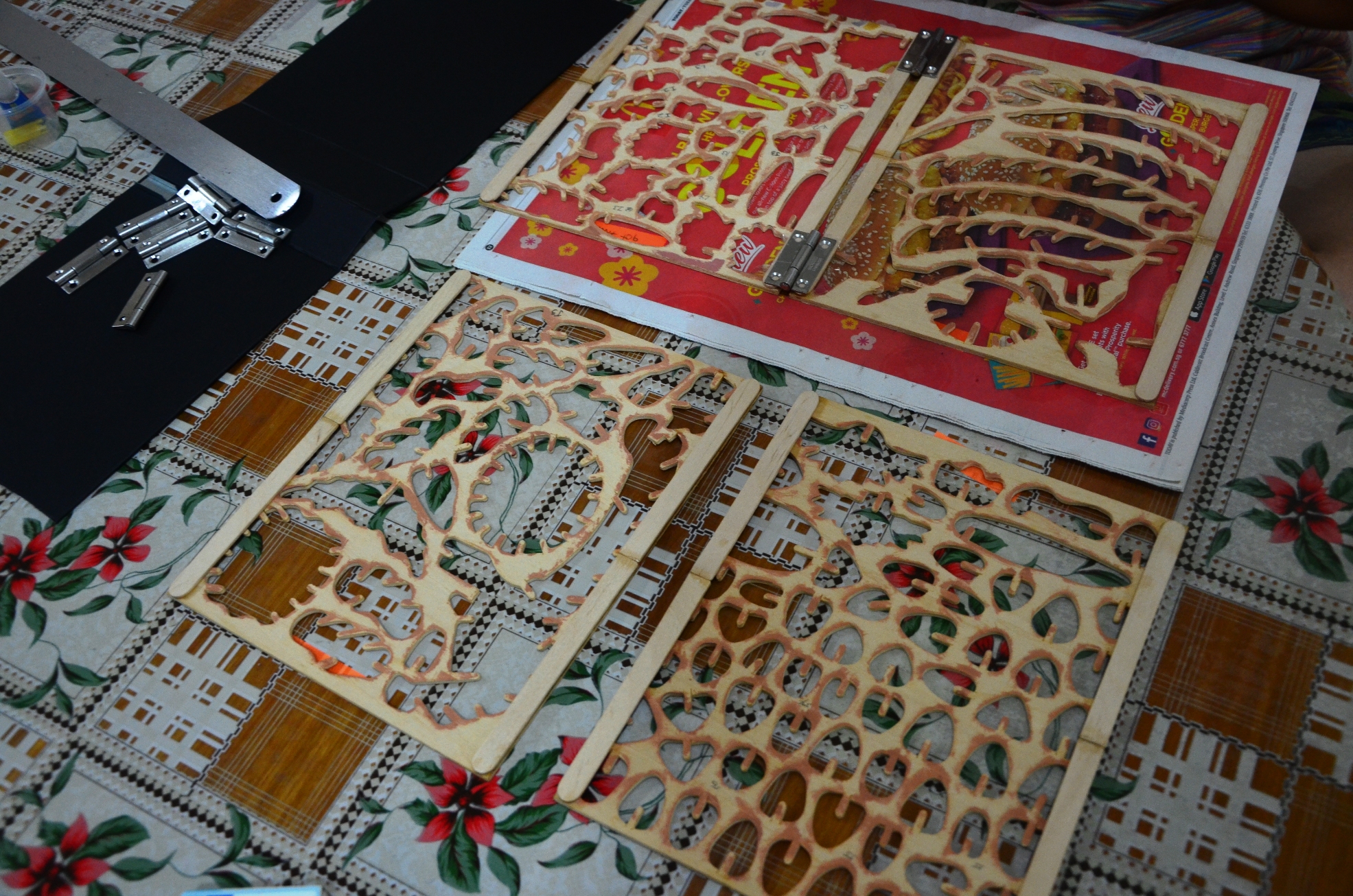
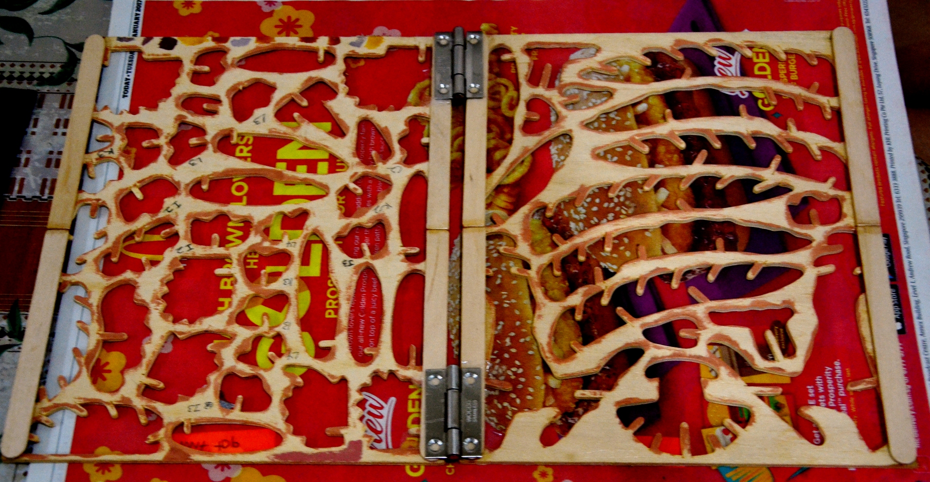
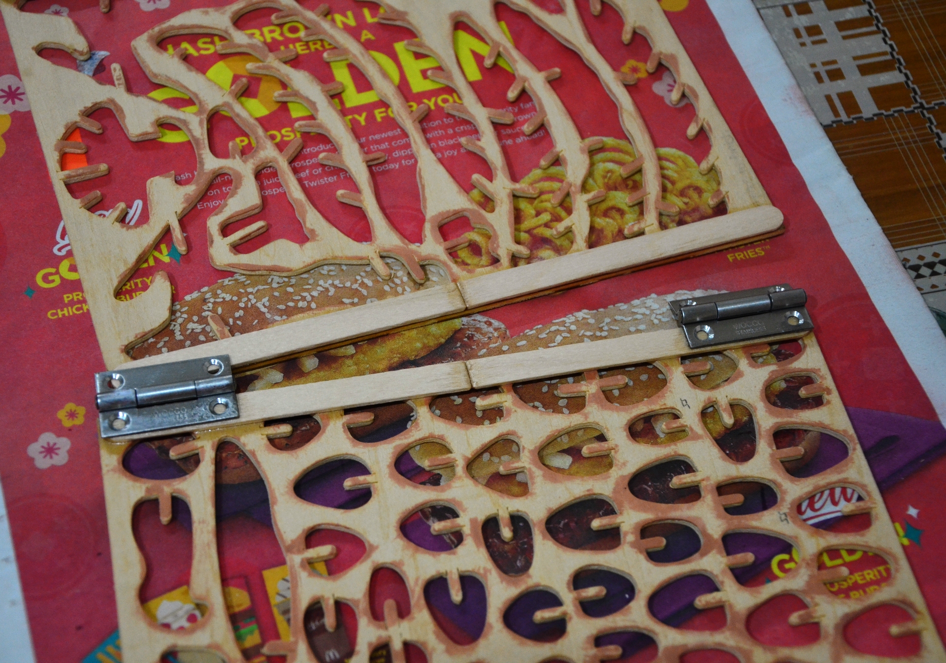
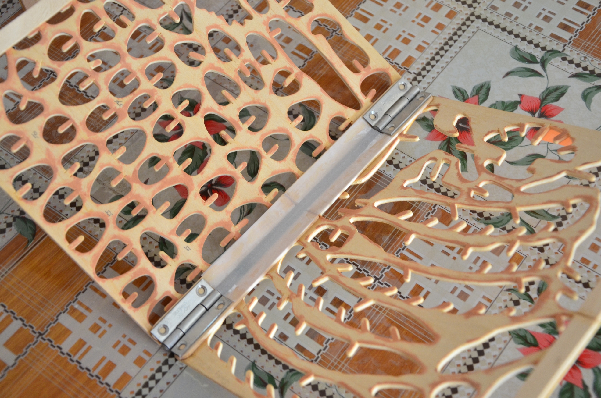
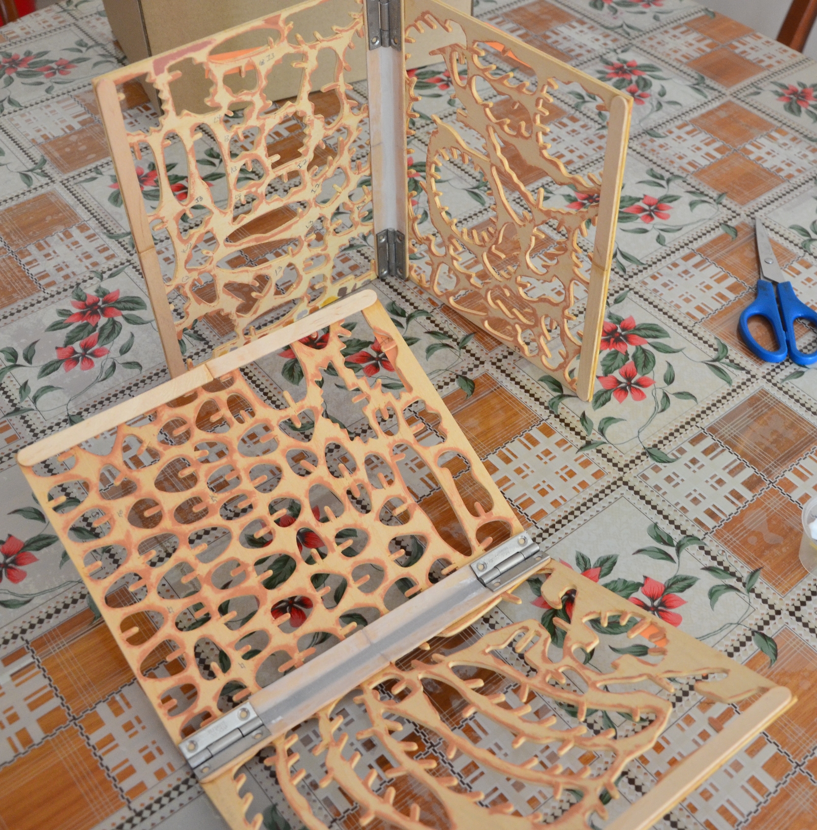
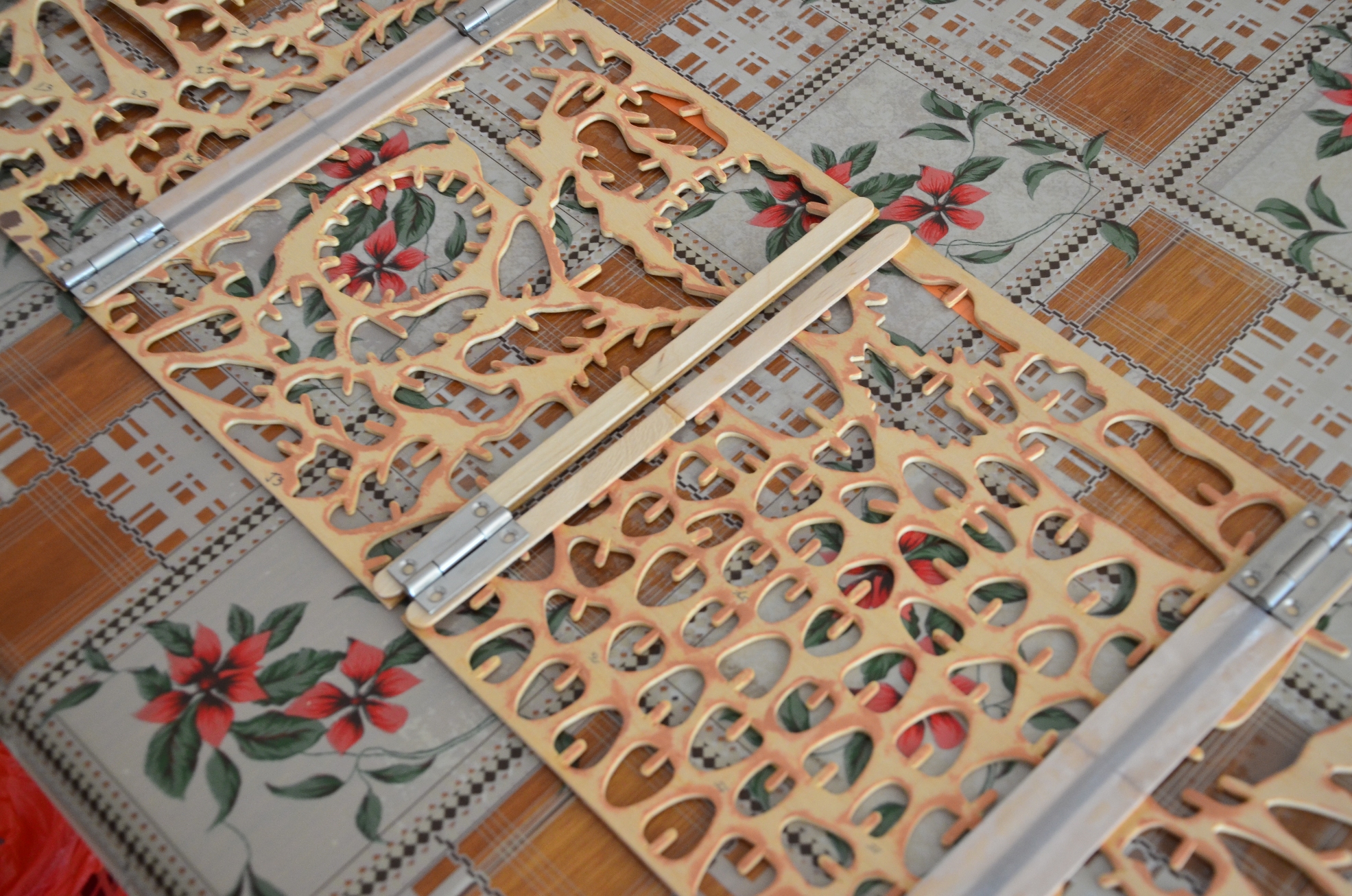
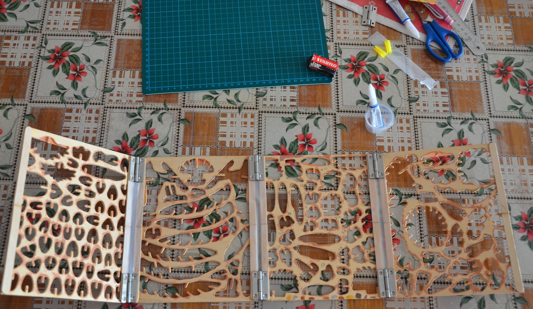
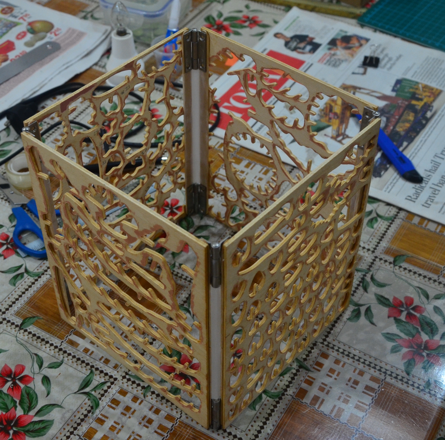
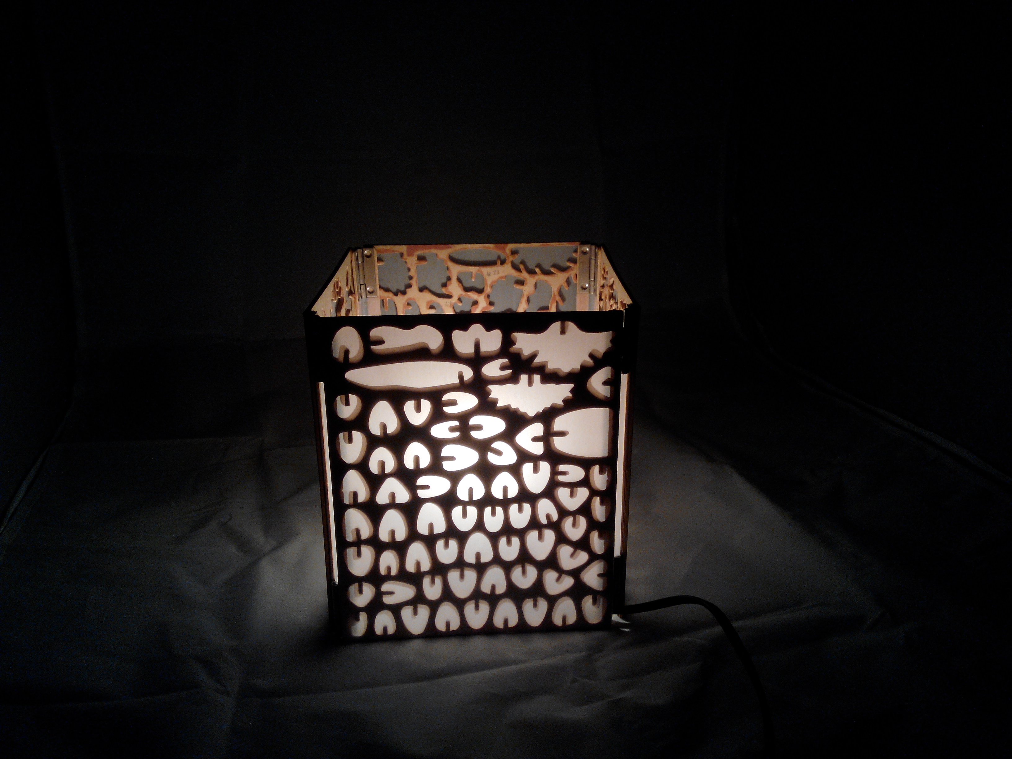
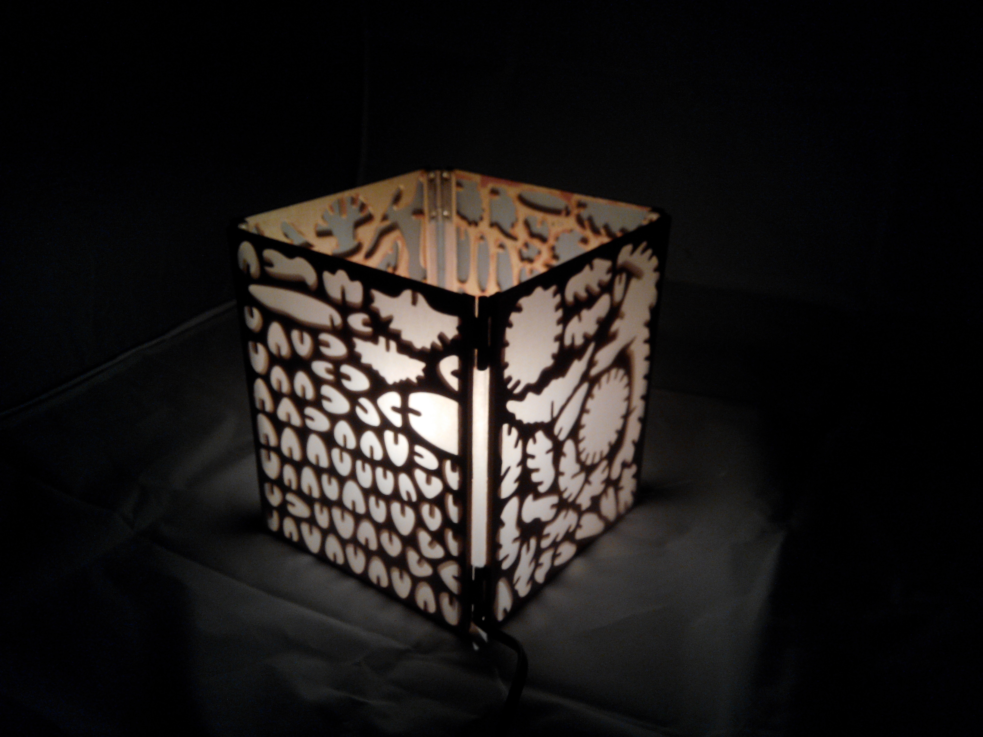
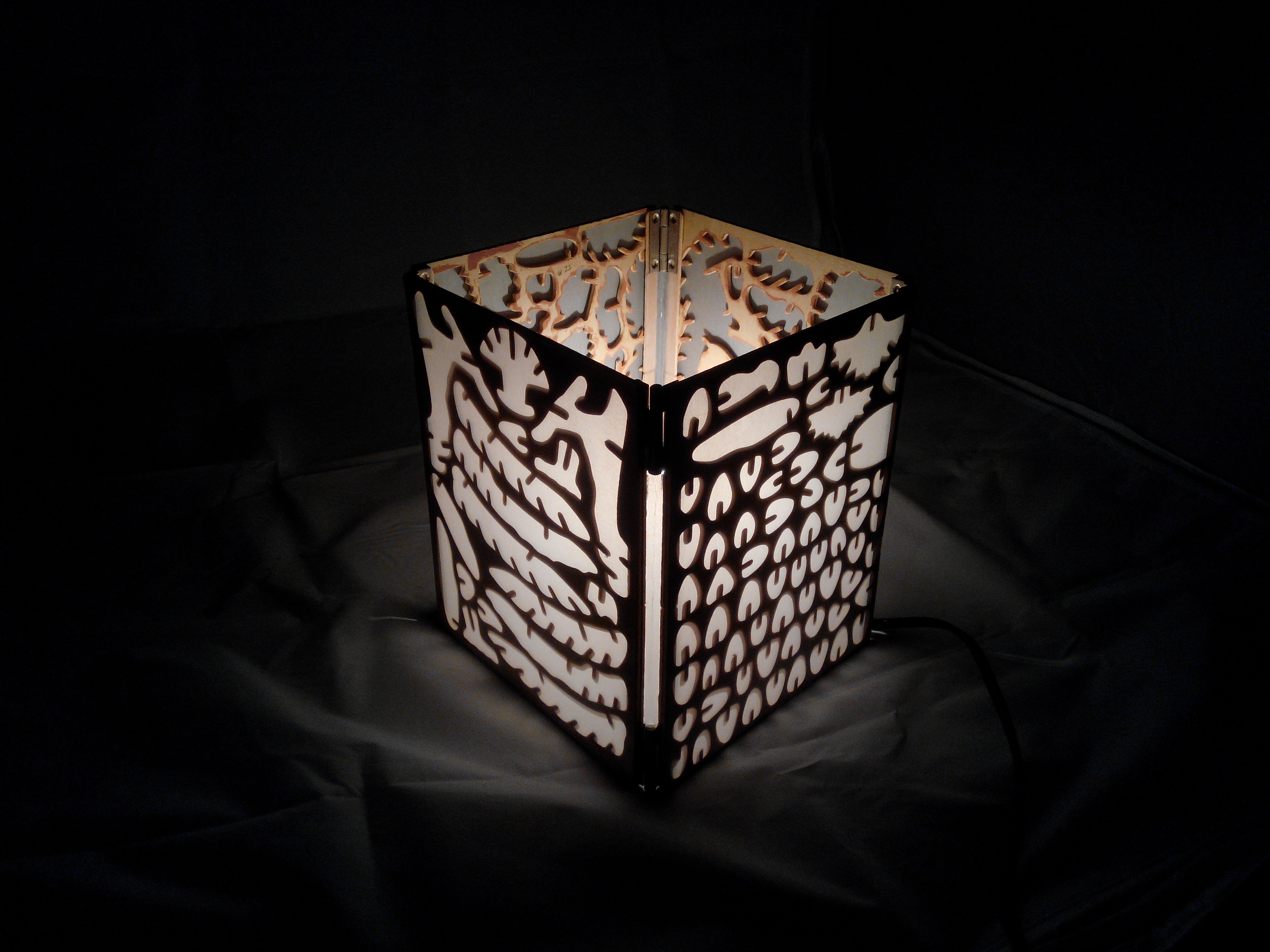
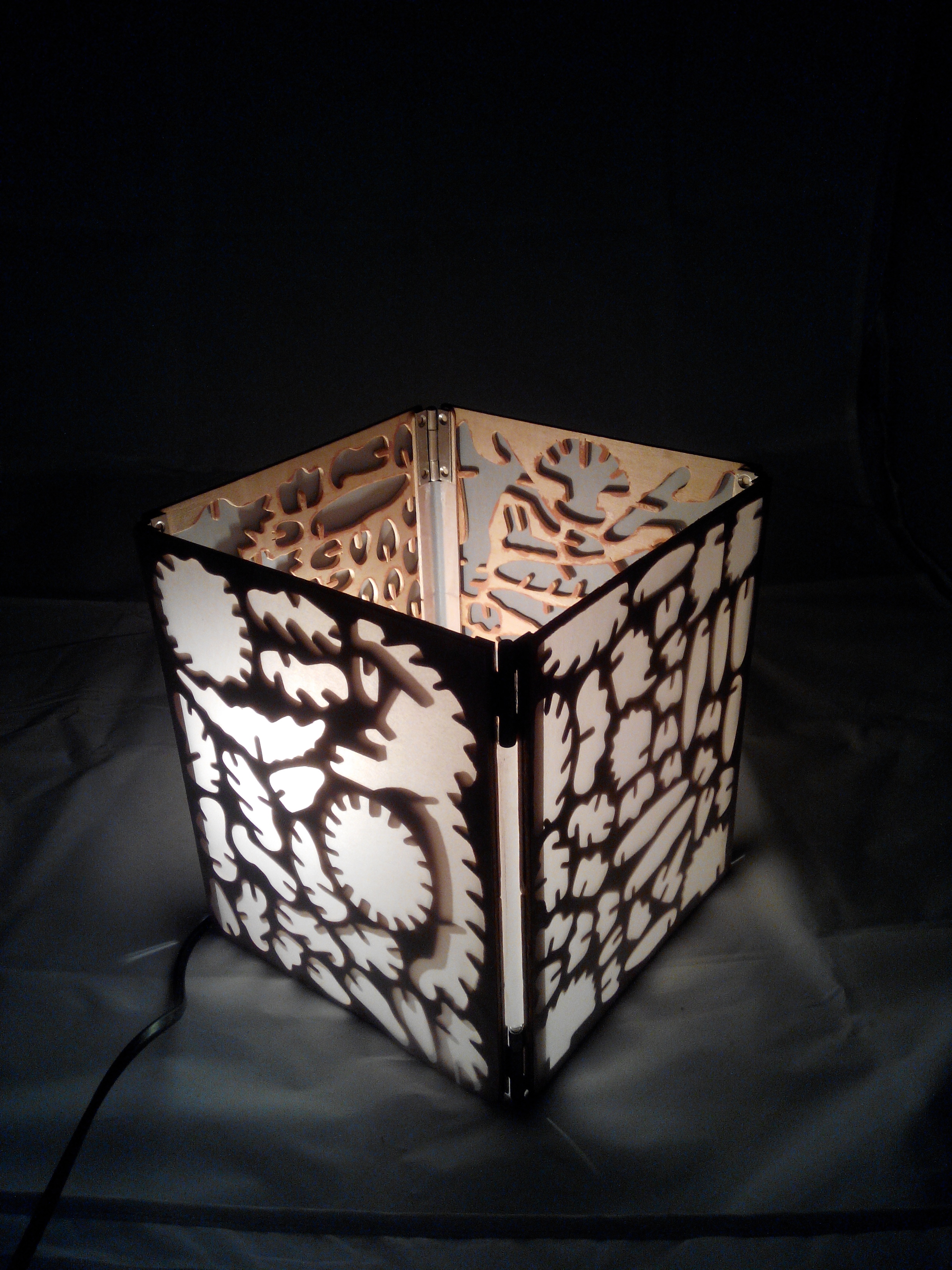
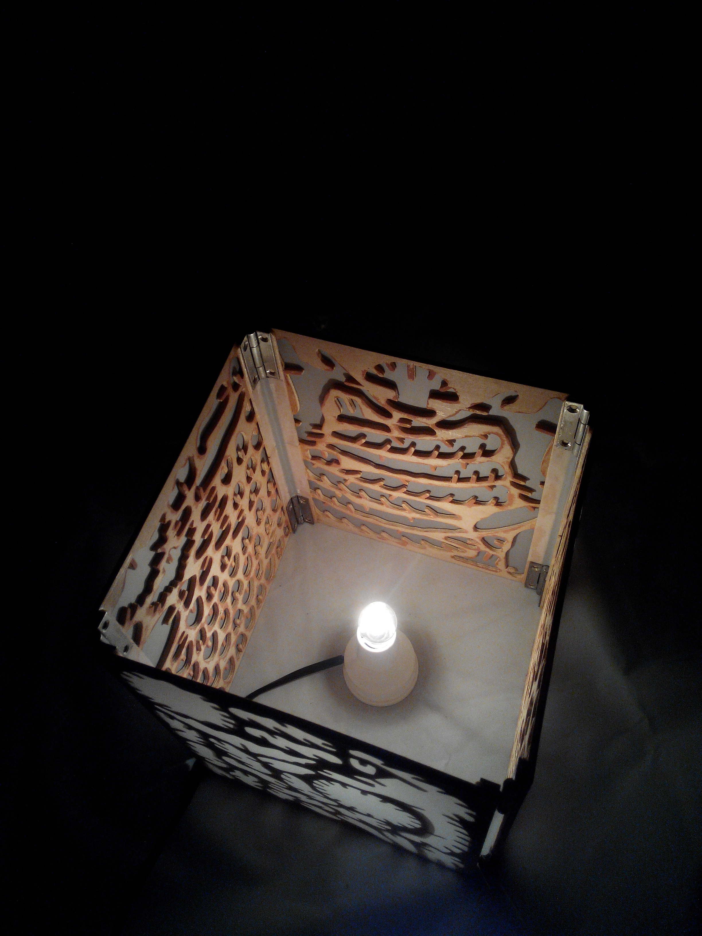
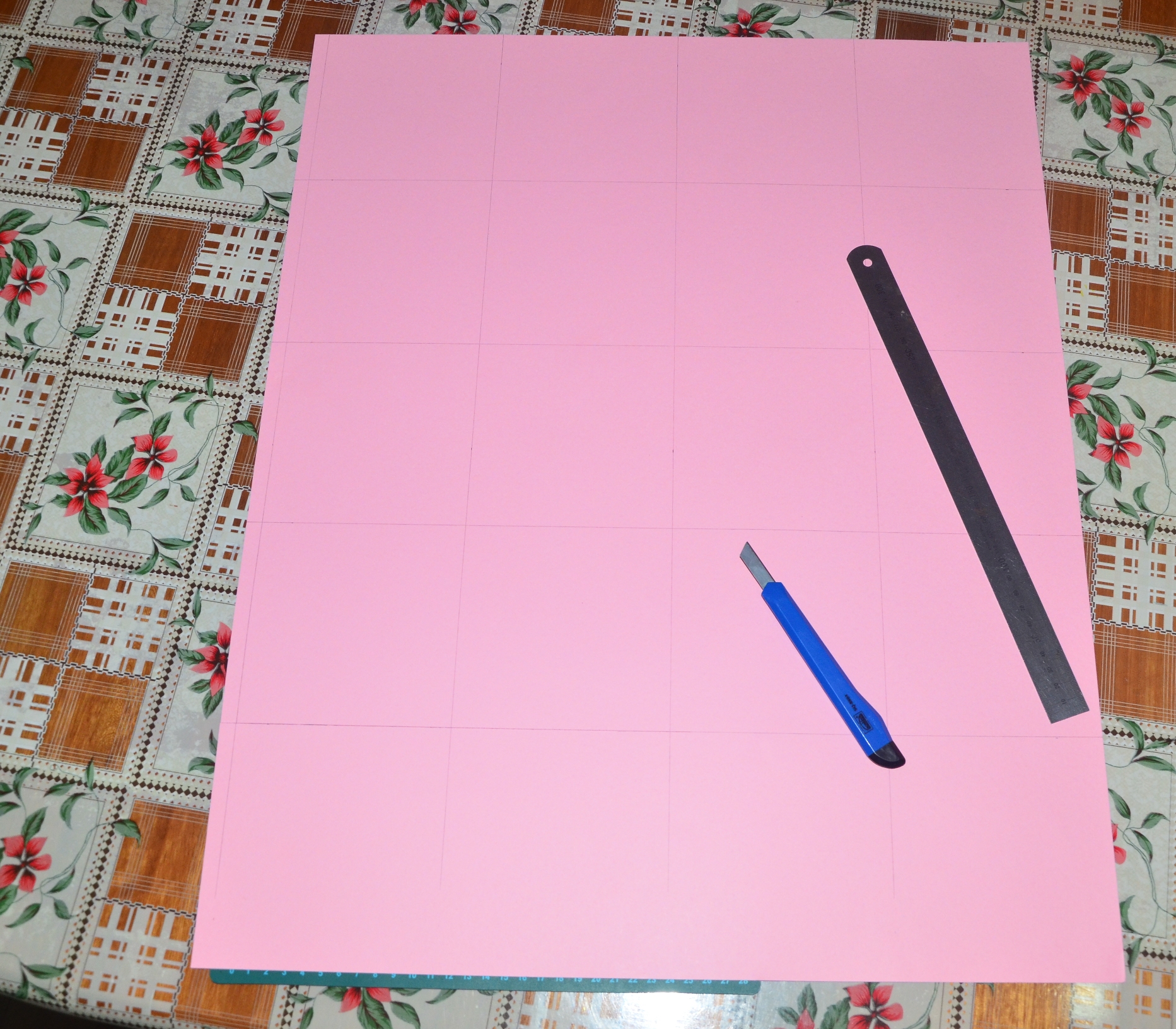
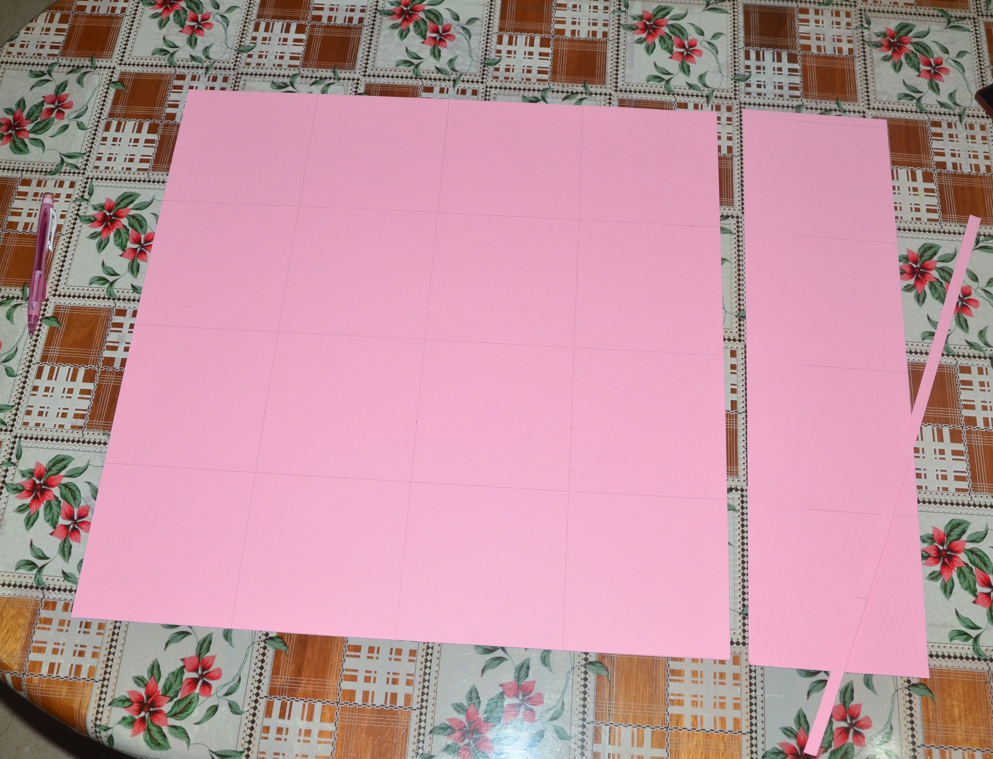
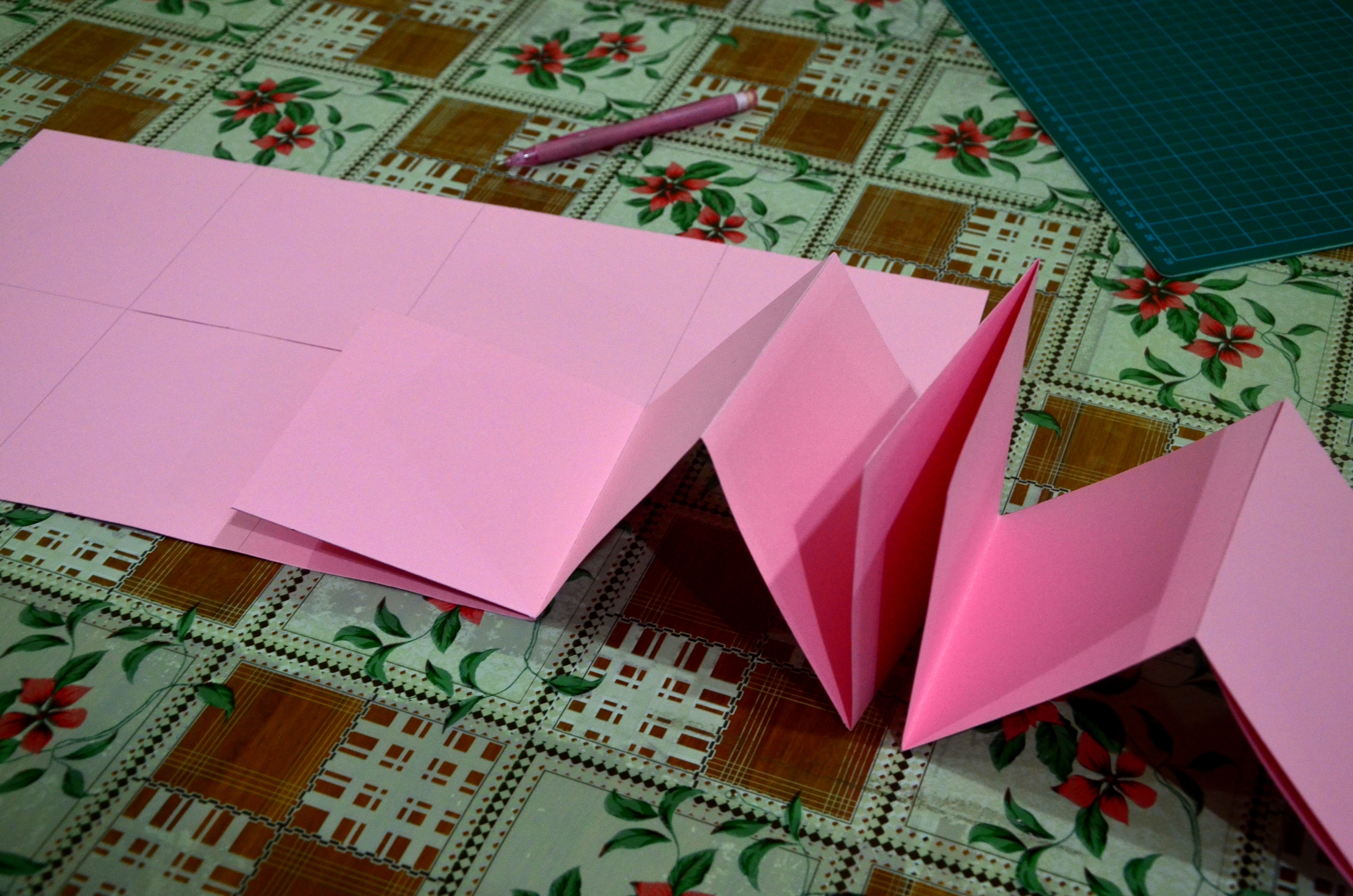
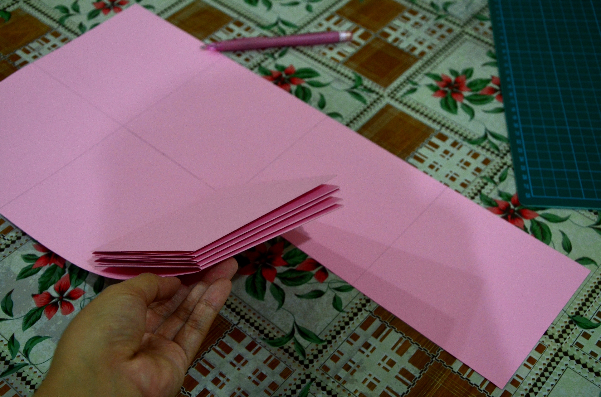
Process: I have decided to make a handmade lamp for her using 4 pieces of wood I found. Initially, I thought of attaching the 4 pieces of wood together. However, it lacks novelty which does not makes it different from just a normal wooden lamp. Hence, I have decided to include a slight tinge of interactive element to it, making it a portable and foldable lamp.
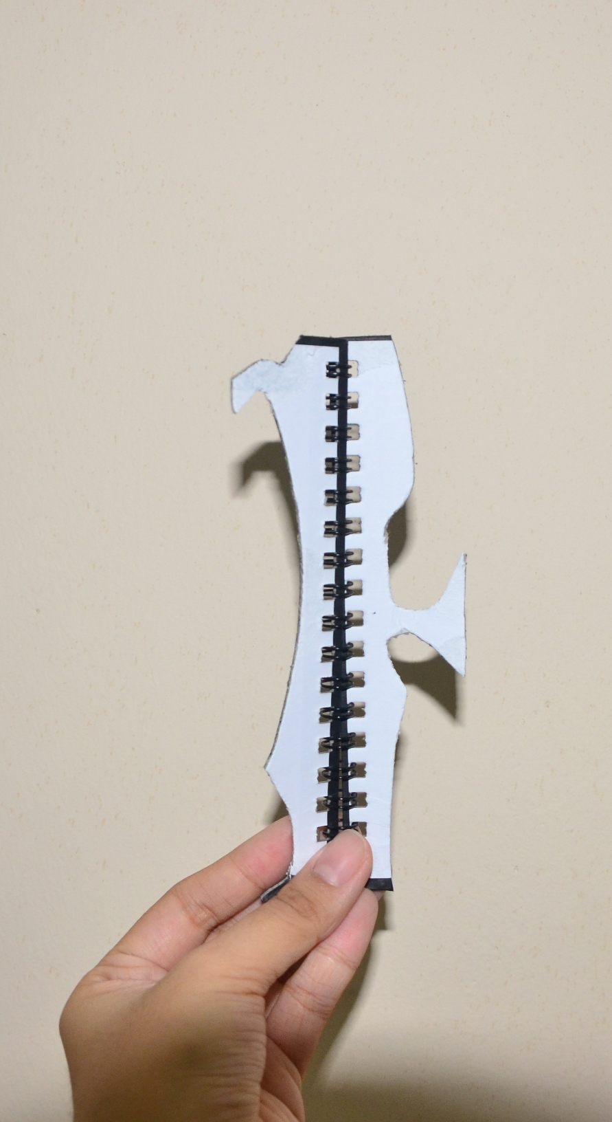
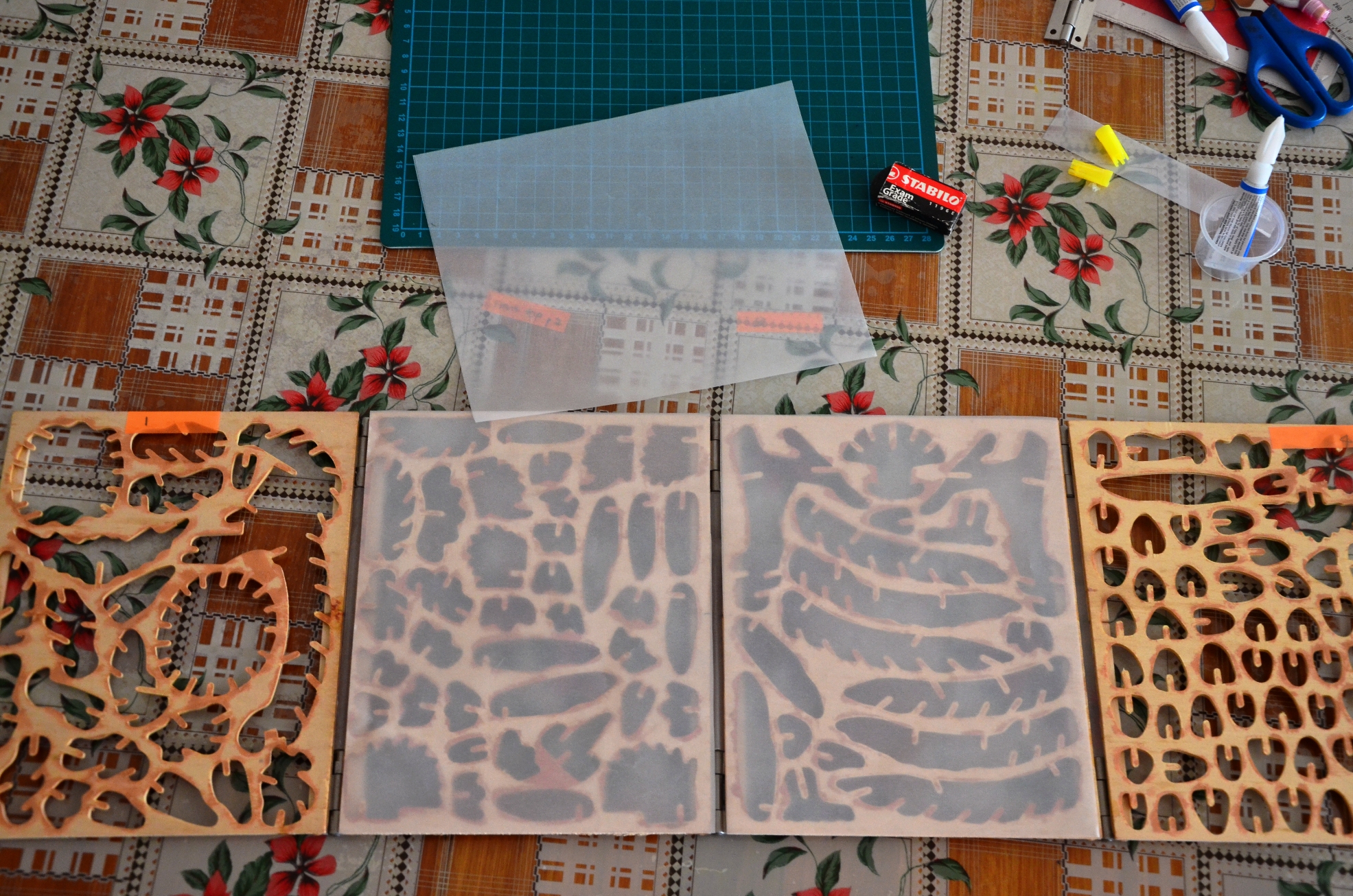
My initial idea was to cut strips of wood and attach it on the back side of the piece of wood. My trials as shown below included strips of cardboard. Subsequently, due to the unavailability of suitable wood strips, I used ice cream sticks instead. I had to cut the 2 ice creams at a certain length. (measure) and attach them together at the back. I also sandpapered the ice cream sticks as well as all jagged edges on the pieces, including the borders of the holes.
To make the lamp foldable, I had to find possible hinges for it. At first, I thought of using the metal bindings found in calendars. I measured and cut out the shape of the holes in the wood and attached it. However, it did not turn out well because the protruding part of the binding looked odd and the colour combination was also off.
I then made a trip to the hardware store and bought the smallest available metal hinges. Although there are plastic hinges on sales, I wanted the lamp to be stable and sturdy, something which plastic hinges lacked.
After which I attached appropriately sized diamond quality tracing paper along the gaps between each piece of wood to ensure that certain angles, the light will not shine directly into the eye. User friendly and comfort was also one of my key considerations.
Then I attached the tracing paper on the outer surface of the wood pieces.
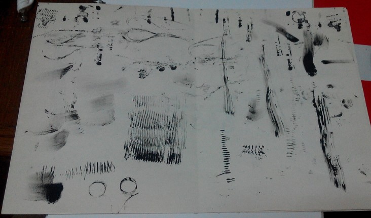
Initially when i first receive the brief, I was at loss of what to choose and how to approach it. Gradually I researched and pondered over and decided to use several techniques to help myself, including photography, collage, manual mark marking and digital editing. Using these combined techniques really helped me learn a lot since I usually do either manual or digital. In this project, I have also ventured into a less familiar field in terms of the mark making tools which were starkly different from semester 1. (Not leaves, twigs, rollers, sponges etc anymore but nails, screws, springs, wire coils threads etc). The project also lead me to think about how the flexibility of typography and how making use of the right items can give u a different type. The learning curve was rather steep for me since from the start till the mid of the project, I did not really grasp the requirements fully, leading to failed attempts such as the branding logo made for the Wine Dealer. It was then that I realised that I had misinterpreted the requirements of the project. However, this also serve as a good platform for me to explore and with every mistake made, I learn. Furthermore, I also learn that simplicity is really important as well since I have the tendencies to stray towards more abstract and complicated designs. The overall experience for this project was enriching and I really enjoyed exploring, be it using the materials, researching into books or even embracing my mistakes and finding ways to improve.
– Chef seems too cliché, quite a few people doing. It seems too general either, should scope down into a specific kind of chef, making me feel uncomfortable and restrained.
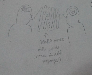
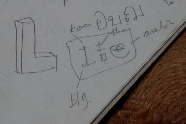
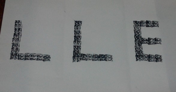
– Translator: the original idea was to design 2 humans interacting together. One with a messy lump of illegible words in his mind and then as the words are spoken, it flows and form a legible form into the other person’s mind. The second idea was that use different languages In the world to form LLE. Example: L in Korean, L in Arabic and E in Chinese. However, the overall concept proves to be quite messy and hence I discarded the idea.
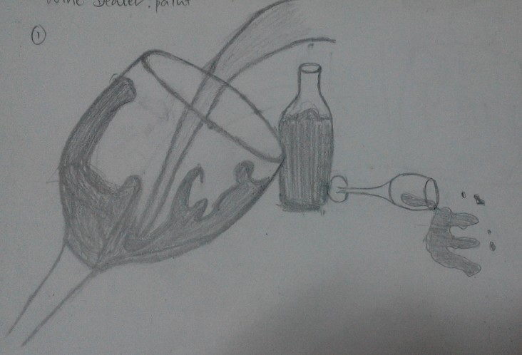
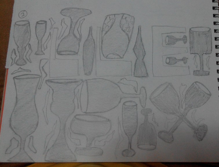
Progress work for wine dealer:
Pic 1-wine glass with splash
– Reasoning: the splash contains the L, the bottle and wine glass also forms an L. the spillage forms the E.
– Comments: the overall concept seems confusing and that they are very disconnected. The splashed in the L in the glass is confused with the unnecessary splash on the other side. The bottle and the lying wine glass also seems to be very disconnected due to the lack of overlap. Even though the E is okay.
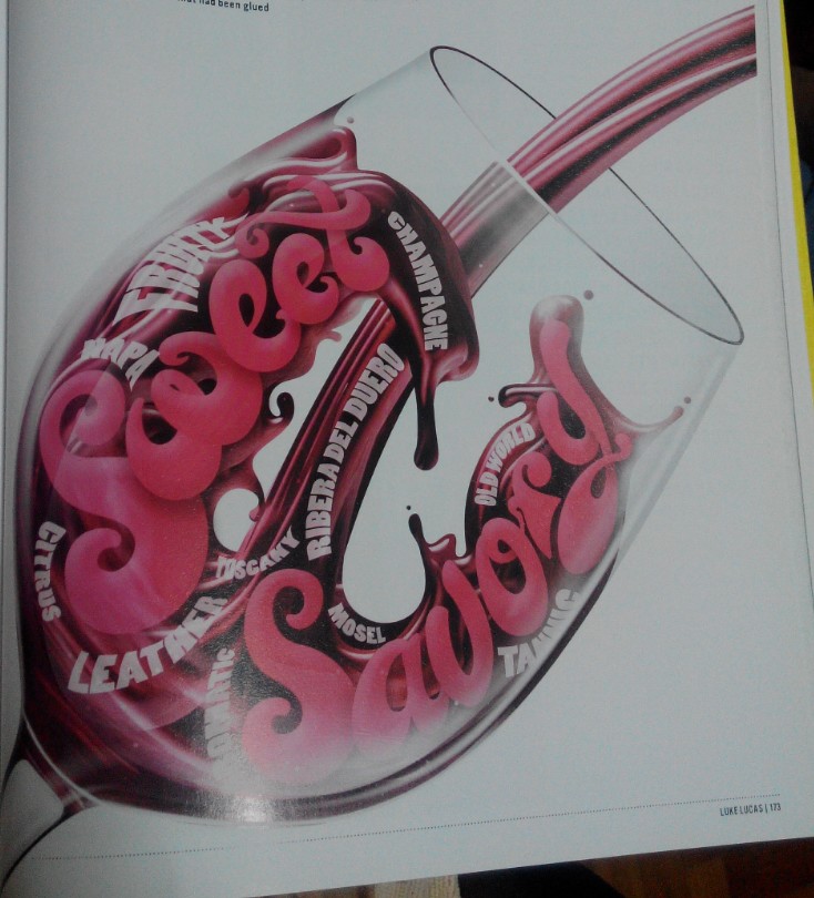
Inspired from:
Pic 2- Arranging all sorts of wine glass and the negative spaces form the LLE.
-Reasoning: the negative space will form the letters.
-comments: there are unnecessary distractions like the small angular frilly things that confused the design. The overall composition seems messy as well.
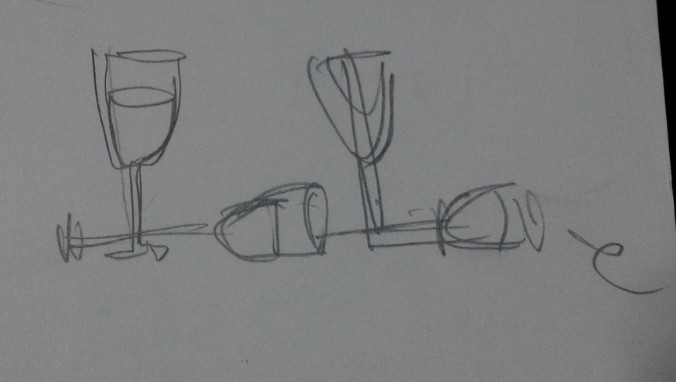
Pic 3 – using distorted wine bottle and barrel to form
-Reasoning: there is a sense of connection on the L , making it very clear card.
Pic4- use lining up wine glasses to form one of the L, then the distorted L as another:
-Reasoning: there will be different variations of the L and it wouldn’t seem to be as plain.
-Comments: still very messy
Pic 5- use 2 wine glasses as the LL
–reasoning: sense of connection
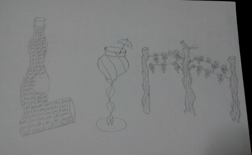
Pic 6- wavy L bottle, wine gals with umbrella (DOT) and poles and vines as the M
-Reasoning: ( as of now, I changed my approach to LIM, thinking that perhaps I can have another approach) again, I want 3 different items to have variation. But then again the connection isn’t clear but I feel that its good that I am opening up my options and seeing more things that are related to the occupation.
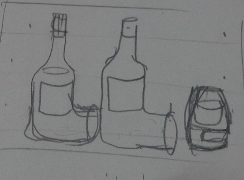
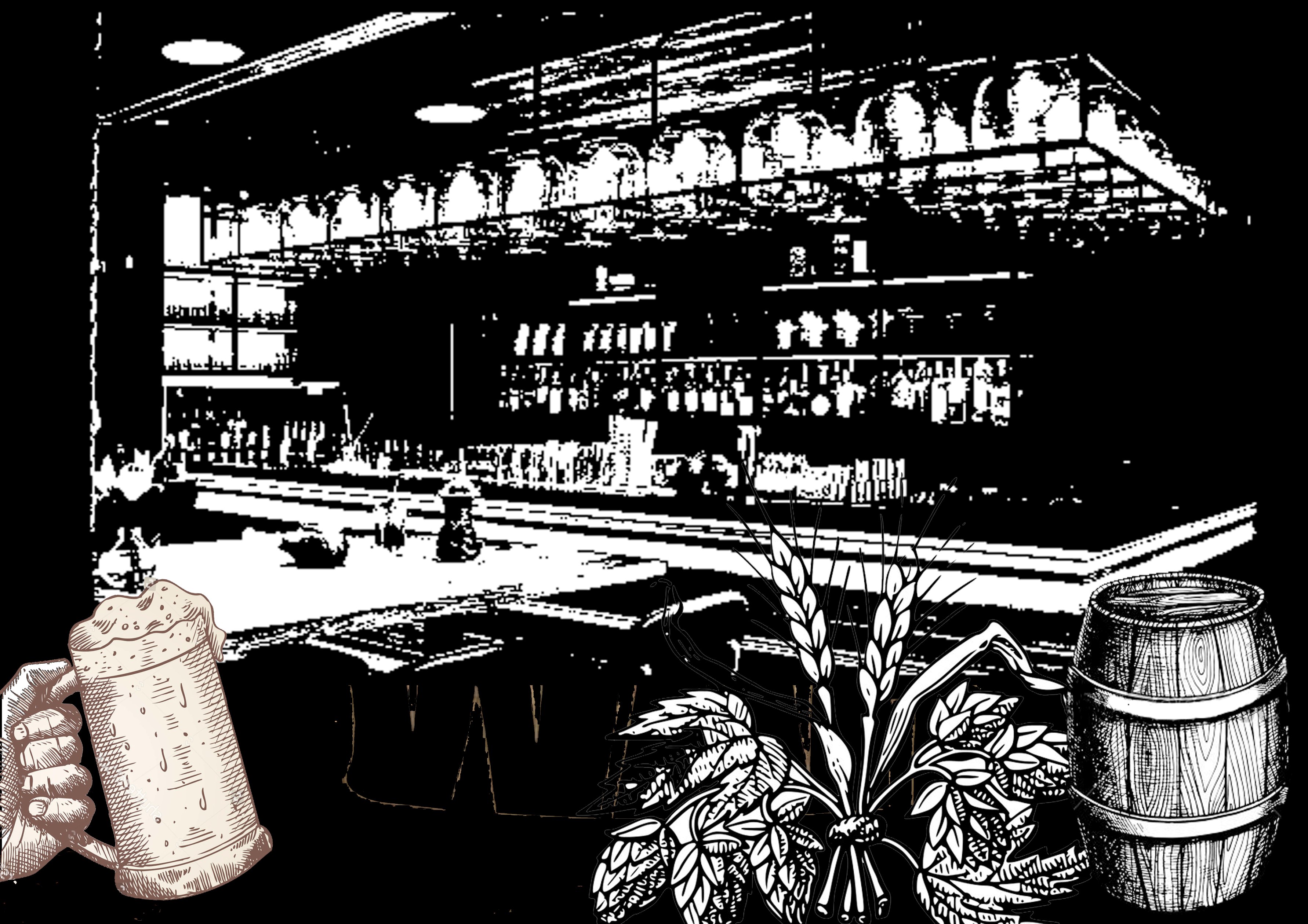
Photoshop figure 1: Bar counter
–reasoning: felt that the setting should be in the wine shop/ bar with main indicative elements that explains the occupation. Since the brief states that it can be in black and white, I edited and threshold it to become what is seen. But it’s way too black and the compositions seems too complicated.
Bottle cap/ top view of beer/wine bottle and arrange in the huge bottle form with LLE in the centre as the negative space
-Reasoning: it’s hard to form the bottle shape with all rounded top views/caps. If places too closely, it’s not realistic since the bottle form is from narrow to wide and there will be this space between each of them from the top view. Besides it will look pretty complicated.
The one with the logo on the front line
–Reasoning: I changed my perspective to one of a beer manufacturer and I want to advertise the brand using my name initials. Hence, I came up with the LLE logo.
-comments: However, the design seems to represent my lack of understanding for the brief itself. What is wanted is that the letters itself should represent the occupation at a glance and not because of the things surrounding it that matters.
Using 1 idea to represent LLE. (vines/ barrel/ wine glass/ mug)
However, I attempted and felt that it was rather restricted and it was difficult to express as well since all of them seems rather uniform.
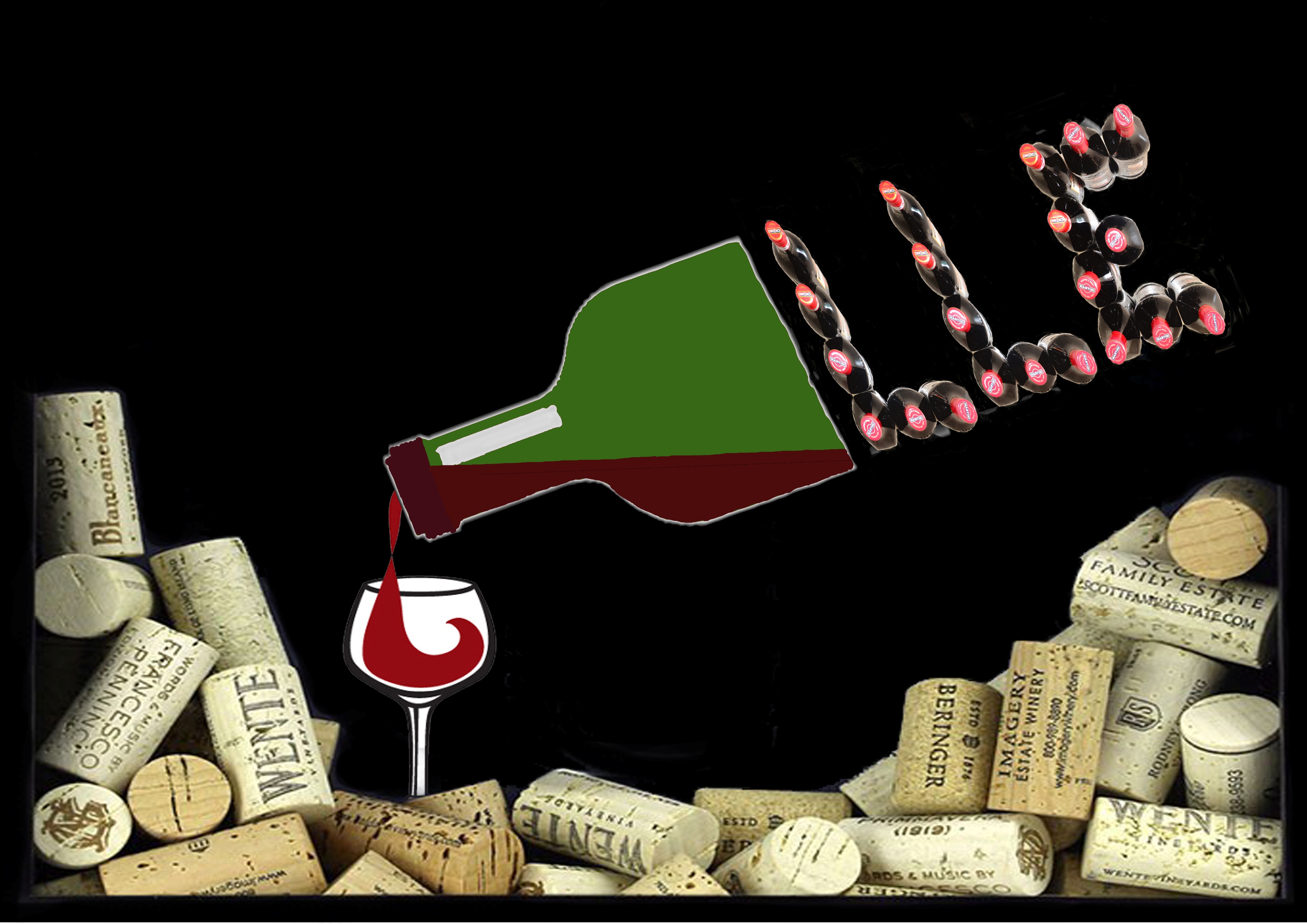
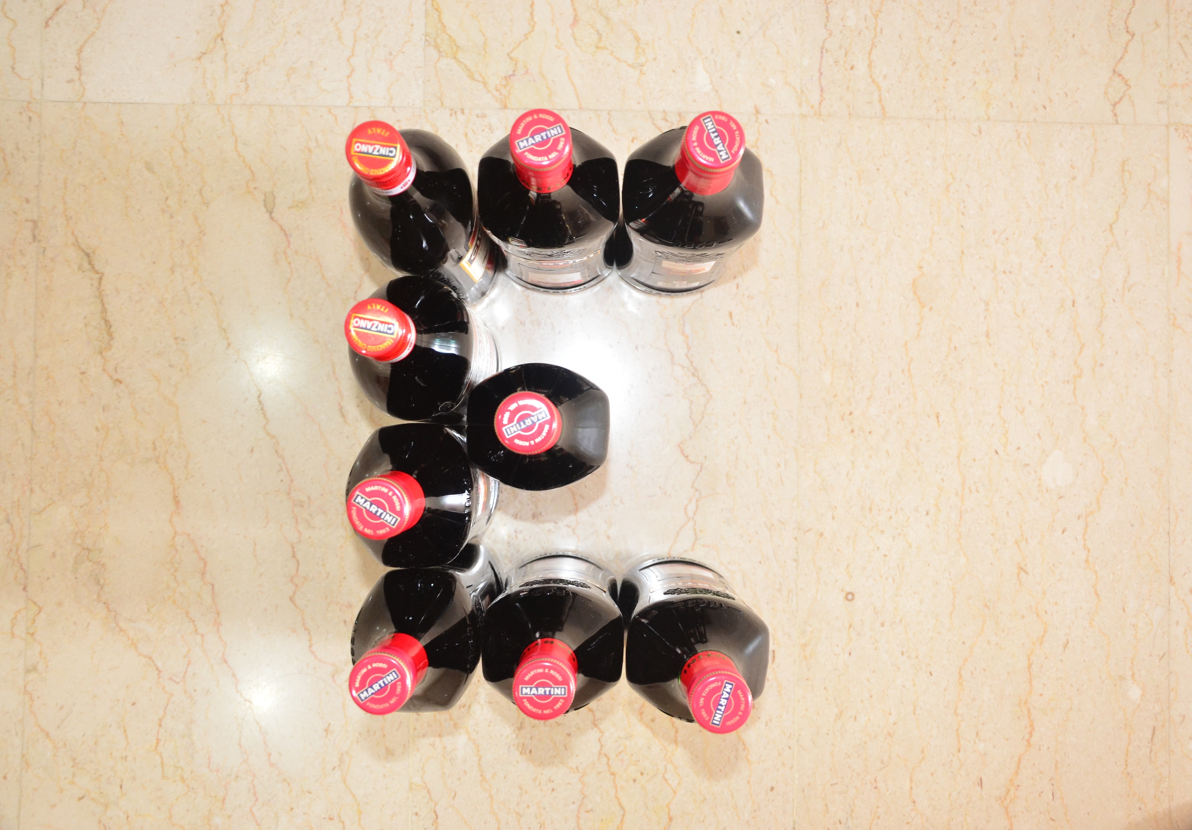
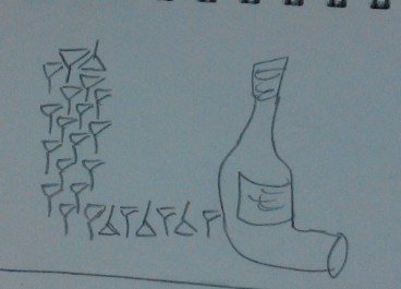
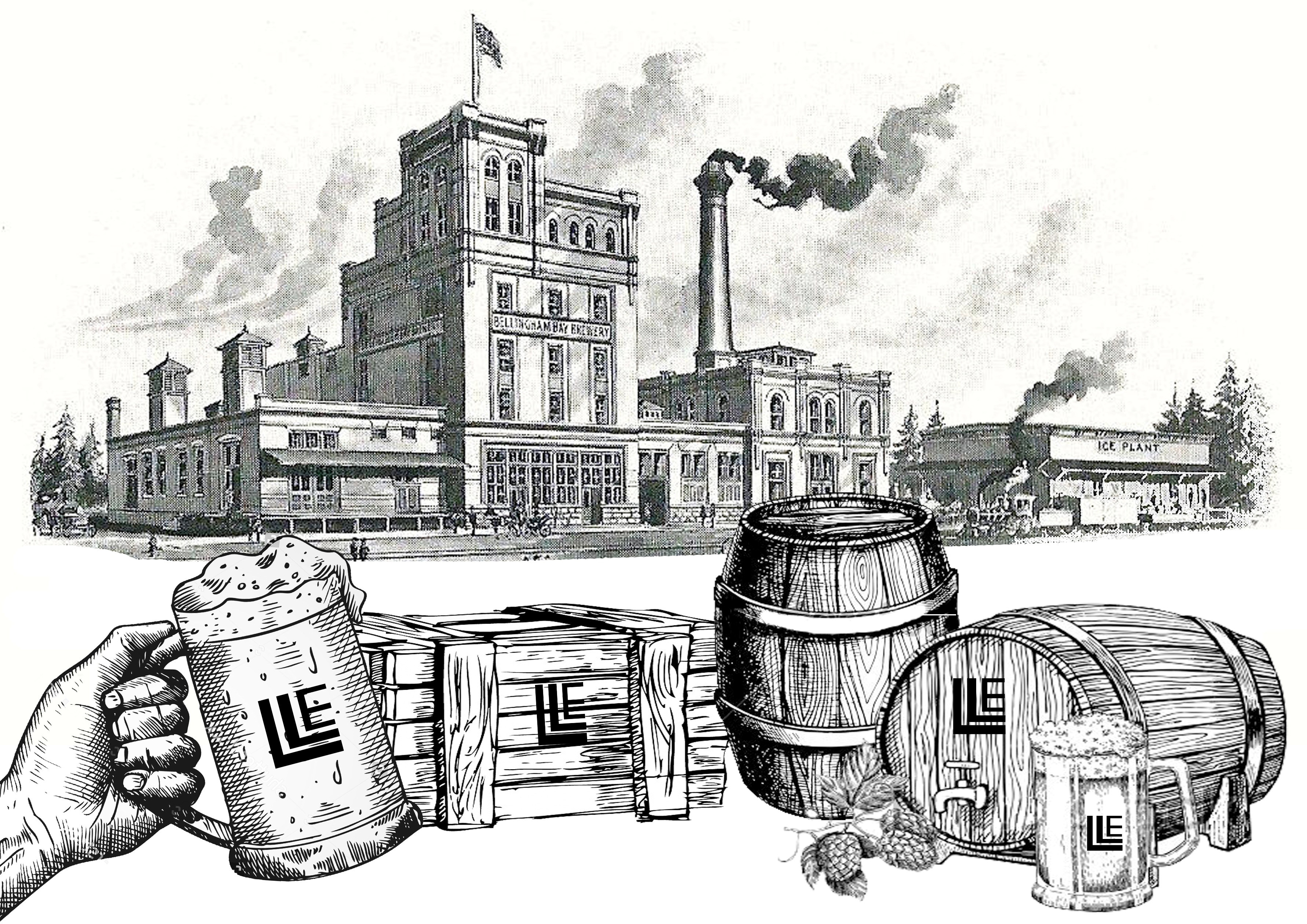
Final Result: Most direct way of using wine bottles.
Key identifiable features of a wine dealer: wine bottles / wine glasses/ wine cork/ wine.
I used Martini and Cinzano wine bottles to create the layout of L and E and photographed them. My original intention was to just overlay the 3 photographs together as one. However, it felt awfully plain and too literal. So I pondered over it and realised that wine corks are also an important part of the wine industry, something I overlooked previously. Hence, I decided to make part of the background with wine corks with wine pouring out from a bottle into a glass. To incorporate the photographed wine bottles, I made half of the bottle solid and finished the shape of the other half of the bottle with LLE.
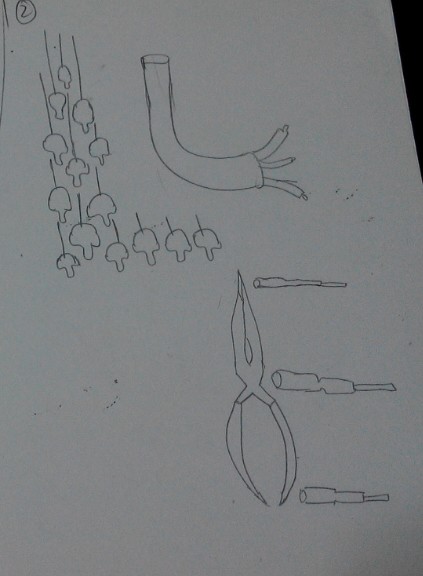
Progress work for electrician:
Initial ideas:
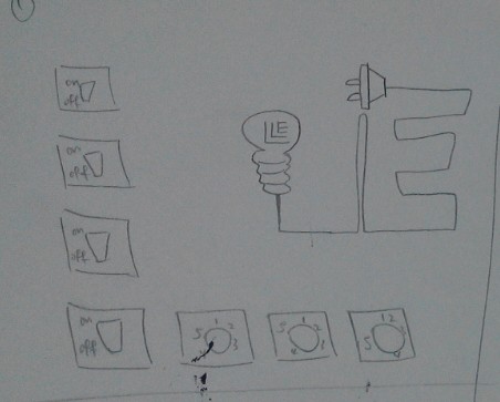
Line up different type of symbols or switches to form LLE. Use a light bulb with the wire coming out at 90 degrees turn to form L. The wire connects in a shape of an E to the end (plug).
Use suspending light bulbs to form shape of an L and use a wire to form shape of the other L, ending with 3 different coloured wires at the end. (Live wire/ earth wire/ neutral wire). Followed by using electrical tools to form the E. ( wire cutter and screwdrivers)
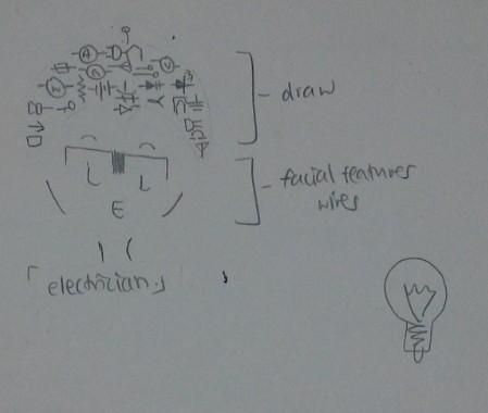
Use the symbols to form the head of an electrician (human figure involved).
Inspired from:
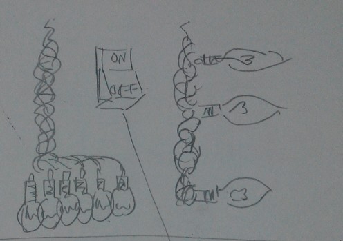
Decided to use light bulbs and lose wire endings to form the LLE instead.
Experiments for final result 5):
Initially I thought of overlapping images of wires to form the body of the letter but then I felt that it was too literal, so I decided to use mark making tools instead.
Items experimented with:
Making the body of the letters:
Medium sized coil of copper wires.
– Coated one side of the coil with ink and tried to roll it to create the lined effects but it was not even nor obvious. The coils have up and downs with gaps in between causing the ink to flow into the gaps instead of staying on the rounded surface. Using this as mark making tool was not exactly feasible then.
Threads
– Cut a piece of thread and tied the 2 ends together. Dipped it in ink and did trial mark makings. The result lines are too thin to simulate that of a wire. Besides, it was hard to control the waviness of the threads as they often clung together into 1 line. Using this as mark making tool was not exactly feasible as well.
Lose ended wires.
-Attempted to stamp the wires but they were too stiff with the casing on and hence make them unsuitable since the results were rather rigid.
Small coiled springs.
– Thinking that perhaps scaling it down to a smaller version from 1) will be easier to control and that the resultant lines will be more prominent. However it did not differ much from the first, except that the lines are more prominent this time.
Cardboard:
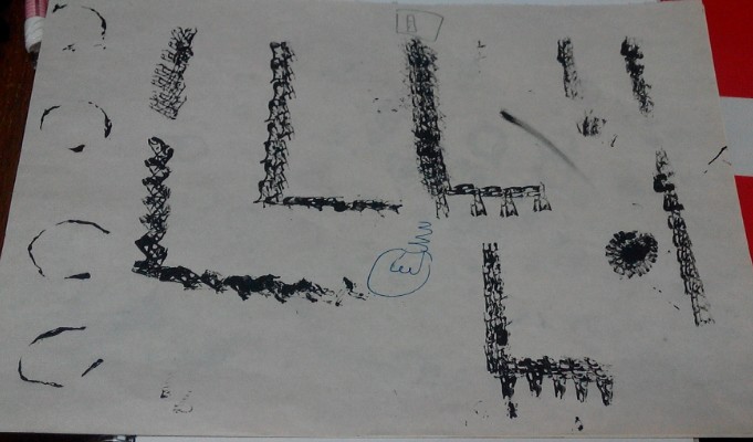
– Cut the cardboard into small short finger strips. Dip the ends into ink gently and stamp it. Surprisingly, the wavy lines within the corrugated board offered good texture for “wires”. I then proceeded to stamp the outlines of the letters out and let it dry overnight before scanning it into my computer for any further digital editing.
Mark making the light bulbs:
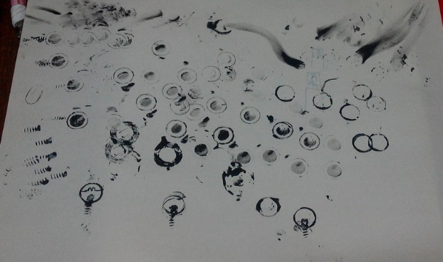
Different thumbnail sized rubber rings / rounded metal stands/ metal rings.
– Dip the materials into ink and try to stamp it. The overall effect was okay but the shapes were too roundish for a light bulb. I then tried to squeeze it a little just before stamping and played around with the shapes. However, I realised that the shapes were too uniform throughout the outline.
Long nails/ small springs found in pens.
-Dip the ends of the materials into ink and stamp it. The effect was rather okay for the ends of the light bulbs but the lines itself were not long enough to go round and cover the U shape under the light bulb. And if done several times, it becomes messy which then makes them unsuitable.
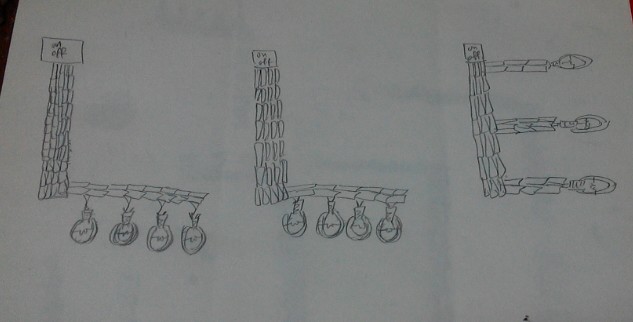
Final Result:
Key identifiable features of an electrician: light bulbs/ wires/ switches/ electricity.
I inverted the scanned images since I wanted a dark background and attached light bulbs at the end of the letters. I also added a switch on top of each letter since the letter itself represents wires. I pondered for some time on how to further represent electricity even though the light bulbs were already lighted up. Since my background was dark, I decided to simulate a “sky” feature and used lightning instead. Allowing the lightning to pass through each switch gives it electricity/ power for the light bulb to function.
Process work for IT Programmer:
Inspired by:
Key identifiable features for IT Programmers: coding / matrix
I have decided to go with matrix instead.
Draft 1: Overlapping columns of digits over digits to try to compact the layers before erasing digit by digit to form the LLE.
– Thought that the idea was too simple and that it was tedious to overlap manually to create the effect as well as erasing the digits. This then led to draft 2.
Draft 2: Deciding that 1) was too mainstream, I decided to crop a part of the matrix background and skew to mini triangles before aligning each of the triangles into the 2 Ls. Small rectangular strips were lso cropped out for the E.
– However, the result seemed to be too complicated and it looked rather confusing. The background was covered by the patterns formed by the overlaps and the attention was stolen away from it. This then led to draft 3.
Draft 3: Change of colour. Since the first 2 methods used were unsuitable, perhaps I feel that I should change the colour of the digits to create the LLE within the background itself.
– It turned out that the effect was significantly worse than the previous versions. The white was hard to distinguish and it made it very confusing for the eye to dart around and make out the letterform.
Hence, I have decided to revert back to draft 1 and make amendments from there.
Changes: I began to overlap more at the designated areas for my letters and resized the digits when needed. Eventually the letterforms became more outstanding.
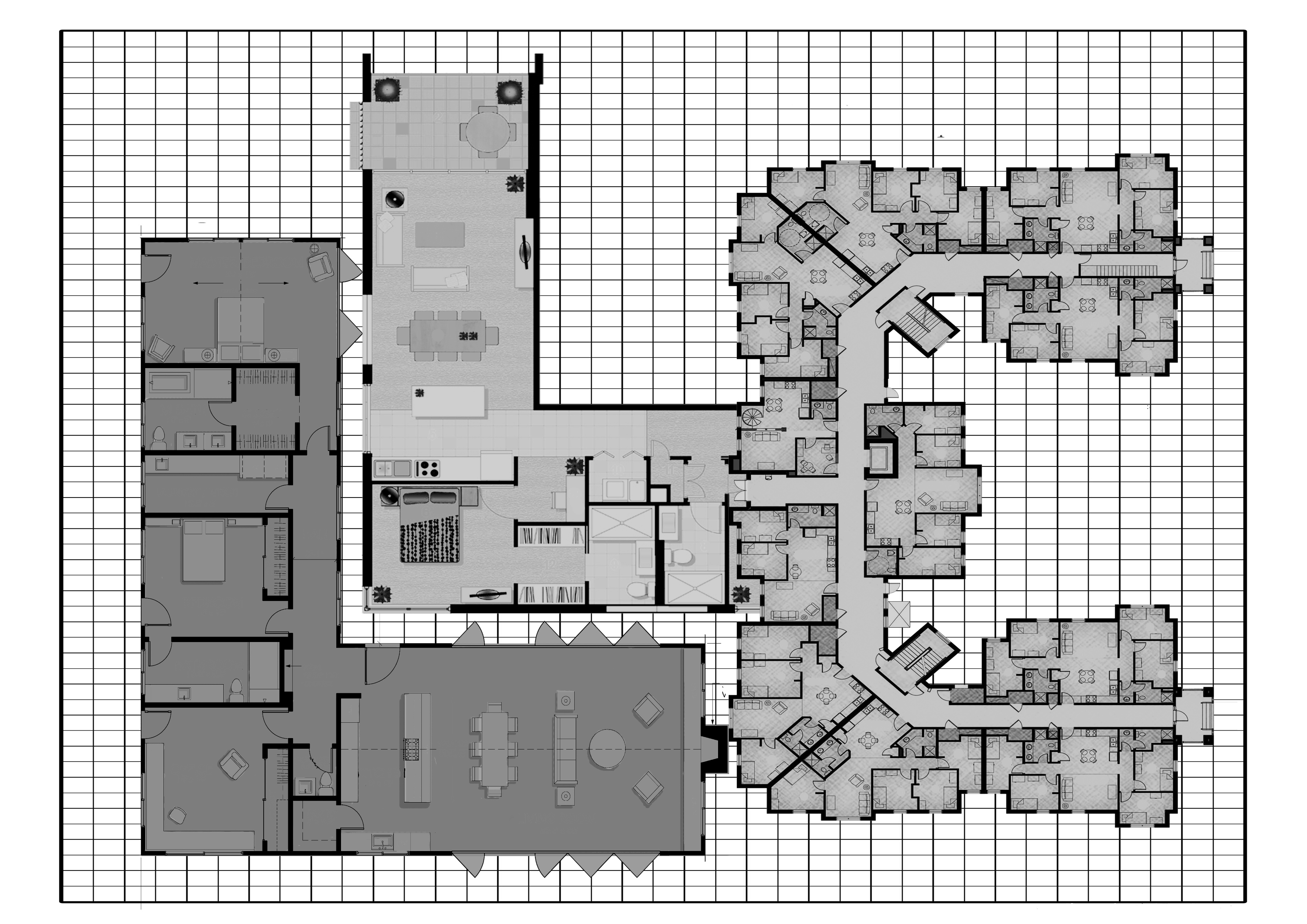
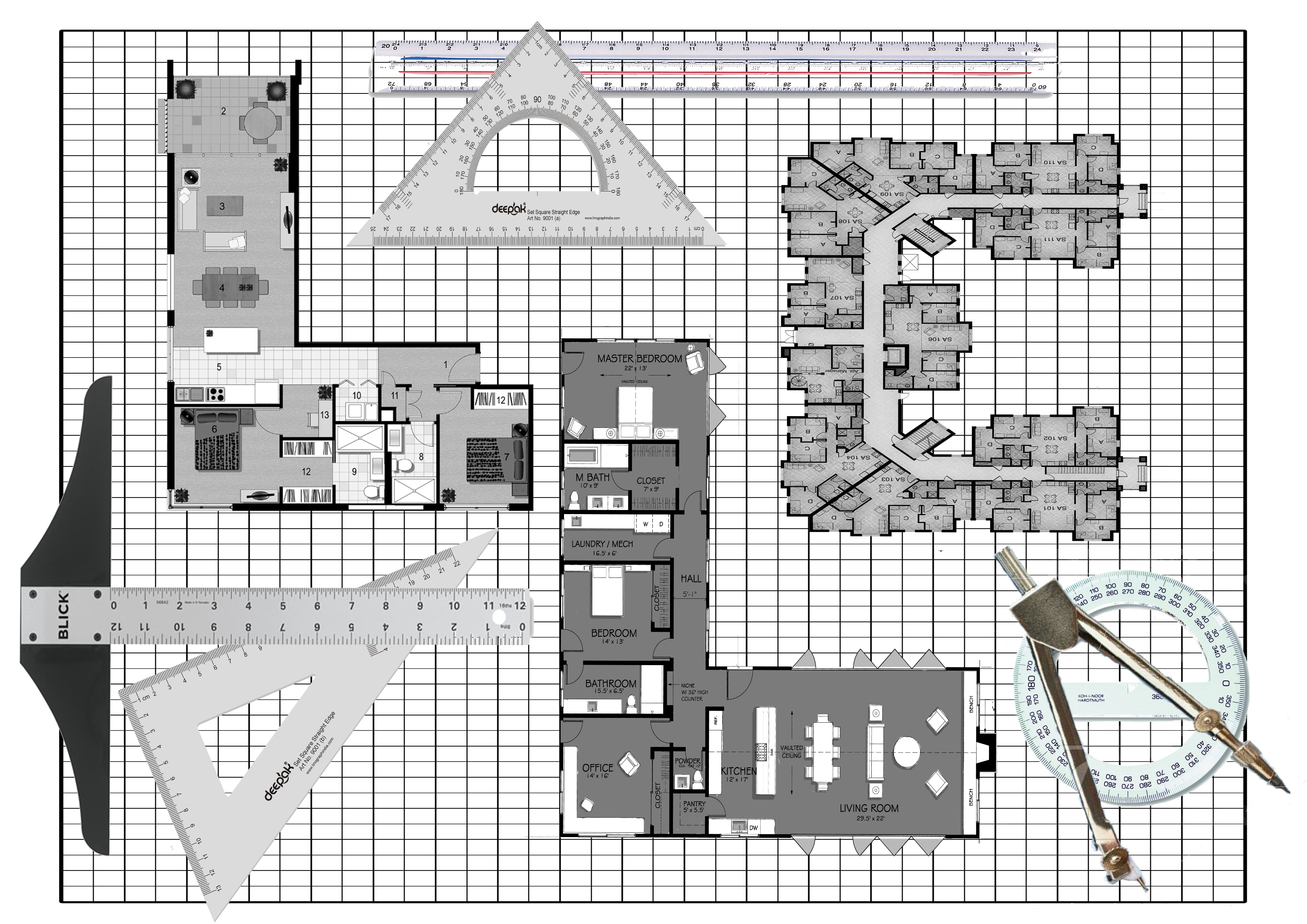
Process work for Architect:
Key identifiable features for Architect: T ruler, graph paper, floorplans, pencils, compass, set square and other tools required for drawing.
Draft 1: I drew a building using perspective and hid the LLE within.
– Although the building looks fairly fine, the LLE was not what the project wanted. The letterform itself has to represent the occupation and hence this method is unsuitable.
Draft 2: Floor plans
– I used floor plans with variations and overlaps to simulate togetherness of a building floor plan. I also edited the colours to simulate pencil drawings and sketching in architecture plans.
Draft 3: Floor plans with equipments
– Deciding that it was too plain, I added an architect’s commonly used equipments inside as well. However, it made the whole composition look messy and the plan itself lost the focus.
Hence, I reverted back to plan 2 and touched up from there.
The birth of DADA originated from a group of artists who were looking for an elementary type of art that they thought would save mankind from the raging madness of those times. They aspire to a new order that could re-establish the balance between heaven and hell.
What was DADA?
DADA was a word, a rallying symbol, an intentionally derisory anti-label. As a provocative slogan it wrong footed the critics, who habitually pinned pejorative labels on new tendencies, such as cubism. The Dadaists were mocking the critics. Dada’s culture which was previously unacceptable was replaced by a new inventiveness and direct relationship between the artist and his art- which were then affected by social constrains. Dada demonstrated that a society that has lost respect was no longer in a position to demand that the artist adhere to its aesthetics and ideological values. (E.g. Rather than focusing on representation, painters now worked with their material for its own sake in terms of its colour, form and structure.
When did the name Dada first appear?
In the editorial of the only issue of the Cabaret Voltaire review created by Hugo Ball.
Who were the Dadaists then?
They were the artist in Zurich who responded to the announcement made by Hugo Ball in the press. They were there either because the war had prevented them from leaving or because they had to come here to flee it.
Tristan Tzara:
He took over from the Cabaret Volataire to launch the Dada Review. It gives details ot the activities of this Cabaret, whose aim is to remind the world that beyond the realm of war and the homeland there are independent men who live by other ideals.
The 1918 Dada Manifesto which was read out on the evening of July 23rd was the true founding act of the movement. Tzara explained that Dada was born of a feeling of mistrust of the “community”. Dada was not absurd, not just a joke. Dada was an expression of a very great adolescent pain that came into being during the First World War and the time of suffering.
Dada Movement:
Dada was a movement of the poets and painters. They worked closely in Zurich, then Berlin but less so in Paris, where the arrival of Dada was more of a literary phenomenon.
Origins of Photomontage:
Raoul Hausmann proclaimed the arrival of a new material in pictorial art. They were the first to use photography as a material with which very different structures, often heterogeneous and with conflicting meanings, could be mixed to create a new entity that drew from the chaos of the war and the revolution an intentionally new optical image.
The First International Dada Fair:
Dada Messe in June 1920 showed photomontages and collages by Hausmann and Hannah Hoch, Grosz and mixed media construction by Johannes Baader. Hausmann mentioned that the Dada Fair was the point of departure for modern art on an international scale.
A Clone of Dada- Merz:
October 1918, Kurt Schwitters came to meet Hausmann and wanted to join the Dada club but Huelsenbeck vetoed his membership. He was compromised by his association with Der Sturm which Huelsenbeck and Hausmann condemned forhaving published a Song od songs of prussianism. Hence Schwitters recreated a Dada all his own. Merz aims for freedom from anything that stands in the wat of forming artistically. Freedom does not mean unbridled license but the product of a rigorous discipline.
Mamas of DADA, Women of the European Avant-Garde by Paula K.Kamenish
HANNAH HOCH:
She was one of the few avant-garde artists to remain in Germany during World War II and is responsible for having preserved many Dada works during the Nazi years in Berlin, thereby jeopardizing her safety were she to be accused of being a decadent artist or harboring decadent art.
Hoch is instrumental in elevating the product of collage from a craft to fine arts. Though earlier artists like Picasso and Gris incorporated collage elements into their paintings, none relied exclusively on collage or photomontage as the foundation of the work. IMPT: oil on linen piece Der Anfang.
First abstract collage was 1916 work Weisse Wolke which she produced while working in Ullstein. Works from 1919 includes carefully designed collages of camera-made images. Examples: Bourgeois Couple (Quarrel), Da-Dandy, Schnitt mit dem Kuchenmesser, Dada-Rundschau (Dada Panorama)
Hoch also created cloth dolls for various Dada events. She said that the puppets and dolls are symbols of mankind, lost on the terrestrial globe. Her adult female dolls have bodies made of strips of fabric and board and heads of stuffed cloth topped by untidy yarn hair.
Hausmann’s mistreatment of Hoch illustrates the lack of respect by some male Dadaists who were initially disinclined to value and welcome women artists. Although Hoch was rather well known that time, the Berlin Dadaists were somewhat reluctantly admitted into their “boy’s” clubs.
Russian Constructivism:
Russian Constructivism was a movement that was active from 1913 to the 1940s. It was a movement created by the Russian avant-garde, but quickly spread to the rest of the continent. Constructivist art is committed to complete abstraction with a devotion to modernity, where themes are often geometric, experimental and rarely emotional. Objective forms carrying universal meaning were far more suitable to the movement than subjective or individualistic forms. Constructivist themes are also quite minimal, where the artwork is broken down to its most basic elements. New media was often used in the creation of works, which helped to create a style of art that was orderly. An art of order was desirable at the time because it was just after WWI that the movement arose, which suggested a need for understanding, unity and peace. Famous artists of the Constructivist movement include Vladimir Tatlin, Kasimir Malevich, Alexandra Exter, Robert Adams, and El Lissitzky.
Main Representatives: Alexander Rodchenko, Liubov Popova, Vladimir Tatlin, Olga Rozanova, Alexandra Exter, Naum Gabo, El Lissitzky, Antoine Pevsner, Kasimir Malevich and Alexander Vesnin.
Description of the Work: Large white plastics sheets were used and hung downwards from the Esplanade Concourse’s ceiling. They looked like individual panels slicing through the space.
Preliminary Read:
Initially when I saw the work, I was quite amazed by the scale of it. It was like a huge white box hanging down from the ceiling. Upon walking closer, I noticed that they were actually plastic sheets hung down in a parallel manner. I was quite curious at the small path intentionally designed in between the sheets which then led to the top of the staircase. At first I thought that the artist wanted the viewer to walk through the path lined up but it was actually blocked. Looking around, I realised that there was another path at the extreme right of the staircase which will lead the viewer right to the top while giving them a chance to view the art work from front to back. Right then I was wondering, perhaps the artist wanted the viewers to notice a space, a common stairway, which we would normally take it for granted and would probably not spare a second thought about it.
Secondary Read:
After reading the work description, the artist’s intention was to make use of the work to allow people to think about their interaction with the inanimate spaces. Intrigued by the artist’s intentions, I stood there for a while and began to notice how people interact with the work. While quite a few did not give a second look about it, a number of them, especially the older generation look rather confused. They were finding ways to get past the piece of work and it was not until they read the description that they look like they get what the work was about. Being situated in an air conditioned place, the plastic sheets exhibit a sense of stillness even though it was rather thin and seem prone to wind movements. The sense of stillness communicates the intention for the viewer to make a detour around the work rather well.
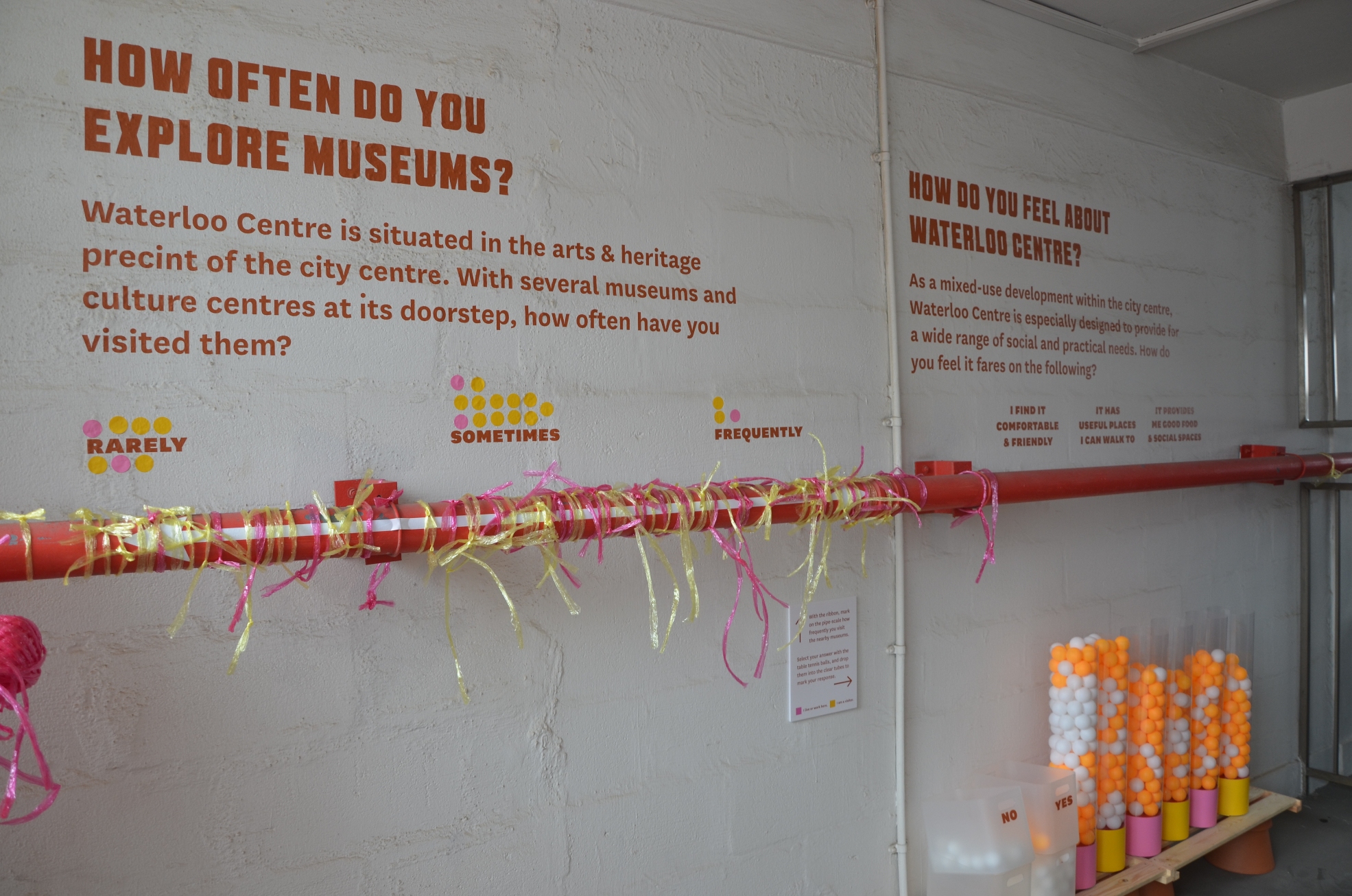
The Living Lab by FELLOW
Description of the Work: There were individual questions posted at different small areas of the space used. Materials such as ping pong balls, coloured stickers, raffia strings were provided for the viewers to answer those questions.
Preliminary Read
When I first saw The Living Lab, I was very amused by the layout of the investigative project. Almost every corner of the space used contained some interactive element which made it very attractive to the viewer. As opposed to just viewing and no touching of art works, this was a refreshing side of the exhibition at the NOISE-Waterloo. Initially, I feel like it is just a normal survey for the public but after reading through each question in detail, I realised that the layout and material provided for the viewer to answer those questions create variation which triggers the viewers’ desire to participate actively in it. Besides, in this totally anonymous survey, I feel that it allows people to be more honest with their answers as well.
Secondary Read:
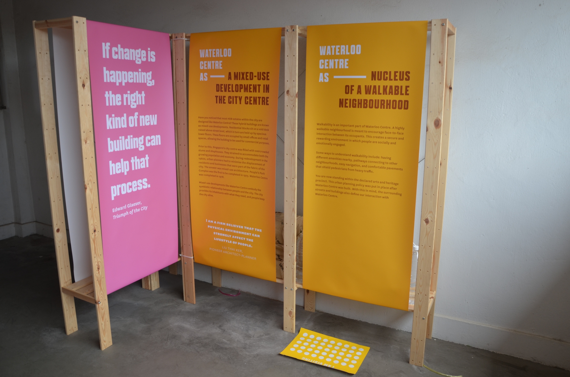
After reading the project’s description, I feel that they are examining human behaviour and the environment rather closely. The investigative project serves as a timely reminder for the symbiotic relationship between the city and the dwellers. I began to appreciate the mixed-used buildings like Waterloo centre more as well.
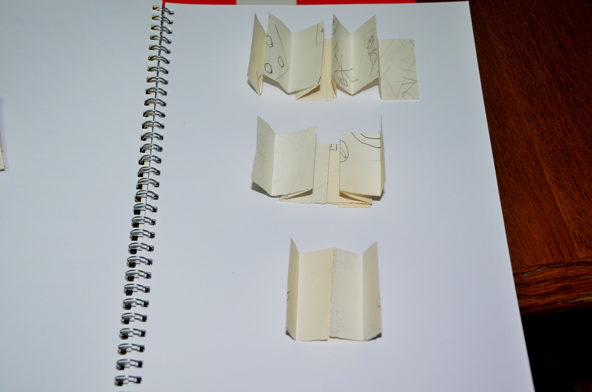
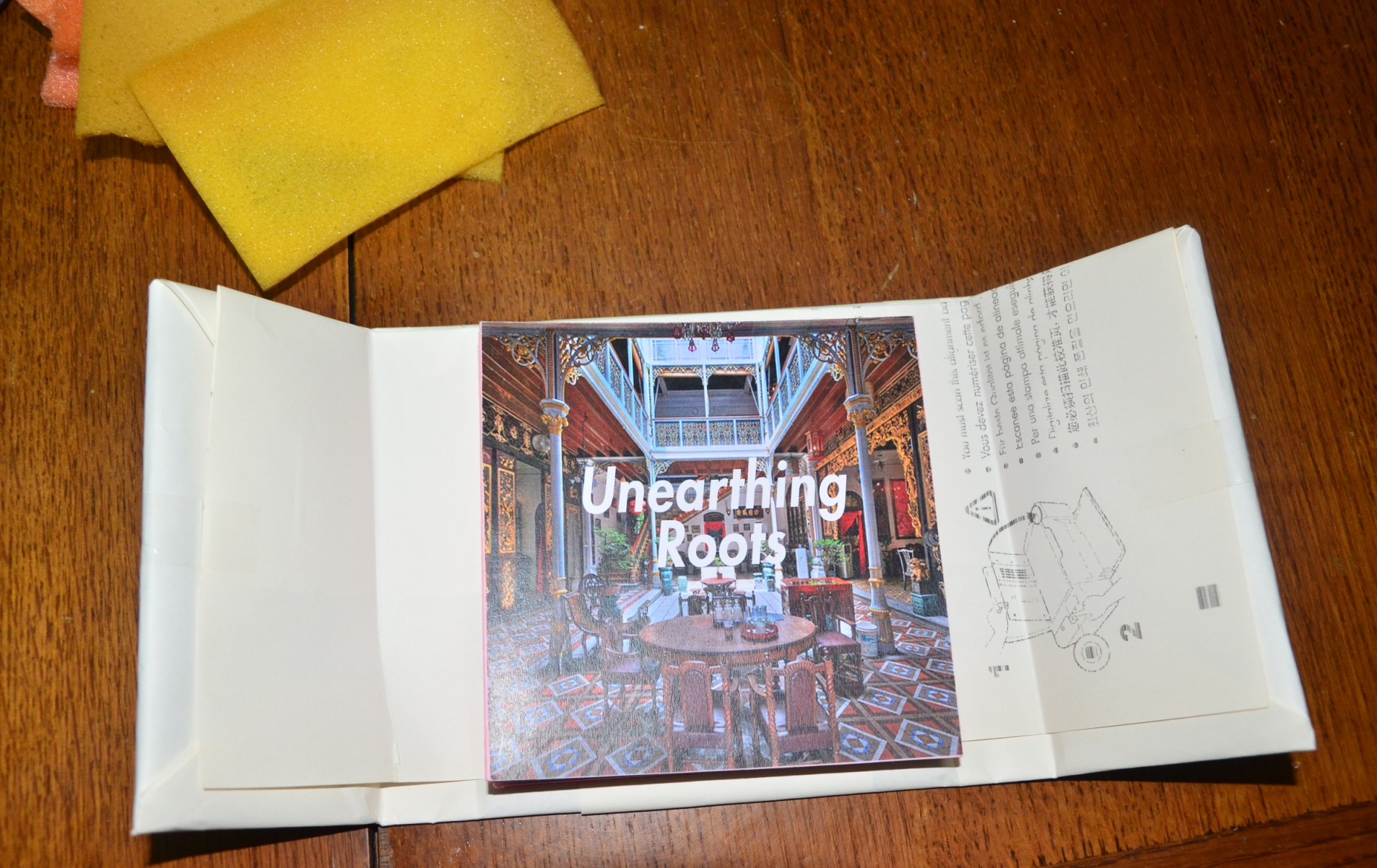
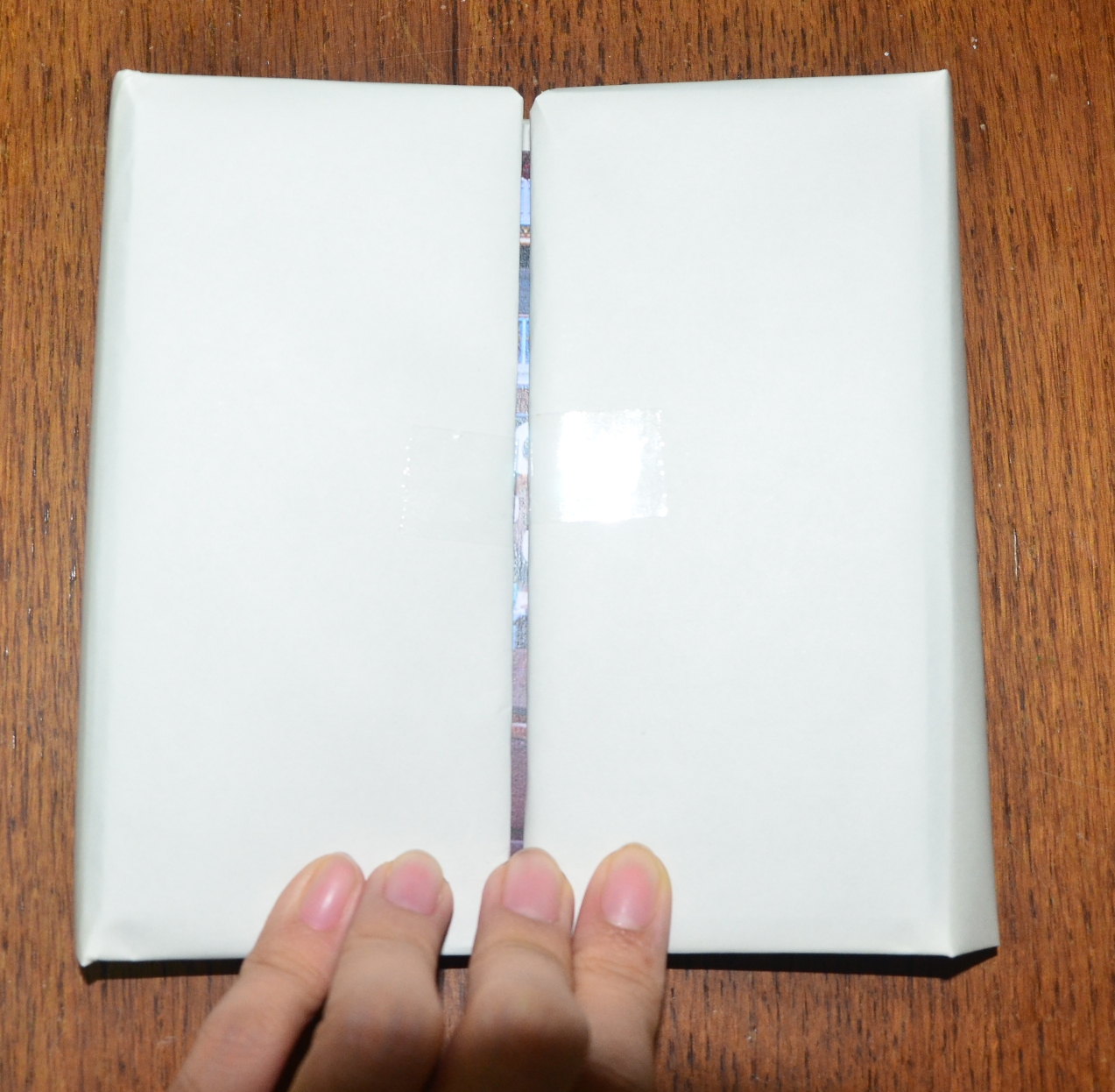
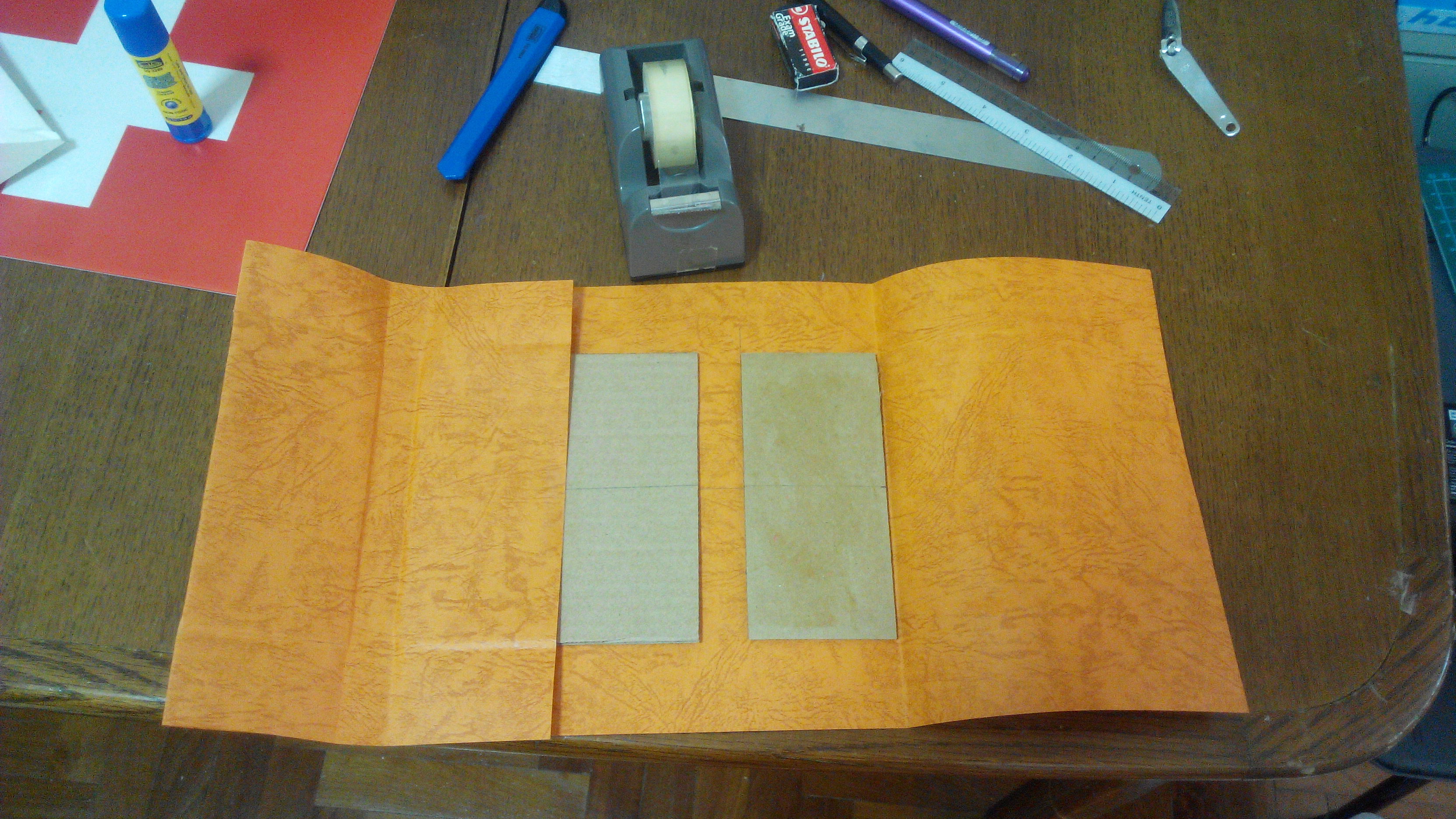
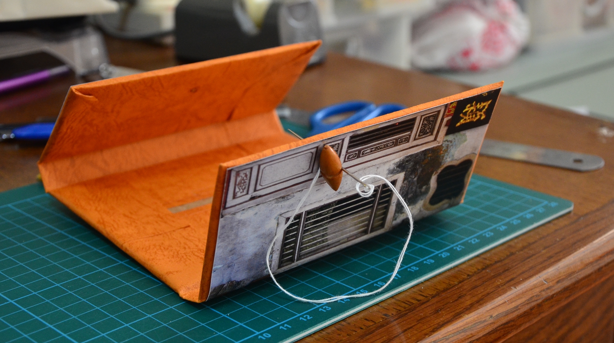
I was thinking of making a small book containing interesting facts regarding my family about the Peranakan Culture. Initially I was thinking of collating photos and develop it into a photo book and send it to print using the modern book style. However, I thought about it and feel that perhaps I can create my own handmade book instead, since the Peranakans are rather focused on handmade items.
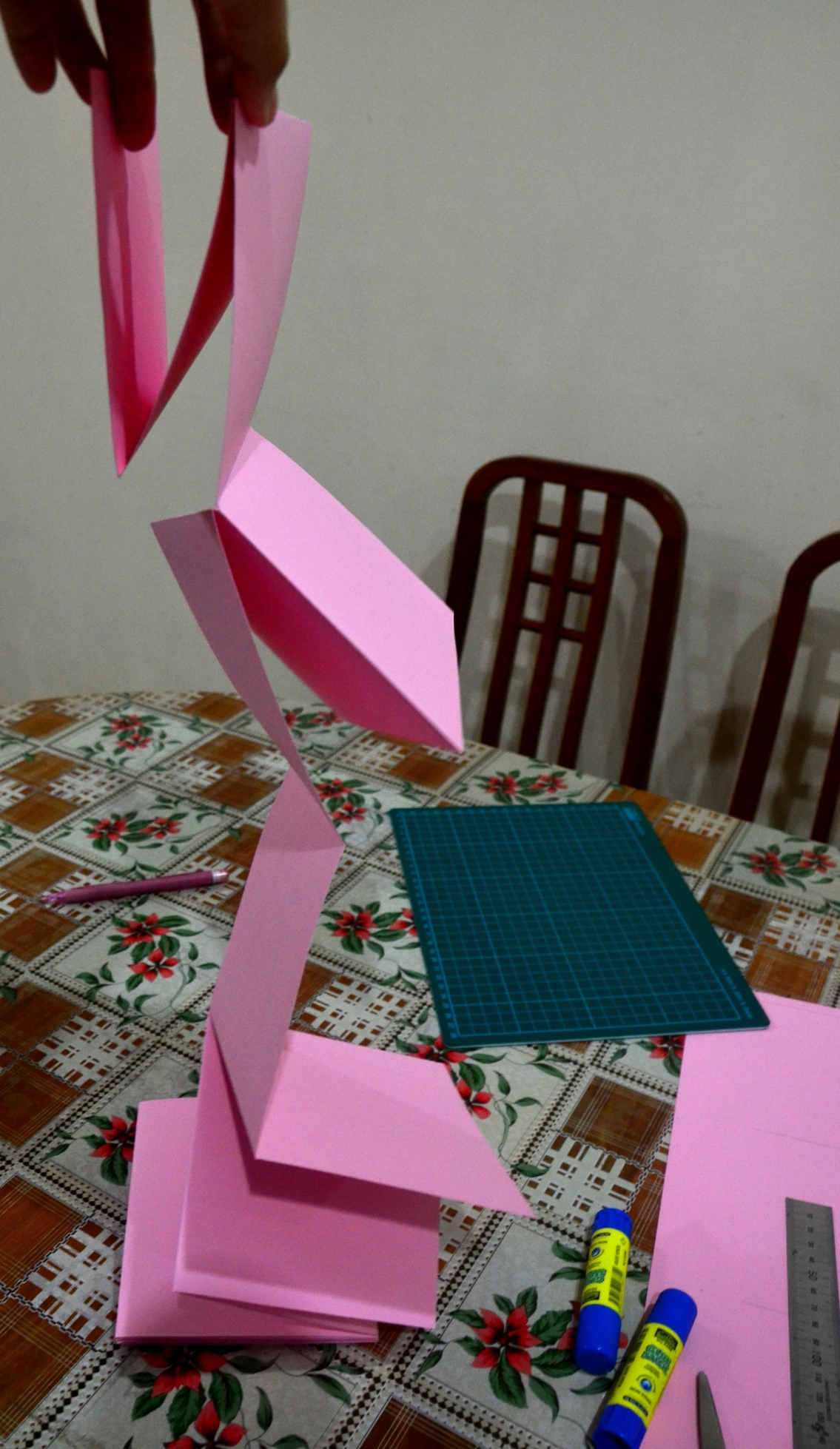
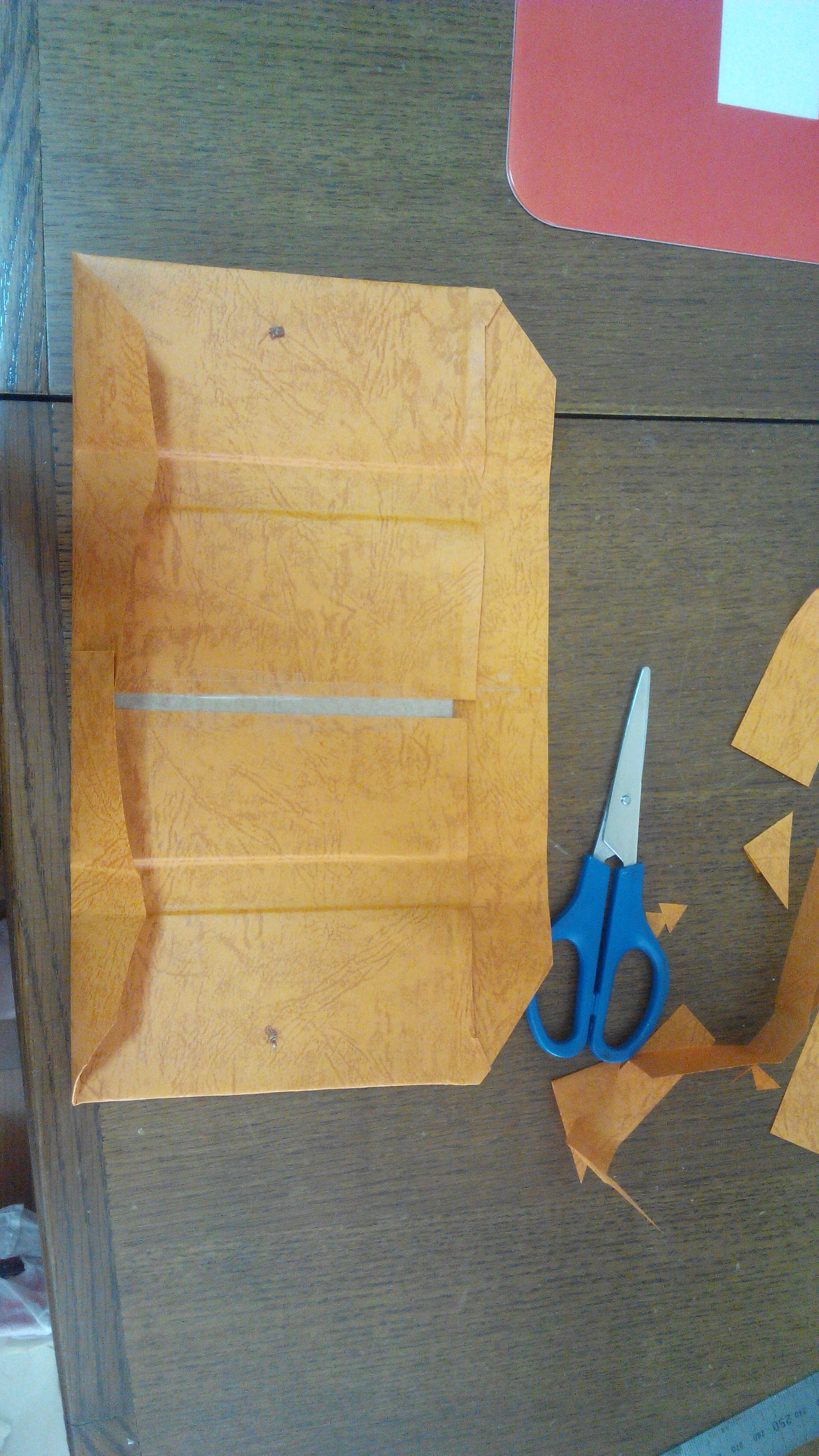
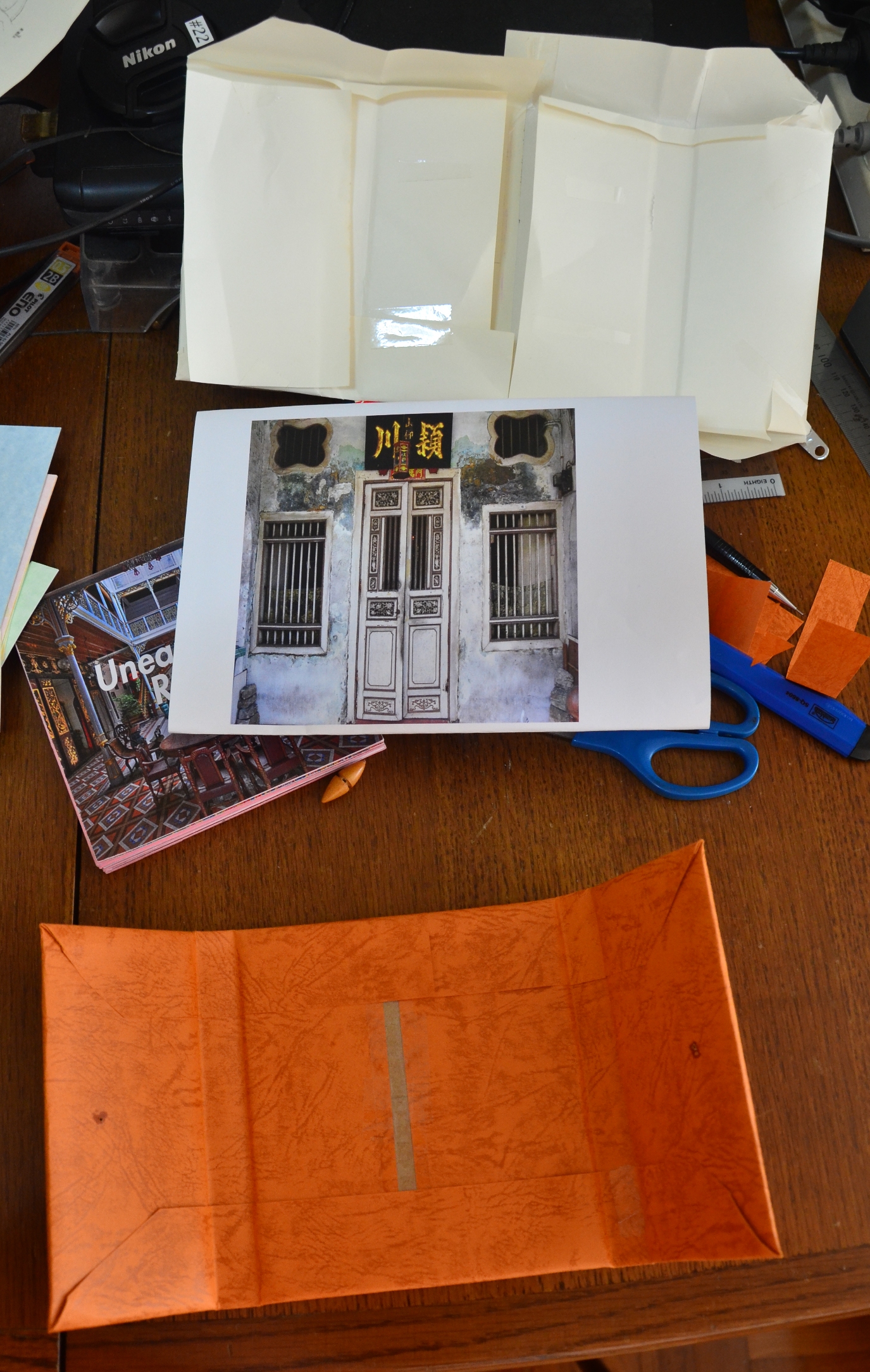
Experimental Designs for the book concept. I researched on the different types of handmade books and have decided to develop a palm sized meander pocket book. The meander book is actually made from a single sheet of paper and if glued correctly, the pages will actually form little pockets (to slot cards with bite size information inside).
After pondering about it, I feel that I would like the book to have a “book within a book” concept. This is to signify that our roots are deep and that it is up to us to step up and discover more about them. At every turn, we discover something new about ourselves and hence opens a “door” to another “book”.
Concept of the Book:
Outer Cover: The doors of an old Peranakan House (2 sides). (1st Book)
Inner Cover: The interior of a Peranakan House. (2nd Book)
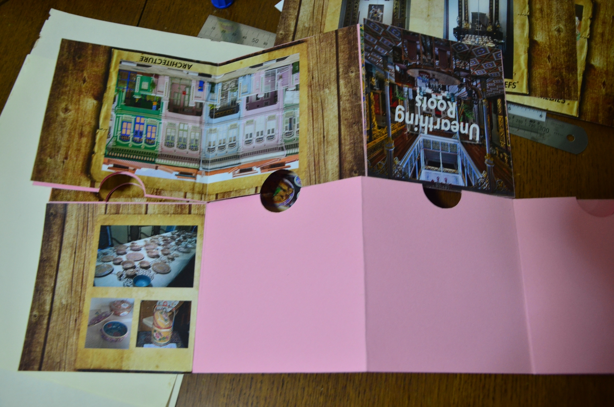
Content: Each sleeve represents a category about the Peranakan Culture. There are images on each sleeve to represent the category. (3rd Book (s))
Sleeve 1: Who are the Peranakans?
Sleeve 2: Architecture
Sleeve 3: Gender Roles
Sleeve 4: Nyona Fashion
Sleeve 5: Cuisines
Sleeve 6: Taboos and Beliefs
Sleeve 7: Old Wives Remedies
In each sleeve, there is a card with information for each category. (4th Book) The information usually starts with a general introduction about the topic and would usually end off with some short stories about my family.
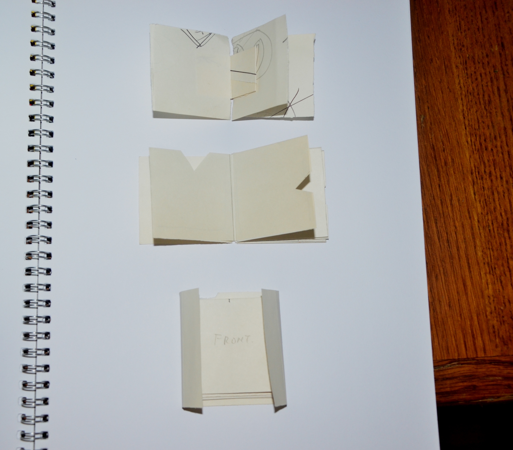
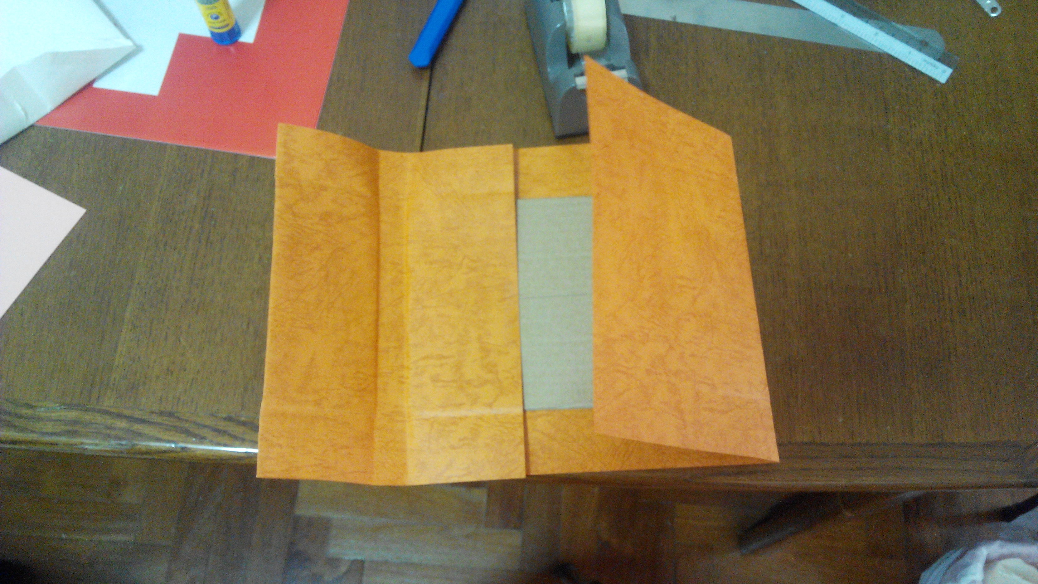
Pictorial Development: Meander Book
This is the process of folding the meander booklet.
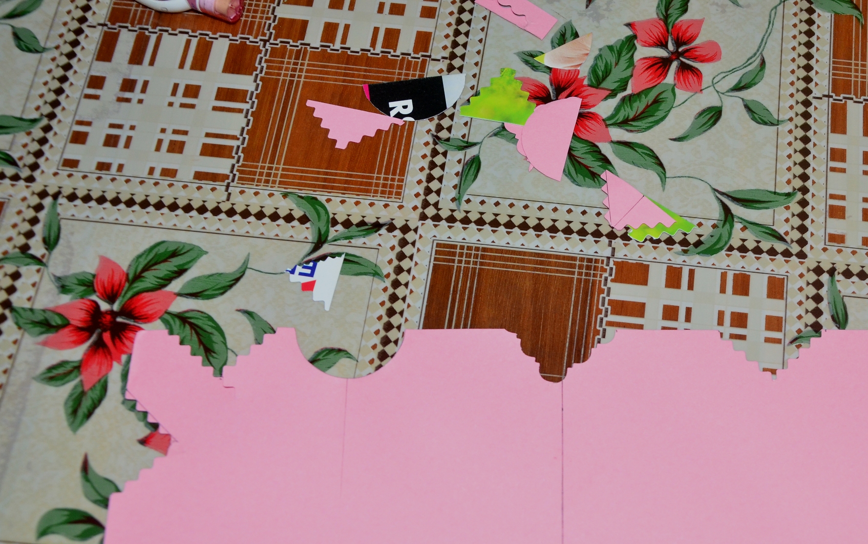
After which, I started experimenting with the pocket tabs.
After trying out a few designs, I have decided to go with the round one.
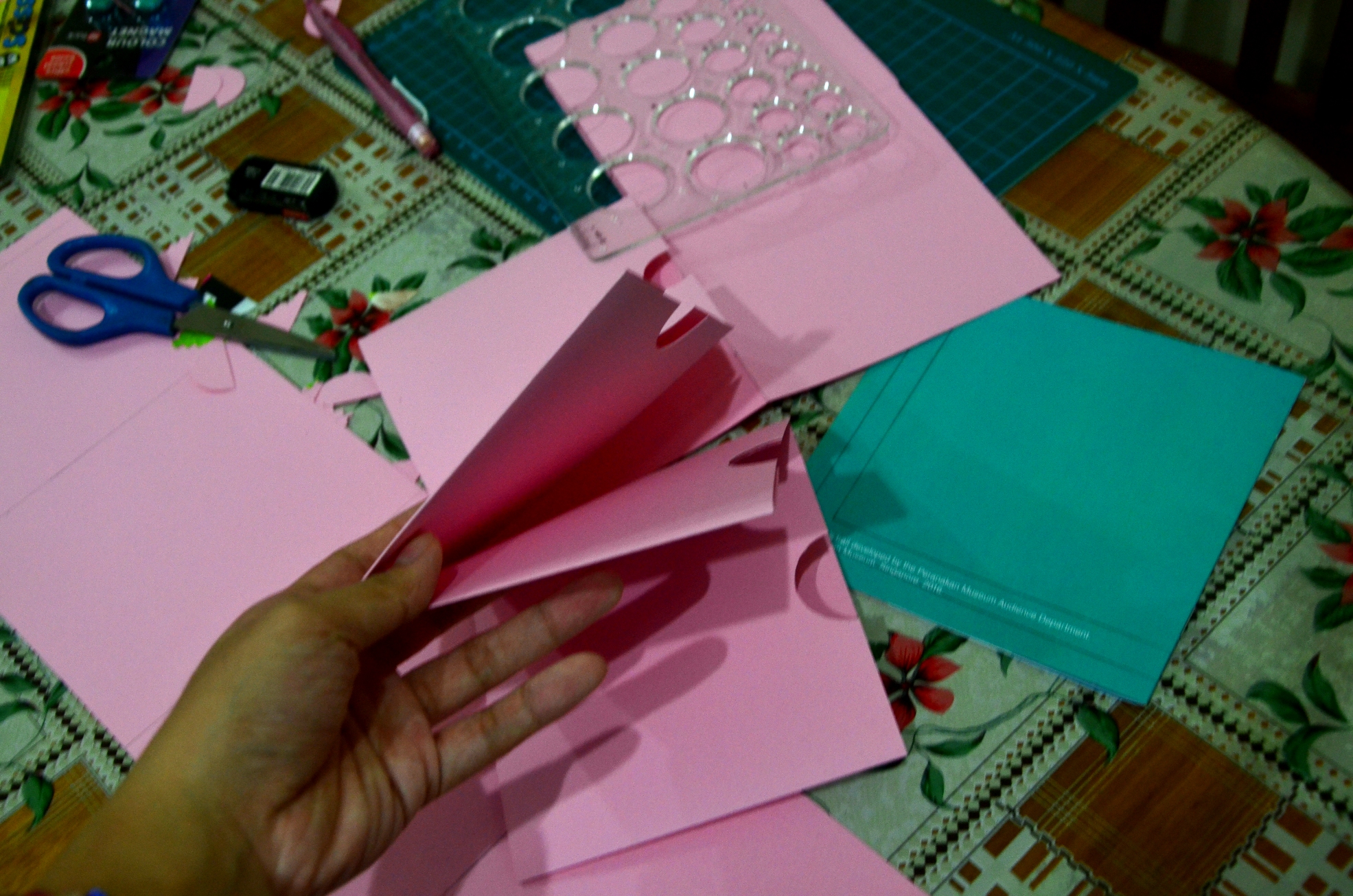
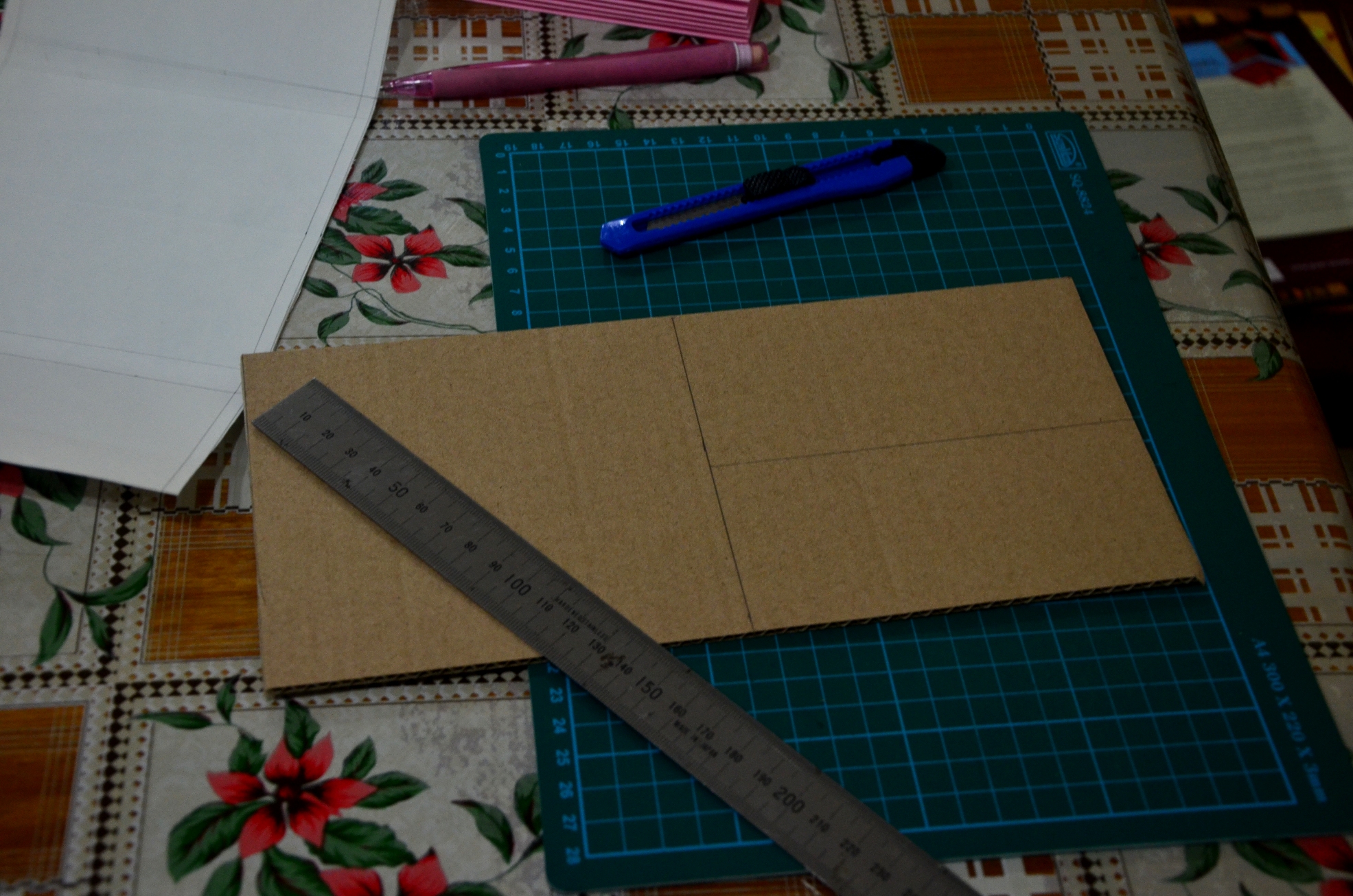
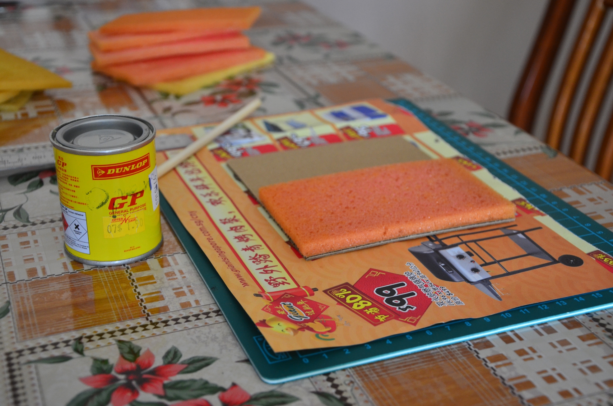
Since I plan to make the book cover with a puffy feel, I used cardboard for the base first before pasting sponge on top.
However, after having trials with rough paper, I realised that it is actually quite bulky and thick which does not really suit the nyonya theme. Hence, I scrapped the sponge idea away and used just cardboard instead.
Reflection:
After the first consultation, I wanted to find out new and more unique information that is not found in museums and books. For example, a book on the unique remedies and prescriptions my family has kept over the years. However, after the interview with my grandaunt, I realised that there were many limitations as there were quite a lot of things that she could not recall (90 years old) and that the knowledge is not passed on to the younger generations. My aunts, for instance, were actually quite clueless about the Peranakan culture and they felt that they learn something new through the bits of information I gathered through the interview. Hence, I decide to take on a different approach and touch on the major topics in the Peranakan culture with a tinge of personal stories included.
This is my first handmade book and there were many trial and errors involved. I realised that precision is really very important and developing a book is not that easy. From the concept to the aesthetics to the content, sometimes I am really at lost of what to include.
The overall experience was enriching and I did discover more about my identity which was the main motivation of this project.
Stories gathered from casual talk with grandaunt (90 years old): (In her perspective)
Interview 1 Transcript:
Both my parents are pure Peranakan from Penang. She brought her younger brother along to marry into the family because she was an orphan already. My father was educated in an English school before and his name was Tay Ang Moh. He conversed in malay and English to us.
My parents were very strict. We cannot talk nor do any unnecessary movements during dinner or meal times. If not my father would throw the bowl of rice in your face (rice bowl broke) and then you are not allowed to eat dinner anymore for the night.
My father usually sleeps at 7.30pm. He would then place his shoe nicely at his doorway and it should remain that way for the night. If he wakes up and finds the shoes misaligned, he would then call everyone out and interrogate them. If no one dares to own up, he would use the huge gemstone in his ring to knock on everyone’s head.
All windows were closed tightly with curtains throughout the house. For the women in the family, they were not allowed to go out of the house nor even peep through the window. If they get caught, they will be punished. Whenever my mother wants to watch a play/ film, my father would make special arrangements for the actors to set up a stage at home for the women to watch. They were strictly not allowed to be outside.
My father was working in a British company and he was usually dressed in tip top condition with his white suit and drove a car to work. And if the children (more for women) wanted to go to school, he would make special arrangements for a chartered trishaw with completely closed lids/ curtains for us.
Mini Cheats over the years: My brothers would bring the sisters out to dance/ party when my father was not around. They would ask the servant at home to guard the door from 7pm onwards. They would then take note of the time closely and quickly make their way home at 11pm and changed out of their outfit quickly. Some pretended to sleep while I pretended to wait for my father downstairs to have supper together. He loved to eat roasted pigeons for supper. He used to set up a mini house for the pigeons to live in at their rooftop. He would then climb and catch one for supper when he felt the craving and then proceed to roast them with spices.
He passed away as he was tortured by the Japanese. (It was the Japanese Occupation that time). He was caught to stand at the door way of our house at 6am in the morning till late at night. He was not allowed to drink any water nor eat anything. He stood there in the hot sun throughout the day. We (the children) stayed in the house and peeped through the window to check on our father every now and then, only to find him on the verge of toppling over each time. One Japanese soldier walked up to him in the night and used his gun to hit his head hard. We knew that it was a dangerous situation. We couldn’t do anything to help him. Shortly after, the Japanese soldiers left out area. We rushed out to help him into the house. Unfortunately, due to the lack of water and food for days, he got too weak to move, much lest heal quickly enough. He passed away after 3 days. He was a very strong man. That Japanese soldier killed him. (Grandaunt was very agitated at this point)
Some of my father’s habits:
We used to rent the house at Syed Alwi road. It was very cheap in the olden days, it only cost us 30 dollars. He usually walks from Syed Alwi road to Chinatown. Hierarchy of the family: I am the 5th child of the family but they usually do not count the females. No matter what, the males come before us. However, my father loves me the most amongst the females. He handed his keys to his personal belongings and valuables to me only.
My mother was known as the medicine lady ( lao sin seh ma) in the kampong and around the estate. Those living nearby often came by and consulted her regarding some illnesses and what specific herbs or concoctions they can make to self-heal. She also grew a lot of herbs in her garden and would often offer to those who came to her for help. There was once a child in the kampong got a fits attack, she rushed and took a couple of herbs along with ginger, onions and a spoon and headed over. She panicked as well and the child bit her nail into two. It was a horrific sight. Despite that, she used a spoon to pry open the child’s mouth and stuffed the smashed herbs to stuff inside. Subsequently, she also rubbed it all over his face, neck and other body parts. I remembered she too poured soy sauce into the child’s mouth. Eventually, the fits died down and the child was rescued.
Another example would be when people came to consult her regarding a cough, she would pluck a few leaves off her peppermint tree in the garden and advised the “patient” to make peppermint tea out of it or he or she could cook it with lean pork into a dish. However, there is a certain “rule” to it. It was believed that men should use odd number of peppermint leaves (3,6,9) while the females should use even number of peppermint leaves (2,4,6) to cook them with lean pork and drink the soup. If it’s cold cough, the phlegm would be whitish in colour, heaty cough, the phlegm would be greenish yellow.
There was once I fell very ill and kept coughing non-stop for 2 weeks. I consulted the doctor at the polyclinic who then claimed that my lungs were slightly ruptured and swollen and that I am in a critical condition. My son then took me to Gleneagles and I did a full body MRI scan, only to find that I am fine. I spent 6000 dollars away like this. After which, I did not want to take any more western medicine and relied on my mother’s old cough formula. Since it was more developed already, peppermint leaves would not be effective. Hence, I used the ginger formula. I bought a big piece of old ginger home and juiced it. (Grind it and squeeze the juice out manually) Heat the ginger juice over the stove to luke warm and add in 2 spoonfuls of quality honey. Stir to mix it well and quickly gulp it down. Do not drink water after that. It was a cheap remedy. I only drank it for 3 times and I am more or less recovered.
Interview 2 Transcript:
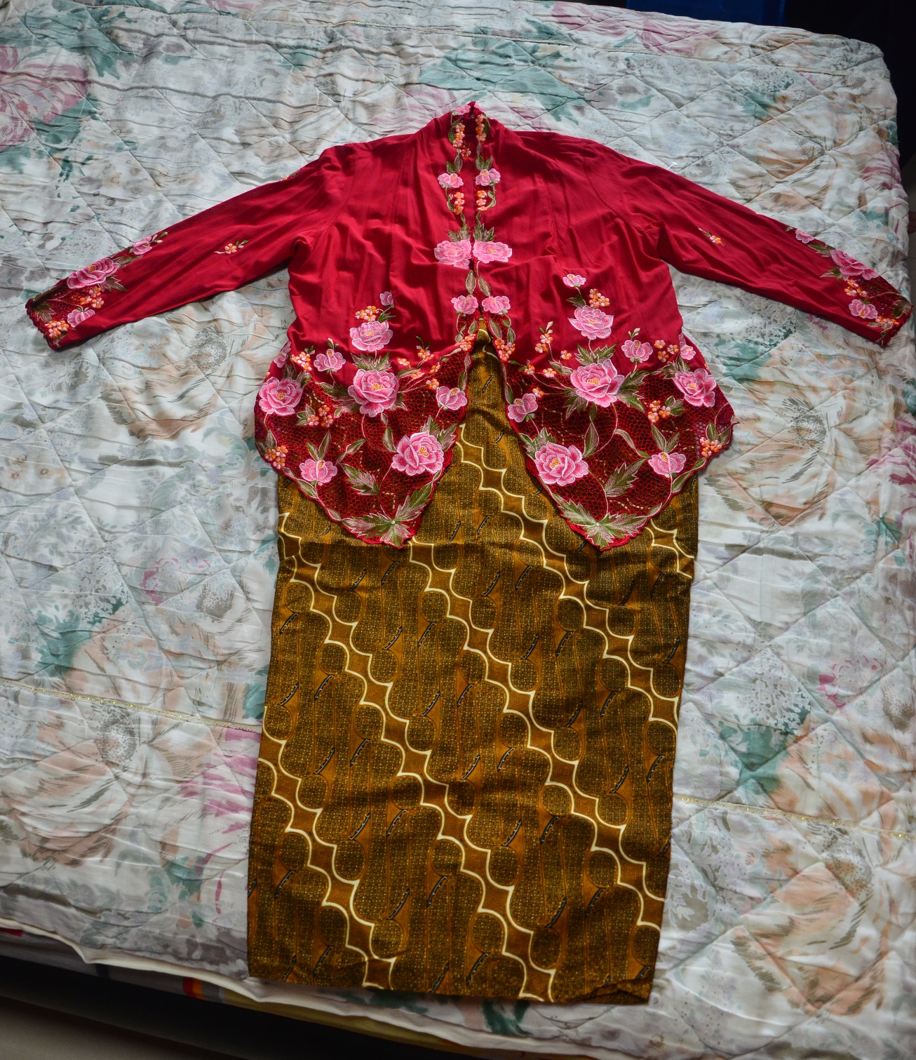
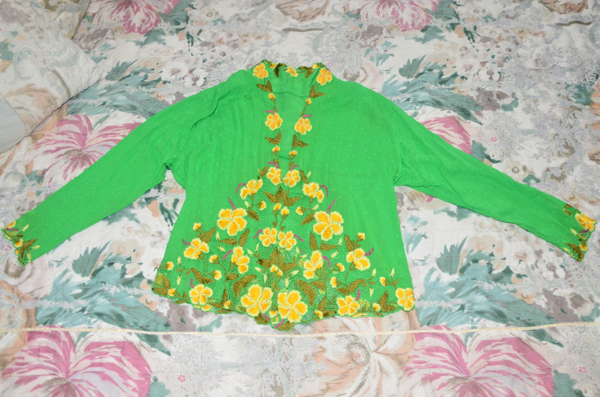
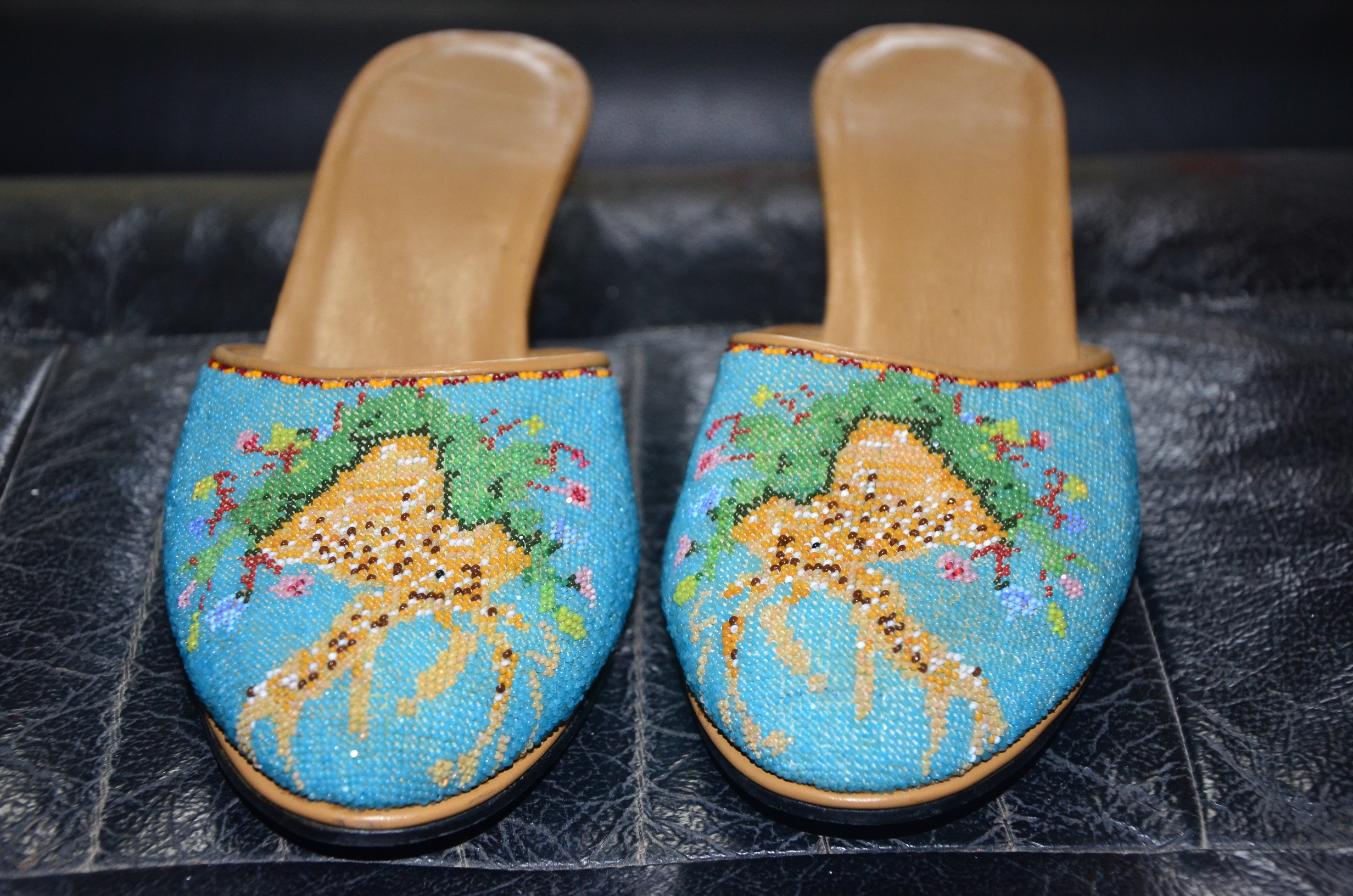
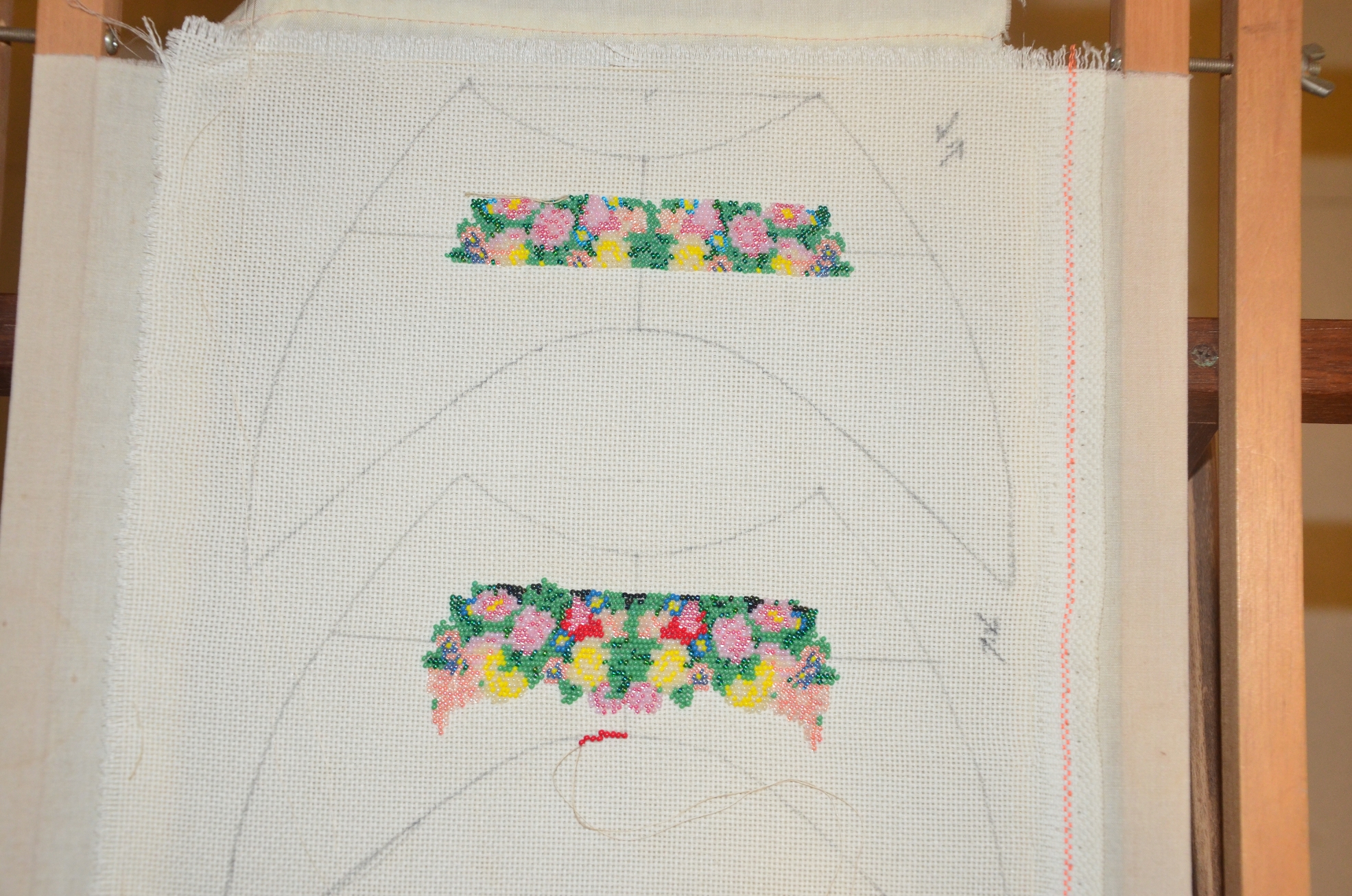
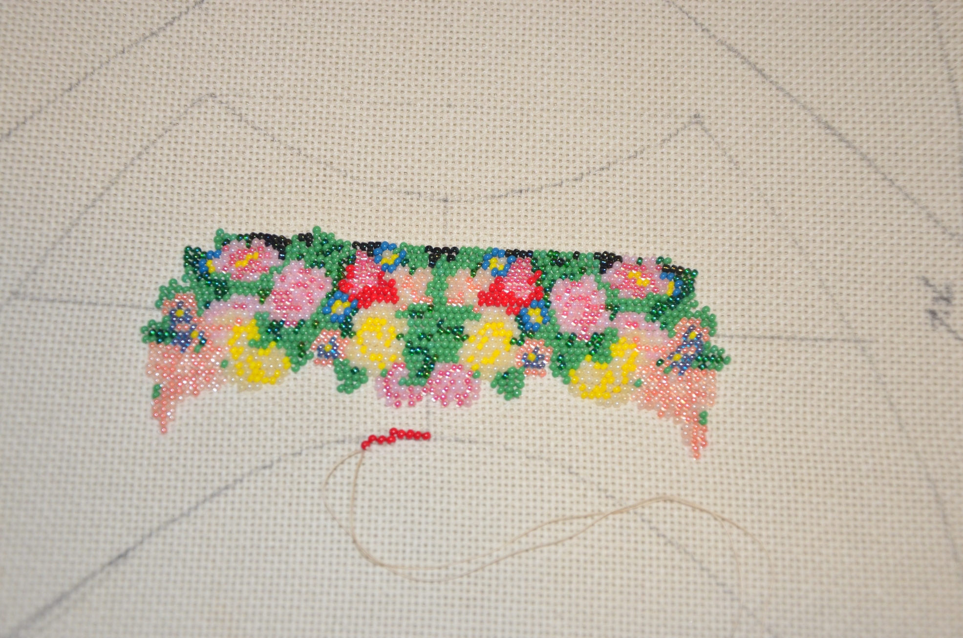
Nonya kebaya kerosangs can determine the status of your family. For the richer people, their kerosangs are more elaborate, with more flowery details in gold and some diamond encrusted (berlian) as well. For the poorer people, their kerosangs are just a plain strip of gold. They would then wear a belt for the kebaya made of silver. For the richer families, the belt buckle would be in gold.
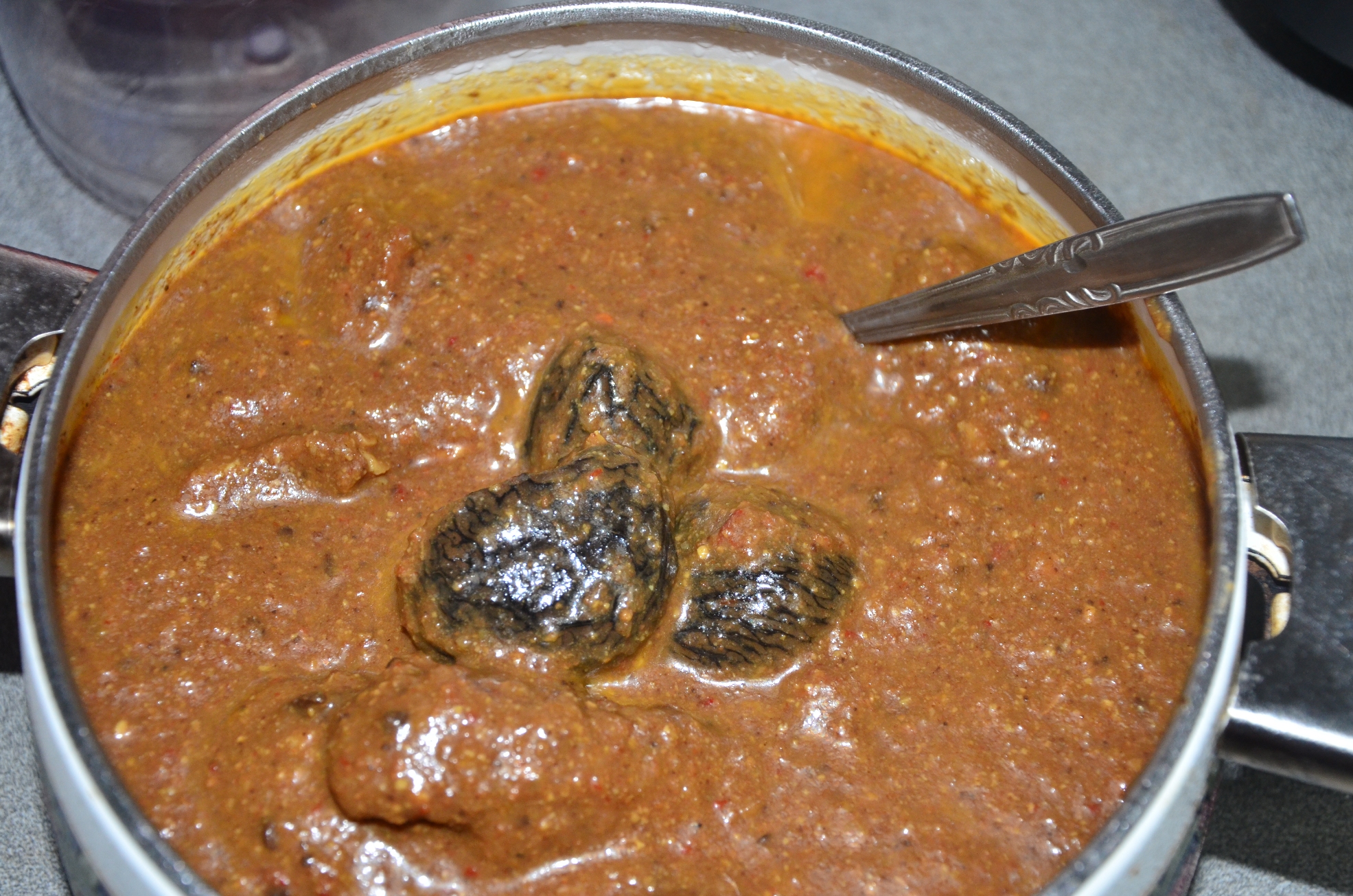
Tok Panjang’s must have dishes: buah keluak, chap chai, babi ponteh, curry ayam, salted mustard duck, soup containing: pork balls, fish balls, cabbage, fish maw, prawns and bamboo shoots, otah and belachan chilli. Ang ku kueh, kueh bahulu and Otah originated from Peranakan.
Preparations for the buah keluak dish were extremely tedious. They are actually poisonous fruits. You have to soak them in water for about 2 weeks and change the water daily. After which, u have to hack an opening in the nut and dig out the flesh and the seed. Mix the flesh with marinated meat well and stuff it back into the nut shell. They were then cooked with pork ribs or chicken.
The head and tail (2 ends) of the tok panjang must be occupied by the hosts / the elderly in the house. Family members usually sit on a table together. For their friends, they have another separate table for them.
The hiring of servants also determine the status of your family. For the wealthier ones, they would hire a butler while the middle class families would hire a female servant.
Some pictures I took:
Unfortunately, my grandaunt was suffering a relapse from shingles and it was getting increasingly difficult for her to continue to interview. I took several photos of her belongings that are closely related to the Peranakan culture. Since she was not well, it was difficult for her to dig deep into her wardrobes for her other belongings. Hence, although I may not have a lot of artifacts or photographs, the knowledge gained from the 2 interviews are quite interesting for me to learn more about the Peranakan culture.
When I first receive the project brief and read through the approaches, I was contemplating to do number 2: Visit a place or an area in Singapore that you are less familiar with, have not been for quite a while or have never heard before. I was thinking of Sungei Buloh or Chek Jawa and perhaps do a project about nature and human interaction. However, I pondered for quite a while and I reread the brief a few times – “What is Singapore to you? Have you taken time to look at this place intently?” Then it struck me that “Have I even look at myself intently yet?” I realised then that throughout my childhood and years growing up I have not pondered too much about my roots and my identity. Hence, I have decided to take a turn and change my direction to a root finding / finding identity kind of project.
After finding my general purpose for the project, I began to look back at the various approaches. I feel that number 4: “Have a conversation with your family member; are there life stories, tradition or experiences about Singapore that you might find?” was the best suited for my project. After briefly asking my mother about her family and roots, I was surprised to find that I actually have Penarakan roots, something I really did not know about at all throughout my years of growing up. As for my father, he is a Teochew with a typical Chinese culture. Considering between the 2, I decided to explore more into the Peranakan culture instead.
Prior to looking for a suitable candidate to talk to or interview, I decide to make a trip to the Peranakan Museum to have a better understanding about their way of life. The architecture of the museum was rather intriguing and there were many sections in the museum, such as wedding, dinner, funeral, accessories etc. There were numerous interesting artifacts that caught my eye as well. After the visit, I tried to recall relatives of the older generation who possibly have a closer connection to the culture itself and most probably lived through the period where the culture was more prevalent. Not long after, I came up with a plausible candidate, my 90 year old grandaunt who is a nyonya.
I interviewed with her and learnt quite a few things about my ancestors and their way of life, especially my great grandparents.