MOVING IMAGES:
- Moving- Spectre Movie Clip
Perception:
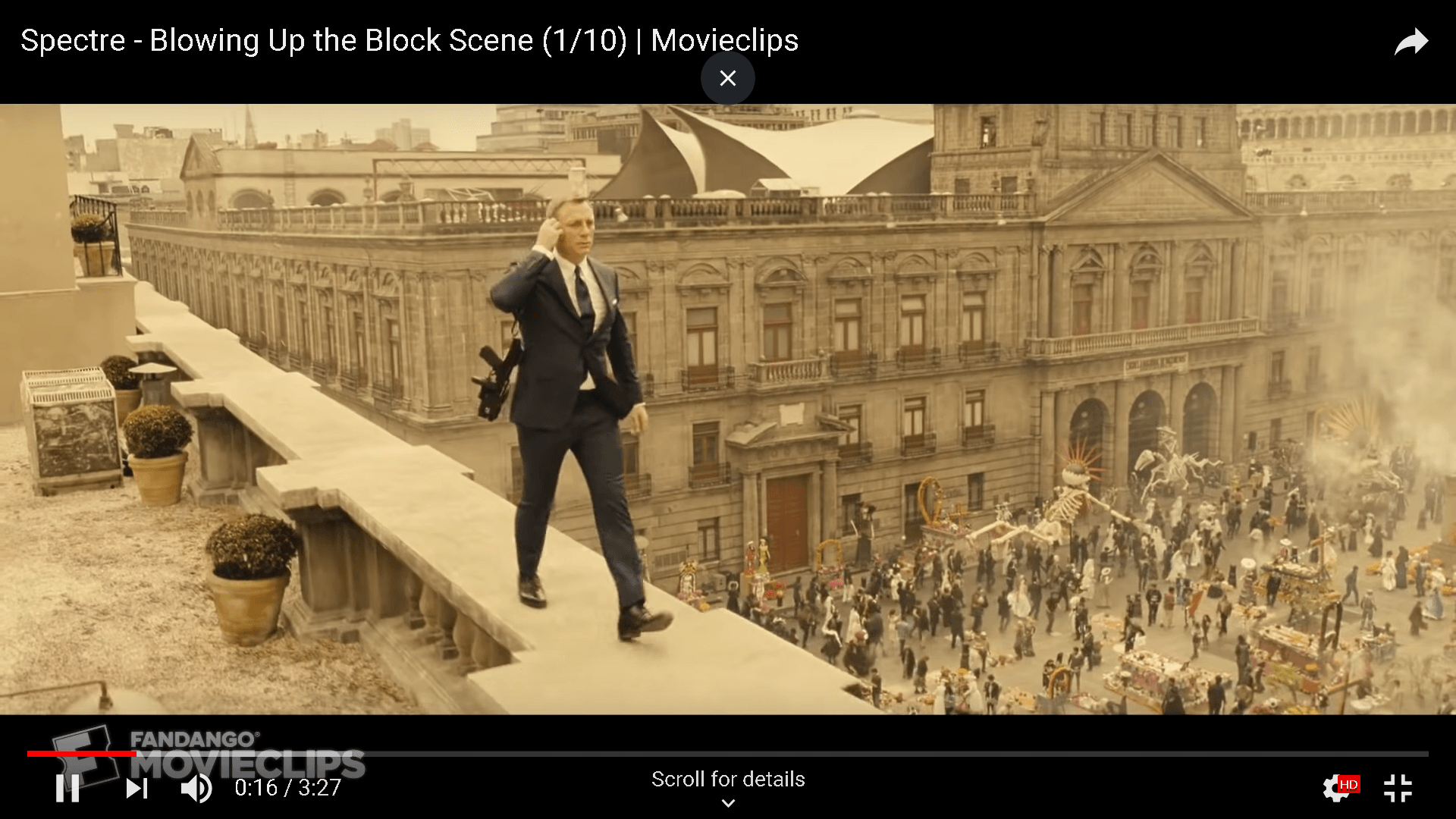
In this clip, the setting of the scene is right at the edge of a building. There is a sense of symmetry of what the viewers can see on the left (below of James Bond) and right. With this composition, the visual element is straight up and very apparent. It also provides anticipation for the viewers when he skips over to another edge quickly. His iconic black suit also gives off a sense of power and mystery. There is also scaling involved where the ratio of James Bond is many times bigger than the people in the background, depicting a high level of contrast.

Architectural and cultural:
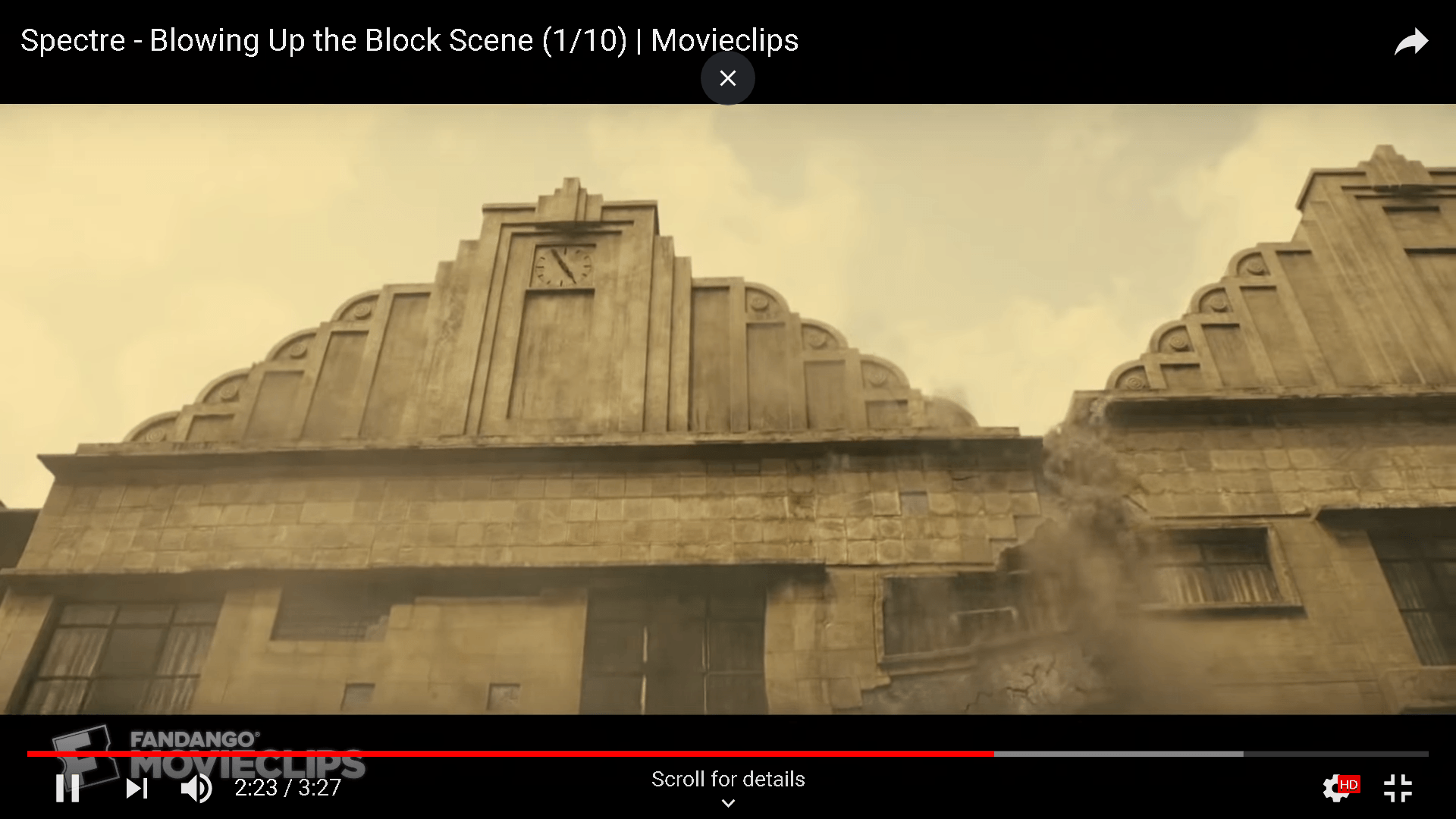
In this scene, the city is having a party, seemingly to represent a lot about death. It seems like a norm or an annual cultural event since the majority of the people seems to be participative. Over here, the choice of setting has a heavy influence on what is about to come next. For instance, the smoky background, Bond walking on the edge of a building, height of the building he is walking on as well. The smoky background gives a sense of ambiguity and uncertainty which links to the scene he is at now- death theme. The architecture around them have a lack of colour, seemingly very dull – when one is near death, lifes start to lose colour. The edge of the building gives up a precarious feel- the edge of death.


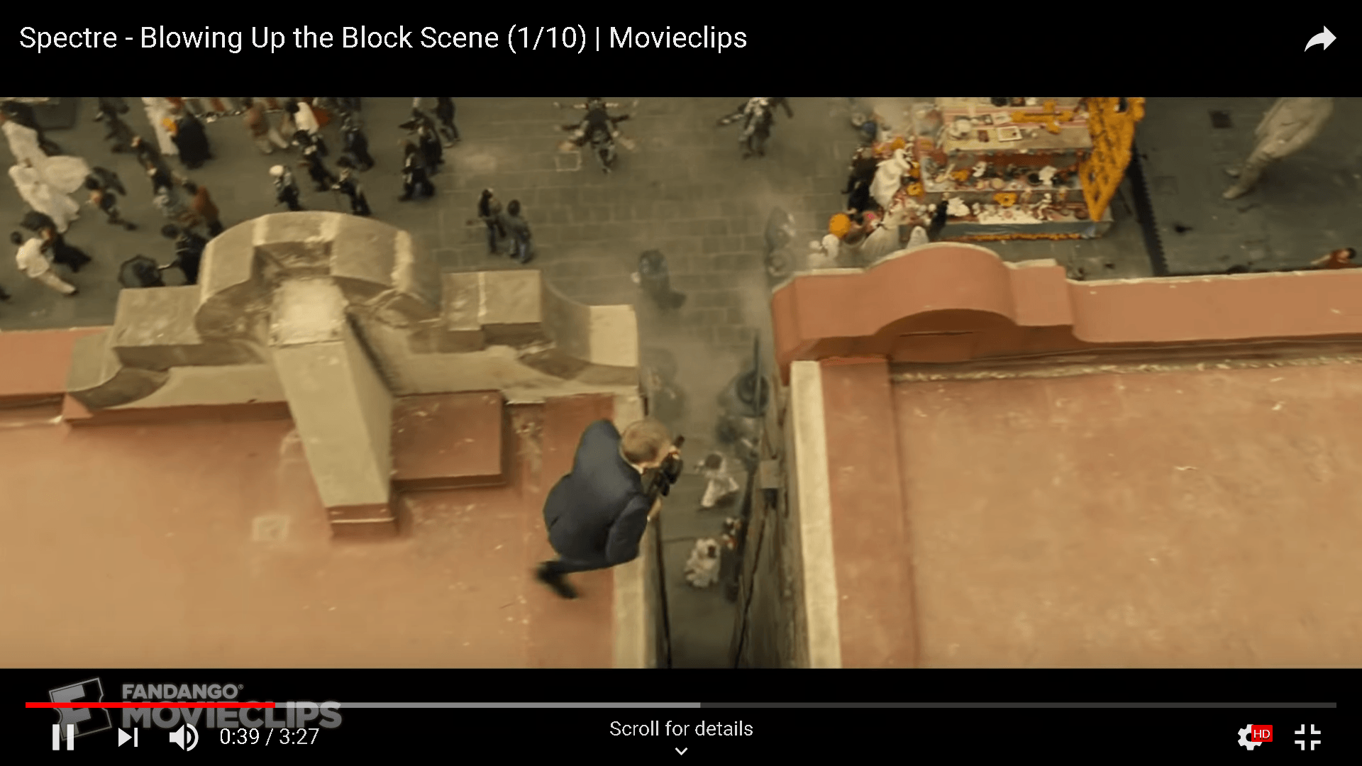


This scene gives a sense of immersion since the viewers were given the view of sudden depth into the film. The speed of the blow up was fast and the falling in of the concrete was very sudden. It was a gradual anticipation buildup from the walking scene mentioned earlier, evoking feelings in the viewers.

Observation:
- Sense of symmetry
- Scale of the background in proportion to the moving human
- Balance and Orientation (shifting camera angle)
- Environment and architecture choice
- Dressing of character
- Changing depth of film.
2. Static Images: Framing of the light


Shadow Spaces by Owen Gildersleeve and Stephen Lenthall
Shadow Spaces is a new personal series that studies the relationship between space, form, light and it’s the natural counterpart, shadow.
They created a series of miniature architectural paper spaces, using light as a map to shape each form.
The structures were built with simple white paper, and each defined by the way they reflected light. This resulted in bold, geometric forms, void of all unnecessary ornamentation. The forms were then further brought to life with a layer of intense light – creating crisp, dramatic shadows. The final effect is a powerful display of capturing light and casting the shadow.
I think this piece allows one to be immersed in it, particularly with the playing of the shadows and light. It also blurs the architectural edges by confusing the viewer on the black and white edges. The shadow seems to enlarge the actual space, having an illusion that tampers with one’s perception of the framing of light.
References:
https://owengildersleeve.com/showcase/shadow-spaces