Category: 2016 Foundation 2D 1 – G4

Reflections
Initially when I was introduced to the Ego project, I felt that this should be a rather interesting project since it gives me an official chance to look into myself further and search within myself to identify the character or traits I have yet to acknowledge. However, I find the process a little taxing since it forced me to see things I normally do not and that I have to identify traits from somewhat unpleasant life experiences at times. It was also difficult to choose between different scenarios and their respective equations since quite a few resonates with my experiences really well.
After much thought, short listing and consulting with friends, I have decided to shortlist the 4 of them I shown in the end. After comparing between the very hands on emotions project 1 versus a very digital project 2 which I learnt a lot from, I felt that perhaps I can take a risk and delve more into the hands on technique again since this is another good platform for learning.
After which I attempted to try out different techniques to portray the feel I wanted, for instance through paper cutting and painting. Initially I used colour construction paper to portray the characters I wanted but then I began to realise that the colours were too uniform and it as hard to achieve the blended effect I wanted, especially for the “short-fused me”. The paper kept tearing easily and since I have never attempted paper cutting with precision before, it was difficult. It did not turn out to be well since I was not very comfortable with the medium then. I then attempted to use art card to replace paper since it was sturdier but it was hard to retain the colour on it. Subsequently, I then decided to turn to just sketching and painting instead since I intention from the start was to give a simple straightforward experience for the viewer.
From portraying myself as a human figure throughout the first row, I have decided to adapt animals and animated characters to give it a more interesting feel instead. Even though the aesthetics of the final product turned out to be kind of horrendous and I was very disappointed in myself, I felt that throughout this project, I was given a chance to really look into myself and attempt to express “me” in a totally different way which is refreshing. The various experiments I had were also enriching in their own way.
I guess this marks the end of foundation sem 1. I learnt a lot throughout the semester with Prof Mimi and she was very supportive in guiding me and giving me honest opinions about my progress and art works along the way. So thank you Prof Mimi! Andddd I am going to take a break to pay off all my sleep debts accumulated throughout the final submissions period. Ciao for now!
Experiments
1 ) Cut Out Colour Construction Paper:  I tried out glossy construction paper for the “short-fused” me and the matte construction paper for the “humpty dumpty”. However, I didn’t like both as the glossy one tends to break easily and both seem to be rather flat in colour since the paper itself is uniform. Even if there is a mix of colour, it was kind of unpleasant since the edges and the contrast between the 2 were too hard.
2 ) Cut Out Art Card and Paint:


I then attempted to use the cut out art card and then paint it over instead. However, due to the surface of the art card, the colour could not be retained. When my finger rub just ever so lightly, the red poster colour became chalk like and falls off. Hence I have decided to sketch on paper and paint them instead.
3 ) Sketch on paper Paper and Paint:


Final Product:

It is easier to blend the colours needed on paper as compared to the rest of the experiments.
Creating my characters and getting inspirations
Sketches of my characters:

Attempt to draw the frames out:

Happen to think of these that inspired me:
Ketsuekigata-kun!
Simple Thinking About Blood Type is a Korean 4-panel webtoon by art teacher Park Dong-sun under the art name “Real Crazy Man”. The webtoon is themed around blood type personality classification.


Their various interactions in a cartoony way really got me thinking and I began to realise that I did not want a very life like feature in my creations but more of a cartoony feel.
The Simpsons:


Another cartoon that got me thinking was this and how I felt like their bulgy eyes are somewhat funny and interesting and decided to adopt that into my characters as well.
The minions movie:


Personally I find that the minions are very adorable creatures and perhaps I should adapt the minions features into my characters as well since they give off a “blur” look which is quite like me hahaha. As for Agnes, I used to have this bangs cut fringe as well with the roundish face when I was younger, hence also giving me another inspiration to adapt this feature into my characters.
Gudetama:

Gudetama is a Sanrio egg-turned-mascot character with its name from a combination of the words “gude“(pronouced goo-deh), which is a Japanese onomatopoeia for describing something or someone with no energy or strength, and “tama” from the word tamago, which means egg in Japanese. I have decided to adapt this character into my first equation (the flat omelette).
Something I created using wires:

Various Equations I came up with
Various equations I came up with and considered:
- Lazy me + exercise = healthier active me
- Blur me + meet dead ends = smarter me
- Frustrated me + late night walks = calmer me
- Stressed me + slam pillows around in bed room = back to normal me
- Tired me + milo boost from fridge = energized me
- Flabby me + constant exercise = fitter me
- Me + phobia of ringing bells in the temple = “lightning” me
- Busy me + staying up late x nights = panda me
- Me with no arts background + lessons in adm = more artistic me
- Me with poor balance + ice skating = humpty dumpty me
- Naggy me + ‘ mini chef’ = auntie me
- First aider + accident = jello me
- Humpty dumpty me + ice skating = flat omelette
- Reserved me + noisy gatherings = muted “invisible” ghost
- “Muted invisible ghost” + noisy gatherings = “dissipate into mist”
- Sloth me + piling deadlines = octopus- like sloth
- Short-fused me + inconsiderate roommate = exploding urchin
Eventually I chose equations 13, 14, 16, and 17 for the EGO project.
Personally I find some of the phrasing of the equations to be awkward, such as 2, 4 and 7 even though they each represent something that is rather significant such as my phobias and what do i usually do when I am alone. Since I was unable to come up with a better phrasing, I “rejected” those equations for the final selection.
Learning about colour theory
Colour notions and colour systems- (Trey, Zihong and Mathias presentation):
Colours are split into tangible and intangible colours. There was an introduction to the addictive colour system (RGB) (often used in televisions and theatres) and the CMYK colour system (normally used in paintings).
For colour notions, there is the Munsell colour system with 3 main attributes of HVC.
Hue: Quality by which we distinguish 1 colour from another. 5 basic colours: R, Y, B, G, P & 5 intermediate colours: 10 step colour scale
Value: Value by which we distinguish the light colour from the dark. Neutral axis refers to the gray level of colour. (White è Black) = (Scale of 1 to 10)
Chroma: Quality that distinguishes the difference from a pure hue to a gray shade. Measured radially from the centre with increments of 2. Not uniform for every hue (purple more than yellow)
Applications: Identify colour for scientific research (Munsell). While Pantone is a more accurate colour series for devices and it has specific orange and gold colours.
Colour properties- (Yu Qing and Sandhya presentation)
Hue: is broken down into 12 basic colours by which they consist of 3 primary, 3 secondary, 6 tertiary colours and infinite hues (mixing).
Pure hues are without any white, black, grey or complementary colours in them.
Mix 2 primary hues to get a secondary hue.
Broken hue: is a combination of unequal properties
Tint: add white to it è pastel è can even change primary hue to secondary hue. ( normally used in marketing and designing)
Shade: Darken by adding black to it.
Tone: 1) Broader Tones: Mixture of pure colours with any neutral / grayscale colour including 2 extremes- white and black.
2) Narrow Tones: without black and white.
Saturation: (also known as intensity or chroma) refers to the dominance of pure hue (pure colour = 100% and grey=10%)
Value and Lightness: HSV model

Colour illusions and emotions- (Veron, Xu Han, Eu Chian presentation)
Colour illusions: images where surrounding colours trick the human eye into incorrect image.
Complementary colours: e.g. red and green è green may seem brighter when placed next to each other
Simultaneous Contrast and Successive Contrast
Edges: increase contrast to create depth
Colour emotions: they gave examples of how different colours evoke different emotions in people. (e.g. white represents purity and peace where yellow represents energy and happiness.)
Silkscreen, Tote bags and Reflection for the Project
Exposing our screens:


We were brought into the dark room with an empty silkscreen and were told to attach our transparencies (2 sheets together) onto the silkscreen before facing it down on the exposing machine which will first vacuum the screens before exposing it to strong light. Afterwhich, the screens will be ready to be washed by the water jet in another room.

My first silkscreen design.

Failed trial prints on newsprint. Most of the just appear pitch black and the halftone could not be seen at all. Though I managed to get the halftone once as shown on the bottom right, it felt extremely insecure.

Turned out that a couple of us in the class also stripped off their first design since they were not satisfactory. Also, we did not realise that the first tub of betastrip used was expired and hence quite a few of us spent futile effort over a good half an hour trying to scrub off the design.

Process of stripping off the first design.

Notice that there is a “ghost” image on the screen!

Subsequently, I came up with a second design and proceeded on to expose it again the next lesson. It also made me realise that I didn’t take a photo of my first exposed design last week. (:( )

I tested it on the newsprint and it seems to be pretty fine. At least the prints were much sharper this time round as compared to the first.

This is my first trial tote bag. Other than the slightly smudged phoenix, the rest of the print seems pretty fine. The method I used was to ask Minh to hold the silkscreen frame diagonally and I scraped the squeegee with one hand downwards directly. Also, I realised from the trial newsprint that I should do the scraping of ink upside down instead of just the original direction of the design. This is to prevent the ink from smudging at the tips of the light bulbs where the thin lines are rather crucial details.

This is the actual tote bag. One side of it was pretty smudged (will be uploaded tmr). Minh recommended that I use a bigger squeegee to scrape the inks with two hands instead of my original method. The method did not turn out well for my design.
After getting a shock (because my trial print was not that bad), I allowed the surface to dry off before trying it again on the other side which thankfully turned out to be pretty good.

We then washed out screens and stripped the designs off using the betastrip. My “ghost” image proved to be rather dark though. ( 😛 )
Reflections:
This is the first time I am creating designs on my own and it has been an enriching experience thus far. I became more familiar with the photoshop functions and managed to successfully design something out of it. Although the process of amending and rethinking my designs were rather arduous, it was nonetheless enjoyable in a way.
I chose 2 quotes from the Harry Potter series since I am a hardcore HP fan. At some point in time, I actually wanted to change the 2 other quotes since I find to rather hard to design. However, I persevered on and designed the Harry Potter ones first since it held more of my interest. After designing those 2, gradually I find it easier to come up with ideas for the rest of the 2 quotes. Through the process, I also found editing on photoshop getting easier as I progress with the designs.
The process of the silkscreen proved to be rather fun, from evening out the emulsion to water jetting the screens to finally spreading ink and trying to manual print them. This is something I had never done before and perhaps will never get exposed to if not for this project, I am hence very thankful for this experience.
Process and Designs for Quote 4
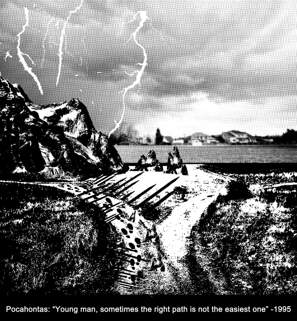
“Sometimes the right path is not the
easiest one”~ Grandmother Willow
Design 1:
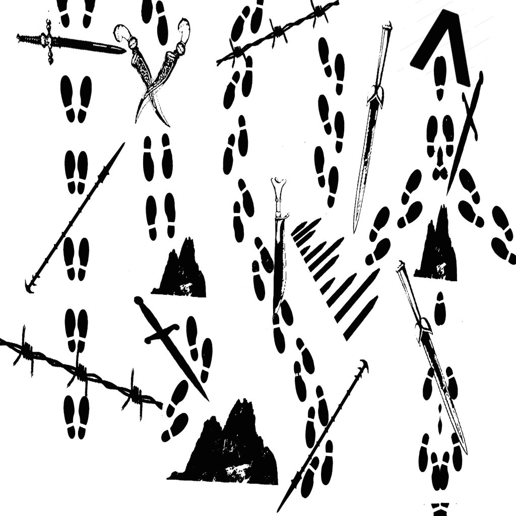
The original idea of this design is to form paths using footprints and how each path is temporarily blocked by obstacles which is the interpretation of “not the easiest”. Ancient swords, spears and barbwires were used to bring out the vintage feel Prof Mimi wants. There are also boulders involved to represent larger obstacles.
However, the comments were that the footprints were too random and that the path is not clearly represented. Besides, all the objects are quite randomly placed as well, giving the feeling that they are “floating” in the air with the fluff and unstable feel. Hence, this lead to the amended design 2.
Design 2:
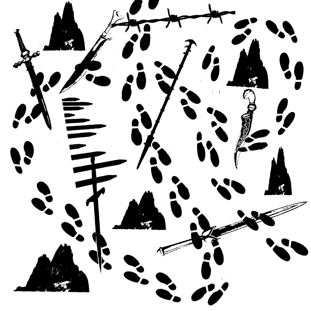
This is the amended design from 1. I attempted to make the path clearer by making the footprints start from the middle top of the design and it goes in 2 loops (bigger and smaller) and ends at the lower right of the design. I also cut down on the variation of the obstacles used to reduce the complicated feel of the design.
However, the comments were that the path of the footprints were once again unclear and it seems to be messy instead. The “random” feel, although lessened, still exists and probably would not be an ideal design for the quote. This leads me to my 3rd design.
Design 3:
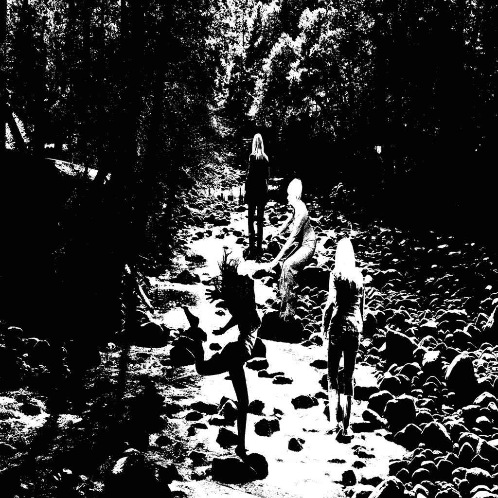
This is the third design for this quote. I decided to have a different approach instead. The dark background represents the “tough” situation one is in and everything seems gloomy for her. I then design it in a way to make her cross the broad river with strong currents through different actions. From the first pose with an “energised” feel to the second pose with the “persevere on” attitude to the third pose with the “i need to be cautious” attitude in the precarious situation on the boulder and finally to the last pose with the “tired but somewhat victorious” after the treacherous path.
However, comments for this design are such that the background contain way too many details which prove to be slightly messy and perhaps would not be an ideal for a printed design. It is quite literal and safe but lacks the vintage and ancient element feel to it. Also, the path seems rather simple, the obstacles are too minimal to even fit the quote properly. Hence this leads to my 4th design.
Design 4:
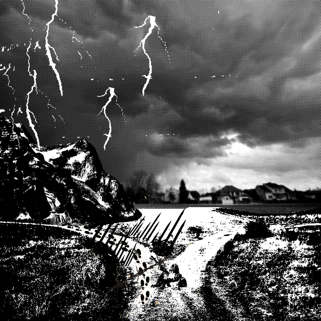
This is the fourth design for this quote. Again, I took another different approach whereby the obstacles were made to be seen clearly such as the huge mountains, the lighting, the spears, small boulders and barbwires. The footprints are then included inside to simulate someone walking through this treacherous path.
This was my original design for the tote bag. I used this design to expose my screen for the first time and it turned out well on the silkscreen. However, when I printed onto the newsprints for test prints, it turned out to be half black instead and the half tone was not seen at all. Technically, the halftone failed and all the small details across the design were pitch black. I had to erase this design using the betastrip and re-expose it the next lesson. This leads to my amended design 5.
Design 5:
This is the fifth design for this quote. I altered the dark grey mid tone to a much lighter one as shown above. Although it is edited, I still feel that it would not be ideal for the silkscreen which lead to my choice of the “light bulb” design for the tote bag.
Process and Design for Quote 3
” The seaweed is always greener in somebody else’s lake” ~Sebastian

The idea for this design is based on comparison which is represented by the half black and half white components. since there is the idea of a “lake’ in the quote, I feel that the general setting should be a lake in a more remote location with mountains instead of any modern buildings around it. In this case, the animal chosen will be a land animal (pig) instead to juxtapose with “seaweed” in the quote. In this design, the pig is situated in the white area (reality) versus the black area (imagination). Once again, this presents the idea of a comparison which is the interpretation of the quote. Since “the grass is greener on the other side” is a more commonly known phrasing than this quote, it can also be somewhat juxtaposed with the old phrase “pigs can fly” which thus explains my choice of this animal. The wings are hence another form of comparison.
Process and Design for Quote 1
” I open at the close” ~ Harry Potter
Design 1:
This symbol on the left is an ancient symbol of death. It also contains wings which is closely linked to the golden snitch in the Harry Potter movie. A small path is then formed by bones, leading “death” to a door. Eventually, a form of resurrection occurs whereby a man emerged with a skull. This is somewhat representative of the process of “rebirth” and a new start when you find a dead end in a situation which is my interpretation of the quote.
Design 2:
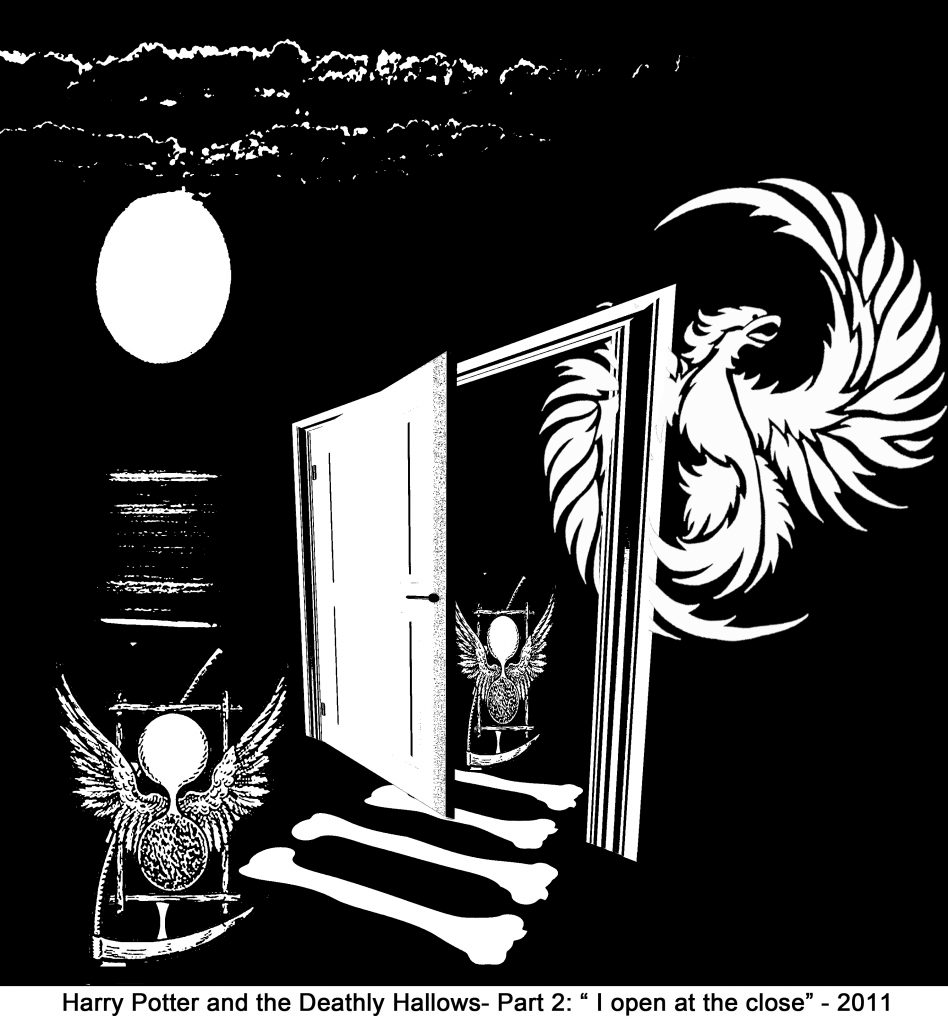
Since the quote is similar to the other Harry Potter quote I chose, I find that they do have some similarity involved which is the idea of “hope” and “rebirth” which translates to the use of a phoenix over here as well. This design looks cleaner than the first and the link between the two movies is also clearer. The reason why i chose a dark background was to represent the overall “close” first which then eventually leads to the “open” with positive spaces for close and negative spaces for open.