Zine, a research project about a place in Singapore I am unfamiliar with. After doing some on site research, we are to produce a short zine on the location we are assigned to, in this case for me, Mandai. “Beyond Trees” is a zine containing 5 things you probably missed out about Mandai.


QUE SERA GALLERY:

Que Sera is a project whereby students get to design a type using their own initials. We get to explore on what constitutes a good typography and what elements we can use to make it an effective one. In this project, we are to depict our future aspiring jobs using our initials and our type creation.


“I am an IT Programmer”

“I am an Electrician”

“I am a Wine Dealer”

“I am an Architect”


It was my first time using indesign, hence I was extremely unfamiliar with it and had to learn from scratch. After the crash course from Tutor Shirley about Indesign, I felt more confident and began to do more self exploration. My zine process with be illustrated as shown below:

It will be shown through a progressive change for each page throughout my different versions.

COVER PAGE:

Initially I had no idea what to do for a cover page. Hence I came up with a “deadpan” look one like the one above.

Subsequently, I began to use more visual elements in my design but they made the zine look rather messy.

This is how my zine looked like after my first consultation. Elements used are simplified and the titles are all put together for ease of reading.

I then came up with another version on on own, wanting a sense of hierarchy to my cover.

This is how my final cover looks like after editing.


LAYOUT  PAGE 2/3: 

My original intention was to use this doll with 5 pins on it to mark out the 5 things about Mandai. However, the first thing that Tutor Shirley said when she saw this was ” you want to curse someone is it? Voodoo doll??” Then I realised my mistake in choosing this doll.

After which I decided to fill my 2/3 page with the birds as my subject matter. This is how the first attempt looks like.

Then I altered the text a little and created some emphasis on some words that seemed more important. However, after my consultation, I realised that this is actually a big nono.

I too learnt that my text should all be in one area and not all over the place. Hence I amended my text’s location and added white borders to my pictures to have a better sense of harmony.

The pictures at the bottom seem a little squeezy after that, so I removed one of them and enlarged the rest with more spacing between my text as well.

This is the version 2 of the bird sanctuary page I created.

This is the final layout I have decided to go with in the end.


LAYOUT PAGE 4/5: 

Once again, this is the very first attempt for using the rectangle tool after the crash course.

I also tried to make use of some gradient effect as well. However, I realised that it can be distracting and thus removed it thereafter.

Pulling images into my layout in the raw state.

My attempt to add borders and shapes to my images and well as a title.

I played around with the different typeface and colour for the title as well as the texts in my layout. However, the feedback was that the caps title seems “angry” and I better change it to some other typeface. Also, deciding that white is not a good idea which actually breaks the sense of consistency, i changed it to black in the following picture below.

Again, I placed emphasis on some words which is not ideal at all and added white borders to my pictures.

I then shifted my text to one area as they should not be all over the place as mentioned in the previous layout.

Seeing that there is not much progress for version 1, I began to start on a version 2 instead. I also made conscious effort to let my pictures have a sense of hierarchy.


Eventually, this is my final layout for page 4/5 for my zine.


LAYOUT PAGE 6/7:

Again, this is my first attempt.

Adding title and pictures into it as usual.

Once again, text flying everywhere. Not ideal at all. Pictures seem rather cramped.

Trying to make use of white borders to help but they are not helping much either.

Tidied up the pictures and texts. Looks slightly better now.

However, I still went on to do my version 2.

This is how the final layout for page 6/7 looks like for my zine.


BACK COVER: 

My first attempt at making a back cover page. I didn’t want it to look complicated hence I reused the same picture. I also want the viewer to have a ‘one glance to end’ kind of feel then the layout is as such.

I then proceeded to add some final text on it.

However, considering that the majority part of the zine is better in version 2, I also went along with the version 2 of my back cover.

This is the final back cover for my zine after adding some social contact.

Reflections: 

I felt that this project really allows me to gain exposure on how to create a mini magazine on my own with a totally unfamiliar software. I learnt a lot through redoing and amending my zine with the feedback I received. Things like the typeface, fonts, colour, placement of pictures and texts, visual hierarchy etc are all very important in a zine and I am really glad I tried many ways and means to get this project done. My initial intention was to do a zine purely on Mandai Crematorium and the comparison between an army’s officer’s procession versus a civilian one. But then it resulted in a very dark aura around my zine, something I didn’t want, hence I changed my subject matter to the 5 things you probably didn’t notice in Mandai. At first my title page was just as literal but subsequently I changed it to a more indirect one “Beyond Trees” since many people think that Mandai has nothing but trees over there. Despite having many doubts and insecurities, it was a chance for exploration, experimentation which actually made me enjoy the process.


Relevant Statistics gathered: (because not all can go/ are suitable for slides presentation) 


TOTAL DEATHS BY YEAR: (with mostly a decade interval) 

1960 – 10210 deaths

1970 – 10717 deaths

1980 – 12505 deaths

1990 – 13891 deaths

2000 – 15693 deaths

2010 – 17610 deaths

2012 – 18481 deaths

2014 – 19393 deaths

2016 – 19988 deaths


PERCENTAGE OF DEATHS BY GENDER FOR THE LAST 5 YEARS: 

2012 – MALE (10075 deaths) = 54.5%   FEMALE (8406 deaths) = 45.5%

2013 – MALE (10426 deaths) = 56.6%   FEMALE (8010 deaths) = 43.4%

2014 –  MALE (10534 deaths) = 54.3%  FEMALE (8858 deaths) =45.7%

2015 –  MALE (10779 deaths) = 54.3%  FEMALE (9073 deaths) = 45.7%

2016 –  MALE (10977 deaths) = 54.9%  FEMALE (9011 deaths) = 45.1%


CREMATION STATISTICS FOR 3 YEARS: 

2012 – ( 14620 deaths out of 18481 deaths ) = 79.11% cremated

2013 – ( 15160 deaths out of 18938 deaths ) = 80.05% cremated

2014 – ( 153700 deaths out of 19393 deaths ) = 79.26% cremated


PRICE OF CREMATION INCREMENT OVER THE YEARS:  

As this is not quite available online, I sent an email in to  enquire about it.


References:

Google Map

Singstats

South Park Characters


MANDAI (Man-Die?)

When I first received the brief and location assigned, I was a little taken aback. Contrary to the places I am familiar with (Bedok and Marine Parade), Mandai is relatively out of town and I am very unfamiliar with it. After researching on the area, I shortlisted 3 places within Mandai, namely the Mandai Bird Sanctuary , Upper Seletar Reservoir and the Mandai Crematorium. Although there is the night safari and Singapore zoo, I intentionally steered away from popular tourist attractions.


When I first reached the mandai area, all I could see was trees and more trees, making it seemed more ulu than I thought.

My first stop of the visit was Upper Seletar Reservoir.

After walking around for quite a while, I feel that it is quite similar to other parks and reservoirs, making it not so ideal for my zine project.

I then moved on to the Mandai Bird Sanctuary.  Mandai Bird Sanctuary has been something of a secret for the past two decades, since it opened in 1994. The sanctuary was previously open only to experts and academics from around the world, and as a place for research development in bird breeding. The sanctuary’s lease was originally set to expire by the end of May. However, an extension by the Singapore Land Authority meant they have till February 2017 to move to Sungei Tengah.

The sanctuary currently sits on two hectares of land along Lorong Lada Hitam, and has long bred exotic species. It has eight aviaries which house about 2,800 birds from more than 120 species. Many of them are rare, and some are also endangered. They include breeds such as the Black Palm Cockatoo and Eclectus Parrot. Mandai Bird Sanctuary is one of only two farms in Singapore which have been approved by the Convention on International Trade in Endangered Species of Wild Fauna and Flora (CITES) – an international treaty to protect endangered wildlife.

However, when I reached 31 Lorong Lada Hitam, the rusty metal gates were closed. I called the office hotline many times, only to reach an engaged tone. There was not a single soul in sight even though I stood at the gate and called out several times. Despite that, loud chirping sounds were heard from within.

Stoning outside the gate for some time, the only pictures of birds I took were of these 2 cuties. They seems to have some synchronised actions. Also, minor bullying spotted (3rd pic).

Perhaps I was too late, the sanctuary was already closed since it was nearing the end of February already. Feeling disappointed, I moved on to my next venue.

Upon reaching Mandai Crematorium, I spotted many army men walking around. Not thinking much about it, I visited the columbarium first.

Strangely, I noticed that the fishes in the pond at the ground level of the columbarium were hardly moving. Thinking that they may be artificial fishes, I stood there to observe them. While I confirmed that they are alive but with very minimal movements, I really wondered why. (Is it too spooky?!)


As I walked up, I also noticed a small poster attached on the walls. Perhaps these are caused by lighted candles or joss sticks. (One of the Chinese Traditions for the deceased)

As I walked through the rows of niches, I noticed that besides from flowers, there are many other little objects like stuffed toys, cards, animals figurines placed on the little platform in front of the tablet.

(I told the deceased about my project before taking these photos) From cards to small soft toys, keychains and figurines (the variety was interesting),  we can see the love their family have for them and the area was well maintained.


As I proceed to the service halls, I noticed many army men putting on black arm bands.

They stood in 2 uniformed rows opposite each other and not long after, a hearse appeared and the army men started saluting one by one.

The state flag was seen draped on the coffin as it was lifted out of the hearse.

Meanwhile, another group was standing in line waiting to march into the empty area in front of the service hall.

This is then followed by the rifles salute with 18 shots into the air.

Shortly after, an army officer began blowing the trumpet.


They then proceeded to march out.

After that, the team then began searching for the bullets lying around amongst the grass.

I then proceeded to the viewing hall. As the viewing hall was too crowded for the deceased army official, I went to the next viewing hall instead. (I also briefly explained the project to the deceased’s relatives before taking any action)

Some other sightings at the crematorium:

(The person in charge was there and he did not mind me taking the photos)

I think I have never been at the crematorium for this long before. It was an interesting on site research journey and coincidentally, I have also seen things that are otherwise normally not seen in more common spaces in Singapore.


These are some of the interesting layouts for zines that caught my eye or had in a way inspired me.

1) Here is zine, here is Hong Kong (http://www.pmq.org.hk/event/here-is-zine-here-is-hong-kong/)

The 3D effect and the sense of texture are both common in these 2 layouts. In “High Rise Residense”, an aerial image of the landscape and concrete buildings form the background of the layout, depicting the sense of “density” in the city. Instead of using solid colour backgrounds, the image used draws the viewer into the space. With small pop outs on the right, the 3D effect gave a more interesting furnish to the space depicted. I like the idea of using a textural image as my background and perhaps I will use it in my zine development.


2) Rubbish Famzine by Holycrap SG

Holycrap, Famzine, is an art collective of the Lim family, made up of dad Pann, mom Claire, daughter Aira, and son Renn. I feel that there is a nice hierarchy in the size of the images which creates a flow for the reader in terms of focus and importance. (Dominant/ Sub-Dominant/Subordinate sizes)  Since this is a famzine which contains family and lifestyle related content, the colour used was warm and successful in conveying the homey feel which is evoked in the reader. It is also rather visual heavy since the text used were small and minimal. I think this is also an aspect I will try to incorporate into my zine.


3) Iceberg 


The 5th, 6th and 7th images caught my attention. The idea of multiple small rectangular texts is actually appealing with one dominant image at the bottom (5th). One extremely dominant image that spans across 1.5 pages is also quite appealing, if the image itself speaks louder to the audience. In this case, the bigger image allows more details to be scrutinised, making the zine more interesting (6th). However, being image heavy in the previous pages may cause the reader to be overly focused on the images itself. The 7th page then brings the reader back to the focal point where large texts are spanned across both pages with lower opacity/ faded images forming the background. It gives a sense of depth to the zine while not drawing attention away from the text.


4)

I feel that the bold colours used are very attention catching due to the high contrast. The sense of variety of (contrast and colours) is important in maintaining the interest of the reader. Geometric patterns and lines are also used to allow the page to have a sense of structured depth. The use of a cut out hole in the flap is also appealing. It makes the reader more curious to flip and know what is behind the flap. The layered pages further emphasized the sense of depth, making it intriguing. Contrary to the norm where the title/ focus of the page is on a single page, the focus of the page (title) is spanned across the 2 pages with wide gaps between each letter. It feels as if the letters could breathe and it makes the reader look across the 2 pages quickly to form a general idea of the content before going into the details.


5)

The design and placement of the images do not conform to the norm and it feels refreshing to read the zine. Having edges cut off and forming irregular shapes is interesting. Despite that, the layout did not give of a messy feel, it looks clean and sharp. The rectangular boxes also look contained and neat.


JOB 1) ARCHITECT

My name is

architecture-final-copy

and I’m an Architect.

JOB 2) WINE DEALER

My name is

wine-dealer-1-copy

and I’m a Wine Dealer

Inspirations:

img_20170213_001608_1486918557250     img_20170213_001629_1486918578010        img_20170213_001541_1486918524704

  img_20170213_002614_1486918693872      img_20170213_002622_1486918717012        img_20170213_002651_1486918744312

Photographed at home using new wine bottles:

select-1

photographed using new wine bottles.

JOB 3) ELECTRICIAN

My name is

electrician-2-copy

and I’m an Electrician

JOB 4) IT PROGRAMMER

My name is

matrix-final-copy

and I’m an IT Programmer

Reflections:

Initially when i first receive the brief, I was at loss of what to choose and how to approach it. Gradually I researched and pondered over and decided to use several techniques to help myself, including photography, collage, manual mark marking and digital editing. Using these combined techniques really helped me learn a lot since I usually do either manual or digital. In this project, I have also ventured into a less familiar field in terms of the mark making tools which were starkly different from semester 1. (Not leaves, twigs, rollers, sponges etc anymore but nails, screws, springs, wire coils threads etc). The project also lead me to think about how the flexibility of typography and how making use of the right items can give u a different type. The learning curve was rather steep for me since from the start till the mid of the project, I did not really grasp the requirements fully, leading to failed attempts such as the branding logo made for the Wine Dealer. It was then that I realised that I had misinterpreted the requirements of the project. However, this also serve as a good platform for me to explore and with every mistake made, I learn. Furthermore, I also learn that simplicity is really important as well since I have the tendencies to stray towards more abstract and complicated designs. The overall experience for this project was enriching and I really enjoyed exploring, be it using the materials, researching into books or even embracing my mistakes and finding ways to improve.

Initial Ideas:

  • 1) Wine Dealer
  • 2) Chef
  • 3) IT programmer
  • 4) Translator

Final ideas:

  • 1) Wine Dealer
  • 2) IT Programmer
  • 3) Electrician
  • 4) Architect

Rough Draft:

img_20170213_011827_1486920256770


Why the changes?

– Chef seems too cliché, quite a few people doing. It seems too general either, should scope down into a specific kind of chef, making me feel uncomfortable and restrained.

img_20170213_011729_1486920147808          img_20170213_011718_1486920130370

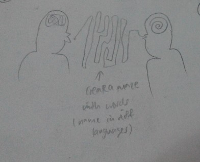
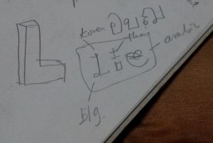
– Translator: the original idea was to design 2 humans interacting together. One with a messy lump of illegible words in his mind and then as the words are spoken, it flows and form a legible form into the other person’s mind. The second idea was that use different languages In the world to form LLE. Example: L in Korean, L in Arabic and E in Chinese. However, the overall concept proves to be quite messy and hence I discarded the idea.

img_20170213_011629_1486920025965    img_20170213_011637_1486920049226


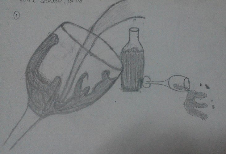
Progress work for wine dealer:

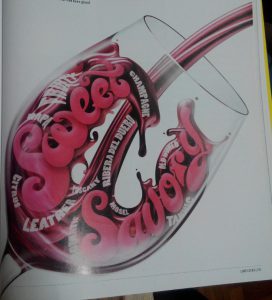
  • Pic 1-wine glass with splash 

img_20170213_011612_1486919981402

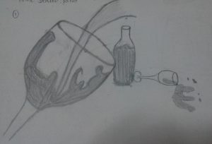
– Reasoning: the splash contains the L, the bottle and wine glass also forms an L. the spillage forms the E.

– Comments: the overall concept seems confusing and that they are very disconnected. The splashed in the L in the glass is confused with the unnecessary splash on the other side. The bottle and the lying wine glass also seems to be very disconnected due to the lack of overlap. Even though the E is okay.
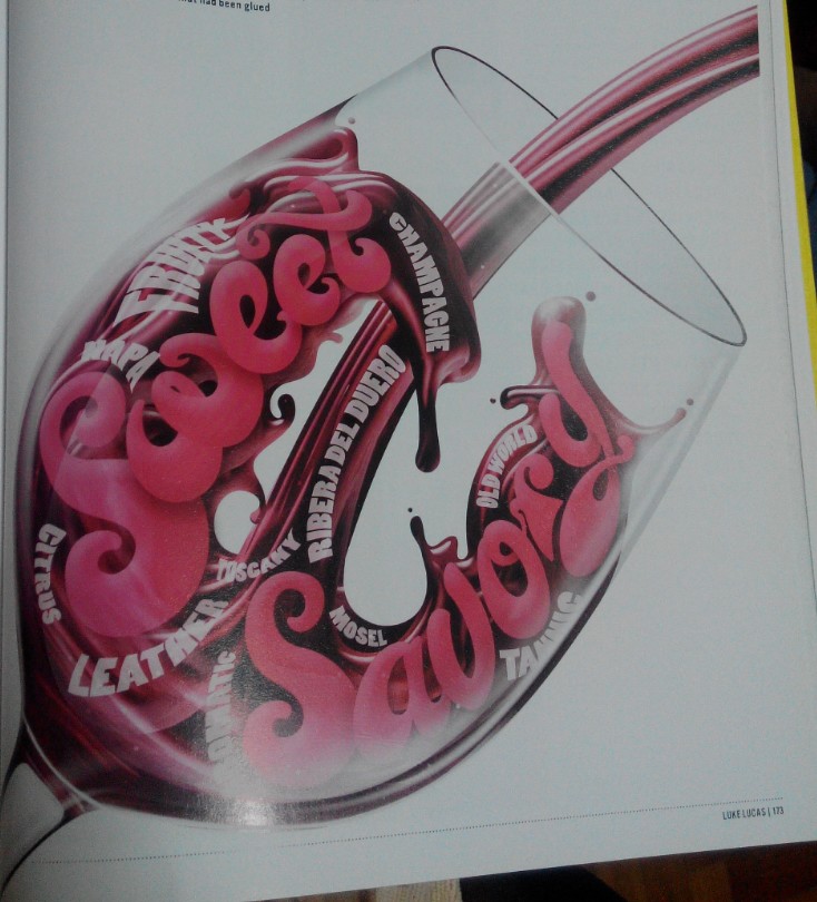
Inspired from:

img_20170213_001153_1486918402230       img_20170213_001345_1486918501872

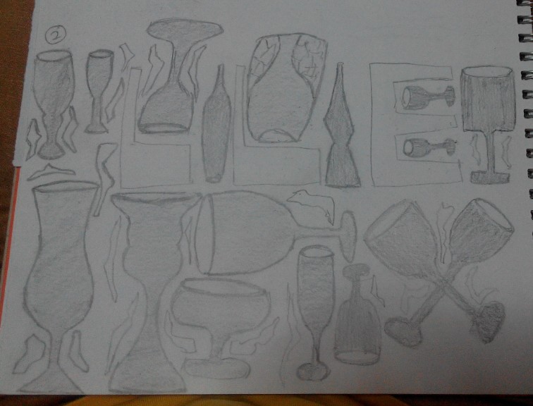
  • Pic 2- Arranging all sorts of wine glass and the negative spaces form the LLE.

img_20170213_011617_1486919999154

-Reasoning: the negative space will form the letters.

-comments: there are unnecessary distractions like the small angular frilly things that confused the design. The overall composition seems messy as well.


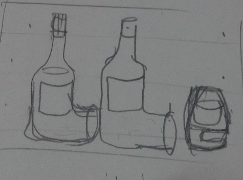
  • Pic 3 – using distorted wine bottle and barrel to form

img_20170213_011652_1486920072541

-Reasoning: there is a sense of connection on the L , making it very clear card.


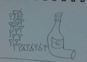
  • Pic4- use lining up wine glasses to form one of the L, then the distorted L as another:

img_20170213_013853_1486921156898

-Reasoning: there will be different variations of the L and it wouldn’t seem to be as plain.

-Comments: still very messy

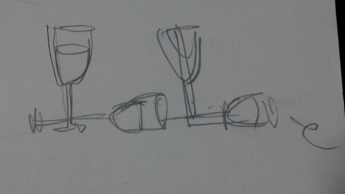
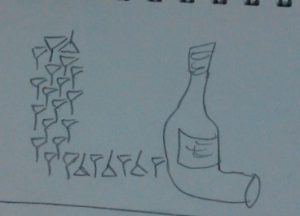
  • Pic 5- use 2 wine glasses as the LL

img_20170213_011655_1486920096015

reasoning: sense of connection


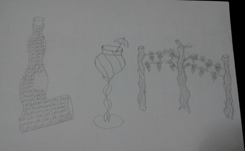
  • Pic 6- wavy L bottle, wine gals with umbrella (DOT) and poles and vines as the M

img_20170213_011707_1486920111853

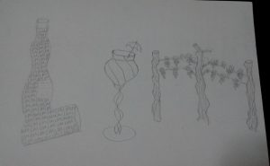
-Reasoning: ( as of now, I changed my approach to LIM, thinking that perhaps I can have another approach) again, I want 3 different items to have variation. But then again the connection isn’t clear but I feel that its good that I am opening up my options and seeing more things that are related to the occupation.


  • Photoshop figure 1: Bar counter
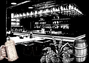
2d-ii-alcohol

reasoning: felt that the setting should be in the wine shop/ bar with main indicative elements that explains the occupation. Since the brief states that it can be in black and white, I edited and threshold it to become what is seen. But it’s way too black and the compositions seems too complicated.


  • Bottle cap/ top view of beer/wine bottle and arrange in the huge bottle form with LLE in the centre as the negative space

beer-top-view

-Reasoning: it’s hard to form the bottle shape with all rounded top views/caps. If places too closely, it’s not realistic since the bottle form is from narrow to wide and there will be this space between each of them from the top view. Besides it will look pretty complicated.


  • The one with the logo on the front line

beer-manufacturer

Reasoning: I changed my perspective to one of a beer manufacturer and I want to advertise the brand using my name initials. Hence, I came up with the LLE logo.

-comments: However, the design seems to represent my lack of understanding for the brief itself. What is wanted is that the letters itself should represent the occupation at a glance and not because of the things surrounding it that matters.


  • Using 1 idea to represent LLE. (vines/ barrel/ wine glass/ mug)

However, I attempted and felt that it was rather restricted and it was difficult to express as well since all of them seems rather uniform.


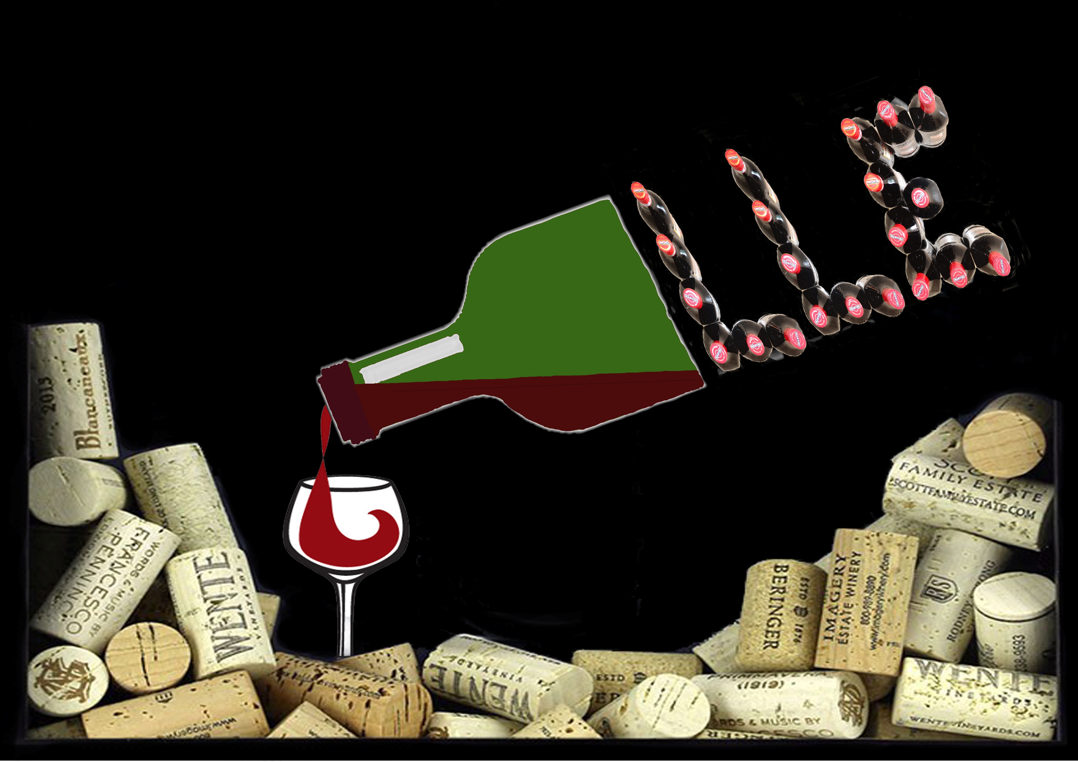
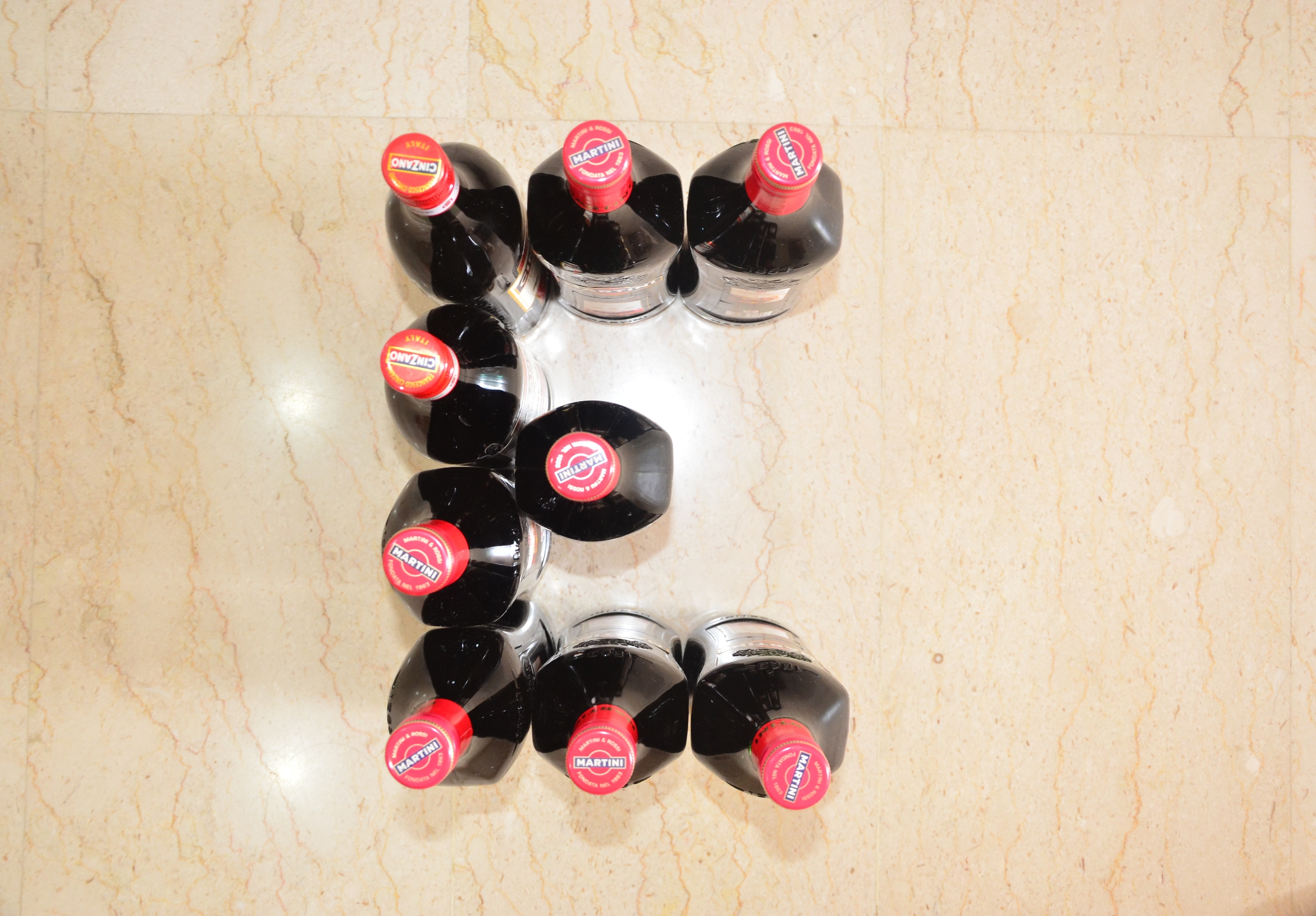
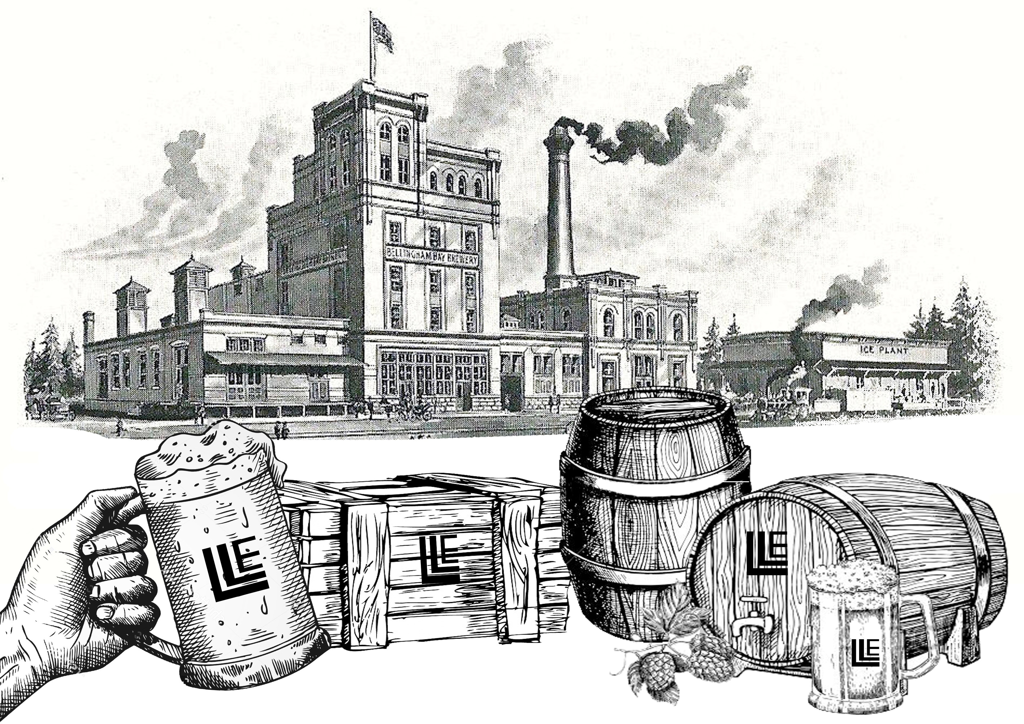
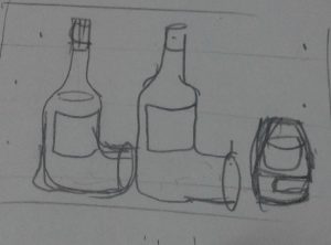
  • Final Result: Most direct way of using wine bottles.


Key identifiable features of a wine dealer: wine bottles / wine glasses/ wine cork/ wine.


I used Martini and Cinzano wine bottles to create the layout of L and E and photographed them. My original intention was to just overlay the 3 photographs together as one. However, it felt awfully plain and too literal. So I pondered over it and realised that wine corks are also an important part of the wine industry, something I overlooked previously. Hence, I decided to make part of the background with wine corks with wine pouring out from a bottle into a glass. To incorporate the photographed wine bottles, I made half of the bottle solid and finished the shape of the other half of the bottle with LLE.


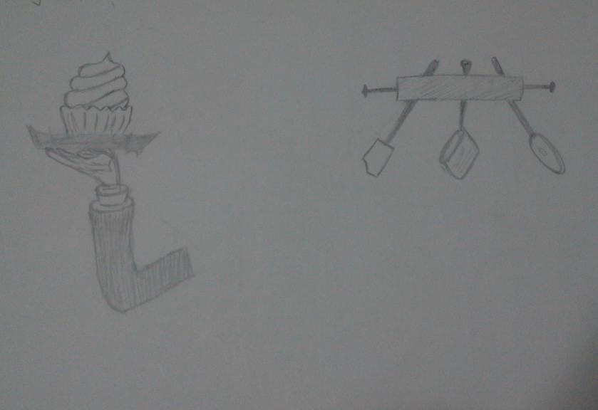
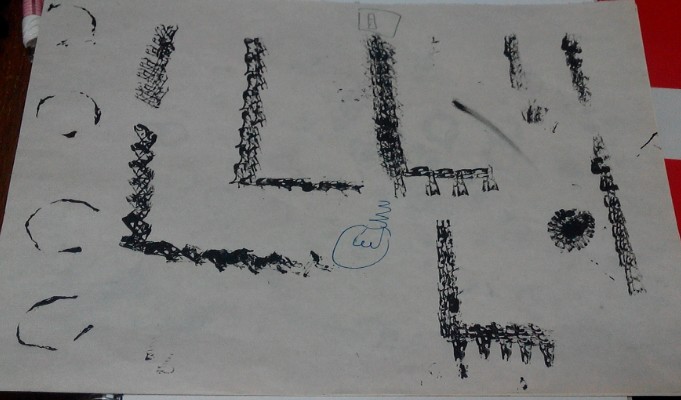
Progress work for electrician:

Initial ideas:

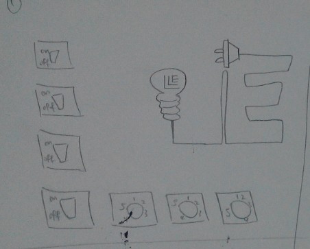
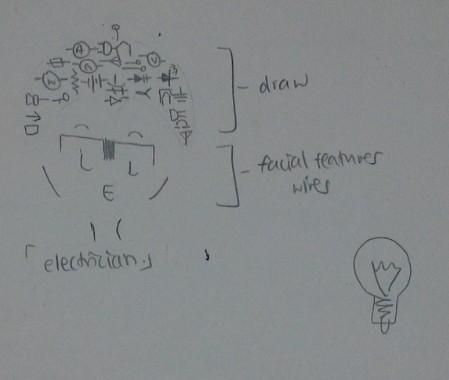
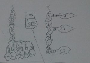
  • Line up different type of symbols or switches to form LLE. Use a light bulb with the wire coming out at 90 degrees turn to form L. The wire connects in a shape of an E to the end (plug).

img_20170213_011744_1486920170393

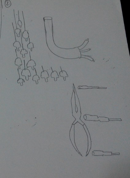
  • Use suspending light bulbs to form shape of an L and use a wire to form shape of the other L, ending with 3 different coloured wires at the end. (Live wire/ earth wire/ neutral wire). Followed by using electrical tools to form the E. ( wire cutter and screwdrivers)

img_20170213_011744_1486920184042

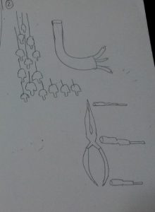
  • Use the symbols to form the head of an electrician (human figure involved).

img_20170213_011805_1486920200436

Inspired from:

img_20170213_001105_1486918375213       img_20170213_001345_1486918501872

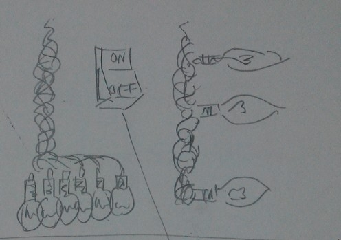
  • Decided to use light bulbs and lose wire endings to form the LLE instead.

img_20170213_011809_1486920218207

Experiments for final result 5):

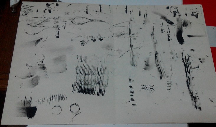
Initially I thought of overlapping images of wires to form the body of the letter but then I felt that it was too literal, so I decided to use mark making tools instead.

Items experimented with:

img_20170213_020147_1486922549534

Making the body of the letters:

  • Medium sized coil of copper wires.

– Coated one side of the coil with ink and tried to roll it to create the lined effects but it was not even nor obvious. The coils have up and downs with gaps in between causing the ink to flow into the gaps instead of staying on the rounded surface. Using this as mark making tool was not exactly feasible then.

  • Threads

– Cut a piece of thread and tied the 2 ends together. Dipped it in ink and did trial mark makings. The result lines are too thin to simulate that of a wire. Besides, it was hard to control the waviness of the threads as they often clung together into 1 line. Using this as mark making tool was not exactly feasible as well.

  • Lose ended wires.

-Attempted to stamp the wires but they were too stiff with the casing on and hence make them unsuitable since the results were rather rigid.

  • Small coiled springs.

– Thinking that perhaps scaling it down to a smaller version from 1) will be easier to control and that the resultant lines will be more prominent. However it did not differ much from the first, except that the lines are more prominent this time.

  • Cardboard:

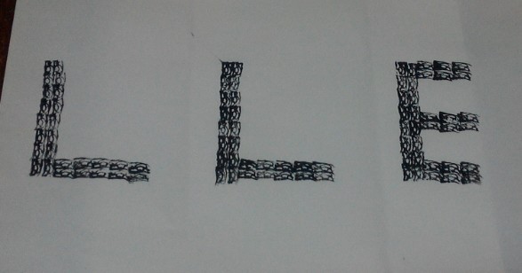
– Cut the cardboard into small short finger strips. Dip the ends into ink gently and stamp it. Surprisingly, the wavy lines within the corrugated board offered good texture for “wires”. I then proceeded to stamp the outlines of the letters out and let it dry overnight before scanning it into my computer for any further digital editing.


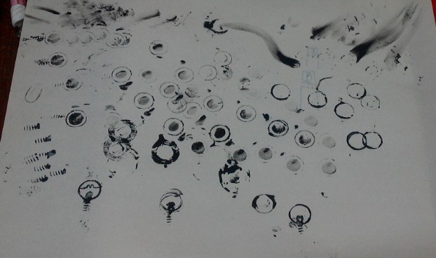
Mark making the light bulbs:

  • Different thumbnail sized rubber rings / rounded metal stands/ metal rings.

– Dip the materials into ink and try to stamp it. The overall effect was okay but the shapes were too roundish for a light bulb. I then tried to squeeze it a little just before stamping and played around with the shapes. However, I realised that the shapes were too uniform throughout the outline.

  • Long nails/ small springs found in pens.

-Dip the ends of the materials into ink and stamp it. The effect was rather okay for the ends of the light bulbs but the lines itself were not long enough to go round and cover the U shape under the light bulb. And if done several times, it becomes messy which then makes them unsuitable.
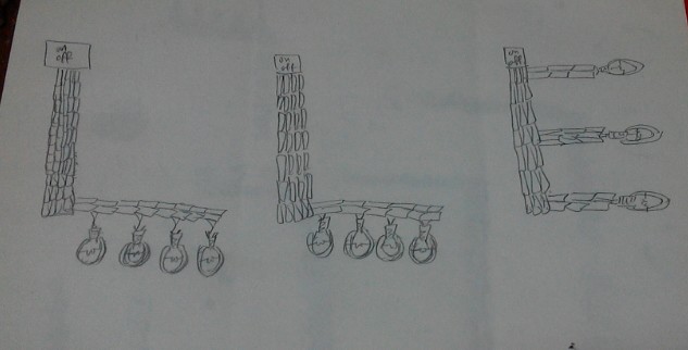
img_20170213_020824_1486922986176

img_20170213_020853_1486923030561

img_20170213_020843_1486923016340

img_20170213_020833_1486923000223

img_20170213_020903_1486923045241


Final Result:

Key identifiable features of an electrician: light bulbs/ wires/ switches/ electricity.

I inverted the scanned images since I wanted a dark background and attached light bulbs at the end of the letters. I also added a switch on top of each letter since the letter itself represents wires. I pondered for some time on how to further represent electricity even though the light bulbs were already lighted up. Since my background was dark, I decided to simulate a “sky” feature and used lightning instead. Allowing the lightning to pass through each switch gives it electricity/ power for the light bulb to function.


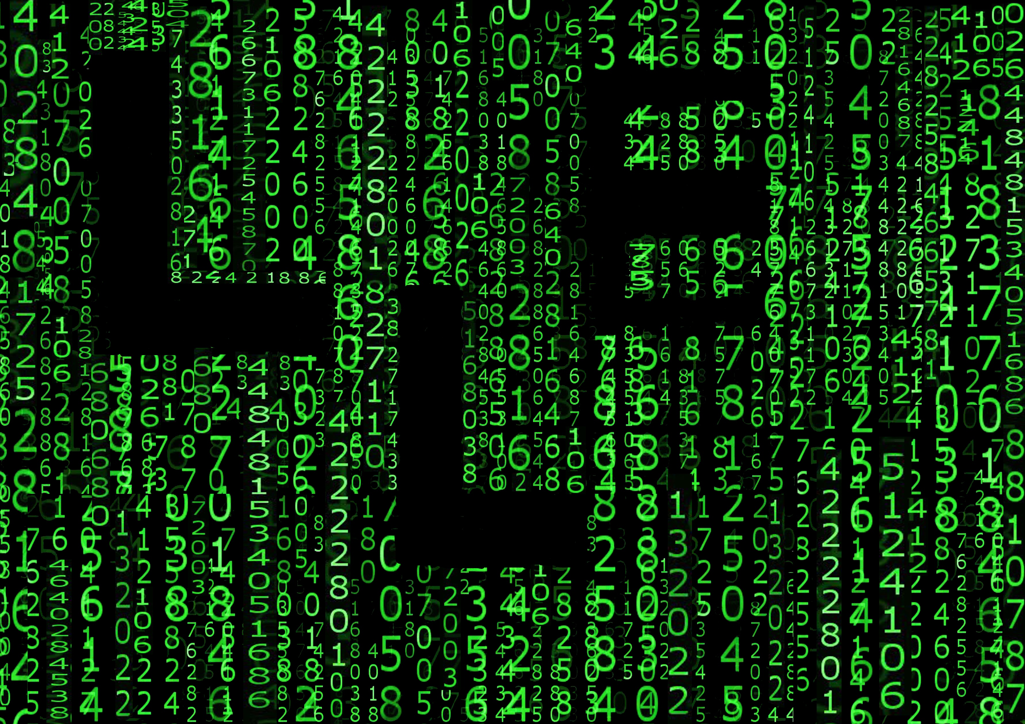
Process work for IT Programmer:

Inspired by:

img_20170213_002336_1486918623963        img_20170213_002359_1486918644547

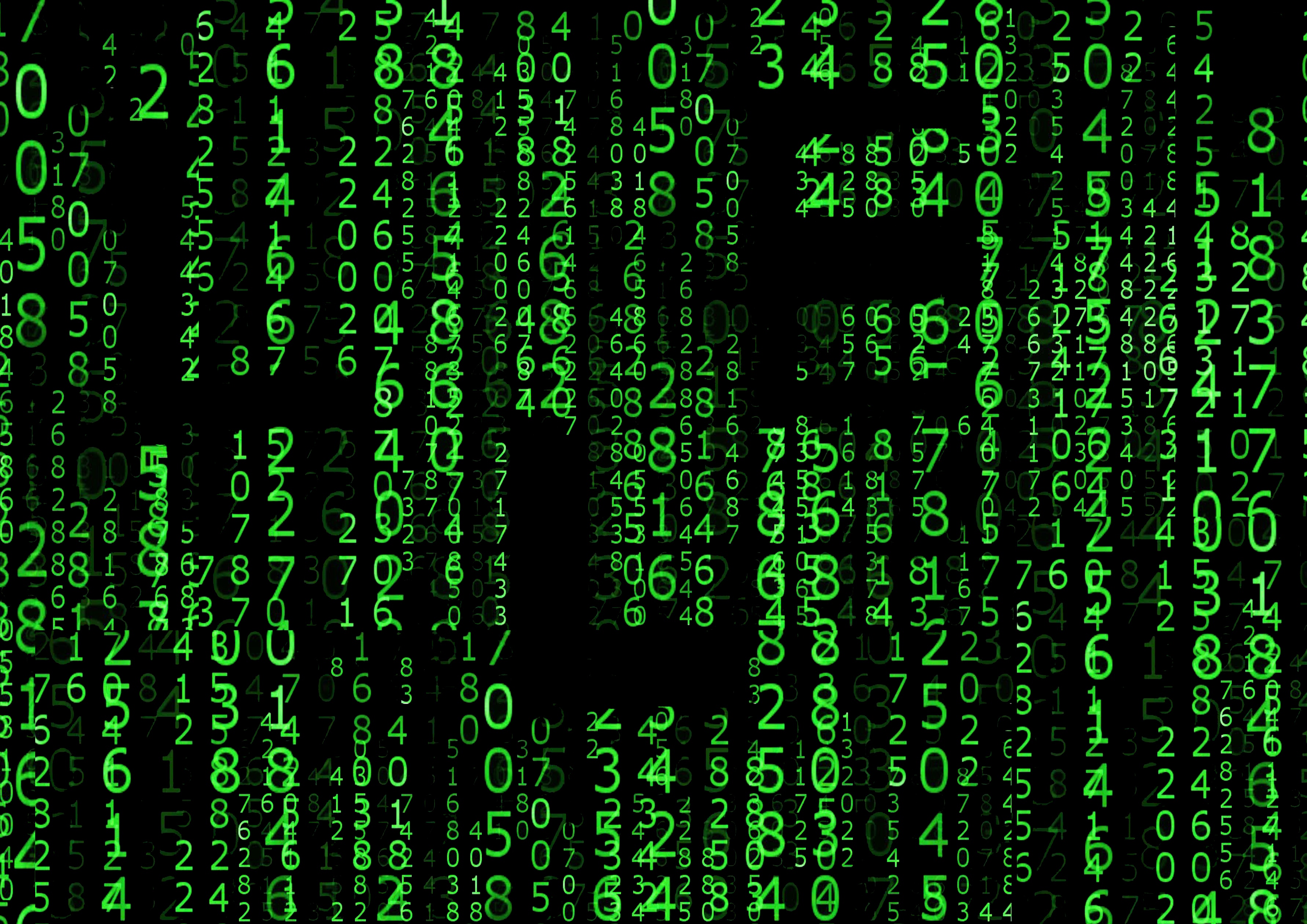
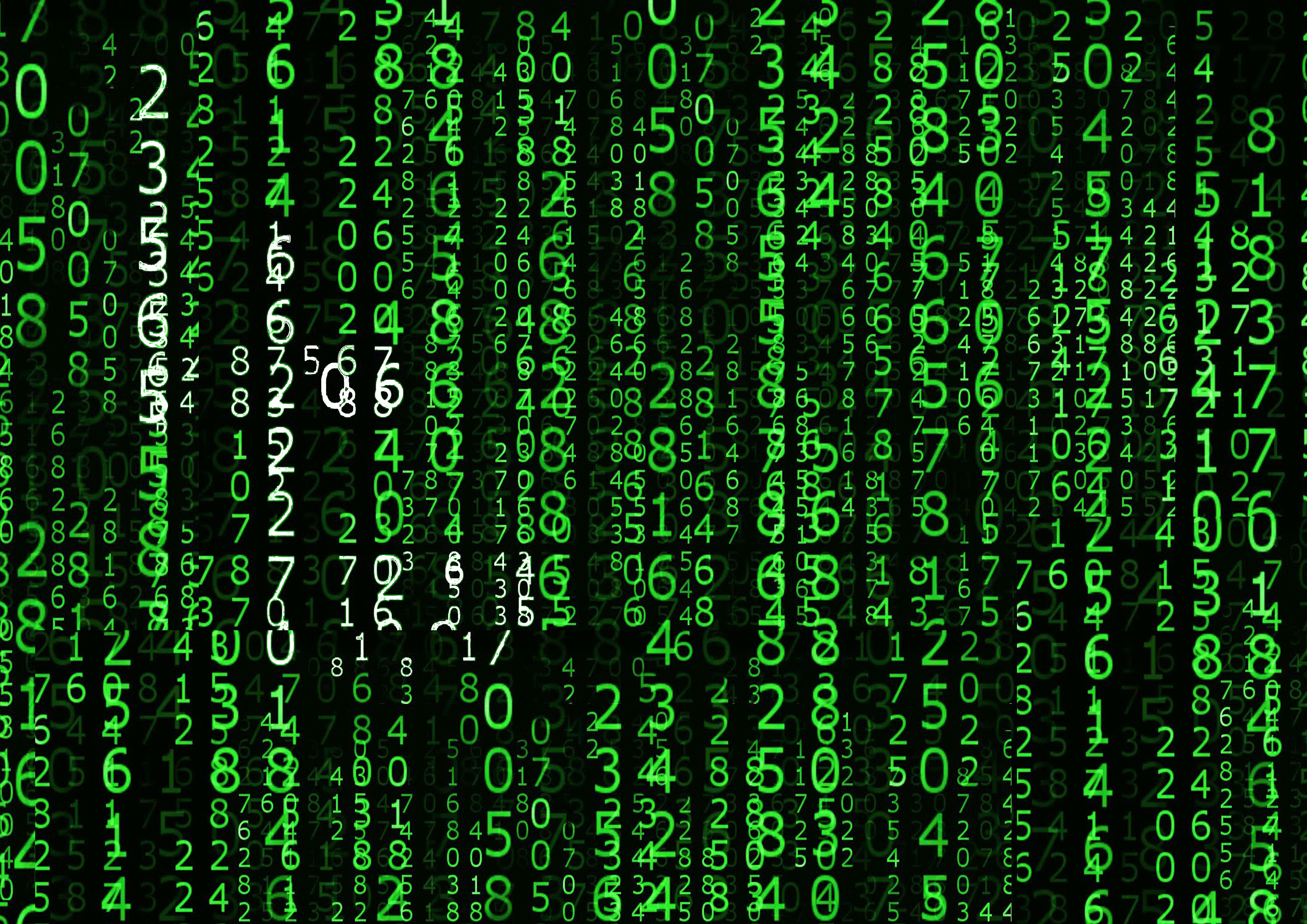
Key identifiable features for IT Programmers: coding / matrix

I have decided to go with matrix instead.

Draft 1:  Overlapping columns of digits over digits to try to compact the layers before erasing digit by digit to form the LLE.

it-programmer-passsed


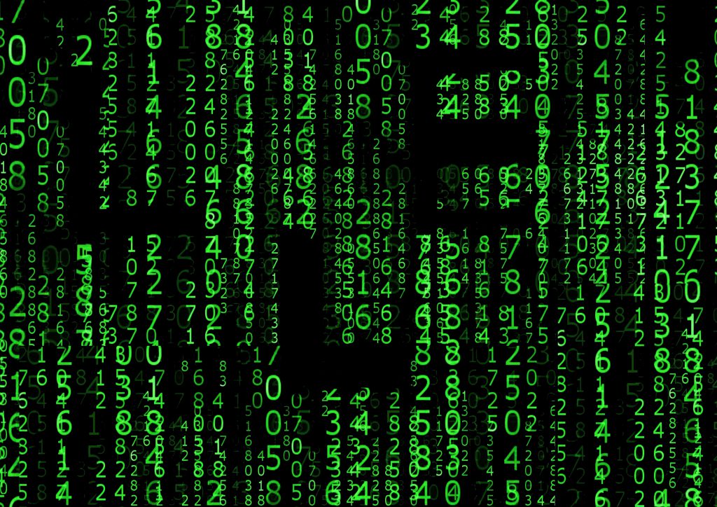
– Thought that the idea was too simple and that it was tedious to overlap manually to create the effect as well as erasing the digits. This then led to draft 2.

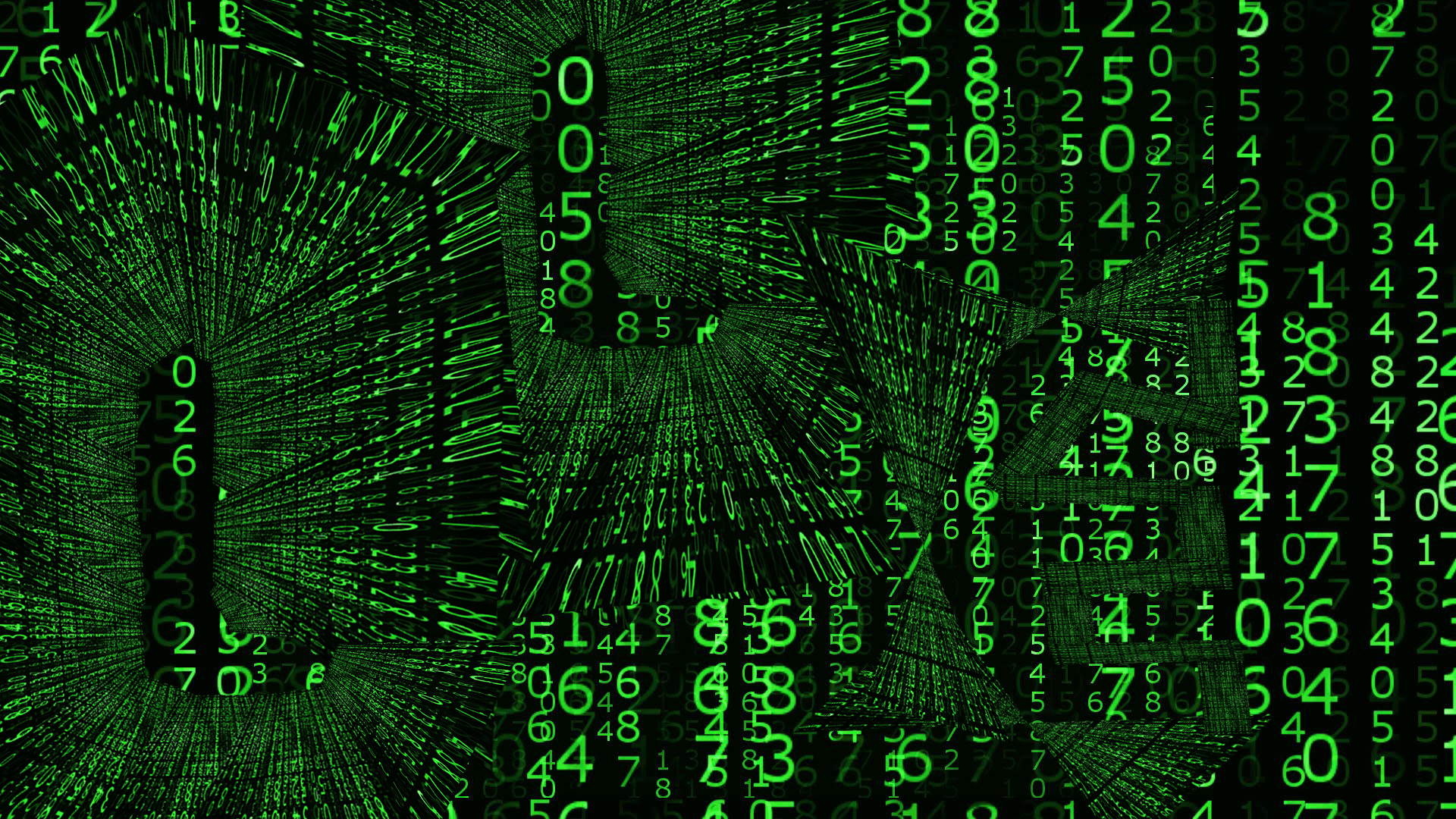
Draft 2: Deciding that 1) was too mainstream, I decided to crop a part of the matrix background and skew to mini triangles before aligning each of the triangles into the 2 Ls. Small rectangular strips were lso cropped out for the E.

matrix-2

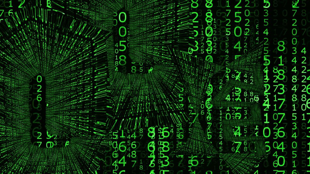
– However, the result seemed to be too complicated and it looked rather confusing. The background was covered by the patterns formed by the overlaps and the attention was stolen away from it. This then led to draft 3.

Draft 3: Change of colour. Since the first 2 methods used were unsuitable, perhaps I feel that I should change the colour of the digits to create the LLE within the background itself.

matrix-3-ideation

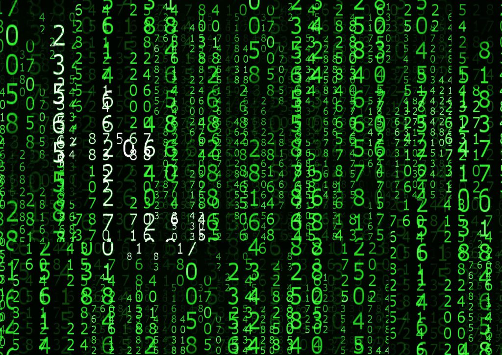
– It turned out that the effect was significantly worse than the previous versions. The white was hard to distinguish and it made it very confusing for the eye to dart around and make out the letterform.

Hence, I have decided to revert back to draft 1 and make amendments from there.

Changes: I began to overlap more at the designated areas for my letters and resized the digits when needed. Eventually the letterforms became more outstanding.


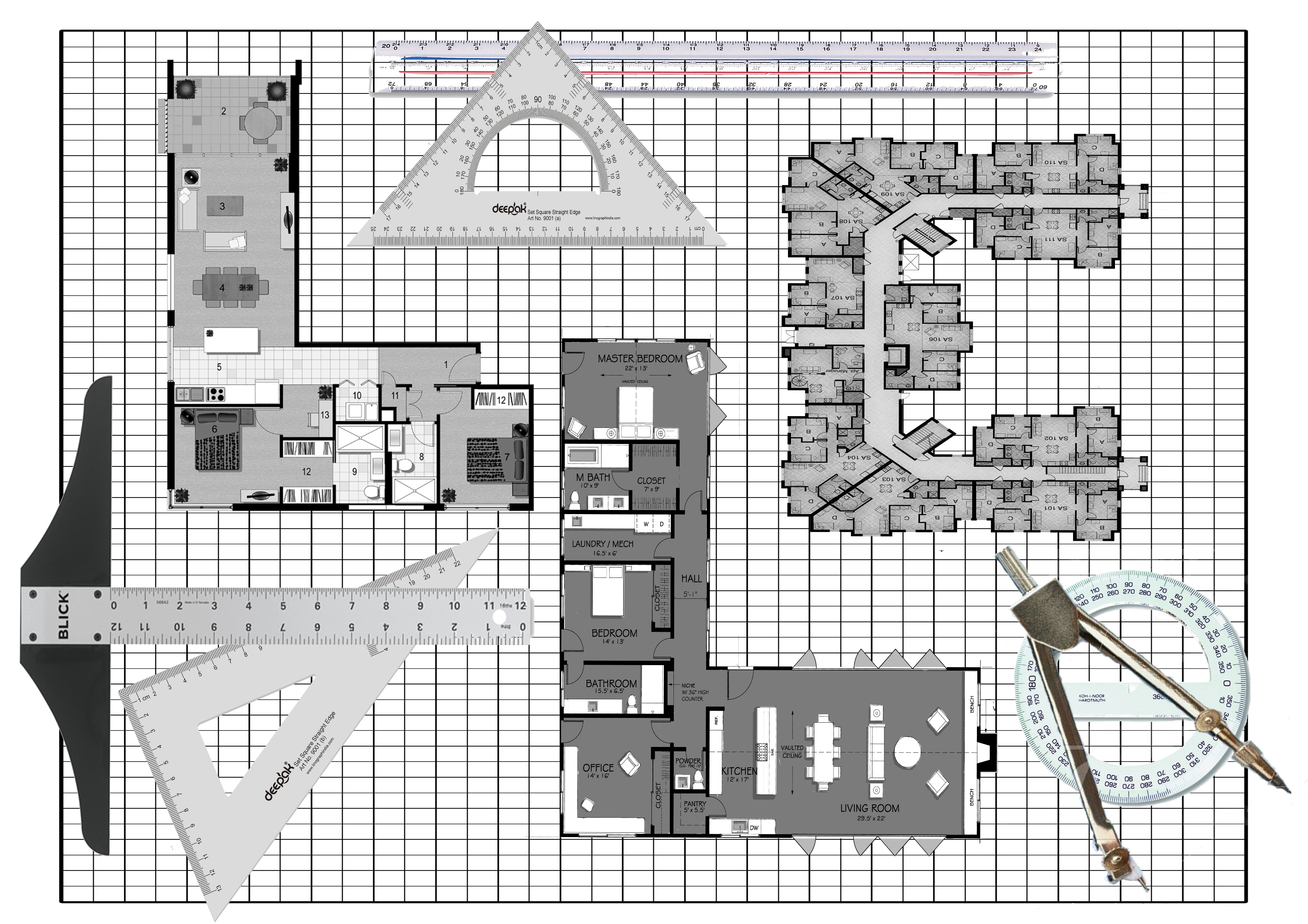
Process work for Architect:

Key identifiable features for Architect: T ruler, graph paper, floorplans, pencils, compass, set square and other tools required for drawing.

Draft 1: I drew a building using perspective and hid the LLE within.

architecture-3-idea-passed

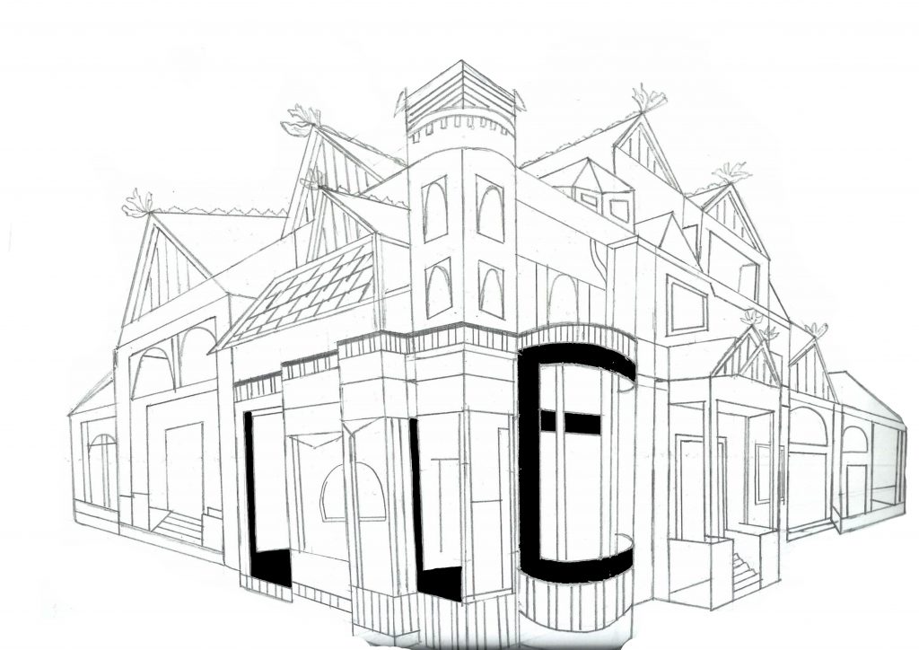
– Although the building looks fairly fine, the LLE was not what the project wanted. The letterform itself has to represent the occupation and hence this method is unsuitable.

Draft 2: Floor plans

architecture-2-passed

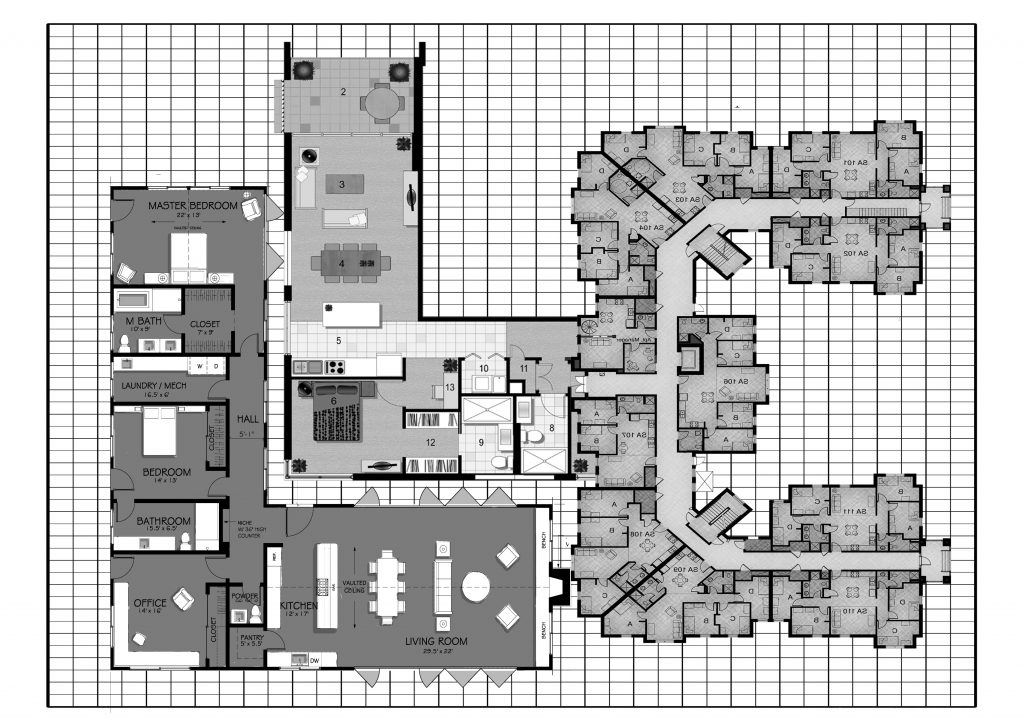
– I used floor plans with variations and overlaps to simulate togetherness of a building floor plan. I also edited the colours to simulate pencil drawings and sketching in architecture plans.

Draft 3: Floor plans with equipments

architecture-2

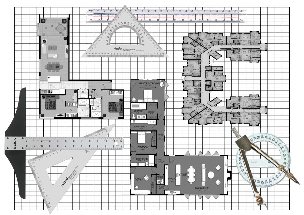
– Deciding that it was too plain, I added an architect’s commonly used equipments inside as well. However, it made the whole composition look messy and the plan itself lost the focus.

Hence, I reverted back to plan 2 and touched up from there.


DADA- The Revolt of Art by Marc Dachy

img_20170213_010011_1486918904171

The birth of DADA originated from a group of artists who were looking for an elementary type of art that they thought would save mankind from the raging madness of those times. They aspire to a new order that could re-establish the balance between heaven and hell.

What was DADA? 

DADA was a word, a rallying symbol, an intentionally derisory anti-label. As a provocative slogan it wrong footed the critics, who habitually pinned pejorative labels on new tendencies, such as cubism. The Dadaists were mocking the critics. Dada’s culture which was previously unacceptable was replaced by a new inventiveness and direct relationship between the artist and his art- which were then affected by social constrains. Dada demonstrated that a society that has lost respect was no longer in a position to demand that the artist adhere to its aesthetics and ideological values. (E.g. Rather than focusing on representation, painters now worked with their material for its own sake in terms of its colour, form and structure.


When did the name Dada first appear?

In the editorial of the only issue of the Cabaret Voltaire review created by Hugo Ball.


Who were the Dadaists then?

They were the artist in Zurich who responded to the announcement made by Hugo Ball in the press. They were there either because the war had prevented them from leaving or because they had to come here to flee it.


Tristan Tzara:

He took over from the Cabaret Volataire to launch the Dada Review. It gives details ot the activities of this Cabaret, whose aim is to remind the world that beyond the realm of war and the homeland there are independent men who live by other ideals.

The 1918 Dada Manifesto which was read out on the evening of July 23rd  was the true founding act of the movement. Tzara explained that Dada was born of a feeling of mistrust of the “community”. Dada was not absurd, not just a joke. Dada was an expression of a very great adolescent pain that came into being during the First World War and the time of suffering.


Dada Movement:

Dada was a movement of the poets and painters. They worked closely in Zurich, then Berlin but less so in Paris, where the arrival of Dada was more of a literary phenomenon.


Origins of Photomontage:

Raoul Hausmann proclaimed the arrival of a new material in pictorial art. They were the first to use photography as a material with which very different structures, often heterogeneous and with conflicting meanings, could be mixed to create a new entity that drew from the chaos of the war and the revolution an intentionally new optical image.


The First International Dada Fair:

Dada Messe in June 1920 showed photomontages and collages by Hausmann and Hannah Hoch, Grosz and mixed media construction by Johannes Baader. Hausmann mentioned that the Dada Fair was the point of departure for modern art on an international scale.


A Clone of Dada- Merz:

October 1918, Kurt Schwitters came to meet Hausmann and wanted to join the Dada club but Huelsenbeck vetoed his membership. He was compromised by his association with Der Sturm which Huelsenbeck and Hausmann condemned forhaving published a Song od songs of prussianism. Hence Schwitters recreated a Dada all his own. Merz aims for freedom from anything that stands in the wat of forming artistically. Freedom does not mean unbridled license but the product of a rigorous discipline.


Mamas of DADA, Women of the European Avant-Garde by Paula K.Kamenish

img_20170213_010042_1486918925736

HANNAH HOCH:

She was one of the few avant-garde artists to remain in Germany during World War II and is responsible for having preserved many Dada works during the Nazi years in Berlin, thereby jeopardizing her safety were she to be accused of being a decadent artist or harboring decadent art.

Hoch is instrumental in elevating the product of collage from a craft to fine arts. Though earlier artists like Picasso and Gris incorporated collage elements into their paintings, none relied exclusively on collage or photomontage as the foundation of the work. IMPT: oil on linen piece Der Anfang.

First abstract collage was 1916 work Weisse Wolke which she produced while working in Ullstein. Works from 1919 includes carefully designed collages of camera-made images. Examples: Bourgeois Couple (Quarrel), Da-Dandy, Schnitt mit dem Kuchenmesser, Dada-Rundschau (Dada Panorama)

Hoch also created cloth dolls for various Dada events. She said that the puppets and dolls are symbols of mankind, lost on the terrestrial globe. Her adult female dolls have bodies made of strips of fabric and board and heads of stuffed cloth topped by untidy yarn hair.

Hausmann’s mistreatment of Hoch illustrates the lack of respect by some male Dadaists who were initially disinclined to value and welcome women artists. Although Hoch was rather well known that time, the Berlin Dadaists were somewhat reluctantly admitted into their “boy’s” clubs.


 Russian Constructivism:

Russian Constructivism was a movement that was active from 1913 to the 1940s. It was a movement created by the Russian avant-garde, but quickly spread to the rest of the continent. Constructivist art is committed to complete abstraction with a devotion to modernity, where themes are often geometric, experimental and rarely emotional. Objective forms carrying universal meaning were far more suitable to the movement than subjective or individualistic forms. Constructivist themes are also quite minimal, where the artwork is broken down to its most basic elements. New media was often used in the creation of works, which helped to create a style of art that was orderly. An art of order was desirable at the time because it was just after WWI that the movement arose, which suggested a need for understanding, unity and peace. Famous artists of the Constructivist movement include Vladimir Tatlin, Kasimir Malevich, Alexandra Exter, Robert Adams, and El Lissitzky.

Main Representatives: Alexander Rodchenko, Liubov Popova, Vladimir Tatlin, Olga Rozanova, Alexandra Exter, Naum Gabo, El Lissitzky, Antoine Pevsner, Kasimir Malevich and Alexander Vesnin.

http://www.arthistoryarchive.com/arthistory/constructivism/