Initial Ideas:
- 1) Wine Dealer
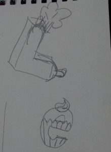
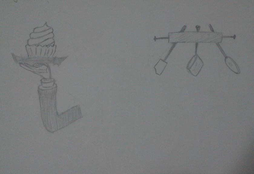
- 2) Chef
- 3) IT programmer
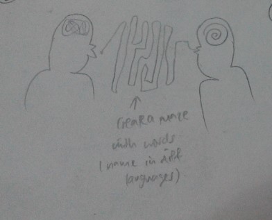
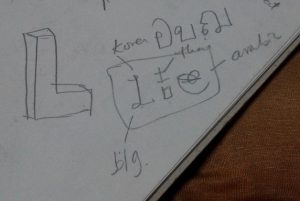
- 4) Translator
Final ideas:
- 1) Wine Dealer
- 2) IT Programmer
- 3) Electrician
- 4) Architect
Rough Draft:
Why the changes?
– Chef seems too cliché, quite a few people doing. It seems too general either, should scope down into a specific kind of chef, making me feel uncomfortable and restrained.
– Translator: the original idea was to design 2 humans interacting together. One with a messy lump of illegible words in his mind and then as the words are spoken, it flows and form a legible form into the other person’s mind. The second idea was that use different languages In the world to form LLE. Example: L in Korean, L in Arabic and E in Chinese. However, the overall concept proves to be quite messy and hence I discarded the idea.
Progress work for wine dealer:
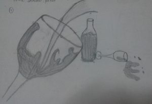
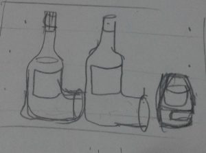
- Pic 1-wine glass with splash
– Reasoning: the splash contains the L, the bottle and wine glass also forms an L. the spillage forms the E.
– Comments: the overall concept seems confusing and that they are very disconnected. The splashed in the L in the glass is confused with the unnecessary splash on the other side. The bottle and the lying wine glass also seems to be very disconnected due to the lack of overlap. Even though the E is okay.
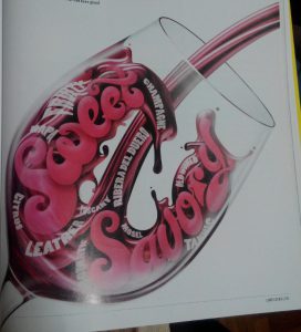
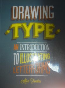
Inspired from:
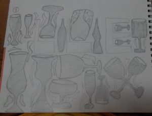
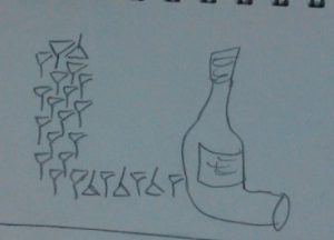
- Pic 2- Arranging all sorts of wine glass and the negative spaces form the LLE.
-Reasoning: the negative space will form the letters.
-comments: there are unnecessary distractions like the small angular frilly things that confused the design. The overall composition seems messy as well.
- Pic 3 – using distorted wine bottle and barrel to form
-Reasoning: there is a sense of connection on the L , making it very clear card.
- Pic4- use lining up wine glasses to form one of the L, then the distorted L as another:
-Reasoning: there will be different variations of the L and it wouldn’t seem to be as plain.
-Comments: still very messy
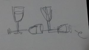
- Pic 5- use 2 wine glasses as the LL
–reasoning: sense of connection
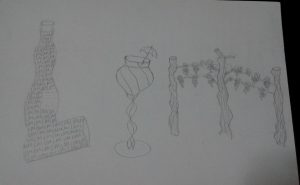
- Pic 6- wavy L bottle, wine gals with umbrella (DOT) and poles and vines as the M
-Reasoning: ( as of now, I changed my approach to LIM, thinking that perhaps I can have another approach) again, I want 3 different items to have variation. But then again the connection isn’t clear but I feel that its good that I am opening up my options and seeing more things that are related to the occupation.
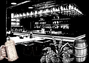
- Photoshop figure 1: Bar counter
–reasoning: felt that the setting should be in the wine shop/ bar with main indicative elements that explains the occupation. Since the brief states that it can be in black and white, I edited and threshold it to become what is seen. But it’s way too black and the compositions seems too complicated.
- Bottle cap/ top view of beer/wine bottle and arrange in the huge bottle form with LLE in the centre as the negative space
-Reasoning: it’s hard to form the bottle shape with all rounded top views/caps. If places too closely, it’s not realistic since the bottle form is from narrow to wide and there will be this space between each of them from the top view. Besides it will look pretty complicated.
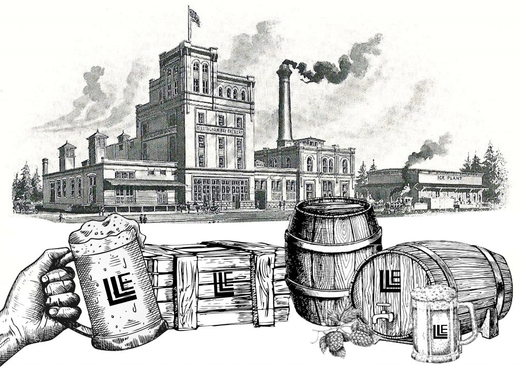
- The one with the logo on the front line
–Reasoning: I changed my perspective to one of a beer manufacturer and I want to advertise the brand using my name initials. Hence, I came up with the LLE logo.
-comments: However, the design seems to represent my lack of understanding for the brief itself. What is wanted is that the letters itself should represent the occupation at a glance and not because of the things surrounding it that matters.
- Using 1 idea to represent LLE. (vines/ barrel/ wine glass/ mug)
However, I attempted and felt that it was rather restricted and it was difficult to express as well since all of them seems rather uniform.
- Final Result: Most direct way of using wine bottles.
Key identifiable features of a wine dealer: wine bottles / wine glasses/ wine cork/ wine.
I used Martini and Cinzano wine bottles to create the layout of L and E and photographed them. My original intention was to just overlay the 3 photographs together as one. However, it felt awfully plain and too literal. So I pondered over it and realised that wine corks are also an important part of the wine industry, something I overlooked previously. Hence, I decided to make part of the background with wine corks with wine pouring out from a bottle into a glass. To incorporate the photographed wine bottles, I made half of the bottle solid and finished the shape of the other half of the bottle with LLE.
Progress work for electrician:
Initial ideas:
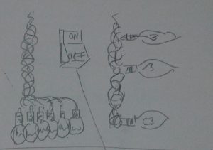
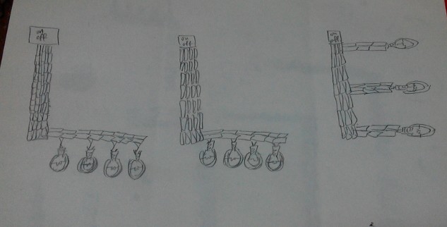
- Line up different type of symbols or switches to form LLE. Use a light bulb with the wire coming out at 90 degrees turn to form L. The wire connects in a shape of an E to the end (plug).
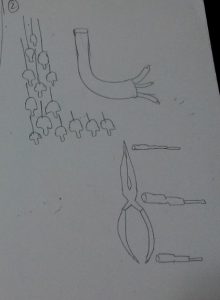
- Use suspending light bulbs to form shape of an L and use a wire to form shape of the other L, ending with 3 different coloured wires at the end. (Live wire/ earth wire/ neutral wire). Followed by using electrical tools to form the E. ( wire cutter and screwdrivers)
- Use the symbols to form the head of an electrician (human figure involved).
Inspired from:
- Decided to use light bulbs and lose wire endings to form the LLE instead.
Experiments for final result 5):
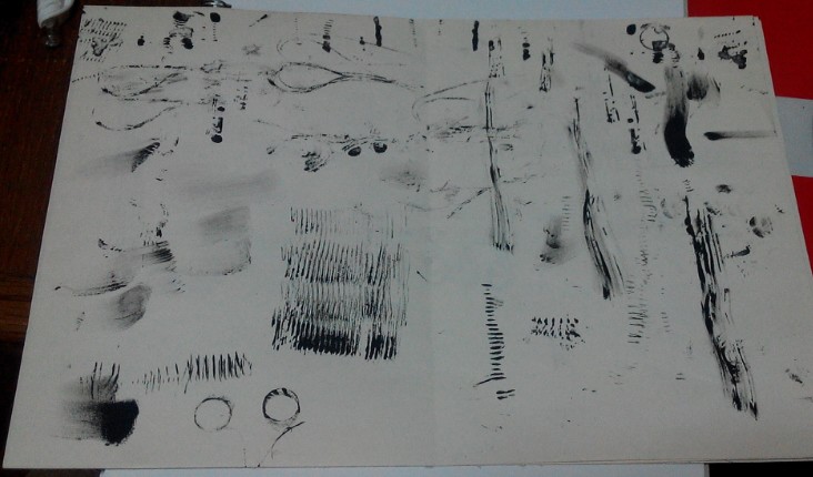
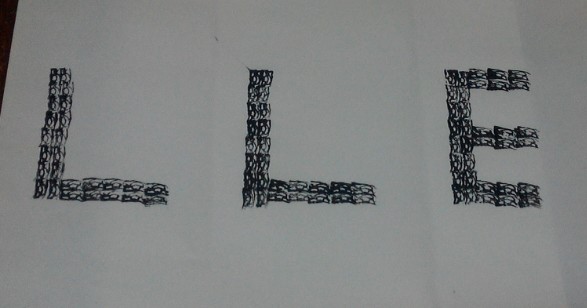
Initially I thought of overlapping images of wires to form the body of the letter but then I felt that it was too literal, so I decided to use mark making tools instead.
Items experimented with:
Making the body of the letters:
- Medium sized coil of copper wires.
– Coated one side of the coil with ink and tried to roll it to create the lined effects but it was not even nor obvious. The coils have up and downs with gaps in between causing the ink to flow into the gaps instead of staying on the rounded surface. Using this as mark making tool was not exactly feasible then.
- Threads
– Cut a piece of thread and tied the 2 ends together. Dipped it in ink and did trial mark makings. The result lines are too thin to simulate that of a wire. Besides, it was hard to control the waviness of the threads as they often clung together into 1 line. Using this as mark making tool was not exactly feasible as well.
- Lose ended wires.
-Attempted to stamp the wires but they were too stiff with the casing on and hence make them unsuitable since the results were rather rigid.
- Small coiled springs.
– Thinking that perhaps scaling it down to a smaller version from 1) will be easier to control and that the resultant lines will be more prominent. However it did not differ much from the first, except that the lines are more prominent this time.
- Cardboard:
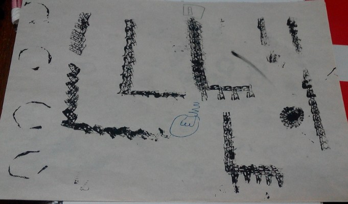
– Cut the cardboard into small short finger strips. Dip the ends into ink gently and stamp it. Surprisingly, the wavy lines within the corrugated board offered good texture for “wires”. I then proceeded to stamp the outlines of the letters out and let it dry overnight before scanning it into my computer for any further digital editing.
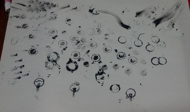
Mark making the light bulbs:
- Different thumbnail sized rubber rings / rounded metal stands/ metal rings.
– Dip the materials into ink and try to stamp it. The overall effect was okay but the shapes were too roundish for a light bulb. I then tried to squeeze it a little just before stamping and played around with the shapes. However, I realised that the shapes were too uniform throughout the outline.
- Long nails/ small springs found in pens.
-Dip the ends of the materials into ink and stamp it. The effect was rather okay for the ends of the light bulbs but the lines itself were not long enough to go round and cover the U shape under the light bulb. And if done several times, it becomes messy which then makes them unsuitable.
Final Result:
Key identifiable features of an electrician: light bulbs/ wires/ switches/ electricity.
I inverted the scanned images since I wanted a dark background and attached light bulbs at the end of the letters. I also added a switch on top of each letter since the letter itself represents wires. I pondered for some time on how to further represent electricity even though the light bulbs were already lighted up. Since my background was dark, I decided to simulate a “sky” feature and used lightning instead. Allowing the lightning to pass through each switch gives it electricity/ power for the light bulb to function.
Process work for IT Programmer:
Inspired by:
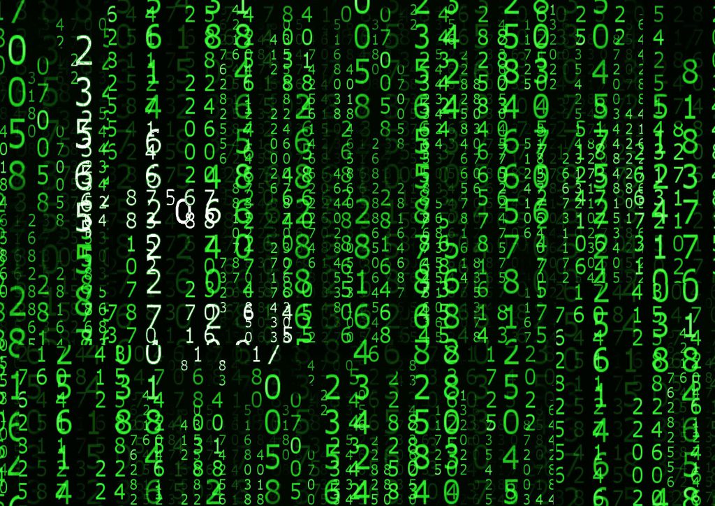
Key identifiable features for IT Programmers: coding / matrix
I have decided to go with matrix instead.
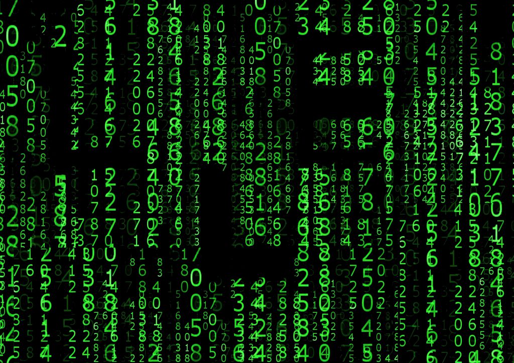
Draft 1: Overlapping columns of digits over digits to try to compact the layers before erasing digit by digit to form the LLE.
– Thought that the idea was too simple and that it was tedious to overlap manually to create the effect as well as erasing the digits. This then led to draft 2.
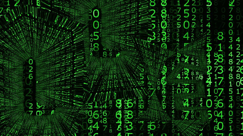
Draft 2: Deciding that 1) was too mainstream, I decided to crop a part of the matrix background and skew to mini triangles before aligning each of the triangles into the 2 Ls. Small rectangular strips were lso cropped out for the E.
– However, the result seemed to be too complicated and it looked rather confusing. The background was covered by the patterns formed by the overlaps and the attention was stolen away from it. This then led to draft 3.
Draft 3: Change of colour. Since the first 2 methods used were unsuitable, perhaps I feel that I should change the colour of the digits to create the LLE within the background itself.
– It turned out that the effect was significantly worse than the previous versions. The white was hard to distinguish and it made it very confusing for the eye to dart around and make out the letterform.
Hence, I have decided to revert back to draft 1 and make amendments from there.
Changes: I began to overlap more at the designated areas for my letters and resized the digits when needed. Eventually the letterforms became more outstanding.
Process work for Architect:
Key identifiable features for Architect: T ruler, graph paper, floorplans, pencils, compass, set square and other tools required for drawing.
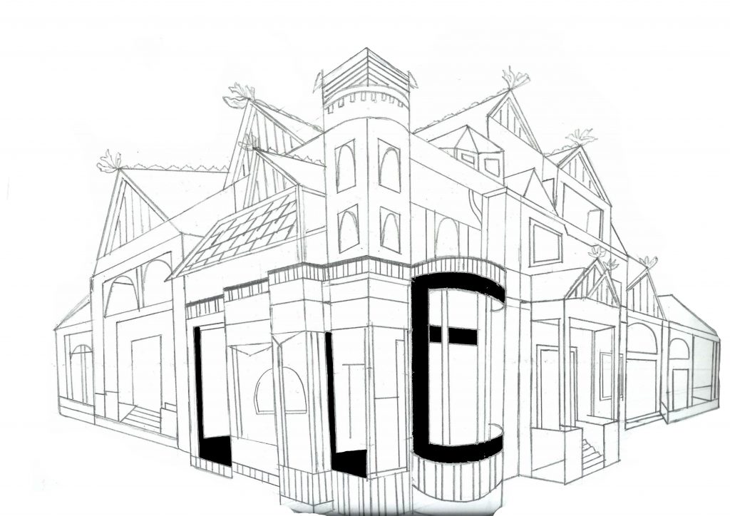
Draft 1: I drew a building using perspective and hid the LLE within.
– Although the building looks fairly fine, the LLE was not what the project wanted. The letterform itself has to represent the occupation and hence this method is unsuitable.
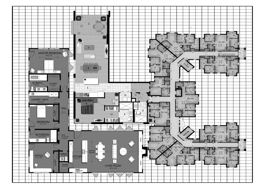
Draft 2: Floor plans
– I used floor plans with variations and overlaps to simulate togetherness of a building floor plan. I also edited the colours to simulate pencil drawings and sketching in architecture plans.
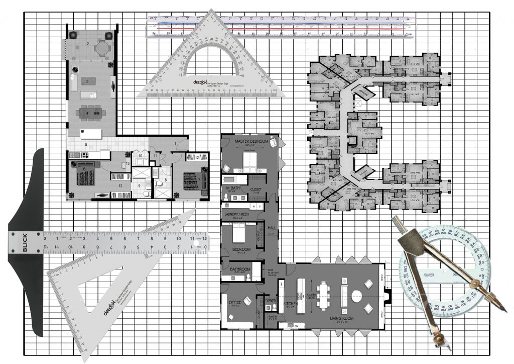
Draft 3: Floor plans with equipments
– Deciding that it was too plain, I added an architect’s commonly used equipments inside as well. However, it made the whole composition look messy and the plan itself lost the focus.
Hence, I reverted back to plan 2 and touched up from there.

