These are some of the interesting layouts for zines that caught my eye or had in a way inspired me.

1) Here is zine, here is Hong Kong (http://www.pmq.org.hk/event/here-is-zine-here-is-hong-kong/)

The 3D effect and the sense of texture are both common in these 2 layouts. In “High Rise Residense”, an aerial image of the landscape and concrete buildings form the background of the layout, depicting the sense of “density” in the city. Instead of using solid colour backgrounds, the image used draws the viewer into the space. With small pop outs on the right, the 3D effect gave a more interesting furnish to the space depicted. I like the idea of using a textural image as my background and perhaps I will use it in my zine development.


2) Rubbish Famzine by Holycrap SG

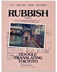
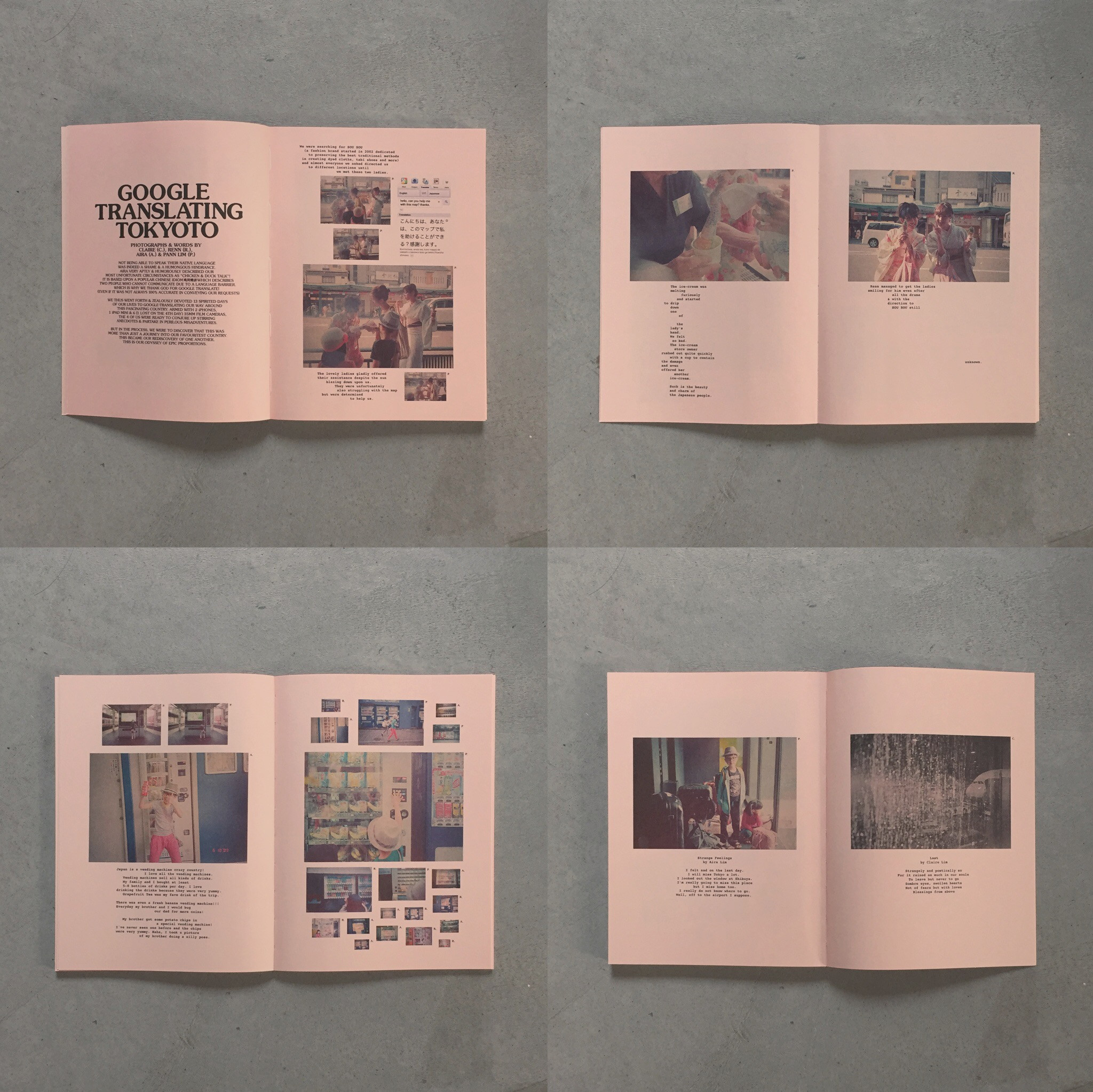
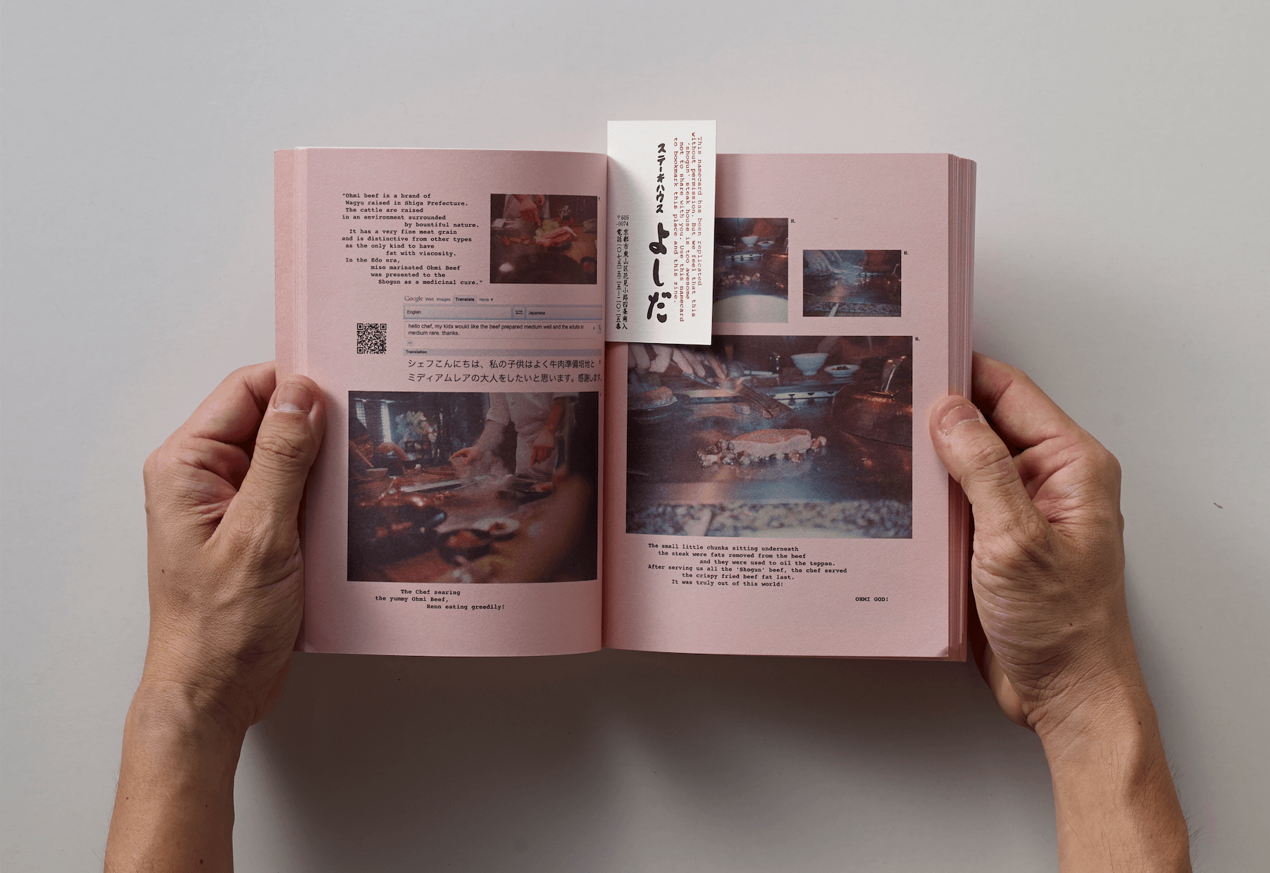
Holycrap, Famzine, is an art collective of the Lim family, made up of dad Pann, mom Claire, daughter Aira, and son Renn. I feel that there is a nice hierarchy in the size of the images which creates a flow for the reader in terms of focus and importance. (Dominant/ Sub-Dominant/Subordinate sizes)  Since this is a famzine which contains family and lifestyle related content, the colour used was warm and successful in conveying the homey feel which is evoked in the reader. It is also rather visual heavy since the text used were small and minimal. I think this is also an aspect I will try to incorporate into my zine.


3) Iceberg 


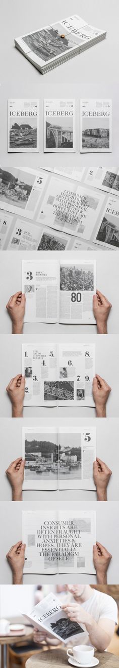
The 5th, 6th and 7th images caught my attention. The idea of multiple small rectangular texts is actually appealing with one dominant image at the bottom (5th). One extremely dominant image that spans across 1.5 pages is also quite appealing, if the image itself speaks louder to the audience. In this case, the bigger image allows more details to be scrutinised, making the zine more interesting (6th). However, being image heavy in the previous pages may cause the reader to be overly focused on the images itself. The 7th page then brings the reader back to the focal point where large texts are spanned across both pages with lower opacity/ faded images forming the background. It gives a sense of depth to the zine while not drawing attention away from the text.
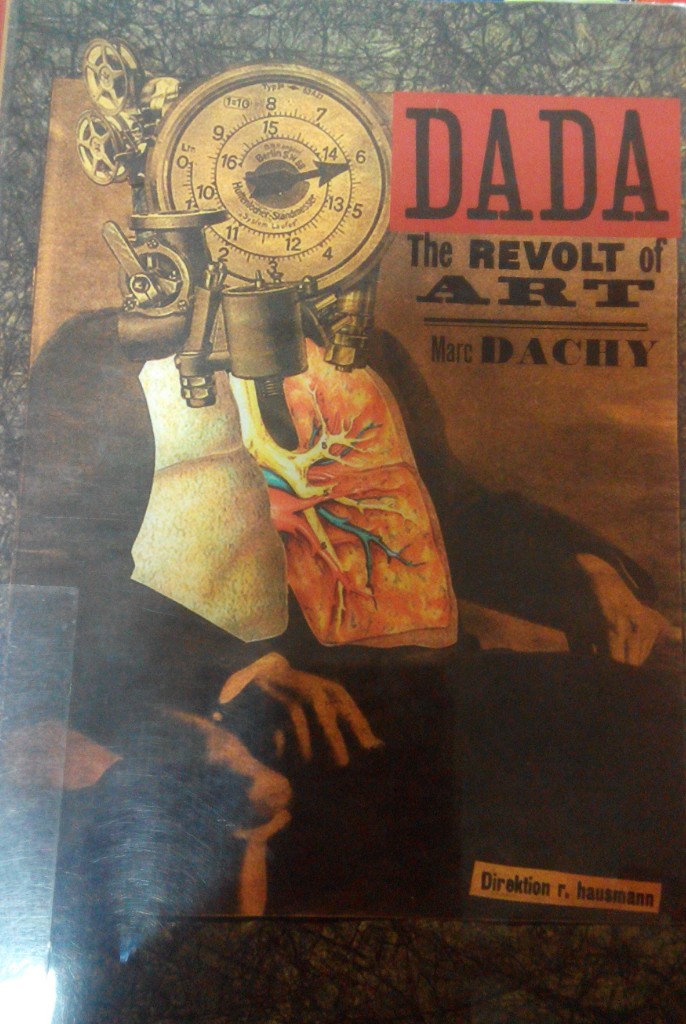


4)

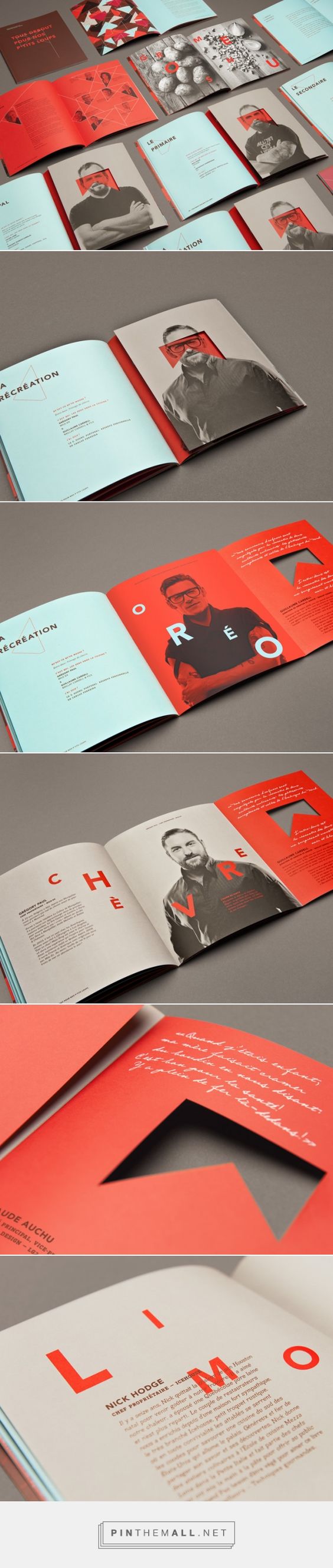
I feel that the bold colours used are very attention catching due to the high contrast. The sense of variety of (contrast and colours) is important in maintaining the interest of the reader. Geometric patterns and lines are also used to allow the page to have a sense of structured depth. The use of a cut out hole in the flap is also appealing. It makes the reader more curious to flip and know what is behind the flap. The layered pages further emphasized the sense of depth, making it intriguing. Contrary to the norm where the title/ focus of the page is on a single page, the focus of the page (title) is spanned across the 2 pages with wide gaps between each letter. It feels as if the letters could breathe and it makes the reader look across the 2 pages quickly to form a general idea of the content before going into the details.


5)

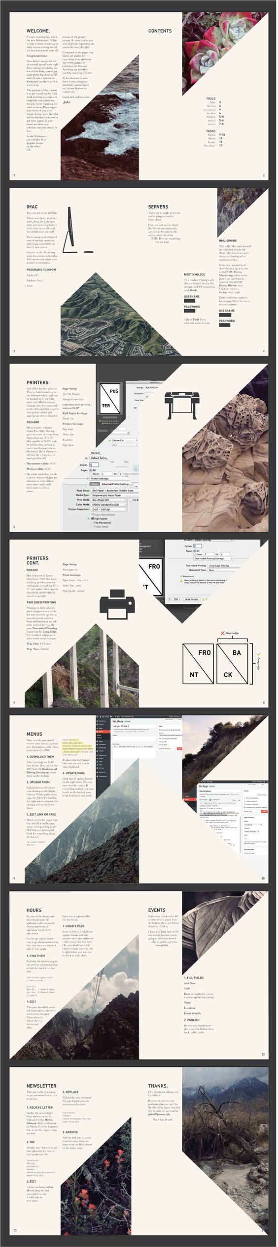
The design and placement of the images do not conform to the norm and it feels refreshing to read the zine. Having edges cut off and forming irregular shapes is interesting. Despite that, the layout did not give of a messy feel, it looks clean and sharp. The rectangular boxes also look contained and neat.


DADA- The Revolt of Art by Marc Dachy

img_20170213_010011_1486918904171

The birth of DADA originated from a group of artists who were looking for an elementary type of art that they thought would save mankind from the raging madness of those times. They aspire to a new order that could re-establish the balance between heaven and hell.

What was DADA? 

DADA was a word, a rallying symbol, an intentionally derisory anti-label. As a provocative slogan it wrong footed the critics, who habitually pinned pejorative labels on new tendencies, such as cubism. The Dadaists were mocking the critics. Dada’s culture which was previously unacceptable was replaced by a new inventiveness and direct relationship between the artist and his art- which were then affected by social constrains. Dada demonstrated that a society that has lost respect was no longer in a position to demand that the artist adhere to its aesthetics and ideological values. (E.g. Rather than focusing on representation, painters now worked with their material for its own sake in terms of its colour, form and structure.


When did the name Dada first appear?

In the editorial of the only issue of the Cabaret Voltaire review created by Hugo Ball.


Who were the Dadaists then?

They were the artist in Zurich who responded to the announcement made by Hugo Ball in the press. They were there either because the war had prevented them from leaving or because they had to come here to flee it.


Tristan Tzara:

He took over from the Cabaret Volataire to launch the Dada Review. It gives details ot the activities of this Cabaret, whose aim is to remind the world that beyond the realm of war and the homeland there are independent men who live by other ideals.

The 1918 Dada Manifesto which was read out on the evening of July 23rd  was the true founding act of the movement. Tzara explained that Dada was born of a feeling of mistrust of the “community”. Dada was not absurd, not just a joke. Dada was an expression of a very great adolescent pain that came into being during the First World War and the time of suffering.


Dada Movement:

Dada was a movement of the poets and painters. They worked closely in Zurich, then Berlin but less so in Paris, where the arrival of Dada was more of a literary phenomenon.


Origins of Photomontage:

Raoul Hausmann proclaimed the arrival of a new material in pictorial art. They were the first to use photography as a material with which very different structures, often heterogeneous and with conflicting meanings, could be mixed to create a new entity that drew from the chaos of the war and the revolution an intentionally new optical image.


The First International Dada Fair:

Dada Messe in June 1920 showed photomontages and collages by Hausmann and Hannah Hoch, Grosz and mixed media construction by Johannes Baader. Hausmann mentioned that the Dada Fair was the point of departure for modern art on an international scale.


A Clone of Dada- Merz:

October 1918, Kurt Schwitters came to meet Hausmann and wanted to join the Dada club but Huelsenbeck vetoed his membership. He was compromised by his association with Der Sturm which Huelsenbeck and Hausmann condemned forhaving published a Song od songs of prussianism. Hence Schwitters recreated a Dada all his own. Merz aims for freedom from anything that stands in the wat of forming artistically. Freedom does not mean unbridled license but the product of a rigorous discipline.


Mamas of DADA, Women of the European Avant-Garde by Paula K.Kamenish

img_20170213_010042_1486918925736

HANNAH HOCH:

She was one of the few avant-garde artists to remain in Germany during World War II and is responsible for having preserved many Dada works during the Nazi years in Berlin, thereby jeopardizing her safety were she to be accused of being a decadent artist or harboring decadent art.

Hoch is instrumental in elevating the product of collage from a craft to fine arts. Though earlier artists like Picasso and Gris incorporated collage elements into their paintings, none relied exclusively on collage or photomontage as the foundation of the work. IMPT: oil on linen piece Der Anfang.

First abstract collage was 1916 work Weisse Wolke which she produced while working in Ullstein. Works from 1919 includes carefully designed collages of camera-made images. Examples: Bourgeois Couple (Quarrel), Da-Dandy, Schnitt mit dem Kuchenmesser, Dada-Rundschau (Dada Panorama)

Hoch also created cloth dolls for various Dada events. She said that the puppets and dolls are symbols of mankind, lost on the terrestrial globe. Her adult female dolls have bodies made of strips of fabric and board and heads of stuffed cloth topped by untidy yarn hair.

Hausmann’s mistreatment of Hoch illustrates the lack of respect by some male Dadaists who were initially disinclined to value and welcome women artists. Although Hoch was rather well known that time, the Berlin Dadaists were somewhat reluctantly admitted into their “boy’s” clubs.


 Russian Constructivism:

Russian Constructivism was a movement that was active from 1913 to the 1940s. It was a movement created by the Russian avant-garde, but quickly spread to the rest of the continent. Constructivist art is committed to complete abstraction with a devotion to modernity, where themes are often geometric, experimental and rarely emotional. Objective forms carrying universal meaning were far more suitable to the movement than subjective or individualistic forms. Constructivist themes are also quite minimal, where the artwork is broken down to its most basic elements. New media was often used in the creation of works, which helped to create a style of art that was orderly. An art of order was desirable at the time because it was just after WWI that the movement arose, which suggested a need for understanding, unity and peace. Famous artists of the Constructivist movement include Vladimir Tatlin, Kasimir Malevich, Alexandra Exter, Robert Adams, and El Lissitzky.

Main Representatives: Alexander Rodchenko, Liubov Popova, Vladimir Tatlin, Olga Rozanova, Alexandra Exter, Naum Gabo, El Lissitzky, Antoine Pevsner, Kasimir Malevich and Alexander Vesnin.

http://www.arthistoryarchive.com/arthistory/constructivism/