What We Sea In You? Installation Process

(Group: Rochele and Ling Ern)


After our first consultation with Michael, we realised that there were quite a few technical difficulties with our decided proposal “I Chope Like That!”

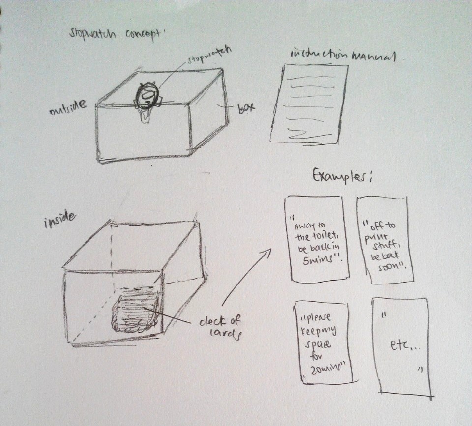
Firstly, it was difficult to ensure that the mechanism of the Chope Card box will work properly. The original idea was to place the chop cards within the box with a pop open lid mechanism using a stopwatch. When the user activates the stop watch, he or she will be able to retrieve the cards from within the box. However, it was not easy to develop the mechanism. Also, there is a maximum cap on the number of laps a stop watch can take, meaning this will be a limitation on the number of users per box. In this case, for it to work, ideally, each seat should have a box in front of them. However, this will be rather cost heavy and hence not an ideal installation. Due to time management and lack of sufficient knowledge to solve the technical difficulties, we came up with another idea.


Final Proposal:

“What we sea in you?” 

Inspired from the cloud installation from my research installation list for this library project, we decided to do something that promotes an exchange of art. Besides, from our survey in the library earlier on for this project, we realised that quite a number of people find that the library is too quiet for comfort and that it becomes somehow uninviting since the people around are all strangers but they do feel awkward if they make the first move to communicate. This leads to the fact that the interaction between the library goers are really quite low. Through this installation, we hope to create a livelier environment whereby library goers are about to immerse themselves in the installation which simulates nature, in this case, the sea, as well as have an indirect interaction with the people around them.  This interaction in enabled via an exchange of art movement (one to one exchange) as mentioned earlier where library goers can take a piece of someone else’s art card off the board with every piece of art card they create and place on the board.

Initially, we wanted to create a vertical hanging area on the panels (somewhat like a laundry line) at this area:

We were thinking of coiling some thicker twine around the panels and provide some mini pegs for them to hang their  cards on the strings. We also felt like attaching some fairy lights on the strings (since there is a socket nearby) to enhance the visibility of our installation.

However after much thought, we realised that putting up this way is a little cliche. People may feel an aversion towards this method as their artwork will be openly displayed in public. For those who are not confident of their artwork, they probably will not contribute or participate since it involves “baring” their work so openly. Hence we changed our location and chose the brown table instead.

Getting inspired by this

we decided to make a similar platform for the library goers to slot their cards into the silts made. This led on to the production process of our installation.


MAKING IN PROGRESS:

(I did more of the physical production while Rochele did more on the digital production)

1) Marking out the shape of the form we wanted. In this case, we feel that the shape M gives us a more even and spreaded area for the silts.

2) Me cutting the foam!

3) Notice the awkwardly vertical chunk of foam at the side with the grey duct tape? We were facing technical difficulties through our cutting process as the upper metal bar was not fully secured and it was slightly tilted downwards, resulting in our foam cutting into odd shapes. Hence, we used another piece of foam to push the bar upwards to make life easier for us.

4) It was not easy to maneuver around the thin wire cutter with this big block of foam and we kind of lost count how many times the wire broke and failed us. Perhaps the foam was too thick?

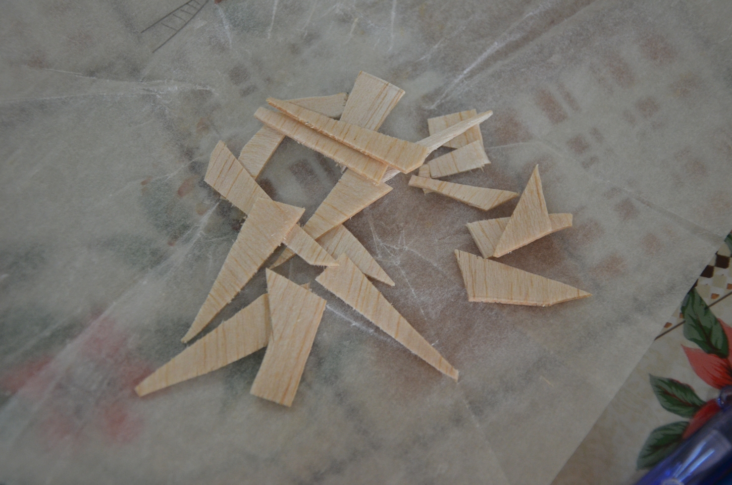
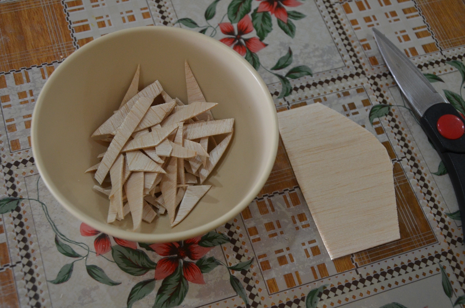
5) I then carried on to cut the foam stamps into interesting shapes.


6) We collated a small pile of usable foam stamps I cut.

7) We tried making the slits from the foam cutter and realised that it was not very easy to do so. Perhaps, a penknife will be more suitable for the job instead.

8) I created a mock up with silts to see if it works.


9) With our foams cut, we then proceeded to do up the cards. We cut out the still image and pasted them on each of the coloured blank cards. (x 100 cards)

10) Subsequently, I wanted to make a foam box with a cavity in the middle to contain the markers for the installation.  I intentionally cut the waves like edges to simulate the waves at the beach. However, the cavity was not properly done and we both figured that getting a box for the stamps and markers will be neater this way.


PROCEED ON  TO LOOK AT THE FINAL INSTALLATION: https://oss.adm.ntu.edu.sg/liml0074/4dii-library-installation-final-what-we-sea-in-you/

Inspiration for my sculpture:


Description of concept development and inspiration:

My inspiration for my sculpture comes from the following two images, namely one depicting world hunger and the other depicting food wastage, a common sight at the hawker centers in Singapore. Having witnessed many people leaving their seats with leftover food on the tables over the years, this issue has been troubling me deep down all along. Other than giving constant gentle reminders to family and friends, this provided me with a good opportunity to express my concern and my power as an individual to allow people to be more conscious of their behaviour.


Process and Development of Sculpture:

Initially, I tried using the ice creams sticks I painstakingly cut up to create the bowl I wanted through soaking them in boiling water. However, it did not work out as expected as the wood was too thick. Then, I went to acquire some balsa wood (a more ideal choice) for my project.


I wrapped a bowl with non stick cooking parchment paper before cutting up the balsa wood into small pieces so that I can glue them together against the bowl to form the shape needed.


However, this method did not work out as it was extremely difficult to hold the pieces there without any support other than the glue. It resulted in the picture below as one of the joins broke, causing the piece to fall apart.

The picture below shows my second attempt at making this work. However this still proves to be rather difficult, hence I have decided to change my approach.

Part of the curvature achieved.


This is my third attempt with a different approach. I did the opposite and lined the parchment paper on the inner surface of the bowl instead and started to glue the balsa pieces together. Due to the support given by the bowl, it was much easier this time.

Two layers of the bowl completed.


Balsa bowl taken out from the “mould”, aerial view.

Side view.

Notice the two layers mentioned.

Back view.

I cut up some ice cream sticks into 4 short sections and glued them together to form a square before attaching it to eh base of the bowl to create the mini “stand”. Subsequently, I cut up 4 pieces of (almost) identical strips of balsa wood and attached it, bent, to the ice cream sticks at each junction to create the curvature I wanted.

After I am done with the bowl, I proceeded on to fold my hands using copper wires.


Fast forward the process many times with some variation (some thicker wires, some thinner, some bigger hands, some smaller etc), I get a small pile of hands.


Creating a comfortable layout on the foam which acts as a base, simulating the ground. I have also placed some steel wire mesh in the bowl to simulate food.

After glueing the bowl to the base,  I began attaching the hands by stabbing the foam with a sharp knife followed by opening the silt to a suitable size by a tweezer.


Attaching in progress.

Final draft model done.


However, after the review in class, Prof Peter mentioned that the blue foam base for mine was not ideal and suggested that I paint the foam instead. Besides, the hands looks a little too scattered. Probably I can move then closer to each other to have a cluster feel to have a more sense of urgency.

This leads to my next post on my final model.


Link to my Final Model: https://oss.adm.ntu.edu.sg/liml0074/3dii-final-project-zer0-waste-final-model/


Inspiration Image References:

http://www.todayonline.com/sites/default/files/styles/photo_gallery_image_lightbox/public/22396714.JPG?itok=Nu6Ox804

https://userscontent2.emaze.com/images/19fb99cb-c03a-4938-bc6e-a4e52279491f/f9dbaf1e10e2b0bb888004cd88d24e65.jpg

“Sometimes the right path is not the

easiest one”~ Grandmother Willow 

Design 1:

foot-pritns

The original idea of this design is to form paths using footprints and how each path is temporarily blocked by obstacles which is the interpretation of “not the easiest”. Ancient swords, spears and barbwires were used to bring out the vintage feel Prof Mimi wants. There are also boulders involved to represent larger obstacles.

However, the comments were that the footprints were too random and that the path is not clearly represented. Besides, all the objects are quite randomly placed as well, giving the feeling that they are “floating” in the air with the fluff and unstable feel. Hence, this lead to the amended design 2.

Design 2:

footprint-edited-2

This is the amended design from 1. I attempted to make the path clearer by making the footprints start from the middle top of the design and it goes in 2 loops (bigger and smaller) and ends at the lower right of the design. I also cut down on the variation of the obstacles used to reduce the complicated feel of the design.

However, the comments were that the path of the footprints were once again unclear and it seems to be messy instead. The “random” feel, although lessened, still exists and probably would not be an ideal design for the quote. This leads me to my 3rd design.

Design 3: 

2nd-design

This is the third design for this quote. I decided to have a different approach instead. The dark background represents the “tough” situation one is in and everything seems gloomy for her. I then design it in a way to make her cross the broad river with strong currents through different actions. From the first pose with an “energised” feel to the second pose with the “persevere on” attitude to the third pose with the “i need to be cautious” attitude in the precarious situation on the boulder and finally to the last pose with the “tired but somewhat victorious” after the treacherous path.

However, comments for this design are such that the background contain way too many details which prove to be slightly messy and perhaps would not be an ideal for a printed design. It is quite literal and safe but lacks the vintage and ancient element feel to it. Also, the path seems rather simple, the obstacles are too minimal to even fit the quote properly. Hence this leads to my 4th design.

Design 4:

mountain-path-min

This is the fourth design for this quote. Again, I took another different approach whereby the obstacles were made to be seen clearly such as the huge mountains, the lighting, the spears, small boulders and barbwires. The footprints are then included inside to simulate someone walking through this treacherous path.

This was my original design for the tote bag. I used this design to expose my screen for the first time and it turned out well on the silkscreen. However, when I printed onto the newsprints for test prints, it turned out to be half black instead and the half tone was not seen at all. Technically, the halftone failed and all the small details across the design were pitch black. I had to erase this design using the betastrip and re-expose it the next lesson. This leads to my amended design 5.

Design 5: 

fiinalised-quote-2-with-text-copy

This is the fifth design for this quote. I altered the dark grey mid tone to a much lighter one as shown above. Although it is edited, I still feel that it would not be ideal for the silkscreen which lead to my choice of the “light bulb” design for the tote bag.

” The seaweed is always greener in somebody else’s lake” ~Sebastian

 finalised-quote-4-with-text

The idea for this design is based on comparison which is represented by the half black and half white components. since there is the idea of a “lake’ in the quote, I feel that the general setting should be a lake in a more remote location with mountains instead of any modern buildings around it. In this case, the animal chosen will be a land animal (pig) instead to juxtapose with “seaweed” in the quote. In this design, the pig is situated in the white area (reality) versus the black area (imagination). Once again, this presents the idea of a comparison which is the interpretation of the quote. Since “the grass is greener on the other side” is a more commonly known phrasing than this quote, it can also be somewhat juxtaposed with the old phrase “pigs can fly” which thus explains my choice of this animal. The wings are hence another form of comparison.

” I open at the close” ~ Harry Potter

Design 1: 

sunrise

This symbol on the left is an ancient symbol of death. It also contains wings which is closely linked to the golden snitch in the Harry Potter movie. A small path is then formed by bones, leading “death” to a door. Eventually, a form of resurrection occurs whereby a man emerged with a skull. This is somewhat representative of the process of “rebirth” and a new start when you find a dead end in a situation which is my interpretation of the quote.

Design 2: 

edited-open

Since the quote is similar to the other Harry Potter quote I chose, I find that they do have some similarity involved which is the idea of “hope” and “rebirth” which translates to the use of a phoenix over here as well. This design looks cleaner than the first and the link between the two movies is also clearer. The reason why i chose a dark background was to represent the overall “close” first which then eventually leads to the “open” with positive spaces for close and negative spaces for open.


” Happiness can be found, in the darkest of times, if one only remembers to turn on the light.” ~ Albus Dumbledore

Design 1: 

oss-tote-bag-quote-copy

The spokes of the ferris wheel originally form the various paths in the dark that eventually lead the lighted centre with the pair of shoes which represent the process of walking through the path to reach the centre.

Comments were that the shoes in the middle were too distracting because of the lines within, making it seem complicated, yet geometrical simultaneously. The light bulbs are also of different sizes which may be distracting for the viewers as well although the ferris wheel forms a nice sense of space around the central of the design.

Personally i find the overall design a little distracting and the specific placements were not uniform. Coupled with the general comments from others, I decided to redesign it.

Design 2: 

grey-spikes-bulb-without-footprints

From bottoms up, the obstacles and the “dark times” were represented by traditional spears. The main focus should be the biggest light bulb in the centre with the phoenix as the focus. The phoenix is actually an ancient symbol representing “hope” and “rebirth”  which is used to represent ” happiness” in the quote. As we move higher up, the various small to bigger light bulbs were placed strategically to give a sense of space. The different sizes of the light bulbs represents the different level of happiness one feels.

Design 3: 

bub-with-foot-prints-grey-spikes

Perhaps influenced by the previous design of the paths quote, I actually added footprints into this to simulate the person “walking” to his or her happiness. However, the feedback I received for this was that the footprints look rather odd, like it came out of nowhere and hence did not fit the overall supposedly clean design in general.

Design 4:  

finalised-quote-tote-with-text

This is the design i eventually used for my tote bag. Personally, I find the design rather clean looking and has a “concise” feel to it. I also realised from the previous designs that the spikes and ends of the lightbulbs are dark grey in colour which made it very unsuitable for normal printing, much less a tote bag. Learning from the previous experience that the grey mid tones came out pitch black for the mountain prints, I quickly made all the spikes and the ends of the light bulbs completely white instead.