4D II | Evocative Object Research

With the end of Project One, it’s time for another journey!

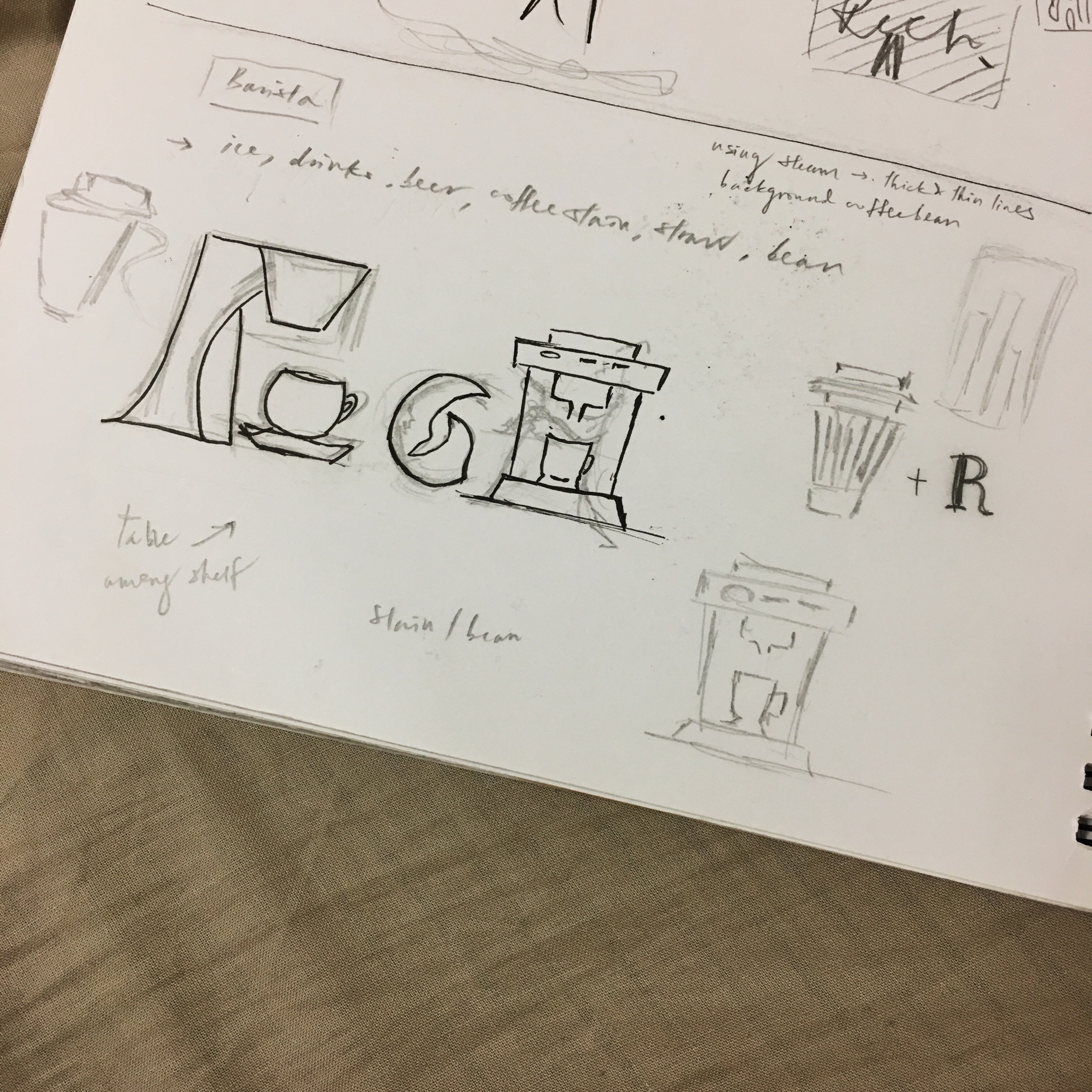
In Project Two, we were tasked to create a sound artwork that can be paired with an object. Basically, it is to make the object interactive such that it must be able to communicate something.

Before I began to work on this project, I went on a little research.

What is sound? What is sound art all about?

Sound is not a substance nor a mass. It is something that constantly pour into our ears without us noticing.  This brings us to recognize the terms “hearing” and “listening”. Sound is literally everywhere, but only people who listen can be engaged with the sound. When the sound is being listened, we are conscious about its details such as the volume, pitch, speed etc, which brings about a whole new meaning.

Sound art, on the other hand, is a type of experimental music. For instance, putting together unconventional sounds to articulate the characteristic of a place, object.

John Cage, an American music composer, successfully moved beyond the confined of conventional musical structures. One of his masterpiece is 4’33” (four minutes thirty three seconds) where the performer stayed silent throughout but there is plenty of white noise involved – the audiences in this case has become the “performers” instead. This is because all the movements from the audiences can be heard while the stage is in complete silent.  Through this piece of sound, John Cage has completely changed the roles of performer and listener.


Some of the sound installations which I find interesting are as below:

Artist: Kiwan Sung

Title: Sonic Jar

The objects used here are Korean traditional jars, known as Hangari. As Hangari is believed to be closely related to the lives of Korean women, the artist recorded 5 women talking about their pregnancy stories and childbirth. The players were then put into the jars. I love that how the artist uses symbolism to depict the idea of women. Something small is loaded with significance – using merely jars to represent Korean women.

https://youtu.be/hqbNO0Rusqk


Artist: Jacqueline Rommerts, Fedde ten Berge, Malu Peeters and Marloes van Son

Title: Sound Boards

This installation uses porcelain plates to function as instrument. The plates will produce sounds when they are hit by drumsticks. The sound of the porcelain is picked up by four electret microphones that are mounted under the plates in the box. When the plates are hit by a performer different sound modules will then become active in a random order. I like how aesthetically pleasing the porcelain plates are when they are arranged in such manner. It is a piece of art itself on the wall. However, there is  an extra layer of meaning when they are combined with sound.

https://youtu.be/c7kDhAHEWAM


Artist: Don Ritter

Title: Intersection

Visitors are required to enter into a dark space where they will encounter the sounds of four or eight lanes of car traffic rushing across them. A dimly lit exit sign is found on the other side of the room such that the viewers need to venture across the dark room in order to exit. While passing through the speakers, visitors can hear loud screeching sounds of cars coming to a halt, accelerating cars or the sound of cars smashing. It taps on people’s fear (the overwhelmed feeling in a dark space, anxiety, lost, tension), while the visitors themselves are active participants in this installation, and I hope to achieve that in Project Two!

https://youtu.be/9OIwCwhtzsc


From these three examples,

I thought of sending out google forms to people to ask about their personal insecurities/fears, something that haunts them in the past or are still experiencing to date. From the data collected, I could do a voiceover. Apart from that, I can try interview people and record their stories.

The objects that I plan to work with are mirrors, such that when a person passed by the mirror, the mirror will start to play the conversations recorded beforehand. Mirrors are chosen because it is the most intimate way of looking at one self. Looking at the person inside the mirror can be a challenge for some people. It makes people confront their insecurities be it body image or their own characters. It is believed that people who look at themselves long enough will experience a kind of visual illusion. For example, they might find that they don’t really recognize themselves after staring at their own reflection for a certain amount of time.

The purpose of this installation is to make people feel that they are not alone and that many people out there are facing the same kind of fears and insecurities.

2D II | Que Sera: Final

Final four: 


Hair stylist

que-sera-iia

A simple background inspired by the barber’s red-blue-white pole is used to give viewer a clue of the job. The minimalist backdrop allows the salon elements to pop. In order to differentiate between letters and equipment, I changed the scissors into silver so that the alphabets are all in black which appeared more obvious.


Private Detective

que-sera-iiia

Private detective/investigator/undercover in my mind has always been someone who is secretive with many hidden devices. Hence, I chose binoculars as the main theme here to symbolize “hiding”. I have also included a few other clues in the backdrop such as fingerprint, lipstick stain, cash as hints of the job scope. Not much of colors involved so as to portray a sense of professionalism.

Painter

que-sera-ia

Using subtle earthy hues in this composition to create a calming vibe of an unoccupied space. The white specks in the background shows that the space is in need of a major renovation and there comes the paint roller! I changed a letter’s opacity so as to make it look like it has been painted over.

Barista

que-sera-iva

My first attempt on something that is not digital.  Textured paper has been used as the base to create a kind of nostalgic feeling. A darker tone is used  to create depth, leaving the letters in white to show contrast. Watercolors are used for realism such as coffee stain on a table.


Reflection

I never thought that creating a few letters can be this challenging when I was first introduced to this project and yes, this project has definitely shown me the truth.

The main difficulty in this project is to incorporate the visual elements of a job into your typeface, without having them look weird and “forced”. While this project has come to an end, there is still a long way to go. I am glad that I understand a little better on how to create a typeface using objects, without the need to twist and bend a letter. Also, I was able to try something new in this project! (aka the paper cut). Apart from that, I learnt that thumbnail sketches do help A LOT when you are suffering from creative block. Because what you sketch will always lead you to more ideas as long as you don’t stop putting down what you have in mind. Ideas will come eventually! Most importantly, I learnt that introducing visual cues into your composition instead of putting all at once can make your composition looks interesting as well as allowing viewers’ participation.

 – END –

2D II | Que Sera: Process

I started working on my sketches for the final four selected jobs.


Hair stylist

An important question I have to ask myself is – “what are the elements related to a hair stylist?”

The first thing that came up in my mind was scissors and more scissors.. comb maybe?

*Googles*

I love how simple the way it expresses the “cut” action. It’s like with just one look, you are able to understand what the designer is trying to convey.

I’m interested in using scissors to form part of my initials. Hence I decided to play with it with my own illustration.

Tried to incorporate the colors of a barber’s sign pole into the background, it turned out weird. Too much popping colors in one composition.

Therefore, I switched things up a little. Why does it look like a flag. (lol)

Shirley suggested that I should push the background behind by changing into narrow lines instead. Besides, the fallen hair seems unnecessary but distractions.

Finally, I went with this.


Private Detective

Next up, we have detective!

I have always wanted to be one though! I really think it’s such a cool position to be in, working as undercover. 

The common visual cues that I found in the net are pistols, handcuffs, binoculars, detective coat, hat, magnifying glass..

Not a fan of the crime scene version, I decided to use binoculars as my main subject. Since there is a kind of mystery involved in this job, so why not hiding behind the lens?

The first initial “R” was not obvious enough as the white area of the human has distracted the focal point of interest, which results in having the “R” seems broken and unrelated. After much consideration, I decided to play with the idea of using objects to form letters.

The end result definitely looks neater than the previous! Also, I filled up the background to minimize unnecessary distractions.


Painter

And then what was supposed to be cafe-related jobs has turned out to be a painter…

I got this idea from the images below:


This is the outcome. Using my own photographs taken recently to form the background of a run-down place.


Barista

Finally, we have the barista!

I  was truly excited to work on this in particular because of how much visual cues that are related to it. I decided to use the cafe setting and equipments to form my letters.

a3cb8be0-7d08-4789-a5ad-92d07132a668

However, I was told that there are too many supporting imagery that give away the message and the fonts are not easy to read, each of the letter is “forced”. I can’t deny it after looking at it for long.

Thus, I decided to do paper cut instead, with some watercolor.

I feel that “ROCH” is a tad too long to be included in the coffee steam, hence I switched to “SX” instead.

2D II | Que Sera: Research

Project One in this semester gives us the freedom to create letter forms using both literal and abstract images to express our future jobs.

After the project briefing, I started listing down some of the jobs that I am interested in as well as deciding which initials to be used.

Short-listed jobs for consultation:

  • Banker/Wealth manager
  • Wedding planner
  • Real estate agent
  • Data analyst

I did some sketches and found some reference images, only to realise my “jobs” are way too realistic and it’s boringggg! 

Besides, I discovered that I might have misunderstood the concept of this project. For instance, I was thinking to use newspaper as the background and red bold text for my initials to express “real estate agent”. Reference images as below:


Out-of-the-world jobs please!!

After consultation, I came up with another list of jobs:

  • Hair stylist
  • Barista
  • Private detective
  • Painter (seriously??)

And of course, I went on to google a ton of different styles and visual elements that are related to my selected jobs.

It amazes me that objects can be contorted to form different characters and they are still visible as alphabets.


Loving how the end results are still looking realistic and not forceful! At first glance they look cute, but after spending a few seconds looking at them, we are able to notice the letters too!


4D II | The SINGAPORE Diary

After consultation, I found that my initial idea was a little static.

Michael encouraged me to explore further such as discovering the reasons why specific people are drawn to specific places and how space is being utilised, what makes the characters in the space stand out? I did go back a couple of times to observe the people and place, however it just seems that it’s not quite up to my expectations (my initial thought was to bring out the diversity of life in a place).

I chanced upon this idea of documenting the life at Kreta Ayer Square, just a few mins walk from People’s Park, while I was having my location painting class. It is a place where you can meet people from all walks of life be it tourists, little kids, old folks etc. The whole place is filled with vibrancy, colours and culture! There were people there on their own and there were also groups of elderly people, looking like they were having the best time of their life!

It isn’t really crowded on a daily basis and it seems like most of the people there have known each other for a lifetime. The street performers were entertaining and people there were so enthusiastic that they would just sing and dance along. Compared to the hostile atmosphere in most of the places we go these days, Kreta Ayer Square exudes warmth and a sense of home. Instead of doing a photo series, I think videography is a better option in bringing out the energy of a place.

I get the opportunity to strike up a conversation with one of the elderly there – Mr Wong (Mr. Wong refused to be filmed/photographed). Instead of making it like a formal interview session, I decided to just let the conversation flows itself – just like meeting a new friend, keeping the topics open, merely talking about his life and thoughts on certain things.

He started sharing what his favourite food is in Chinatown and bits of his family as well as where he comes from. Surprisingly his hometown is in Johor! Mr Wong is an awesome soul; he is so adventurous for his age such that he will use his free time to take long bus rides travelling to different parts of Singapore and food hunting too! Besides, he kept emphasising on how important education is and that he regretted missing his chance.


Reflections

I find it hard to put myself out there in the public still. And I think this project has definitely pushed me a little further out of my comfort zone. Also, I think that the most precious thing in life is to be able to gain new perspectives just by talking to people, regardless if he or she is just a stranger because everyone you meet has a story to tell.

Below is the link to my documentation:

https://youtu.be/0XBuidwJCcw


4D II | Open House! Waterloo & Esplanade

Name of Artist: Chen Wei

Title of Artwork: In the Waves

Medium: Inkjet Print


This photograph attracts me the most due to its cinematic vibe, emphasising on lights and dark cool tones. When I first looked at the print, it expresses a sense of loneliness such that a person can be so invisible even in a large group of people or even while everyone is having fun. This print gives the viewer a hint of the setting which I guess it is a party or concert.

The artist is inspired by the contemporary modes of leisure consumption in China such as bars, clubs and concert halls. Thus, this staged photograph of a dance floor is created using installations and detailed sets. The work description shifts my initial understanding of this print. I was enlightened that a dance floor (subject matter) has so many layers of meaning as depicted in one photo. The artist is trying to convey that it is a place where people can feel connected as well as being isolated. Through this piece of work, the artist explores an individual role in the China society where social change is happening in an unprecedented scale.

The artist’s choice of using still photograph instead of film provides viewer the freedom to imagine the meaning behind, avoided the clear-cut storyline and bringing in a certain level of depth. As this piece of artwork focuses on the issue in another country which there might be people who are not aware of it, the artist’s statement has made his intention clear, hence it helps to stimulate dialog – an opportunity for viewer’s participation.


Name of Artist: Tan Luo Yi

Title of Artwork: My Account of Being Nowhere (Try Again, Again.)

Medium: Fishing Nets, White glue, Found materials


My first impression of this installation is abandonment. The run-down of the area reminds me of those unoccupied houses located away from the city. As we visited the place during the day, the atmosphere was not creepy. However, it might be a totally different experience if we were to visit at different time of the day.

The artist is inspired by her own experience with homelessness and being the “urban nomad”. The artist’s choice of media helps to portray the physical discomfort of a vagrant where there is no settled home and having to stay in a tiny space.  The artist conveys the idea of home in her mind with this installation by binding fishing nets using glue – symbolizes everything is temporary and broken.

The work description relates to my initial impression of the work. Most importantly, it brings a new perspective on the homelessness epidemic which we are not familiar with or which we pay little attention to. The work helps to bring awareness to the plight of homeless people and allows us to reflect on the circumstances behind it.