Final four: 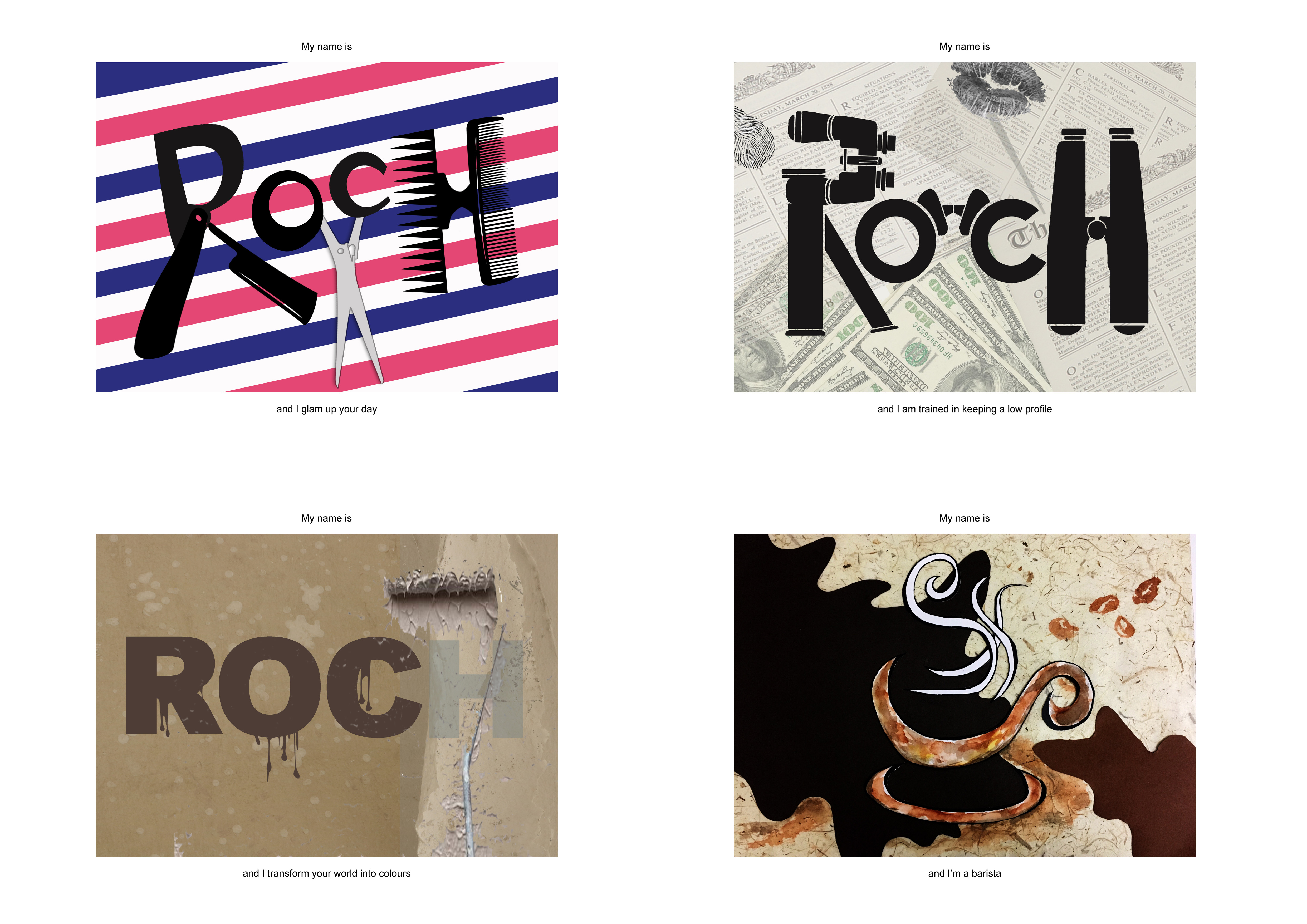
Hair stylist
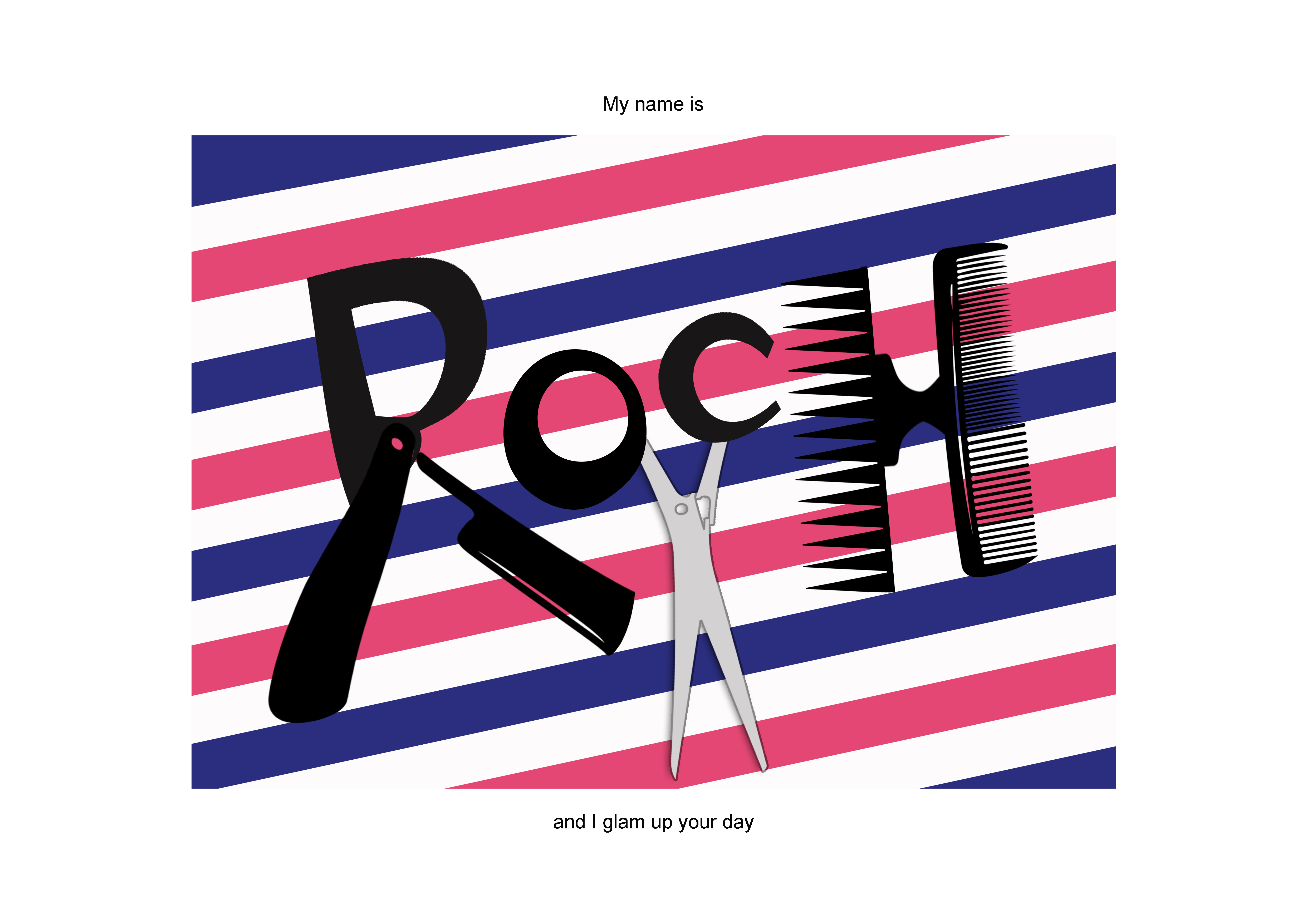
A simple background inspired by the barber’s red-blue-white pole is used to give viewer a clue of the job. The minimalist backdrop allows the salon elements to pop. In order to differentiate between letters and equipment, I changed the scissors into silver so that the alphabets are all in black which appeared more obvious.
Private Detective
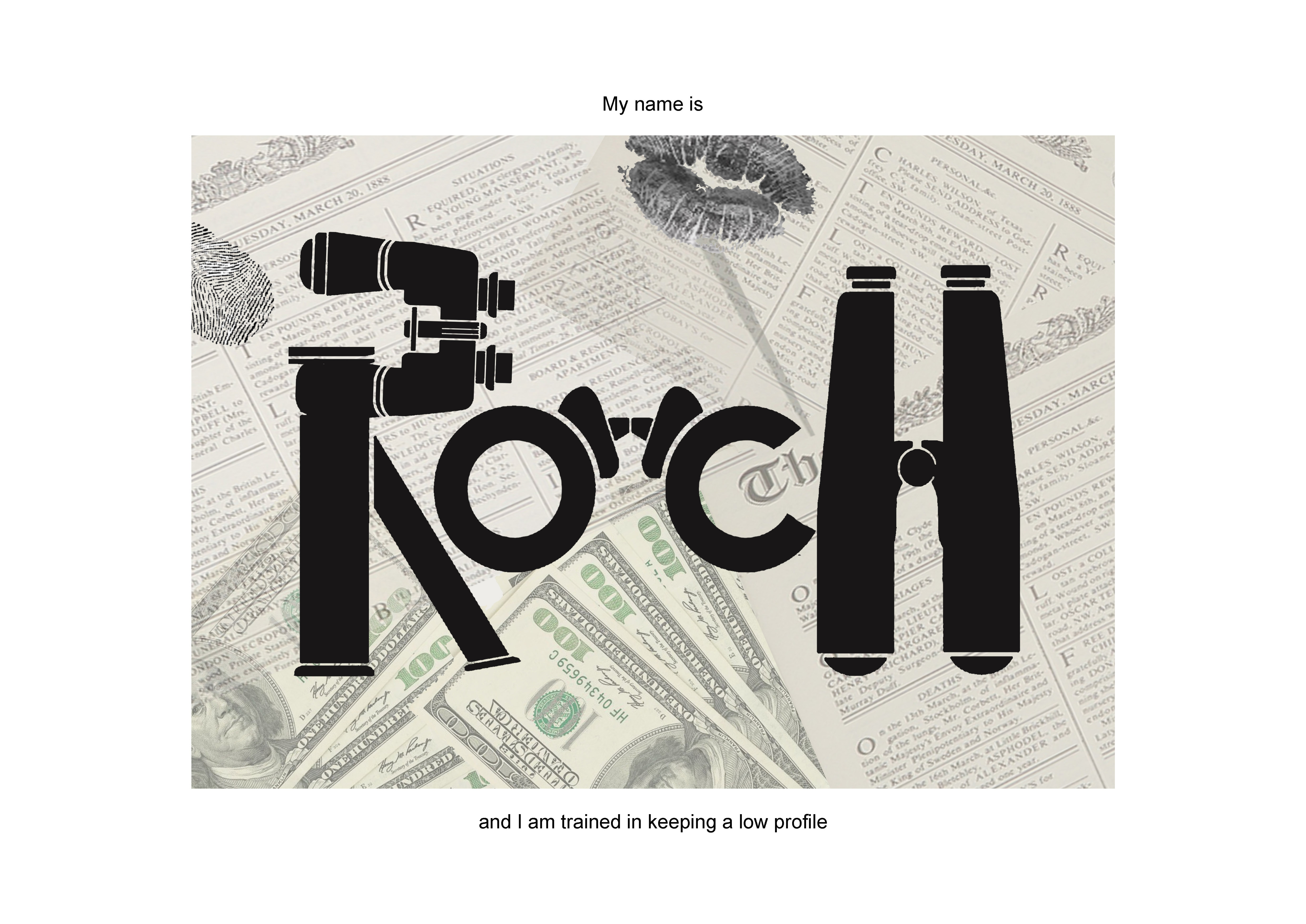
Private detective/investigator/undercover in my mind has always been someone who is secretive with many hidden devices. Hence, I chose binoculars as the main theme here to symbolize “hiding”. I have also included a few other clues in the backdrop such as fingerprint, lipstick stain, cash as hints of the job scope. Not much of colors involved so as to portray a sense of professionalism.
Painter
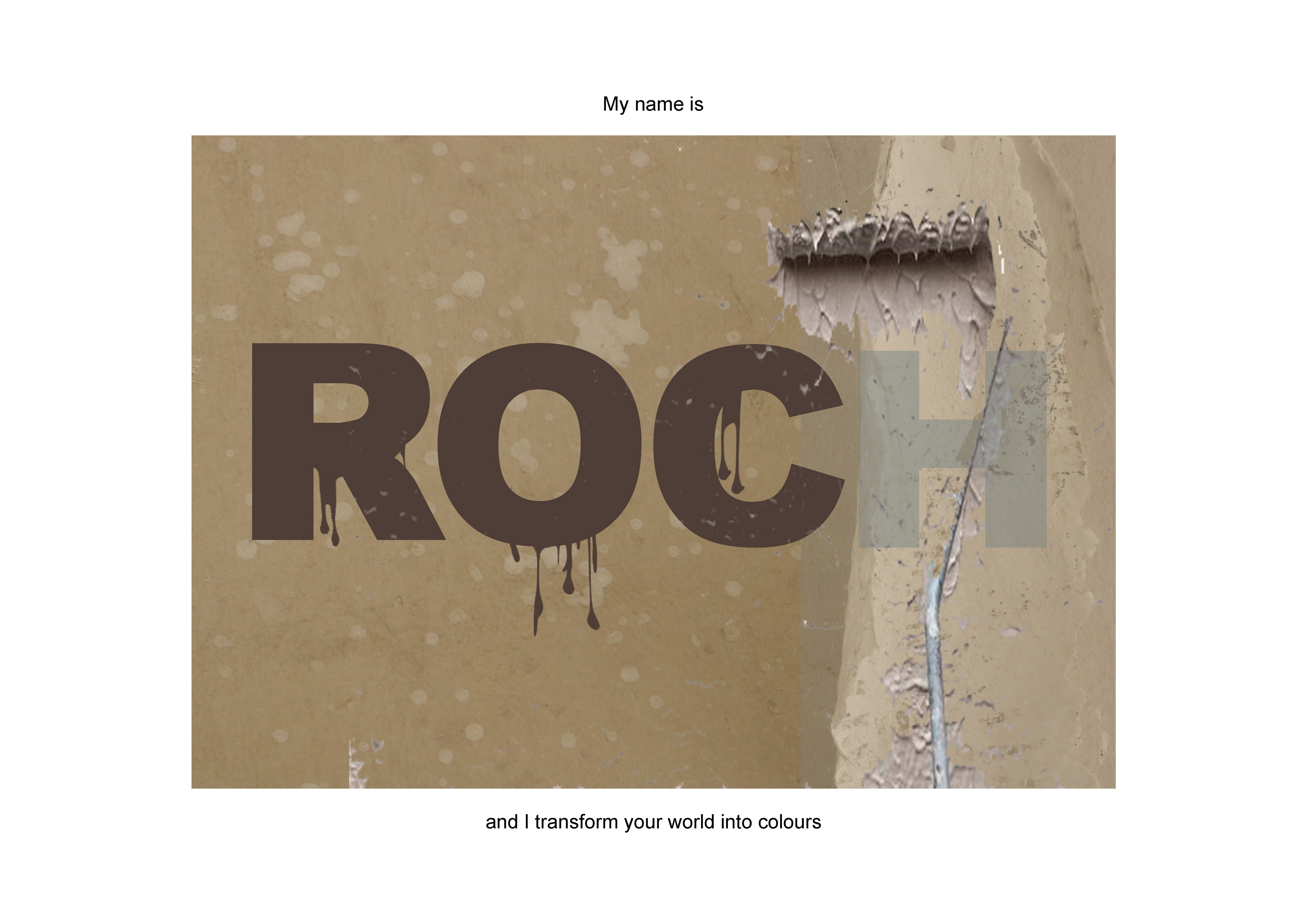
Using subtle earthy hues in this composition to create a calming vibe of an unoccupied space. The white specks in the background shows that the space is in need of a major renovation and there comes the paint roller! I changed a letter’s opacity so as to make it look like it has been painted over.
Barista
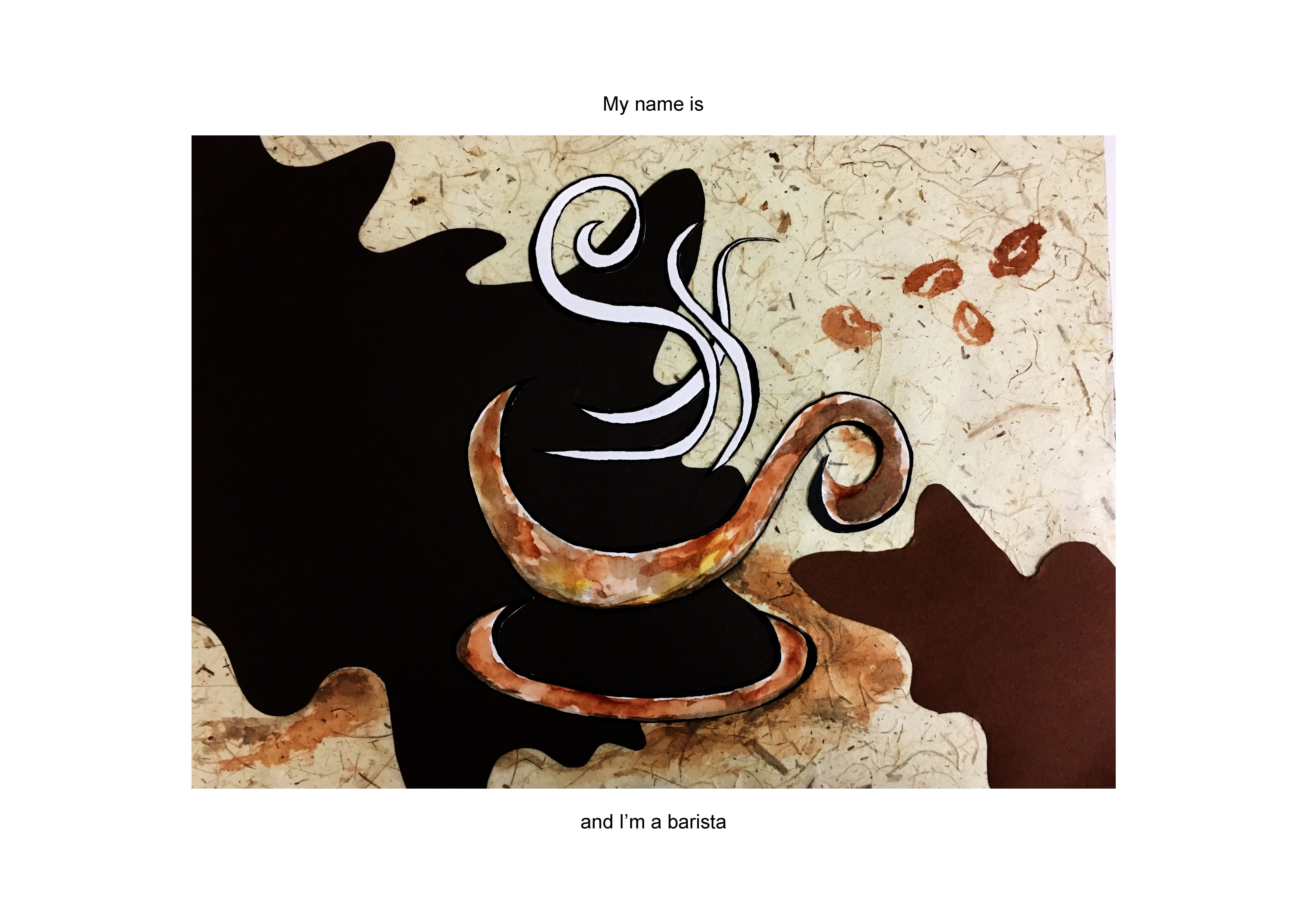
My first attempt on something that is not digital. Textured paper has been used as the base to create a kind of nostalgic feeling. A darker tone is used to create depth, leaving the letters in white to show contrast. Watercolors are used for realism such as coffee stain on a table.
Reflection
I never thought that creating a few letters can be this challenging when I was first introduced to this project and yes, this project has definitely shown me the truth.
The main difficulty in this project is to incorporate the visual elements of a job into your typeface, without having them look weird and “forced”. While this project has come to an end, there is still a long way to go. I am glad that I understand a little better on how to create a typeface using objects, without the need to twist and bend a letter. Also, I was able to try something new in this project! (aka the paper cut). Apart from that, I learnt that thumbnail sketches do help A LOT when you are suffering from creative block. Because what you sketch will always lead you to more ideas as long as you don’t stop putting down what you have in mind. Ideas will come eventually! Most importantly, I learnt that introducing visual cues into your composition instead of putting all at once can make your composition looks interesting as well as allowing viewers’ participation.
– END –