


Category: Project 2 Zine: Research
2D II | Neighbourhood Research
When we returned from our first semester break, we were all tasked to list down one or a few places that we are familiar with. Little did I know that this was part of our 2D project – we were assigned a neighbourhood that we are UNfamiliar with to explore and find out the “interesting” features about the subject area.
I was allocated to Sengkang (secretly hoping to get Changi lol.) But oh well, let’s keep an open mind, shall we? Sengkang in my mind, was just a place almost reaching the far end of the Purple Line and it also seems like a place with parks and greens everywhere (which proved to be true too!). Literally there was nothing fun I can think of when it comes to this location. As usual, I went on to Google “things to do in Sengkang” but all I get was the typical stuffs such as riverside park, wetland, complex, food etc. 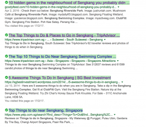
No way I’m going to build my zine around nature theme so I decided to JUST GO there and I will figure the things out later.
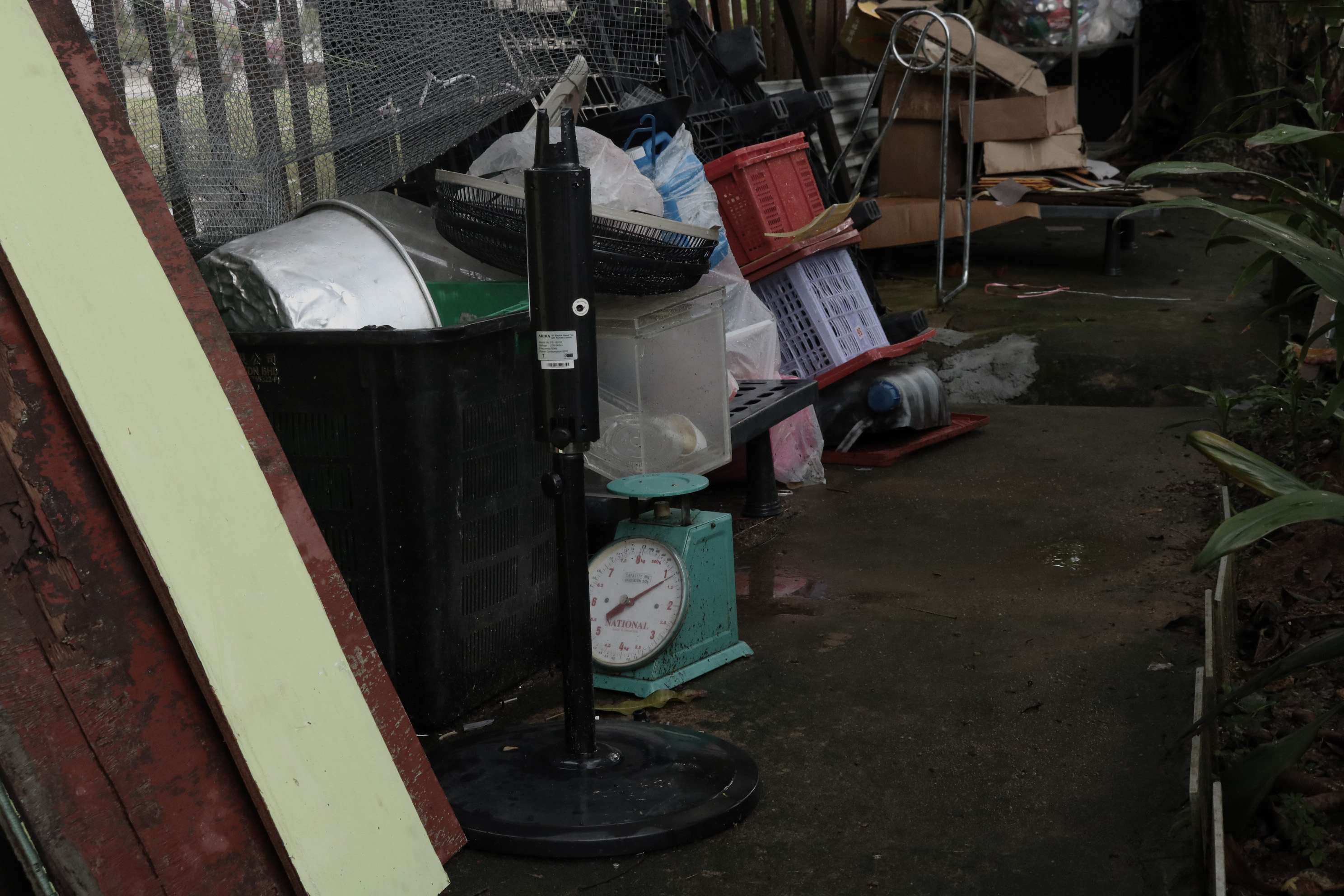
As expected, all I could see is HDBs and MORE of them as I walked around; maybe just a change of colours.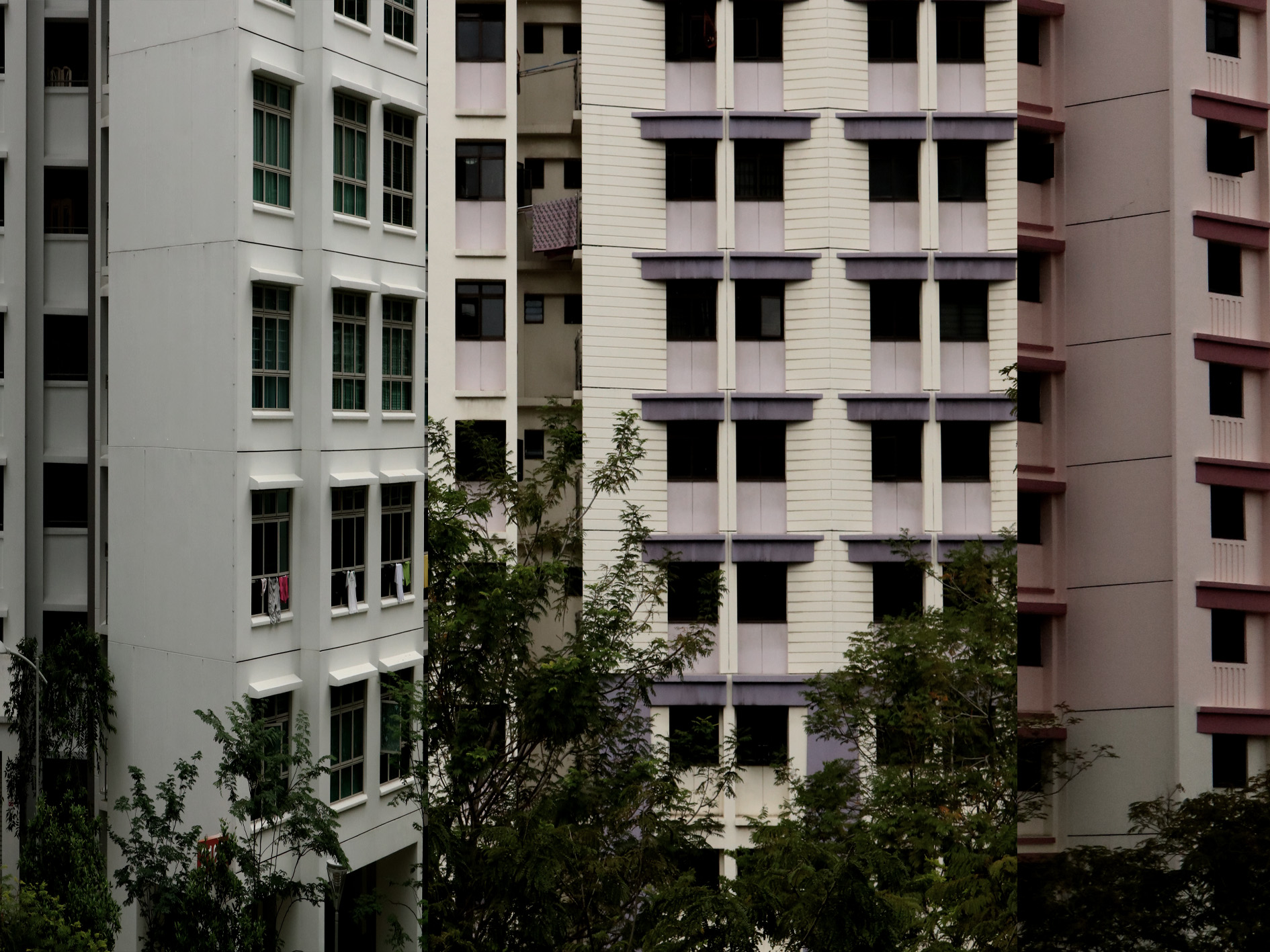
- Idea #1: A series of visuals about flats and its somewhat interesting architecture
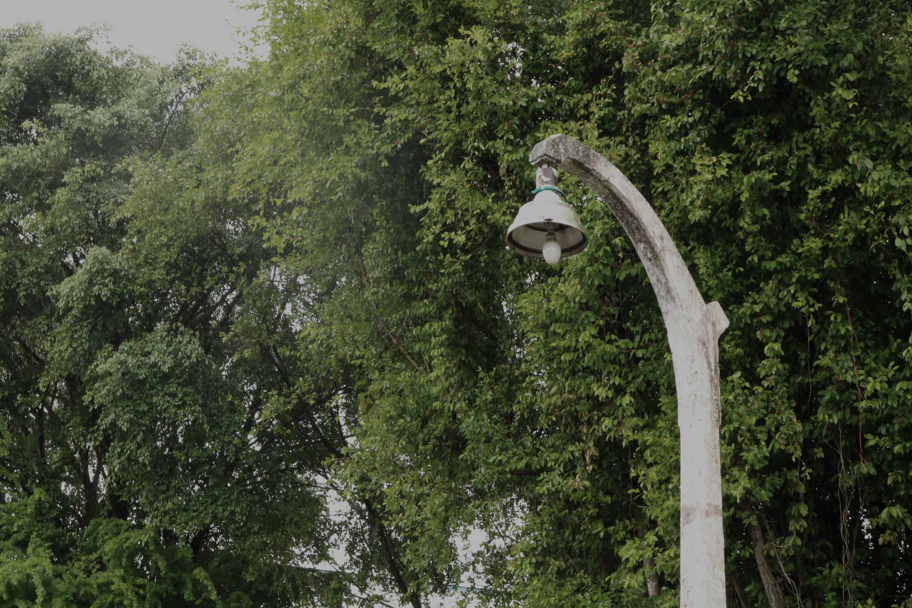
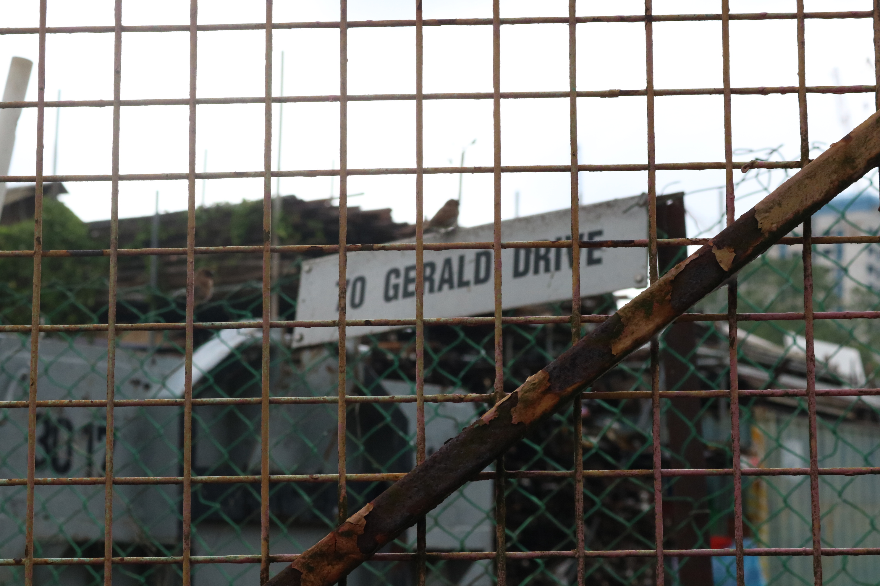
I chanced upon Jalan Kayu (a malay term of “wooden road”) while I was exploring Fernvale. Why is it called wooden road?? I find it rather unique as compared to other areas’ name. Curious, I googled about Jalan Kayu and it opened a new door for me.
One version for the road name’s origin is that firewood used to be stacked on the roadside. Another version is that the muddy laterite roads leading to the rubber estates in the area were made passable due to logs of wood that used to cover the muddy roads, hence the term in Malay jalan kayu. -Wikipedia
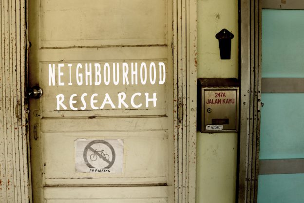
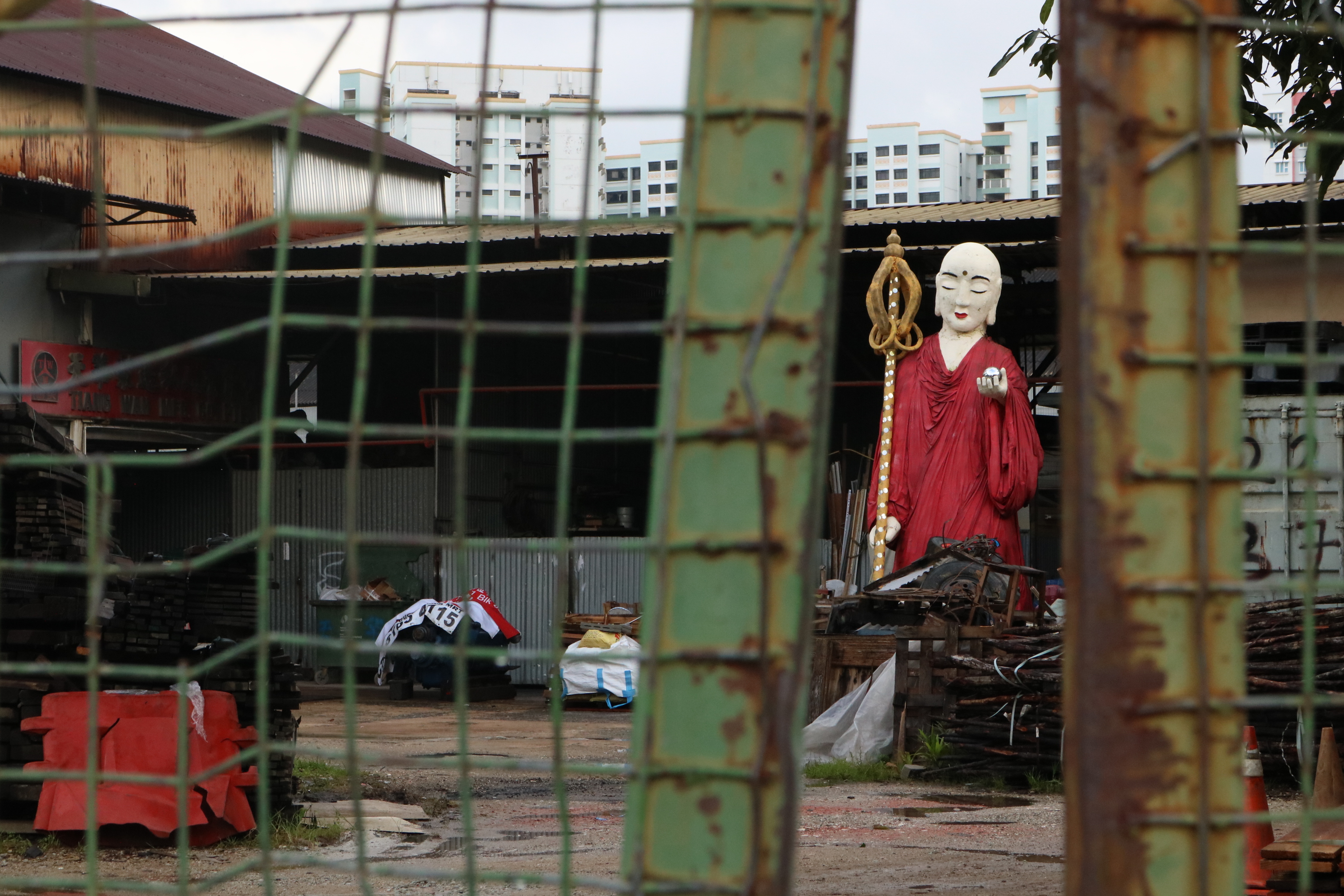
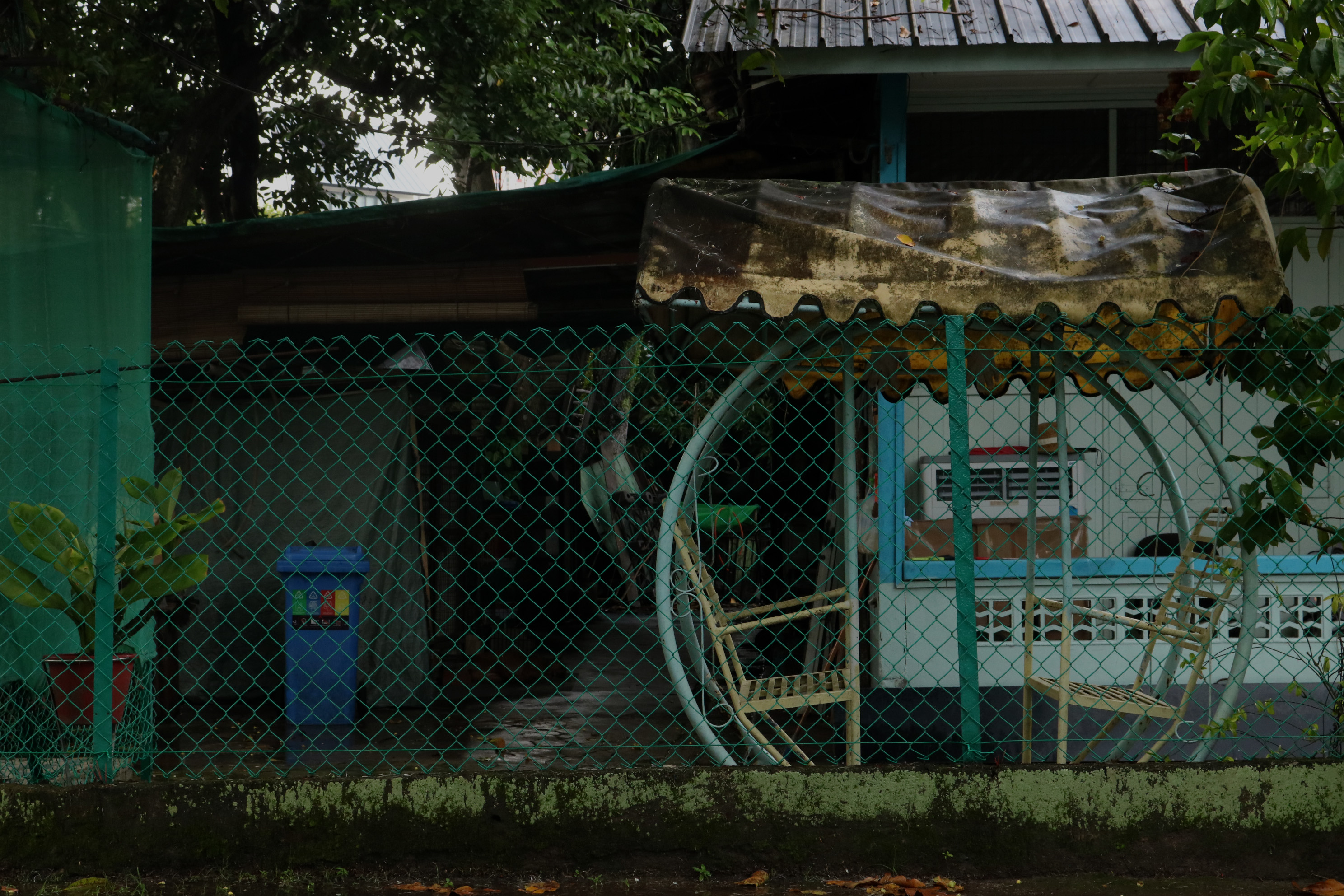
Jalan Kayu itself is an one lane road. My first impression of the road was that it was just a typical road dotted with many bars and restaurants of different cuisines. My mind was completely blank. I wanted that “something” of Sengkang but I had no idea what it is and where to find it. Annoyed by the fact that I had to go home empty-handed, I walked into an alley and A HA! I found a gem.
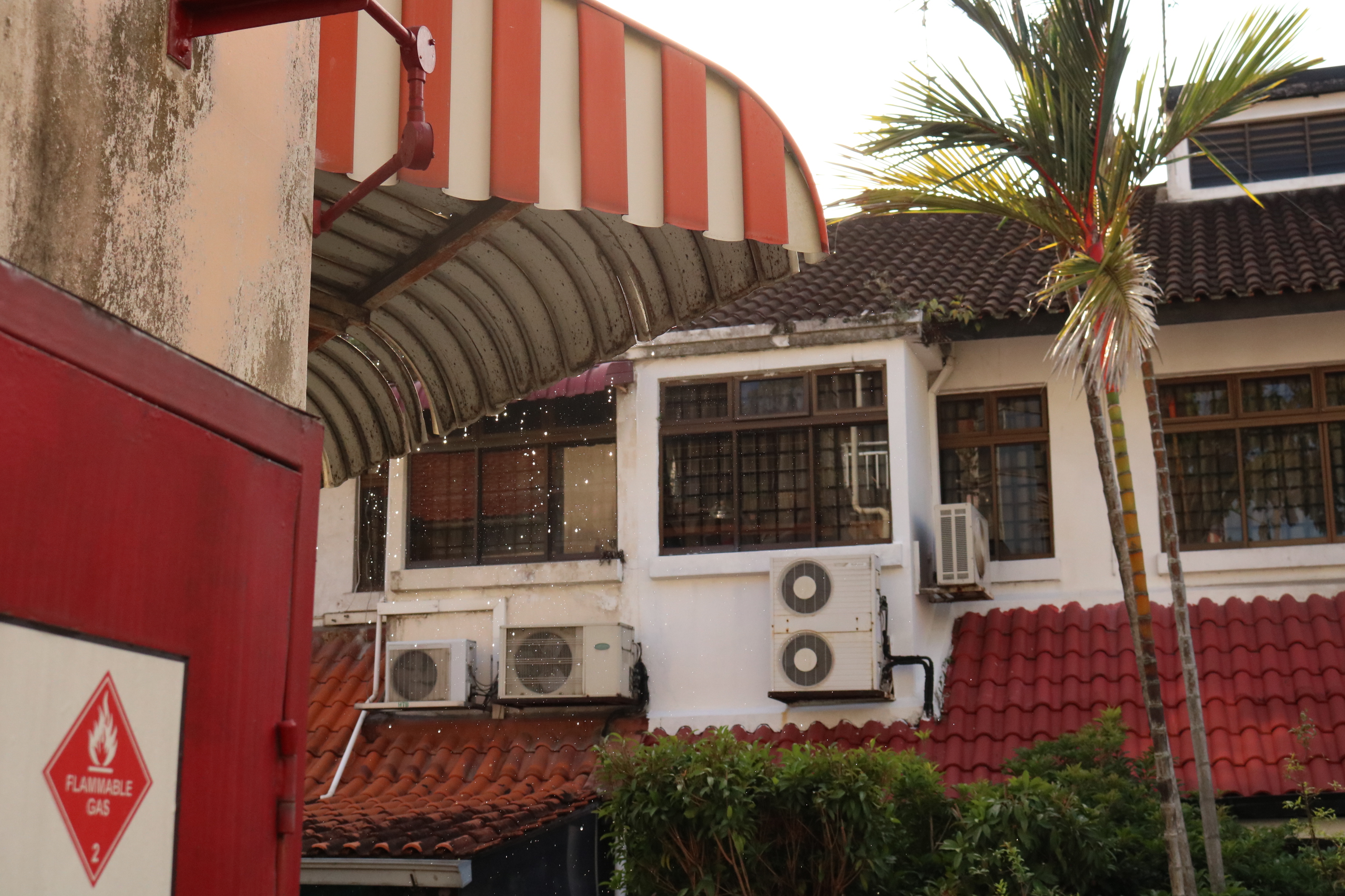
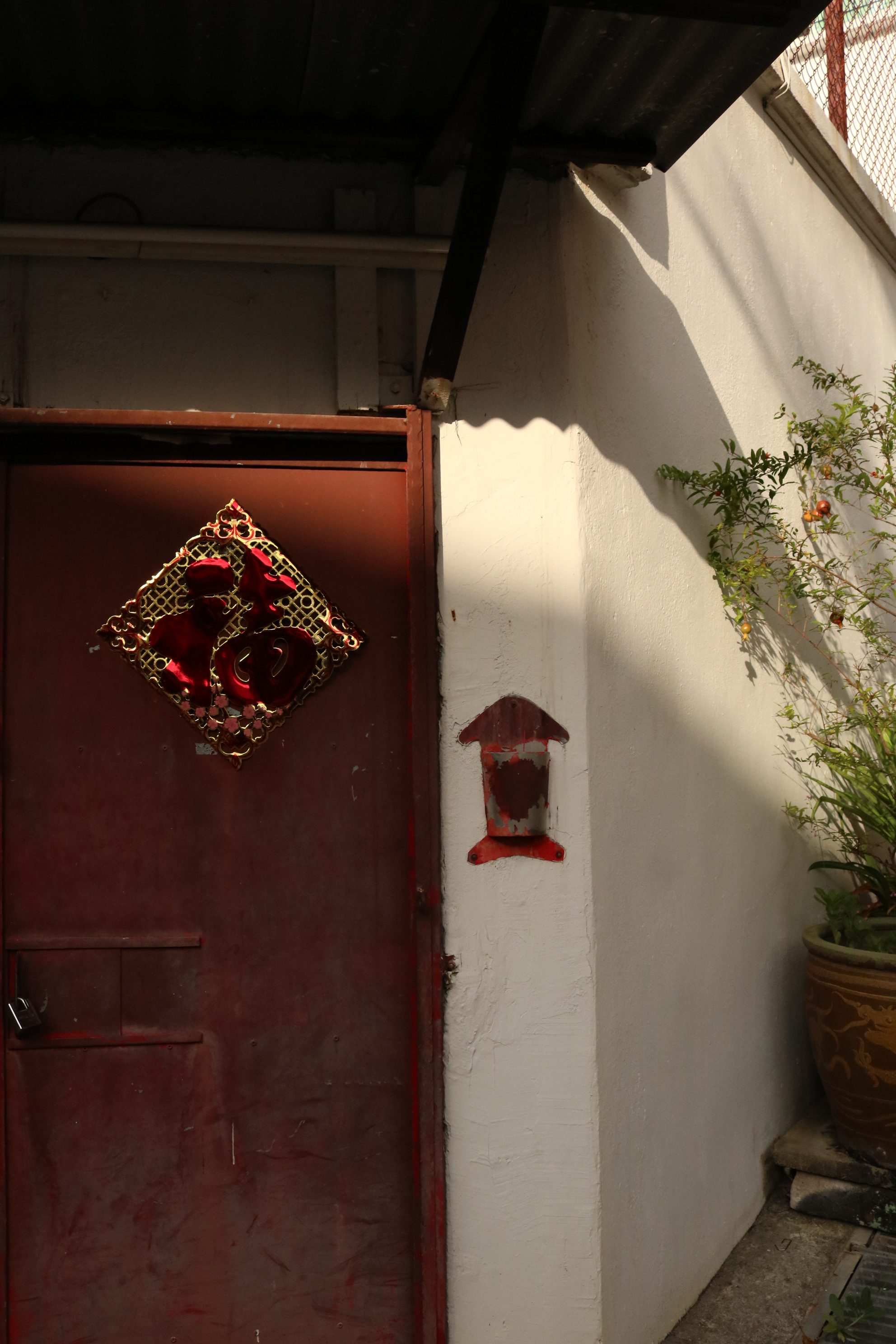

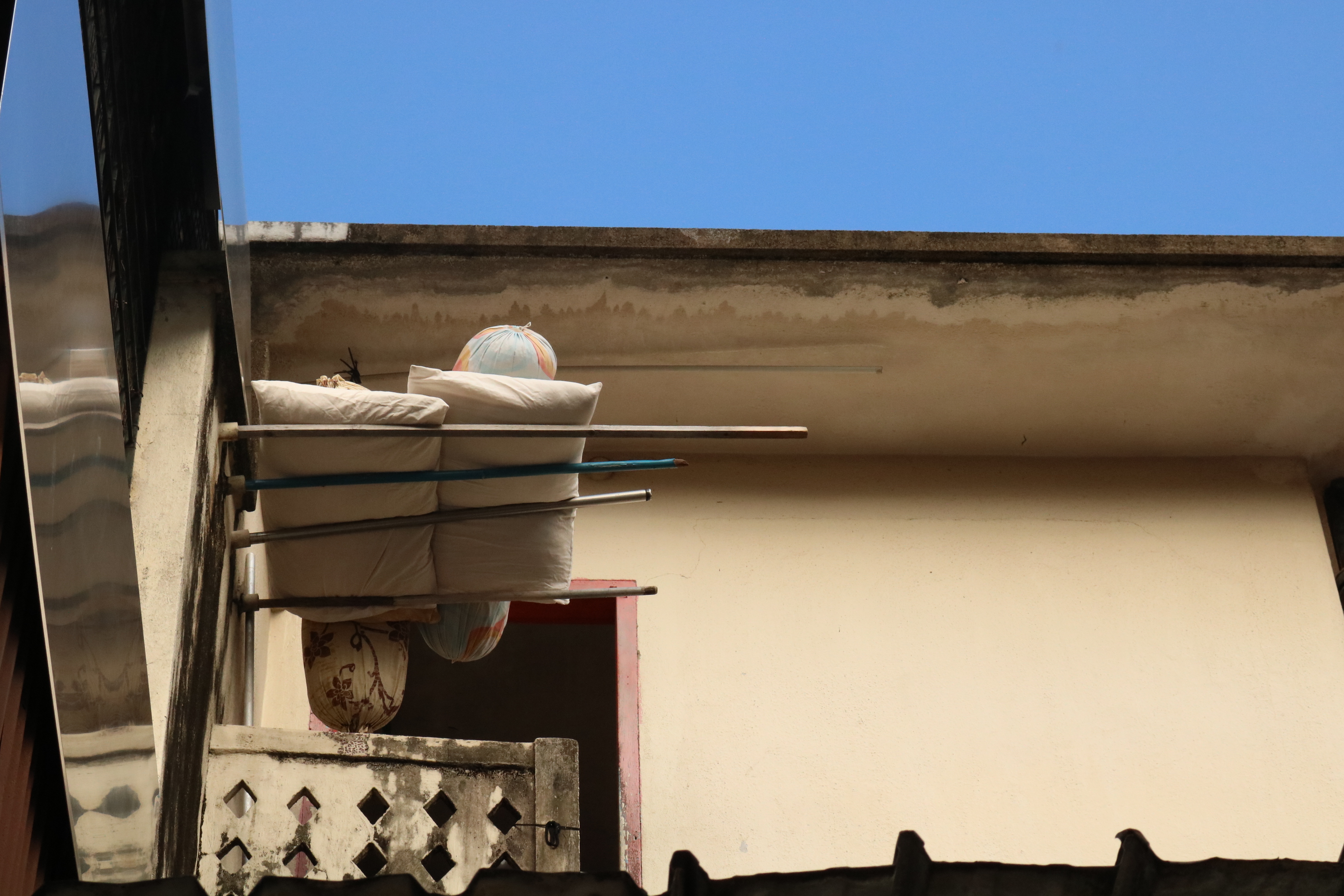
The architecture of these shophouses wasn’t what I would have imagined it to be. It exudes a kind of 70s post-war vibe. Vintage. Retro. I thought I was transported to another era or even country. Besides, I realised that the colours are recurring. 
- Idea #2: A series of visuals about the interesting things I found along this route + play with colours
After my first trip to Sengkang, I was left rather confused, undecided on what to do for the project. Should I extend my search to another area? And YEAP I went back again on the following week to further dissect the subject area.
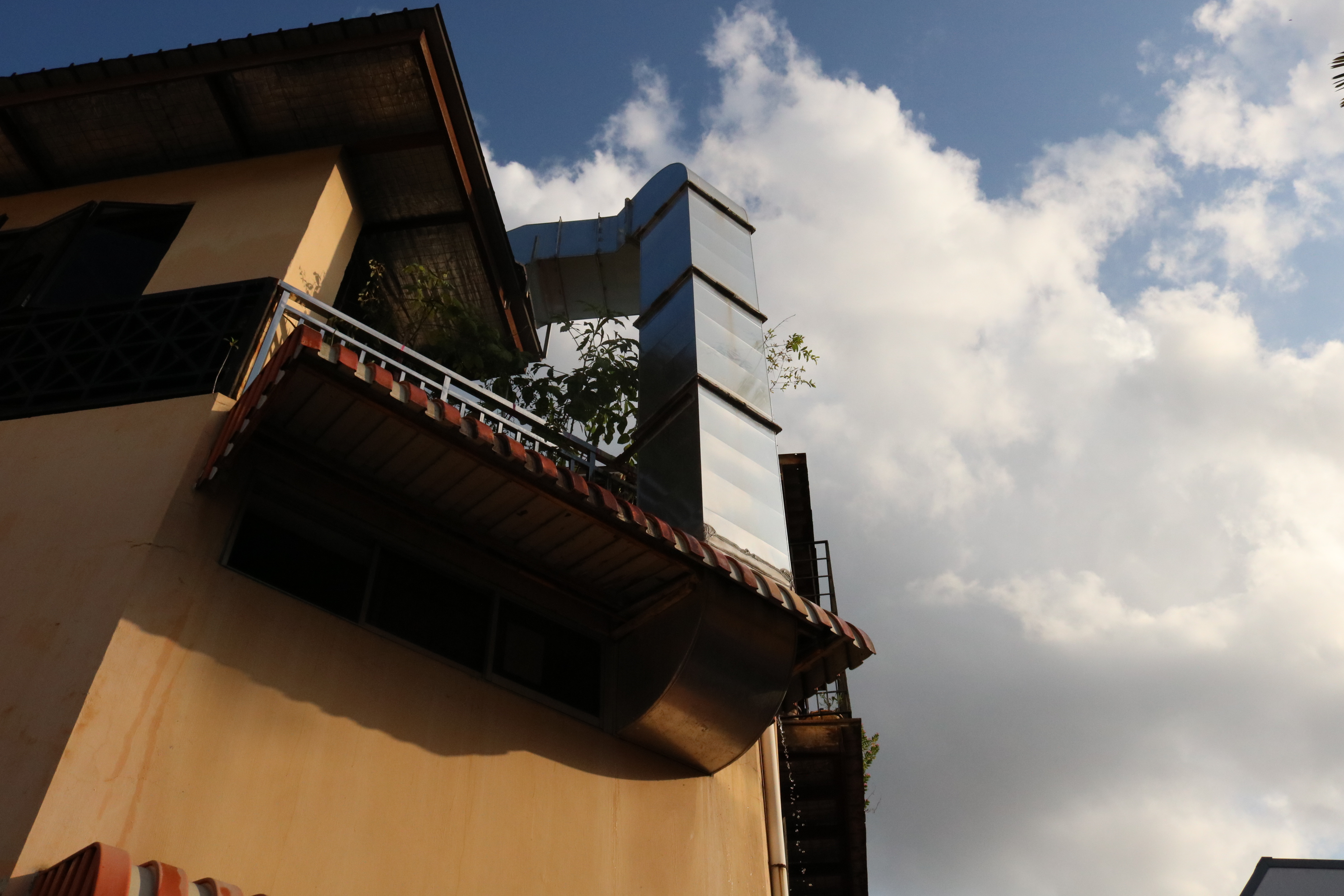
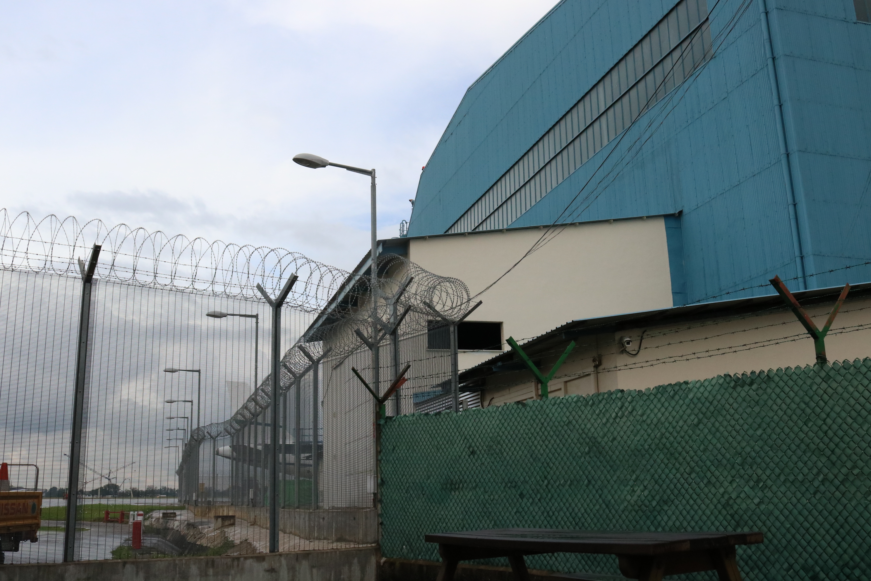
It was raining the day I went back, so I took the bus instead and travelled along Jalan Kayu till the end which I then entered into the British-built military compound. Seletar Airport is just a few minutes drive away and I knew that was going to be my next spot! 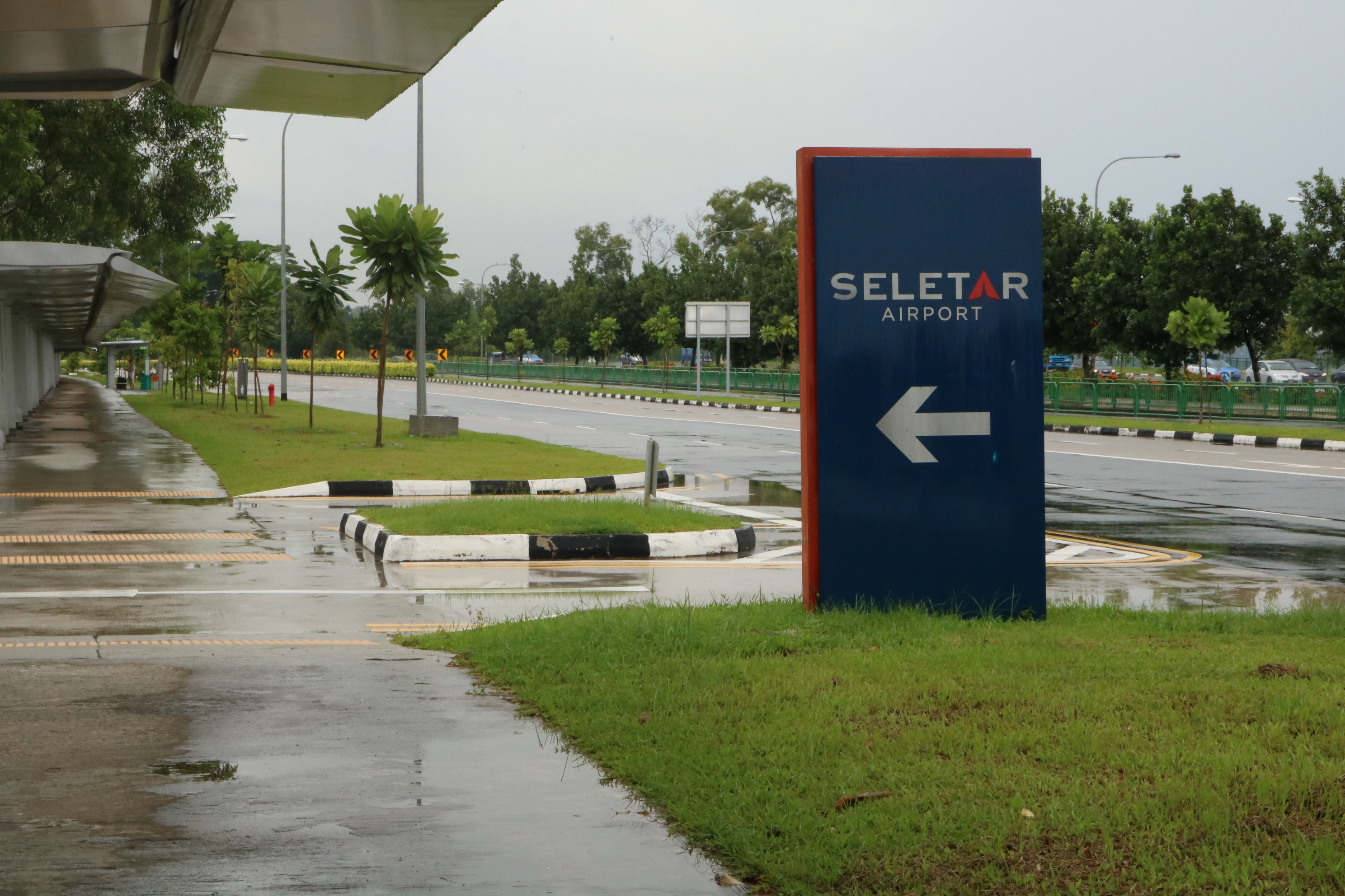
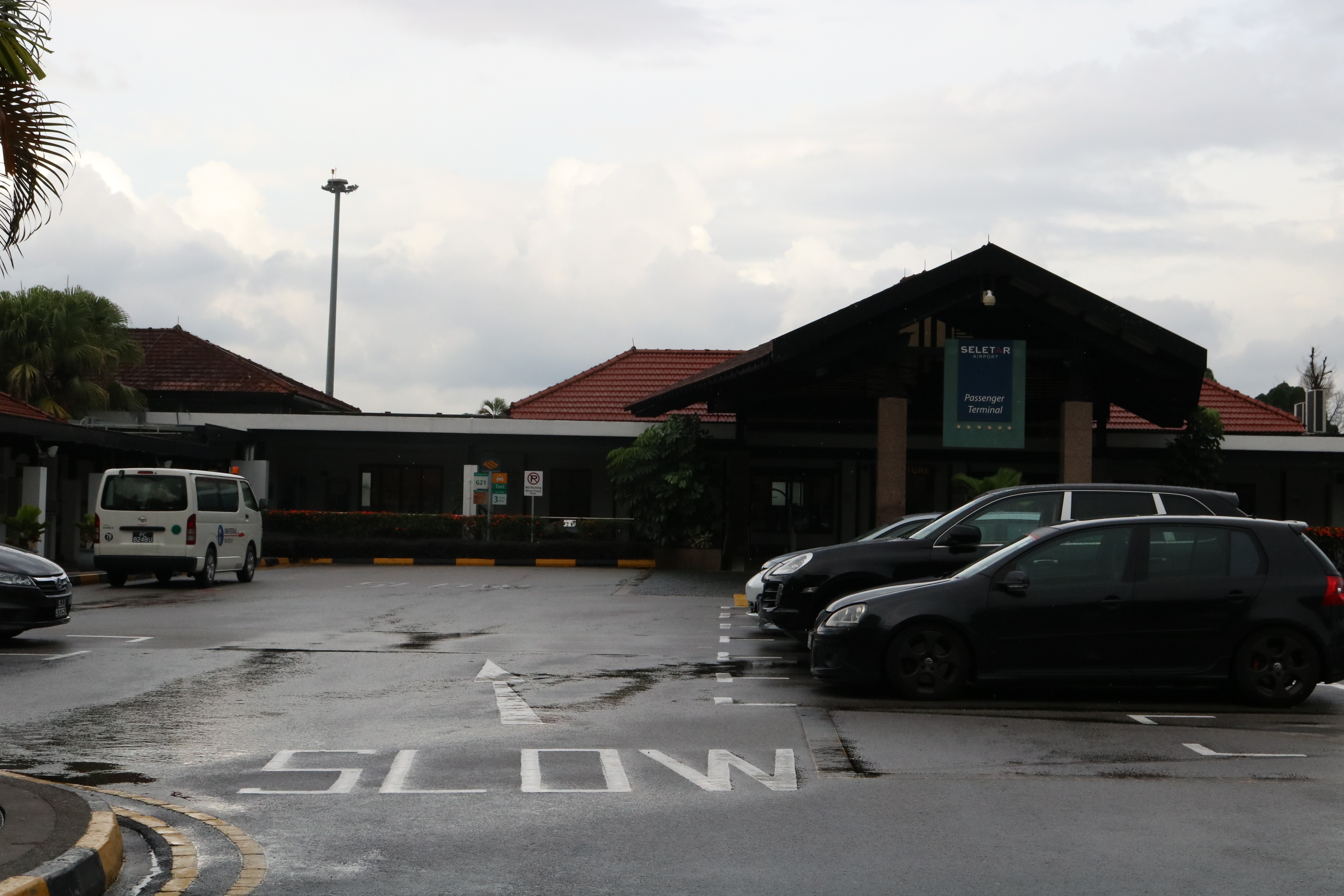
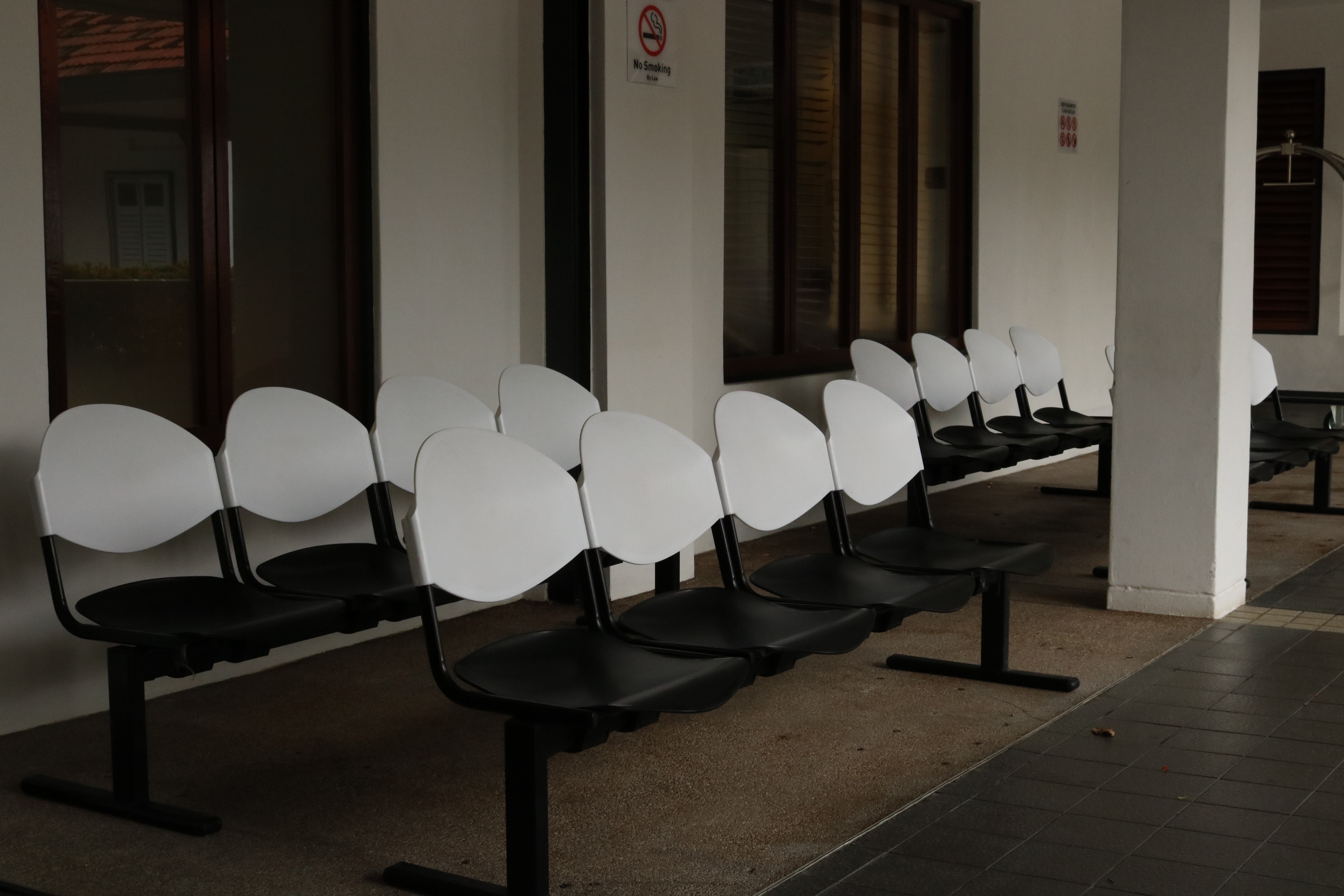


There wasn’t a single passenger there on that day. It did feel like I own the entire airport. After spending some time walking around the airport, I started wondering about my whole existence. What if I disappear right here right now?
Onwards to my next stop – Buangkok.
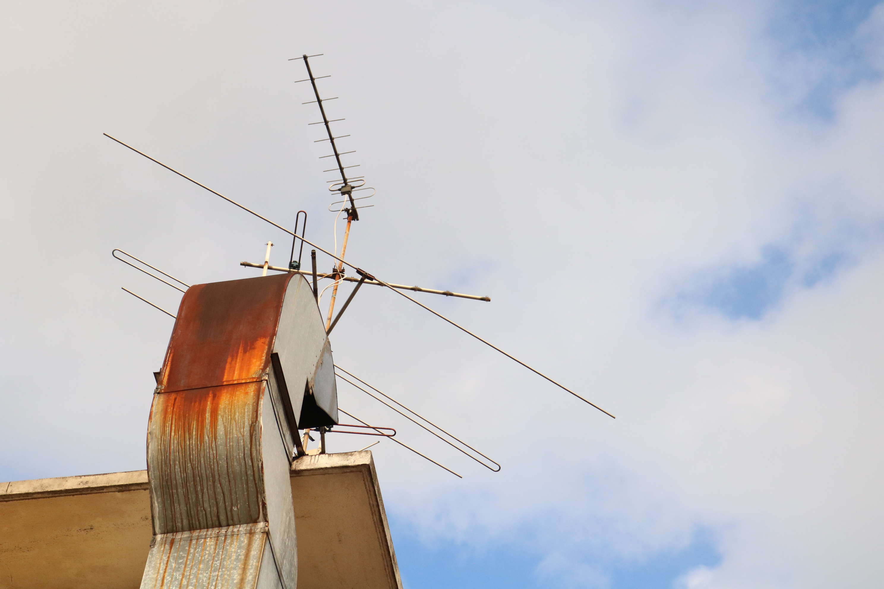
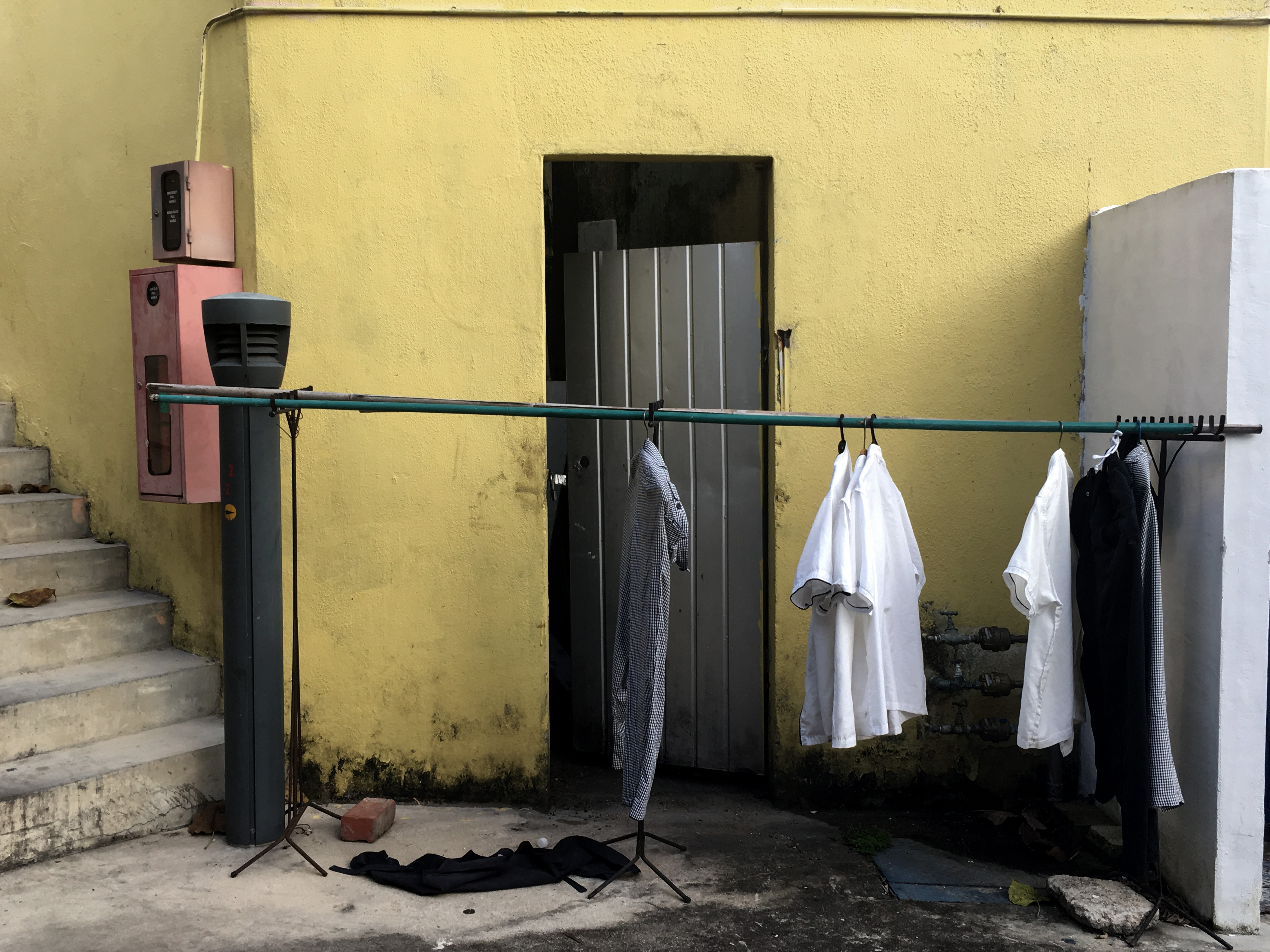
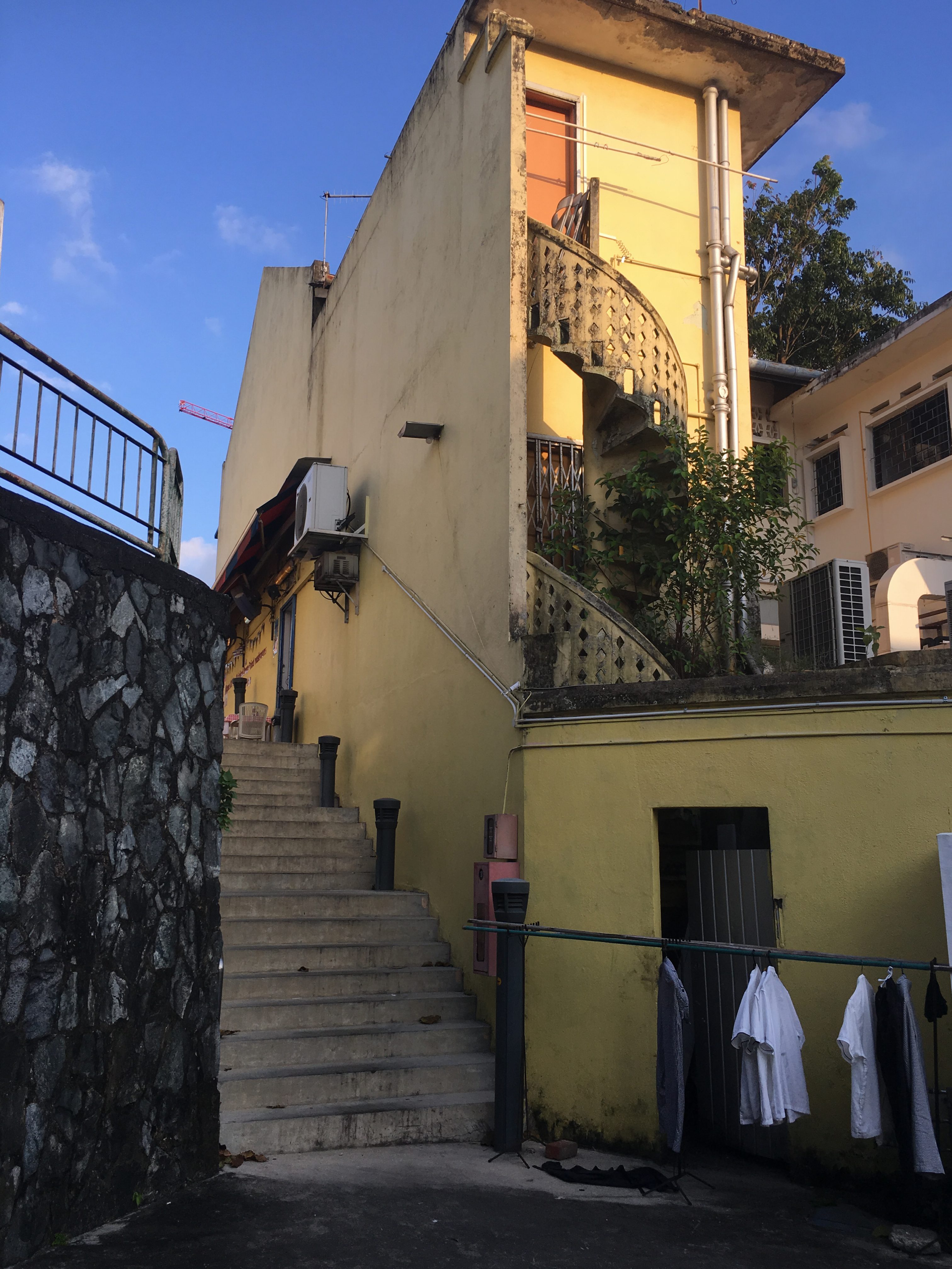
I wasn’t really that interested about Buangkok area mainly because it has been a “touristy” place. Nonetheless, I decided to pay a visit and see what it has to offer. 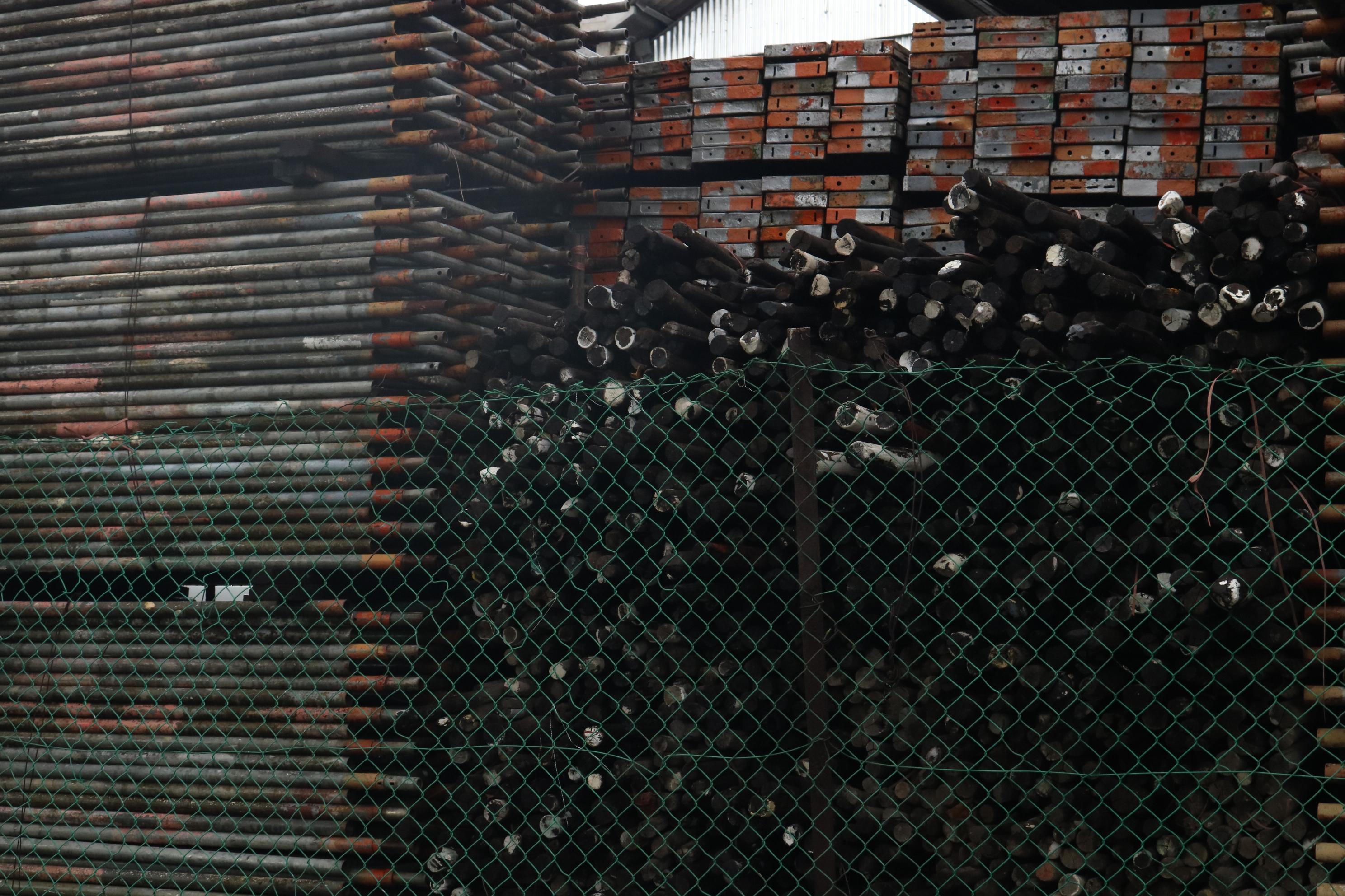
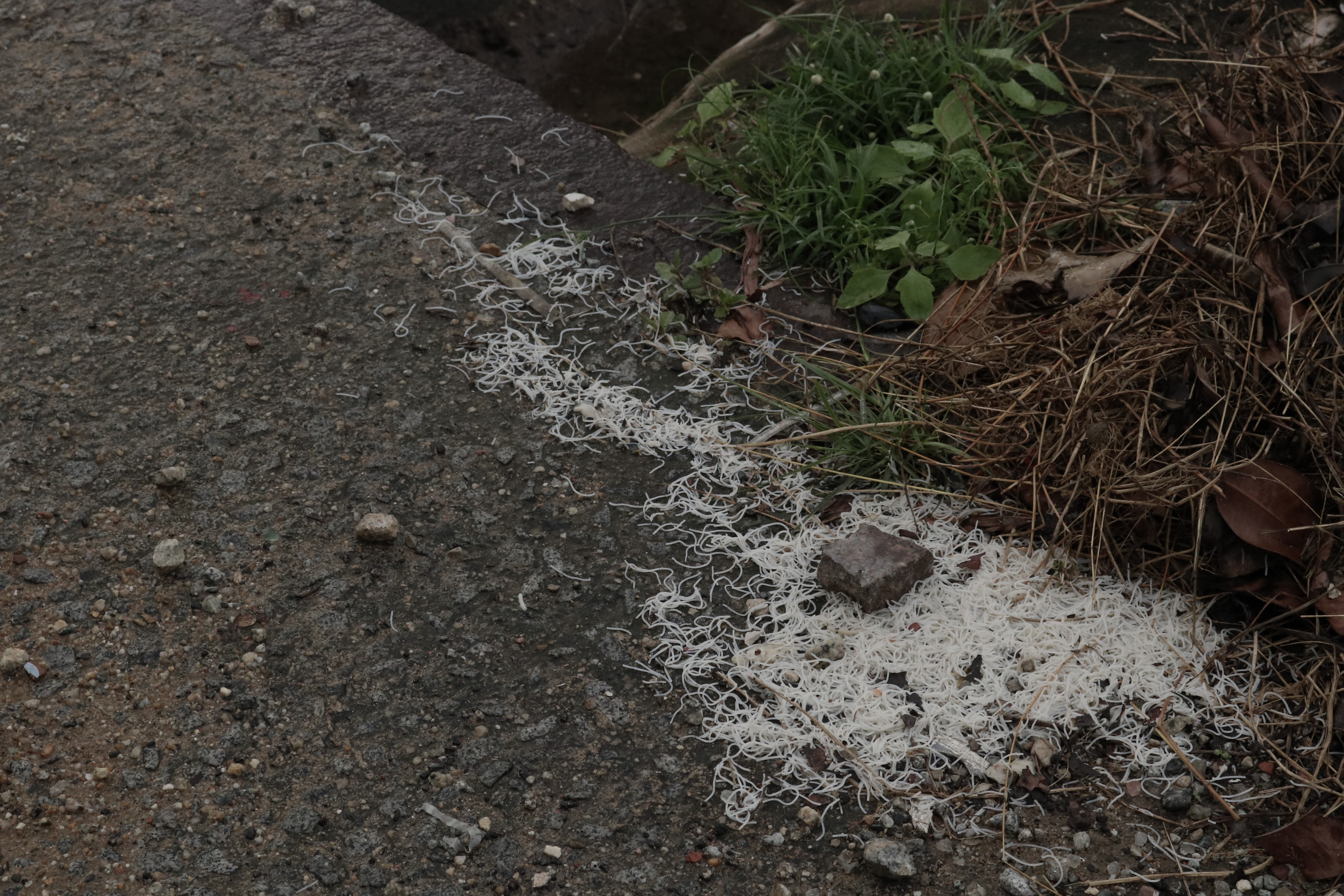
And then it hit me that all the photos I have taken has this same kind of vibe which I feel cold, distant, abandoned and yes LONELY.
It’s time to work on the Zine concept —
LOCATION OBJECT FEELING
2D II | Zine Layouts
#1
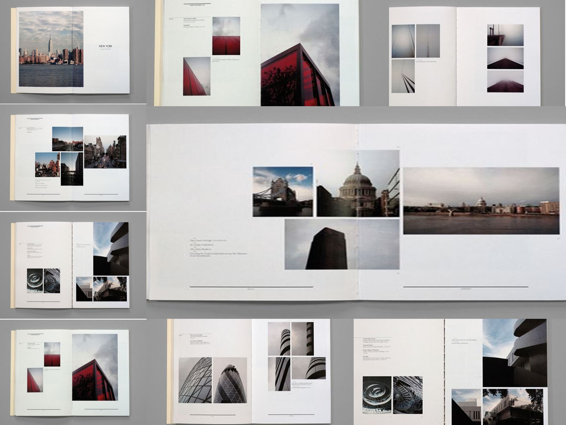
I love that the principle of hierarchy in terms of scale is being used here such that the main structure/building covers a bigger area of the page. The designer then zooms in on the details of the structure with smaller photos aside. Besides, there is a substantial negative space left around the photos which makes the elements more visible to the readers. The typefaces used are all the same size and weight, achieving equivalency so that readers’ attention is drawn to the visuals rather than text.
#2
What’s interesting in this layout is the way designer breaks up the text or the photo so that they span across two pages. The typeface is strategically placed, giving the content ample room to breathe. I love how the text is arranged in such a way that the paragraph is aligned to the left when it is on the left side of the page and vice versa when it is on the right. “People read bigger things first” – the designer differentiates the title of each segment by altering the text’s sizing and spacing.
#3
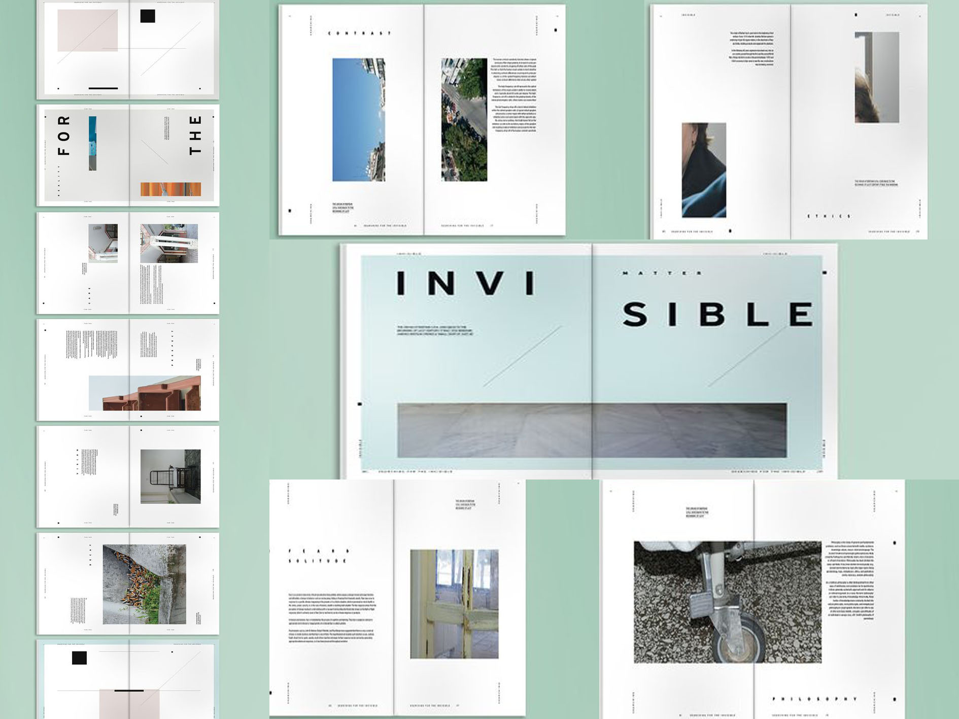
I love the minimalist clean look of this layout. Simple color blocking is used with just three colors – red, sand beige and black. By adding a layer of color onto the photo or part of the photo, it adds visual interest to a normal photograph. With just clean lines and airy space, the whole layout looks more chic and stylish. Color blocking chops up large pieces of content, making it more interesting than an otherwise plain page.
#4
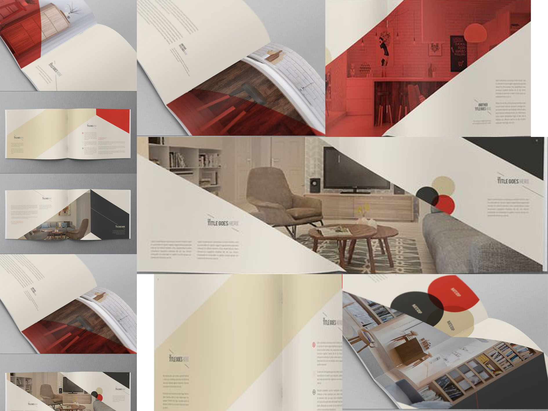
The typeface of this layout attracts me at first sight. I like that the titles are made obvious due to being bigger and bolder. Although all the texts are of the same typeface, visual hierarchy is being established when there is a modification of sizing and its weight. Besides, the photos are broken into grids which add visual interest. There is also a clear structure in this layout such that readers find it easy to focus on the content.
#5
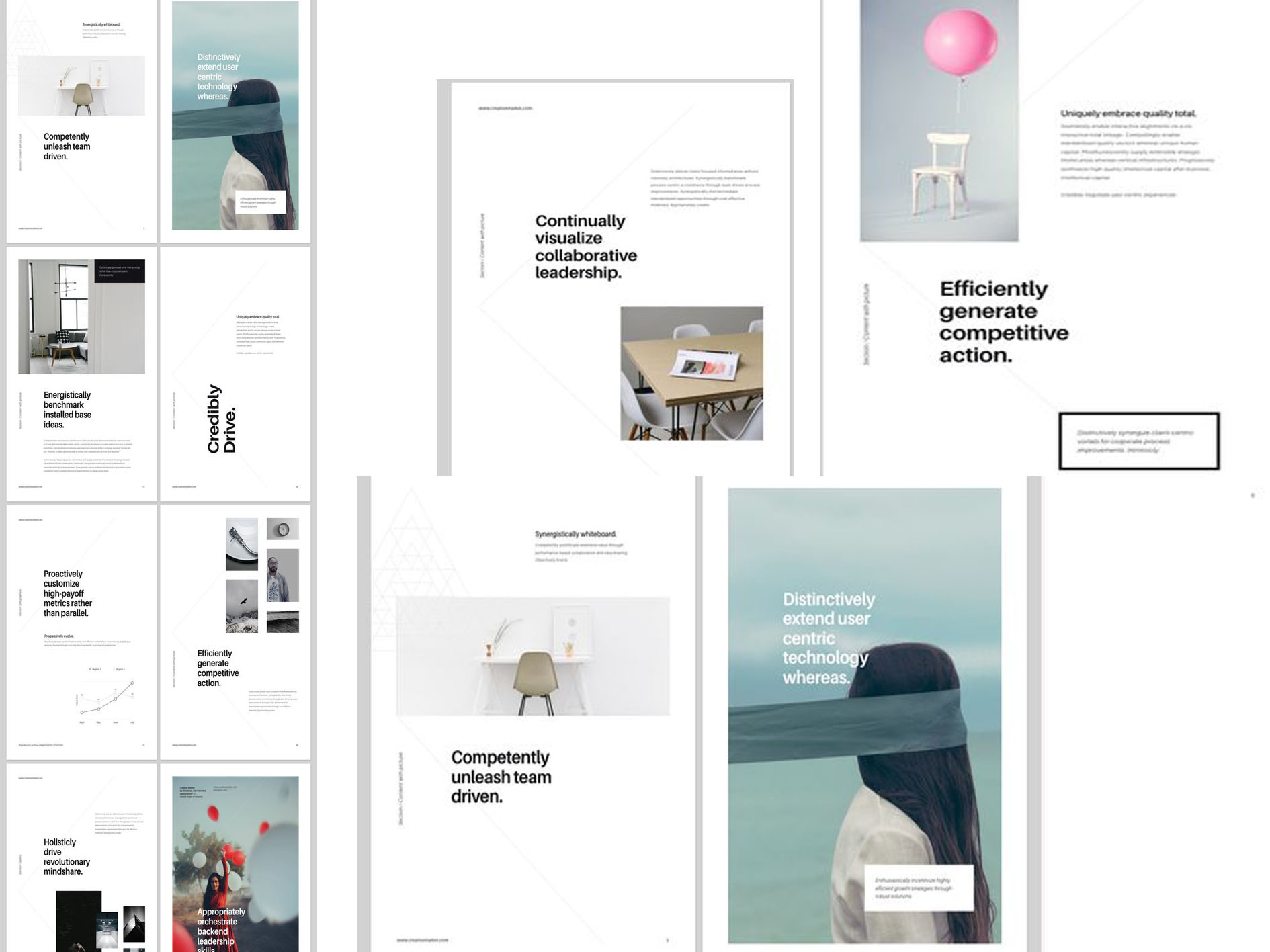
Simplicity is the focus in this layout where Z pattern is being practiced. For instance, the most important information (e.g. heading) is placed at corners and other paragraphs along the top or bottom that connects diagonally. Colors are kept to minimum – cool tones are used mainly with a dash of color in some pages. There is a clear visual hierarchy coupled with white space buffer. This helps to guide viewers through each part of the page. Placing texts on large piece of photographs helps to break up the otherwise monotonous look.