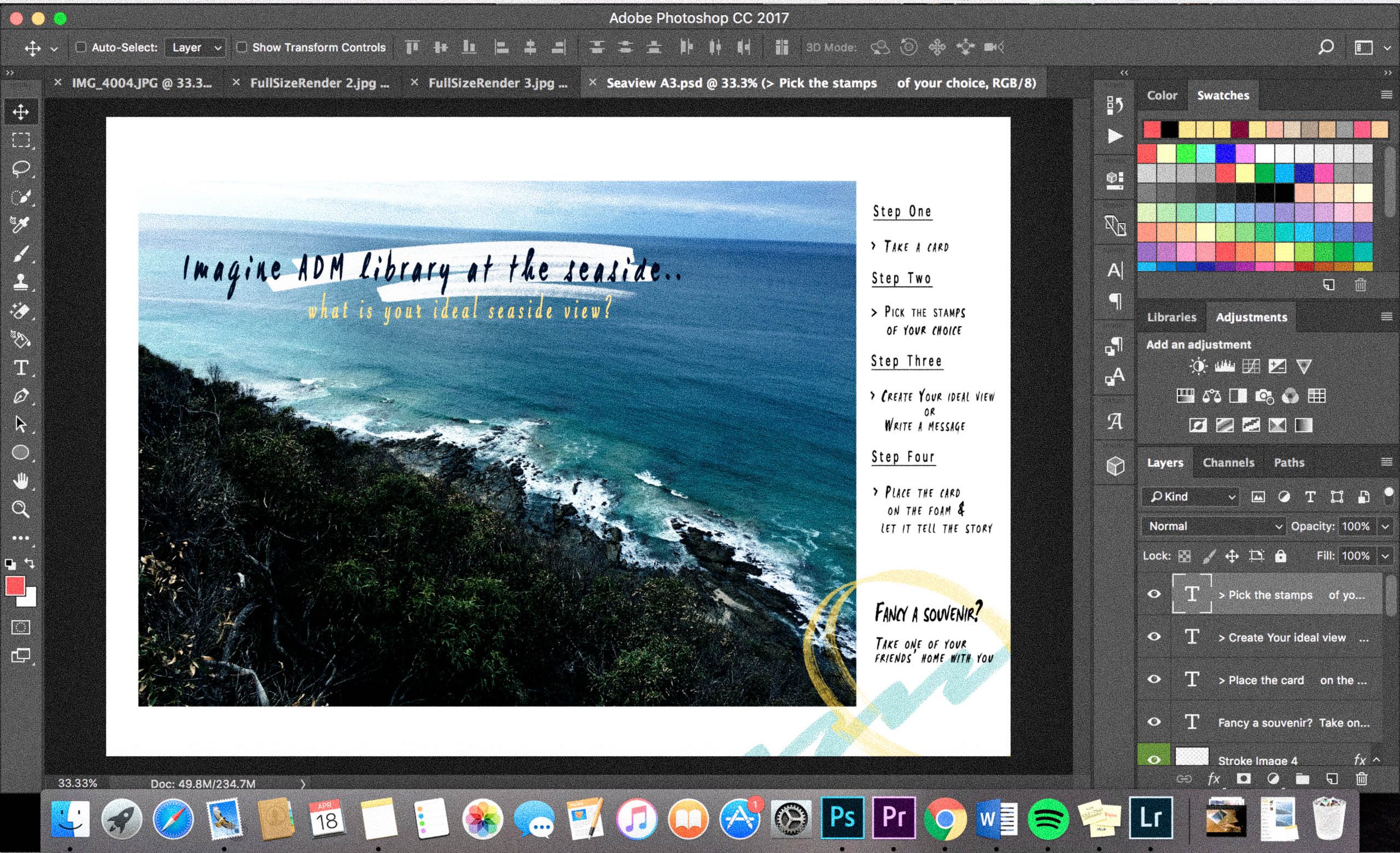
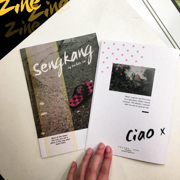
It’s ZINE TIMEEEEE
Thanks to Indesign tutorial lesson (which helps ALOT) !
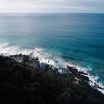
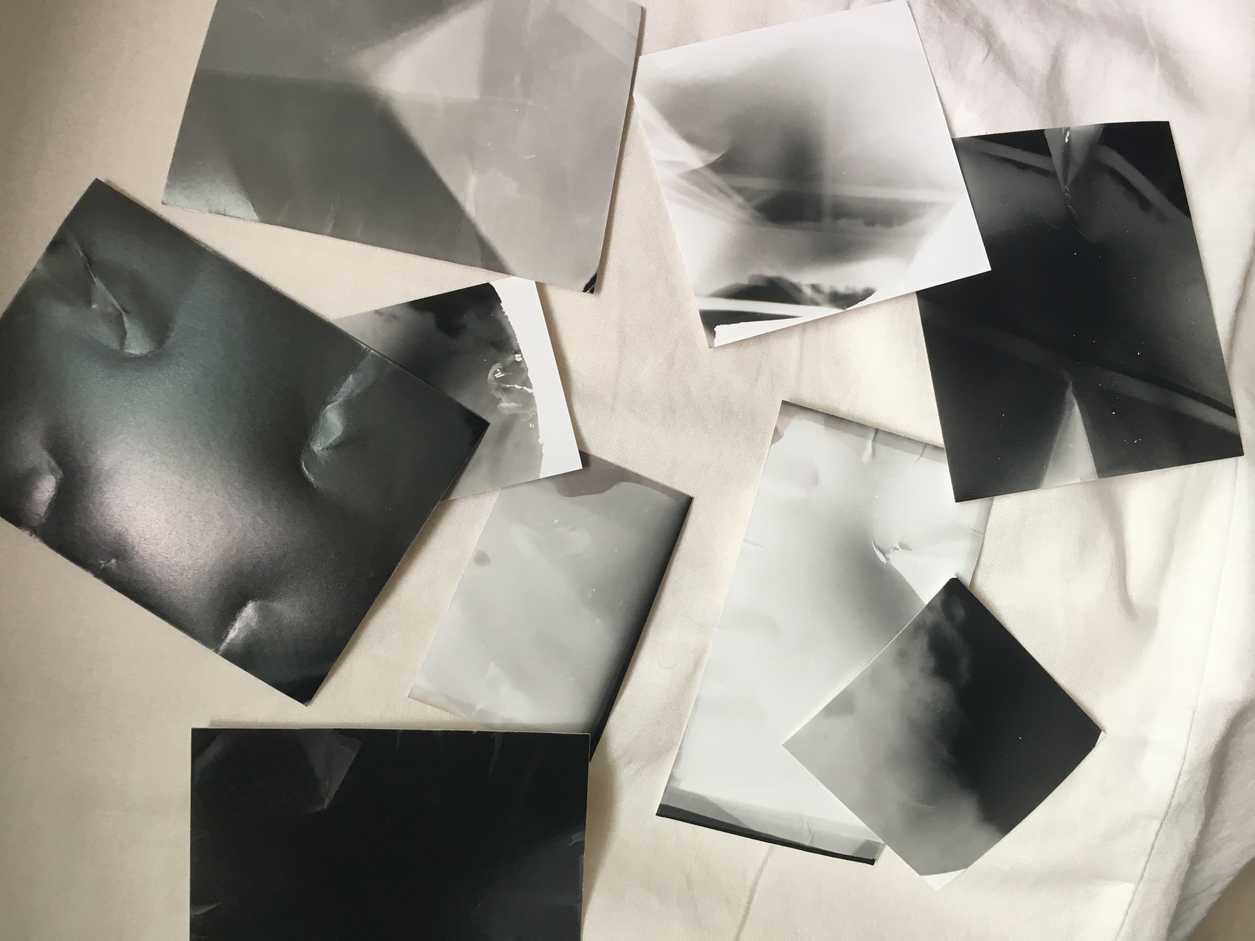
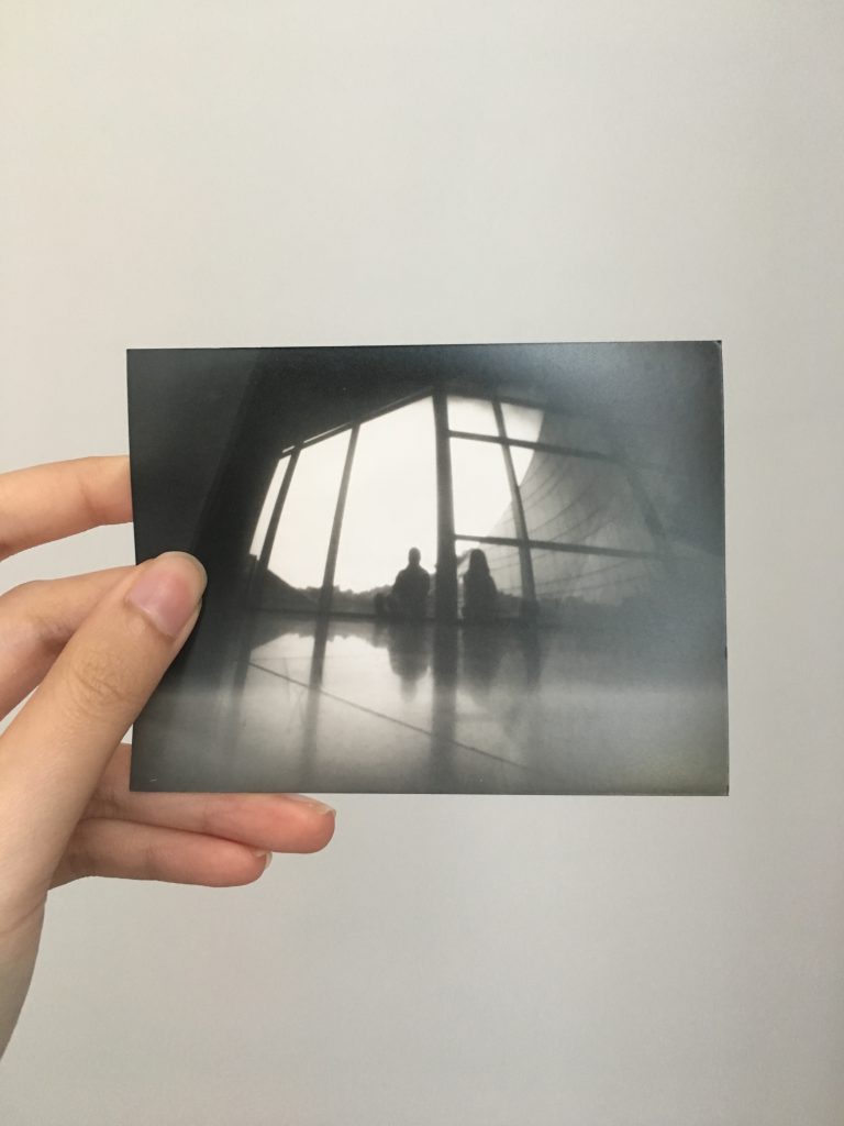
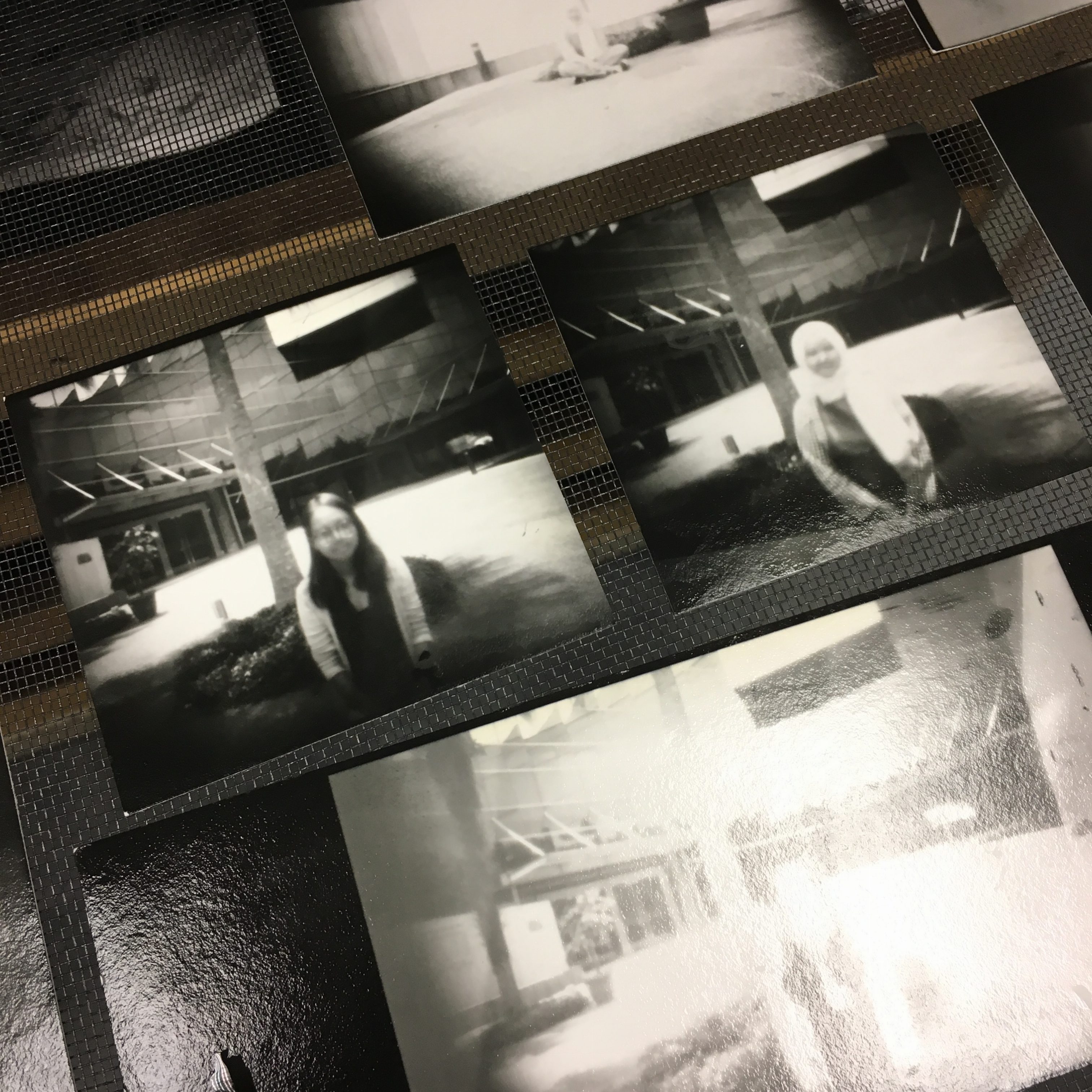
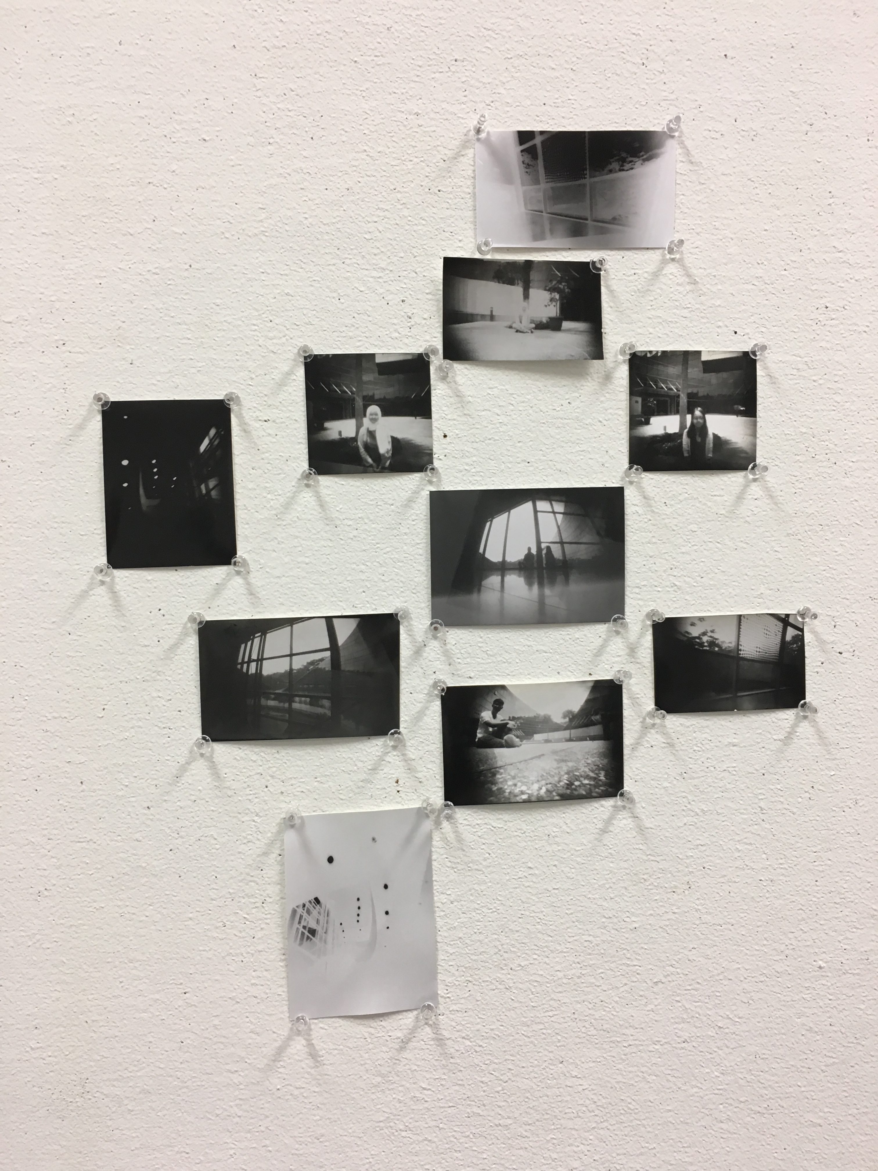
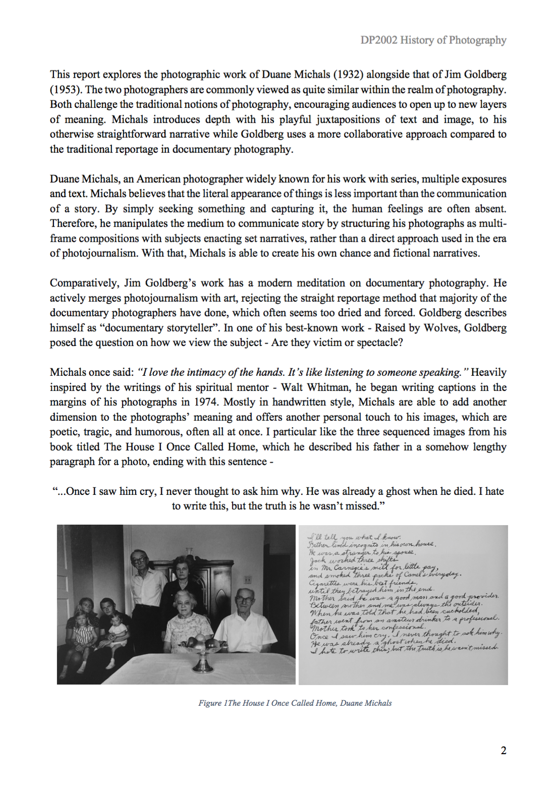
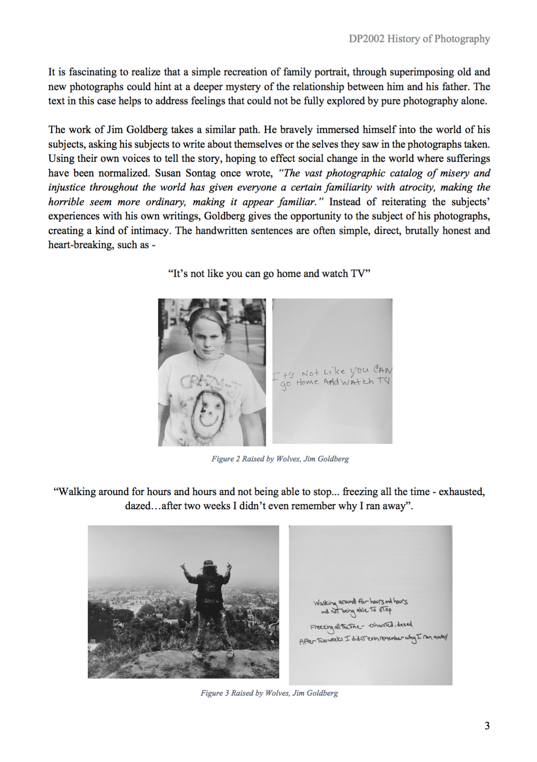
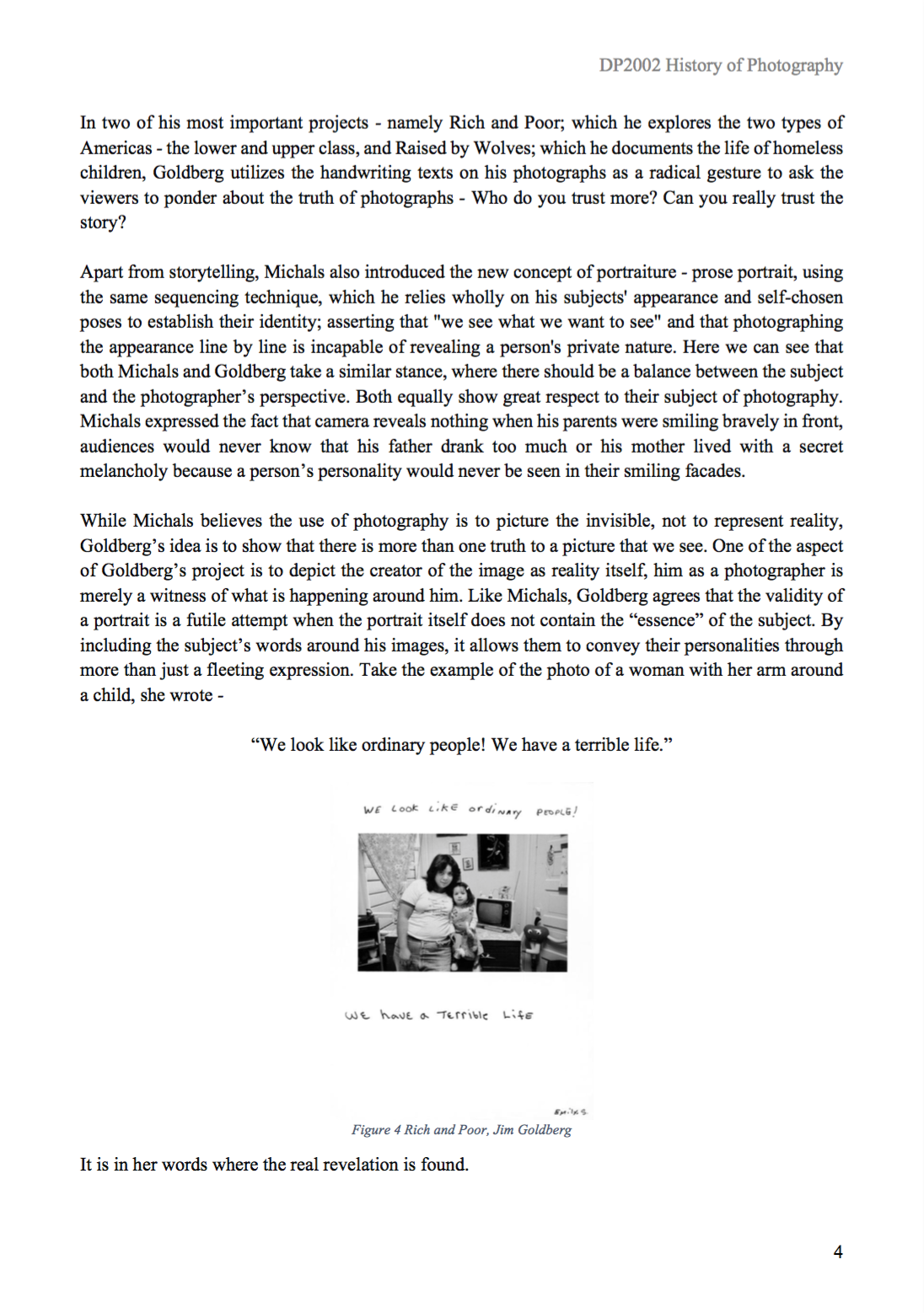
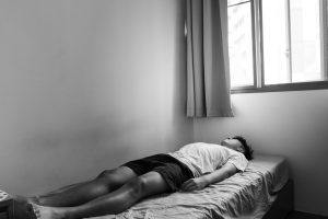
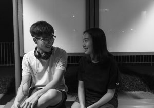
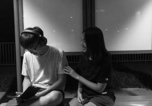
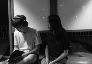
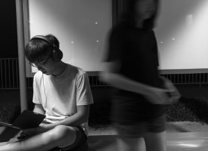
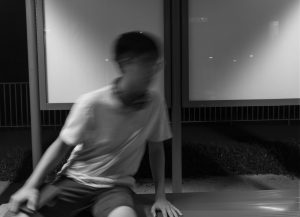
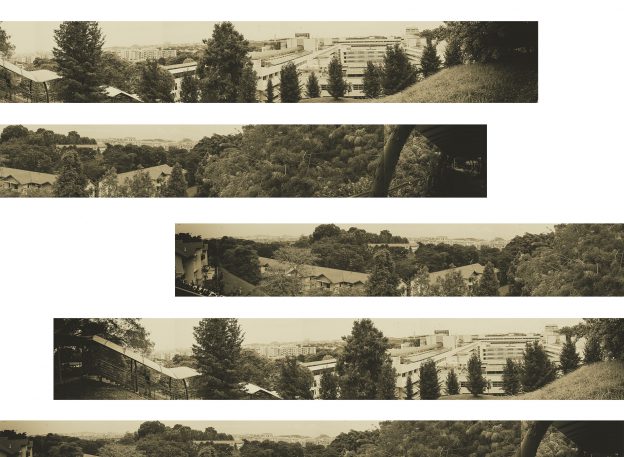
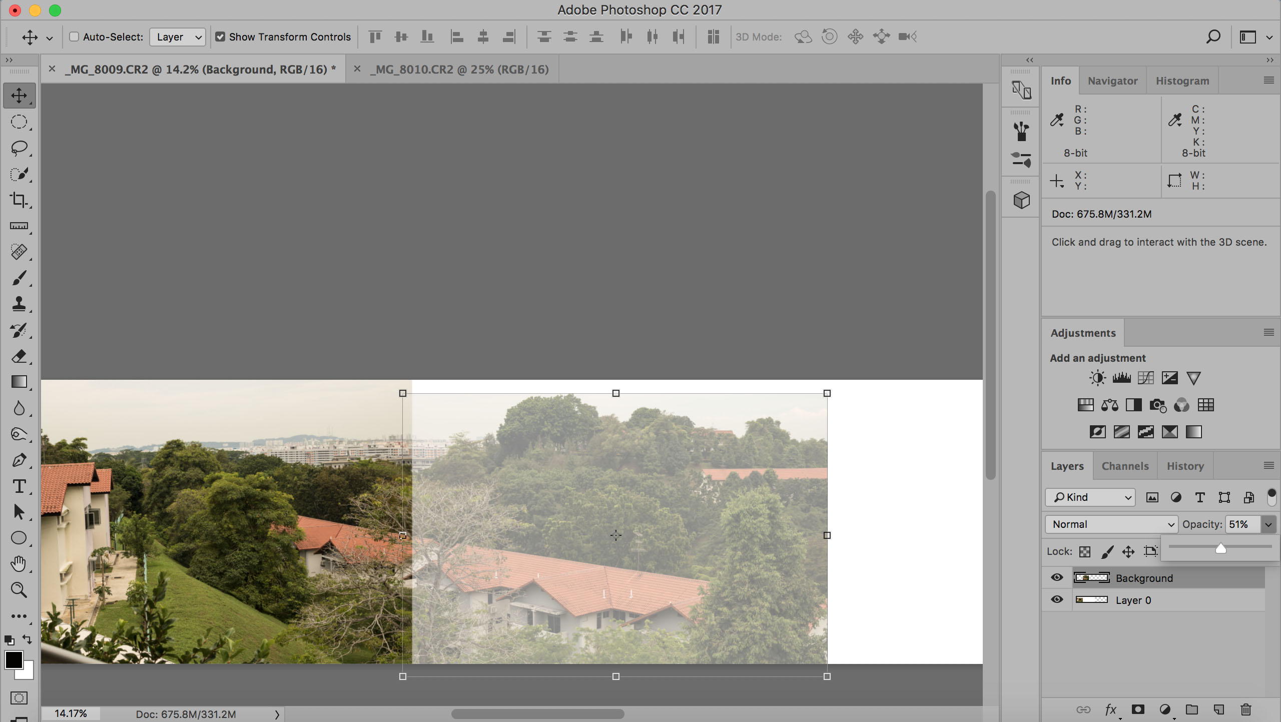
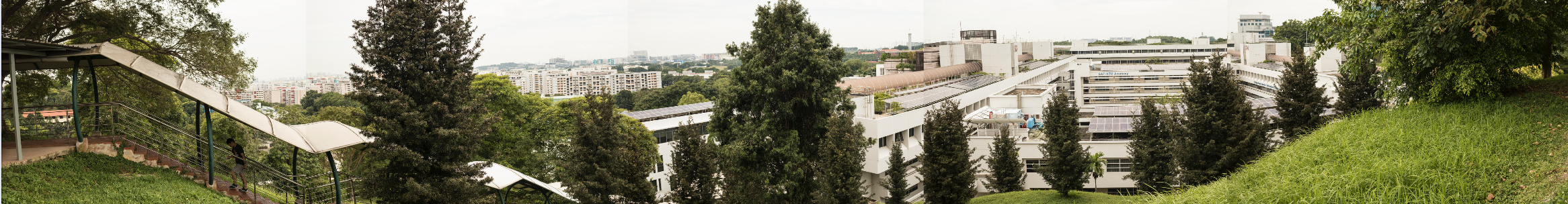
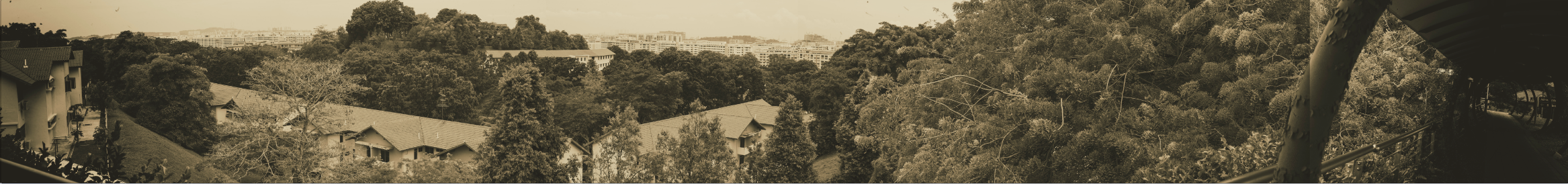
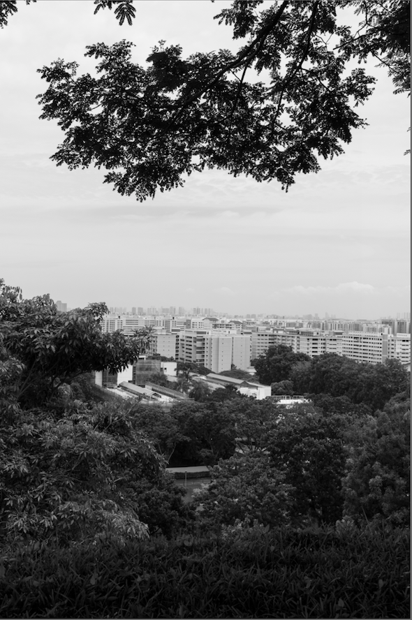
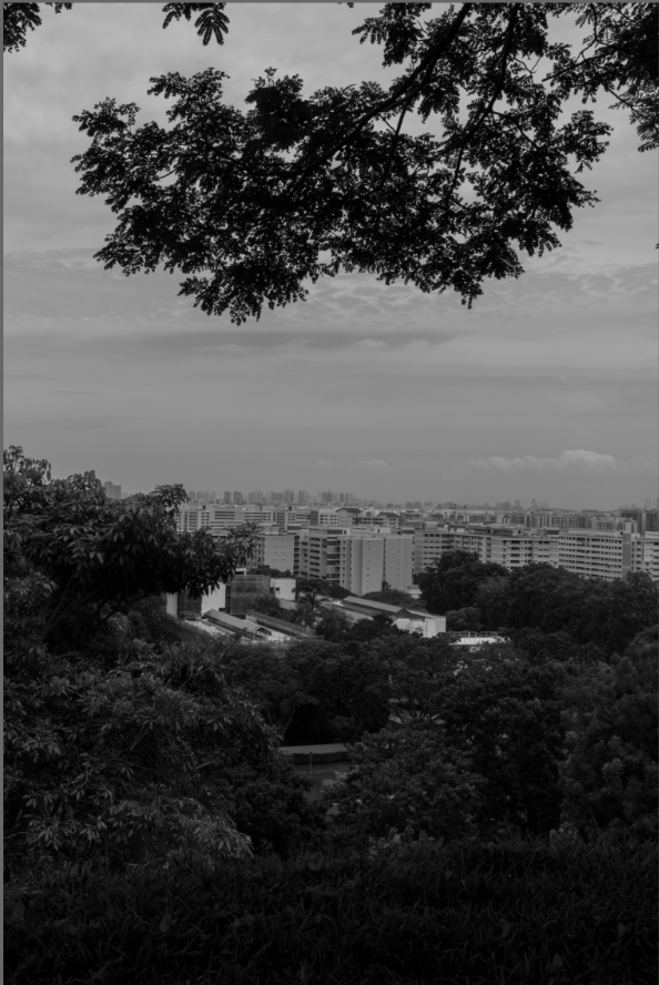
Okay so, just to recap. My idea for this zine is to let the photos tell the story. With that in mind, I began to filter a ton of photos taken from Sengkang and try to look for the ones that fit the abandoned, vintage vibe I’m going for.
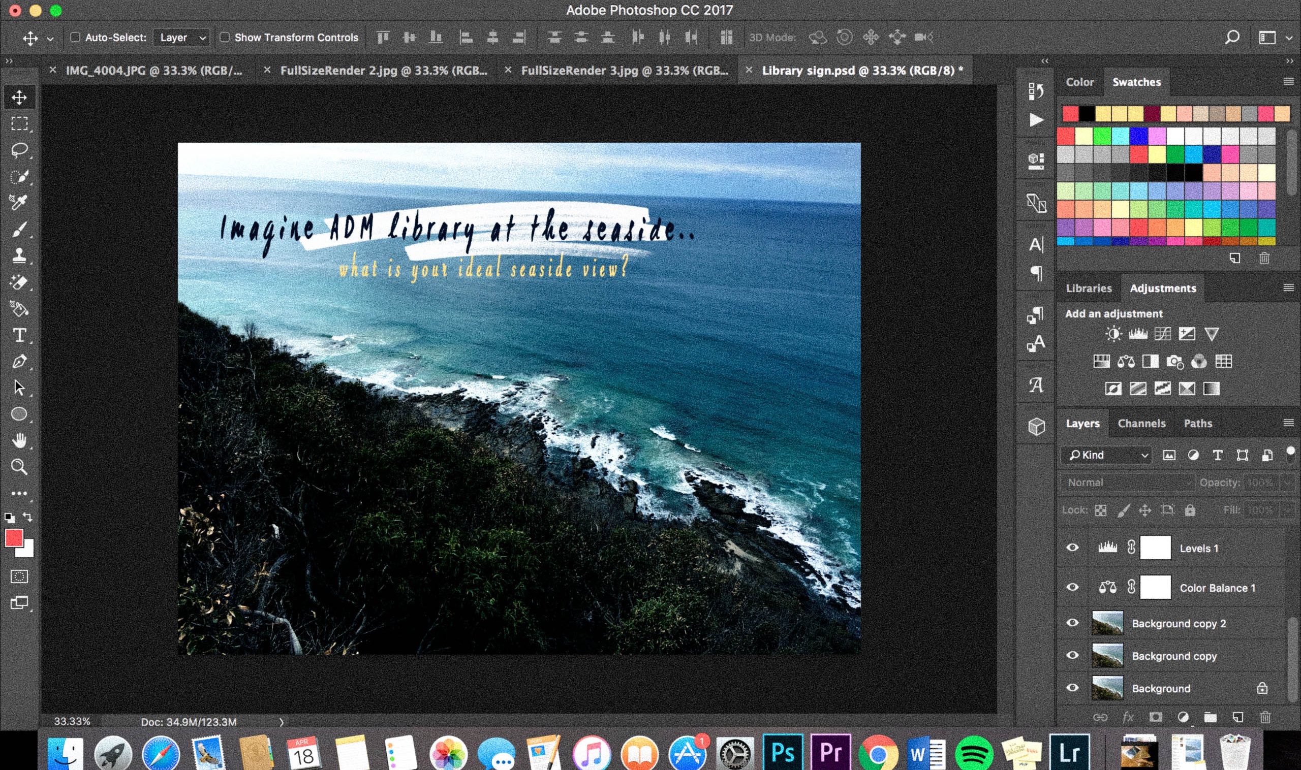
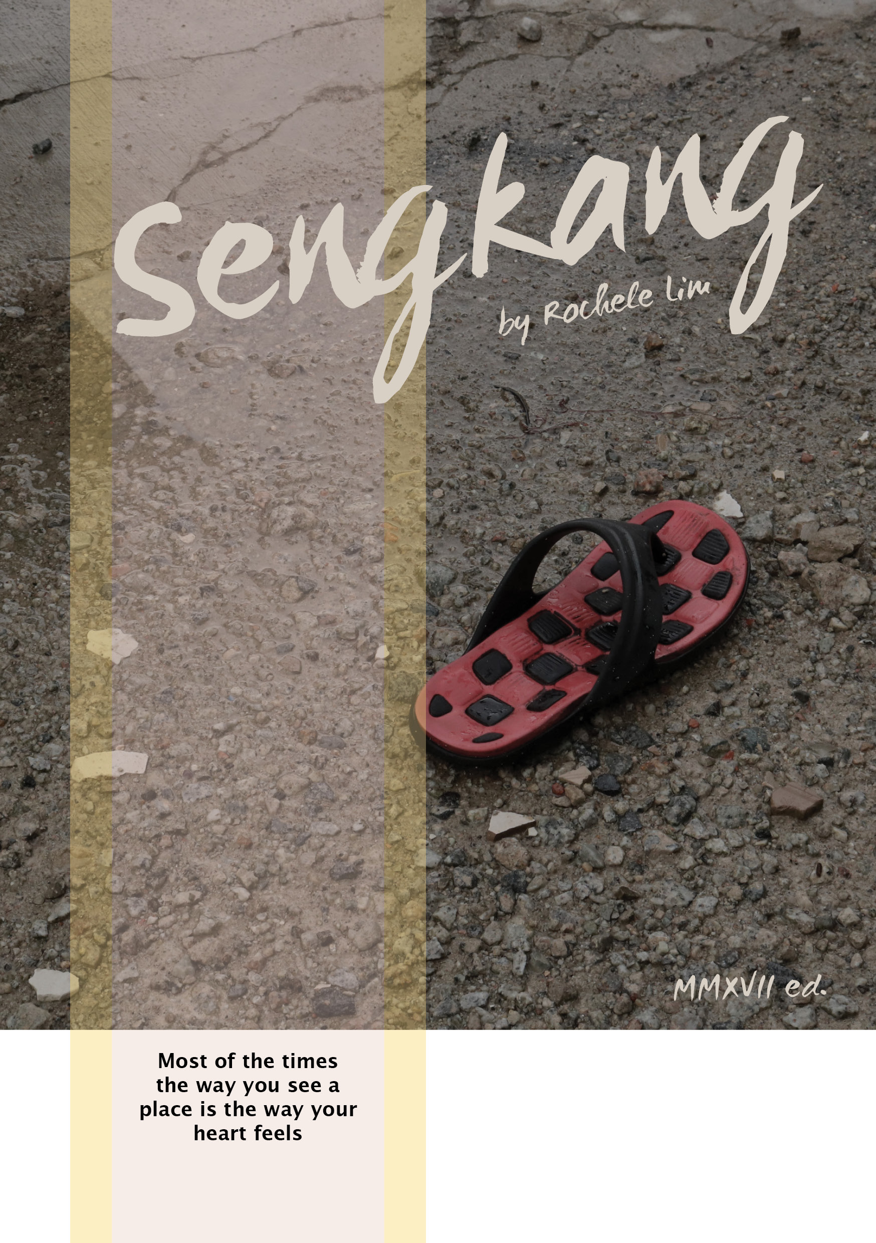
Front Cover
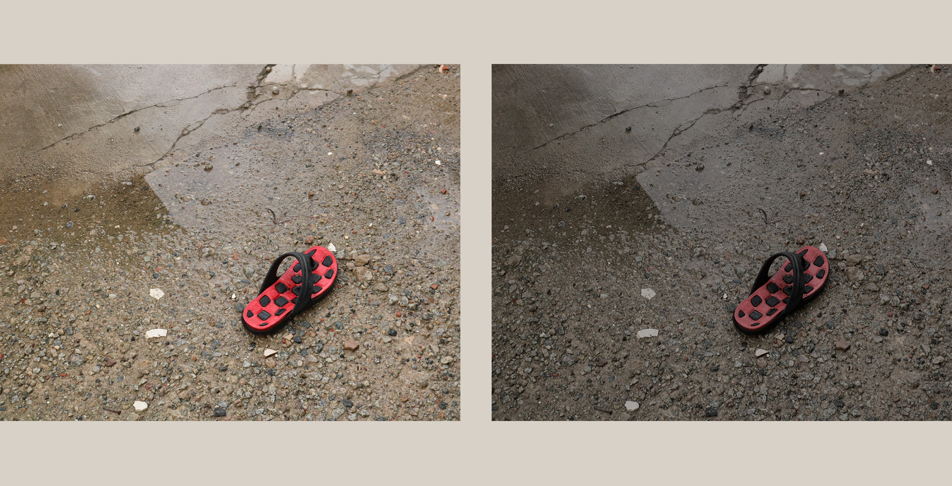
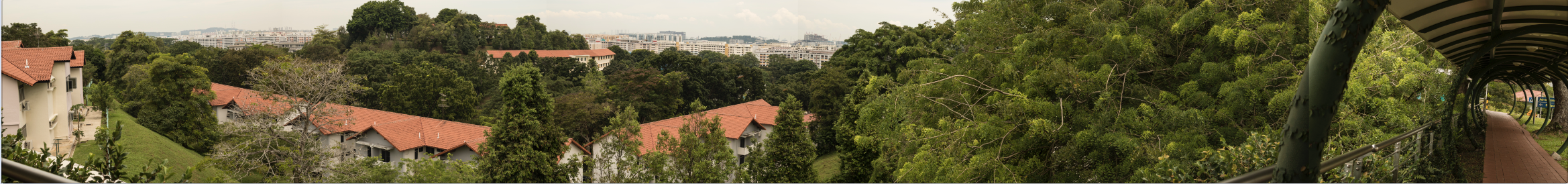
The original photos I have taken are all too bright, with pure colours which didn’t fit the theme of my photo-centric zine. I wanted dull, more muted colours to suggest a sense of melancholy, hence I desaturated all my photos and adjusted the mid-tone contrast. And ta-daaa the whole mood changes!
Some variations I made for the front cover as below.
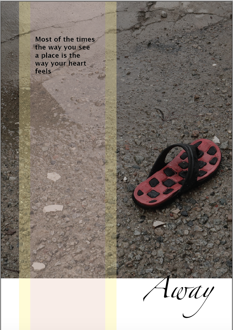
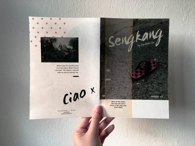
Cover #1: Decided to make the cover as simple as possible and the lonely slipper is exactly what I needed. Couldn’t really decide on the name of my zine so AWAY is what it is at the moment.
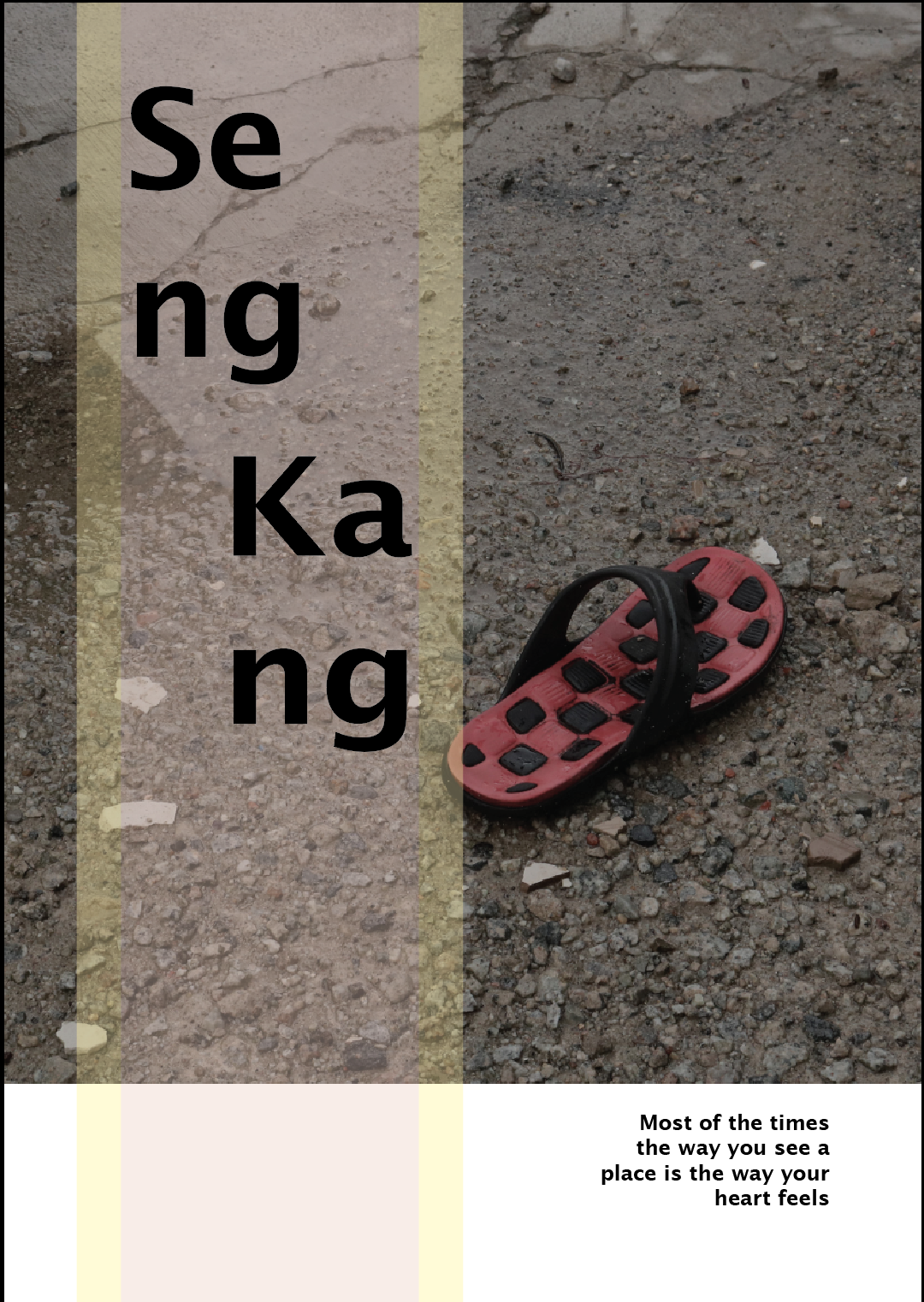
Cover #2: Moved the paragraph text to the bottom so that it doesn’t float and tried to play around with the letters “SENGKANG”, but after sitting on it for awhile, I feel like it’s hard to read, especially to people who don’t even know the existence of Sengkang.
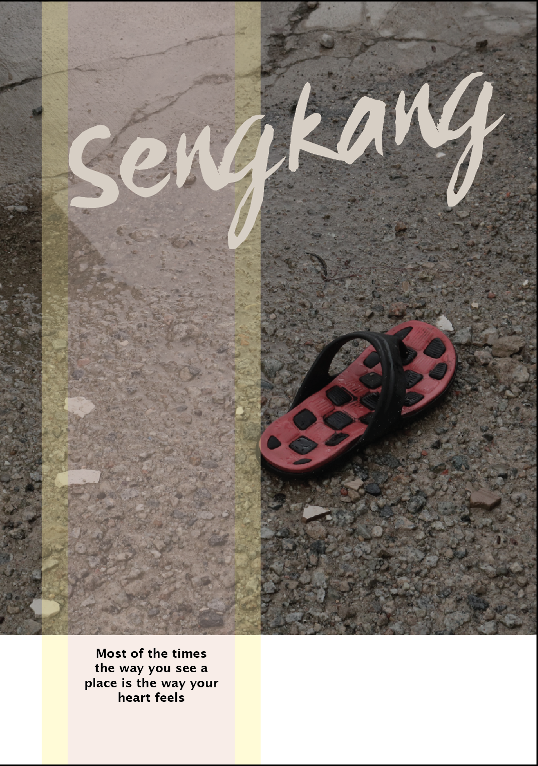
Cover #3: Felt that the previous font was a tad too rigid, went for font shopping and settled on this – handwritten letters, a little cursive yet readable! Changed the font colour because black makes it looks like it is screaming at me..and way too cold (??) as well as professional. Also, moved the paragraph text again to the bottom left so that the page looks less crowded with that extra white space.
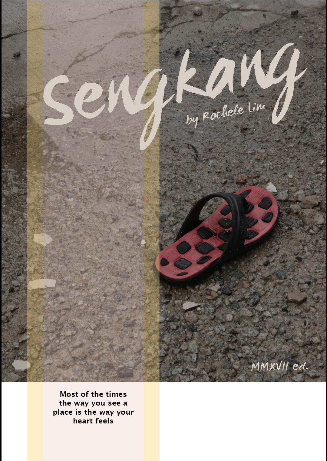
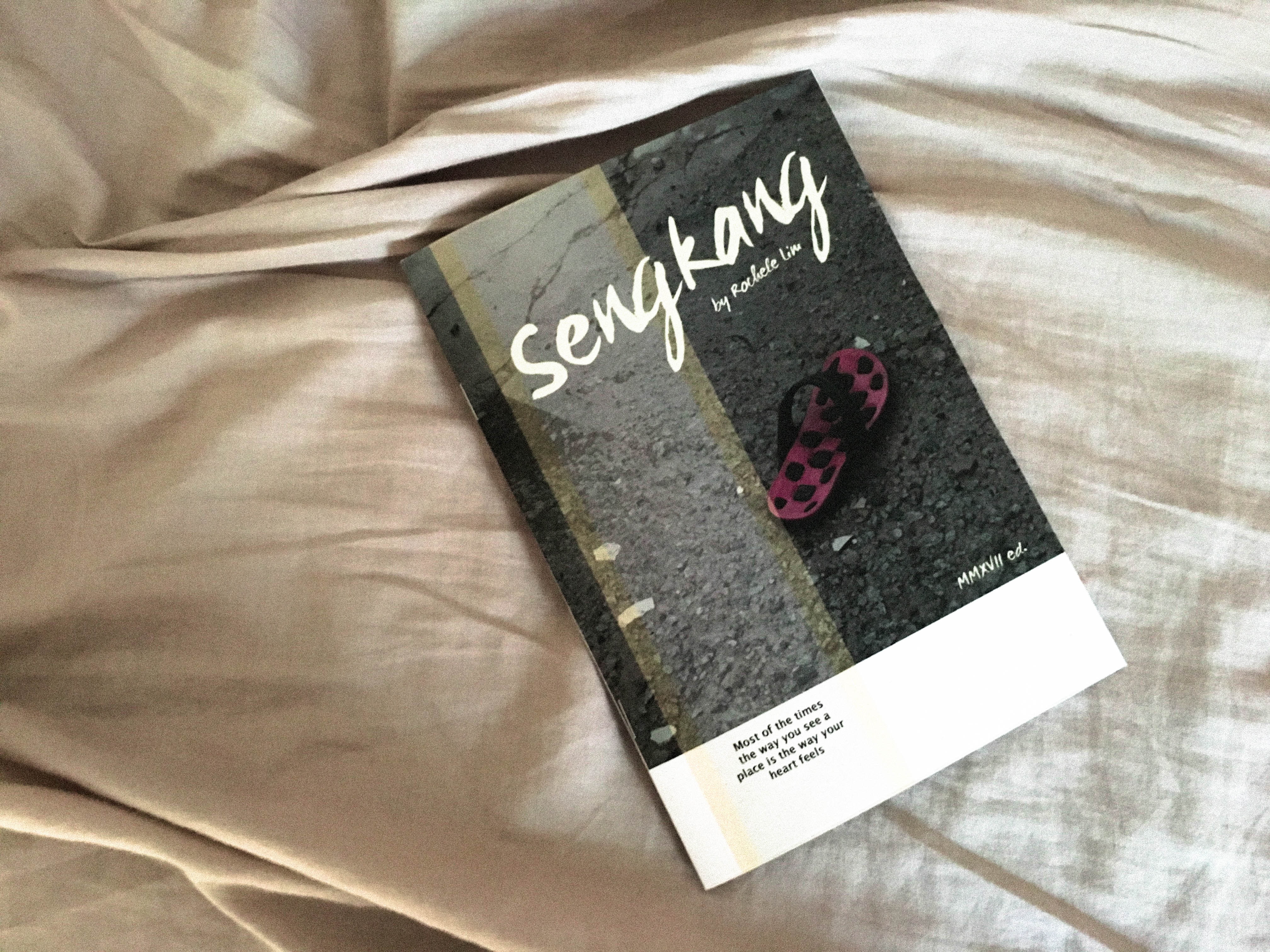
[FINAL] Cover #4: Added in some elements.. and finally it’s good to go!
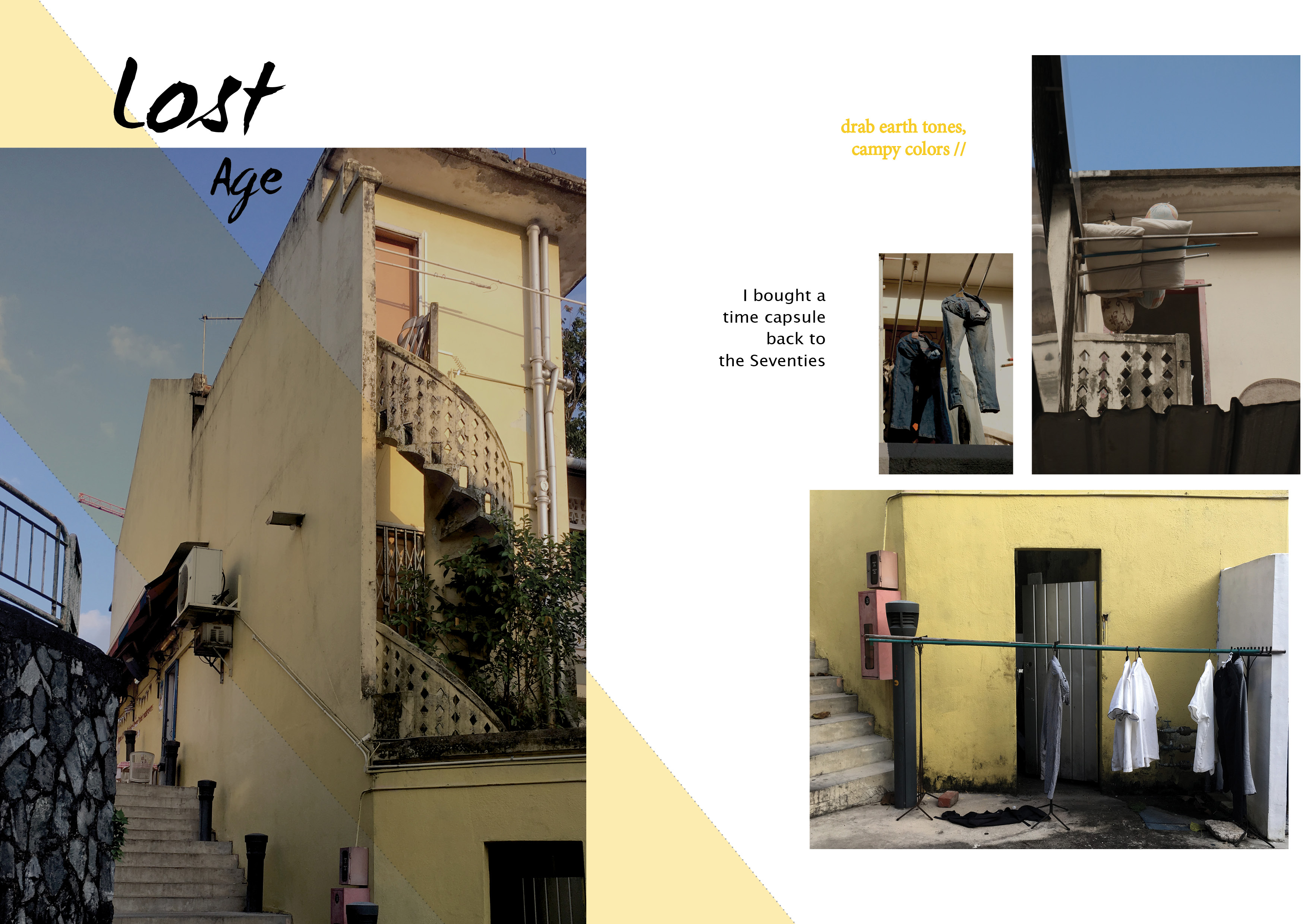
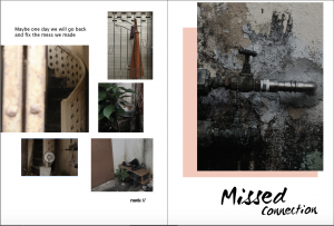
IFC & PAGE 3
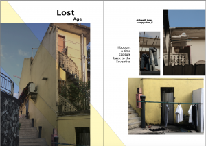
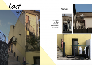
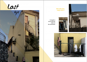
From top:
I started designing my layout by arranging the photos so that their colours fit well to one another on a plain white background. Felt that the visual hierarchy wasn’t strong enough, Prof Shirley suggested me to cut off the sky of the smallest photo. The photos look boring so I added a yellow colour box with about 30% opacity that cuts across the spread – to show connection between the two pages so that the photos don’t look like they are all individual entities.
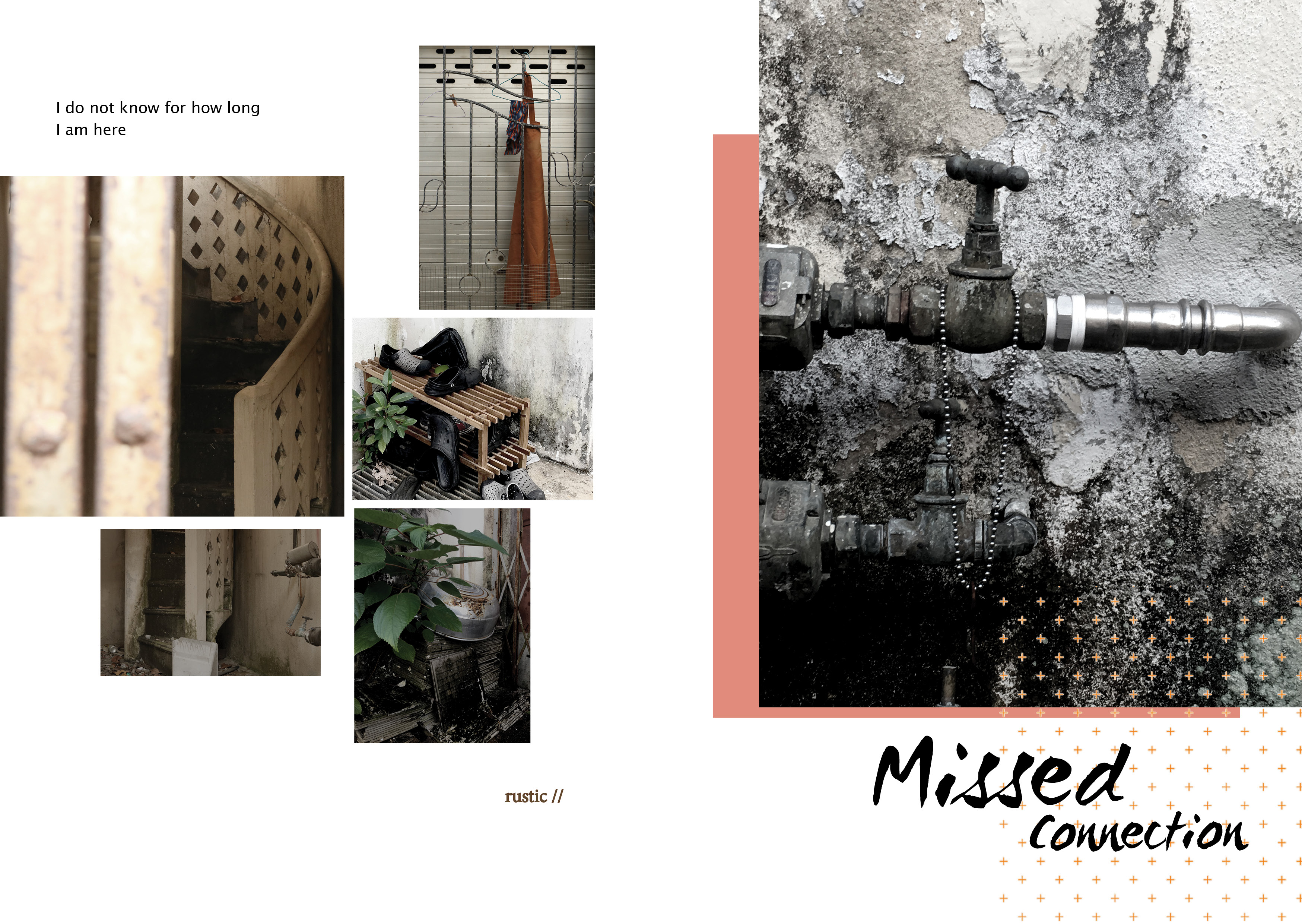
Page 4 & Page 5
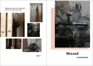
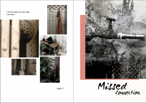
From top:
I did the same layout for this spread – a large photo at one page and reduces each photo size for the next page, to match the spread before this. To spice things up a little, I played with colour box again to give it a contrast and depth. Also I added the tiny cross patterns at the right bottom to make the whole spread looks slightly quirky.
Page 6 & IBC
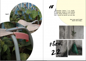
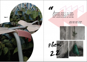
From top:
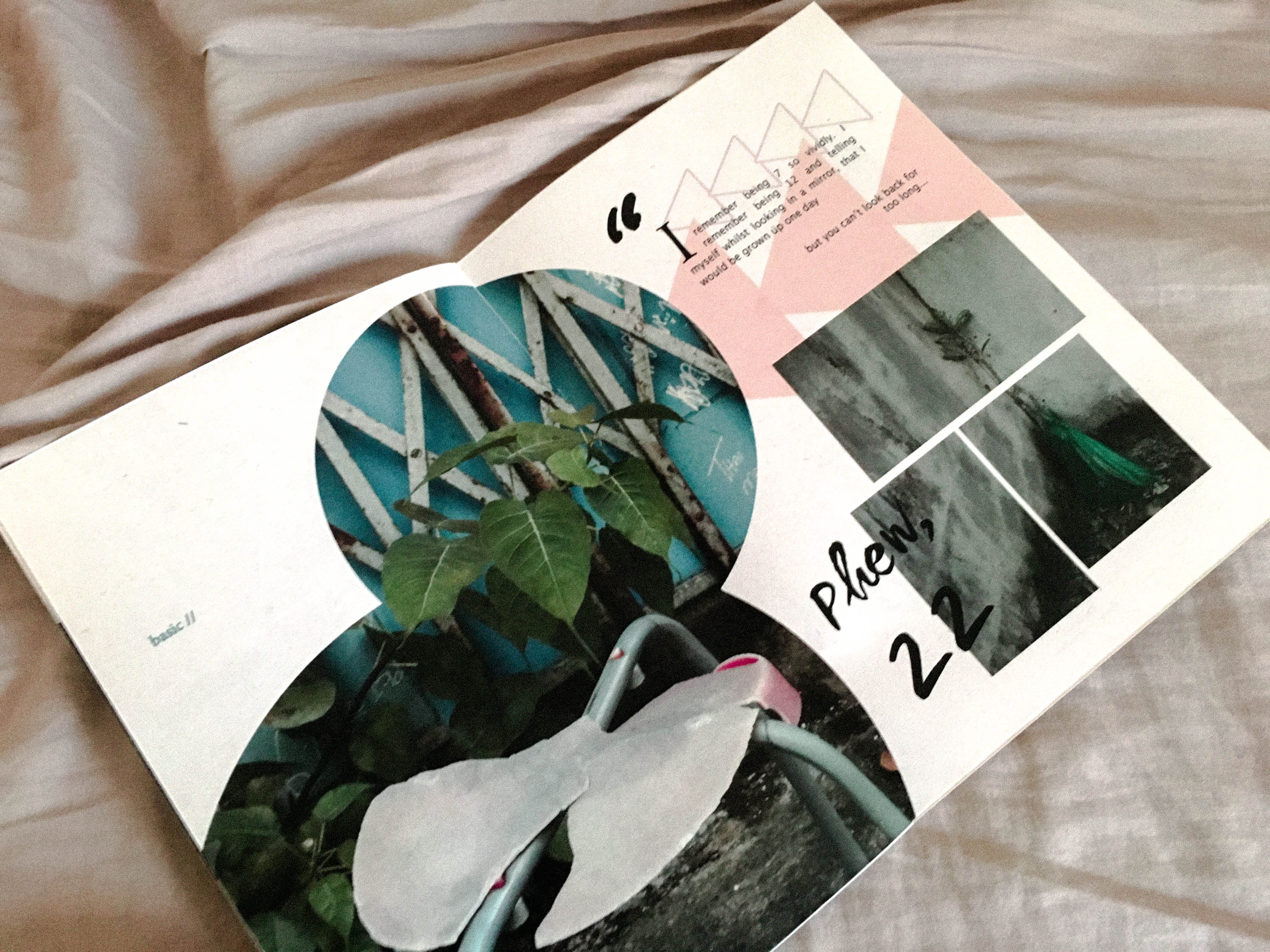
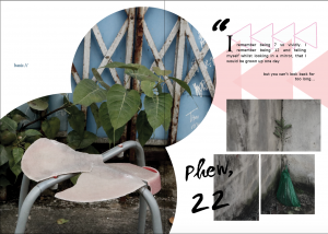
Here comes the final spread. I figured I need to do something different from my previous two spreads and hence I placed my photos into two big circular shapes. Initially, I used two photos (with a slight variation; taken at different angles) in two circles and made them link in the middle (?). To complement this new look, I added another yellow circle as background shape on the next page. In addition, I broke the plant photo into fragments to match my broken stool.
But it was still lacking something.
The yellow circle didn’t look pleasing to my eyes. SO I switched it to triangles instead – in the text, I mentioned “looking back”, hence it might be appropriate to place a few triangles and form the “rewind” icon. I chose pink this time to match the colour of the stool so that the whole spread have a consistent colour scheme, rather than having a yellow shape that pops out itself. During consultation, Prof. Shirley experimented with me by placing only one photo in the two circles and scaled up the circular shapes to break the spread, leaving a breathing space on the top left corner. The visual flow was so much better right now. I am pretty satisfied with it!
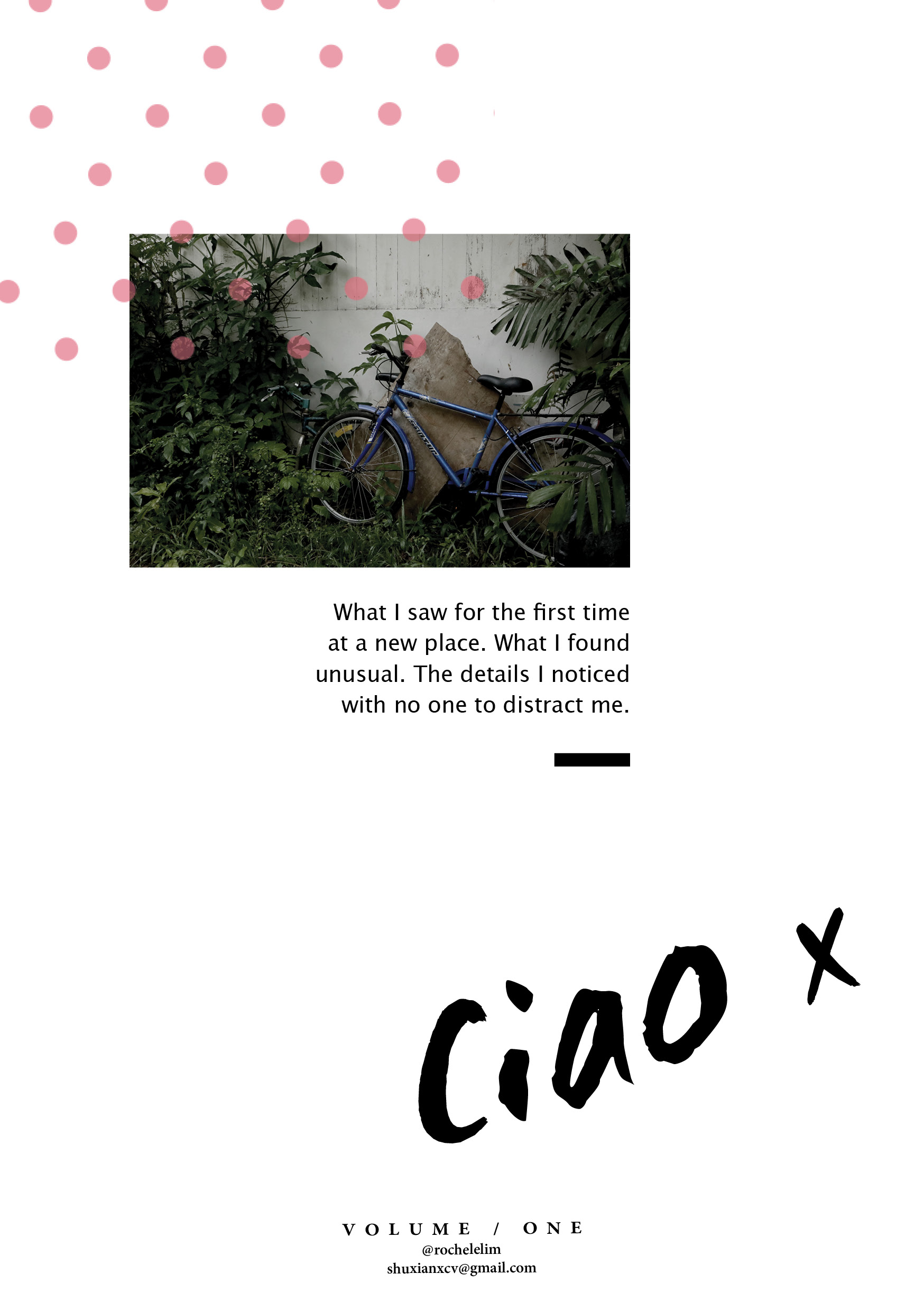
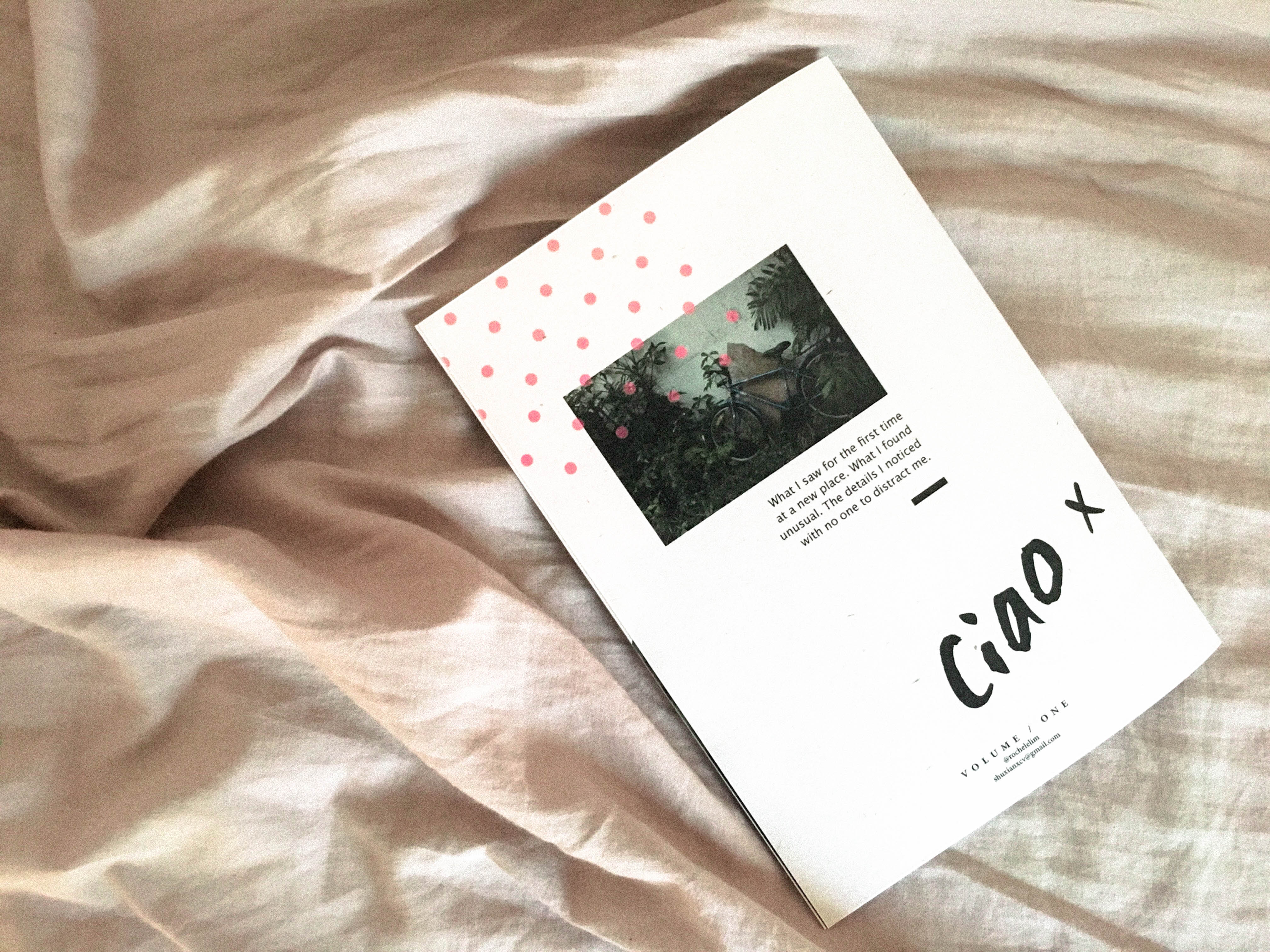
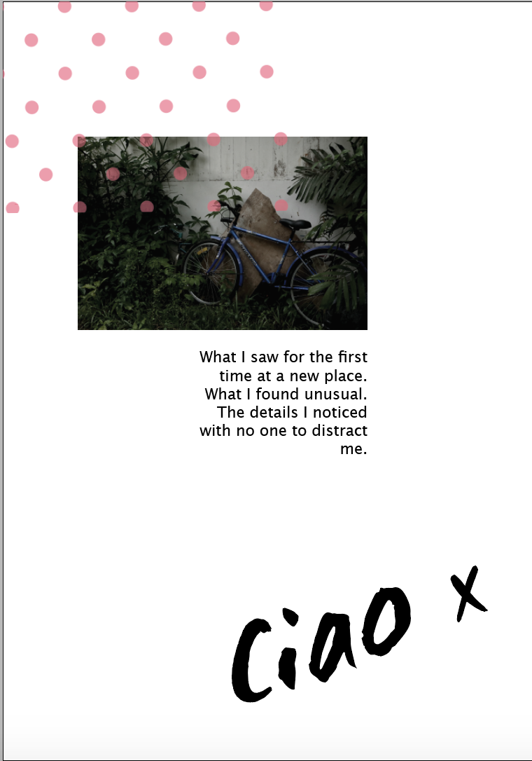
Back Cover
Didn’t really pay much attention to the back cover throughout the Indesign journey. Having a large photo on my front cover, I thought of including a smaller one at the back and have a brief description of what my zine is all about. The white background was a little boring, hence i added in the polka dots pattern to give it a fun-nature! LOVING IT.
Draft #1:
Draft #2: 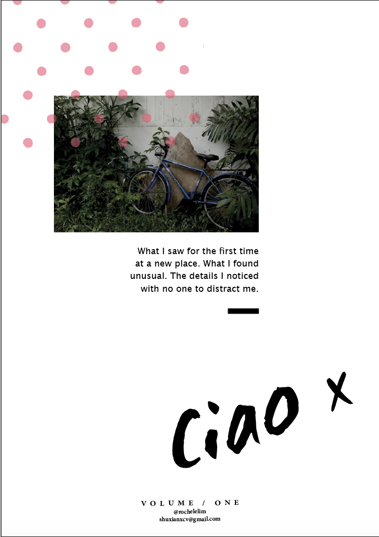
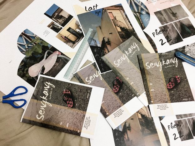
AAAAANNNND off to print!!!
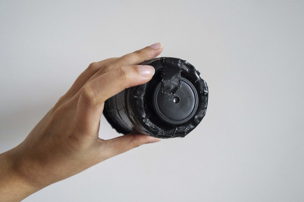
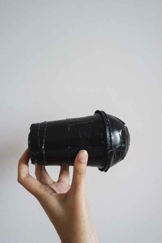
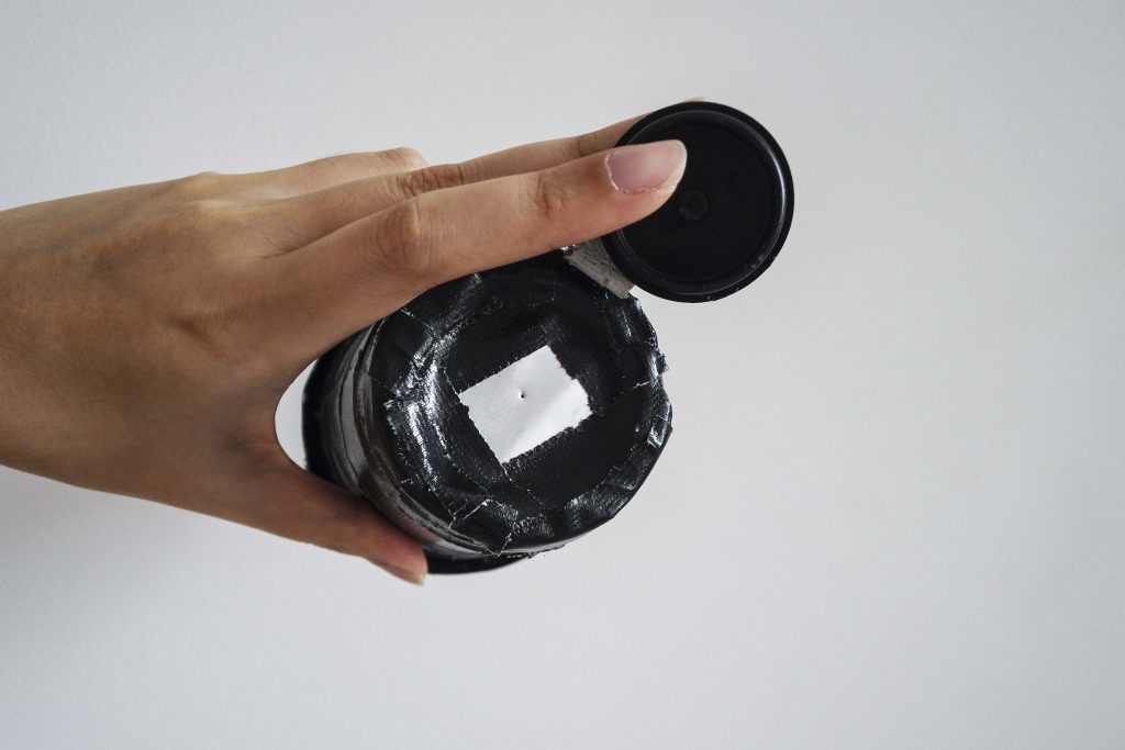
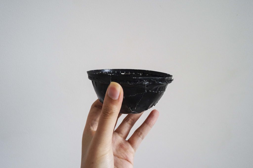


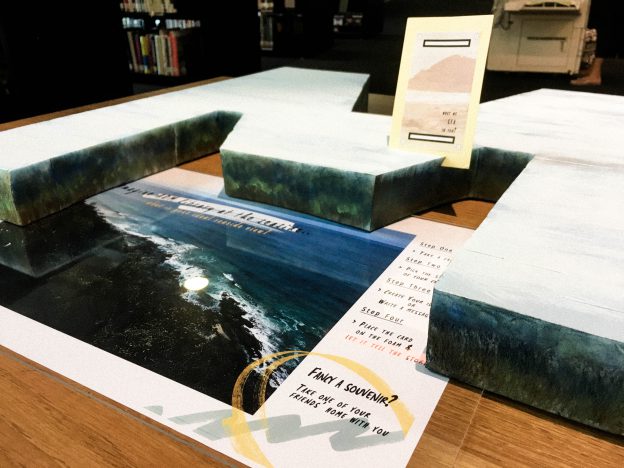
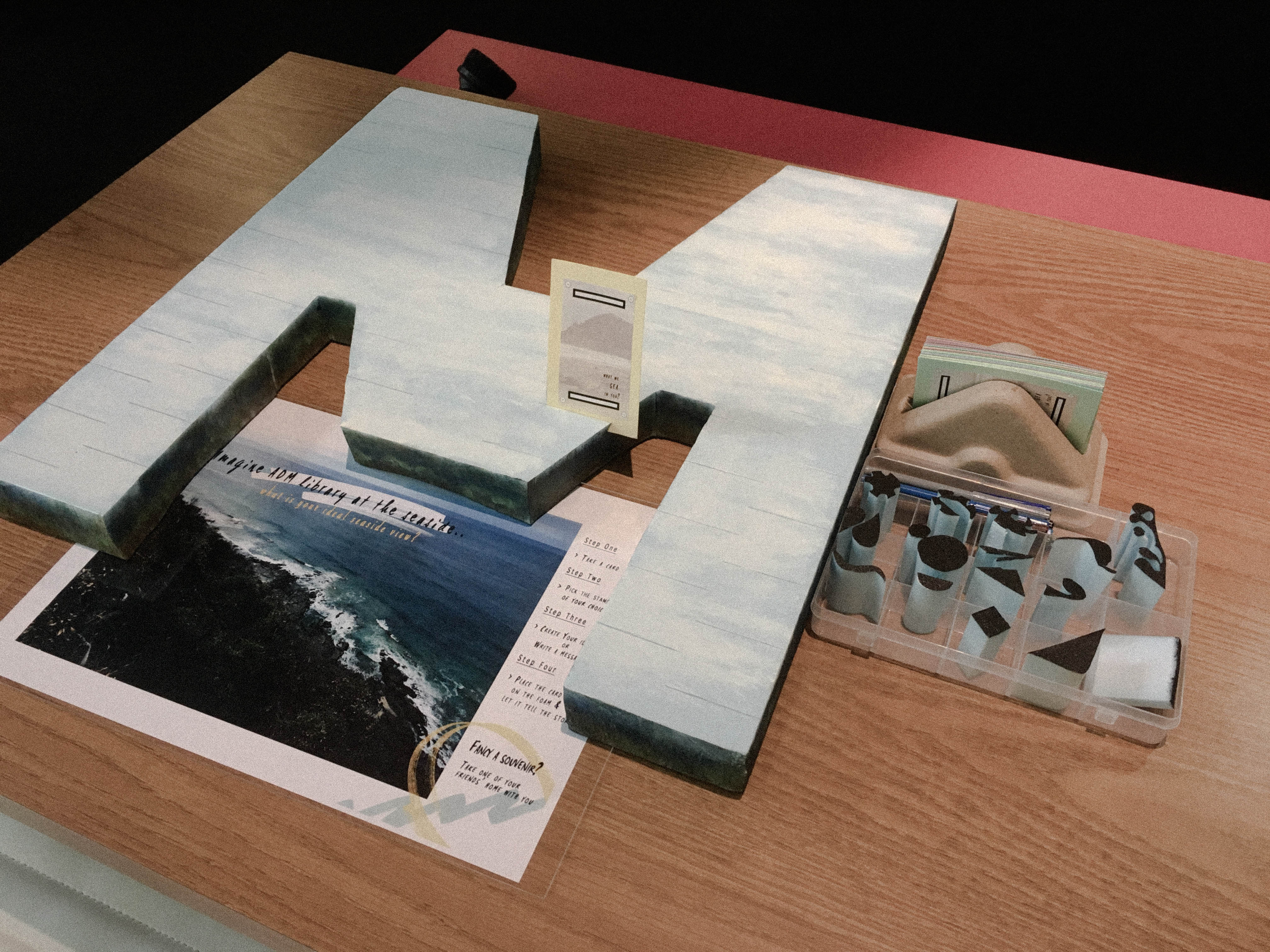
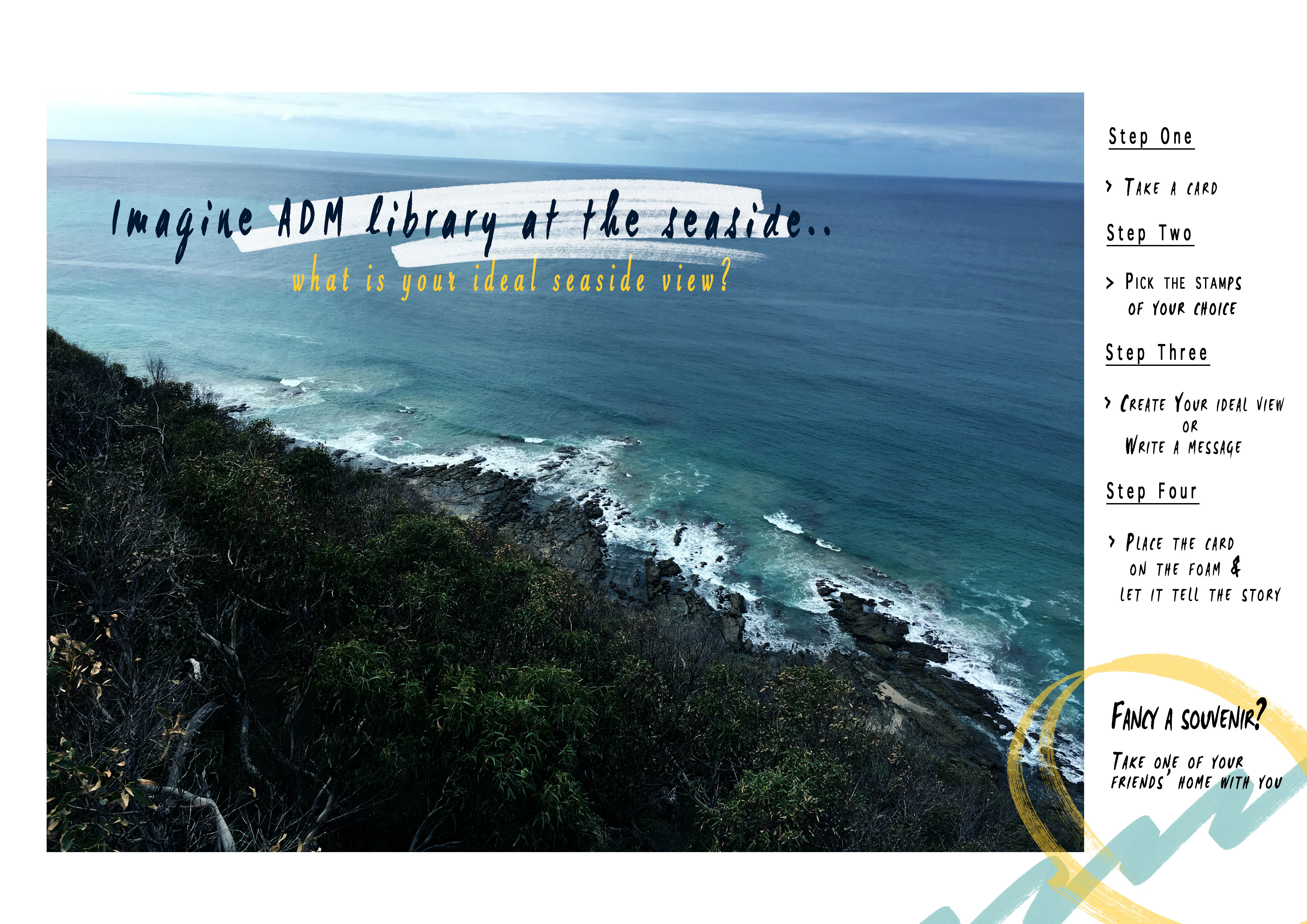
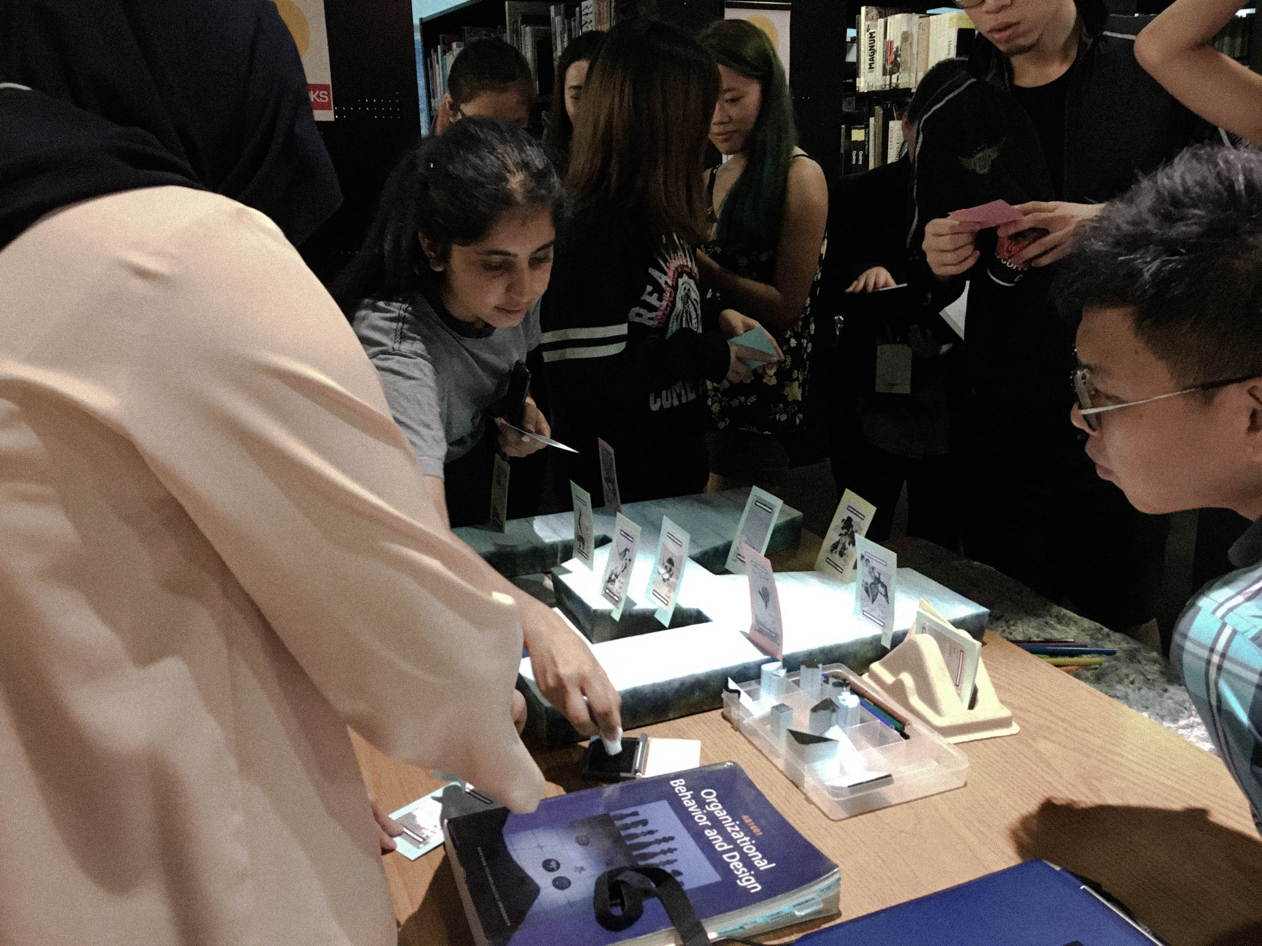
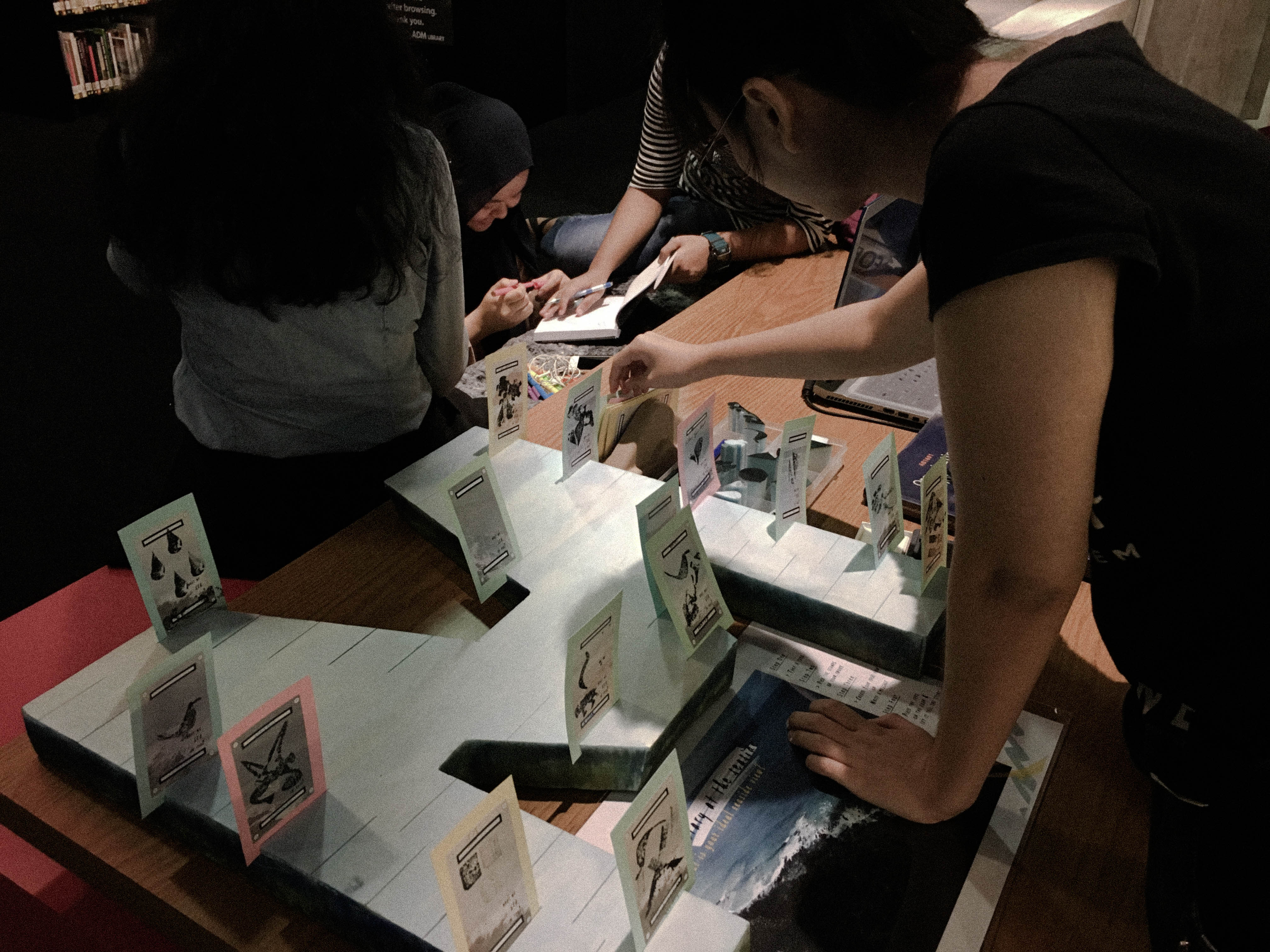
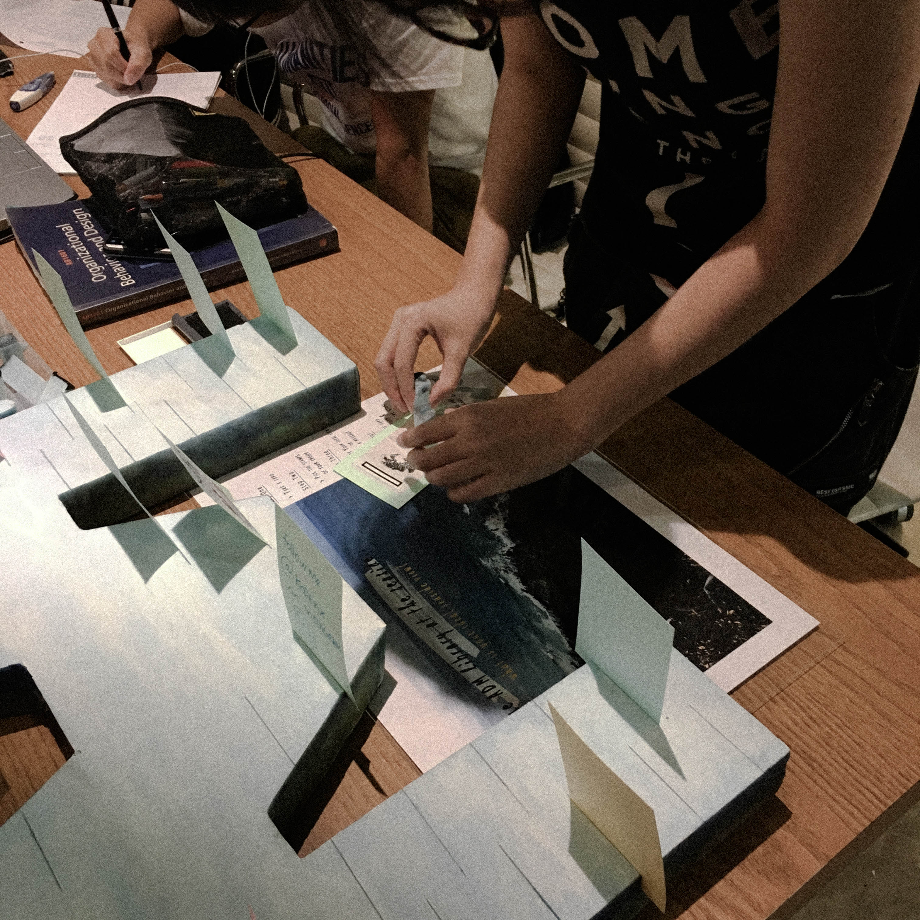
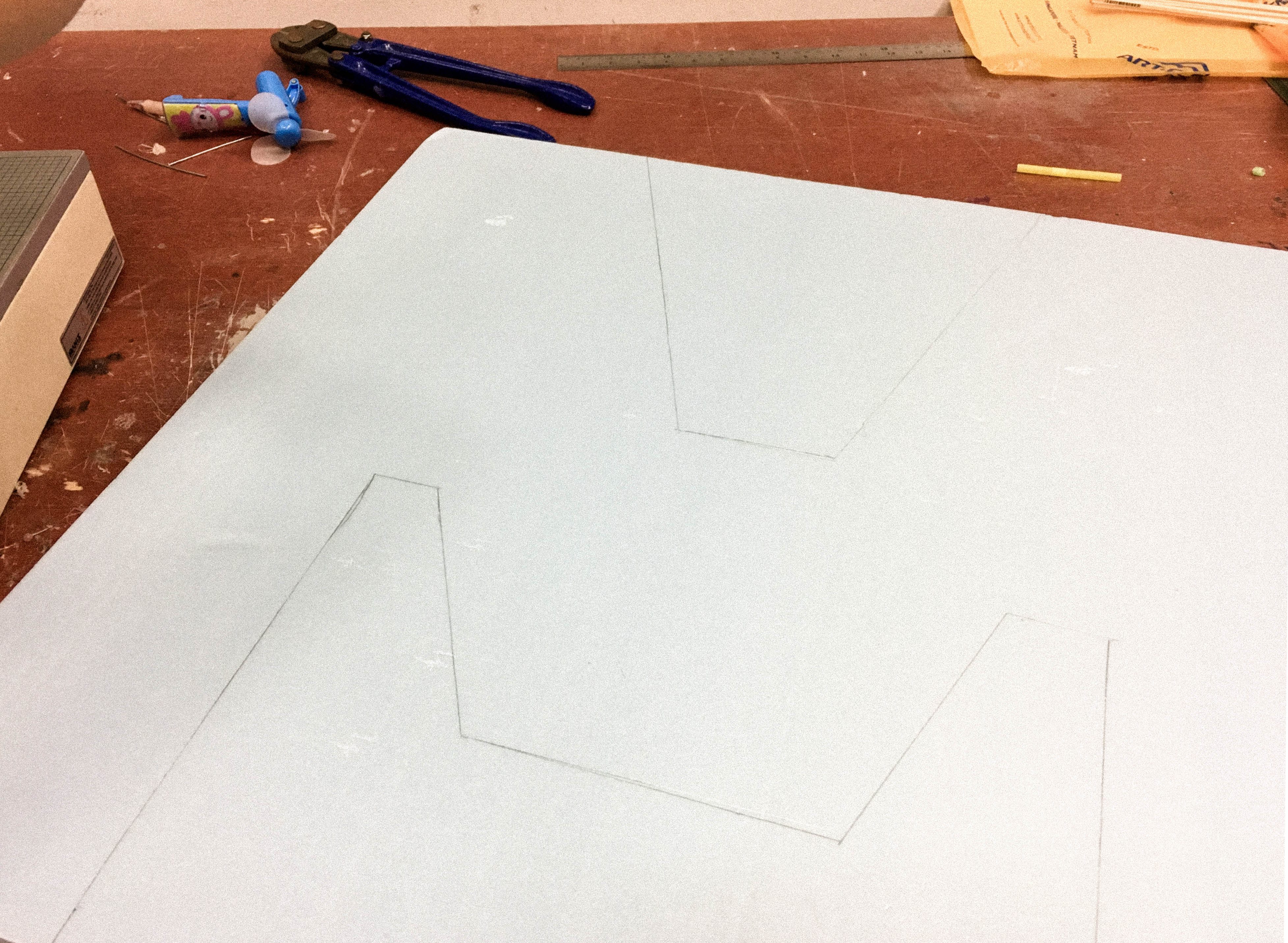
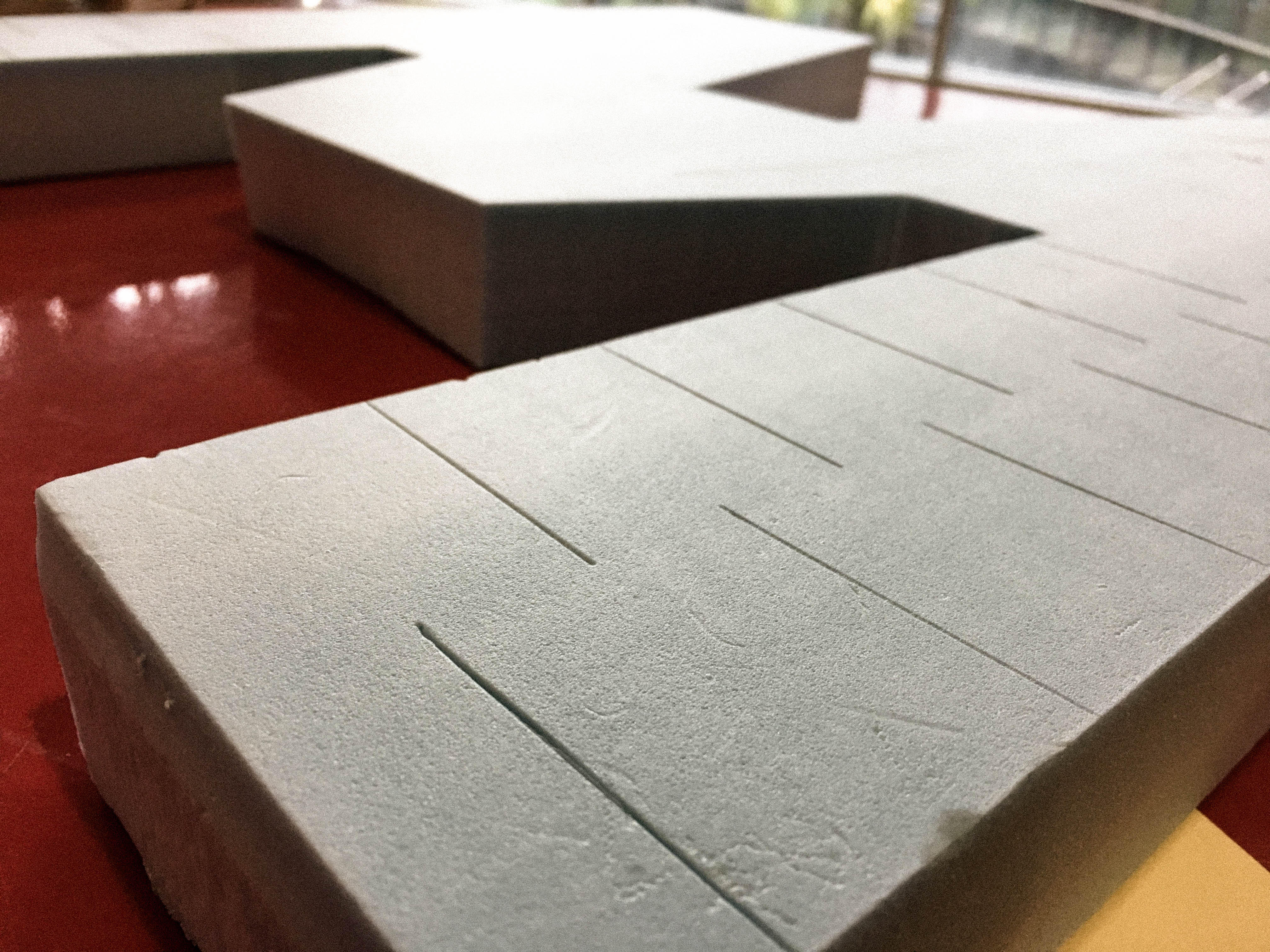
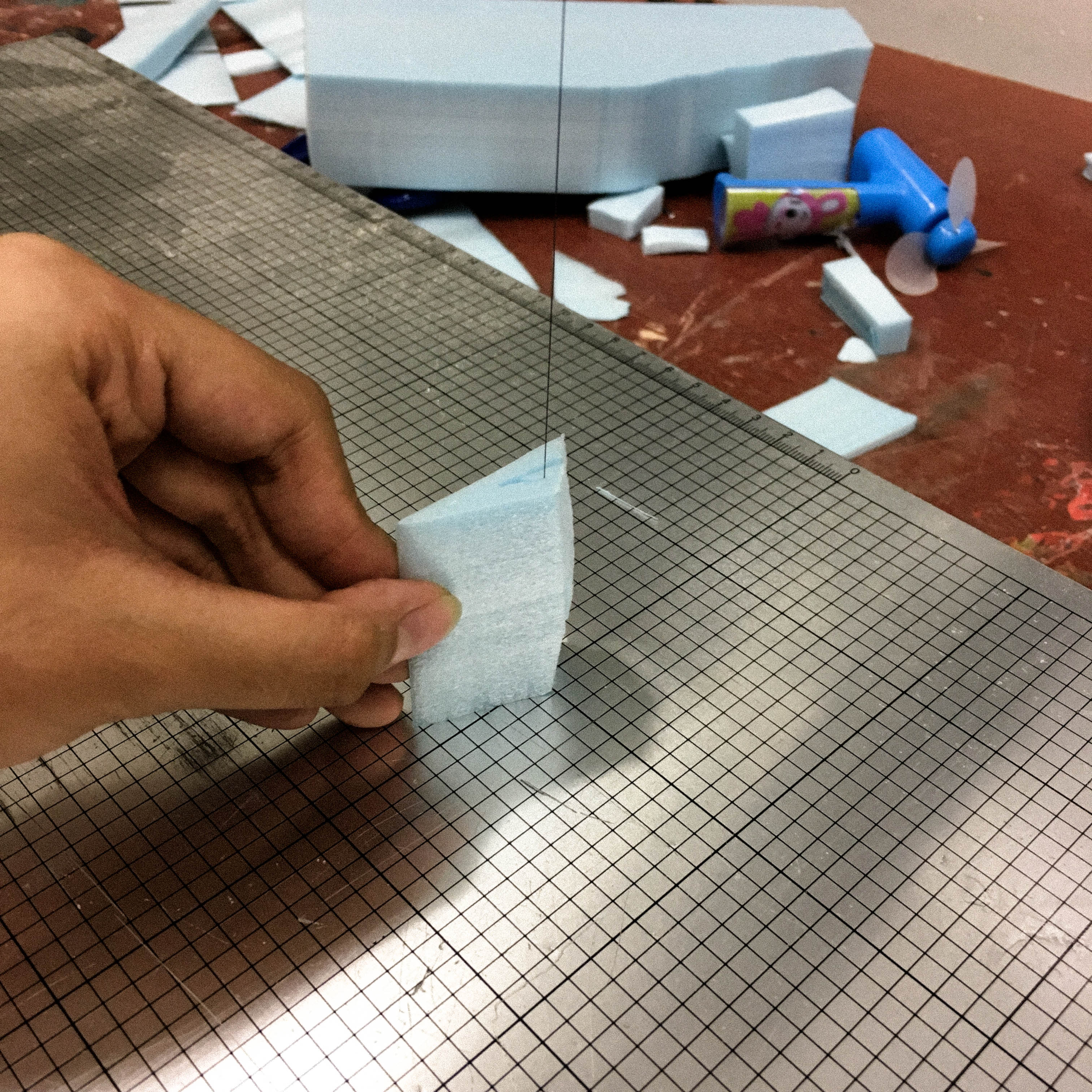
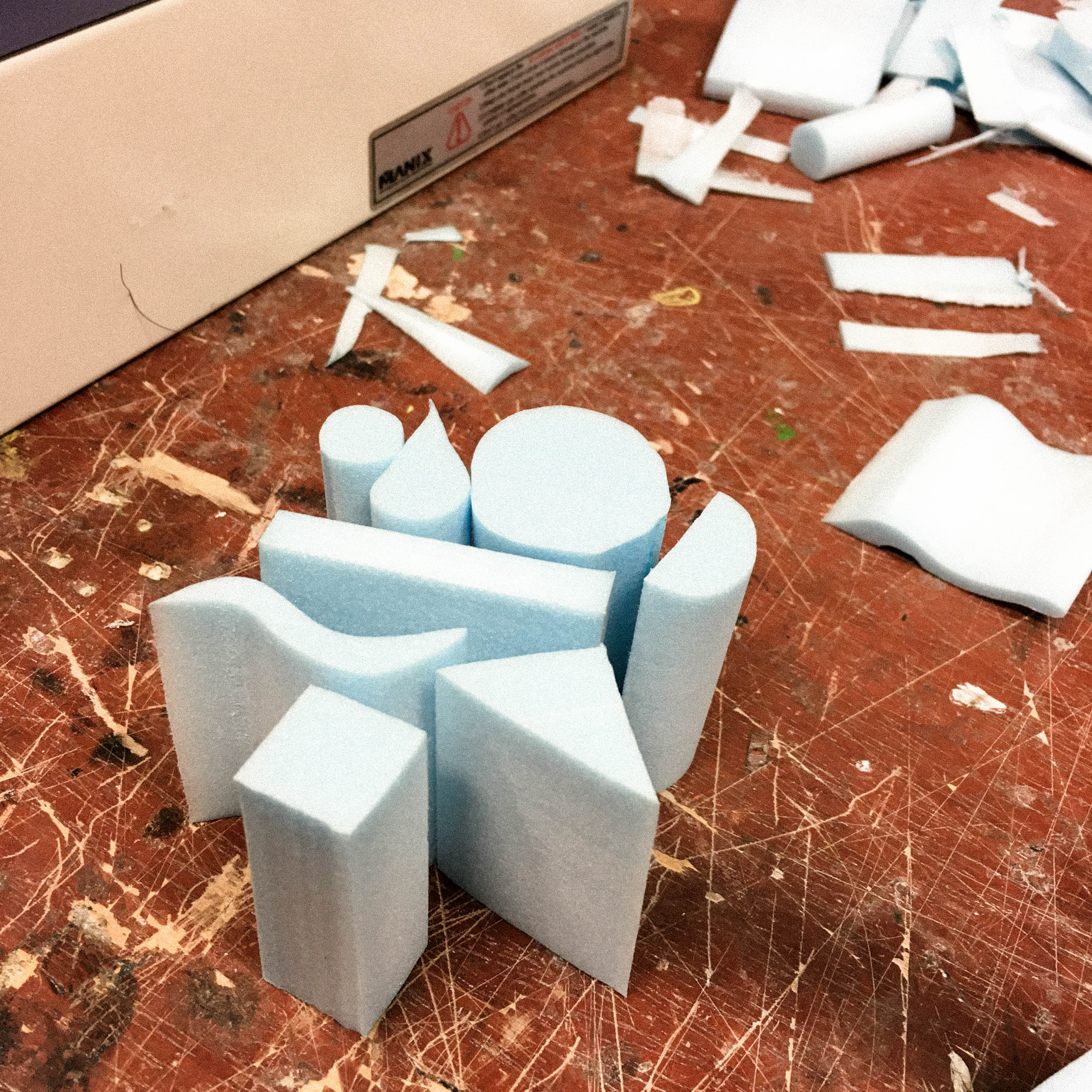
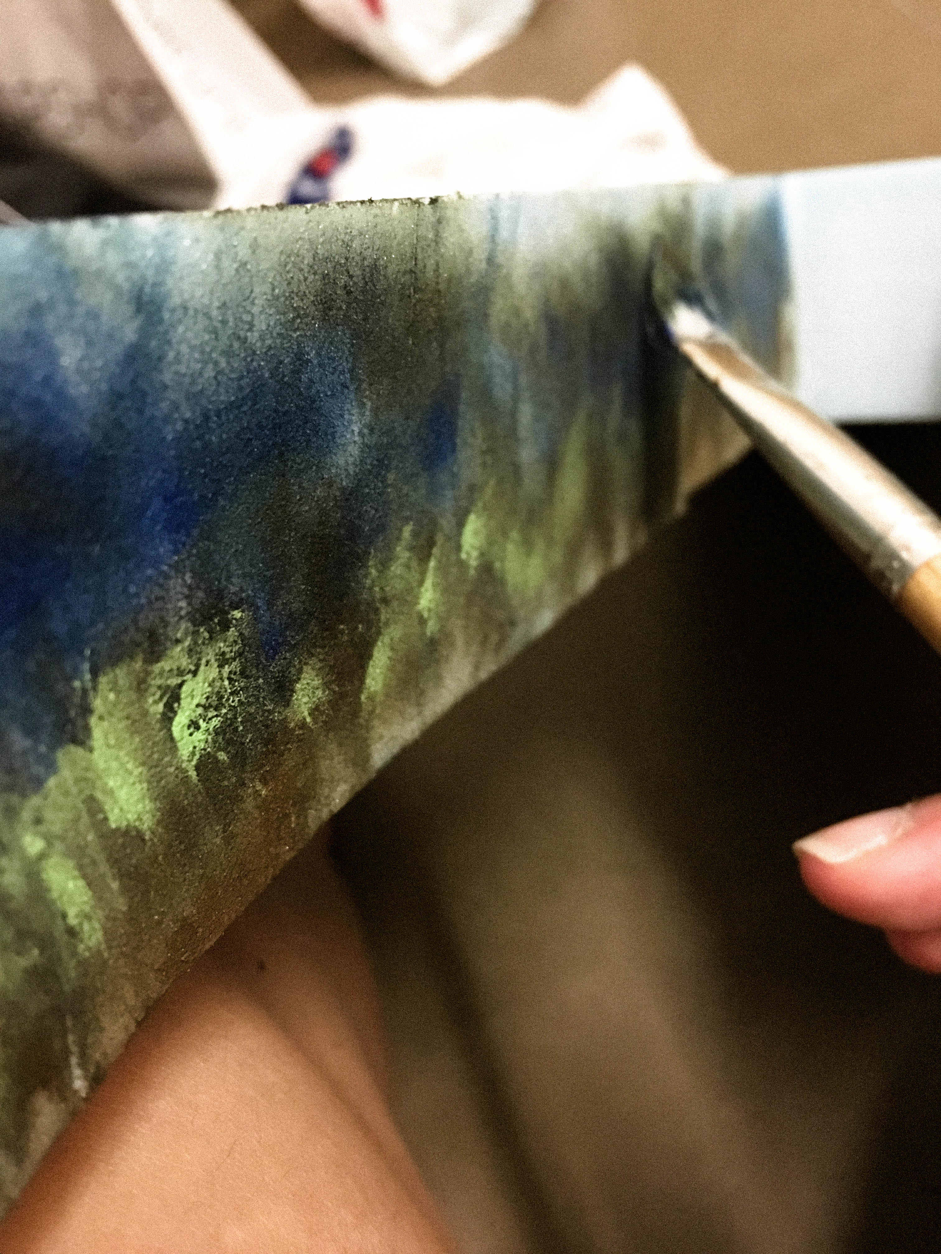
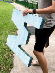
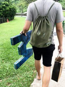
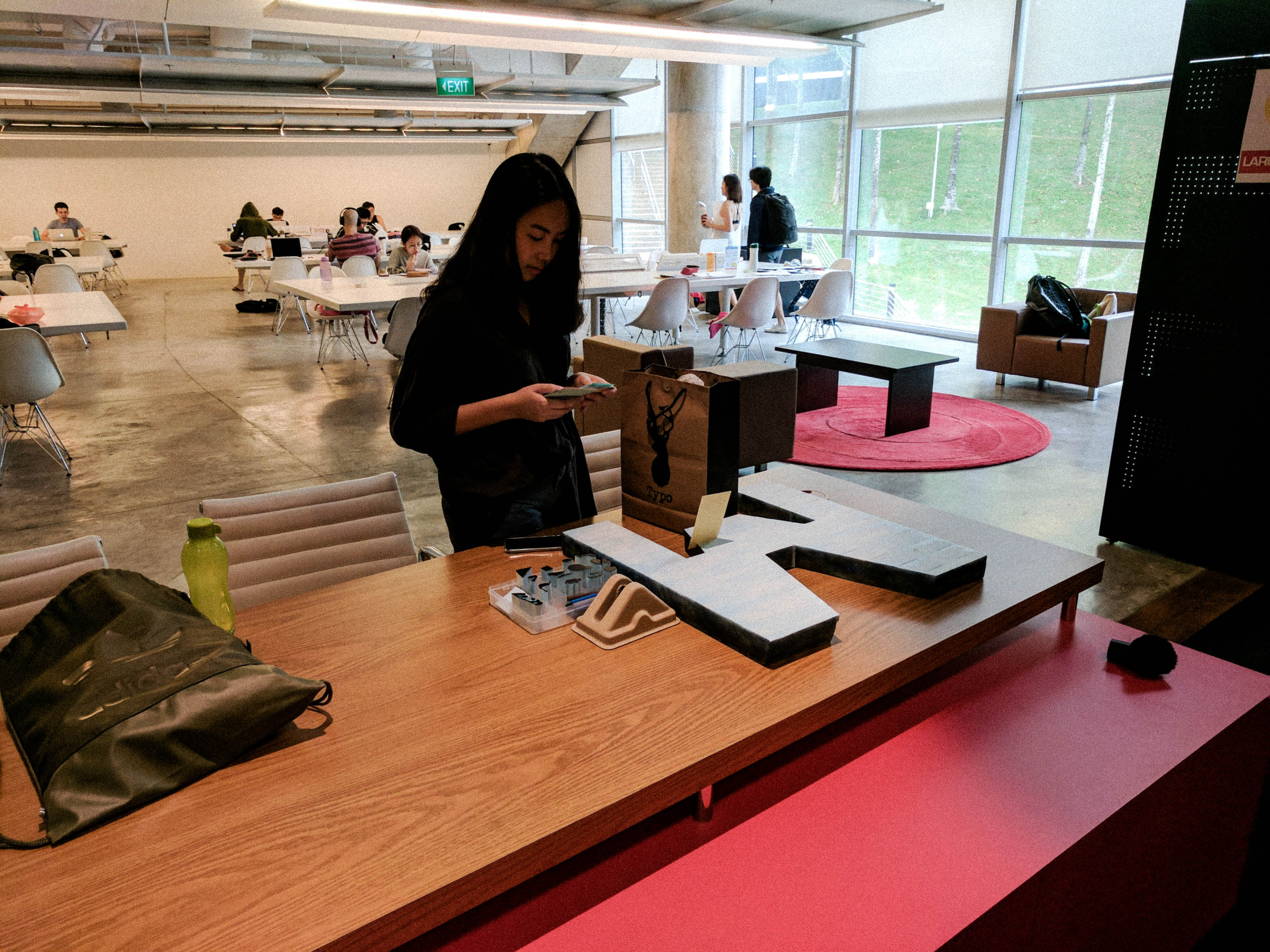
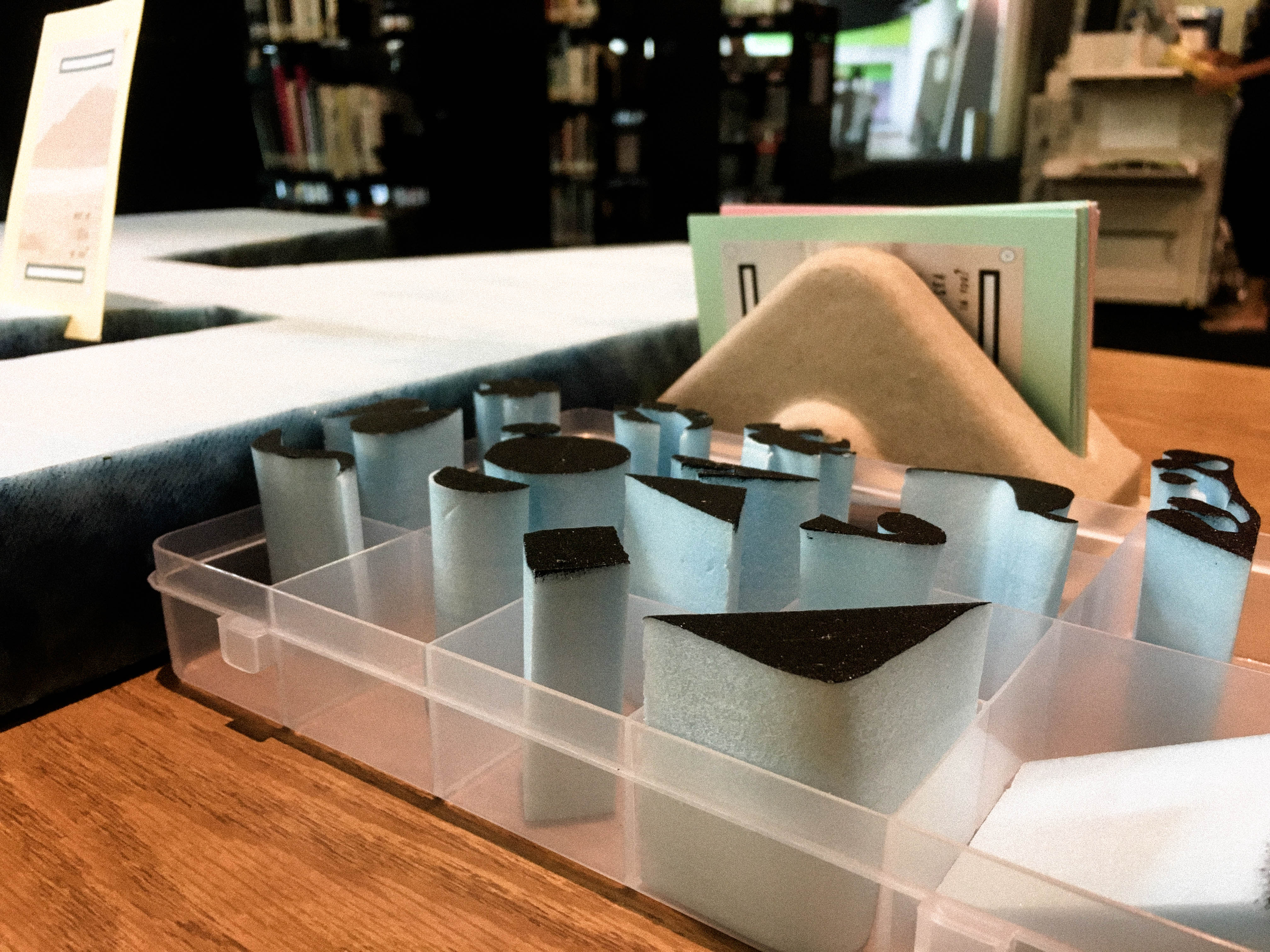
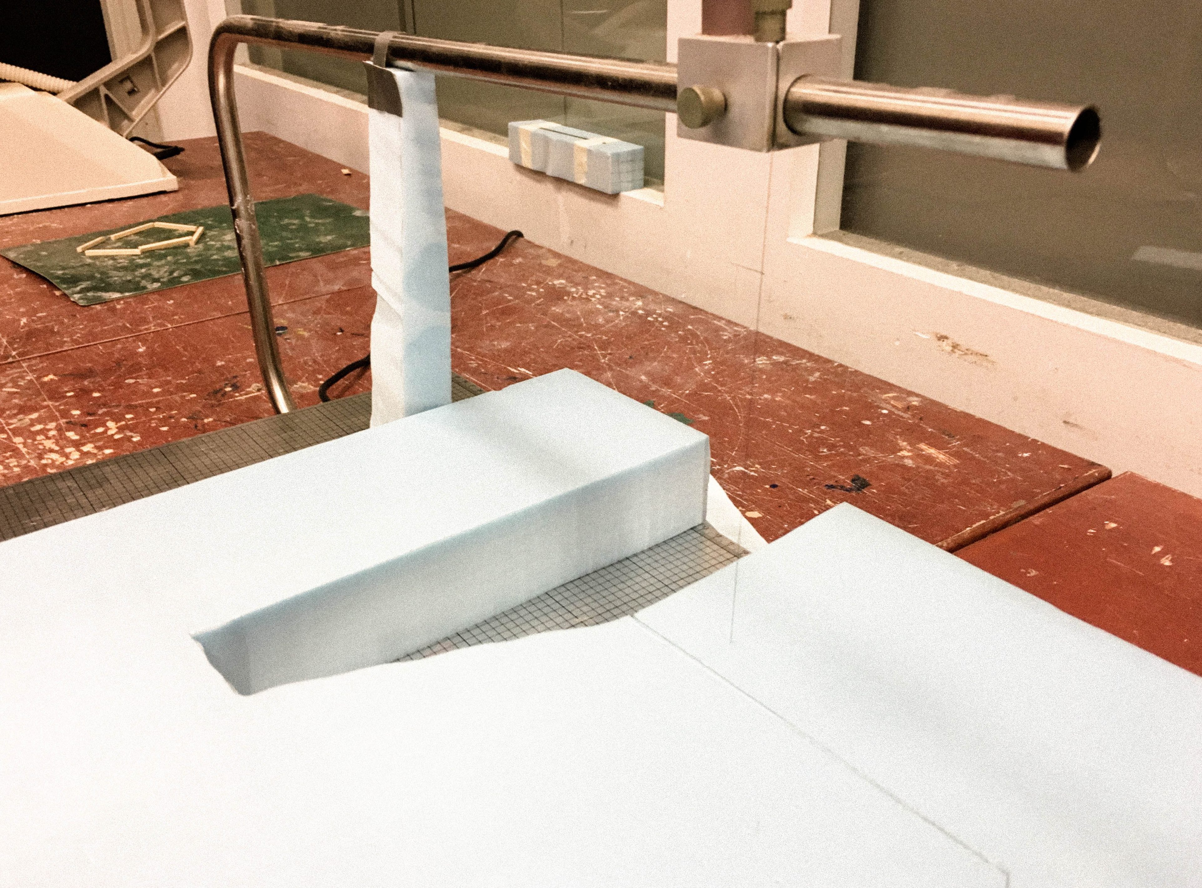 Working with such a huge foam was never easy. Due to the lack of skills, we literally broke the wire four times. Thanks to the people in the 3D studio for all the help (we were so so sorry!!)