Project One in this semester gives us the freedom to create letter forms using both literal and abstract images to express our future jobs.
After the project briefing, I started listing down some of the jobs that I am interested in as well as deciding which initials to be used.
Short-listed jobs for consultation:
- Banker/Wealth manager
- Wedding planner
- Real estate agent
- Data analyst
I did some sketches and found some reference images, only to realise my “jobs” are way too realistic and it’s boringggg! 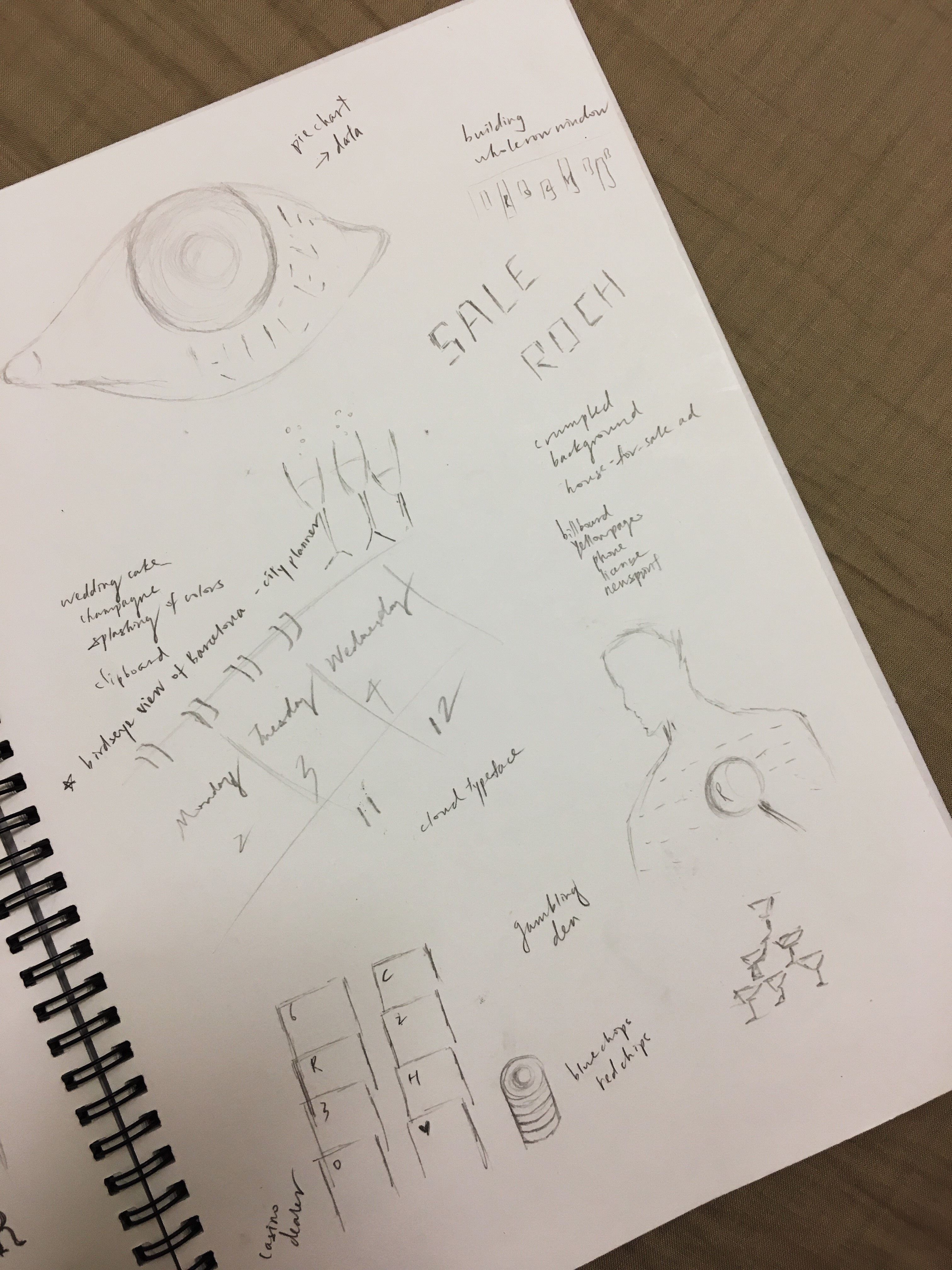
Besides, I discovered that I might have misunderstood the concept of this project. For instance, I was thinking to use newspaper as the background and red bold text for my initials to express “real estate agent”. Reference images as below:

Out-of-the-world jobs please!!
After consultation, I came up with another list of jobs:
- Hair stylist
- Barista
- Private detective
- Painter (seriously??)
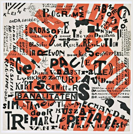
And of course, I went on to google a ton of different styles and visual elements that are related to my selected jobs.
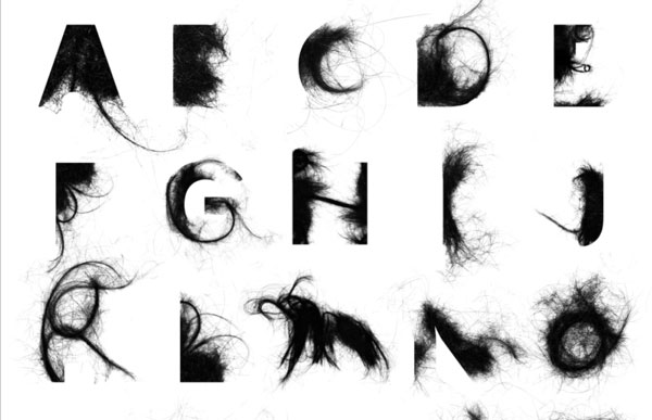
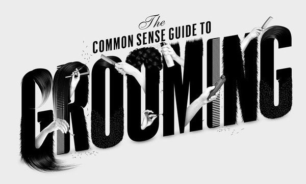
It amazes me that objects can be contorted to form different characters and they are still visible as alphabets.
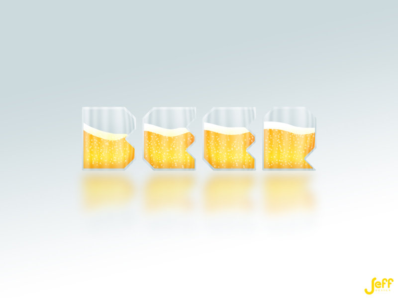
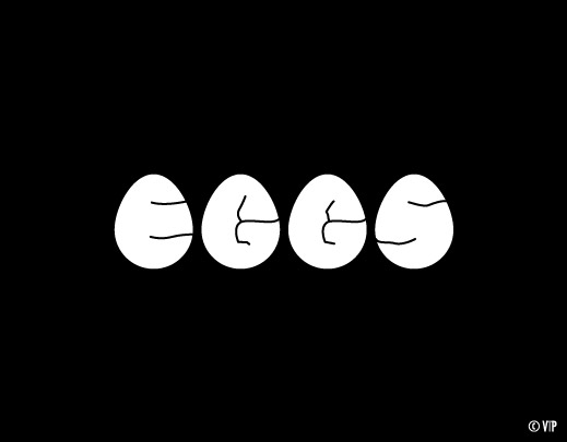
Loving how the end results are still looking realistic and not forceful! At first glance they look cute, but after spending a few seconds looking at them, we are able to notice the letters too!