#1
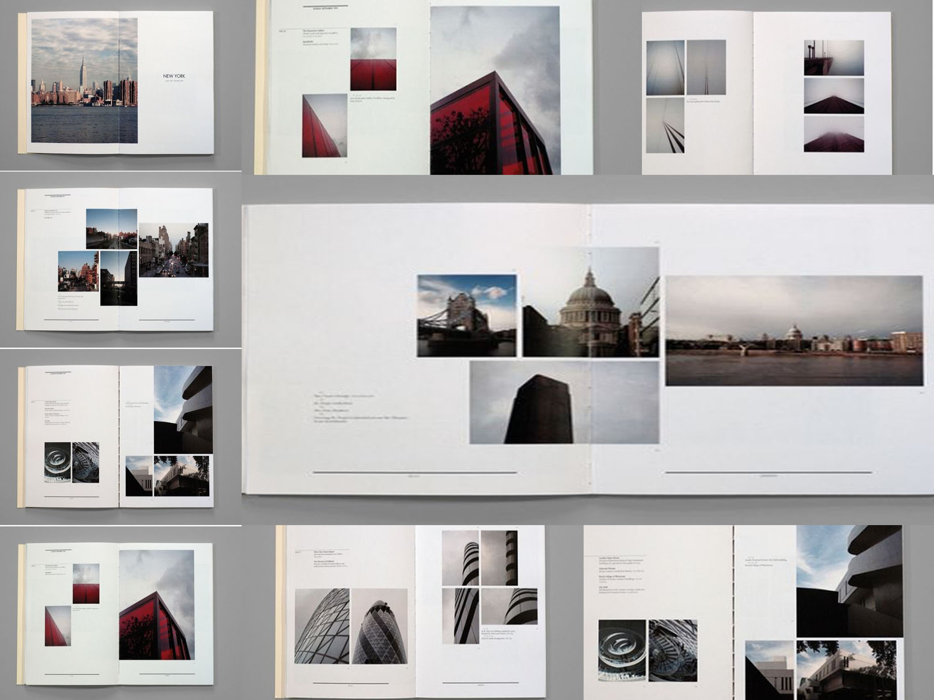
I love that the principle of hierarchy in terms of scale is being used here such that the main structure/building covers a bigger area of the page. The designer then zooms in on the details of the structure with smaller photos aside. Besides, there is a substantial negative space left around the photos which makes the elements more visible to the readers. The typefaces used are all the same size and weight, achieving equivalency so that readers’ attention is drawn to the visuals rather than text.
#2
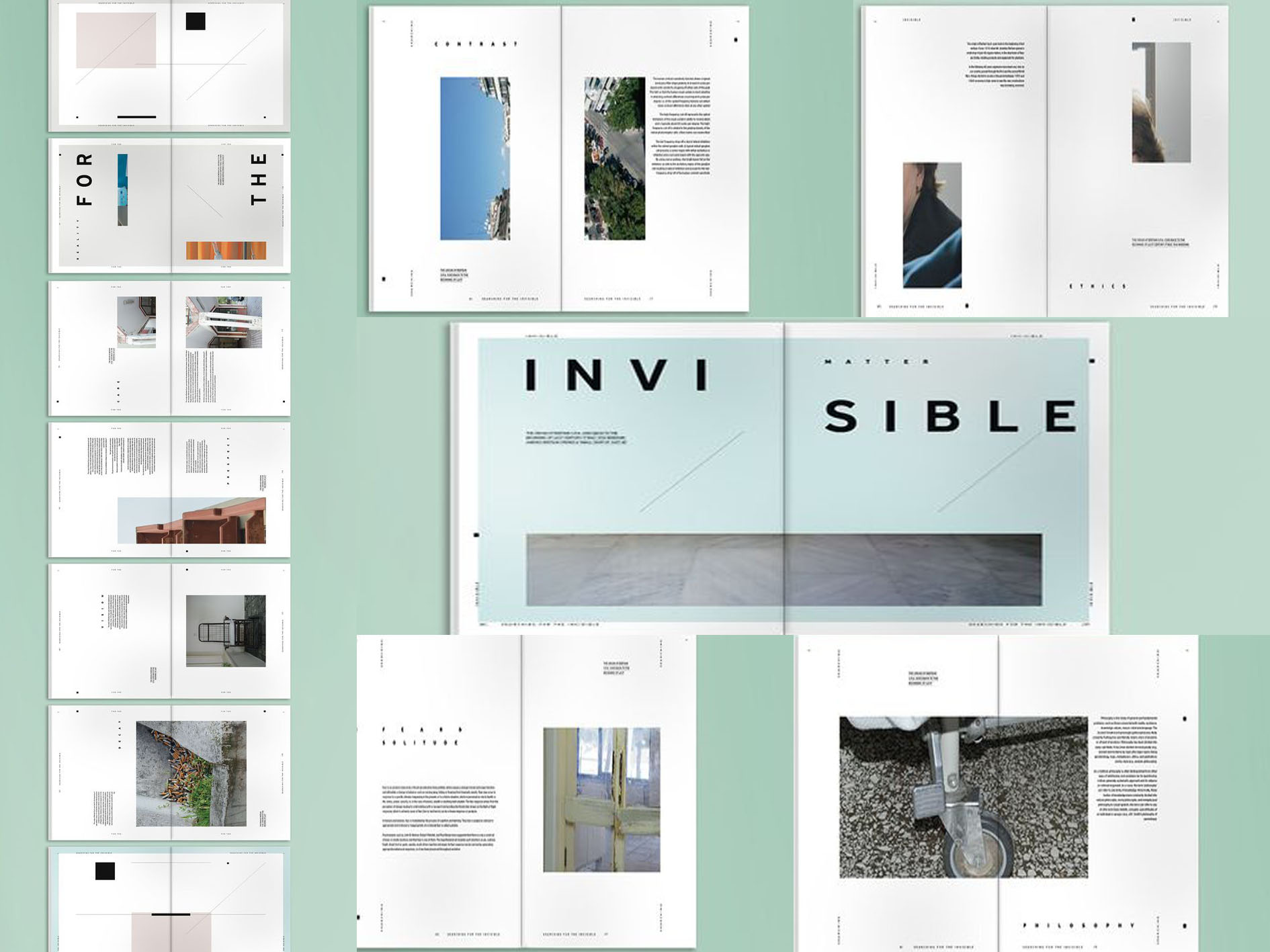
What’s interesting in this layout is the way designer breaks up the text or the photo so that they span across two pages. The typeface is strategically placed, giving the content ample room to breathe. I love how the text is arranged in such a way that the paragraph is aligned to the left when it is on the left side of the page and vice versa when it is on the right. “People read bigger things first” – the designer differentiates the title of each segment by altering the text’s sizing and spacing.
#3
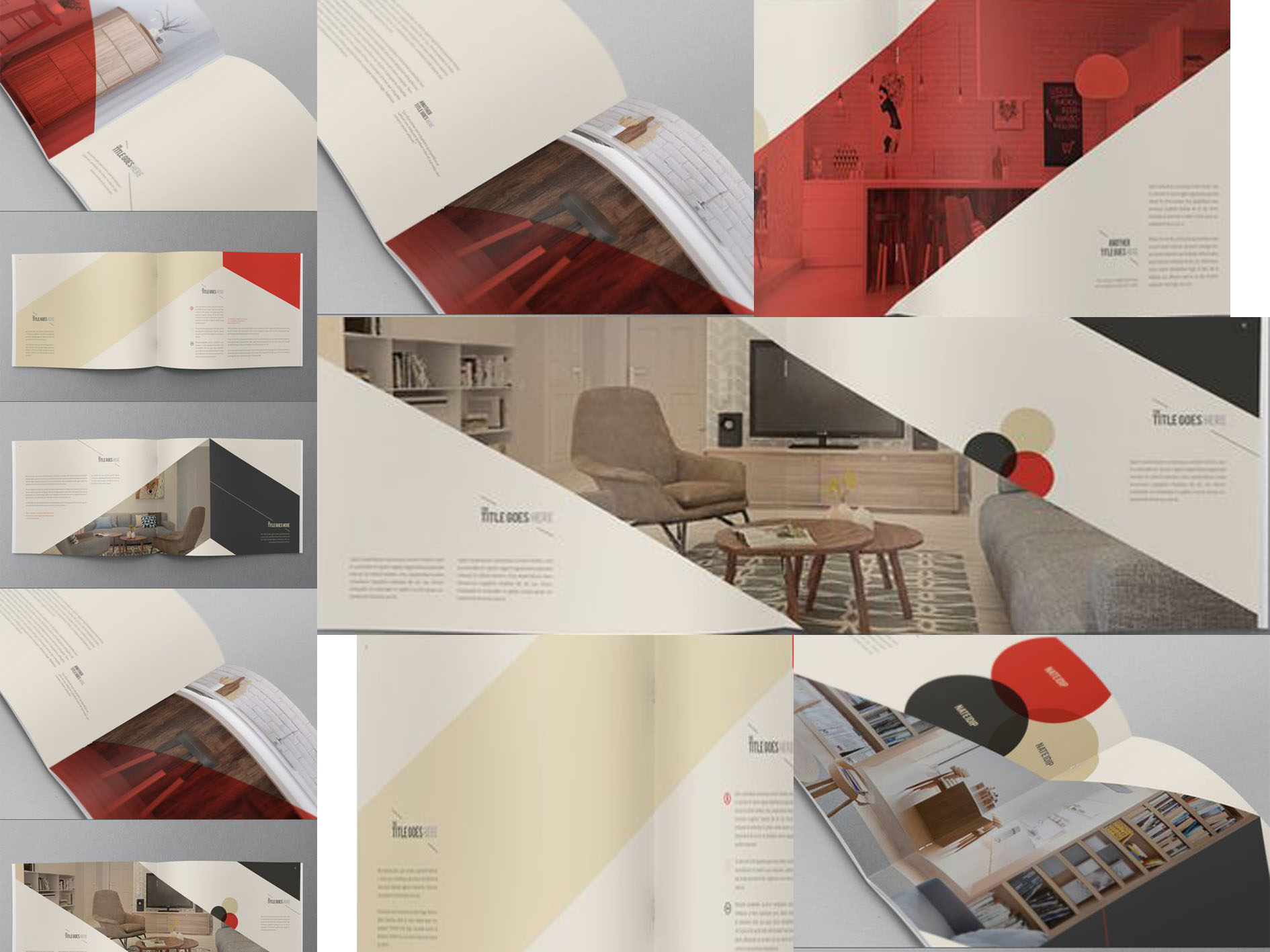
I love the minimalist clean look of this layout. Simple color blocking is used with just three colors – red, sand beige and black. By adding a layer of color onto the photo or part of the photo, it adds visual interest to a normal photograph. With just clean lines and airy space, the whole layout looks more chic and stylish. Color blocking chops up large pieces of content, making it more interesting than an otherwise plain page.
#4
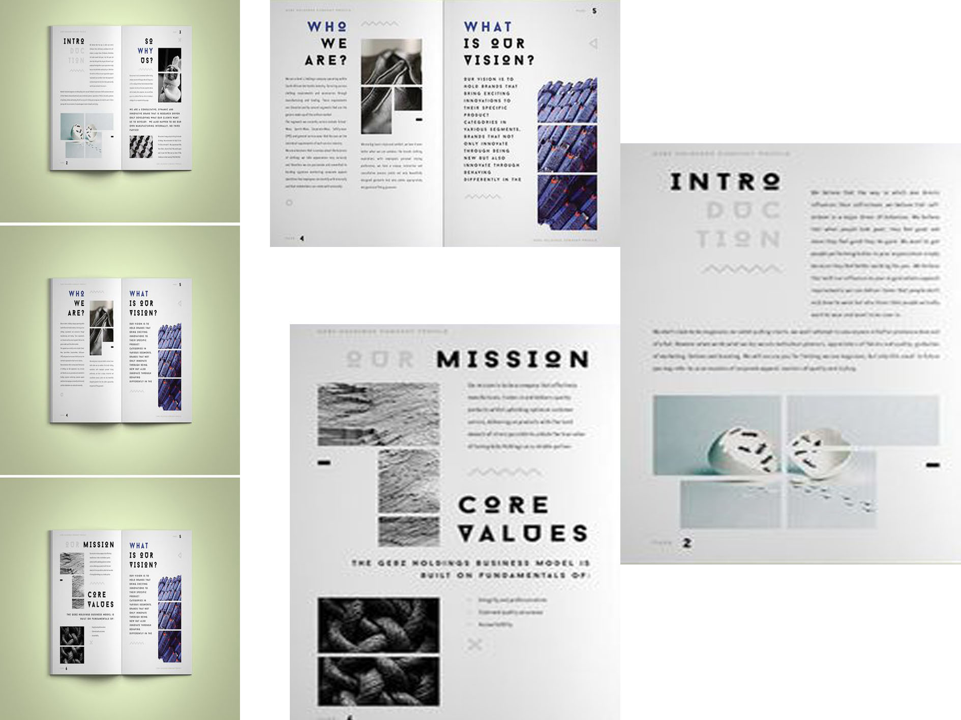
The typeface of this layout attracts me at first sight. I like that the titles are made obvious due to being bigger and bolder. Although all the texts are of the same typeface, visual hierarchy is being established when there is a modification of sizing and its weight. Besides, the photos are broken into grids which add visual interest. There is also a clear structure in this layout such that readers find it easy to focus on the content.
#5
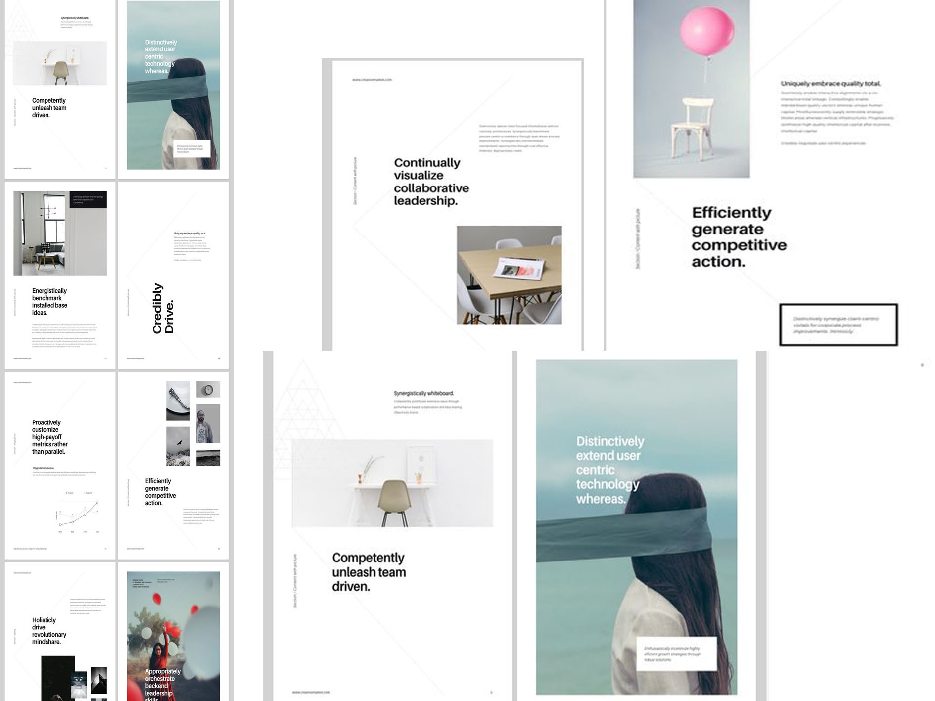
Simplicity is the focus in this layout where Z pattern is being practiced. For instance, the most important information (e.g. heading) is placed at corners and other paragraphs along the top or bottom that connects diagonally. Colors are kept to minimum – cool tones are used mainly with a dash of color in some pages. There is a clear visual hierarchy coupled with white space buffer. This helps to guide viewers through each part of the page. Placing texts on large piece of photographs helps to break up the otherwise monotonous look.