Project 2 was definitely more fun to work with, to be honest. Mainly because there wasn’t much manual work to begin with and there’s complete freedom. From choosing movies to picking quotes and googling images that fit, I couldn’t be happier! I didn’t have any trouble in selecting movies, thanks to all the great movies shown in recent years and all the books adapted into movies. Therefore, the quotes kinda stuck in my mind.
However, the conceptual phase wasn’t THAT easy as I thought it would be. Sometimes I have this image in my head of how the whole composition should work out. But finding the right elements wasn’t an easy task. For instance, I wanted this guy to look sad with just a side profile, but that alone probably takes a few pages of Google images to finally get the right one. You are in luck if the image is in high resolution, or else Illustrator comes into the picture.
Apart from that, I tend to look at the quote as a whole sentence and tried too hard to figure out a narrative for it, which I felt overwhelmed and restricted in many ways. Later, I learnt that I could do better if I break up the quotes into words, which made my life so much easier! Each word branched out into something else, which became my sources of inspiration.
The production stage aka silk screen printing was quite the challenge for most of us or maybe it’s just me (?) But thanks to our work-study mentor for guiding us every step of the way. Also, I realized that no matter how many trials we had on newsprint, printing on tote bag was a total different story. (Wish I found out earlier) We only need to take note of the amount of ink used when printing on newsprint, while strength is an important factor during tote bag printing due to different materials.
Given only one tote bag made everything incredibly stressful! And yeah the more careful you try to be, you are more prone to mess things up, which explains my failed attempt in producing a perfect tote bag print. As I have quite a bit of fine lines in my image, I didn’t do another round of printing. Opportunity cost guys!! Smudged image with complete quote or nice image with faint quote. I chose the latter.
All in all, this project is very fulfilling as I get to see the start to end of the whole process – conceptualizing and getting my prints out. In addition, I get to improve my technical skills. Most importantly, I learnt that it is always better to work on something you have a personal connection with, such as movies that you actually watched and quotes that you can relate to instead of googling “top 10 movie quotes”. Because the more emotionally invested you are, the more likely you will put in the efforts to follow through.
Anyway, I have a new found respect for this screen printing! It’s such a practical medium for small artists and I hope we could do more in the future because practice makes perfect!!
P.S I finally understand why a simple T-shirt design can be really pricey… just look at the amount of time and effort in printing one design..
The artist who inspires me the most in this project is Jessica Walsh. I particularly love how bold her style can be. And how different elements and style can speak something when they are put together!
“You deserve someone who loves you with every single beat of his heart.”– Love Rosie, 2014
Draft.
The focus in this quote is “every single beat of his heart”. I played with the shapes of the heart and varied its color to represent the “beating” motion. Skeletal hands are used to symbolize eternity and infinity love. Since the heart is the main subject here, I emphasized it by using a different style of image – engraving. Flowers are added to symbolize life.
Joyce, who was with us during our Photoshop tutorial commented that the composition looked rather stable with everything arranged symmetrically. Yep, it does. It’s just heart and more hearts, which lack of interactions. She suggested that I should play with shape distortion or change the position of the hearts.
Final composition.
I reevaluated my previous design and added in a few other elements to make the whole composition more alive. Furthermore, I played with some of the transforming effects for the hearts. The figure-ground relationship is used such that if the white heart is removed, all there is left is a solid black heart, which in turn becomes a single, dominant element. Even though this composition does not have the symmetrical effect in the first draft, the focal point is still pretty obvious. Therefore, the final result appears more energetic than before.
Composition #2
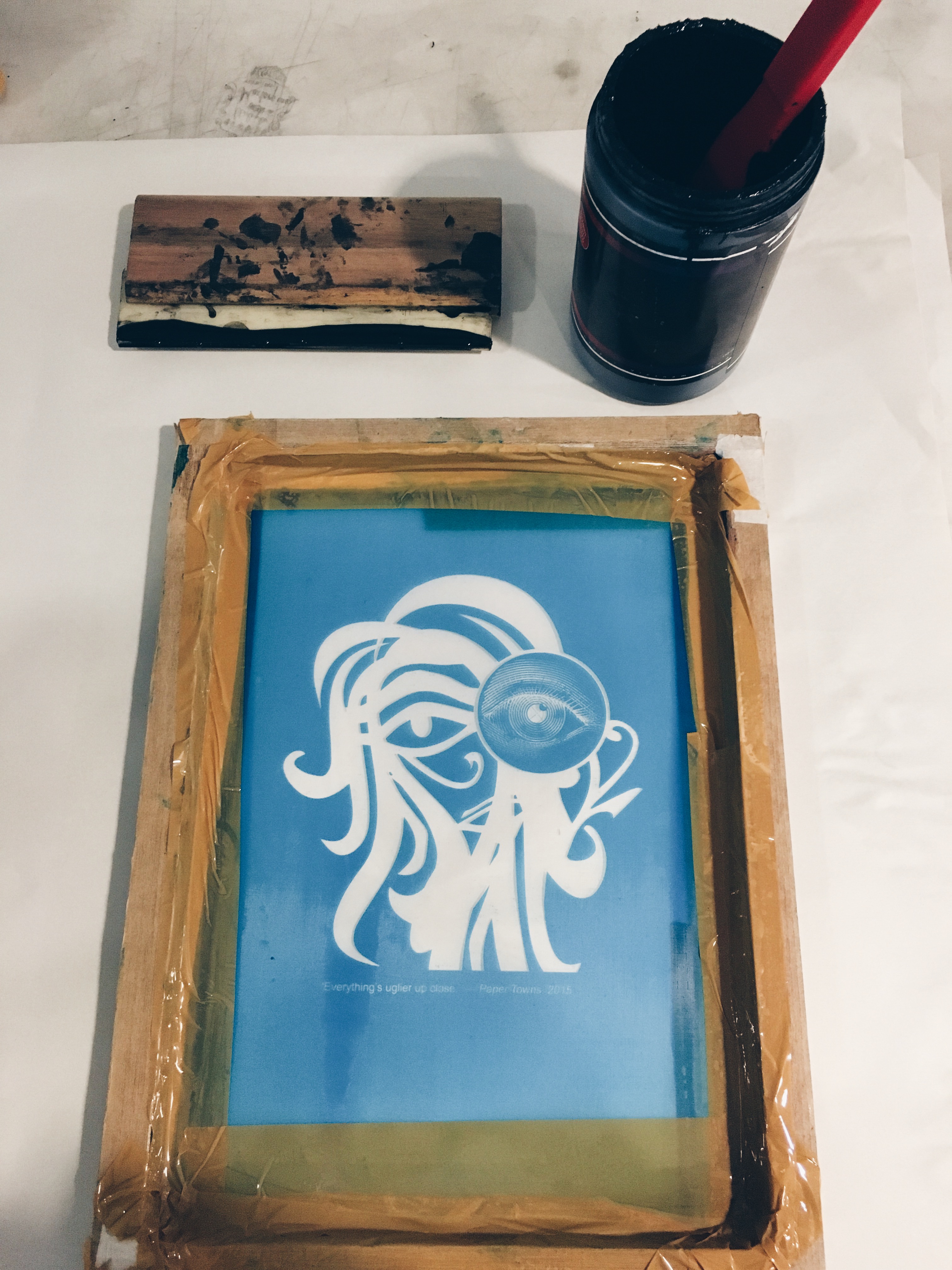
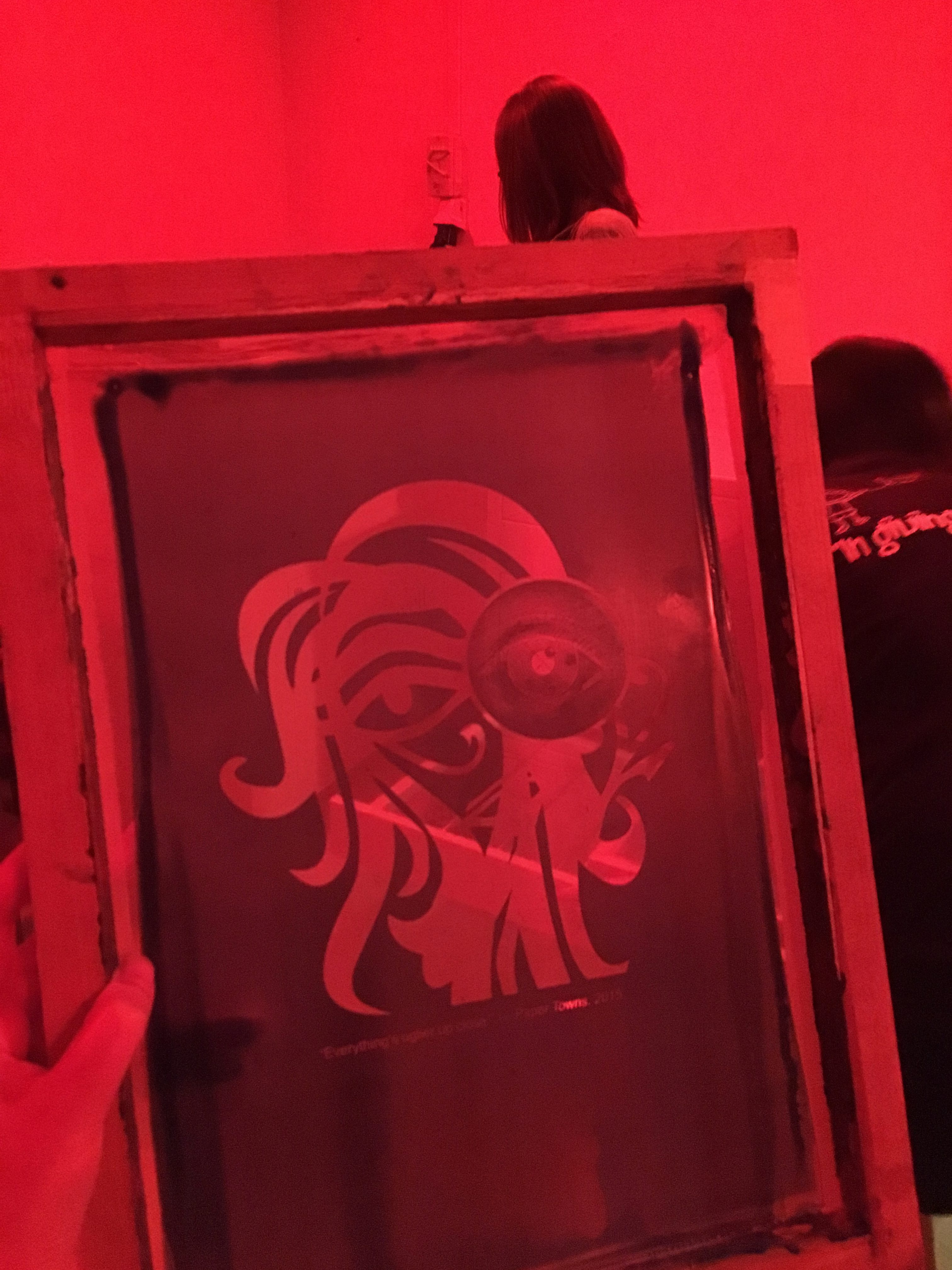
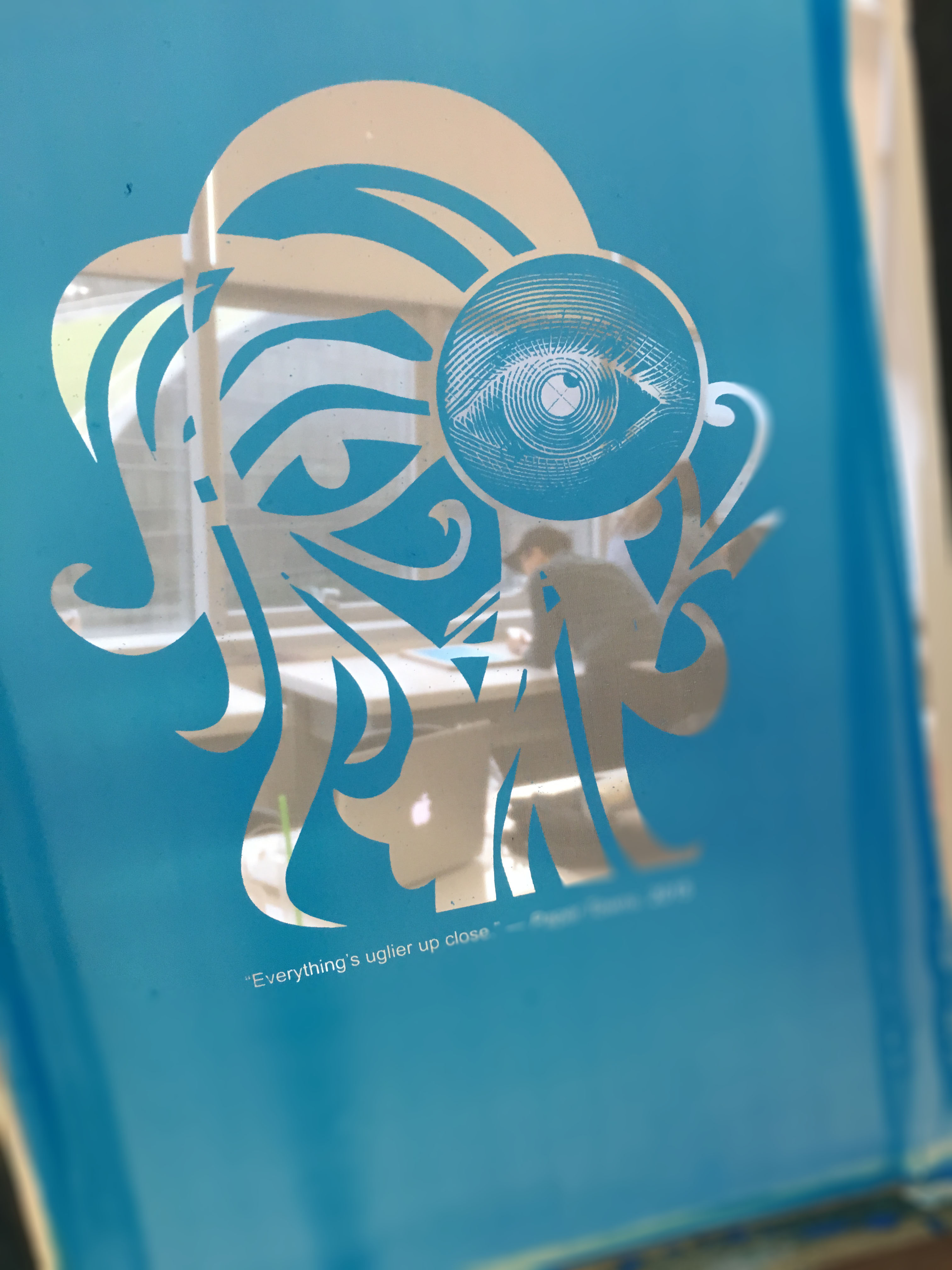
“Everything’s uglier up close.”
– Paper Towns, 2015
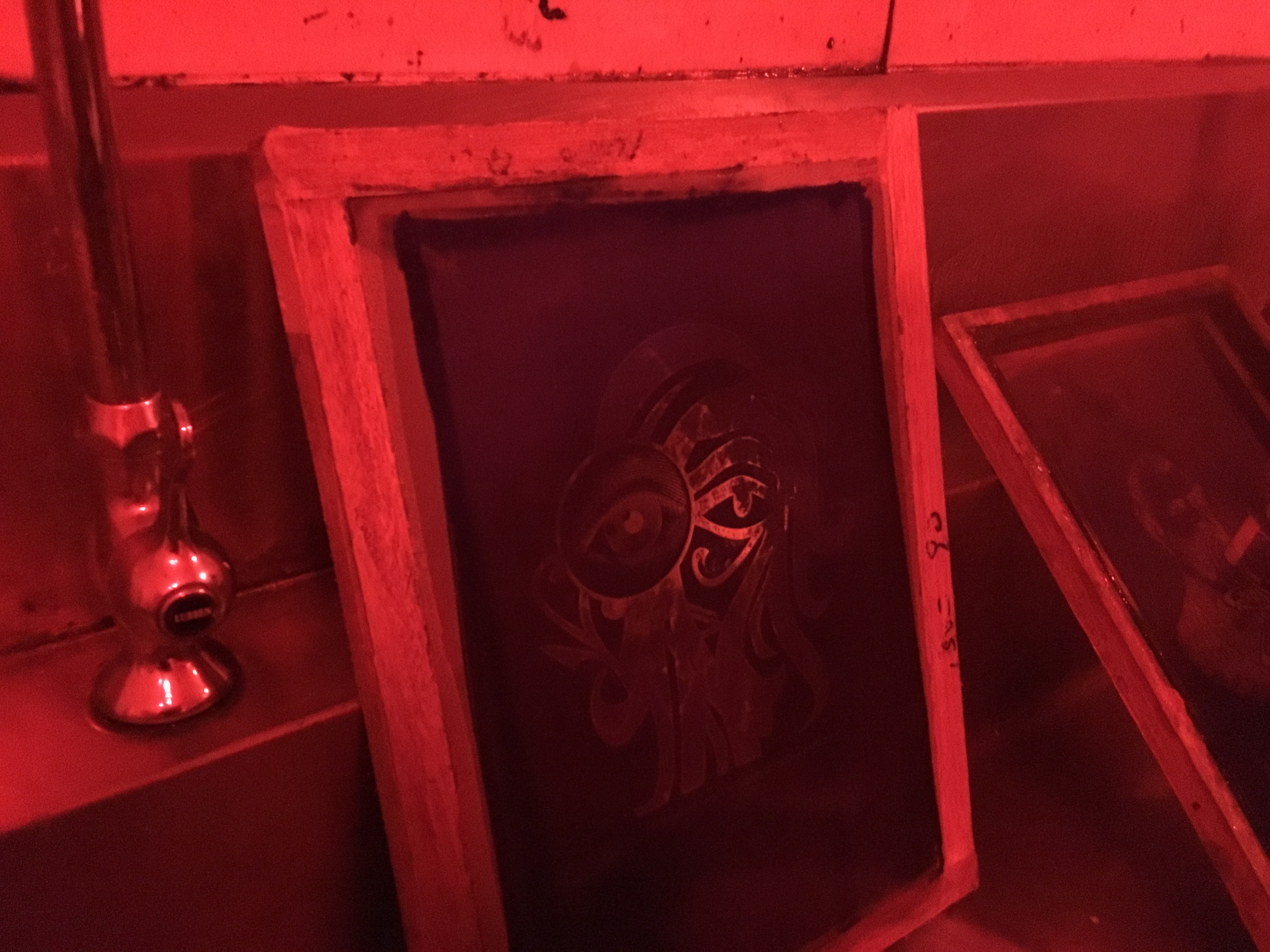
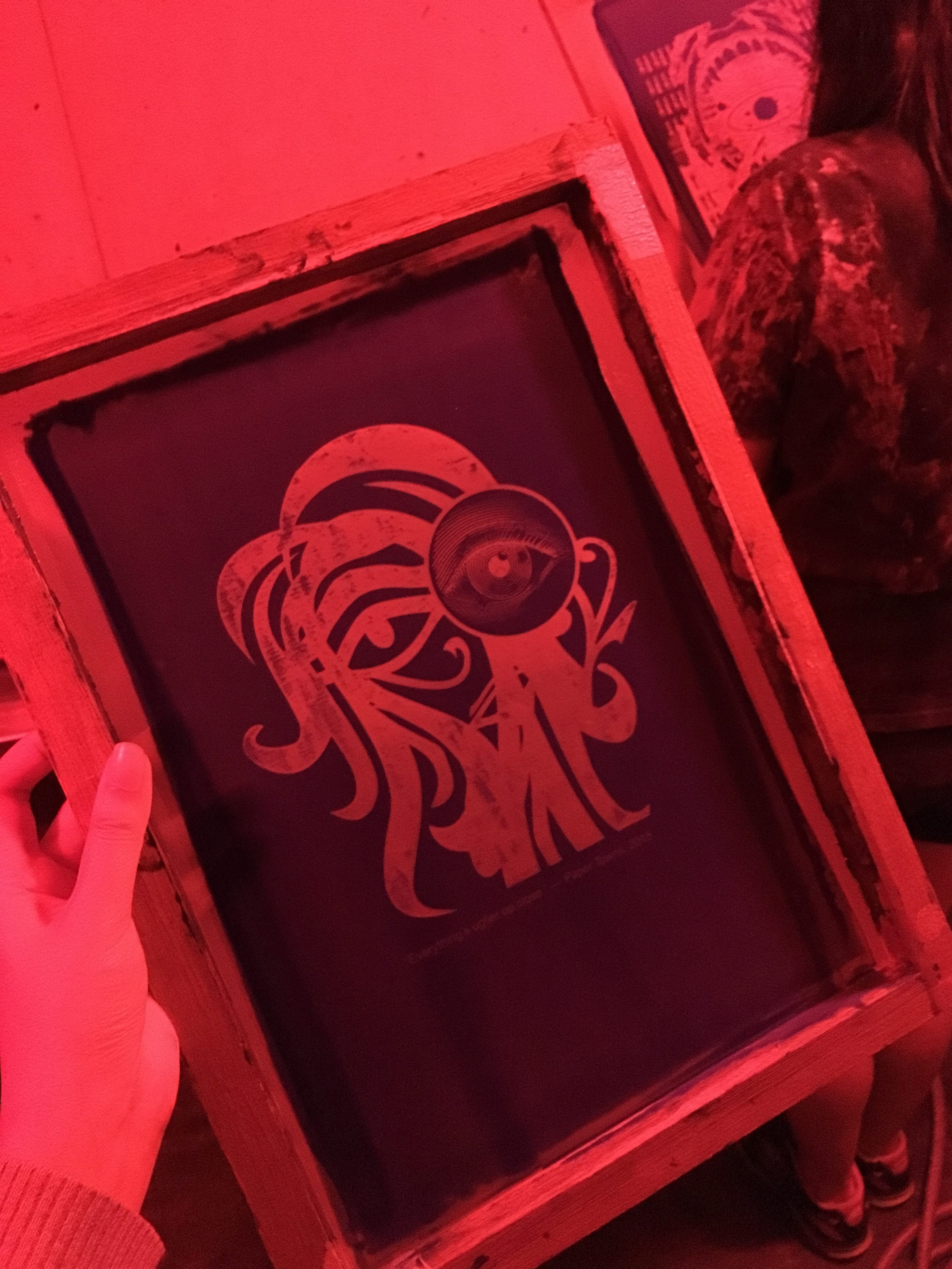
“Uglier up close” is my focus on here. Again, I used a different style of image – engraving, to direct the viewers’ eyes to my main subject – eye, because opposing elements create a focal point of interest. The eye is placed in a seeming magnifying glass or peephole viewer. As if someone is trying to look a little closer, but the closer you look, the uglier things are.
Lines are repeated to create rhythm; an illusion of movement so as to form the wavy hair. The law of proximity is applied by placing the lines closer to one another, so that viewers could perceive it as a whole, instead of a mere background pattern. Since “ugliness” is a huge aspect here, I wanted to portray a character who is trying to cover her face with hair. Besides, the thickness of the line is varied to create a three dimensional effect. The Eye of Horus is used because it matches the wavy lines that I’m going for. Also, is it just me or does she has this cool, distant vibe? I love how it is so flexible that I could duplicate it as its mouth as well as the handle of the “magnifying glass”.
I chose this as my tote bag print because of its simplicity, minimalism style. I particularly love how quirky it looks compared to the rest, which are squarish and seem confined in a box.
P.S secretly hopes that I could print this on a lot of stuffs but oh well the size..
Composition #3
“The music is all around us, all you have to do is listen.”
– August Rush, 2007
Since music is the focus in this composition, musical instruments are largely used. The wave-like piano keys intersect with the volutes, forming an unbreakable bond to symbolize “all around us”. All the volutes are curved inwards, which creates a type of rhythm, allowing the viewers to see it as a revolving item. The key message of placing buildings at the bottom is to show that everyone shall take note of their surroundings, where music can be found. Gestalt theory on the figure-ground relationship is used in the harp/head profile illusion. Depends on viewers’ interests, the image fluctuates between the two possibilities. This is also related to the stored information in viewers’ brain, which contains information about the harp and profile of head.
A sense of unity is achieved in the composition such that all the elements are linked to one another. The composition is seen as harmonious which every part complements each other, thus holding everything tightly.
Personally, I like this design the most. I did contemplate if I should use it as my tote bag print. Although it looks interesting as a whole with a bunch of elements in it, I doubt a tote bag print like this will catch my attention right from the start.
Composition #4
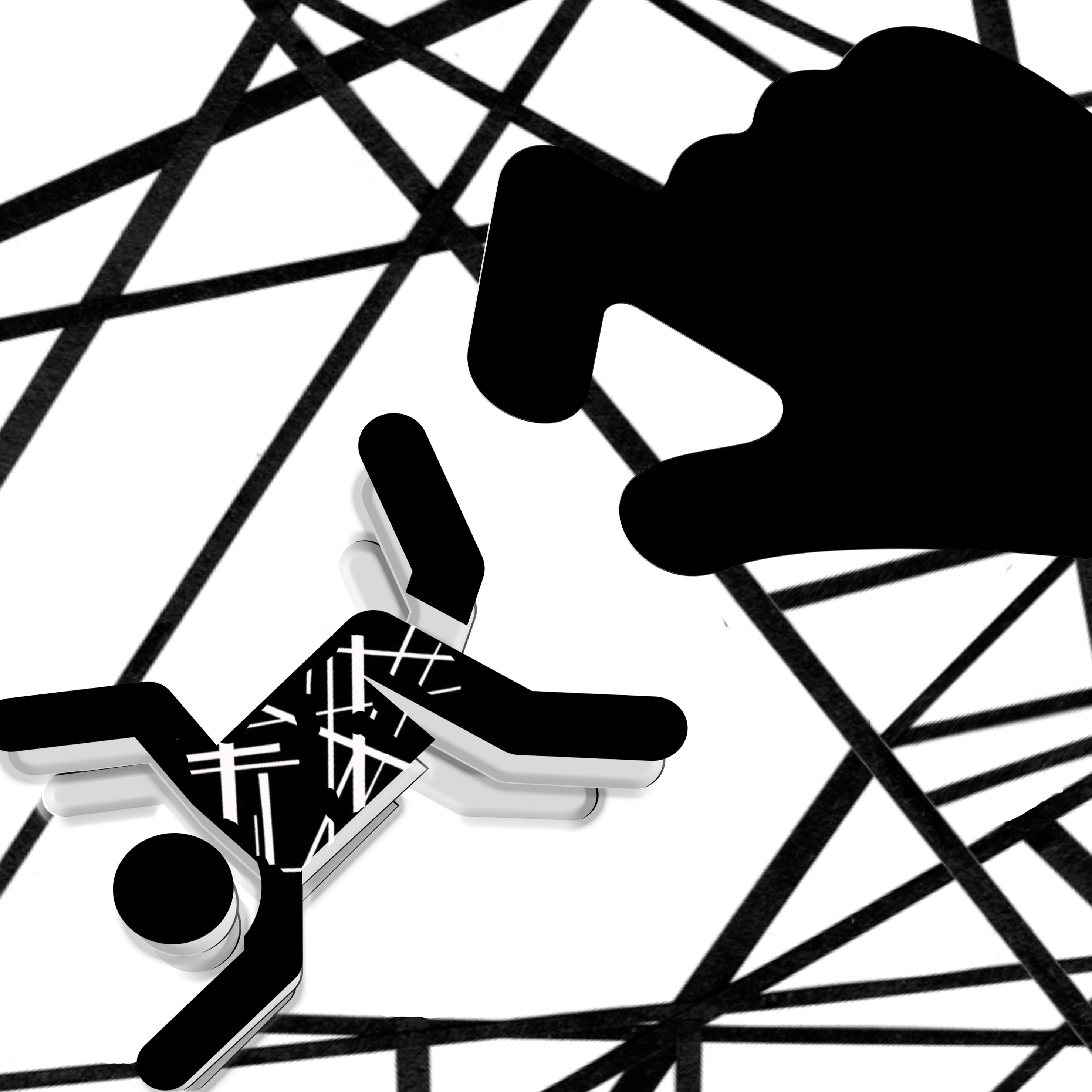
“Maybe all the strings inside him broke.”
– Paper Towns, 2015
This might just be the toughest composition I have ever worked on among all four. Ironically, I was pretty excited to work on it at the start of the project because I thought it was easy to portray.
Just broken strings right? Yeah.
SO WRONG.
I took it very literally and there you go, my first draft.
Cringing so hard just by looking at it right now. Well, there is always a first time for everything.
I tried again, obviously.
Boring. The design appears plain, which the viewers aren’t going to look at it for long.
More experimenting and here comes the third draft.
This time, I figured that I could portray hallucinations; “broken strings = losing control of oneself. It is scary, just like a horror film. I thought maybe adding in more black might turn out better since black is my everything?? However, the whole composition looks cluttered, not much breathing space, unsettling.
Oh well. I’m just gonna keep trying until something “clicks”! Also, I started to question my choice of movie quote that I went back to some of my backups.
IS MY QUOTE TOO SHORT?!
But no, I’m not going to give up on this.
This was also the part where I started thinking out of the box. Instead of “strings”, “broken”, why can’t I relate it to something else? I thought of broken cassette tapes and just broken machines in general because humans are made up of different parts too. Aaaaand that’s how the gears formed the background.
However, the whole composition looked rather messy still and the cassette tapes are not obvious enough for the viewers. So I scraped the idea.
Final composition.
After so many trials and errors, I finally settled on this piece. I feel that it has a certain depth and it relates to the quote in an abstract way.
Thread spools are used to represent “strings”. When things are broken, you tend to fix it and that’s how the wrench comes into the picture. I combined the man’s body with a bunch of gears to show that humans work like machines and it can be broken too. Clock symbolizes death (this is taken directly from the movie itself – Margo found a dead body under a tree, she figured that maybe all the strings inside the man broke and that’s why he committed suicide).
The man is being emphasized by placing it slightly off-center. Apart from that, the repetition of the elements improves visual interest. Value contrast controls the visibility of an element which helps viewers to distinguish between background and foreground. For example, higher value (lighter color) shows that the element is more distant while lower value (darker color) makes the element stands out from the rest.
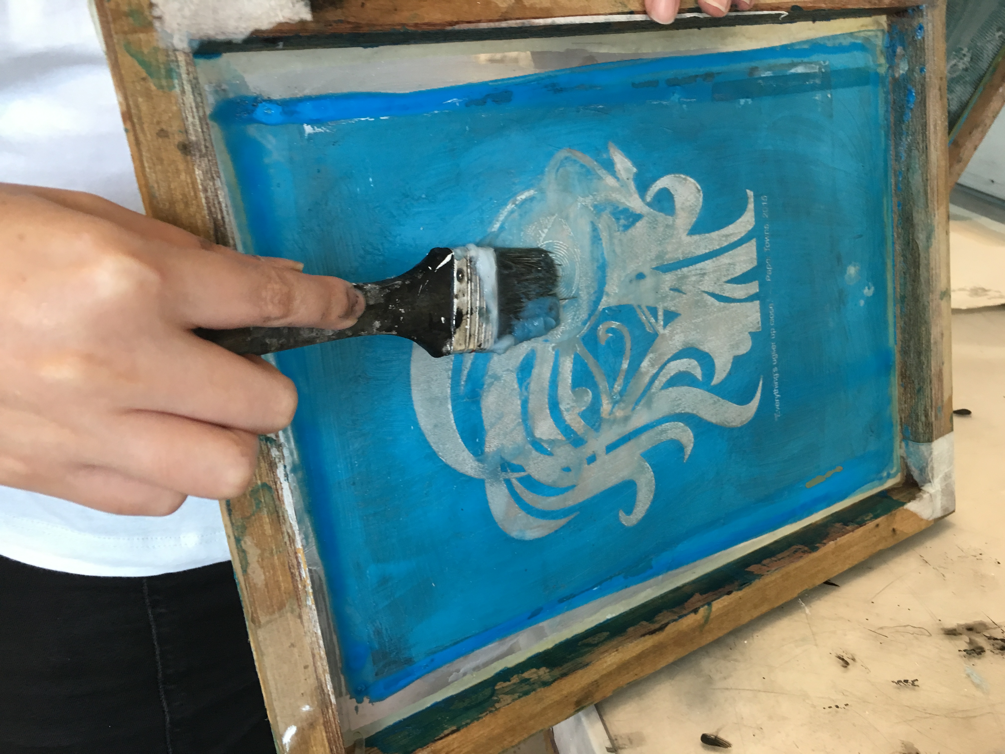
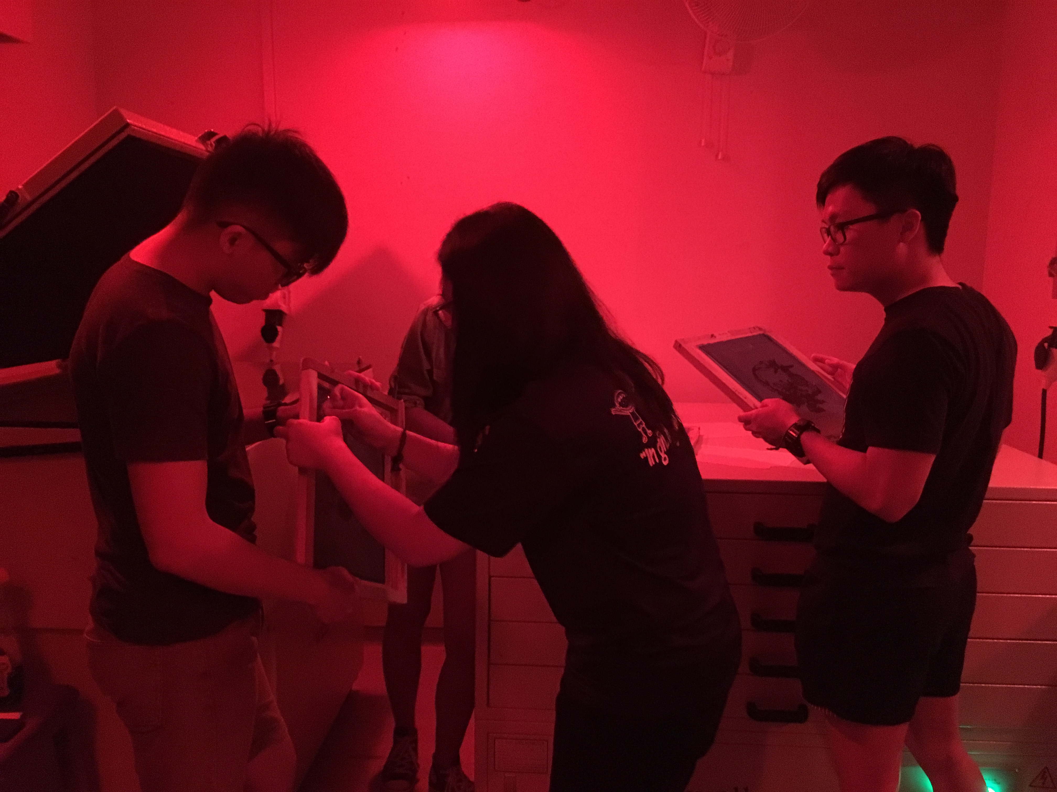
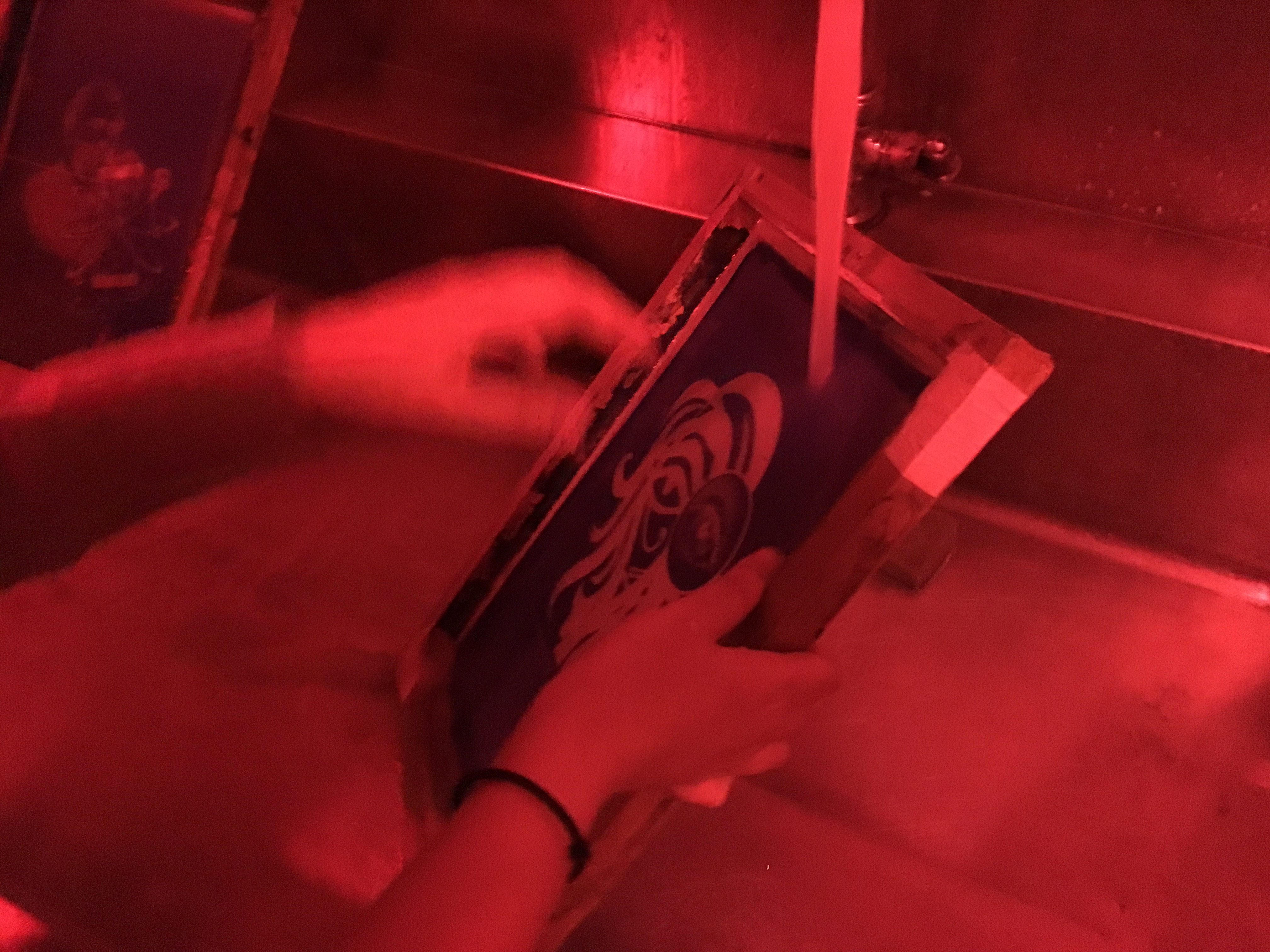
We began the session with demonstration by JiaHui. Firstly, we had to place four coins on each corner of the screen and tape them all up! The same goes to the inside of the screen, but minus the coins. It was an important step to prevent the ink from seeping through the screen, where there was no emulsion. We were told that the coins will help to achieve an “off contact”, preventing the screen from laying flat on the tote bag.
Next, we put a desired amount of ink on the top of the screen and spread it across using a wooden squeegee. Also, it is essential to place the ink so that it could cover the width of the image.
Before printing on the actual tote bag, we tried on newsprints to check for any discrepancies as well as the amount of force needed.
Since the ink would clog up after printing, the whole session was a series of
SPREAD PRINT WASH REPEAT.
At the end of the session, it was time to dissolve the photo emulsion from the screen. Prior to that, we washed off any excess ink. Using a paint brush, we coated both sides of the screen with remover. Then we allowed some time for the remover to soak in before rinsing it with water.
EW GROSS BUT IT WAS SUPER FUN
FINALLY the screen is completely clean for new designs!
Final product:
Kinda disappointed as the quotes didn’t come out completely, but overall it was a great experience!
P.S the drawstring bags turned out pretty well. (Is that some kind of Murphy’s Law?? You always screwed up the most important thing aka the TOTE BAG)
Thanks Alicia for all the help! And all the laughter during our screwed-up moments LOL
The silk screen process was pretty interesting, yet stressful as we were worried about how the screen would turn out.
We started off by coating the screen with two layers of photo sensitive emulsion and let it dry in the oven. This was done in the dark room. We were asked to return 20 minutes later.
Next, we had our images printed in black on transparencies. We taped down the textured side of the transparency onto the screen and placed it in the exposure unit for 18 seconds to expose the emulsion.
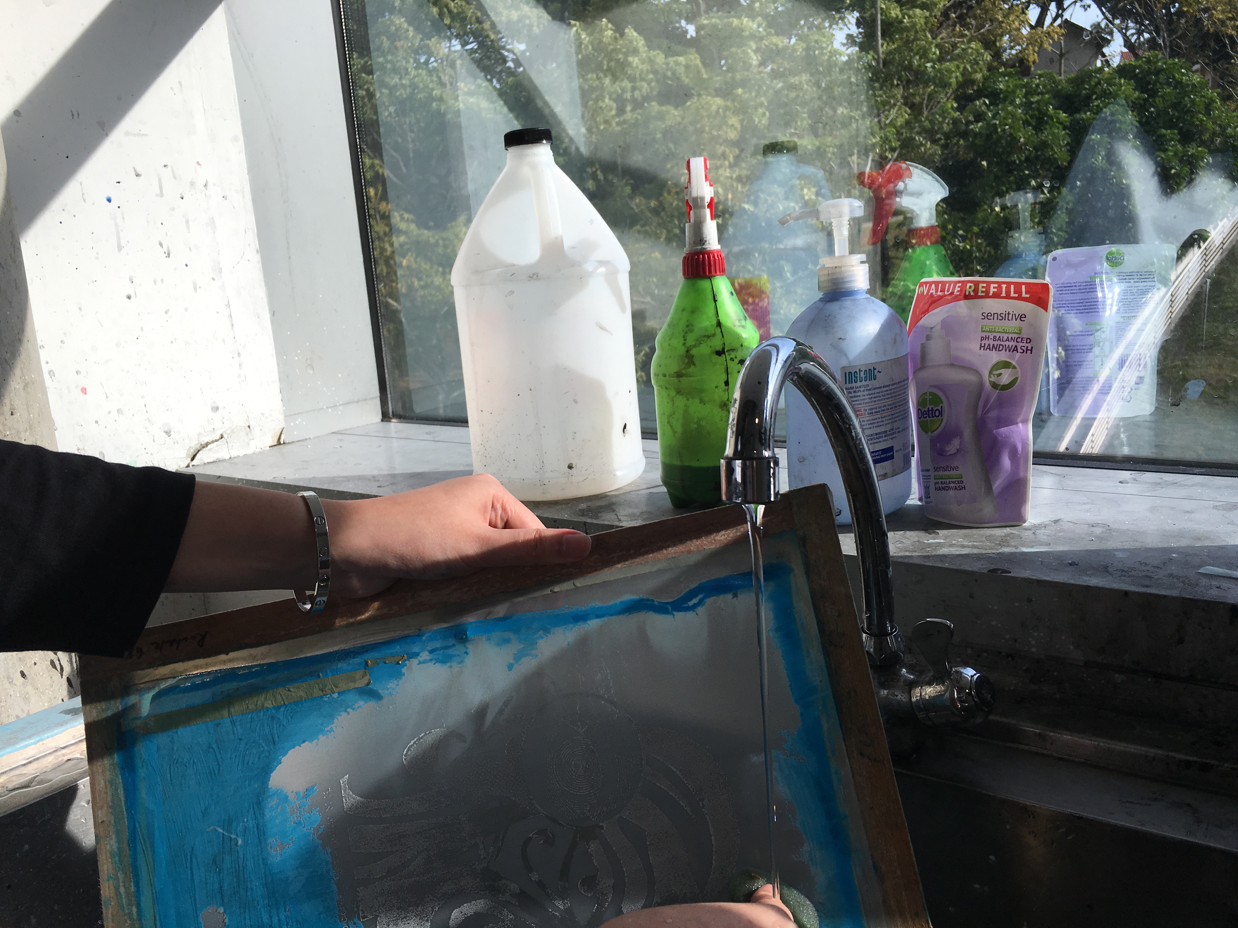
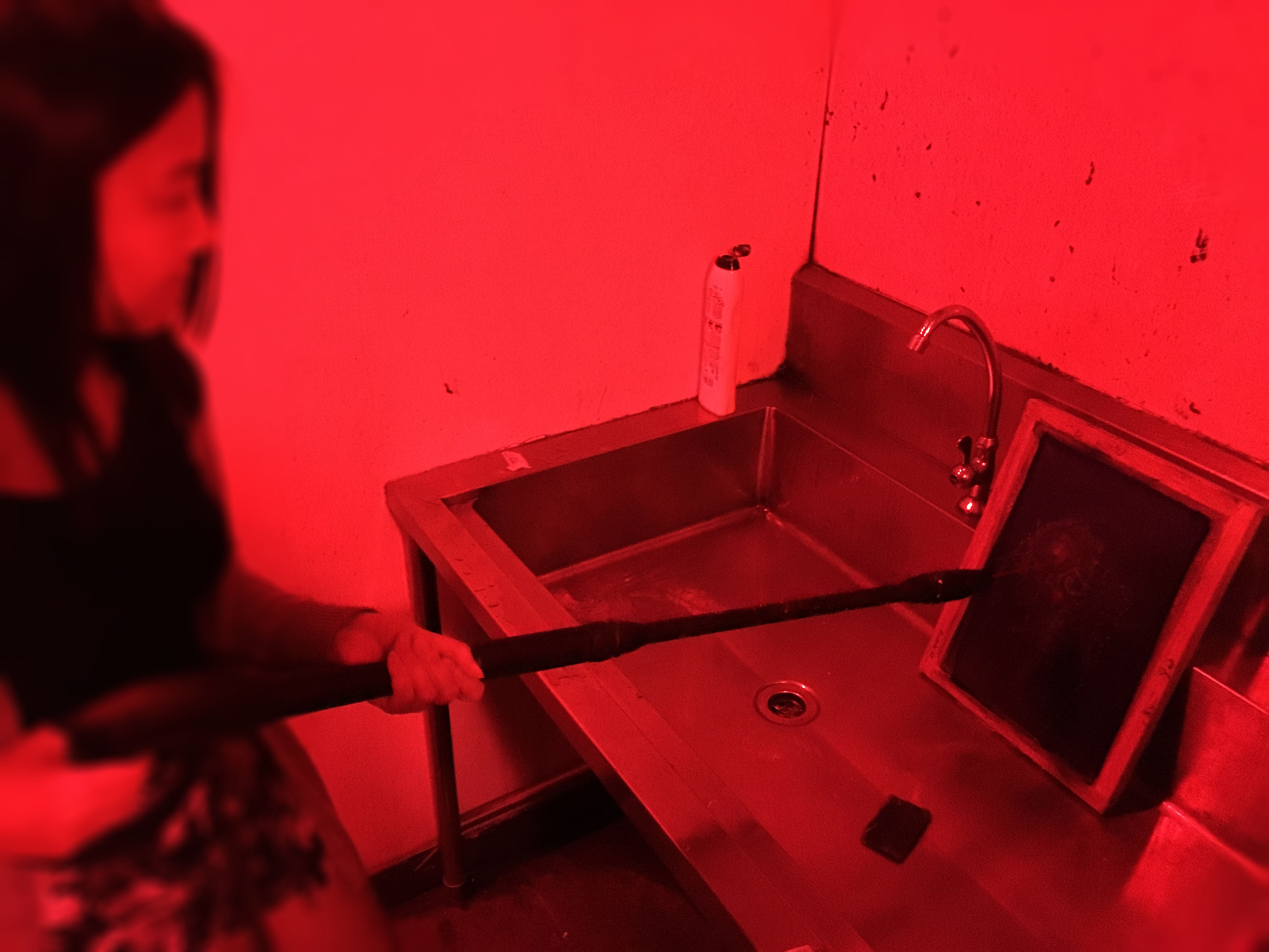
After the emulsion has been exposed, it was time to wash it out. The transparency was removed and we brought the screen to another area for rinsing. Using water jet hose, we washed away the emulsion covering the image.
We also scrubbed/rinsed out any excess emulsion afterwards and the screen was once placed in the oven again to dry.
10 minutes later, we went back to collect our screen! It was a huge relief that it turned out pretty well, even though some of the fine lines were not showing up but overall it looked alright!
“You deserve someone who loves you with every single beat of his heart.” — Love, Rosie (2014)‘The music is all around us, all you have to do is listen.” — August Rush (2007)“Maybe all the strings inside him broke.” — Paper Towns (2015)“Everything’s uglier up close.” — Paper Towns (2015)