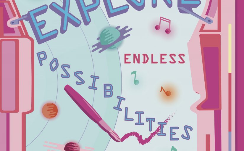
Based on feedback gathered in class, this was what I came up with.
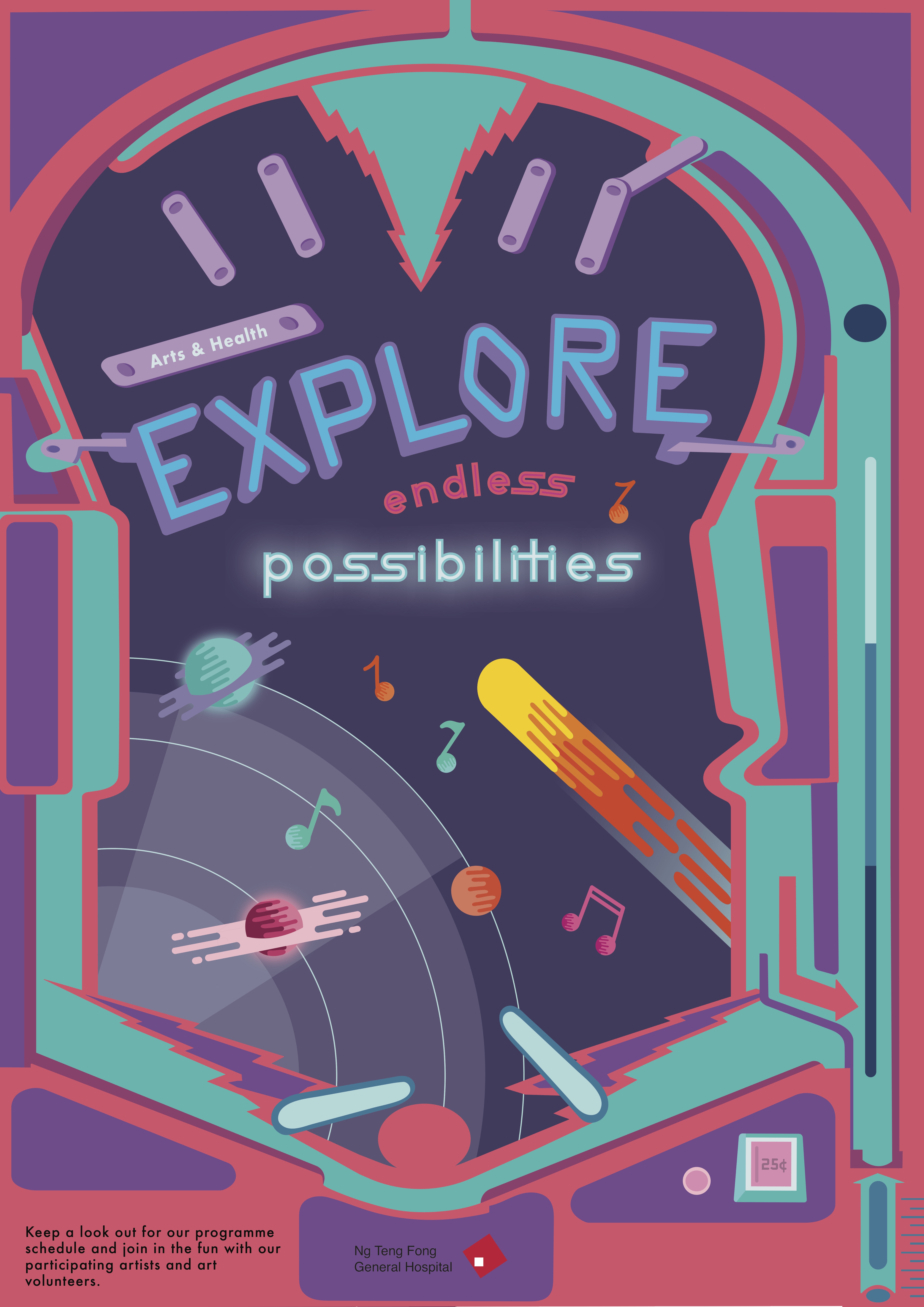

I decided to stick with a more consistent colour palette that is darker with accents of brighter colours compared to my previous one that was rather lacklustre in terms of colour choice.
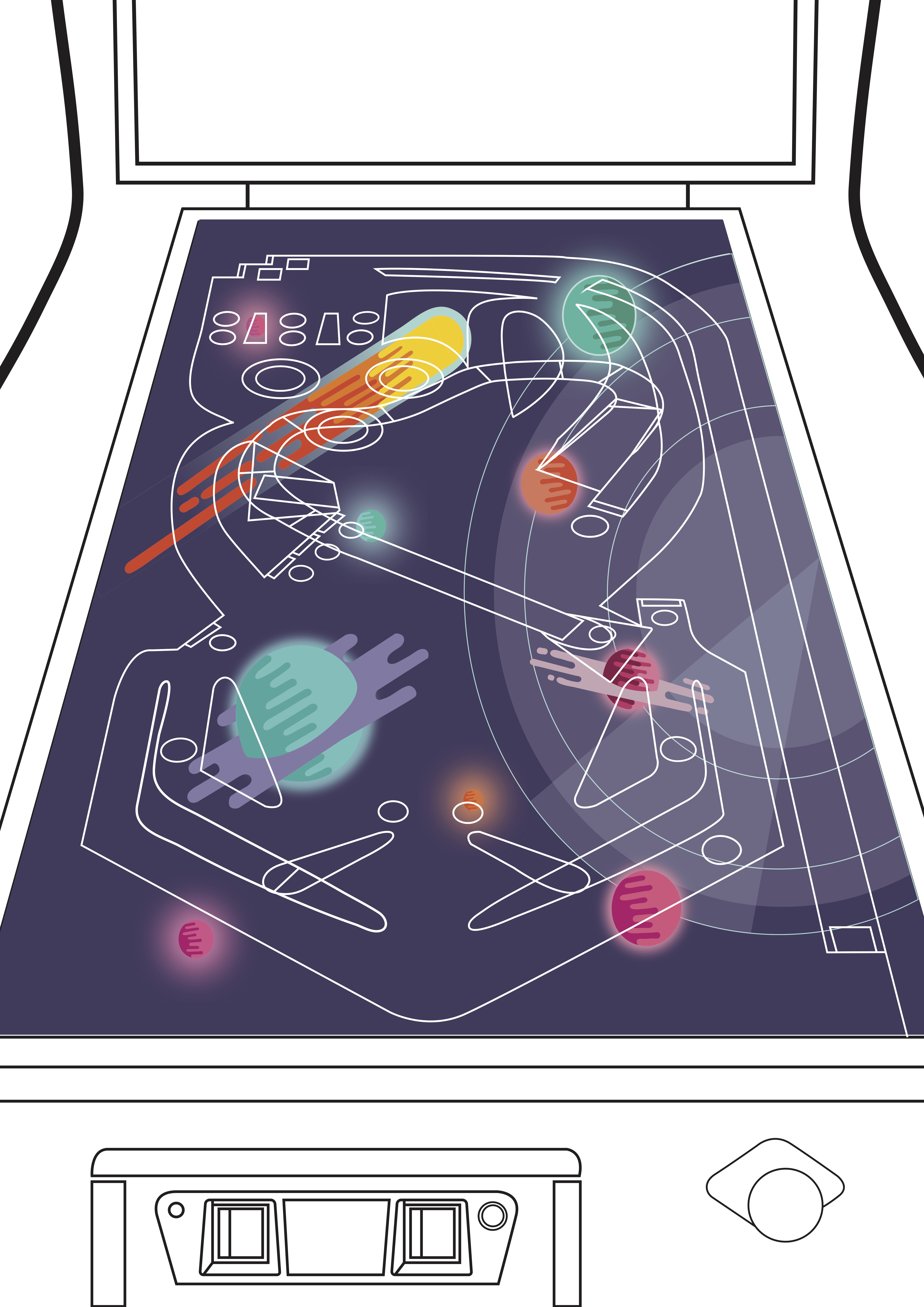
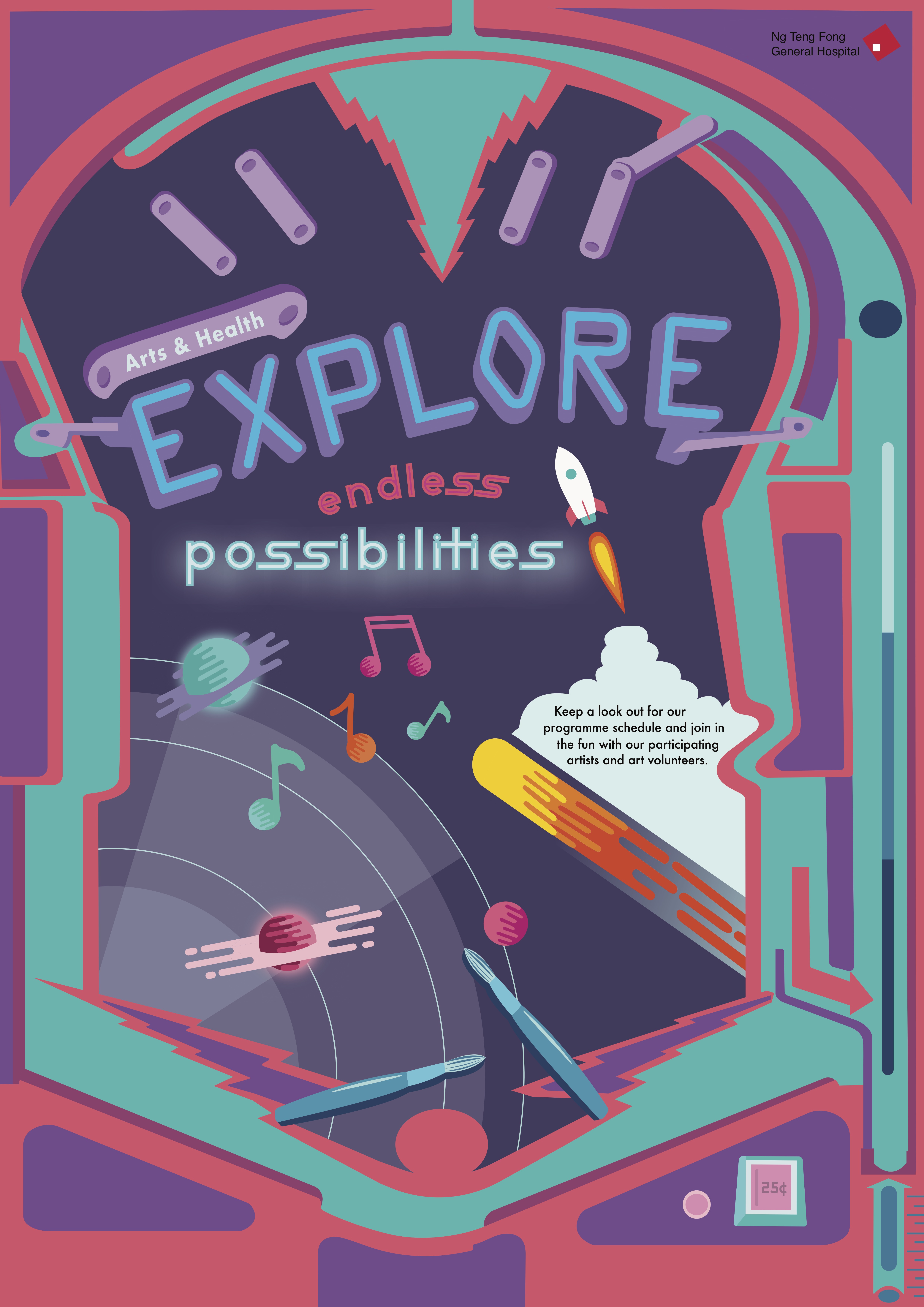
Feedback gathered from Michael was:
- Move the hospital logo to top right
- Align the arts and health bar with the shape of the word Explore
- Smoothen out the curves of explore
- Group elements at the center together to create more focus and emphasis
- Connect the comet graphic with the pinball lever to suggest motion
- Vary the sizes of the music notes to make it less monotonous and static
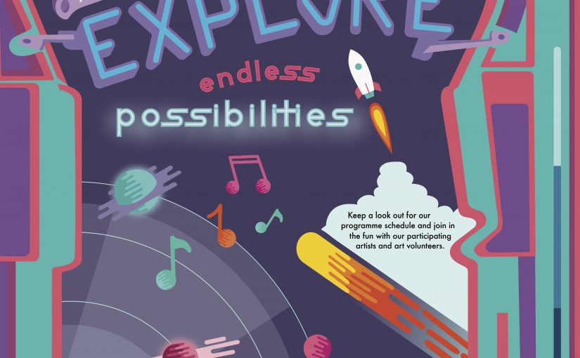
- Introduce a ‘rocket’ to help incorporate the body text within the pinball board
- Introduce more art elements
- Create more space within the pinball board, less exterior needs to be seen
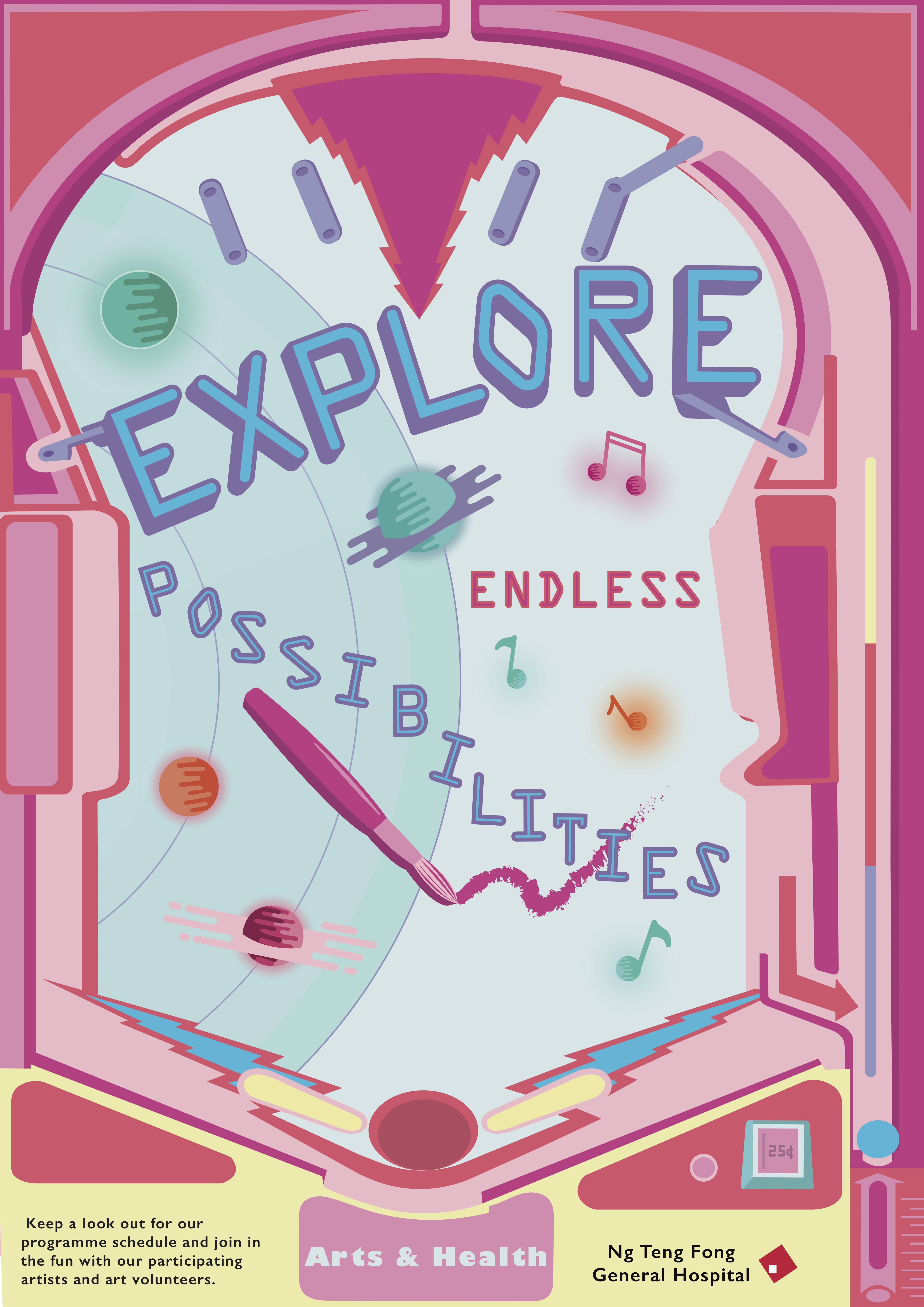
Revised design
Takeaways and Reflection
I think this project really helped to push me to do a full on A2 illustrated poster and I really learned a lot from this assignment. I learned about poster layouts, colour schemes, text placement, choice of typefaces etc. I know that my poster design is not the best but I am proud of myself for being able to come out with this from the first initial draft. Moving forward, I would probably change the “NTFG” hospital logo to white to increase visibility, decrease the opacity or colour of the cloud to make it less striking, cut the space at the bottom of the poster, tighten the lines in between the slogans and probably reconsider the arrangement of the graphics in the middle to make it more “organised”. But yea overall, it was a great learning experience that I will take with me as I continue onto future projects.