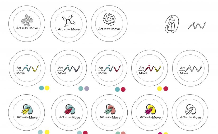
After the feedback gathered in class, I made some changes to my pencil design such as making the swoosh downwards instead of up and integrating an element of “community” in the design.
After more feedback from Michael, I decided to add more visual weight in my design and change the text font as well as orientation.
Colour Exploration

I played around with analogous colour schemes such as blue and green, orange and yellow as well as contrasting colours like yellow and blue to bring some vibrancy in the design. However, I felt like the colours felt a bit too “contained” within the black lines.
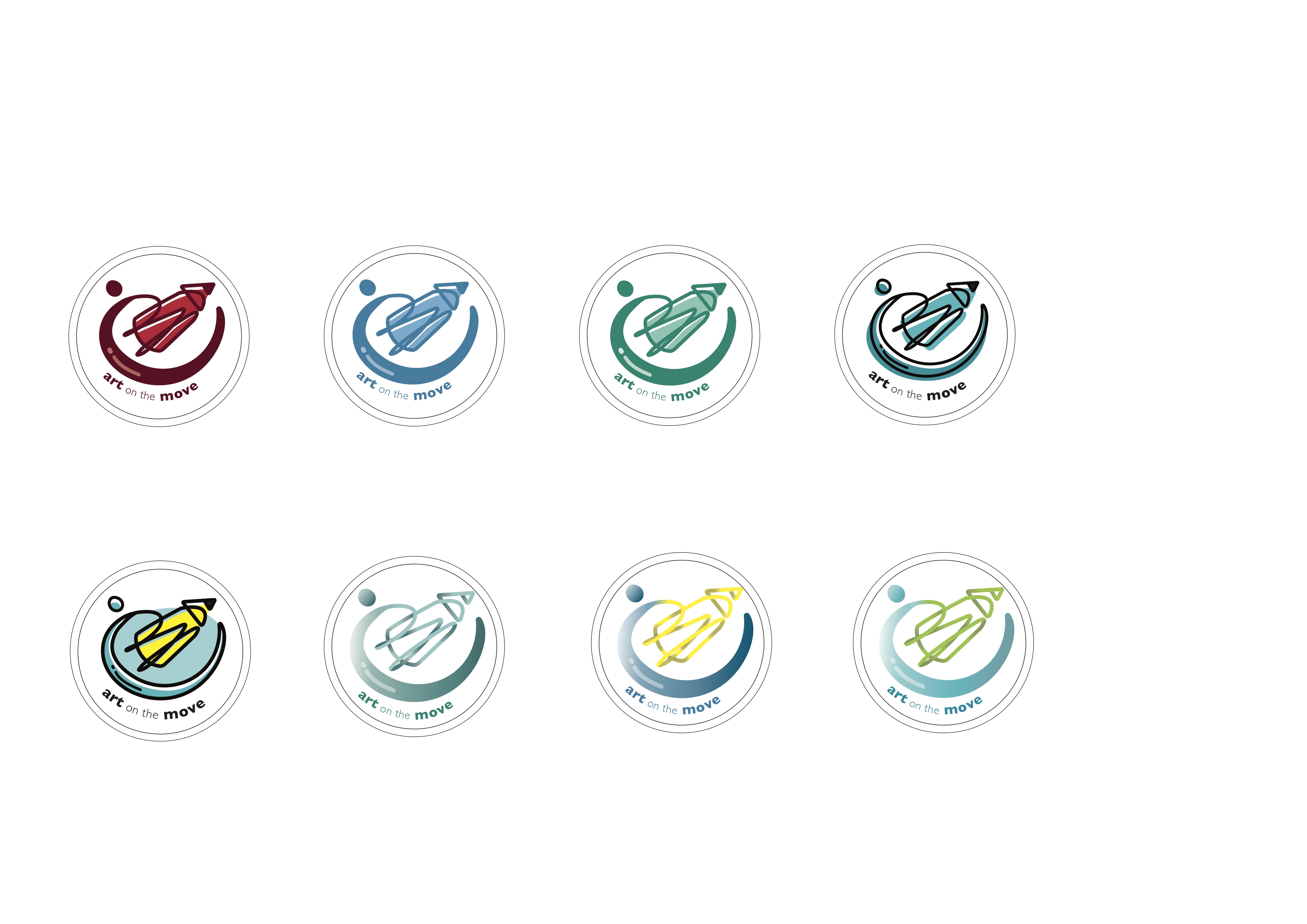
Subsequently, I tried different techniques such as gradient tones and playing with the shades of one colour. However, incorporating gradient in the lines made the “swoosh” lose its form. Hence, I decided to go with the flat colours instead and stick with the shades of one colour.