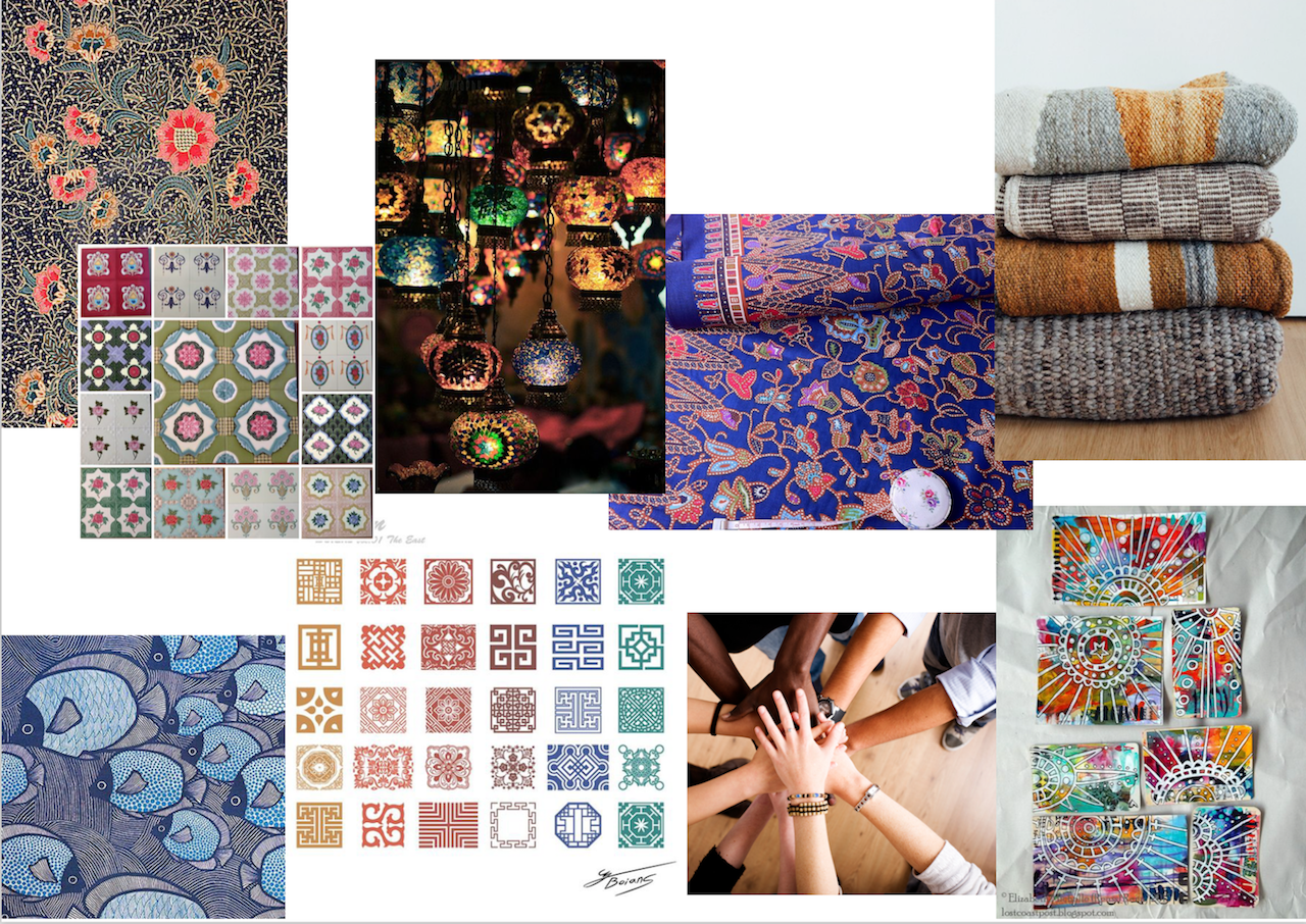
Illustrative posters

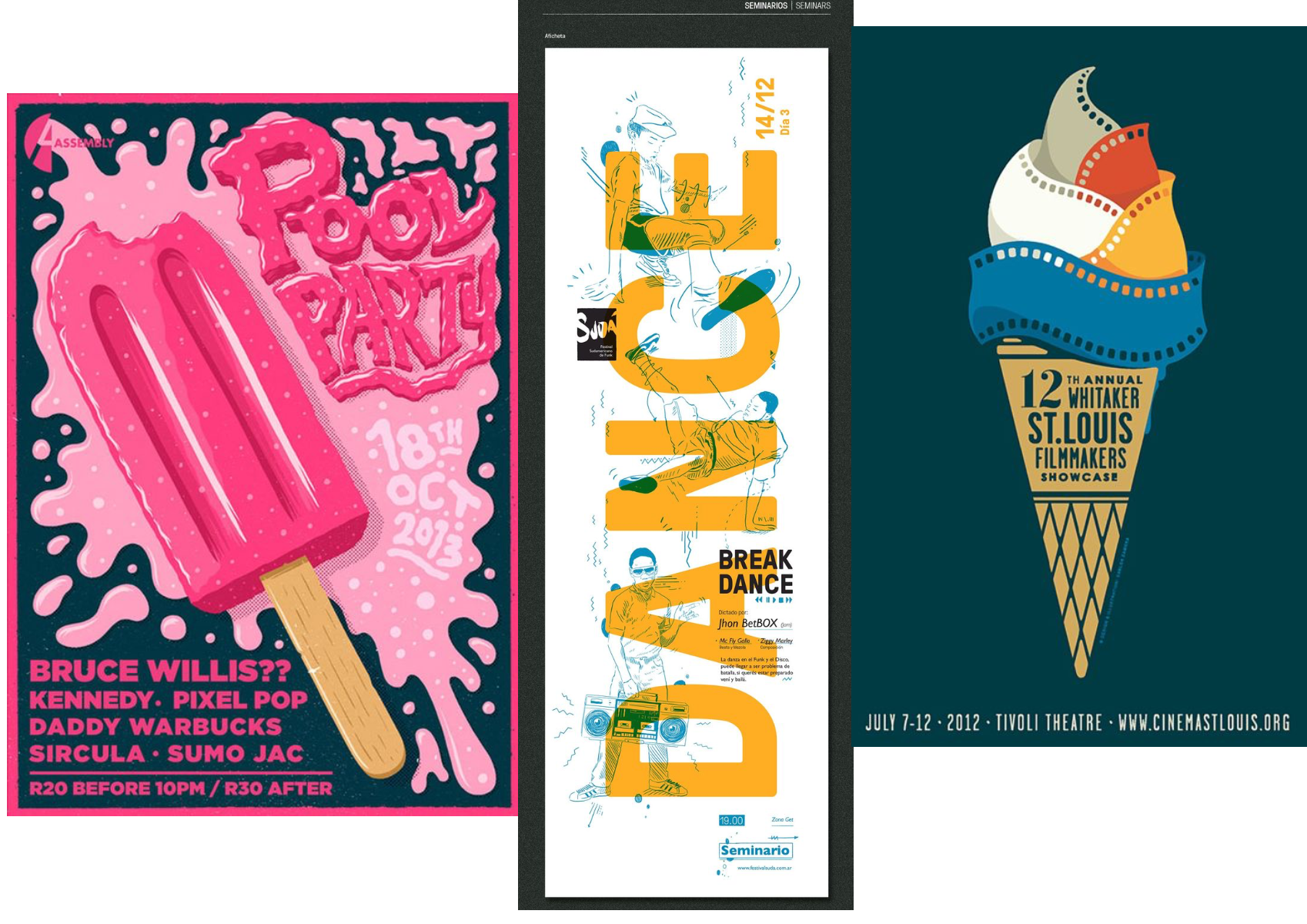


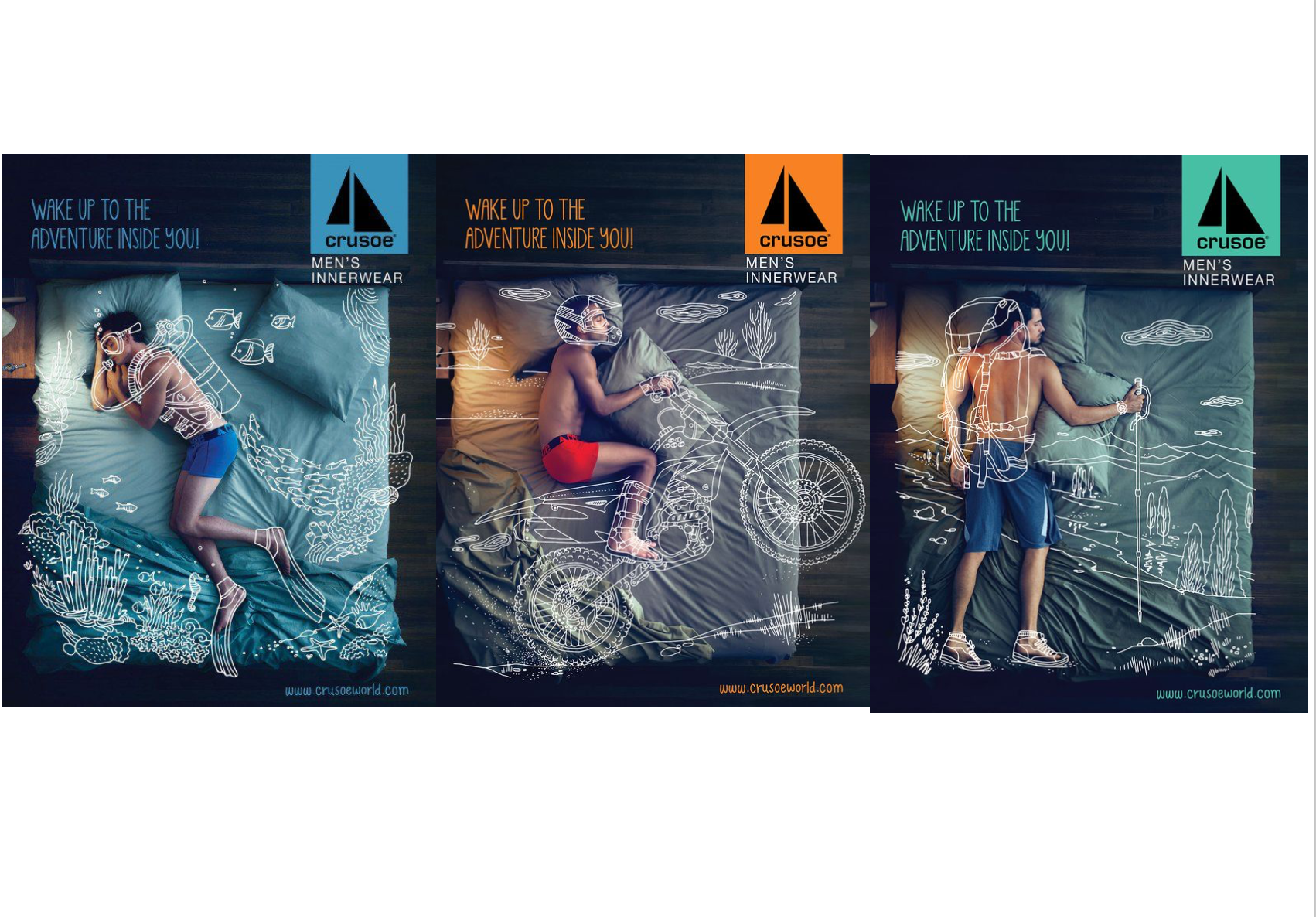
Illustrations + photographs
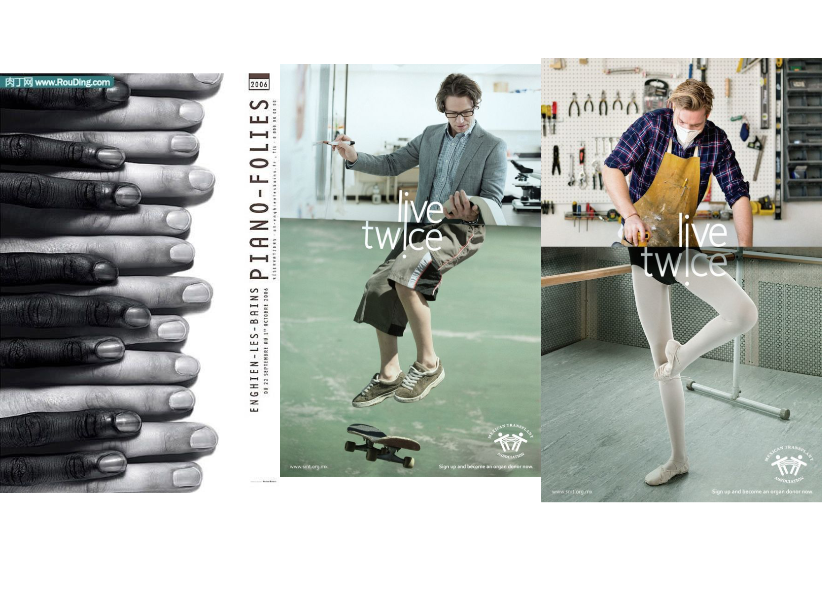
Photography/ Digital collage
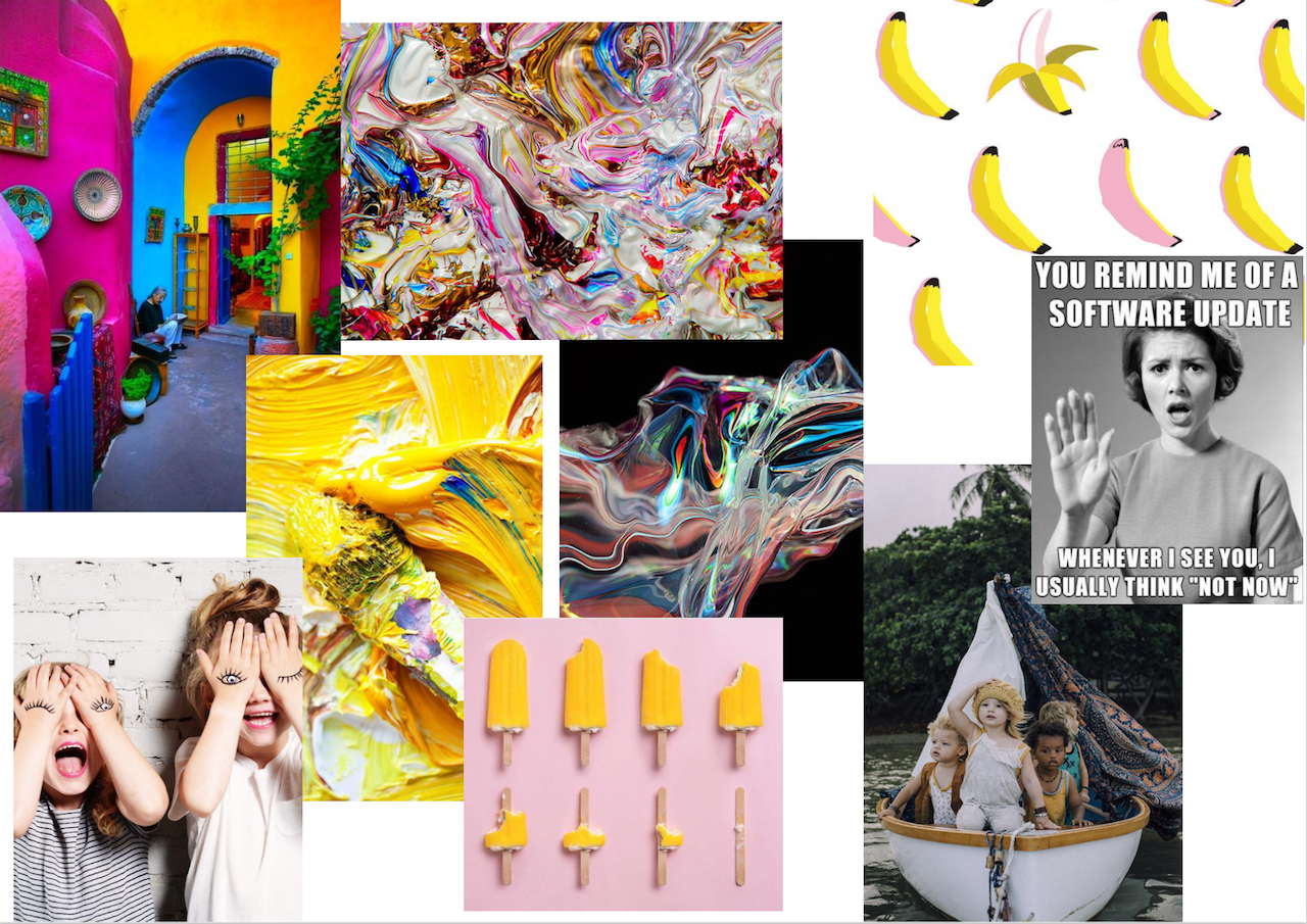
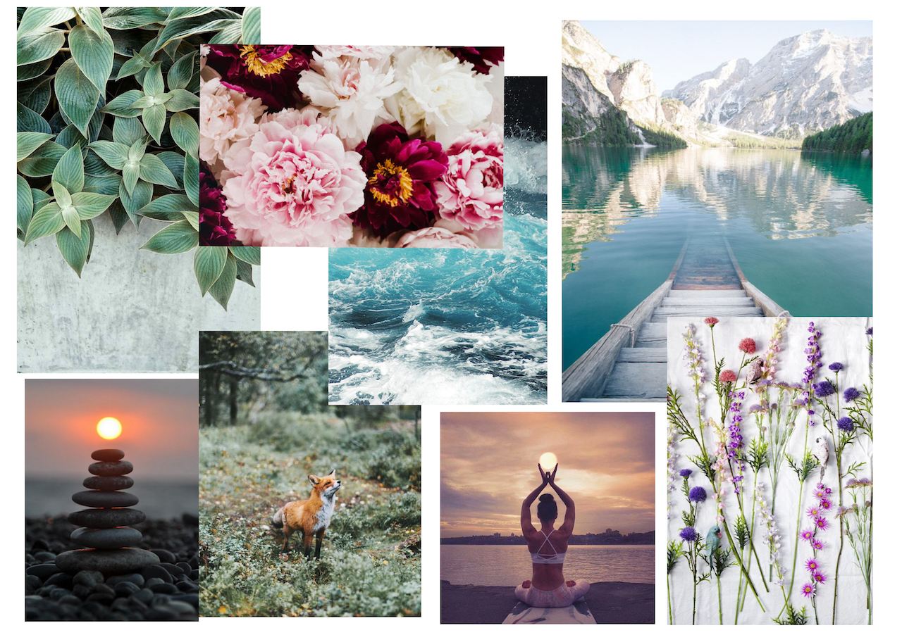
Illustrative posters
Illustrations + photographs
Photography/ Digital collage
Final Design
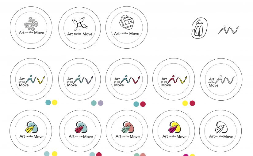
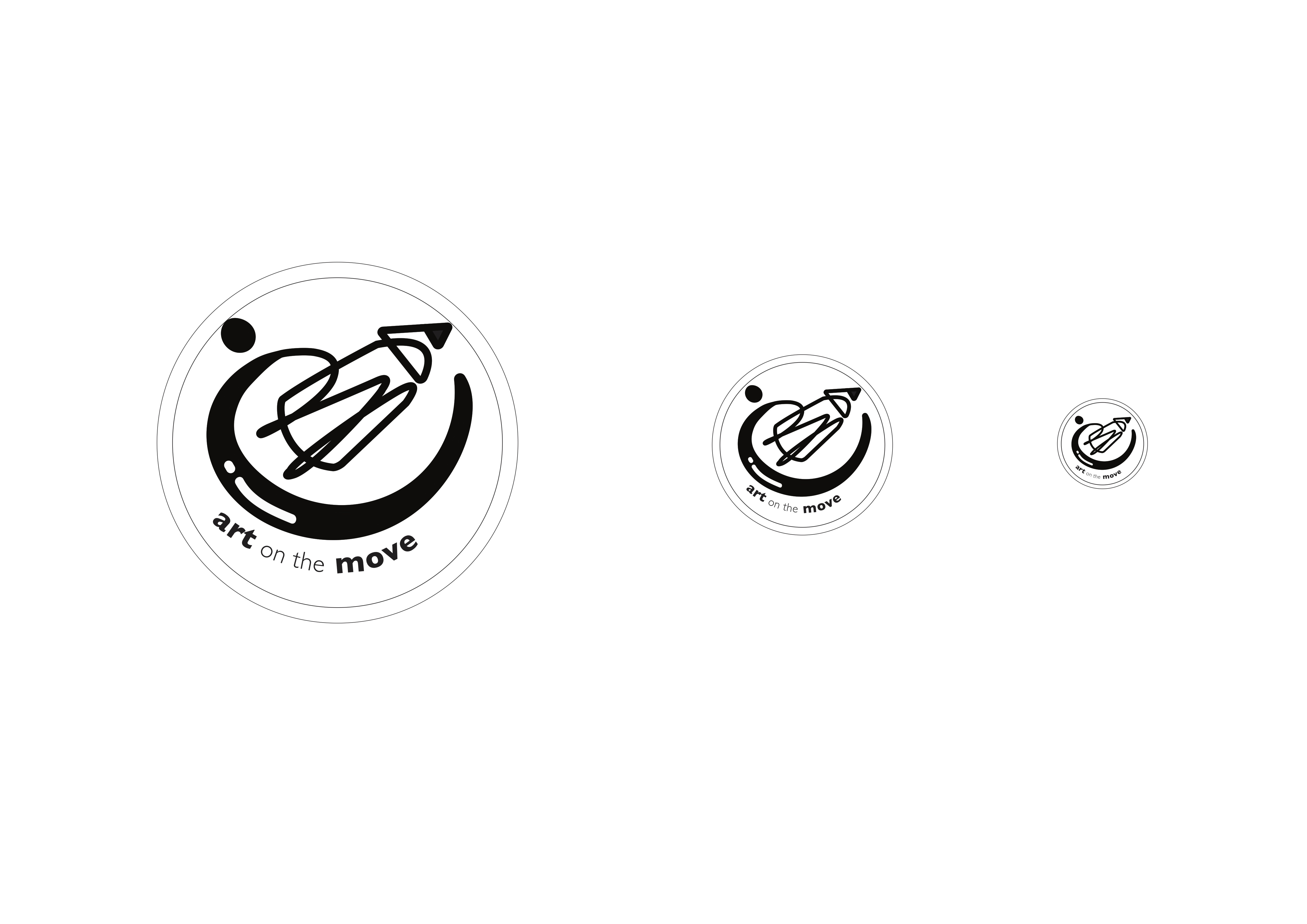
My final design concept is titled “Sense of community” . I felt that the “Arts on the move” programme provides patients with more than just an outlet for stress relief or distraction. The fact that the hospital provides a platform for local artists to showcase their works along with the works of some of the patients shows a collaboration amongst local artists, staff and patients in the same space. This allows for the formation of a community spirit in an environment that is no longer sterile and unfamiliar.
My design shows a figure interconnected with a pencil, symbolising the integration of each person in the community into the programme as well as the integration of arts into the environment and lives of patients at the hospital. The choice of shape of the logo, a circle, suggests community, friendship, relationships and unity. The choice of the colour blue, is a sign of stability and reliability as well as serenity and calmness, all traits that are important in invoking a sense of community. 


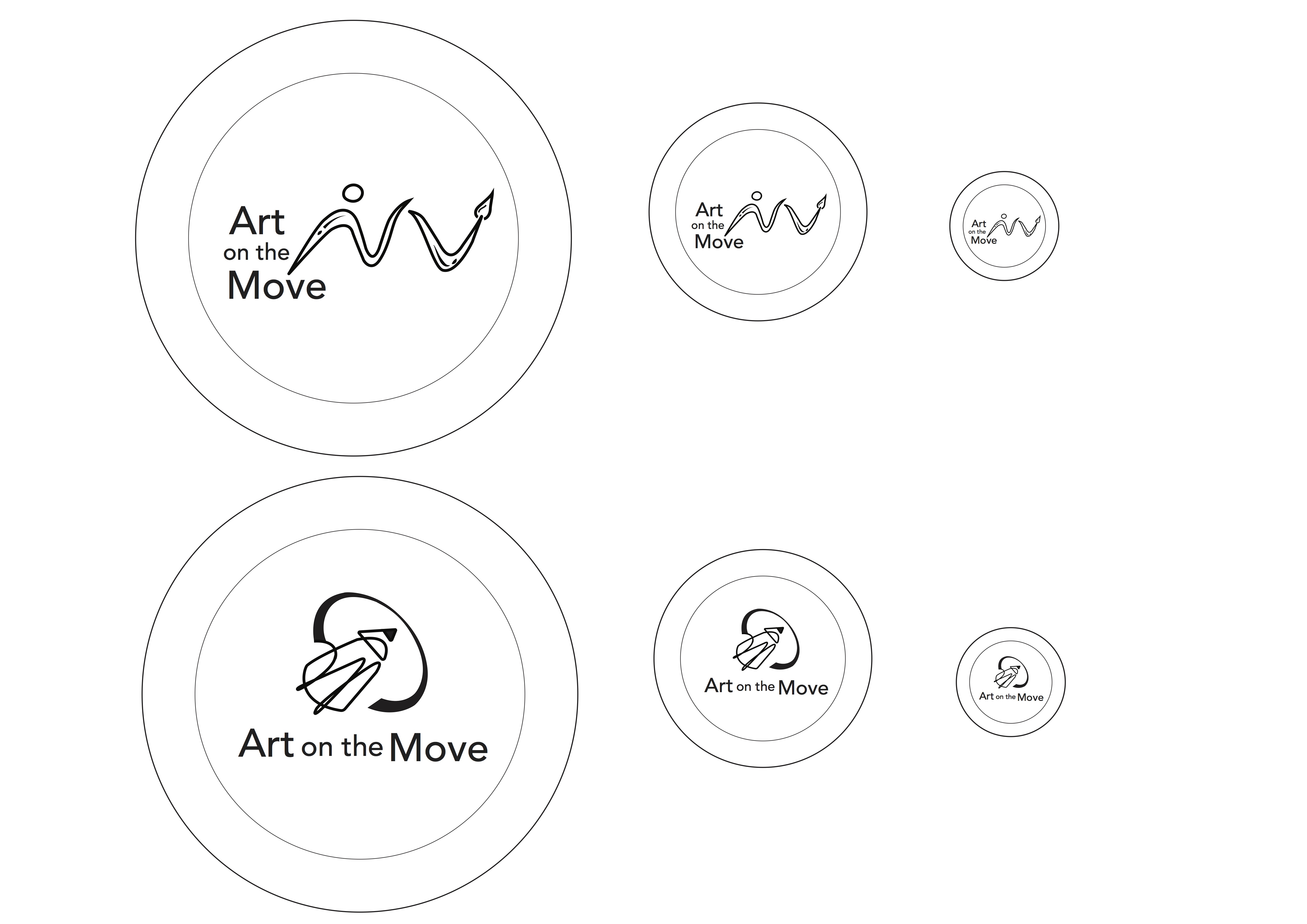
After the feedback gathered in class, I made some changes to my pencil design such as making the swoosh downwards instead of up and integrating an element of “community” in the design.
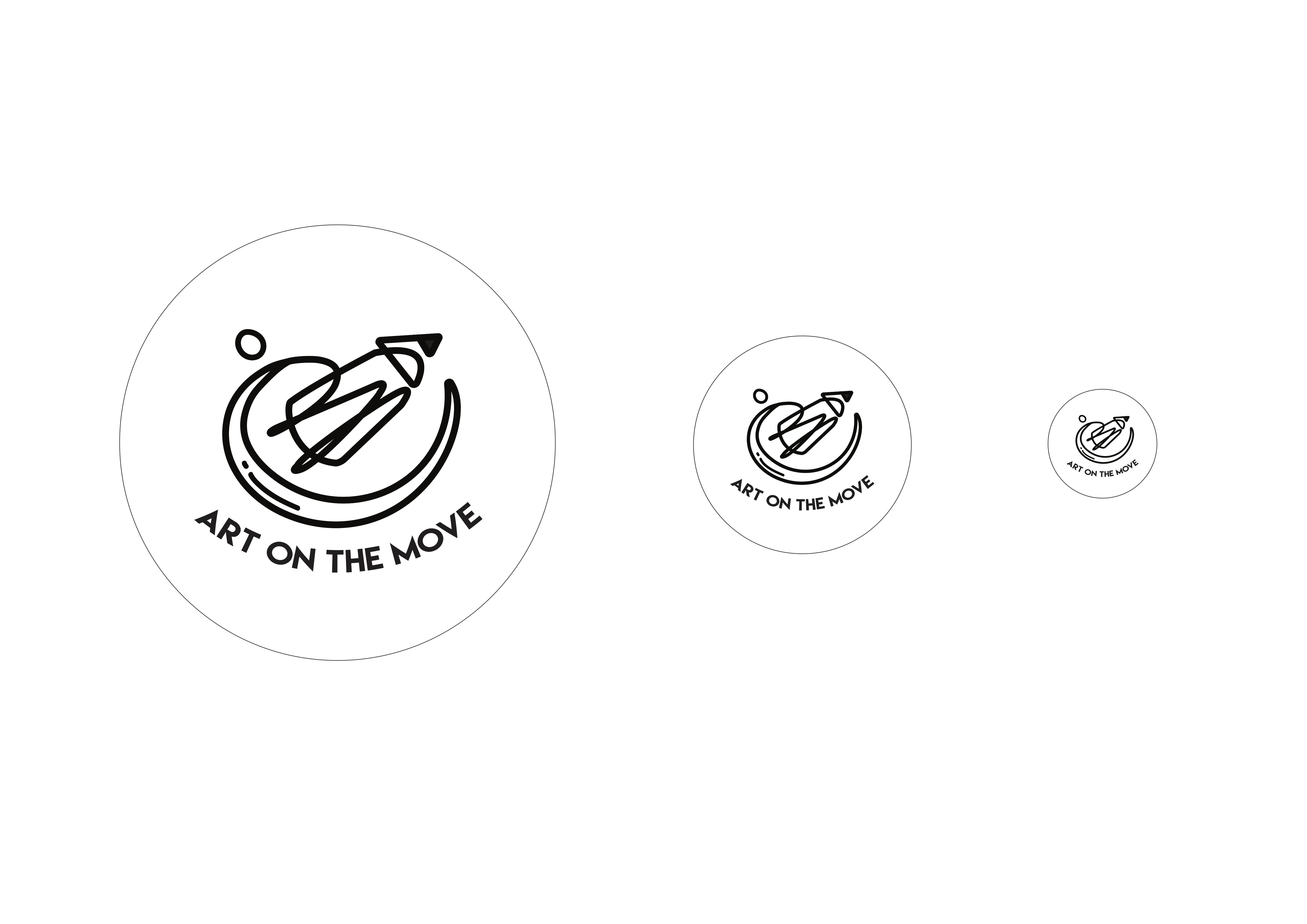
After more feedback from Michael, I decided to add more visual weight in my design and change the text font as well as orientation.
Colour Exploration

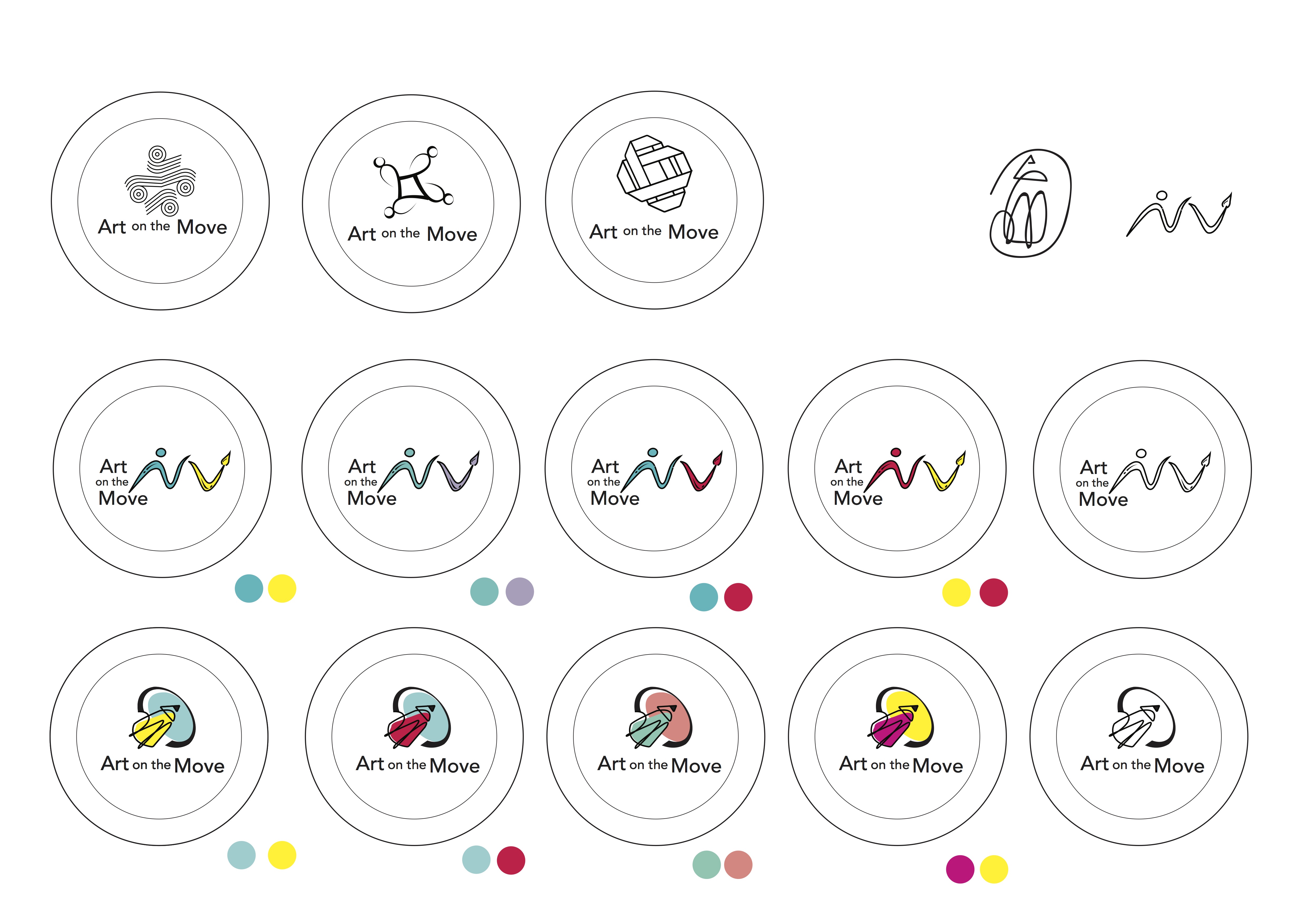
I played around with analogous colour schemes such as blue and green, orange and yellow as well as contrasting colours like yellow and blue to bring some vibrancy in the design. However, I felt like the colours felt a bit too “contained” within the black lines.
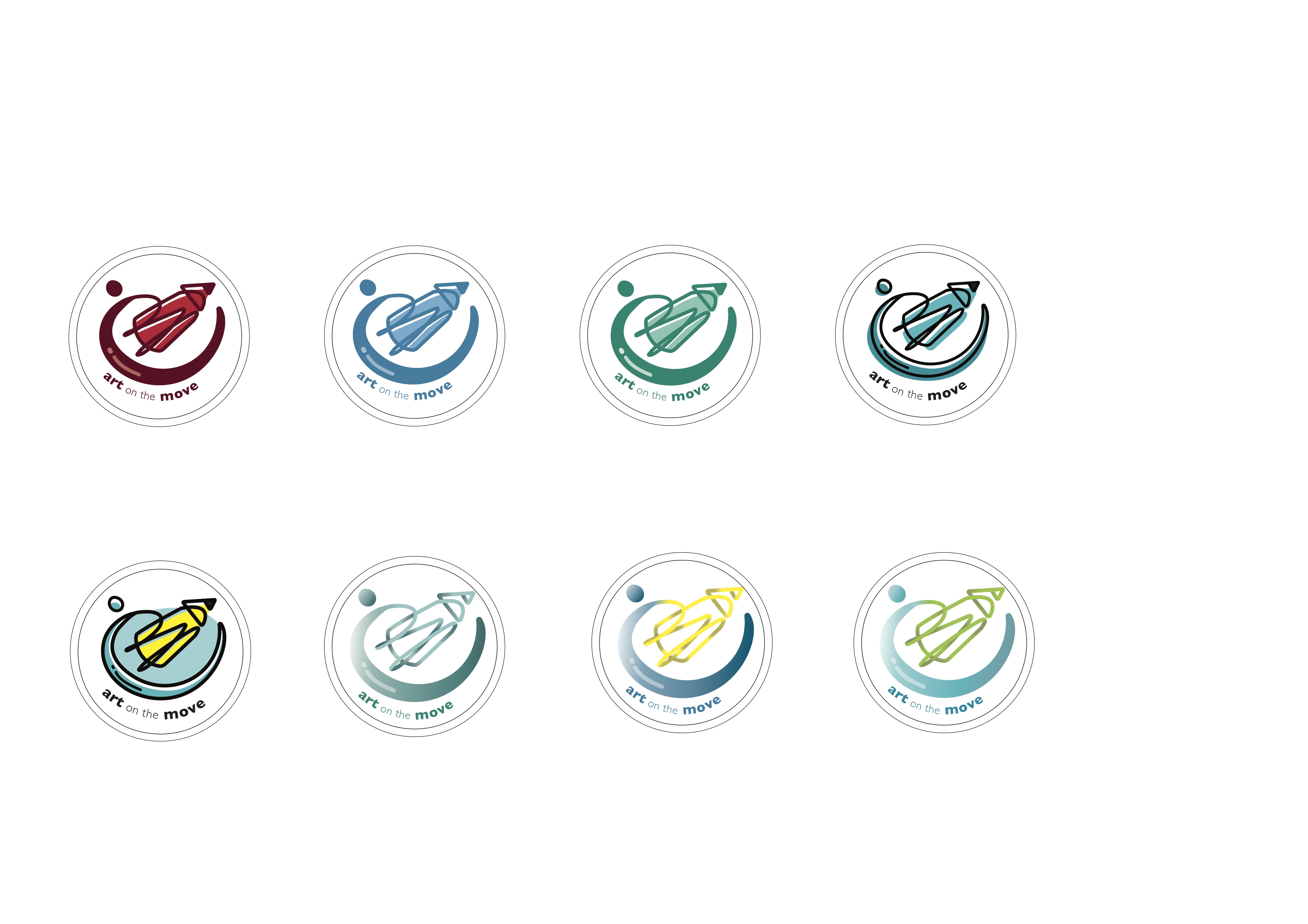
Subsequently, I tried different techniques such as gradient tones and playing with the shades of one colour. However, incorporating gradient in the lines made the “swoosh” lose its form. Hence, I decided to go with the flat colours instead and stick with the shades of one colour.
After conceptualising the possible themes I wished to explore, I went more in depth into the possible logo designs.
Initially, I was really interested to do my first concept which was ” A sense of familiarity” so I did a table based on a class exercise we did to explore the possible visuals I could come up with. It was really difficult and I found it hard to simplify the sketches or connect my concept with the mission and spirit of the programme.

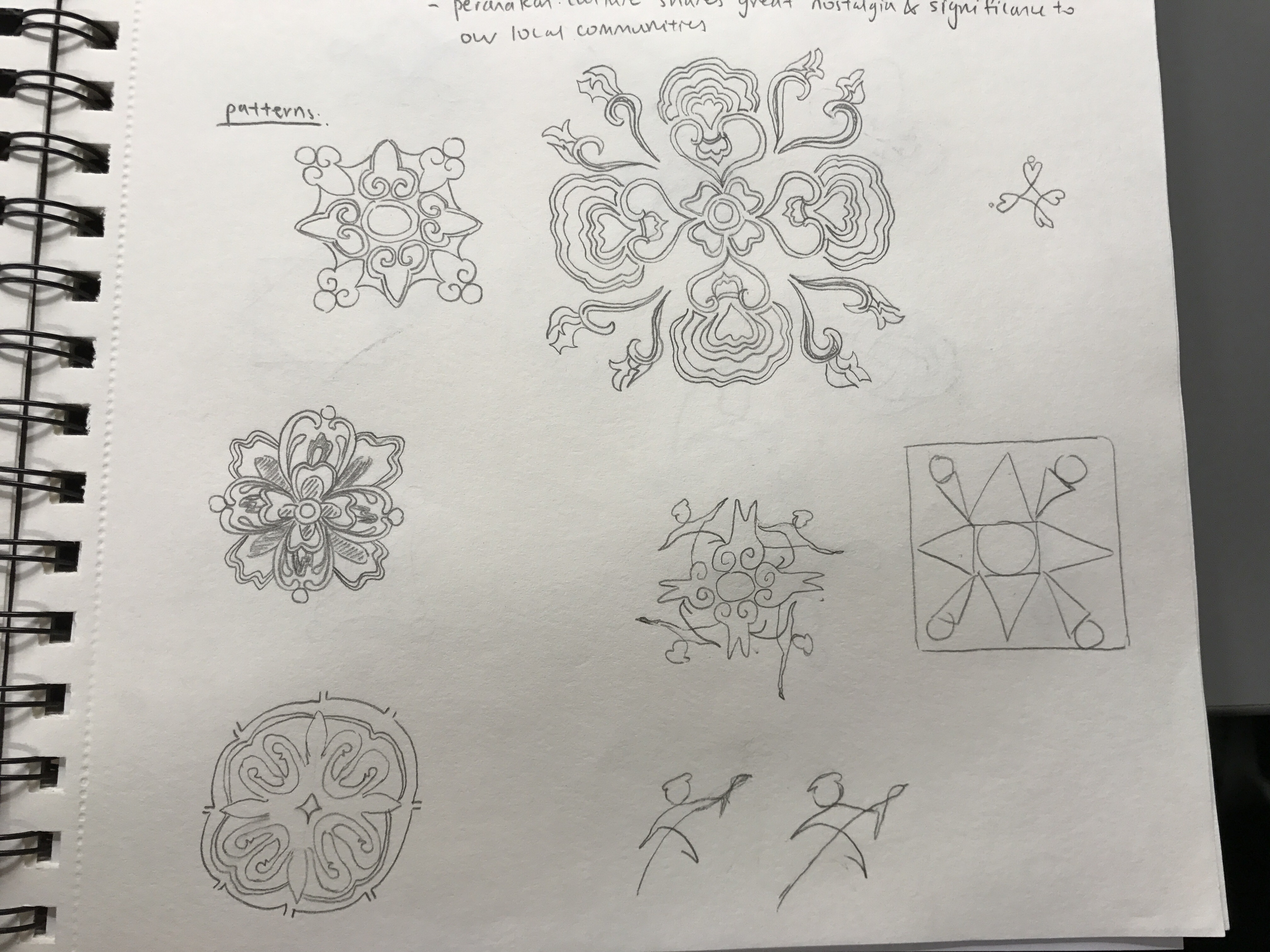
I was really interested in the idea of lamps and I tried to combine the idea of 3 ethnic groups represented by each lamp. The concept was that light gives a sense of warmth and home as well as encapsulates the passion and spirit of the community. I also tried to incorporate some batik or traditional motifs into the designs.
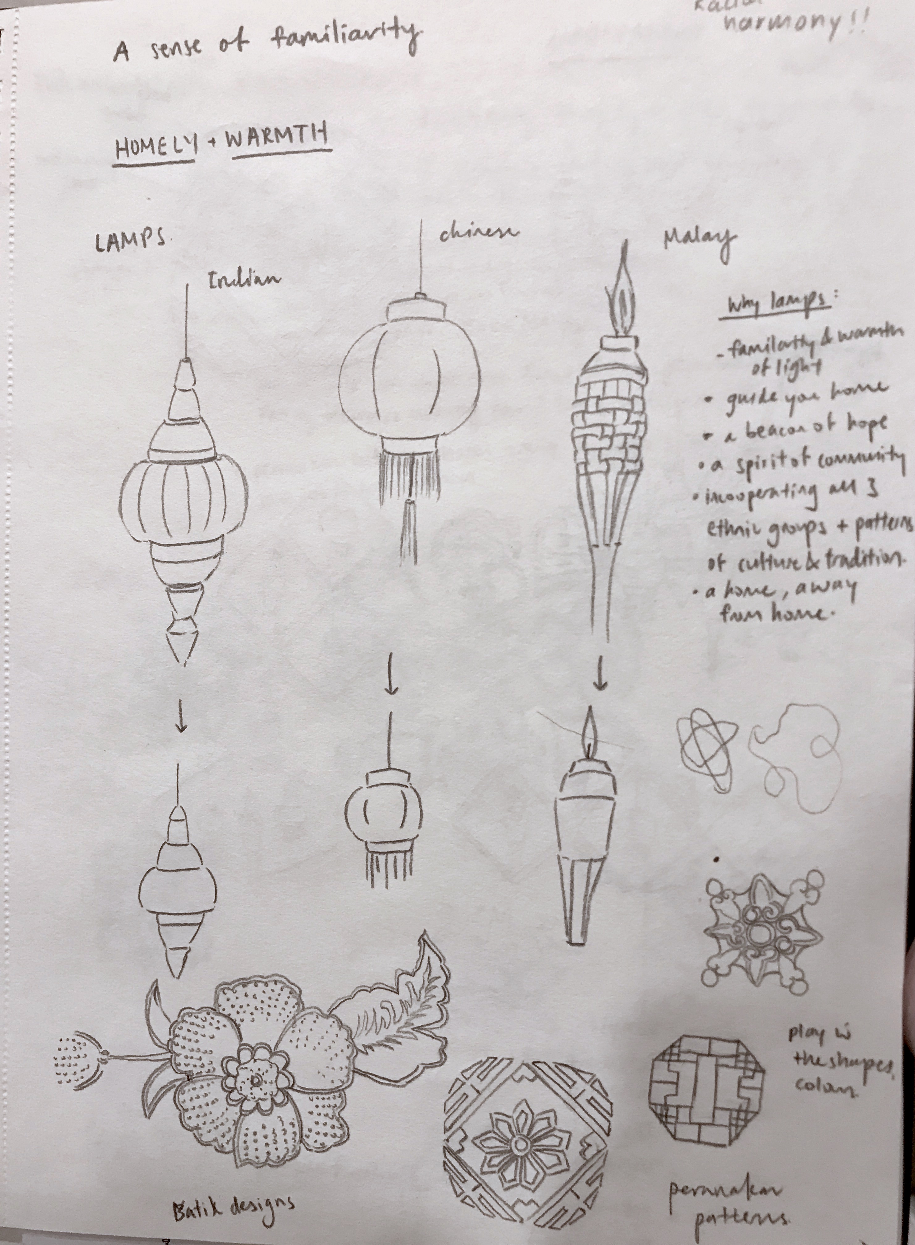

I played around with the different orientations and arrangements of the lamps. However, after feedback from the class and Michael, I realised that my designs came off more “cultural” and “racial harmony day” rather than “arts on the move”. Michael mentioned that one of the pattern motif I drew looked quite interesting so I decided to explore further and see how I could incorporate “arts” into it while simplifying and making it look more like a logo.
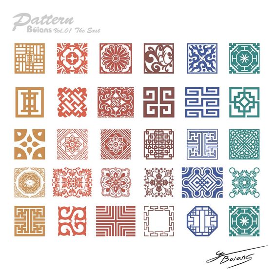
I looked more into tile patterns and explored the possible designs I could do. Since my inspiration was drawn from the Peranakan tile patterns, I looked more into the culture and customs of the Peranakan community and found that it actually tied quite well with the concept I was going for.
Peranakans retained their Chinese beliefs but also adopted local indigenous lifestyles such as having their own variations of the Malay language, Baba Malay. The culture also focuses a lot on family unit, an important facet of the peranakans and family members are usually found living under one roof. I felt that it was reflective of the mission and spirit of this programme, which was to bring people together through art and build a community regardless of one’s background or culture.
However, yet again, I struggled greatly with simplifying and showing the essence of “art” in the logo. So, I picked out the key idea and shape I wanted which was a circular structure, drawing on the idea of a community, family and interconnectedness. I explored many weaving and interlocking designs.

However, I still found it hard to show the “arts” element. I was afraid my designs would end up looking more “community centre” or “social service” like. As desperation drew close, I decided the best way was to not overthink and just show the obvious, which was to incorporate pencils and paint brushes. However, I felt it was the best way for the logo to stay relevant, distinctive and focused.

I stayed with the idea of community and interconnectedness while adding a bit of fun and quirky-ness into my designs. One big lesson I’ve learned from this process would be to just not over complicate things and overthink my concept, but rather just let the visuals speak for themselves 🙂 Moving forward, I will digitalise my designs and play around with scale, lines and perspective to see what I can come up with.
Feedback that I gathered after class was that the design with the paintbrush was too “spread out” and I had to put the brush with the person together in order to show some form of interconnectedness and integration.
As for the second design, the pencil was too big and perhaps I could make the community aspect show through better. Some suggestions were to bring the circle down to the bottom rather than covering the top and maybe show some human forms in the design.
I also did some mock ups for the colour schemes based on analogous and complementary colours as seen above.
Observations/ About the programme:
Design Aims:
Develop a logo design for its “Arts on the move” programme for application on button badges worn by volunteers. A symbol that represents and captures the mission and spirit of the programme and volunteers
Be distinctive, visually striking, aid easy identification
Concept 1:
A sense of familiarity
Keywords:
Warmth, family, community, homely
Rationale:
The arts programme at the hospital emphasises strongly on using art to create a caring, relaxing and engaging environment for patients. Hence, the hospital provides a platform for local artists to showcase their works along with the works of some of the patients. A collaboration amongst local artists, staff and patients in the same space allows for the formation of a community spirit in an environment that is no longer sterile and unfamiliar. A common reoccurring theme in their works were often local culture and arts. By introducing elements of the local arts and culture scene that is unique to the Singapore identity, it creates a sense of nostalgia and familiarity for the patients. For instance, maybe batik painting patterns, motifs and colours could be used and incorporated in a single unified logo.
Concept 2:
Humour, bright colours and a bit of playfulness
Keywords:
Fun, quirky, joyful, uplifting, positive
Rationale:
The designs will encapsulate the idea of art as a medium to evoke happiness and joy and that anyone can create art no matter how young or old they may be. Designs will be fun and quirky with simple illustrations and bold colours for easy identification.
Concept 3:
One with nature
Keywords:
Heal, Serenity, untroubled, carefree, peaceful
Rationale:
Nature has always been known to evoke tranquility and peace, evident in the nature artworks of scenic landscapes, floral and fauna displayed around the hospital. The focal point of this concept would be art as a form of therapy to help in the recovery for patients.
Printing Process
I struggled quite a bit with the printing process as my layouts all either came out bigger than A5 or smaller than A5 and I had to visit the printing shop 3 times before getting the right size. I also tried experimenting on different coloured paper, white vs cream but went with the cream instead as I felt that it fits the feel of the zine better.
Sadly, the third time I went back and finally got the right size, I went to a different shop and my pink turned out more purple instead. 🙁
Takeaway and Improvements
Finally, after final presentation and critique, some feedback that I got was that my contents page didn’t really fit into the entire zine and that I had to look out for hypenations in my paragraph which I overlooked. Also that my paper type didn’t fit the required 100-120gsm that was a mistake on my part as I thought I could get away with it when the temptation for thicker paper got the better of me. I agreed that the execution of my contents page could have been better and maybe went with the tile/ traditional theme instead. Also, after looking through it once more, I felt that improvements could have been made like including a tile pattern at the corner of every page of example to tie the whole zine together better.
Overall, I think this project was definitely a really fulfilling one and I had a lot of fun coming up with the concepts and designing my first ever zine?!! Great end to F2DII to conclude my entire semester 😀 Thanks Joy for all your guidance throughout the semester and to the class for the good times and support!
Neighbourhood exploration research – https://oss.adm.ntu.edu.sg/limx0098/project-2i-neighbourhood-explorer/
Infographic – https://oss.adm.ntu.edu.sg/limx0098/project-2i-infographic-process-and-final/
Zine Process – https://oss.adm.ntu.edu.sg/limx0098/project-2ii-zine-process/
Hello!
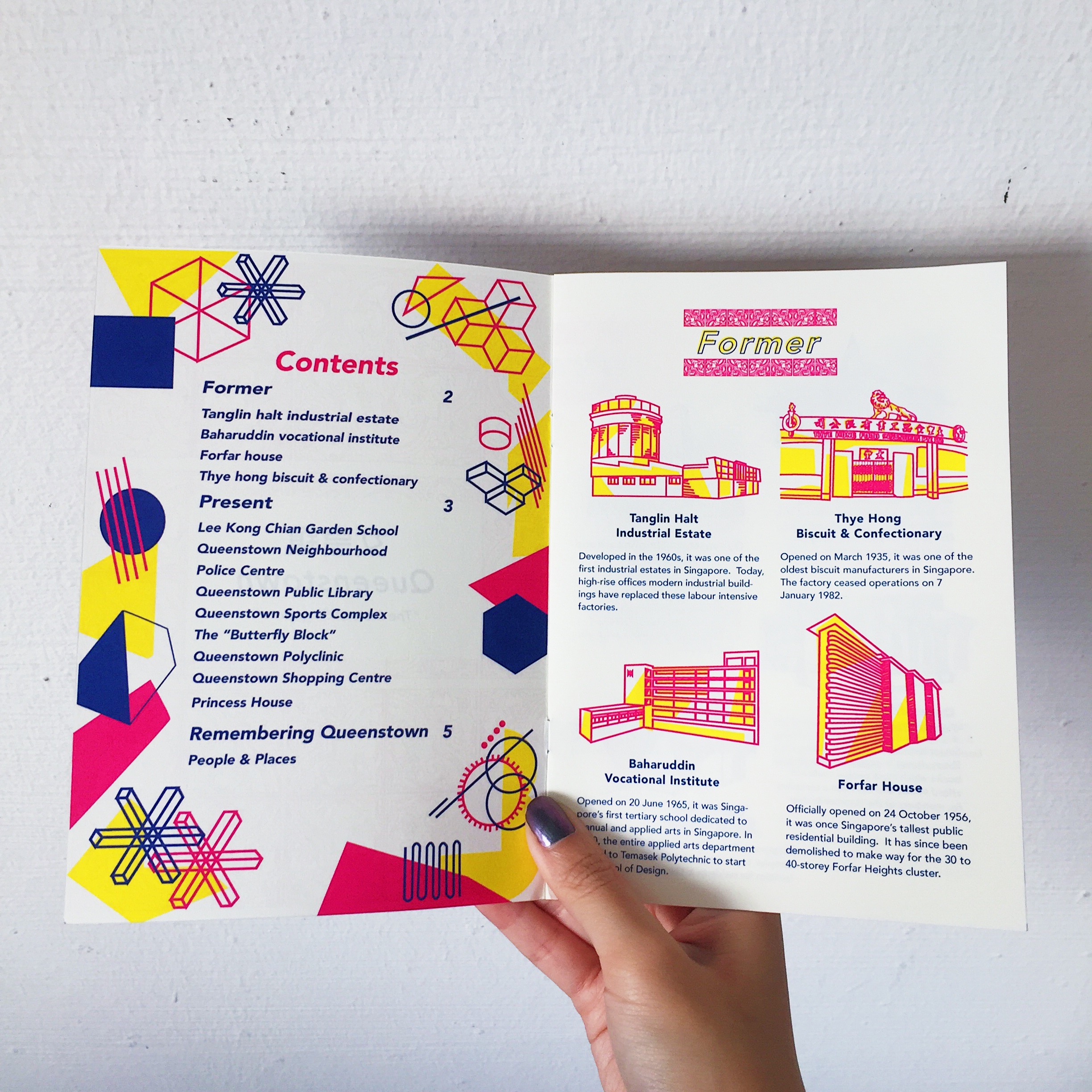
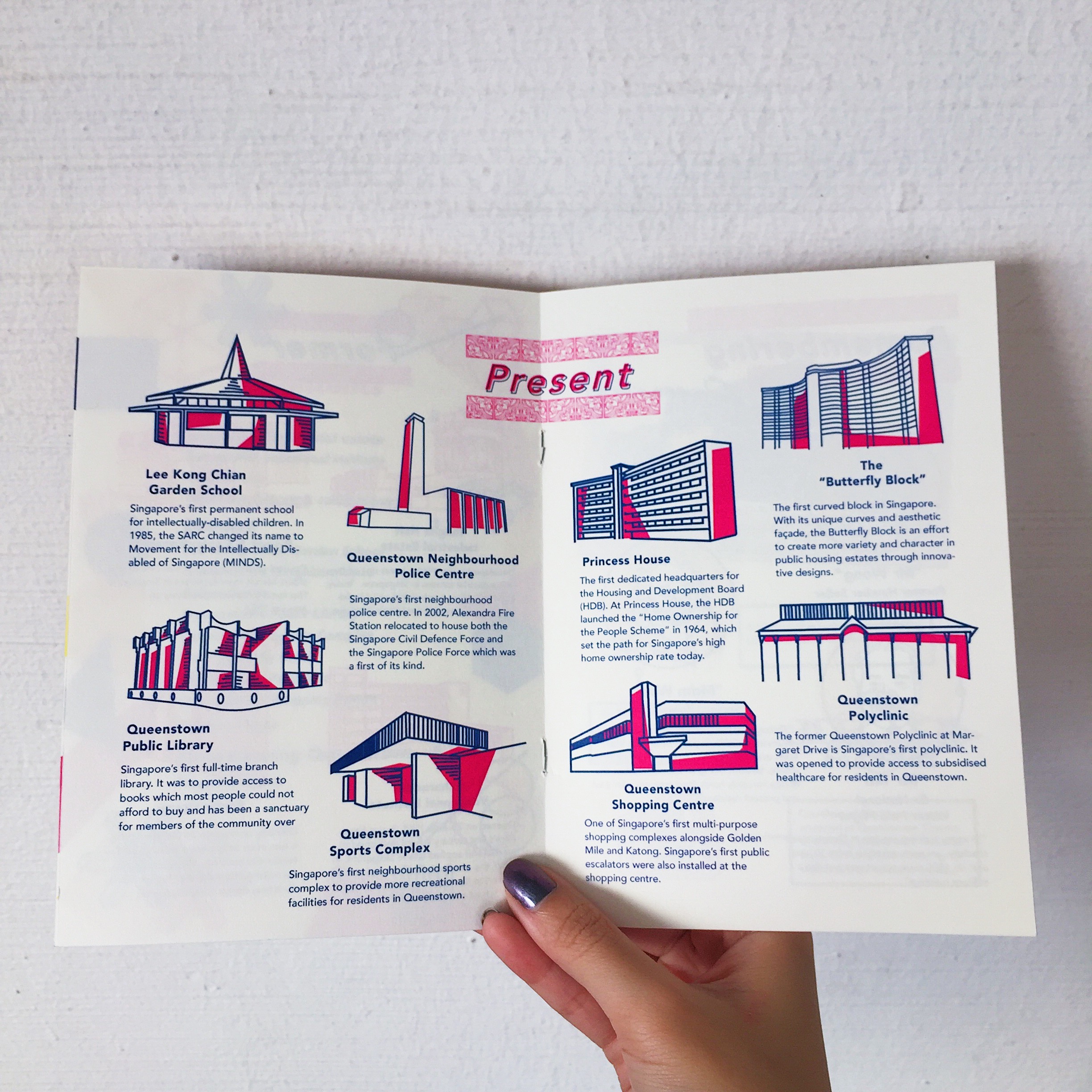
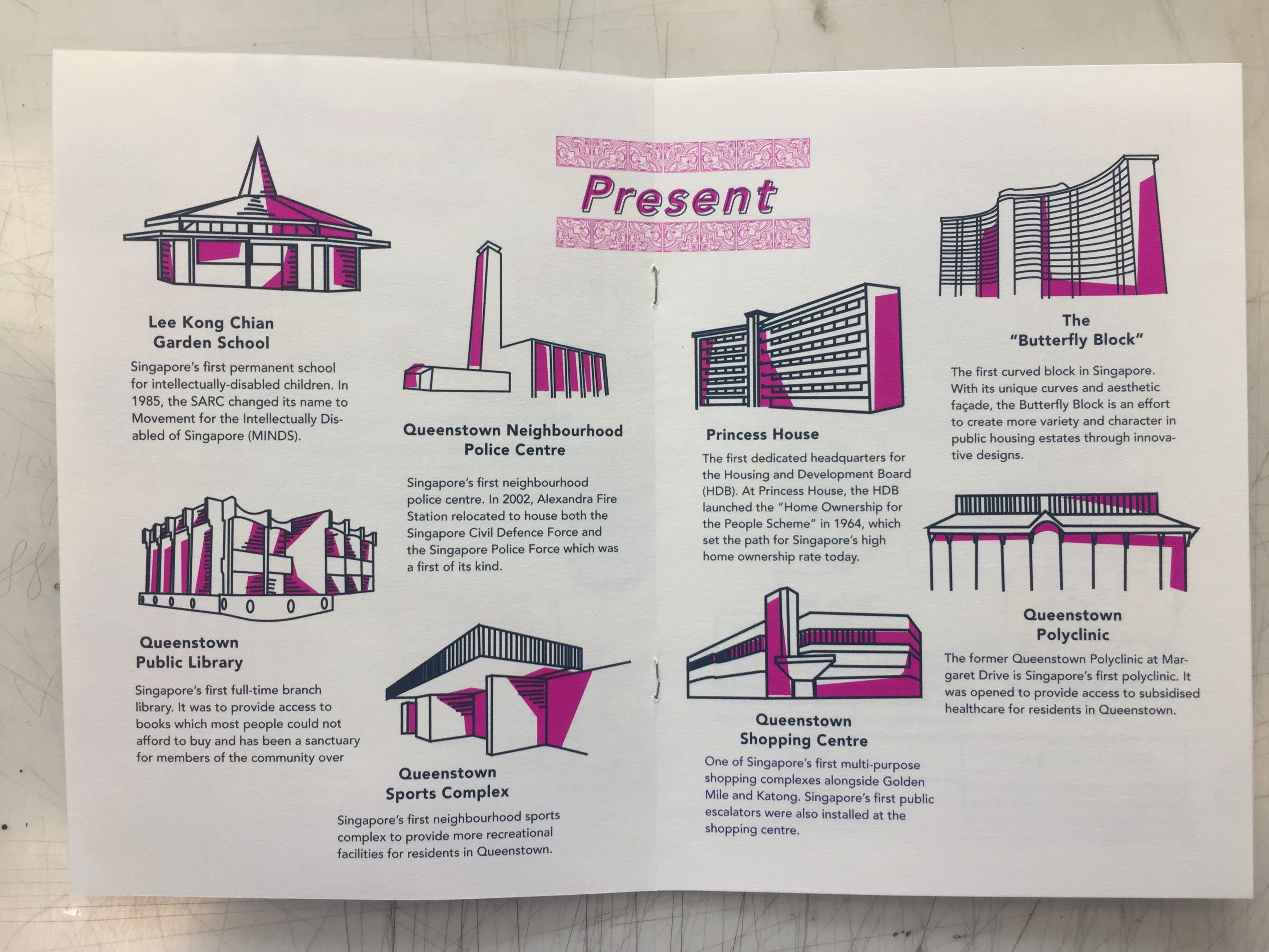
As a continuation from part 1 of our neighbourhood infographic research, my zine would consists of the “firsts of Queenstown” and here’s the break down of my work process!
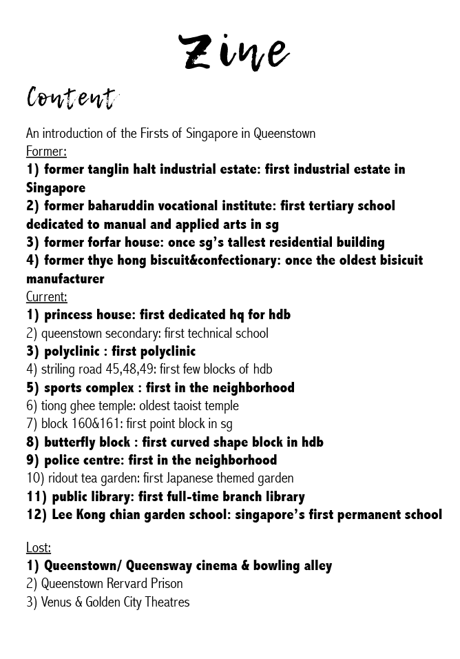
Due to space constraint, I had to narrow it down to the places that were bolded and they were places that I felt best embodied the spirit of Queenstown as the pioneer of many firsts.
References


Layouts


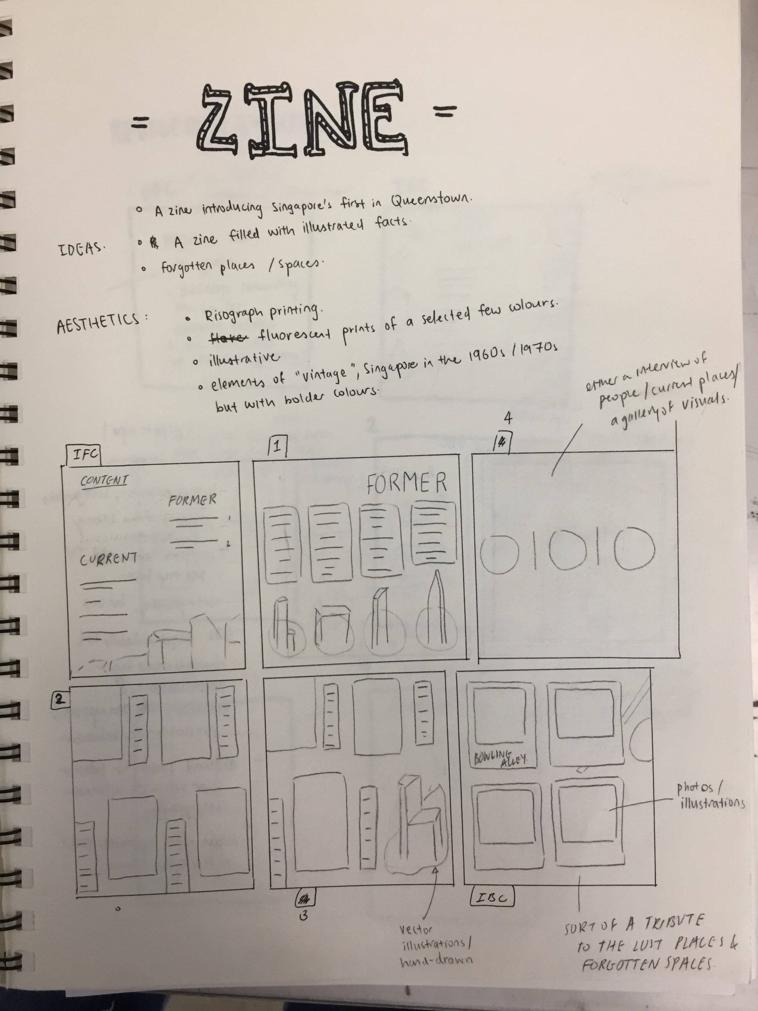

My initial layout followed a simple 4 column grid and 2 places in each column. However, after my first consultation Joy advised me to experiment with different placements given the freedom of space I had with the middle spread.
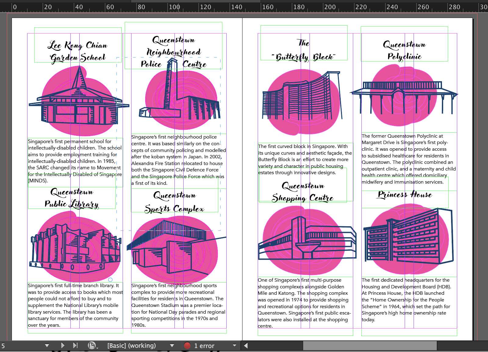
My friend suggested why not I put 4 places in a spread instead to make it less cramp and gives more room for the text and illustrations to breathe. However, after trying it out, I felt like 4 places in a spread were too little and given the constraint of 8 pages, I had to maximise my space more and it also defeated the purpose of making a zine about the firsts of Queenstown if there were only 4 places mentioned.
Typeface & Text
Initially as you can see above, I used a total of 2 different fonts for the header and body text. My header text was more cursive and the body text was simpler and sans serif. However, after consulting friends, I also agreed that maybe sticking to one font was better and I could play around with the different weight, (heavy, medium, light etc.) to make the texts look neater and readable.
After the first consultation, Joy also suggested that I cut down on the description of each place to just the essential contents as it was coming off too wordy and cramp.
Illustrations
As seen above, my initial illustrations had blobs of pink overlaid with my line illustrations. I actually had the idea of doing this from some risograph illustrations I saw on pinterest and I thought that after printing the pink would be lighter and just provides a backdrop for my illustrations. However, my friends did mention that it looked like I was just “covering up a bad illustration”. Hence, I decided to continue with what I did with the illustrations for my infographic. https://oss.adm.ntu.edu.sg/limx0098/project-2i-infographic-process-and-final/

Revised Layout and Typeface
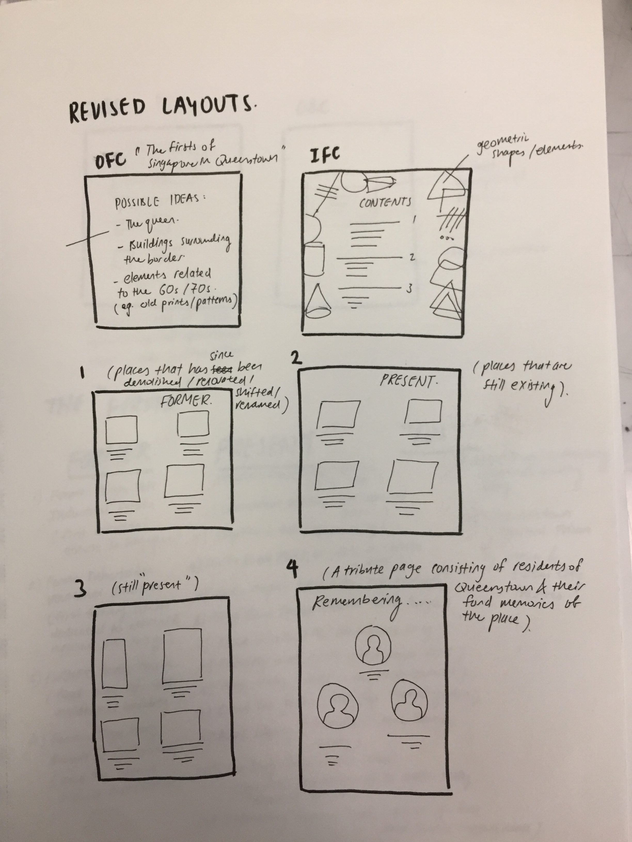
Spread 1

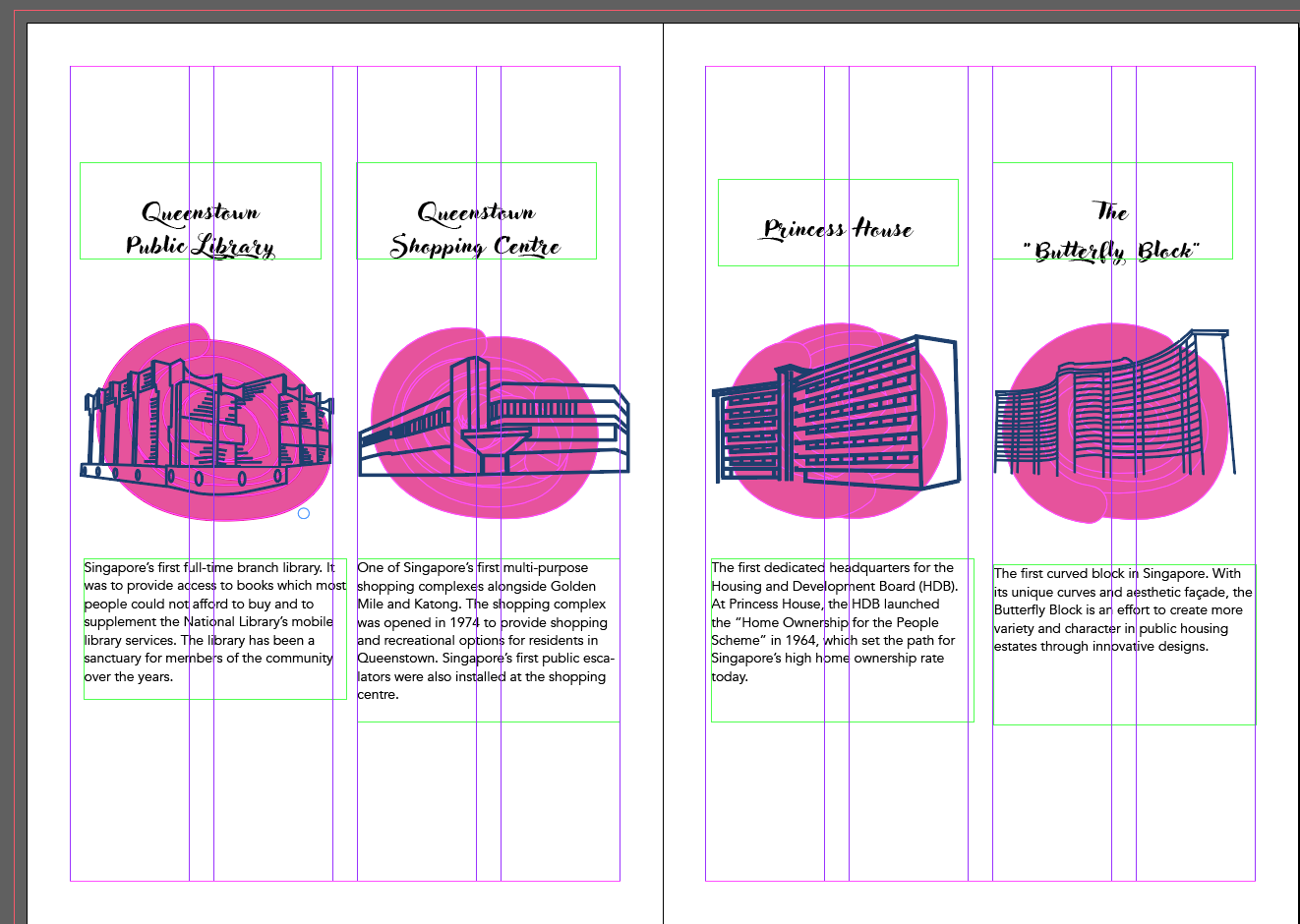
My contents page had elements of geometric shapes and patterns because I wanted it to be more fun and I thought it went well with my illustrations. To differentiate between the “former” and “present”, I used 2 different colour schemes. I also standardised the entire zine to just one font, Avenir in all its glory.
Spread 2
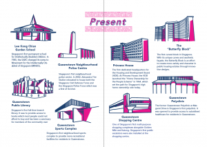
My middle spread layout was now placed in sort of a semi-circle instead of the previous more structured grid. How I came up with this layout was really just moving the objects around and just figuring out which layout worked the best with the limited amount of space I had. I had to consider factors like heading placement, body texts and the illustration. Do I centralise them? Or is the heading off centre for places at the side and centralised as it goes to the middle? Is there enough space at the sides for the text to breathe?
Spread 3
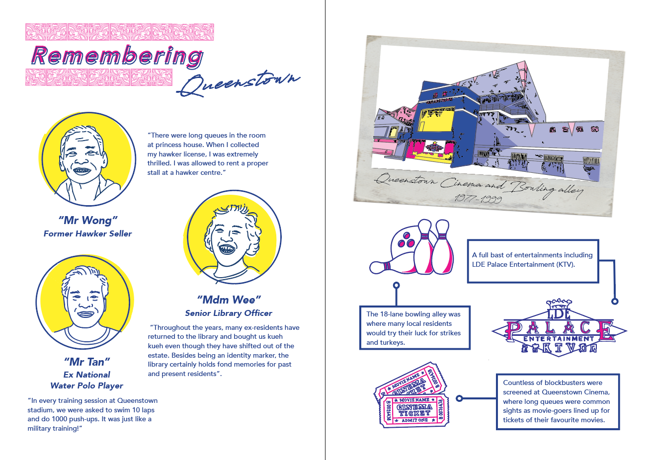
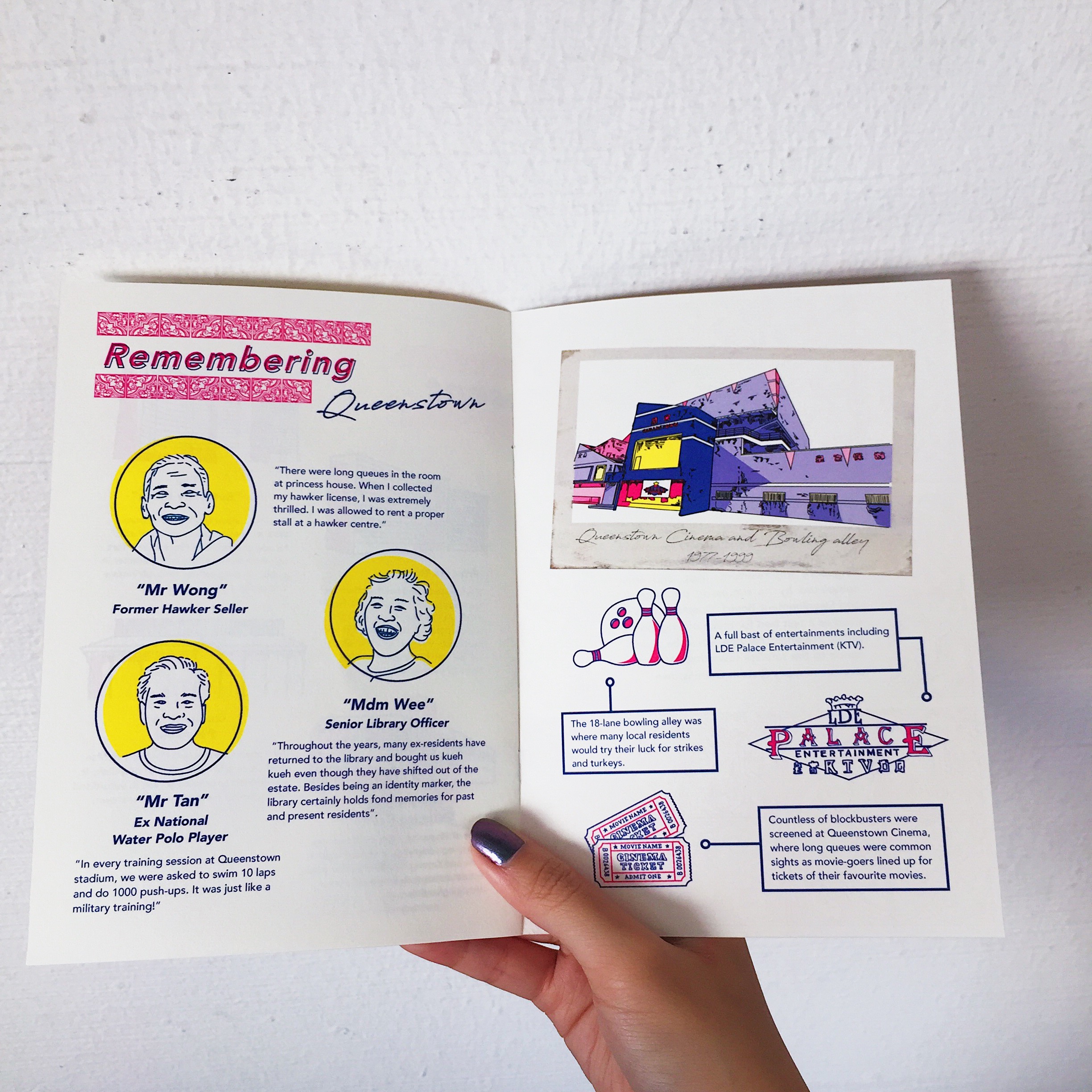
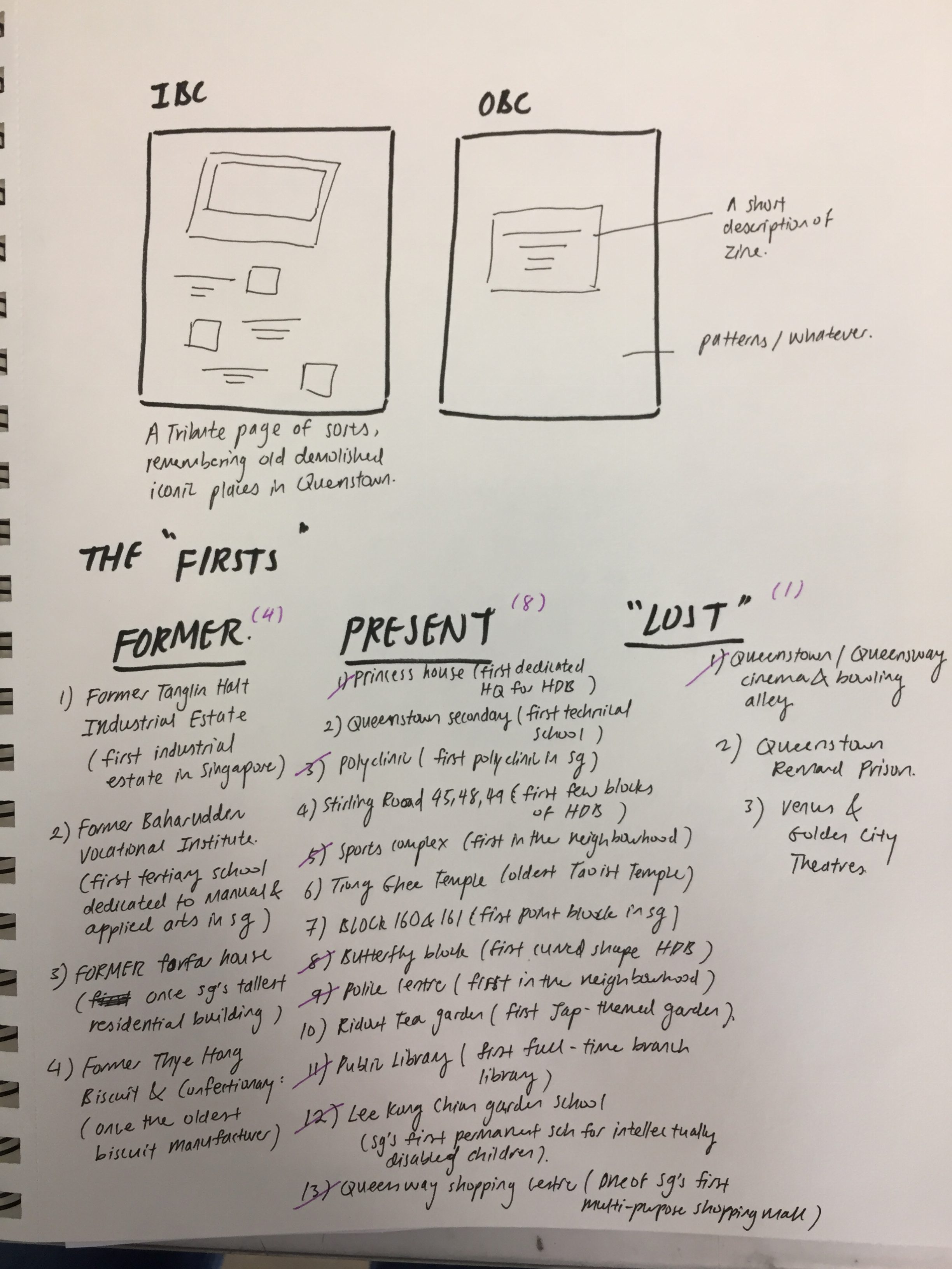
This spread was more of a “tribute” page. The left was a recount of the memories of old residences living in the estate after interviewing some of the residences during my site visit. The right was a tribute to the old Queenstown bowling alley, ktv and cinema with a short description of each. Initially during consult, Joy suggested that I change up the polaroid frame to a drawn one to match the rest of the pages. However, I had this idea in mind that the reason why a real picture was used was because much like the old bowling alley, it was a thing of the past and no longer fits in anymore. Hence, it was meant to look out of place amongst the rest. The illustration style of the bowling alley was also drawn differently in comparison to the rest of the spreads. Also, if we had the chance to explore more printing or layout options, I would have liked to print the polaroid out separately and slot it into the zine, making it detachable like a real polaroid.
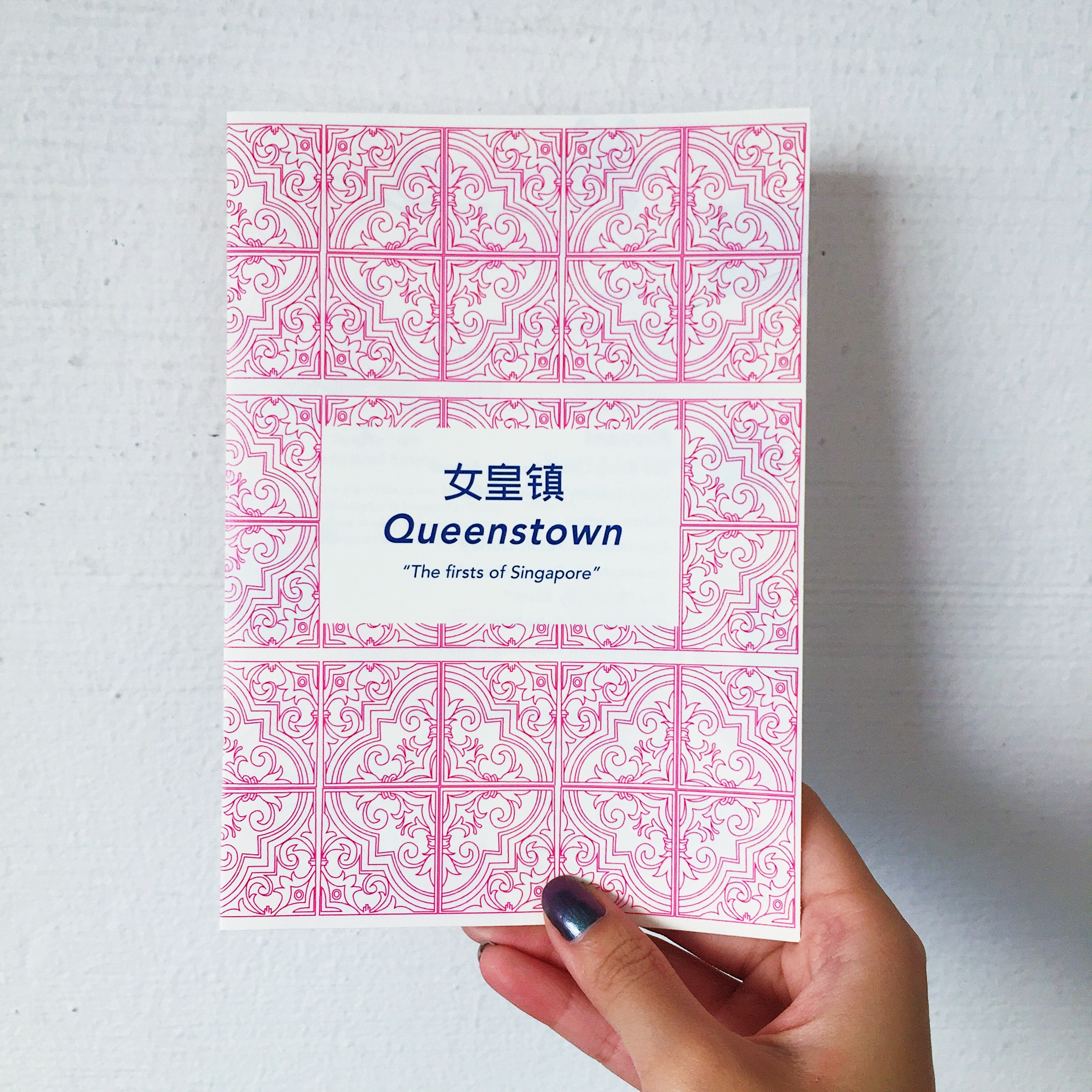
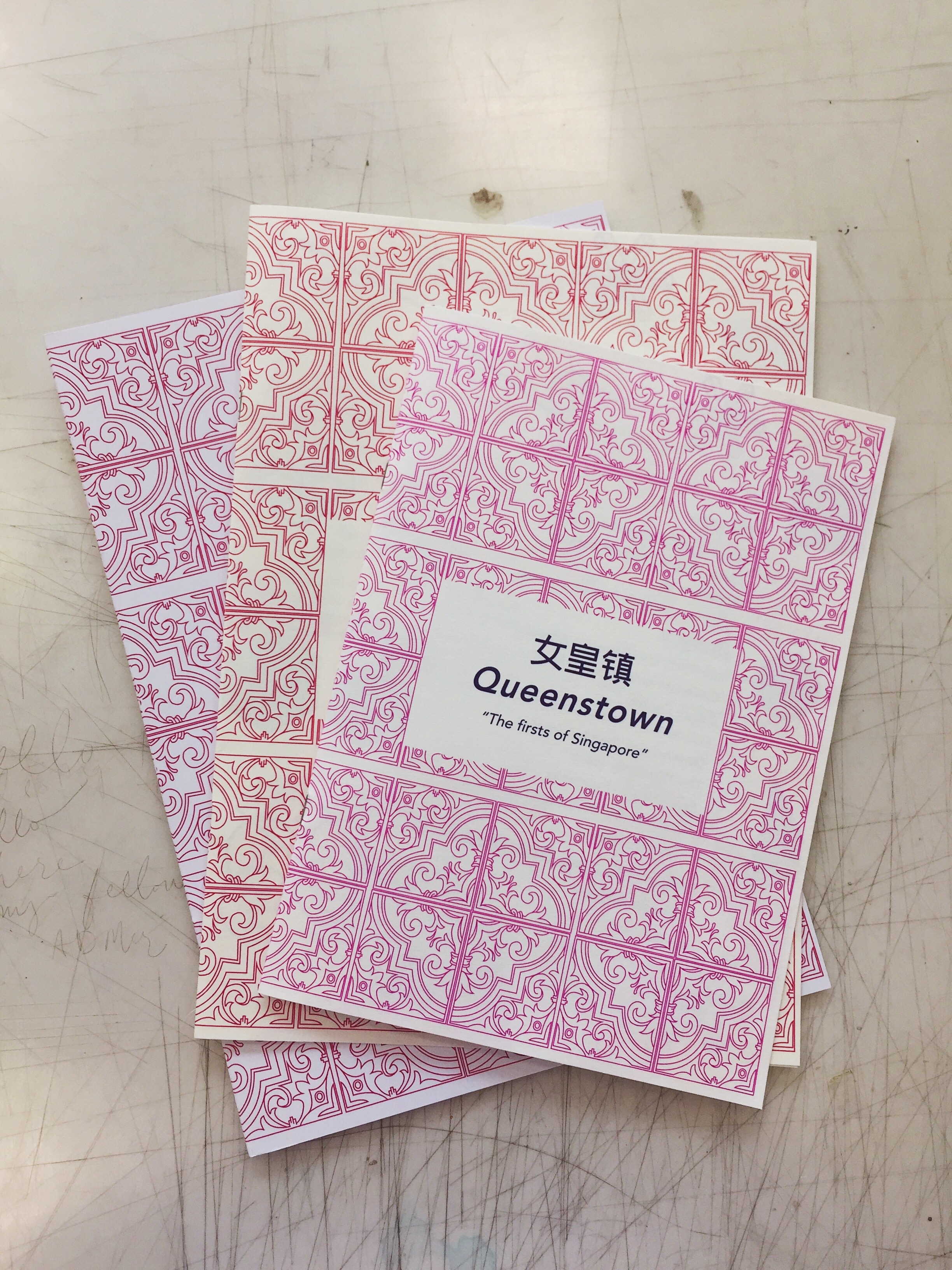
Cover + back page
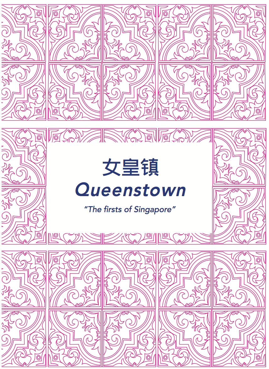

The idea behind the cover page was using the traditional peranakan tiles. Given that it was a historical recount of old places in Queenstown, I thought it would evoke a feeling of nostalgia with the use of a familiar pattern that is uniquely Singapore. The back page includes a short description of the history of Queenstown as sort of a introduction to the zine and the significance of the “firsts” in Queenstown.
Next posts will feature the final printed zine and reflections 🙂
For this project, we had to propose an idea of an installation work that considers time, space and body. Here are a lists of controversial video, sound or performance art installation that I thought were quite interesting to look at and hopefully adopt certain ideas or styles from these artists.
Santiago Sierra
His works mostly focuses on social issues of our economy today and highlight some of the often ignored problems inherent to a globalised capitalist economy. His works usually encompasses photography, video, text, sound, installation and sculpture. This reveals the scope of Sierra’s practice and how he articulates his ideas through different media.

Sierra’s work normally takes the form of ephemeral actions or temporary interventions. While adopting a minimal language, he creates ‘incidents’ that highlight the existence of situations of conflict. Many of Sierra’s more recent projects have been the outcome of a particular social context, exposing the reality of that environment.
For the past two decades, Santiago Sierra has carried out provocative actions around the world. Influenced by the formal language of the minimal and conceptual art movements of the 1960s and 70s, Santiago Sierra’s work addresses the hierarchies of power and class that operate in our modern society and everyday existence. Sierra became well known for his actions in which underprivileged or marginalised individuals were hired to perform menial or pointless tasks in exchange for money.
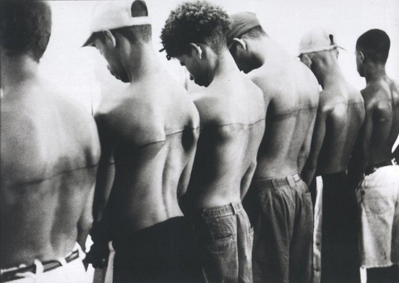

Pieces like these underline the situations of labourers’ exploitation, isolation, and repression within capitalist structures. By transforming individuals into consumer goods, Sierra also highlights current socio-political issues while challenging the intrinsic mechanisms of reality.
As a result, the essence of his work can often be found exemplified in the tension that is generated and sustained between the ephemeral performance, its documentation, and the spectator. The latter is hence exposed to the edges of morality and permissibility, but also to the formal and poetic articulation of the voices of those who are ordinarily invisible or unheard.
Wim Delvoye
Wim Delvoye is not merely an artist – he’s a provocateur. An enfant terrible of the contemporary art world, Delvoye’s work is often designed to shock, appall, and provoke. The Belgian artist regularly pushes the boundaries of his craft, forcing audiences to question his ethics – not to mention how we should be defining ‘art.’ He’s since become well-known in the art community for his provocative works employing a range of rather unconventional materials, to include fecal matter.
In 1997, Delvoye began tattooing live pigs in Europe – a practice which was, unsurprisingly, met with widespread criticism from animal rights activists.
In 2004 he bought a farm in a small village outside of Beijing, where animal rights laws are practically non-existent. He systematically elaborated a new concept that he called his ‘Art Farm.’ Here, specialists look after his pigs, while the artist sedates them, shaves their skin, and tattoos them. Veterinarians treat their skin after the process to ensure that their wounds are clean and their skin is properly moisturized.


The tattoos themselves are based on Delavoye’s drawings, mostly references Western iconography such as the Louis Vuitton monogram and characters from Disney films. By placing these iconic images on pigskin, the artist takes away their commercial value. They become pure decoration – their only purpose is to shock.
The artist sees the pig as an investment. Pig skins value highly in China, so Delvoye tattoos his pigs when they’re young. Buyers can choose from live or taxidermied pigs; some buyers choose to purchase the piglets and let them grow old on the farm. Others choose to purchase the pig’s skin after its death.
Delvoye doesn’t slaughter his pigs for their skin, but he repurposes their lives as living canvases. They are objects of a different form of consumption in life and death. In several different cultures, pigs are associated with filth, gluttony, and greed. But Delvoye compares them to humans, noting their perceived nudity and the texture and color of their skin.
With this piece I think it’s interesting how the artist used this notion of “branding” on a live animal. Often people purchase luxury goods made from the skin of exotic animals but they fail to realise the origin of these animals and how often they are harvested, slaughtered and tortured for their commercial value. I love the juxtaposition of taking something nice and innocent like characters from disney films and luxury brand logos and tattooing them onto a live pig that is portrayed as dirty and a symbol of greed.
Laura Lima
Working across mediums, the artist frequently subjects the body to surprising juxtapositions with objects and architectures. With each installation, Lima consistently reinvents the viewer’s encounter with her work, skillfully considering the nature of perception, social relationships, and human behaviors, while creating profound and startling aesthetic experiences.
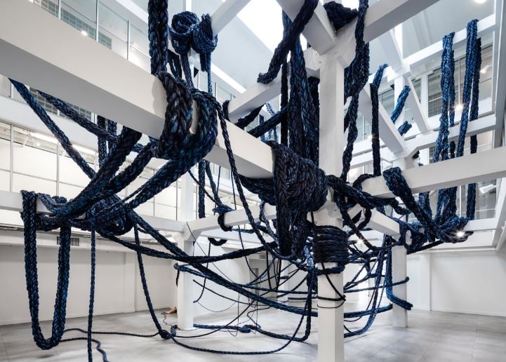
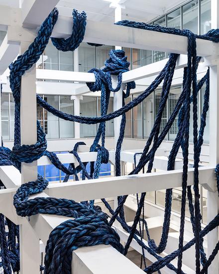

For this monumental, site-specific installation, Lima entangles the gridded support beams of the museum’s Atrium Gallery with industrial nylon rope. Enormous at one end, the braided material dwindles in size until it seems to merge with a female body. Set still and partially out of view, the participant’s body achieves uncanny abstraction, presence, and suspense.
“The Inverse” poses challenging questions, engaging topics related to identity, representation and agency. The female body, and the many fluid ideas of the feminine, is central to.
“The central topic of this conversation is to understand their part and the choices they make in bringing the work to life. Participants are not obligated by a script and are free to inhabit the space as they wish.”
This work brought about controversy when performers for felt pressured to perform sexual acts using a nylon rope at the museum. This is an example of a “happenings” type of performance art that required the audience to do certain things using the props provided.
I think it was definitely interesting to see the different styles and techniques artists used to convey an idea, regardless of how crazy some of them may be. I think I would want to look more into the different ways in which I can bring across a message of an issue such as multimedia installation, interactivity etc. while keeping consideration of the space and audience in mind.
Artist Statement
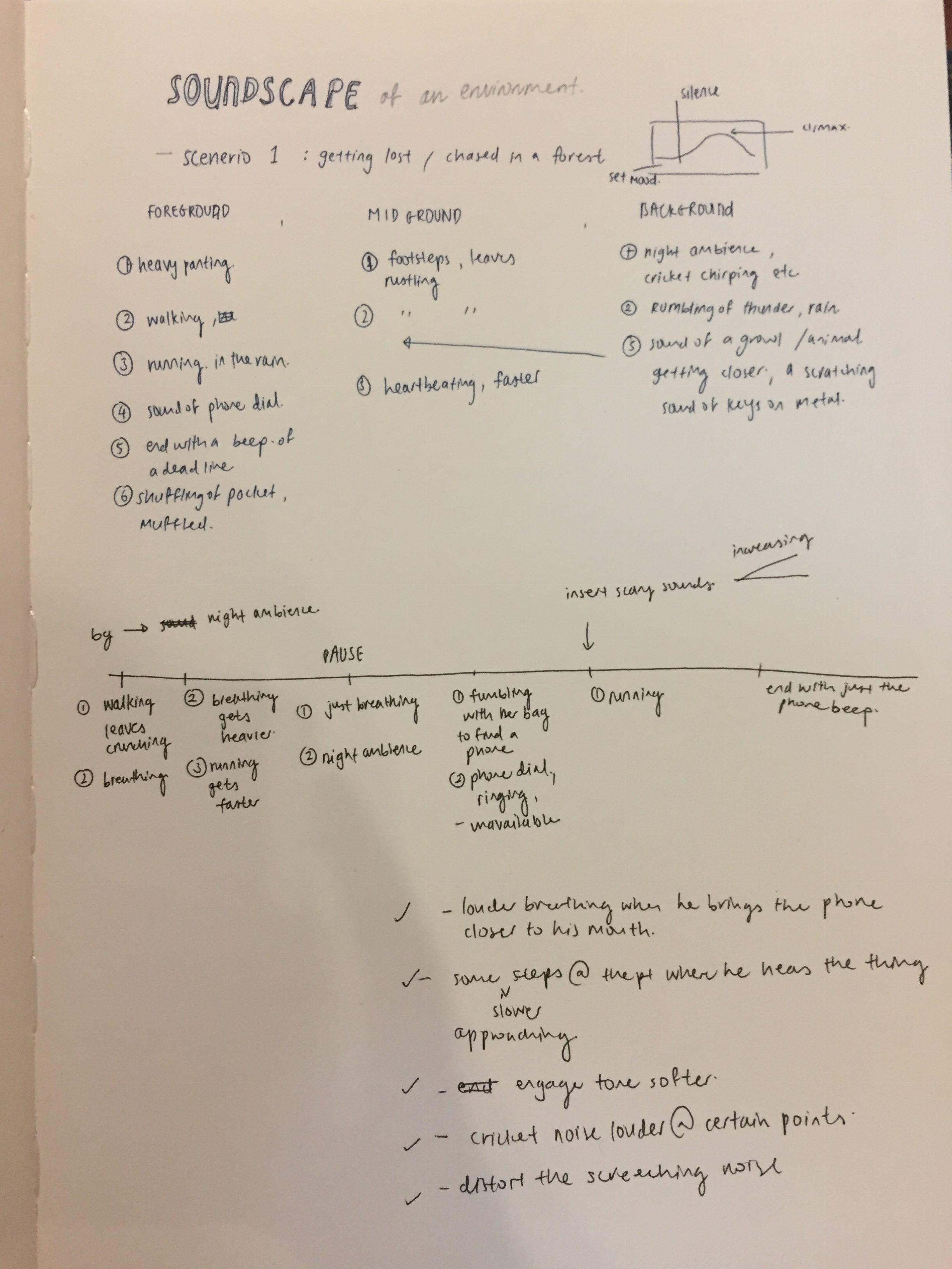
My soundscape illustrates a person walking through a forest but encounters a mysterious object or sound that ends up chasing after him. I layered a combination of sounds like the forest ambience, footsteps, breathing, rustling of clothes and belongings etc. I also wanted to create a sense of movement and anticipation as the person tries to escape from the mysterious sound by starting the scenario slow and building up towards the climax.
Concept
After getting the brief for the project I don’t know why but the idea of thriller/horror stuck to me. I love the use of sound effects in horror movies and the sounds were what often ended up making a greater impact on me than the visuals.
In this video, I reference The Revenant and the usage of sound to build up towards the climax ( which was the bear attack)
Afterwhich, I made a list of sounds that I needed to record as well as the arrangement of sounds.
All of the sounds I recorded were done in hall at around 1am? But there were still a lot of people awake and walking about. The zoom recorder was so sensitive that it was able to pick up doors slamming and chattering from a few blocks away. Hence, isolating and recording the individual sounds were one of the challenges for me.
The ambience sound was probably the easiest to record and given that my hall was in a hilly and forested area, I just needed to go to an isolated area away from other noise disturbances. For the breathing and walking sound, I got my friend to walk about on a patch of grass and got him to vary his footsteps, faster, slower, etc. I wanted to use a combination of sound to create the illusion of running, hence I used a T shirt to rub against the mike of the zoom recorder and hit a bunch of hangers on the drying rack which I thought gave off a really nice sound of movement. As for the “mysterious sound”, I ended up scratching my nails on a metal pole to create an eerie screeching noise. I thought it was appropriate as it was a sound that makes the hair on the back of your neck stand and gives people goosebumps, which was what I wanted.
Another challenge I faced was probably the layering of the sounds. I started off the scene slow with minimal sounds and slowly build it up towards a loud symphony of sounds as the person is running away from the mysterious object. I ended off with just the ambience of the forest to create a feeling of eeriness. However, the layering of sounds proved to be pretty difficult as I had to be mindful of the background, middle ground and foreground and I had to vary the volume of the individual sounds if not it would just end up messy and disorganised. I also had issues with the transition between sounds. I wanted a “pause” in the middle to create some tension but I wasn’t sure if it ended up coming off as awkward.
I also tried to do some panning for movement as the person is running from the left to the right and tried to vary the sounds heard from the left and the right but it might have been a little hard to hear after the sounds have been layered.
This project has been really interesting for me and I have learned so much about sound. I could say that I prefer sound production than video production now 🙂
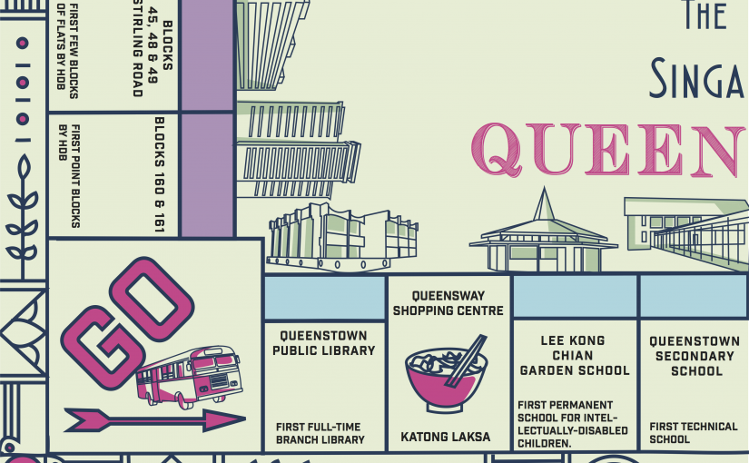
After much deliberation and site visiting, I had a few ideas in mind for my infographic which was either a heritage trail of Queenstown, iconic places in Queenstown or a guide for expatriates moving into the area. However, after visiting, I found that there was already an existing heritage trail of Queenstown and they even conduct weekly tours for the public. Hence, I thought that it wouldn’t be as interesting to make an infographic for something that already exists. Moving on, I also found it hard to make a guide for expatriates because of the fact that there wasn’t much entertainment in the area and many of the places that would typically be applicable to them such as shopping malls, food places etc. were pretty obvious and they wouldn’t require much of a guide for that. Hence, I went back to what makes Queenstown different from other estates? Queenstown is known for being the oldest estate in Singapore which makes it extremely rich in heritage. After much research, I found an interesting recurring theme amongst all of the heritage sites in Queenstown. Being one of the pioneer estates for many of Singapore’s early developments, Queenstown was the first for many things in Singapore for instance, the first estate for HDB blocks, first polyclinic to provide subsidized healthcare, the first neighbourhood public library and so on. I thought that this was an interesting angle to work on without making the heritage seem dull and overused but emphasizing on interesting “facts of firsts”.
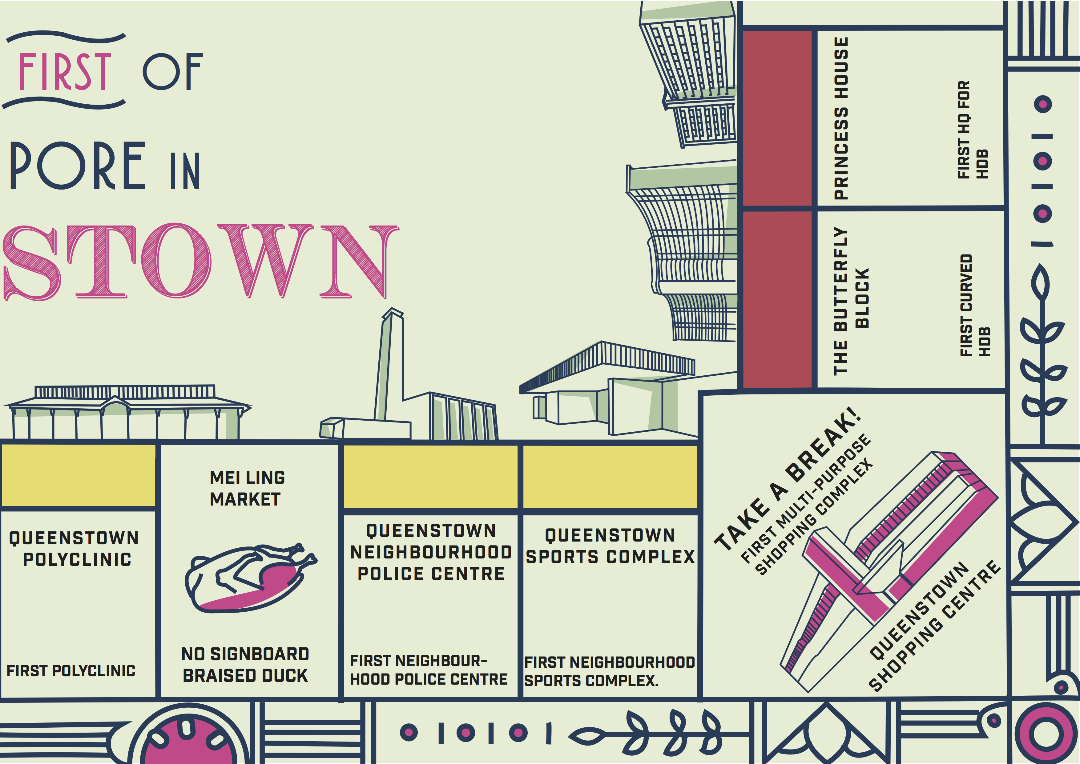
During consultation, I showed some of my infographic style references to my classmates and one of them suggested why not I make it into a card game or board game format like monopoly!


I also referenced these minimalistic icon styles for a visual representation of the places mentioned.


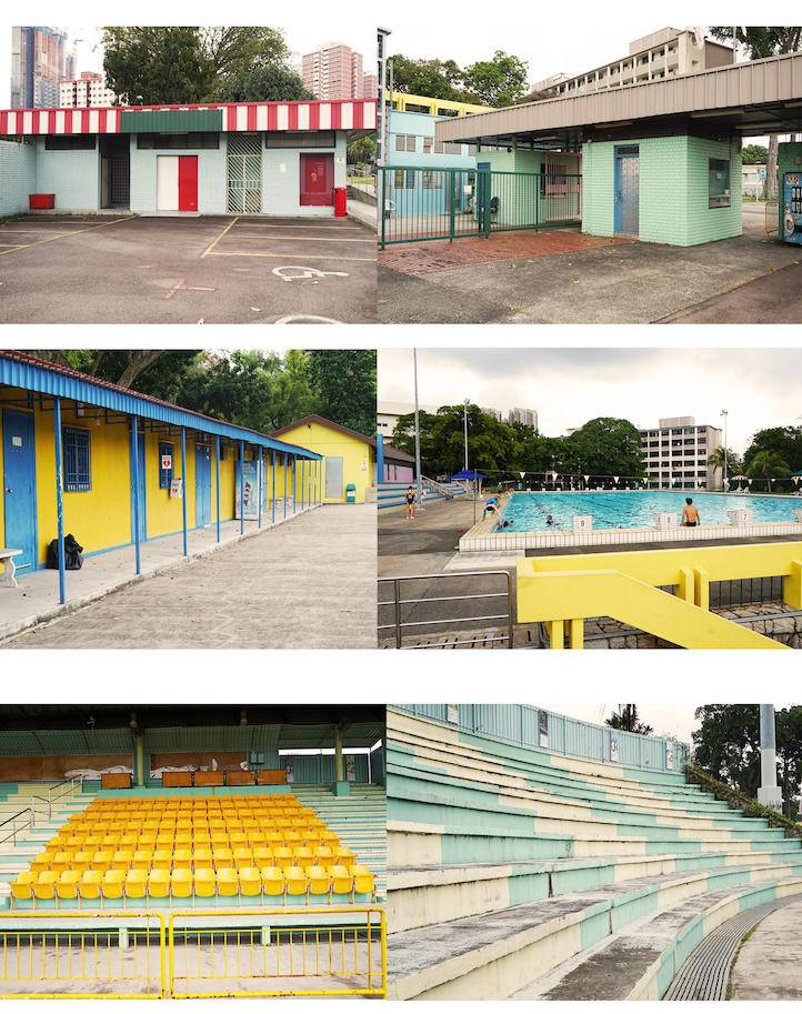
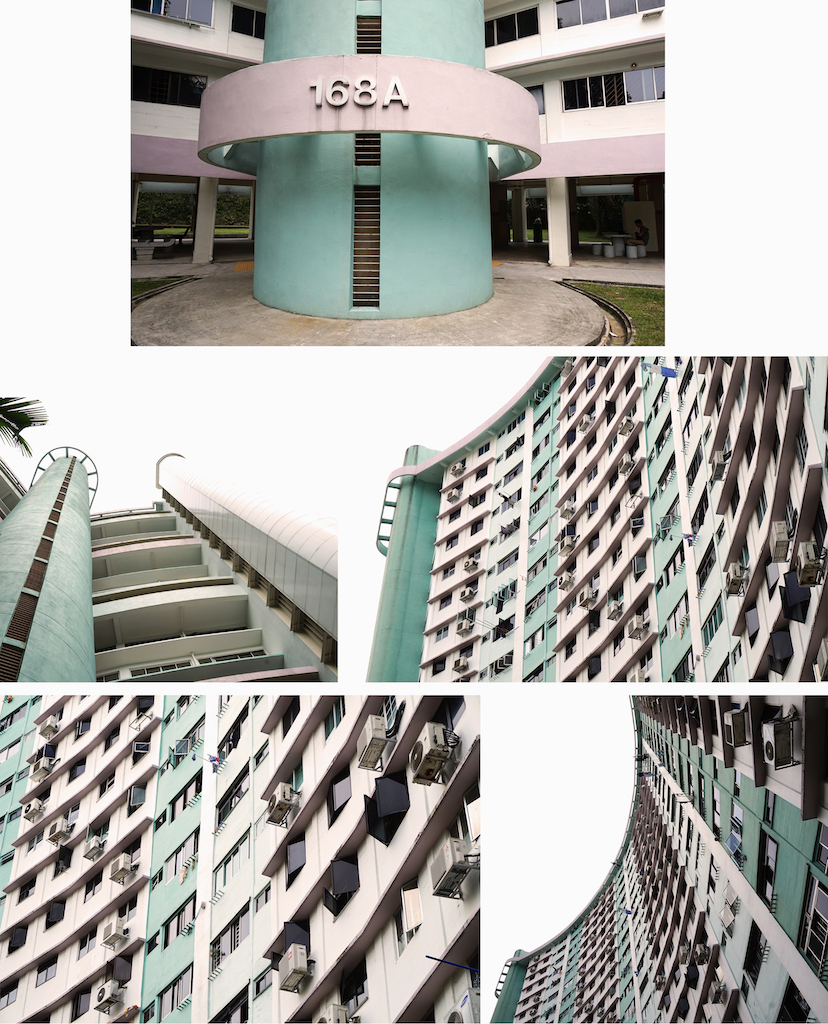
As for the colour palette of my design, I took elements from the bright and pastel colours found at the Queenstown stadium and the “butterfly” HDB block.
Finally here is my final infographic!
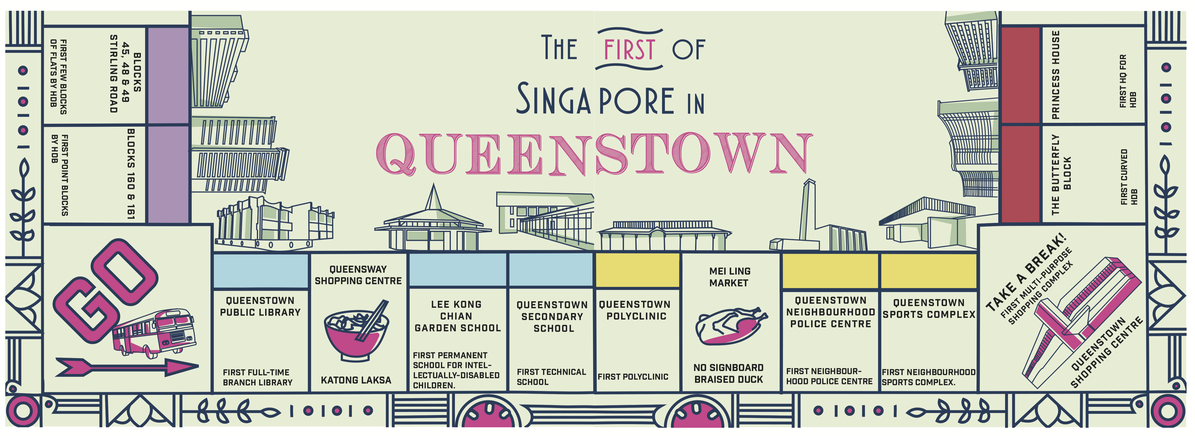
I incorporated some food stop suggestions such as the famous katong laksa at Queensway shopping mall and braised duck at Mei Ling food street as well.
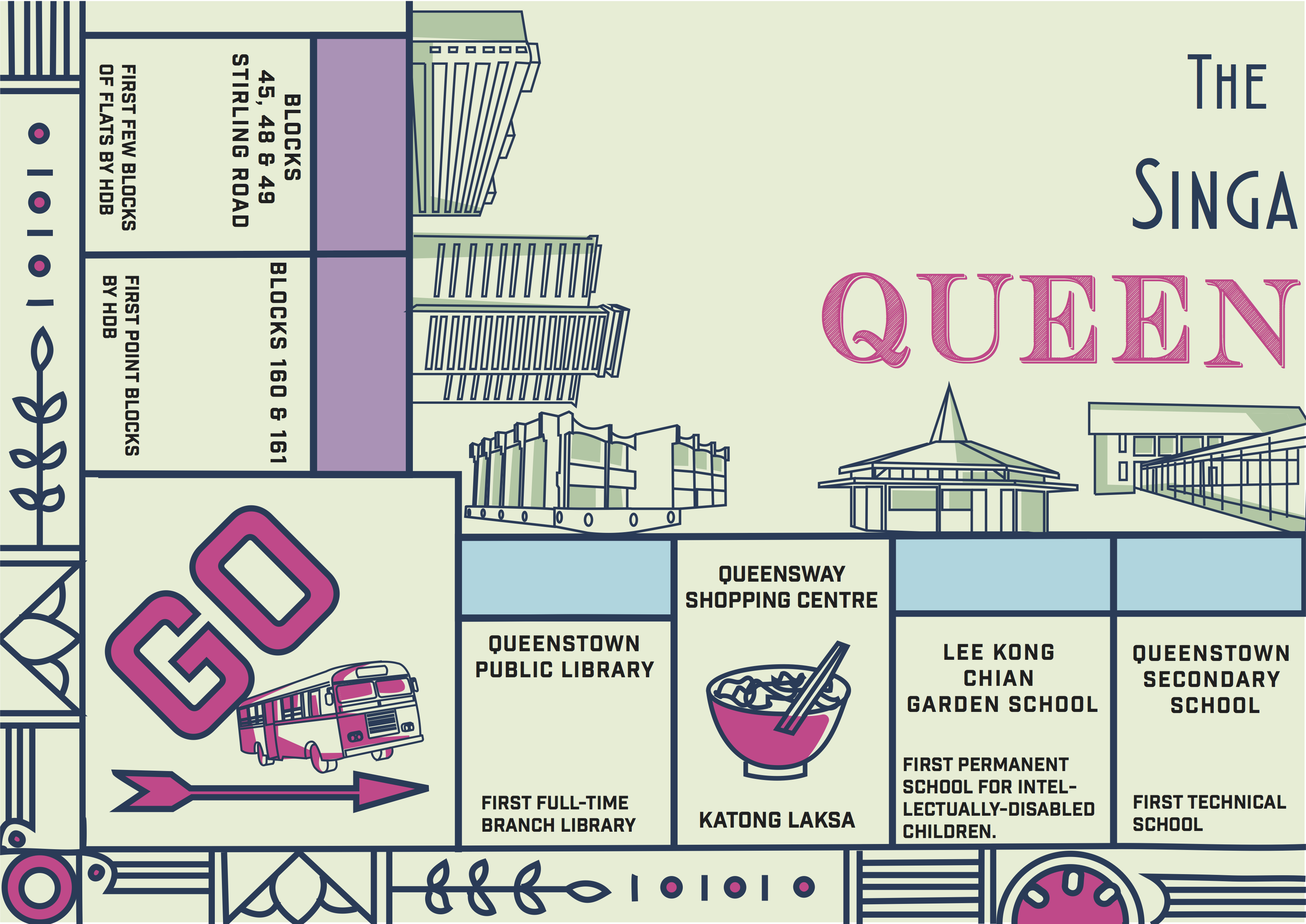
Pretty satisfied with my design and was happy with the overall positive feedbacks from everyone 🙂 However, Joy suggested that I could incorporate more visual elements related to that time period into the border instead of the current one which was a little unnecessary. Moving on from this, I hope to explore more of this style in my zine and maybe make it interactive(?) That’s it for now and thanks for reading! 😀