
1. ALONE + OUT AT SEA = REFLECTIVE
When I am alone, especially in bed at night, I have a tendency to overthink about life in general. Be it thinking about work, self-doubt, relationships or the future. Because I am alone, I have no need to put up a front for anyone else and I am bare/transparent to my own feelings and emotions.
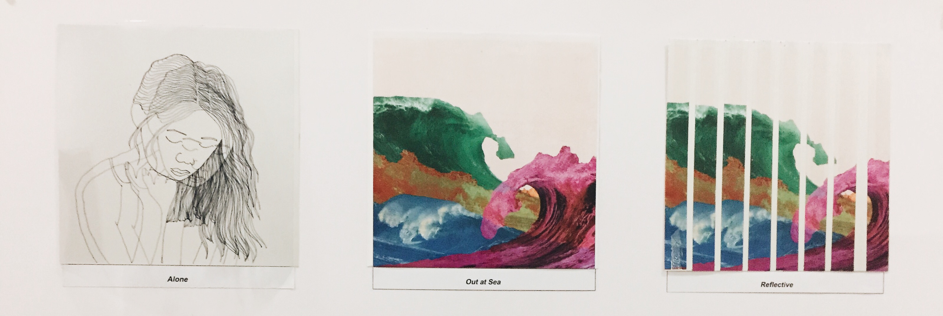
Me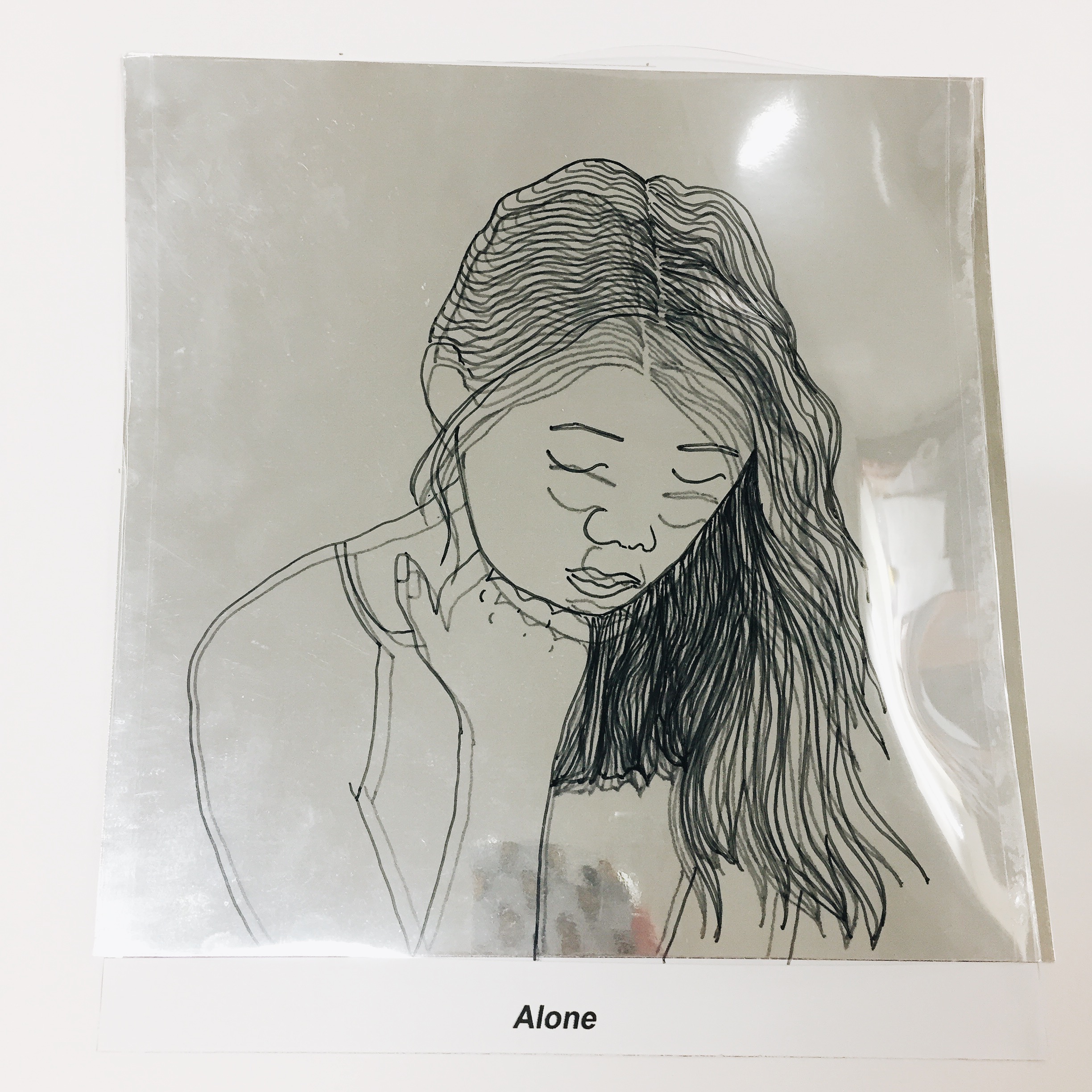
Hence this is depicted in the “ME” through the use of reflective paper and a transparency which I drew of myself to represent transparency and reflectiveness of self. Initially when i came up with this idea. I just wanted to stick the transparency on the reflective paper. But when i put the two together, I found that the reflectiveness of the paper creates a 3 dimensional feel if i elevate the transparency which creates the illusion of “2 MEs”. I thought this was a perfect representation of how torn i feel sometimes when I am alone. Torn between the feeling of being optimistic or pessimistic and self-love or self-doubt.
SETTING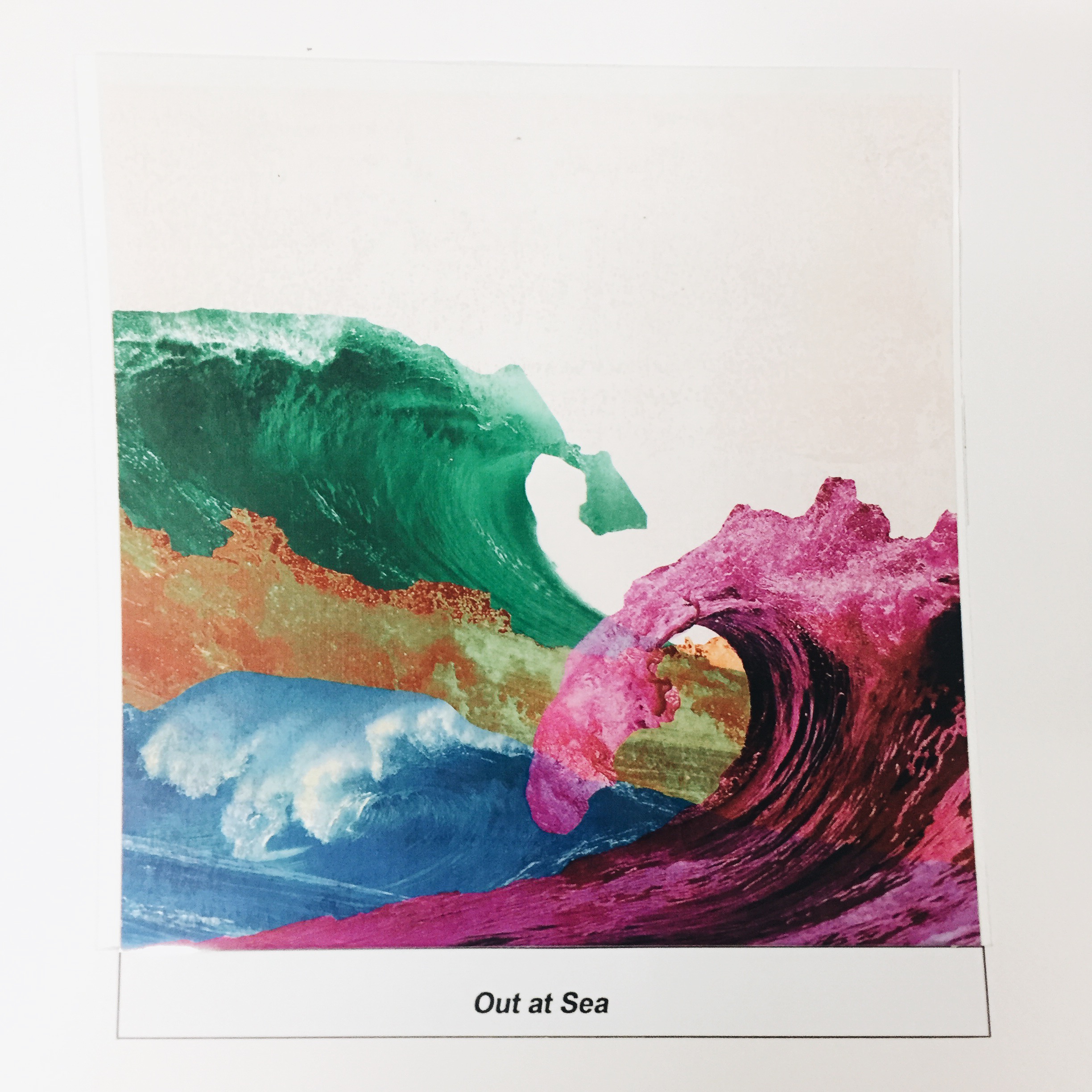
The setting I chose were waves to represent “waves of emotions” or the tranquility I feel when I am alone much like the feeling when I am out at sea. The waves were presented with different colors to show the different emotions such as jealousy, sadness, love and happiness.
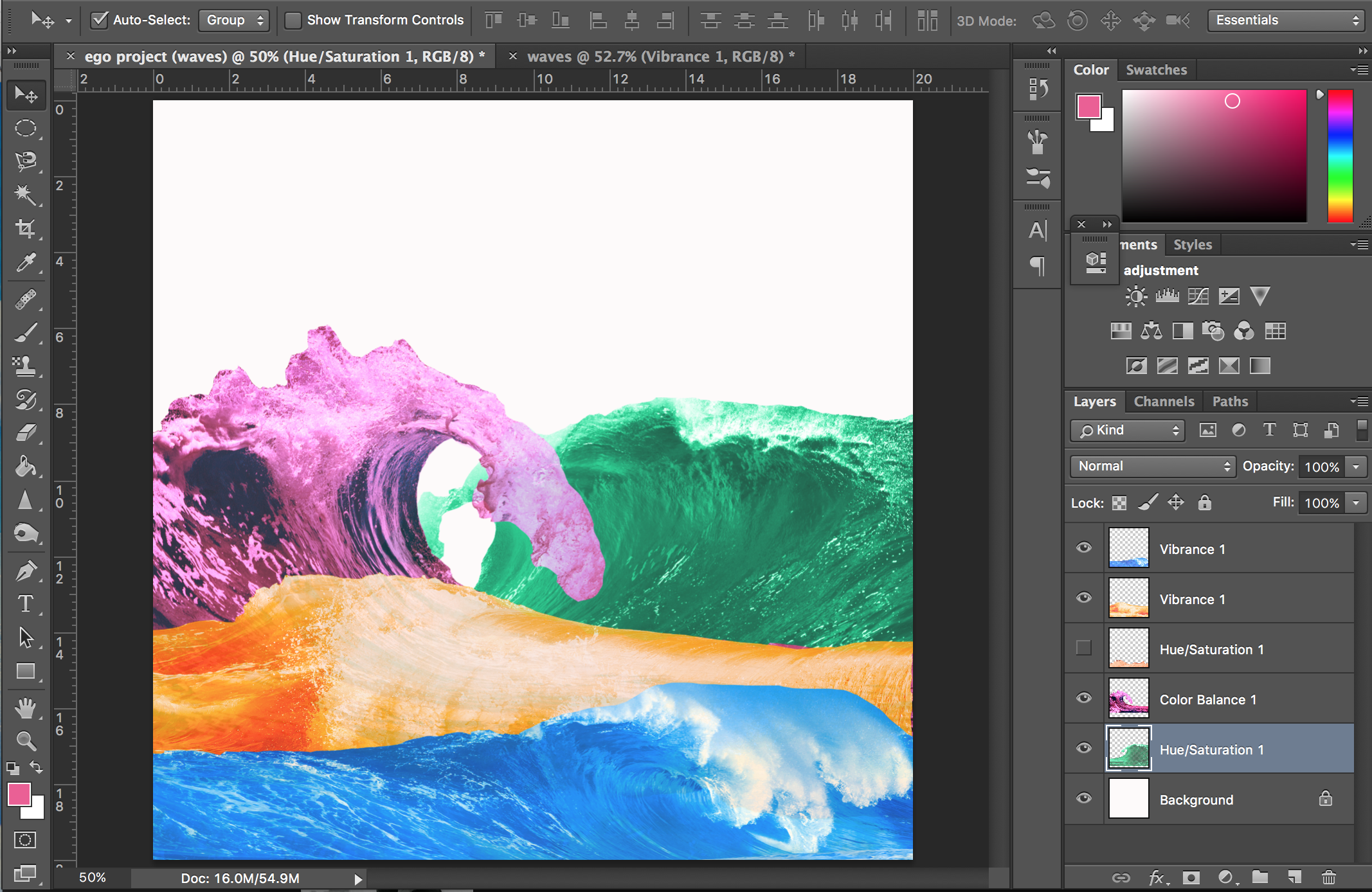

I played around with the different compositions, printed it on transparency and pasted it on white paper.
OUTCOME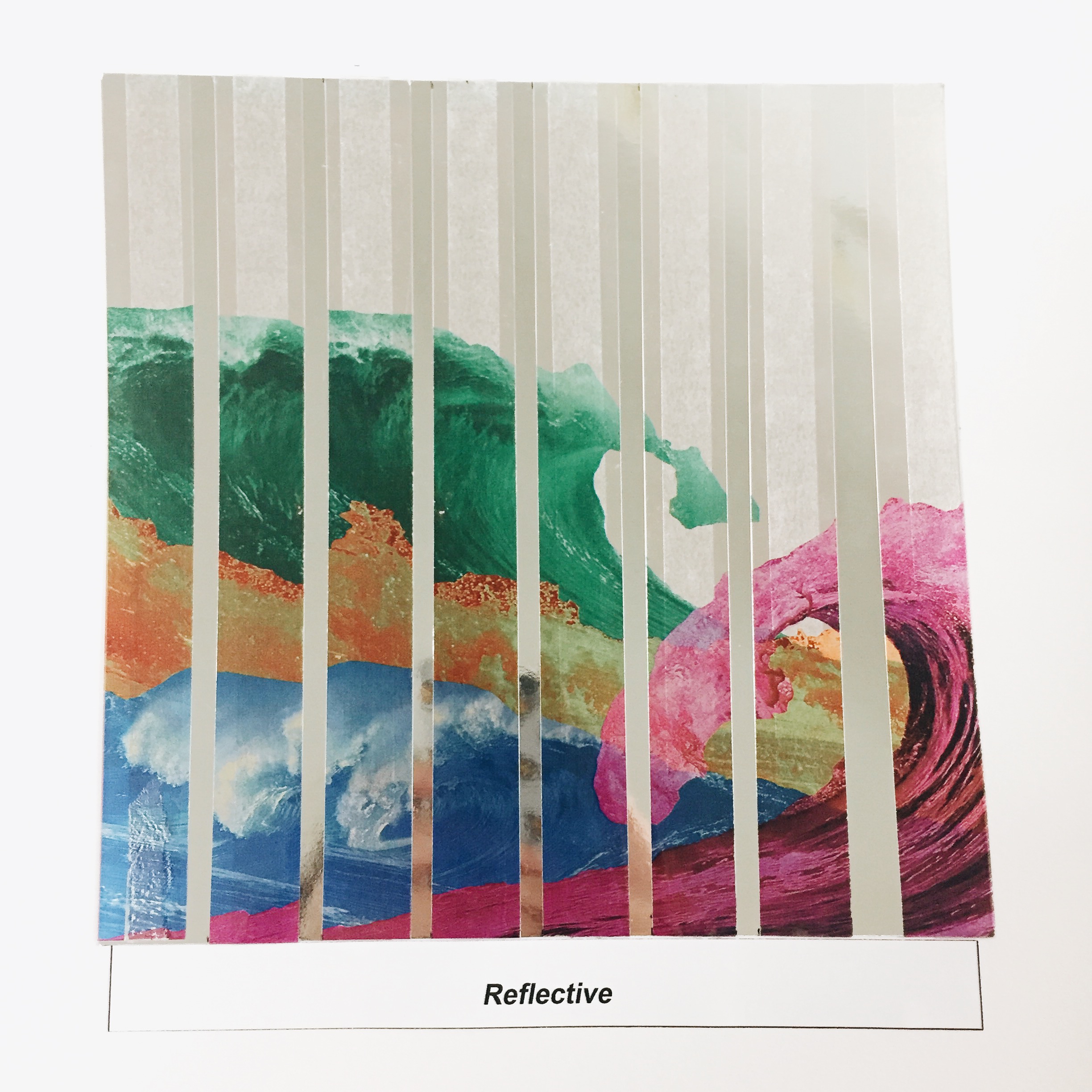
The outcome of the two would be reflective. I actually struggled a bit with the composition of this but i decided to slice up an image of waves and paste it over reflective paper to show the feeling of being torn in the midst of self discovery.
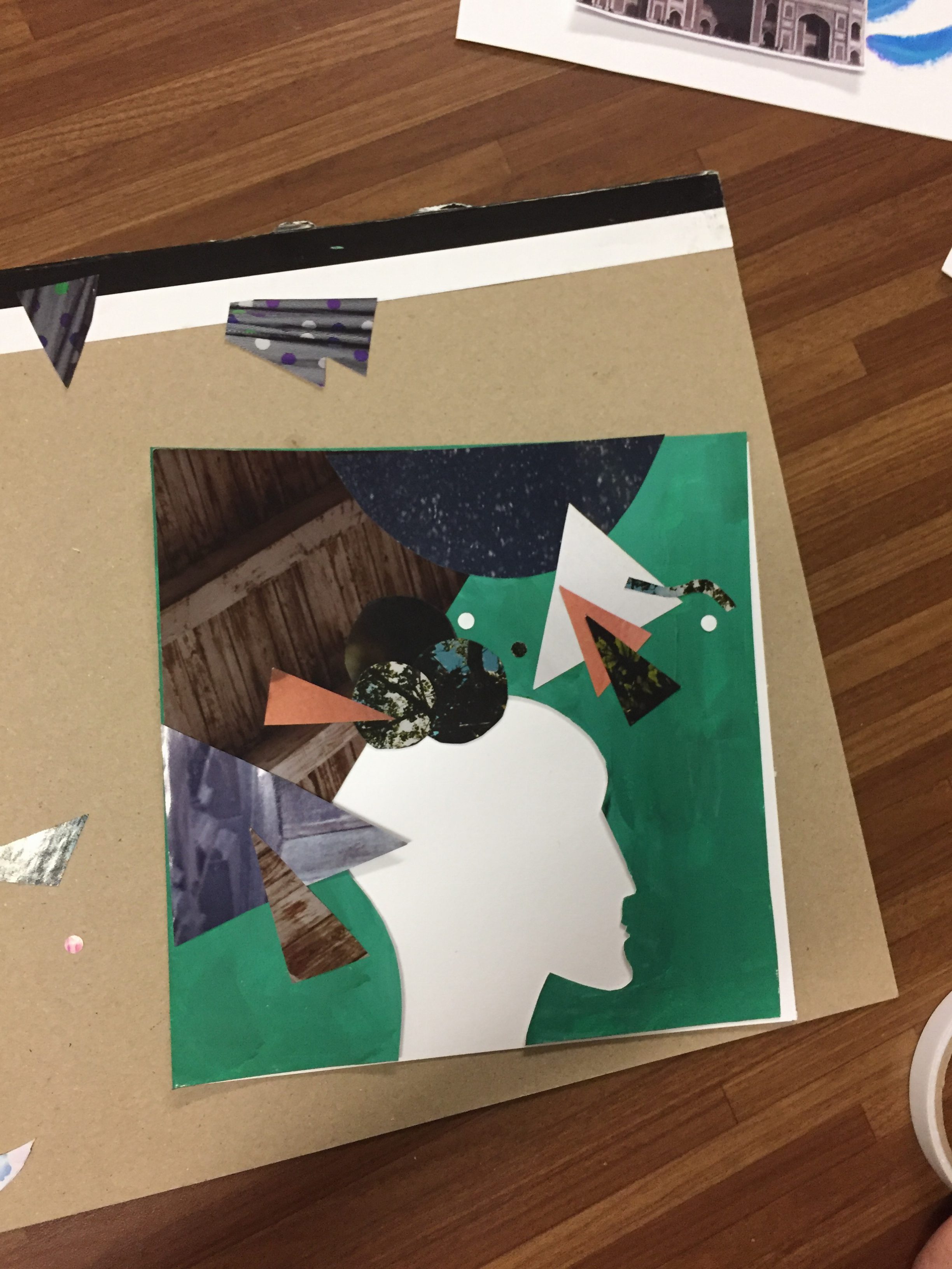
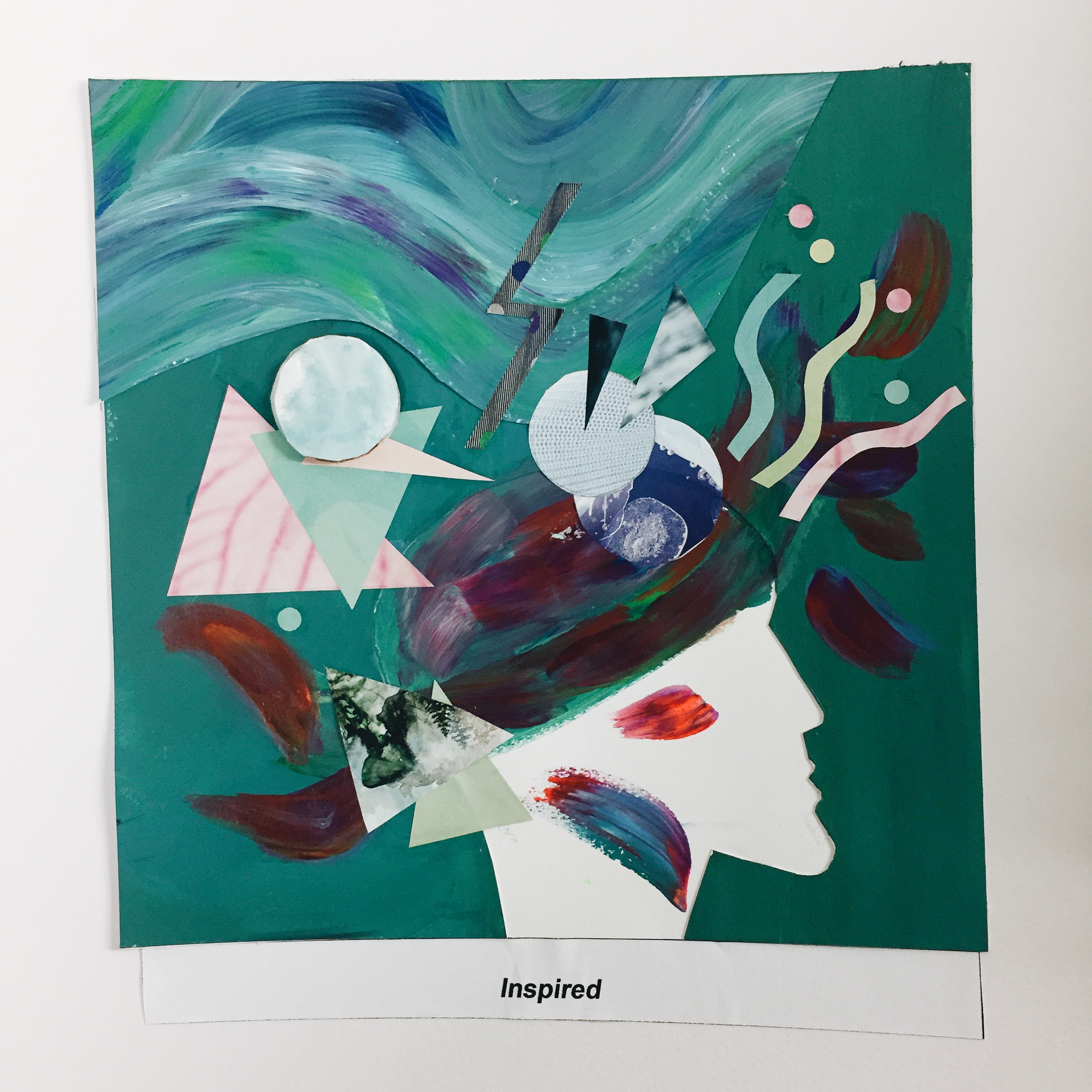
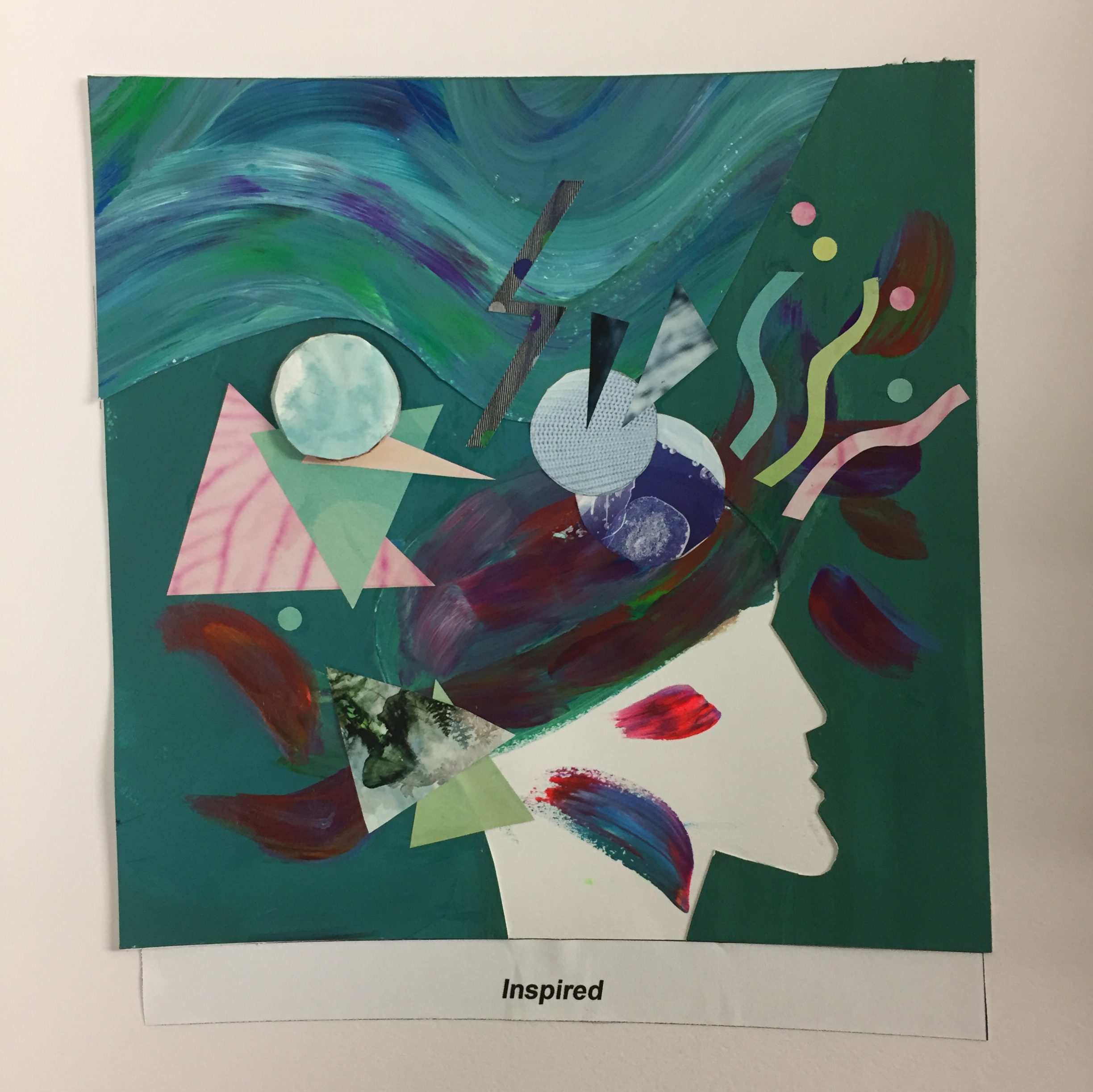
2. UNINSPIRED+EXPLORING NEW PLACES= INSPIRED

Often when I travel, I feel greatly inspired and a sense of enlightenment from discovering new places and meeting new places.
References


Final Pieces!
Me ( Uninspired)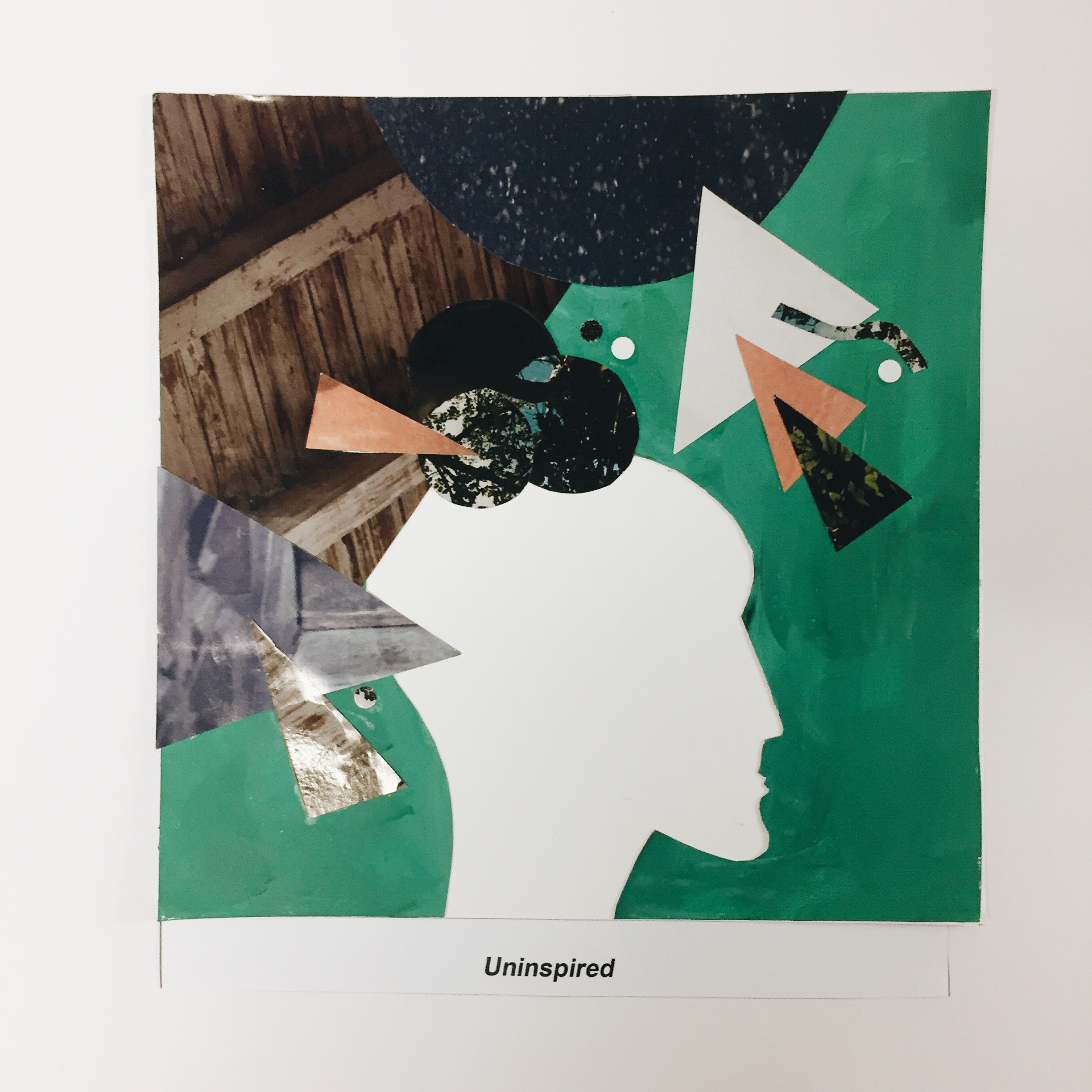
Setting ( Exploring New Places )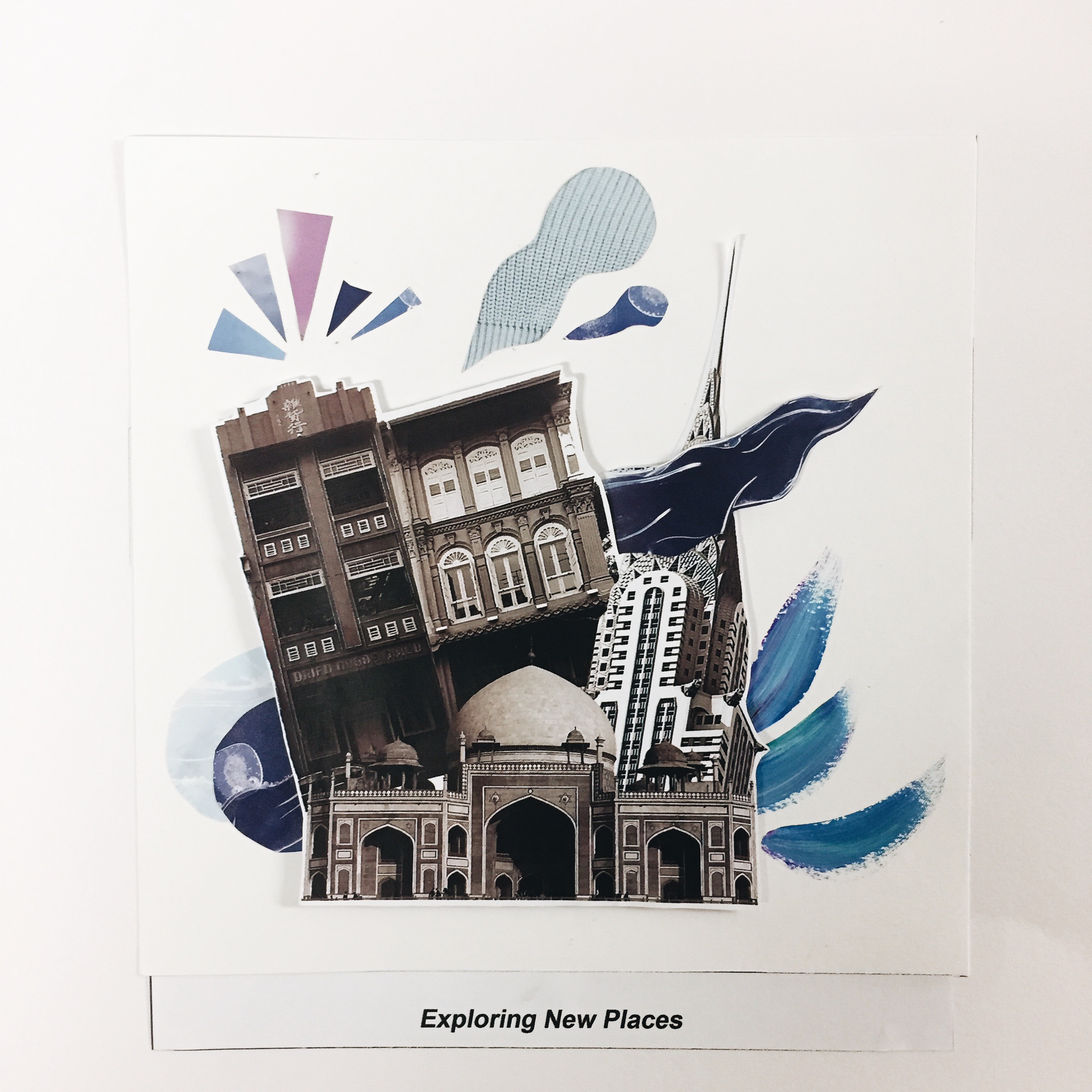
3. WITH STRANGERS+MEETING NEW PEOPLE=HESITANT
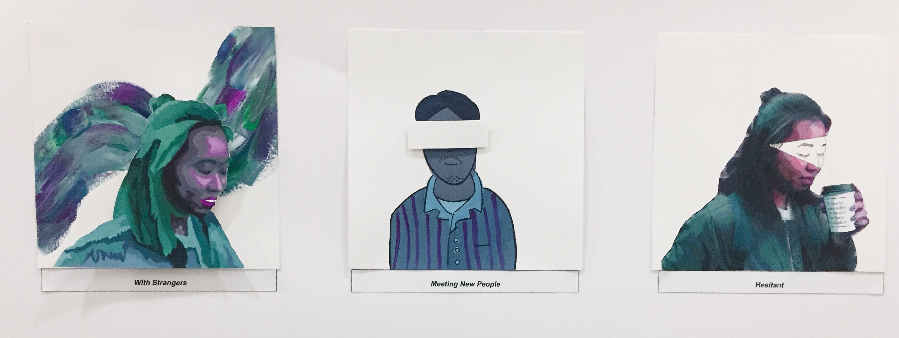
For this, I chose to use analogous colours such as blue, green and purple to create a serene and comfortable design. I also chose to use cooler tones to portray the idea of how much more introverted or not as expressive I am especially when I am meeting new people.
Me ( with strangers )

I posterized a picture of myself on photoshop and painted a self portrait using hues of purple, blue and green. I also added a touch of neon paint in my designs to further enhance the colours better. For the background I was inspired by the references below of using unmixed acrylic paint to create splashes of colour.
References


Setting ( Meeting New People )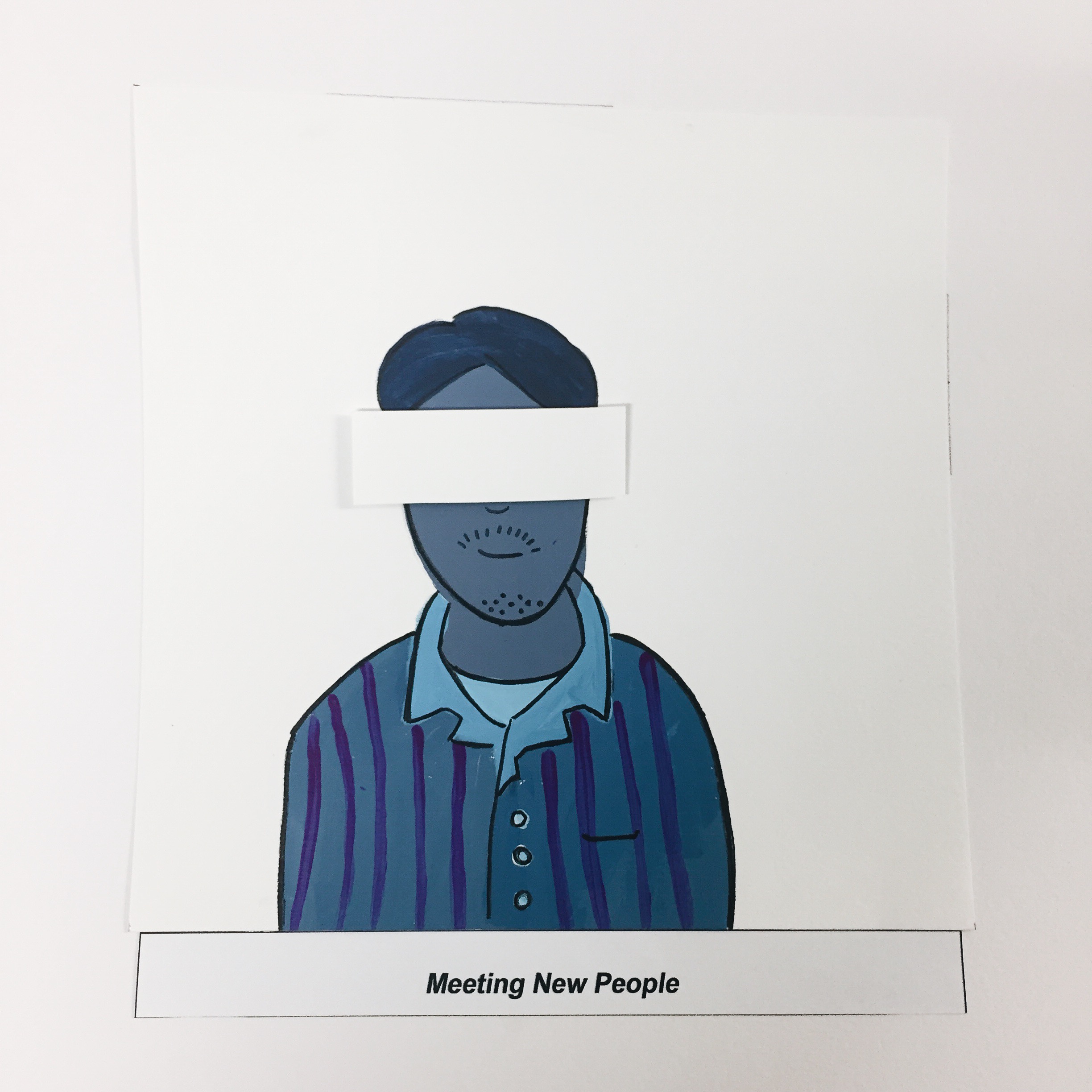
For the setting I decided to portray a person or “stranger” in a completely different style in contrast to the “me” to show the disparity when meeting a stranger. I also chose to block out his eyes as when you’re meeting a stranger, you know nothing about him or his identity. After putting the pieces though, I felt like maybe the style choice for this design was too much of a contrast and the piece as a whole kind of lose its cohesiveness. But I guess this is a learning point for me to take note of in future projects.
Outcome ( Hesitant )
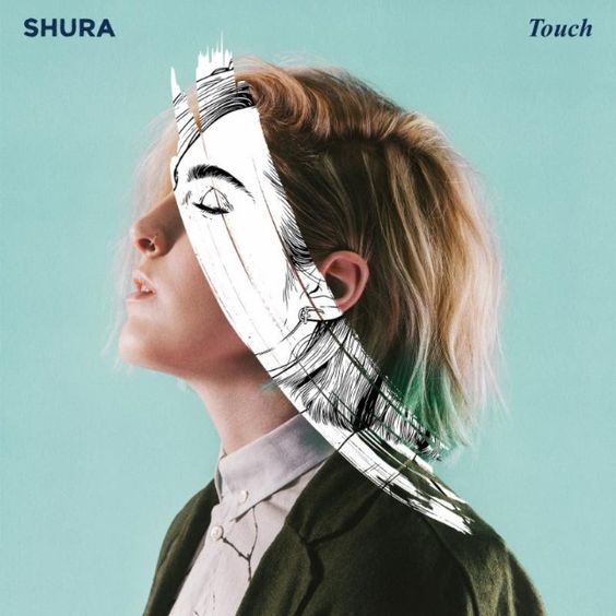
When meeting a stranger, I would feel hesitant to be myself hence, only a small part of my true self is revealed as seen above. I got inspired by this idea from Shura’s album cover which I thought was quite an interesting idea of incorporating b&w with a real photo.
References
4. WITH FRIENDS+ MEETING UP WITH FRIENDS= COMFORTABLE
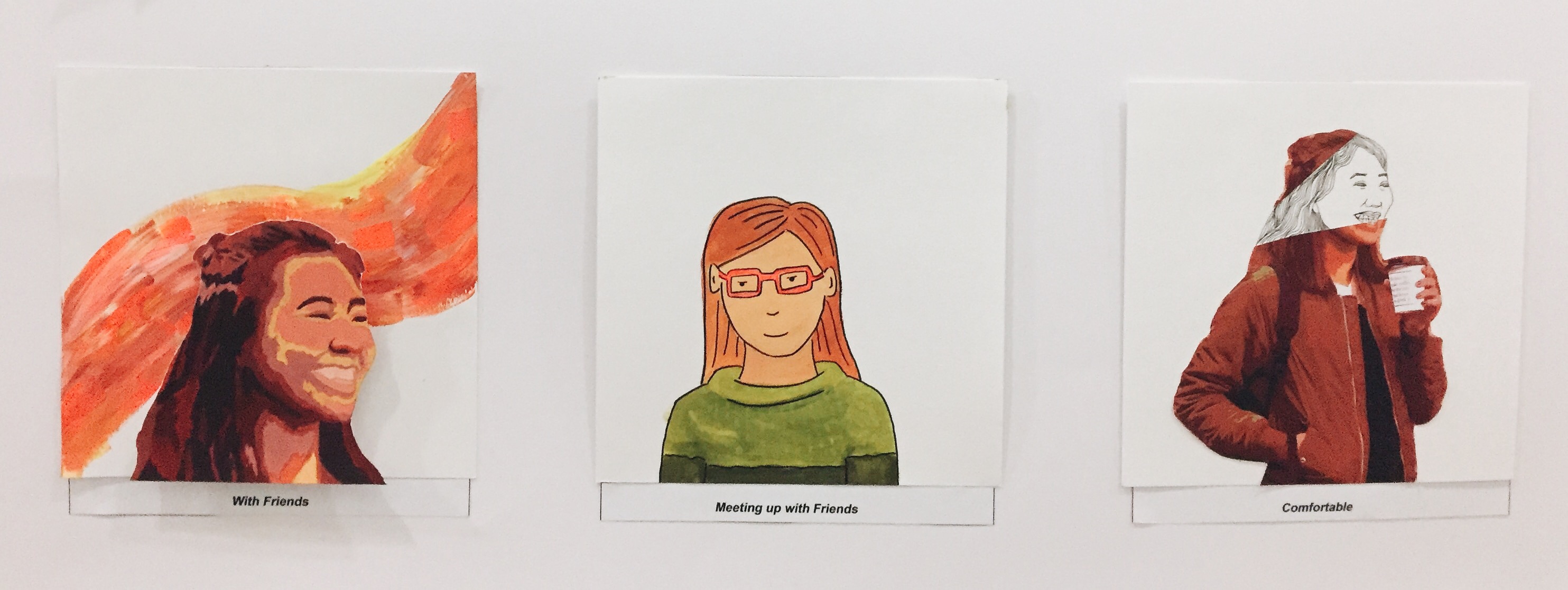
This is in contrast with my previous row but with friends. I chose to use warmer analogous colours such as red, orange and yellow as with friends, I feel more comfortable in my own skin.
Me ( With Friends )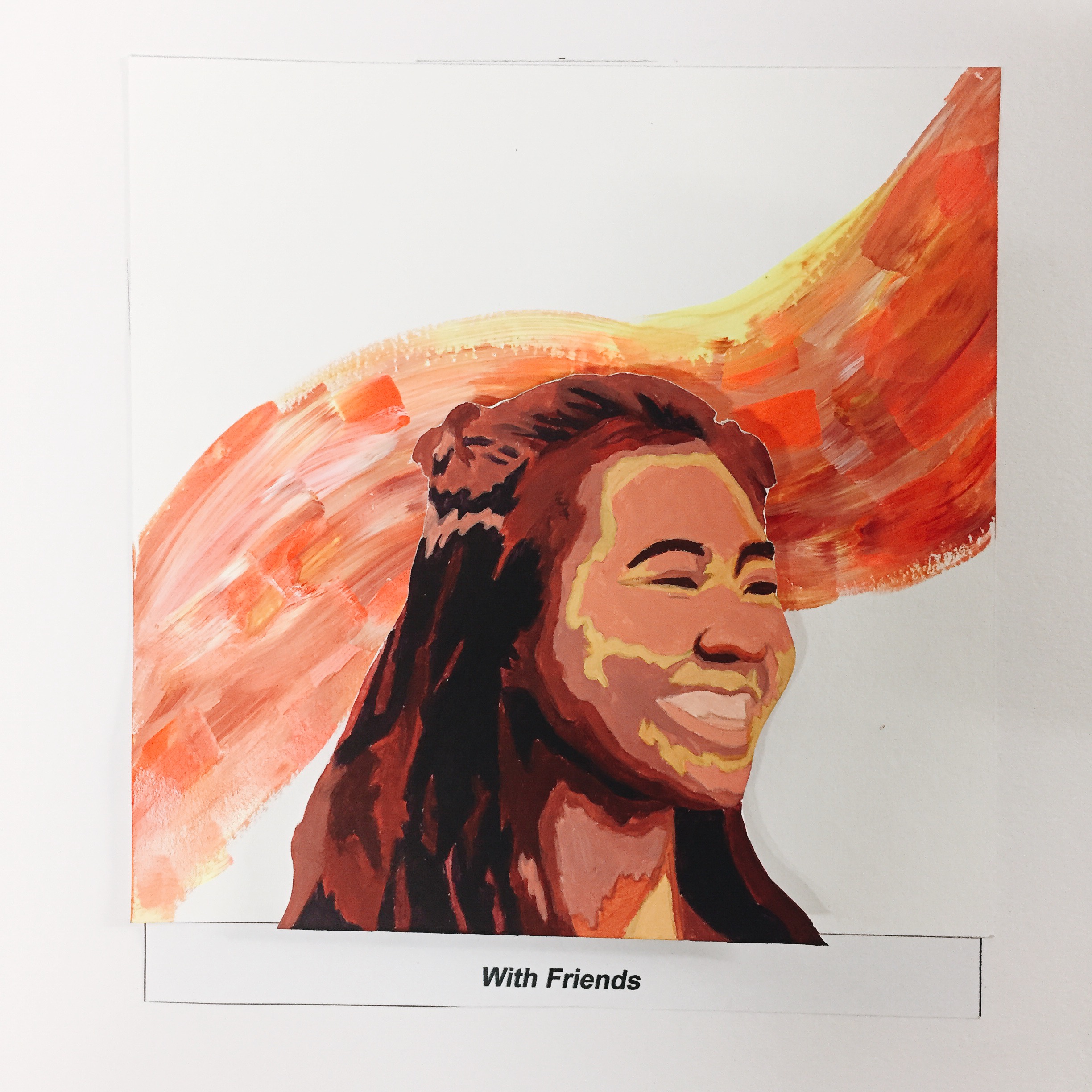
Setting ( With Friends )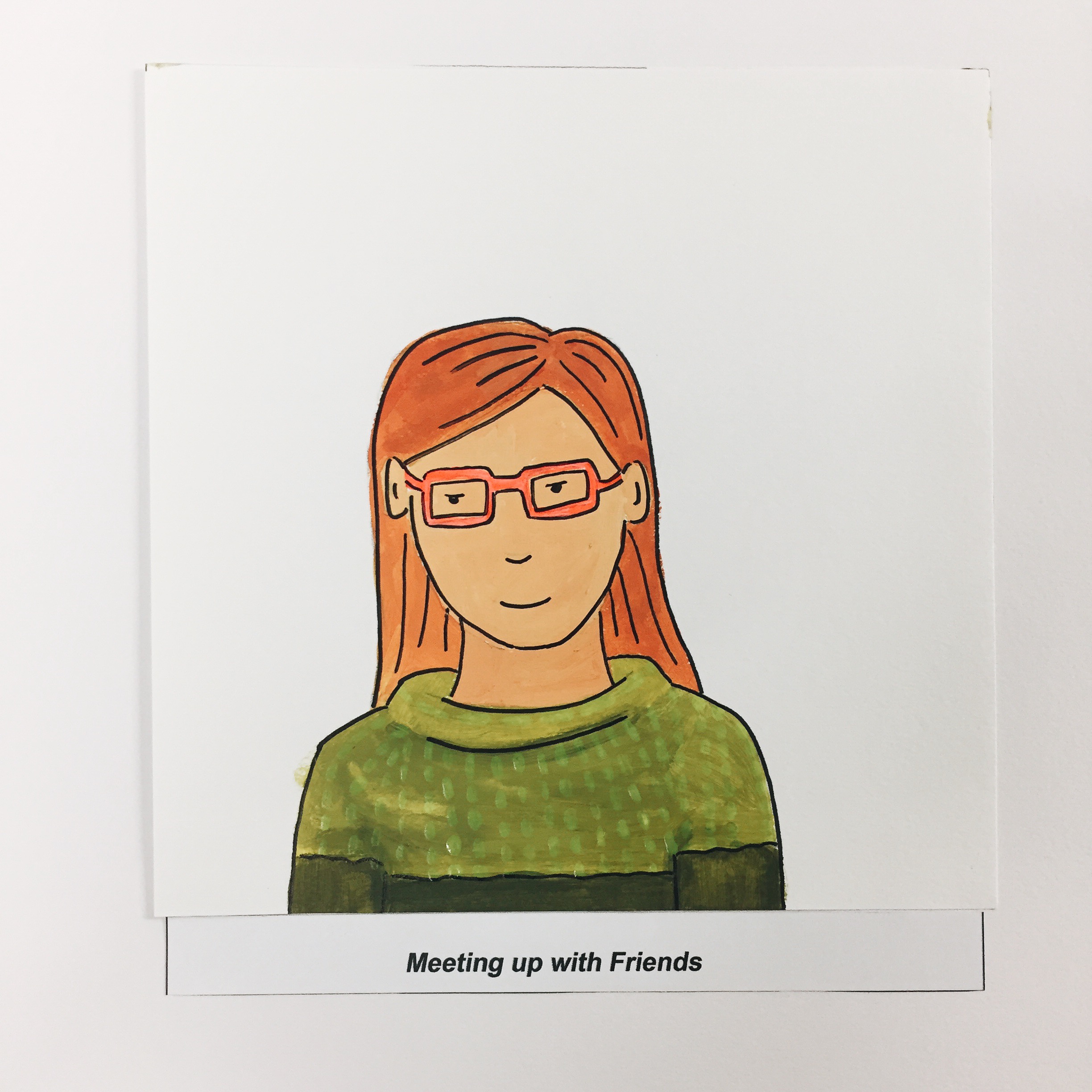
Outcome ( Comfortable )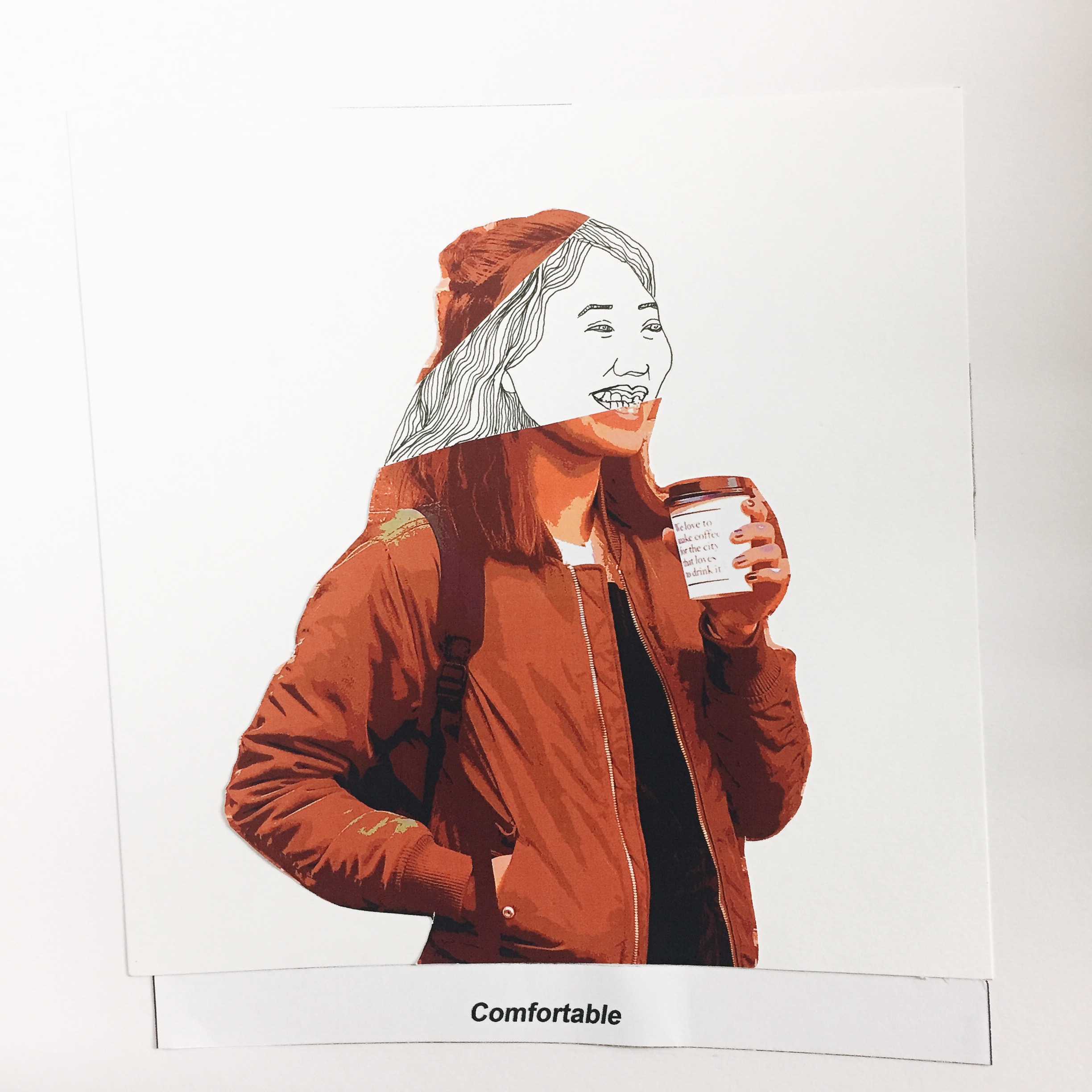
A larger part of my true self is revealed when I am with my friends.
FINAL DESIGNS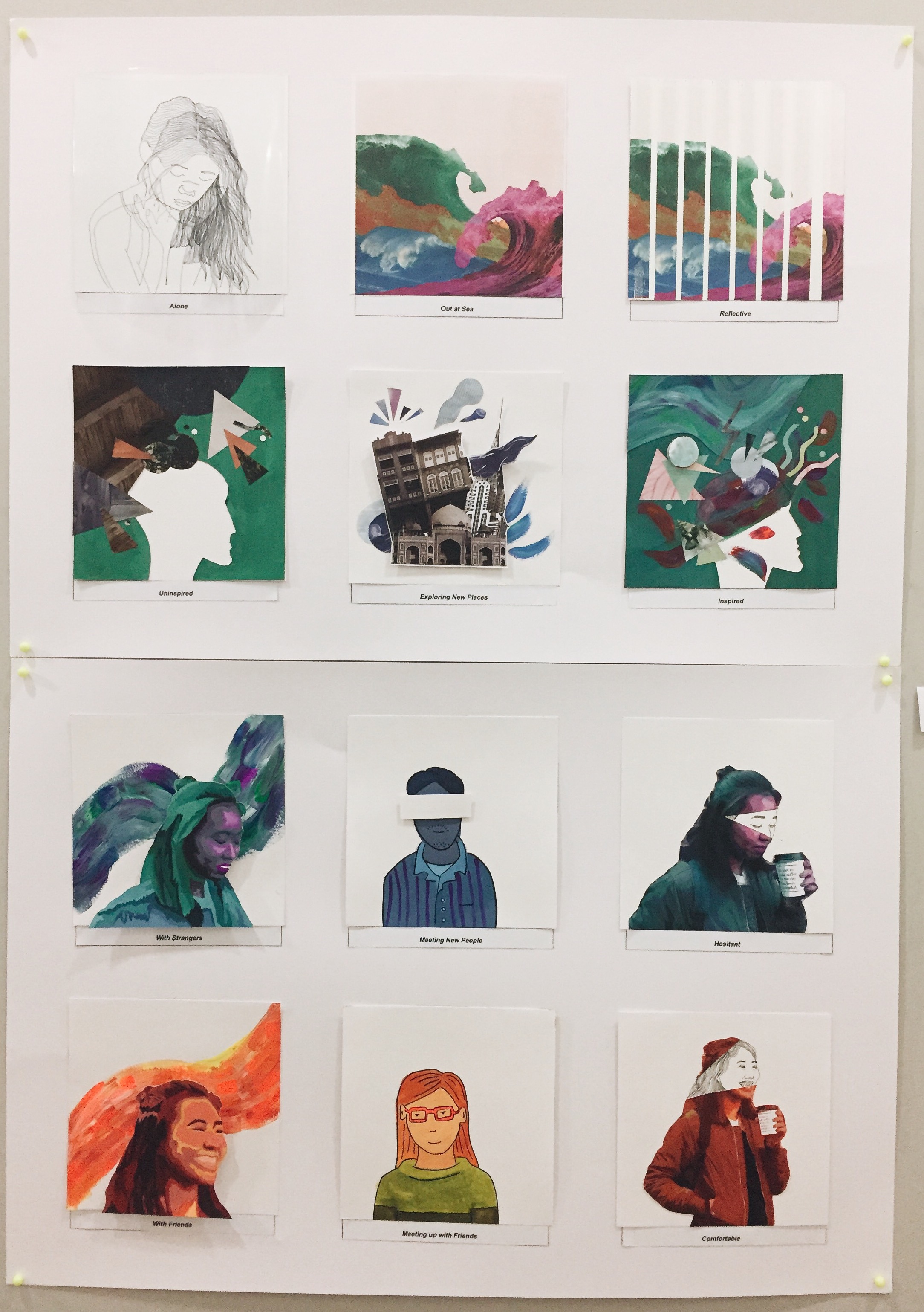
REFLECTION
This project has mostly been experimental for me with the use of colours, collage, paint and different mediums which are all a first for me. I think there is definitely a lot to learn from this project and Im excited to apply these techniques learned again in future projects with perhaps some digital painting involved. I have definitely learned and experimented a lot which i feared would cost the style to become inconsistent. I guess it is all part of the learning process and I am glad I took the risk to try things I never thought I would have attempted.
The mediums you used and overall look is very refreshing ! I really like the colors you used and how you incorporated different mediums for your panels
aww thanks zerline! Love your illustrations too and the color scheme you chose def one of my fav
Stunning colour schemes, Cassandra! I admire your skill with both traditional and digital media.
naw thanks jamie! I admire your skills with everything haha