
(N.B I haven’t been tagging these posts right last time hence I’m reuploading them in hopes that they appear in the class pages again!)
I like the idea of accumulation small things leading up to larger things. As such I thought about the butterfly effect / chaos theory that Joanne had discussed for her time project, the choices of one person or thing will eventually lead to another and accumulate to something.
When I first pitched it to my partner about this, she felt that I was a little pushing the blame to others and I was like yeah …. sorta
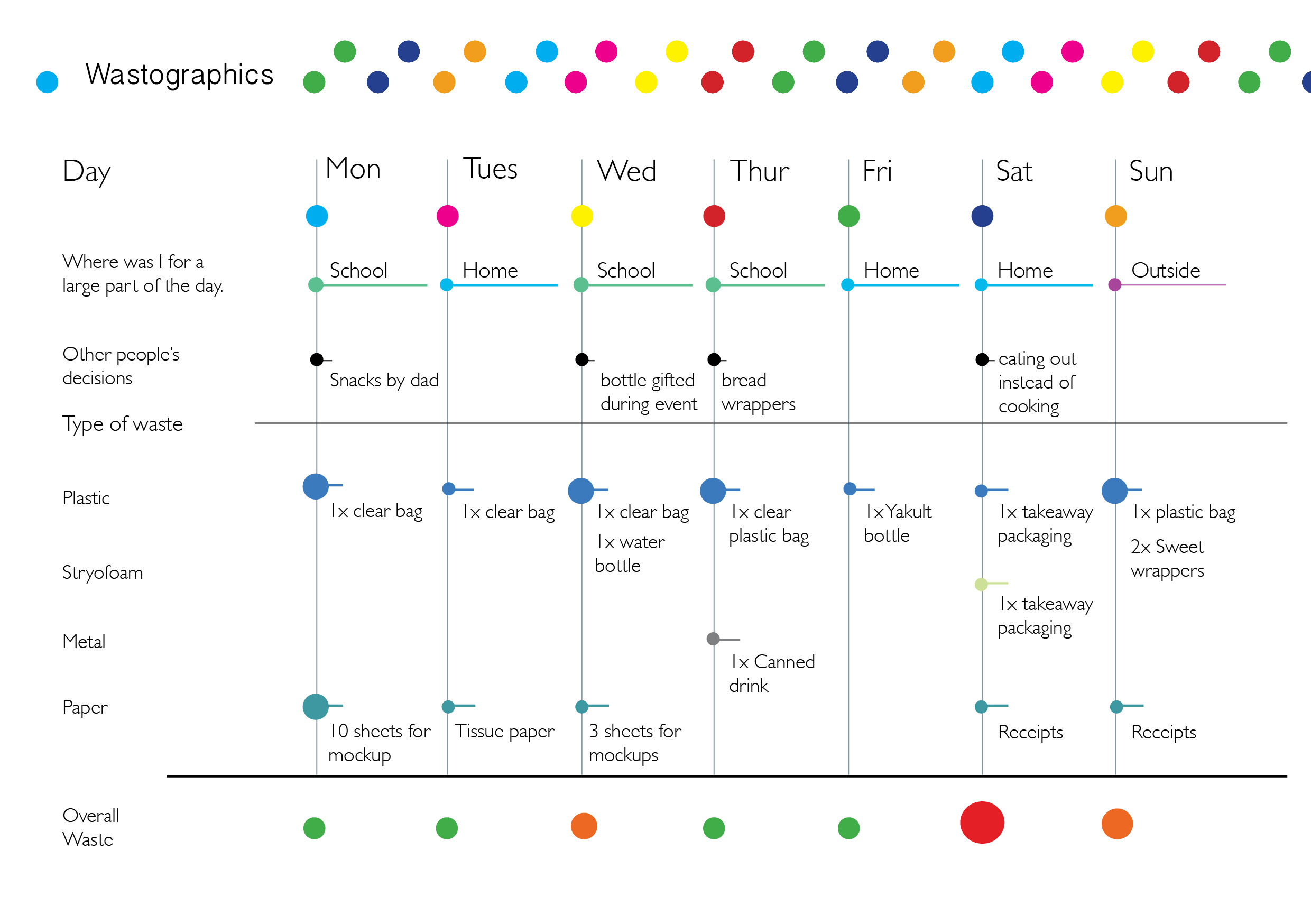
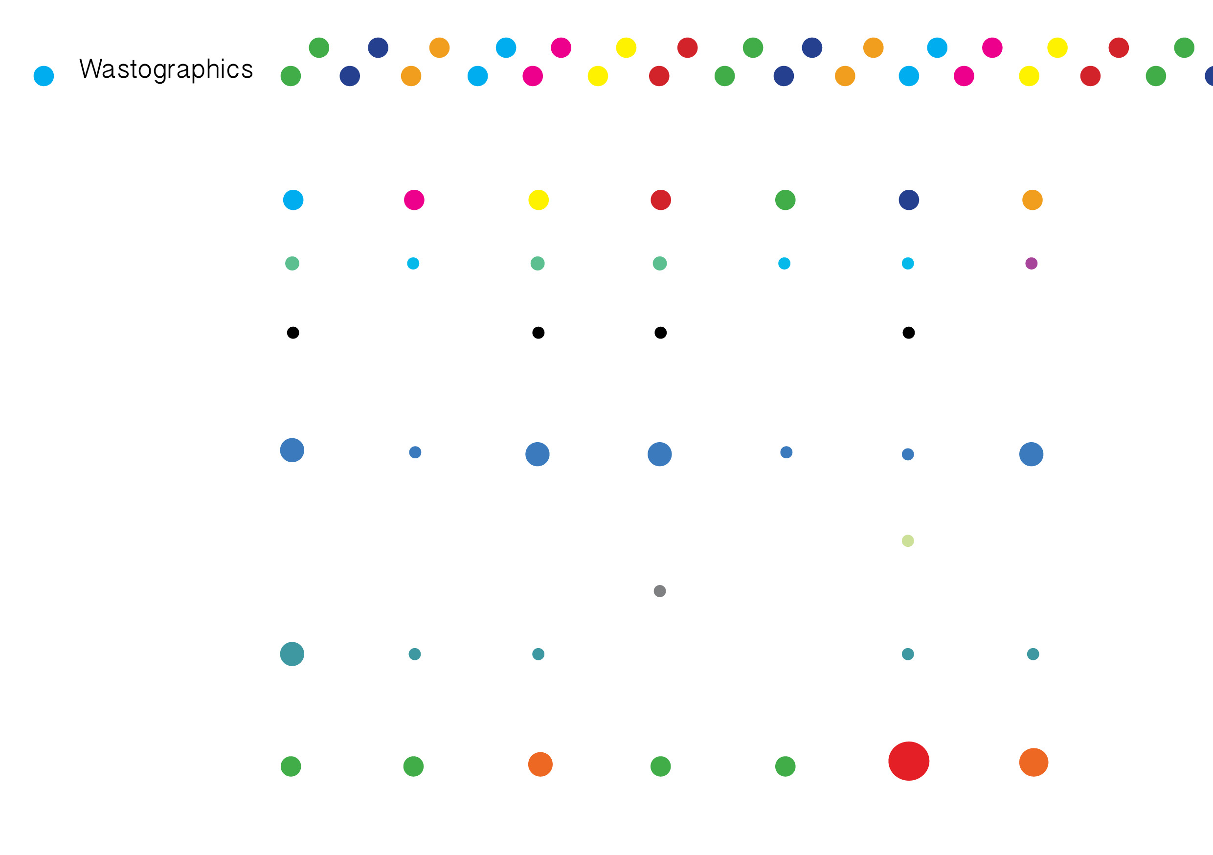
Legend

While doing this, I’ve decided to note the places I’ve spent the most time in as I wanted to prove that going out would be a large factor as to waste consumption but I actually realised having takeouts or tabaos instead is a bigger role player ( for that week). So my advice to myself is to cook more ( or at least eat at the restaurant/coffeeshop etc. )
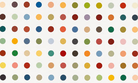
Visuals wise, I’m inspired by spot paintings from artist Damien Hirst in terms of using very colourful dots. I was also inspired by the movement of water droplets coalescing when they merge into one another to become a bigger water blob, as such, instead of using the same size of dots, I decided to vary their sizes according to how much waste was generated to give off the idea of accumulation. I liked how that effects creates a rhythm and flow to the infographics visually.
( originally posted on 25/3/2016.)