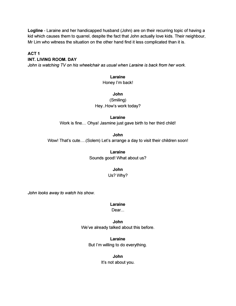
Here is our group’s updated script!
Please click here to read: Jaze:Jerry:Ziyu Script
Our see the screenshot preview below!
my journey in an arts school
Here is our group’s updated script!
Please click here to read: Jaze:Jerry:Ziyu Script
Our see the screenshot preview below!
There has been a tweak in the storyline now because Jerry will be joining Jaze and my scene! 🙂

Brief profiles
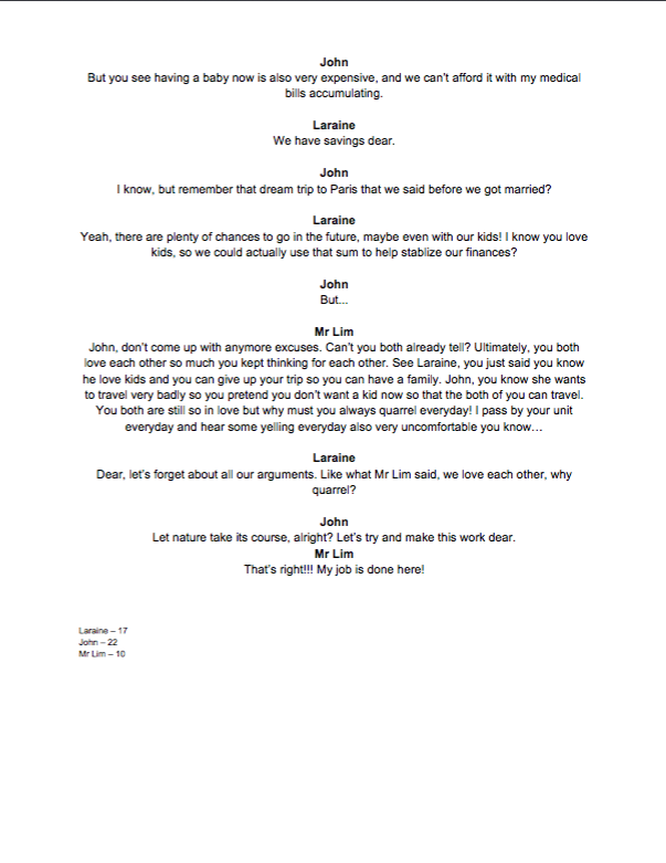
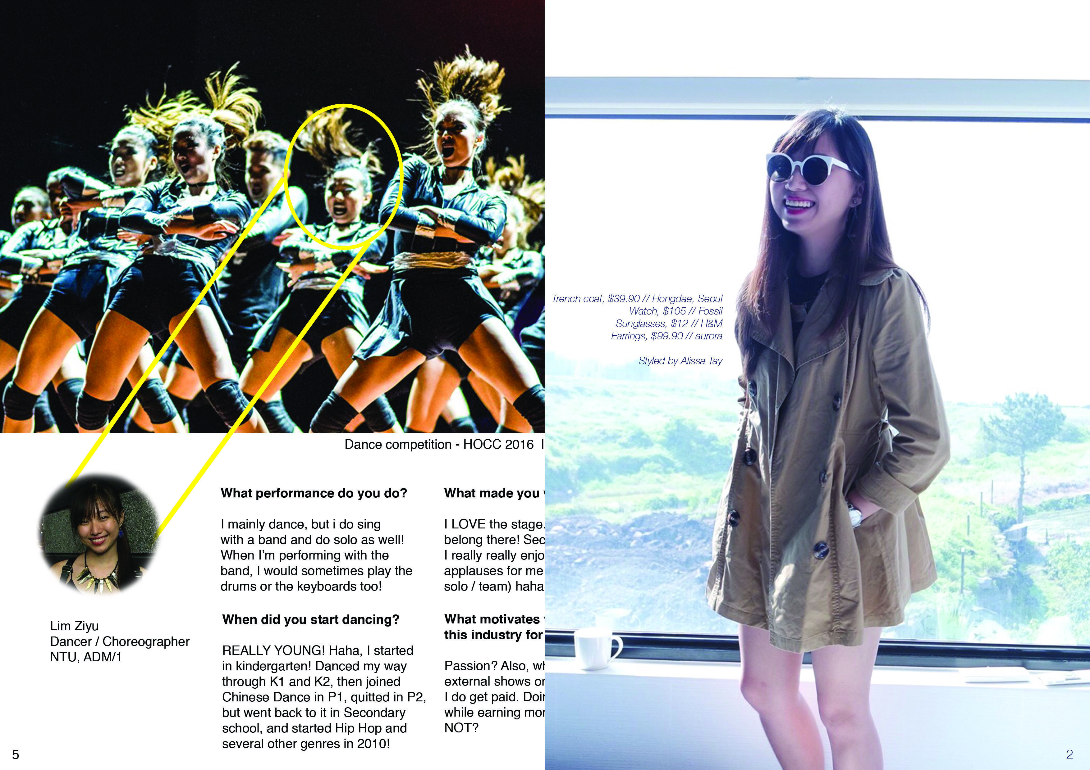
Ziyu as Laraine
Pleasant personality
Driven in career, and does not mind taking care of the household as well
She loves children and can’t wait to have a family
Jaze as John
Handicapped due to an accident
Cares for his wife but doesn’t show much due to his disability (inferior)
He loves children but is afraid of raising his kids as a handicapped father
Jerry as Mr Lim
Loves to help people around him
Neighbour of the couple
A young policeman who just started his career
Enjoys being the middleman/peacemaker

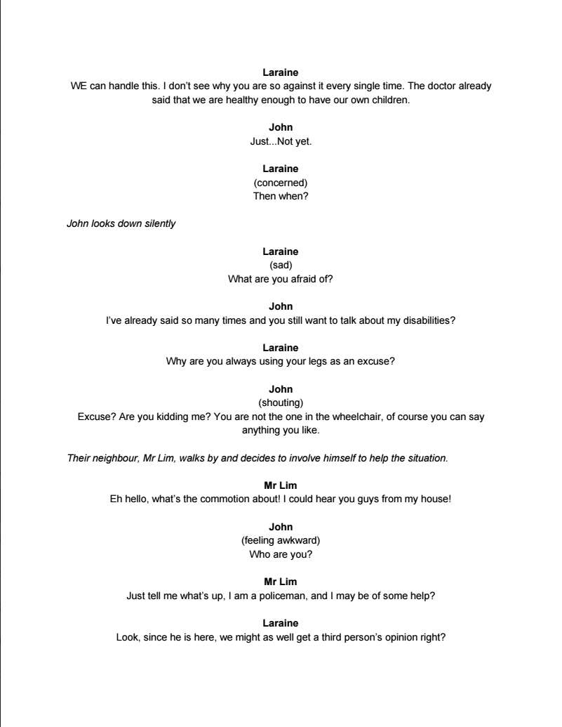
The storyline is pretty much the same as the previous post (click here), except that Laraine don’t walk off at the end, but instead, we have Mr Lim entering the scene halfway and try to mediate the couple.
Start:
– Laraine entering with mother care brochures, maternity magazines and pamphlets from a baby fair
– Her husband sits on his wheelchair doing nothing
– She tries to strike a conversation with him mentioning about her colleague’s children
– He knows her purpose of the conversation and was unhappy
Conflict:
– He insists on his point of not wanting a child
– She tries to be patient and explains a plan she has in mind
– He didn’t let her finish her lines and cuts in hopes of her dropping the idea
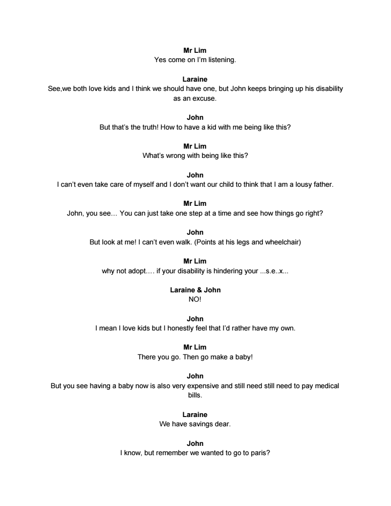
– Mr Lim enters the scene and tries to mediate the couple
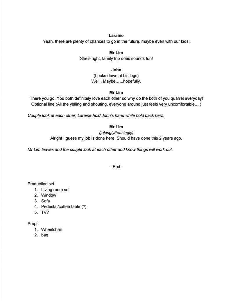
End:
– The couple realizes that they care for each other too much which led them disagreeing with each other

We are still working on cutting down lines, but here is our draft!
Click here – screenplay draft
Or see the screenshots below!


In a post two weeks ago (click here), I mentioned about my character’s profile, personality, and conflict with her partner. With those information, the scene would be some thing like what Jaze (profile) and myself performed in class – the wheelchair scene.
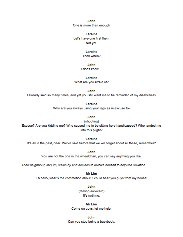
 Start:
– Laraine entering with mother care brochures, maternity magazines and pamphlets from a baby fair
– Her husband sits on his wheelchair doing nothing
– She tries to strike a conversation with him
– He rejects and was all gloomy
– She approaches him and he spots the brochures before she manage to say anything, and he got angry
Conflict:
– He insists on his point of not wanting a child
– She tries to be patient and explains a plan she has in mind
– He didn’t let her finish her lines and cuts in hopes of her dropping the idea
End:
– She also got very unhappy
– ends of with a “FINE!” and storms off, leaving her husband alone and upset in the scene
 For Laraine’s character arc, she’d start off with being slightly lethargic (end work), and then it shows her being patient to her husband, and still smiling a little. Her mood starts to turn more and more unhappy and disappointed at her husbands attitude, and she finally got angry at him and flares up.


working adult


Character’s profile:
Laraine
Mid 20s
Working adult
Has been in a relationship with her boyfriend (now husband) since secondary school
They just got married a year ago
Character:
Pleasant personality
Driven, and does not mind taking care of the household
She loves children and can’t wait to have a family
Conflict:
Her husband met an unfortunate accident and is paralysed
She could not understand his point of view (inferior) and insists on wanting a child
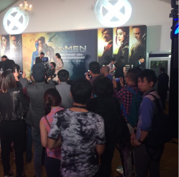
HUGH JACKMAN
I loved his performance and charisma, especially in the x-men series as Logan or Wolverine. He is really some one I admire because he is already 48 years old this year and he could still perform so well in his action movies.
Apart from that, I used to be in an event company before entering university, and my company were the ones organizing the X-Men Days of Future Past movie premiere. I managed go upclose to Hugh Jackman a little as I was coordinating his media interview schedules and he popped out of the interview room from time to time. His humble and down-to-earth self really got me so inspired!
Group members: Alfred, Darren, Gladys, Jo Inng, Valerie, Ziyu

We will be making use of sound, videos, voice overs and props to create the desired atmosphere. To ensure that participants are able to understand the installation, we decided to make only the voice over explicit while the rest of the mediums will be kept abstract.
Room 1
As mentioned earlier, the first room is a narrative re-enactment of Singapore’s fast-paced lifestyle. The room is set up with 3 projected screens adjacent to one another.
In this room we use the metaphorical representation of water as life and merge it together with scenes of the protagonist’s life. The protagonist is never explicitly shown, allowing participants to insert themselves into the narrative and relate the events with their own lives.
The three screens are played in sequence and document the growth of the character from a toddler to a teenager to a young adult respectively. Interlaced with the scenes of the character’s growth are scenes of coloured water droplets being dropped into a tank full of water. The water represents life, and the different coloured droplets represent the memories, experience and feelings associated with each growth stage.
The first screen narrates the toddler stage. The tank of water starts of transparent to represent the character’s innocence and purity. Her first memories, which are represented by yellow droplets are seen penetrating the surface of the water before spreading outwards. The screen then shows clips of a young kid playing with toys and having fun in the playground. The screen then fades back to the now yellow water in the tank.
The second screen starts playing as the first screen continues showing the yellow colours fusing with the water. Red droplets are added into the yellowed water, and is then overlapped with scenes of the character’s slow submission to teenage pressure and rebellion. She is stressed from studying and is too absorbed by commitments which result in negligence of her family. The screen fades back to the water, which is not a mixture of yellow and red. The water is now turning darker and murkier, symbolising the chaos and impurity in her life.
The final screen starts playing as the second screen continues showing the yellow and red tainting the water. This is overlapped with scenes of the character descending into a downward spiral in her life. She starts smoking, and is increasingly distant with her family. She is then seen fainting as the fast pace of her life has finally caught up with her and her health. She dies, and only realises the important things in her life during her last moments, when it’s already too late for her to change anything.
The screen turns black. Black is an irreversible colour, which means that the addition of other colours will not change it. Her life is over, and there is no turning back.
Room 2
While Room 1 focuses heavily on using videos, Room 2 shifts towards the usage of props and performance to create a reflective mood for the participants. In this room, a mock ritual for the dead has been set up.
The room is darkened as much as possible, and a table is setup at the end of the room. On the table lays different objects that are related to death. They include red string, candles and flowers commonly used for offering. In the center of the table lies a dirtied glass bowl. This is a connecting element for the 1st and 2nd room, and is representative of an empty life vessel. Life, symbolized by water, has been drained out, and only the ugly stains of the black contaminated life has been left behind. Behind the table stand a mirror that reflects the face of those who enter the room, and is meant to prompt participants to look at themselves and self-reflect.
As participants enter the room, a short performance is also put up. A male and female stands on either side of the table. They have a short dialogue about the character in the previous room.
Dialogue:
Ziyu | She didn’t have to die this way.
Alfred | But at least she was doing what she loved
Ziyu | But what does that amount to?
Alfred | Have YOU lived a fulfilling life?
Ziyu | Or are you just chasing after happiness that is only temporary?
After this short dialogue, an usher will come in to encourage participants to have a silent self-reflection for a duration of 1 minute. The narrative her is kept short as the main highlight here is the participants’ own involvement in the room.
| Filming Location | Foundation Drawing Room 1 Foundation 2D Art Room Foundation 3D Room Crit Room B1-14 Product Design Spraying corner Gladys’ House Hall 15 NTU’s playground Presbyterians High School Starbucks NTU North Spine |
| Things we borrowed | Projector Bamboo sticks Black cloth Speaker x2 Laptop x3 Long Mirror x1 Fish tank Tables and Chairs Ladder |
| Things we purchased | Black cloth White cloth Fake candles Tea candles Batteries Bell Fresh flowers Dried flowers Secondary school textbook Black garbage bags Food colourings |

For this project, we aimed to tackle and address the issue of leading a fulfilling lifestyle in a modern context. We observed that many youths face the similar issue of being overwhelmed by school work and other commitments, and often had little quality time with things in life that truly mattered. (BBC, 2007)
In our research, we came across one particular trend that had a huge impact on our artistic direction.
Due to high societal pressure and escalating suicide rates, the ‘Near Death’ movement has become increasingly popular in South Korea. This movement aims to address this issue by giving participants the chance to detach themselves from their fast paced lifestyle to reflect on their lives. As such, multiple ‘Fake Funeral’ services have been conducted across the country. In this particular one, they are lectured by a philosophical guru and invited to write out their own eulogy. After that, they will be placed in a coffin for 30 mins to experience death. The act of being enclosed creates a deafening space of endless darkness, and the atmosphere allows the participant to evaluate their lives from a objective and detached point of view. A lack of self reflection usually leads to people feeling lost and depressed, and this death meditation in the enclosed space forces them to look within themselves for answers that they have been seeking, but thought they didn’t have.
Another work we came across was Christian Boltanski’s The Heart Archive. Occupying a space in a museum on the uninhabited island of Teshima in Japan, this artwork collects heartbeat sounds from all around the world. Participants are invited into a room where they listen to the sounds of their own heartbeats through a headset. After that, their heartbeats recordings are saved and used in subsequent set ups of the art piece. The heartbeats are immortalized, and remain as fragile remains of their existence on earth.The work makes one contemplate on bereavement and what we remember during our existence on earth. As you take part in the installation, it evokes a sense of uncanniness which acts as a mirror of what lies ahead and our future and our nonexistence in it. The artwork questions the impact left behind by each individual whose heartbeat sounds have been recorded, and we believe the fragile and faint nature of the recordings makes one ponder on the meaning of their lives, and how many people they have impacted. It also relied heavily on symbolism and non-literal ways of portraying the theme, which we found interesting.
We believe these two artworks were greatly valuable and conveyed an important message. We thus decided to reference these two particular artworks/movements in terms of artistic style and content.
Bibliography
Life in the fast lane ‘speeds up’. BBC. BBC News, 2 May 2007. Web. 4 May 2007.
“Fake Funerals in South Korea.” Vice. Vice Japan, n.d. Web. 21 Apr 2016. Demetriou, Danielle. “Boltanski’s hearts don’t skip a beat.” The Japan Times. The Japan Times, 6 Aug 2010. Web. 4 July 2013.
Waters, Florence. “Christian Boltanski: The Heart Archive, Serpentine Gallery, review.” Telegraph. Telegraph, 12 Jul 2010. Web. 6 Aug 2010.

Click here to view individual Artist Statement from previous post!
Group Artist Statement
Sheng-Si (Life-Death) is an immersive video installation aimed at the everyday individual. Playing with both literal and abstract representations projected on three screens surrounding the audience, this exhibit seeks to invoke thoughts on the bigger picture in life. Drawing reference from the fake funeral trend in South Korea, it ultimately aims for people to diverge into deep thought and contemplate on their purpose in life.
 Throughout this project, we have been taking turns to film some behind the scenes (BTS) and the process of this entire installation. From the clips we have, I edited them into a video-log style BTS to allow viewers to understand our project from the very beginning till the installation day.
We also asked our classmate (Thanks Tiffany ^^) to help us hold the camera while visiting our installation during critique.
Our group consist of 6 people, the biggest group amongst our classmates, and that is because our plan was to make the project like a sequel in such a way that the narratives are connected for 2 different rooms. In the initial stage, the 6 of us came together and planned everything from the storyline, to the visuals and art direction; then we proceeded on to filming. Next, we somehow divided ourselves into different main roles, while also helping one another in our respective roles.
Jo and Val were mostly doing the writings and enhancing our existing conceptualization; Darren and Gladys were the film team, including execution and post production; while Alfred and I handled the planning of room layout, props, all the technical aspects as well as me volunteering to do the BTS video! Through the BTS video, you can actually see that we don’t just stick to what we have to do, but instead, help each other every where as and when we could.
In the beginning of filming, we tried out the ink dropping into water and almost resorted to using stock videos, but we managed to make it work! To make the screen’s timing work, we had to plan it in such a way that the duration of 3 different video is timed very accurately.

& Gladys managed to work her math and made this happen!!!
Next, I drew up 2 different floor plans because we were not sure if we will get to book our ideal location or not.

After deciding on logistics and required props, we headed out of school to purchase everything we needed and prepared for set-up. As I have worked with event companies before, I’ve had prior experiences to setting up a venue and installation and it really came in handy!

All in all, I felt really glad that I managed to combine what I have learnt previously in my polytechnic days, during my gap year, and also what was covered in 4D I and 4D II in adm into this installation! Through this project, I have learnt a lot about how much an environment could affect the narrative and the impact it can create on the viewers.
Also, the narrative we plotted is really relatable to me; and I believe it is to many of my fellow classmates too. We all have a lot of commitments in and out of school, and this installation aims to allow viewers to really relate and think about what they have done so far. I really hope viewers can relate to this as much as I do, and that everyone will do what they wanted to do and live with no regrets!
Also, I am so happy I got to work with all my close friends and that we worked in such a cohesive manner; it really helped us pull through all the late nights that lasted till 3am or 4am :’)
AND THANK YOU 4D CLASS AND THANK YOU RUYI! 
SHENG.SI consists of three screens designed with visuals portraying new birth, adolescence, and the chaotic life of young adults chronologically and on each screen respectively. The projection on screen will be injected with different coloured inks dropping into water, implying the emotions of the individual visuals. At the end, all inks will turn black, representing life progressively turning chaotic and tainted. The water level will then go down, symbolizing the motion of “draining out”, which relates to humans getting so tired and drained out. With references to a South Korean event, “Mock Funeral”, they aim to lower the increasing rate of suicidal case. The event allowed participants experience death, or being alive at their own wake, and reflect on life in a coffin. Similarly, SHENG.SI aims to let viewers reflect on their life and themselves with their take on an abstract portrayal, and then an experiential theatre. SHENG.SI aims to let viewers think about how much they have done in life and if they have lived life to the fullest.
Produced by: Alfred, Darren, Gladys, Jo Inng, Valerie, Ziyu

I am so happy that whatever we visualised have all came into place!
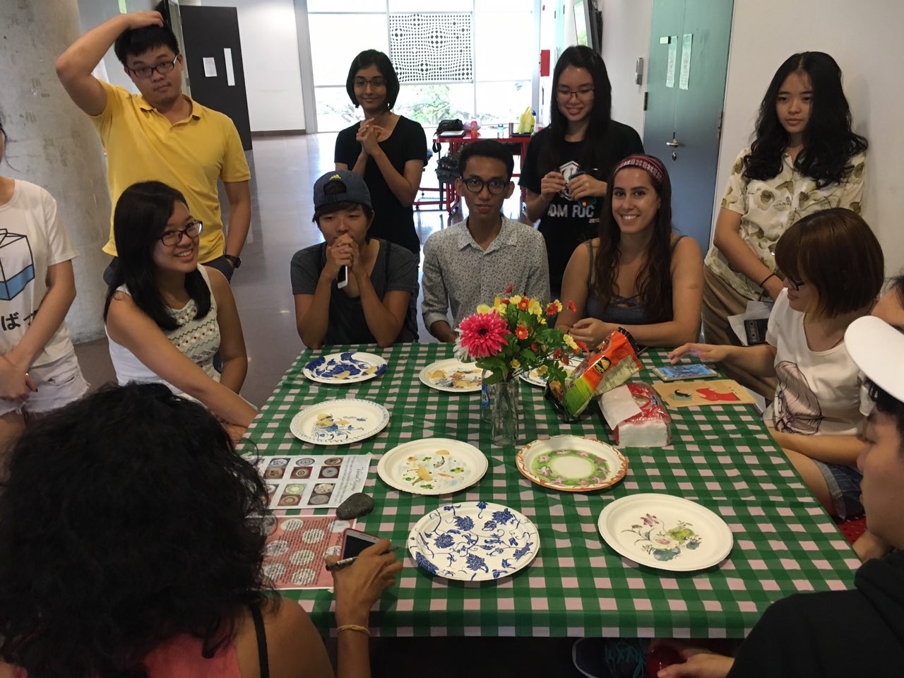
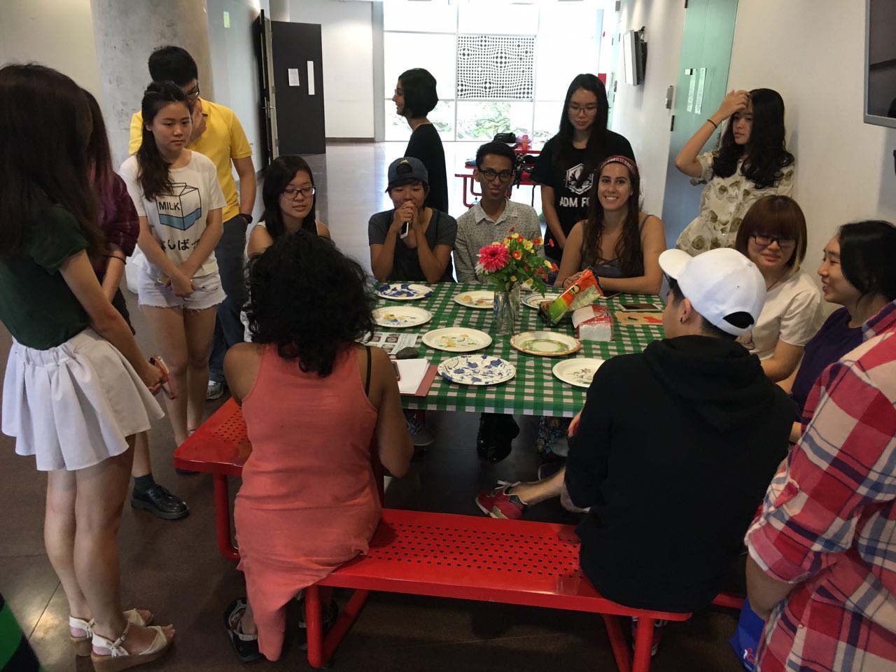
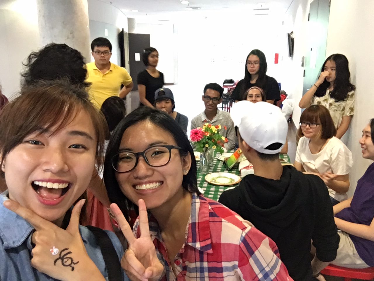
We managed to set-up a picnic setting, and let our classmates participate in the presentation as well!
I am really grateful to have project mates that think alike and work on the same pace!
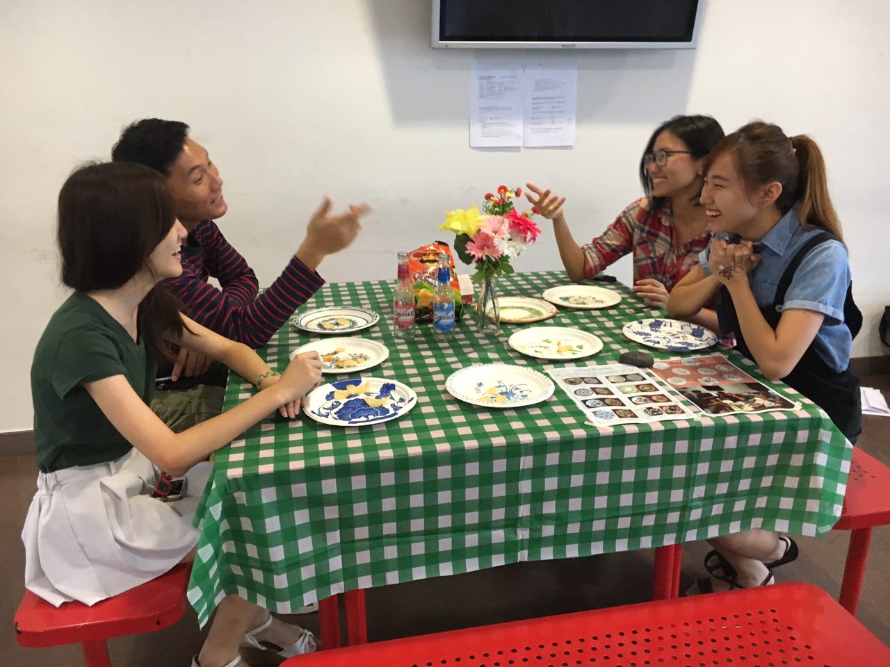
 Thanks Andrew, Chen Yue and Fern!!! ^^
See reflections in previous post – Click here!
See all Art History posts – Click here!
See my profile – Click here!


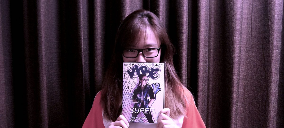
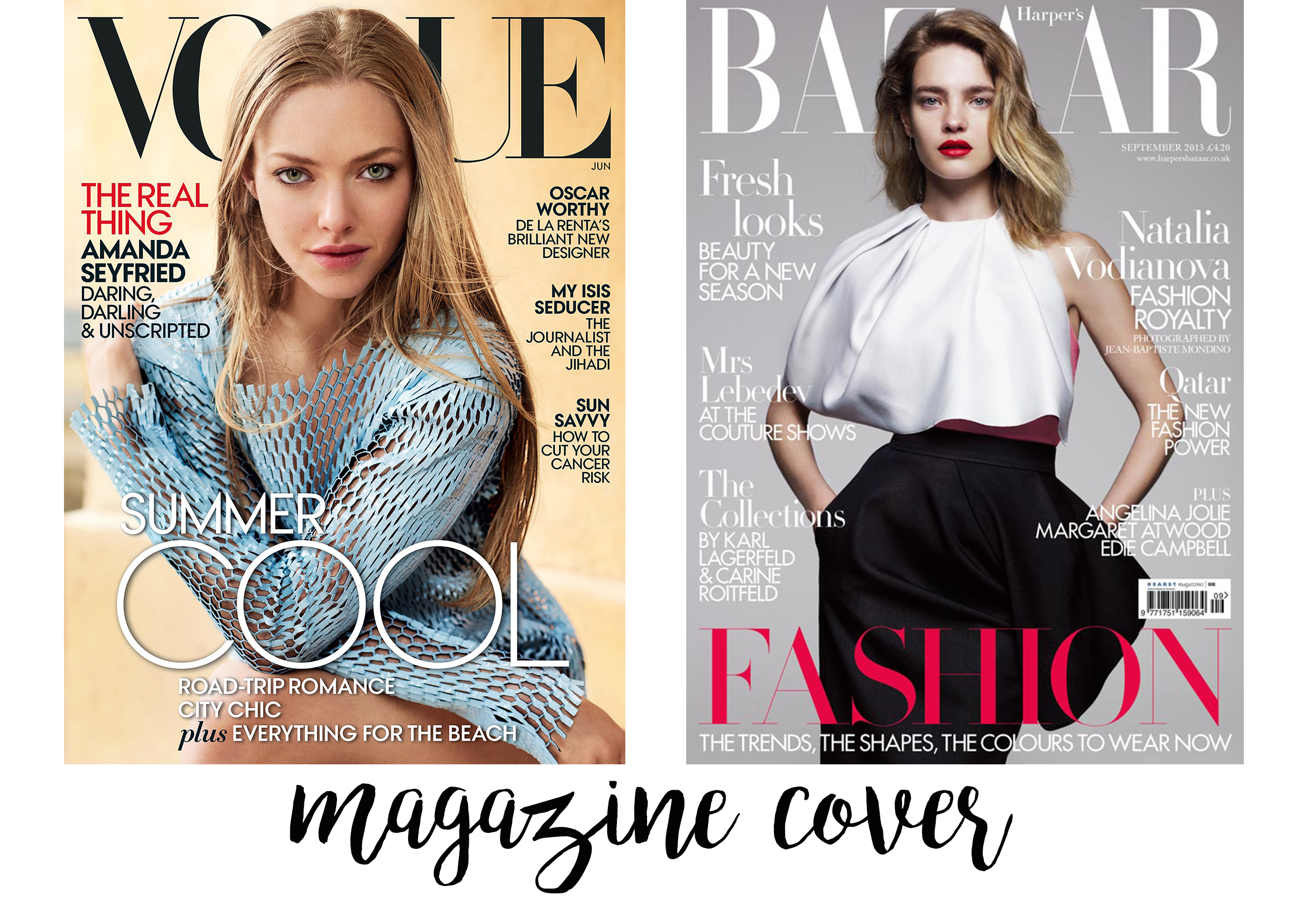
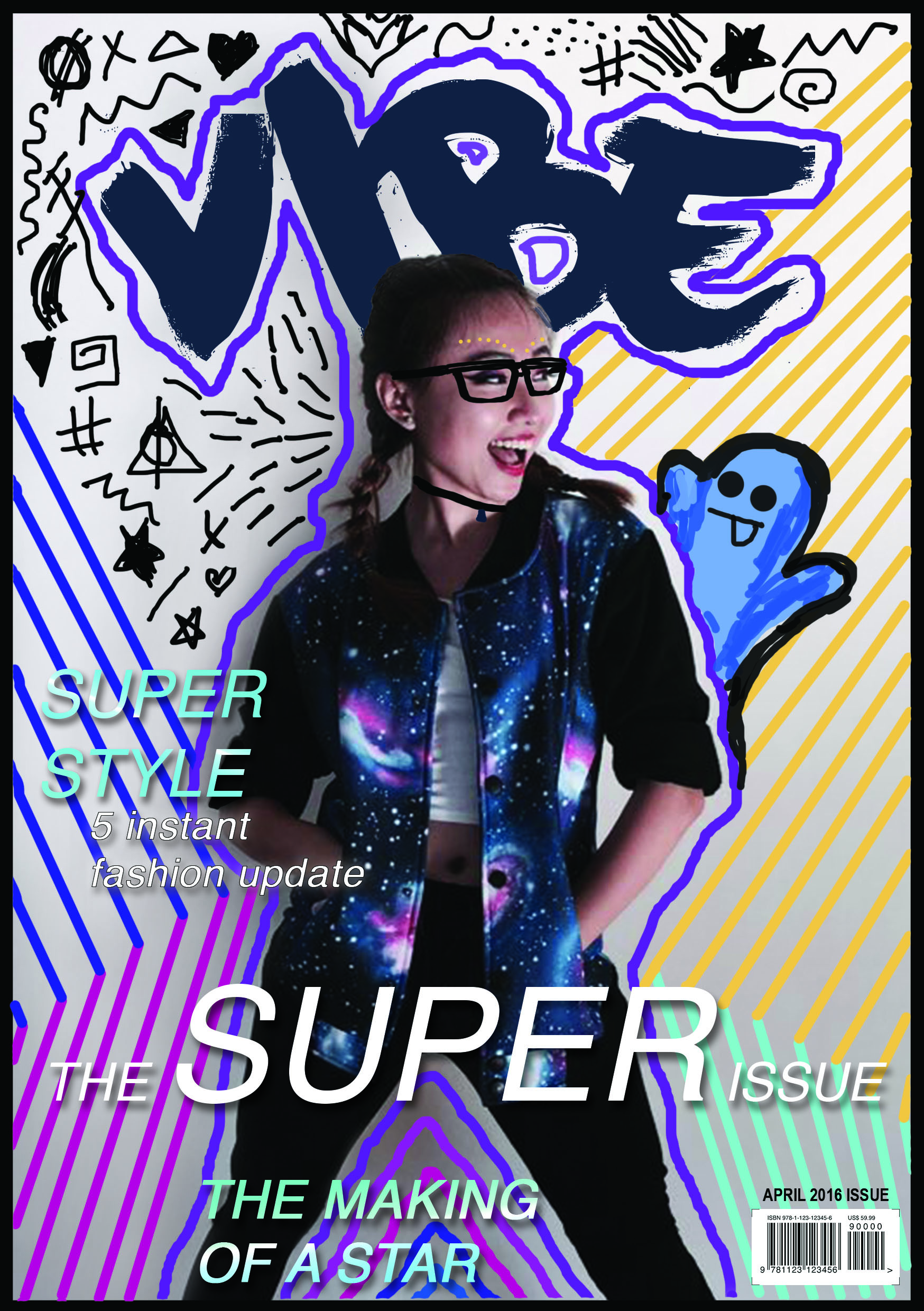
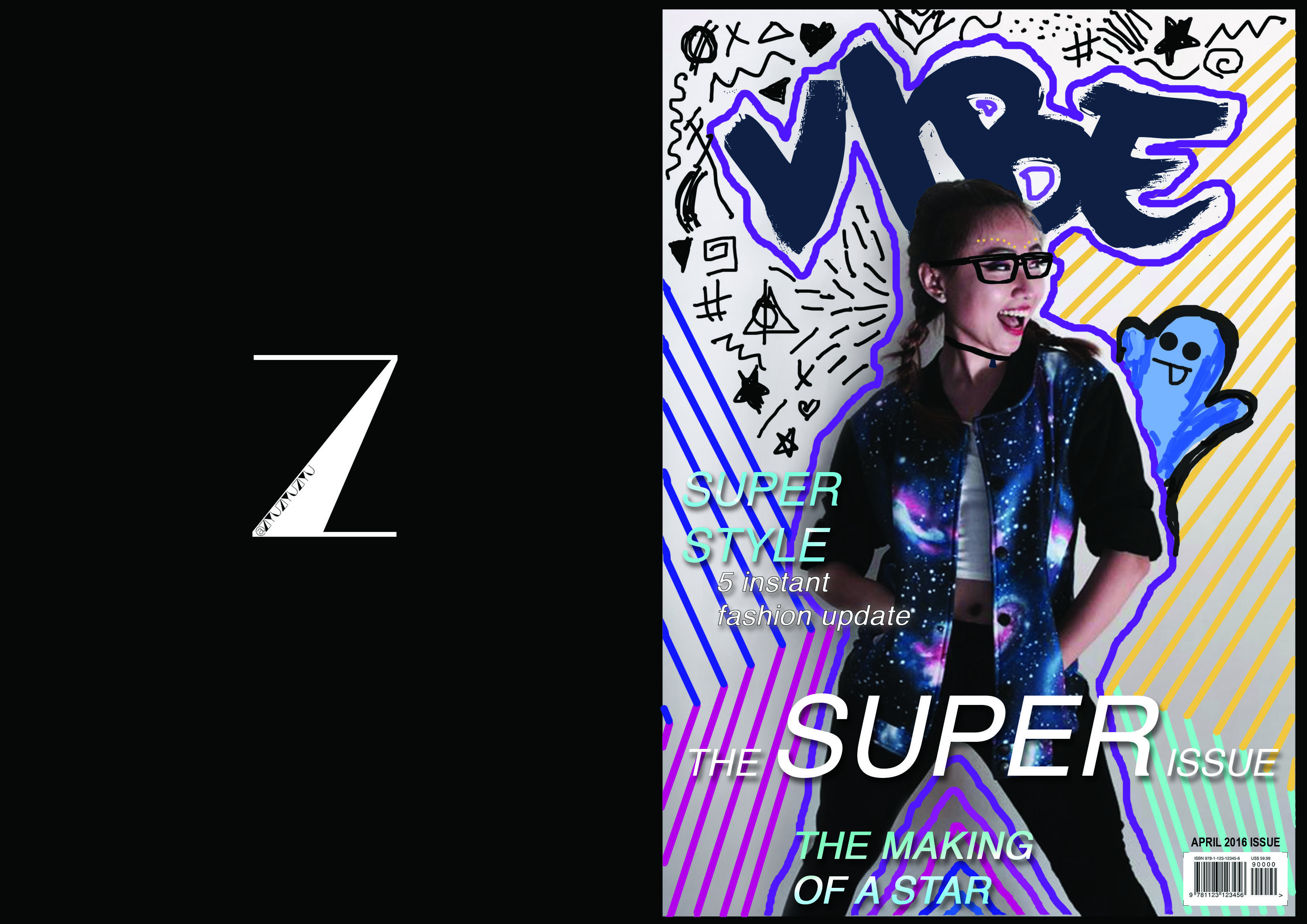
Before I worked on the cover, I searched to see various designs of magazine covers like Harper’s Bazaar, Cosmopolitan, and Vogue, to spot its common technique (layout, font, cover girl’s cropping proportion etc)
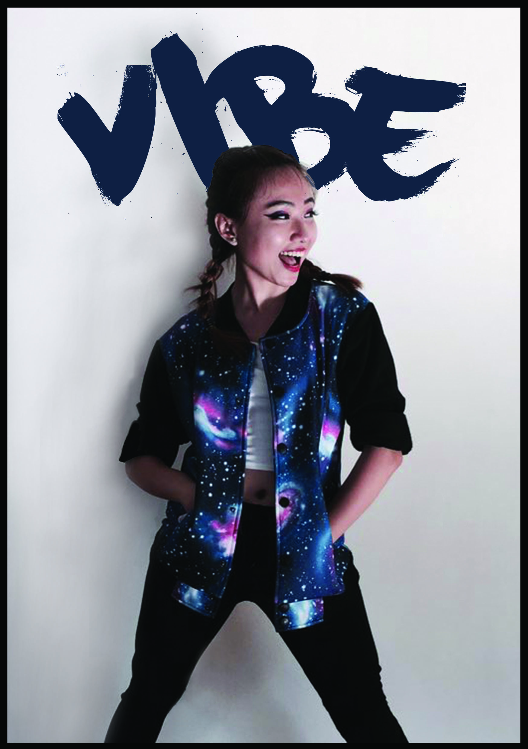
 Then I tried my own, but during consultations, group mates were saying that it is really too plain, then I thought……why not incorporate the cover with Hattie Stewart inspired artwork?
 →
→
I tried it out by doodling on the test print (in the visual journal) to see if I can capture the essence of Hattie Stewart’s art work.

I picked up on the strokes, the bizarre patterns, as well as introducing a “character” into the doodle – snapchat ghost icon peeping over my arm.

I am a really heavy snapchat user, and my pose on the cover was just so nice tilted to 1 side of the page, therefore, adding the snapchat ghost icon is actually pretty apt to me!
Then, it still doesn’t really look like a magazine if there weren’t any text, it can just pass off as a normal poster or artwork? So I took the magazine reference I showed above, and inserted some texts and added barcode on the cover to look more like a mag!
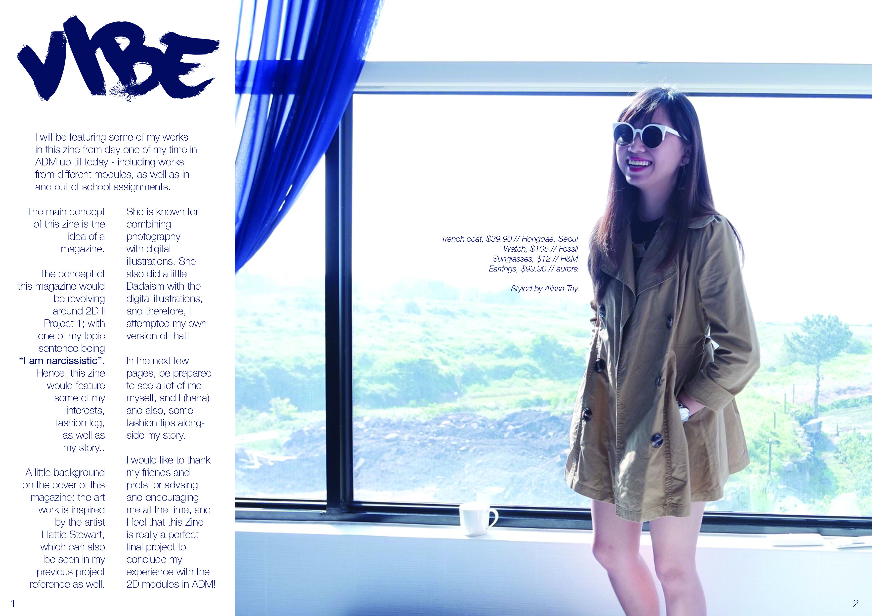
Typically, the following page after a cover would be advertisements, and it will slowly lead to the editor’s note or foreword. I thought adding advertisements of fragrances or watches or items may be a little weird, hence, I adapted the layout of an advert, having a huge image with a small description on the products on myself, and then created a column on the left for foreword. I wanted it to look a little like the credits page on a magazine, thus, I created the layout of the text in that manner!

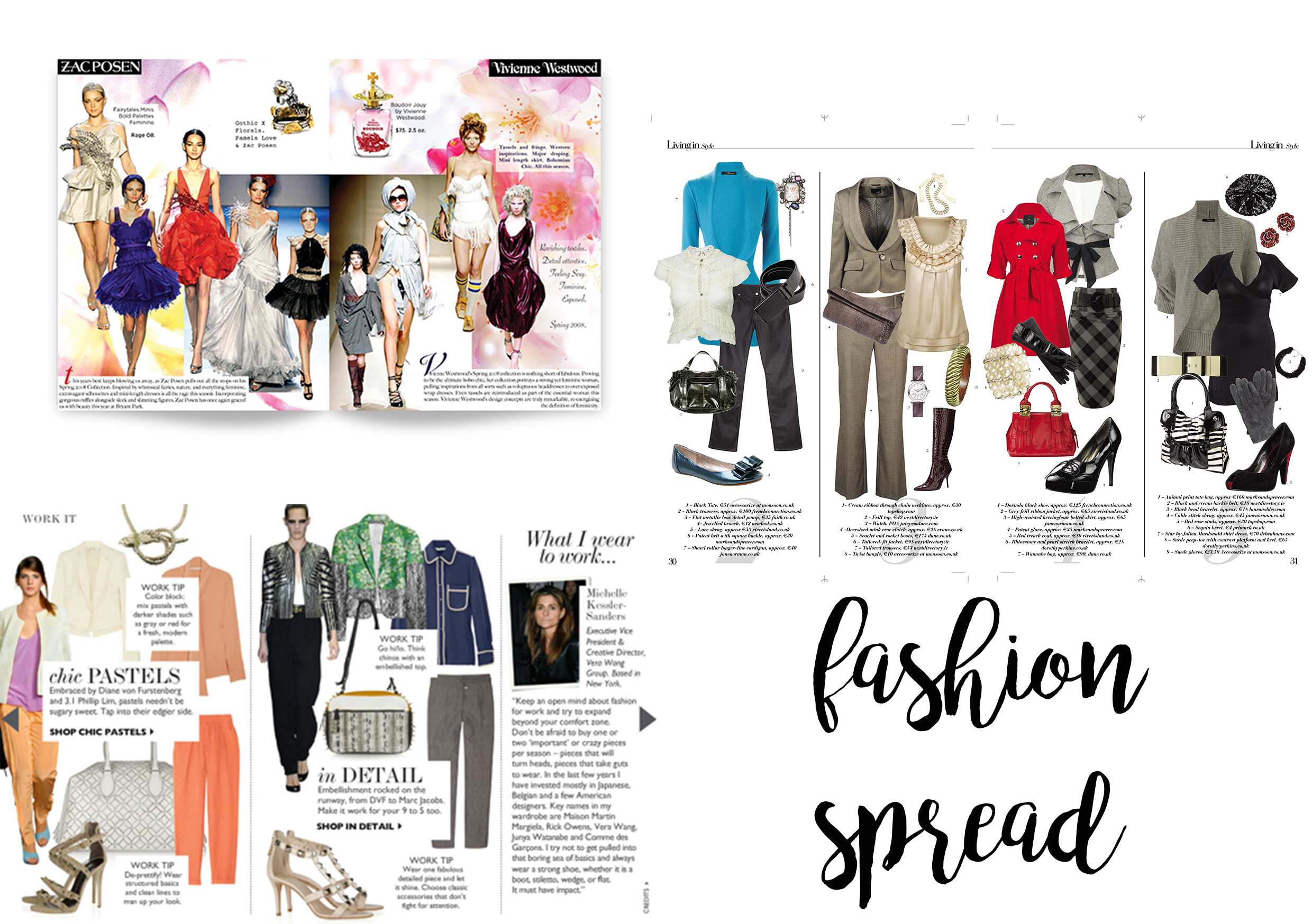
In a fashion spread, it is quite a norm to see the layout being very free-formed. It usually includes models on a runway, and then clothing or cosmetic usually in .png format, and then some text to support the F/W collection or S/S collections, or maybe even covering NEw York Fashion Week or something!
So I adapted its format, and created a fashion spread like below.
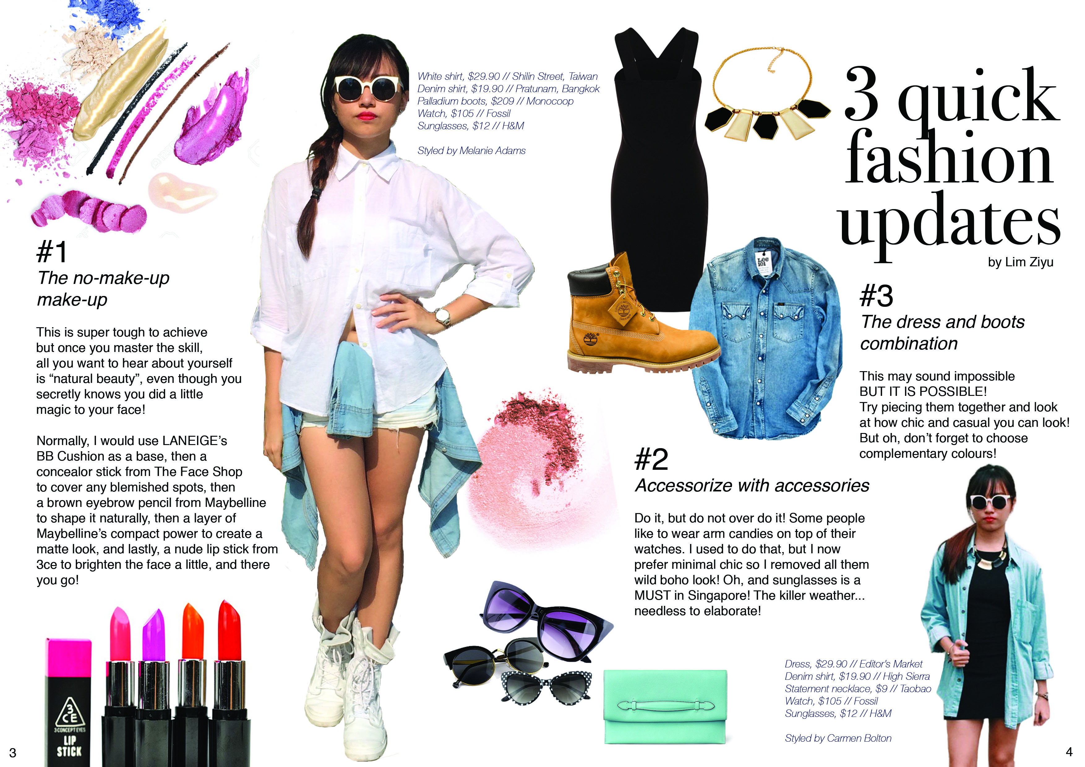
I pointed out the details on my outfits, and gave quick short tips on how I usually dress-up or prepare before I head out!

As usual, I googled the the keywords to search for references, and I typed “magazine interview layout”. Above, I felt that the structure is pretty clear and comfortable for readers to absorb information, hence, my creation below!
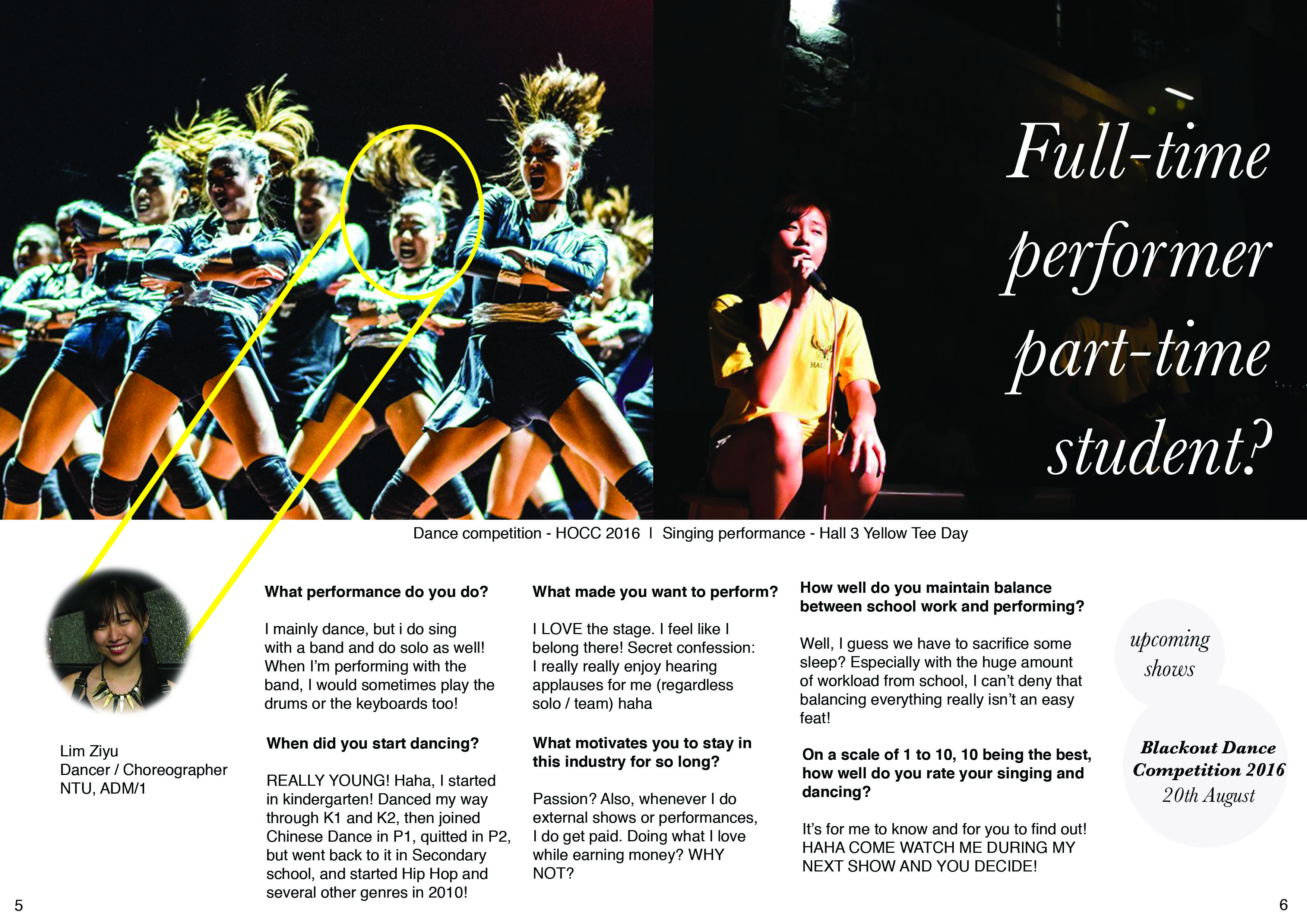
I asked my friends to imagine that I am a celebrity (as of now), and what sort of questions will they want me to answer, then I constructed them, and interviewed myself HAHA.

Some designers insert advertisements on the back page of a magazine, some creates a connection from the front cover to the back, so that front-back looks in-sync.
I felt that placing an advertisement may be a little strange as I’ve mentioned above. So since this zine is really about myself, and if I still want to adapt the concept of an advertisement, I put a logo that represents me (so I am like advertising myself?! Haha), accompanied with my social media name! I chose it to be so simple because the front cover is already pretty loud and heavy, so I thought the back should be a little more simple and minimal. I love to play with the positive and negative space, so you can see my personal logo and social media name combined as one “Z”.


I’m not familiar with InDesign, so I didn’t know how to use it to let the pages switch sequence and be printed like a normal book. Hence, I made use of Photoshop and Illustrator to design and layout the pages manually before sending it to print.


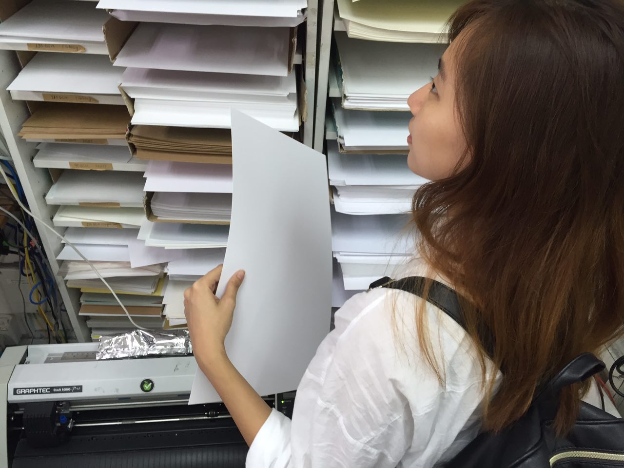
The selection of paper has always been a challenge for me because I am not familiar with the different effect it will create based on the gsm and texture of each paper. I wanted this zine to resemble a magazine, but not too cheap, so I thought I should use a slightly thicker paper instead of the very thin recycled paper on a typical magazine!
I then used saddle stitch to complete the magazine. However, it didn’t occur to me that the gutter space has to be so significant, because I thought that there was only 2 papers, and I’m not sure how much space to leave blank for, hence, the position of the staple is quite weird, just so I don’t block the wordings on the interview page!

In the beginning, I wasn’t very sure on what to do. Like a portfolio of my entire 2D? Select one 1 past project and expand on it? Create an event brochure like how Singapore Night Festival always does?
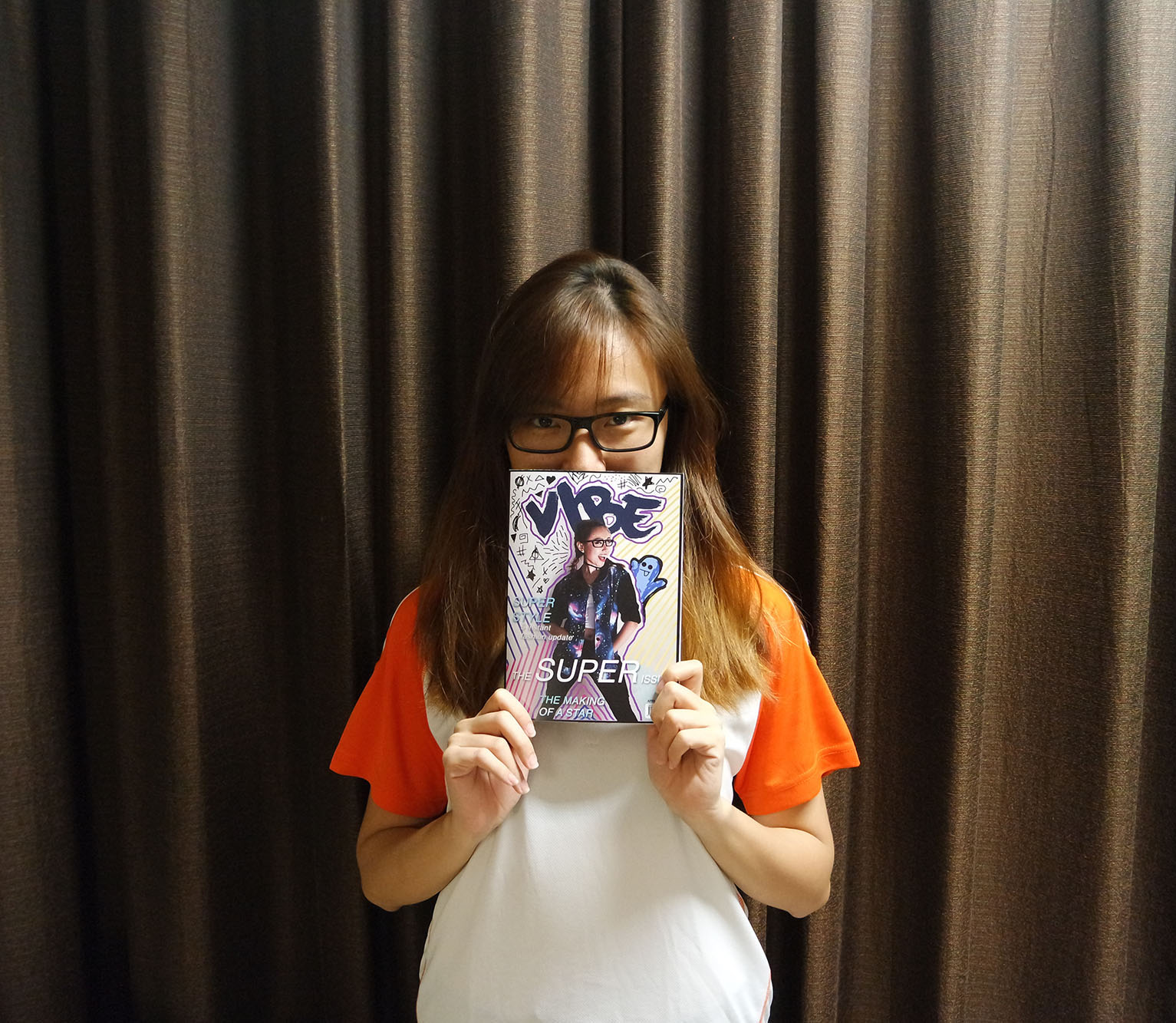
Then I decided that, since I’ve been highlighting the point of “body parts” in various projects on 2D, and I admitted that I am a narcissist (healthy one, no worries hahha) PLUS, I love reading magazines, so I thought it’d be great to have my own magazine about myself! I have always wanted to work on a publication and print it for my close friends as a Christmas present – to sum up our year together and for me to have a platform to try out the layouts and technicality of publishing a magazine! So this final project really came in handy and I really felt like I pushed and learnt a lot, especially digitally drawing like Hattie Stewart, and after group consultations, where friends gave more ideas and suggestions on how I could improve my existing magazine then!
Through the final critique, I learnt that I’ve still got pointers to note and improve on the zine. So I thought MAYBE I can expand on it, add a few pages, and explore more during this vacation break! Then I can try out on the gutter space issue too 😛
All in all, I really had a lot of fun doing 2D this semester and I thank all of you + Joy for these great experience and memories! :’)
– xoxo @ziyuziyuziyu HAHA
Group members: Andrew, Chen Yue, Fern, Ziyu
To follow up with my previous post on the ceramics plate, my team and I have decided on the following claim:
The function of Chinese ceramic plates has changed from decorative items to common utilitarian wares over the years.
And below, I will be covering a brief proposal on our concept, some images of the Prototypes that we have done, Artist Statement, Bibliography, as well as my Reflections on this project and the overall Art History in Sem II.

Proposal
From my previous post (Click here!), you can see that the functionality of plates have changed over the years – from being a decorative item to a normal day to day utilitarian, and from being owned by the wealthy to an ordinary material that can be afforded by all in sundry.
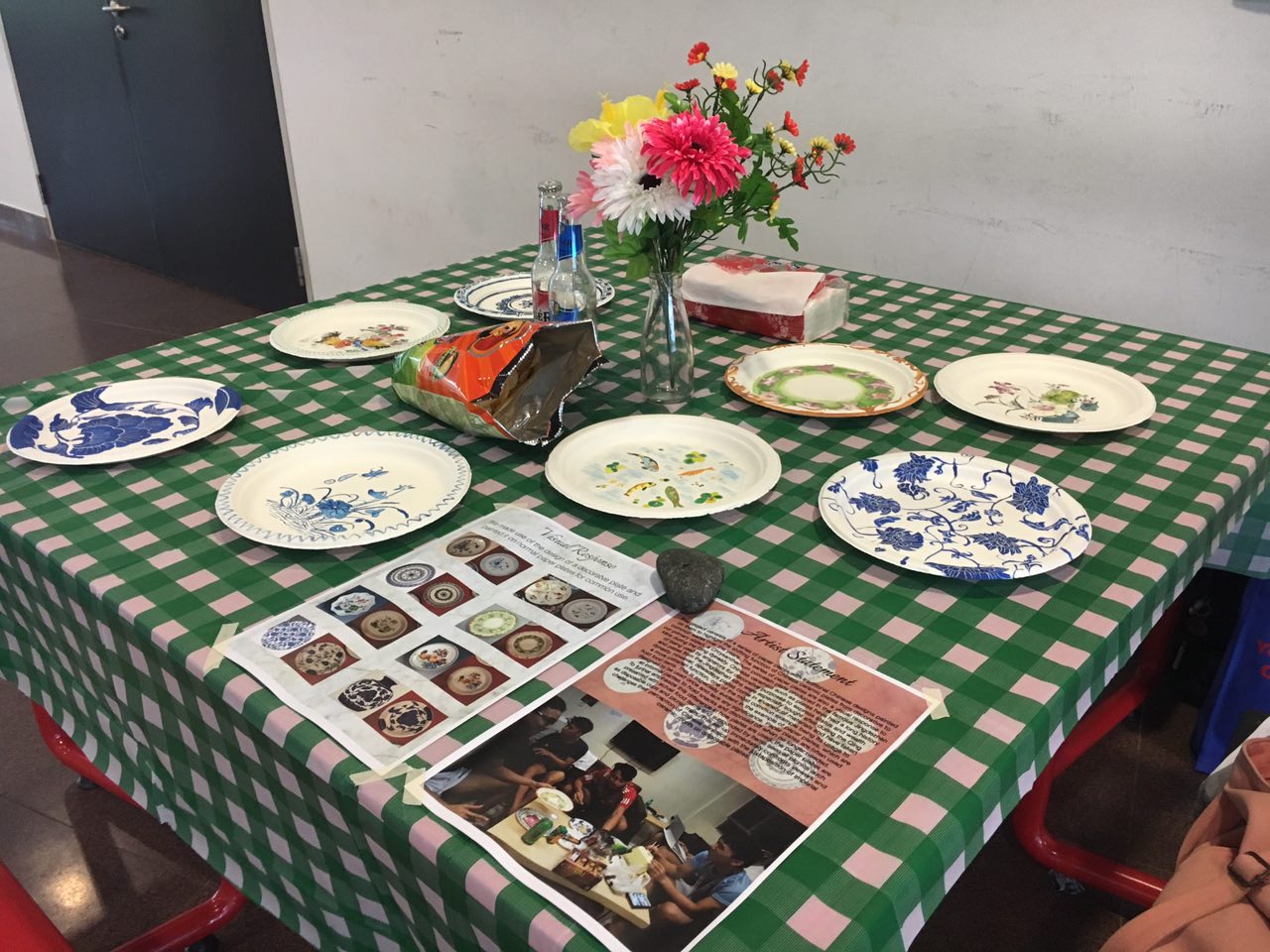
Thus, our team has decided that we would use paper plates for our product, and we will inject decorative elements on the plate to combine the idea of decoration, functionality and affordability. Also, we have been considering about its purpose: why paper plates? And we’ve concluded that it could be commercialized for thematic events or party use, or even just a normal service plate at home!
Ideally, the actual plates should have prints and the finances should be calculated in such a way that its profit margin is high – since the production cost of a paper plate or printed paper plate is quite low, and after imprinting oriental and elegant designs, its perceived value could easily be viewed much higher as compared to a plain white paper plate.
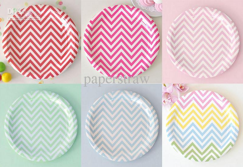
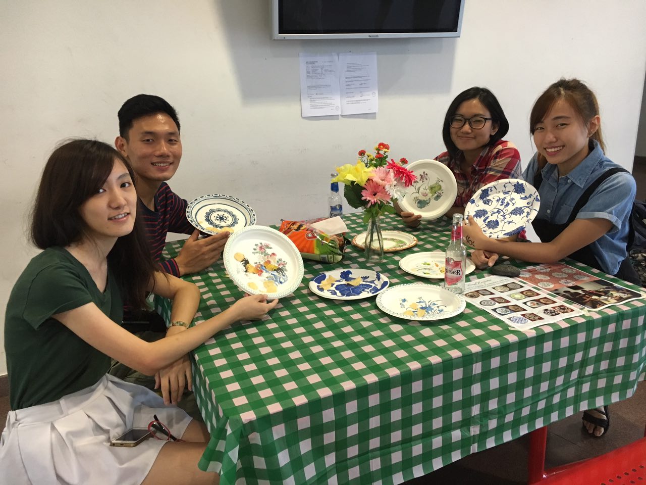
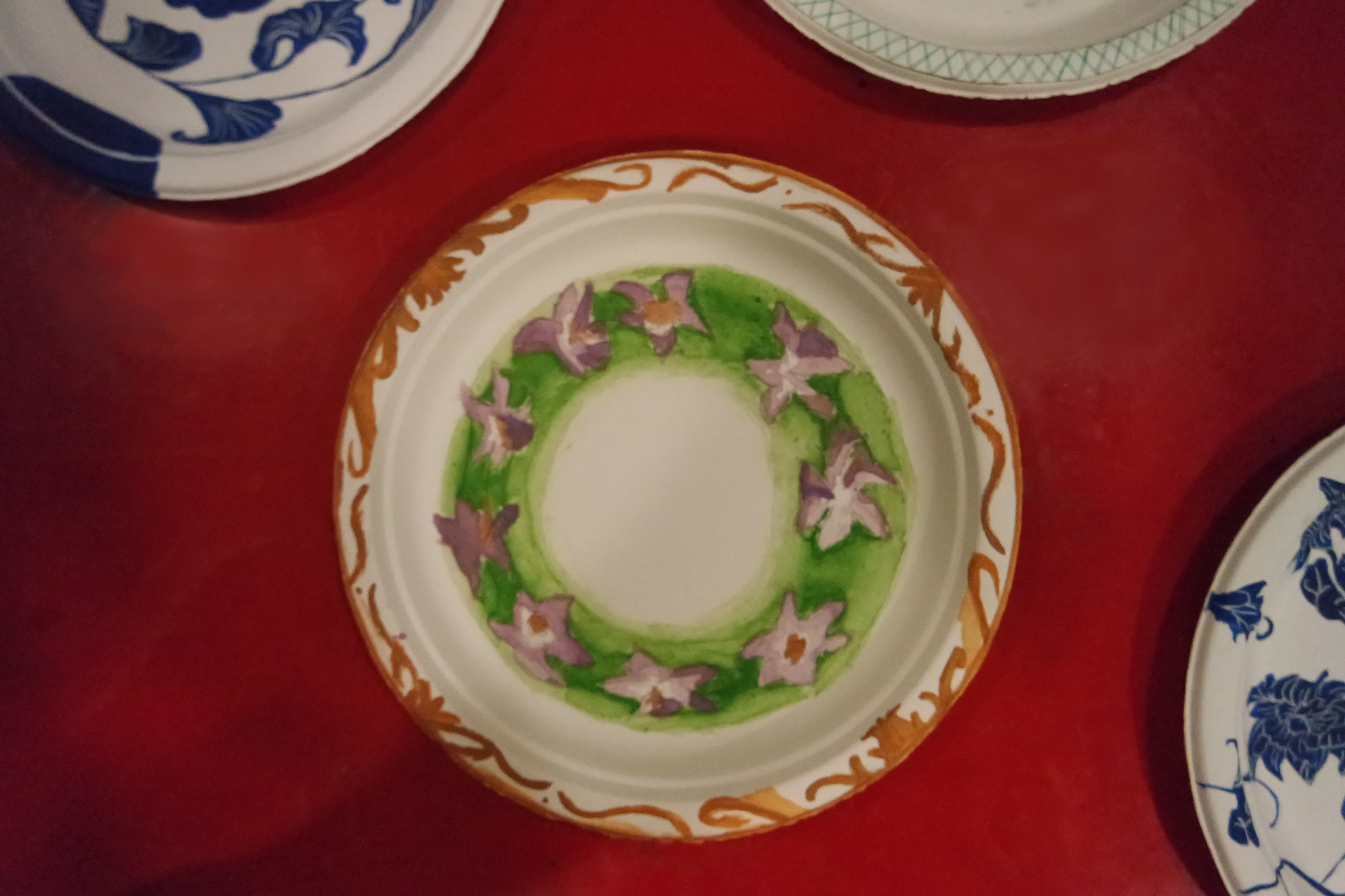
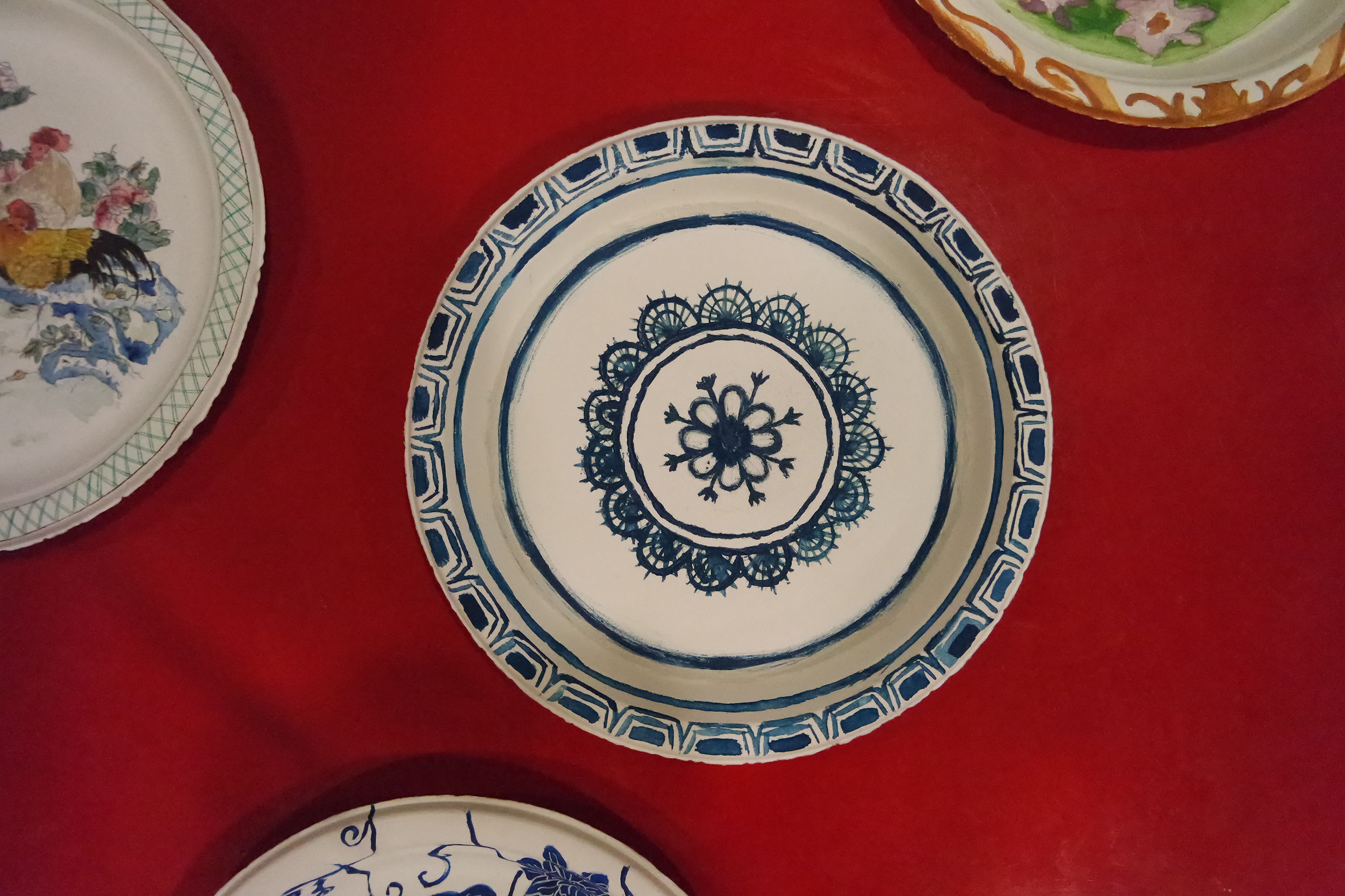
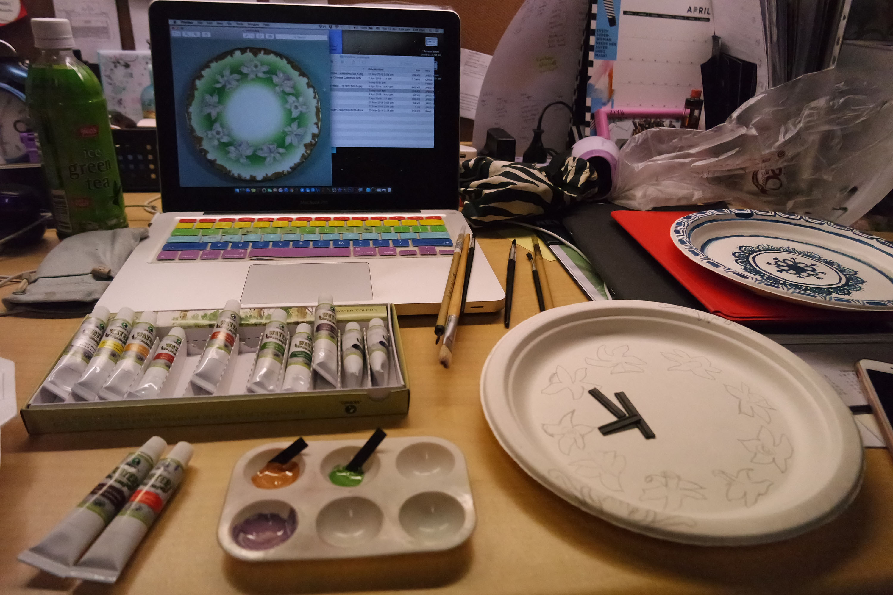
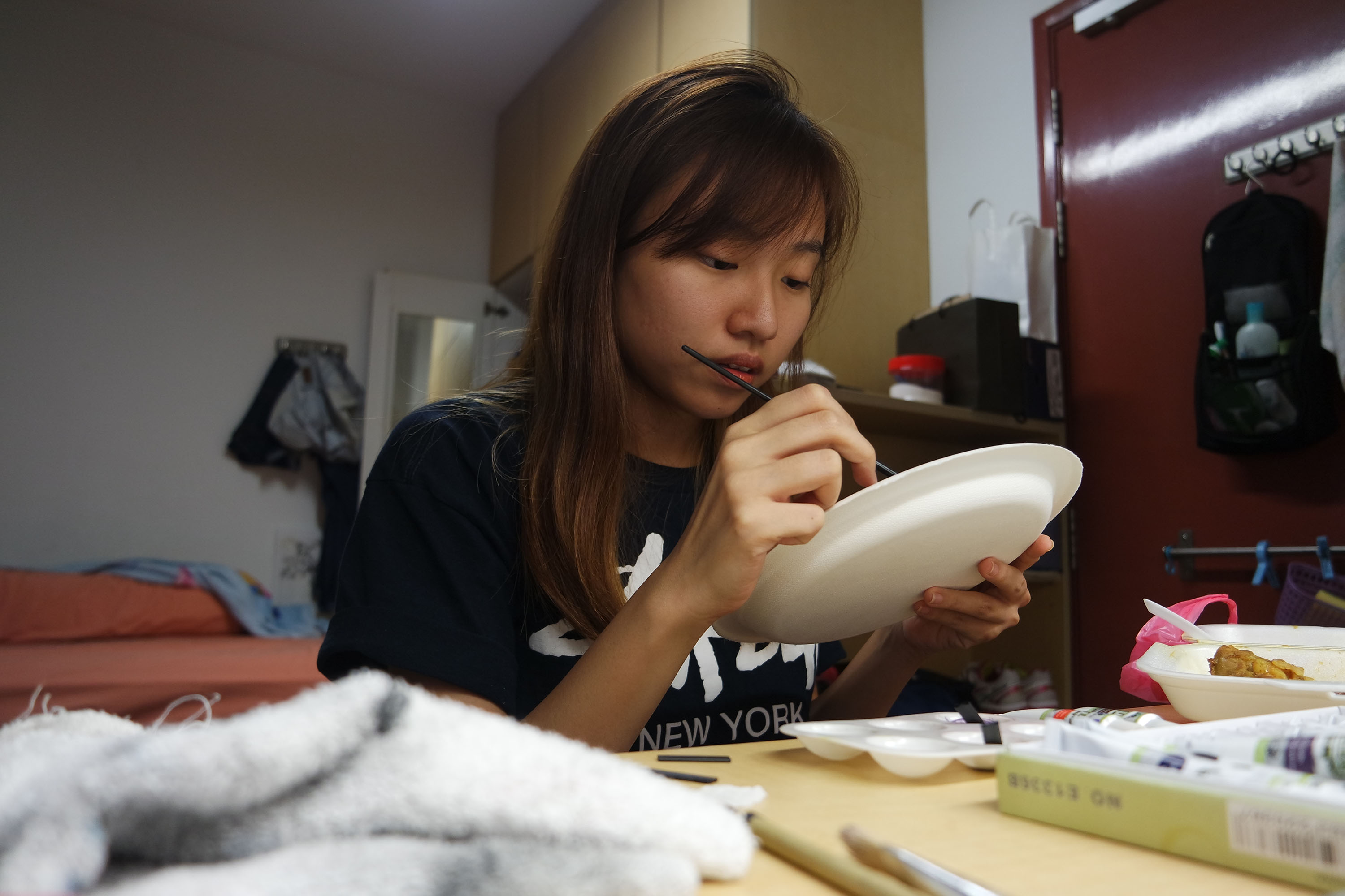
Therefore, we have decided to paint on a plain paper plate for the prototype to bring across the idea and concept. We decided to paint 2 designs each, thus producing 8 different prototypes!
Prototypes
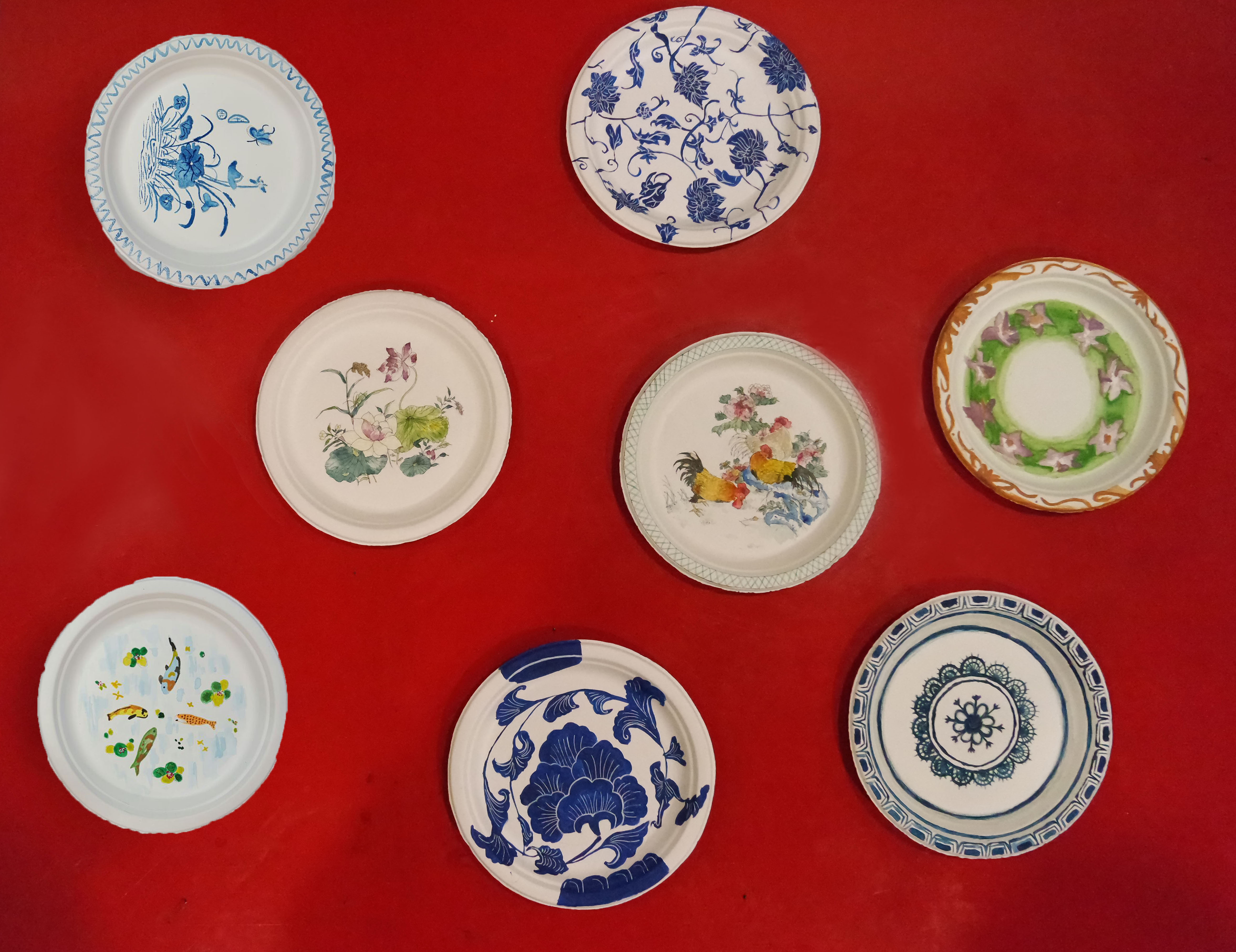
Here is a close-up of my 2 different designs:
Artist Statement
This project consists of a series of paper plates with traditional Chinese designs painted on them to highlight the shifting function of Chinese ceramic plates from decorative to common wares over the years. The series of paper plates are also a visual response to our primary object, a Chrysanthemum porcelain plate produced in the famous Jingdezhen kilns during the Qing dynasty. Chinese ceramics such as plates have had a long history of being used by emperors for decorative purposes to express status and wealth and plates from the Jingdezhen kilns were especially sought after during the Qing dynasty. However, nowadays plates come in a variety of materials and have taken a more utilitarian function, one of the most common example being its usage to hold food items. This is especially evident in the example of paper plates, which are designed to be used once and lack any significance. Paper plates are often used at informal parties to hold snacks and disposed off when no longer needed. To further emphasize this difference in how plates are used, the paper plates are presented with actual food items and surrounded by items seen at picnics such as disposable cups and picnic mats. This set-up immediately confronts viewers and challenges their perception of Chinese ceramics with the juxtaposition of imperial ceramic motifs on disposable plates.
Bibliography
Leidy, Denise Patry. How to Read Chinese Ceramics. New York: Metropolitan Museum of Art, 2015.
Medley, Margaret. The Chinese Potter: A Practical History of Chinese Ceramics. New York: Scribner, 2001.
Rawson, Jessica. The British Museum Book of Chinese Art. United Kingdom: British Museum Press, 2007.
Wu, Juan. “Chinese Jingdezhen Blue and White Imperial Porcelain.” Sci China Ser E Science in China Series E 47, no. 3 (2004): 366.
“Porcelain Obsession: Denise Patry Leidy on Her New Book …” Met Museum. September 11, 2015. Accessed April 6, 2016. http://metmuseum.org/about-the-museum/now-at-the-met/2015/how-to-read-chinese-ceramics.
Reflection
I really felt like I’ve pushed and learnt a lot through this project. Initially, we were all aimless even after reading the project brief. We often lose track during our project meetings and we just couldn’t figure what thesis or claim we should go ahead with. From the moment we’ve confirmed it, everything else was rather smooth sailing. I am really glad that my group and I worked well together; it seems like we are all different but were able to complement each other in a positive way! All of us were able to compromise and agree with each other, adapting constructive comments and ideas into one.
Personally, it is a great achievement especially for this final project because I don’t really know how to paint well, but because of what we have agreed on, I did what I could and was able to produce the 2 plates that I did! 🙂
Overall, my biggest take aways from this module is visual analysis. I’ve been hearing this since week 1, and I became really sensitive to details of a painting, sculpture, or anything I see basically! I really helps a lot and my friends and I would also comment on things we see even when we go for meals or come across certain art work online! I like how we can apply whatever we learn in class out of it because then I know that it is important information that we have learnt, and not just something we go through just so we can “cover the syllabus”. I love learning and exploring and I can’t wait to discover what in for us in the next semester’s Southeast Asian Art!