2D II // ZINE_final

zine

www.GIFCreator.me_FBOPso

cover

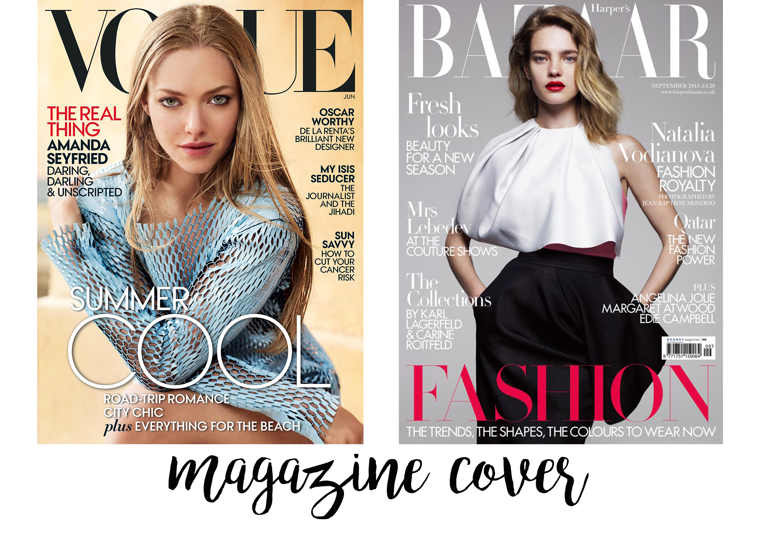
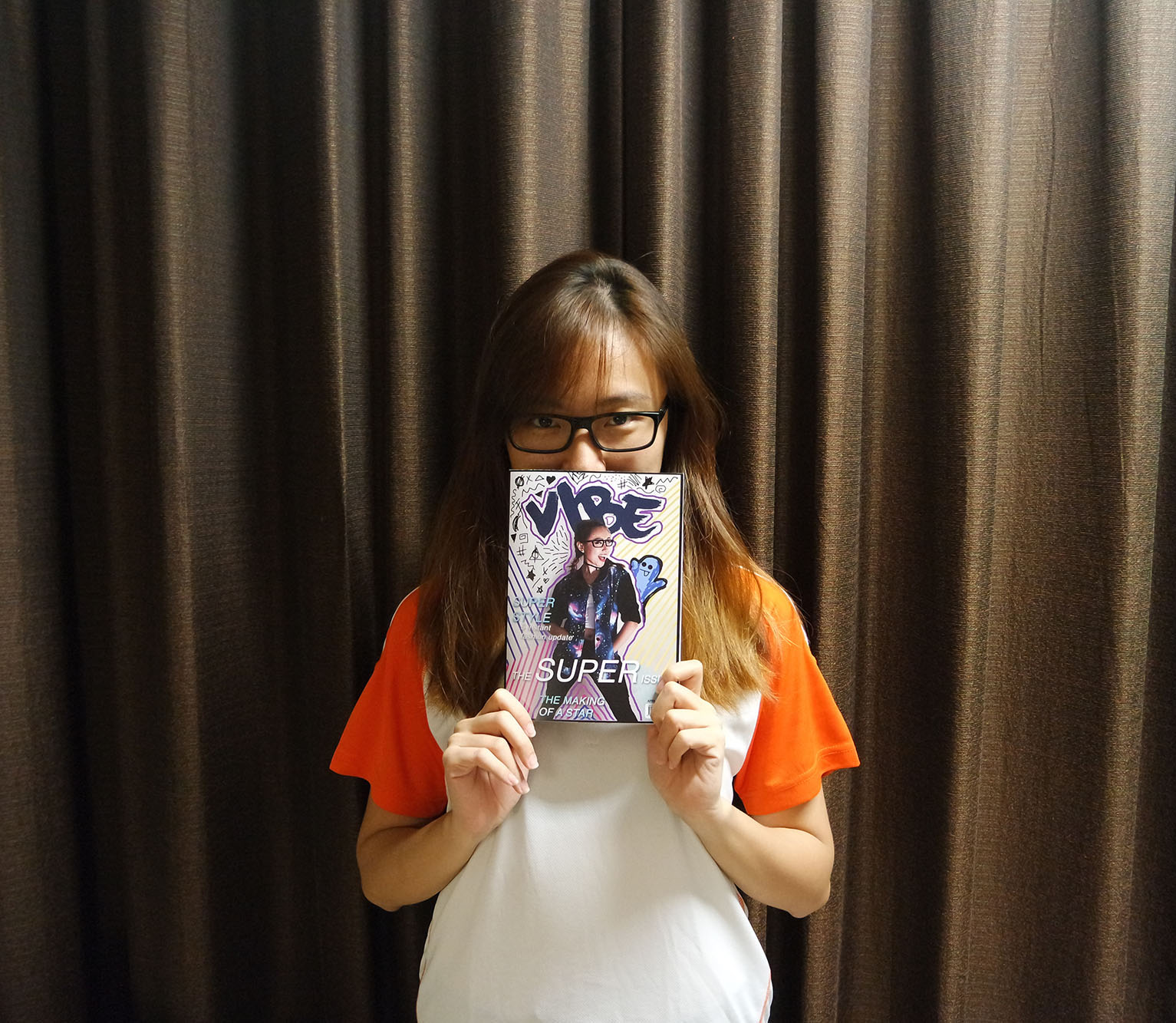
Before I worked on the cover, I searched to see various designs of magazine covers like Harper’s Bazaar, Cosmopolitan, and Vogue, to spot its common technique (layout, font, cover girl’s cropping proportion etc)
cover
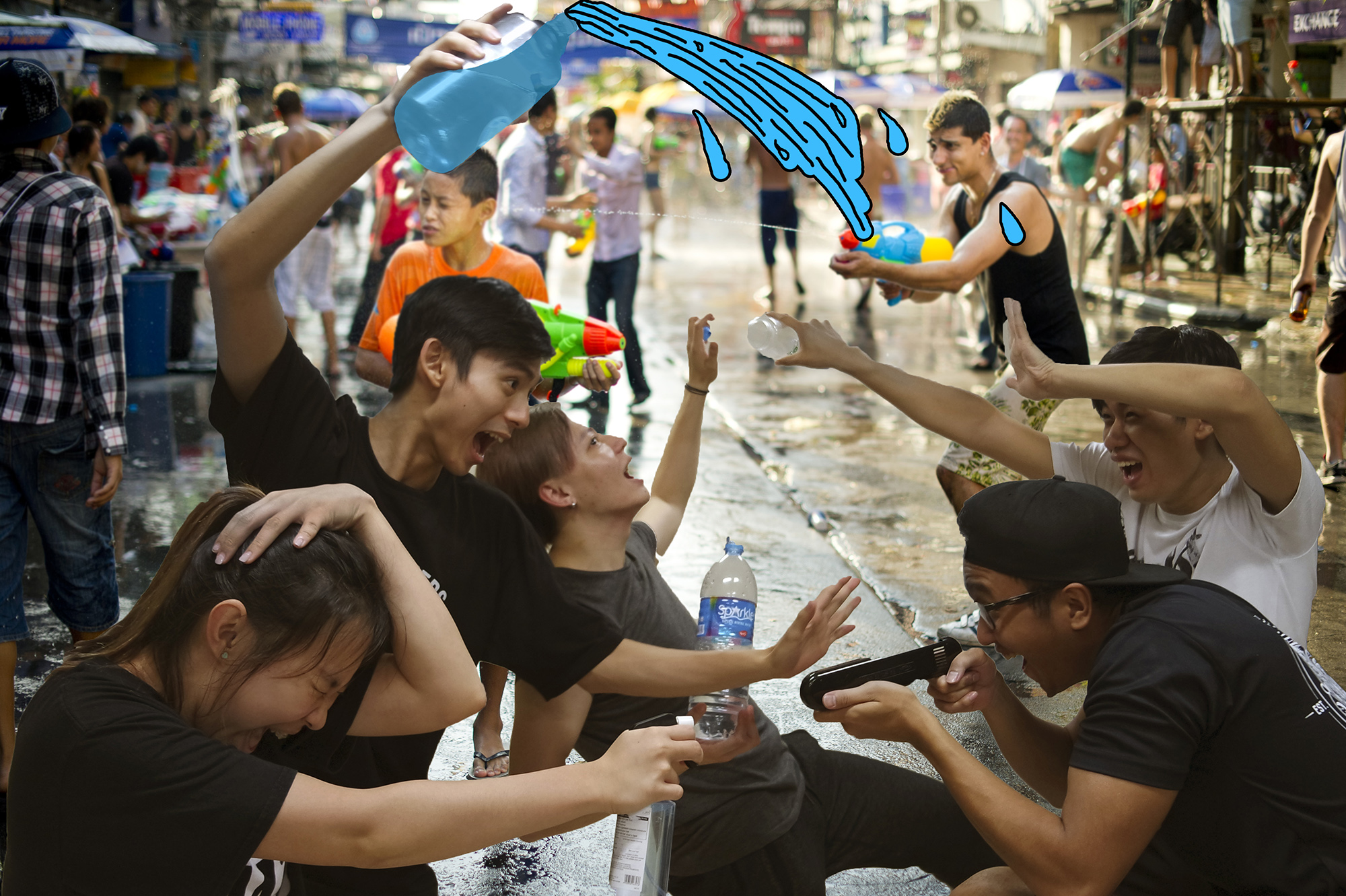
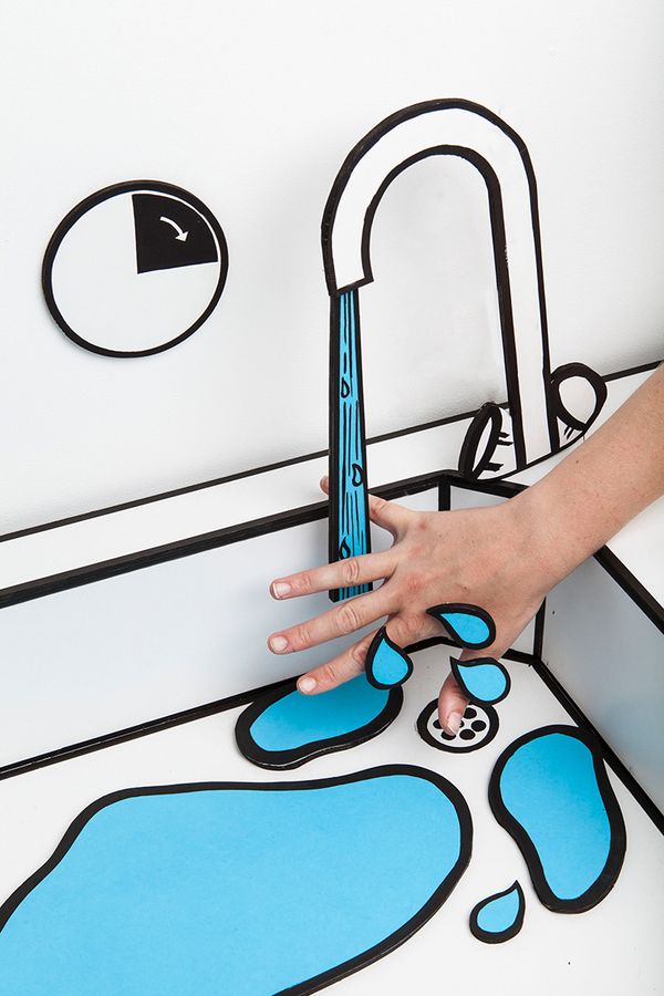
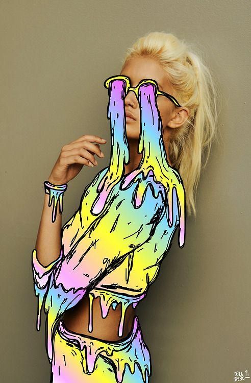
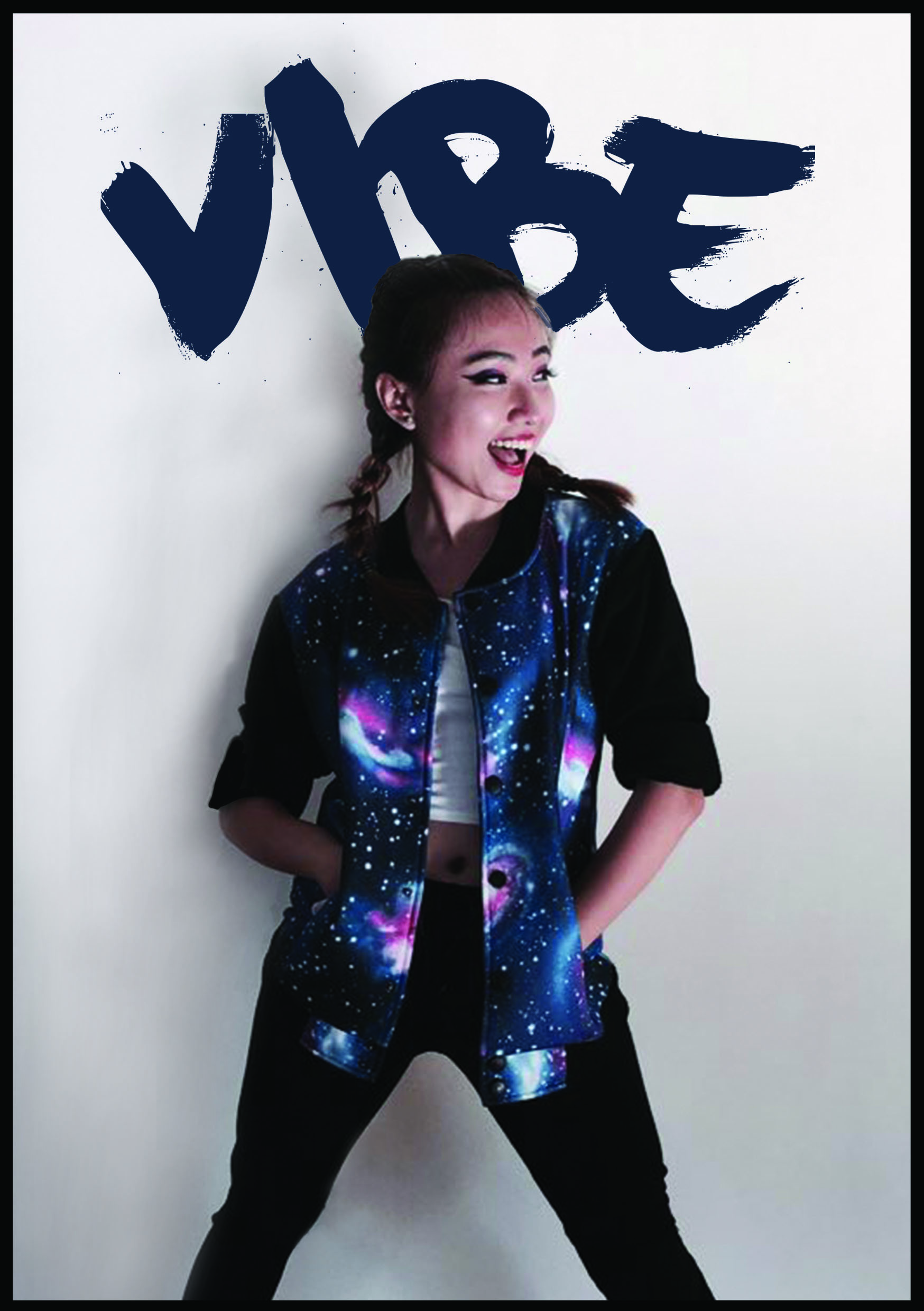
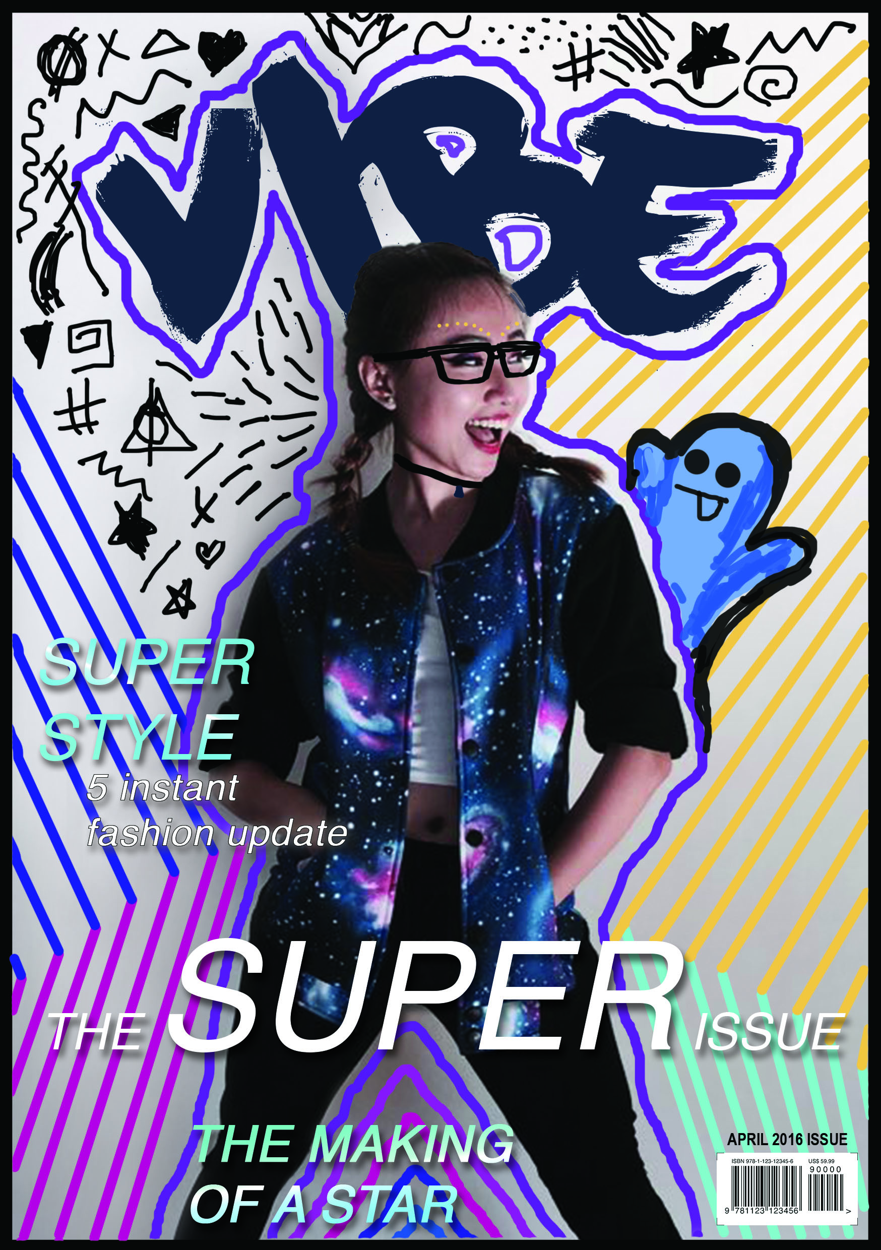
Then I tried my own, but during consultations, group mates were saying that it is really too plain, then I thought……why not incorporate the cover with Hattie Stewart inspired artwork?
COVERdoodles
I tried it out by doodling on the test print (in the visual journal) to see if I can capture the essence of Hattie Stewart’s art work.
hattie

I picked up on the strokes, the bizarre patterns, as well as introducing a “character” into the doodle – snapchat ghost icon peeping over my arm.
snapchat

I am a really heavy snapchat user, and my pose on the cover was just so nice tilted to 1 side of the page, therefore, adding the snapchat ghost icon is actually pretty apt to me!

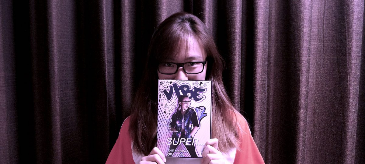
Then, it still doesn’t really look like a magazine if there weren’t any text, it can just pass off as a normal poster or artwork? So I took the magazine reference I showed above, and inserted some texts and added barcode on the cover to look more like a mag!

COVER

me

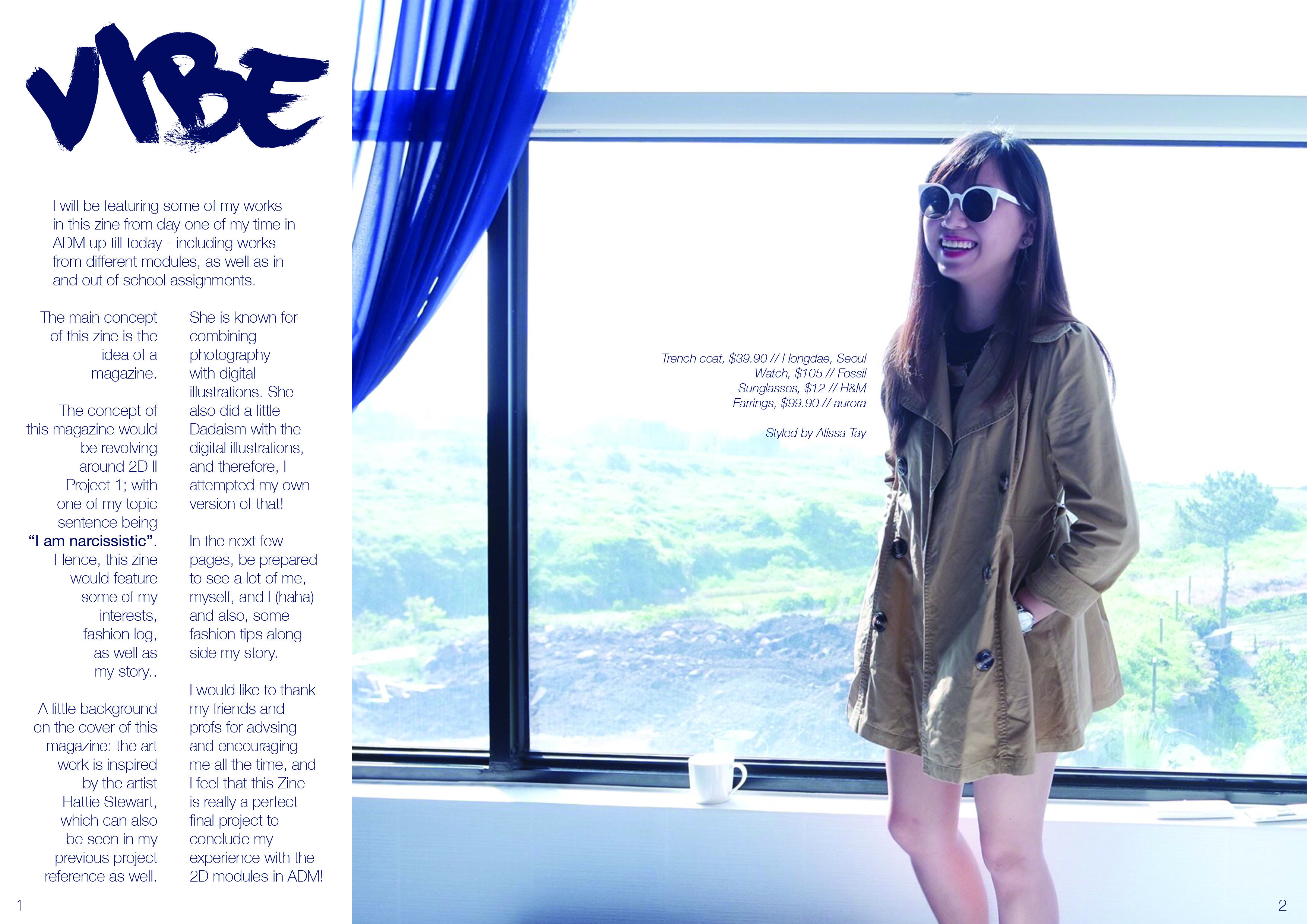
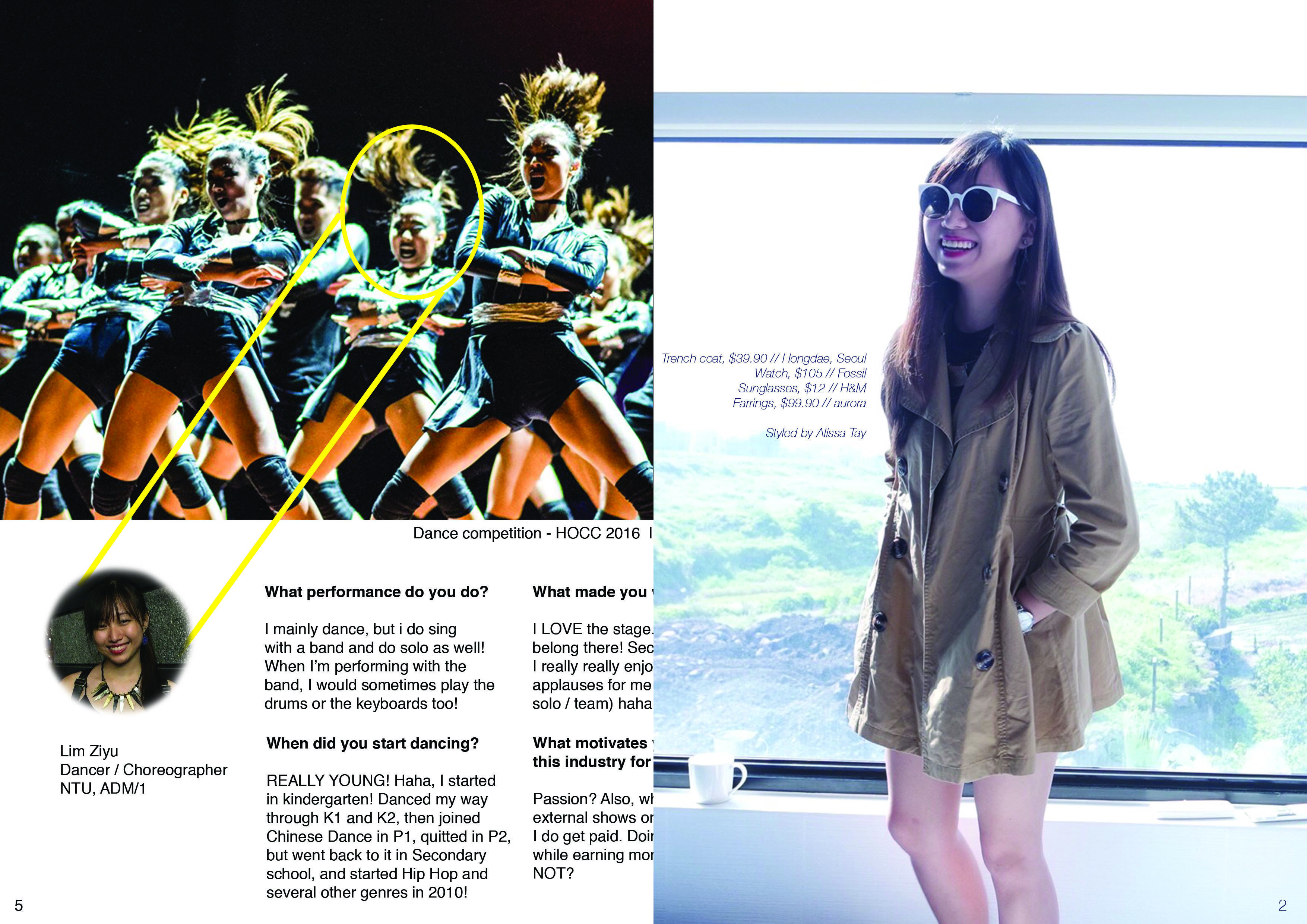
Typically, the following page after a cover would be advertisements, and it will slowly lead to the editor’s note or foreword. I thought adding advertisements of fragrances or watches or items may be a little weird, hence, I adapted the layout of an advert, having a huge image with a small description on the products on myself, and then created a column on the left for foreword. I wanted it to look a little like the credits page on a magazine, thus, I created the layout of the text in that manner!

2

fashion

fashionspread ref

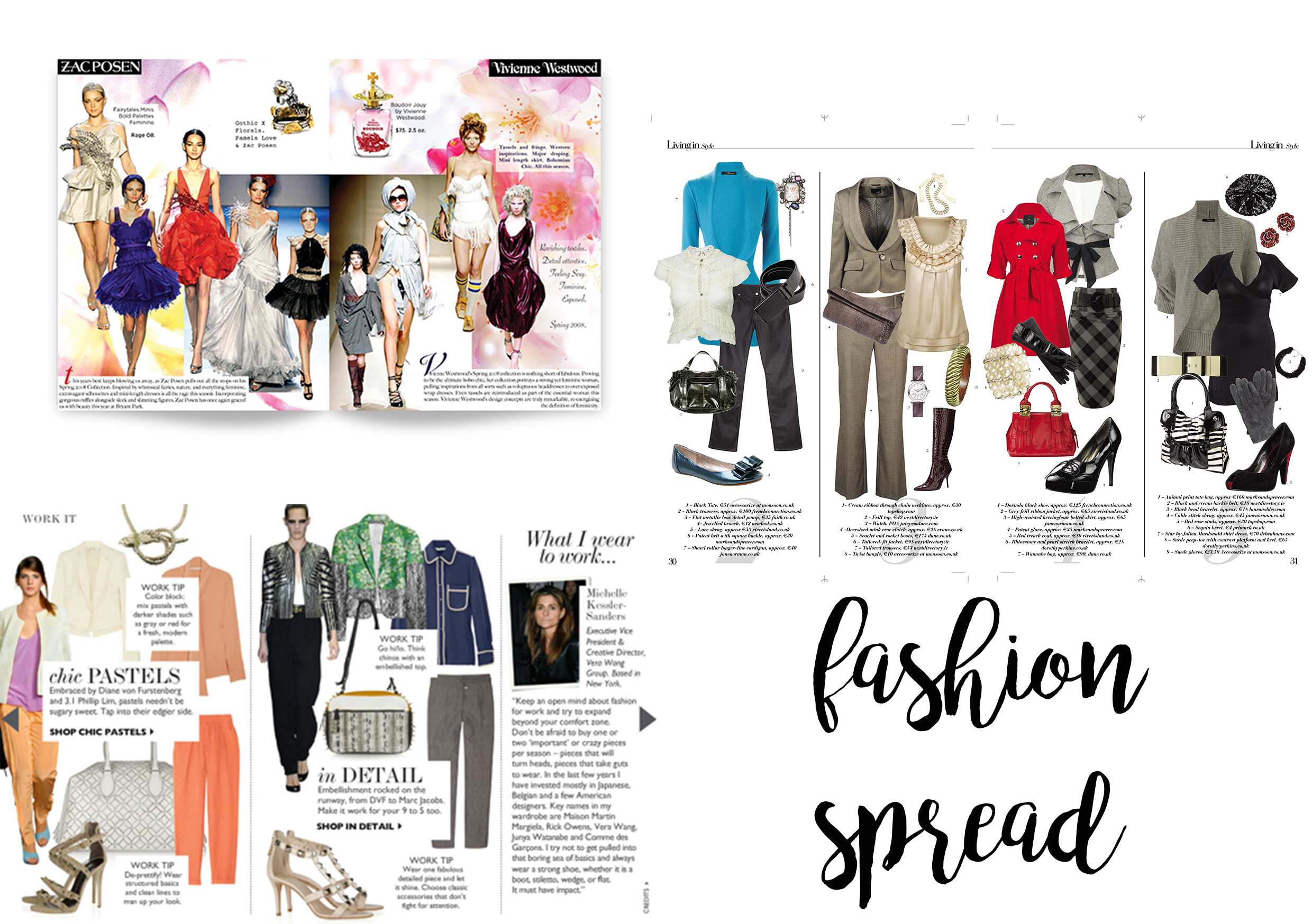
In a fashion spread, it is quite a norm to see the layout being very free-formed. It usually includes models on a runway, and then clothing or cosmetic usually in .png format, and then some text to support the F/W collection or S/S collections, or maybe even covering NEw York Fashion Week or something!

So I adapted its format, and created a fashion spread like below.

3

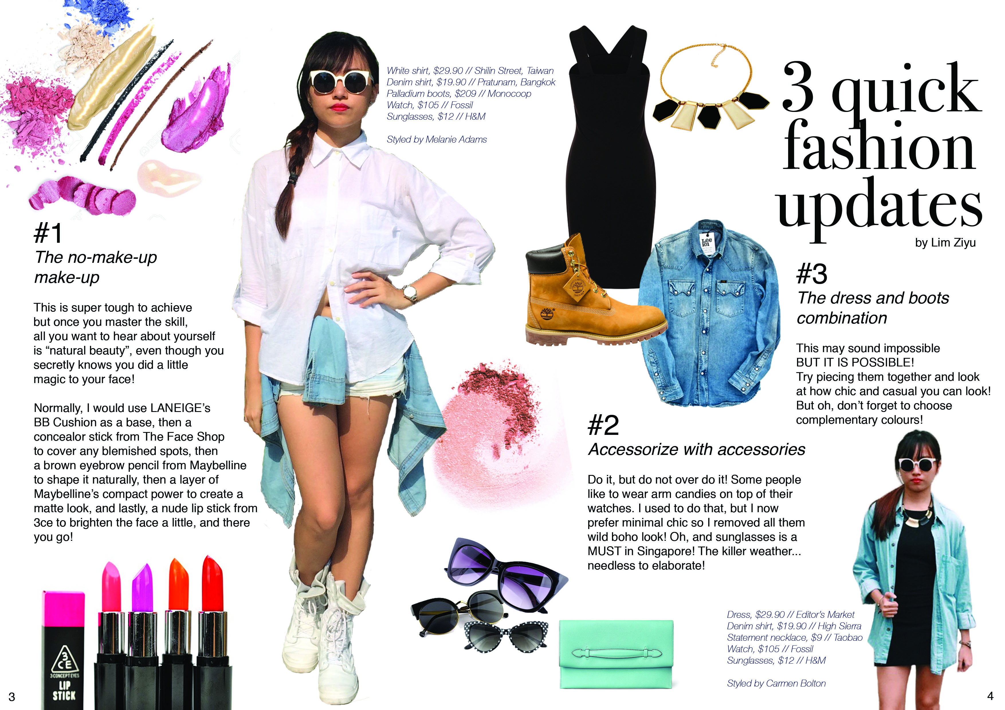
I pointed out the details on my outfits, and gave quick short tips on how I usually dress-up or prepare before I head out!

shine

interview

As usual, I googled the the keywords to search for references, and I typed “magazine interview layout”. Above, I felt that the structure is pretty clear and comfortable for readers to absorb information, hence, my creation below!

4

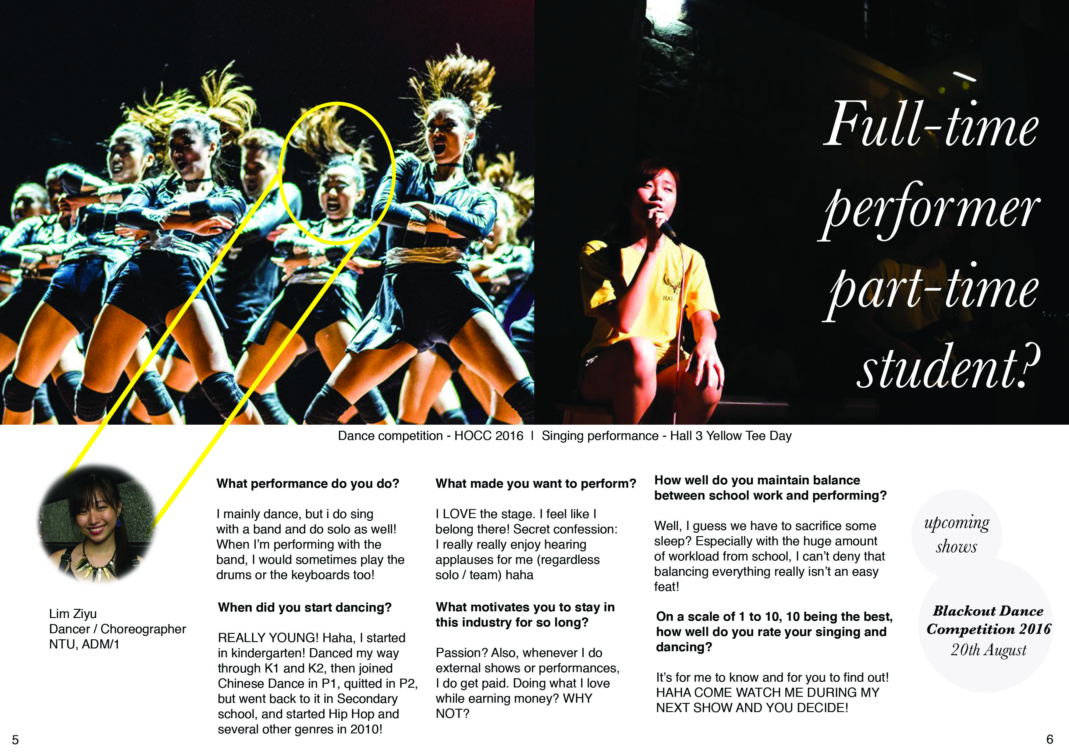
I asked my friends to imagine that I am a celebrity (as of now), and what sort of questions will they want me to answer, then I constructed them, and interviewed myself HAHA.

final

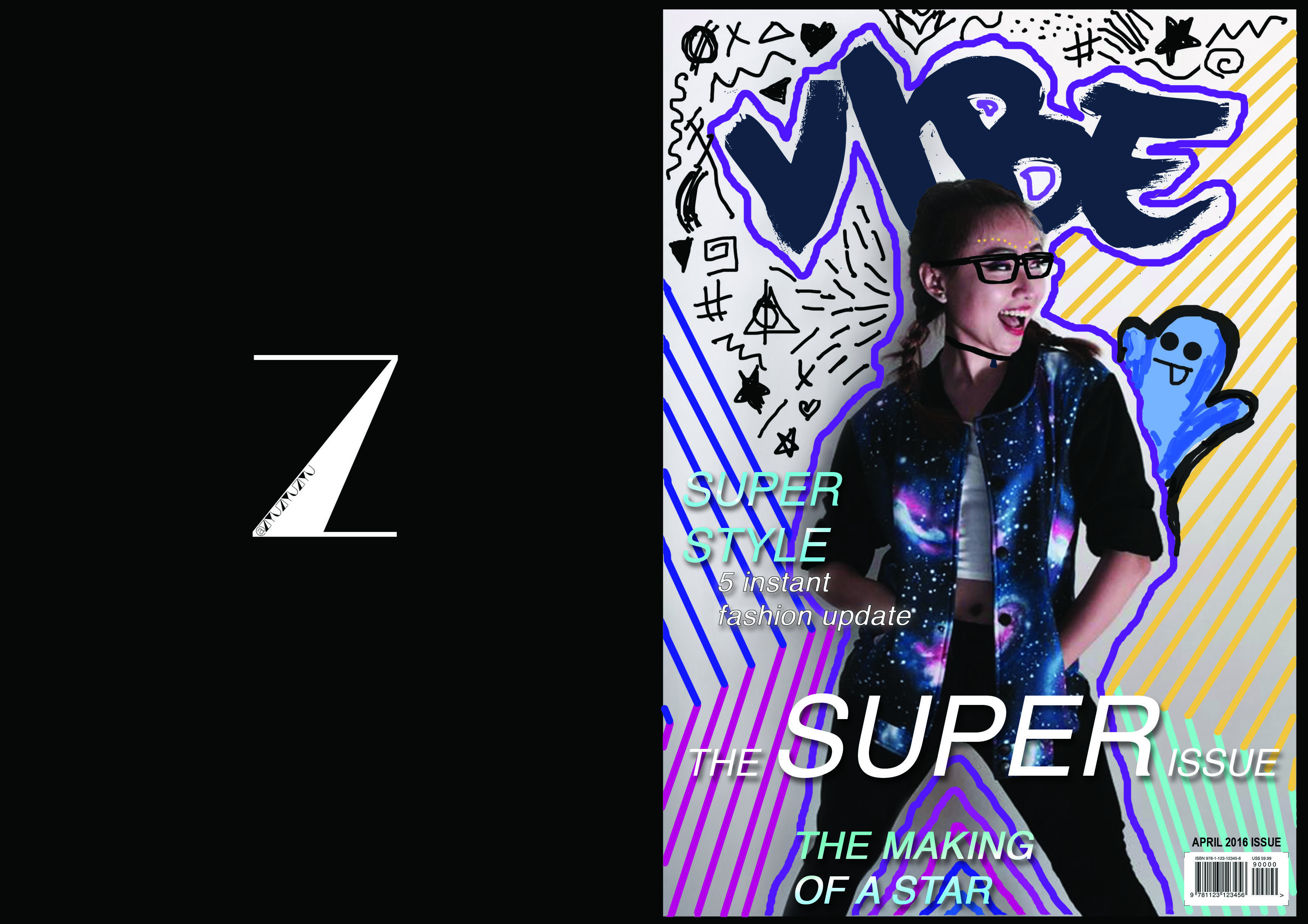
Some designers insert advertisements on the back page of a magazine, some creates a connection from the front cover to the back, so that front-back looks in-sync.

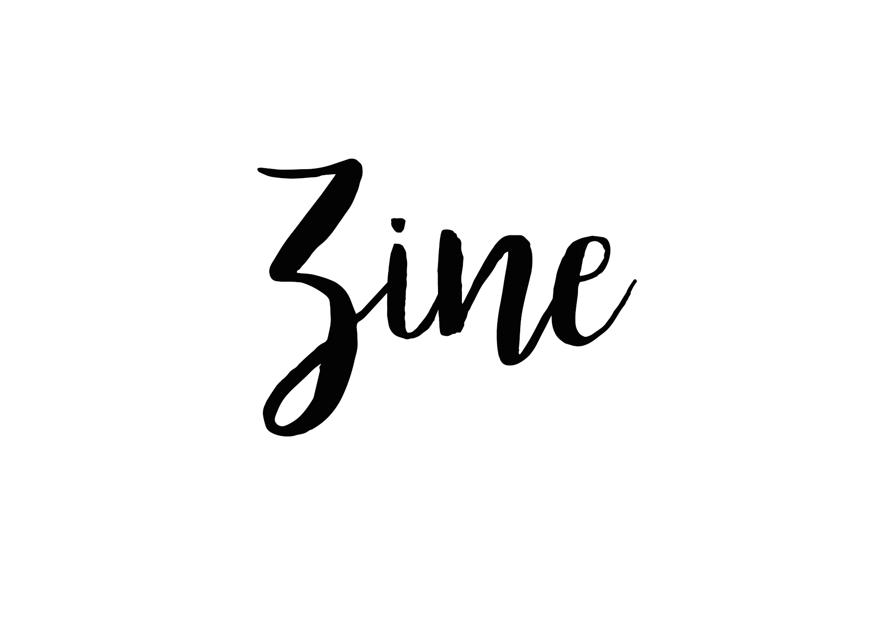
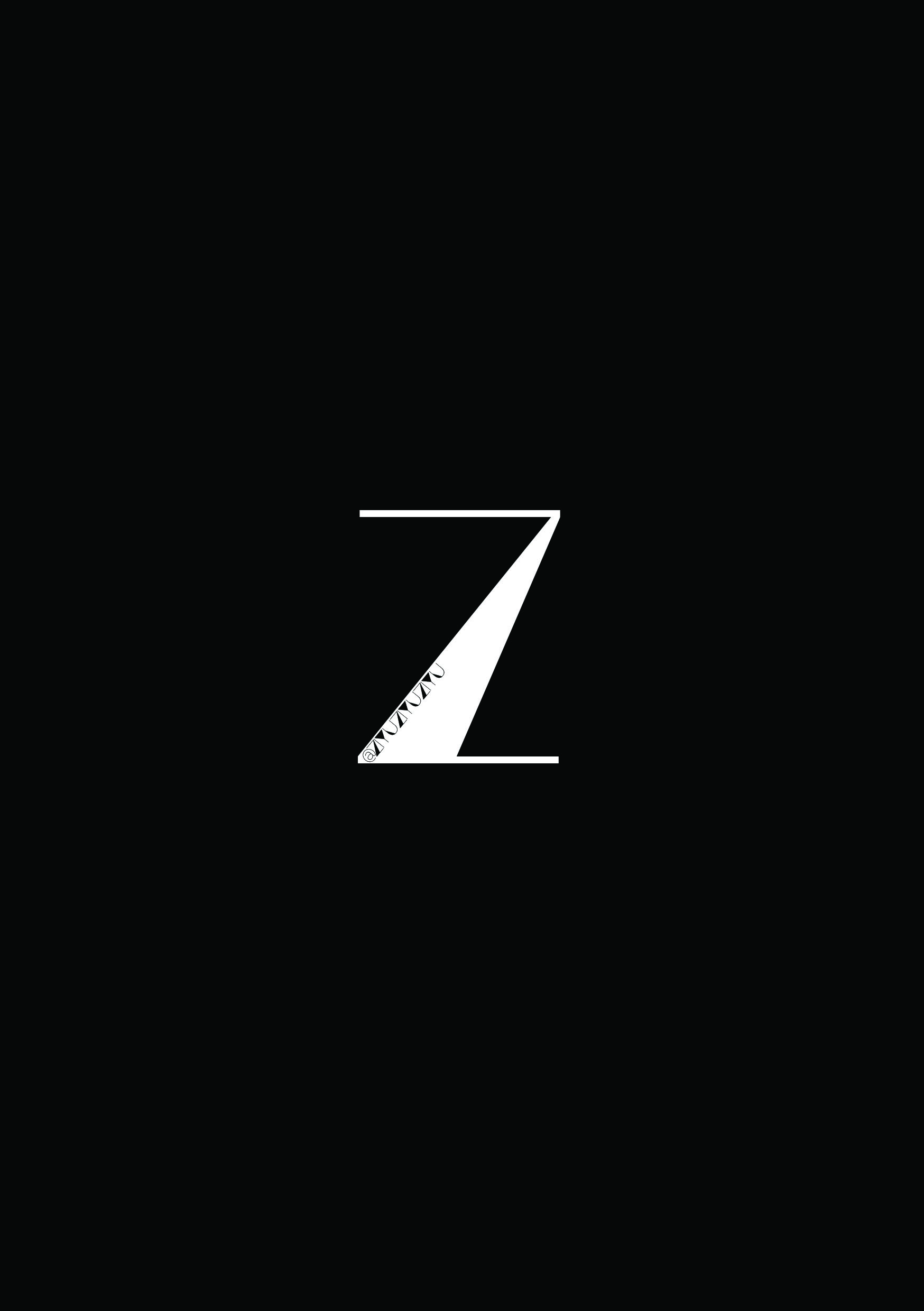
I felt that placing an advertisement may be a little strange as I’ve mentioned above. So since this zine is really about myself, and if I still want to adapt the concept of an advertisement, I put a logo that represents me (so I am like advertising myself?! Haha), accompanied with my social media name! I chose it to be so simple because the front cover is already pretty loud and heavy, so I thought the back should be a little more simple and minimal. I love to play with the positive and negative space, so you can see my personal logo and social media name combined as one “Z”.

BACK

printing

I’m not familiar with InDesign, so I didn’t know how to use it to let the pages switch sequence and be printed like a normal book. Hence, I made use of Photoshop and Illustrator to design and layout the pages manually before sending it to print.

1 2 3 4

paper

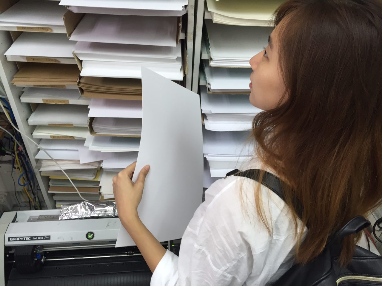
The selection of paper has always been a challenge for me because I am not familiar with the different effect it will create based on the gsm and texture of each paper. I wanted this zine to resemble a magazine, but not too cheap, so I thought I should use a slightly thicker paper instead of the very thin recycled paper on a typical magazine!

I then used saddle stitch to complete the magazine. However, it didn’t occur to me that the gutter space has to be so significant, because I thought that there was only 2 papers, and I’m not sure how much space to leave blank for, hence, the position of the staple is quite weird, just so I don’t block the wordings on the interview page!

reflections

SAMSUNG CAMERA PICTURES

In the beginning, I wasn’t very sure on what to do. Like a portfolio of my entire 2D? Select one 1 past project and expand on it? Create an event brochure like how Singapore Night Festival always does?

Then I decided that, since I’ve been highlighting the point of “body parts” in various projects on 2D, and I admitted that I am a narcissist (healthy one, no worries hahha) PLUS, I love reading magazines, so I thought it’d be great to have my own magazine about myself! I have always wanted to work on a publication and print it for my close friends as a Christmas present – to sum up our year together and for me to have a platform to try out the layouts and technicality of publishing a magazine! So this final project really came in handy and I really felt like I pushed and learnt a lot, especially digitally drawing like Hattie Stewart, and after group consultations, where friends gave more ideas and suggestions on how I could improve my existing magazine then!

Through the final critique, I learnt that I’ve still got pointers to note and improve on the zine. So I thought MAYBE I can expand on it, add a few pages, and explore more during this vacation break! Then I can try out on the gutter space issue too 😛

All in all, I really had a lot of fun doing 2D this semester and I thank all of you + Joy for these great experience and memories! :’)

– xoxo @ziyuziyuziyu HAHA

2D Project 2 // FINAL

WATERfinal

I wasn’t very confident of illustrating graphic art, but decided to try it anyway, because I really liked the idea of photography combining with illustrations! Overall, I really had fun exploring and trying out various ways of directing a shoot and drawing digitally, and below are some of the process work for my final artwork! 

  1. Water from the point of view of a flame is death.
I first shot an empty bottle with the motion of pouring water to an lighted candle.
4
I then illustrated water flowing out of the bottle towards the candle. However, my friends from group consultation suggested that the idea of a dying flame was still not as strong.. Thus, I’ve made the flame extinguish and water overflowing everywhere for my final piece

5

2. Water from the point of view of feng shui is flow of money.

suntec fountain 2
I took a picture of the fountain of wealth at Suntec. Concept being, wealth=money, water=flowing, which already depicts my line! In addition, fountain of wealth is also known as the world’s largest fountain in 1998! It also is the representation of fengshui, thus my selection on this!

fengshui

3. Water from the point of view of a Thai citizen is Songkran Festival.

SAMSUNG CAMERA PICTURES
I directed the scene of Songkran with the help of my friends
Then i started editing the water illustrations in
A tourist spray a boy with his water gun during the Songkran festival at Khao San road, a popular tourist area in Bangkok. Songkran is the traditional Thai New Year festival. The most obvious celebration of Songkran is the throwing of water.
Tried to have a Thailand city Songkran background but it looks a little messy?
A tourist spray a boy with his water gun during the Songkran festival at Khao San road, a popular tourist area in Bangkok. Songkran is the traditional Thai New Year festival. The most obvious celebration of Songkran is the throwing of water.
Tried removing the background but I felt that it seems a little fake and flat
A tourist spray a boy with his water gun during the Songkran festival at Khao San road, a popular tourist area in Bangkok. Songkran is the traditional Thai New Year festival. The most obvious celebration of Songkran is the throwing of water.
Thus, I kept the background but muted the colours a little, and also illustrated the existing water on the stock image to blend both the stock image and my photography together!

4. Water from the point of view of Singapore is contract.

bottle2
We all know NEWater bottle is iconic, and its existence is also significant to Singapore’s water and its contractual terms with organization or regional countries. Thus, I decided to incorporate this element into this line.
toilet
had to use this toilet bowl because I wanted to illustrate and portray the idea of what people perceives – toilet water = NEWater


tap4toilet-partitions

contract
I illustrated the water and incorporated NEWater’s logo into it too!

5. Water from the point of view of instant noodles is completion.

SAMSUNG CAMERA PICTURES
I tried out with this image but I did not quite like the composition and the background was too messy…
SAMSUNG CAMERA PICTURES
So I tried to remove the background but it still doesn’t seem to portray the look that I want…Thus, I changed to cup noodles instead!

SAMSUNG CAMERA PICTURES

6. Water from the point of view of Science is ph7.

pH7 chart
I can’t find the correct tools and apparatus for this science experiment, thus, I used a stock image for this. As we know litmus paper test can determine the pH value of a substance, thus I used this visual to portray my idea!

ph7

All in all, I really had fun exploring and learning while on this project. Can’t wait for the next project already! 🙂

P.S. thanks for all the post-it notes guys! 🙂

2D Project 2 // Research 1

Point of View

Potential topics:
1. Dance
2. Camera
3. iPhone
4. Water
5. Fire

Brainstorm process:

  1. Water from the point of view of an athlete is motivation.
  2. Water from the point of view of an African child is hope.
  3. Water from the point of view of sea creatures is home.
  4. Water from the point of view of cleaner is a means to an end.
  5. Water from the point of view of a chef is an ingredient.
  6. Water from the point of view of a plant is sustenance.
  7. Water from the point of view of a swimmer is career.
  8. Water from the point of view of a flame is death.
  9. Water from the point of view of instant noodles is completion.
  10. Water from the point of view of a desert is miracle.
  11. Water from the point of view of feng shui is flow of money.
  12. Water from the point of view of firemen is weapon.
  13. Water from the point of view of hose is ammunition.
  14. Water from the point of view of an eye is heart break.
  15. Water from the point of view of a Thai citizen is new beginning. (Songkran)
  16. Water from the point of view of a pair of lungs  is pneumonia.
  17. Water from the point of view of Singapore is contract.
  18. Water from the point of view of a bottle is purpose.
  19. Water from the point of view of Bruce Lee is battle cry
  20. Water from the point of view of Science is ph7.


Inspiration:

I’ve always loved the idea of combining photography and graphic art. It could be executed in digital painting or physical drawing, which could be combined as one. It gives off a typically clean overall look and feel and an illusion of 2D animation instead of the actual 3D object. The artwork could also symbolically represent an alternate reality in which all these objects could be viewed from varying perspectives.

e8a49ee962f8a5eb357384fdfbaee4f4

4d4b8bc15f2f5e90a15ecb9d126f2258

Refer to the following link for more: http://www.dailymail.co.uk/femail/article-2621536/2D-not-2D-That-question-The-amazing-bags-look-just-like-cartoons-actually-real-thing.html

Selected phrases:

  1. Water from the point of view of an athlete is motivation.AhXkCxoA2yQQLoCsbzDm38BItvrTVlE8tLMyTOYDSonB
  2. Water from the point of view of an African child is hope.
    Ajca7XtPT8t8UBEfVURHLmdoLBFzIJSSWZrxAWHUoxrR
  3. Water from the point of view of firemen is weapon.
    AuxvL_82s_nCWB_GXP6KNE1xuMkF-TtFZLfwJBiBDc4V
  4. Water from the point of view of Singapore is contract.
  5. Water from the point of view of Science is ph7.
  6. Water from the point of view of an eye is heart break.