
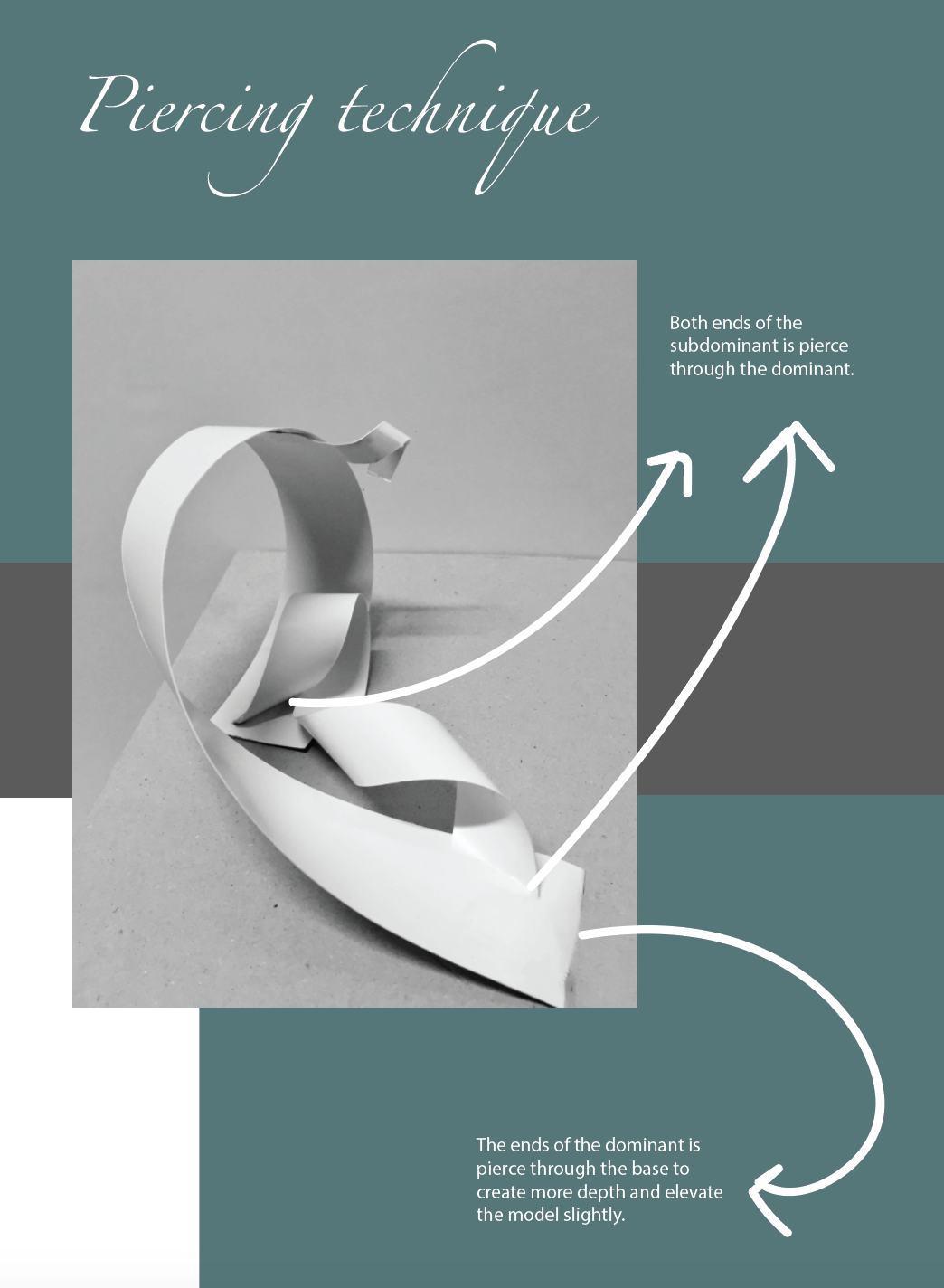
Dadaism
Dada was an art movement formed during the First World War in 1914, in negative reaction to the horrors of the war. They were looking for ways to express anger towards the war. this is where art, poetry and performance produced by dada artists started surfacing and is often satirical and nonsensical in nature. Dada artists felt that the war questioned every aspect of a society’s capability. Their aim was to destroy traditional values in art and to create a new art to replace the old. Some of the art works in this movement were dark and self-destructive.
After the war, many of the artists who had participated in the Dada movement began to practice in a Surrealist
Surrealism
Surrealism is a cultural movement that began in the early 1920s. It was the aftermath; result of World War 1 when it destroyed the Western civilisation . It encompasses all forms such as art, sculpture, music, literature, film, and philosophy. The aim of this movement was to “resolve the previously contradictory conditions of dream and reality.” Artists painted illogical and occasionally disturbing images that allowed the unconscious to express itself. At its basic, the imagery is often strange and mysterious in an unsettling way to jolt the viewer out of their comforting assumptions.
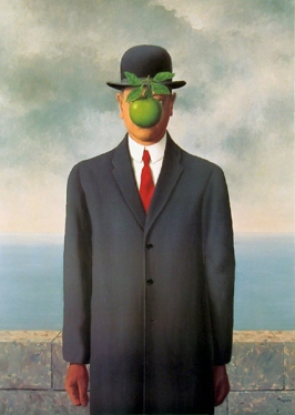
Rene Magritte, The Son of Man 1964 https://upload.wikimedia.org/wikipedia/en/e/e5/Magritte_TheSonOfMan.jpg
One example of surrealism art is this painting, named: The Son of Man, by Rene Magritte. The painting is a self-portrait whereby an apple is placed in front, hiding his face / expression. Magritte wants his viewers to know that we humans always want to see what is hidden beneath the obvious. There is always an interest in the curious mind that is hidden in which the visible does not show us.
Surrealism techniques includes Collage, Cubomania, Decalcomania, Eclaboussure, Frottage, Fumage.
Research on André Breton
André Breton was an original member of the Dada group and the founder of Surrealism in 1924. In early 1920s, Breton had changed his allegiance to another group of intellectuals who shared different opinions on art, not as nearly as dark and self-destructive as was the case with Dadaists. This is where he shifted to Surrealism. He was fascinated by the fine line between reason and irrationality, especially as manifested in dreams, erotica and mental disorders; all in which are reflections of Breton’s own interests.
One of Breton’s fundamental beliefs was that he sees art as an anti-war protest. He presented the art scene with completely new concepts and ideas, such as the automatism – a principle in which writers and artists were encouraged to adopt a stream-of-conscious method, as well as spontaneous means of expression without any planning what so ever.
Working with halftone
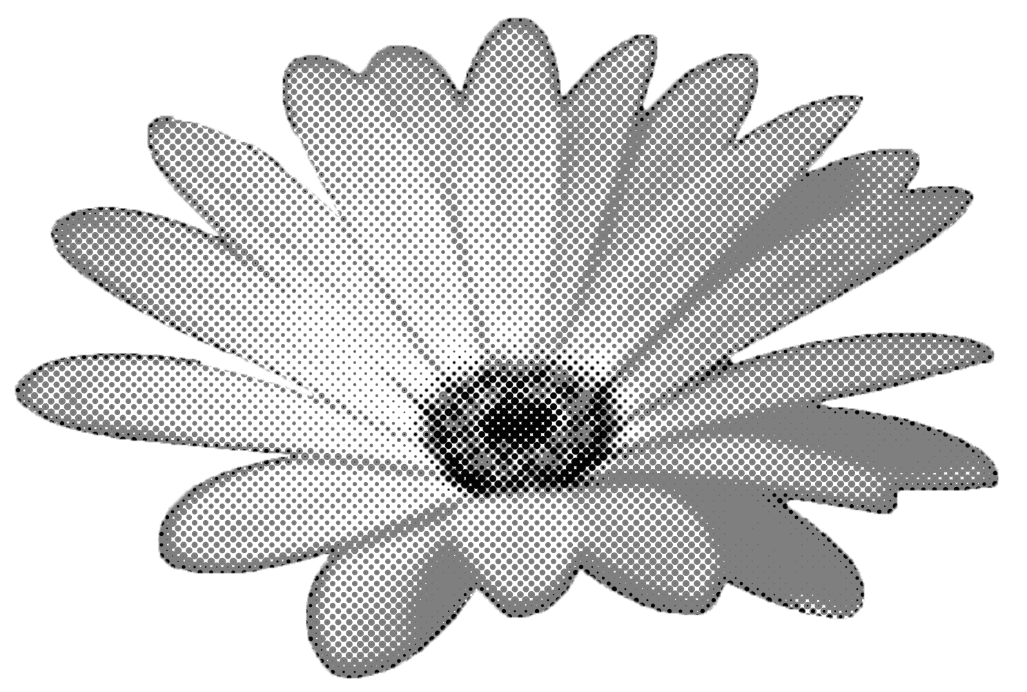
Halftone is achieved by taking an existing image and reproducing it with a series of different sized dots. The closer and bigger the dots, the darker (and less detailed) the image; and the smaller and more spread out the dots are, the lighter (and more detailed) the image is. Halftones are often used for screen printing artwork. Screen printing involves breaking images down to simple colours.
Working with Threshold
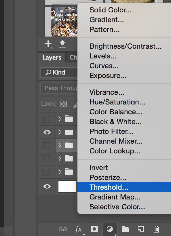
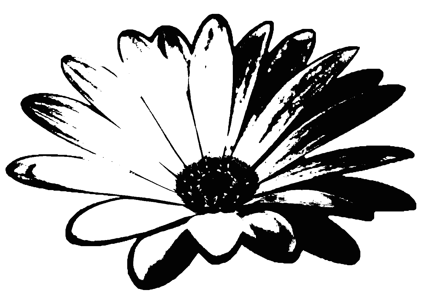
The Threshold command in Adobe Photoshop can create a neat one colour effect. A full colour photo can be turned into a black outline. The amount of black and white created by Threshold can also be adjusted through brightness and contrast when editing the original picture.
Movie Quote: “We are all trapped here.” – 12 feet deep, 2017
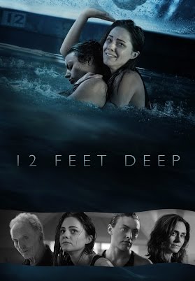
https://i.ytimg.com/vi/qWvEBk7aciQ/movieposter.jpg
Plot: This movie talks about Two sisters are unwittingly trapped under the fiber glass cover of an Olympic sized public pool and must brave the cold and each other to survive the harrowing night.
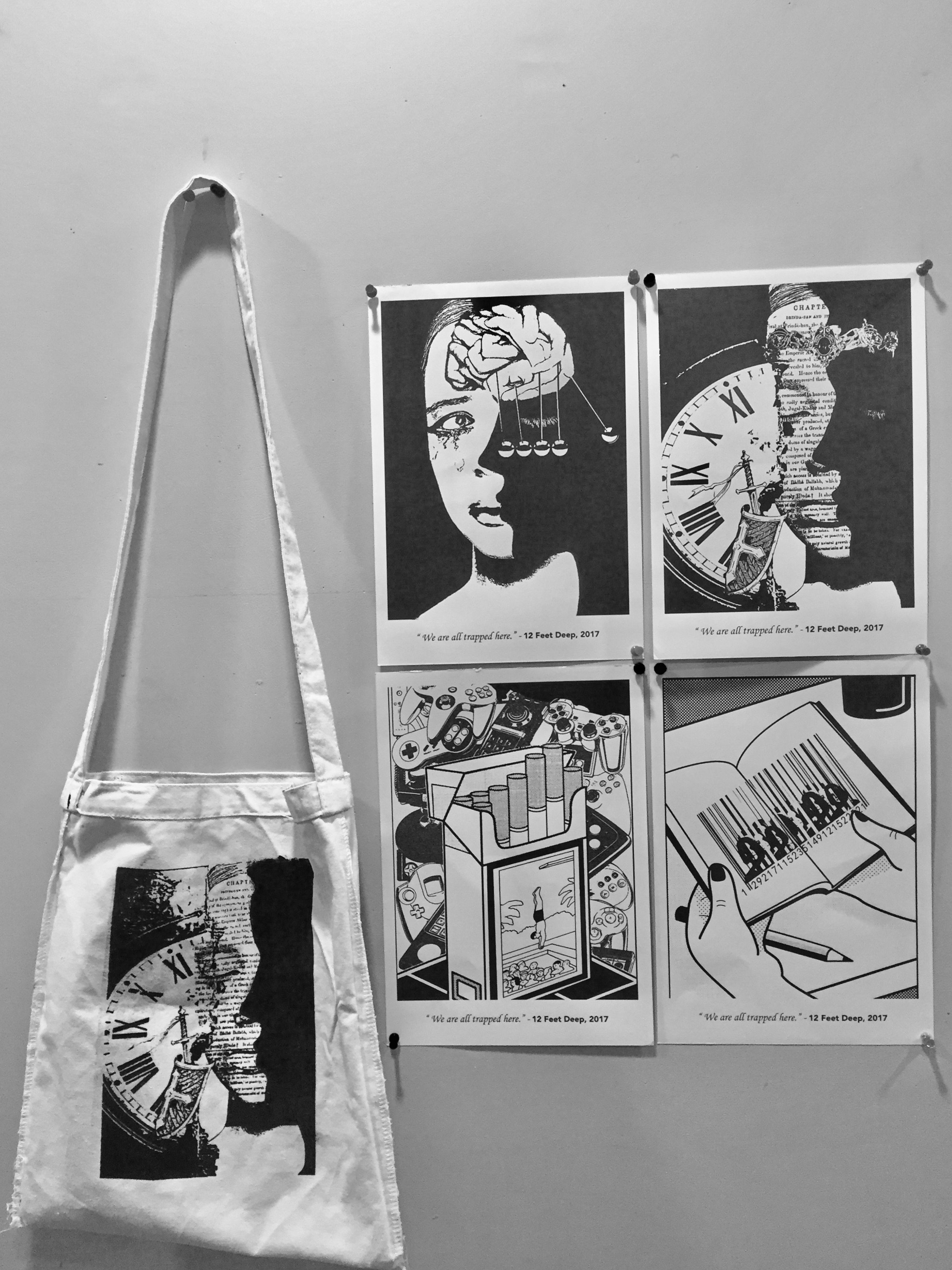
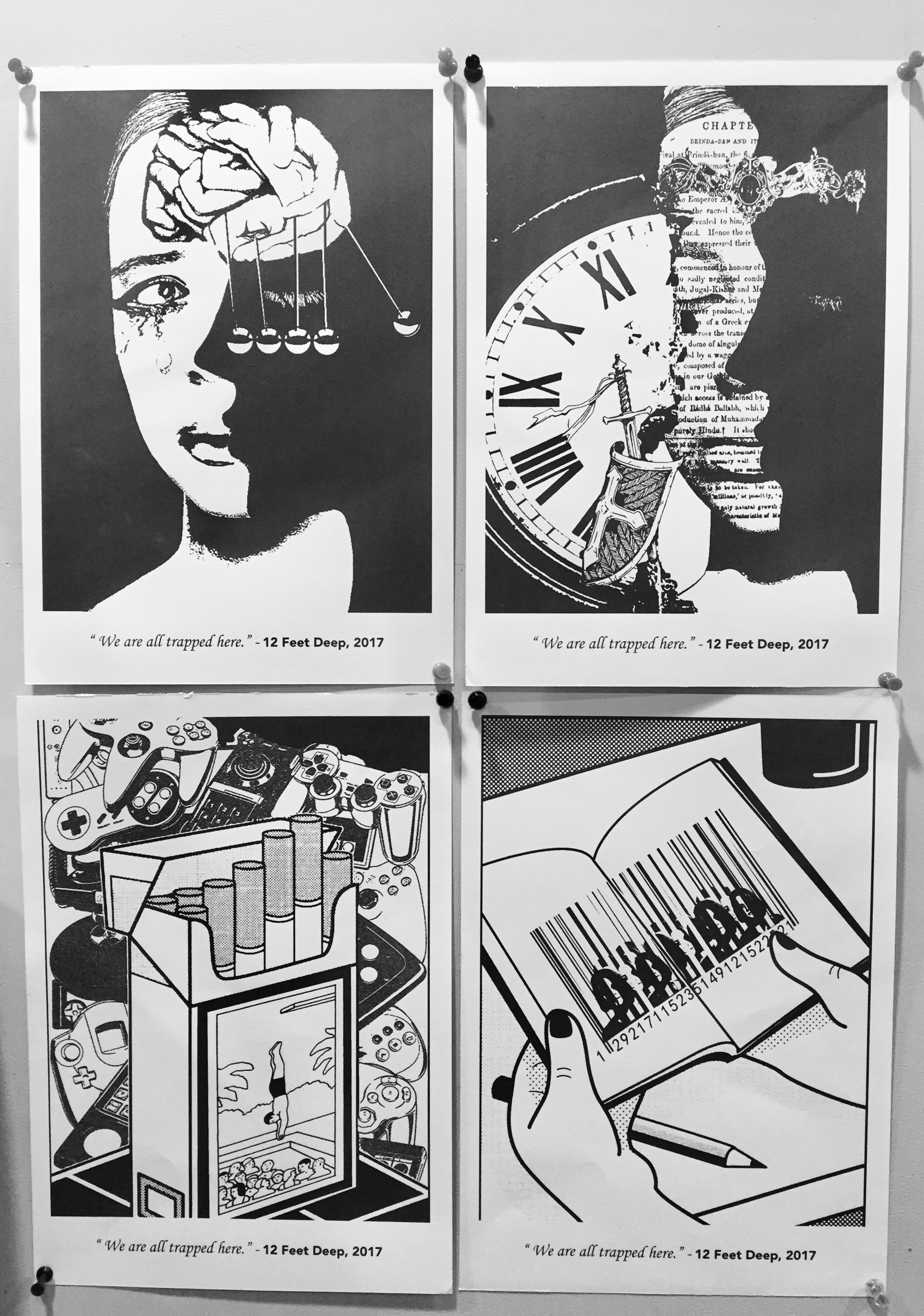
All 4 concept revolves around the same movie title. The final image of each concept are seen in a rectangular angled structure to suggest the ideal of being trapped. Concept 1 and 2 are slightly similar in style. Both uses threshold to create the final imagery. Concept 3 and 4 are more relatable to each other when it comes to ideation. Both revolves around the idea of teenagers and halftone used besides using threshold.
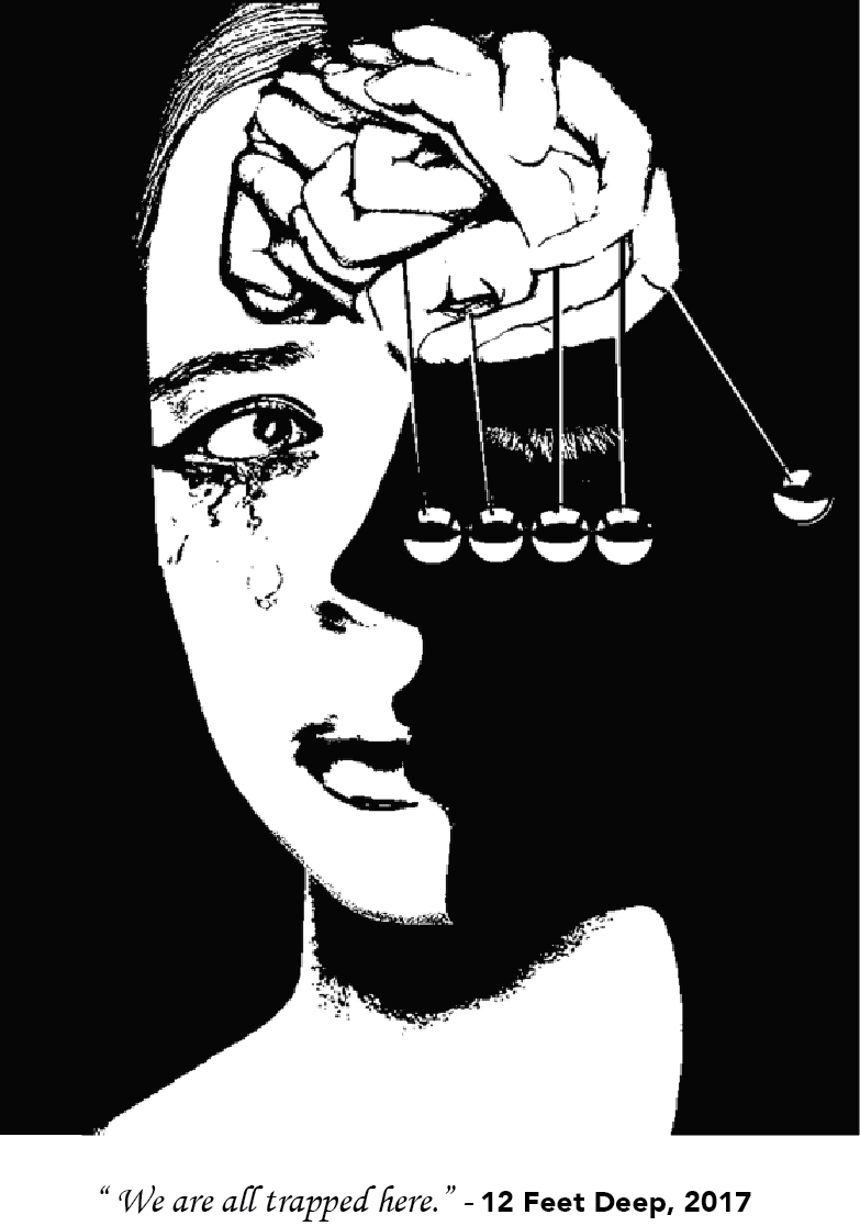
Concept 1:
The first image talks about how we; individuals, are always trapped within our own minds. (suggested by the not-so-obvious person portray in the negative space of the woman’s face.) There are so many things that we want to do, to explore, but are always reluctant to be daring, because often, the voices in our minds are telling us otherwise, and is holding us back. All these trapping revolves around time. ( suggested from the swinging pendulum ) However, all these thoughts in our minds are controlled by ourselves. (suggested from the hands that forms the shape of the mind ) We are in control of what we want to do, and how we want to lead our lives.
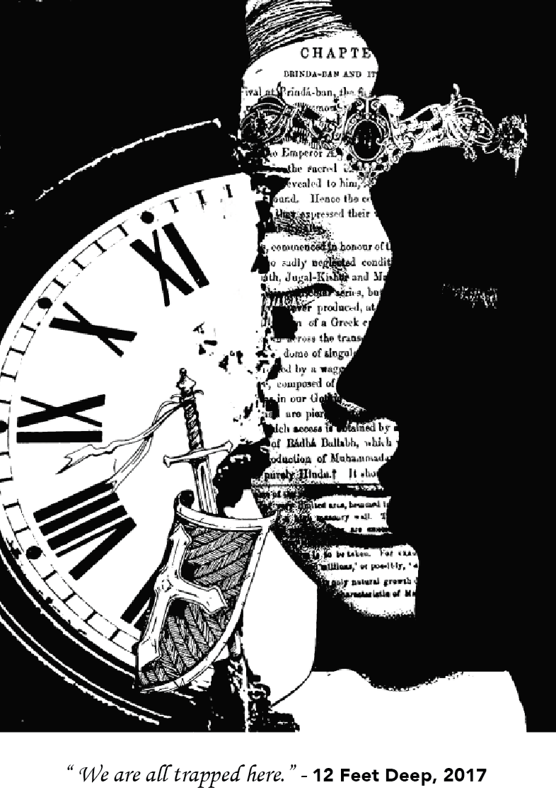
Concept 2:
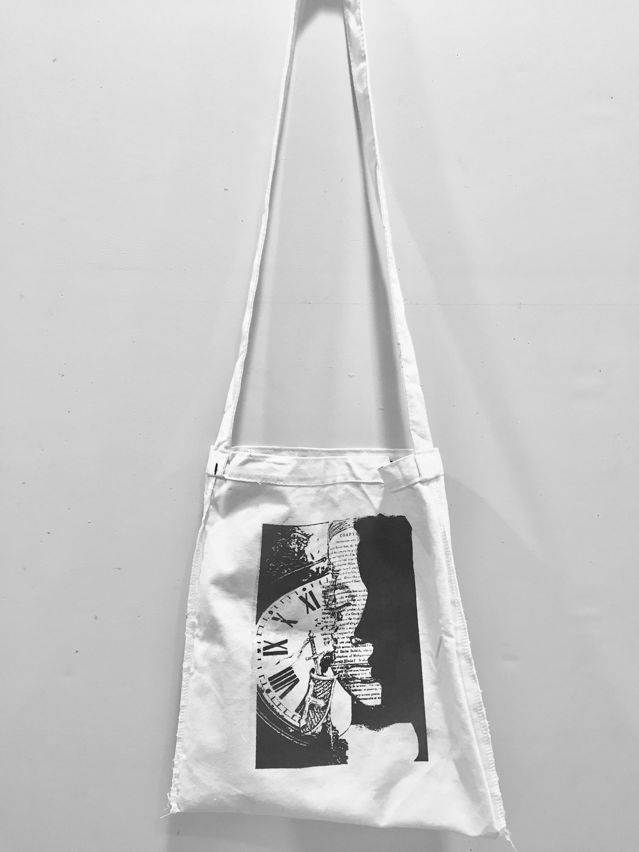
Concept 2 is inspired by concept 1. In this concept, the idea revolves around how in every disney fairytale books, the princess are always trapped and confined in the story ( suggested by the book text on the face ). As the story progress, they fight against time, WAITING ( suggested by the contrasting clock at the left side of the image; notice that the numbers on the clock is written in an old and vintage style, which suggested a long long time ago, as what every fairytales would called it ). They wait in their dreams, their minds, hoping that prince charming would save them in his knight and shining amour. ( suggested from the sword and shield ) .
Concept 3:
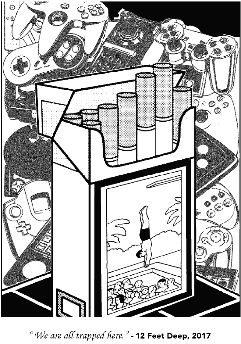
Concept 3 shows troubled teenagers and the negative influences by their peers that polluted their minds. Many teenagers nowadays are obsessed with all sorts of gaming on the different devices that advancement in technologies has created. ( suggested the gaming tools in the background ) Teenagers are also picking up smoking at a very young age ( suggested from the packet of cigarette.) Usually, a disturbing image is often shown on the front packaging of a cigarette box. In this case, I swap it for an illustration of a teenager diving into a pool filling with the other teenagers that are of the same age. This suggest a warning sign of how these young adults are diving into a trap; a trap that seems all fun and excitement on the outside, but will slowly develop into a negative impact on their future.
Concept 4:
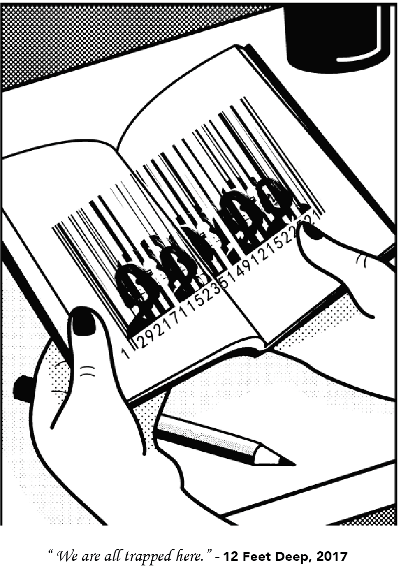
Concept 4 talks about how students nowadays are trapped within education itself; or at least thats how I feel. ( suggested from the lines and strokes down the faces of the girl in the image. ) The lines / strokes formed into a barcode, which represents money; that education is a money draining system, despite it having a positive or negative impact on our future. Are we studying what is worth studying? or are we just wasting our parents money away as each day passes. This trapped feeling in the world of education at our age made me question myself what exactly are we studying for.
Silkscreen Printing 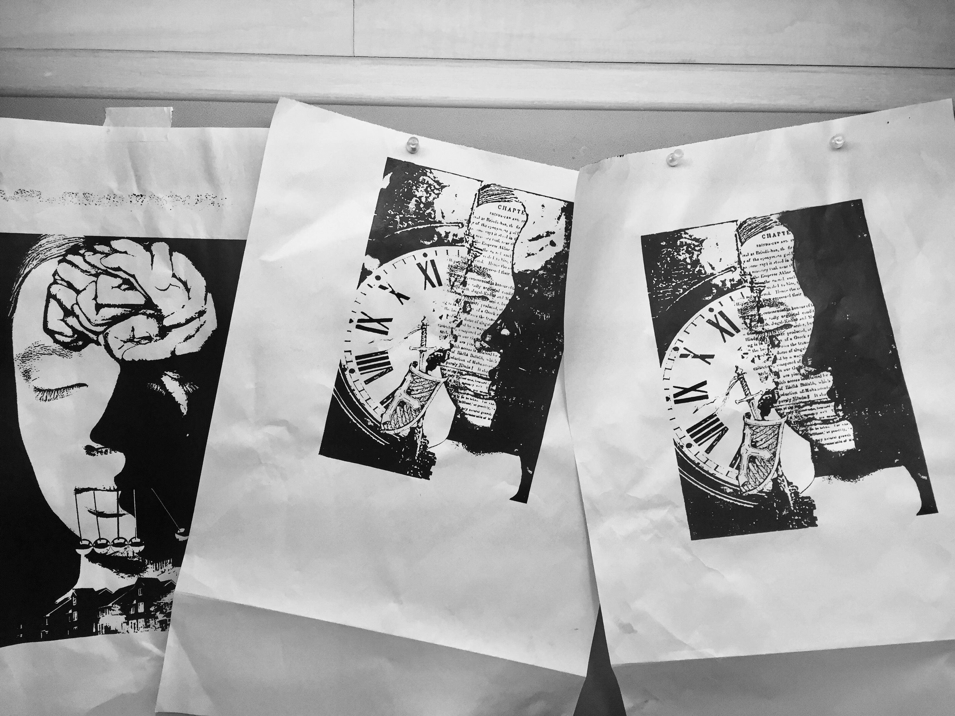
Silk print is a popular method for applying designs on tote bags. It works like a stencil, in which the artwork is burned unto a mesh and empty areas are covered with chemicals. After which, ink is applied and pushed through the mesh, onto the tote bag. As the silkscreen printing is done in a way that allows the ink to bond with the fibres of fabric, it is said that the print is durable and does not peel off.
To me, the process does take up some time, therefore timing is key when executing silk printing. The pressure from our hands and the amount of black ink also plays an important part on the final result. However, after several practices, it gets better. Overall, it was not a hard process but rather, a fruitful one.
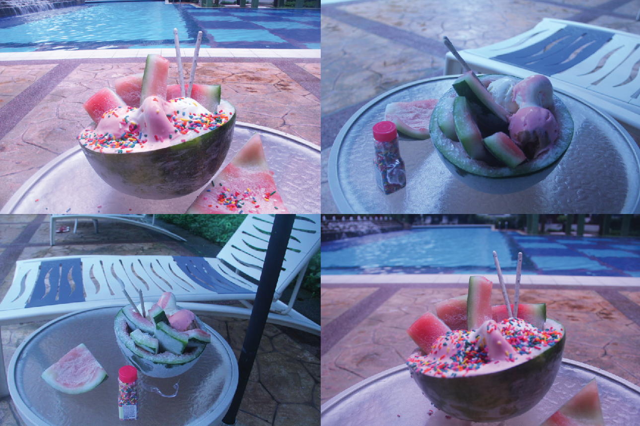
Final Works
Reflection:
Through this project I learnt that ideation is a very important step that will affect the overall composition of the entire imagery. Sometimes, having too many ideas will create many different objects and items that will clutter the whole image. What works best is to have a focus idea on each different piece of work. That way, the final image can be understand and view easier without being too complicated for viewers.


 *changing desktop screen
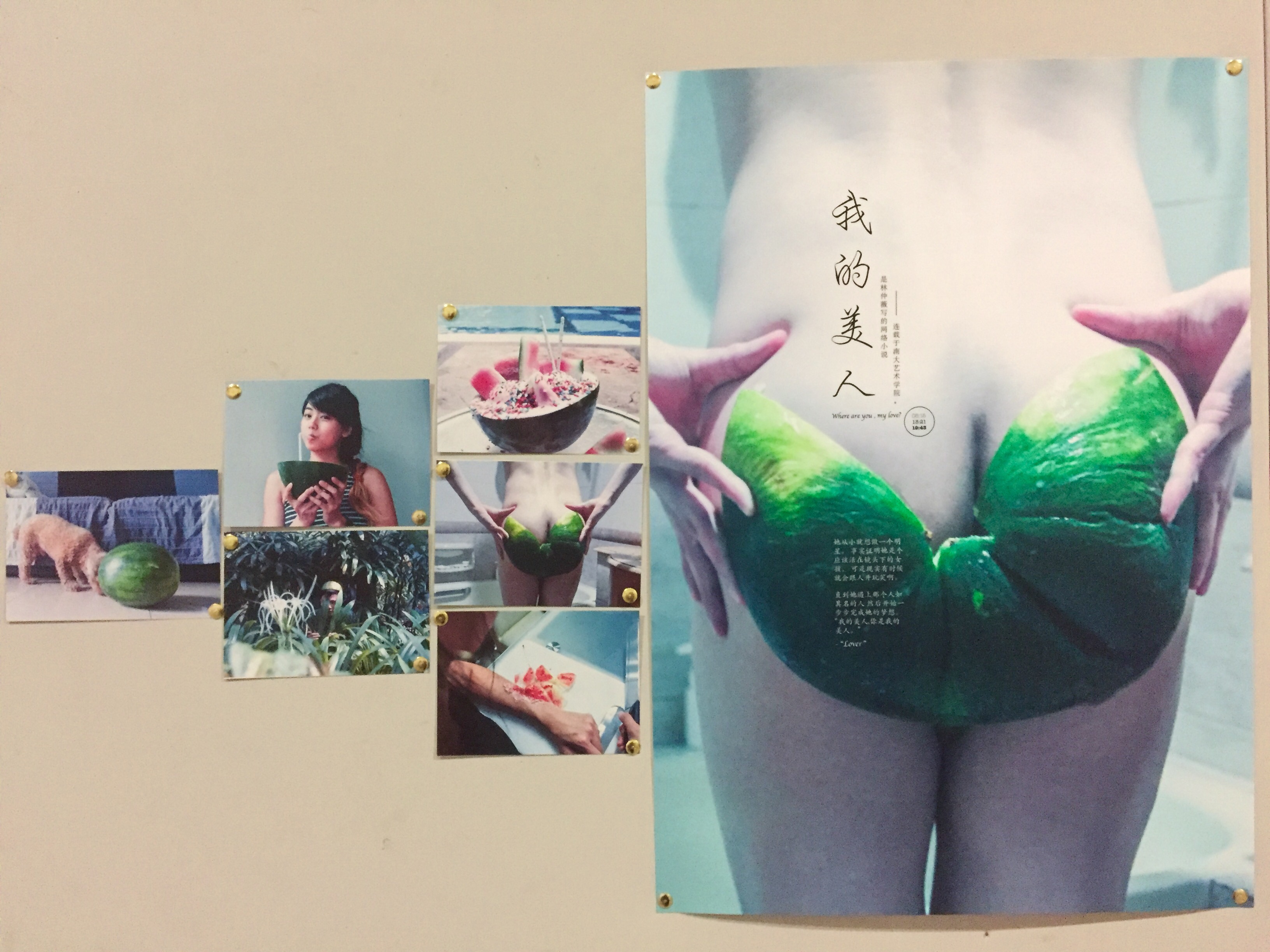
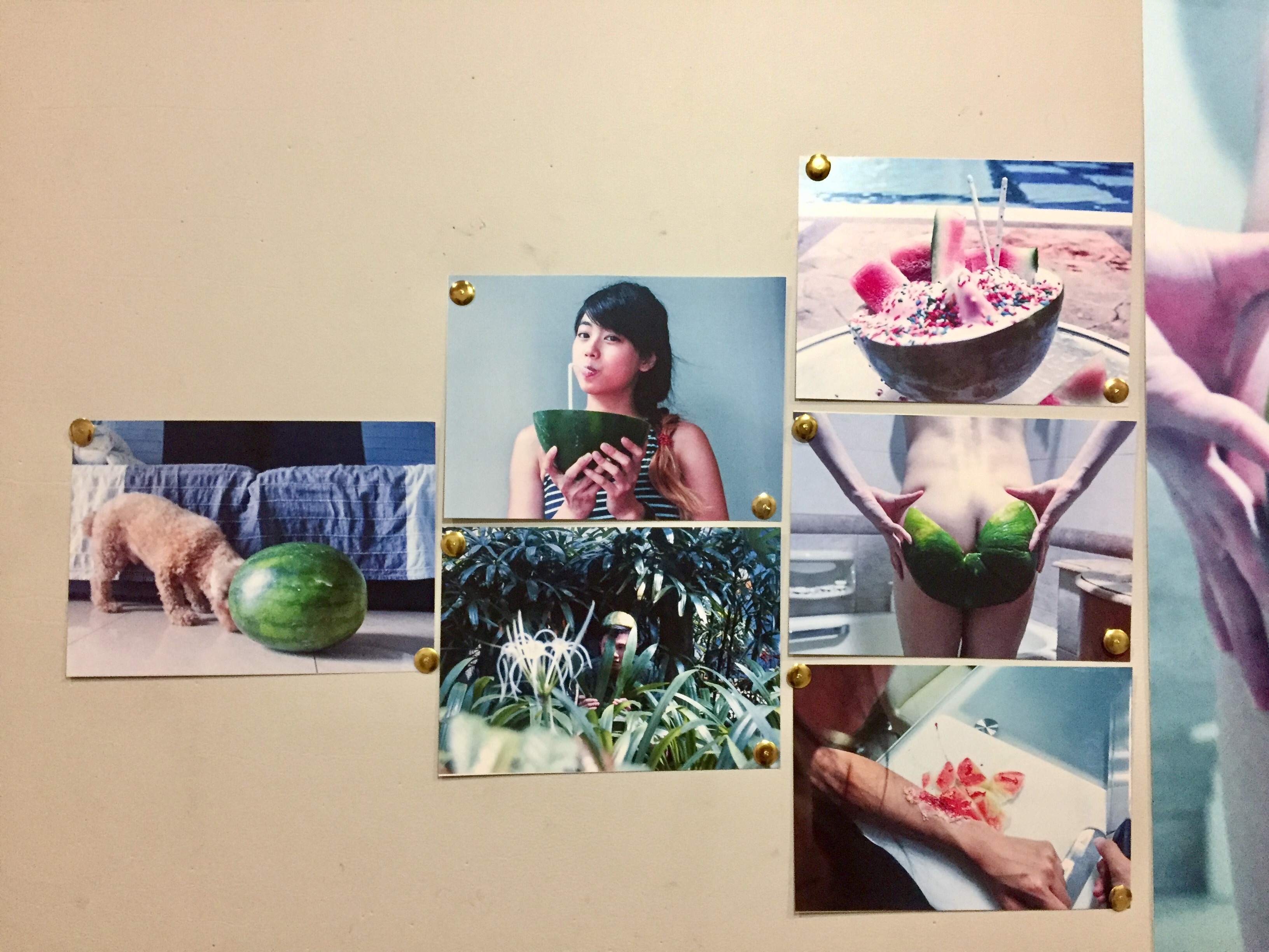
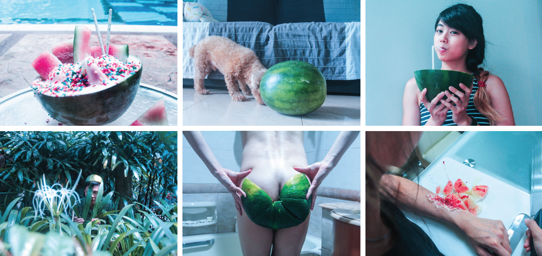
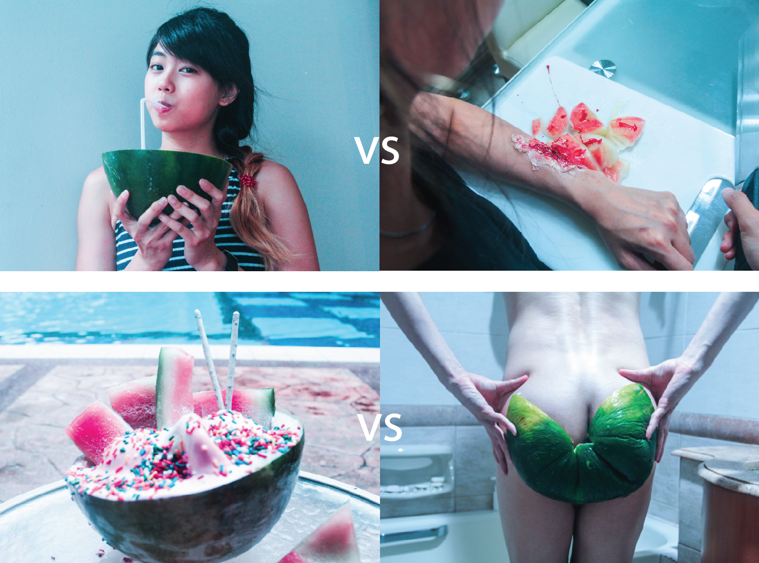


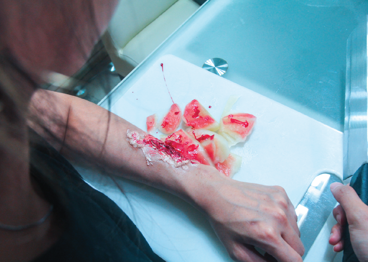
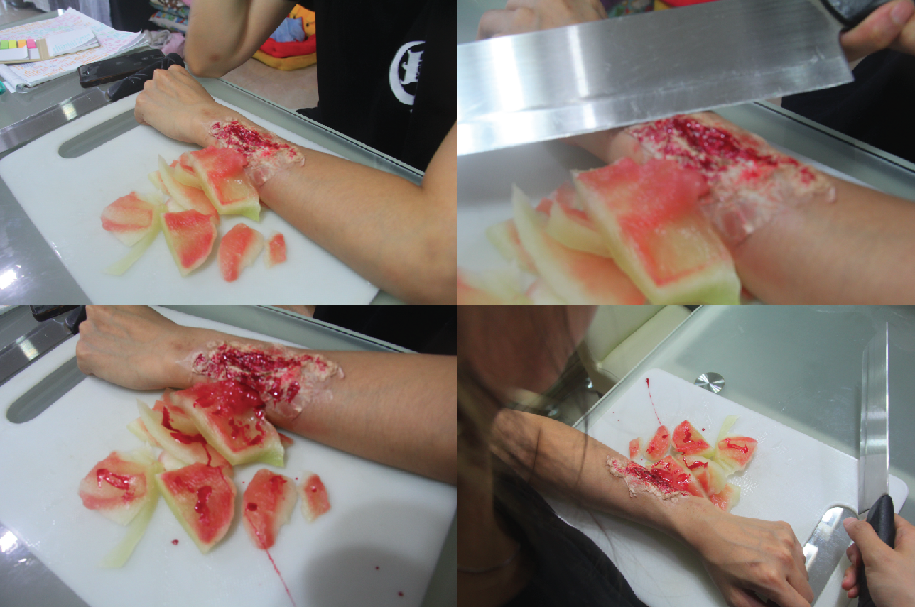 In the test shots, I find it hard to connect the different elements (wound, watermelon, knife, model, chopping board) all together into the photograph. Until I found the right angle to take shot the photo; the back shoulder of the model.
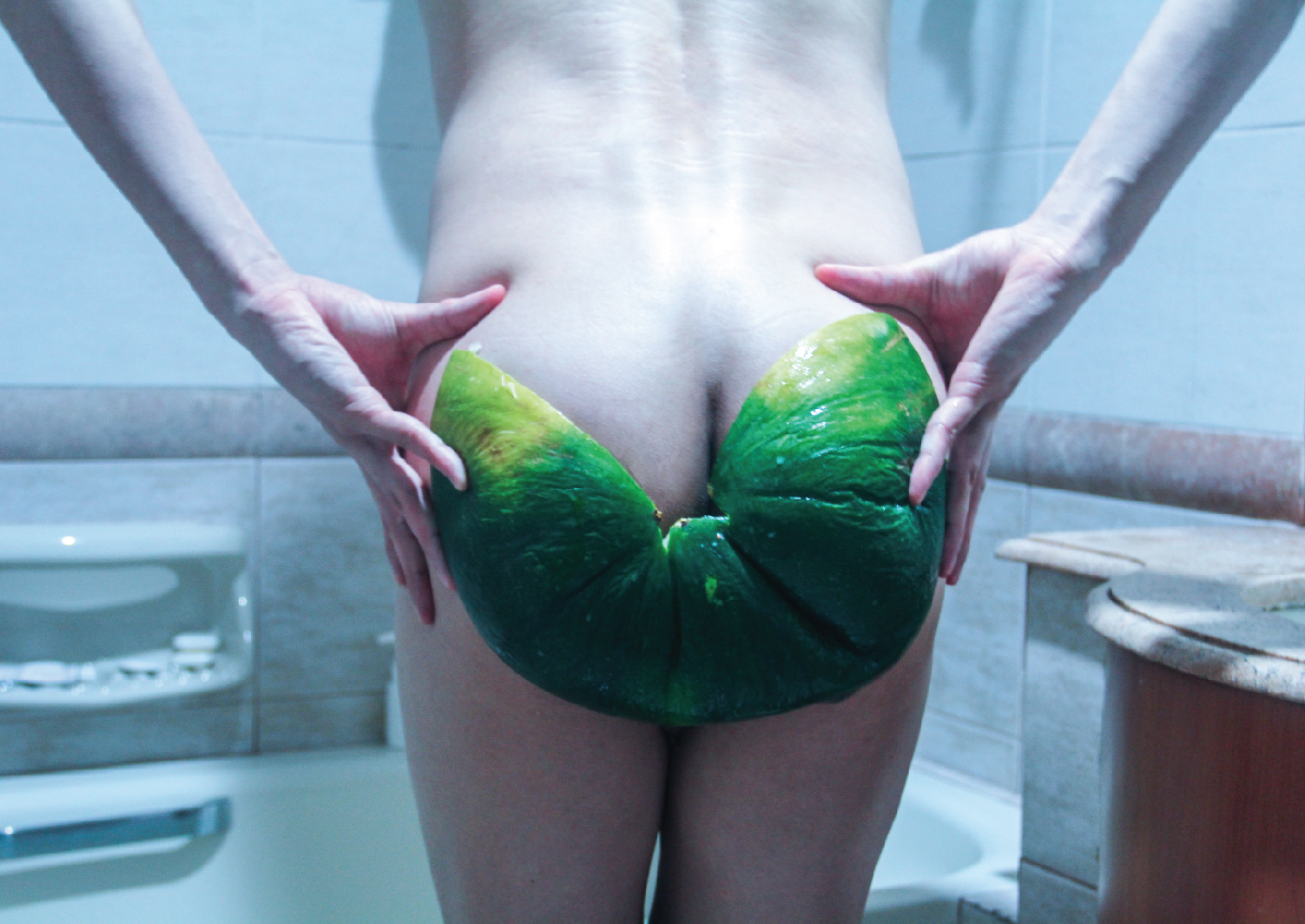
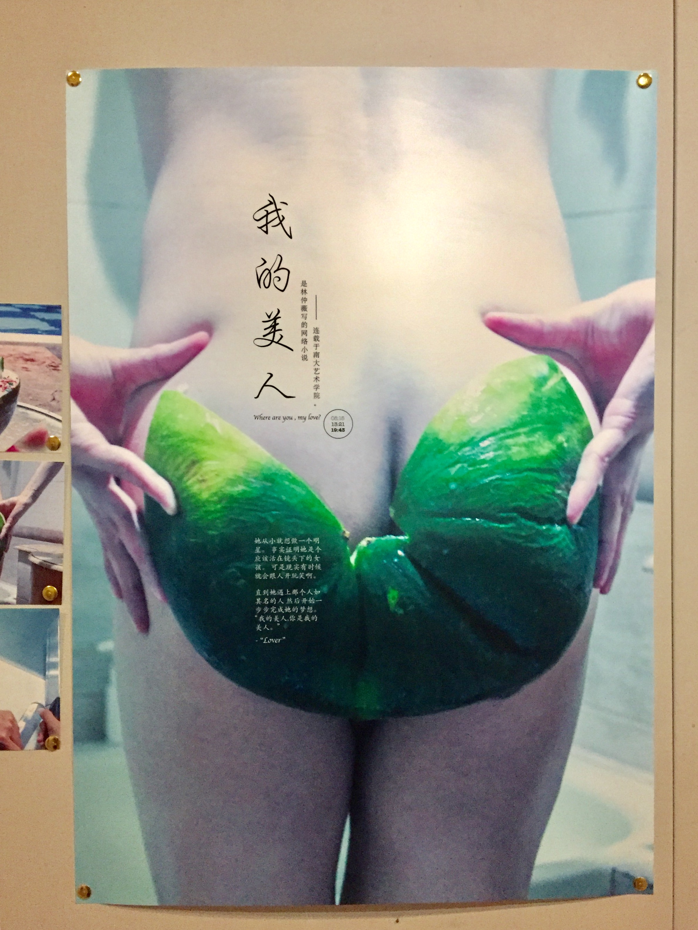
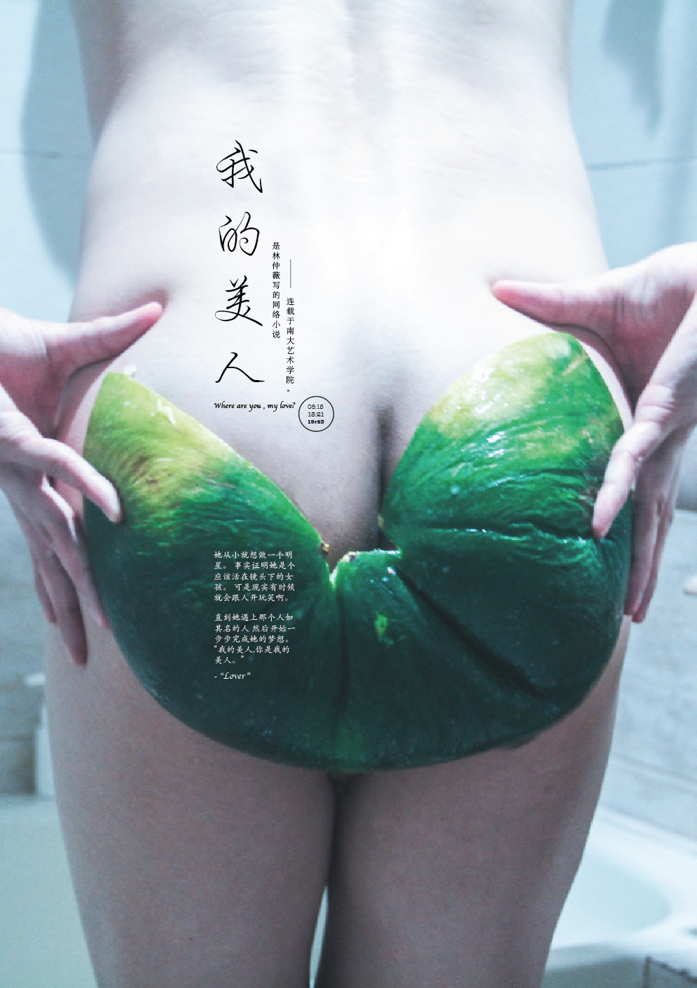 “我的美人“


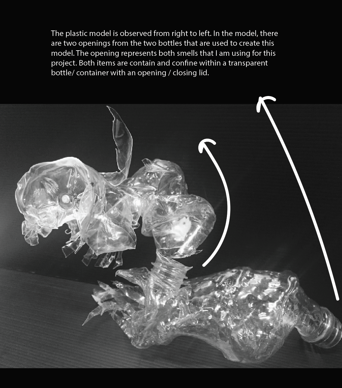
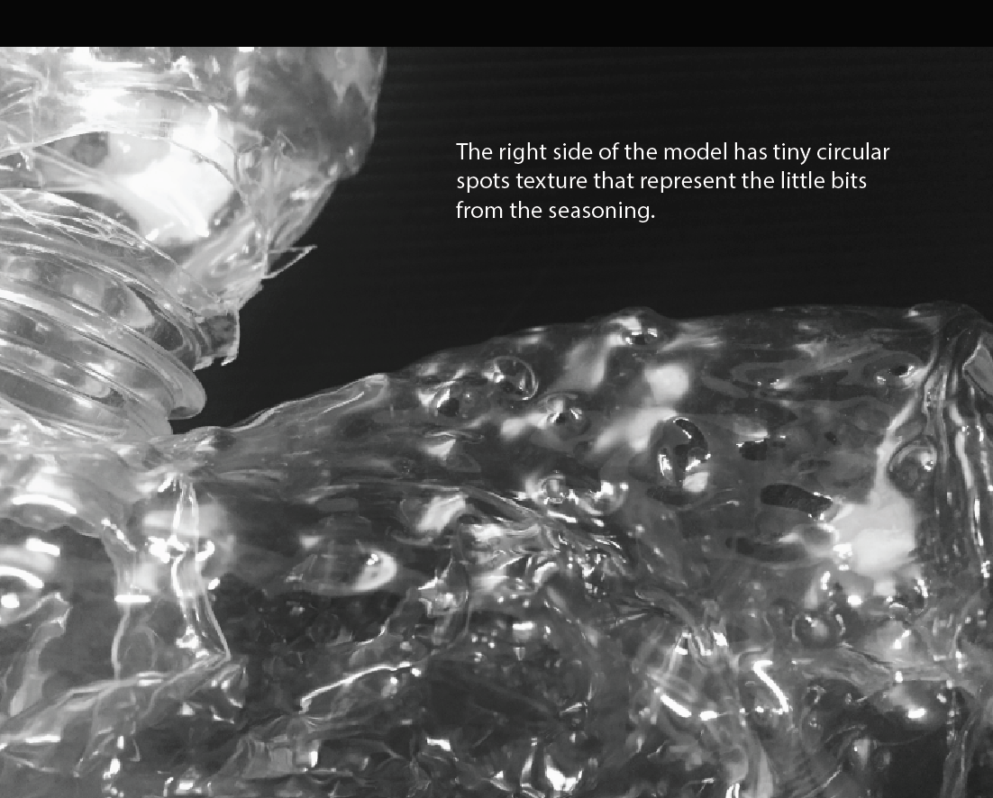
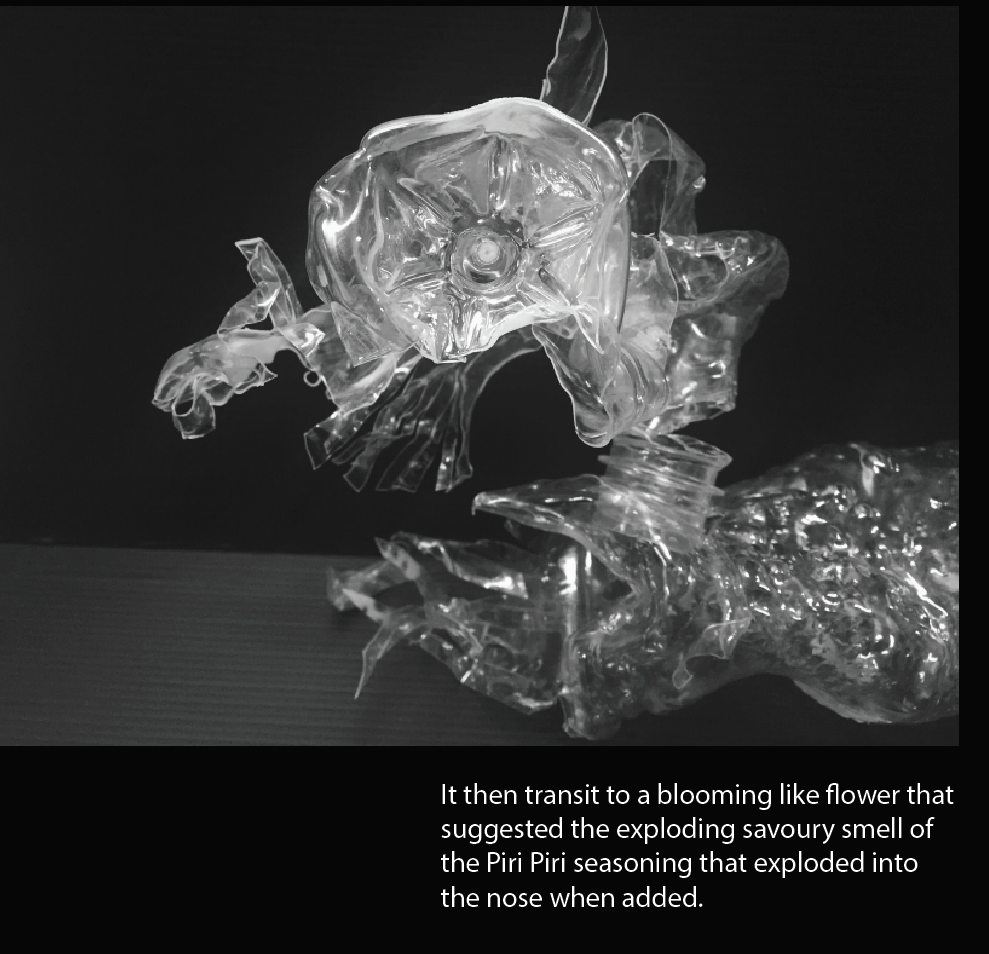
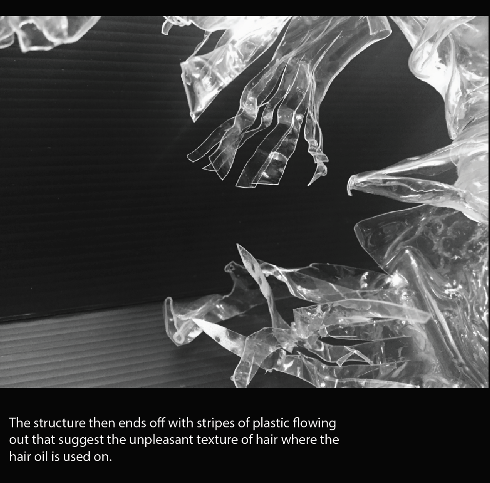
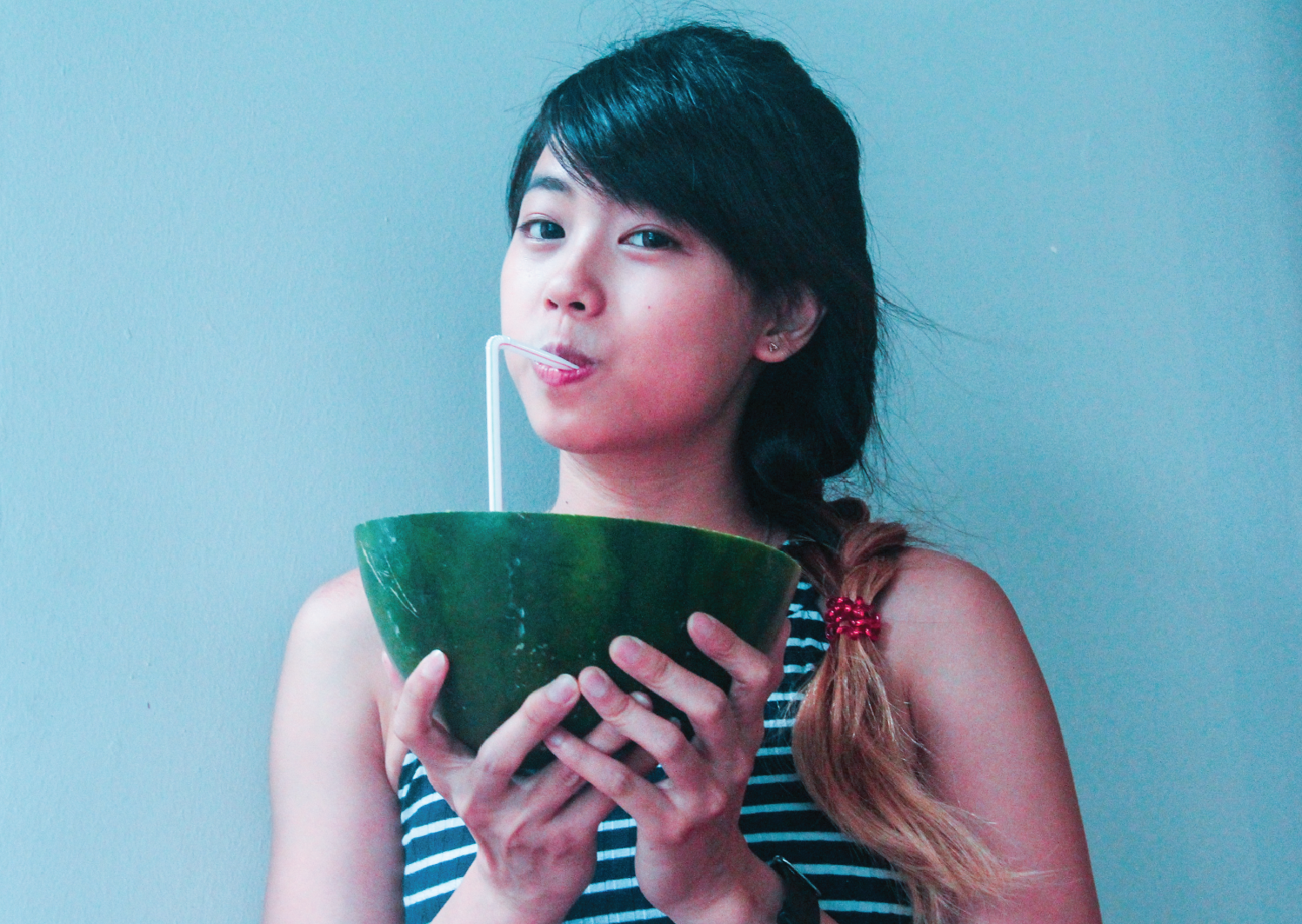
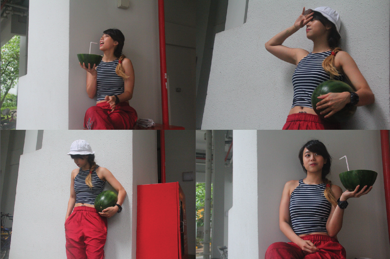
 Other views of the same model


