Research:
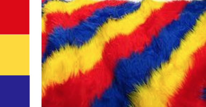
Primary Colors: Red, yellow and blue
In traditional color theory (used in paint and pigments), primary colors are the 3 pigment colors that cannot be mixed or formed by any combination of other colors. All other colors are derived from these 3 hues.
Secondary Colors: Green, orange and purple.
These are the colors formed by mixing the primary colors.
Tertiary Colors: Yellow-orange, red-orange, red-purple, blue-purple, blue-green & yellow-green.
These are the colors formed by mixing a primary and a secondary color. That’s why the hue is a two word name, such as blue-green, red-violet, and yellow-orange.
Monochromes Harmony
The colours of a monochromatic palette all share a single hue, but vary in brightness and saturation. White, black and grey are considered to be neutral.
Analogous Harmony
Analogous colour palettes consist of different, but neighbouring hues. The constant property can be either the saturation or the brightness level or both.
Complementary hues
Complementary colours are any two colours which are directly opposite each other, such as red and green and red -purple and yellow -green. These opposing colours create maximum contrast.
Split complementary
The split -complementary colour scheme is a variation of the complementary colour scheme. In addition to the base colour, it uses the two colours adjacent to its complement.
Triadic colour scheme
A triadic colour scheme uses colours that are evenly spaced around the colour wheel.
Colour Harmony
In visual experiences, harmony is something that is pleasing to the eye. It engages the viewer and it creates an inner sense of order, a balance in the visual experience. When something is not harmonious, it’s either boring or chaotic.
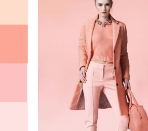
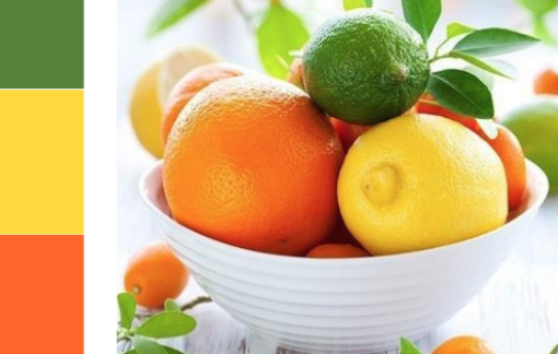
In my concept, I use analogous colours to depict something that I love doing, and complementary colours to show a dislike in the setting and actions taken.
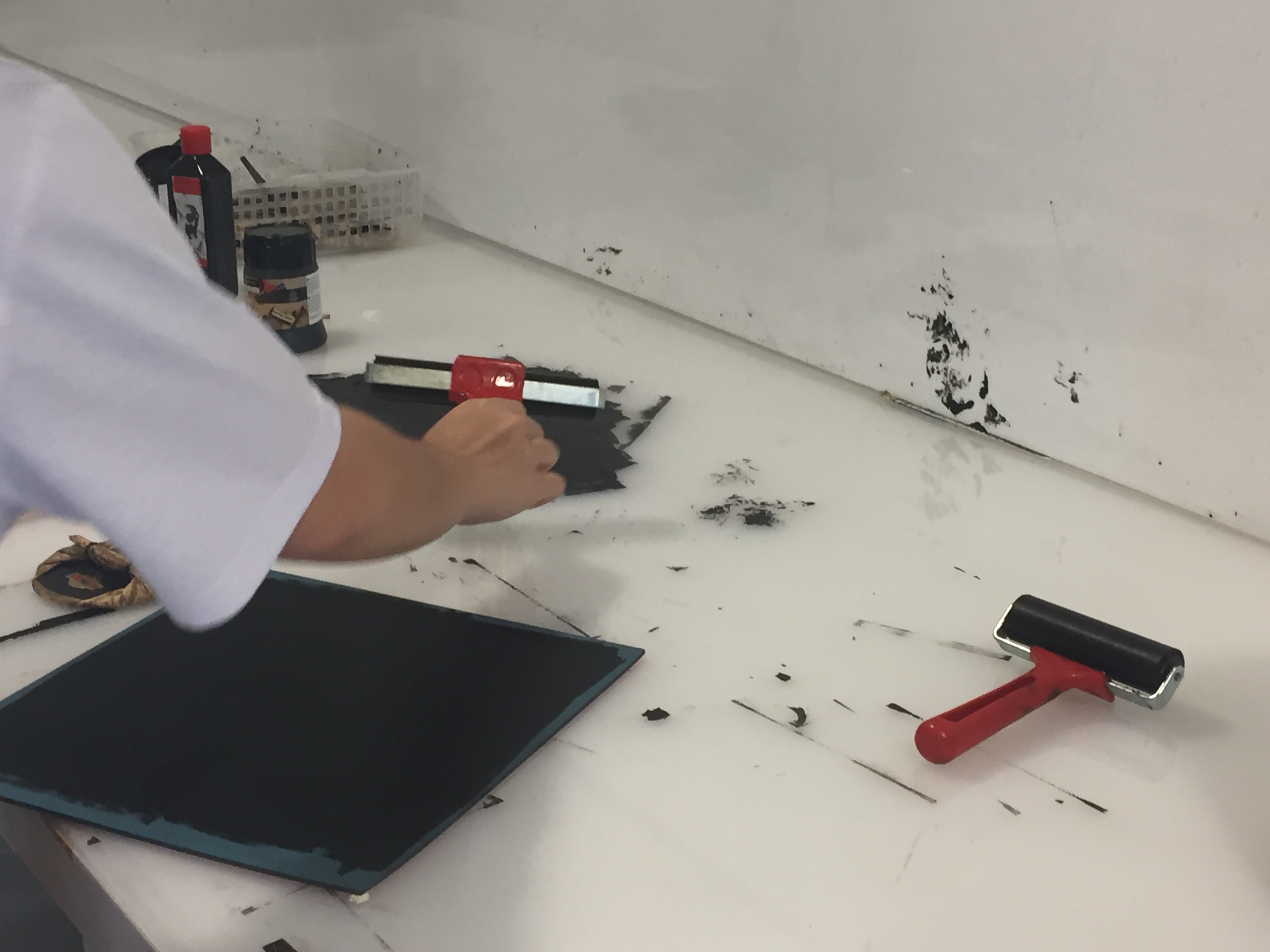
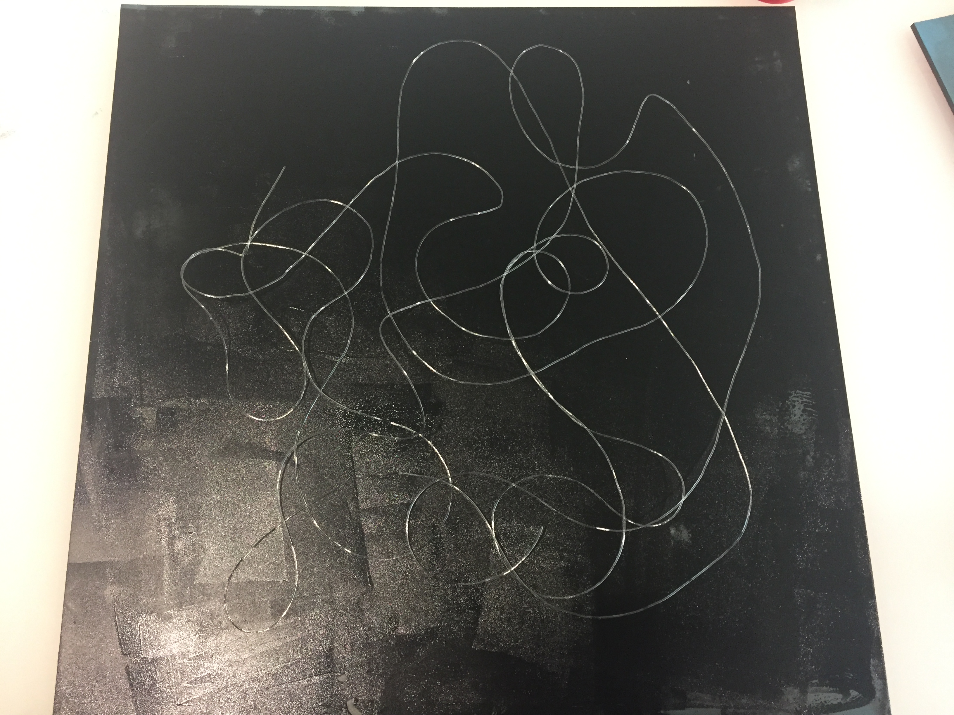
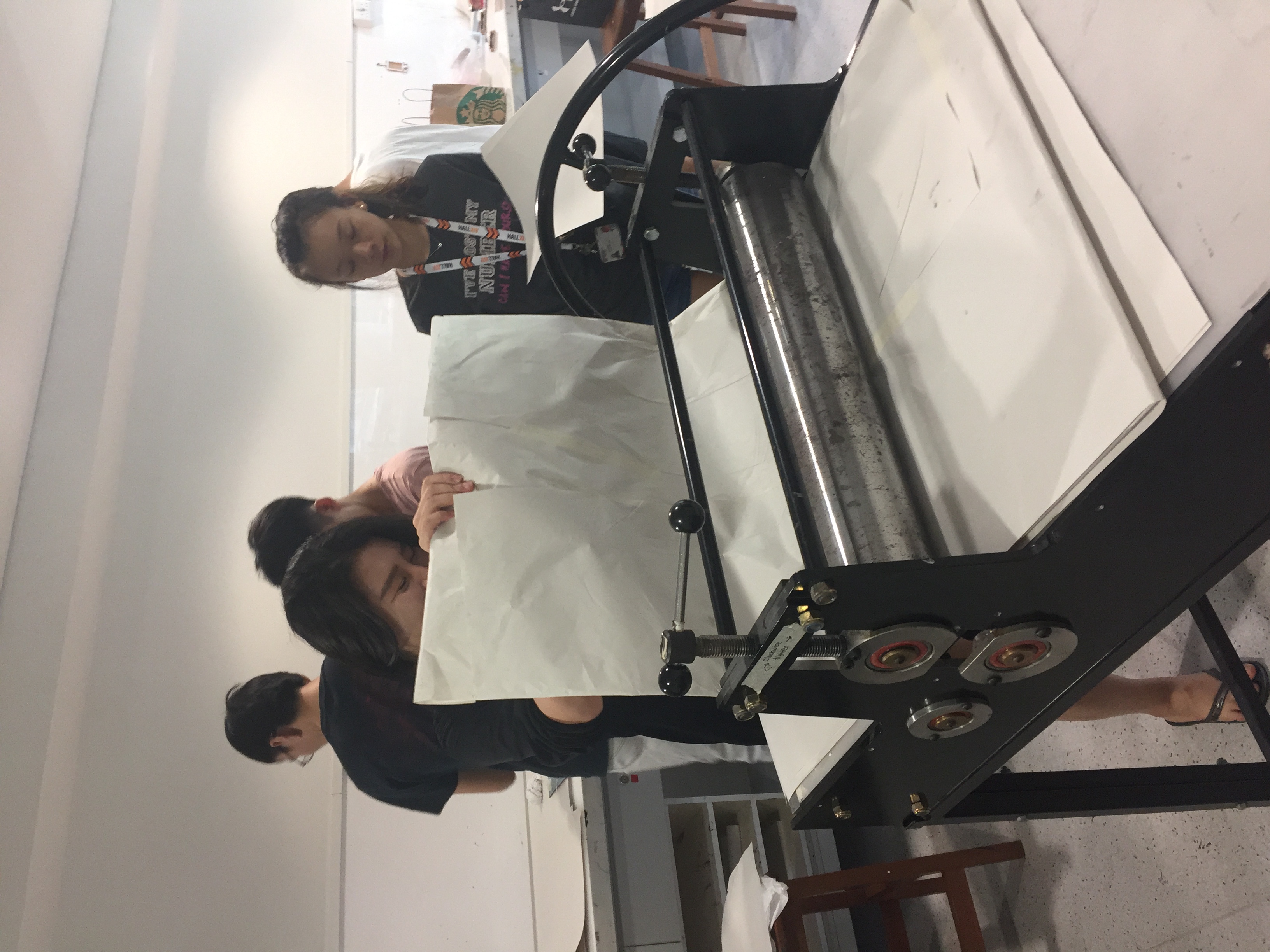
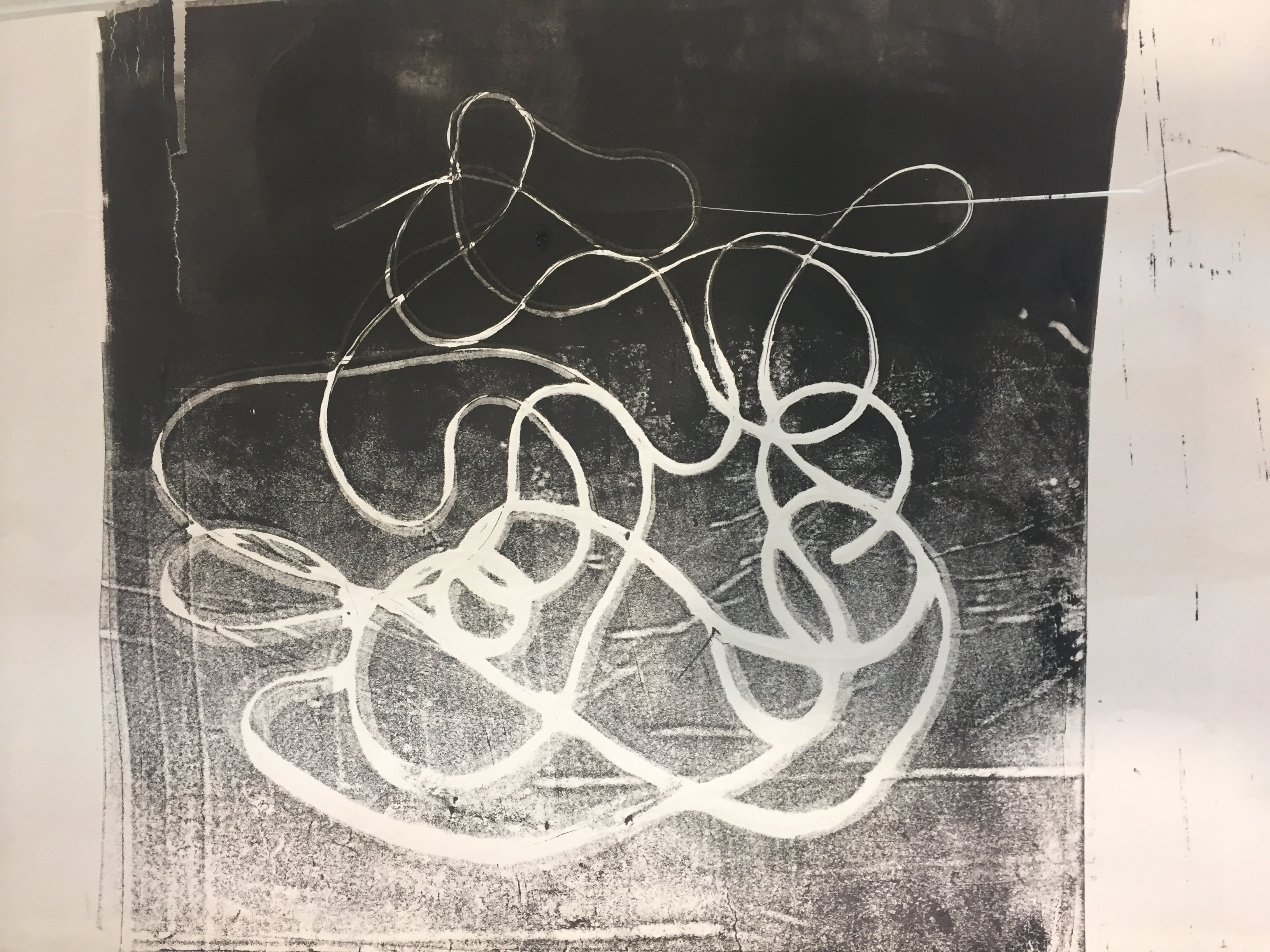
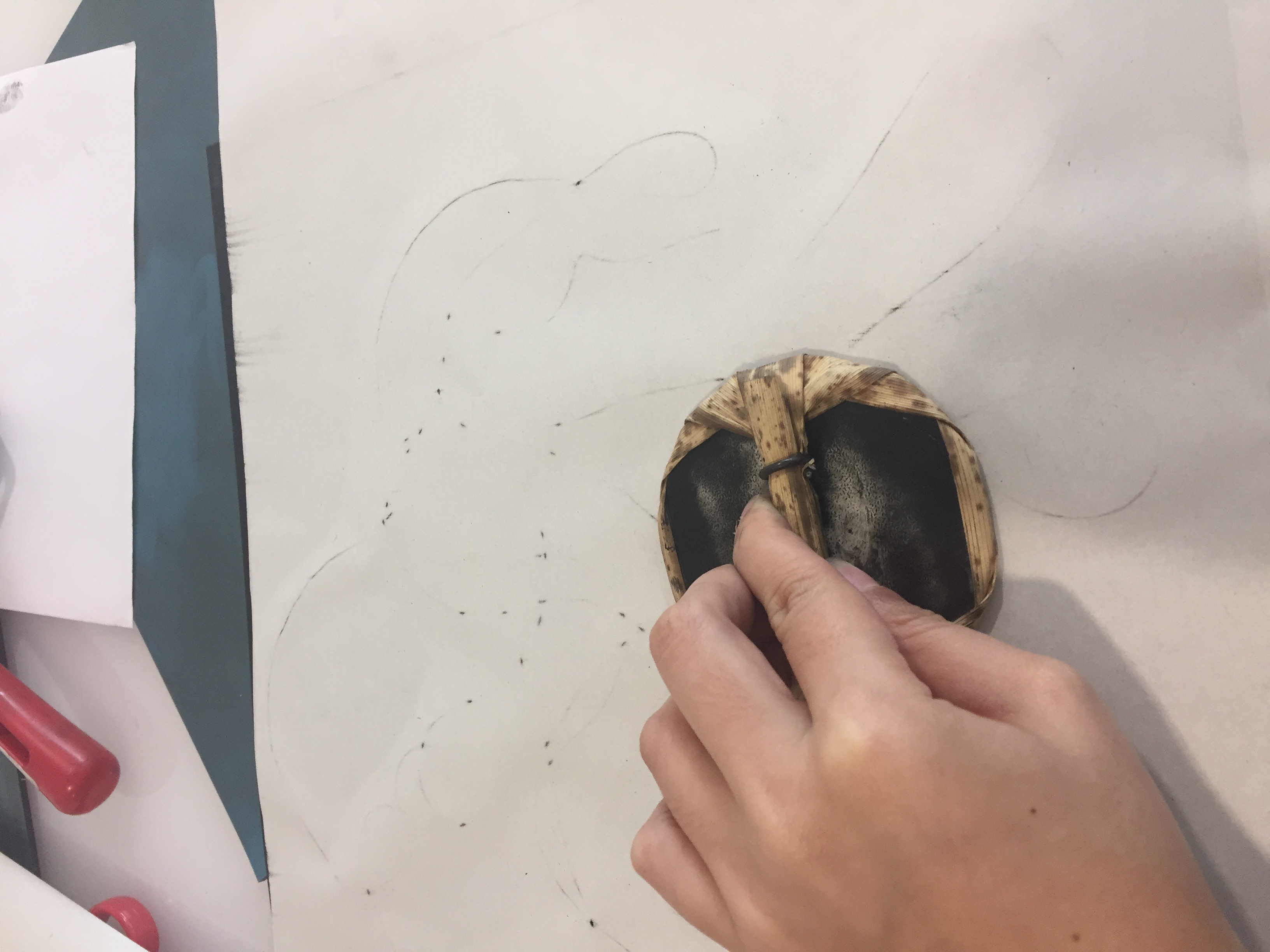
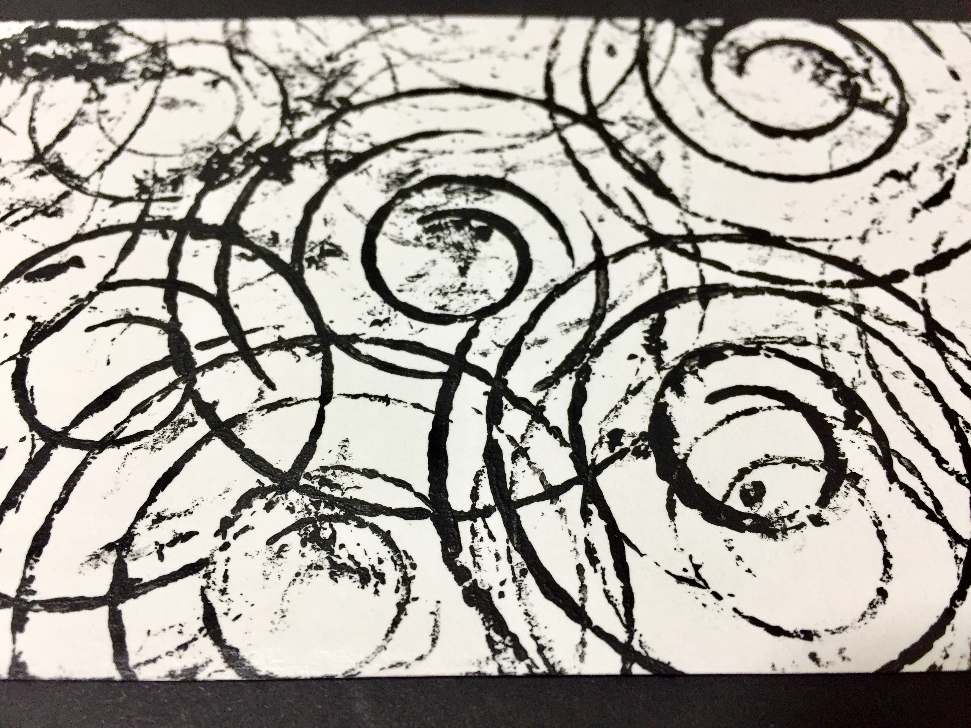
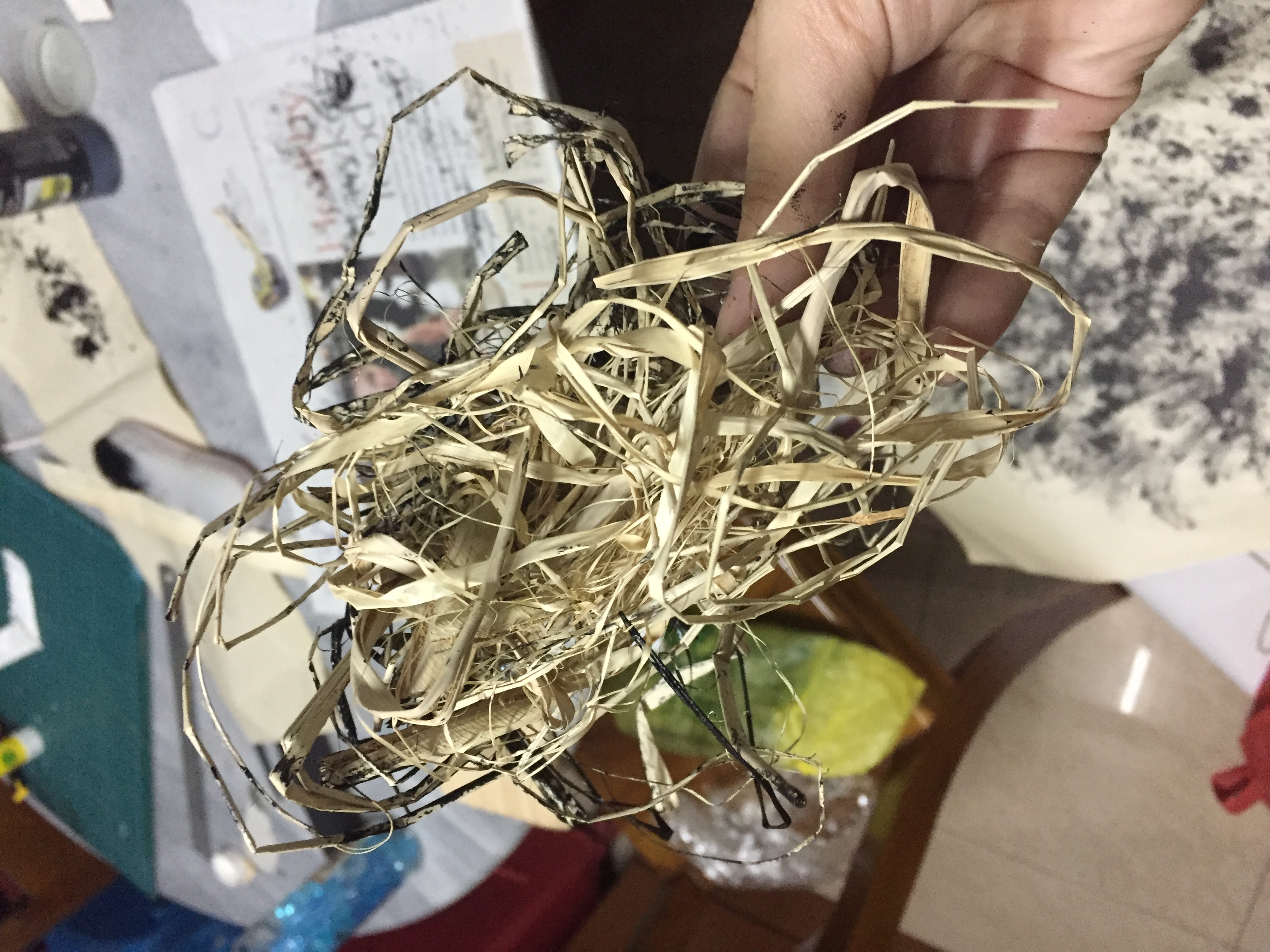
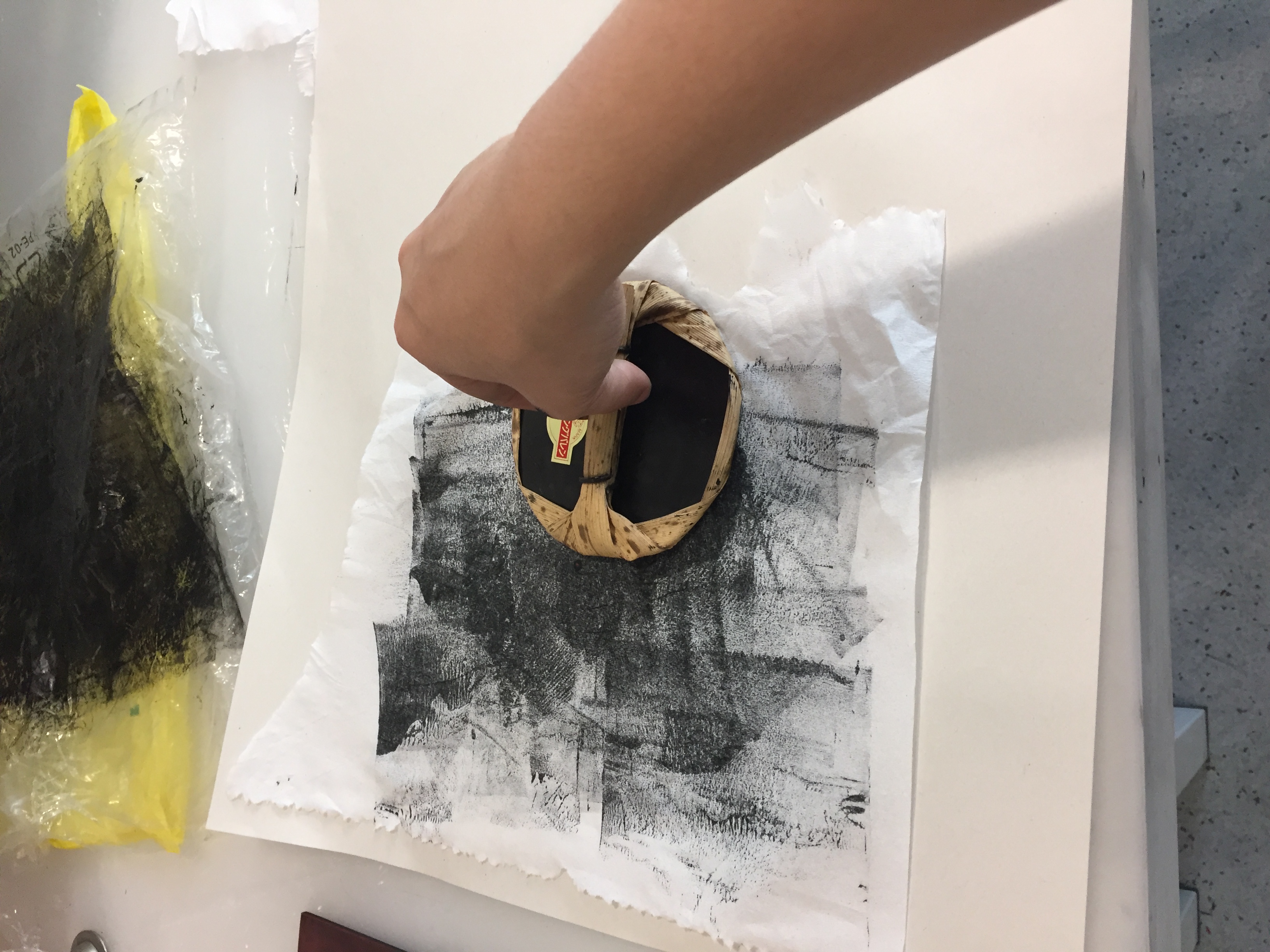
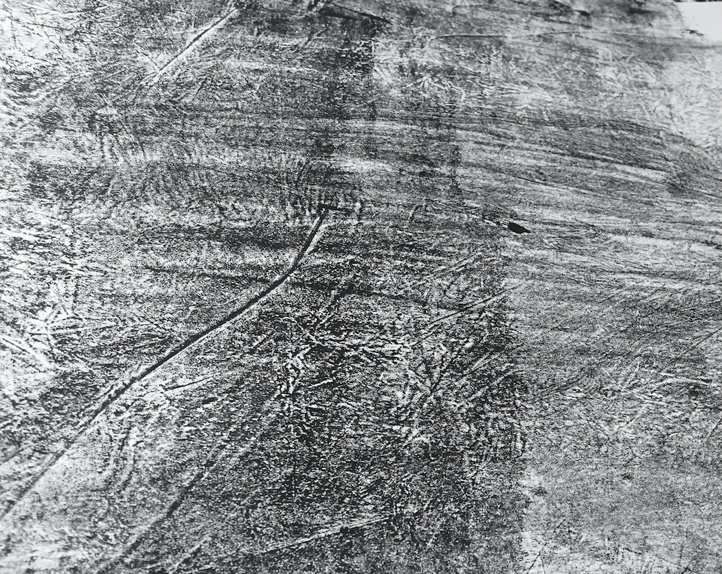
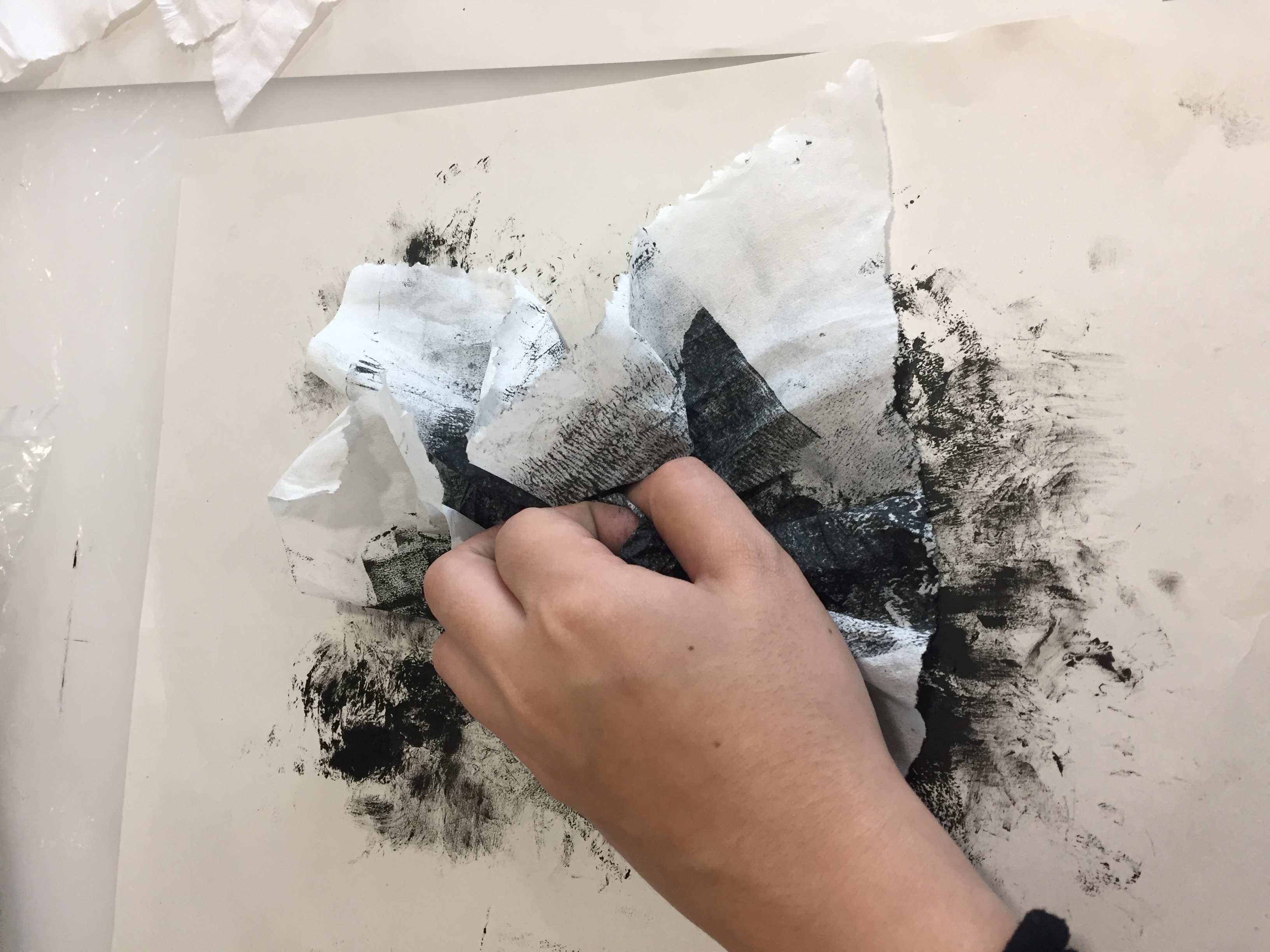
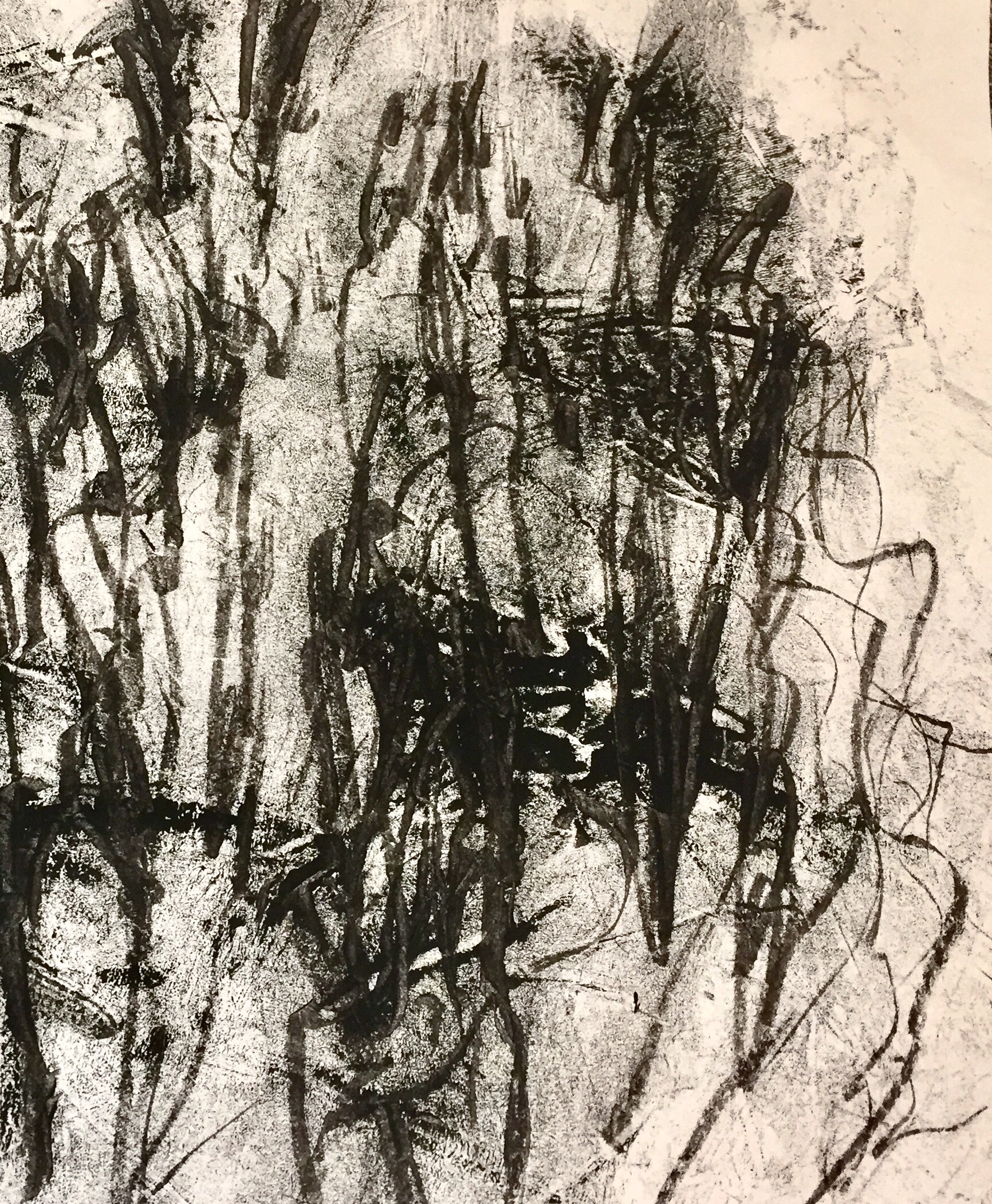
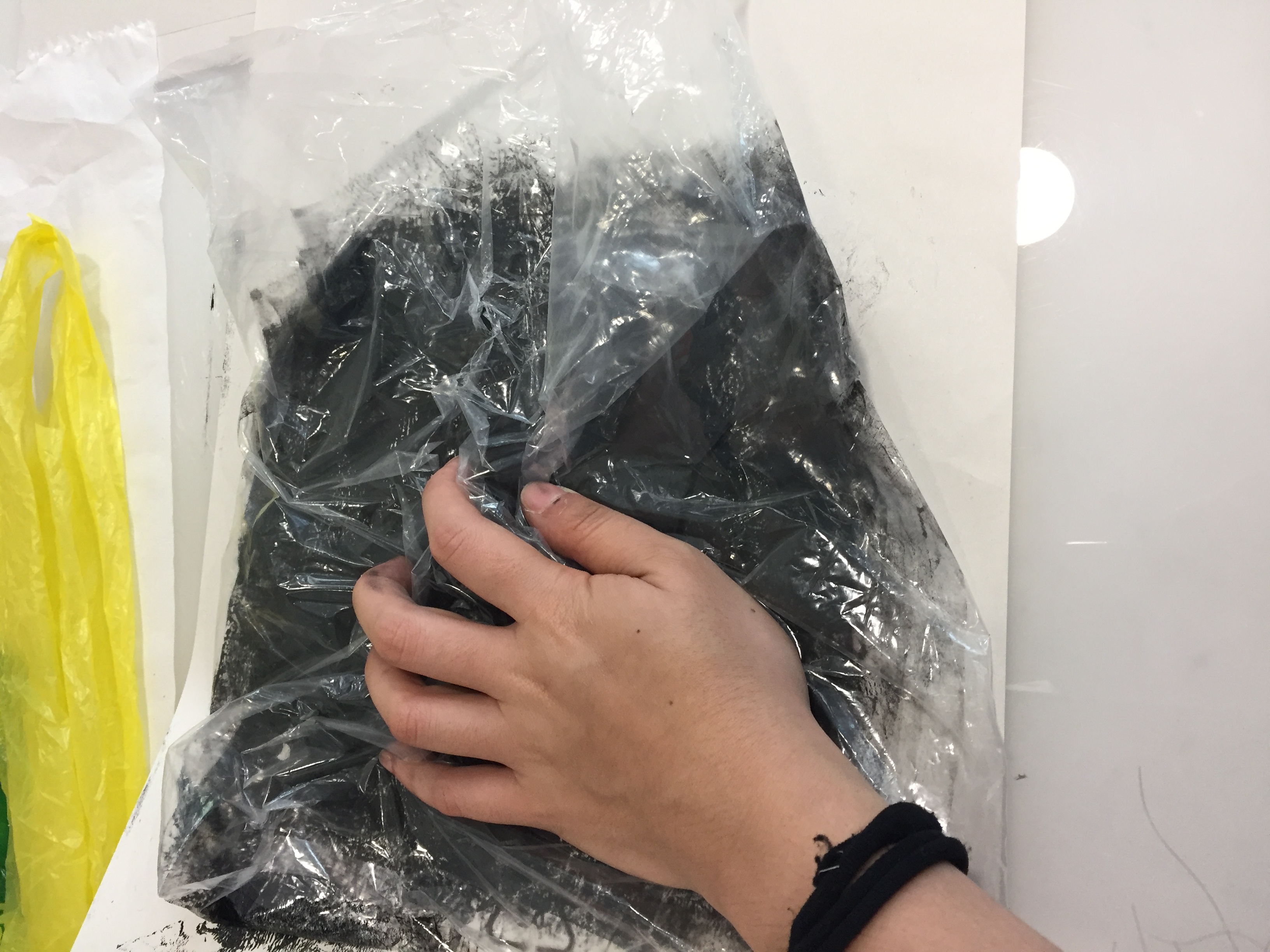
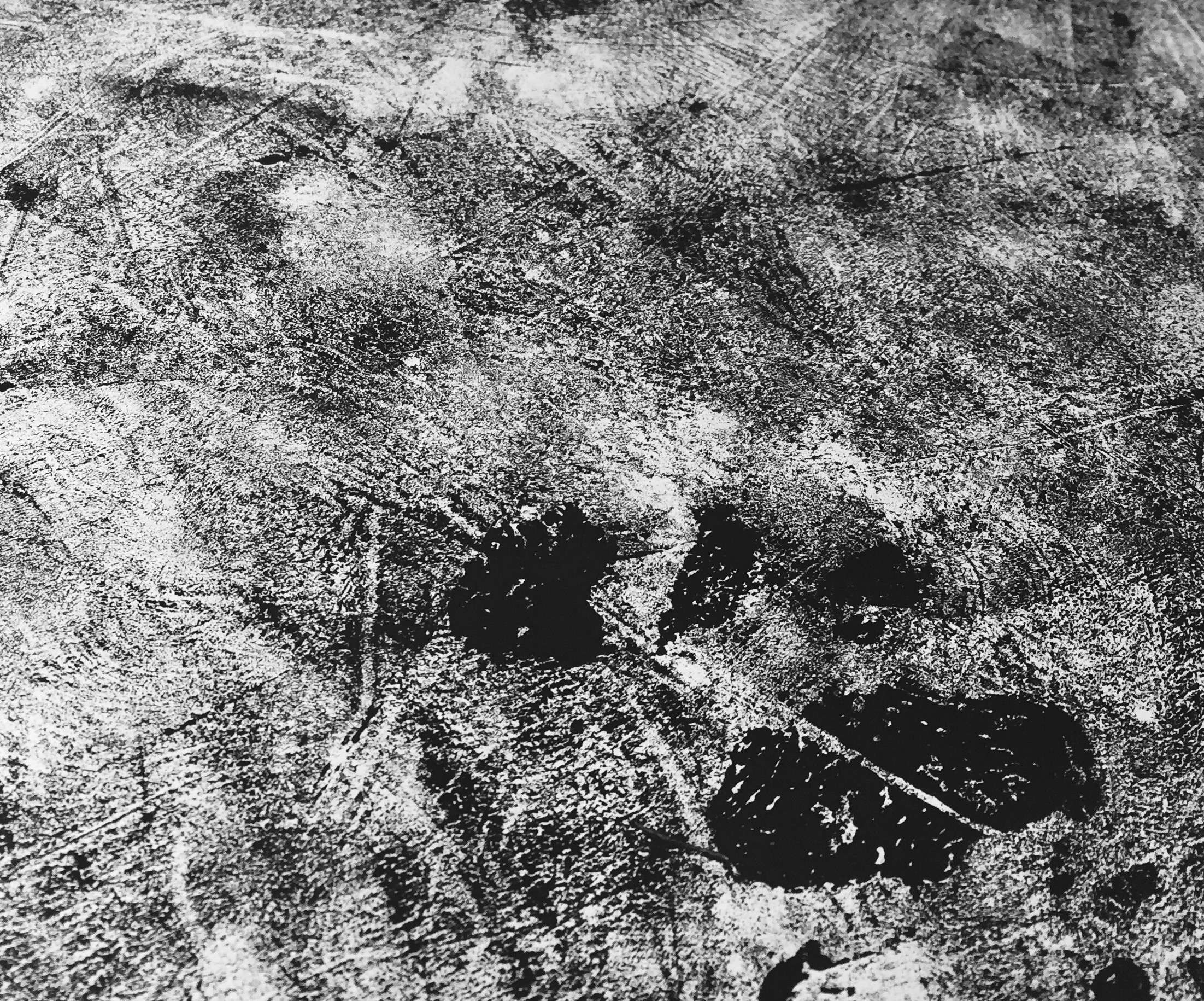
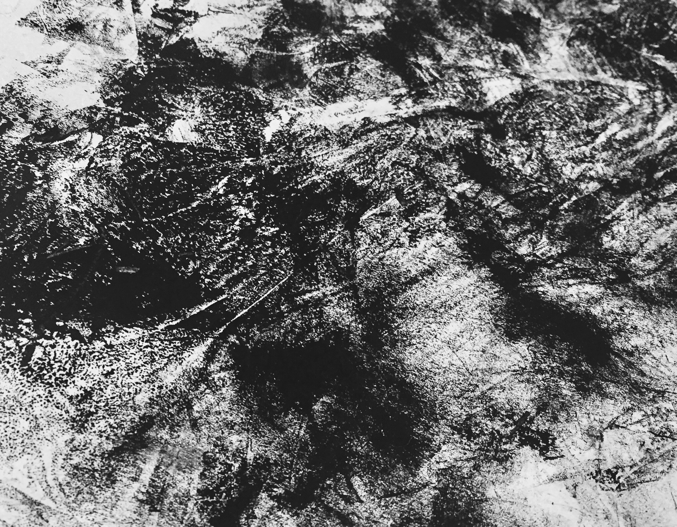
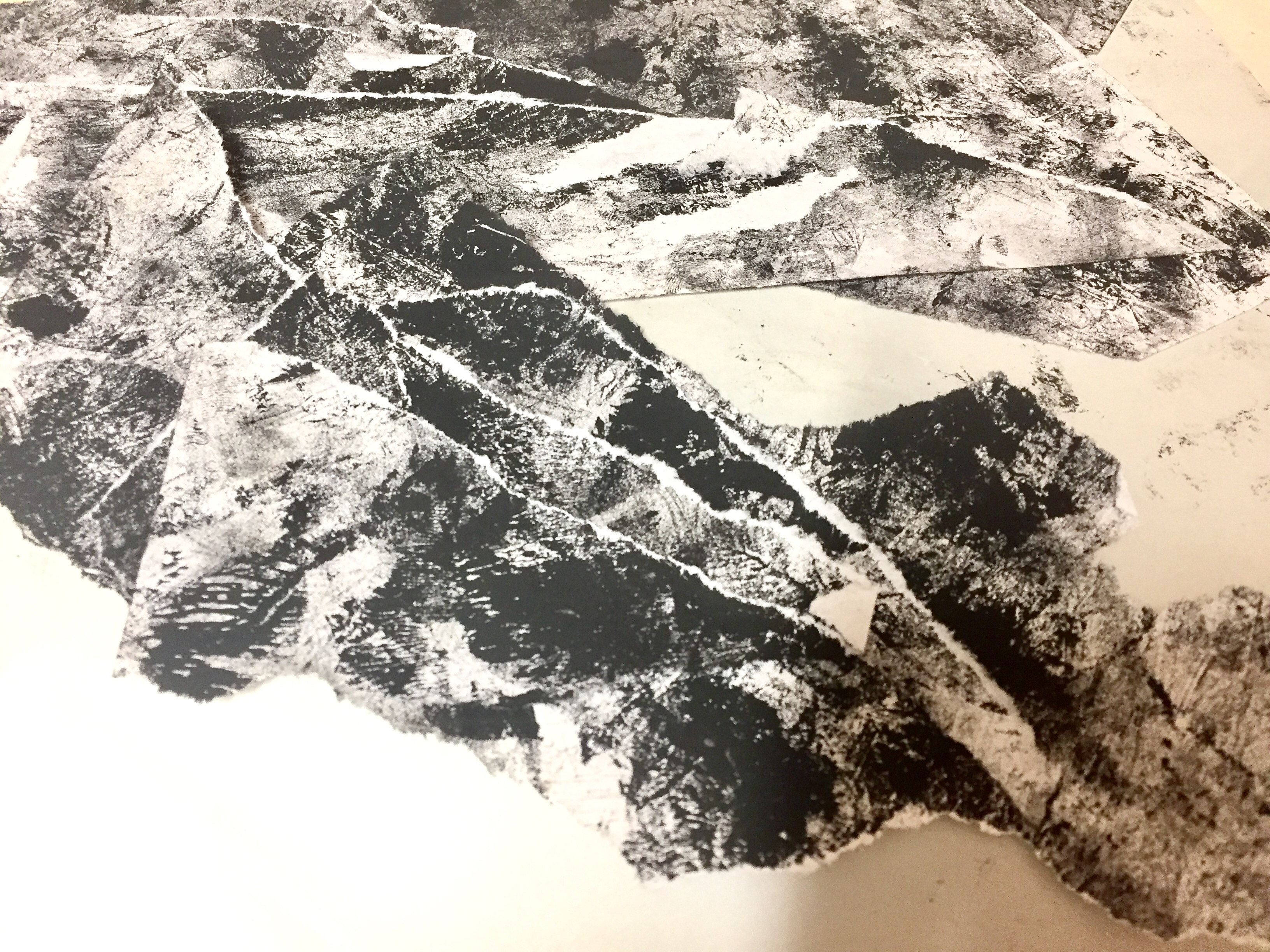
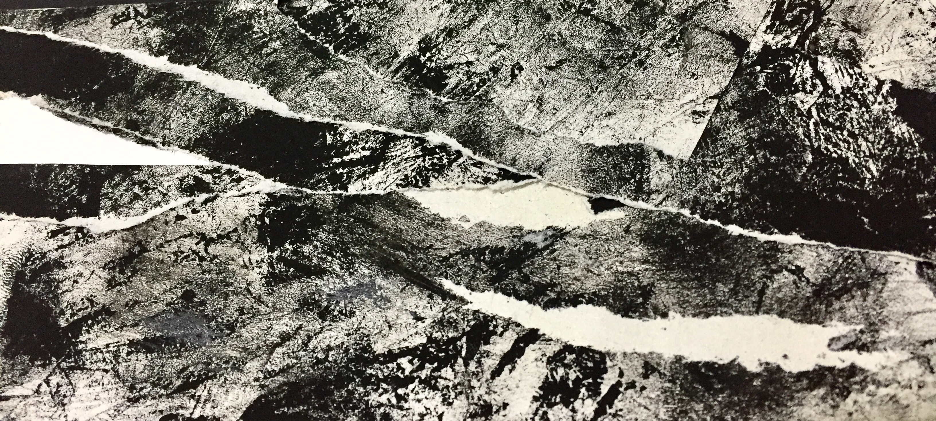
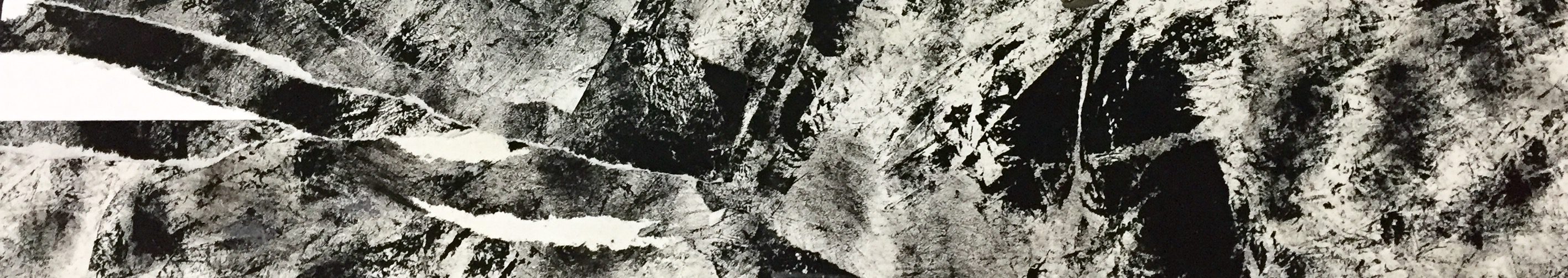
Process and experimentation.
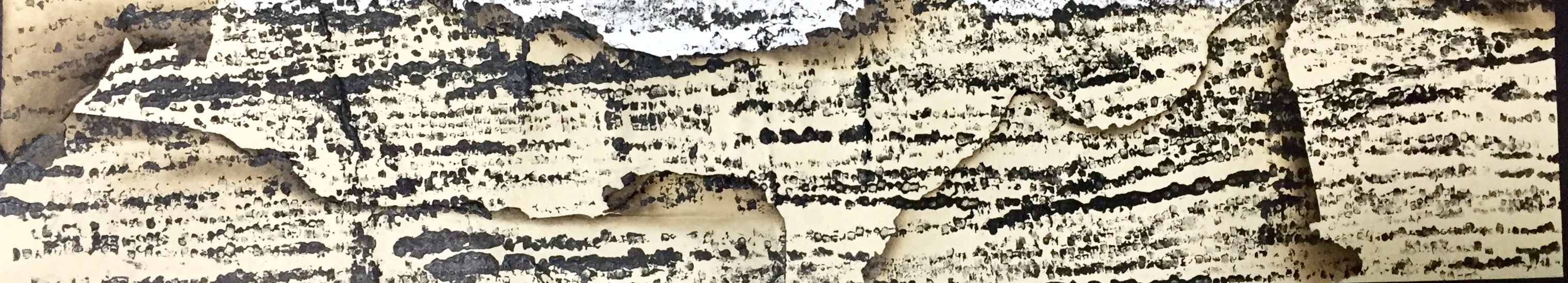
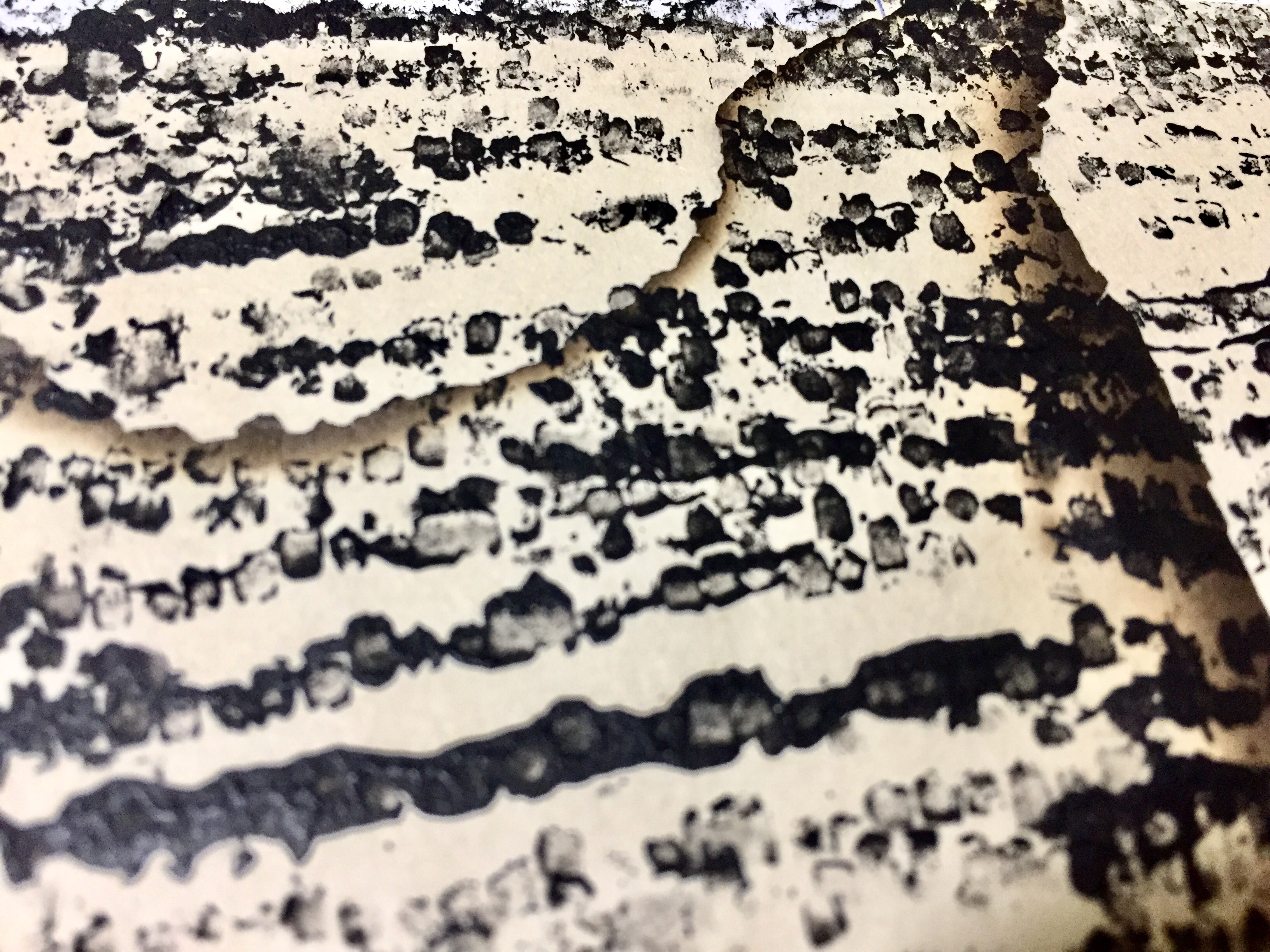
I first began with experimenting simple 2D illustration and their interaction with objects that I have photograph. The 3D objects were photograph and then further enhance with the texture and lightning in photoshop, with the background removed. I fell in love with the contrast between the 2D illustration and 3D objects. And because the illustration had essence of white in it, it doesn’t overpower the object.
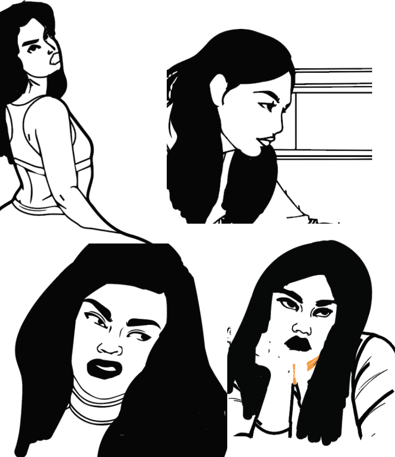
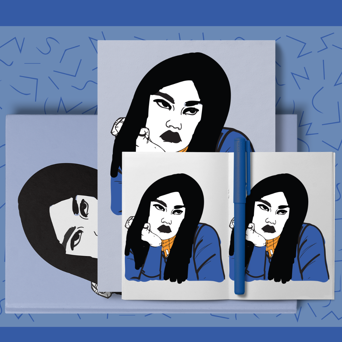
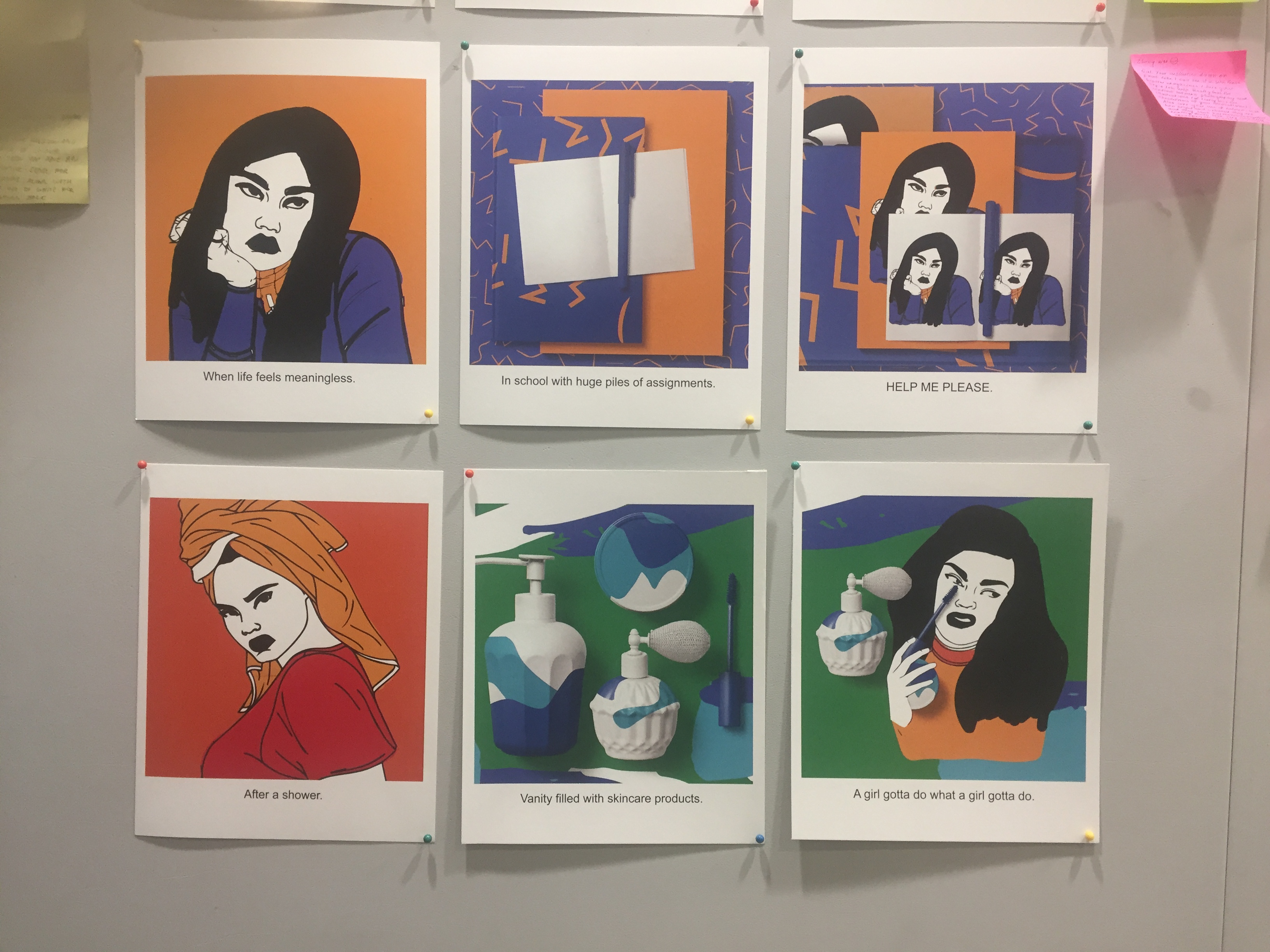
I then started illustrating a depiction of myself in every one of my composition series. Notice that the woman figure that i illustrate has an essence of white and black in the face and limbs, and a strong black outline so that it doesn’t outshine or clash with the other colours. I pay much attention to every character’s expression so that it can convey my emotions well when placed in a different setting. ( all illustration is done in illustrator )
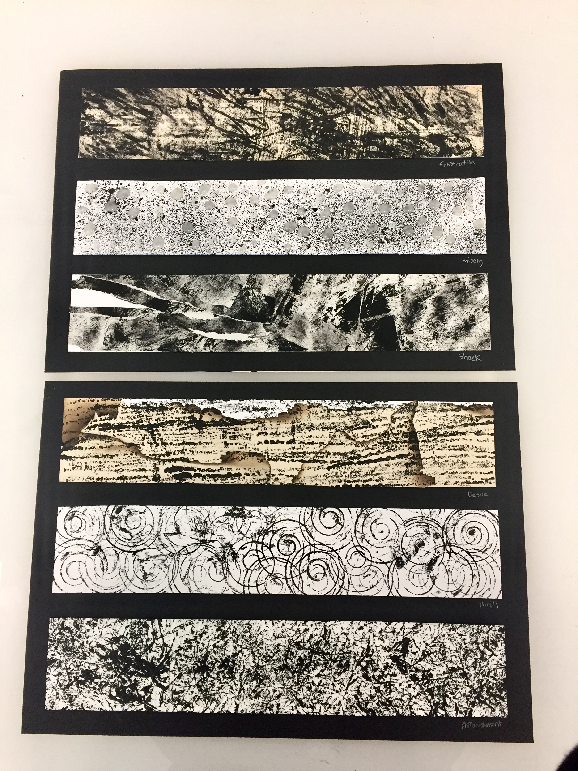
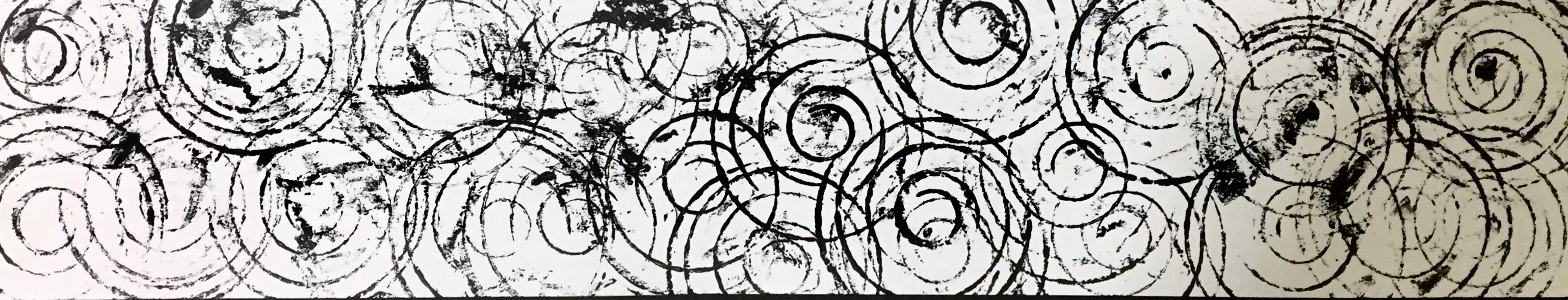
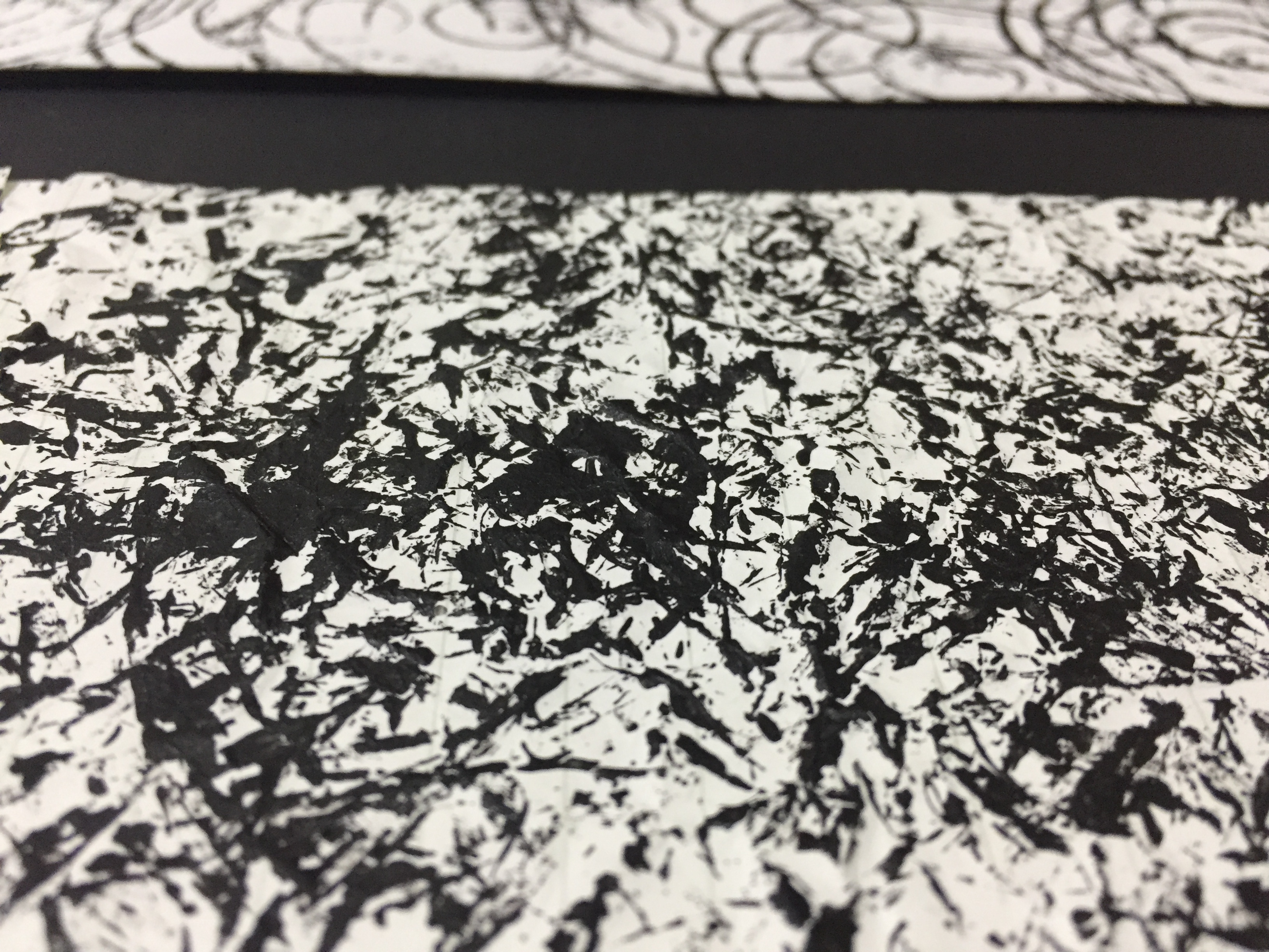
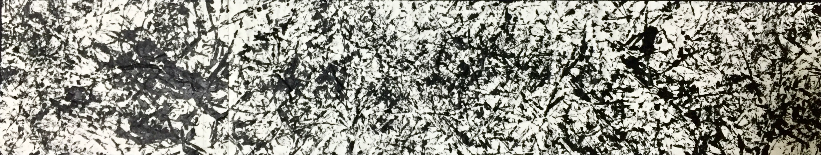
Next, I illustrate different symbols and shapes to determine different background settings. In each of my setting, I use photography of the objects and illustrations to show my viewers the different settings that i am trying to portrait. Different shapes and symbols in each scene represent different location. For example, the 1st image shows weird looking strokes that seems like alphabets ( this is where i tried to depict a study environment setting) , or the blue and green brush strokes ( where it depicts a vanity setting where i glam myself up ).
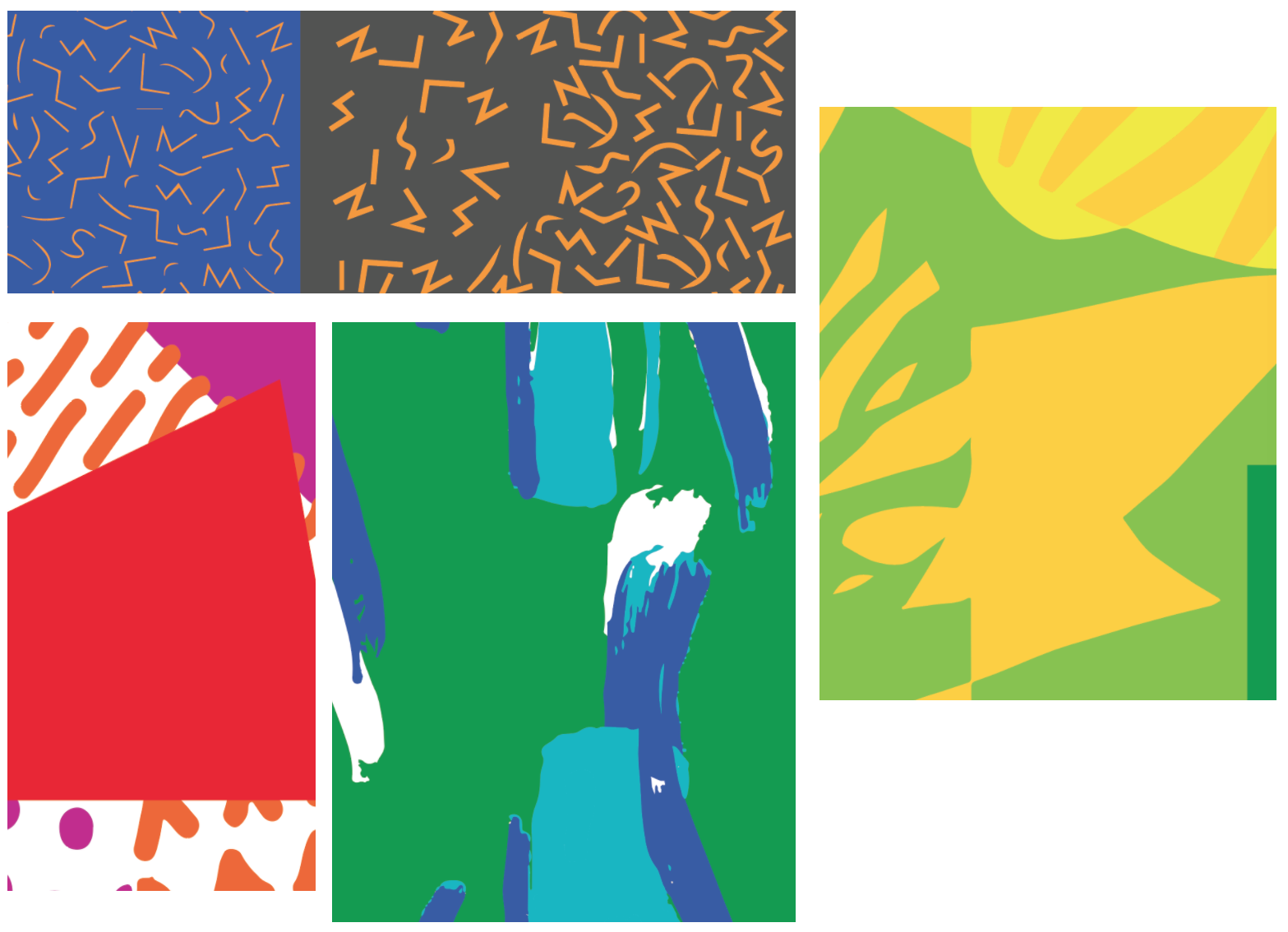
Then i began playing with the different colour tones that we have learnt. I asked myself which colour combination suits the composition and story telling best. Here you can see that I played with the different Monochromes and Complementary colours.
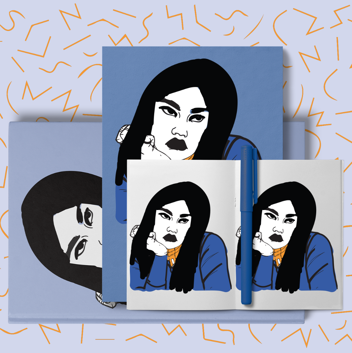

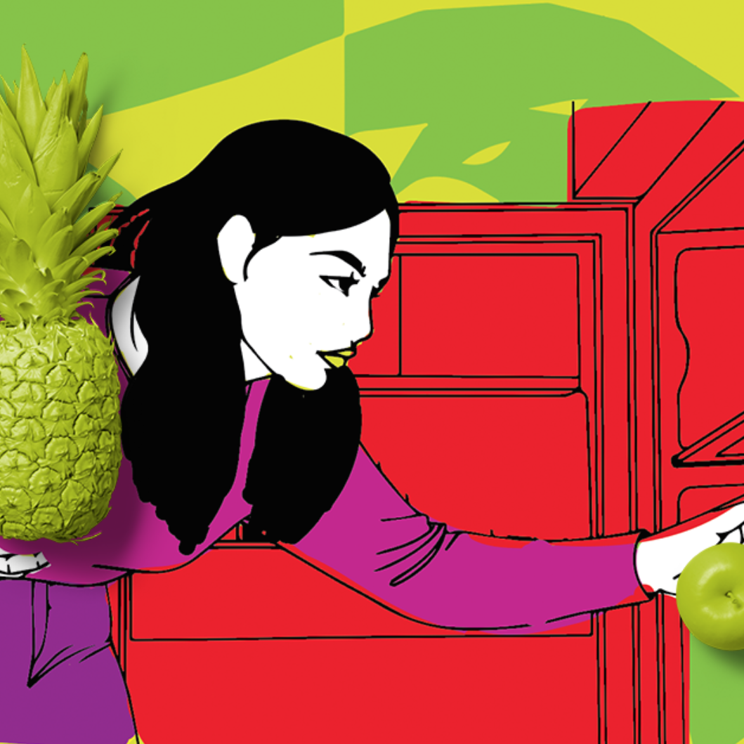
I then try to mix the 2D illustrations into the 3D objects. Because of the contrasting 2D and 3D effects, each combination is meant to look a little off, however, are able to relate to each other. Here, lots of back and forth editing in photoshop and Illustrator is done. 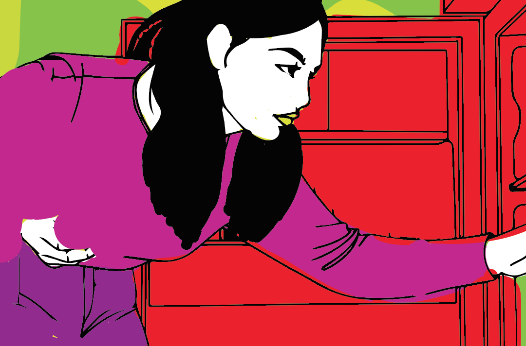
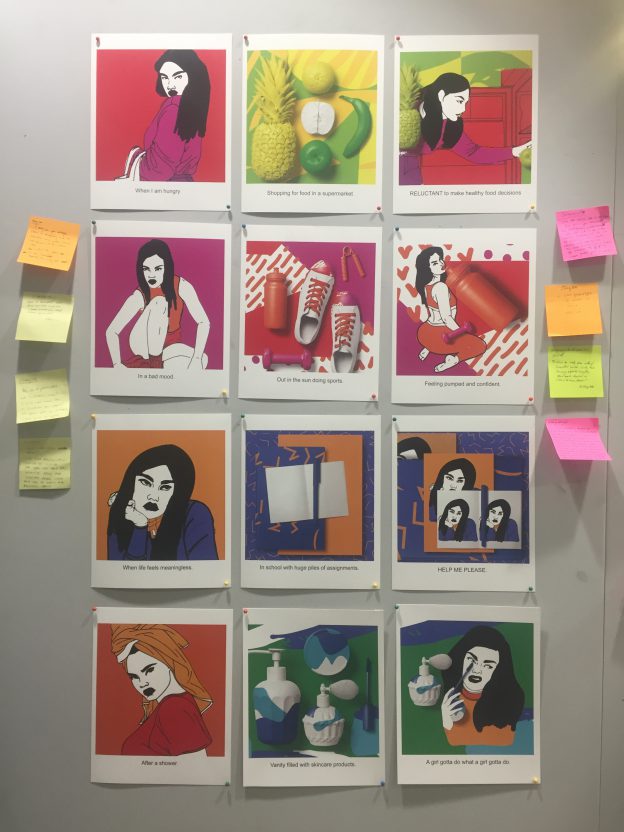
FINAL
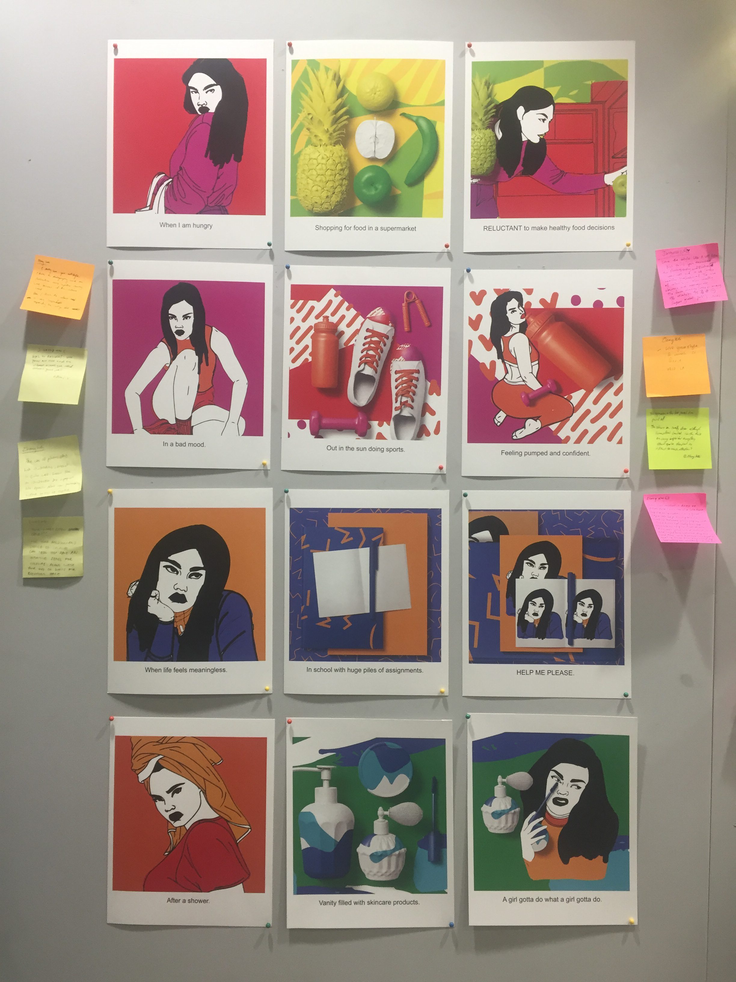
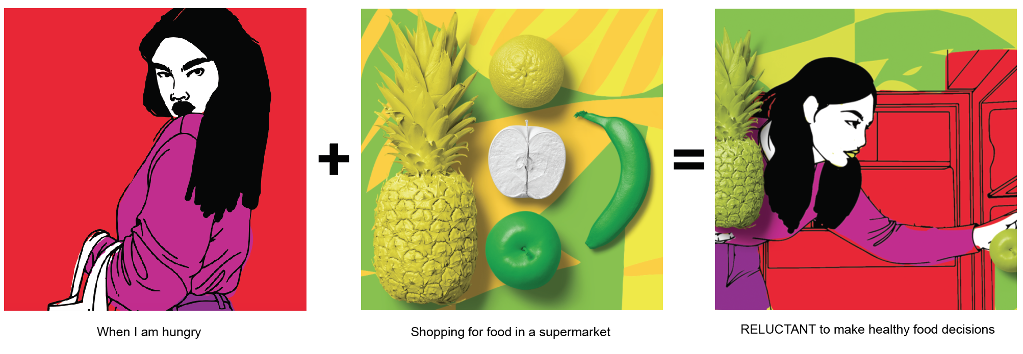
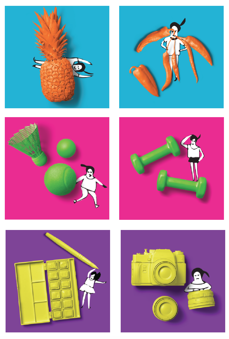
1st composition
Whenever I am hungry am always ready to go groceries shopping for food. However, when ever i am at the supermarket, I have to always make healthy food choices and end up not buying unhealthy snacks that I love because of health issues and that my mom will constantly nag at me for eating junk food. In this case, my setting shows a supermarket and my reaction to the setting is that I have to always purchase healthy fruits and veggies; its like a lifestyle. The colours used here consist of 2 sets of Analogous colours ( as shown in the 1st and 2nd image ) which shows that I love going getting ready to eat and shopping in the supermarket , however, I hate that I always have to end up buying only healthy food ( shown in the Complementary hues in the 3rd picture)
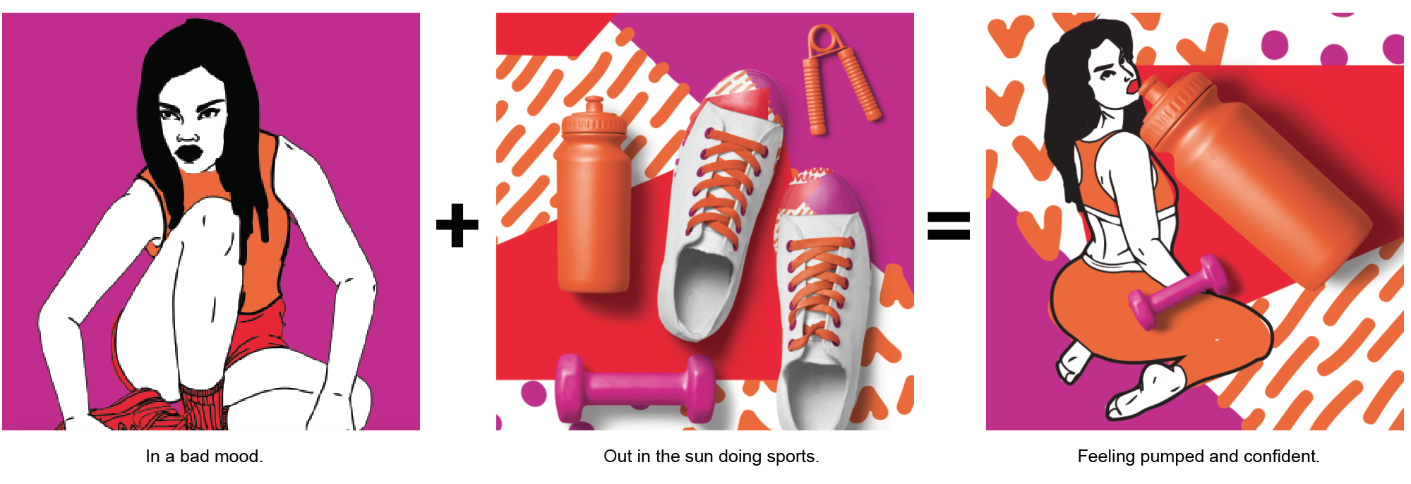
2nd composition
The second composition shows a series of analogous colours, where every one of the image shows something that I love doing. The 1st picture shows myself getting ready to workout, and the setting depict my exercising spot with all the equipments. Lastly, my reaction is a sense of satisfaction where I feel good about myself.
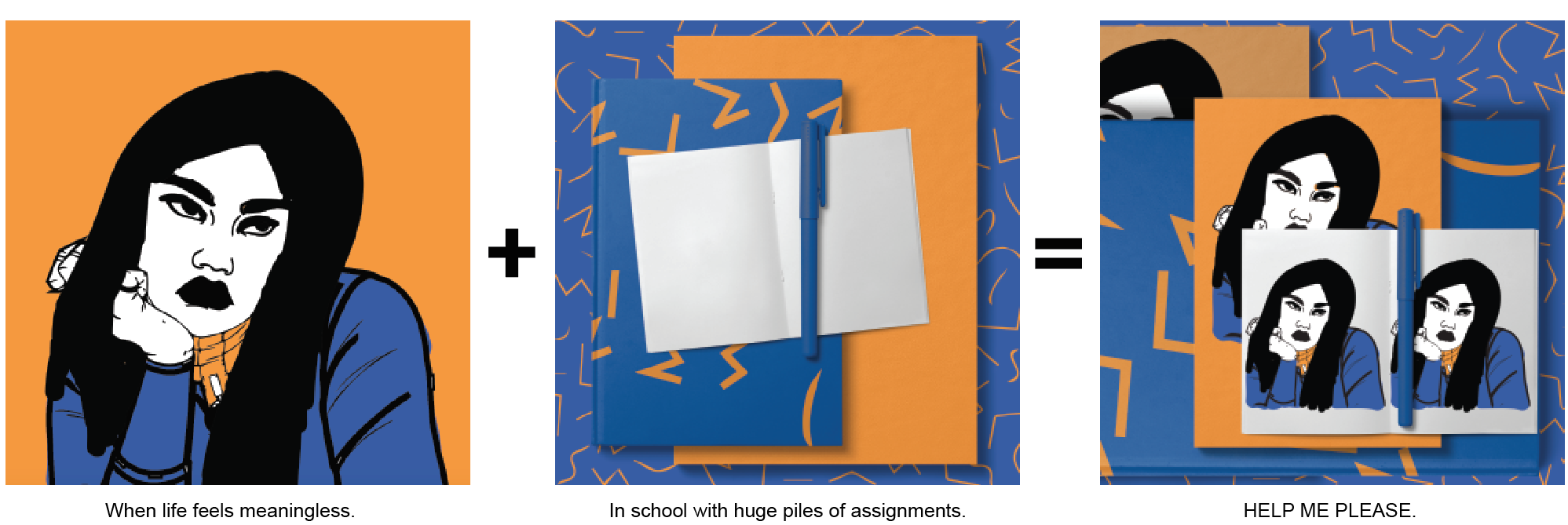
3rd composition
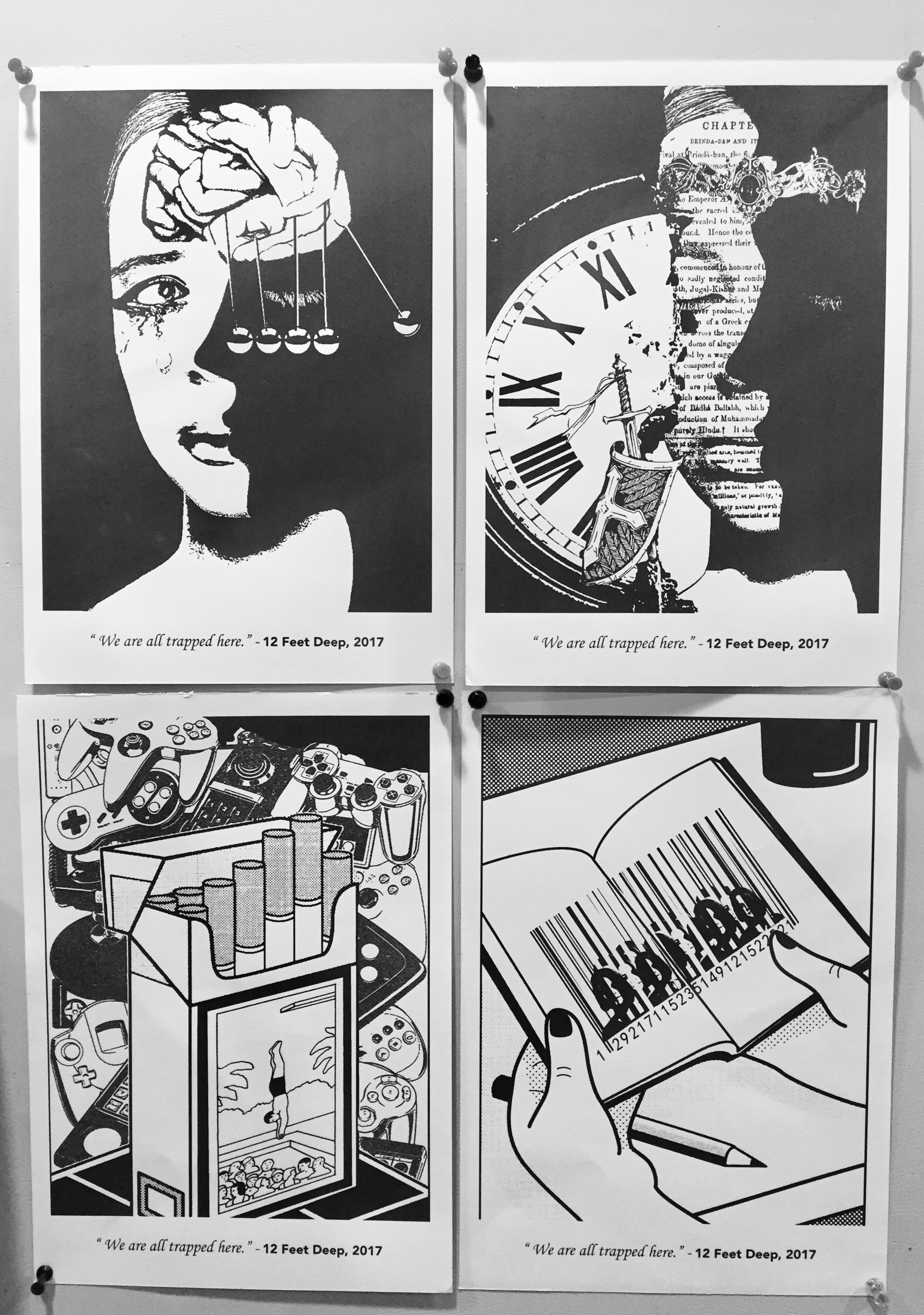
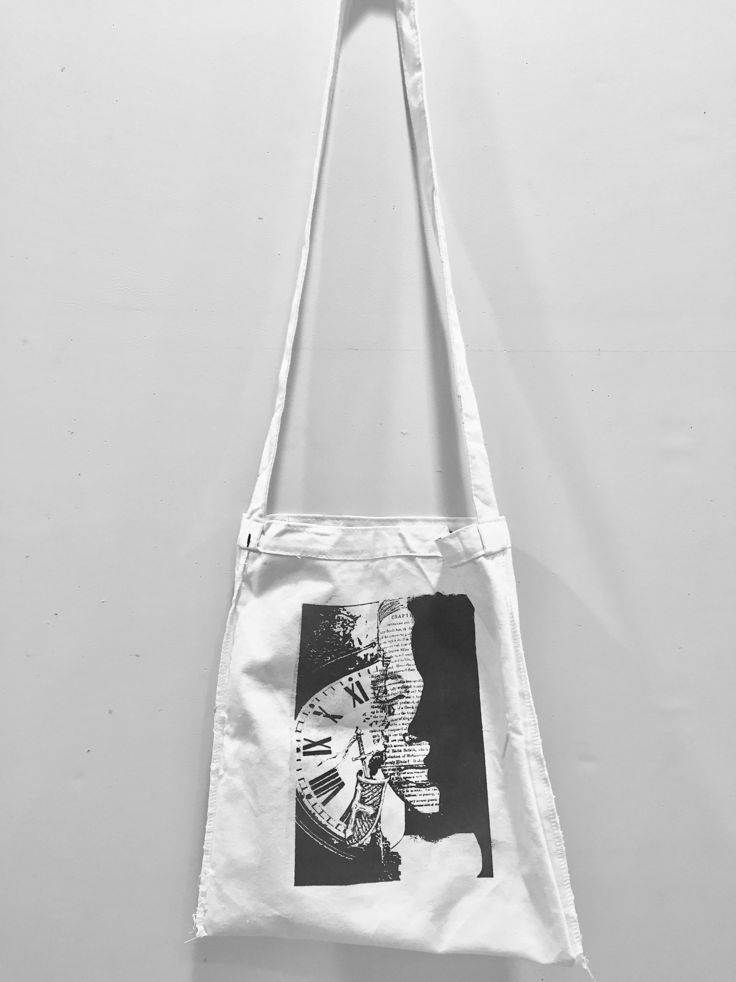
The 3rd composition shows a series of complementary colours where I show my hatred for studying for test. The colour blue is determine as the main colour as it represented the night, which is the time where I would always do my work and assignments. The 1st image shows the boring and reluctant self, being place in a study area filled with books ( shown in the 2nd picture) . My reaction to all these is countless unpleasant emotions and expressions.
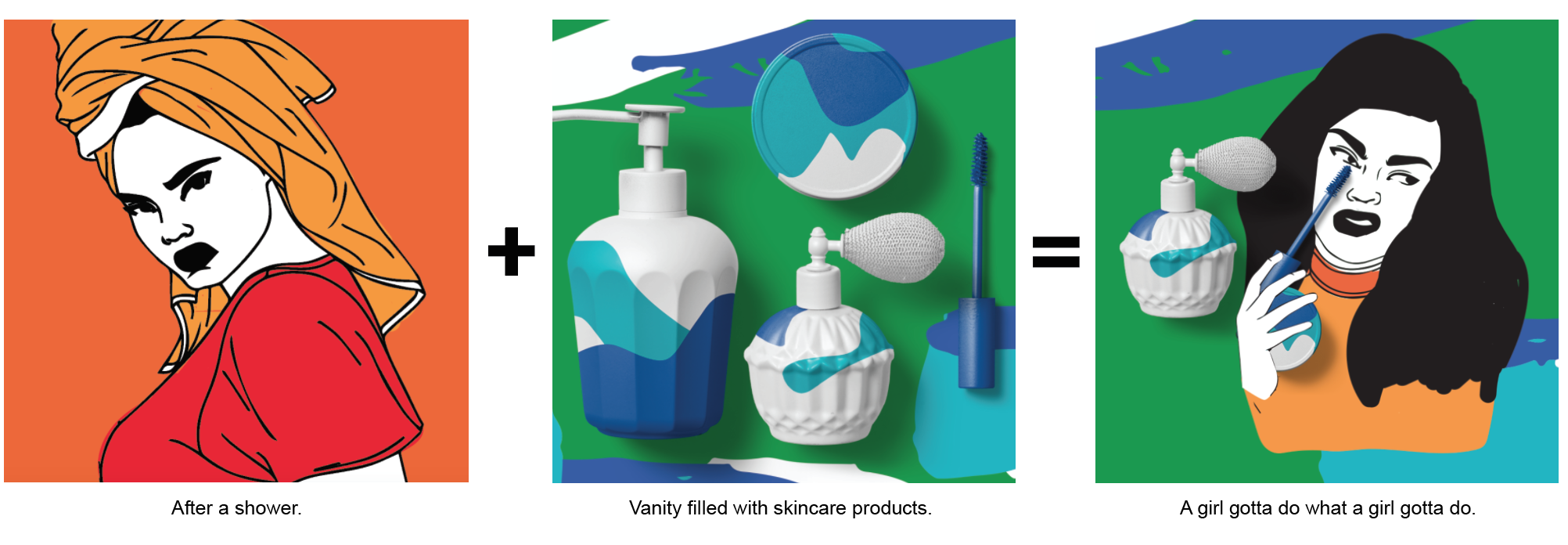
4th composition
The last composition colour scheme is similar to the 1st composition, where the 1st picture shows the analogous colour (red orange as the main colour) to show my love for taking a shower after a long day. The 2nd picture also show analogous harmony ( blue green as the main colour) which depict that I love my vanity area at home as it is always filled with high end products that my mom bought for me , which makes me feel glam and girly. However, my reaction to putting on facial products and after I shower is always a hassle to me as I always find it troublesome and a waste of time. Especially when I am ready to head to bed or rushing out of the house. ( this is express through the complementary colours form the 1st and 2nd picture )
Reflection
At 1st, I had a hard time coming up with ideas, thinking how I could use colours and simple illustrations to depict my settings and reactions. Because I didn’t draw or take photo of an actual place or venue, I was afraid that the message that I would like to convey to my audiences would be hard for them to understand. However, after experimenting with the different colours, it gave me a head start in which I can use these selected colours to convey a stronger message to my viewers through each pictures. Using these colours that I have paired up, I am able to help my viewers understand each compositions better.


 (final execution)
