EGO
As shown below, these are my final panels.With the sequence of:ME, BETTER ME, IDEAL ME &ME IN 5 YEARS. The prints turned out good as I did a test print prior to this and adjusted them accordingly.
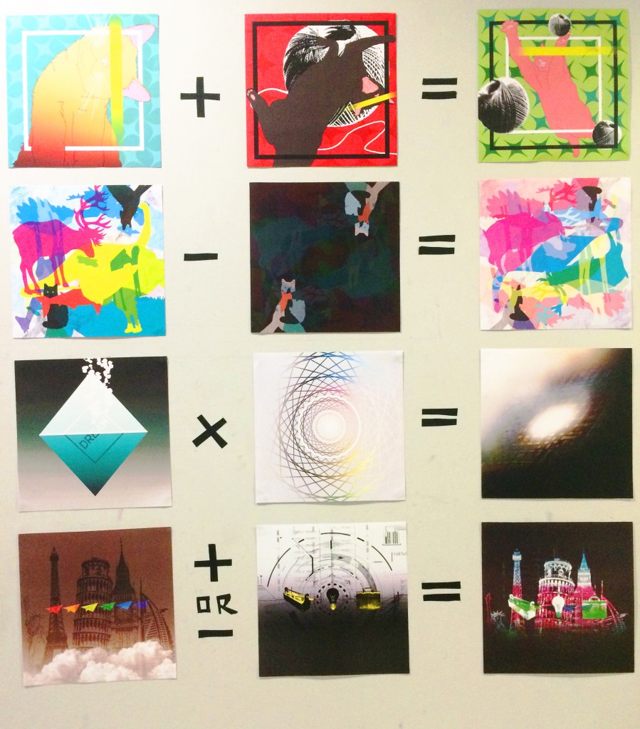
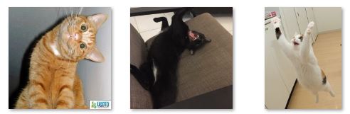
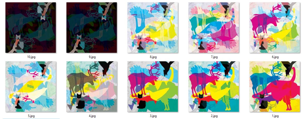
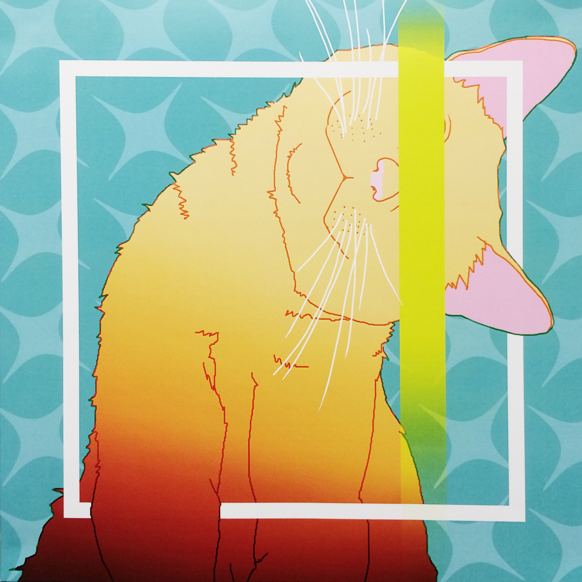
First Line is one based with cat images. For one reason that I like cat and for another are their characters. Inspired by my research, I tried to play with bright, saturated colors in the contrast with black&white.

CURIOSITY
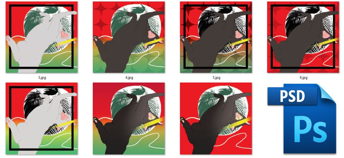
A curious looking cat was tilting its head in the image and one of its hand reaching forward. I am always curious about many stuffs and most of time very keen to learn new and interesting things. Also, quite often I feel confused and sometimes lost… This image has both flat colors as well as gradient, which was kind of my focus of experiment for this line.
+

Passion/Craziness
I feel very passionate about the things that I really like and enjoy doing them. Just like when a cat sees a ball of yarn! Red is also the color for passion. I can keep on doing the thing that I love for hours without feeling tired or distracted sometimes skipping meals…it’s a good thing to be concentrated but also sort of crazy as my friends said.
=

ME
So adding the two distinct traits…is me. This is a popular internet image of the cat titled as ”I regret nothing!” Red and green as you all know, are complimentary colors and many times they look horrible together when they are both very saturated. Somehow when they are similar in a less saturated but lighter, everything looks balanced, which I assumed were to the yellow and blue-green colors that linked red and green.

Adventurous/Bold
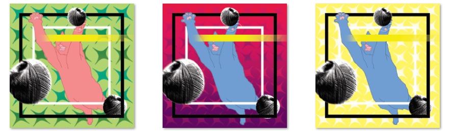
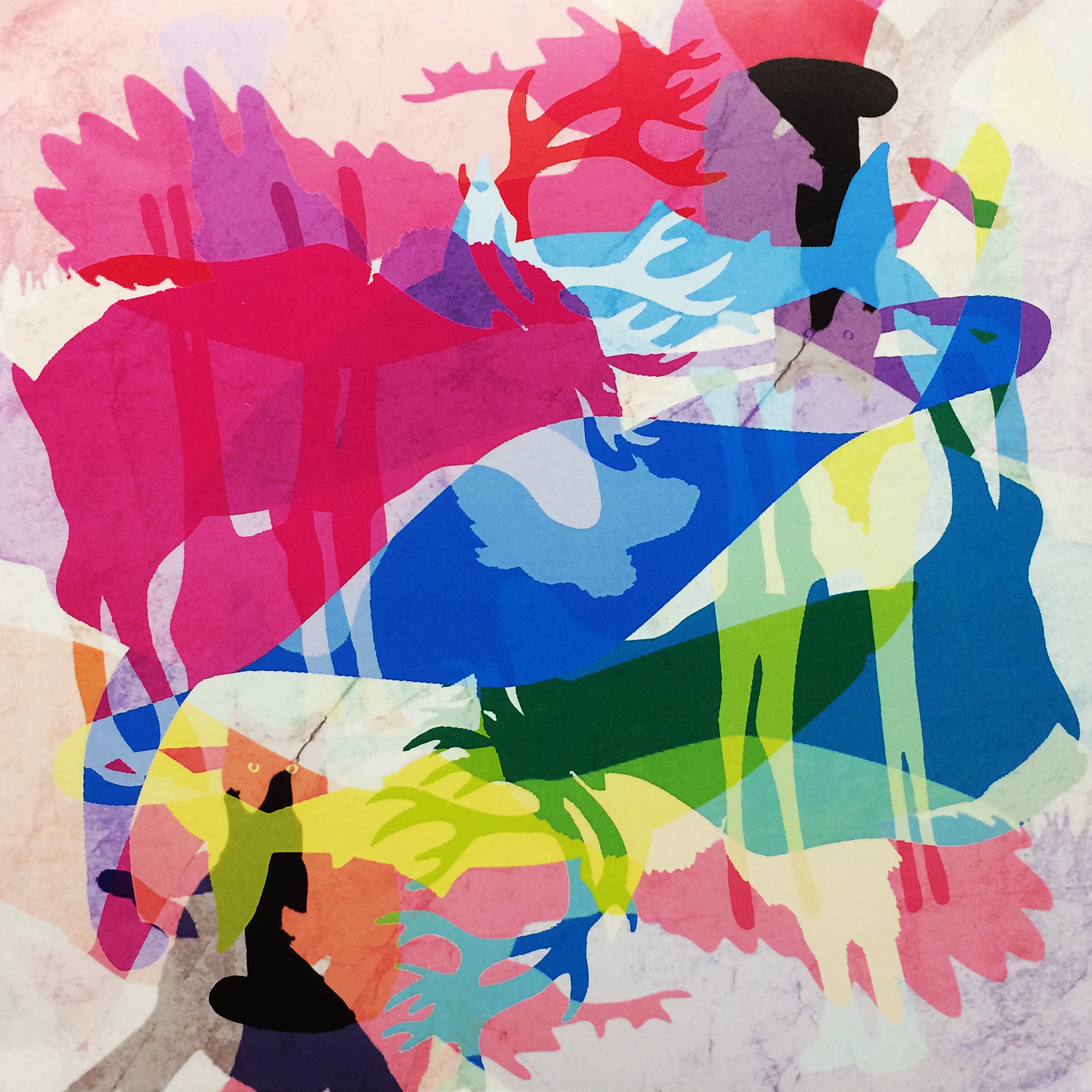
As shown above, there are many animal silhouettes in the panel, as I always associate animals with wild & adventures. For this line, there actually consist of same layers but they were blended and combined in different ways to achieve different moods. The first one is colorful and highly saturated as well as dark black colors. It’s about being bold and also confidence with what we are doing.
–

Negativity/Darkness
Everyone has his/her own dark side…I tend to be pessimistic deep inside and sometimes I feel depressed, which is not beneficial at all. It would be impossible to only purely joyful and positive all the time…Still I believe minus some portion of the negativity there will be a better me.
=

A Better Me
Here is a version of the same composition with brighter and delightful colors. If you notice, there is actually less black color but still some. The colors also have a better variety in comparison to the first one, which I think represent a better me.
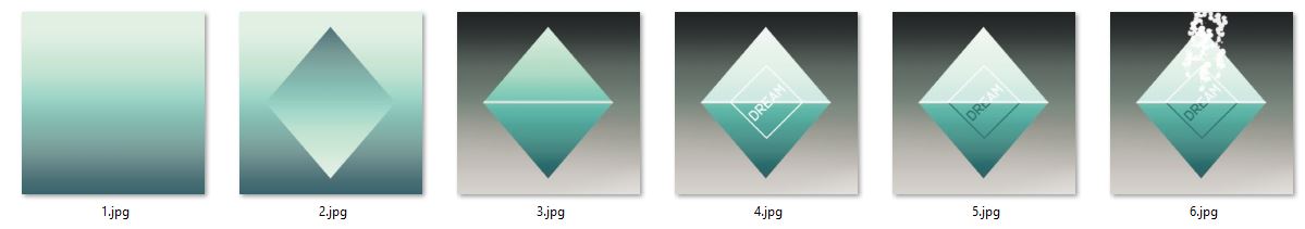
For the third line, I wanted to try a simpler and minimalist style as the ones above were very colorful and busy.

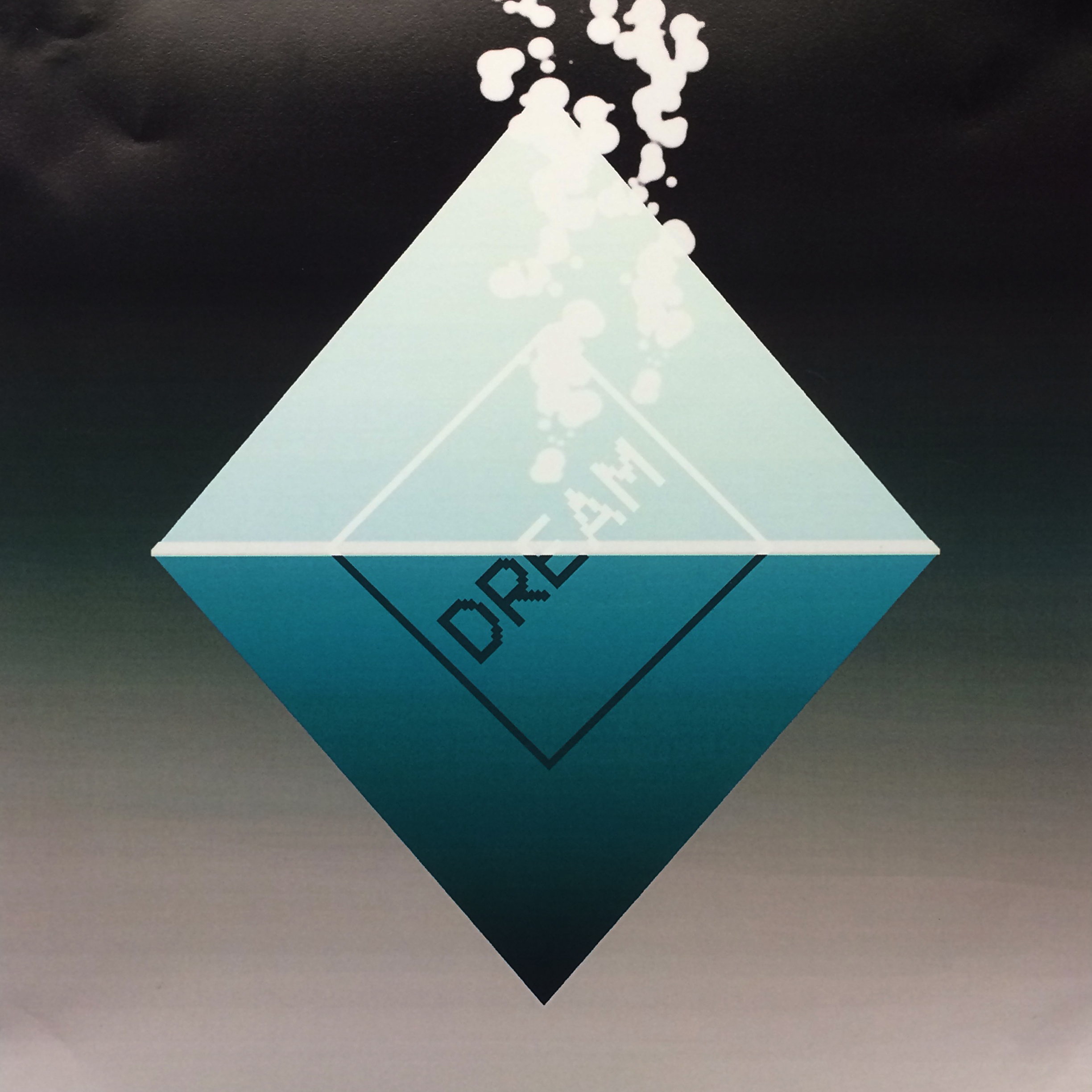
Dream
This was inspired by a melting sugar cube in a cup of hot tea that I was drinking. Dream is represented by the sugar cube, although slowly, it melts and the sweetness spreads. Dream is slowly coming true.
X

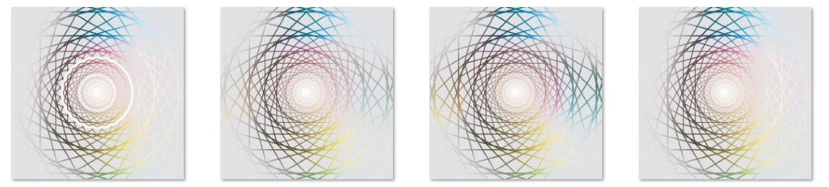
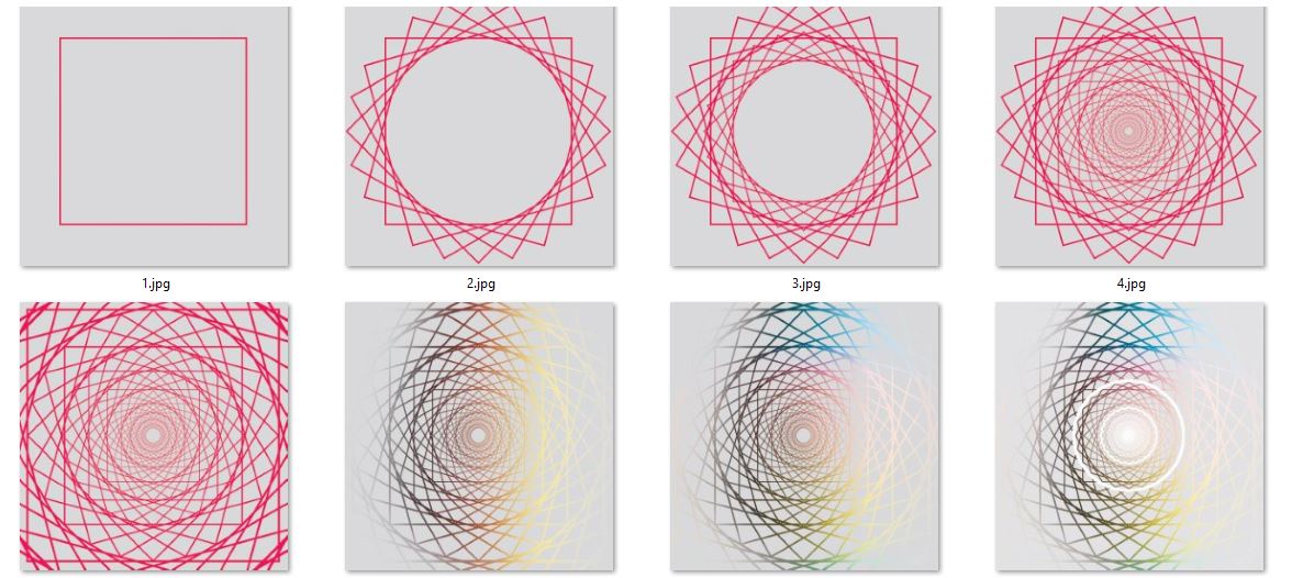
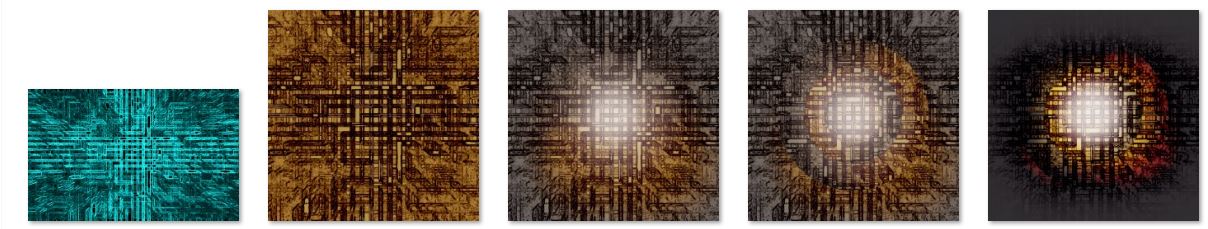
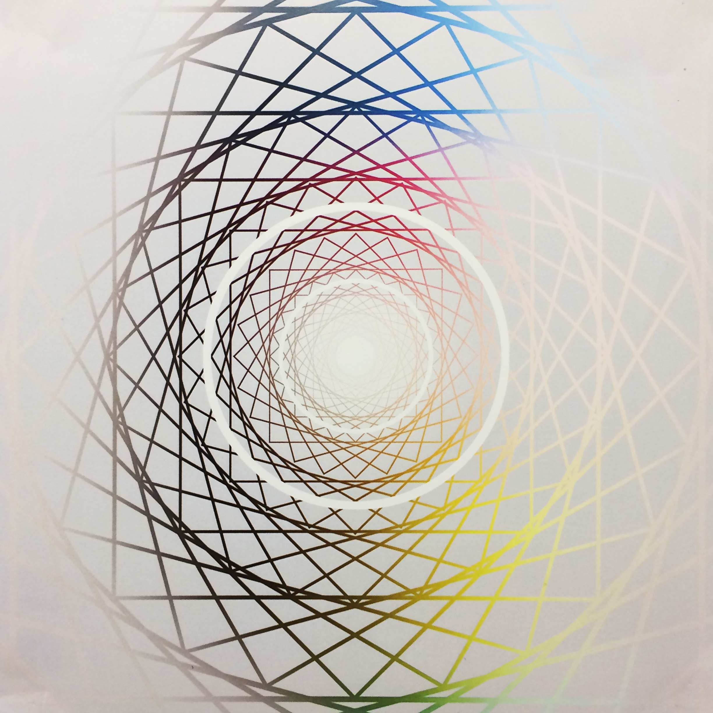
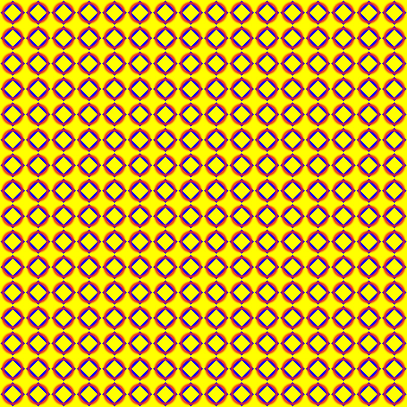
Perseverance
This image was created from a simple square by rotating and scaling them, and then I add different colors onto the pattern and made it faded away at the sides. The background was not white but very light grey so the contrast of saturated colors and white colors on grey was very interesting and created a solid feel in the middle and a softer one at the side.
=

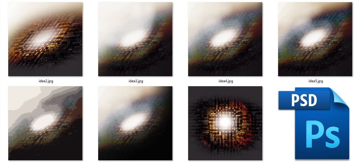
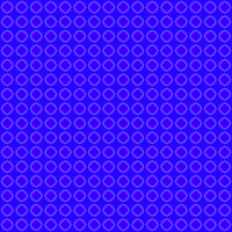
An Ideal Me
Combining the two things will complete an ideal me…With numerous grids and lines and the fuzzy background of black and grey. There is same grey background like the previous one and the ellipse, which even though is not the brightest white, seems very bright and the highlight of the whole composition. The concept of this is that there is both brightness and darkness but with hardwork, one will eventually shine.
For the last line, it is about 5 years in the future…I created two images and overlay them in a way that it looks different with another style.

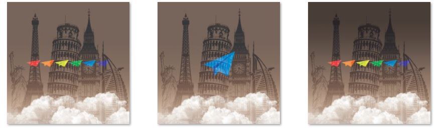
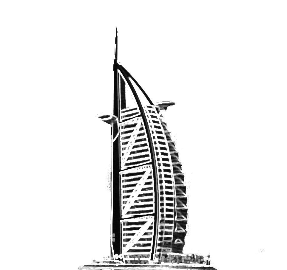
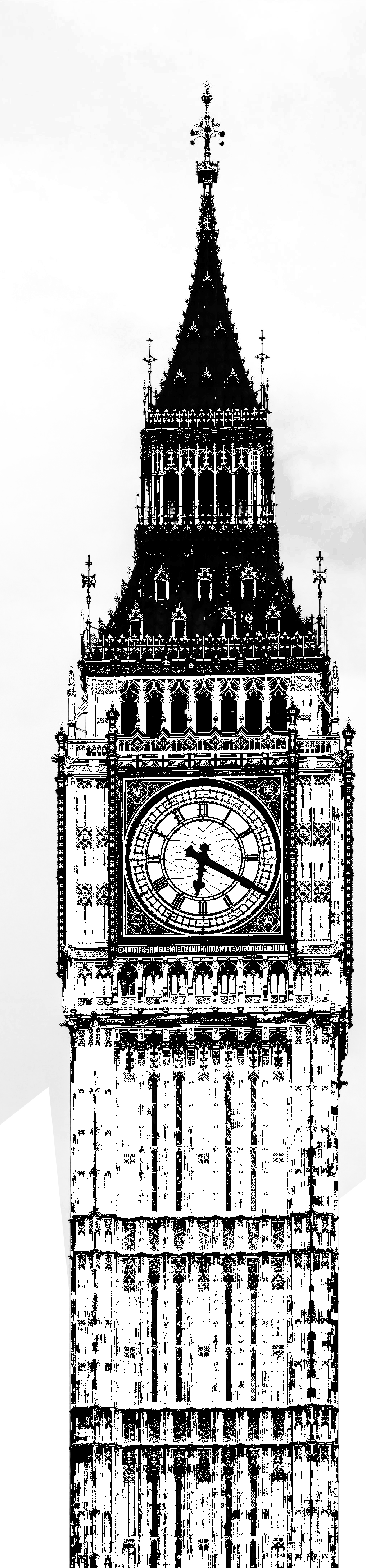
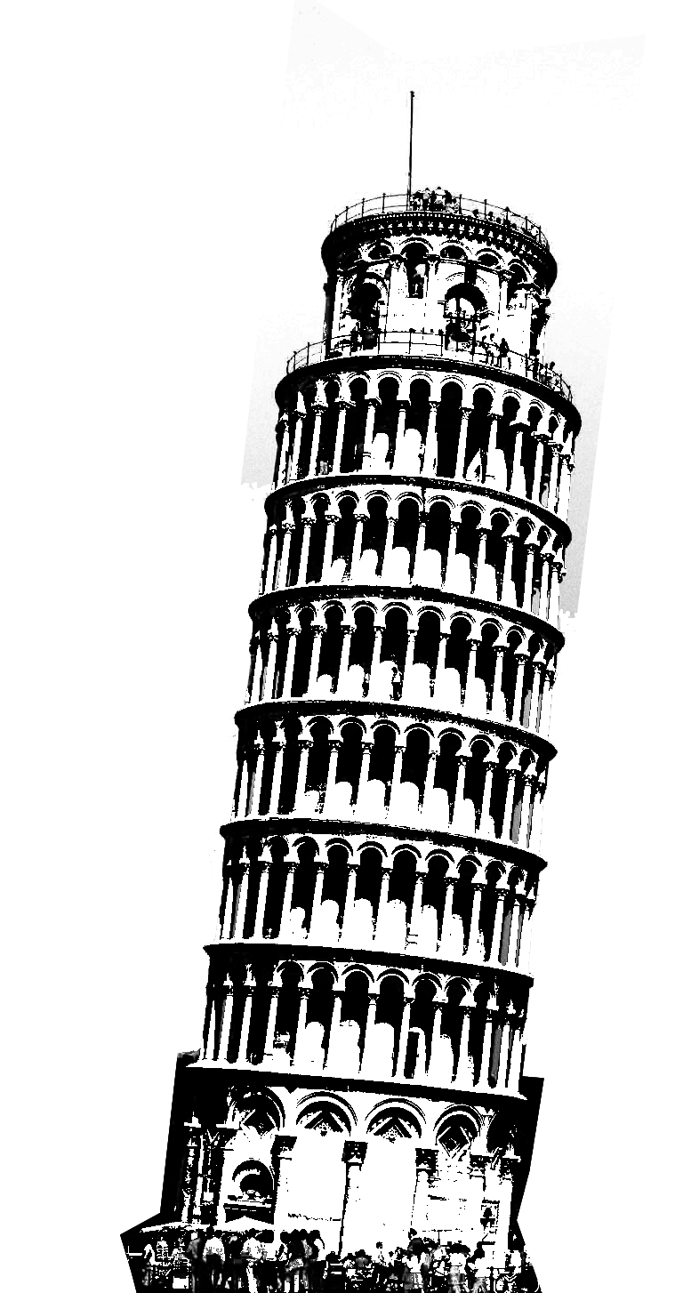
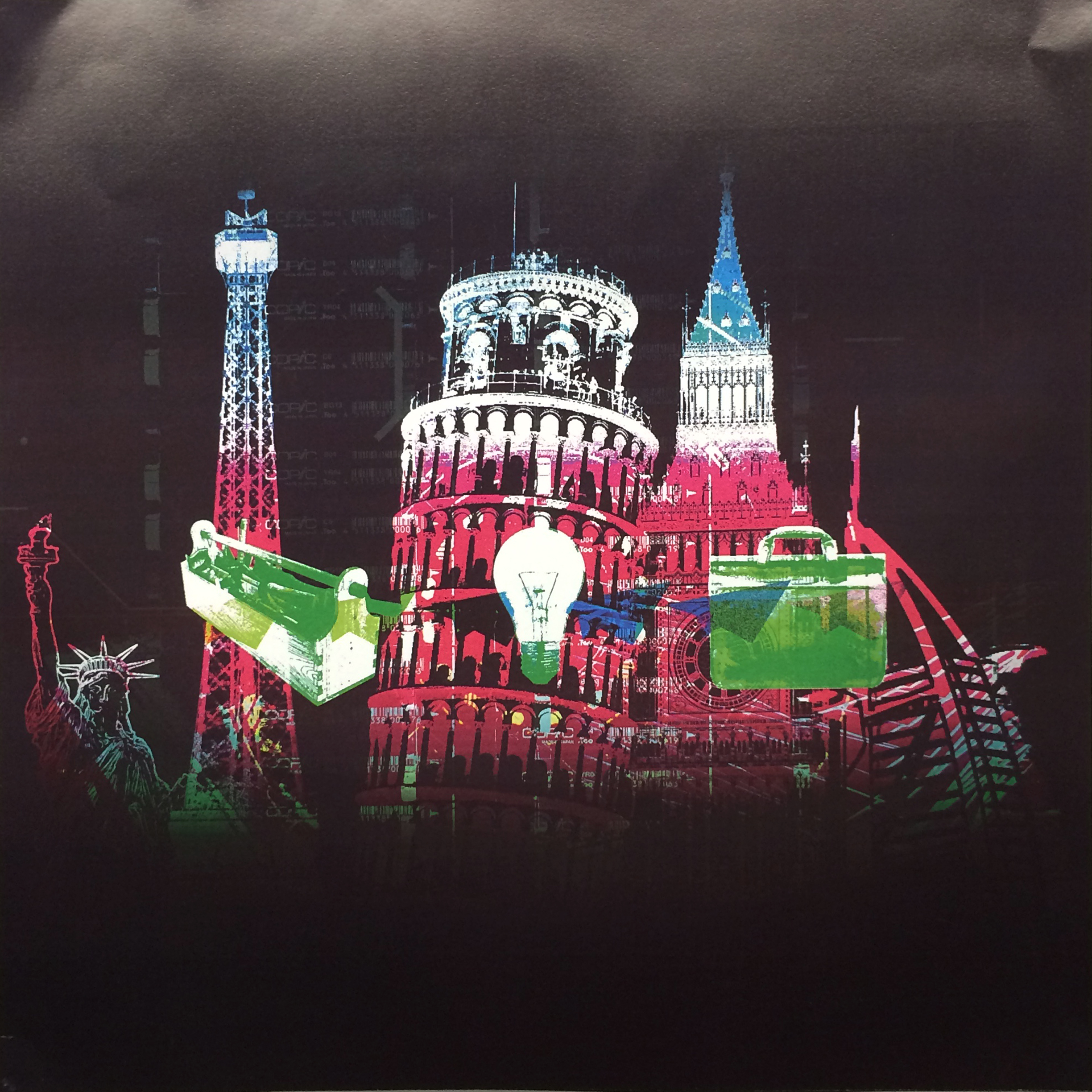
Travel
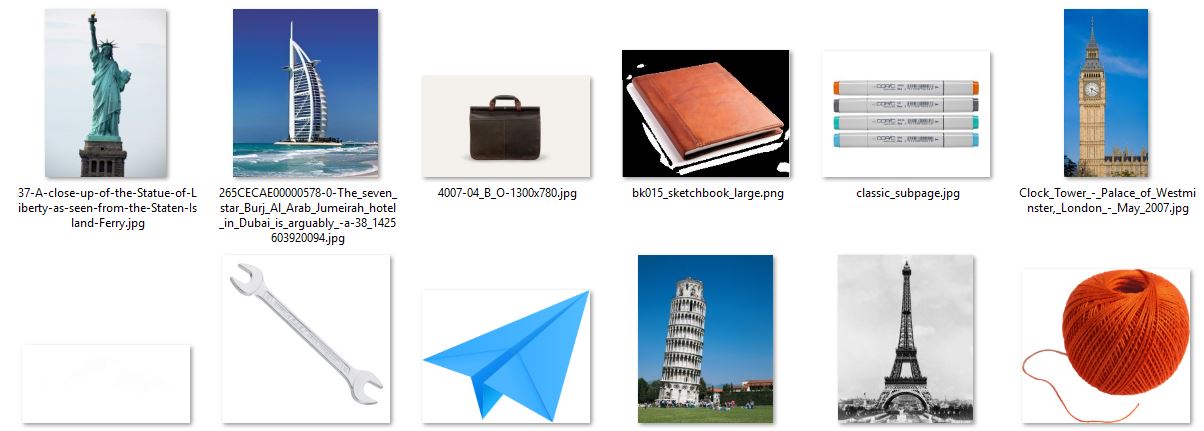
As shown in the images, there are landmarks of many countries arranged together. They were all based on actual photos so that they consist of great amount of details. With a much less saturated background, there are 6 colorful bright paper planes icons, which represent travelling.
+ or –

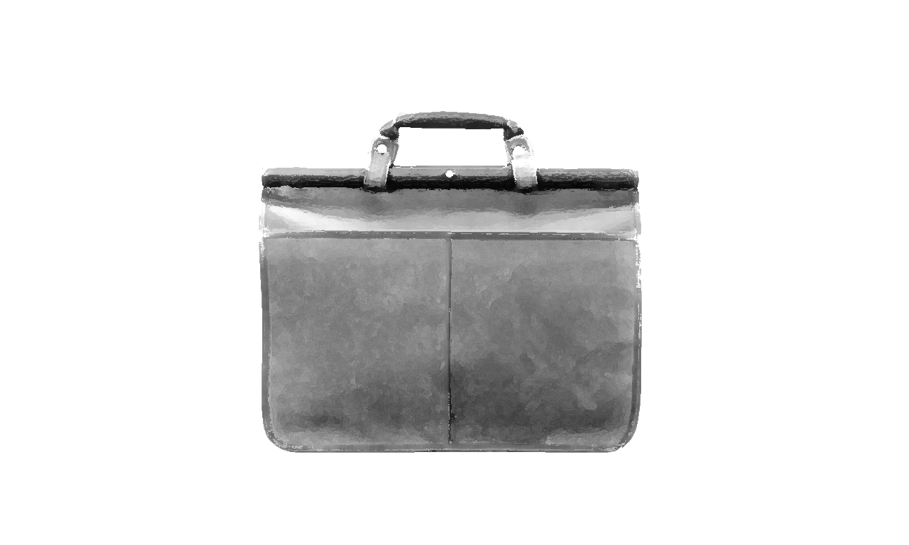
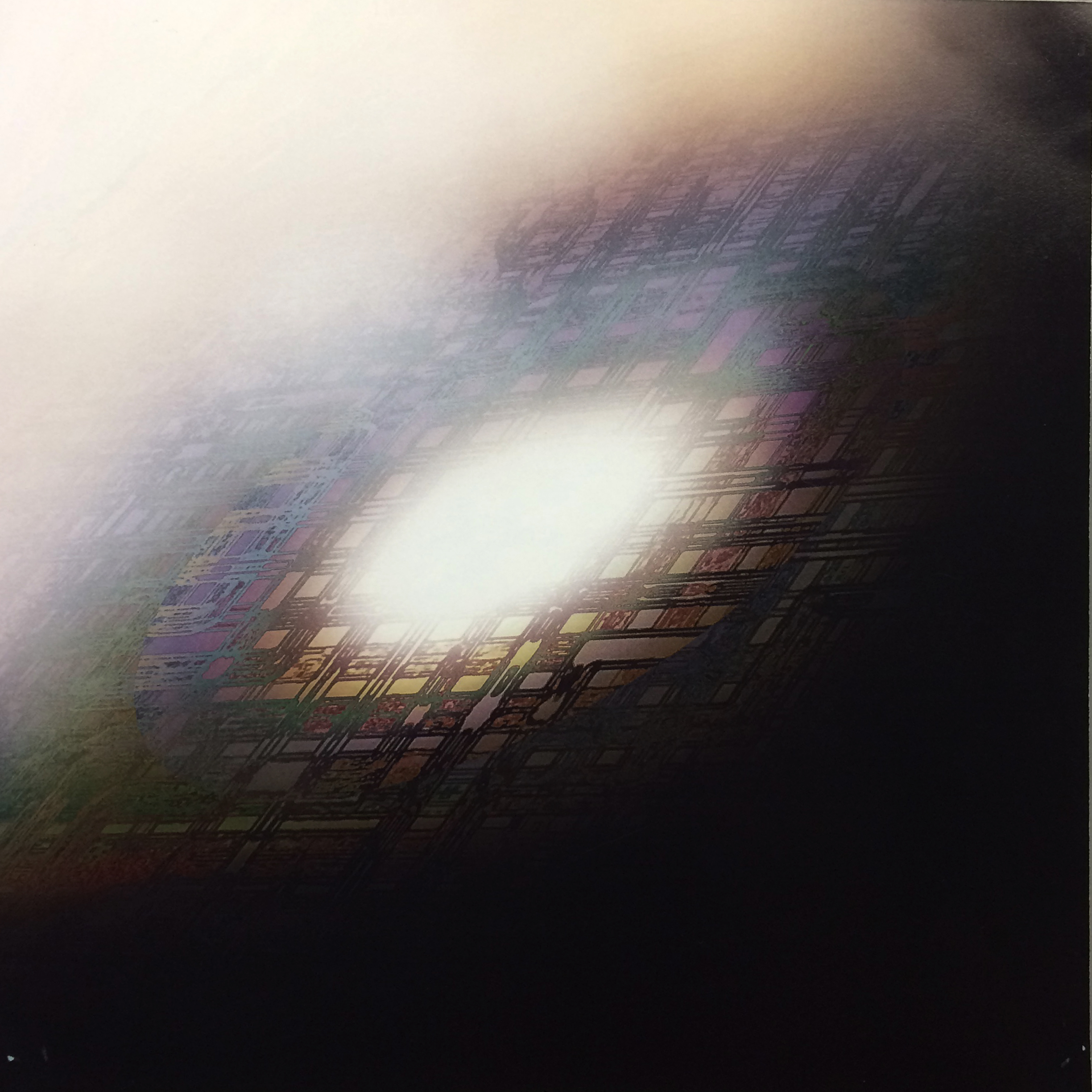
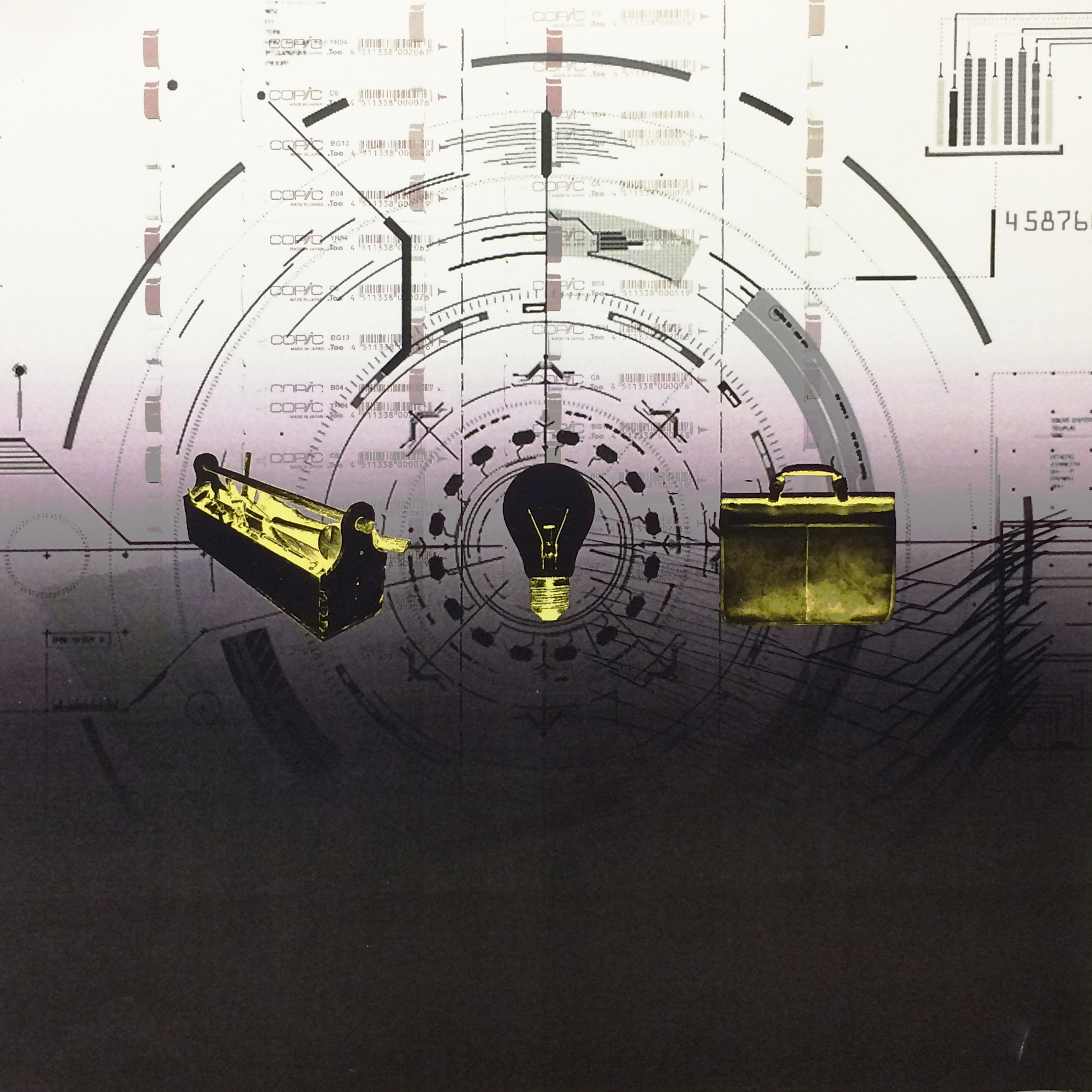
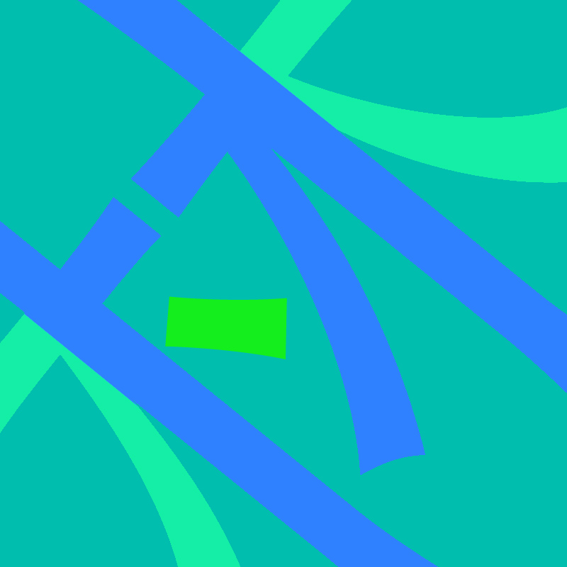
Work
In 5 years, I believe there will be great difference in the ways people work as technology develops. That explains the sci-fi feeling background, but it was combined with traditional tools such as sketchbooks paper and Copic Marker, which were fading away slowly. The three icons in the middle were toolbox, light bulb and a brief case. They represented designing work, idea-based work and a brief case of course symbolized professionalism.
=

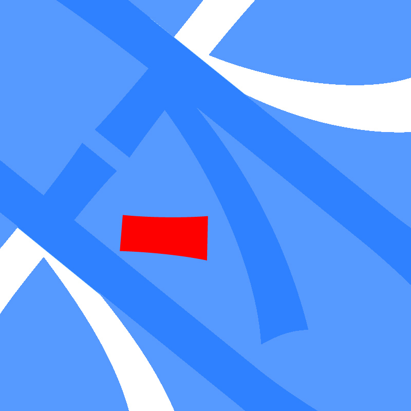
Me In 5 Years
Therefore, the combination of the two images brought the whole picture of a possibility of me in 5 years. The colors were contrasting against each other as well as the dark background. It probably hinted that I will be working late at nights.
The End
Thank you
![img0003[400PX]](https://oss.adm.ntu.edu.sg/linc0013/wp-content/uploads/sites/321/2016/03/img0003400PX.jpg)