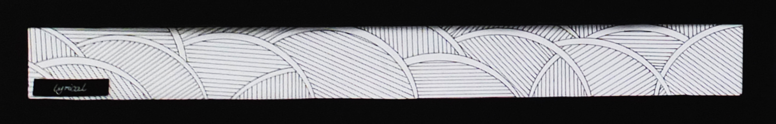
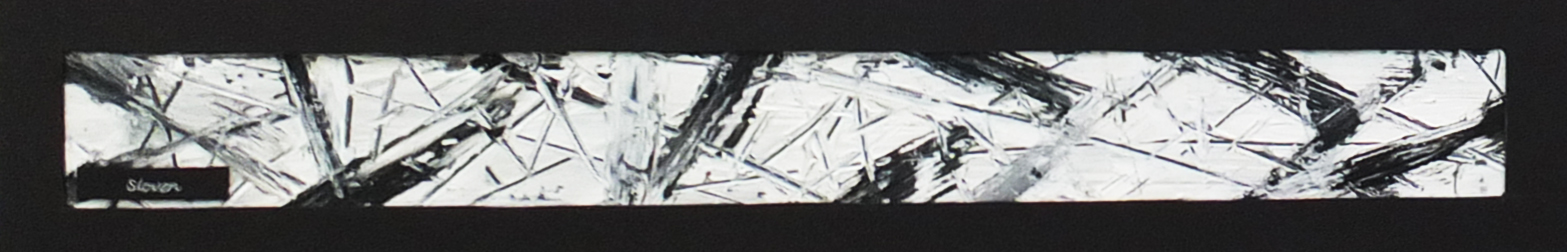
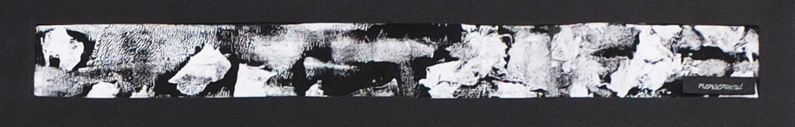
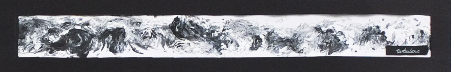
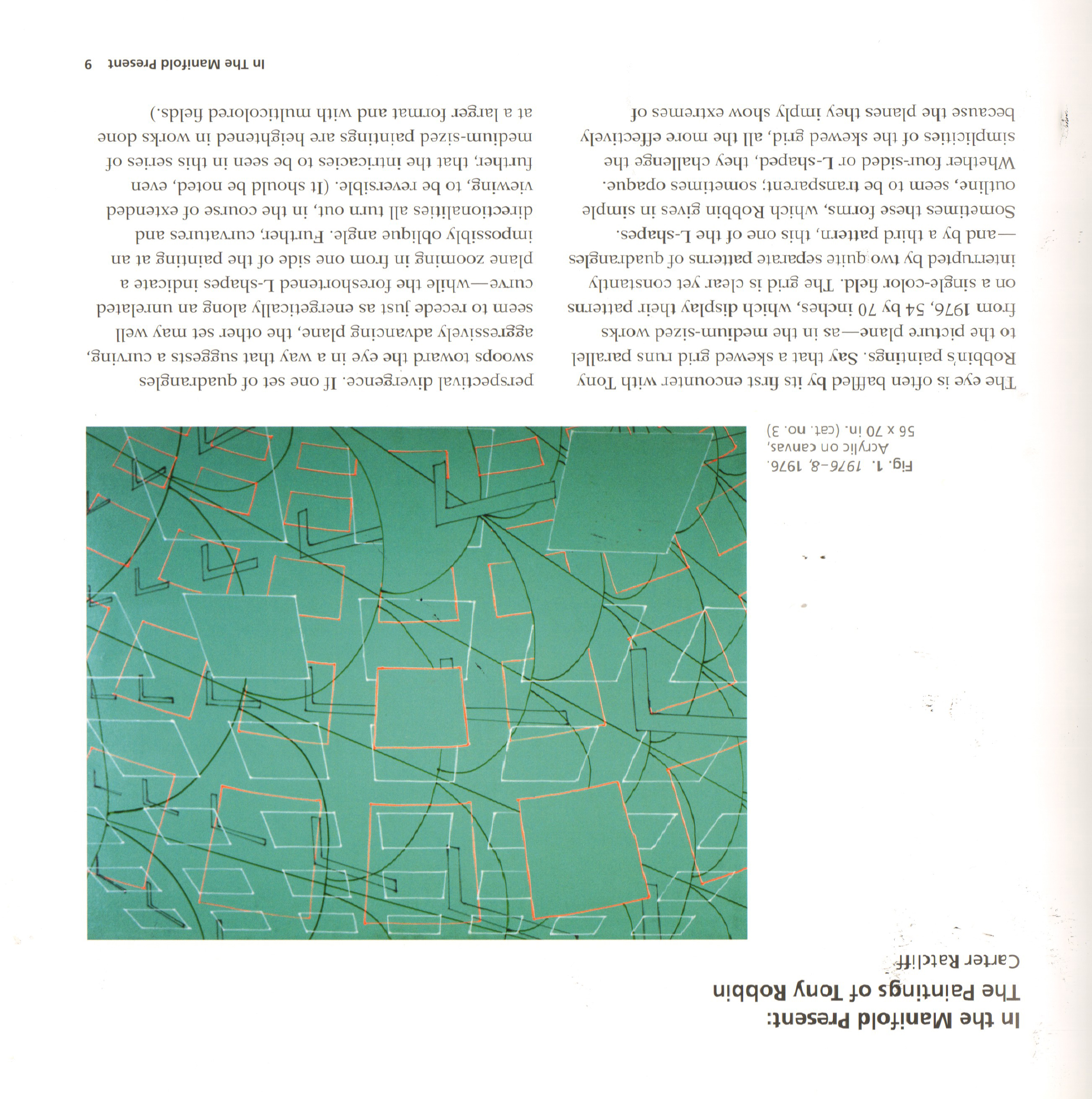
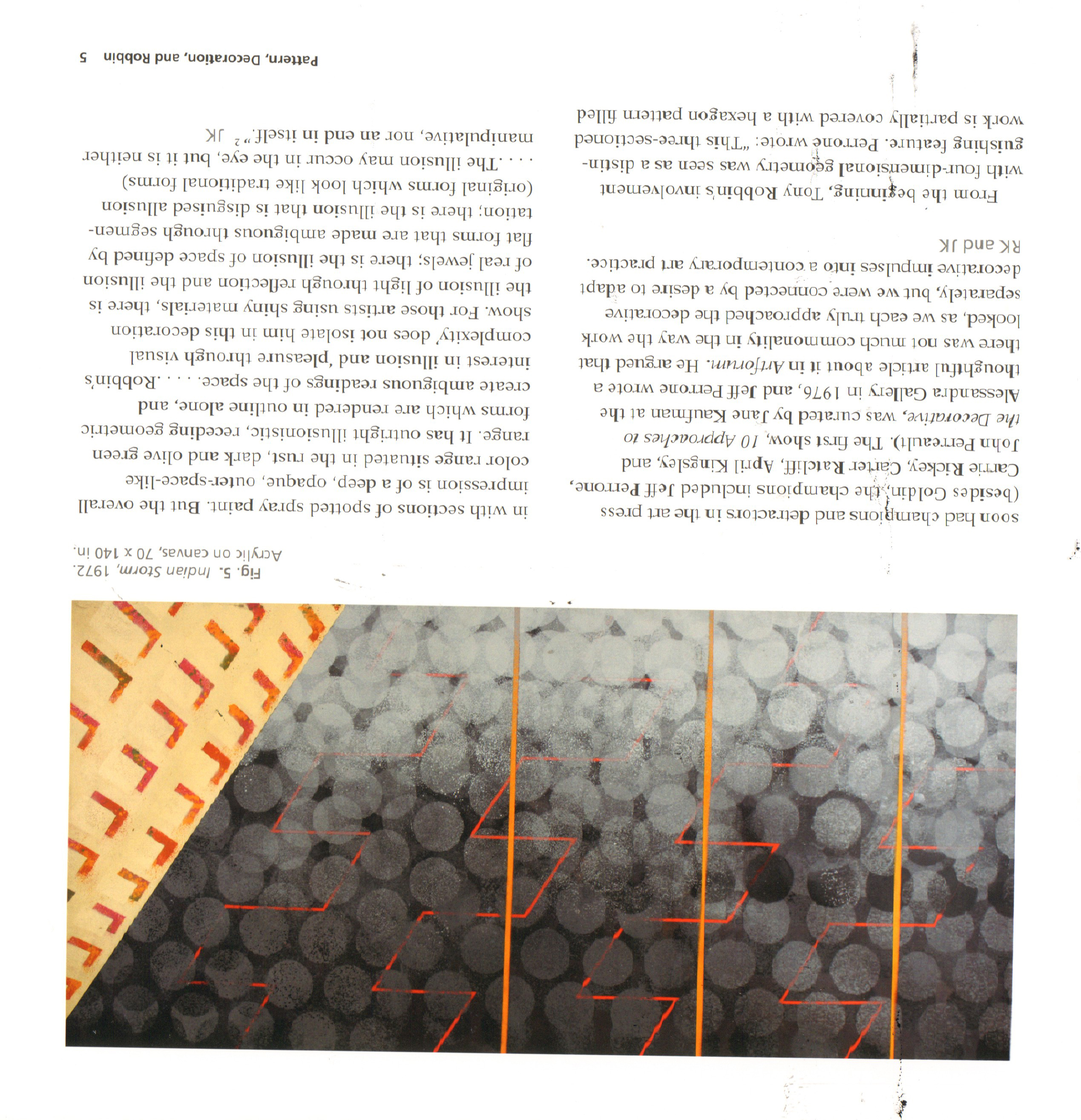
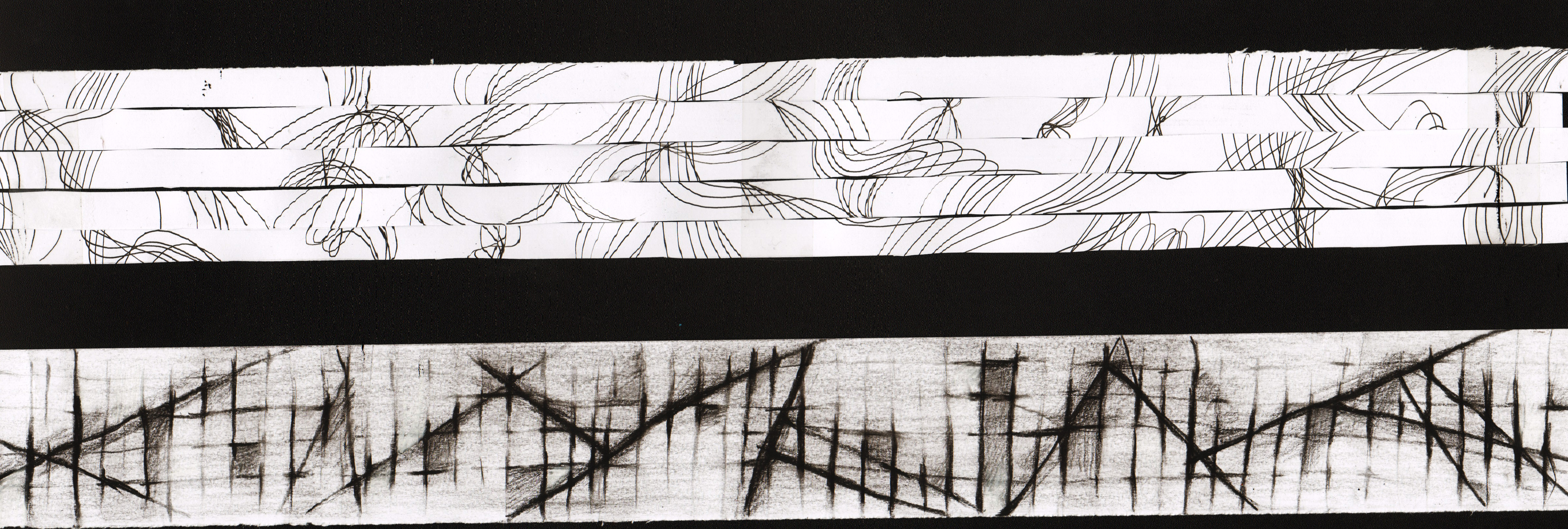
Rhyme-research & inspiration


FullSizeRender

This is the book I looked into when I was researching for inspiration for the project. It’s called “I don’t know where I’m going but I want to be there,the expanding field of graphic design 1900-2020”  Paperback – October 18, 2011, by Sophie Krier (Draft Writer), Marjolijn Ruyg (Draft Writer) Graphic Design Museum printed by Pfset Yapimevi, Turkey.

This book consists of so many great examples of graphic design and below are some photos taken from the book. Besides that, there are more thumbnail images that inspired me on the rhyme composition as well. In fact, if given more time, I would like to experience more with the images.

FullSizeRender(1) FullSizeRender(2) FullSizeRender(3) FullSizeRender(4)  IMG_2776  IMG_2780 IMG_2781 IMG_2782 IMG_2783


IMG_2750

  Besides, I also looked into  a book titled “Index A” by Charles Wilkin, published Die Gestalten Verlag (April 15, 2003) “Index A is in essence a catalogue of thoughts, images and instinct collected and reassembled by American Charles Wilkin of Automatic Art and Design. With clients ranging from Coca-Cola to Urban Outfitters, Wilkin combines multiple layering of images and type reminiscent of David Carson. In an era of multimedia full of visually aware consumers and highly targeted marketing, Index A acts as a reminder of the increasing influence of design on the human culture and the individual expression in a very commercial world.’“

  It has great examples that inspired me too but I didn’t scan or take photos of the pages inside.


There was another book I found interesting as well. Besides its the nice colors in each picture, there is a concept of masking layers. And the composition of the images were inspiring.


IMG_2759IMG_2751 IMG_2752 IMG_2753 IMG_2754 IMG_2755 IMG_2756 IMG_2757

Final Rhyme

There was an old woman who lived in a shoe.

She had so many children she didn’t know what to do.

She gave them some broth without any bread.

Then whipped them all soundly and put them to bed.


There was an old woman who lived in a shoe.

The shoes were flushing down the whirl

to the bottom where the old woman was at

Rotation and change of scale creates a sense of depth

2


Then whipped them all soundly and put them to bed.

an unbalanced composition

Consists of different images and overlapping texture

Contrast variation with the left side being lower and the right being extreme black & white

4


She gave them some broth without any bread.

The composition that seems symmetrical but not completely

The black background and white diamond creates a stage with spotlight

And the hero for the play is the bottle

The show is on and the many faces appear like the audience


6


There was an old woman who lived in a shoe.

As mentioned by Prof Ina. This composition made use of a technique called Gestalt.

‘Gestalt’ is a psychology term which means “unified whole”. It refers to theories of visual perception developed by German psychologists in the 1920s. These theories attempt to describe how people tend to organize visual elements into groups or unified wholes when certain principles are applied.”

The positive space in the composition will be the two halves of the old woman’s face

Yet with a small heel tiled at an angle,

the negative space appears like a person with a wicked smile

it indicates the dark side of the friendly and kind-looking old lady

And it is upside-down from the original picture,

which also imply a message of something being wrong


8


There was an old woman who lived in a shoe.

I like the wired and mysterious smile of the old woman

It seems like she is looking at somewhere out from the window of the shoe she lived in

And the shoe being presented in black and white  on the background of the opposite color

This composition is simple with big contrast and just some small texture to balance it out

1


She had so many children she didn’t know what to do.

A  radial composition

The old woman is at the center,

symbolizing the sun

burning out her energy for so many children she had

When looked closely carefully,

you will discover the children are facing different directions,

they are in a chaos

3


She gave them some broth without any bread.

The two compositions are arranged together as they flow naturally

together

The contrast in the images brings the focus

The second composition consist of the bottle as well as many hands,

which appear in other composition,

making a connection among the series.

5

7


Rhyme Concepts


There was an old woman who lived in a shoe.

She had so many children she didn’t know what to do.

She gave them some broth without any bread.

Then whipped them all soundly and put them to bed.


So I will be posting all of my compositions except those selected for printing here.

Begin with the very first few attempts on this.

The egg was supposed to represent the children of the old woman.

The whirl/vortex images in the background indicated the emotions of her, which changes according to the sentence from the rhyme.

She had so many children she didn’t know what to do.

2

She gave them some broth without any bread.

3

Going for a creepy scene when she is actually feeding the eggs with an egg.

Then whipped them all soundly and put them to bed.

4

And a background that is much more distorted.

She had so many children she didn’t know what to do.

Variation for radial composition

Repetition & Contrast

and lots of eye contacts

The Funeral Wreath

The old woman could barely took the burden of so many children

2-1

There are so many of them…the place is all filled up

She tried to smile with a frown

It’s suffocating her

2-1-1

The old woman is in the center just like the sun,

giving our energy to her children

2-1-2

A similar composition as the second one

A sunflower-like shape

2-1-3

There are not only so many of the children

They are even in a chaos

disagreeing in the  direction they face

2-1-4

2-1-6 2-1-7

Inspired by what you see when you flush the toilet…

or  unplug a bathtub filled with water(children)

2-1-8

Then one attempt for a linear composition

Some shadow to create a floor and distance in space

3 - 1

There was an old woman who lived in a shoe.

1-1

Some play with the positive and negative space

Two halves of  one face of the old woman on the sides

a tiny small shoe that appears like a smile on a white person

11

10

She gave them some broth without any bread.

The old woman was feeding them with the liquor

It is almost empty

But there were so many of them waiting

It is kind of linked with the previous sentence of the rhyme

“She had so many children…”

6-2

6

5-6

5-5

5-3

5-2

5

Then whipped them all soundly and put them to bed.

 collage with different texture to create a stage

7 7-2 9-2 8

Journey Video(draft & thoughts)

Hit play for the draft of my video. : )

Or click here!


This is my final idea.

Sometimes I just feel depressed and it gets worse if I continue to stay indoor especially when no one else is around to talk to.

Feeling tired from stuffs in life, I would tend to stare at random things and it is kind of blank in my brain. Those sounds from all ordinary objects suddenly seem clearer and louder, yet repeated in a rather dull way. Everything seems so quiet, but my emotion could be changing rapidly and sometimes I become emotional on small unimportant things.

This is when I know that I need to talk a walk and relax, preferably somewhere different. A change of place, change of mood, I suppose. Therefore, this is a journey of escape from depression. Is it a dramatic one or a peaceful one? Will find out more in the final video.


About the video

Media: I chose to use still images instead of videos for several reasons. But mostly because I feel more comfortable with arranging images than videos. Videos seem more dynamic and vivid but I also love the pause of moment created by the still images. It leaves more for the viewers’ imagination.

Progress: So far I manage to arrange the images in the order I prefer and scale them into the appropriate sizes. Also I add some sounds into the beginning of the video as well as trying out some simple effects. Still, there are adjustment of the images, more sounds and probably  captions(or voice-over?) to be added.


Thank you for watching! And I would appreciate it if you leave you comments!

e.g. Is it moving at too slow or too past pace?


The End!


Journey-initial idea 2

DSC07373


  When I looked out of my window, I was so amazed by the orange light and reflection on the window frame. When the focus was on the frame, the light turned blur and the drain ditch somehow reminded me of a train track. So I took my camera and walked outside to explore. The lights turn out to be fascinating when they were out of focus. With contrast of the darkness, the orange color seemed more warm and cozy. I also loved the light in between the tree leaves.


Capture2 Capture3

  Besides taking photos, I did some Photoshop editing to explore on colors and contrast as well. Different exposures bring certain different emotions toward the image. When it was desaturated, we tend to pay more attention on the contrast of the brightness than the colors of the objects themselves.

Capture1

Another idea of taking photos/videos of an small object/figure in the nature as it is taking an adventure also hit me the other day. I kind of like the idea but didn’t think of an ideal thing to represent the hero.

The End

Journey-initial idea 1

The initial idea of taking photos of the cats came from a question of where did the cats go and what did they do at nights. As a volunteer cat feeder, I had the chance of getting close to the cats. Even though the cats stay in a certain area as their territory, there are actually many interaction among them, which often surprises us.

However, it was not easy to know when and where exactly the cats were going on ‘adventure’. Even if I saw something interesting and unusual going on, I failed to capture the moments as they really ran very fast…… More often I got the photos of their cozy life downstairs campus halls.

All these cats are so different, as I approach them and get to know them more. This turned out to be more like a journey of me getting closer to these cats instead of the journey of the cats themselves.


This is Milky. She loves to lie around on the ground or beneath the cars. She gets distracted so easy when we are feeding her and we always end up ‘begging’ her to eat. Otherwise, she will look at you with her innocent eyes, asking for more food when you just distribute all the cans.

DSC07342 DSC07343

DSC07368


This is Charlie. She has FLV and sadly no teeth to chew the food. Only smashed can food can be given to her and she always runs towards us when we call her. She is just like a little kid when she kneads on my legs as I sit down near her.DSC07344DSC07345 DSC07346 DSC07347


Meet Zero the younger black cat! He loves to rub his head against our legs and when we feed him. In this photo, I found it quite funny that he put his tail in the cracks on the ground.

DSC07351


This is Youth. He is picky about his can food. As we were told, he doesn’t like Satin, but sometimes he seems like he enjoys it. And he eats really a lot! He always appear in dark places and we only see him at night so it was actually not easy to take photo of him.DSC07363


This is another black cat called Champion. She was in a fight or incident once and therefore there were wounds on her ears. She is always very alerted and stops eating and even runs away when she hears sounds of cars or big group of people. I also discovered that she moves around in a bigger area than others. One time I saw her chasing after Youth and I took this photo before she ran fast.DSC07365

 The End

Project 2- image editing

Below are the edited images for the rhyme ‘Old woman lives in a shoe’. The original images were from different sources: woodcuts, old engravings and even real life photographs. I edited them to create the vintage feel required for this project.

Also, from what we learnt last week, different ways of editing result in variation in styles. As shown below, the same images give no similar impression after editing.

Capture Capture2 Capture3

2D Lines final submission

‘A Line Is A Dot That Went For A Walk’

Final Submission for the Line project was in A1 Landscape format. I arranged the lines so that too similar ones won’t fight for attention and there were some orders such as going from darker to lighter colors. Through the process of exploring and making all these lines, I learned a lot more about ways of creating images, which would not been achieved easily by just pen. And I actually enjoyed a lot when I was doing the lines as it doesn’t really require us to be always careful and accurate. On the contrary, sometimes coincidence created beautiful unexpected results.

DSCF4943

1

Aggressive

There are many speedy lines flying from the left to the right as well as many shapes that look like bullet holes on the window.

2

Embarrassed 

The patterns are hiding behind the bright white lines of exposure. They are dark and barely showing the details almost like they are embarrassed.

3

Spontaneous

This line is a happy incident from the combination of glue and ink, which creates the free flow of the water-like shapes.

4

Anxious

Repeating and messy lines are what I tend to draw a lot when feeling anxious. They also happen to have many round or ellipse shapes.

5

Psychotic

This was done with monoprints and as mentioned in the previous post, I liked the way the thin lines look glowing the the contrasting background. Somehow it reminds me of some scenes in the psychotic horror movies

.

6

Awkward

The darker marks on the lighter ones seem awkward. They are in different directions and all over the line while the background is more organized in comparison.

7

Exhausted

The ink used in the background is glittering. The black lines and white lines are trying to create a space as the brighter ones are nearer to the viewer. I think it represents exhausted because it looks like abstract meteorite fall. They are so exhausted that they just let gravity takes control of the fall.

8

Lyrical

This line was done using only pen and protractor. It is wavy with the ellipses yet not turbulent because of the presence of the straight lines to balance.

9

Sloven

There are several layers to this line. The bottom one being black and the top one being white allows me to scrape lines on it. The line has an untidy and messy feel.

10

Nonsensical

Done using monoprint with tissue and ink. The shapes are very random and irregular. There is a section on the left top part of the line that contains interesting patterns.

11

Systematic

There are horizontal and vertical lines in the background with some stronger lines. Then I erased some edges on the line with a certain rule I made up and also for applying darker colors for some grids.

12

Turbulent

For turbulent, I meant to create the abstract look of the strong waves in the ocean. They were drawn with dark ink and white paint.

13

Bizarre

There is a river with weird eye-like shapes in it and it is surrounded with patterns. I made those patterns with as many different inks and paints to produce more details. Then I scribbled on them something like those ancient cave drawings.

14

Indecisive

15

Ambiguous

The line was created with the technique of fumage. It took quite long and several trial and error to have the paper covered with smoke marks. Then I wiped it lightly with tissue to create the unclear and ambiguous atmosphere.

16

Distracted

The straight lines going from the top to the bottom. It is like some shapes are behind there distracting the lines.

17

Fragile

The inspiration for the fragile line came from the nature, the spiderweb. Similarly, they were first drawn with hard solid lines and then I erased them to create the space in between each shapes.

18Sensual

The sharp patterns were produced with a dry and spoiled brush. The tip was dipped in the ink and went over the line with passion and movement.

The End

Hope you enjoy them! Thank you

2D line inspiration & process


I found two interesting books on lines and compositions. They were written by Tony Robbin and John Cage respectively. As we can tell from the book covers, they were very different in the atmosphere.IMG_2172


reference is taken from : Book Title “Tony Robbin: A Retrospective: Paintings and Drawings 1970-2010″ by Linda Dalrymple Henderson (Author), Robert Kushner (Author), Joyce Kozloff (Author), Tony Robbin ( Author) Publisher: Hudson Hills; First Edition edition (July 16, 2011)ISBN-10: 1555953670

About Tony Robbin: Tony Robbin is a pioneer in the computer visualization of four-dimensional geometry. Since 1981, his realtime rotation programs of four-dimensional figures have been useful for obtaining an intuitive feel for four-dimensional and quasicrystal space.

John Cage: Zen Ox-Herding Pictures Hardcover – October 7, 2009
by Stephen Addiss (Author), Ray Kass (Author) Publisher: George Braziller Inc. (October 7, 2009) ISBN-10: 080761601X
” This book brings together fifty never-before-seen watercolor images from the brush of renowned artist and composer John Cage. These pieces were initially considered a by-product of a 1988 Mountain Lake Workshop, test sheets used to experiment with the flow of color from Cage’s brush as he prepared for larger Zen pieces, but authors Stephen Addiss and Ray Kass unite them here to explore the influence of Zen in Cage’s life. They juxtapose the compositions with the Ten Ox-Herding Pictures, a series of images used to communicate the essence of Zen for nearly one thousand years. They refer fragments of Cage’s poetry and his many statements about Zen practice, providing a fascinating lens through which the reader can view the Mountain Lake Workshop paintings. Cage’s images seem to become mysterious echoes of the centuries-old Ten Ox-Herding Pictures themselves, images about searching for the path to enlightenment.” (http://www.amazon.com/John-Cage-Zen-Ox-Herding-Pictures/dp/080761601X/ref=sr_1_1?s=books&ie=UTF8&qid=1442143981&sr=1-1&keywords=John+Cage++Zen+ox+herding+picture)

John Cage was famous for his music and he was avanguard composer ”
From Publishers Weekly
“Known best for his music and performances, John Cage also painted and wrote extensively. Zen Buddhism influenced his approach to his work—nature as a path to self, collaboration in performance and happenstance in composition. The art and poetry in this book represent a collaboration both accidental and deliberate between Cage, Addiss and Kass. Cage was working on another series of paintings when he marked a series of brown paper towels. Artist Kass and artist/composer Addiss ordered the towels into a sequence, then Addiss culled Cage’s writings to create a cutup or recomposition of found words and phrases into a new work. Cage recognized the importance of the remix long before it became fashionable. The accidental circumstances of this work’s assemblage doesn’t diminish its charm or delicacy. The introductory material provides essential context, but the best approach may be to read and view the work, read the essays, then review the piece again. Addiss and Kass prove the continuing relevance of the tradition of ox-herding as a format for teaching and connecting the heart to the mind. 50 color and 12 b&w illus. (Oct.)
Copyright © Reed Business Information, a division of Reed Elsevier Inc. All rights reserved.

First of all, there were some of the images I really liked in the first book so I scanned them in. The simple geometrical shapes created a 3 dimensional space. They might look plain at first glance, but then I started to look into all the details and realized just there were so many interesting arrangements of elements creating several layers.  MDS00004 MDS00003 MDS00001 MDS00002  MDS00005

John Cage: the choice of the yellowish paper and lines were very different from Tony Robbin  The atmosphere of Zen as he mentioned. MDS00007 MDS00008MDS00006As a matter of fact, I didn’t get to spend more time on exploring similar effects from these books. If I had more time, I would definitely try out more lines with 3 dimensional space and on more types of paper.


Process

fumage: I fixed the candle to make it standing and then I could move my paper over the fire to get the smokes on the strips. When I first tried out this technique on my hard copy journal, several pages were burnt though. Therefore, I cut out the lines instead.

IMG_2141 IMG_2142 FullSizeRender(2)

In the image below were experiments I did with fumage

When you move the paper fast enough, you will get the intermittent effects

Then I erased the color with different things such as pen, tissue paper and my finger…

Drew on it using charcoal as well

the one below I was trying to create the clouds and raining effects to it

IMG_2373


I also looked into straight lines and how they could be possibly arranged.

Below was a photo of the carpet at SAC (originally colorful)  I think it looked great and kind of remind me of the scan bar codes.

FullSizeRender(1)


This one was one of the experiment I did. I was wearing a stripped dress at that moment so I took this photo.FullSizeRender

And then I cut the lines into equal width and aligned them in all kinds of way to explore.

54

19


Besides, I also found these amazing art works online by Filomena de Andrade Booth. As a matter of fact, one of my line was inspired by her works. There were not  much information on her but she being an American contemporary artist.

IMG_2146 IMG_2145


images referenced from: http://filomenabooth.com/MDS00009


After I completed all my lines, I cut out the small black papers with the emotions written as I didn’t want to write directly on the lines.


FullSizeRender(3)


2D lines artist research-Andy Warhol

LINE PROJECT

a


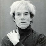
Image referenced from: revolverwarholgallery About Andy Warhol  https://revolverwarholgallery.com/andy-warhol/


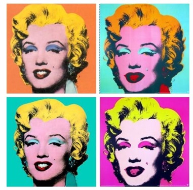
Andy Warhol (American, 1928-1987)

He was one of the leading artists of 1960s Pop Art Movement. He explored in a wide variety of art forms, including performance art, filmmaking, video installations and writing. Andy Warhol was generally known as a successful commercial illustrator.

b c


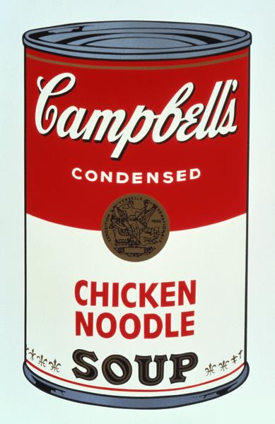
Image referenced from: The Warhol Campbell’s Soup: Ode to Food

http://www.warhol.org/education/resourceslessons/Campbell%E2%80%99s-Soup–Ode-to-Food/

Image referenced from: Pinterest  https://www.pinterest.com/pin/419679258996976244/


In 1962, he exhibited the now-iconic paintings of Campbell’s soup cans and he also used vivid and garish colors to create celebrity portraits. “My idea of a good picture is one that’s in focus and of a famous person.”, he said.


Process

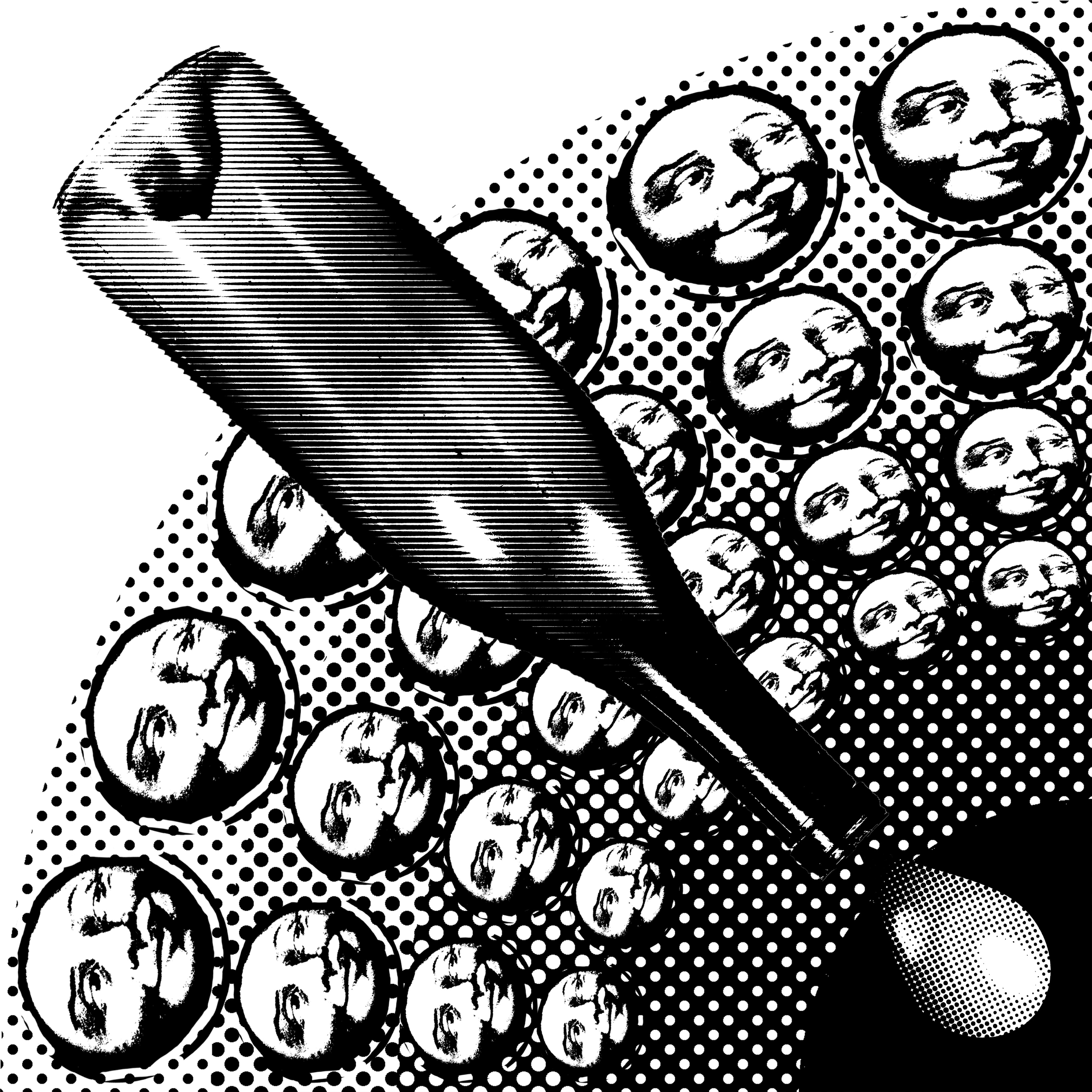
For most of the twentieth century, screen-printing techniques were kept confidential. It wasn’t until the 1960s, with the help of Andy Warhol, that it became a more widely recognized art form.

He produced silkscreen paintings based on photograph and used its efficiency to his advantage to create multiple copies of the same composition in different colors.

d


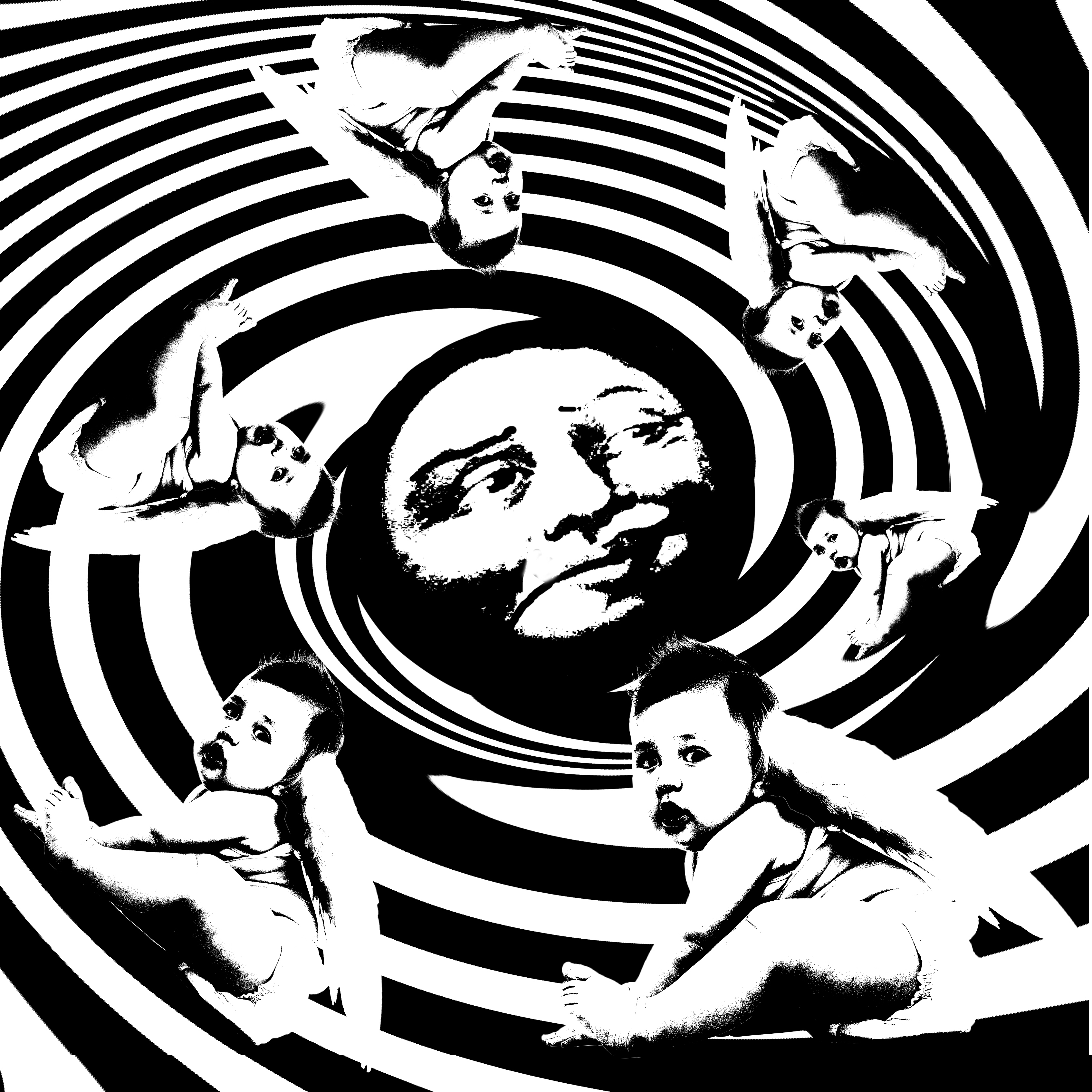
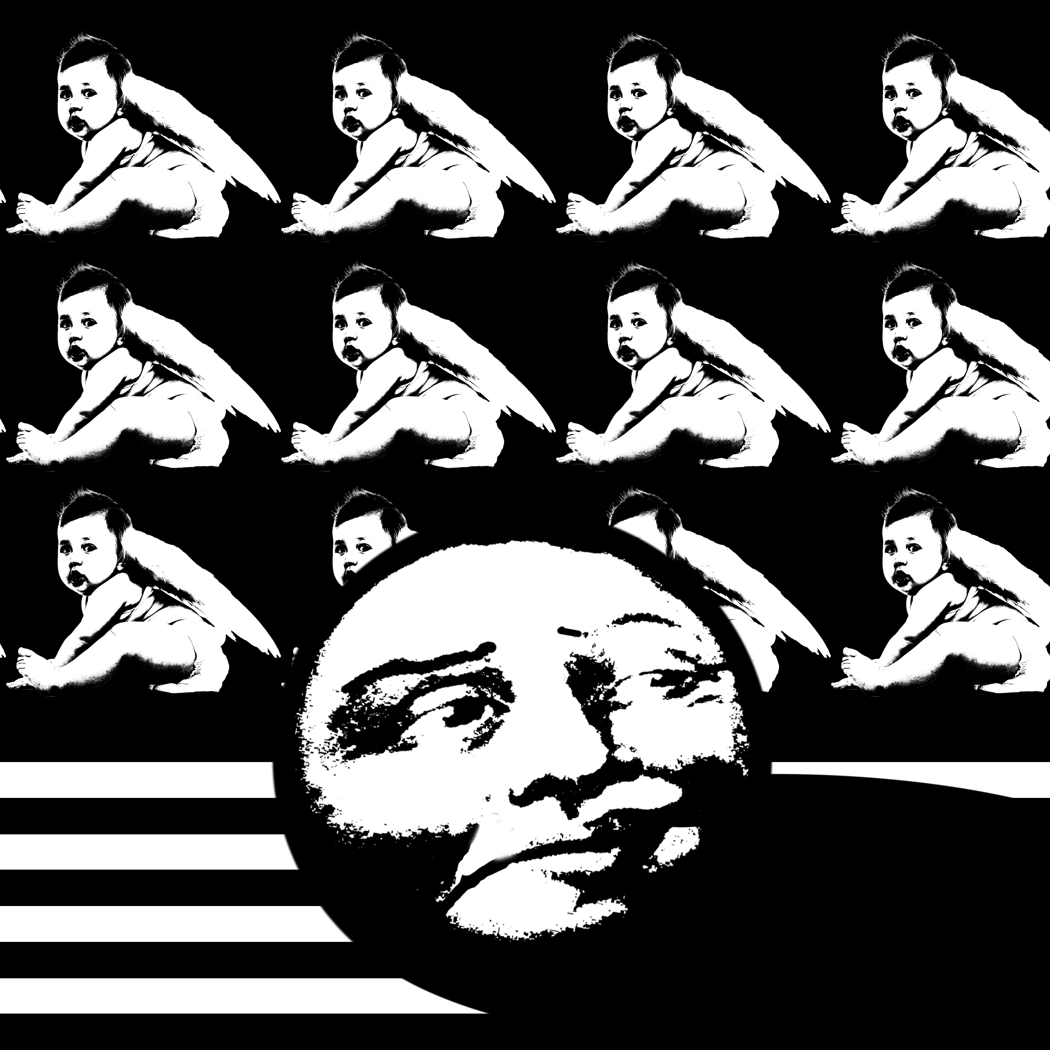
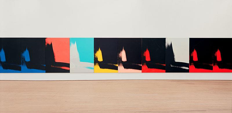
Eight Elvises was sold for a reported $100 million

Image referenced from: Total Histroy Eight Elvises  http://totallyhistory.com/eight-elvises/


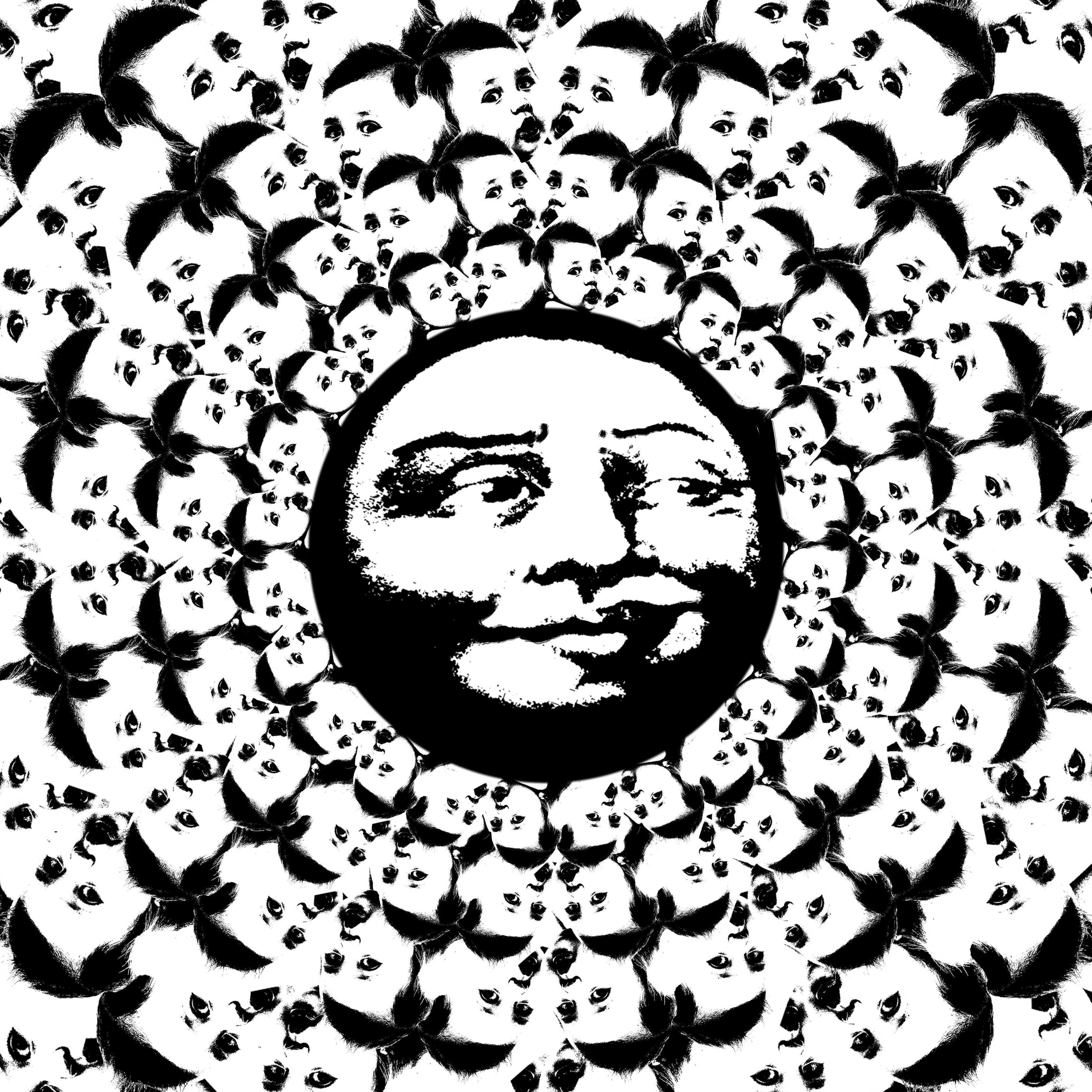
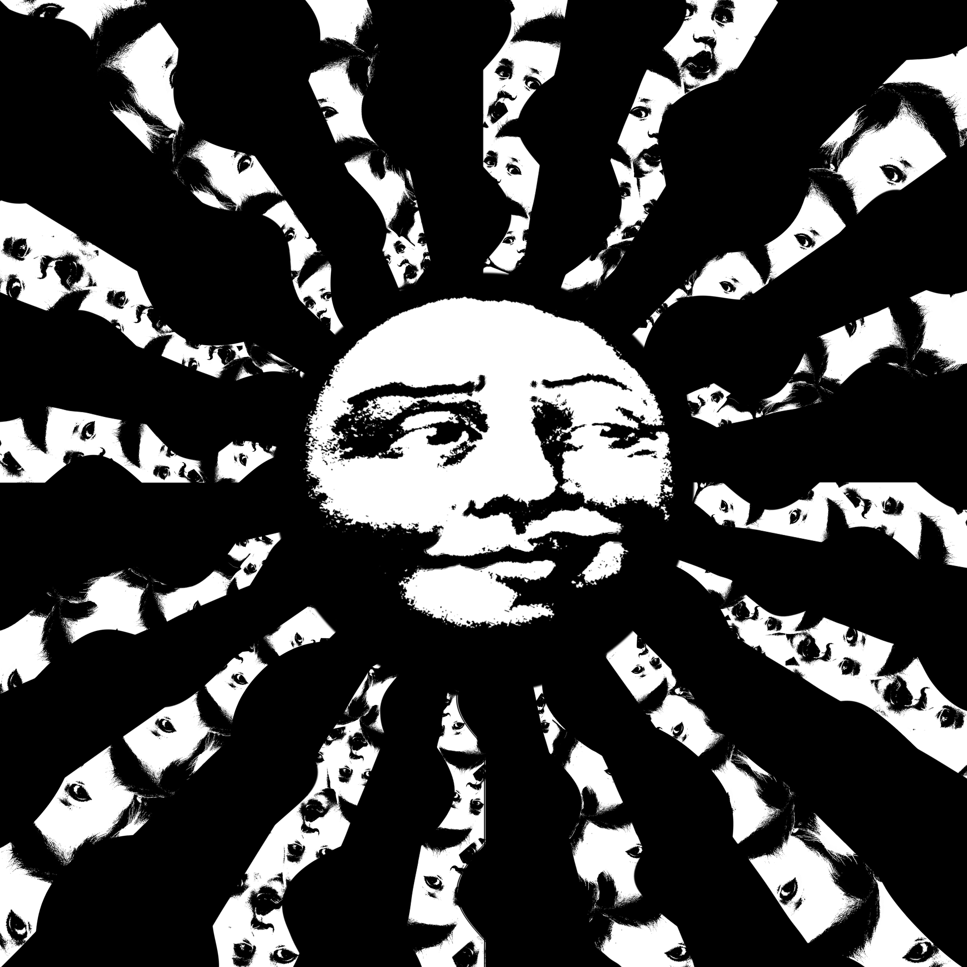
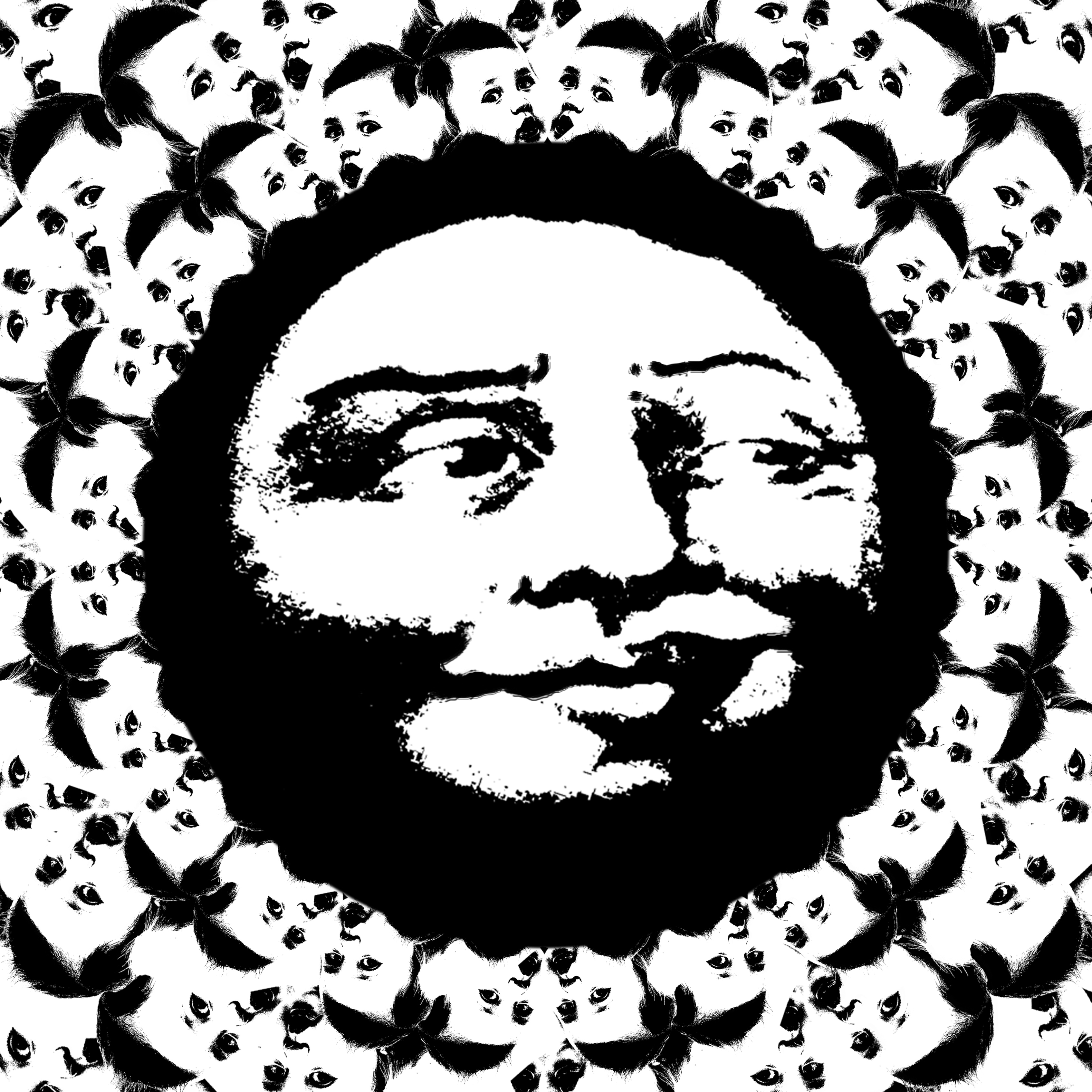
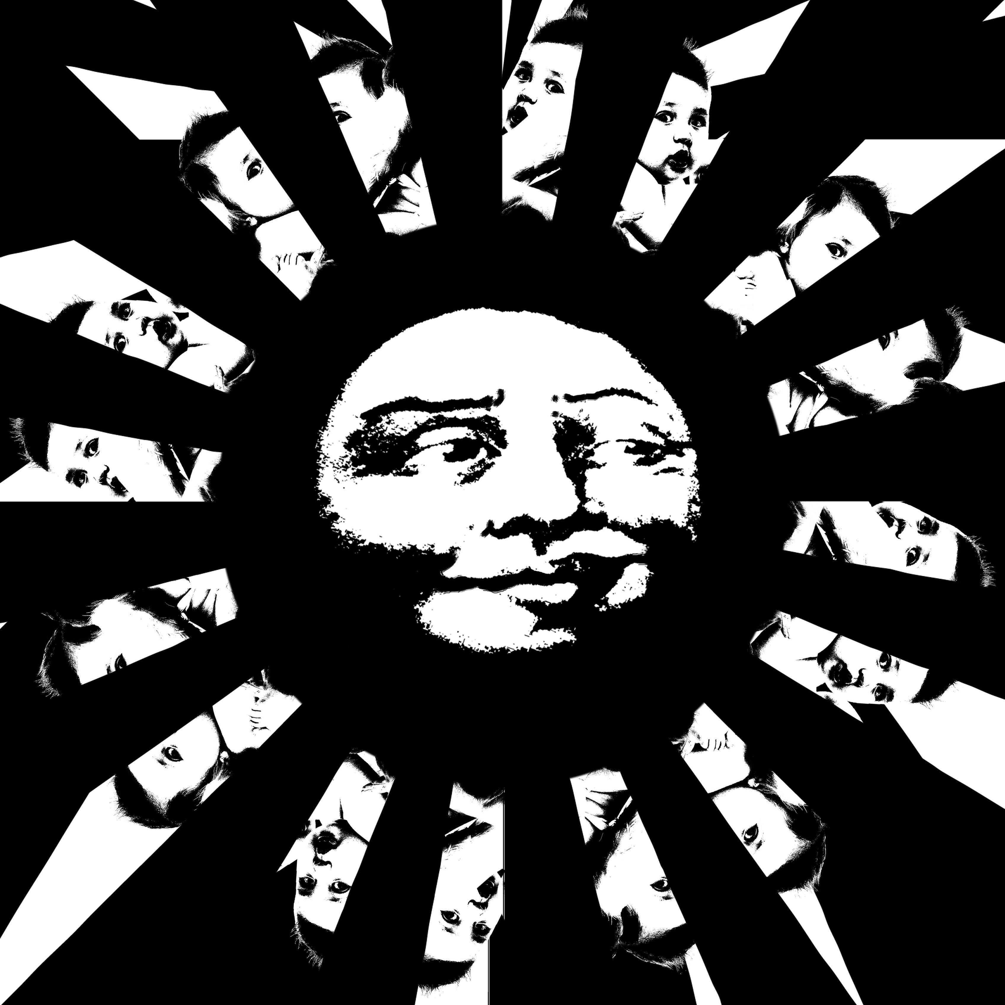
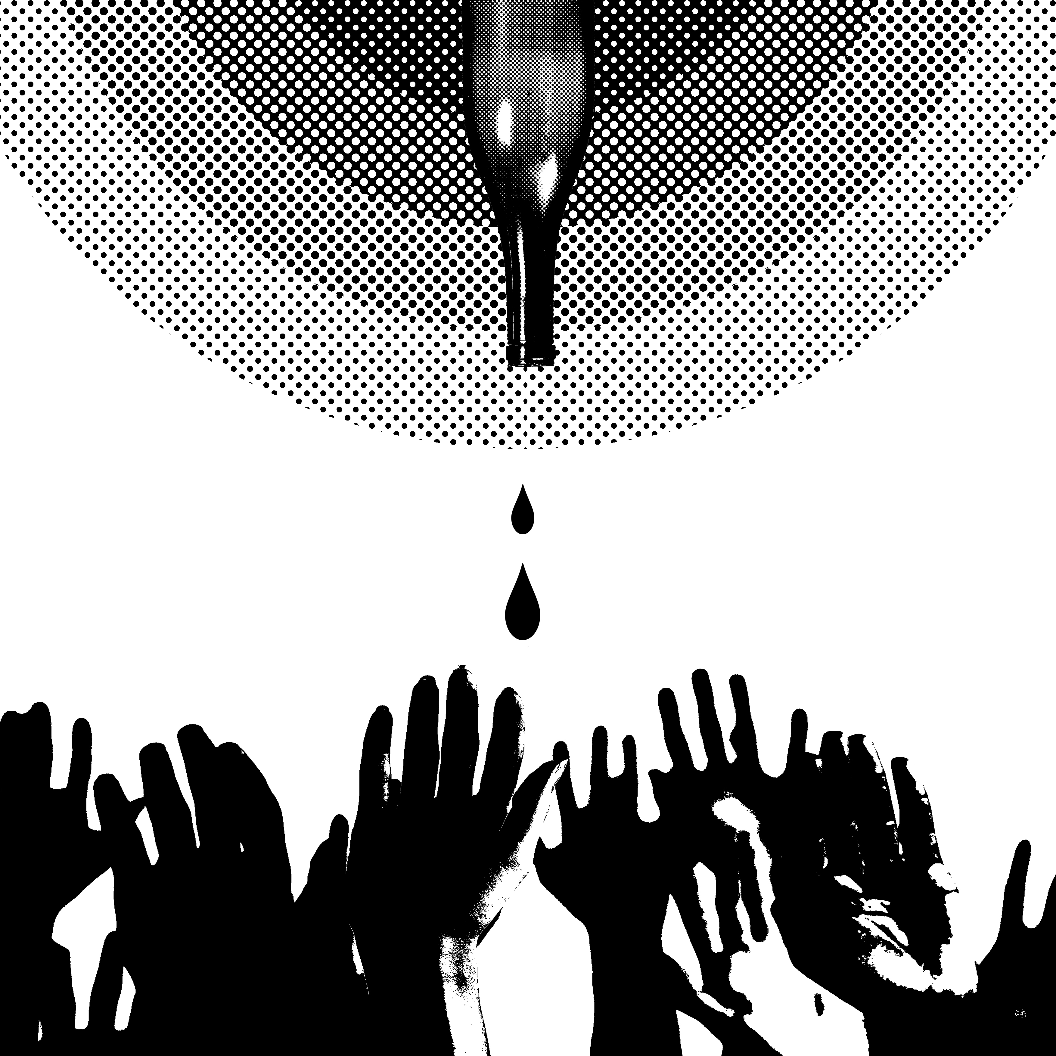
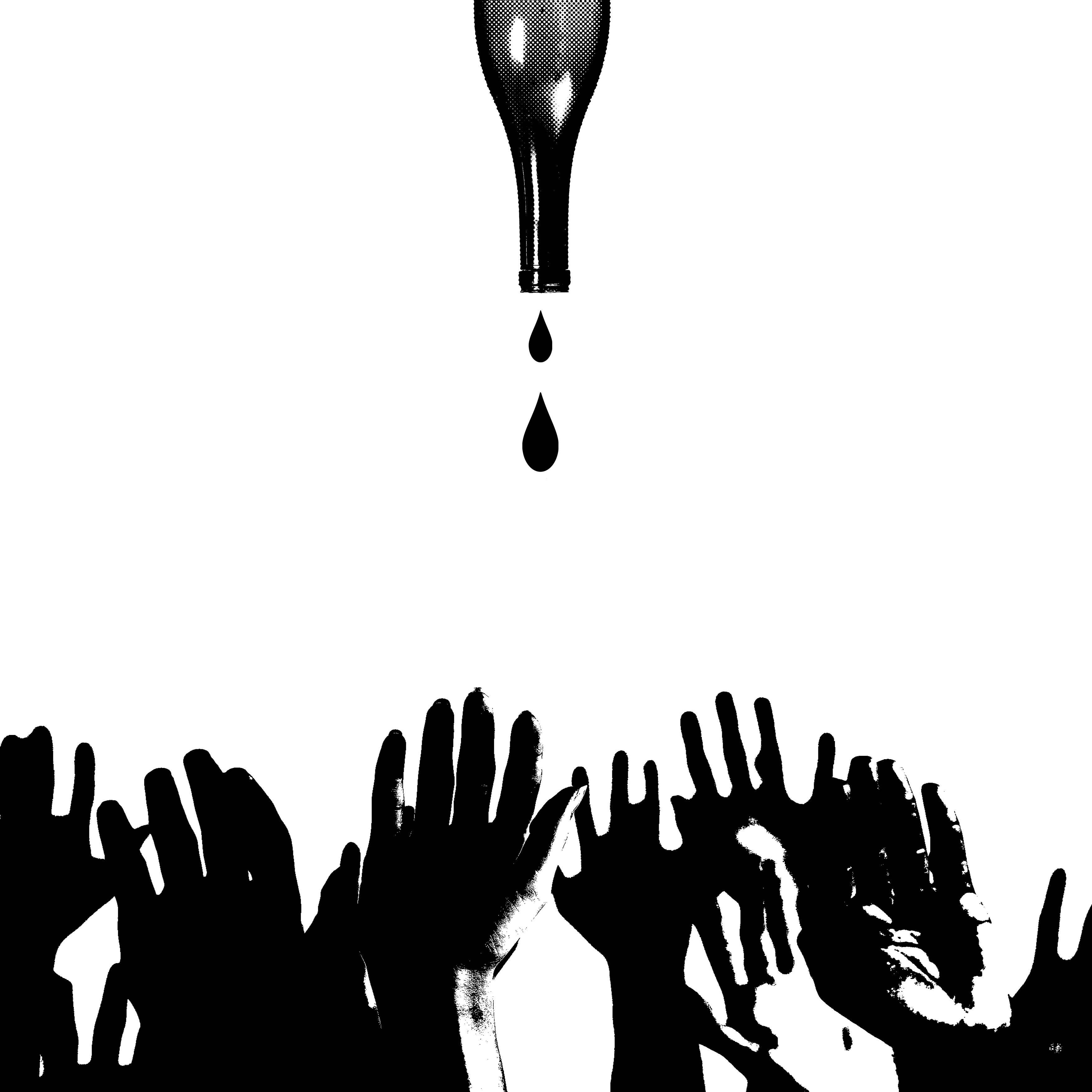
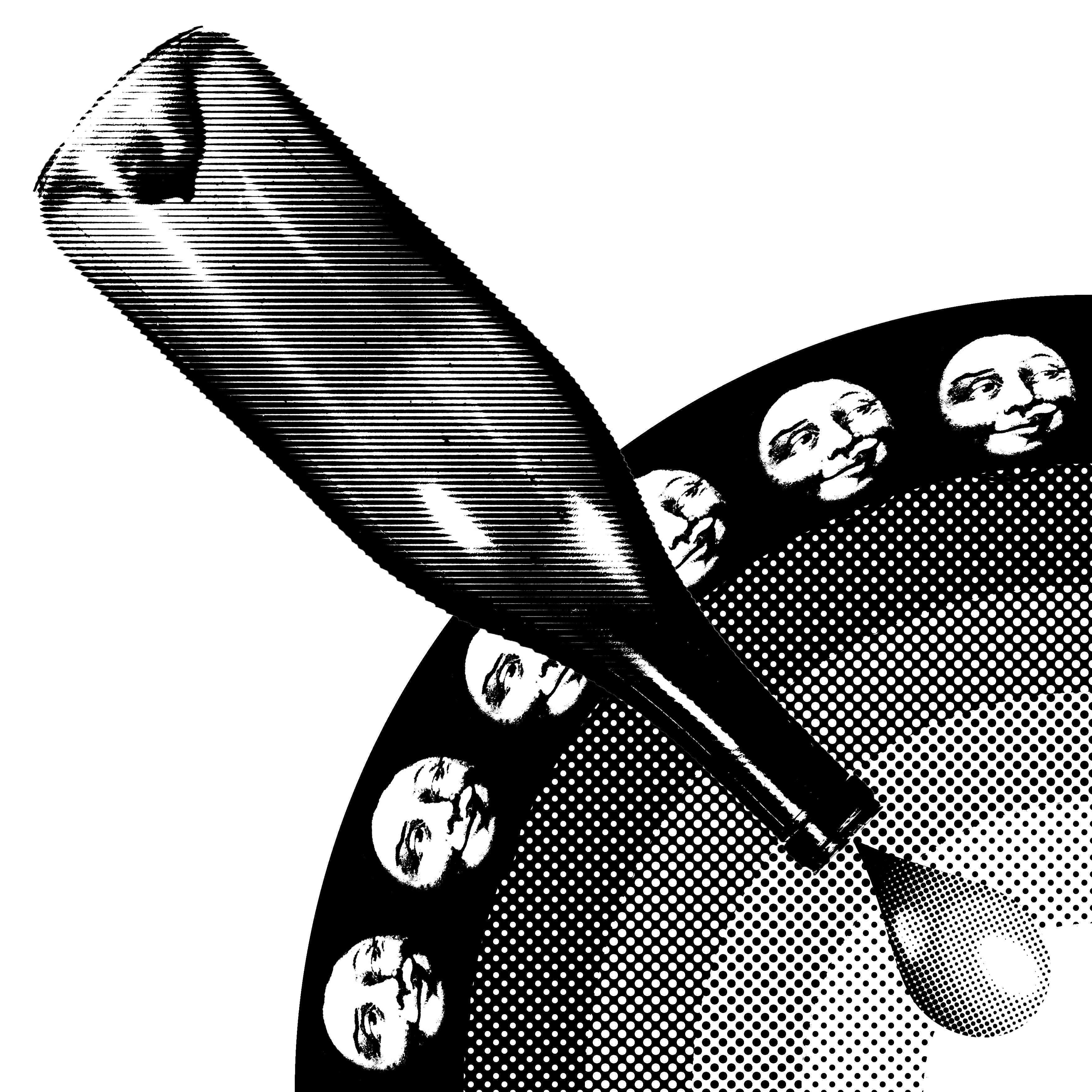
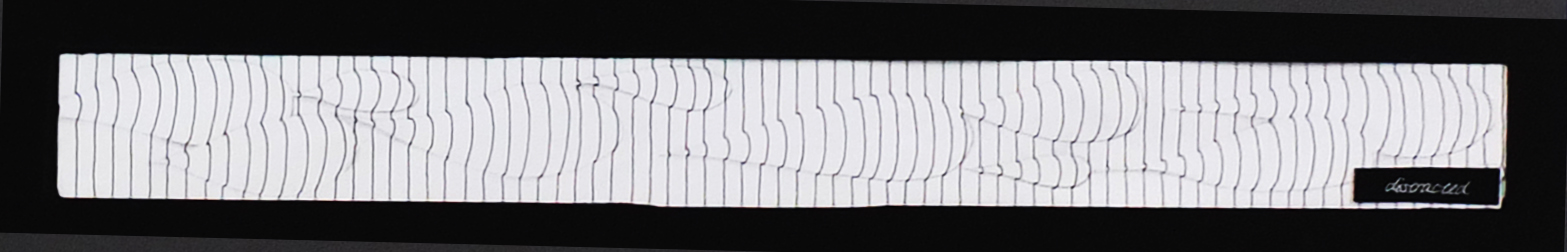
The concept of speed was depicted simply by decrement of space in between each print.

e


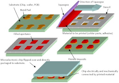
Image referenced from: microstencil What is stencil printing? http://spc.microstencil.com/tutorials/what-is-stencil-printing

The screenprinting process is a form of stenciling, in which a stencil is placed on top of a sheet and then ink is pushed through the stencil to create an image.
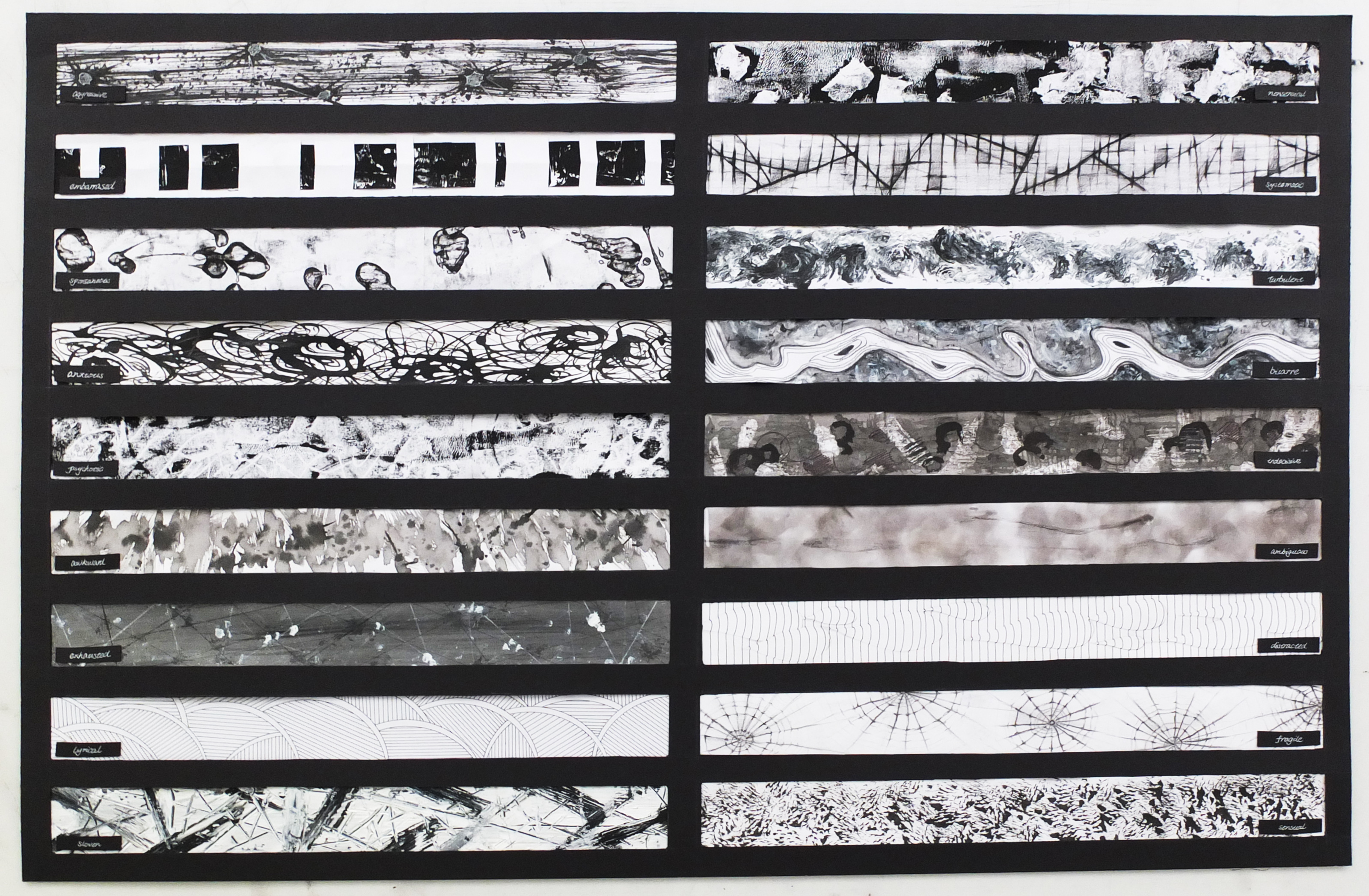
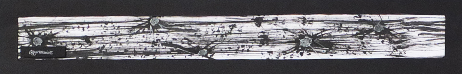
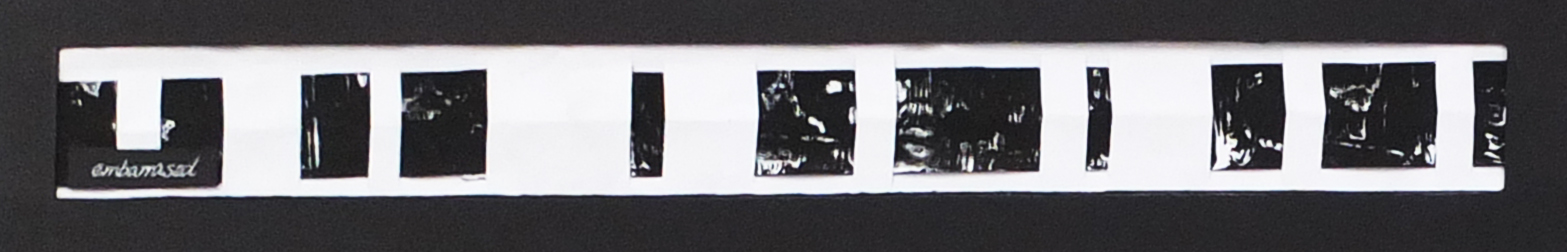
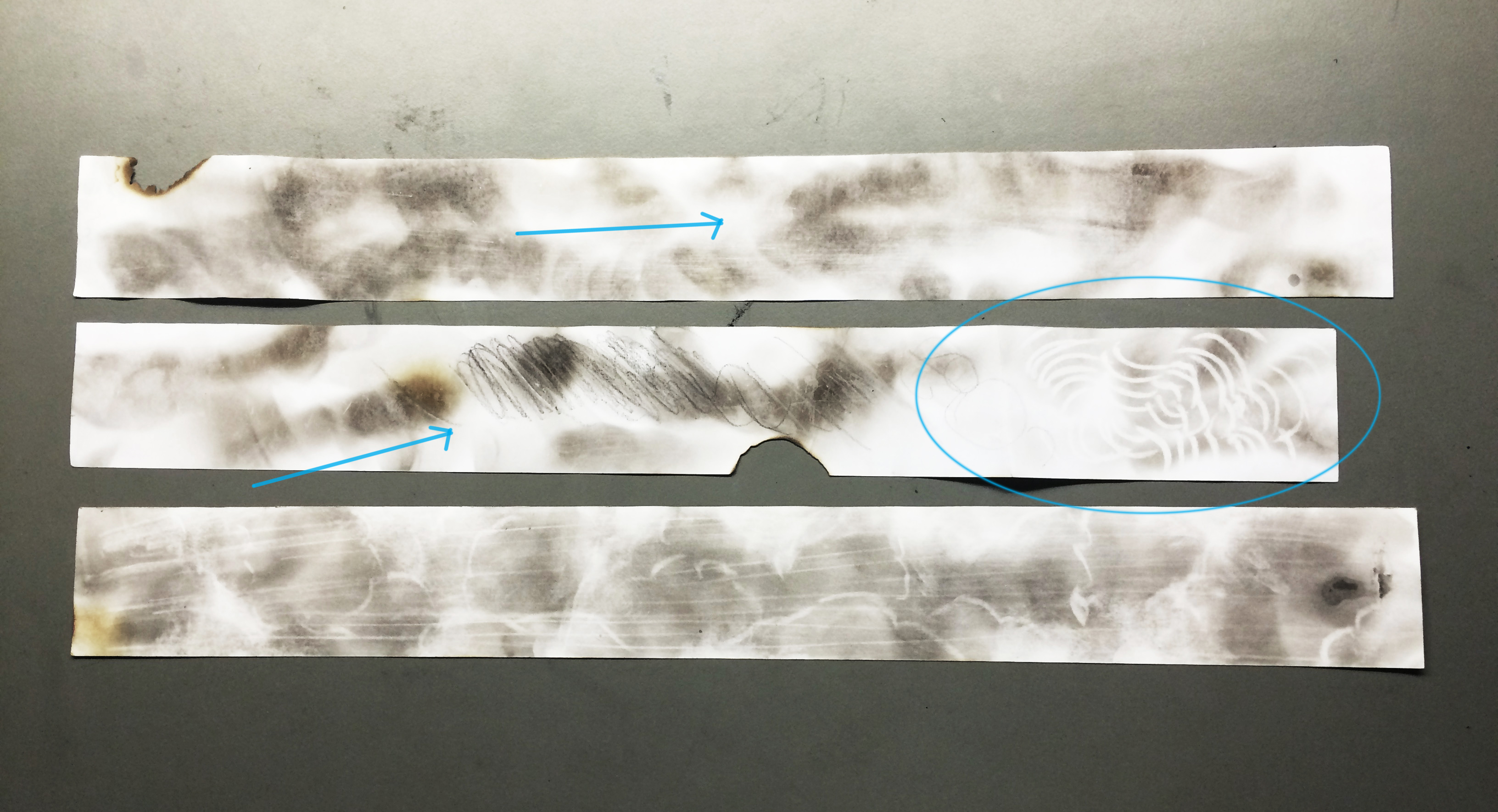


Shadows

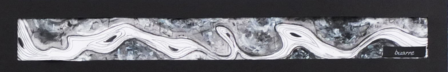
“Isn’t life a series of images that change as they repeat themselves?”

f


Image referenced from: AZZURRO 23 MAY ANDY WARHOL, CHASING SHADOWS IN PARI  http://azzurrodue.com/andy-warhol-chasing-shadows-in-paris/


I saw the quote above and wonder maybe this was what Andy Warhol expressed in his work” Shadows”. There were in total 102 parts exhibited as one work displayed like a long film strip. There were produced using his famous process of silkscreened and hand painting.

They were based on photographs of real shadows taken in The Factory (his studio in NYC)

There were alternate between positive and negative imprints with range of hue. Seriality and repetition created visual music, artwork full of mood and mystery. Following his previous experiments on abstraction e.g. Oxidation

Inspiration from the Shadows for me was that he made use of the photograph taken of real life. He chose the specific part of the shadows and combined different colors to express his emotion and feeling. With black and white contrast in the variation of hue background, a strong yet mysterious atmosphere emerged.  All the paintings were displayed in a strip, creating a flow with vitality, symbolizing ups and downs in life.


g h

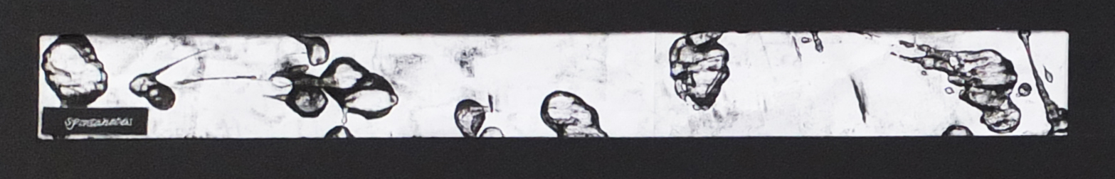
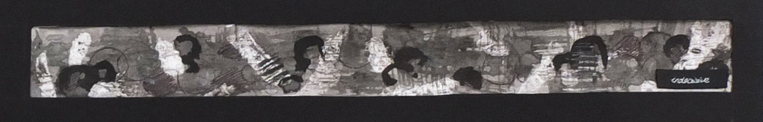
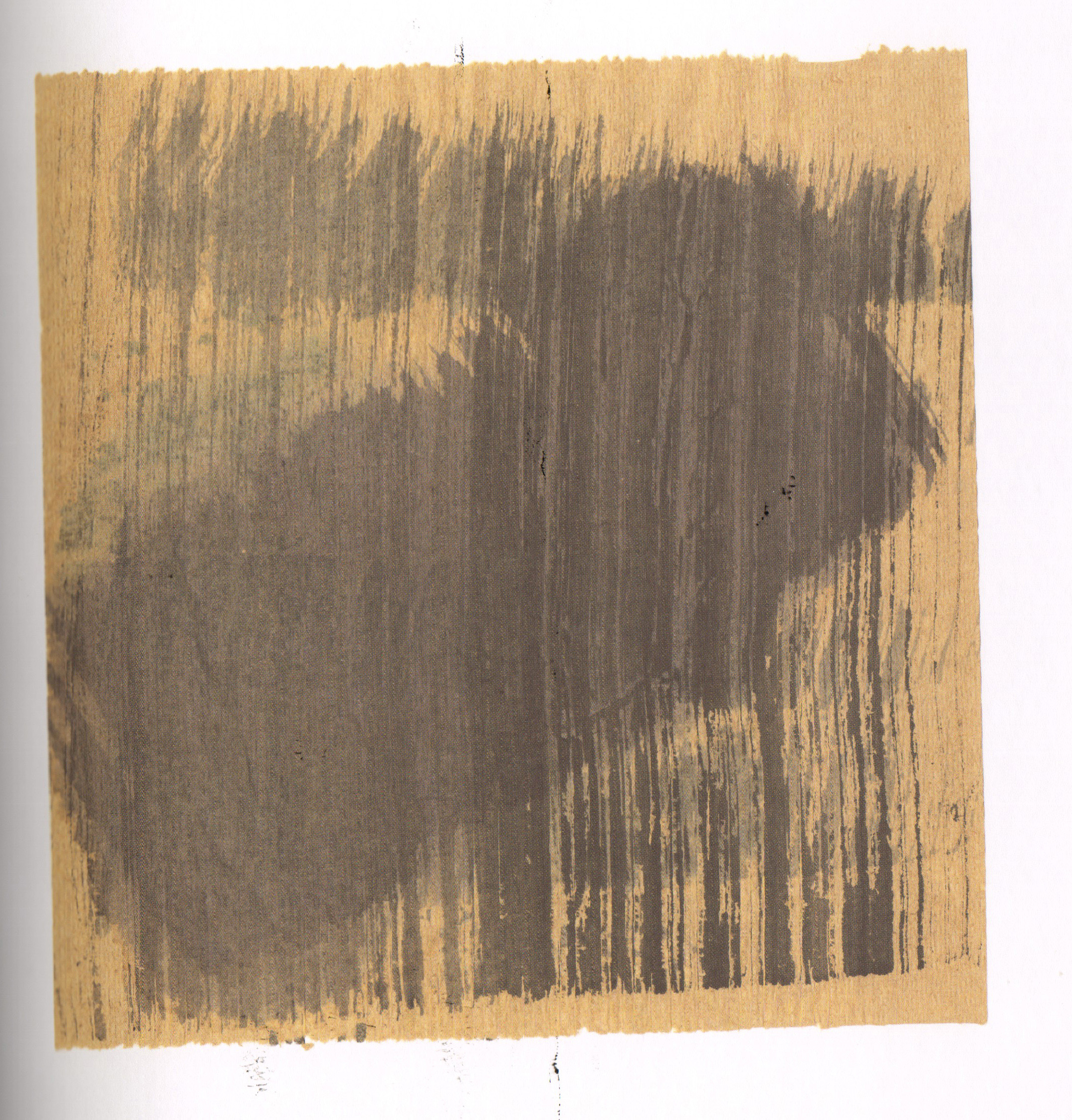
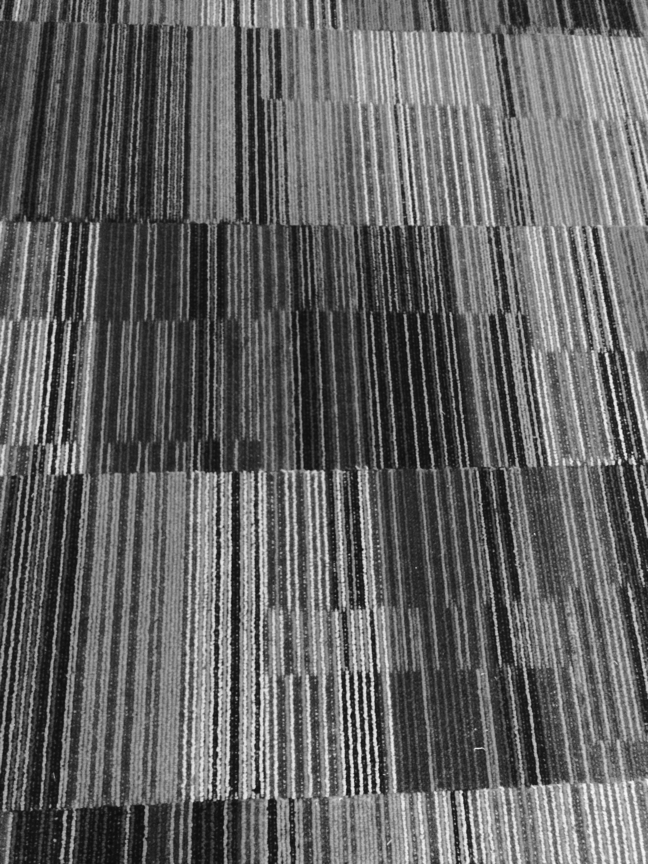
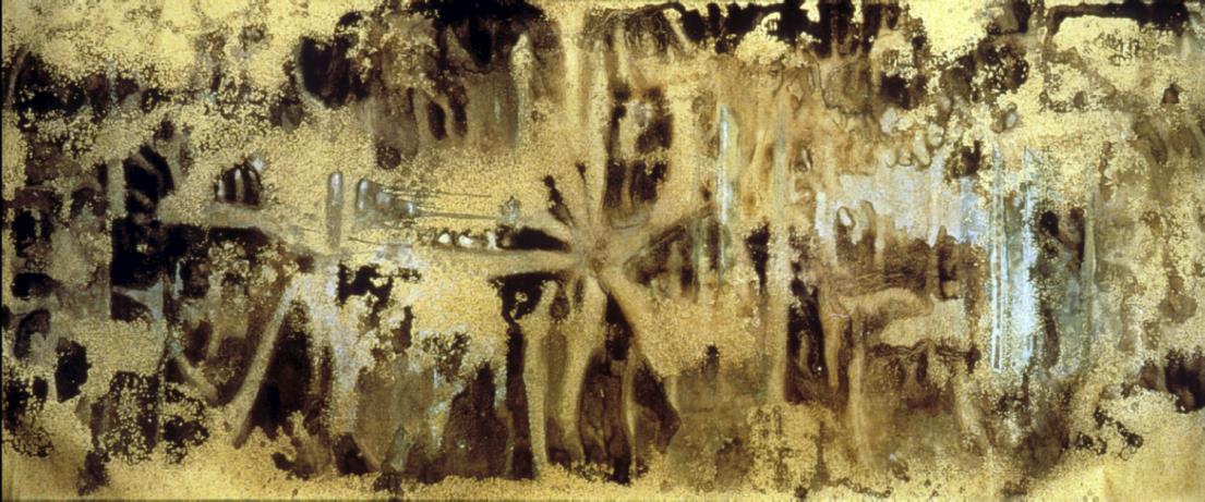
Oxidation also referred as Warhol’s Piss Paintings

Generally attributed to 1977-78

Canvas pre-coated with copper painted by Warhol. Uric acid would oxidize the metal in the copper ground, causing it to discolor, allowing patterns to be created according to the ‘movement’ of the ‘painter’. He experimented with both pattern and coloration by using a variety of metallic background paints and varying fluid and food intake.

May be inspired by Pasolini’s film, Teorama (1968) where a man urinated on a canvas in search for ultimate methodology and activities in sex clubs and gay bathhouses.

Image referenced from: christies the art people Andy Warhol 

http://www.christies.com/lotfinder/paintings/andy-warhol-oxidation-painting-5074062-details.aspx

Image referenced from: Study Blue https://www.studyblue.com/notes/note/n/final-2/deck/6214367

From my point of view, this was experiment Andy Warhol carried out on the chemical reactions. Since the movement of the painters wasn’t fixed and the exposure to the air made a great difference on the outcome of the art work, they were in a sense unpredictable and spontaneous and adventurous as one may say.


i j


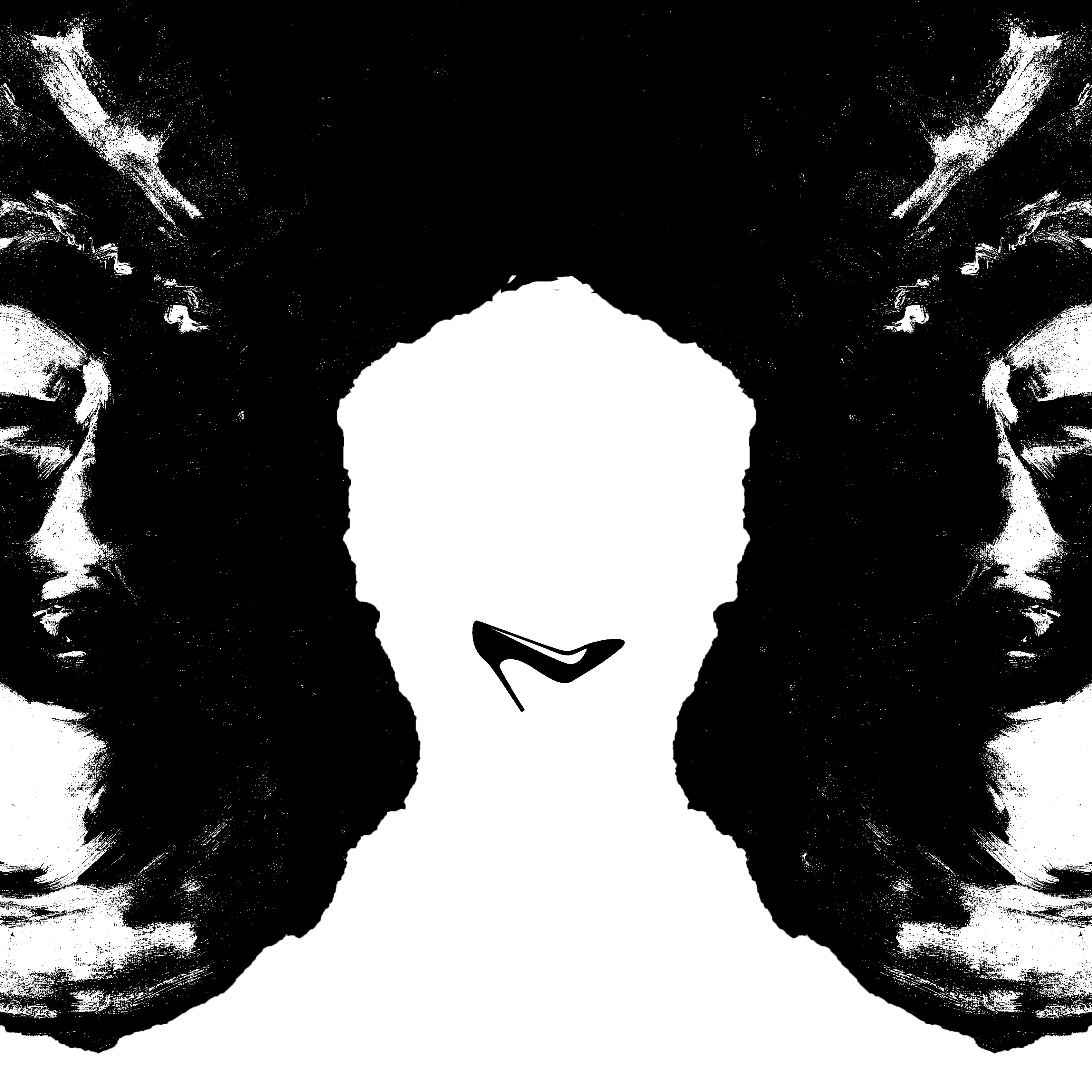
Image referenced from: Pinterst https://www.pinterest.com/hayetdeb/rorschach/

Image referenced from: The Warhol Rorschach, 1984 http://www.warhol.org/collection/art/work/1998-1-297/
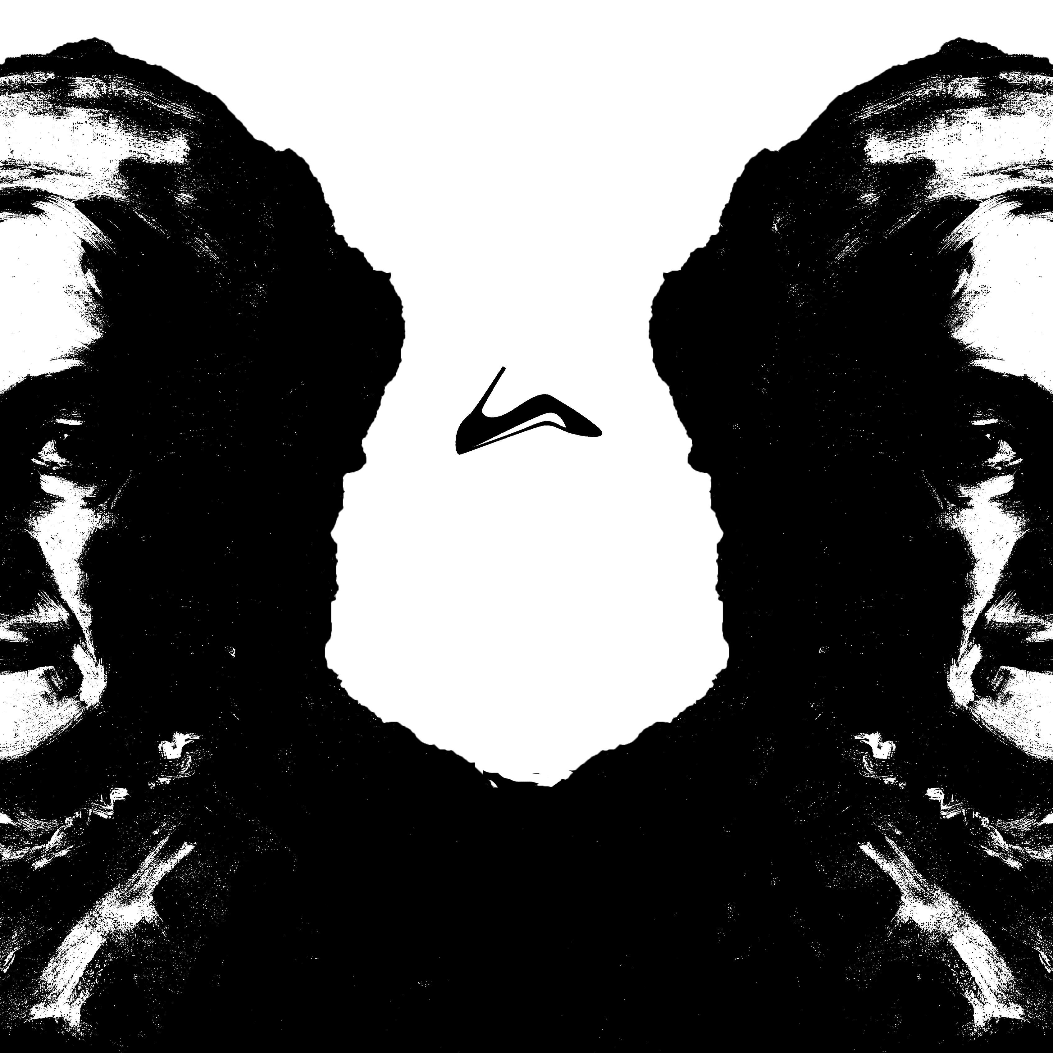
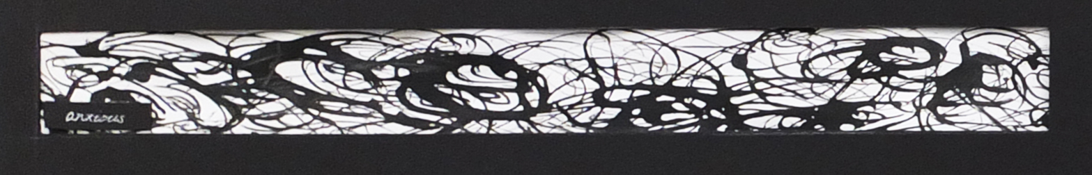
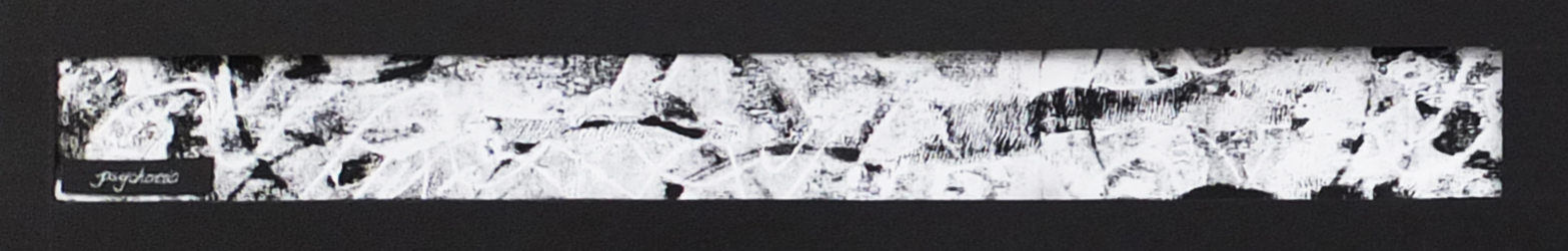
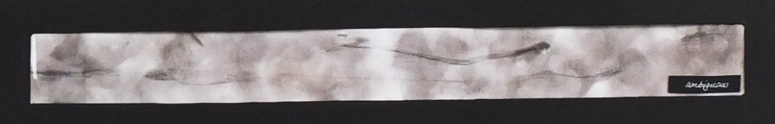
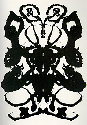
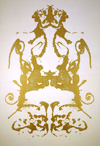
 

Rorschach

These paintings were achieved by painting on one side, and folding vertically to imprint it on the other half. Andy Warhol used this pour-and-fold technique to obtain the symmetrical images that appeared somewhat resembled body parts.

This technique was modeled on the famous “inkblot” test invented by the Swiss psychiatrist Hermann Rorschach. The actual test provides ten standardized blots for a patient to decipher to interpret about the subject’s personality, intelligence and sexual proclivities.

The research brought me back to the definition of automatic drawing and realized the similarity of them. We draw or pour ink spontaneously and let our heart lead the way. The outcome in some level reveals something deeper about us.


 Links to other posts:

2D LINES EXPERIENMENT (including stencil printing inspired by Andy Warhol)

MORE LINES!