Hello!
At the start of this project, I wrote down on how I should go about with my thought processes as shown below:
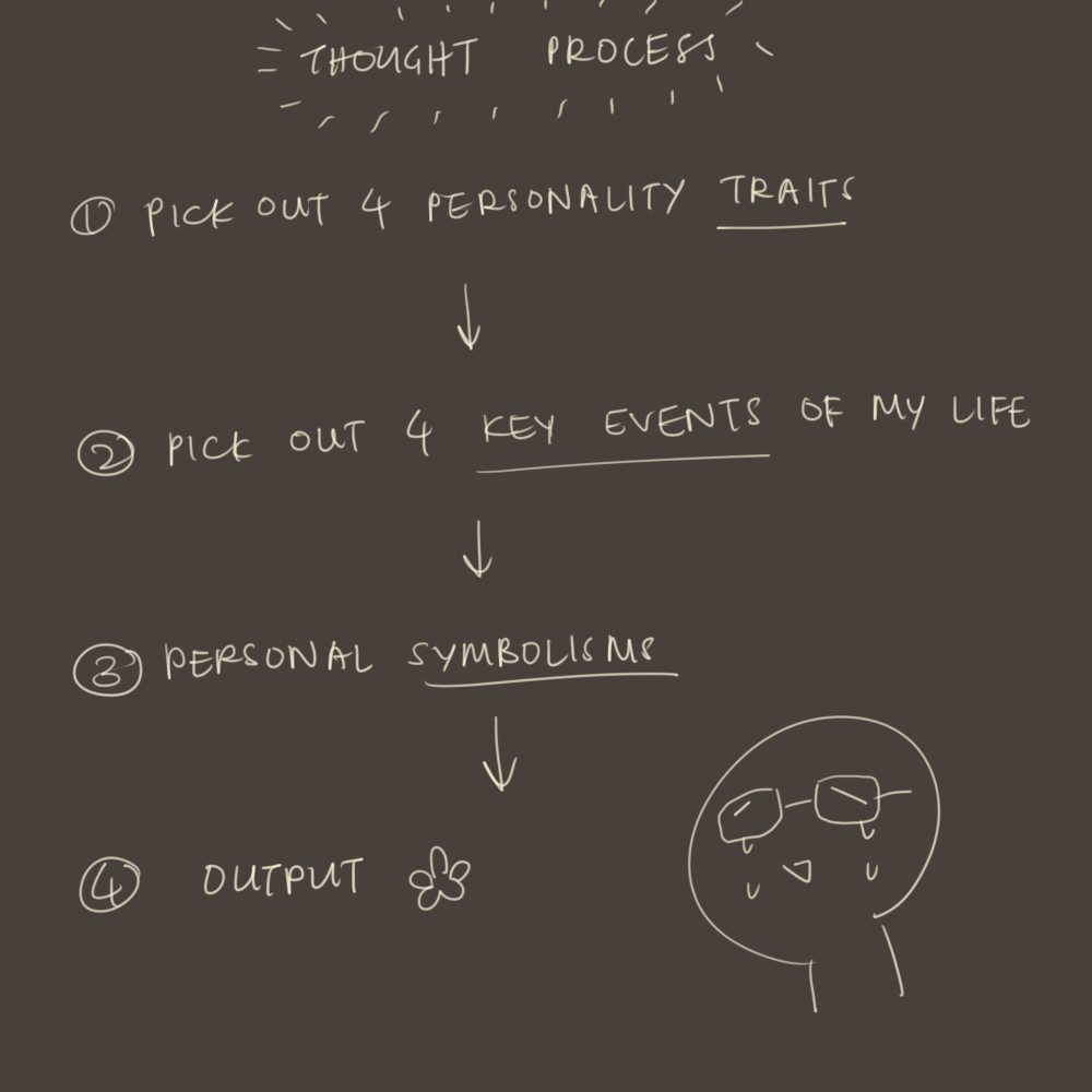
…Something like that.
Well then, let’s get started.
Personality Traits
I took the 16 Personalities Test (also known as the Myer-Briggs’ Test) and thought about my personality for quite a while.
I am an INFJ-Advocate:
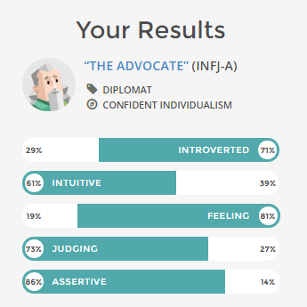
Some key personality traits (that I’m very conscious of):
- Reserved
- Emotionally stable
- Detached
- Daydreamer/ head in the clouds
- Nature-lover
- Goes with the flow
I like happy things, and I enjoy being happy!
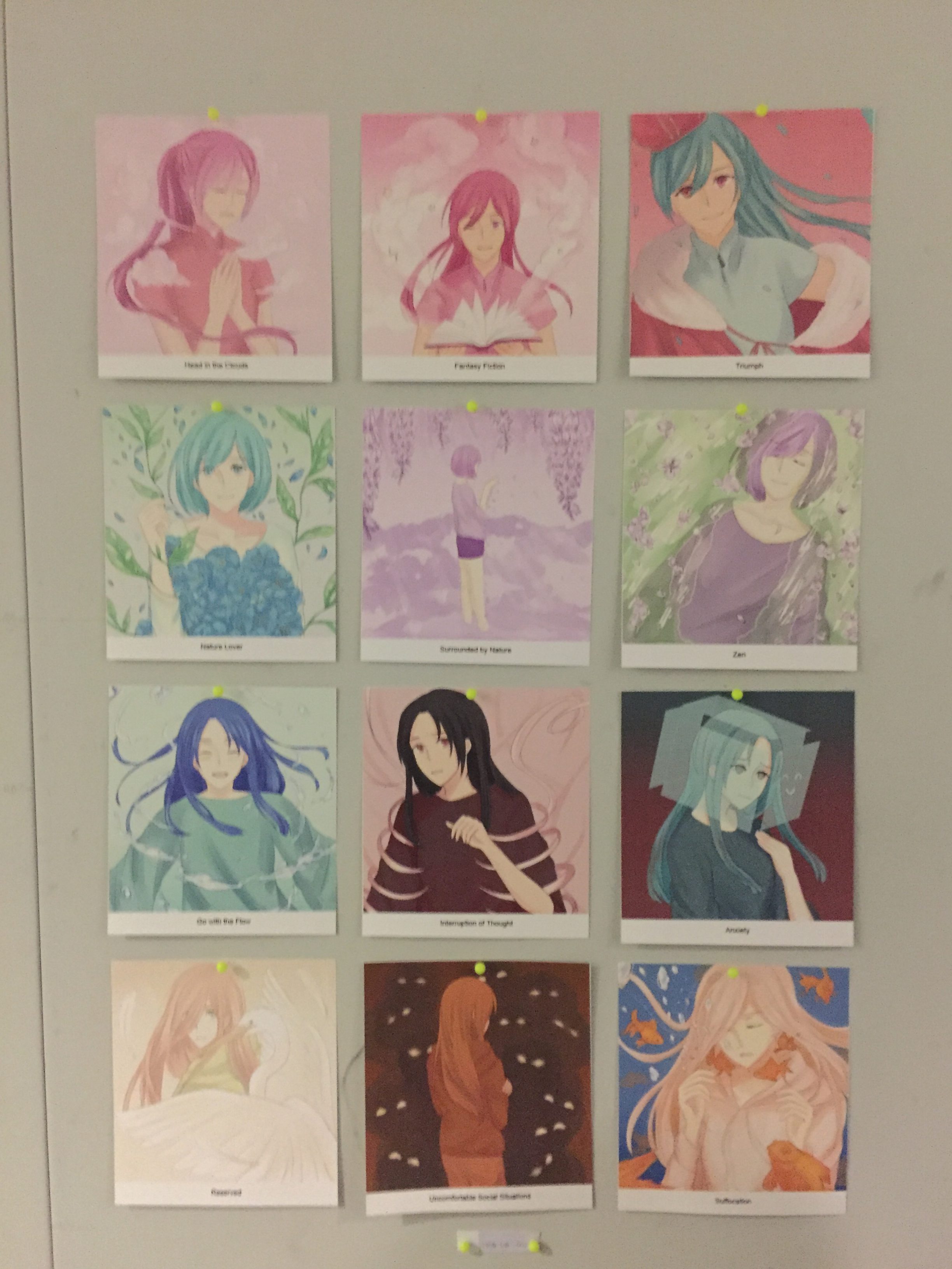
Personal Symbolism and Image References
Nature-lover + Surrounded by Nature = Zen
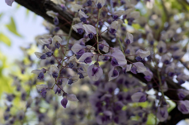
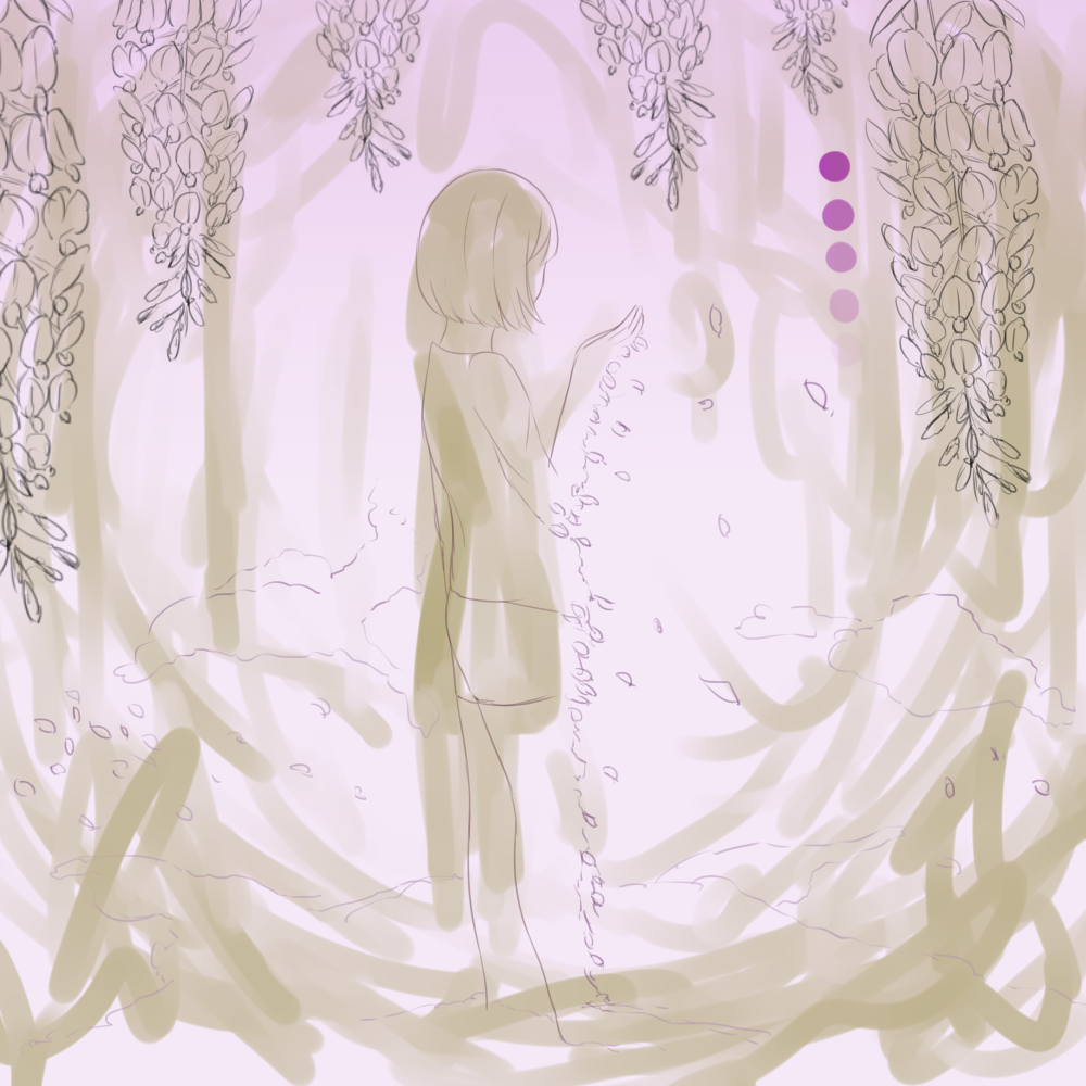
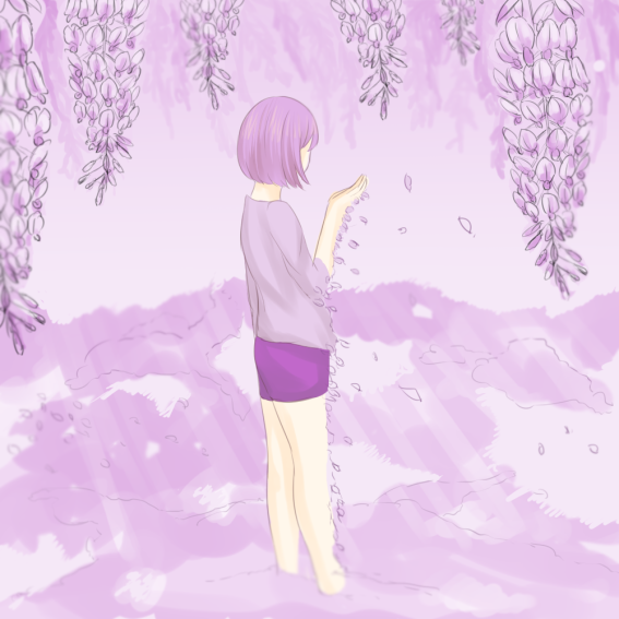
Wisteria – A Calming Sight
One of my favorite flowers is the wisteria; From the many pictures I’ve seen on the net, I’ve always imagined myself in the picture itself, surrounded by the wisteria.- Just imagining it gives me peace. I love nature very dearly.
Reserved + Uncomfortable Social Situations = Suffocation
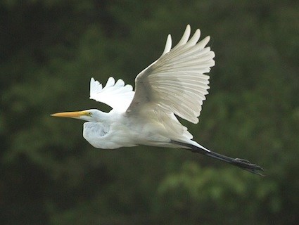
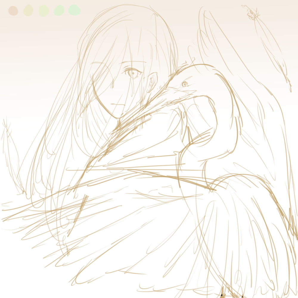
The Great Egret – Observation and Judgement
- I often alight at Marymount station and walk along the canal to get home. I see an egret (sometimes a small gray one) from time to time, perched on the opposite of the canal (where no humans can get to them). They’ll look at me as I walk past, and I’ll stare back at them (because I find them pretty and interesting). If I stare for too long, they’d feel threatened and fly away into the trees.
- Funny enough, I feel the same way during social events – reserved.
- Observing people before I act. Making the correct judgement in forging new relationships. I don’t “hate” anyone, but if I get a feeling that someone doesn’t seem to like me, I’ll stay away from them.
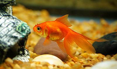
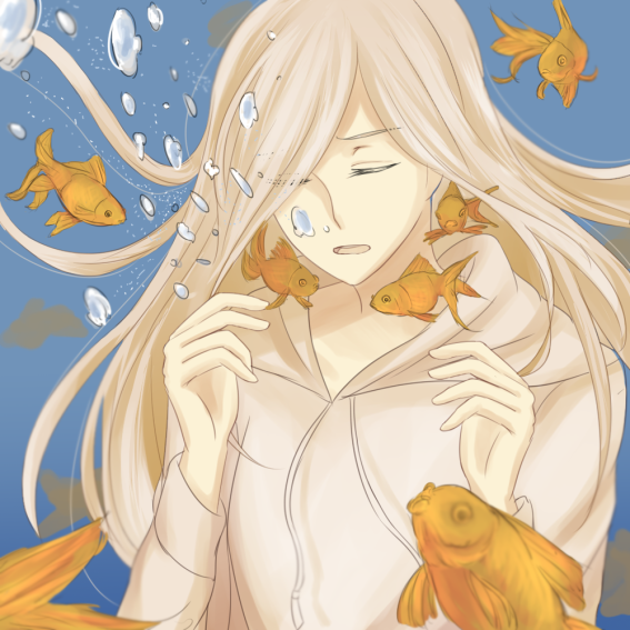
Goldfish – A symbol of death.
- When I was young, I used to keep fishes as pets together with my father. We would take care of them splendidly well — providing the correct minerals and pH levels in the tank, cleaning the tank regularly, properly introducing the new fishes by adjusting the water temperature…
- But the only fish that we could not keep alive for long was always the goldfish. It’s eerie, but I’ve always associated goldfishes as pets that would not live for a long time.
Go with the Flow + Disruption = Anxiety
Water – Flow
- Water, in literature, is a symbol of cleansing, life and freedom. It has many other meanings, but I feel that these three are the best meanings of water that I can relate to.
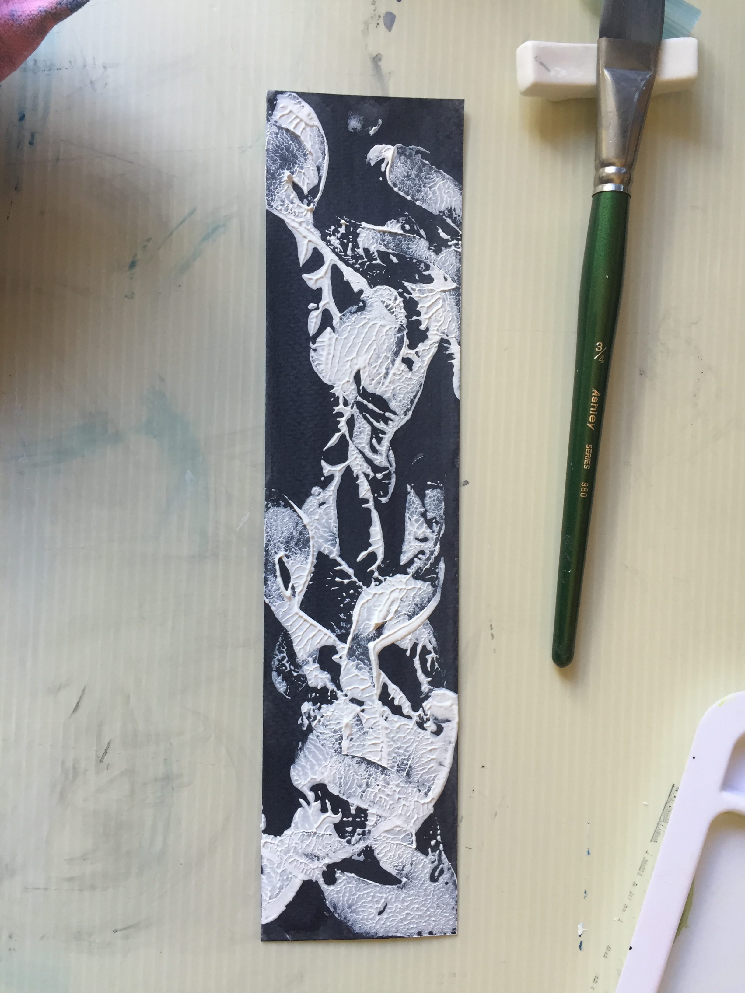
Skeletons and Ribcages – Death
- Skeletons remind me of death. It is a very common symbolism among many.
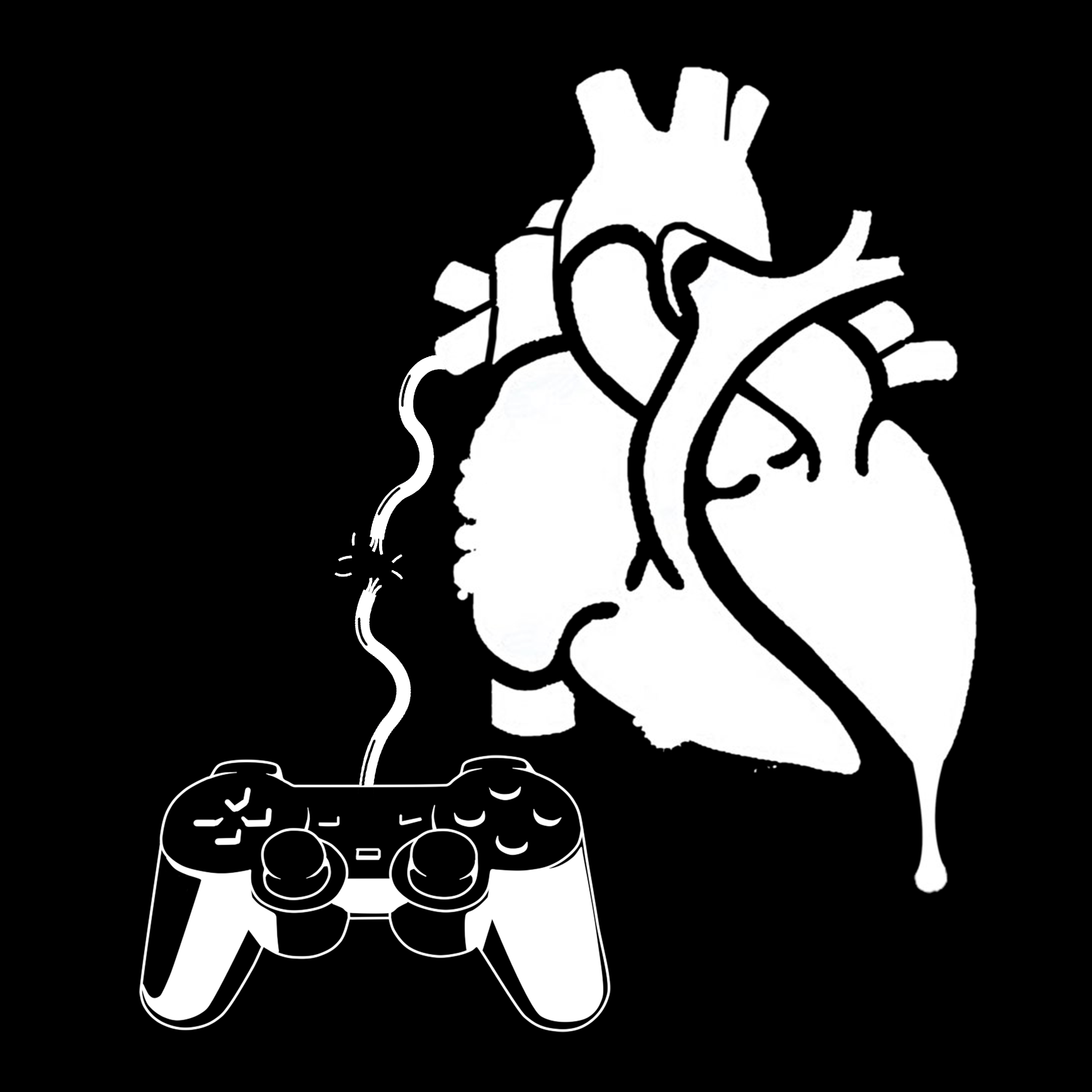
Head in the Clouds + Fantasy Fiction = Triumph
Video Games – An interactive storybook
- The video games I play are usually under the genre of RPG (role-playing games), and it’s something I grew with. I enjoyed the video games that I played very much as they had stories to tell; characters to relate to, environments that helped establish the story.
- I feel that video games are what gave me most of my imagination as a person; I would say that without growing up with video games, I probably wouldn’t be in art school at this point of my life.
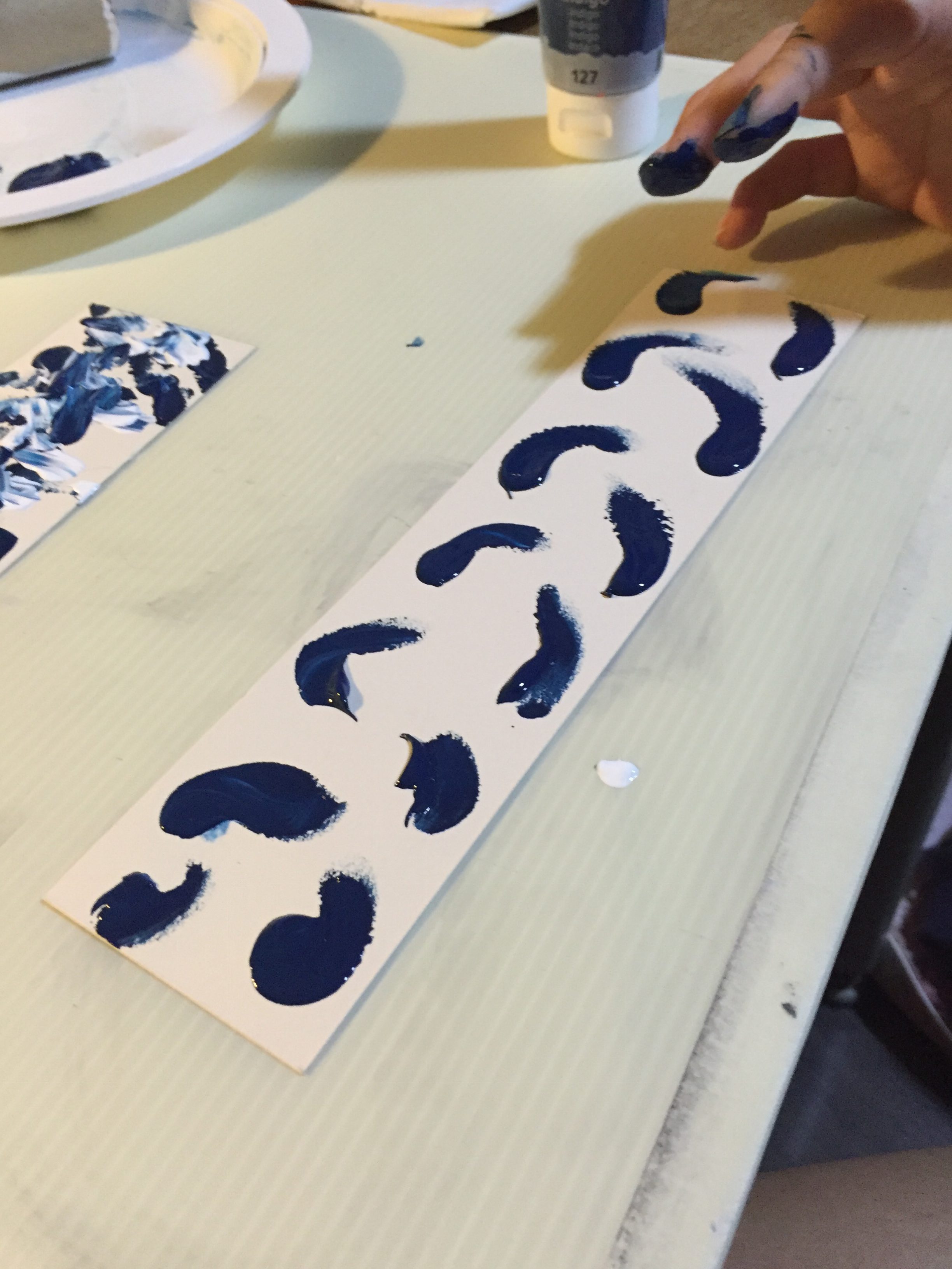
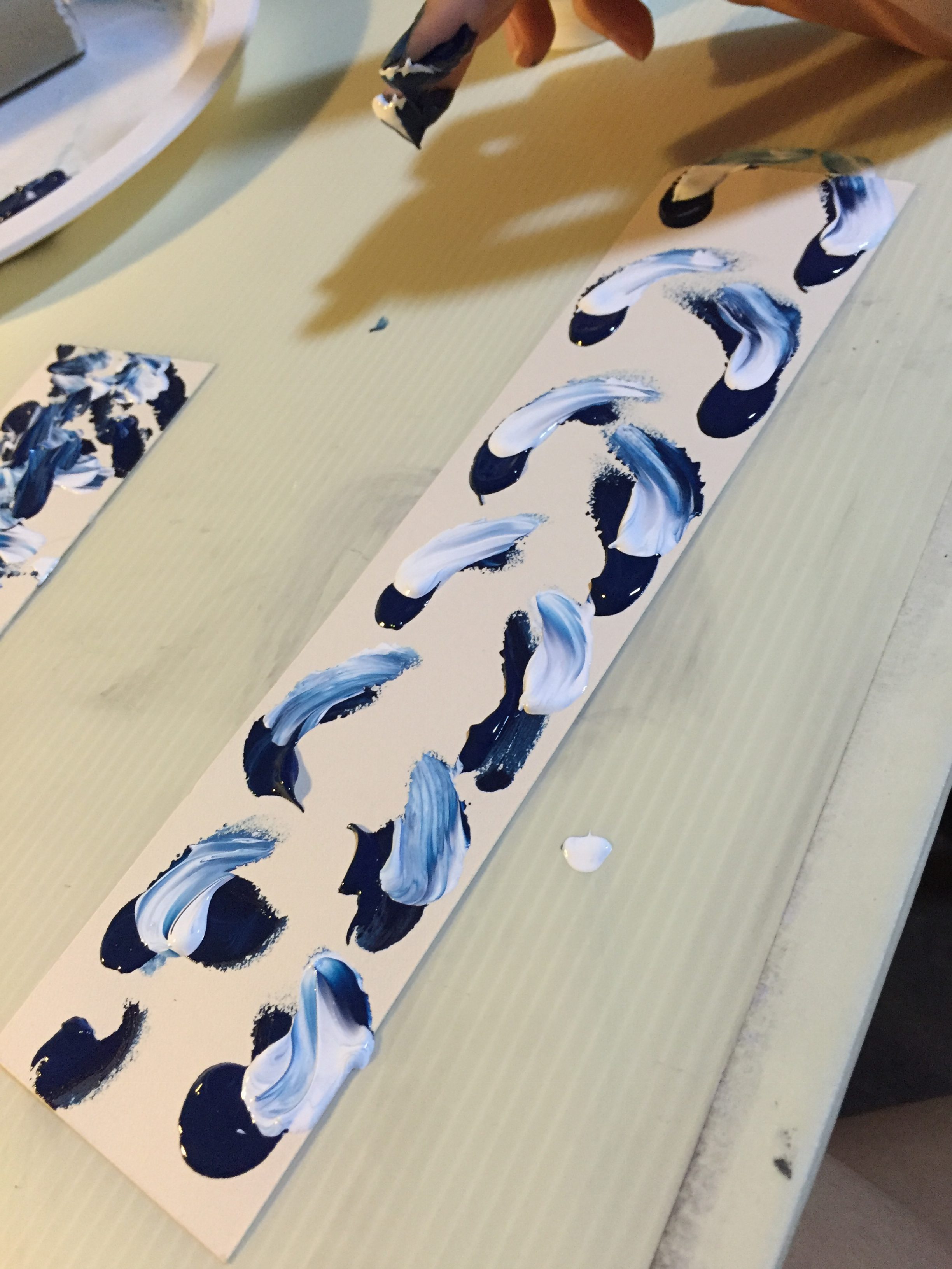
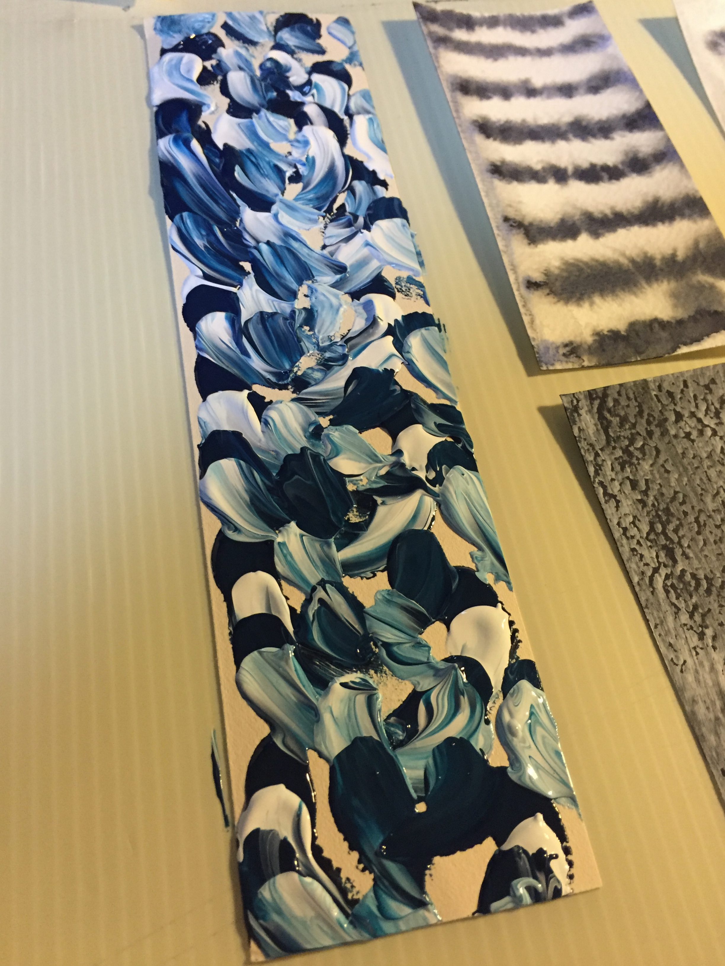
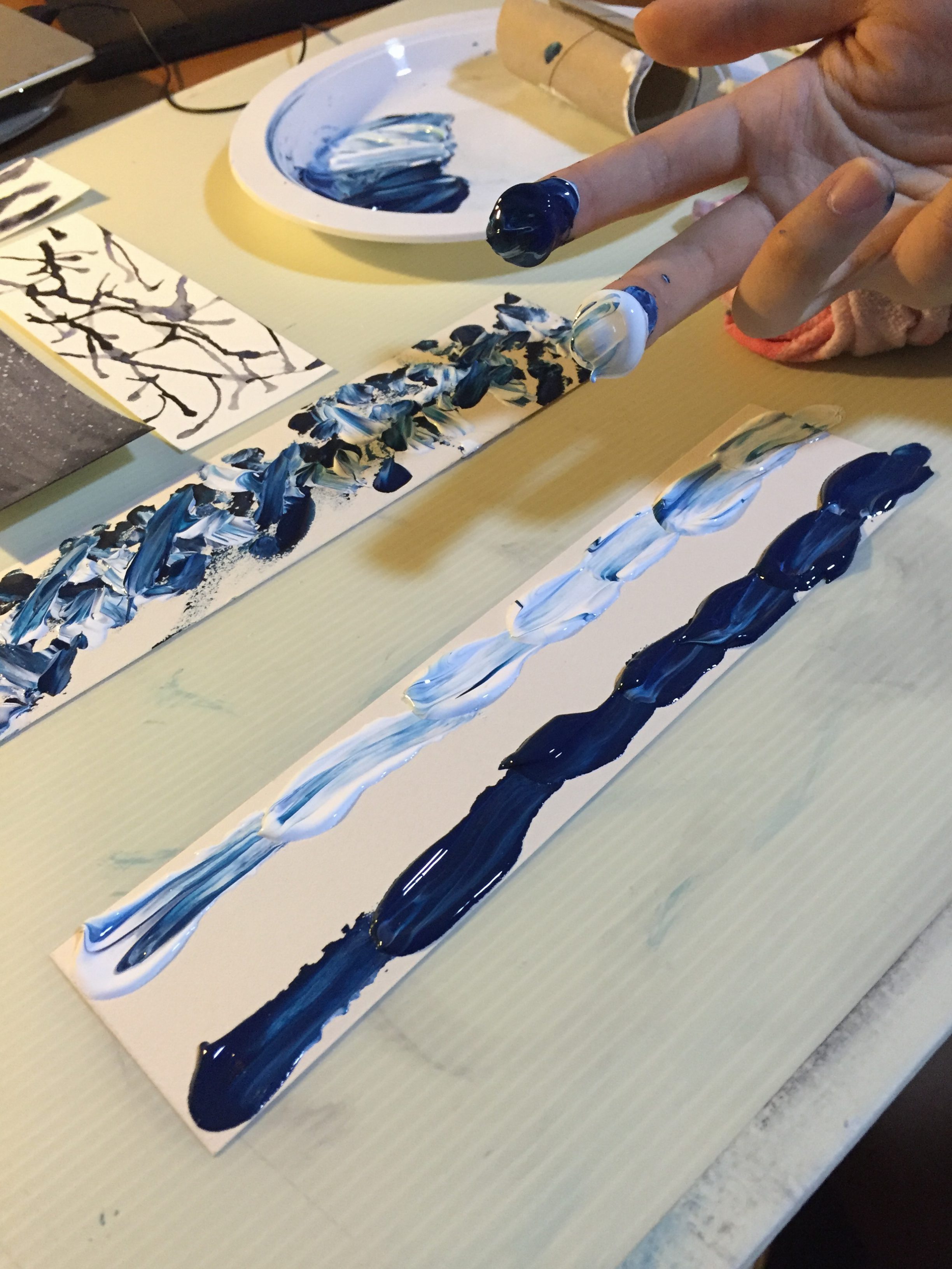
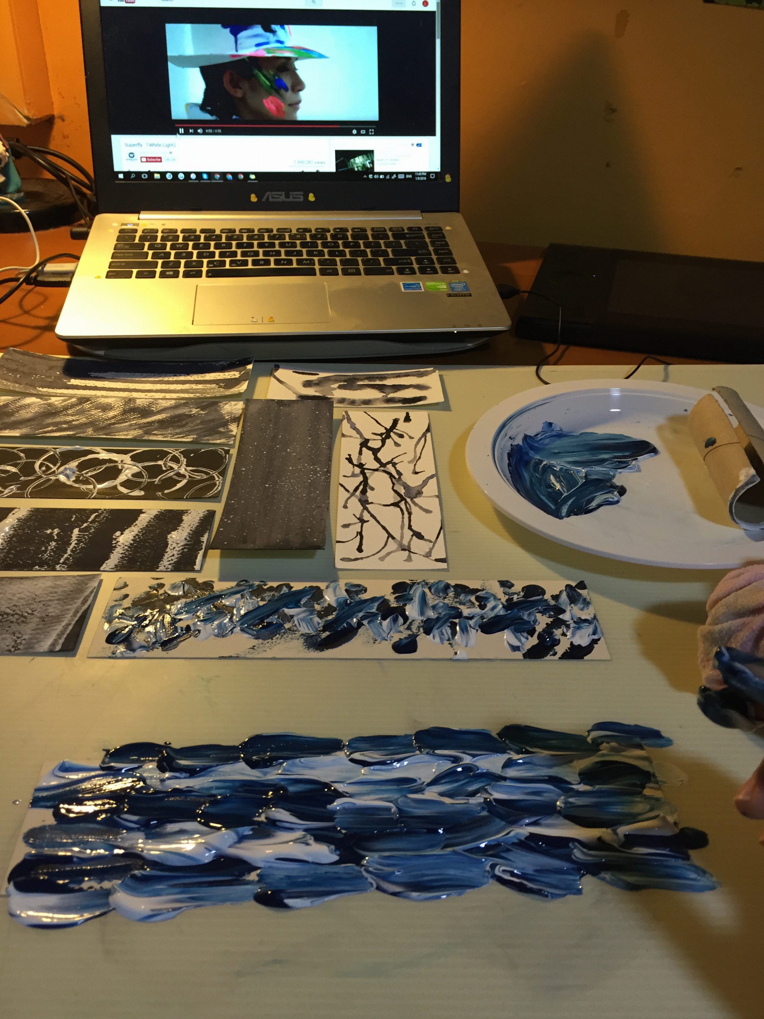
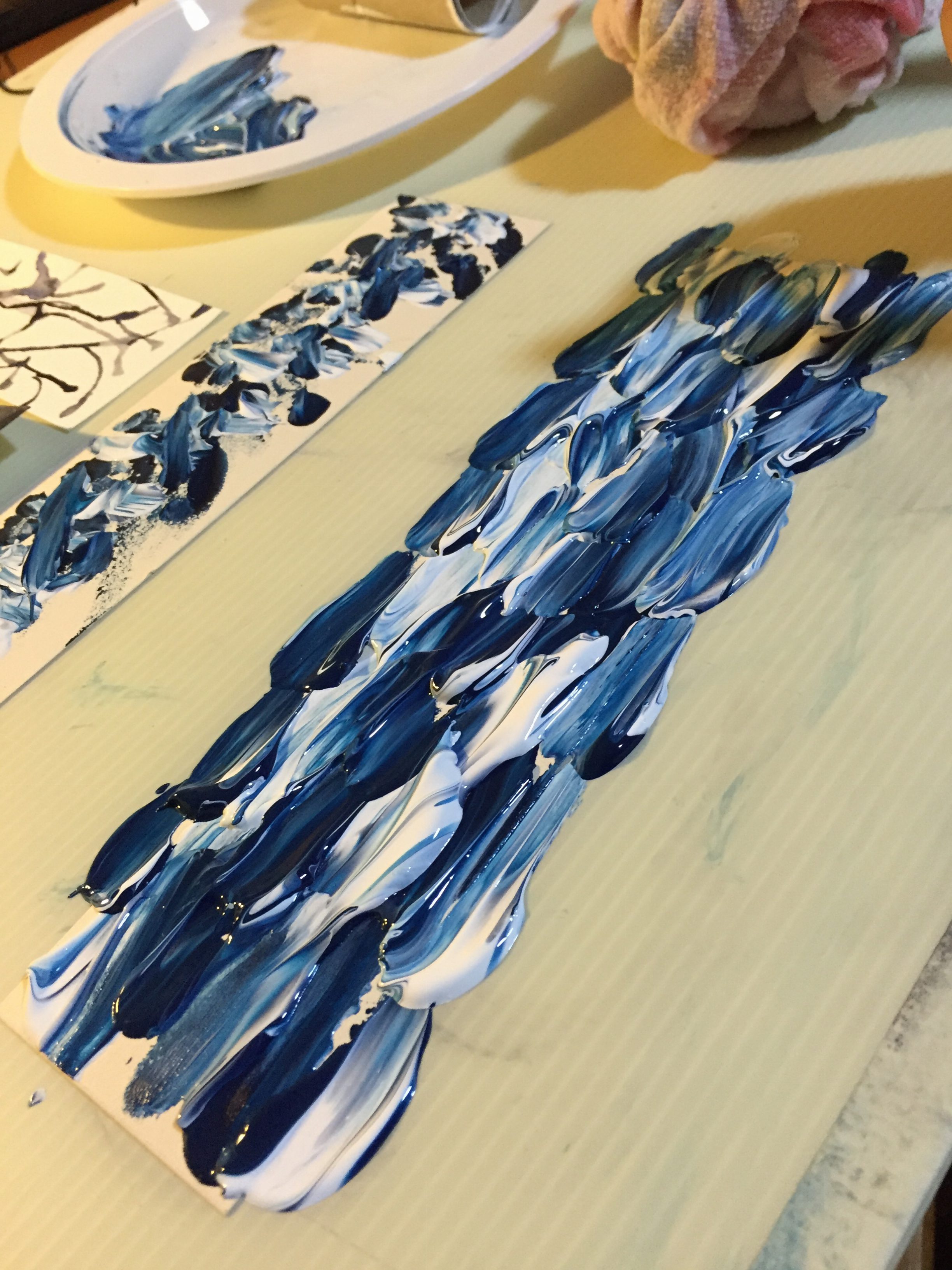
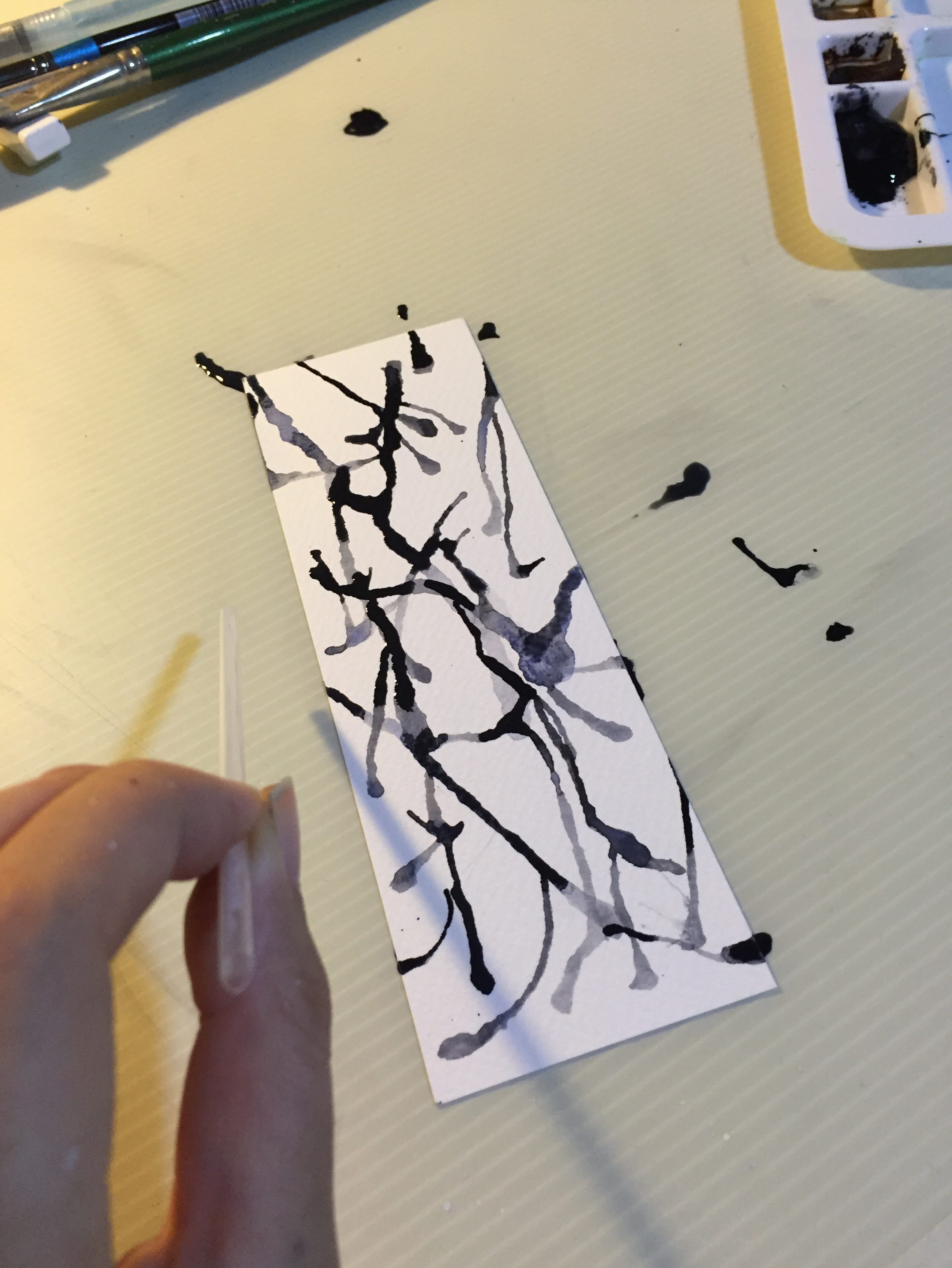
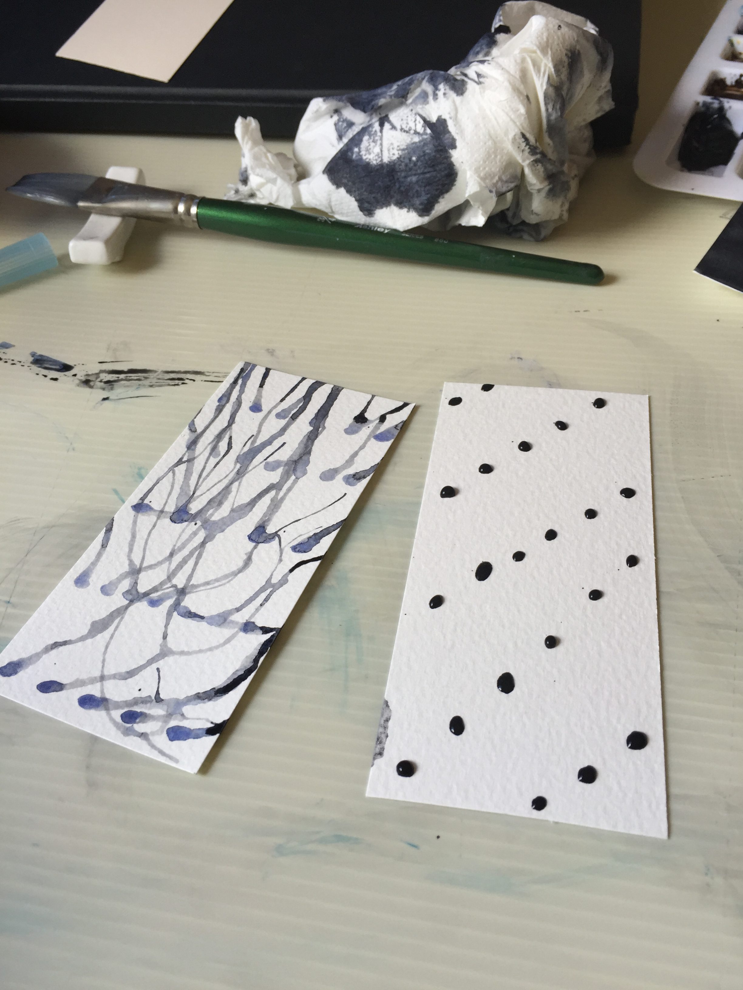
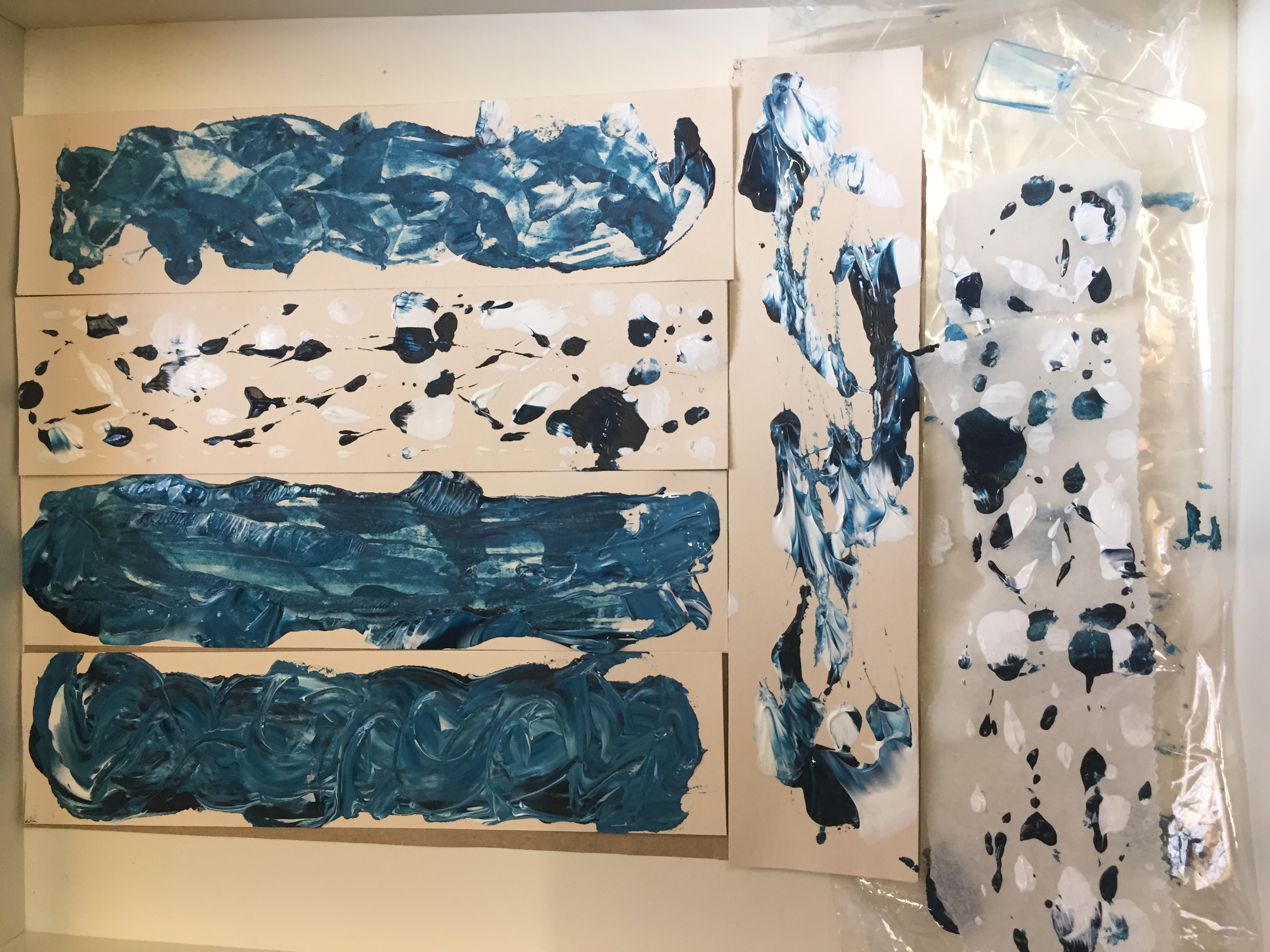
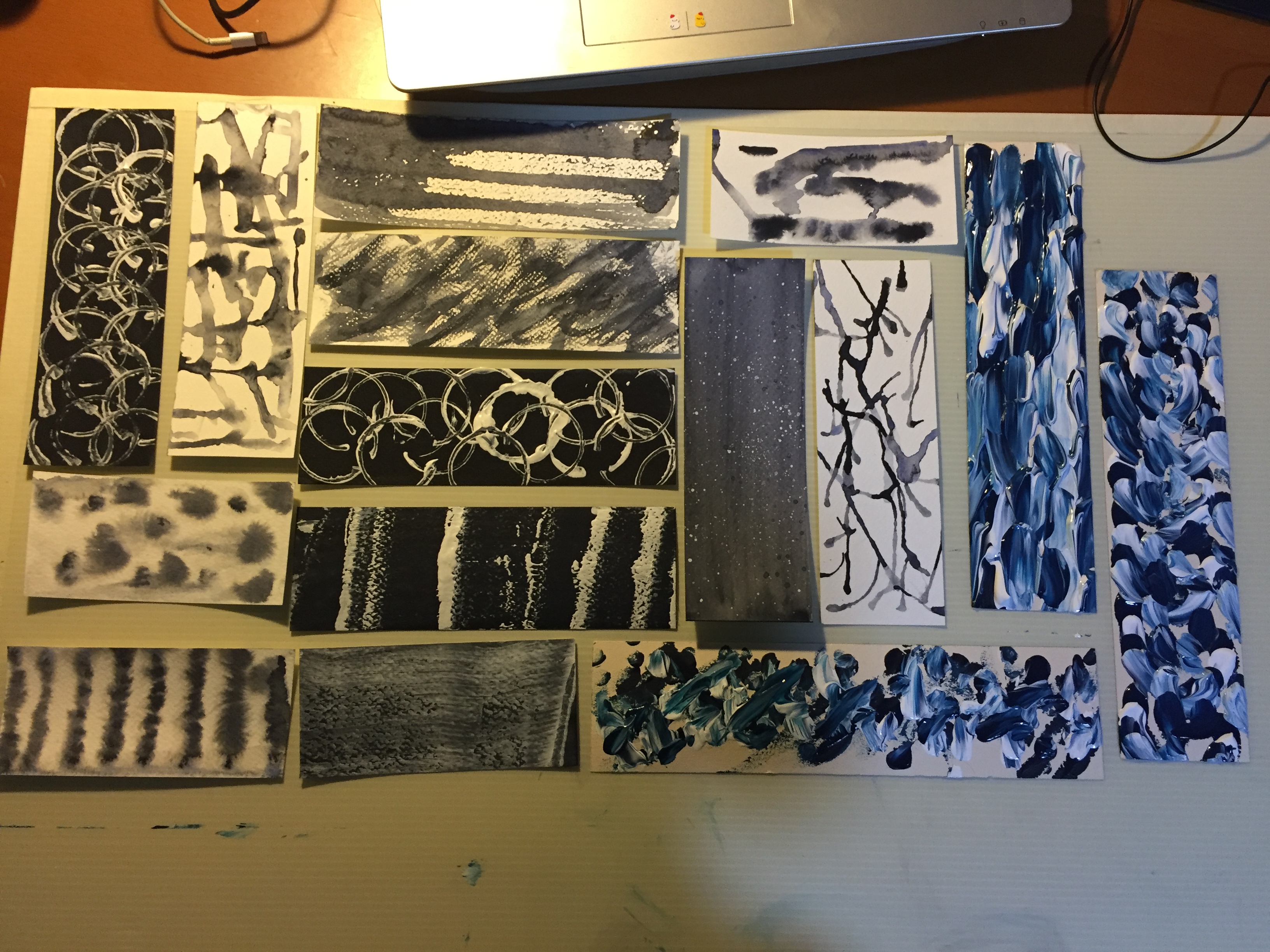
Color Analysis
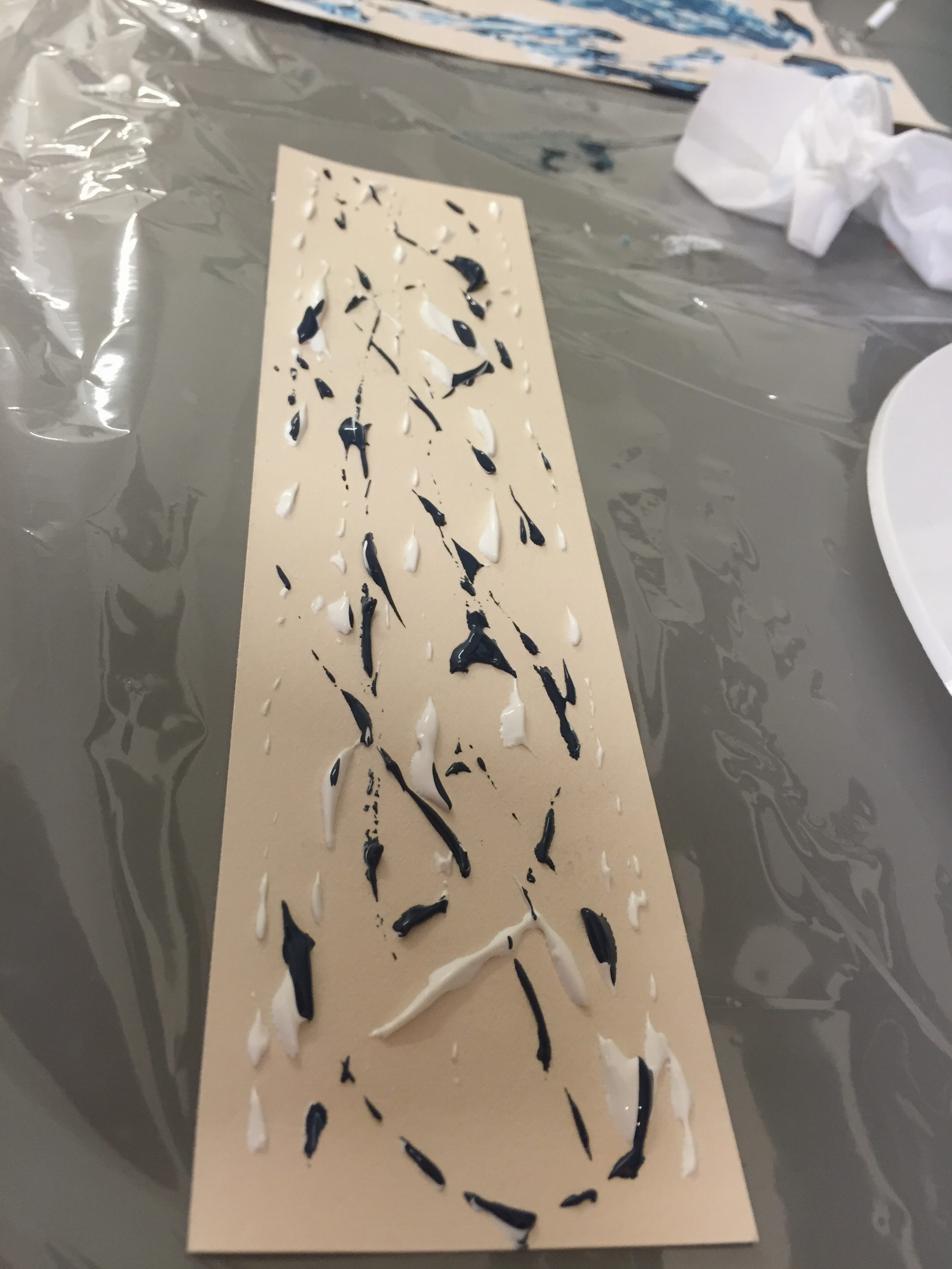
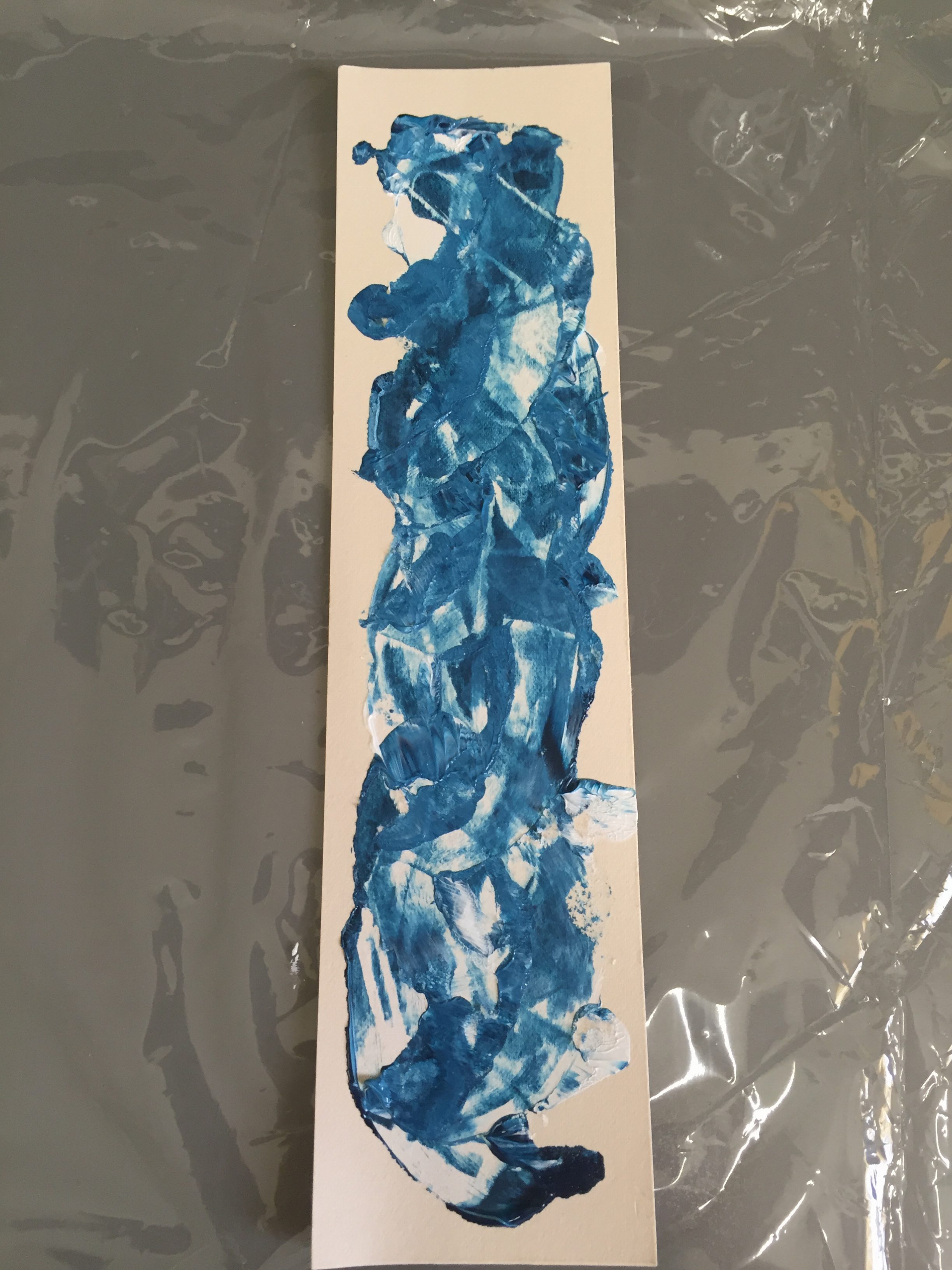
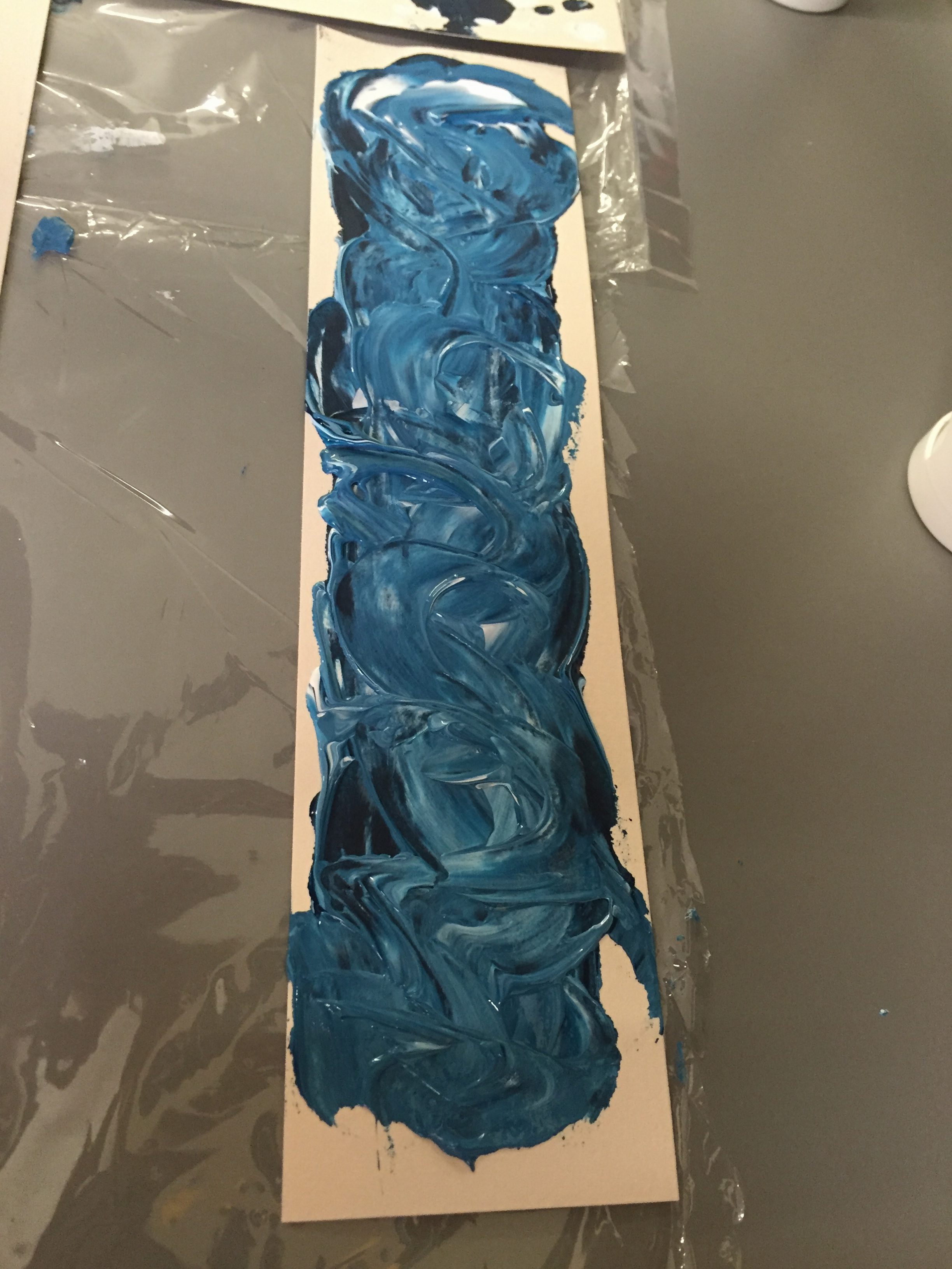
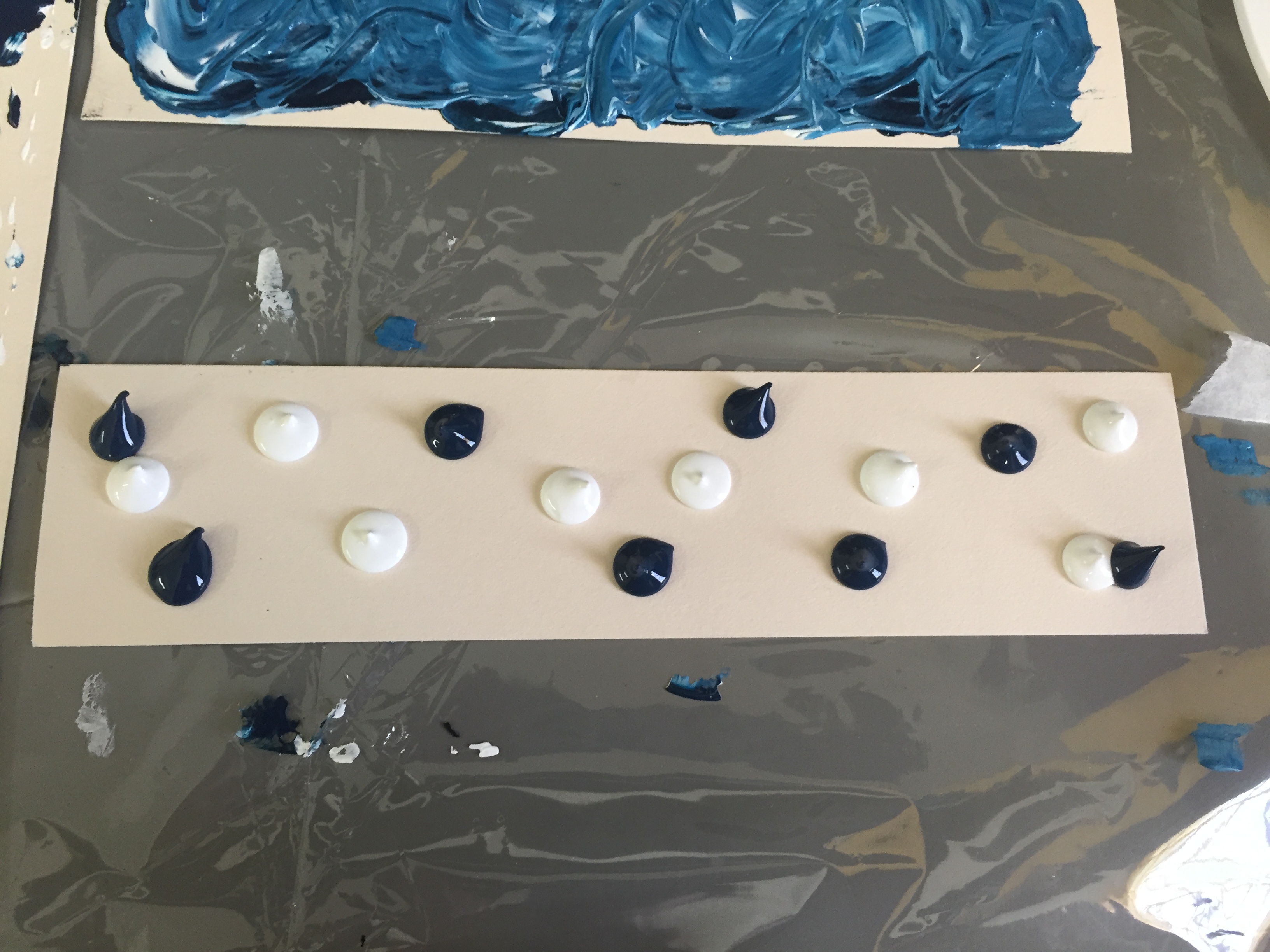
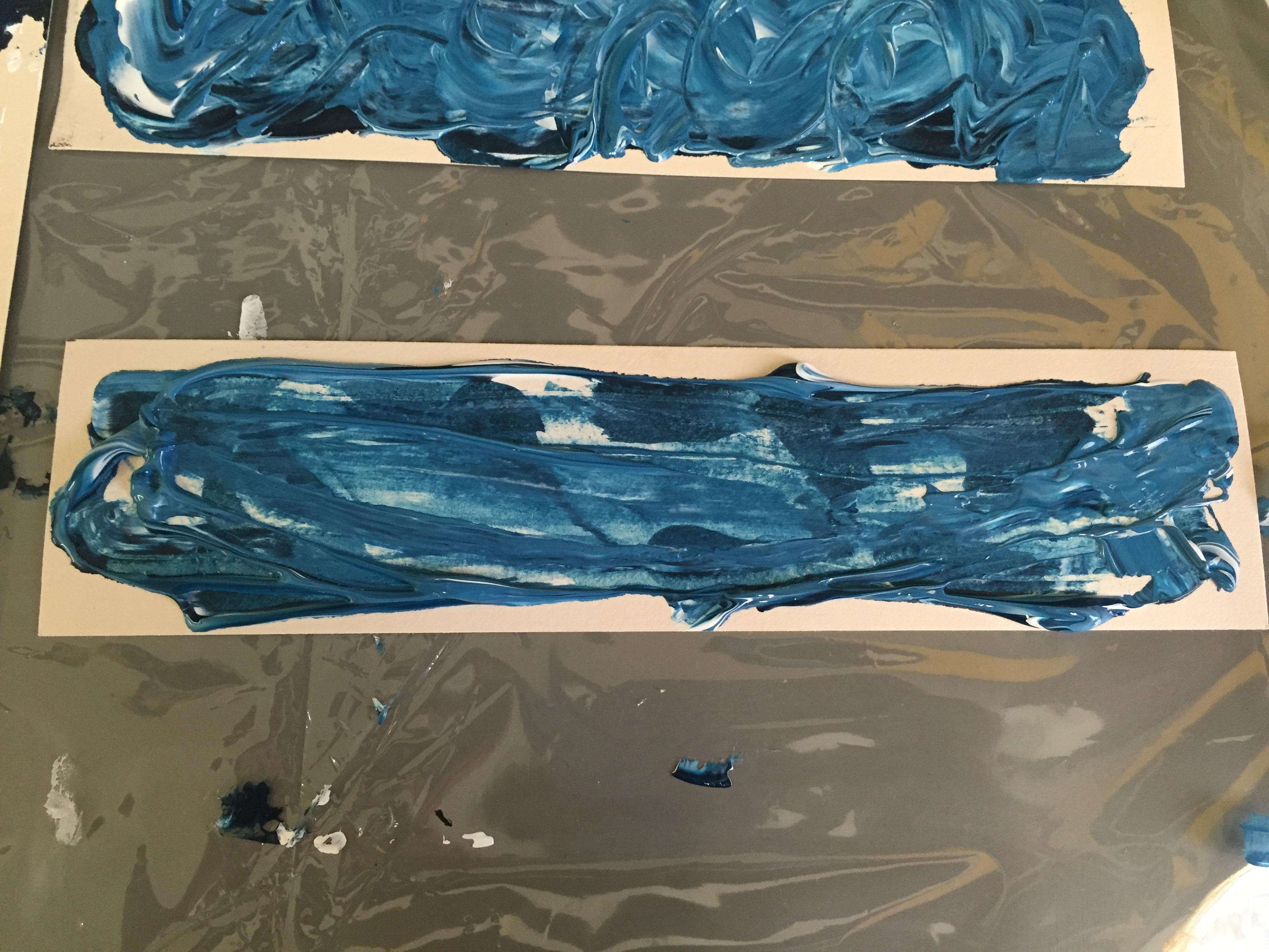
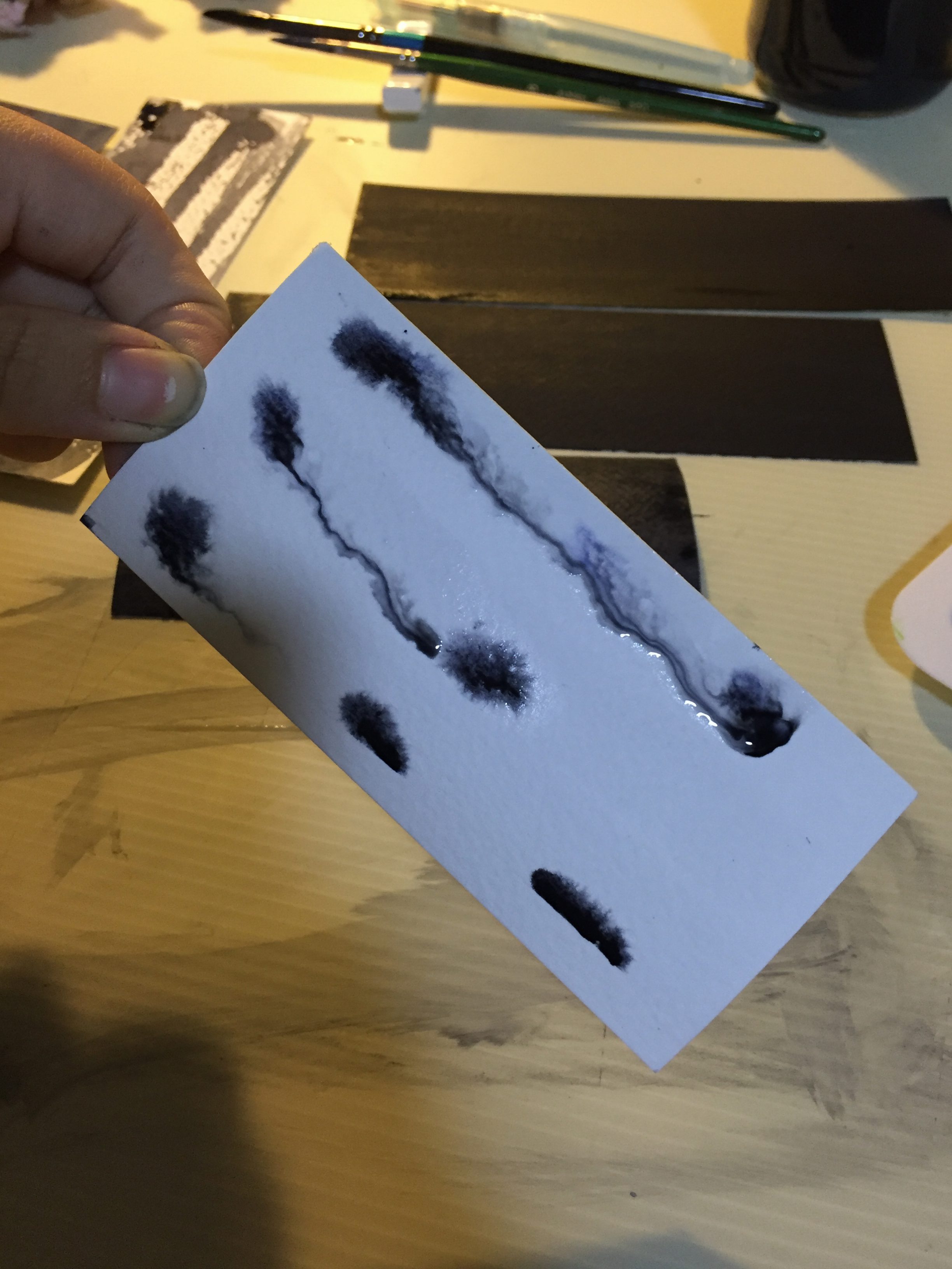
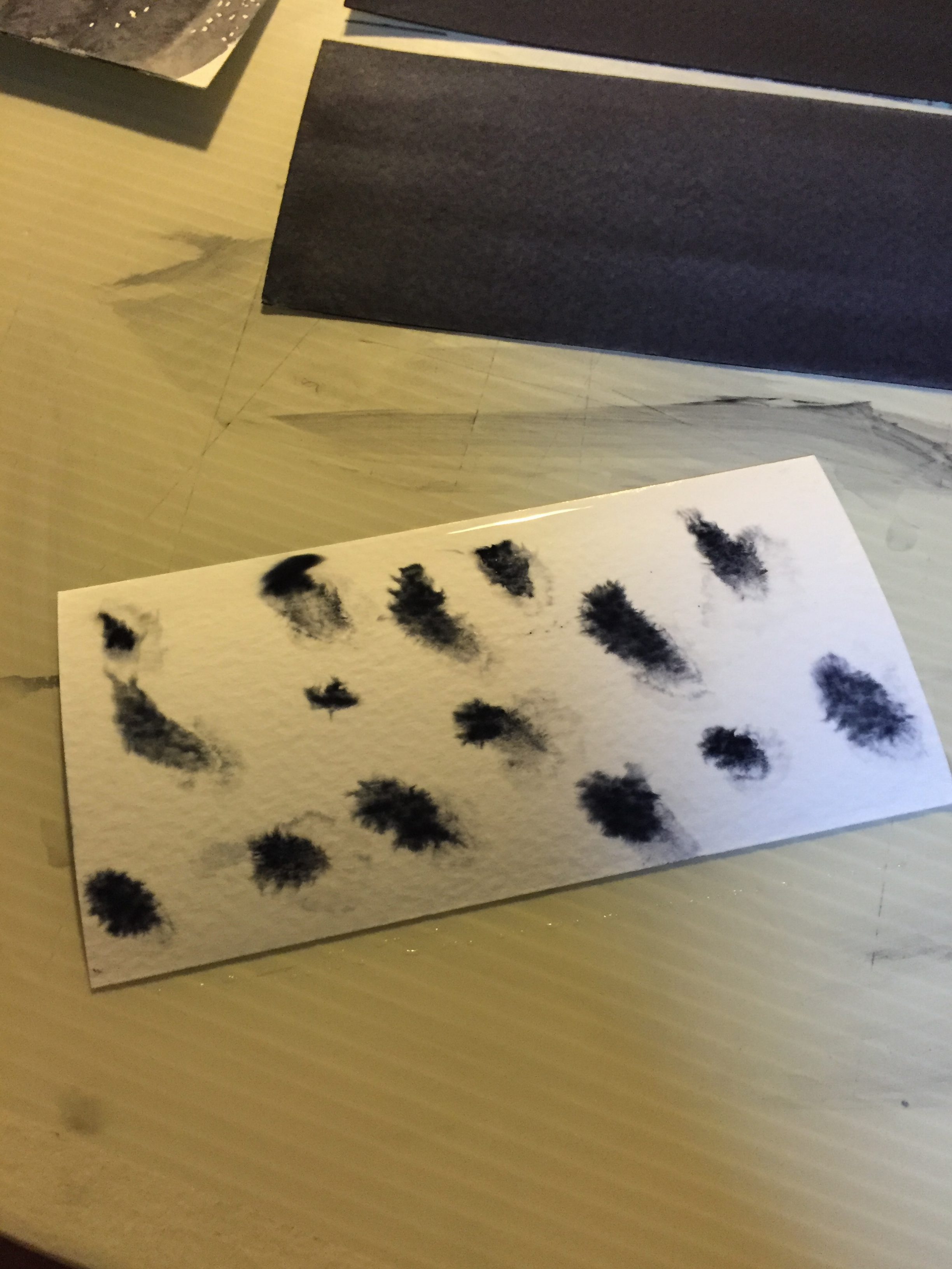
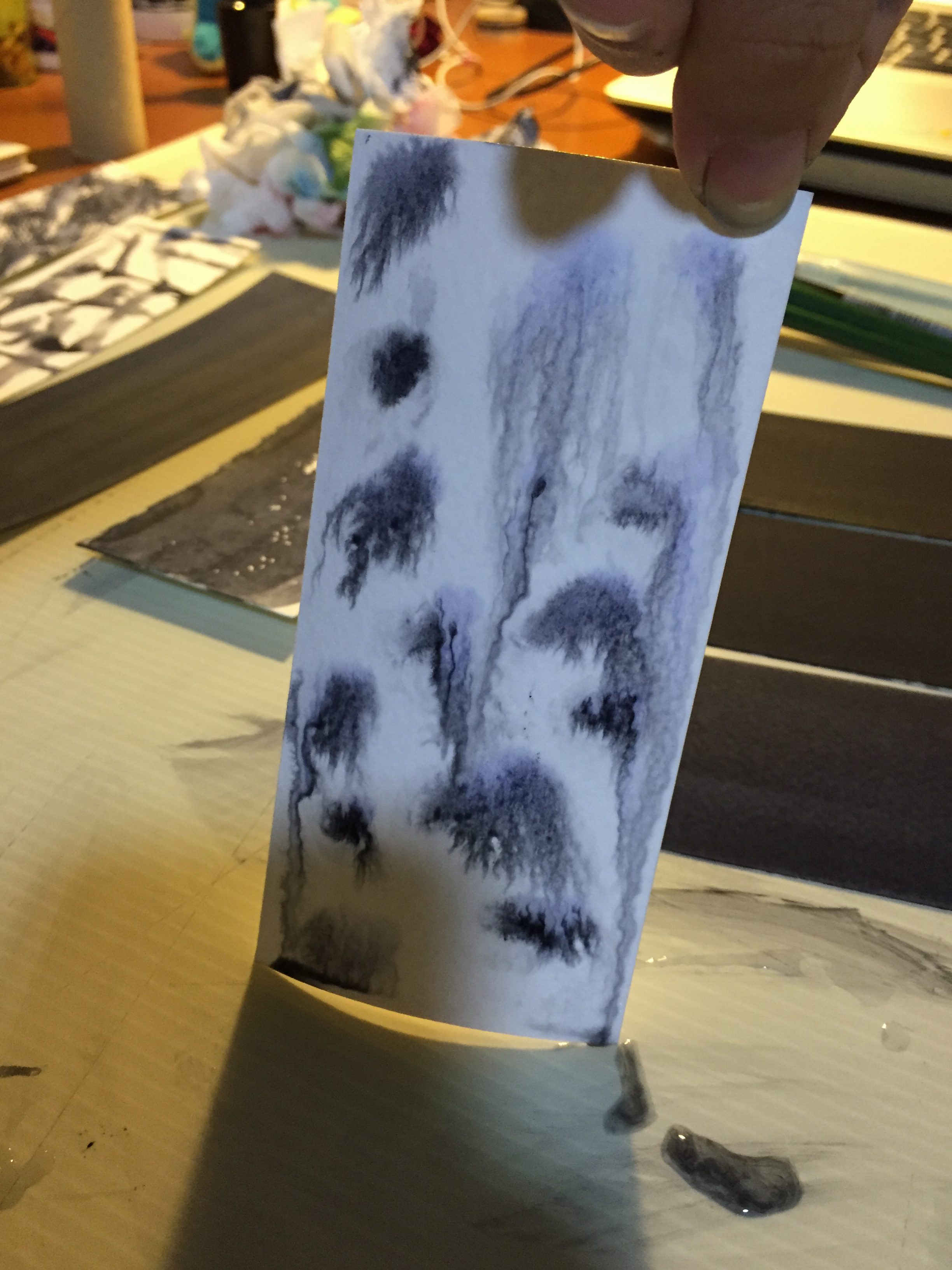
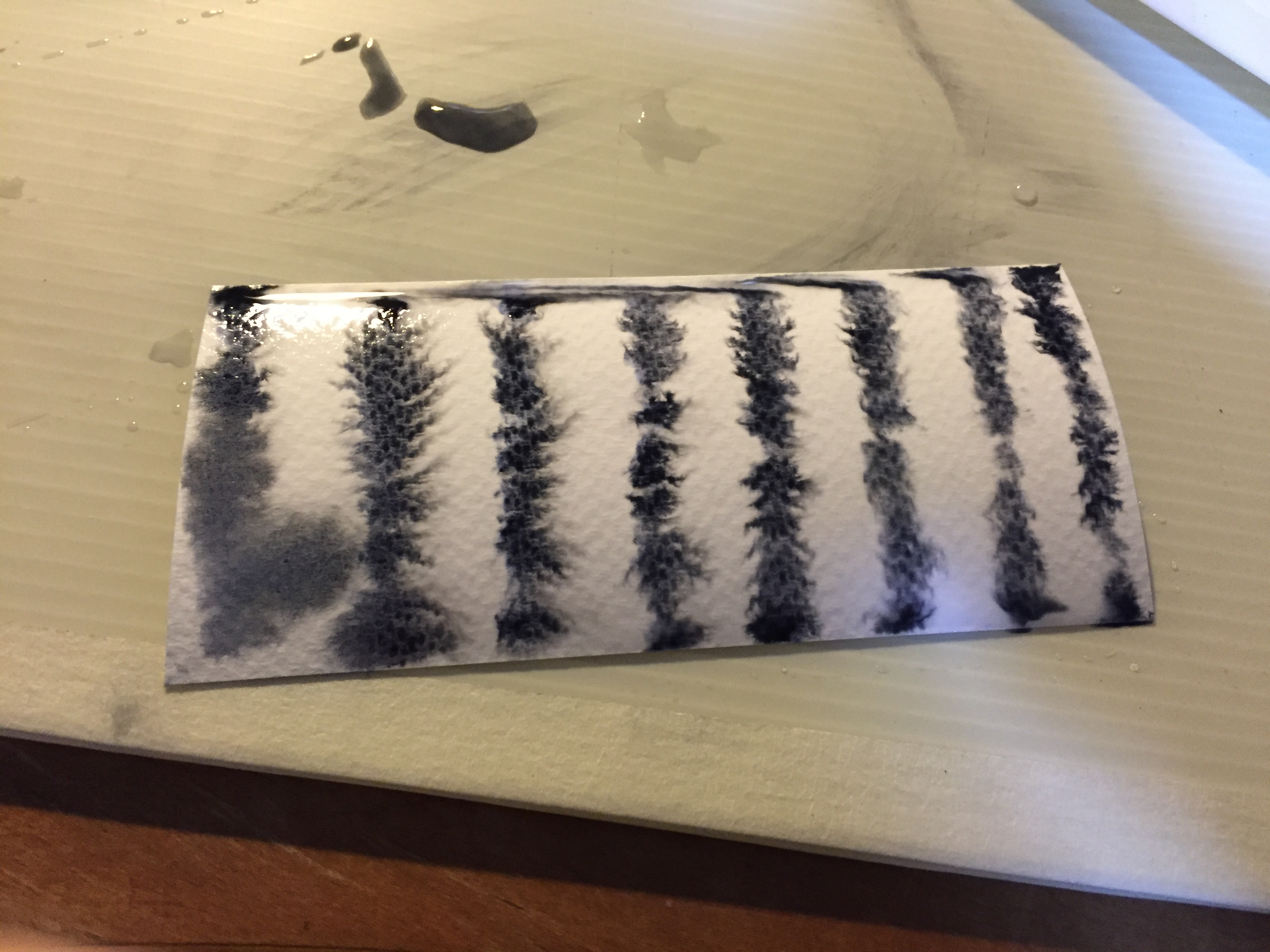
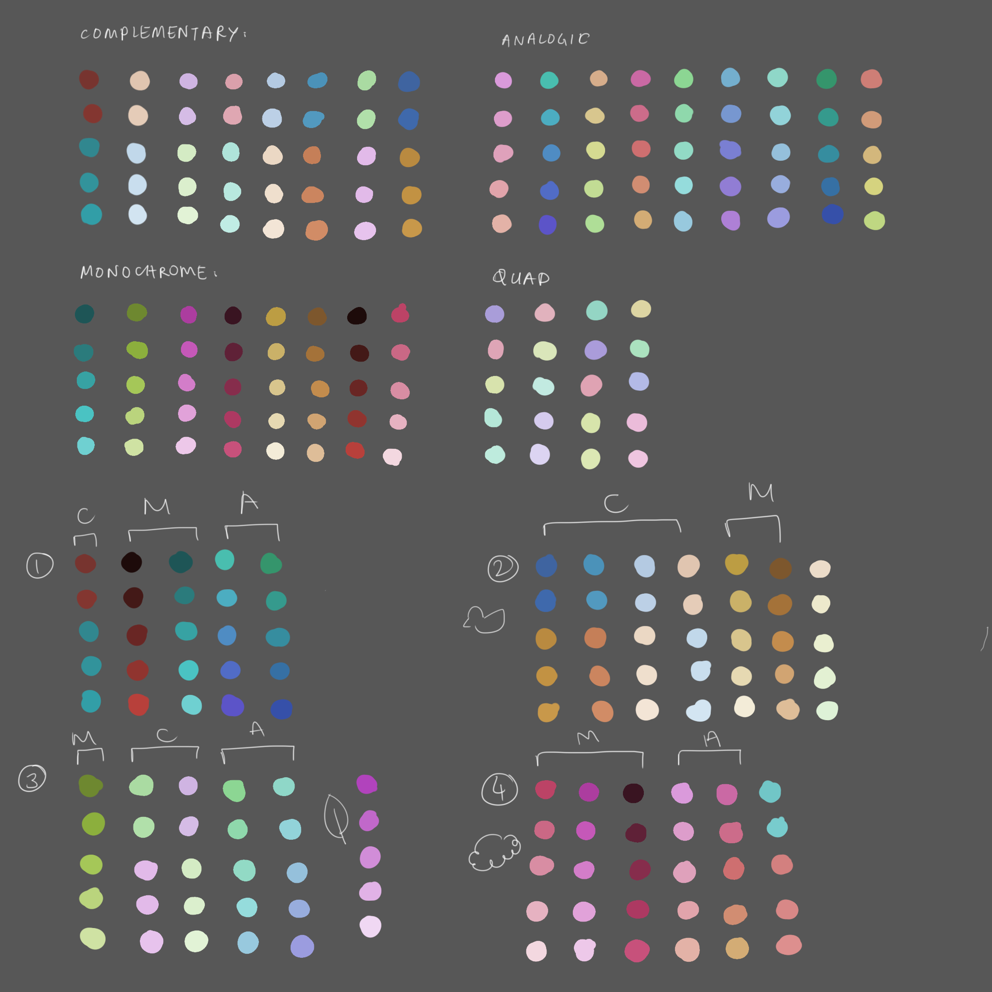
I first picked color schemes that I liked via colourco.de ; This is a website that I use when I want to play around with colors.
Here is my chart of color schemes:
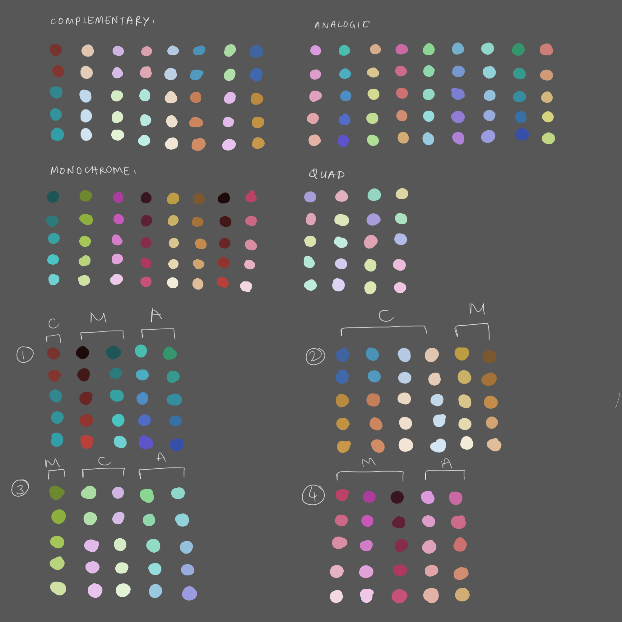
I didn’t go with mood boards because it’s rather distressing; I’d come up with too many color schemes. Listing the colors I found appealing would be better in terms of organization.
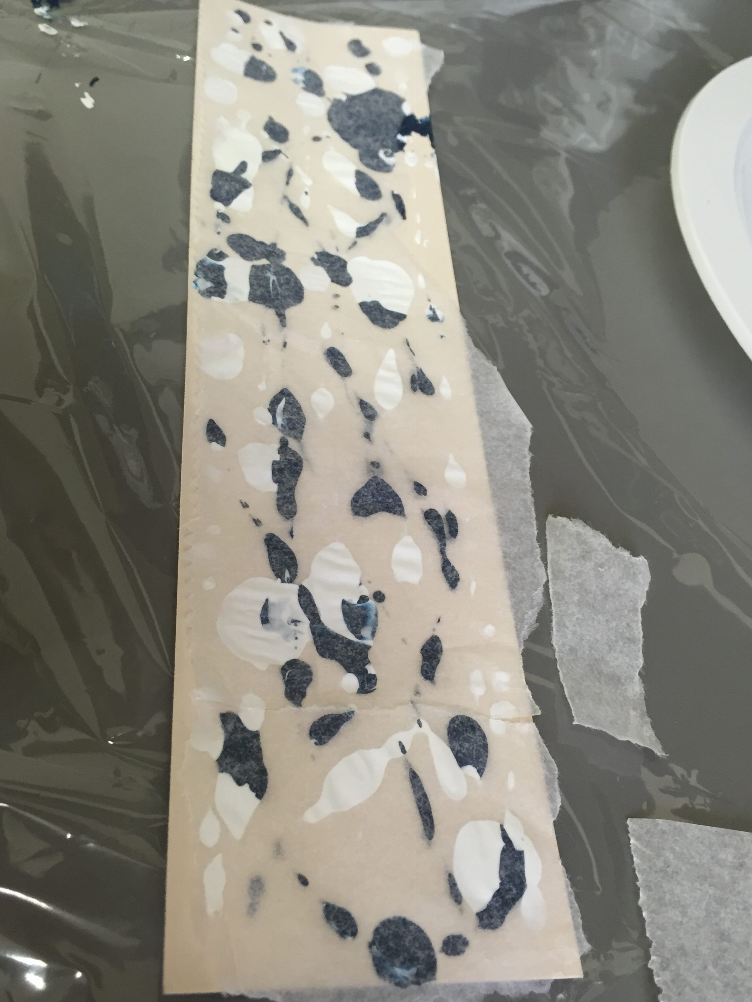
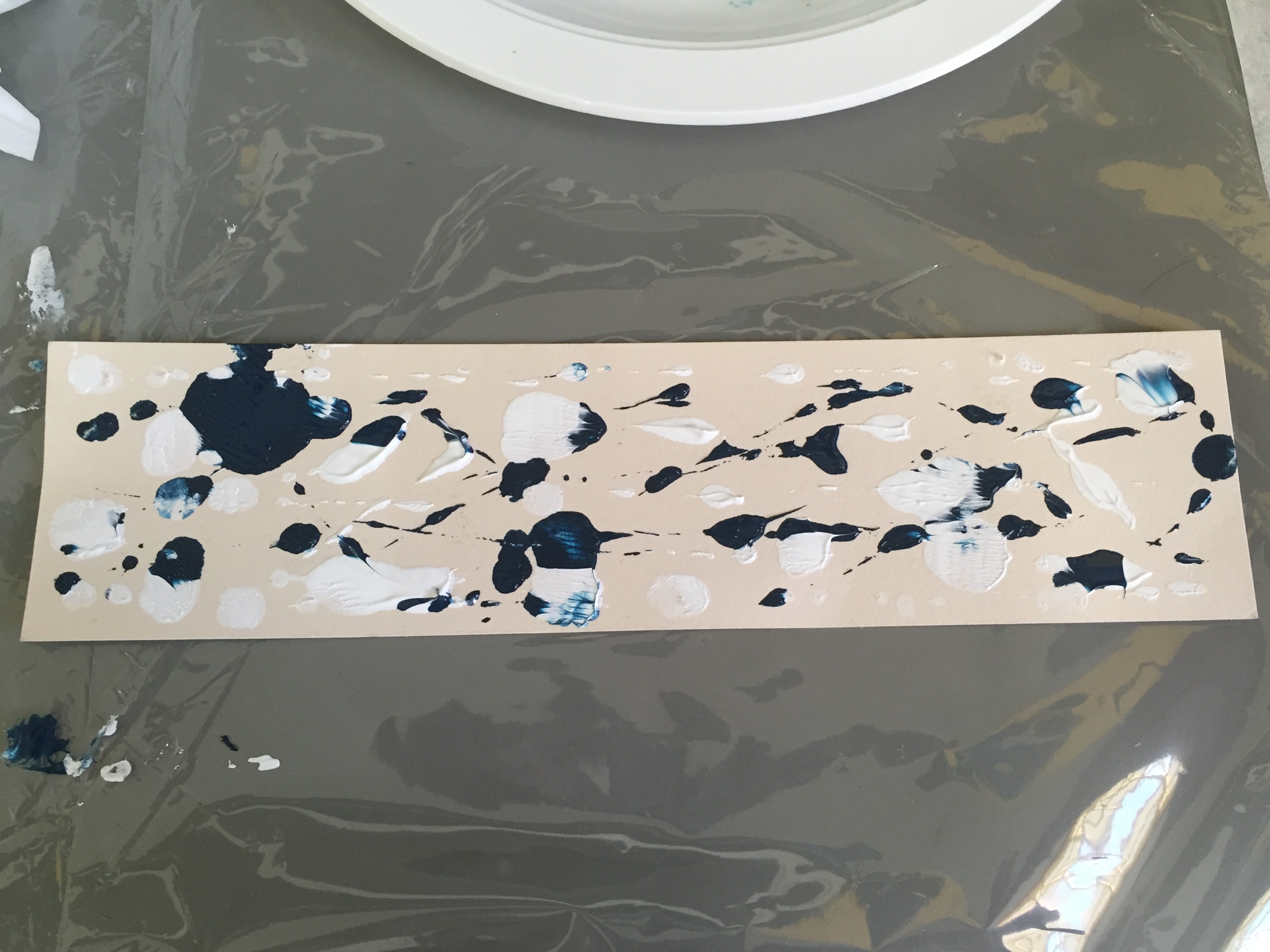
I grouped the numerous color schemes according to their similarity and got 4 distinct groups of colors. [C – complementary, M – monochrome, A – analogous]
Afterwards, I added a few more color schemes in order to balance my colors (after the lineart)
The Color Decision
Analogous Colors – Personality Trait (First Row)
I personally feel that my character traits are strong and weak at different times – I react differently in different settings. Analogous colors hence represent this fact; my personality is not toned in one color, but similar colors/colors side by side.
Monochrome Colors – Setting (Second Row)
An environment or situation, to me, is dyed in one color, but of different tones.
Complementary Colors – Outcome of Me (Third Row)
Settings influence my behavior, and how I react to people’s actions and the stimuli around me; that’s why I see it as not just one color, but different colors.
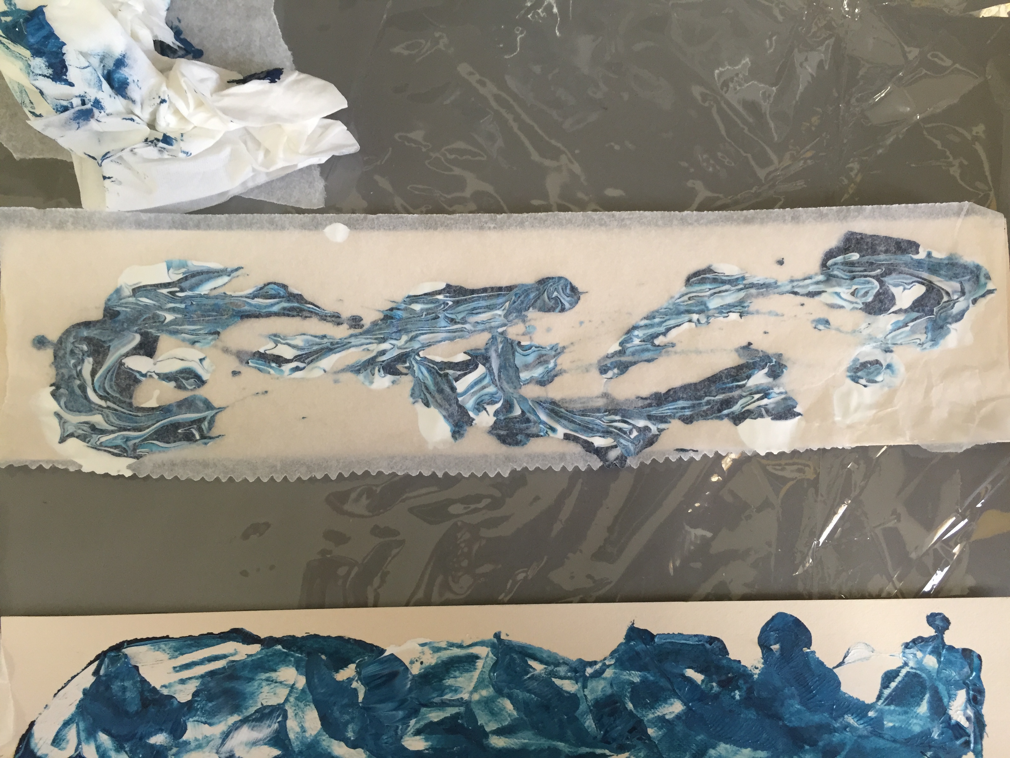
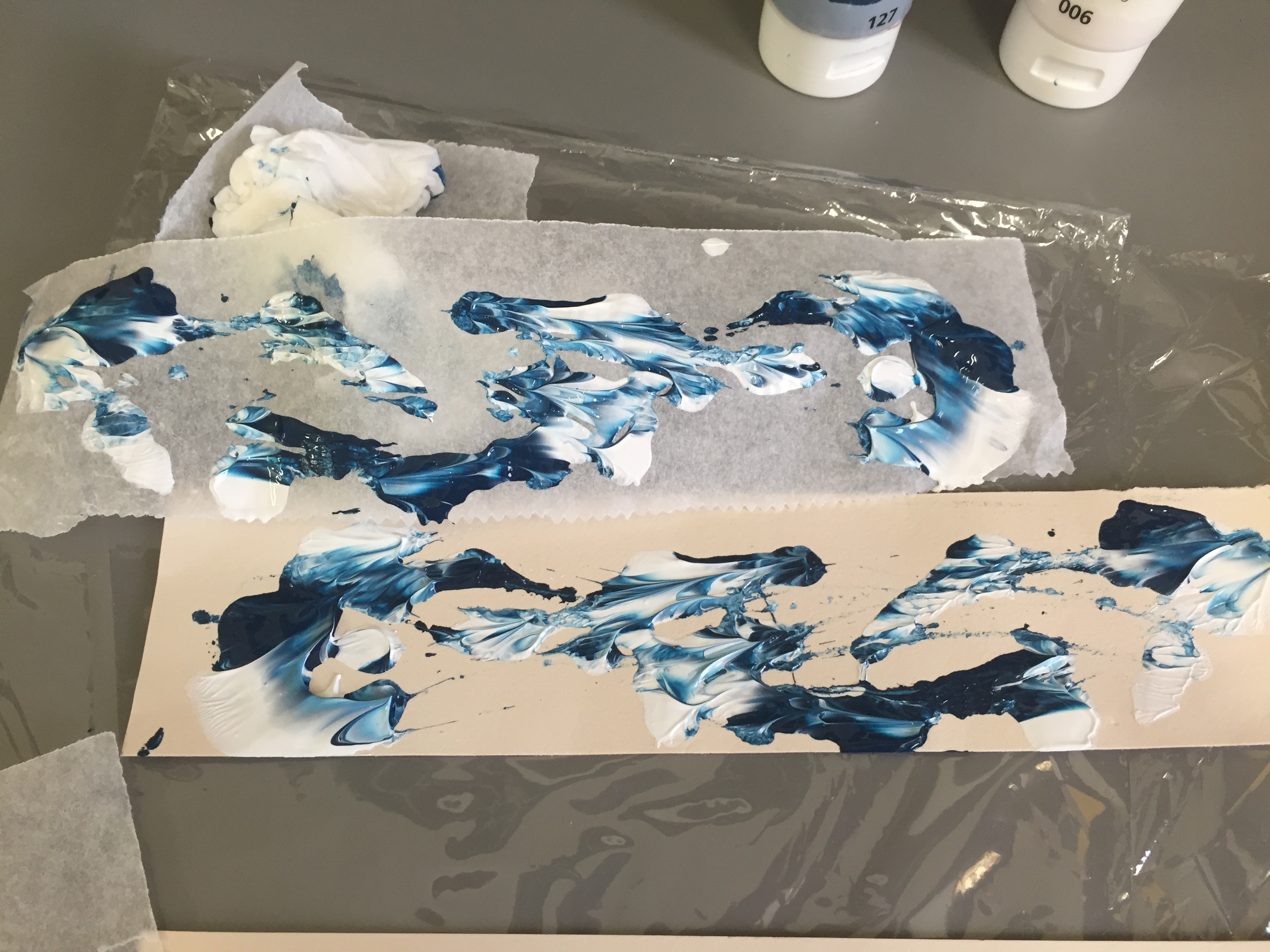
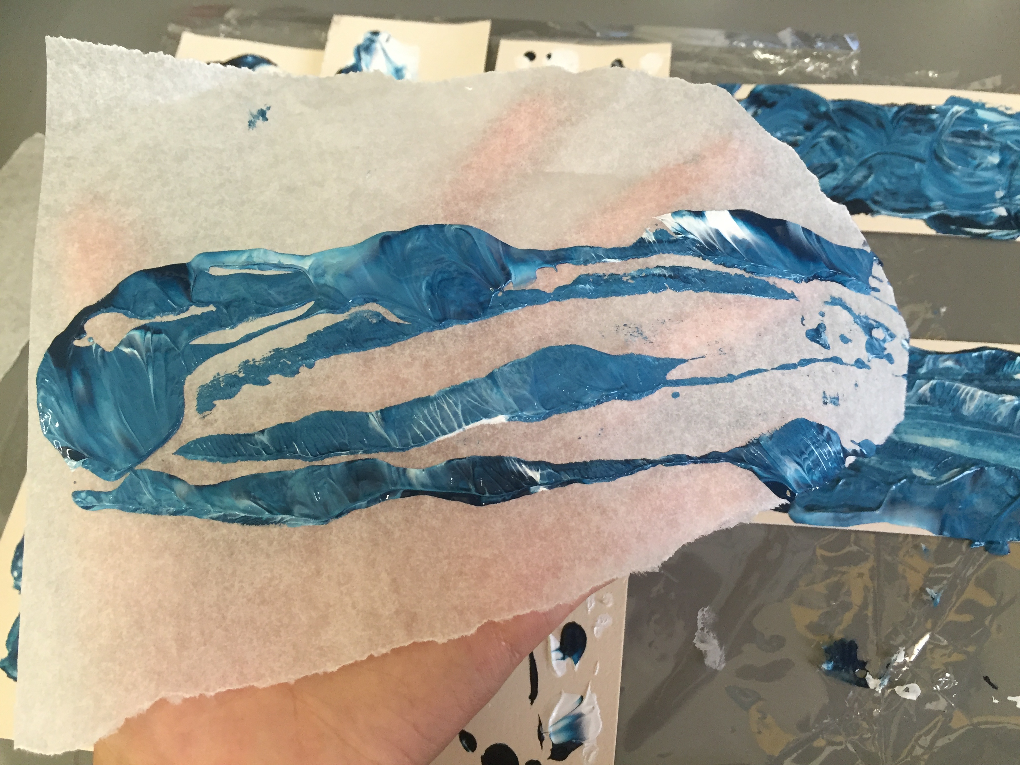
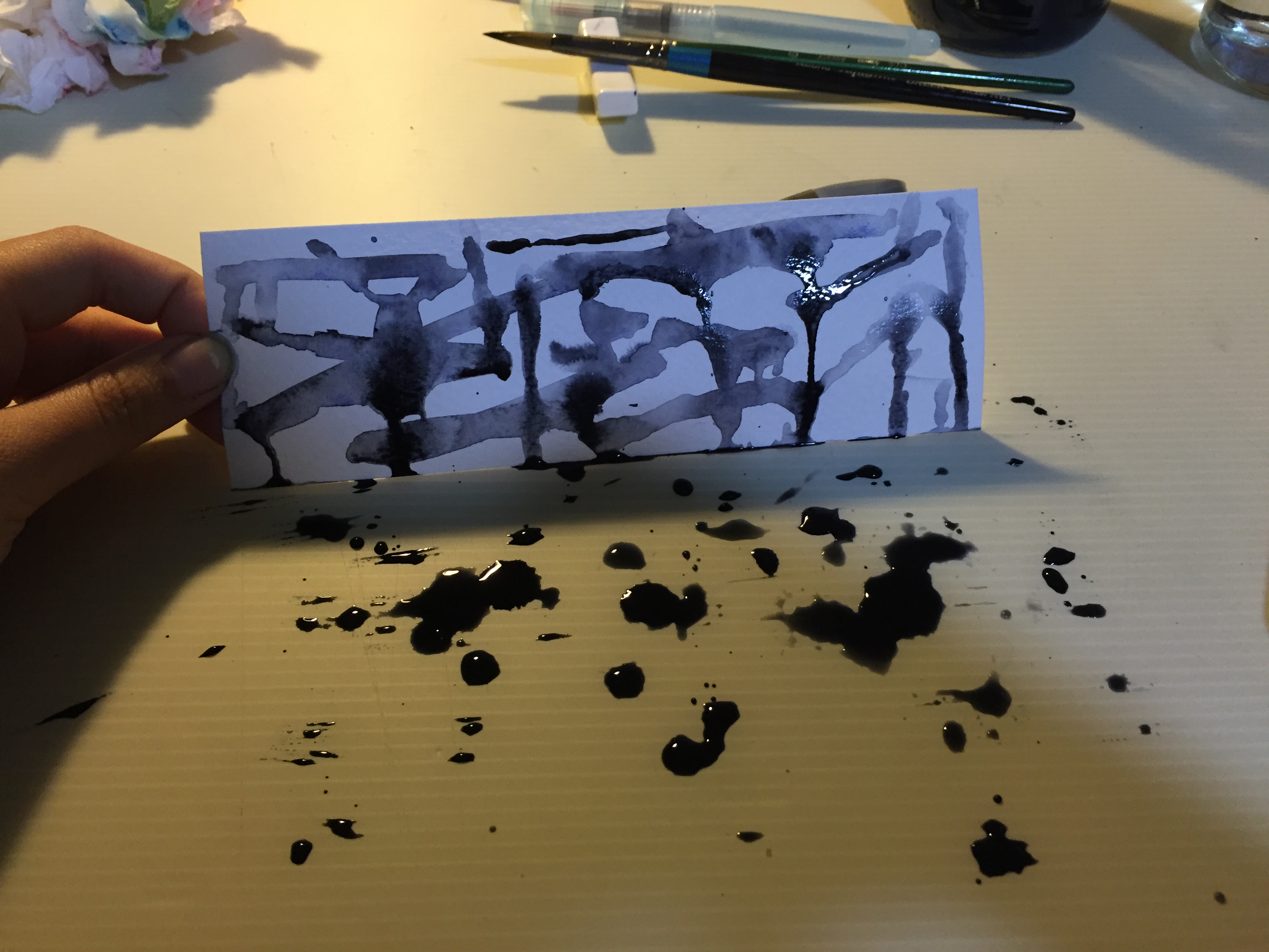
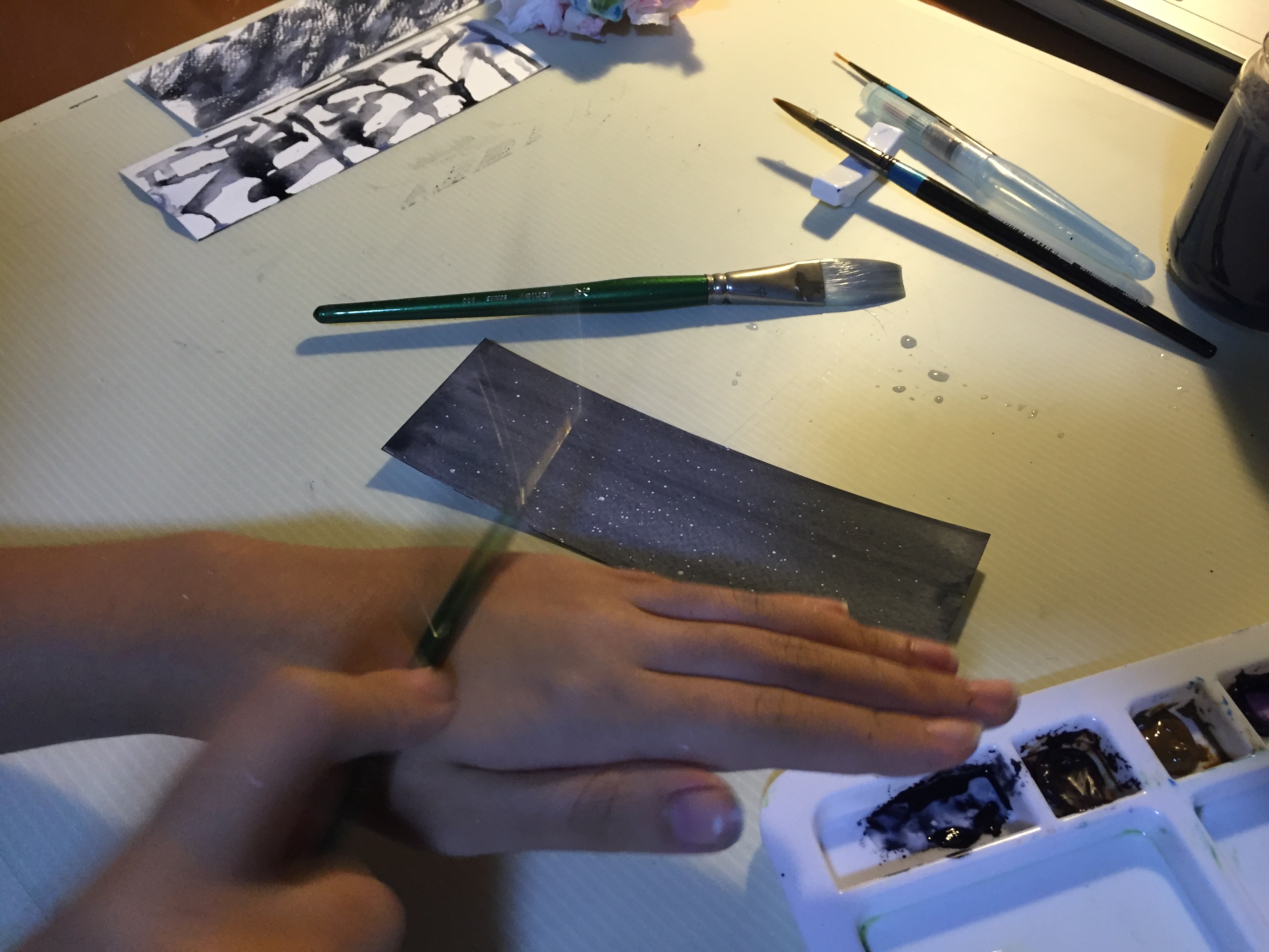
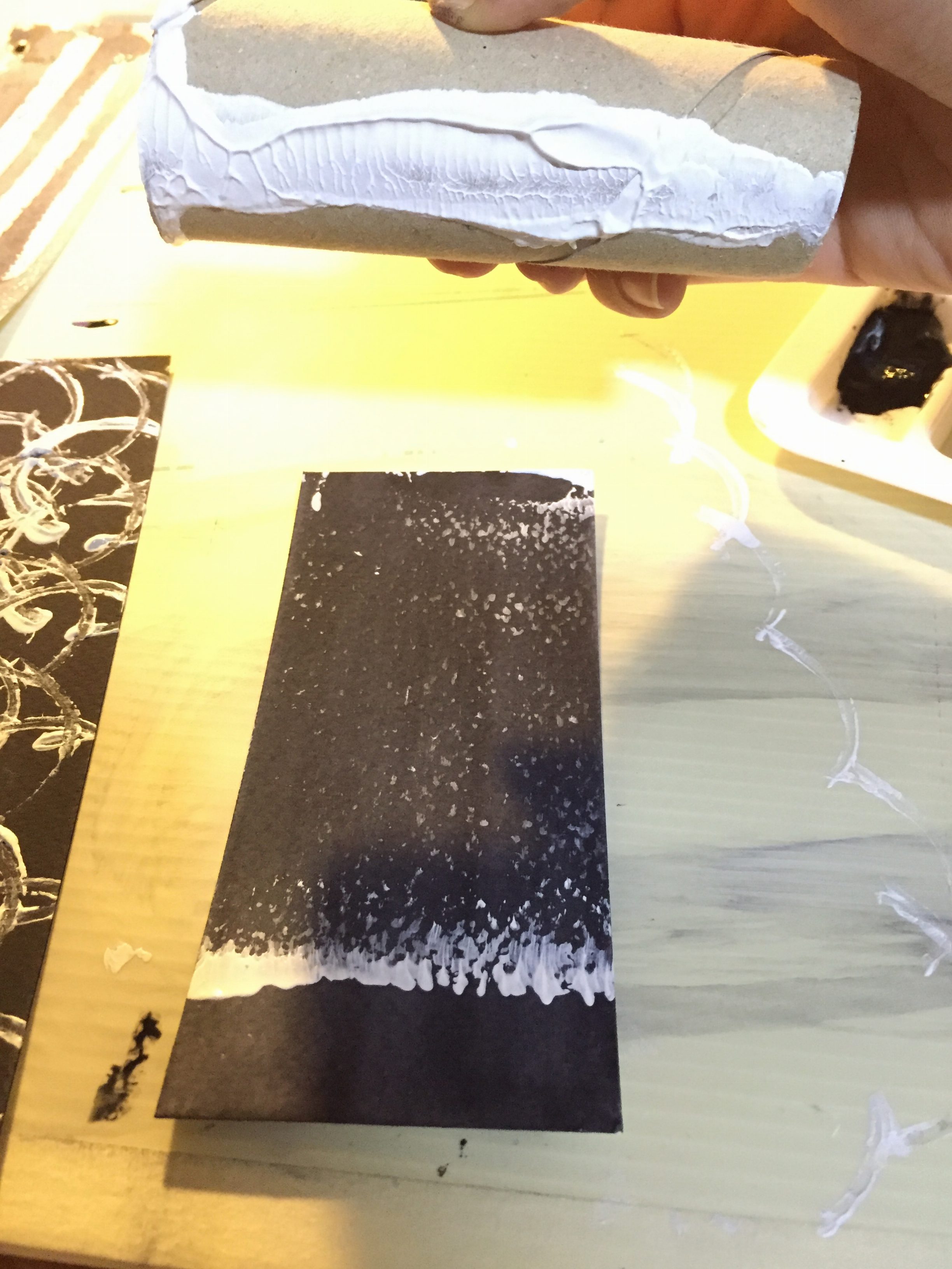
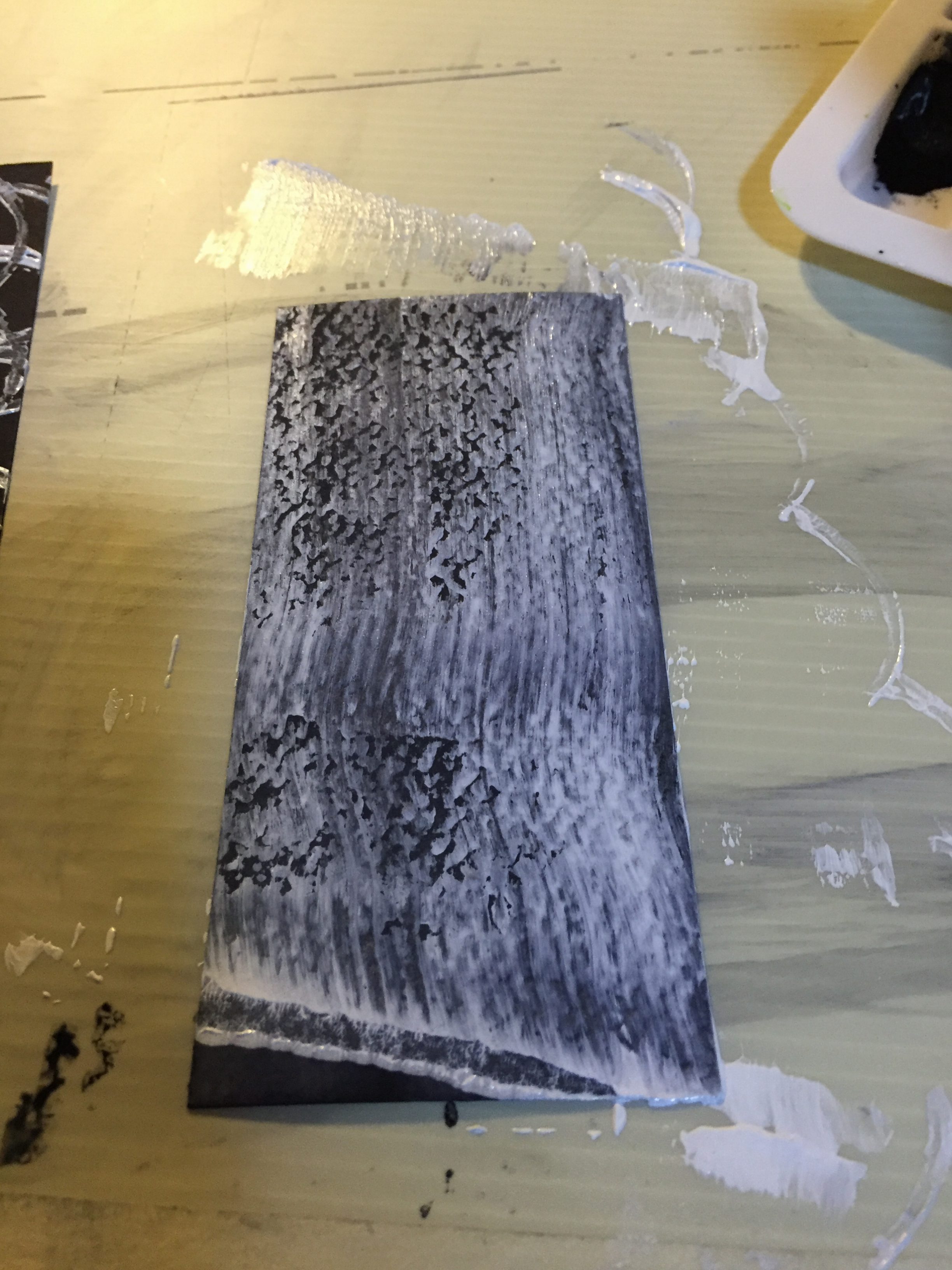
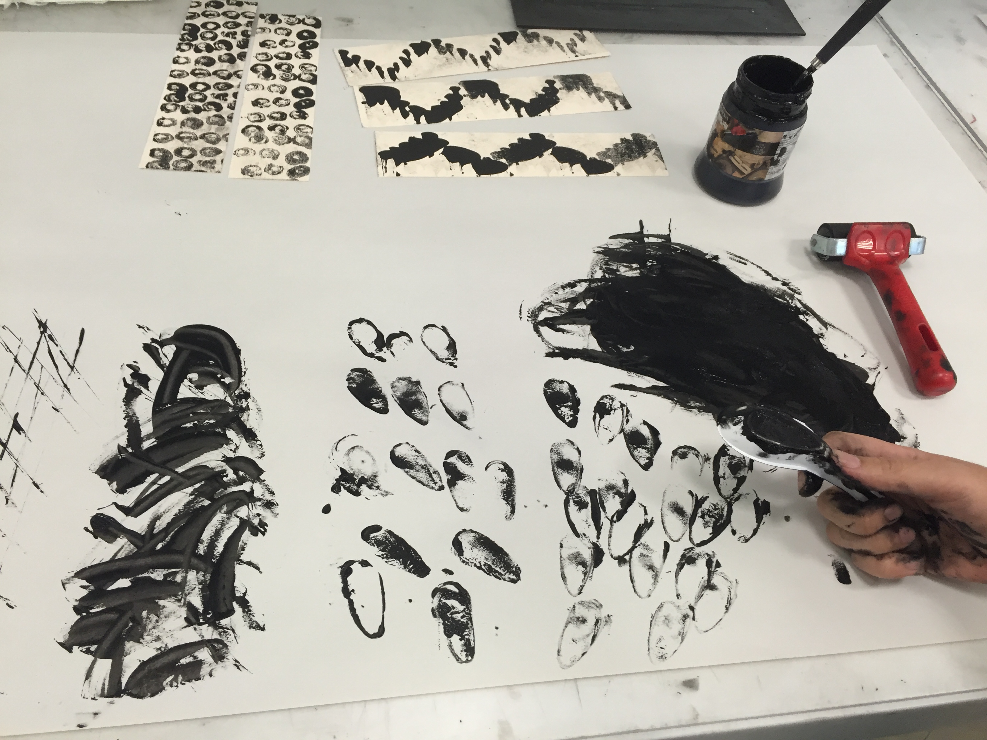
Sketches
After pinning down the settings, symbolism and colors, I put them together:
- Head in the Clouds + Fantasy Fiction = Triumph
- Reserved + Uncomfortable Social Events = Suffocation
- Go with the Flow + Disruption = Anxiety
- Nature-lover + Nature = Zen
Final Outcome
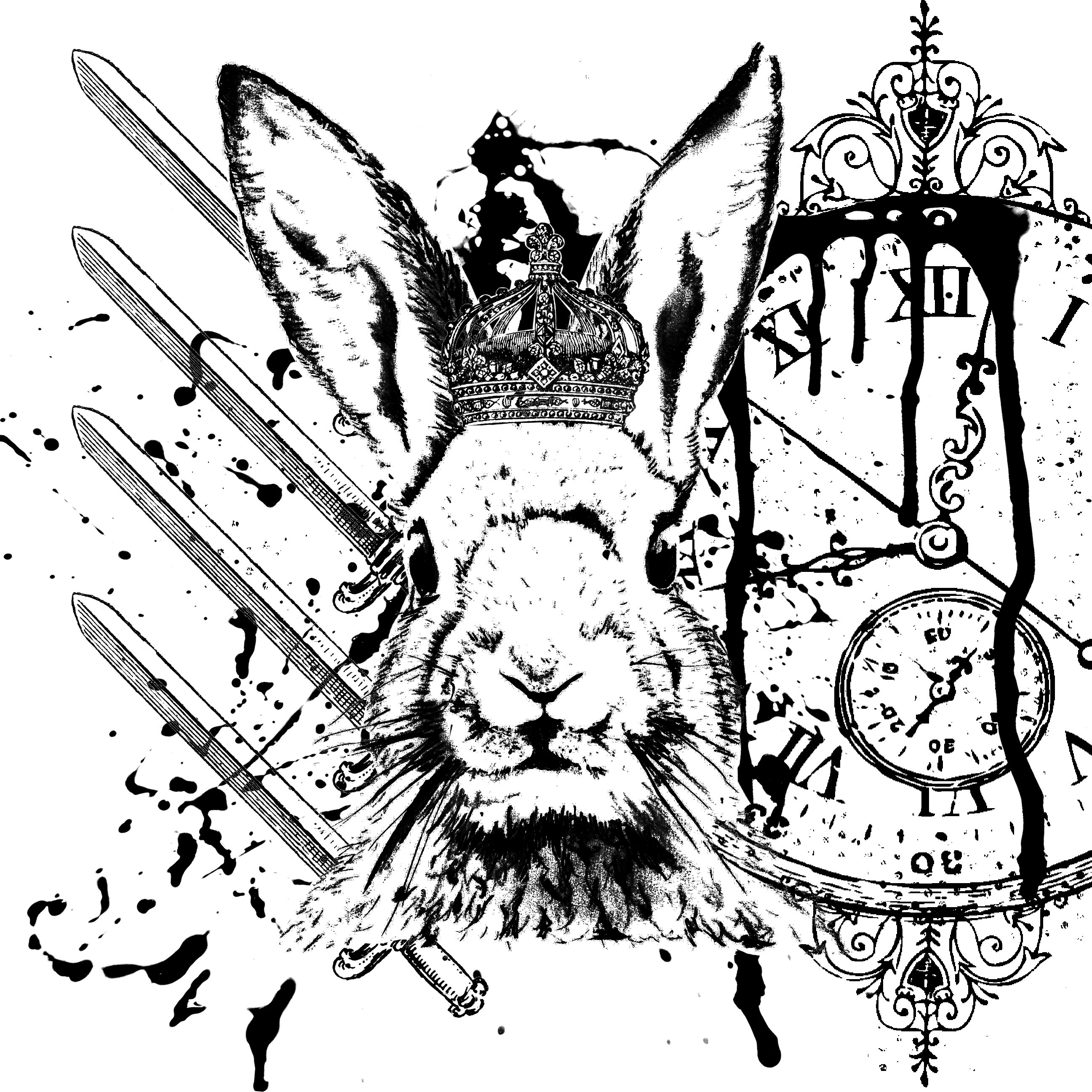
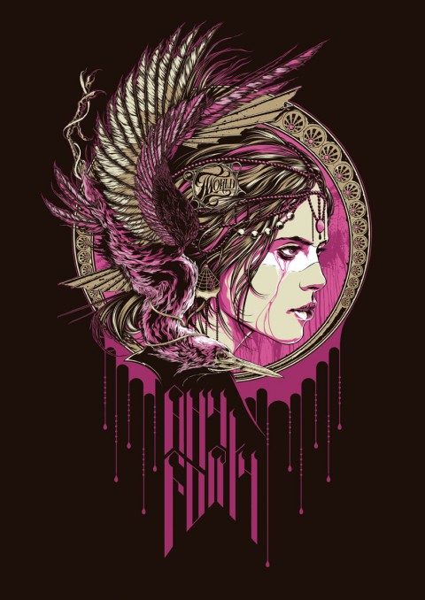
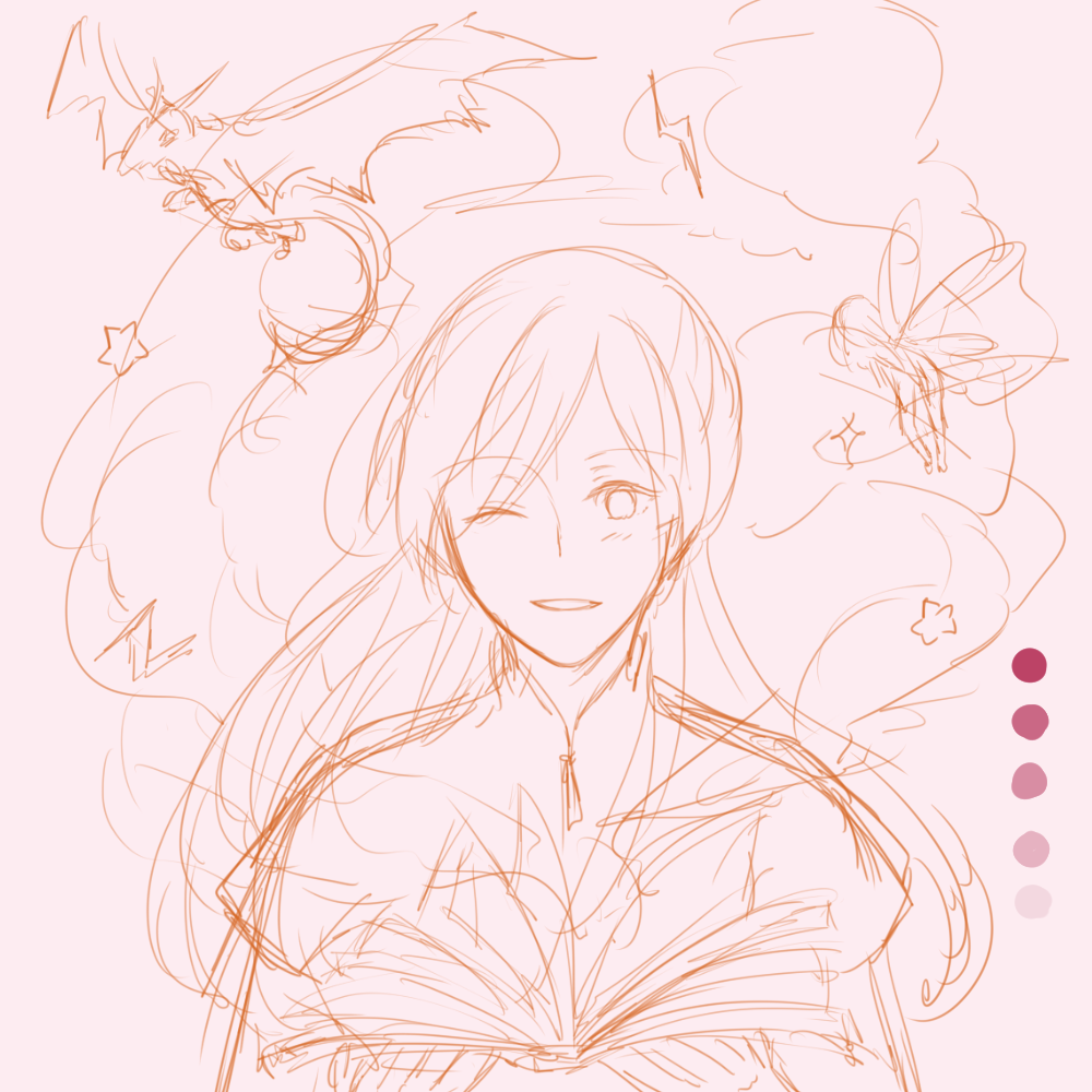
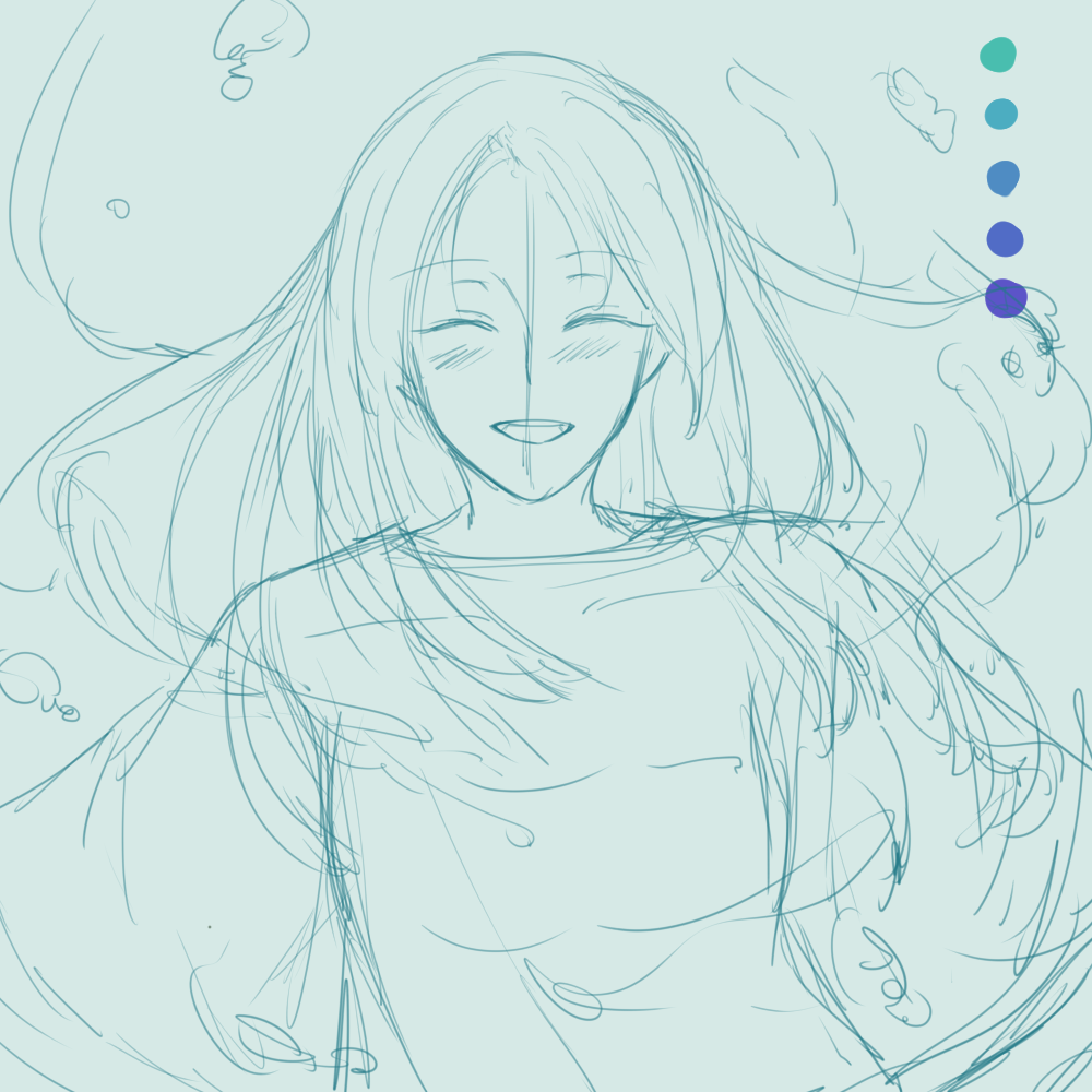
Head in the Clouds + Fantasy Fiction = Triumph
Head in the Clouds
Fantasy Fiction
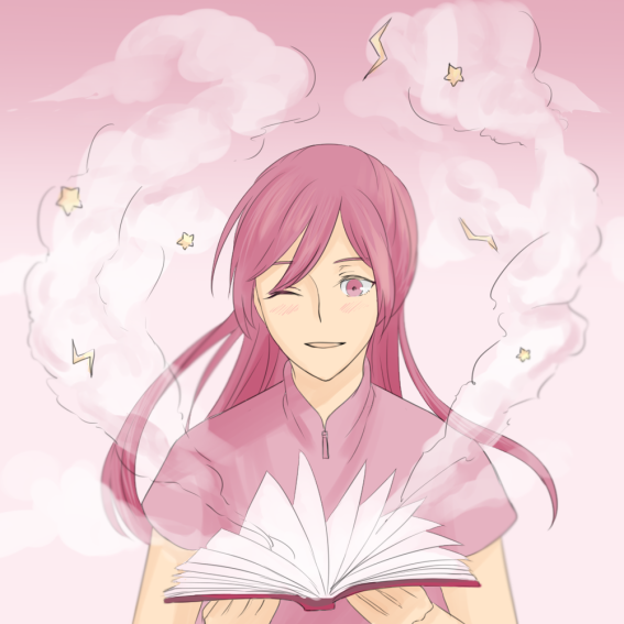
Triumph
Personally…
I’m always told by people that I’m “in my own world” and things like that; and I agree wholeheartedly. If you catch me staring into space, I’m probably thinking about fantasy fiction and very often, video games.
Triumph is a depiction of what I feel after I play a video game/read a book — I feel that I’ve won and conquered; I have control over the character in video game, and when I win a battle, it of course feels triumphant.
With regards to colors…
I chose the pastel pink color scheme group for this equation as it best represents fantasy to me; it brings out a very pixie feel to it.
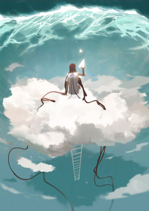
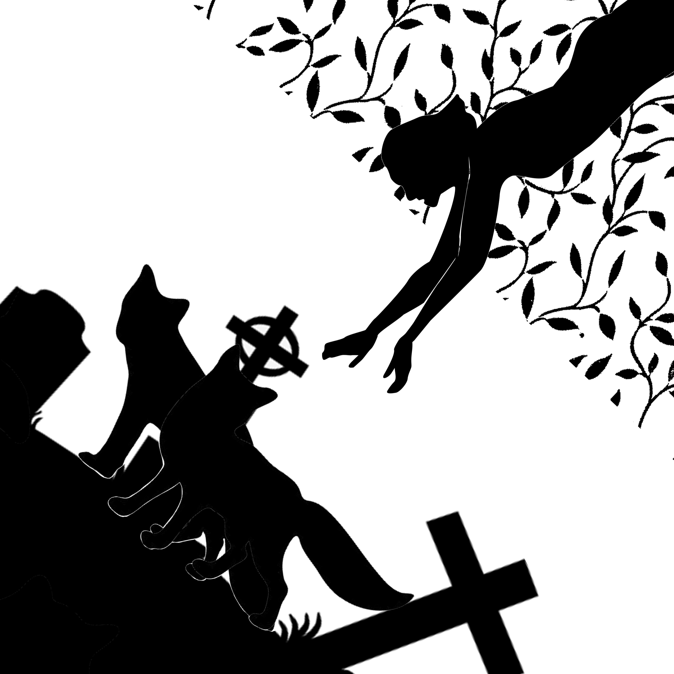
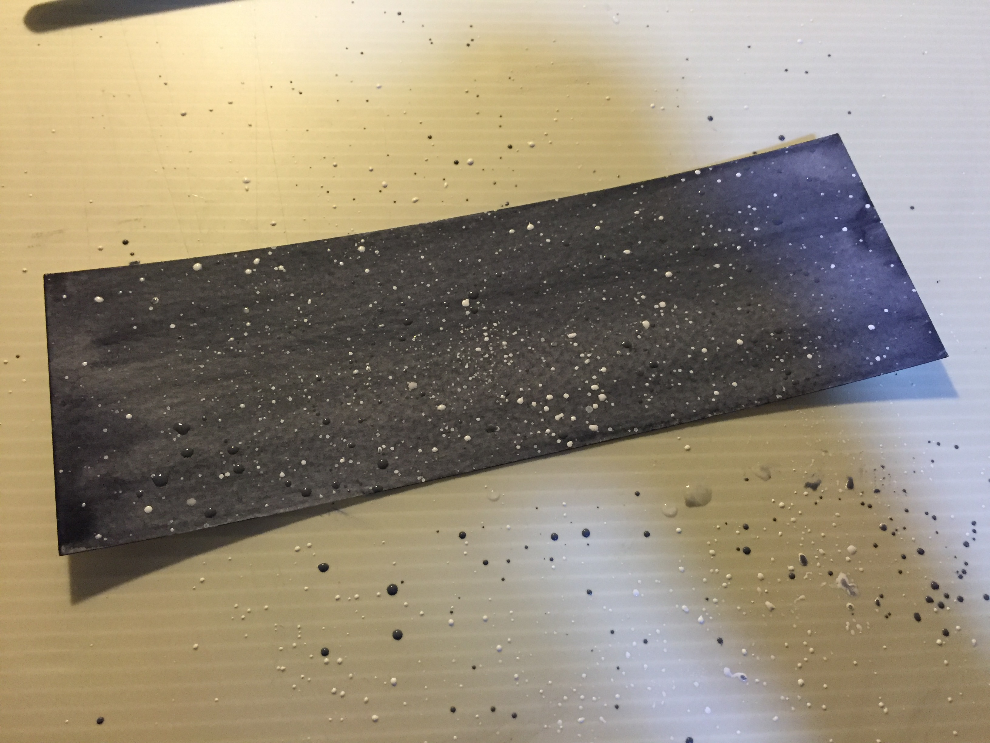
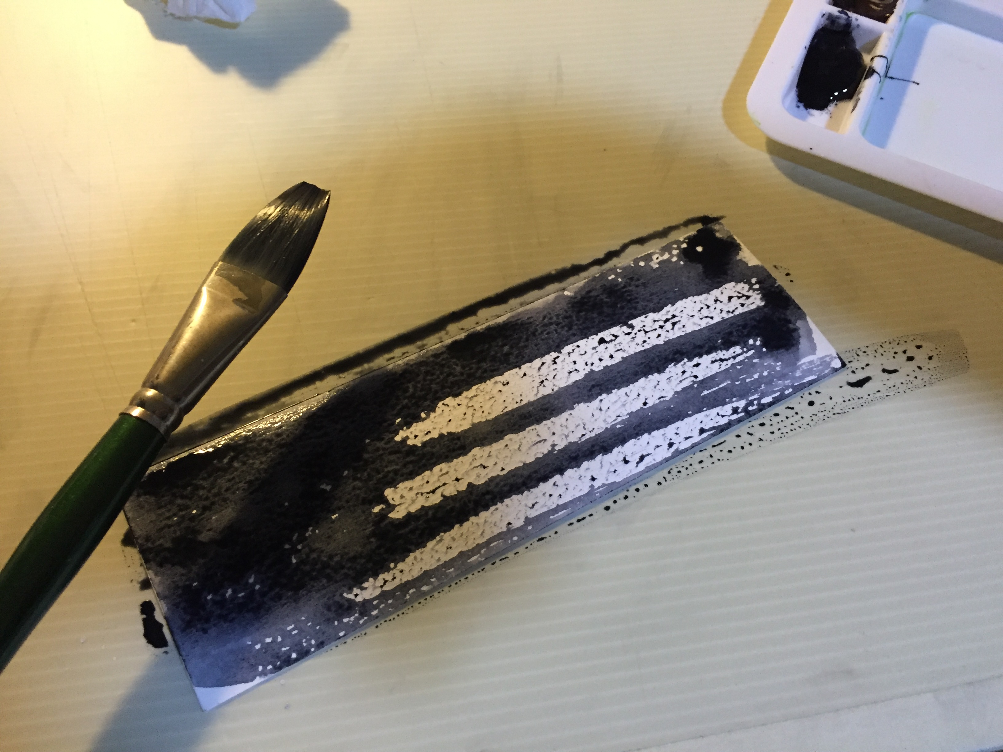
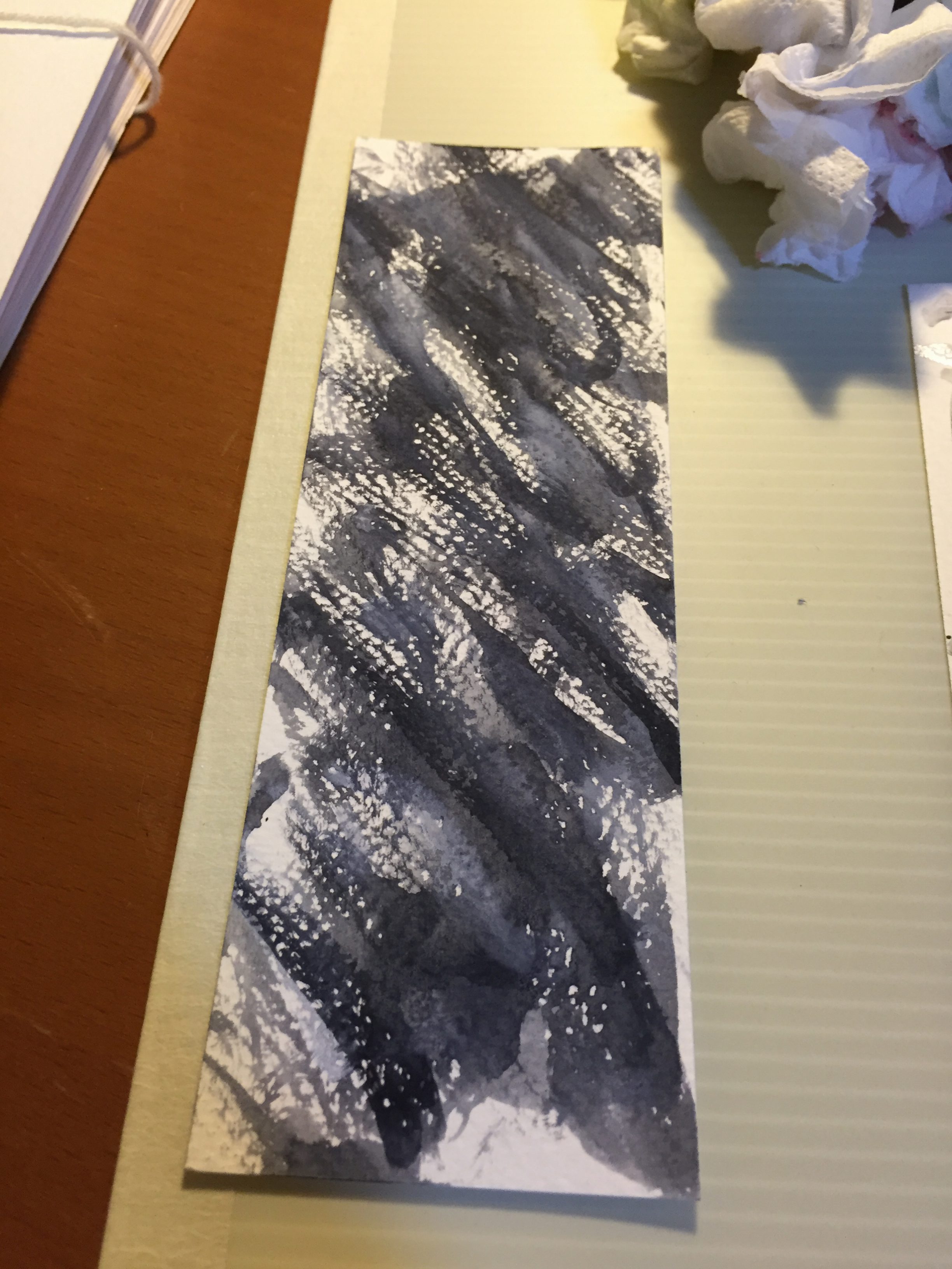
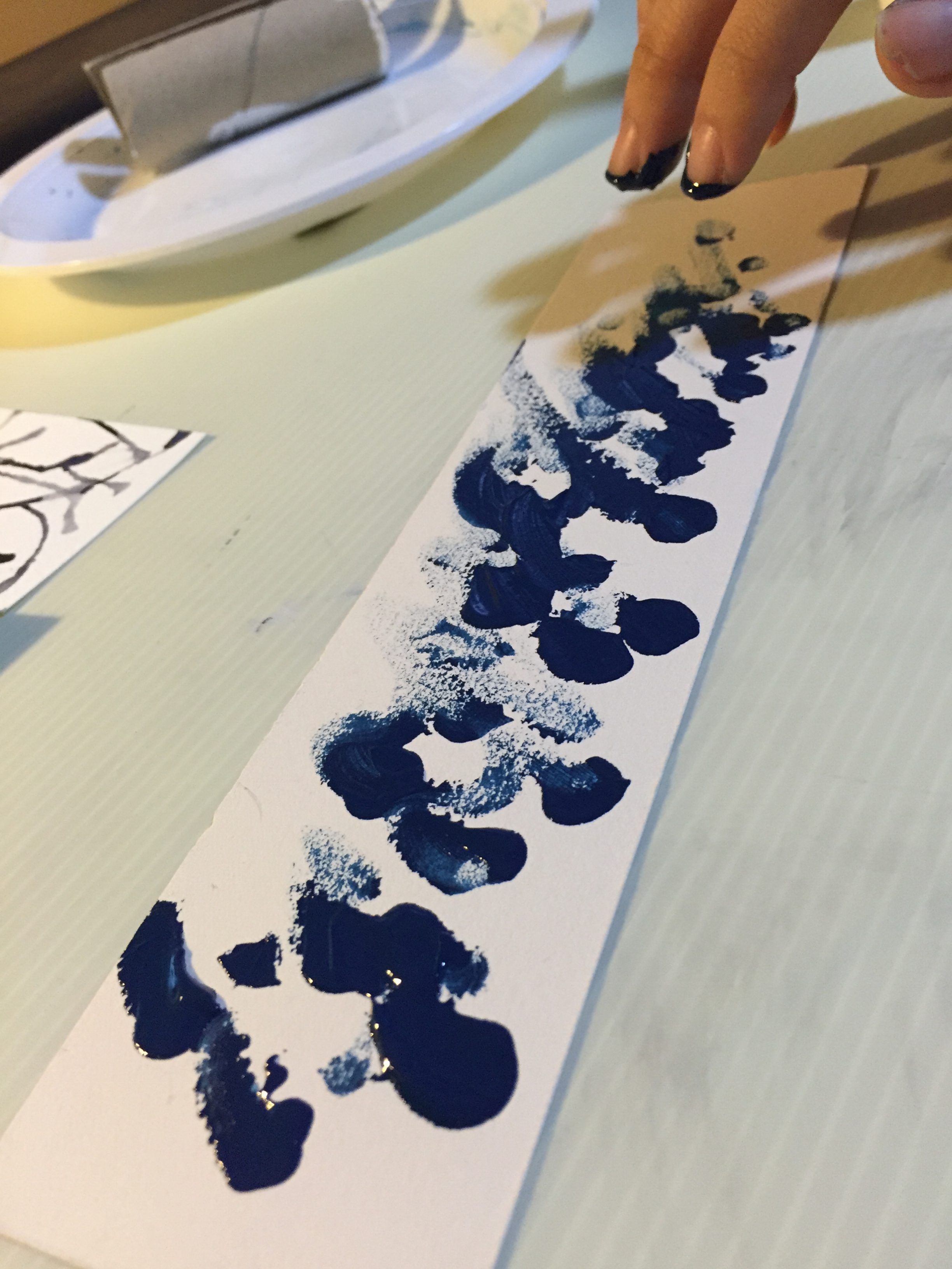
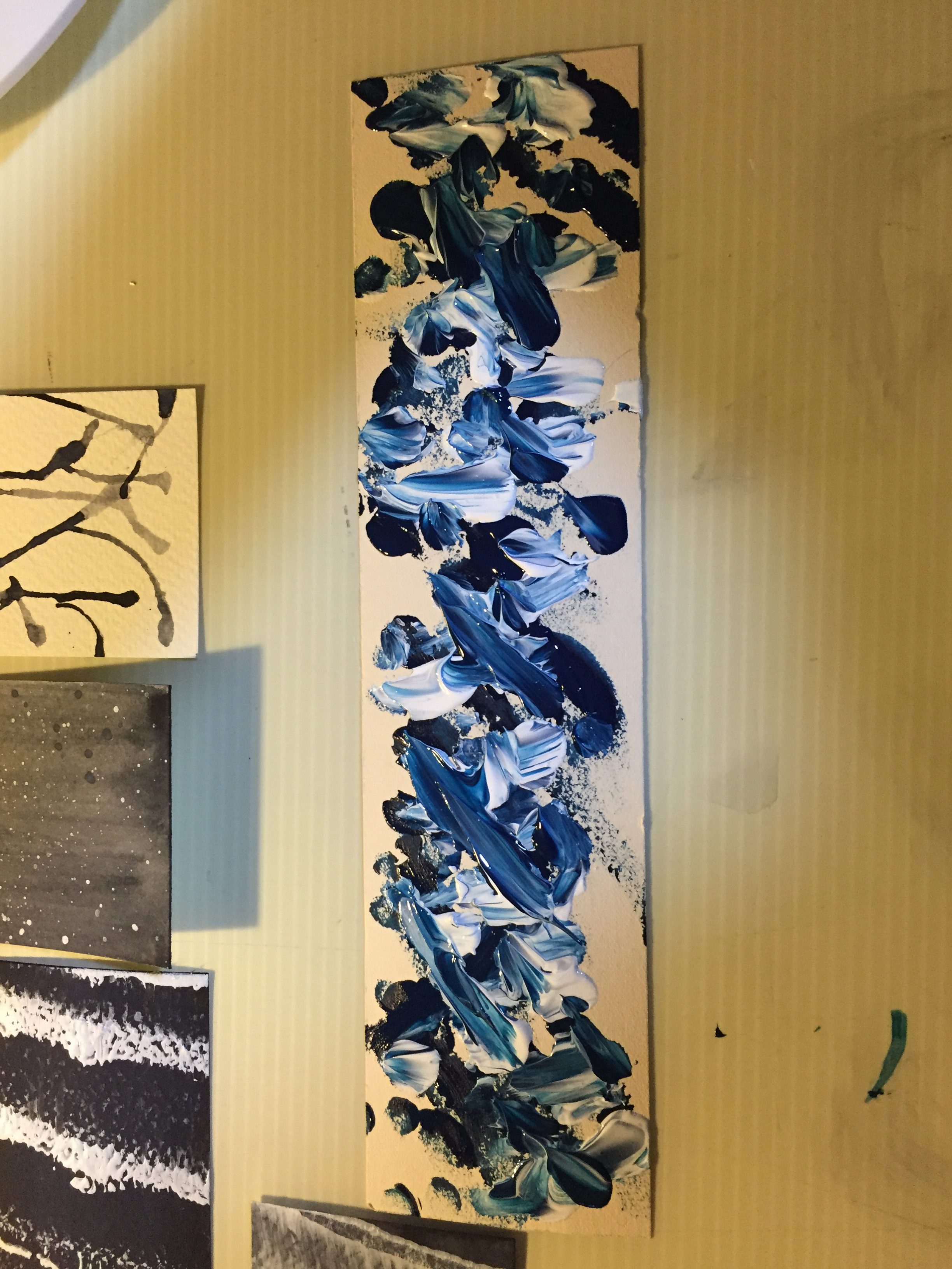
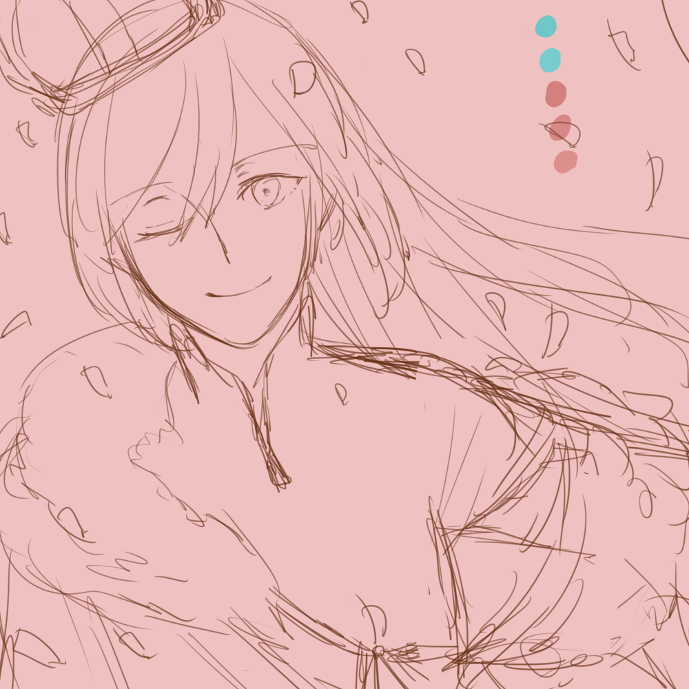
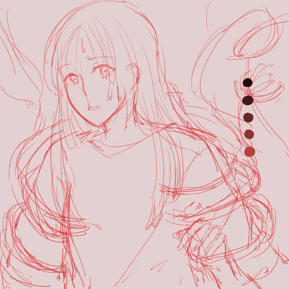
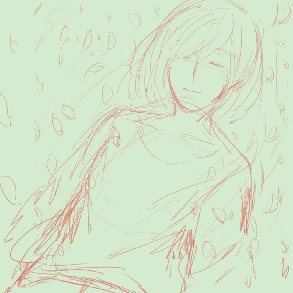
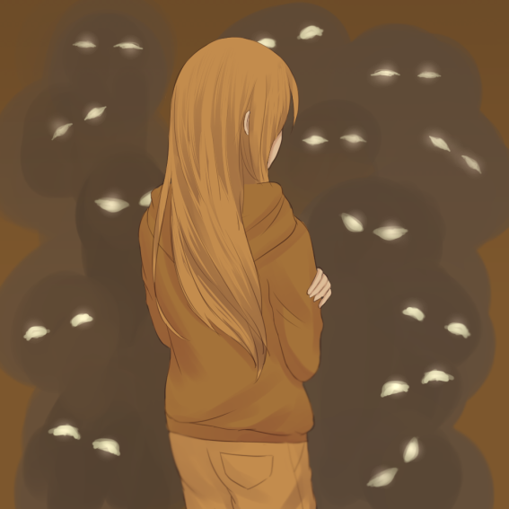
Go with the Flow + Disruption = Anxiety
Go with the Flow
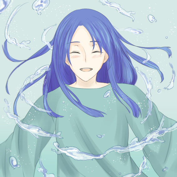
Disruption
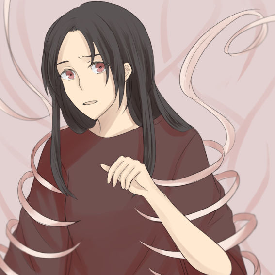
Anxiety
Personally…
I am a person who is very easy-going, and people do say that I’m accepting and very open to other’s opinions. But when others come into conflict with my moral values/ actions, I tend to get very perturbed and then, anxious. (I have no idea why, it maybe the consequences of being an INFJ-A).
With regards to colors…
I chose the deep blue and red color scheme group for the equation. Red and blue are my favorite colors, and the dark tones of the blue and red really bring out the melancholy of the “Outcome” panel. Deep red is the color of blood, and the analogous blue-green colors have this calming feeling to it.
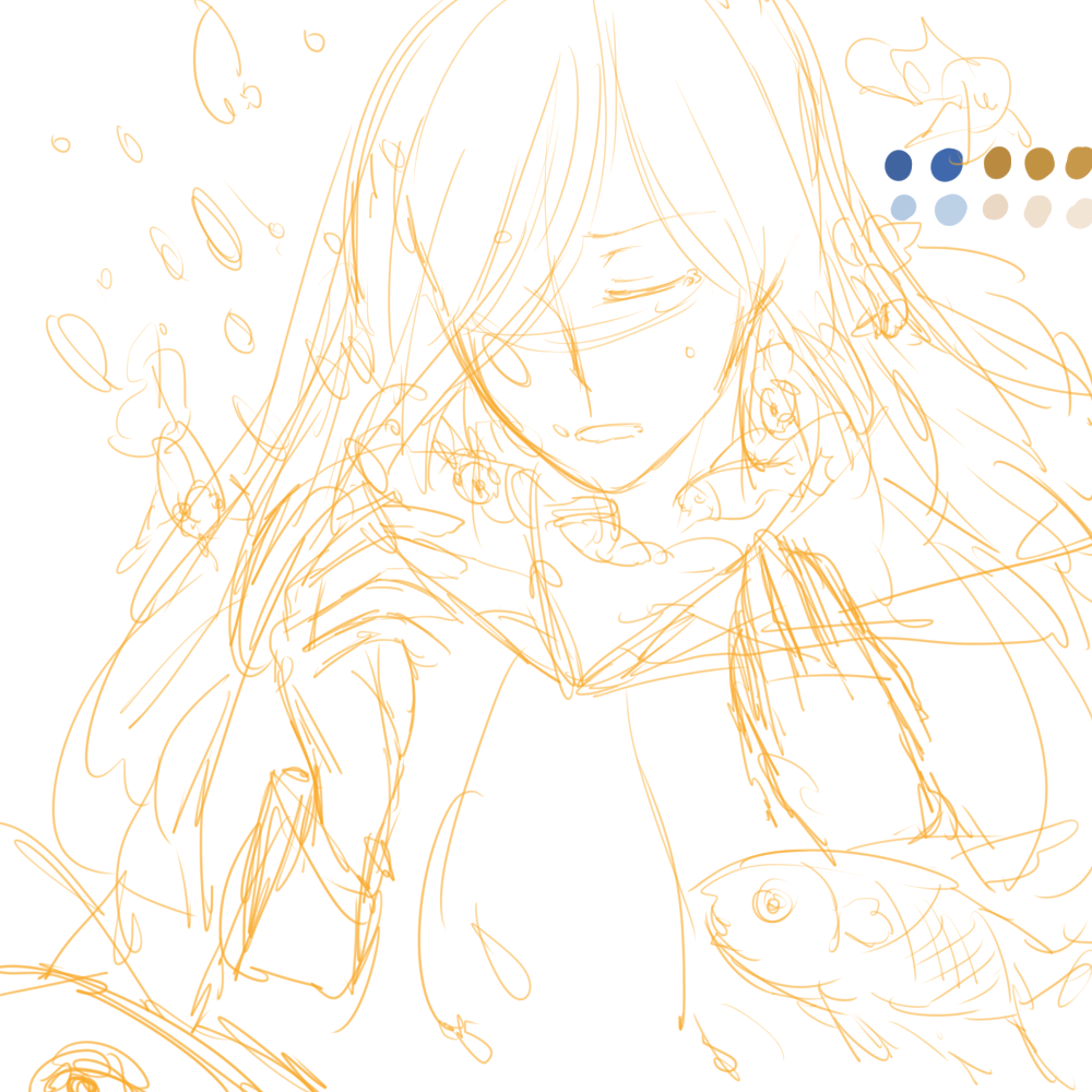
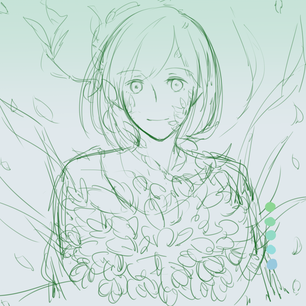
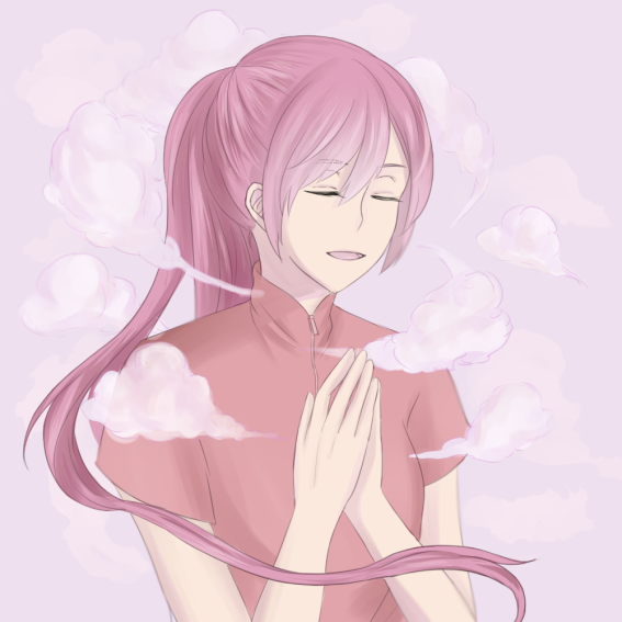
Nature-lover + Surrounded by Nature = Zen
Nature-lover
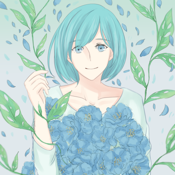
Surrounded by Nature
Zen
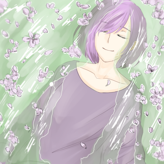
Personally…
As a christian, I really appreciate the people around me, and especially nature. I love flowers, trees, and animals! I feel a huge sense of peace within when I’m surrounded by nature.
With regards to colors…
This time round, I went with realism over the choice of colors – green and blue for leaves and flower colors respectively and the color of purple for the wisteria flowers.
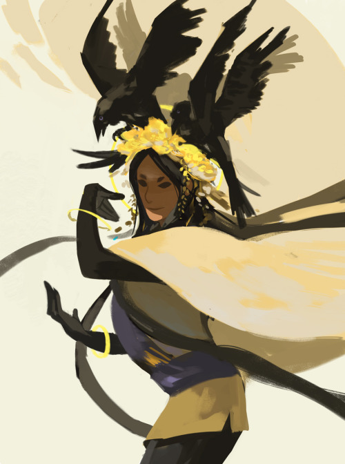
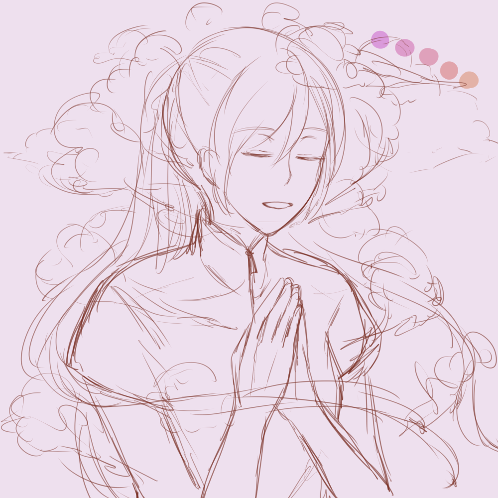
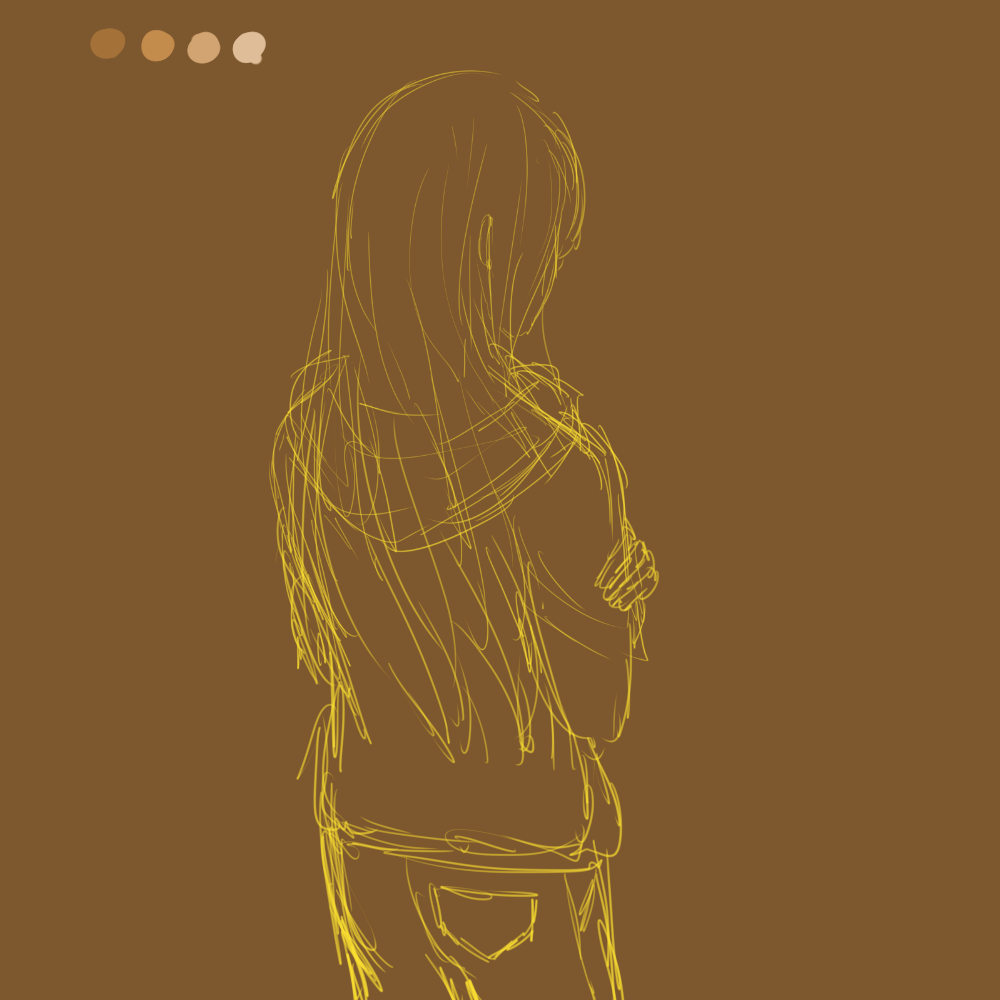
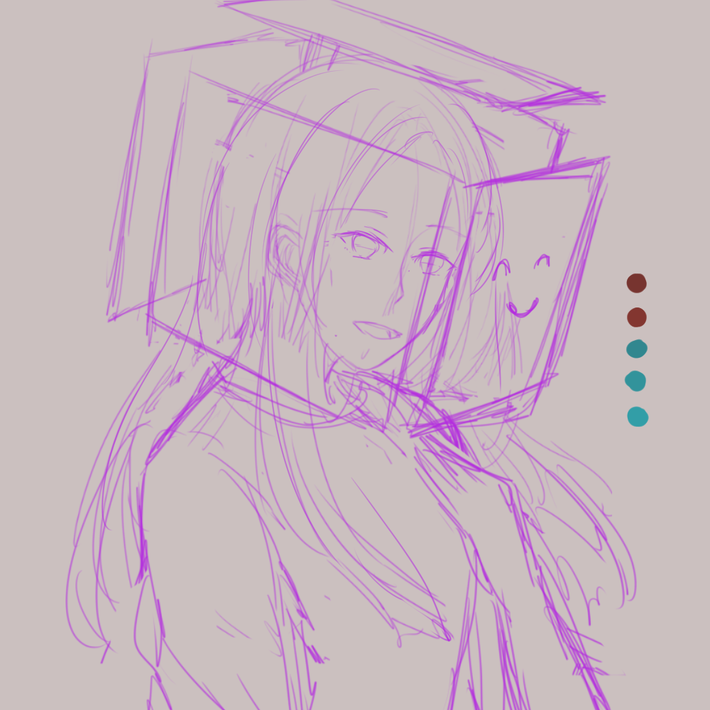
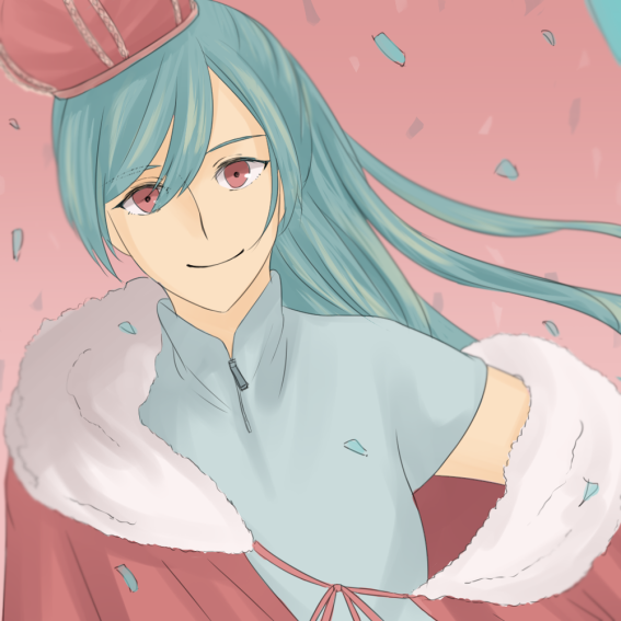
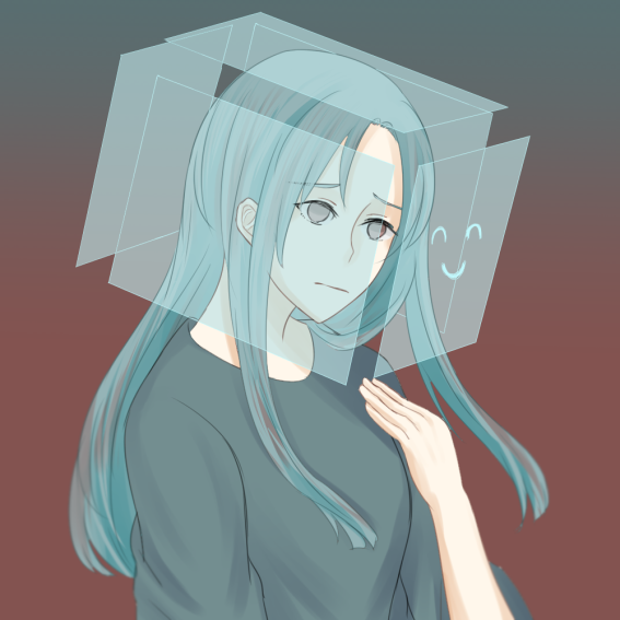
Reserved + Uncomfortable Social Situations = Suffocation
Reserved
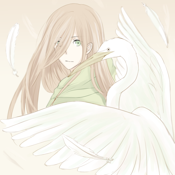
Uncomfortable Social Situations
Suffocation
Personally…
As an introvert, I dislike being in uncomfortable situations. I’d feel very suffocated if I was forced to speak to a crowd that I’m not familiar with.
With regards to colors…
I wanted to bring out the white colors of the great egret, so I selected a color scheme group that would allow for the whiteness of the egret’s feathers. One of the color white’s symbols is safety, which also brings out the idea of being “reserved”; being careful and cautious.
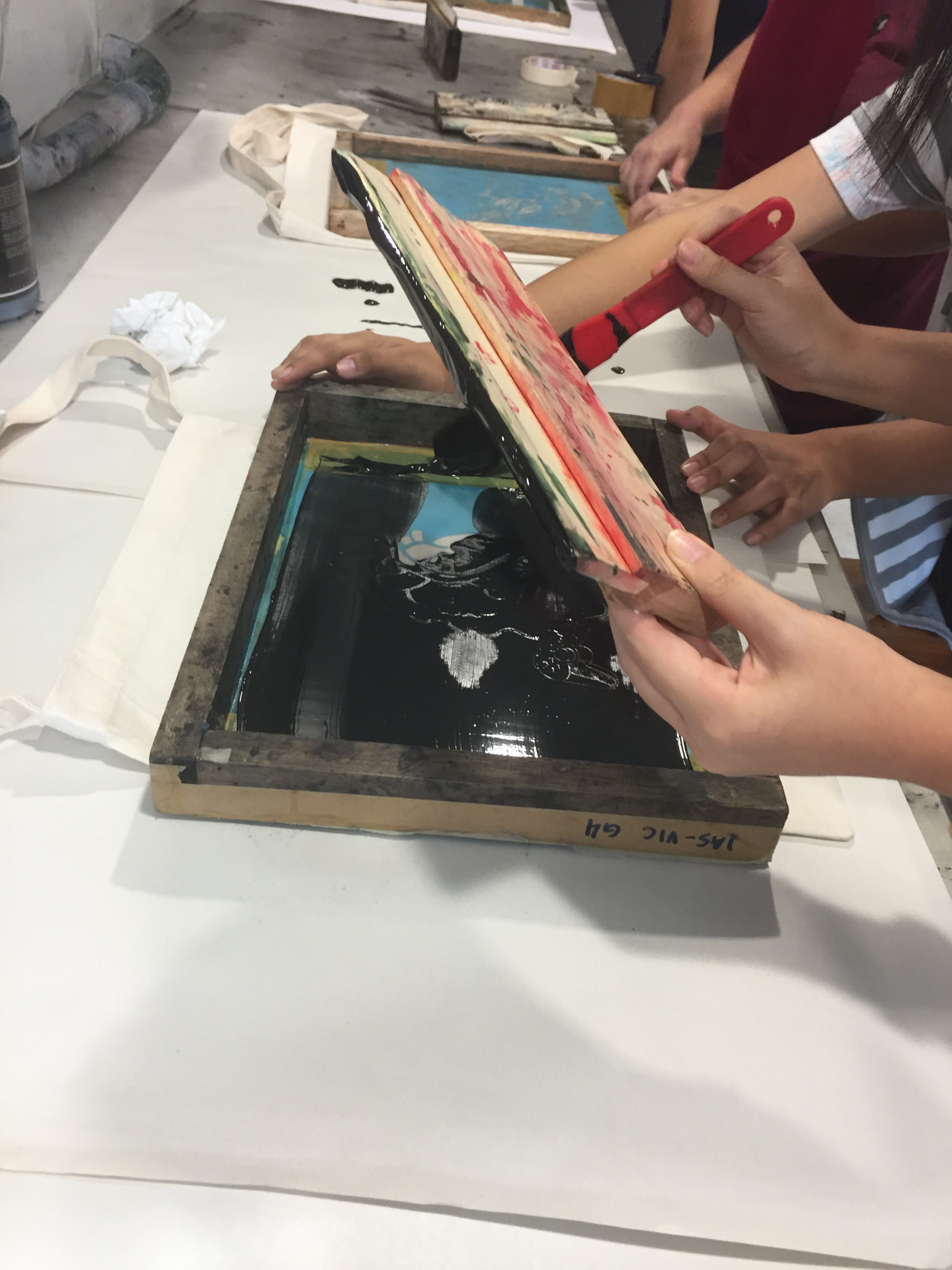
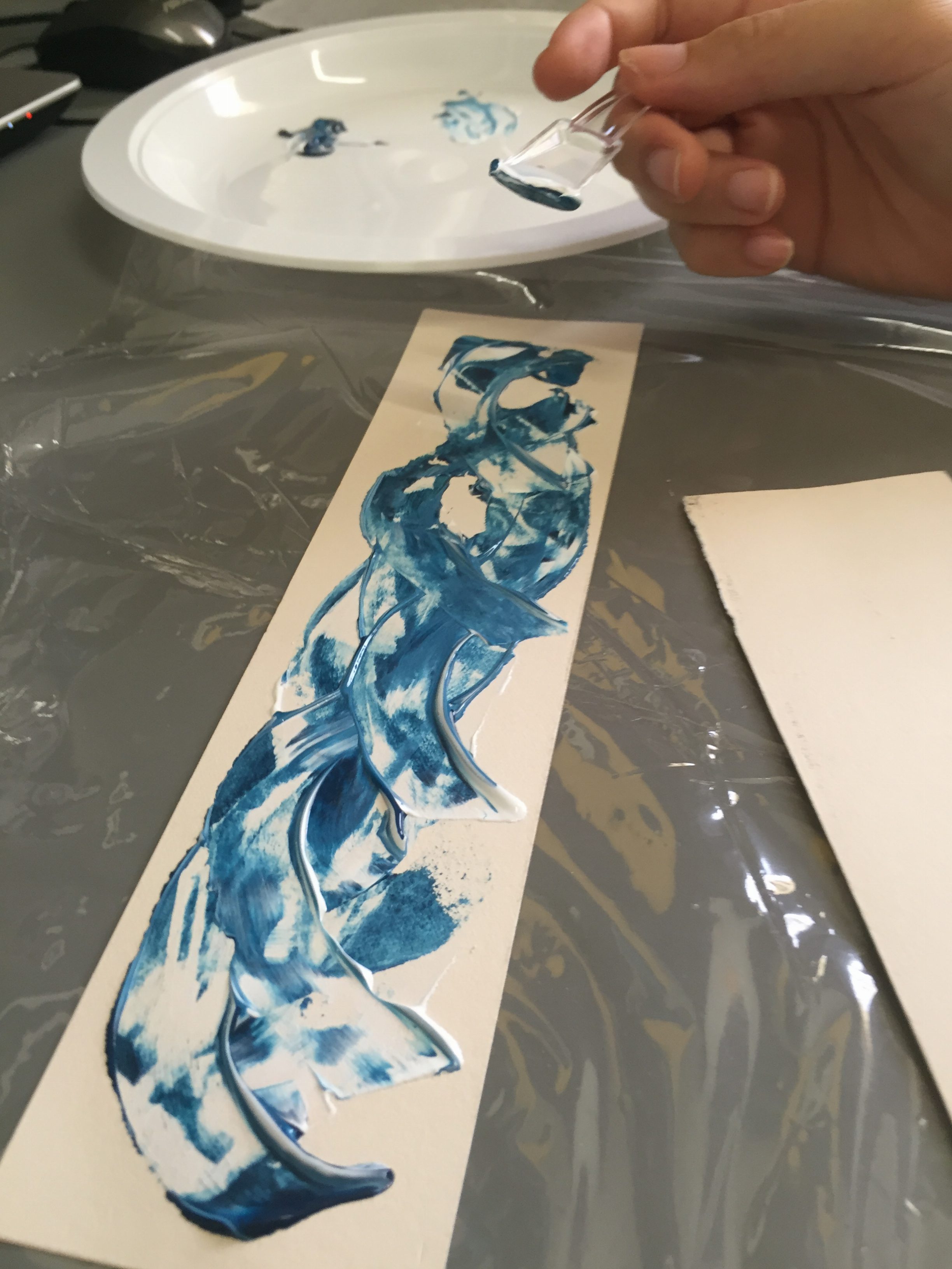
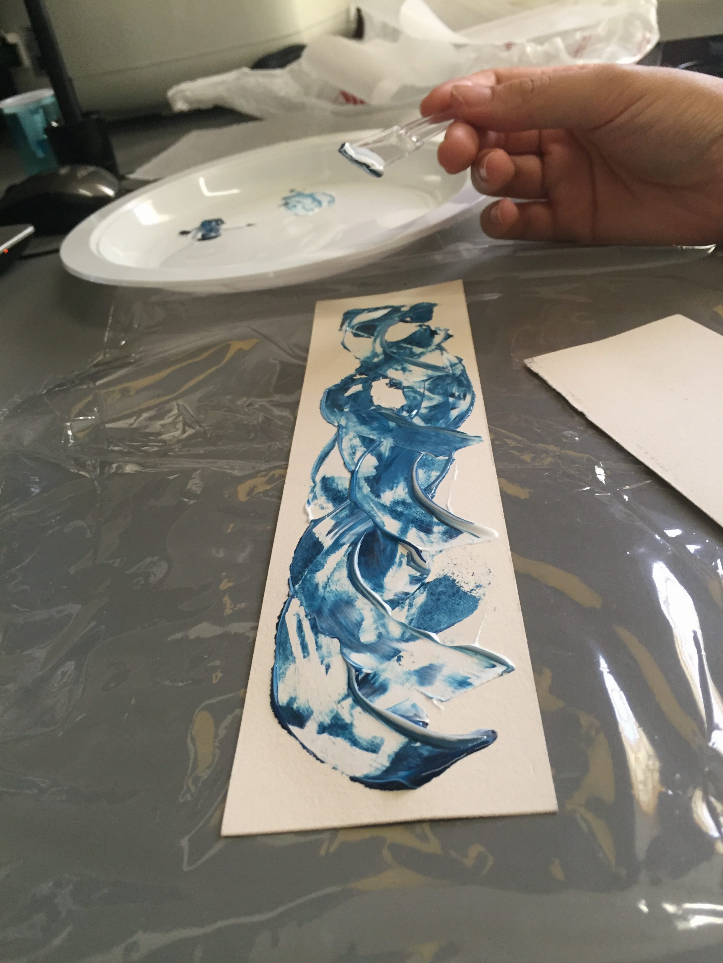
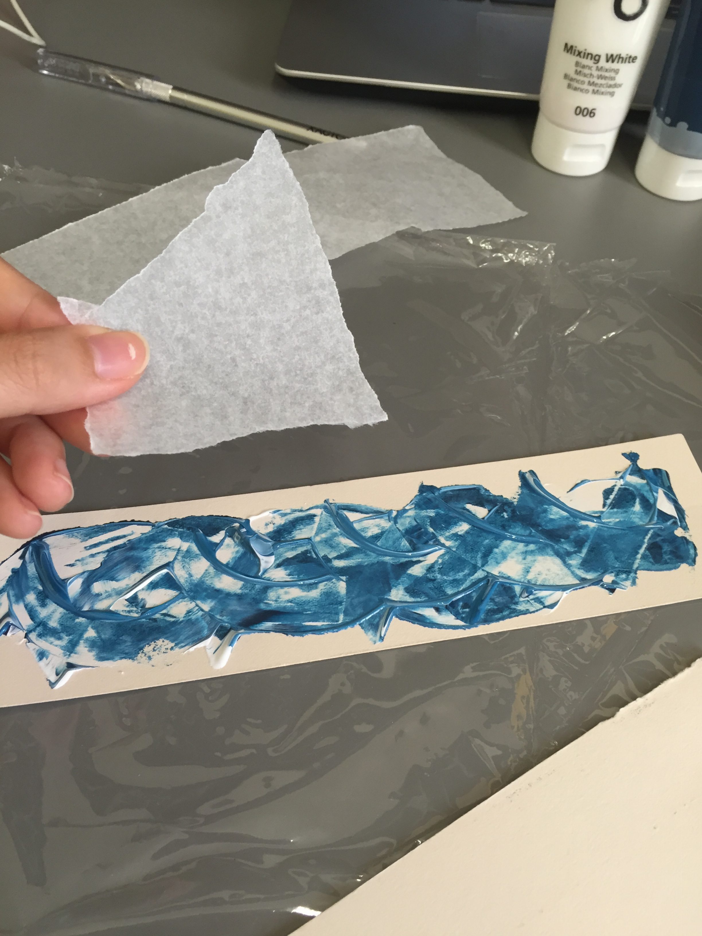
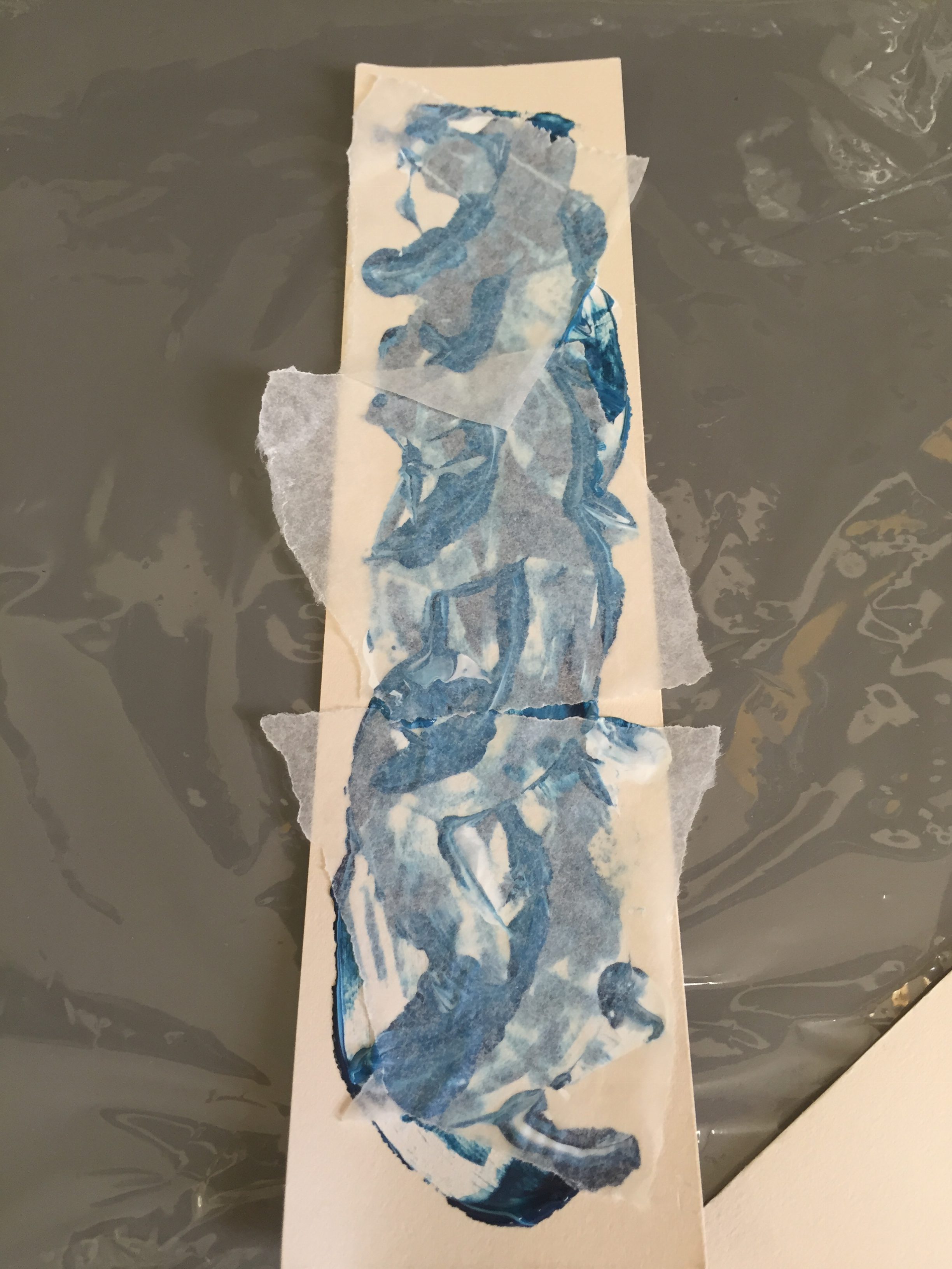
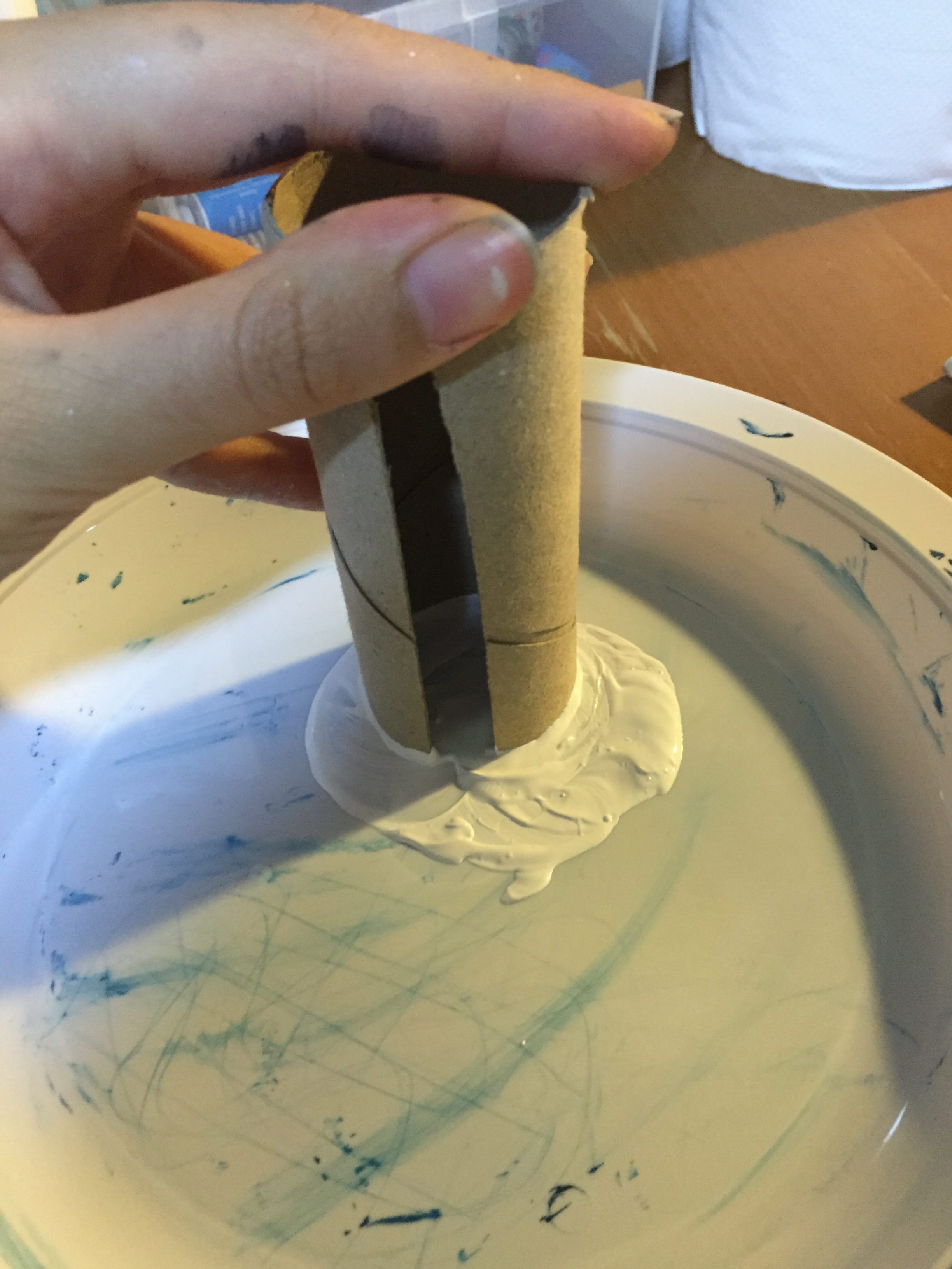
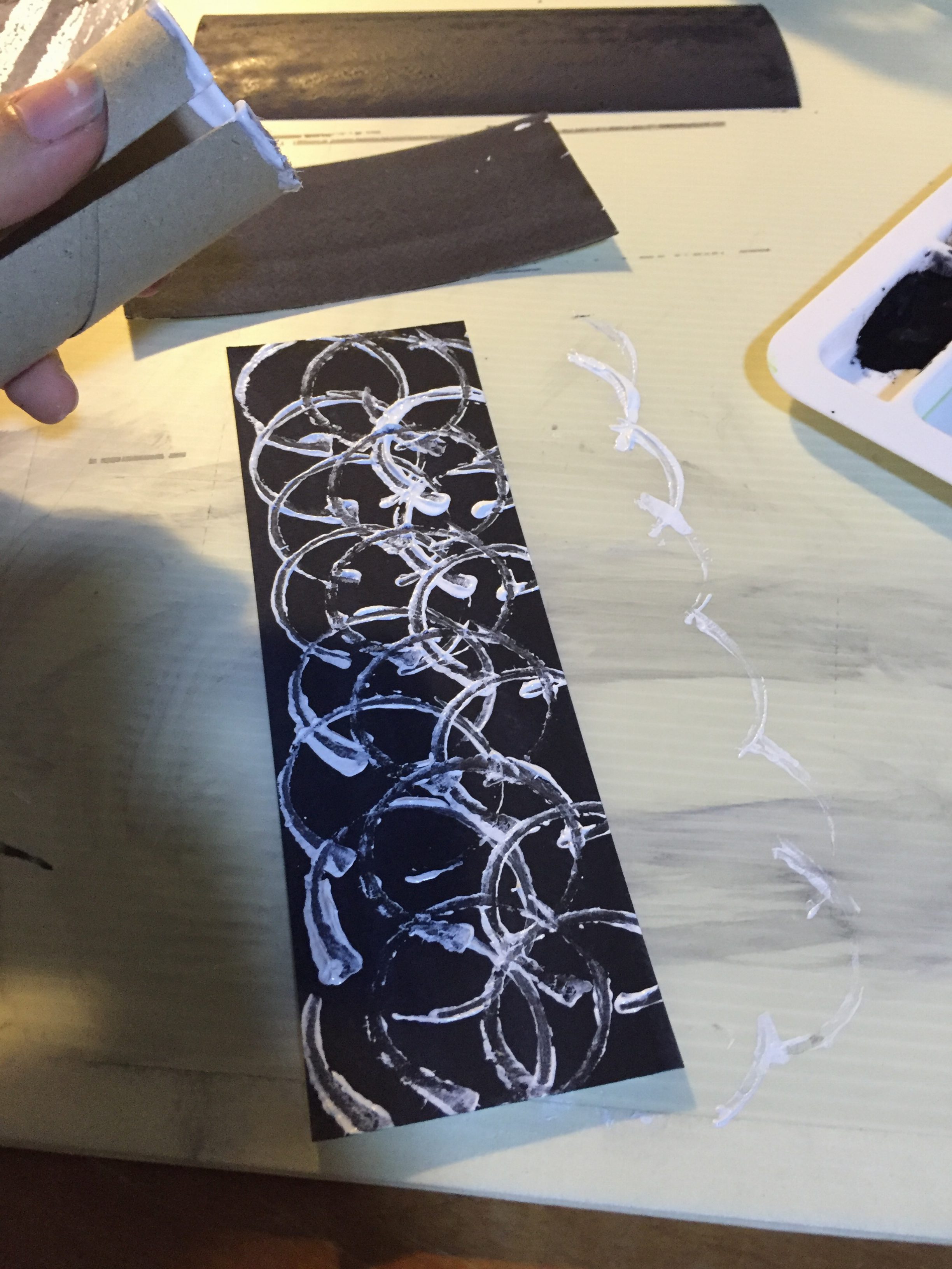
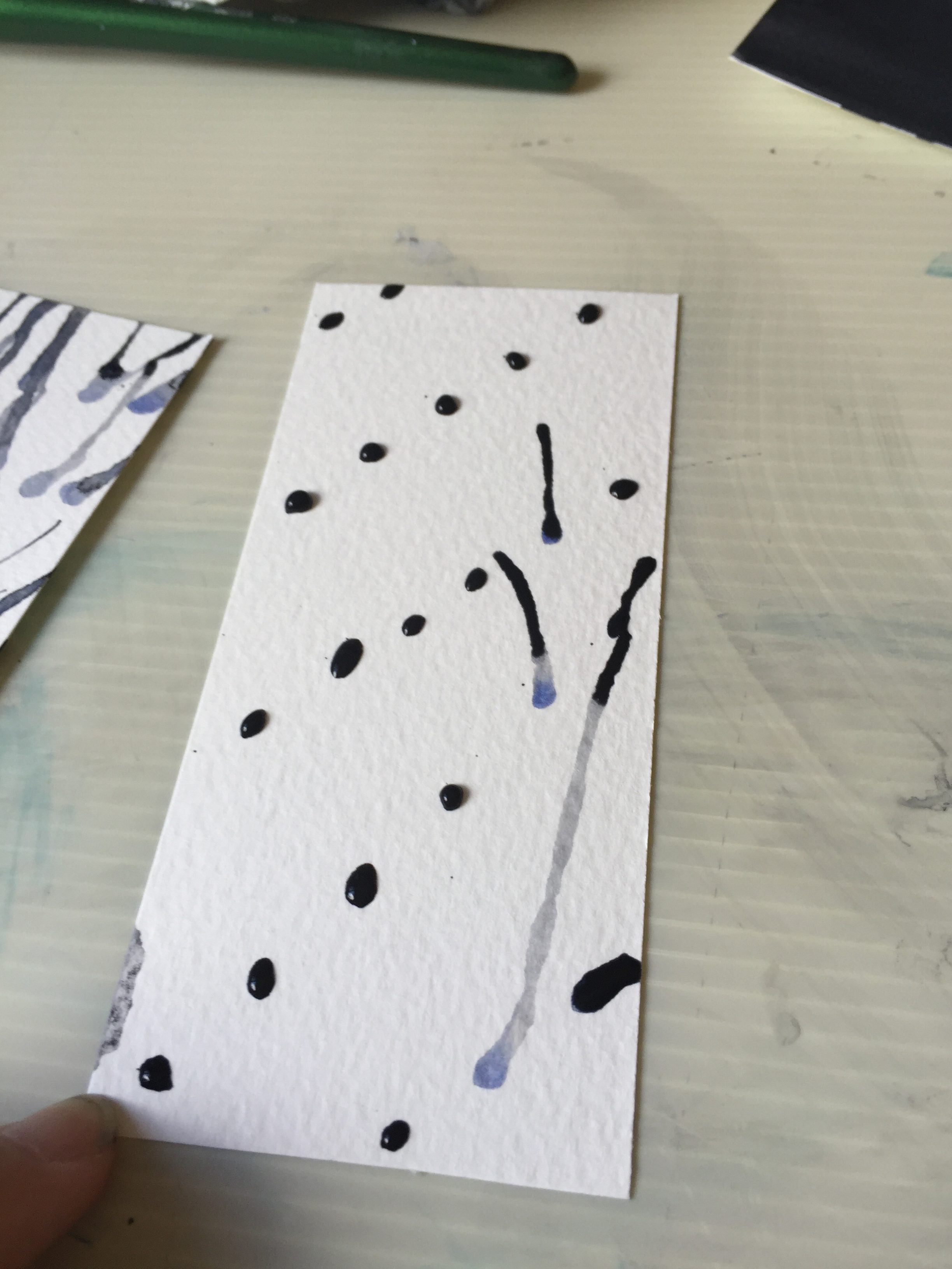
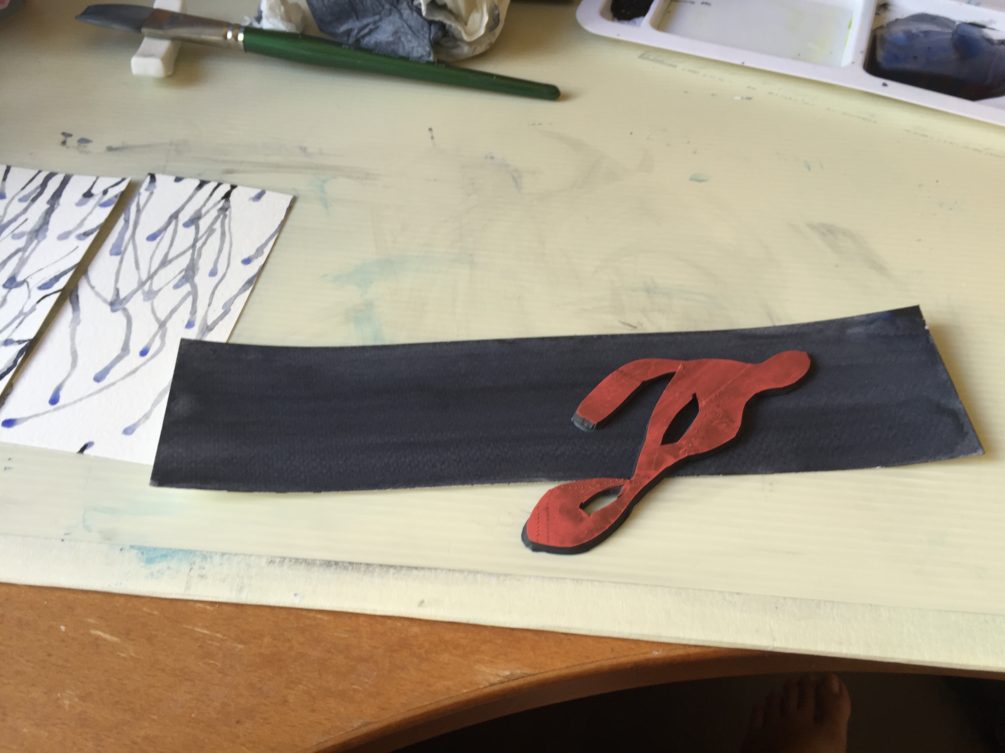
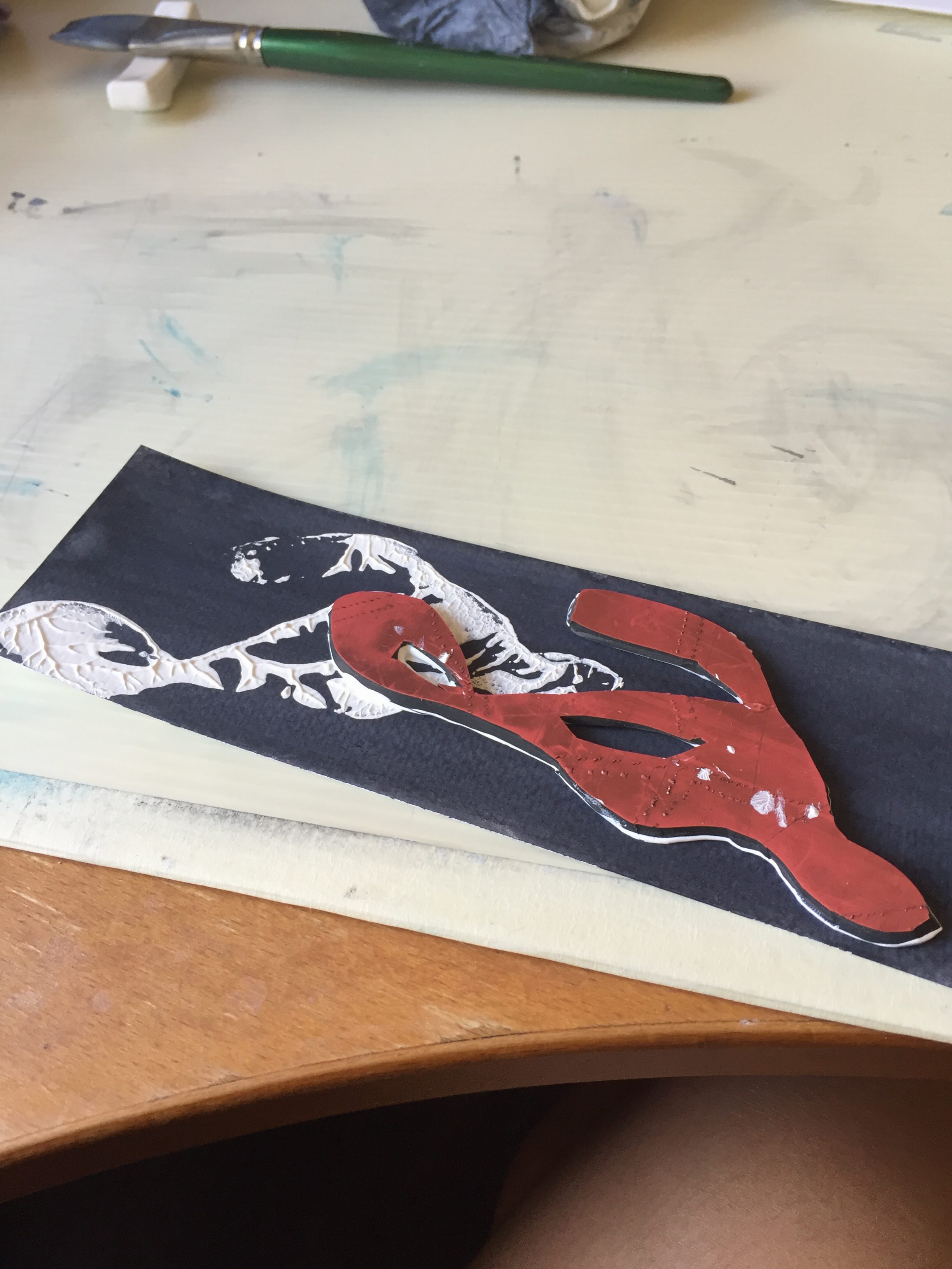
Final Presentation and Mounting
Reflections
This project was… even more tiring than the last. I had fun exploring color schemes, but it was tough trying to analyse myself and thinking about life. I did have fun doing something that I was familiar with; to be honest, it takes a lot of courage to print out my own digital art and even present it to the whole class. I’m glad that this project gave me the opportunity to step out of my comfort zone and show what I love to do to the class.
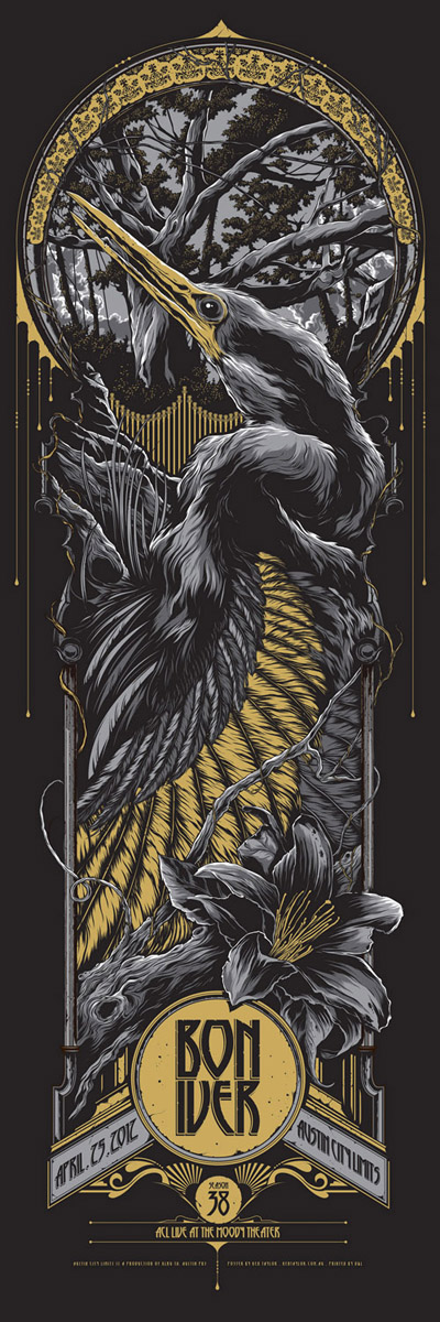
Artist Inspirations
Toi8
Toi8’s a Japanese artist which I’ve been inspired by for a very long time. He mainly does art for games, manga and animation. I love the colors he uses for his compositions, and I especially love his lineart.
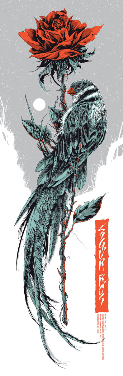
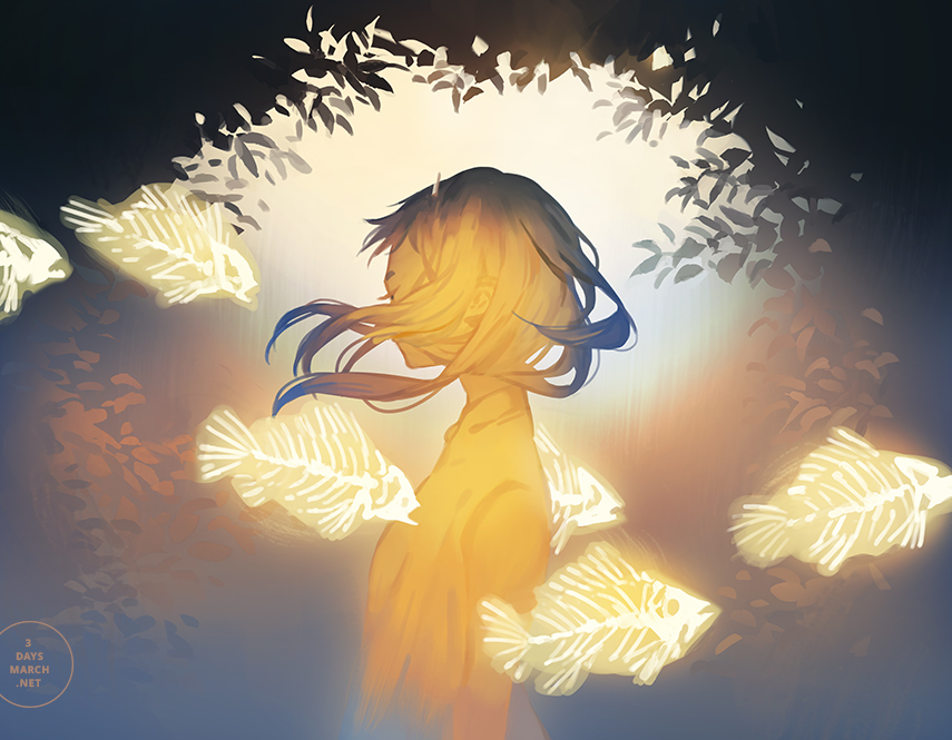
Loika
Website: http://www.3daysmarch.net/
Loika’s natural compositions are beautiful, and the colors Loika chooses are very natural; which I enjoy very much!
Amei Zhao
Website: http://seventypercentethanol.tumblr.com/
Amei’s series of original art, The Nameless and the Scientist, is a favorite of mine. Amei does many beautiful concept and environmental art.