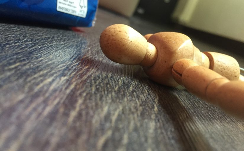
Project 2: Movie Quotes, Design Drafts and Artist Inspirations
Here are the movie quotes, synopsis, as well as the dialogue leading up to the quote. The quotes are in bold. (Quote breakdown — keywords and ideas associated with them are also included).
I have also placed the design drafts under each movie section.
NON-STOP (2014)
Synopsis:
Bill Marks, a former cop dealing with his daughter’s death by drinking, is now a federal air marshal. While on a flight from New York to London, Mark gets a text telling him that unless 150 million dollars is transferred to an offshore account, someone will die every 20 minutes.
Dialogue:
Jen: Are you asking me if I saw someone else go in, or if I killed the captain?
Bill: did you see someone else?
Jen: …No
Bill: Then that’s the question.
Jen: You’re a dick.
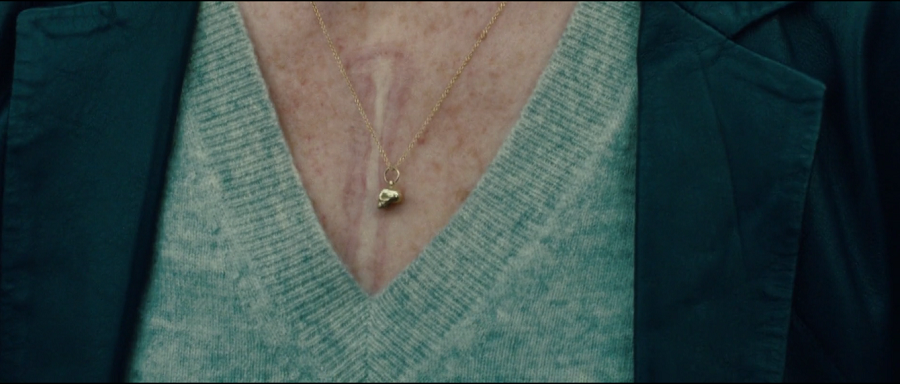
(Bill starts to suspect Jen, talking about how she possibly choose the window seat right next to Bill and asked him a personal question. Jen gets exasperated, and says that she was the only one who stood by him the entire time; then she starts to share about her heart failure and how she might die anytime. She walks out, and Bill pours her a drink, then apologizes.)
Bill: I hate flying.
Jen: Really? I’ve always kinda liked it. You know, six hours in the same spot. Nobody get to you, nothing to do but just be present.
Bill: There’s no control.
Jen: Control is an illusion. There is no control. Over anything.
QUOTE BREAKDOWN:
- CONTROL — dog leash, steering wheel, controller…
- ILLUSION — mirage, virtual reality, dream…
Design Draft:
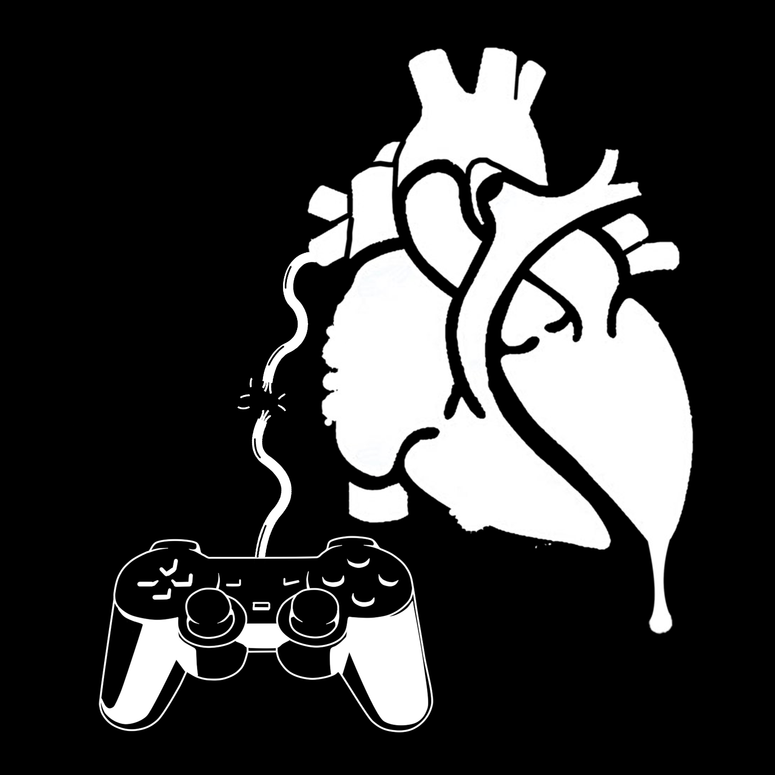
Symbolism:
The controller represents the perception of control. The cord connecting the controller to the heart is broken, suggesting the lack of control. I decided to add in the context of the movie here, in which Jen Summers is unable to control her lifespan, thus the human heart represent Jen’s own heart/life.
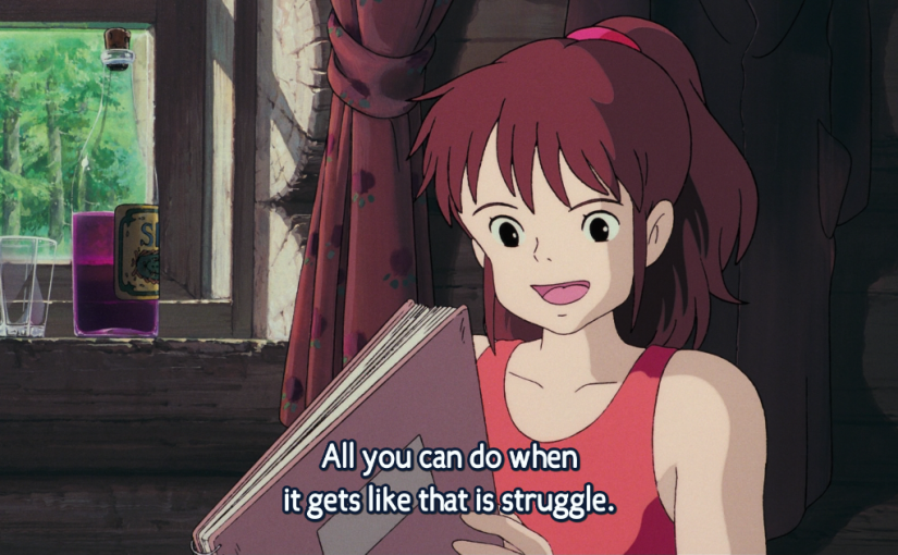
KIKI’S DELIVERY SERVICE (1989)
Synopsis:
Kiki, a young witch-in-training, has reached the age of 13. According to tradition, all witches of that age must leave home for one year, so that they can learn how to live on their own. Kiki, along with her talking cat Jiji, fly away to live in the seaside town of Korico. After starting her own delivery service (using her broom as the delivery vehicle), Kiki must learn how to deal with her new life, especially after she loses the power to fly.
Dialogue:
Ursula: Magic is like art. I, too, don’t paint very well sometimes.
Kiki: Really? What do you do then?
Ursula: don’t look this way.
(Kiki goes back to her original pose.)
Kiki: Before, I could fly without giving it a thought. Now I can’t even begin to remember how I ever managed to do it.
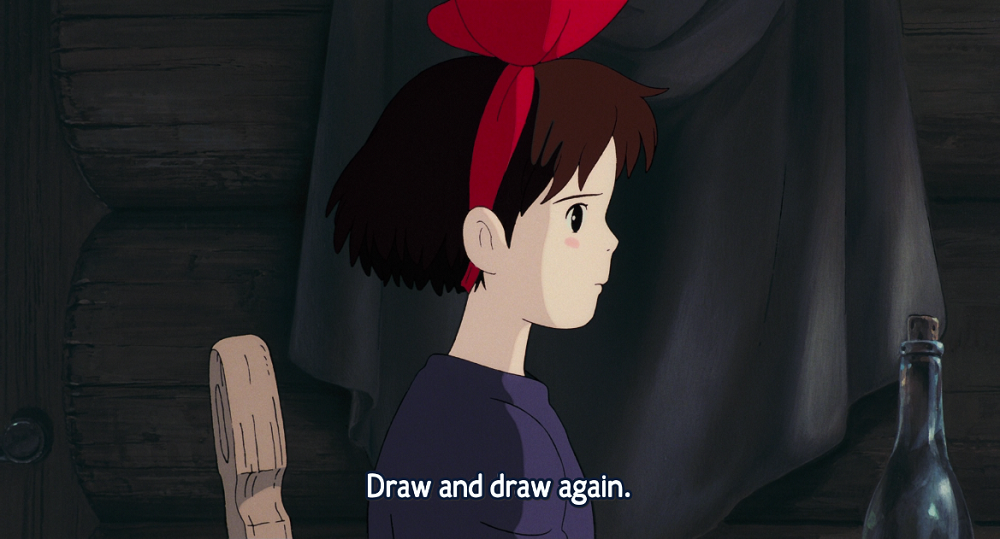
Ursula: All you can do when it gets like that is struggle. Draw and draw again.
Kiki: But if I really can’t fly…
Ursula: I stop drawing… I take a walk… Look at the scenery… Take a nap… Or even nothing at all. Then all of a sudden I want to draw.
Kiki: Does that really happen?
Ursula: Sure it does! Now, look sideways.
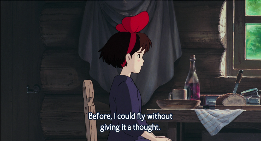
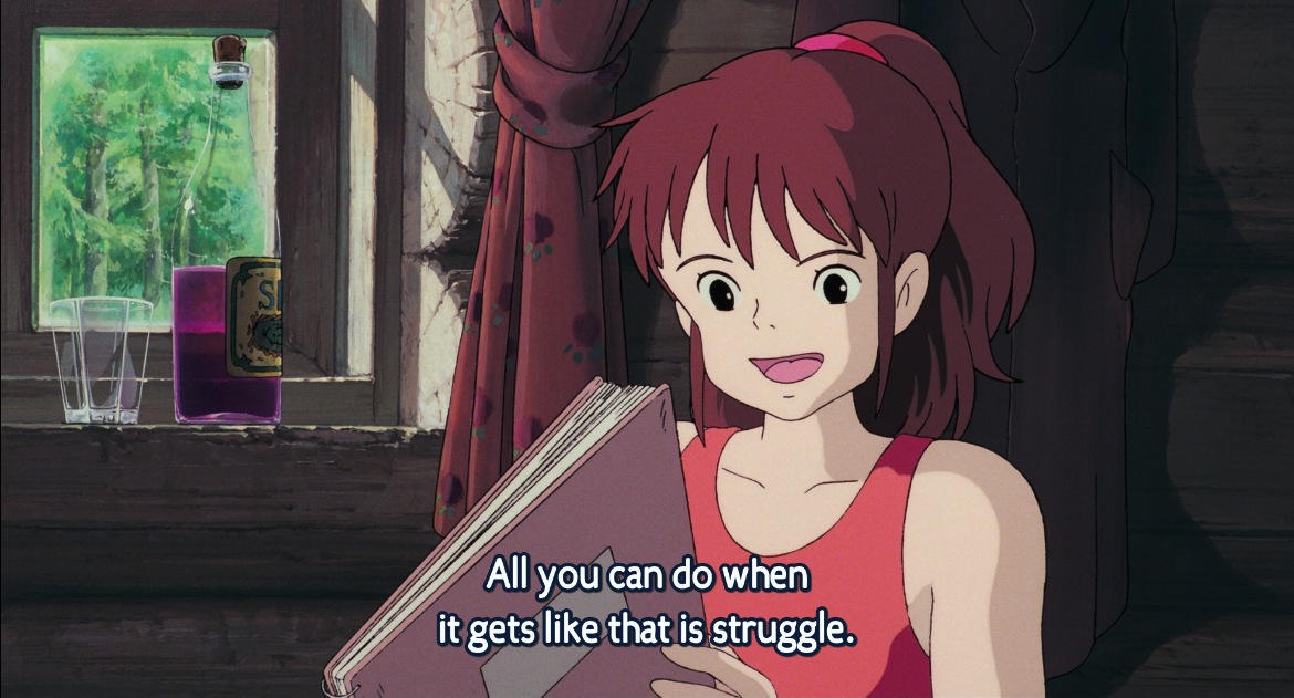
About Ursula…
- She became Kiki’s friend after meeting her when Kiki was on her first delivery
- She is an artist, and in this context, she is explaining to Kiki about what artists commonly have — art block.
QUOTE BREAKDOWN:
- STRUGGLE — flail, trying to take control, repeatedly try to do something
- AGAIN — repetition, retry
Design Draft:
Symbolism:
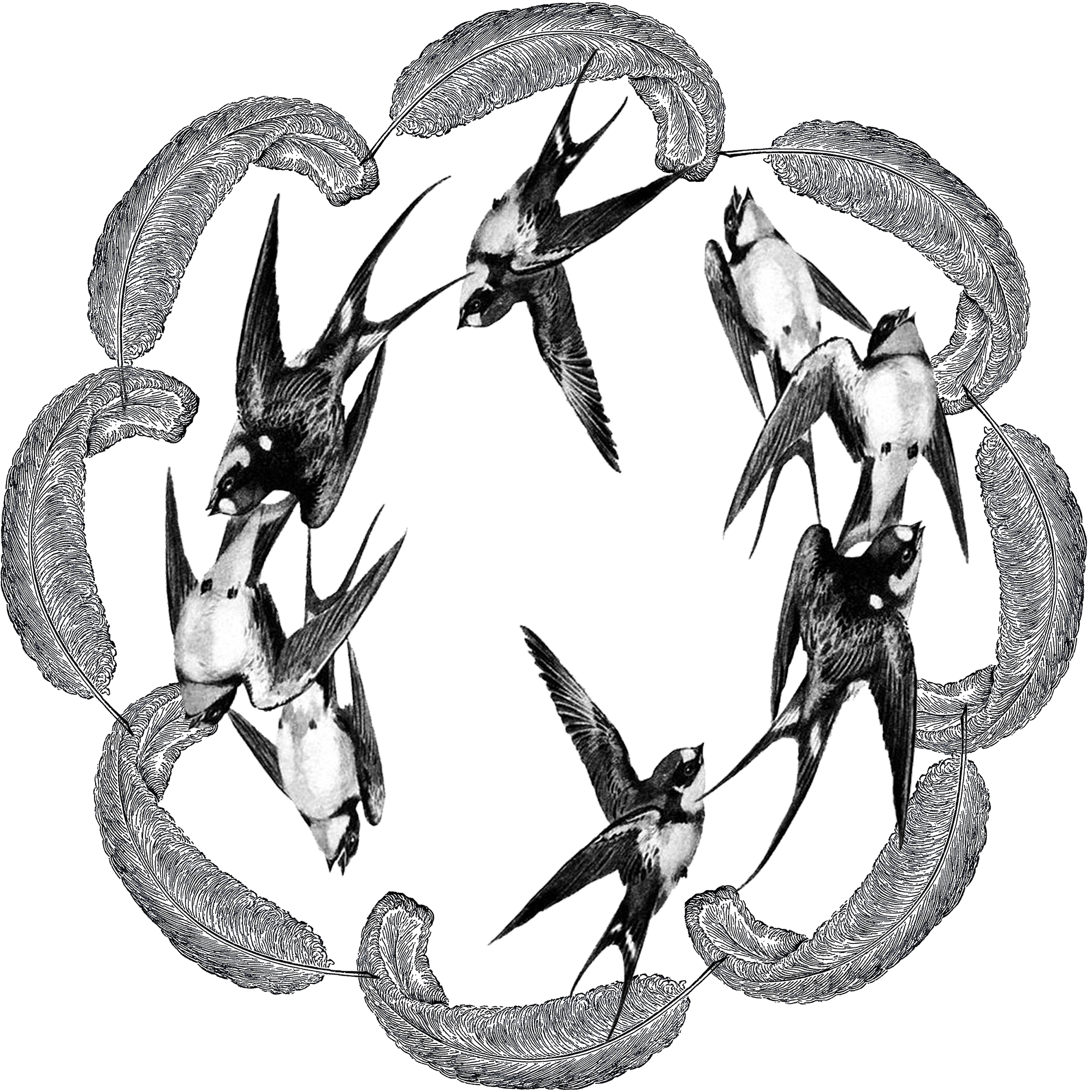
The swallows represent Kiki, who is struggling to fly again, thus the repetition of movement in the swallows. The feathers represent the struggle, whereby feathers often fall off birds when they take flight. The feathers and the swallows are continuous in a circle which shows repetition and highlights the attempts of “trying and trying again”.
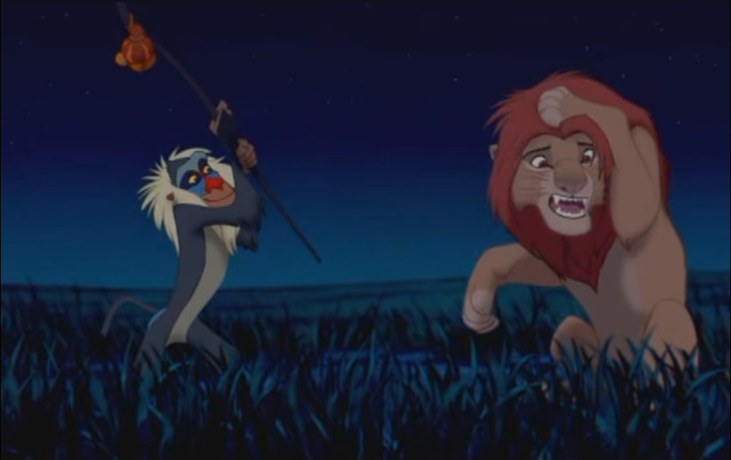
THE LION KING (1994)
Sypnosis:
A young lion prince is born in Africa, thus making his uncle Scar second-in-line to the throne. Scar plots with his hyenas to kill King Mufasa and Prince Simba, thus making himself King. The King is killed and Simba is led to believe Scar that it was his fault, and so flees the kingdom in shame. After years of exile, he is persuaded to return home to overthrow the ursurper and claim the kingdom as his own, thus completing the ‘Circle of Life’.
Dialogue:
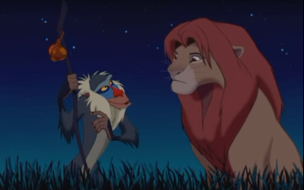
Adult Simba: I know what I have to do. But going back means I’ll have to face my past. I’ve been running from it for so long.
[Rafiki hits Simba on the head with his stick]
Adult Simba: Ow! Jeez, what was that for?
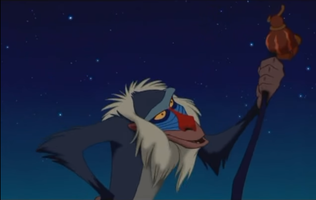
Rafiki: It doesn’t matter. It’s in the past.
[laughs]
Adult Simba: Yeah, but it still hurts.
Rafiki: Oh yes, the past can hurt. But from the way I see it, you can either run from it, or… learn from it.
[swings his stick again at Simba, who ducks out of the way]
Rafiki: Ha. You see? So what are you going to do?
Adult Simba: First, I’m gonna take your stick.
[Simba snatches Rafiki’s stick and throws it and Rafiki runs to grab it]
Rafiki: No, no, no, no, not the stick! Hey, where you going?
Adult Simba: I’m going back!
Rafiki: Good! Go on! Get out of here!
[Rafiki begins laughing and screeching loudly]
QUOTE BREAKDOWN…
- PAST — time, clock, steps taken, road
- HURT — pain, blood, tears
- RUN — looking away, turning your back, flying away from a predator
- LEARN — avoiding mistakes, education, facing an enemy
Design Draft:
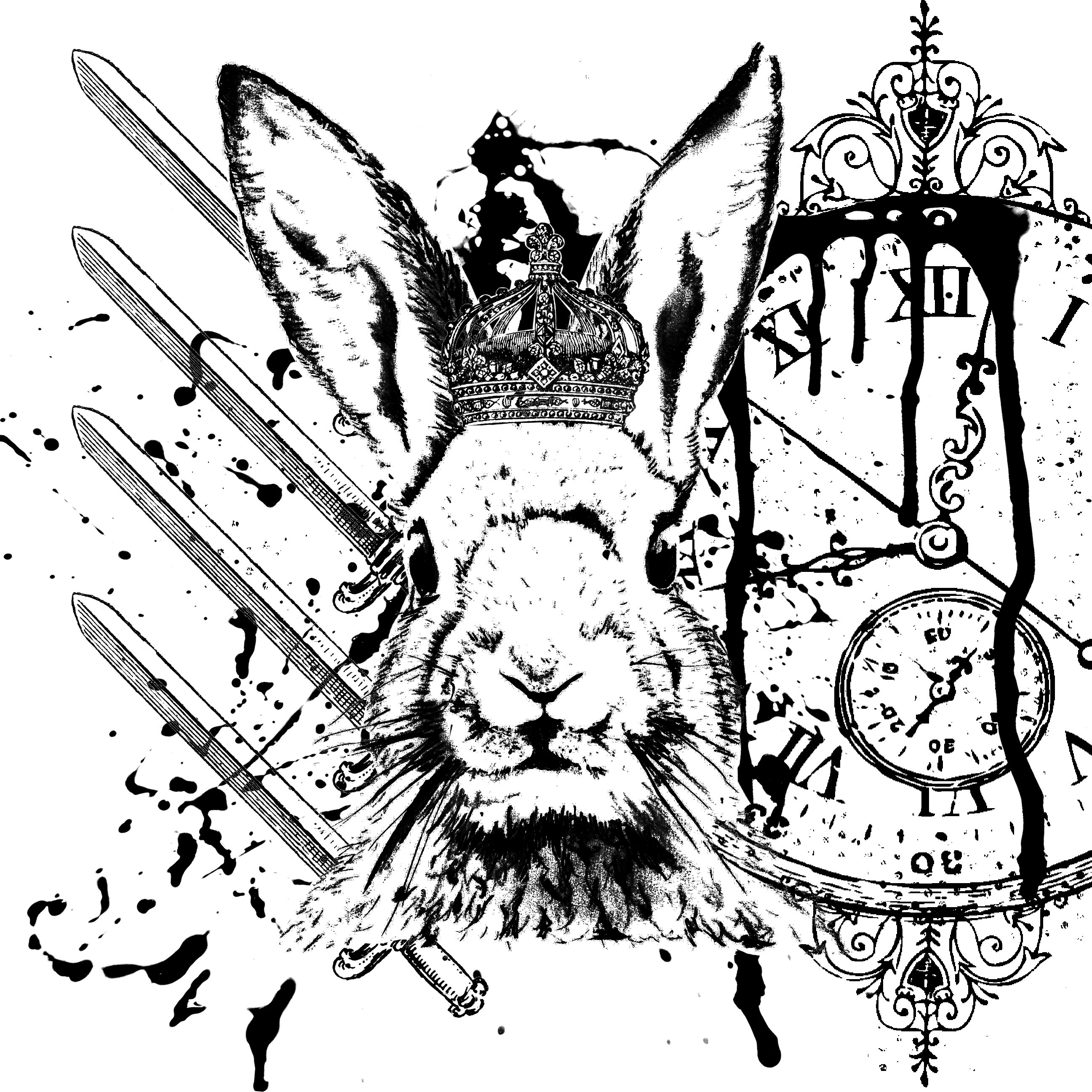
Symbolism:
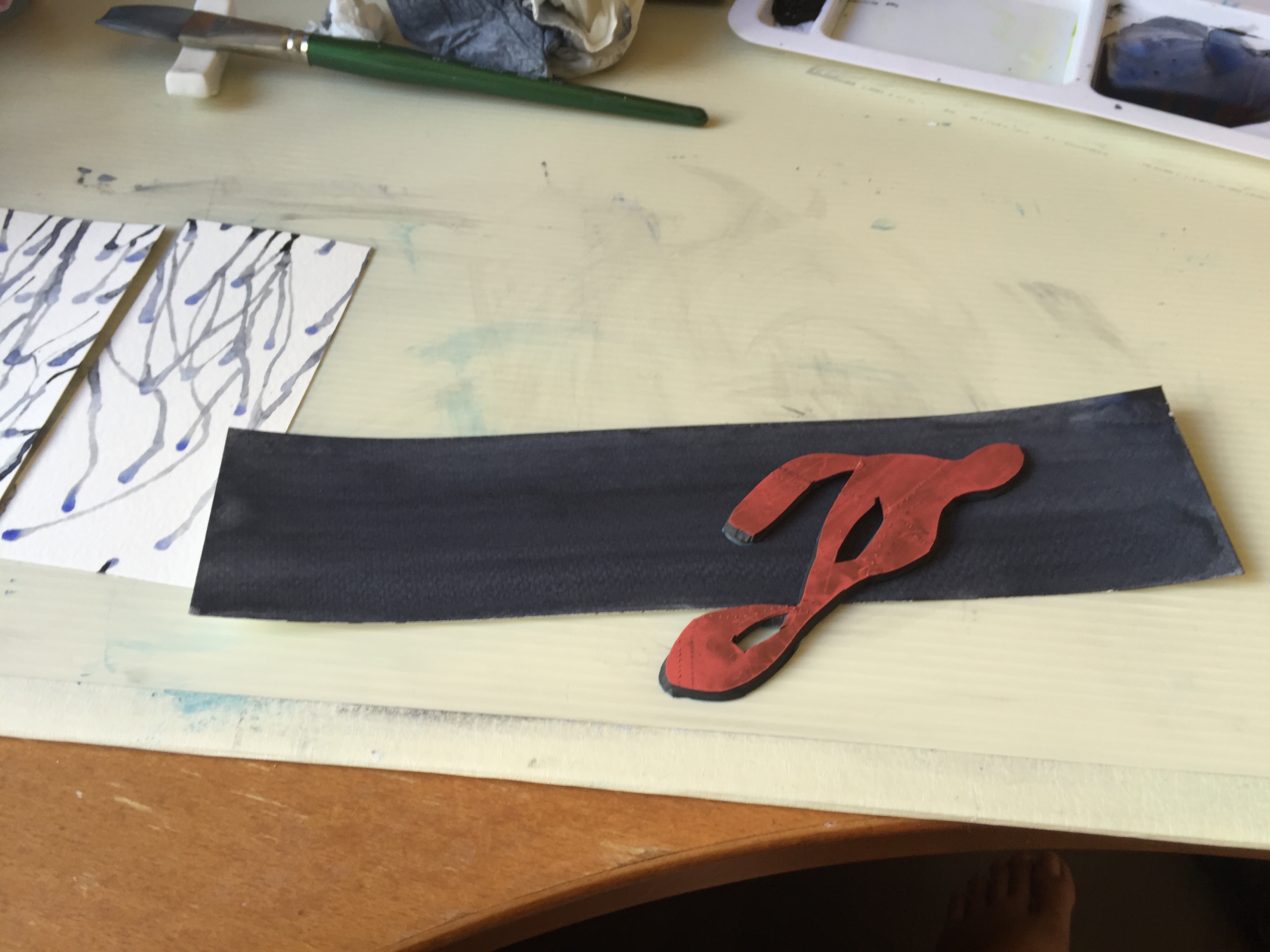
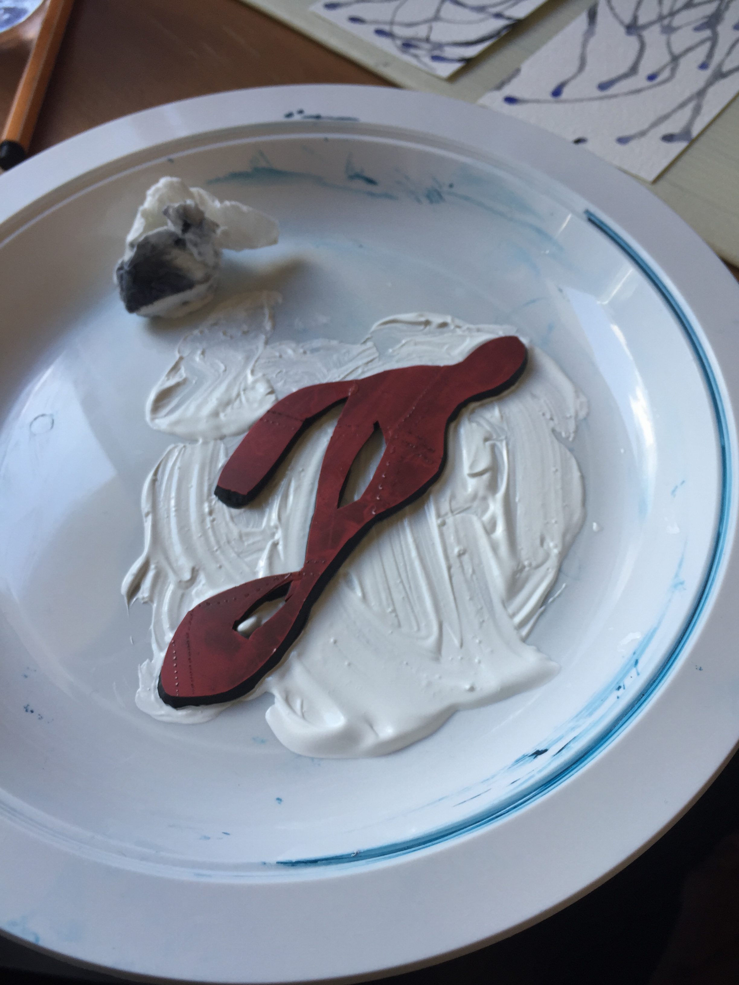
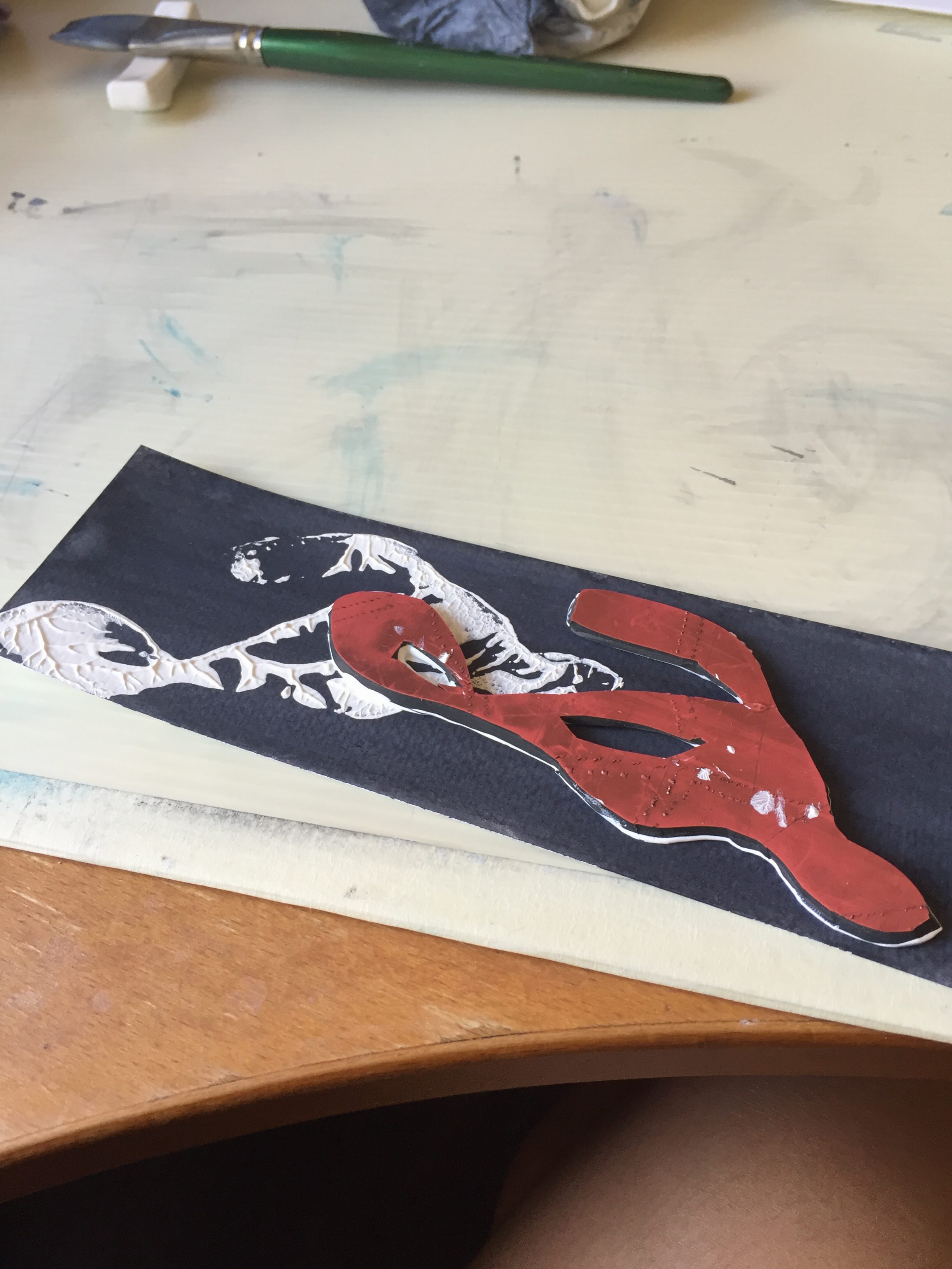
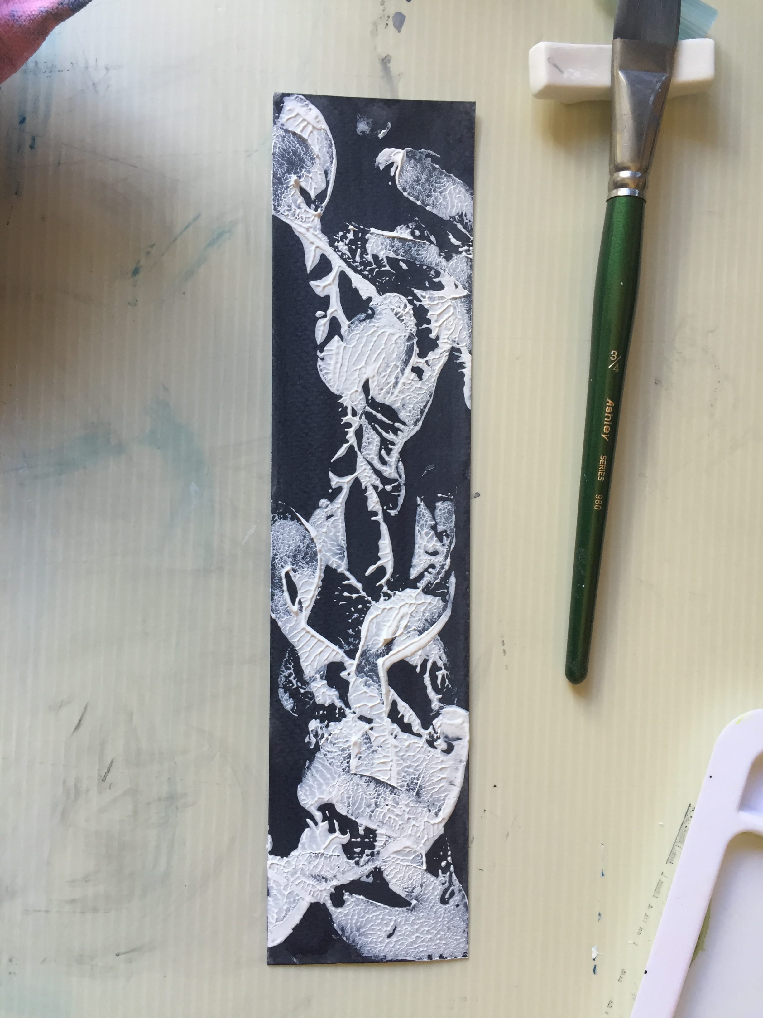
The rabbit represents Simba (heir to the throne, thus the crown), who is timid and afraid of facing his past (where he blames himself for his father’s death). The clock shows the essence of time/Simba’s past and how long he has been running from it. The past can hurt, as shown by the blood splatters on the clock. The swords symbolize Simba learning from his past.
HARRY POTTER AND THE PHILOSOPHER’S STONE (2001)
Sypnosis:
Harry Potter thinks he is an ordinary boy celebrating his eleventh birthday, but hs is far from right. A giant named Hagrid appears and gives Harry the all important news — He is a wizard. Now Harry’s journey in life gets more intense as he travels to Hogwarts School of Witchcraft and Wizardry to learn the trade of being a wizard.
Dialogue:
Dumbledore: It does not do well to dwell on dreams, Harry, and forget to live.
QUOTE BREAKDOWN…
- DREAMS — dreamcatcher, sleep, illusions, mirage
- DWELL — remain, longing, encircling
- FORGET — lose sight of something, emptiness
- LIVE — living things like plant vines, spring
Design Draft:
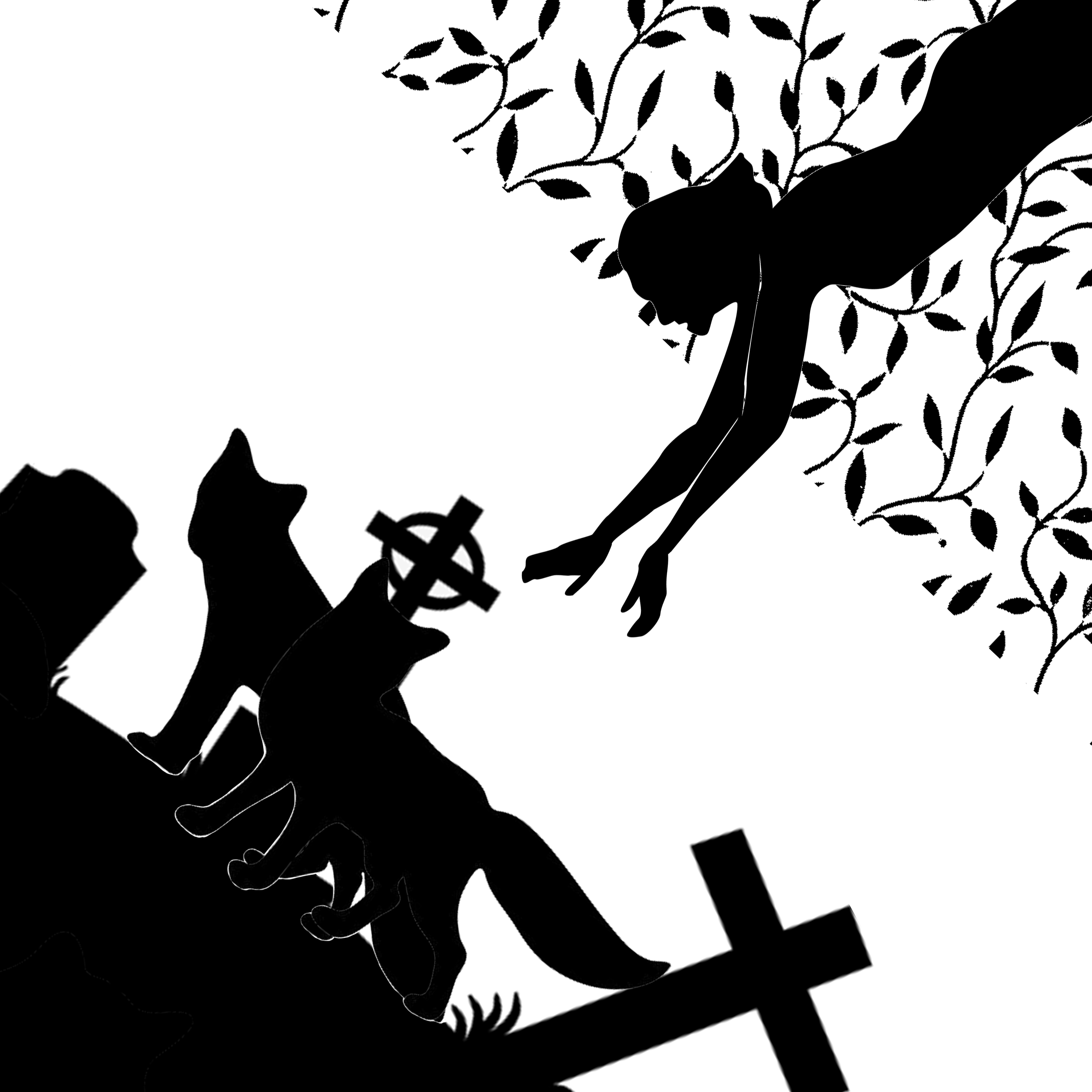
Symbolism:
The figure reaching out from the top right hand corner represents Harry, who is staring into the Mirror of Erised. The vines represent the living world/reality in which Harry is in. He is reaching out to his parents, represented by the two fox figures who are together. The fox figures are treading on the ground with graveyards, representing the dead/the underworld. Also, take note that only the figure’s arms are beyond the area of vines — it represents the part of the quote “forgetting to live“.
In short,
- dwelling on dreams — Harry longing for his parents (reaching out for them)
- forgetting to live — Harry possibly losing sight of what his actual reality is/the living present
ARTIST INSPIRATIONS
Biography
Melbourne based Illustrator & Designer Ken Taylor works primarily within the music industry and is predominantly well known for his striking rock posters. Ken started in Perth Western Australia doing posters and album artwork for local bands. In 2001 He moved to Melbourne and slowly started to create a name for himself within Melbourne’s music scene. In 2006 he went out on his own and started to work full time on music based artwork.
Personal Opinion
I personally enjoy Ken Taylor’s artworks and they are an inspiration as they include huge amounts of detail, and the layouts, use of space and colors are very striking and pleasing to the eyes.
Any Forty
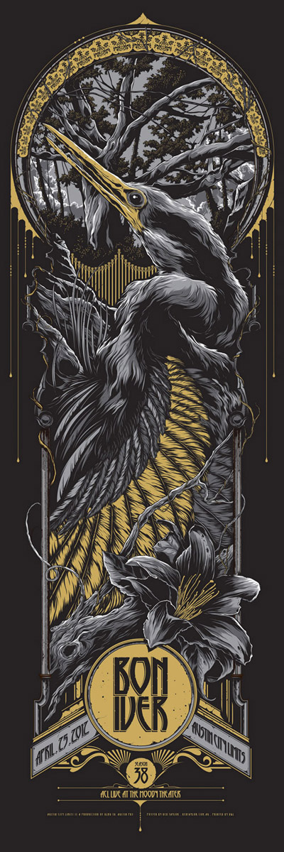
Bon Iver — Austin, TX
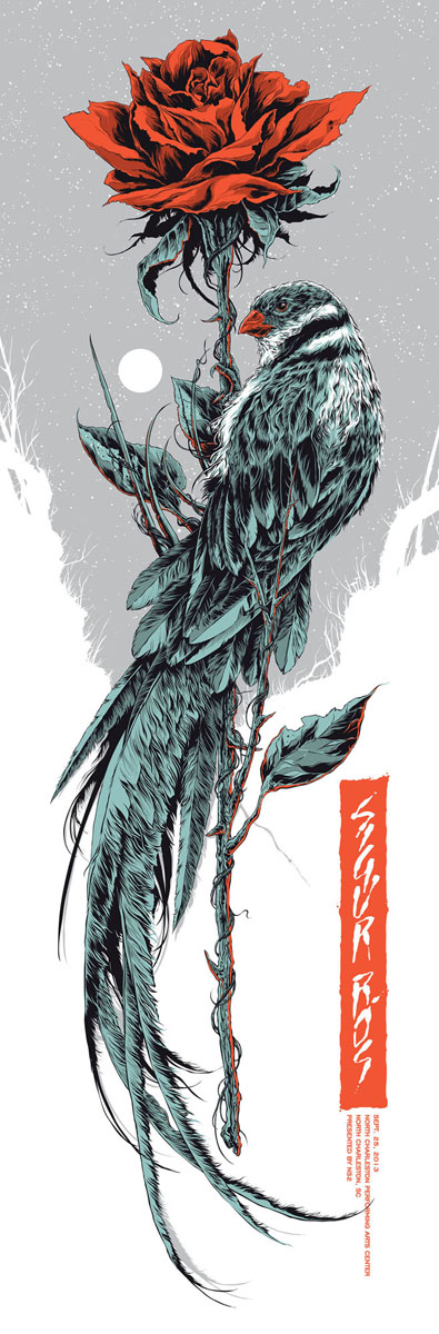
Sigur Ros — North Charleston
Biography
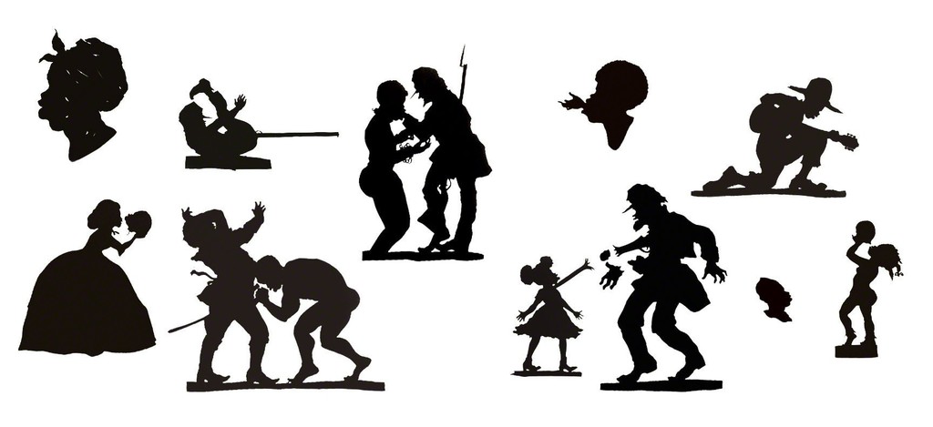
Kara Walker is known for creating black-and-white silhouette works that invoke themes of African American racial identity. Her subjects, often scenes of slavery, conflict or violence, are rendered in a style recalling traditional African illustration and folklore of the pre-Civil War United States; the works preserve and draw critical attention to these earlier cultural epochs. Working in collage, Walker cuts out and affixes black or white paper directly to gallery walls, and utilizes light projectors to cast viewers’ own shadows into her silhouetted narratives, creating a deeply engaging experience. Despite the oftentimes sombre nature of her subjects, Walker relies on humor and viewer interaction. “I didn’t want a completely passive viewer,” she has said. “I wanted to make work where the viewer wouldn’t walk away; he would either giggle nervously, get pulled into history, into fiction, into something totally demeaning and possibly very beautiful.”
Personal Opinion
I am astounded by how impactful Kara Walker’s artworks are — the silhouettes are void of color and facial/bodily details, yet the dynamism of the poses brings the message across very strongly.
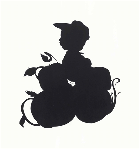
Untitled (Tomato Patch Girl)
African/American , 1998
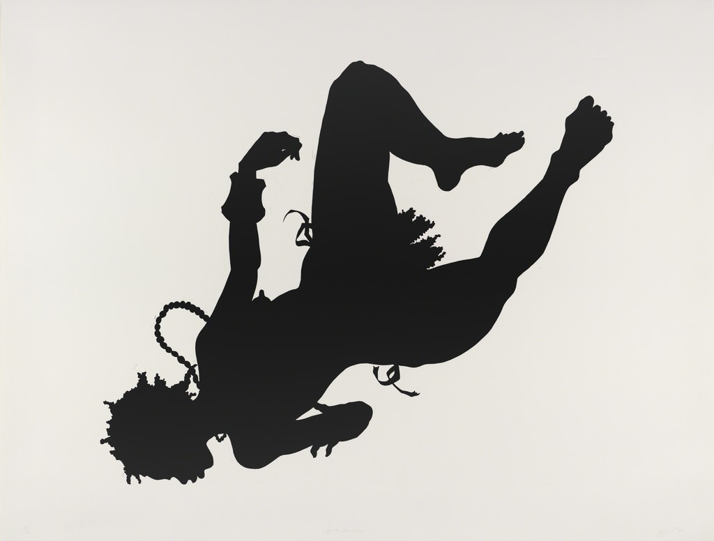
Auntie Walker’s Wall Sampler for Civilians, 2013
Biography
Dot Dot Dot is a pseudonym for a mysterious Norwegian stencil artist. Like Banksy and many stencil artists before him, he prefers to remain annonymous, this has as much to do with his long graffiti career as it does with the allure of anonymity.
What we do know is that he was born in Oslo, Norway and first started graffiti in 1997. He has operated under several pseudonyms, but when he successfully shifted to a more conceptual and figuratie style, settled on Dot Dot Dot.
He began focusing on stencil work in 2007 and in the last few years has become regarded as one of the country’s leading street artists.
Personal Opinion
Similar to Kara Walker, these works of Dotdotdot below are very miminal and just contain silhouettes, but they bring the message across with a huge amount of impact.
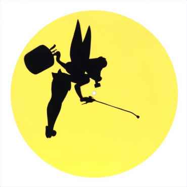
Toxic Thinkbell (Yellow)
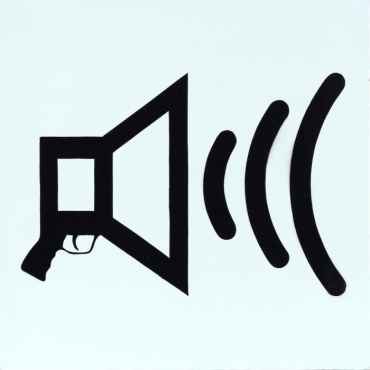
Weapon of Choice (Black on White)
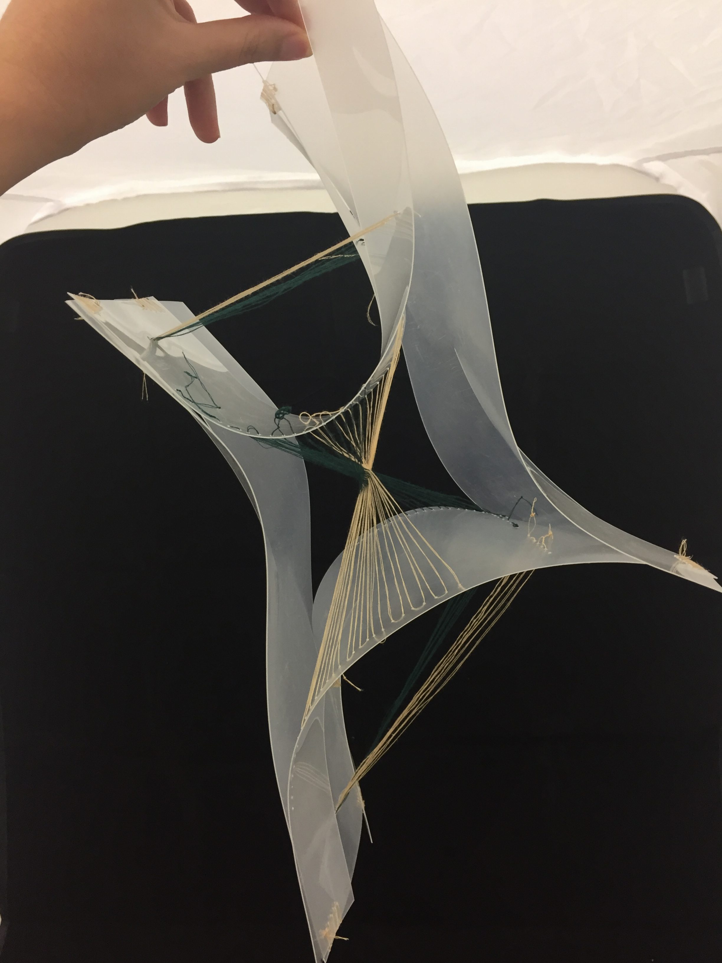
Project 1.5 Conclusion
Project 1.5 final outcome!
TOOLS USED: Plastic card, threads, needle
FINISHED PRODUCT

Sequential Imaging
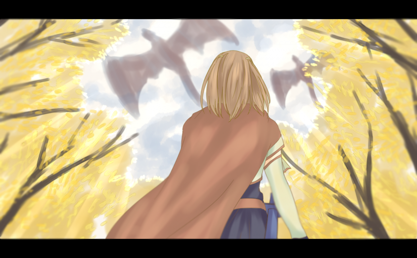
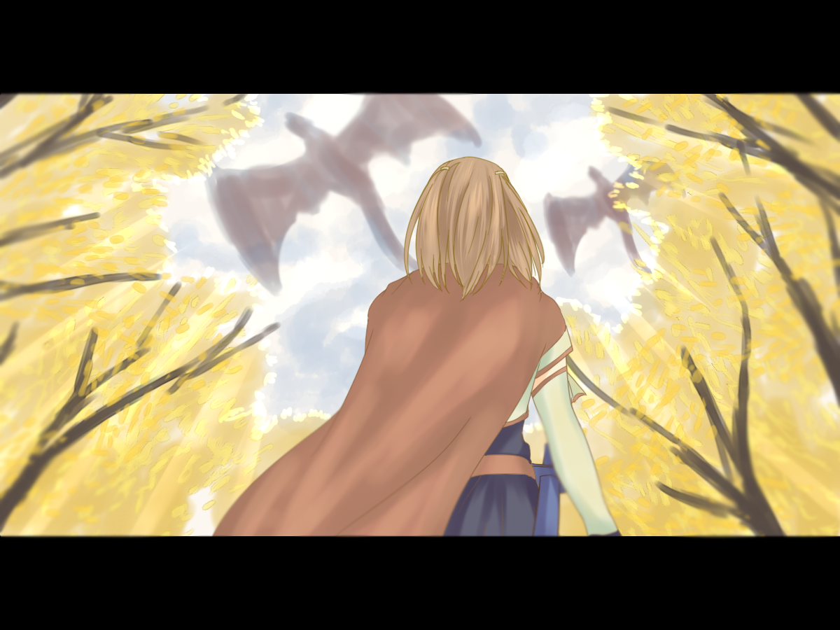
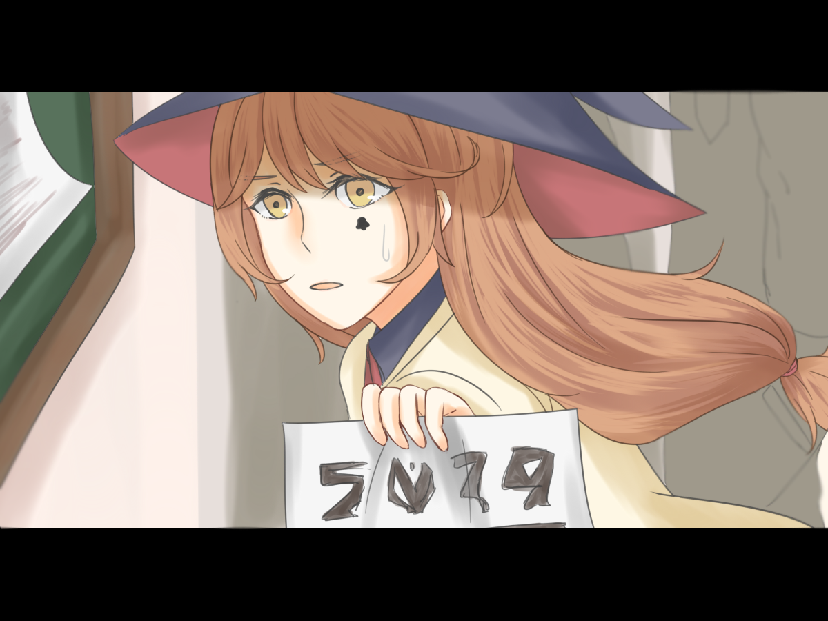
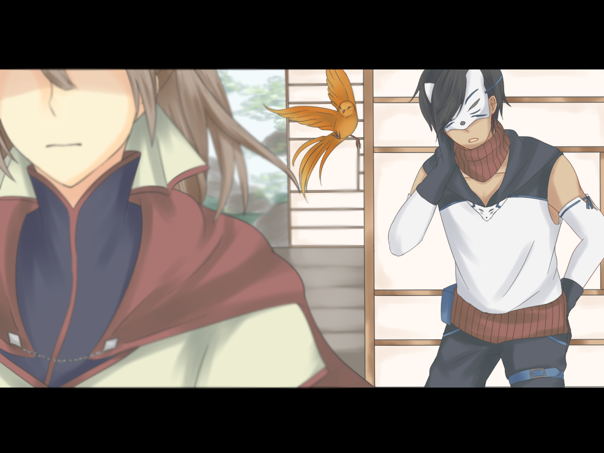
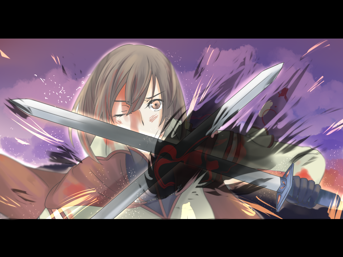
I drew 5 key images for a movie trailer of Ignite.
TOOLS USED: Paint Tool SAI
TRAILER SEQUENCE
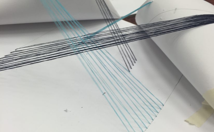
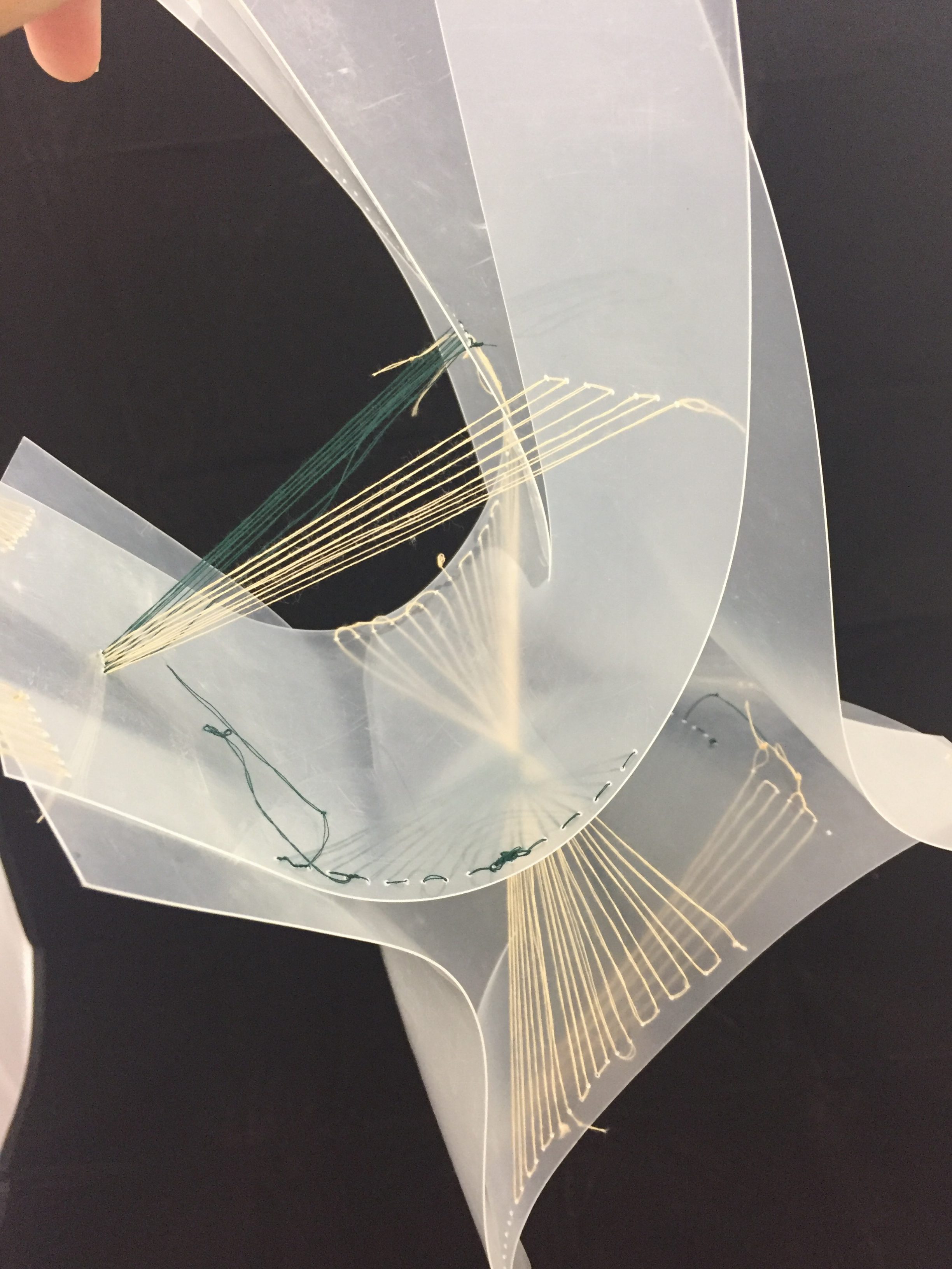
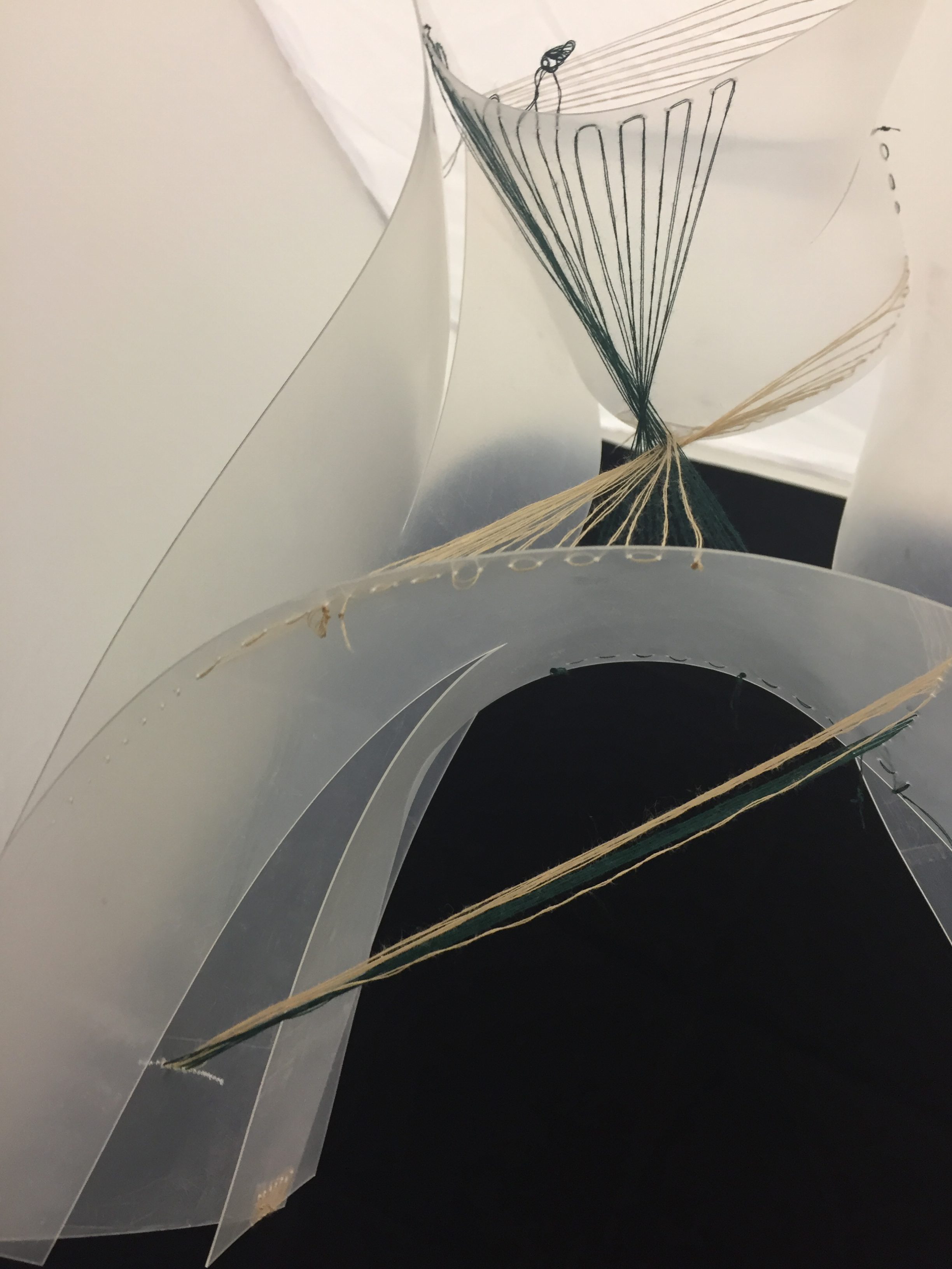
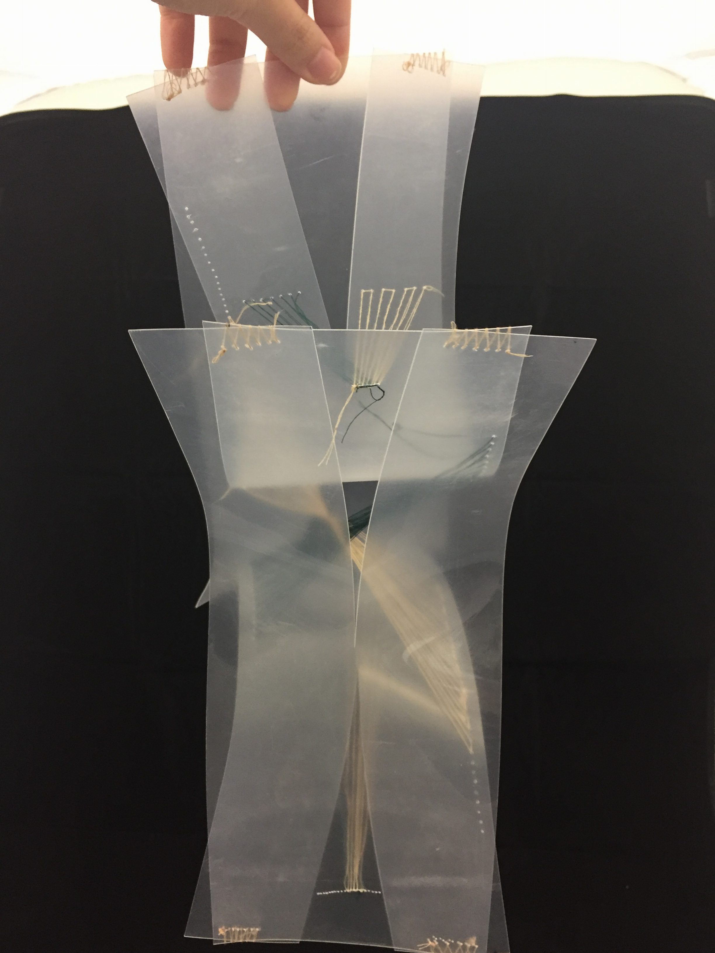
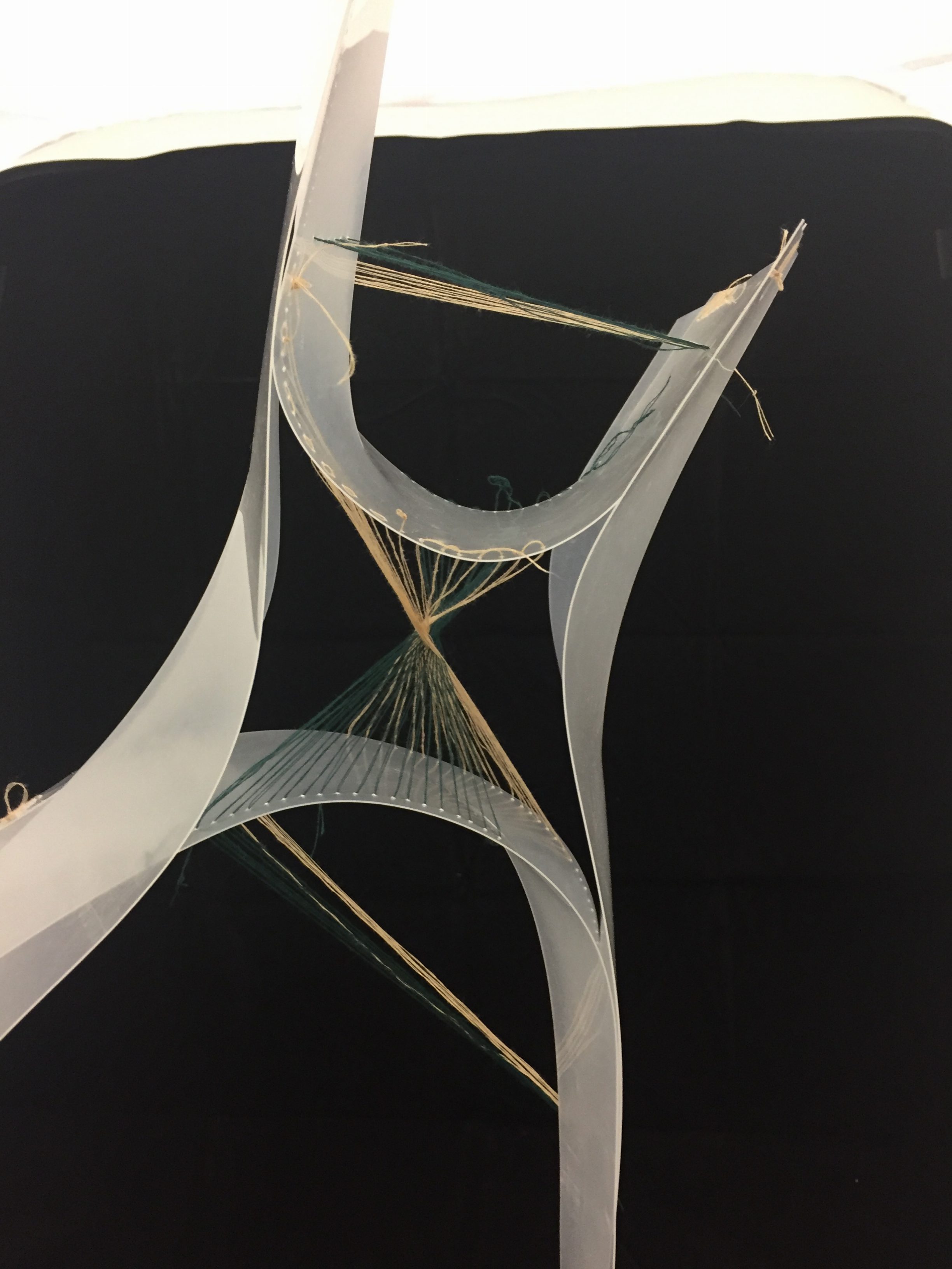
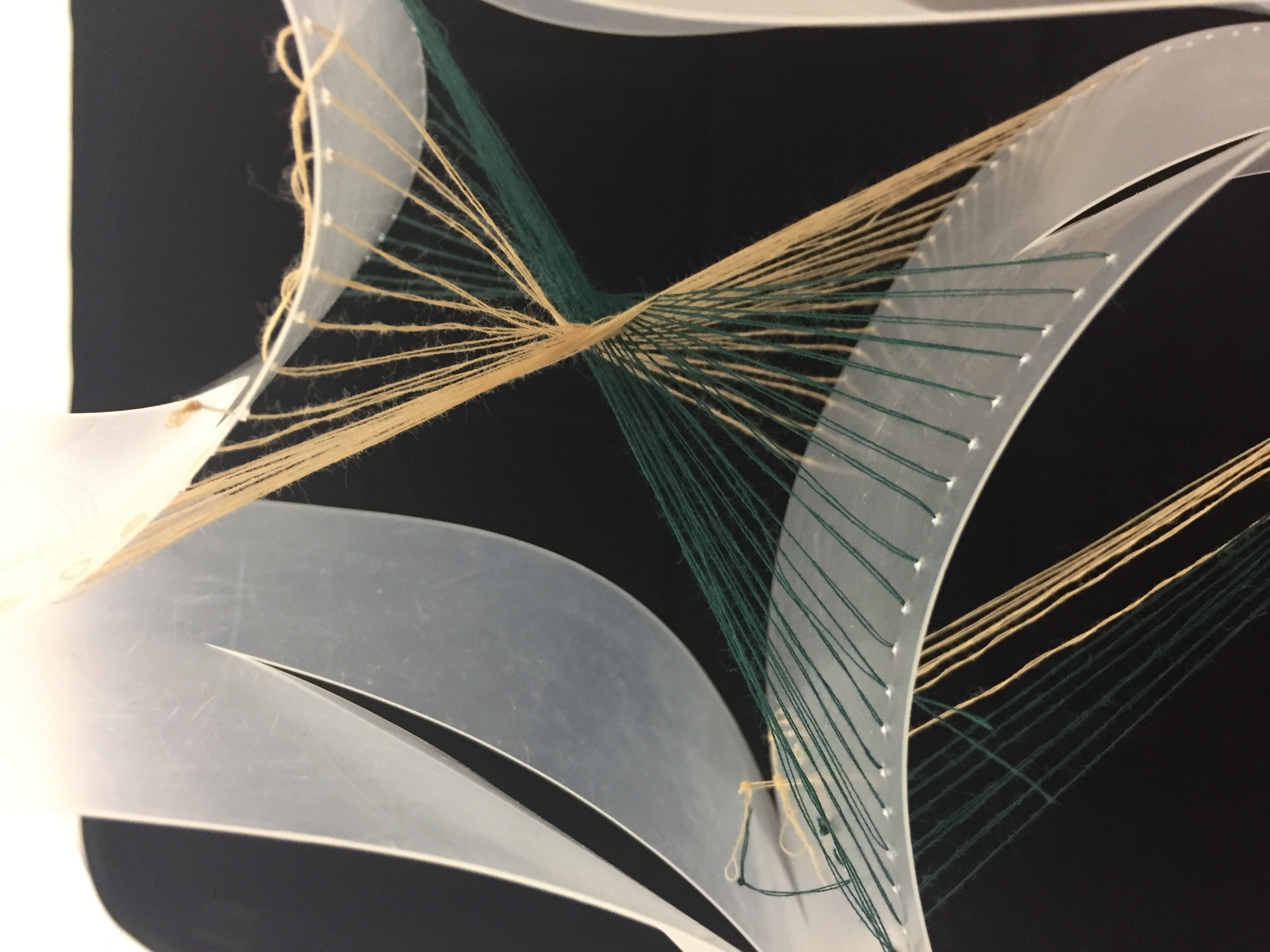
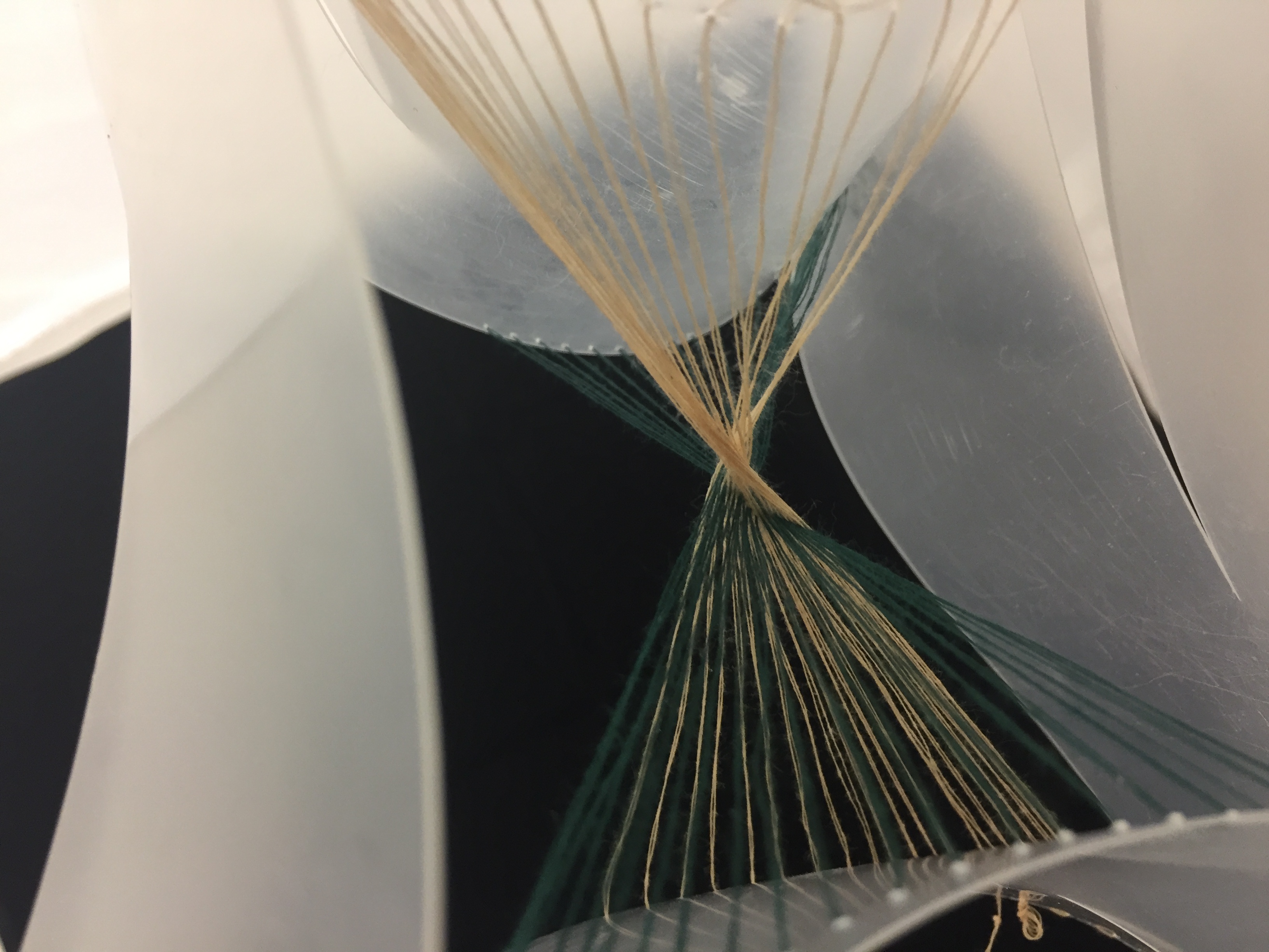
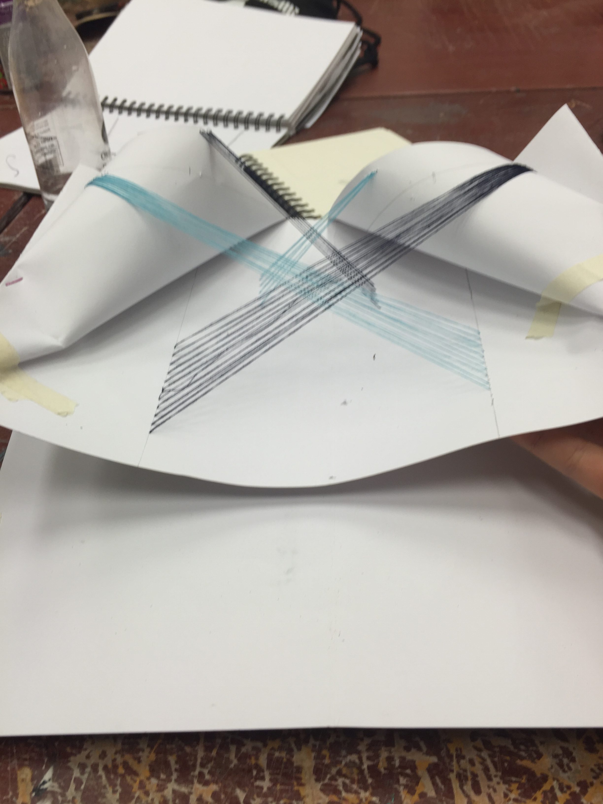
Project 2 — Line Sculpture Process I
We did study models of line sculptures in class!
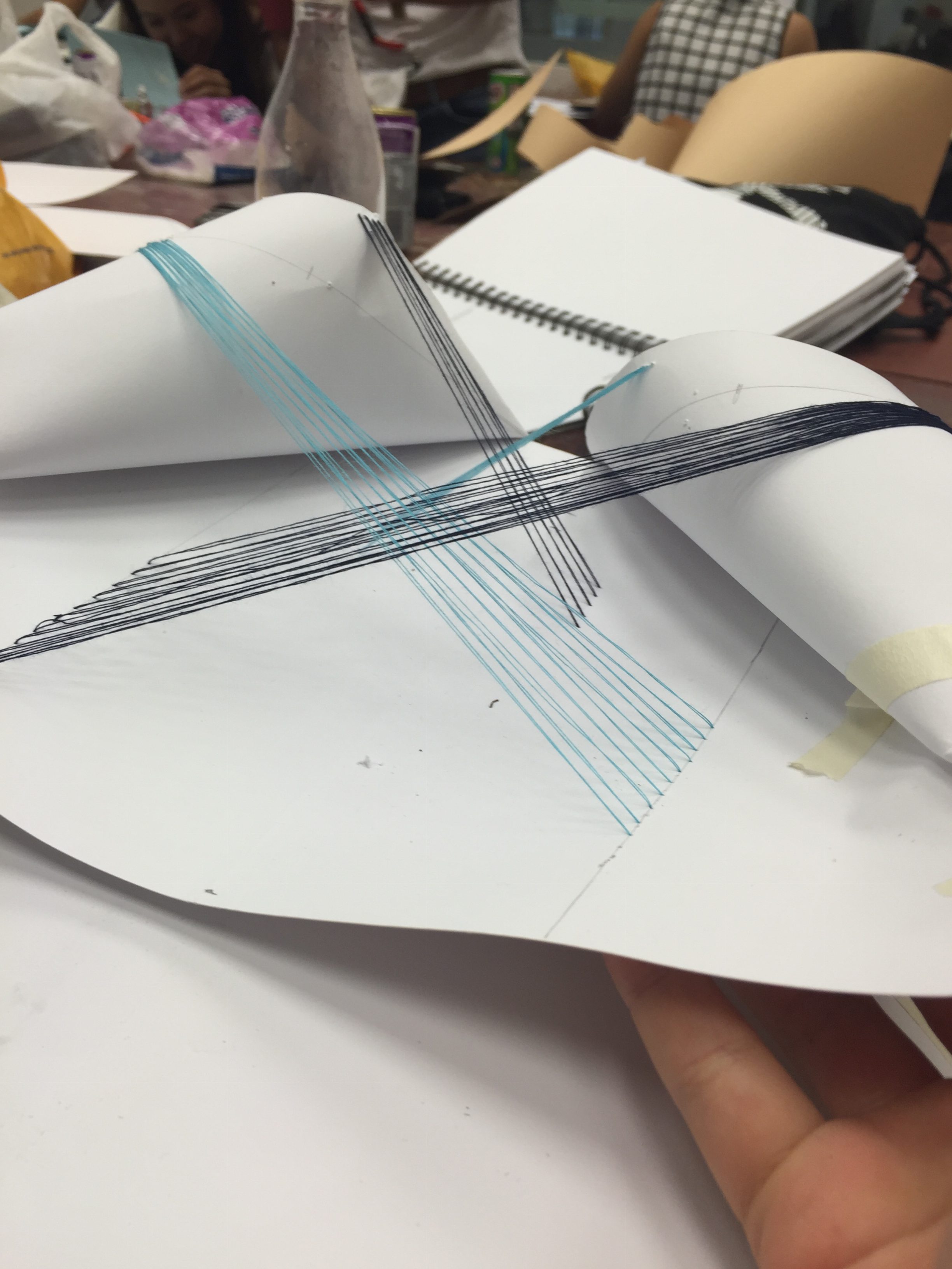
I thought of fountains when making my study model; I wanted to have lines of two colours intertwine each other on a flat surface.
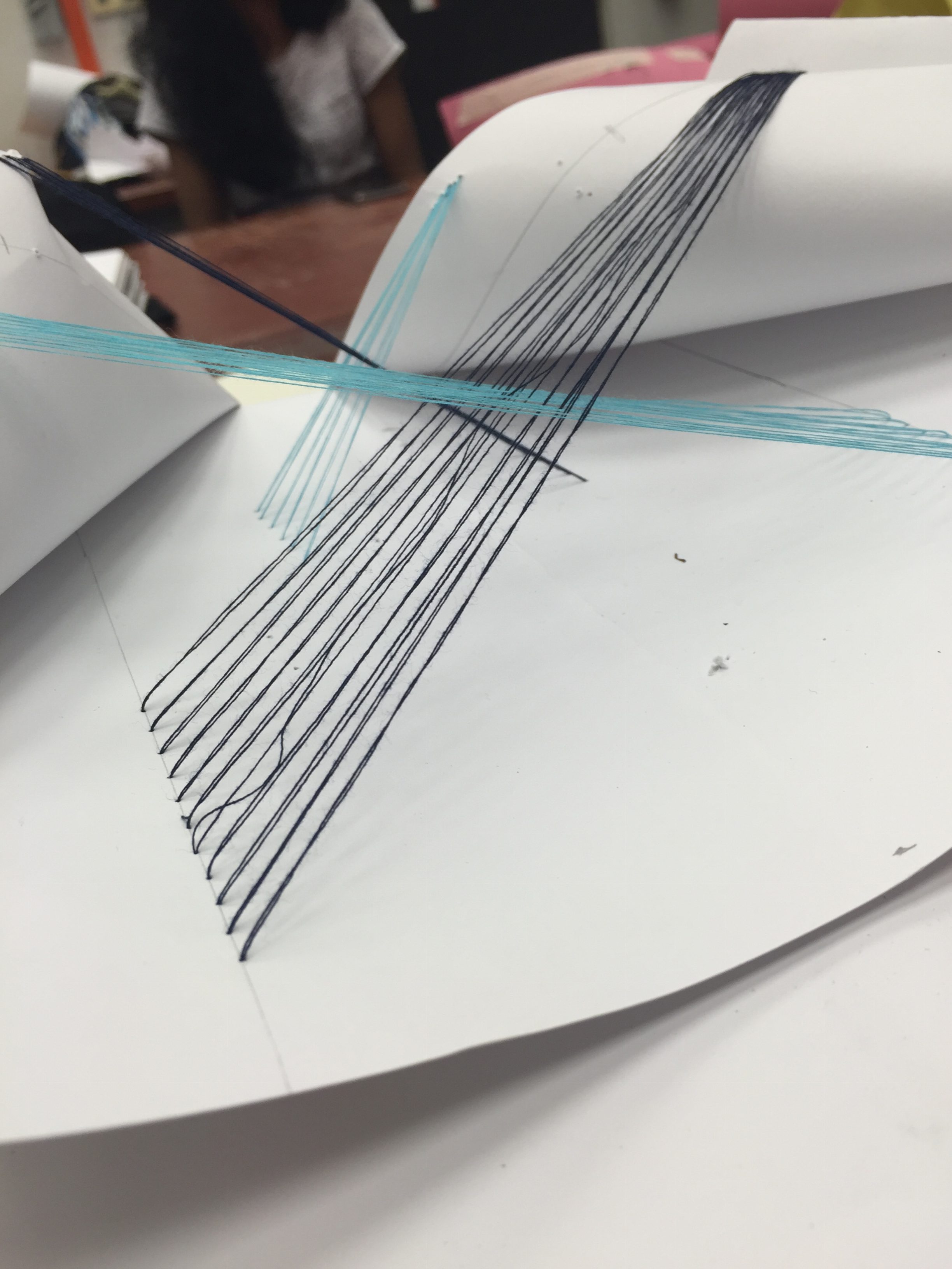
I had to curve the sides of the vanguard paper because of the paper was too flimsy and it could not support the strings to form proper planes.
“My Line is Emo” Final Outcome
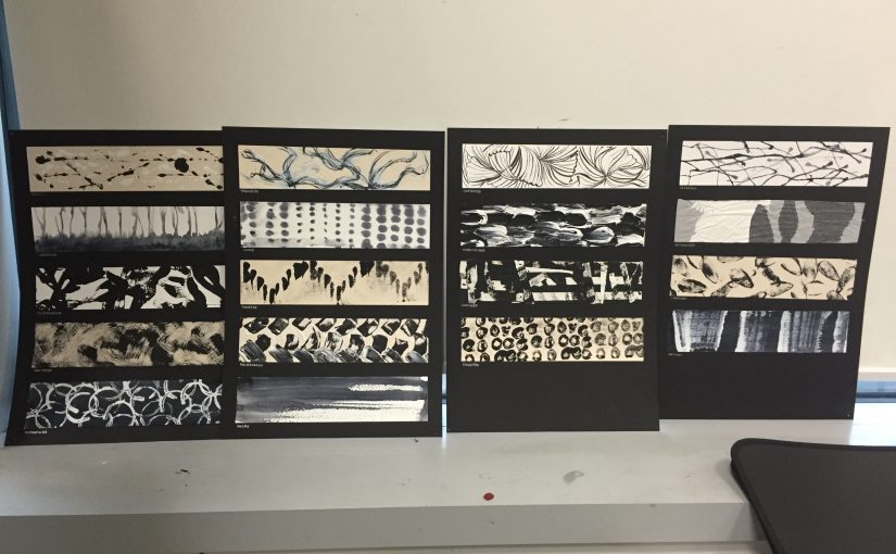
2D Project 1, “My Line is Emo”, is complete!
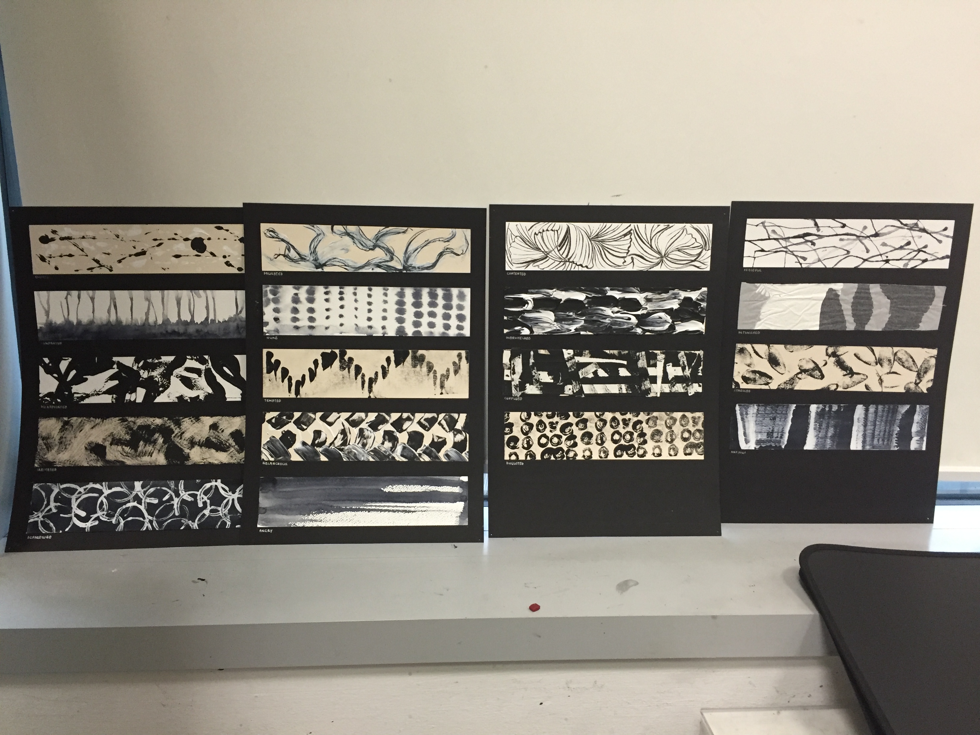
My layout style was four A3s pieces of black Canford paper, with five emotions on two of the A3s and four emotions on the other two.
On each piece of Canford paper, the emotion is arranged such that the most positive emotion is placed on the top and the worst emotion is placed on the bottom.
Here are the final pieces, mounted:
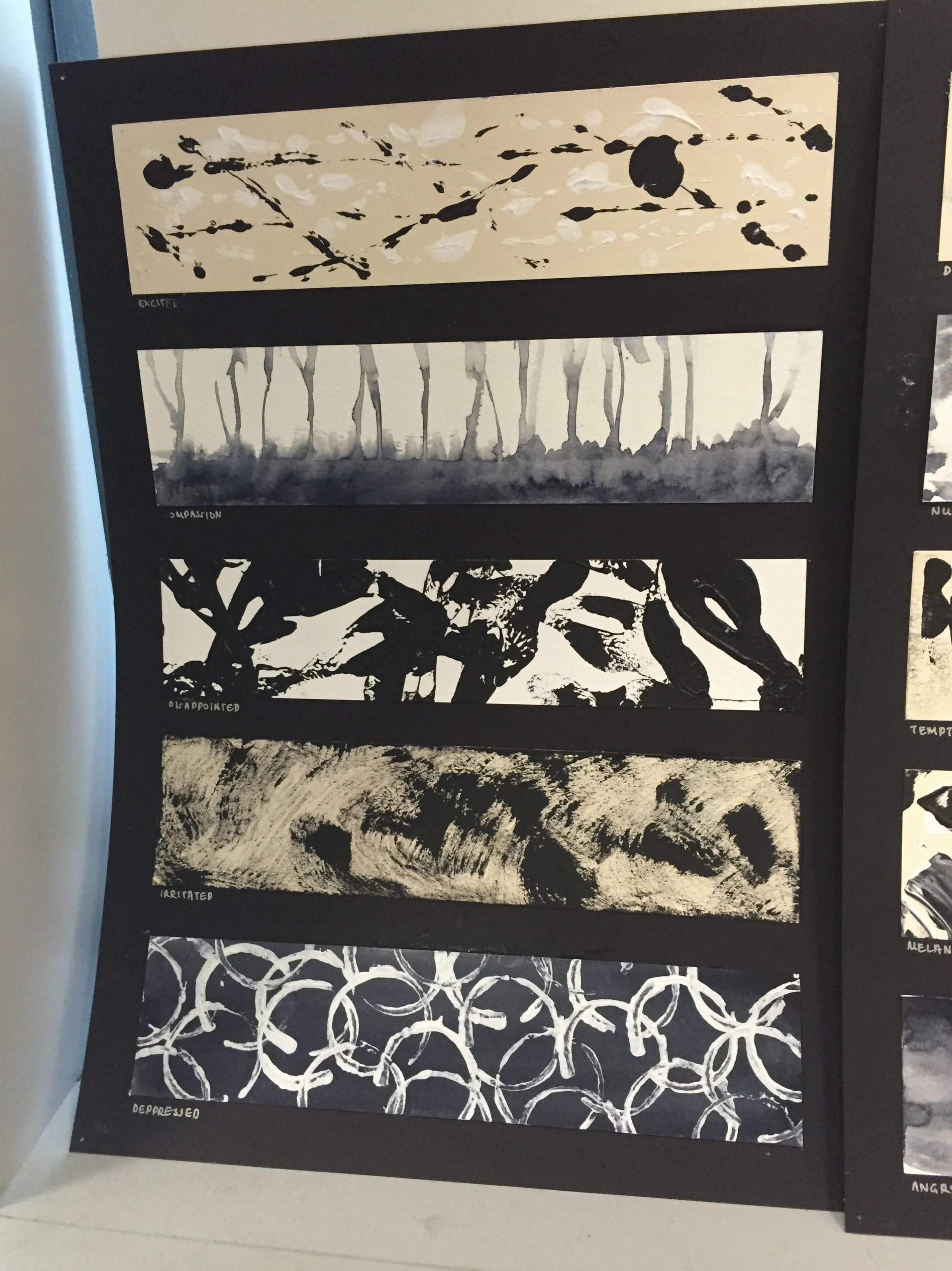
Emotions (Top to Bottom): Excited, Compassion, Disappointed, Irritated, Depressed
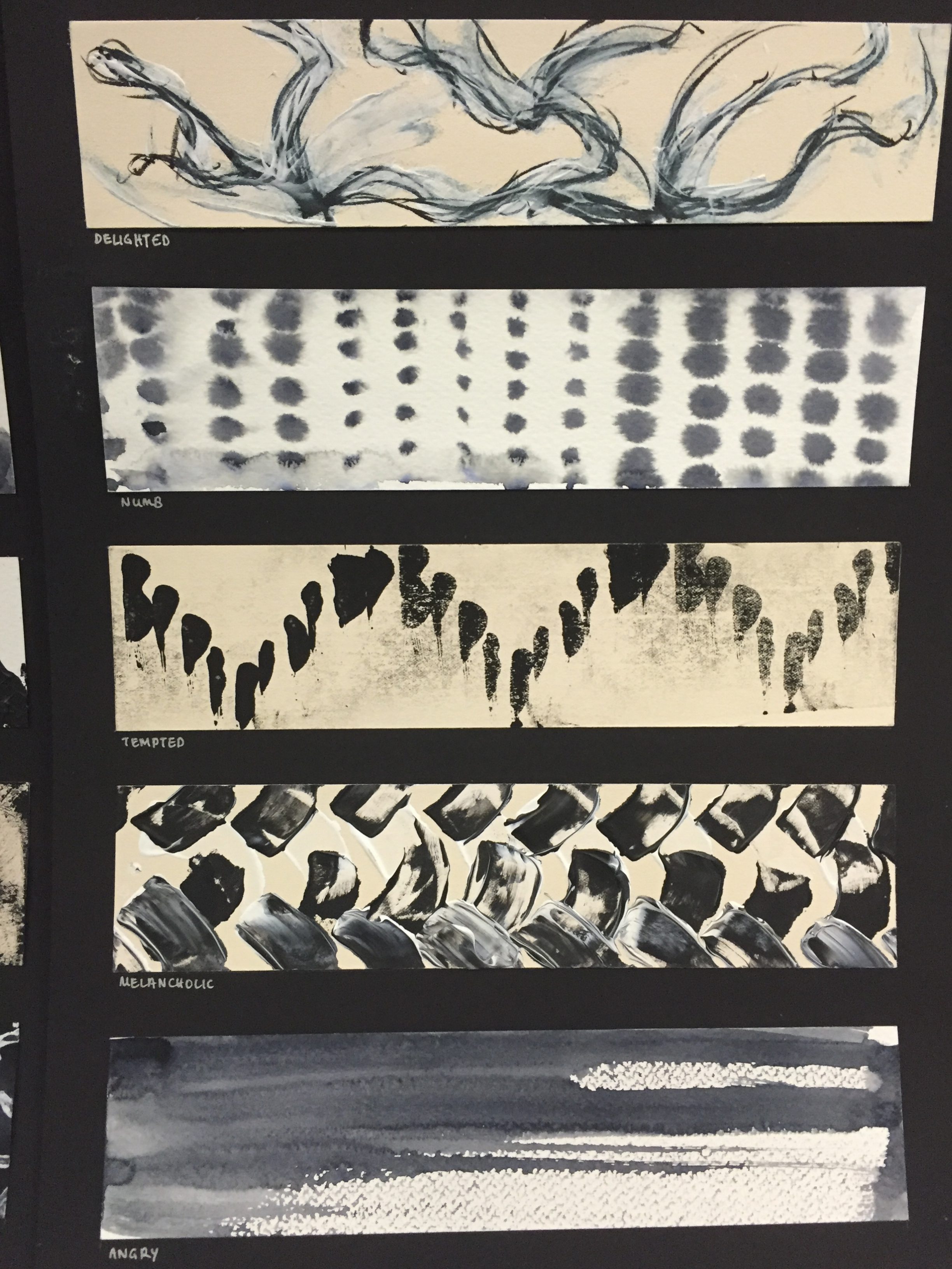
Emotions (Top to Bottom): Delighted, Numb, Tempted, Melancholic, Angry
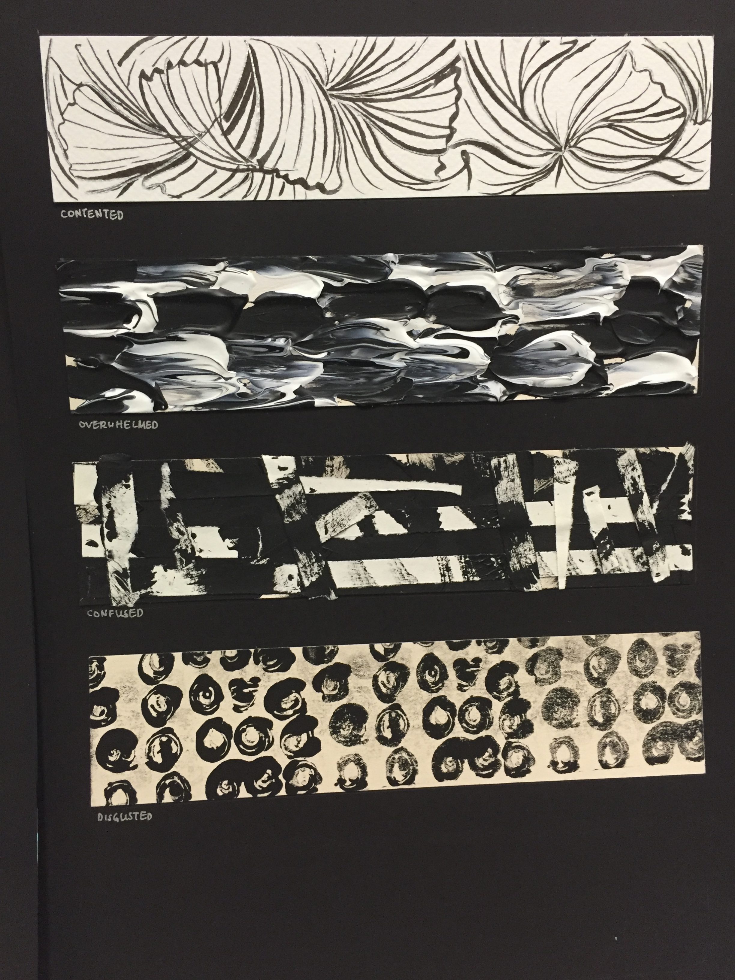
Emotions (Top to Bottom): Contented, Overwhelmed, Confused, Disgusted
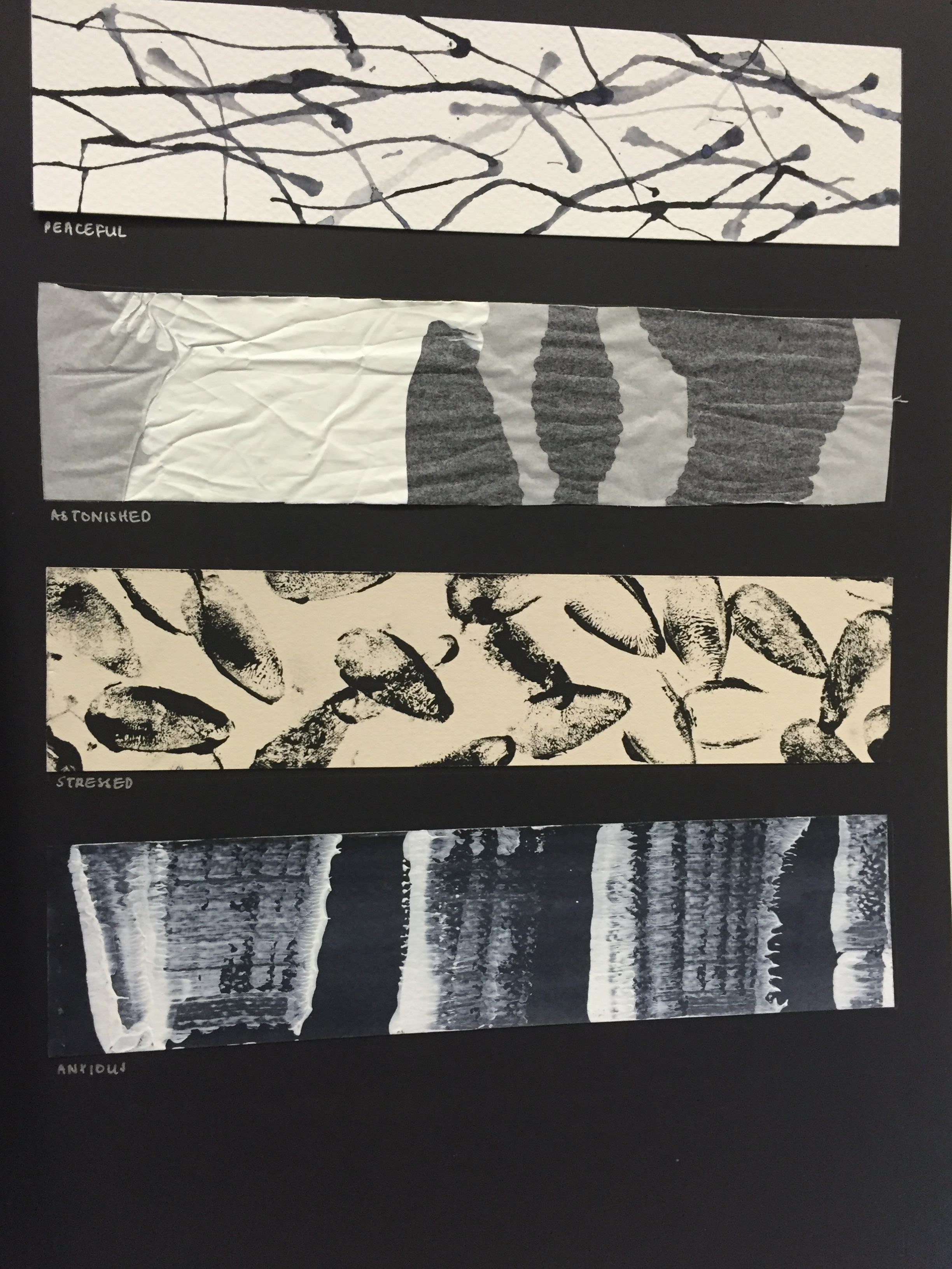
Emotions (Top to Bottom): Peaceful, Astonished, Stressed, Anxious
REFLECTIONS
After the processes and presentation, I realized that I was very emotionally invested in this project. I describe myself as a very “zen” person — I do not express my turbulent emotions as much as others do; thus I found it difficult to even put my feelings into my work. Moreover, I am more of an illustrator than an abstract artist, so this project was quite the challenge… and I digged my emotions and personality as much as I could to produce it physically. Nevertheless, I had a lot of fun!

“My Line is Emo” Process II
I continued to work on more prints for the assignment while I was away from school. I also continued to work on it the previous 2D class.
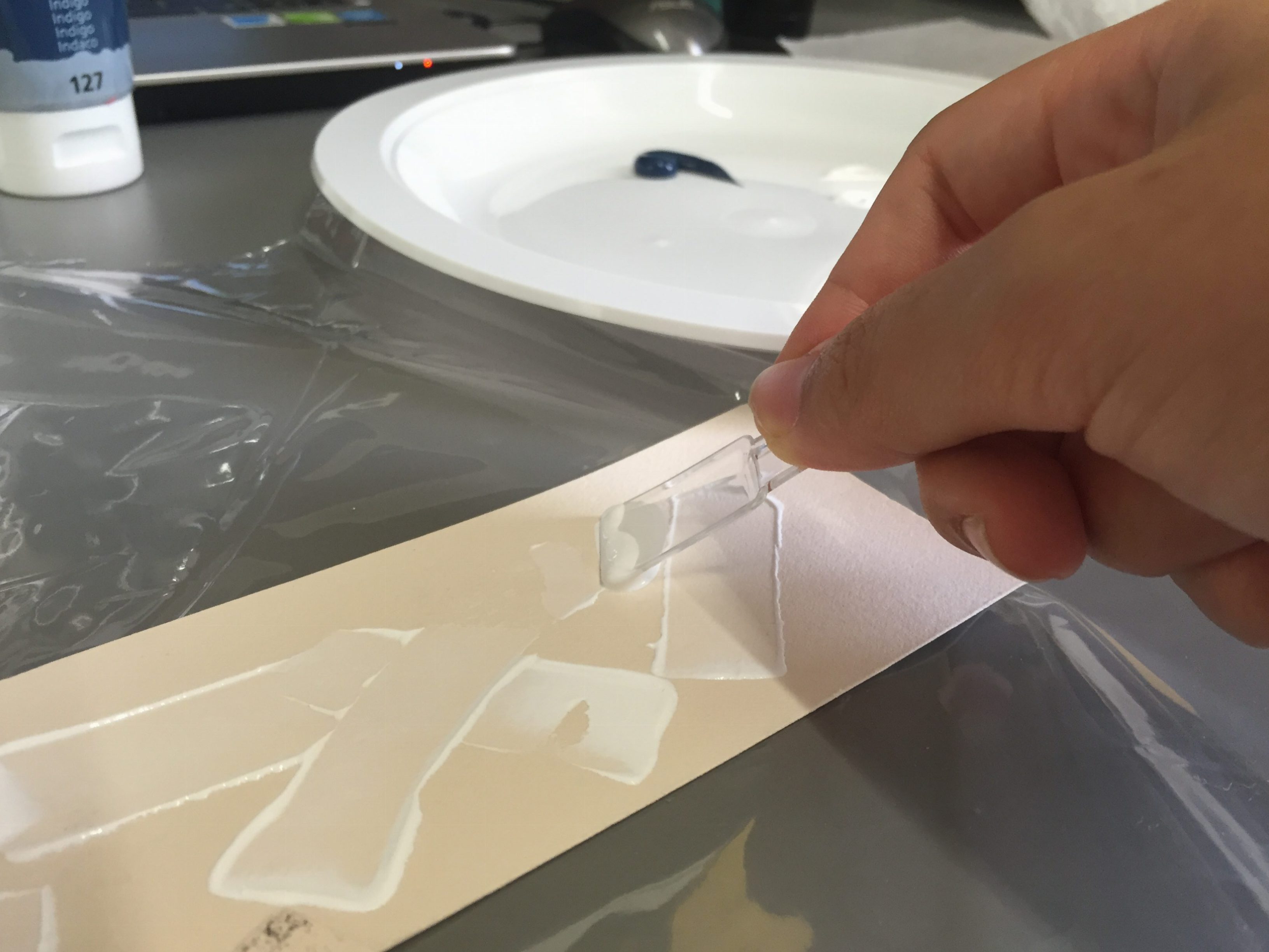
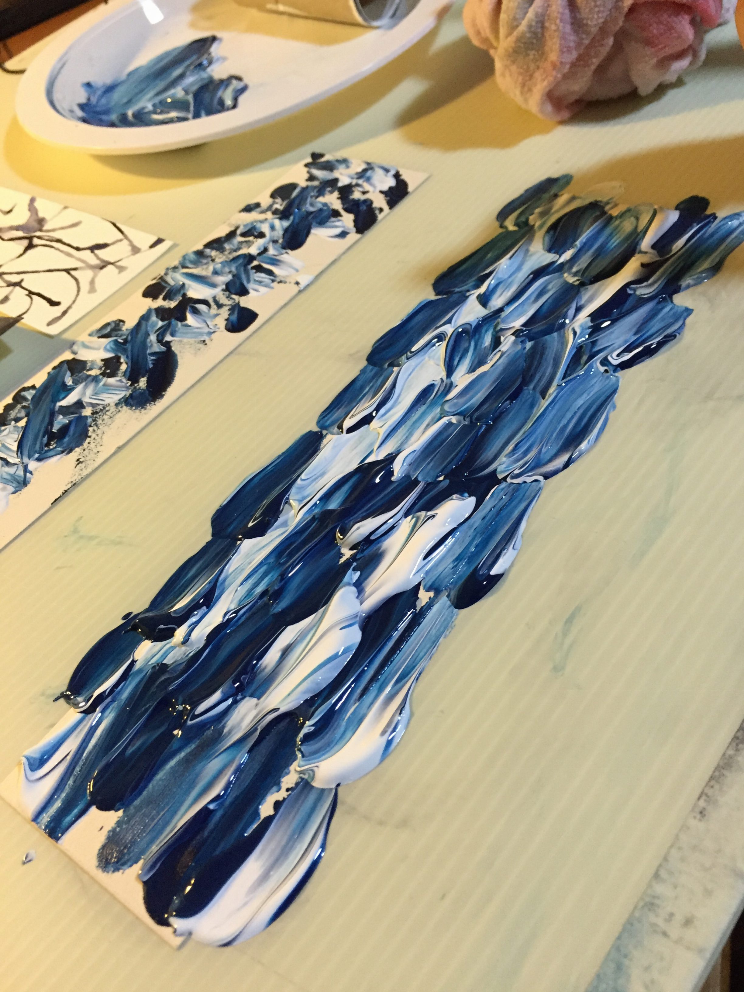
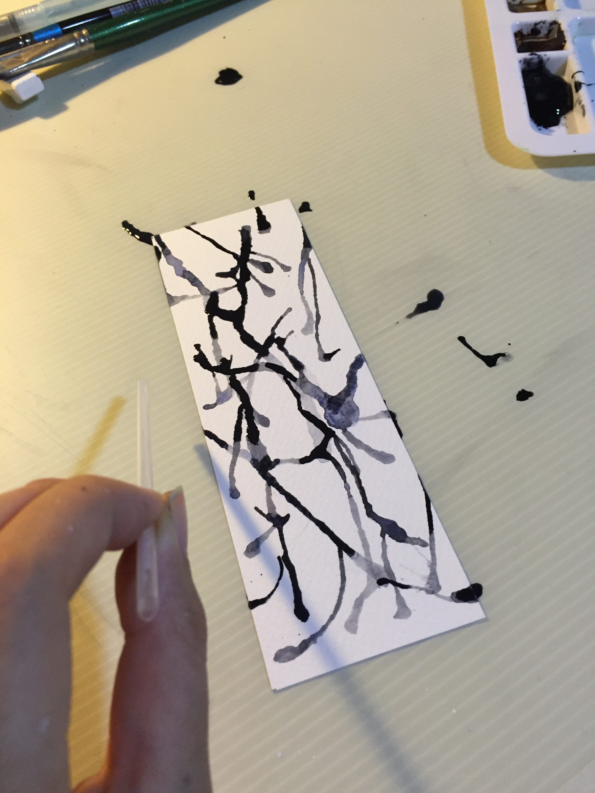
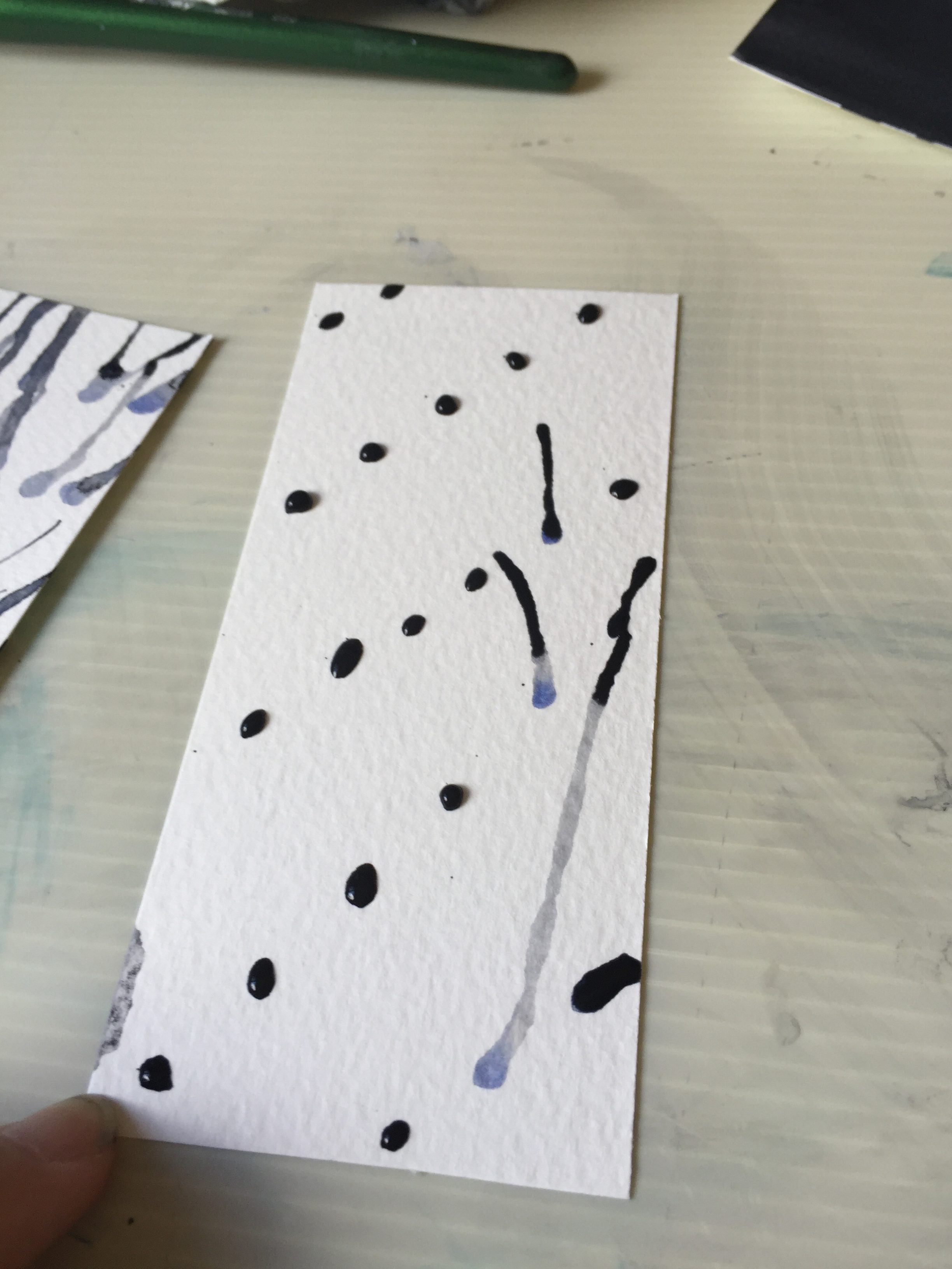
TOOLS USED: Ice cream spoon, toilet roll, tissues, Lino, straw, black ink, rubber paint roller, spoon, battery, mini binder clip, Daler Rowney Aquafine Watercolour (Payne’s Grey), Daler Rowney Graduate Acrylic (Indigo and White)
PROCESSES
I already had some ideas for the mark making patterns, so I went ahead with the ideas and carried them out!
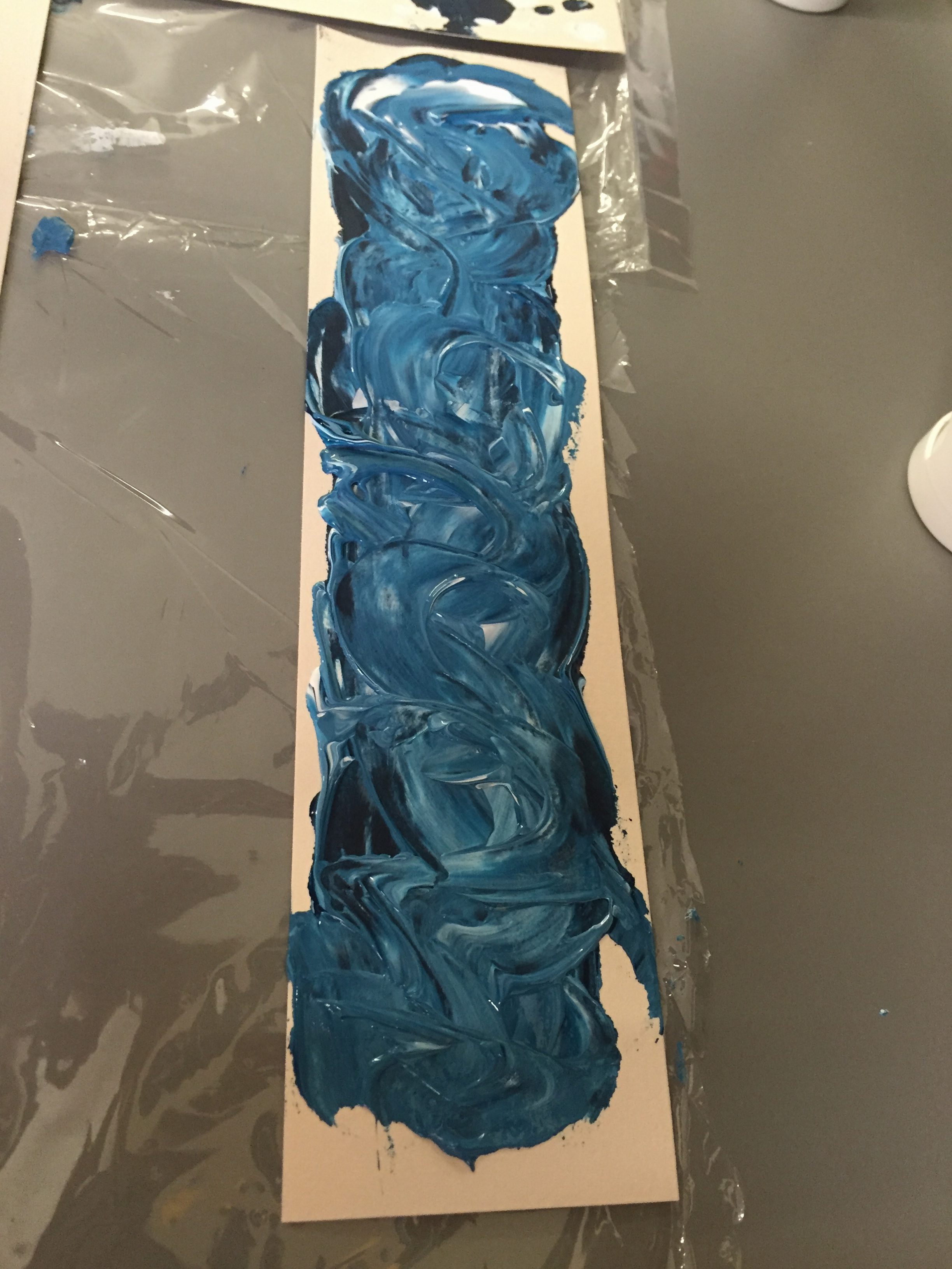
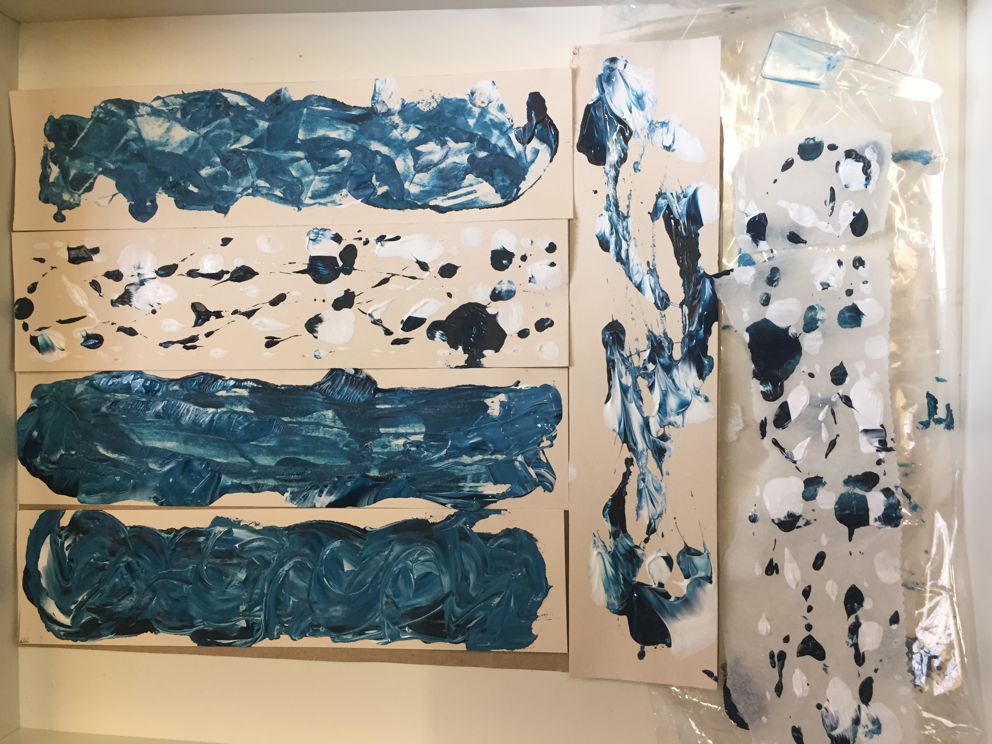
HAPPY
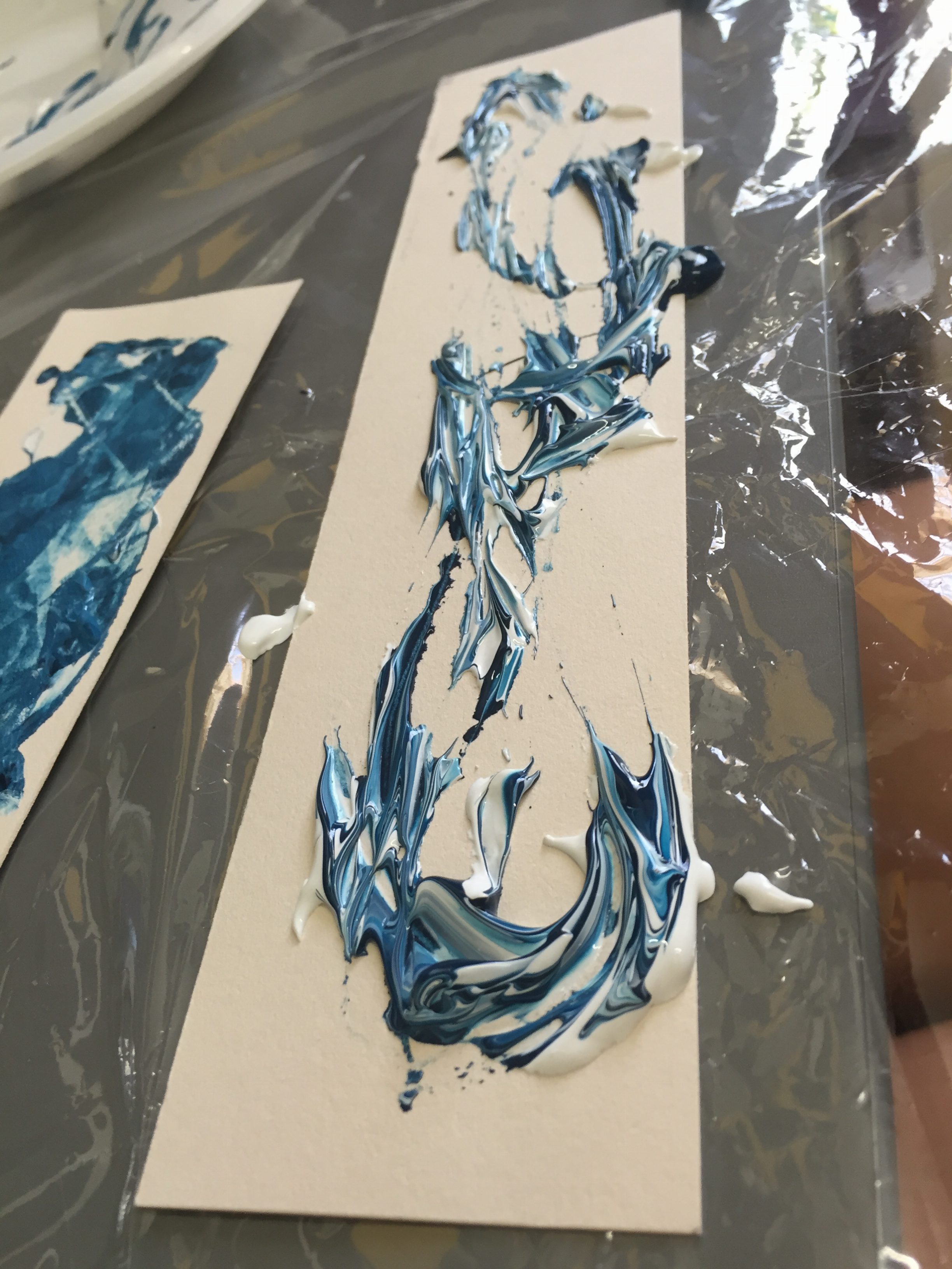
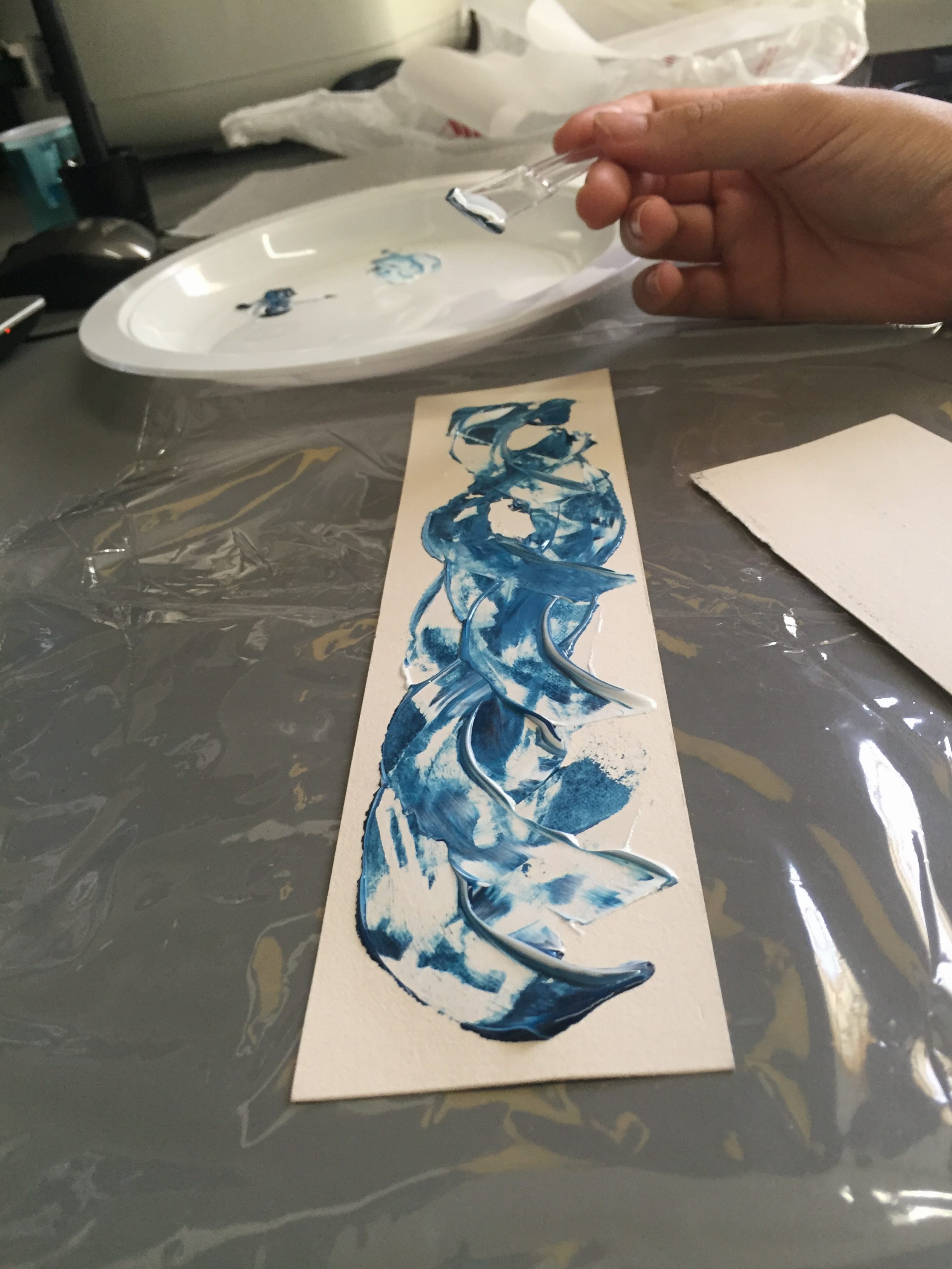
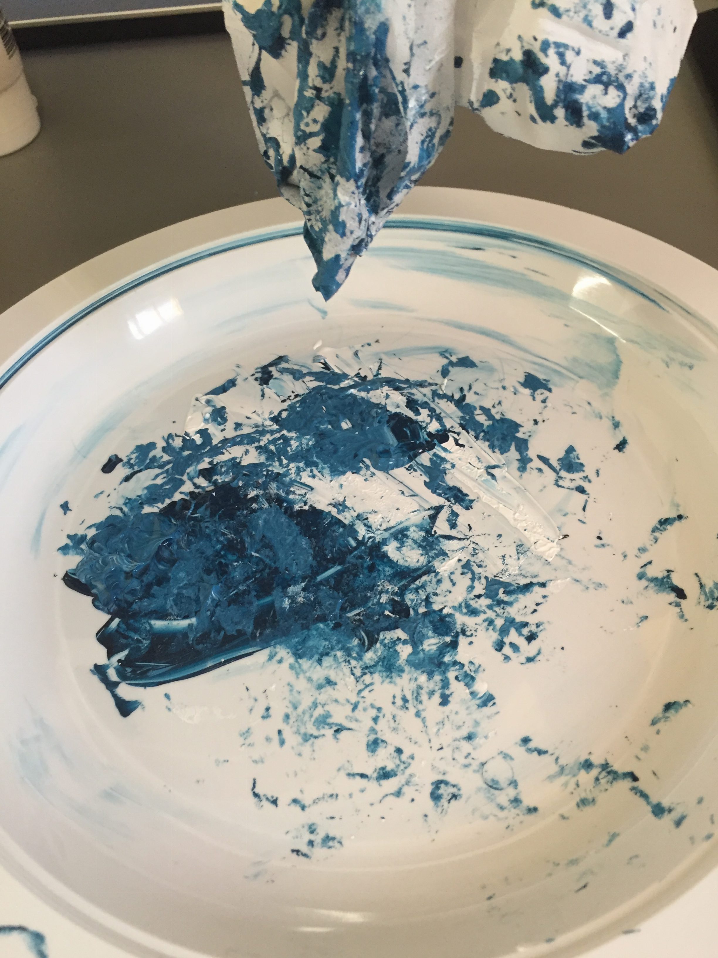
For this piece, I dropped acrylic ink straight from the tube and onto the paper. I then proceeded to swirl the two ink colours together (like making a marble cheese cake) to mix them.
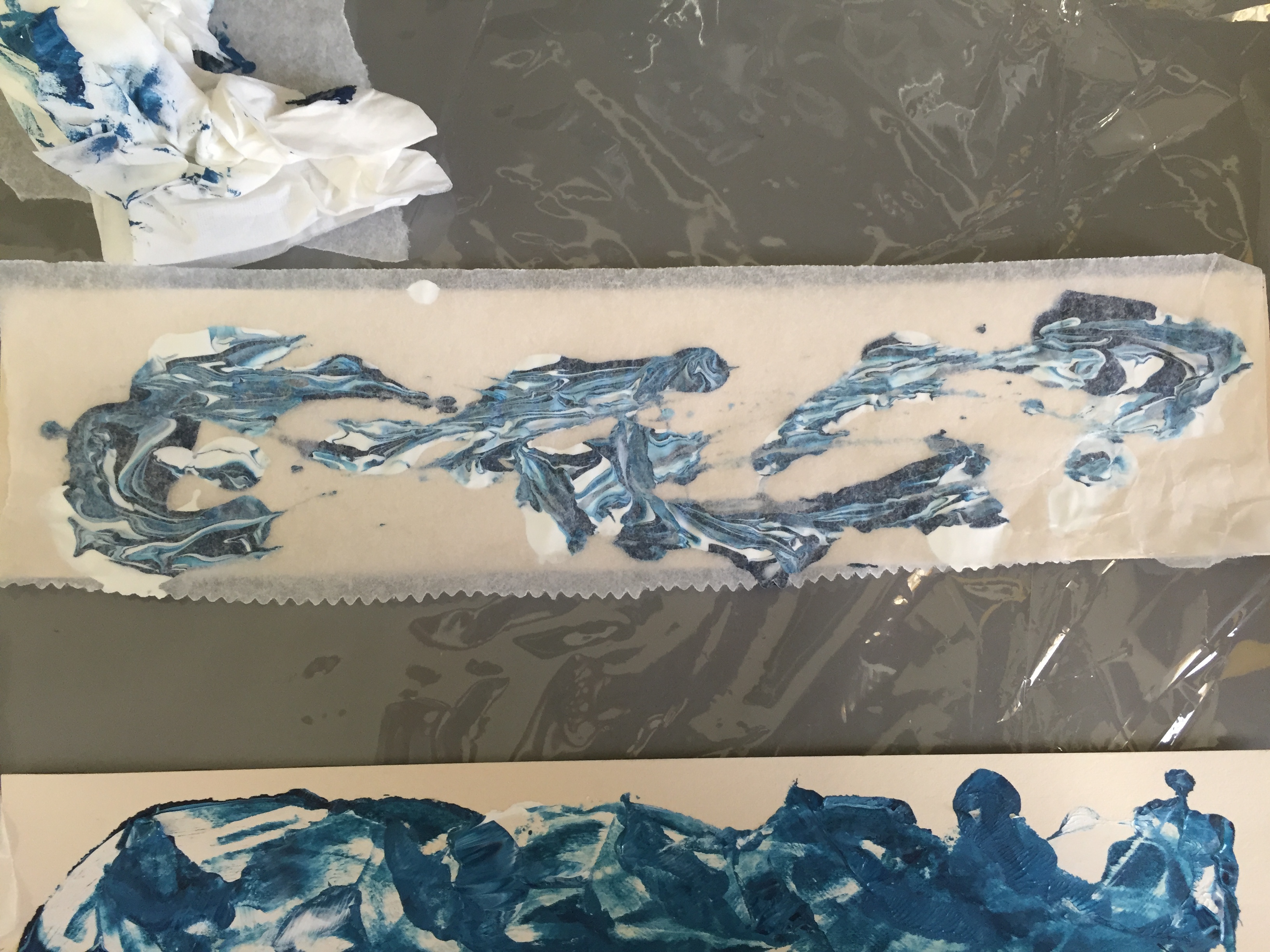
I felt that the ink did not mix enough together, so I pressed baking parchment paper onto the paper in order to further mix the colours together.
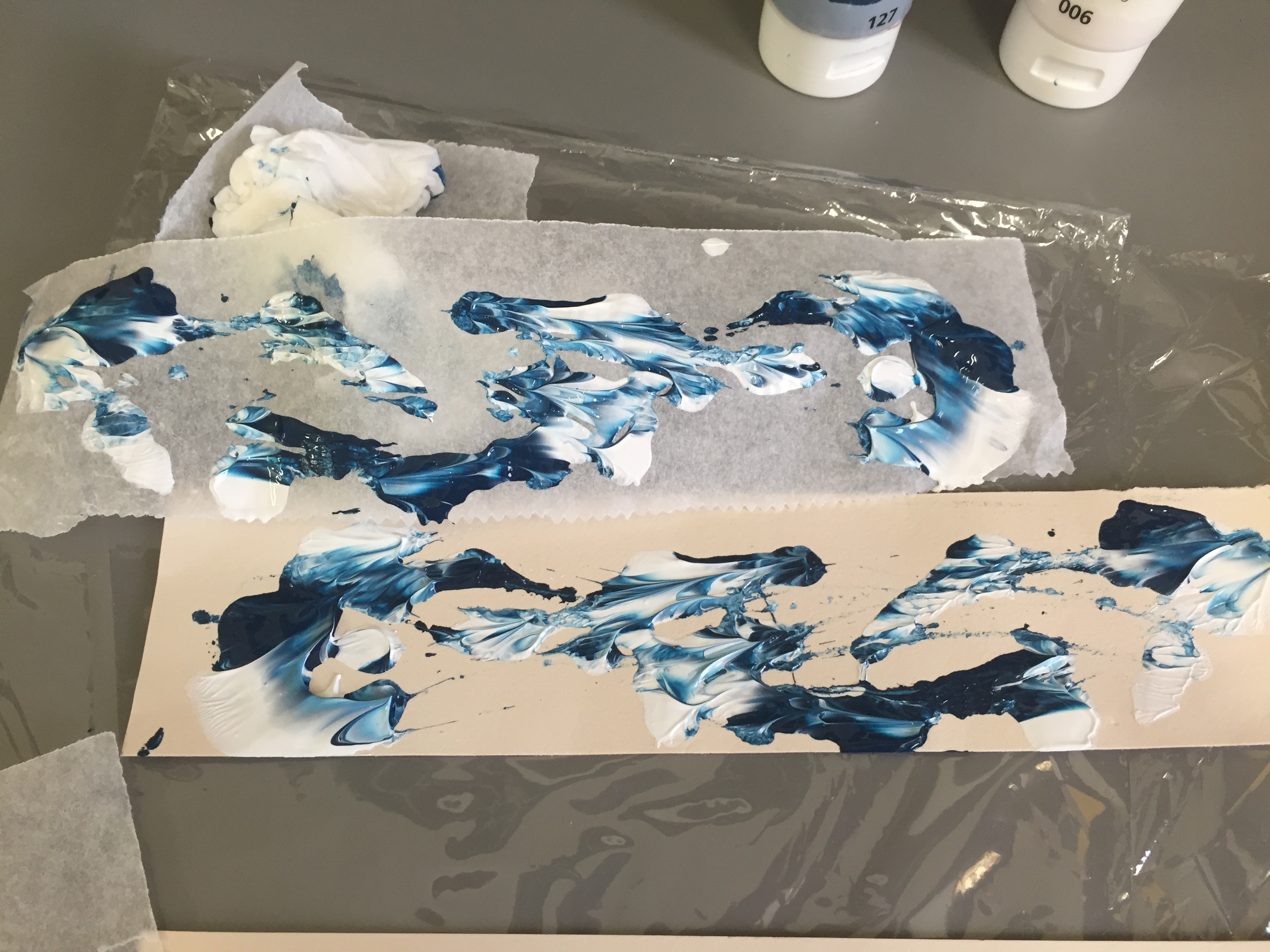
First happy print is done. I really like this effect, but it had an element of turbulence in it (the swirl effects), so I tried going with a different technique.
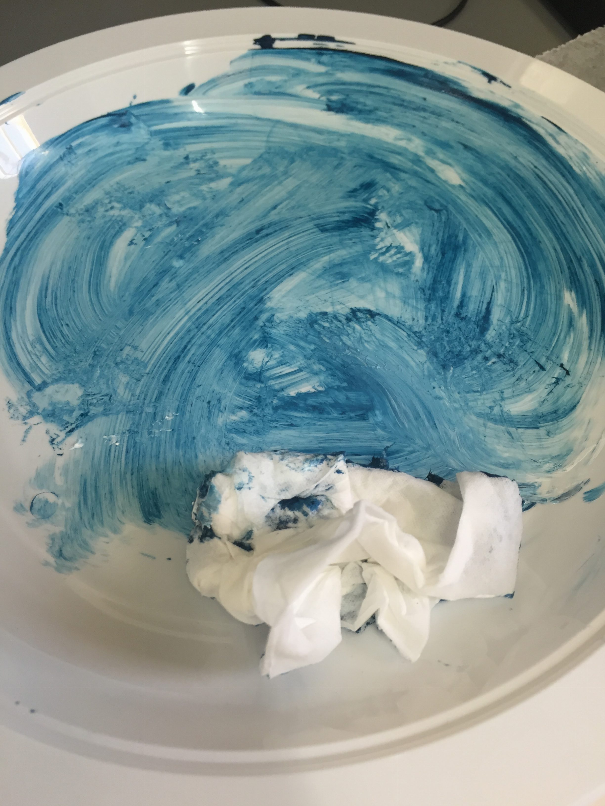
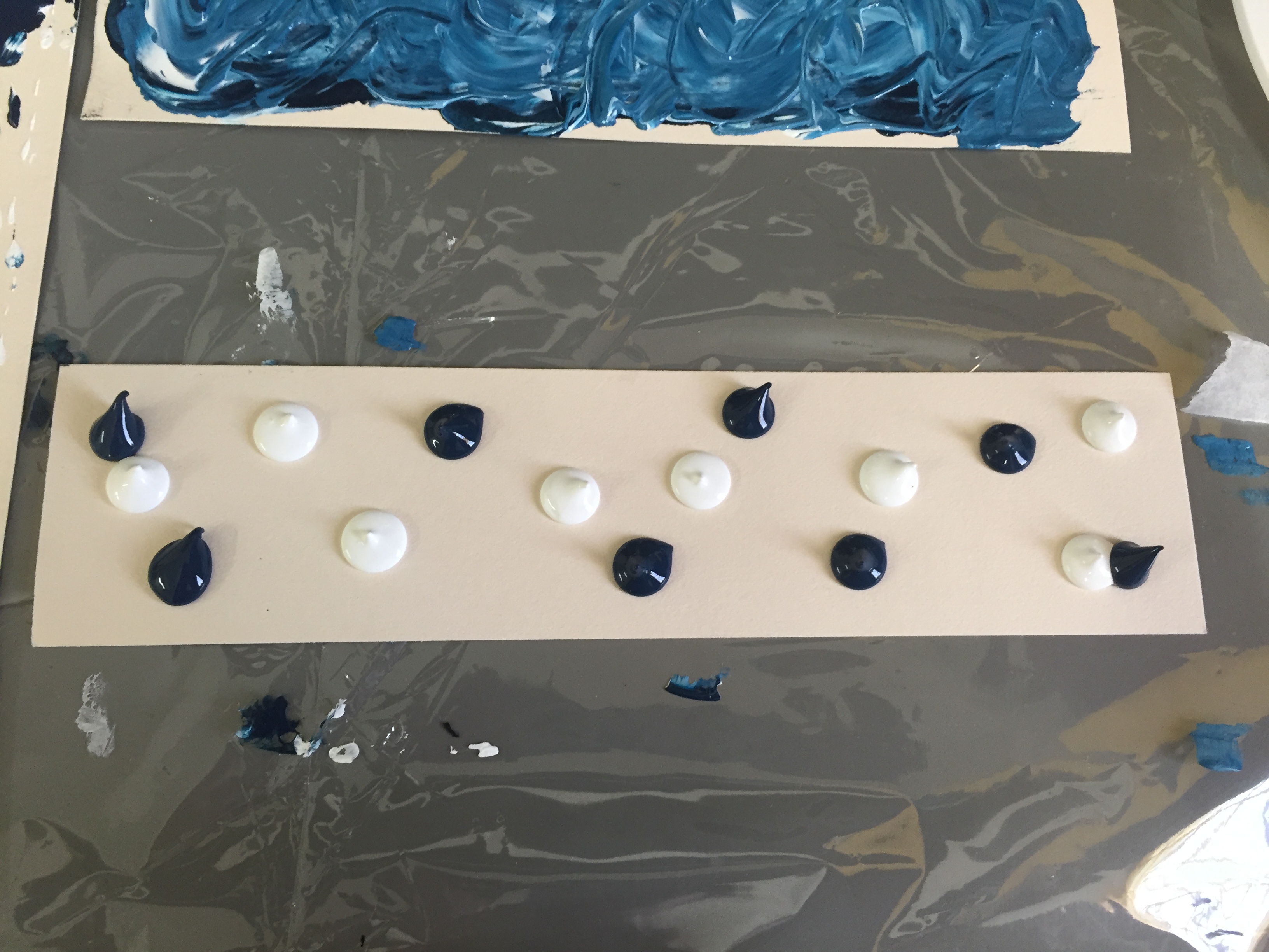
I cleaned up my plastic plate which I used to put my paint. I took a picture of it because I thought it looked pretty nice, and that I might use it for another emotion later on.
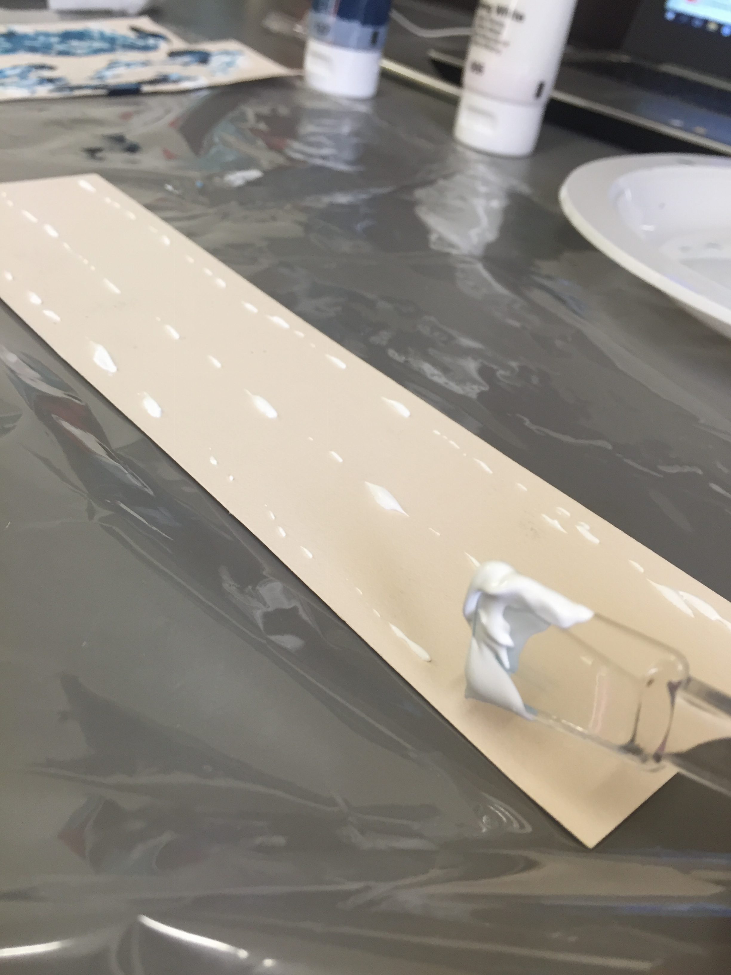
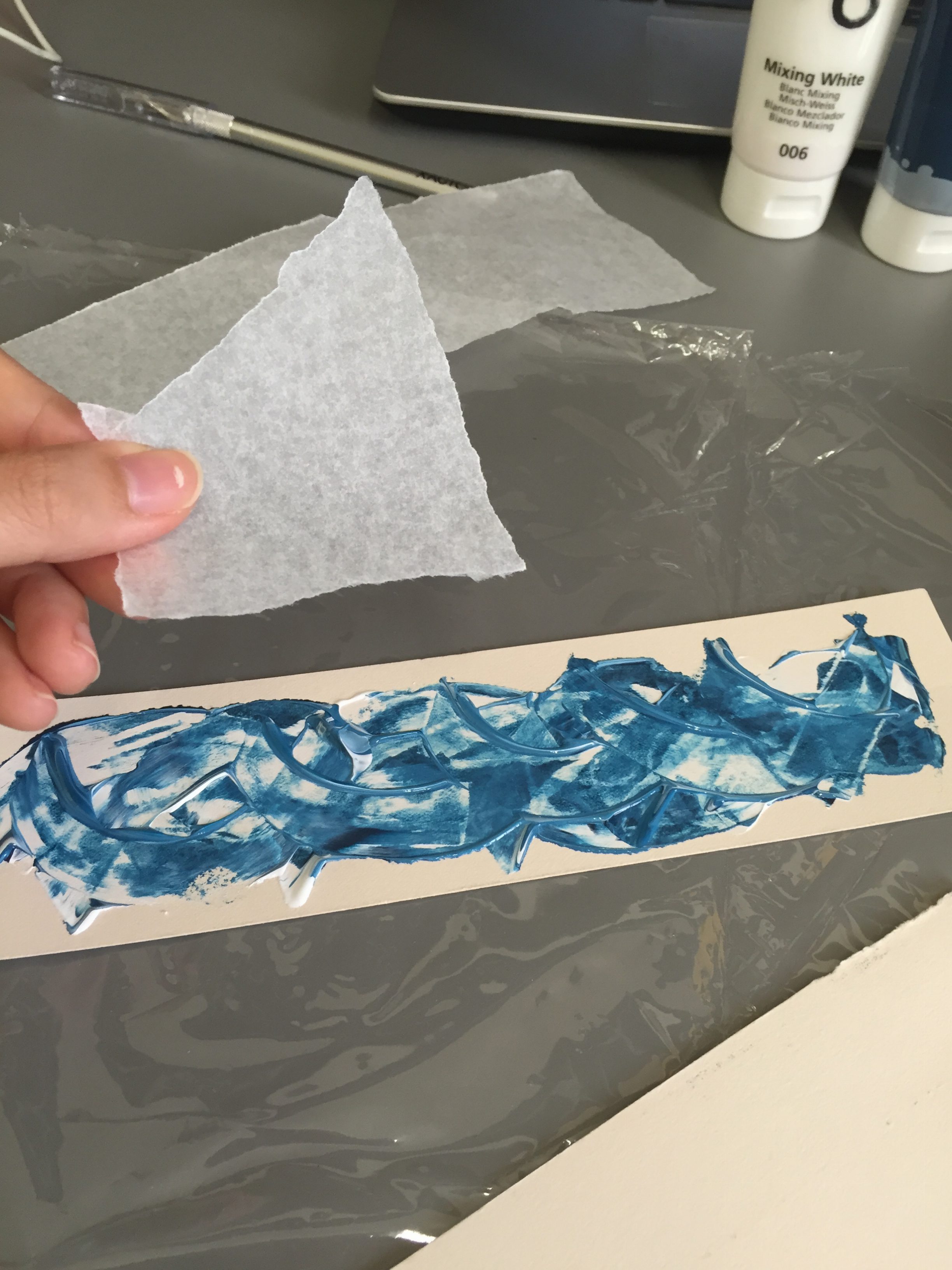
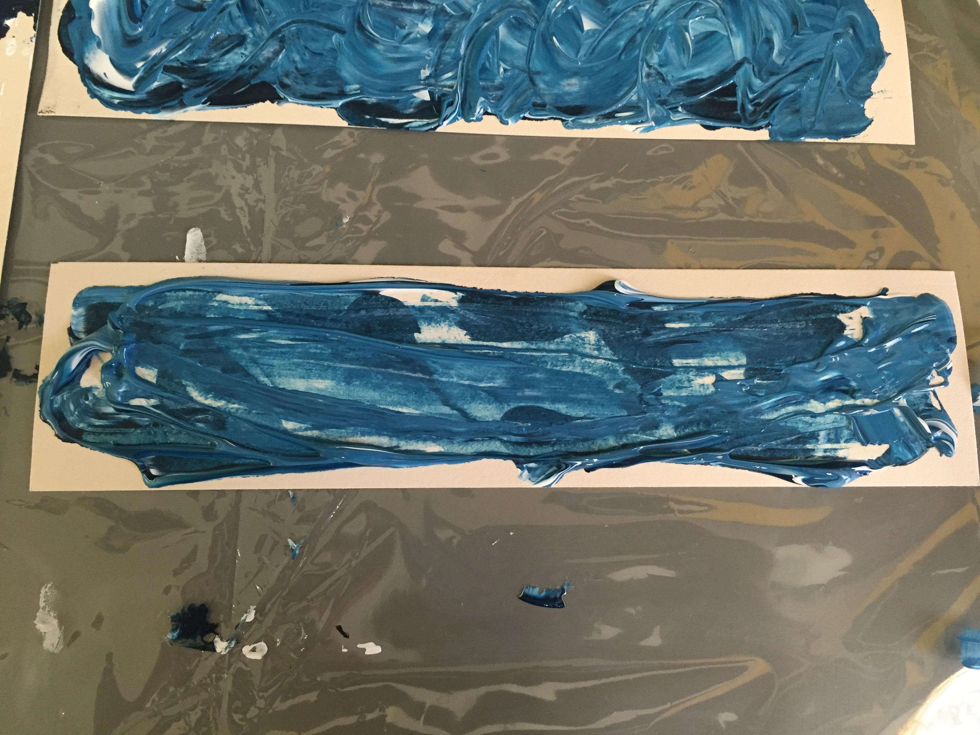
This time, I lightly smeared thick lines of white acrylic across the paper,
then proceeded to place the indigo lines in a random fashion.
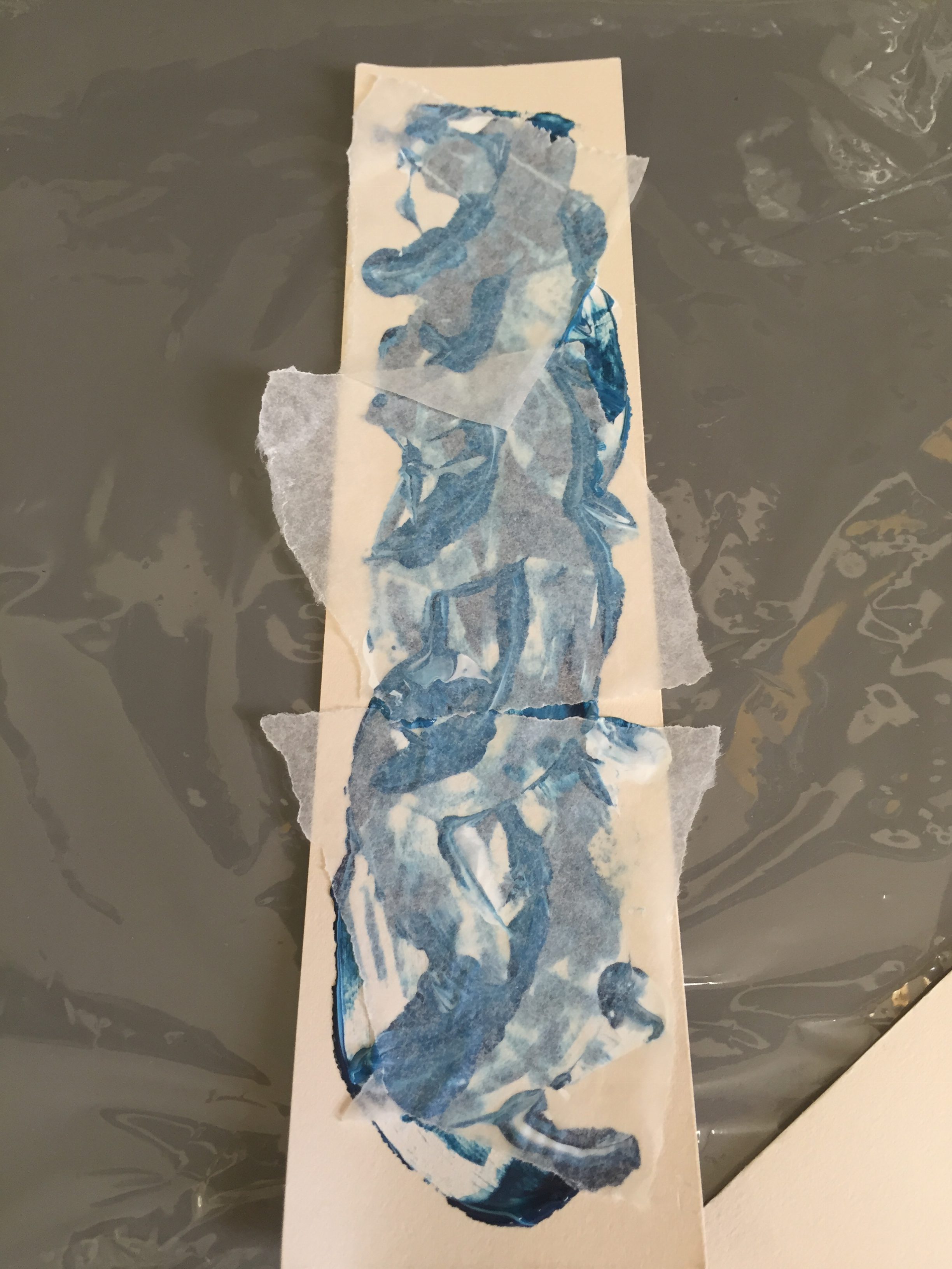
After which I pressed parchment paper over it to mix the colours again, like what I did for the previous piece.
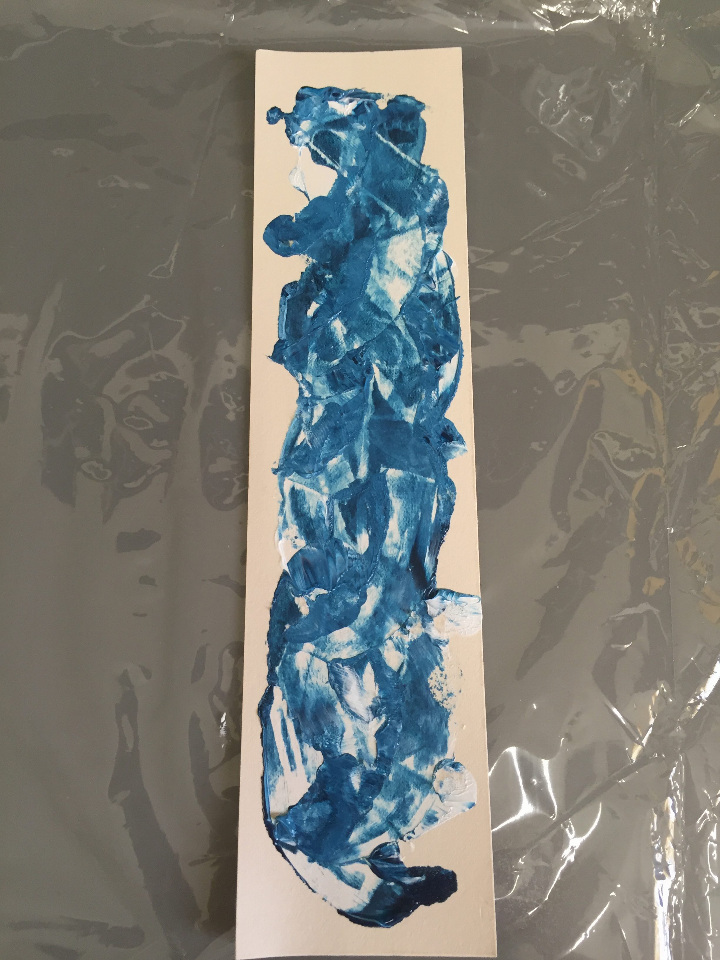
I like this print a lot! I feel that my happiness is associated with nature a lot, and this print has some blobs of ink that look like flower petals; When I take walks surrounded by nature, I feel very happy.
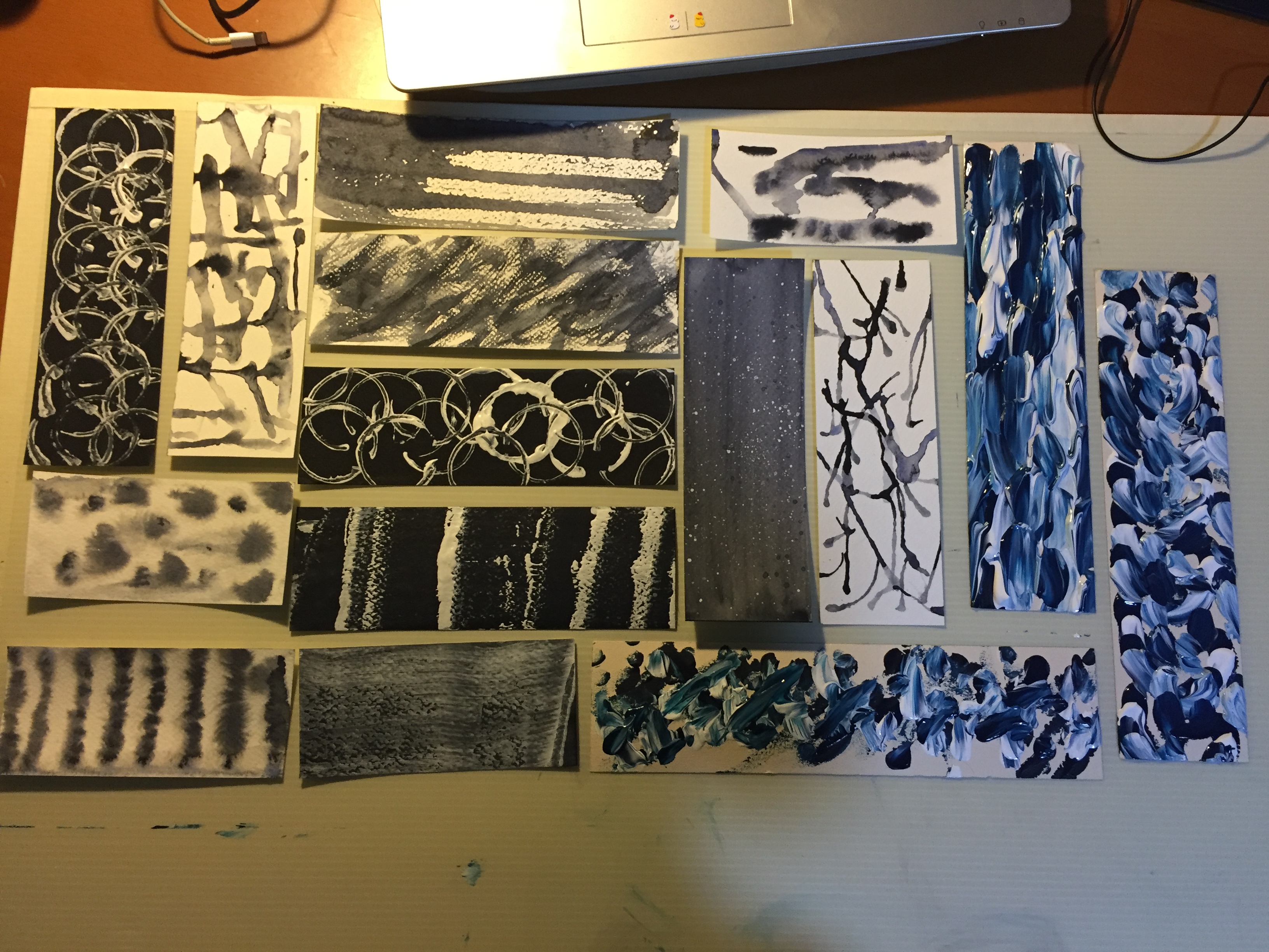
MELANCHOLY
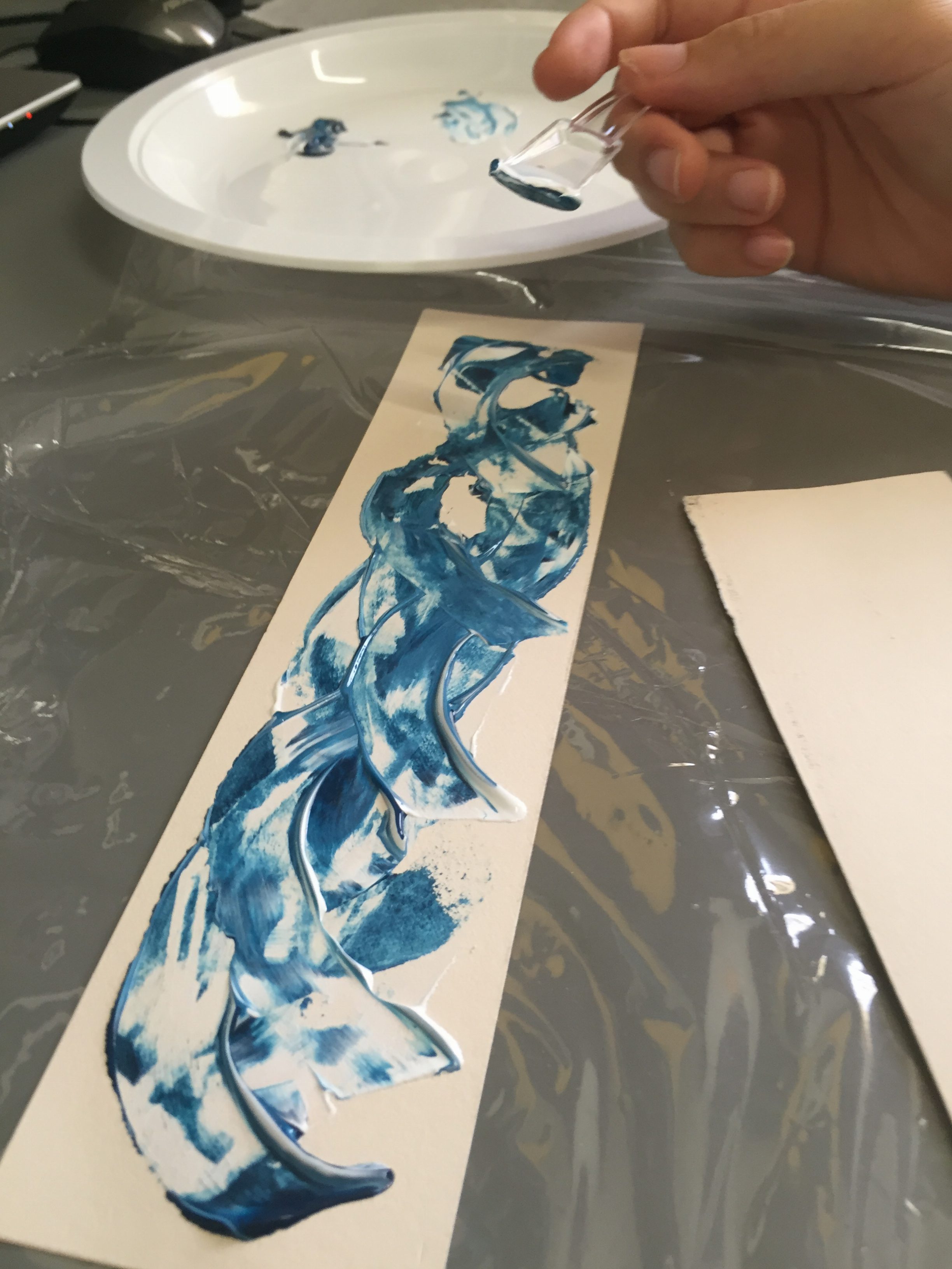
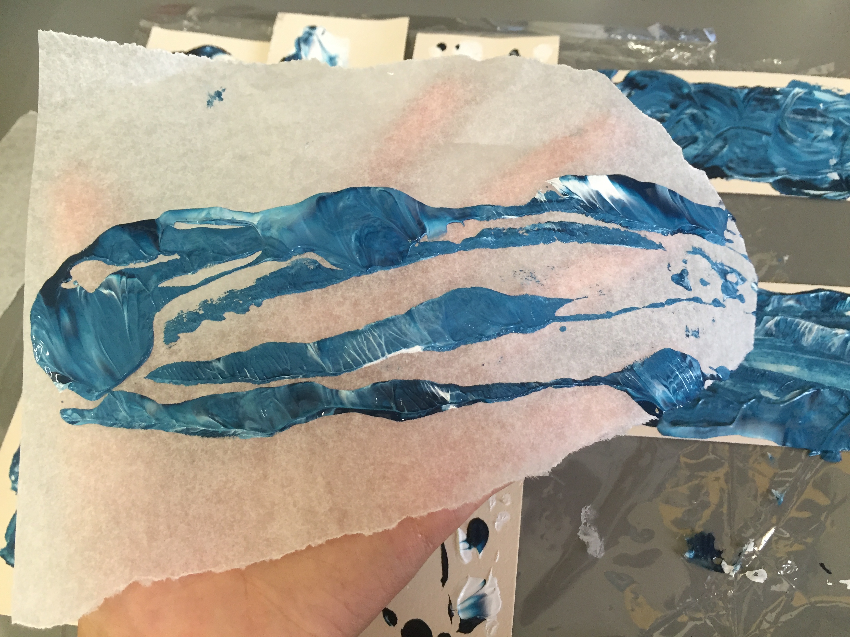
I smeared ink in two different directions using an ice cream spoon on the paper. The curves represent what my feeling of “melancholy” is like — a swirling surge inside of me.
I then proceeded to press on parchment paper on it to achieve an even surface (which I immediately regretted, because the emotive quality and texture of the piece was lost.. I felt that the texture brought out the turbulence more.)
First melancholy print is done.
This print was a mess. I smeared too much ink around here and there, and it became like this.
For the next one, I dropped ink directly from the tube,
then smeared across the paper lengthwise using the ice cream spoon. I then pressed parchment paper on it, because I wanted to know what kind of print would turn out on the parchment paper.
Cleaned up my plastic plate and saw something interesting once again.
TEMPTED
I attempted to recreate the print of a test print I did for the first process, but with watercolours. I preferred the original one, which was done with black lino ink and the rubber paint roller.
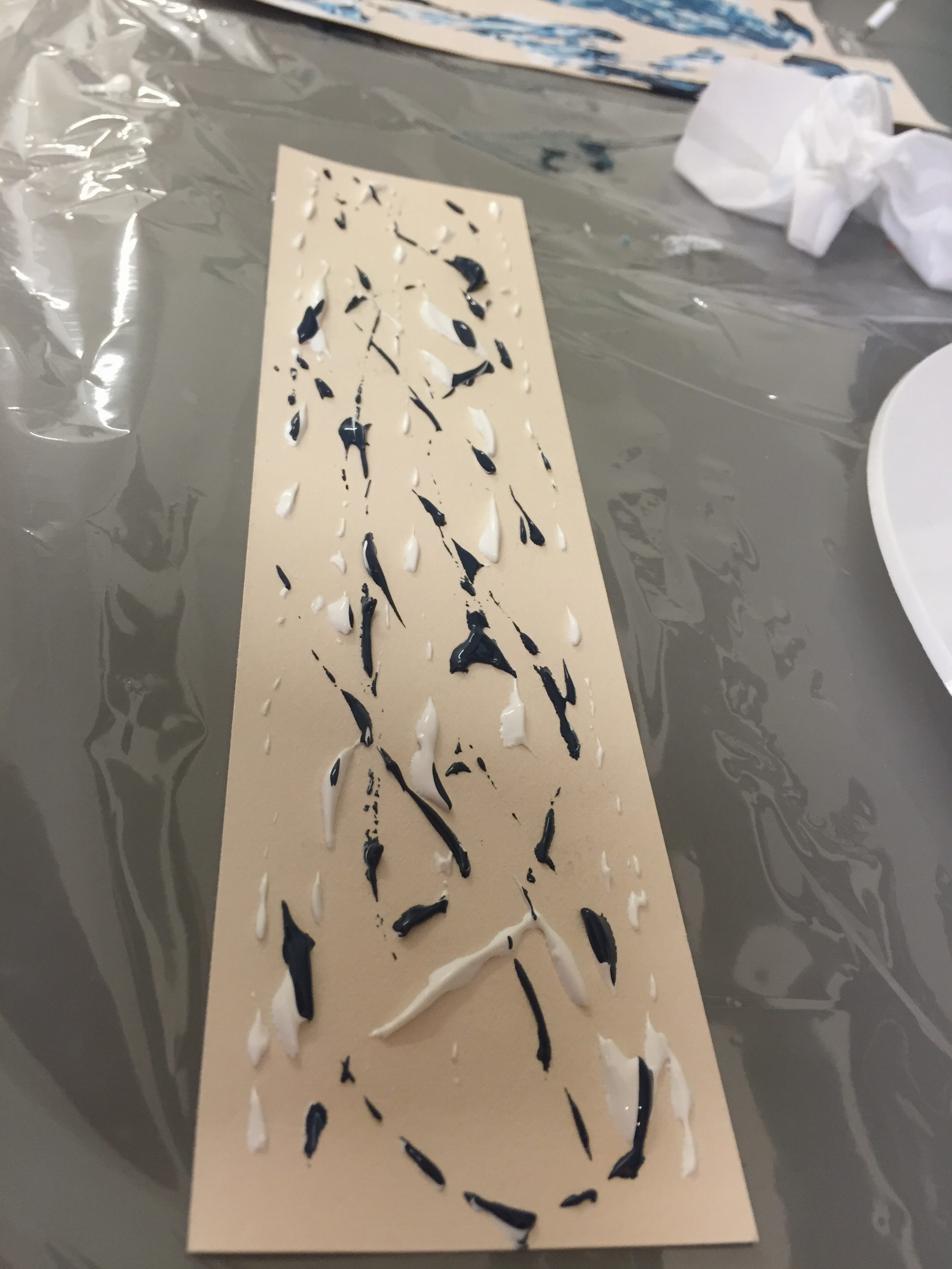
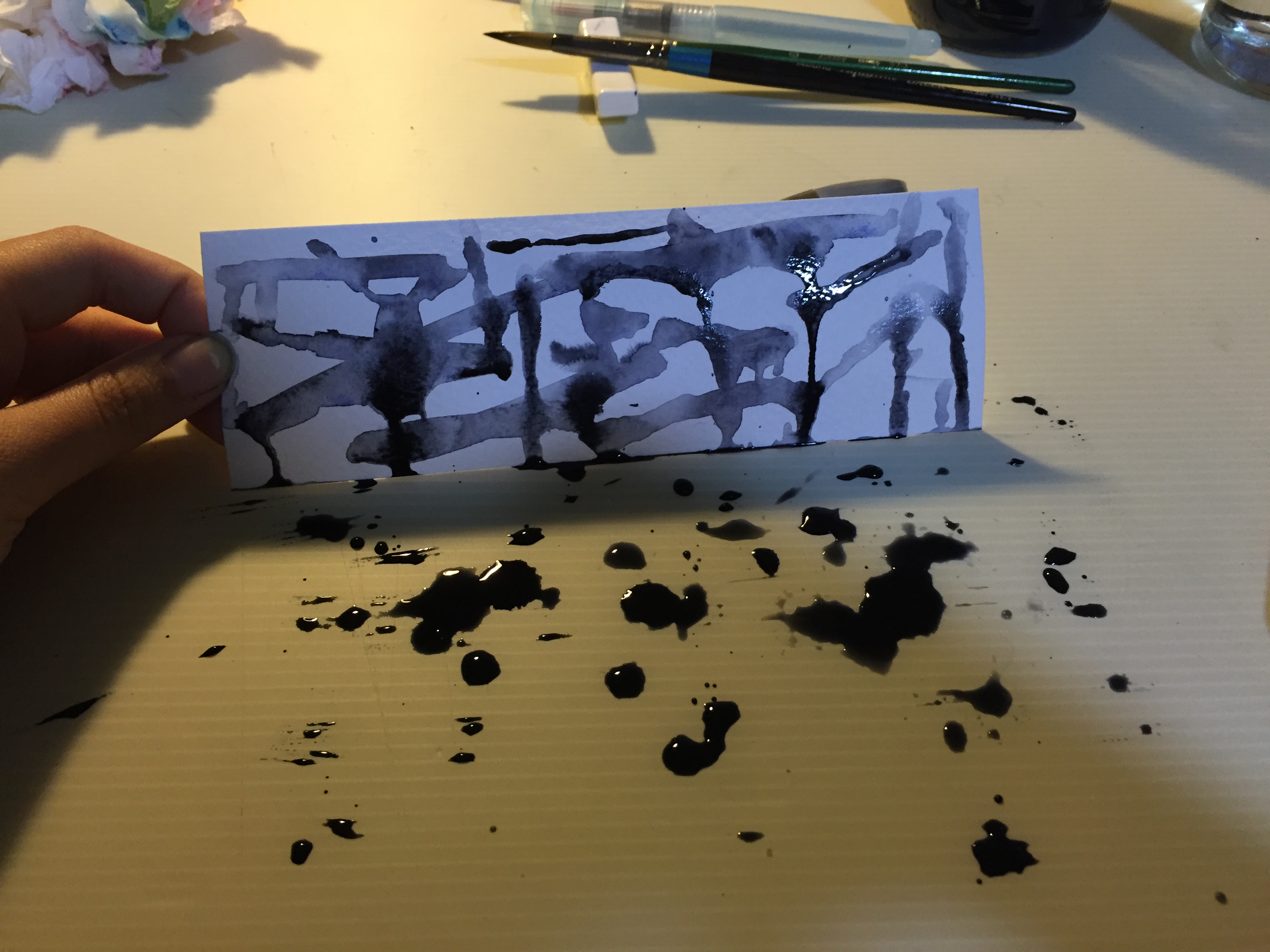
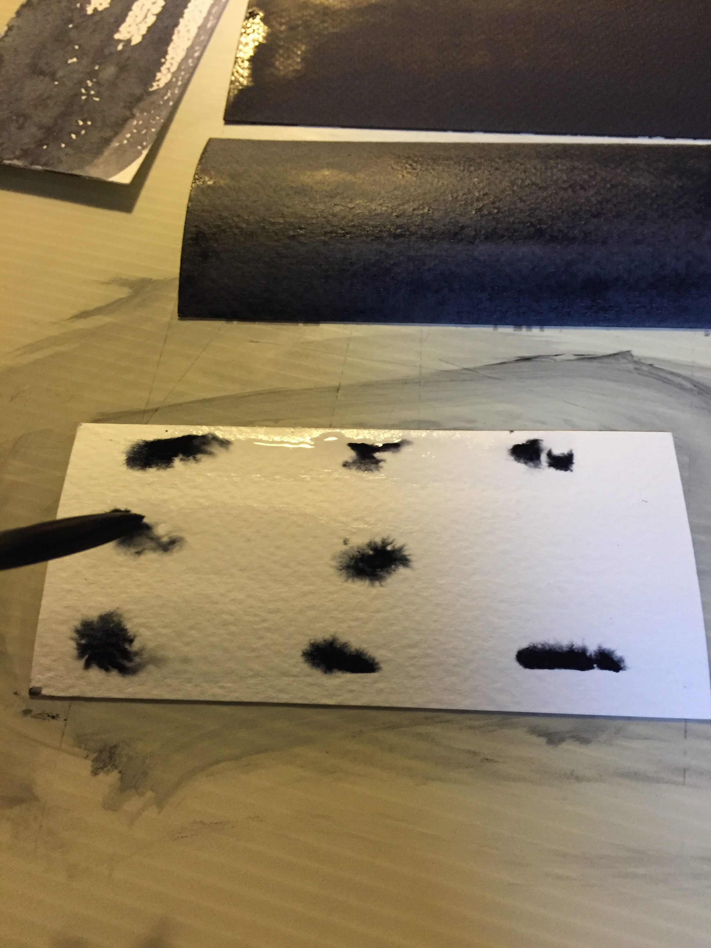
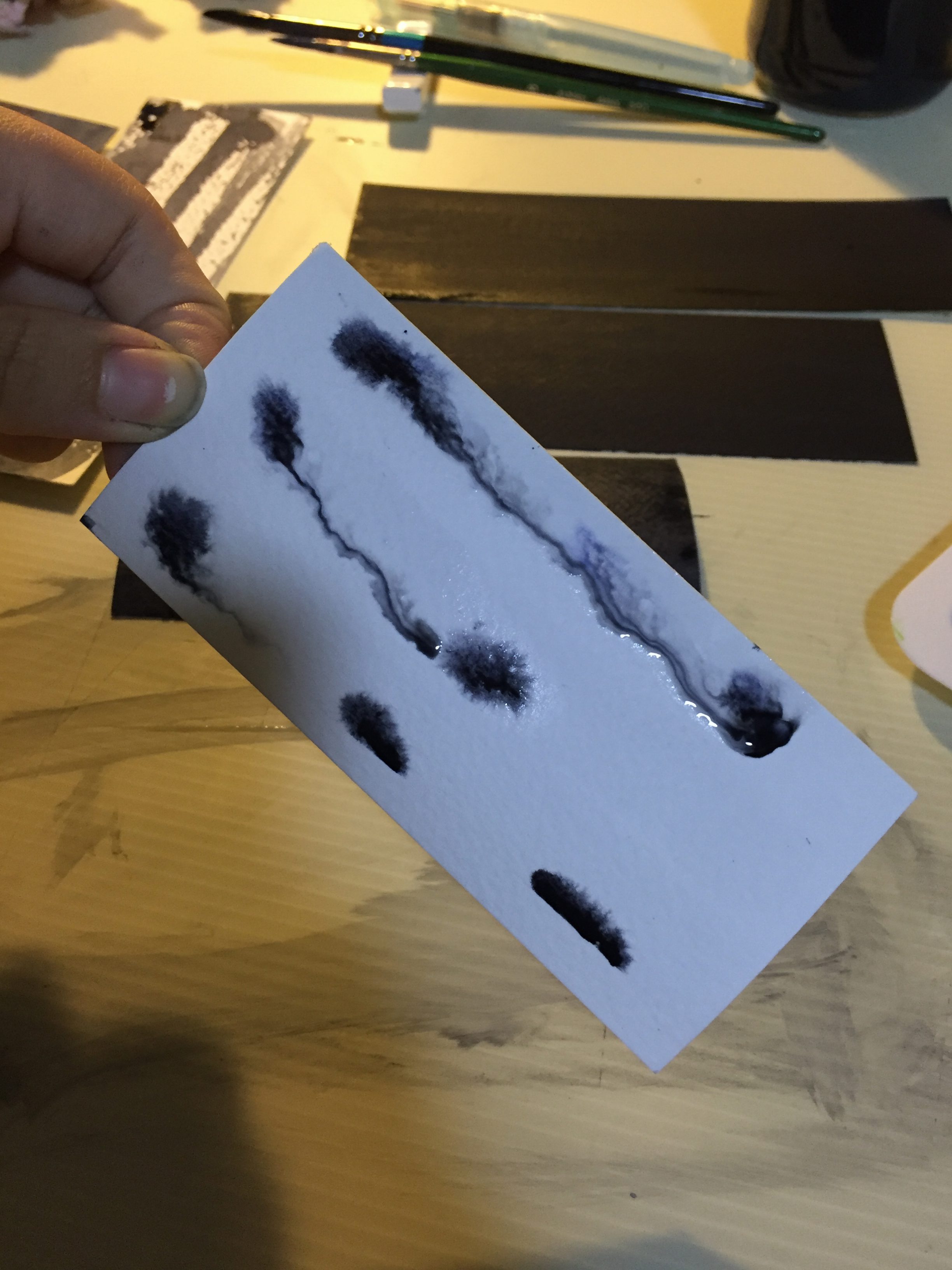
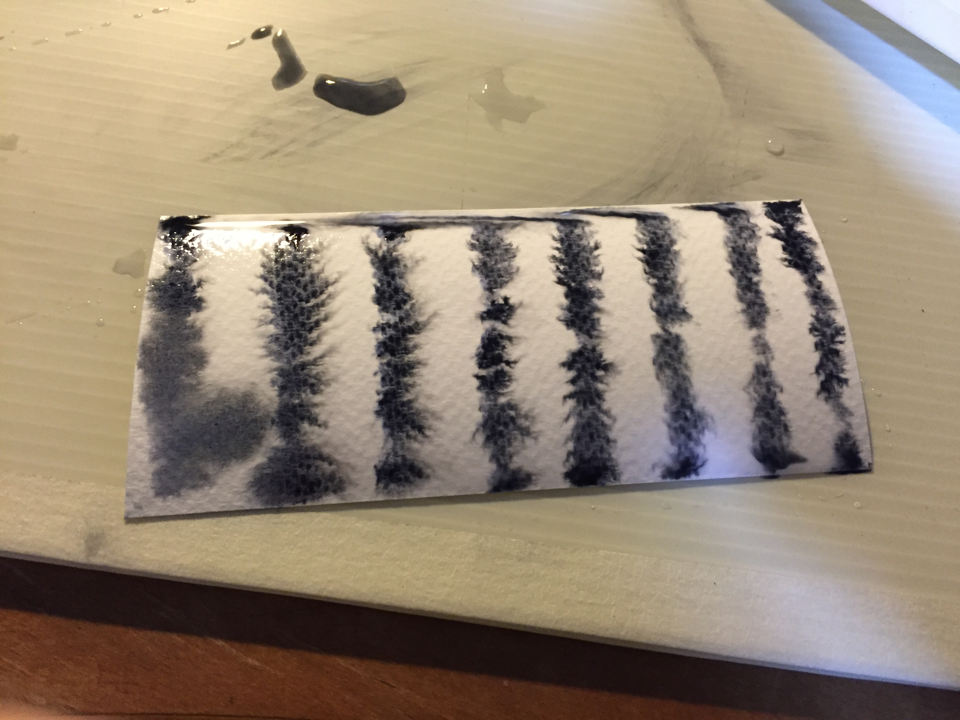
IRRITATED
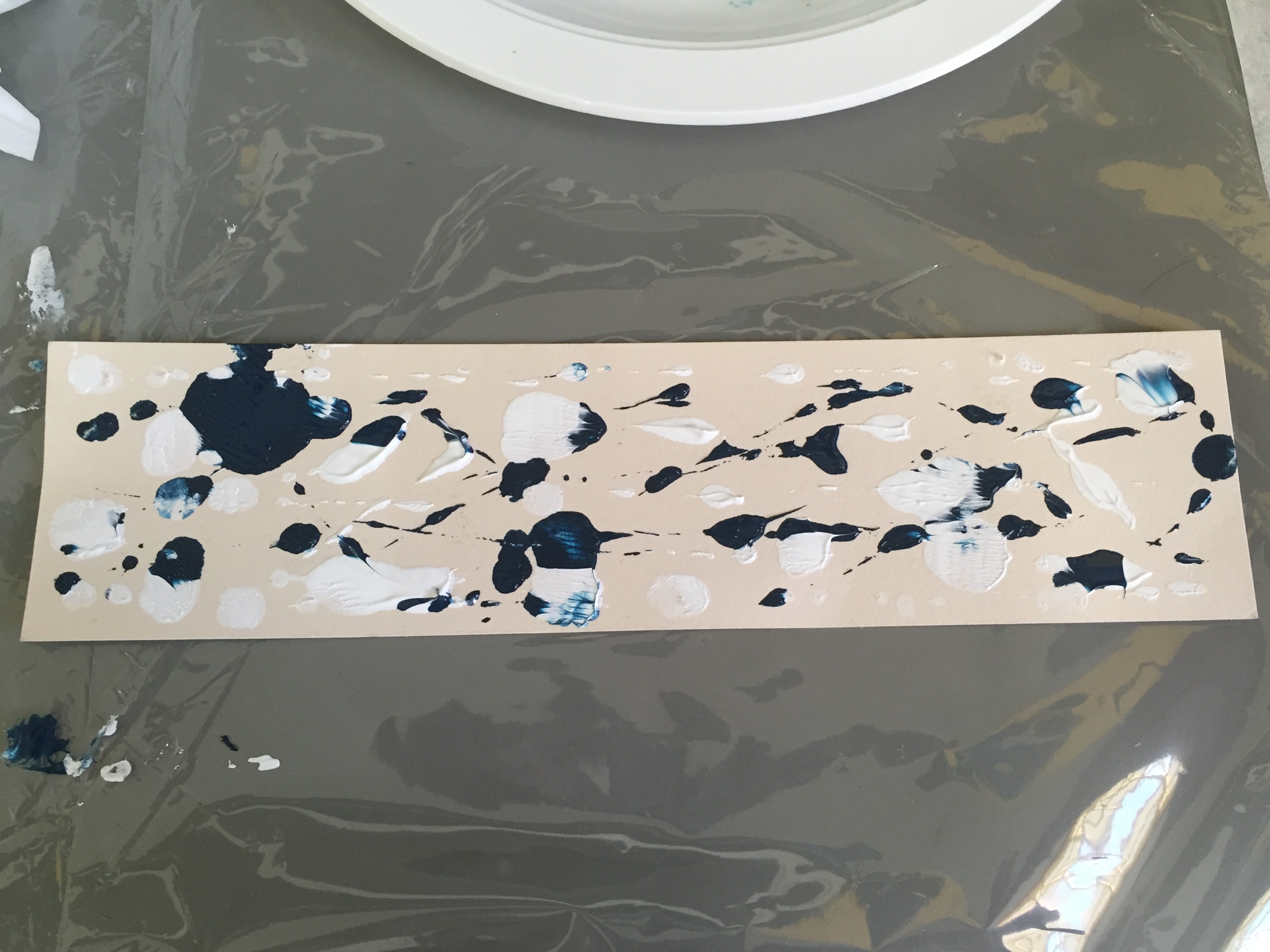
This was done when I was actually feeling irritated. I let my hands do the work subconciously, and I found myself knocking out ink splatters from the watercolour round brush, using the back of my hand.
ANGRY
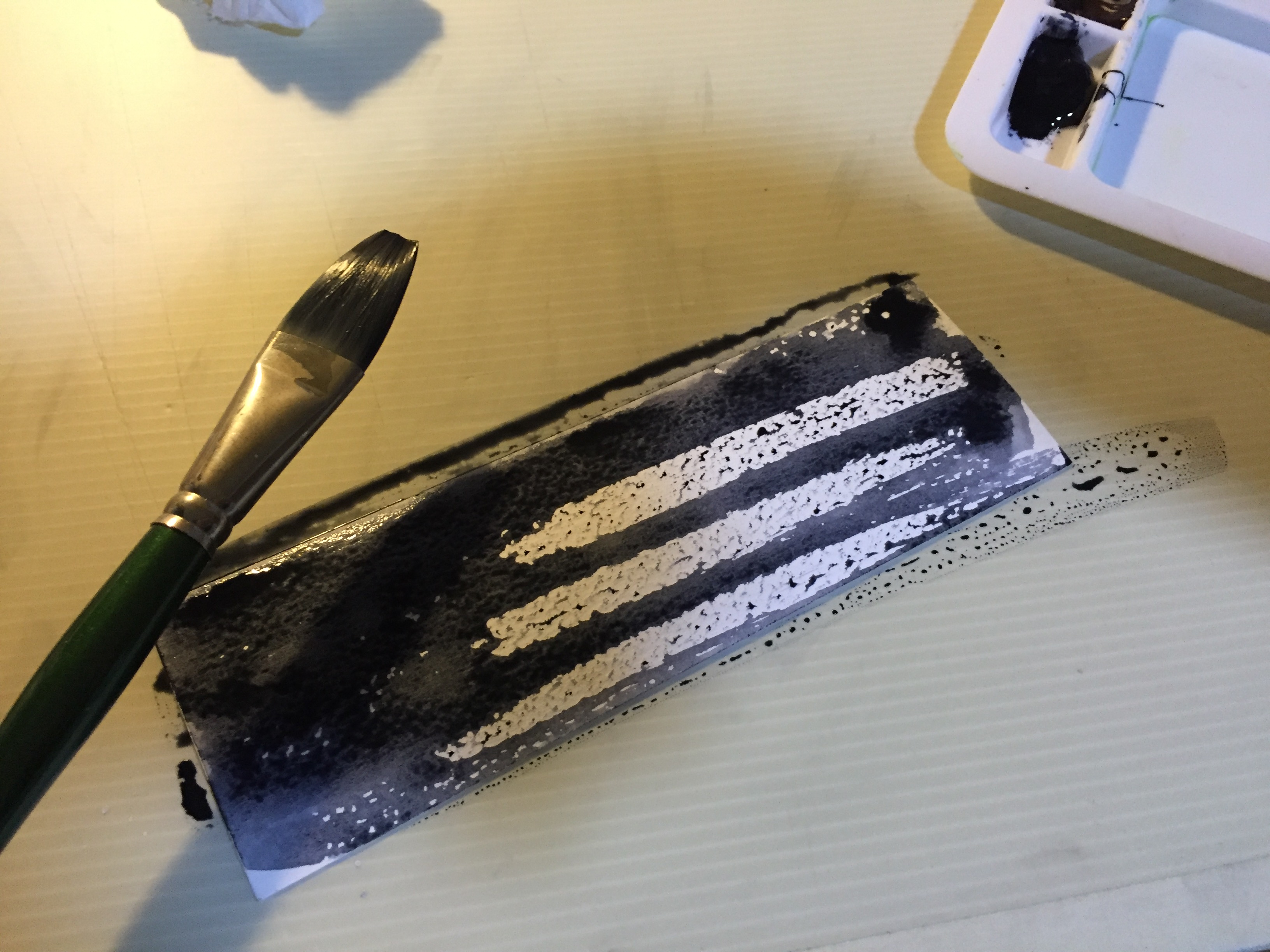
This print was discovered when I was colouring the strips of paper black for another print. I pressed down hard on the flat brush to lay out an uneven surface across the paper. This feels very angry to me; it looks like someone is tearing away at the paper with their fingers.
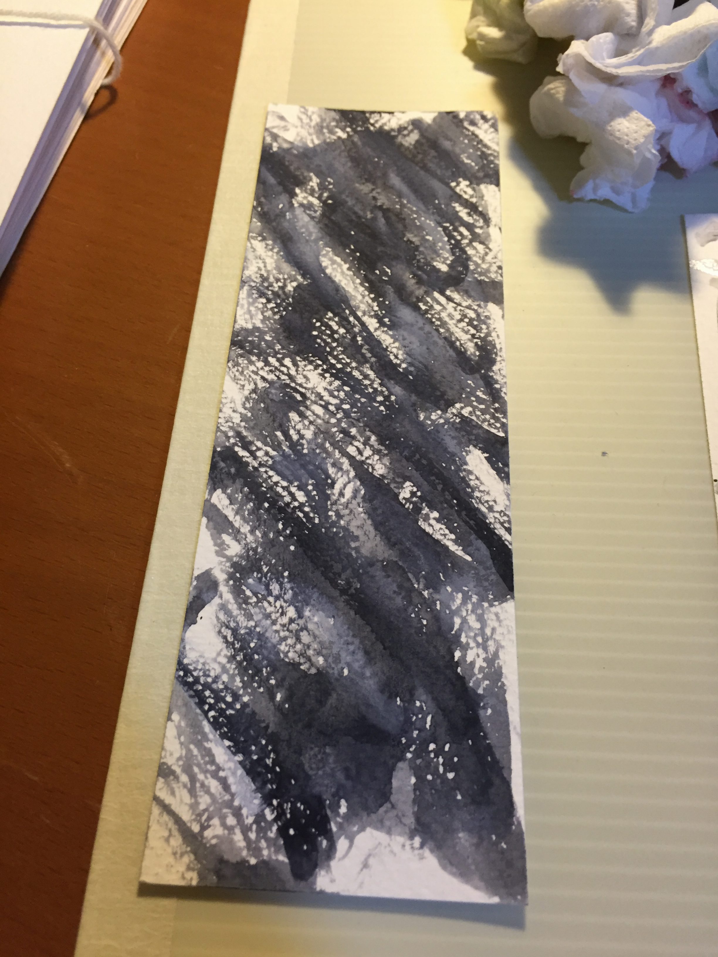
Since the watercolour paper has such a rough texture, I tried creating another angry print with the use of a round brush and less water, more ink.
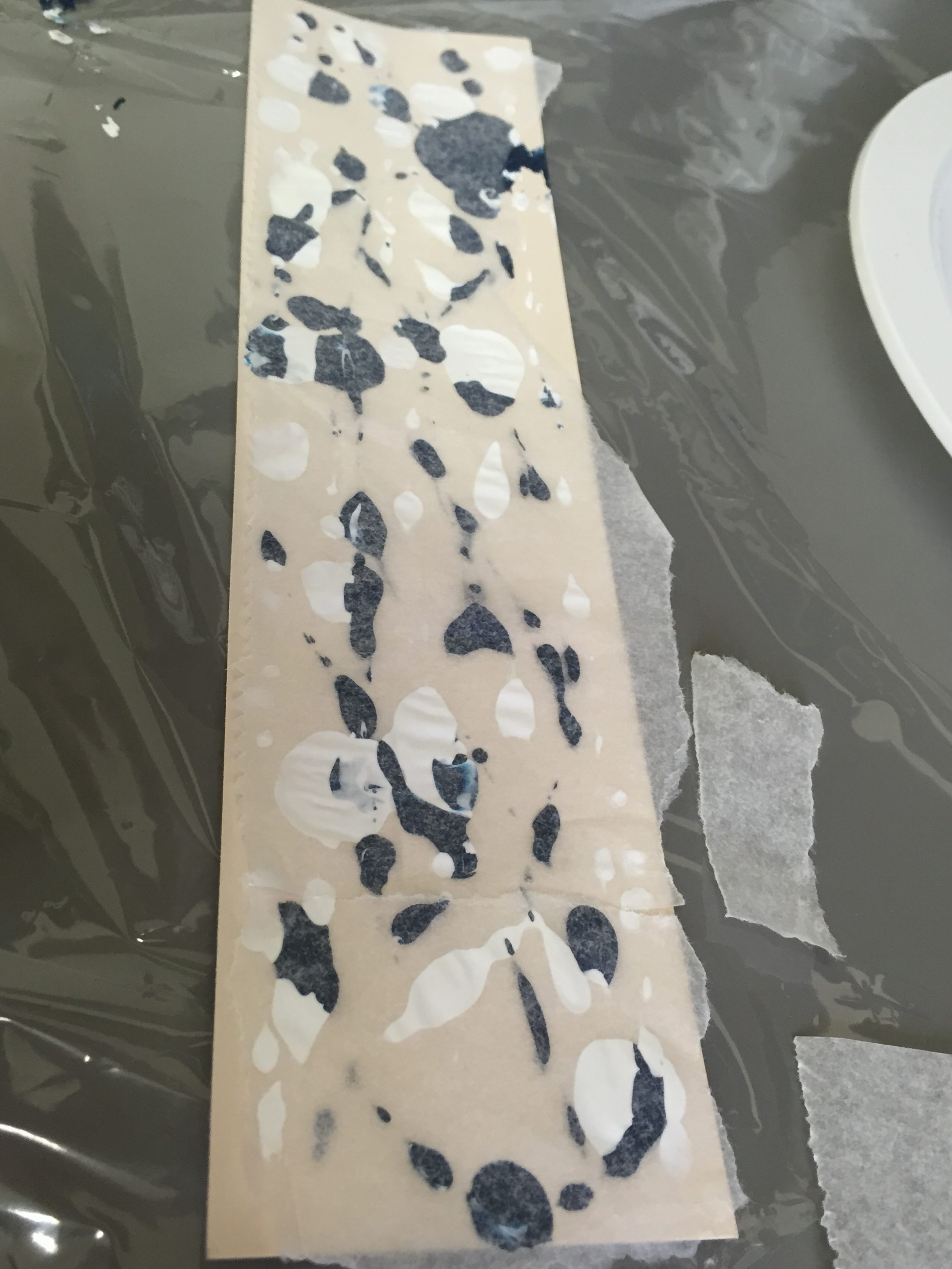
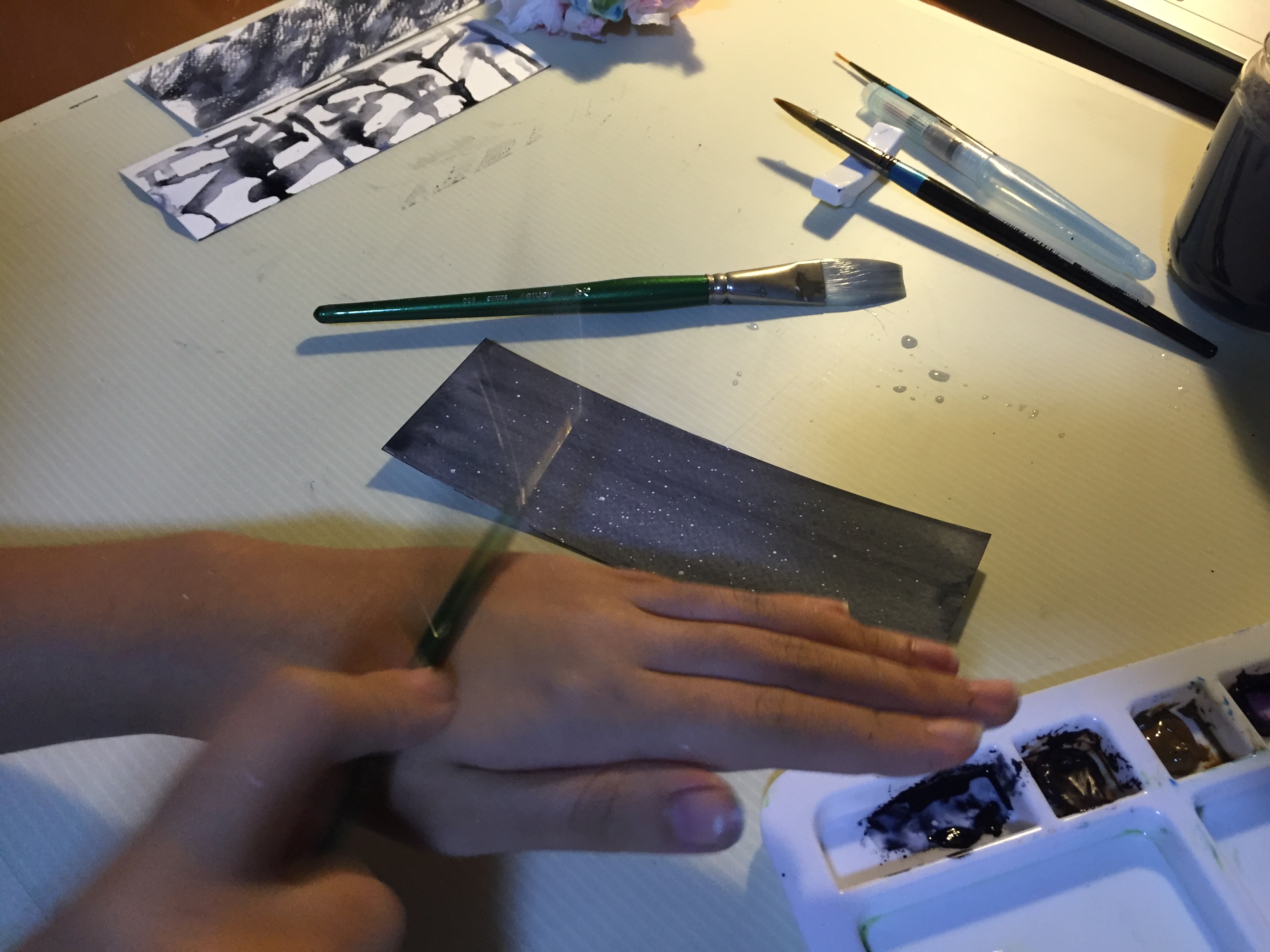
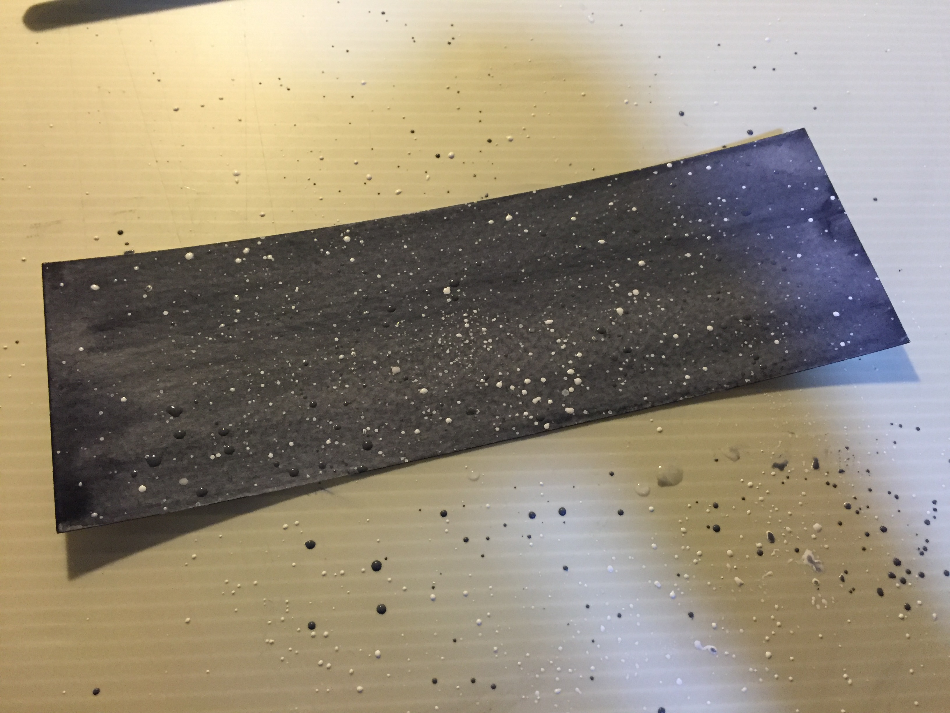
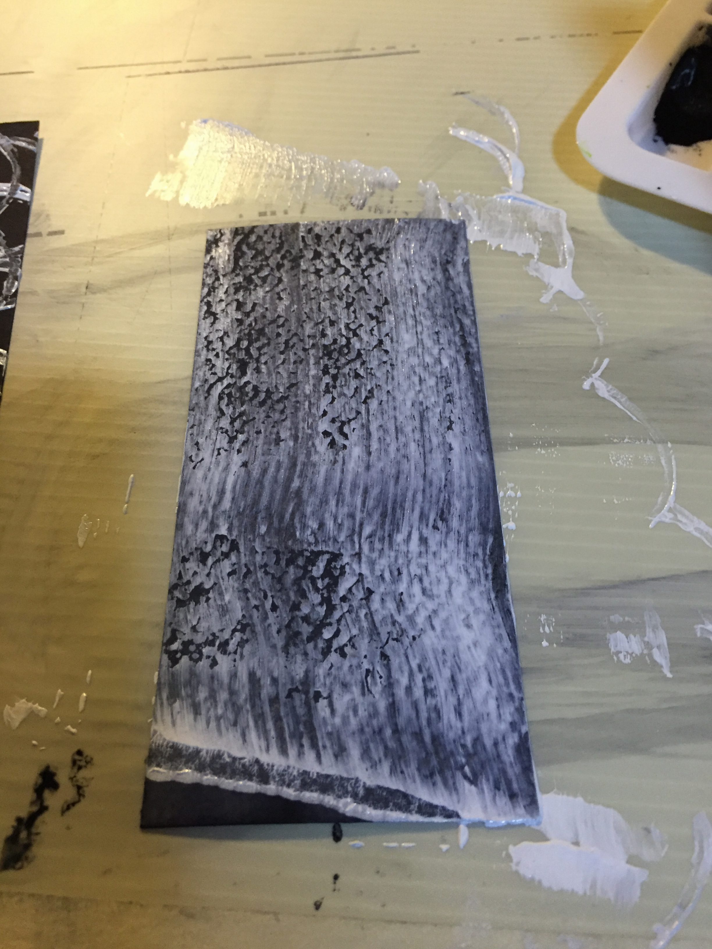
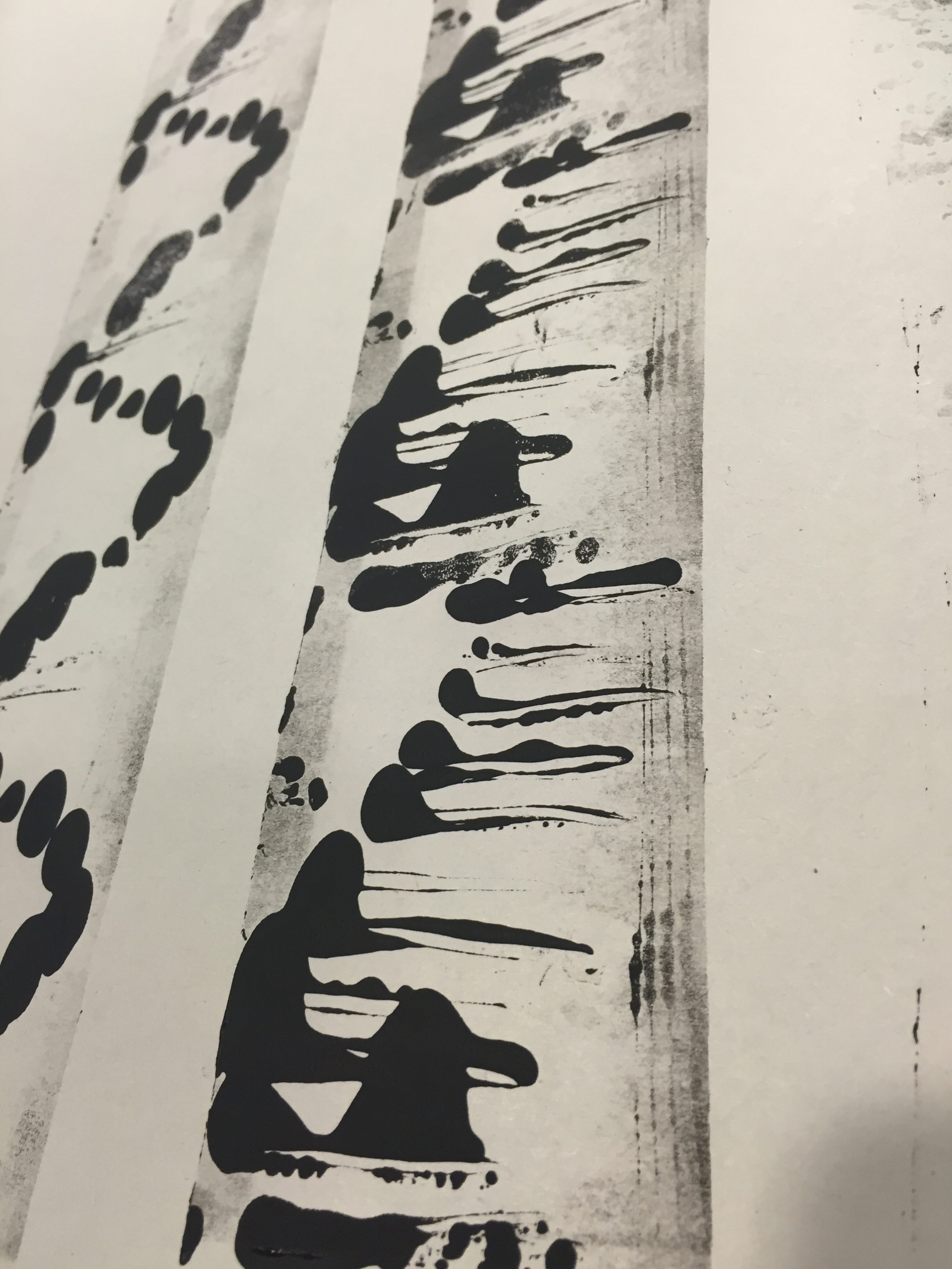
NUMB
I wanted to achieve a “blurred” out effect for numbness, because to me, it is an emotion which is almost “unfeeling”. I tried using watercolours to achieve this effect; for this strip, I wet the paper entirely, then dropped ink onto it.
I tilted the paper around in order to spread the ink around.

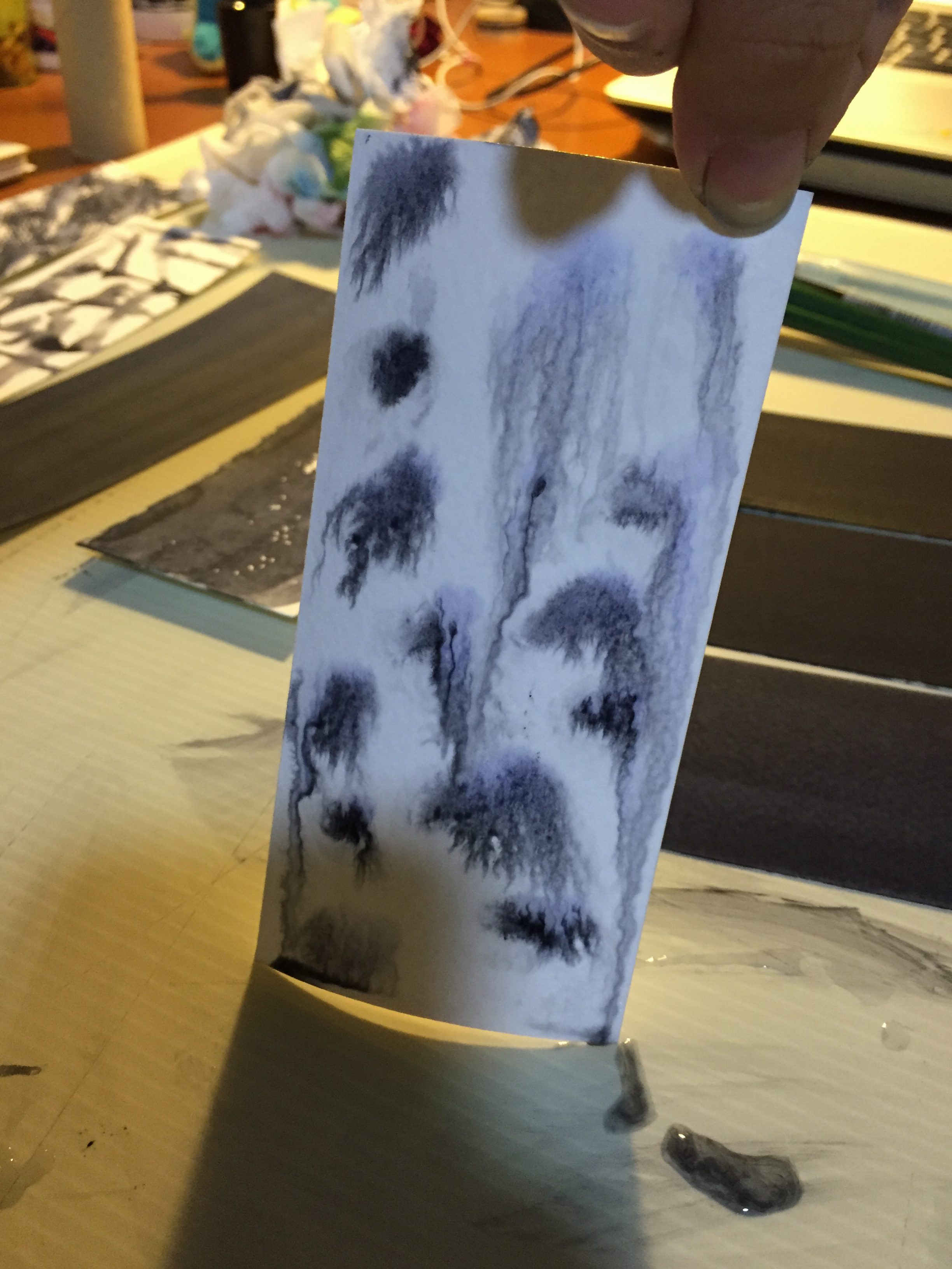
I liked the blurred effect, so I tried to achieve another pattern using the same technique.
For this strip, I dropped ink in blobs and in straight lines, then left the paper flat on the table. I felt that this pattern represented the emotion of “numb” perfectly– unfeeling to the continuous stimulus in the surrounding environment.
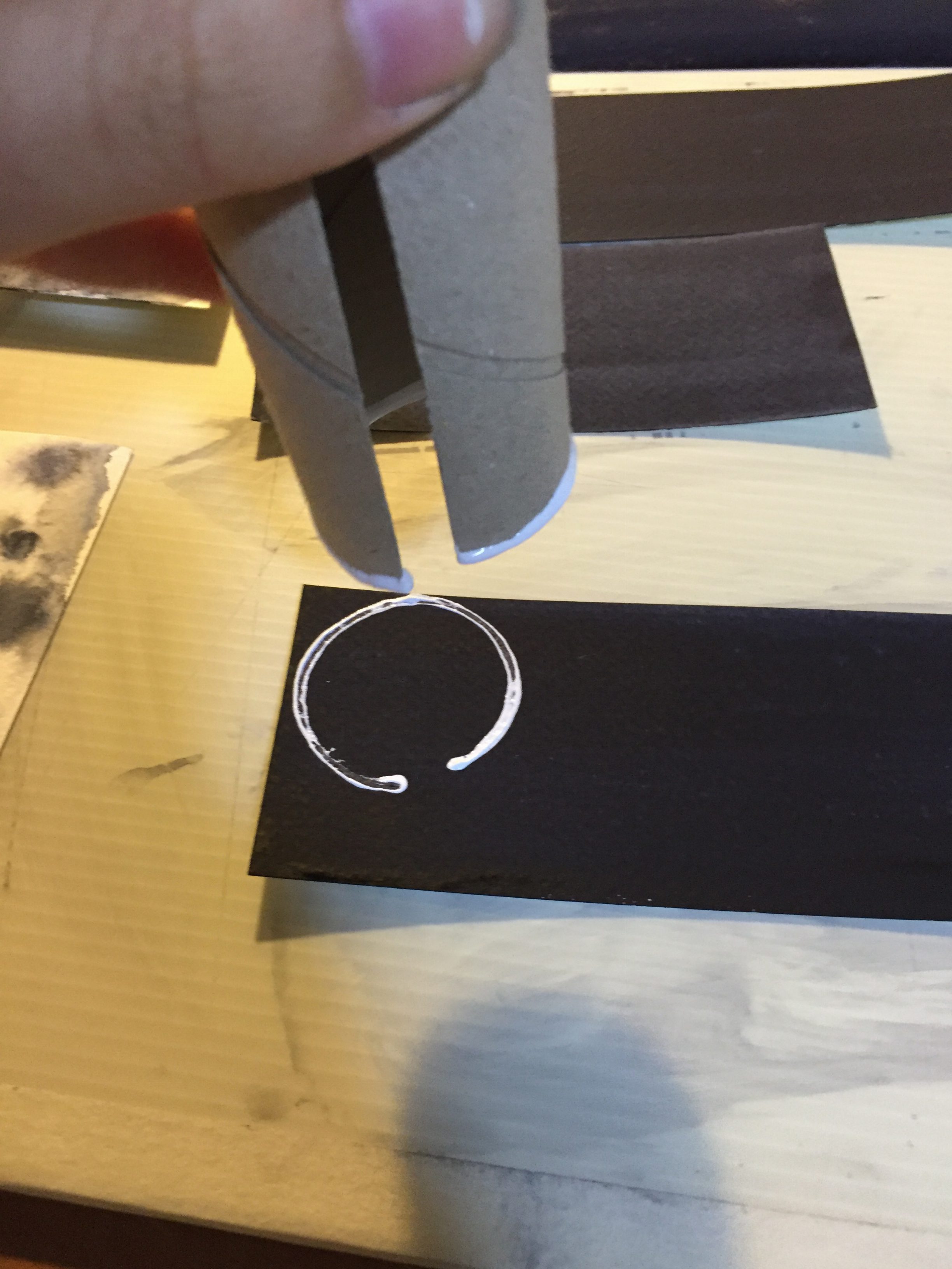
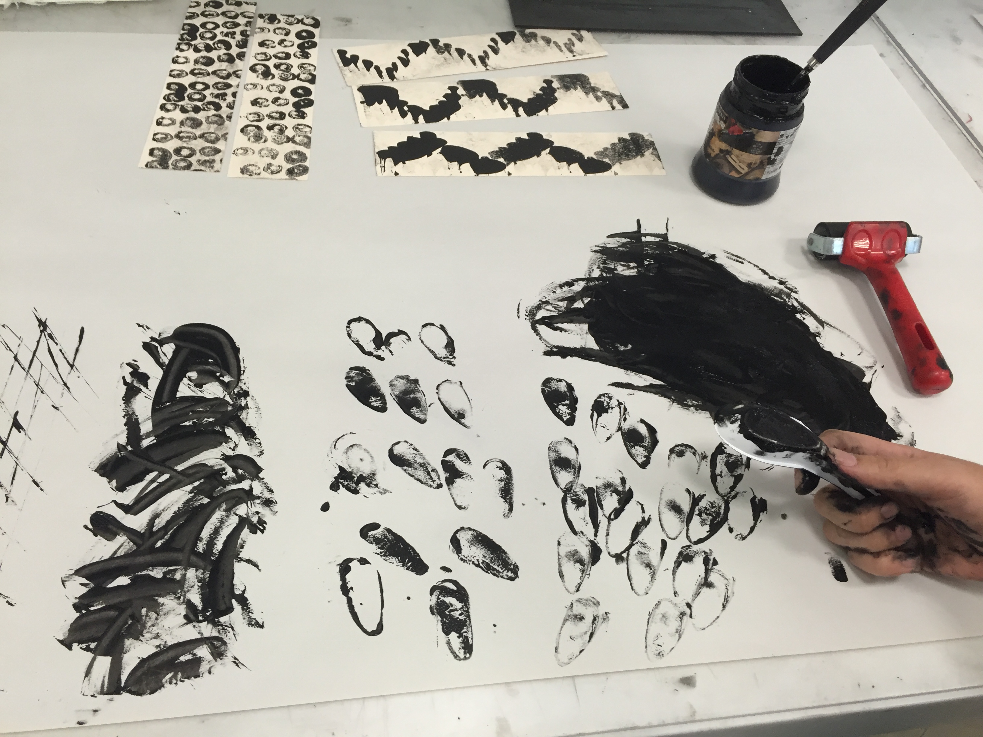
DEPRESSED
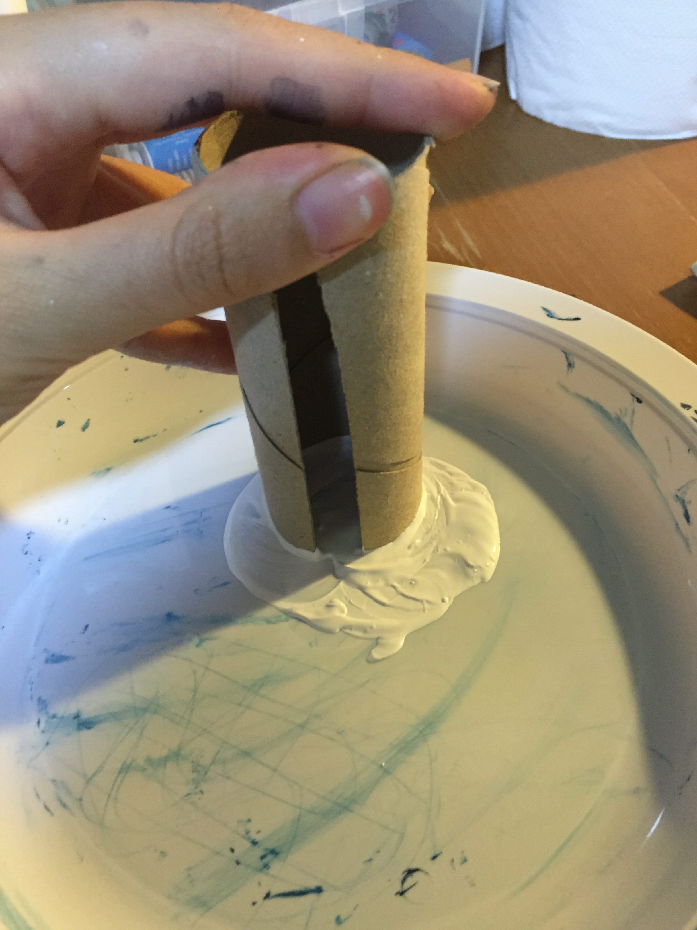
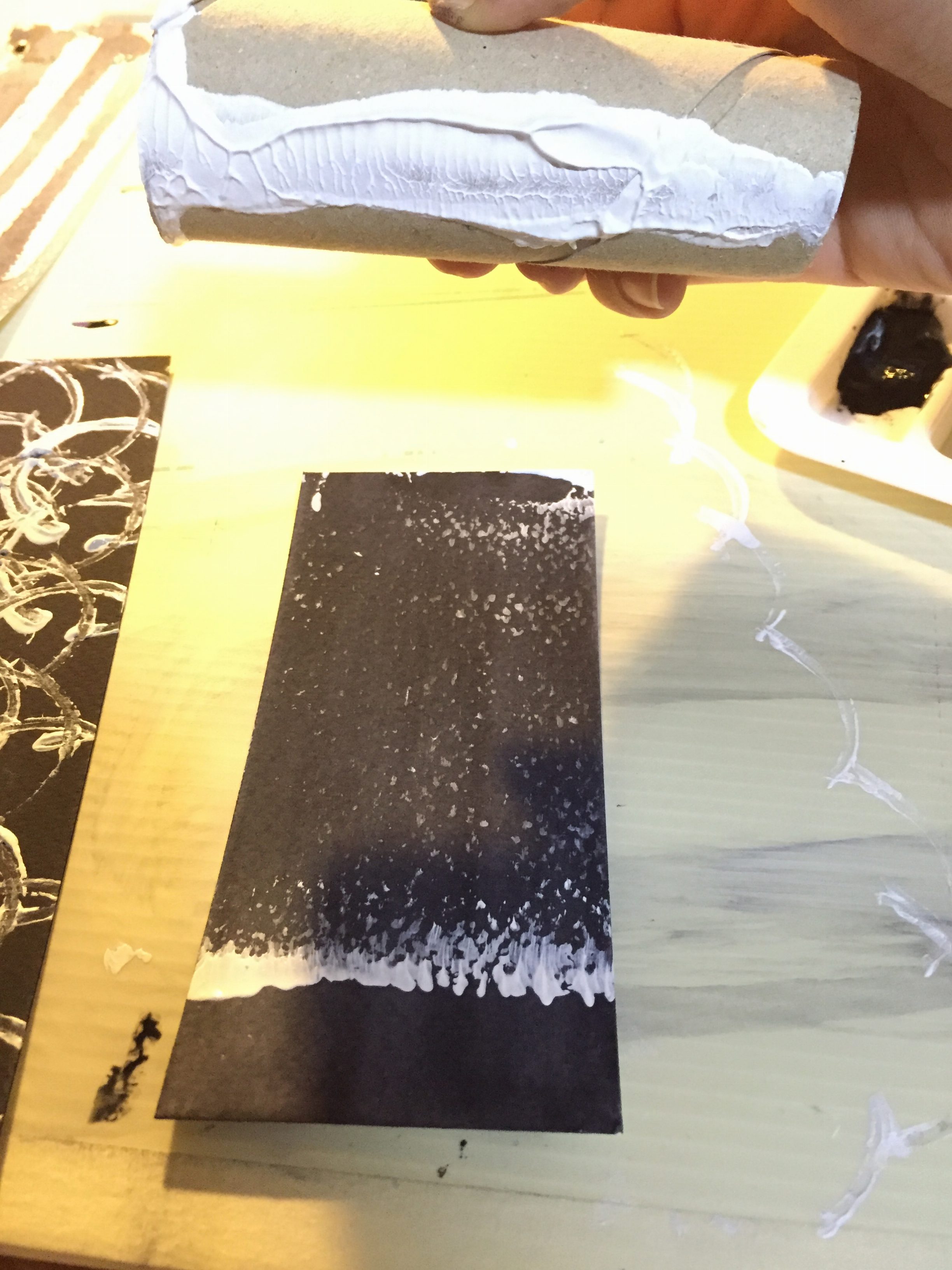
A follow-up of the memory drawing we did during the previous class; we had to remember a time in which we were sad. My doodles came out in small circles, so I thought I’d try using the toilet paper roll to achieve the shape. The roll is cut on one side as I used it for some other purpose a few months ago, but the cut in the circle represents detachment– the feeling of separation from the current situation.
I first coloured the paper blackish grey.
Then went on to make imprints on the paper with white acrylic when it dried.
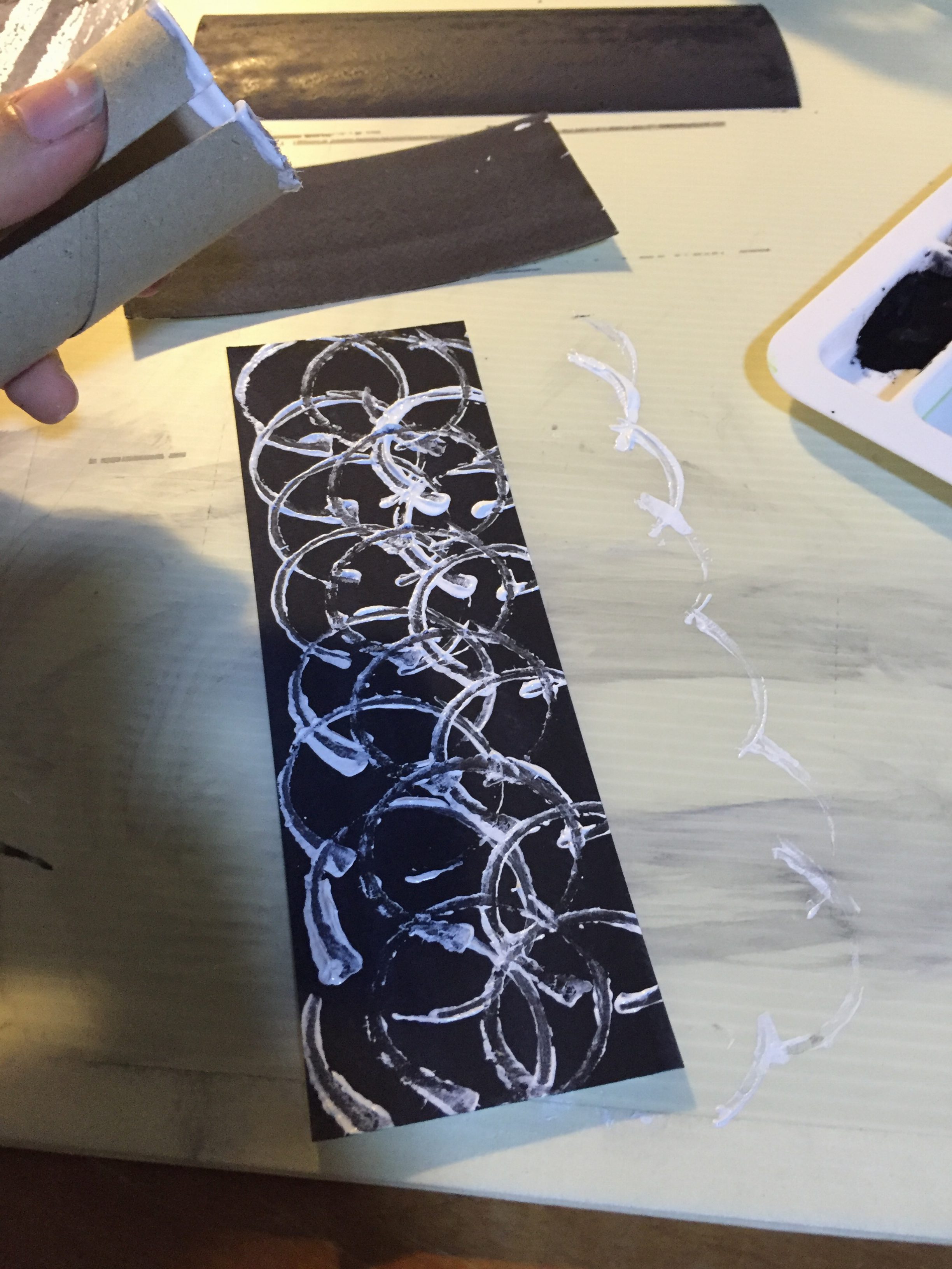
I did it in a regular motion, constantly rotating the toilet roll. This represents turbulence of negativity swelling in me when I am depressed.
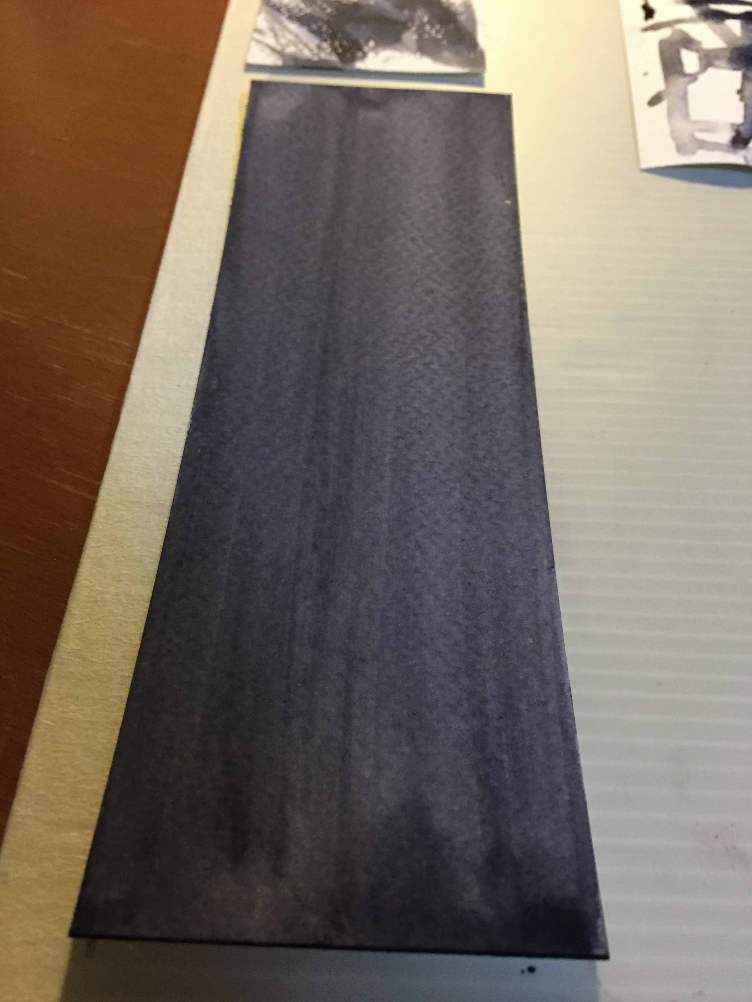
ANXIOUS
Anxiety is a horrible feeling. I normally get anxious when something bad has happened to someone close to me. I perceive anxiety to be very “rough”, so I went for watercolour paper (which had a rough texture) and made used of the side of the toilet roll to create the effect.
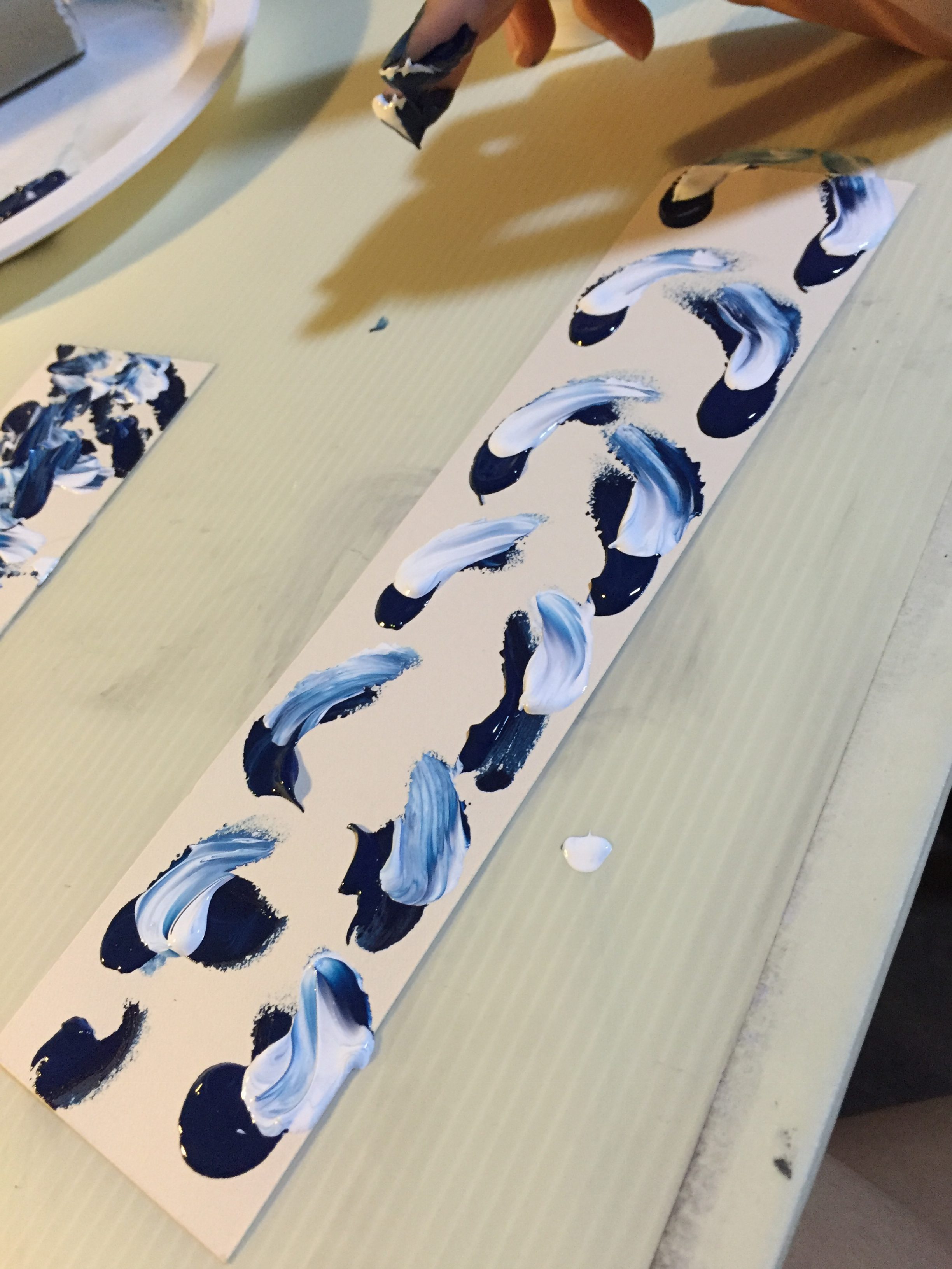
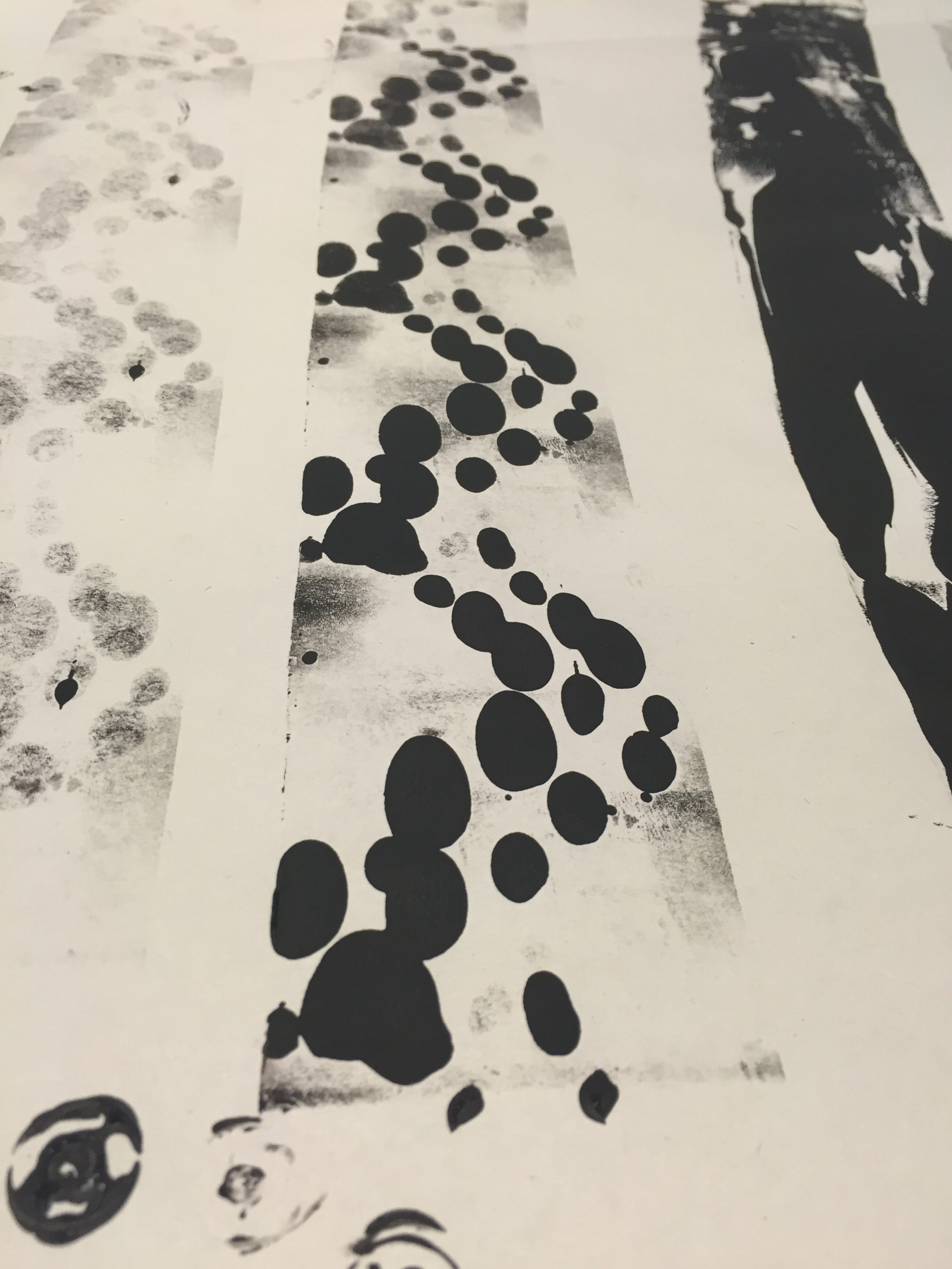
OVERWHELMED
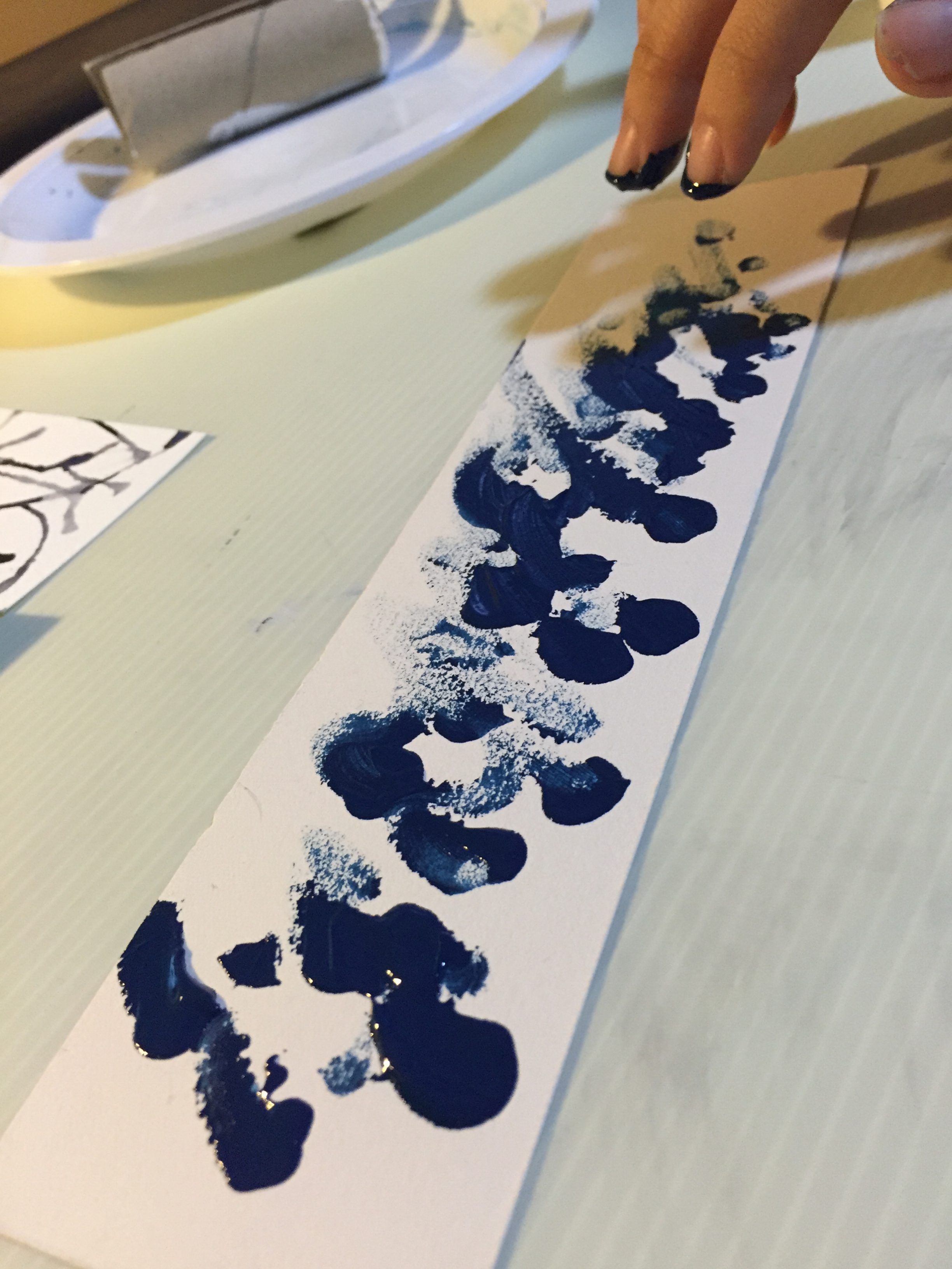
For the emotion of overwhelmed, I wanted to use excessive amounts of acrylic ink because feeling overwhelmed is like a whole pile of stresses placed on myself. I went physical with this emotion, and used my right index and middle fingers to apply the ink. I call this “fingerpasto”.
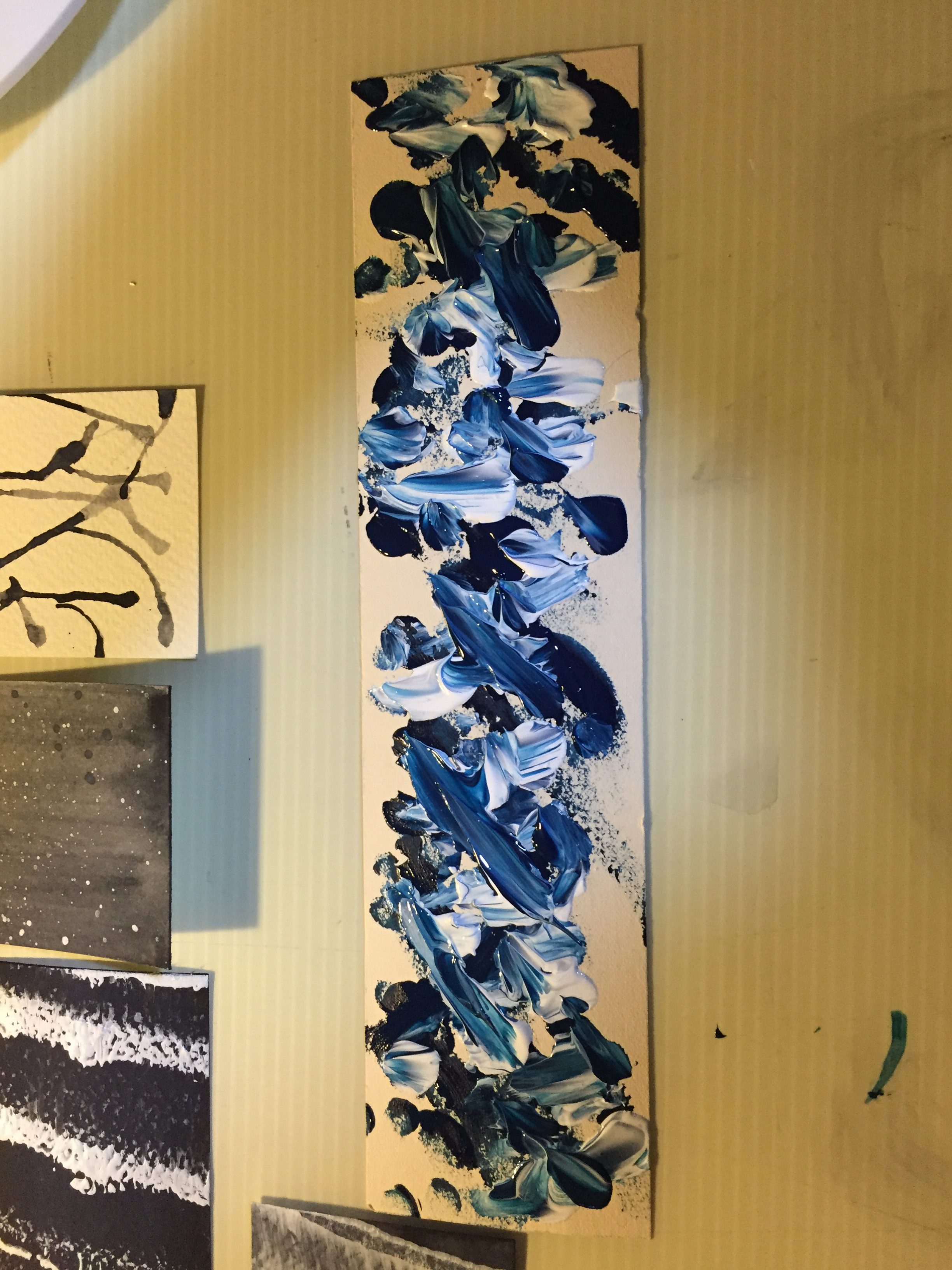
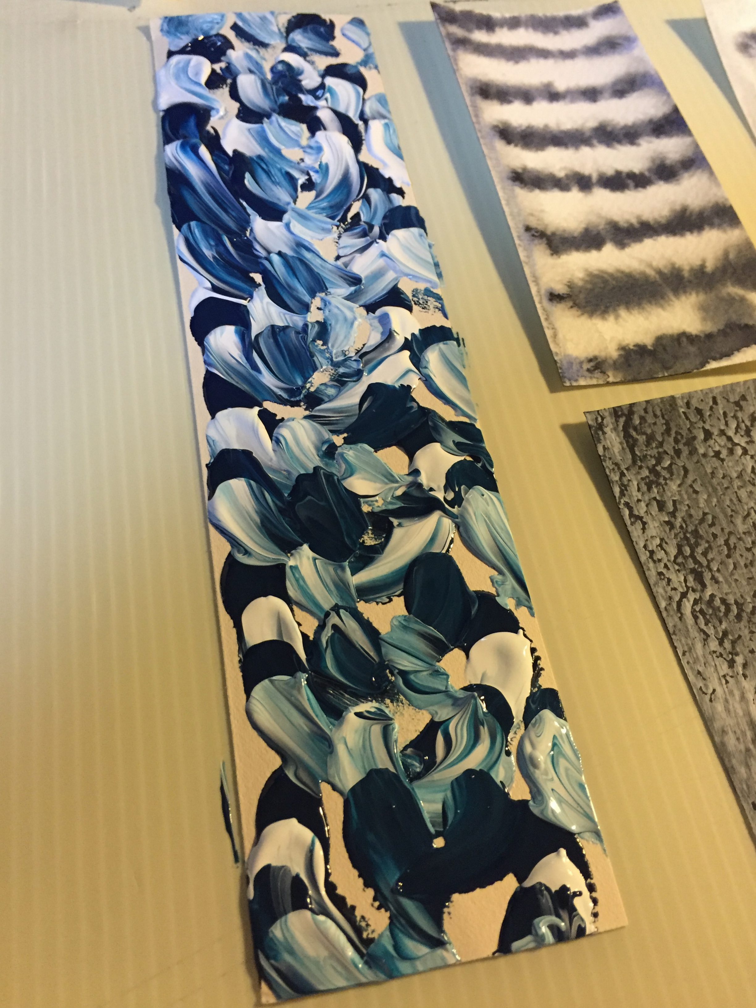
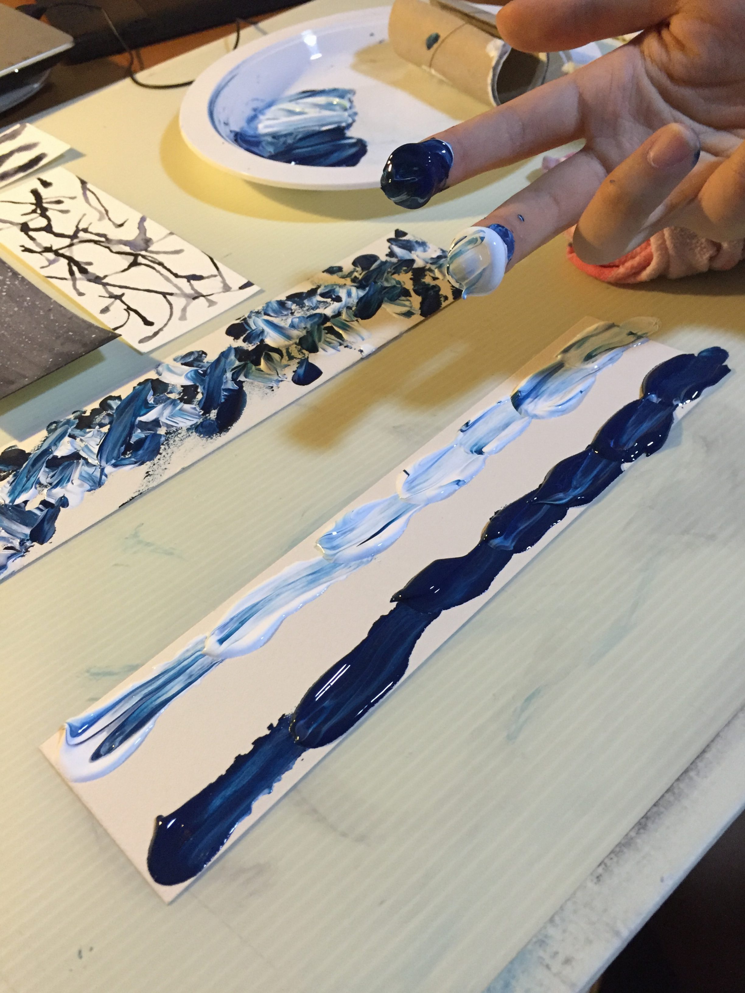
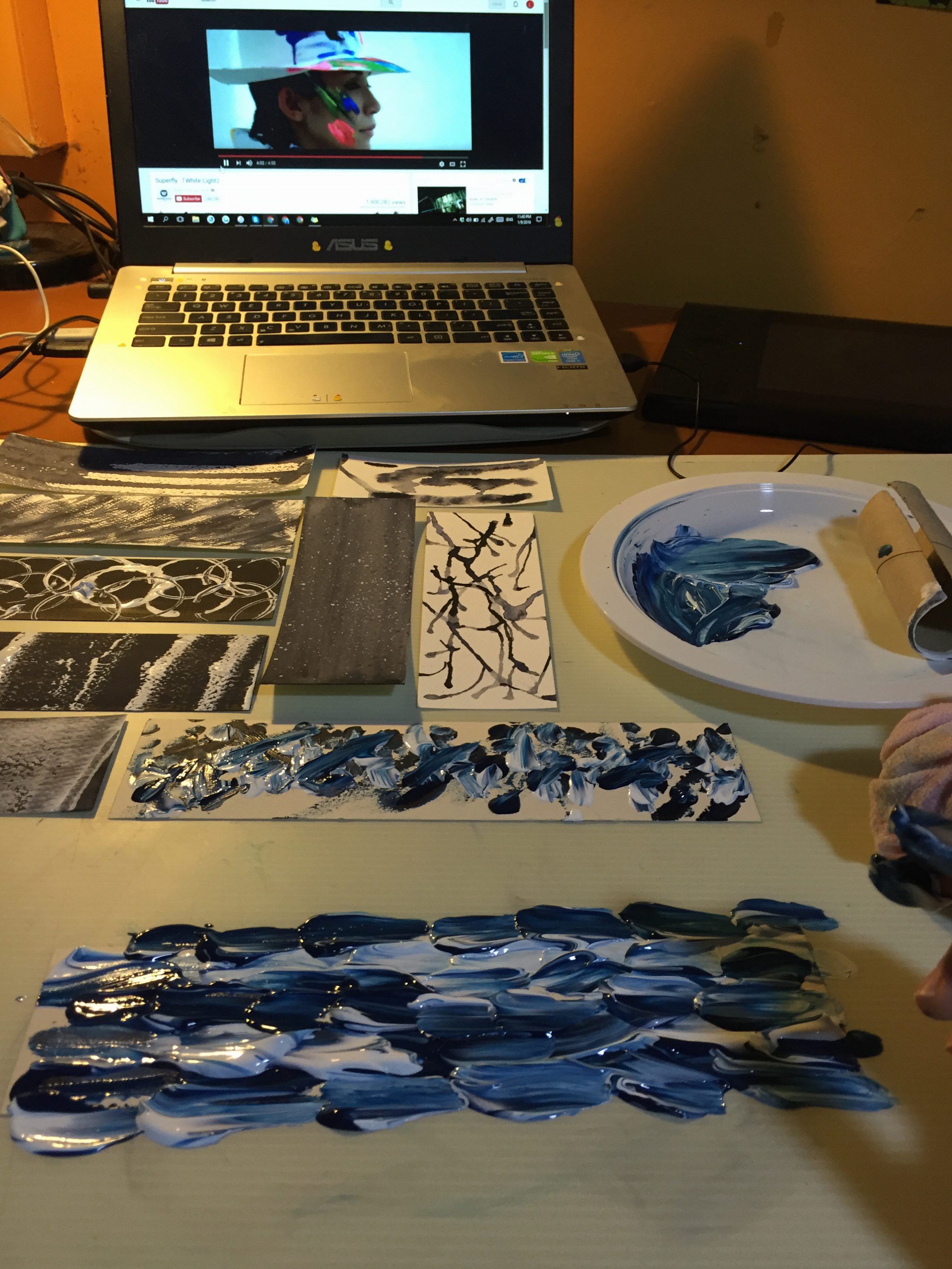
I was inspired by the music video of the japanese pop song, “White Light” by Superfly, whereby the video depicts a person painting with his hands, using intense colours. For this strip, I flooded the whole paper with ink until no spots of paper base could be seen.
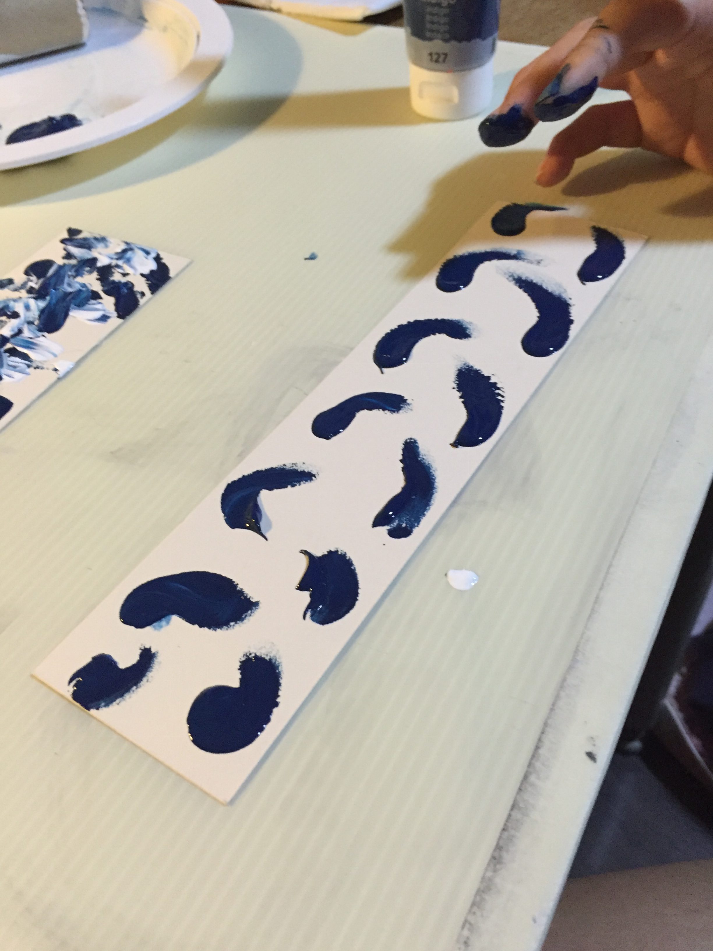
PEACEFUL
I associate peacefulness with nature as when I was a child, I was often brought outside to parks and reservoirs to appreciate nature. It was the most peaceful moments of my life, and even now, I feel at peace whenever I take a walk surrounded by nature on my own.
I dropped blobs of watercolour onto the paper and used a straw to blow at the ink in order to form imprints that look like tree branches.
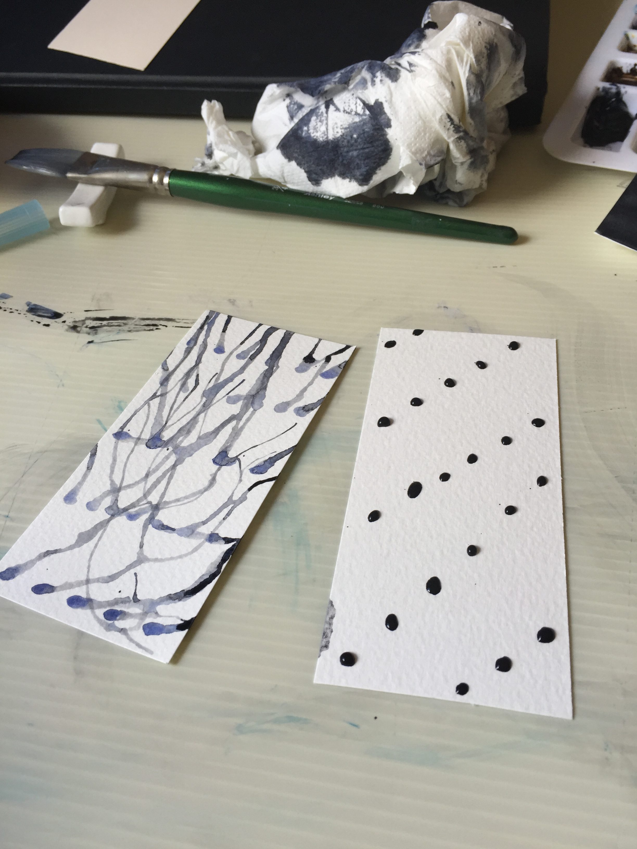
I tried experimenting in different directions, but still liked the original most.
DISAPPOINTED
Following the motif I did in the previous class, where we had to recall a time we were sad. I cut out the motif with the lino mat and made prints over the black paper with white acrylic.
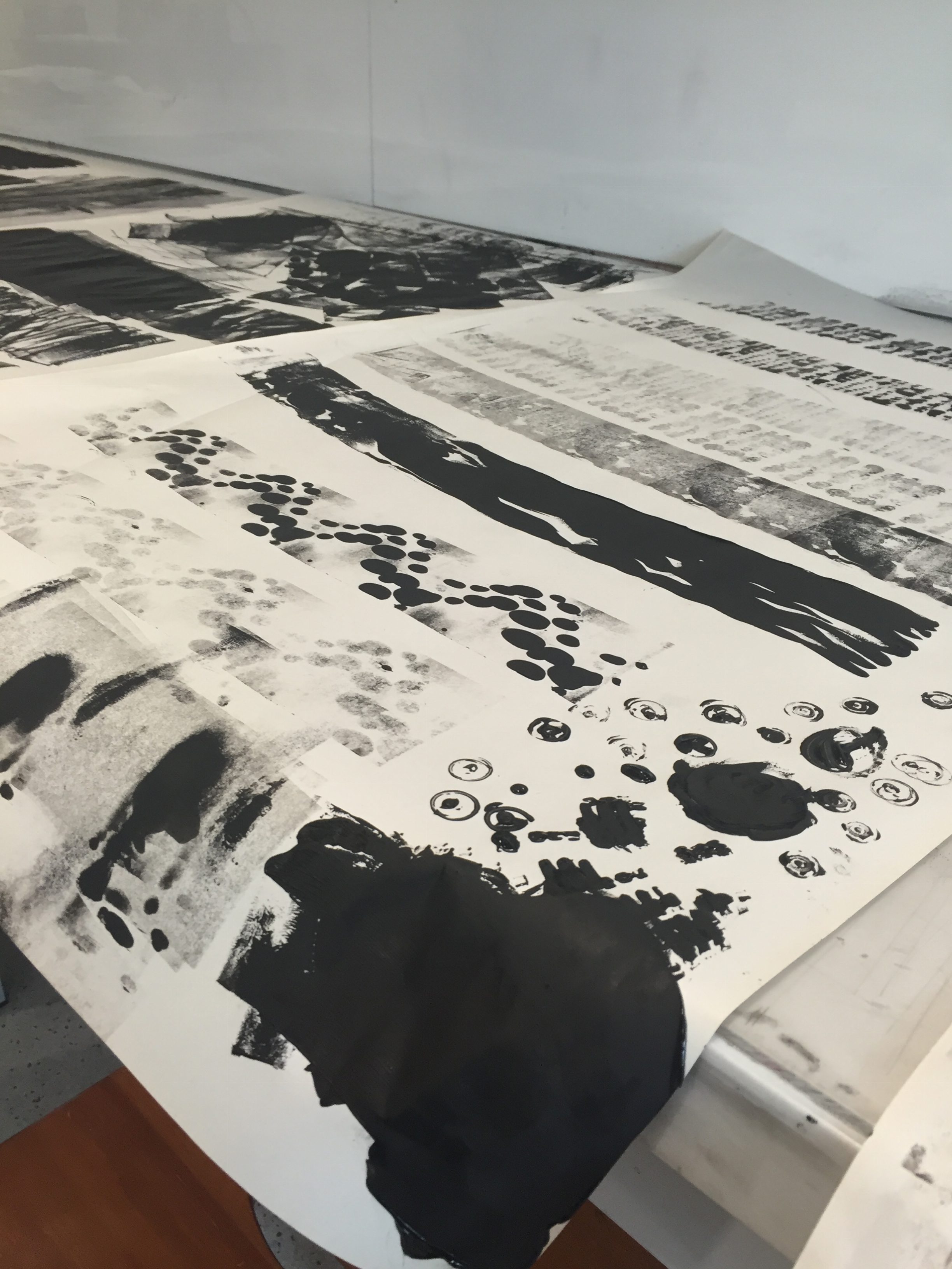
FINAL OUTCOME
The prints I did in hall — I only had indigo and white acrylic with me at that time.
Some prints I did on a late sentimental friday night.
And these were done in class, one week before submission!
Character Design
We had to design characters for the 4D assignment using the techniques of add, subtract, substitution and superimposition that we learned the other lesson.
PROCESS: I drew my images then superimposed textures to the garb of my characters.
TOOLS USED: Paint Tool SAI, Photoshop CS6, textures
TEXTURE SOURCE:
http://blaxbla.deviantart.com/art/Vintage-texture-set-3-192008546?q=boost%3Apopular%20vintage%20textures&qo=52
and
http://texturesource.tumblr.com/post/31216910645/ofabeautifulnight-deactivated20-11-hq-floral
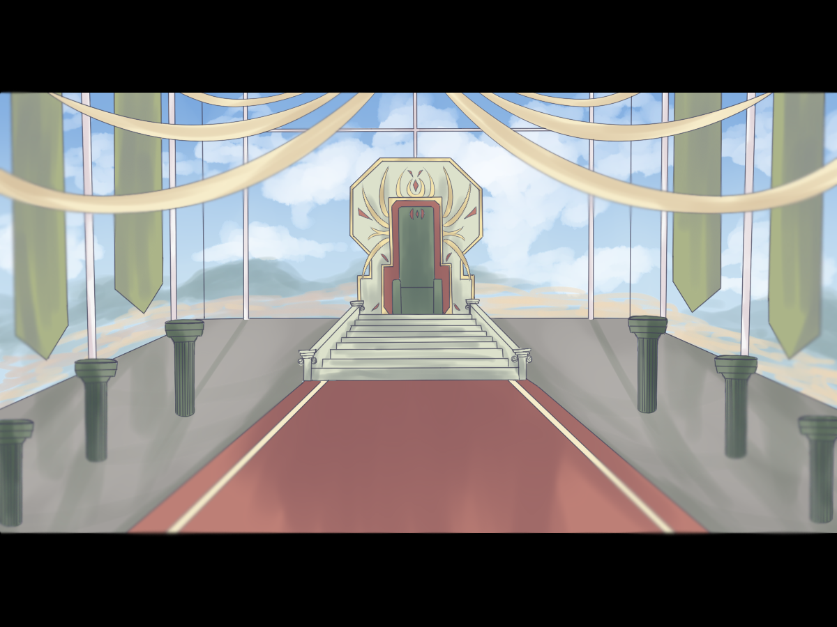
IGNITE
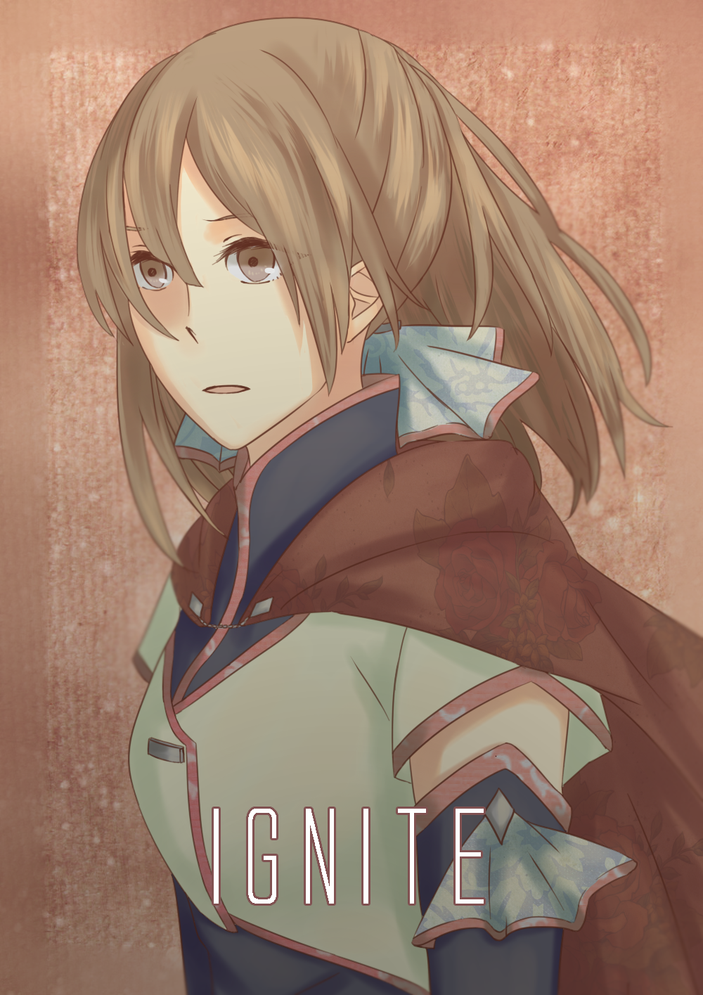
STORY SYPNOSIS
In a world where magic and dragons exist lies a flourishing kingdom of three nations that have been united a century ago by the Hero King. The Hero King possessed the great power of control over time, and this power was passed down to the following generations of kings. As time passed, the power weakened and in this present day, the king can only predict the future of a person with the touch of their hand. The king of the present time called forth the next generation of representatives to validate their candidacy and bestow upon them the blessing of the Hero King. However, on that fated day, the flames of darkness engulfed the palace, killing the king. With his final breath, he commanded the three young rulers to find the person whom he had passed on his power to, and ultimately, confront the enemy of the kingdom.
CHARACTERS
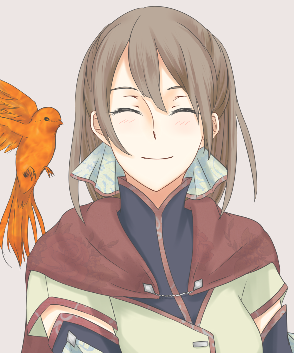
Amr
Next Great Knight-in-Command of the land of mercenaries, the Clockwork City. Her father, Arthur, is the current Great Knight-in-Command. At 18 years old, she is the first upcoming female Great Knight Commander to be appointed. She wields two swords, and is famous for her Defensive Sword Arts. Nicknamed as the “Unbreakable Shield”.
[Extra: When she was 13 years old, Amr adopted an orphaned baby phoenix sparrow when she was out training in the outskirts of town at dawn. She named it Aurora.]
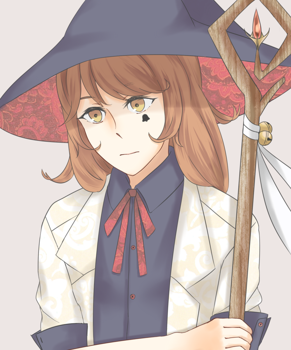
Campana
At 10 years old, she is the youngest witch to be appointed as the next Head Magus of the land of the Magi, the Great Tree. A complete genius — high affinity with all elements of magic, excellent in her theory, but still has much more to learn.
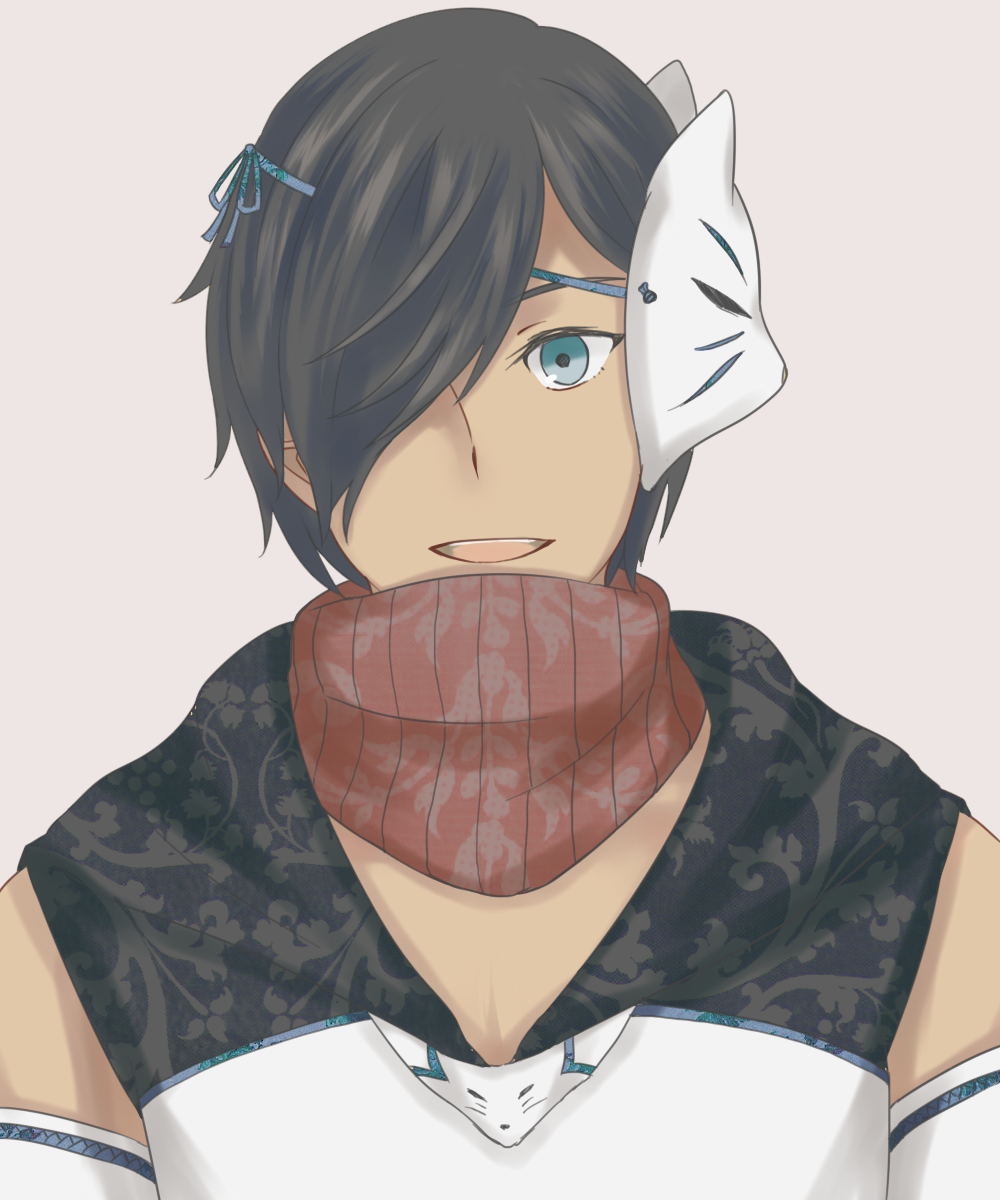
Taiyo
Next clan head of the Blue Kitsune which is the current leading clan of the land of the Ninja, the Bamboo Grove. The Blue Kitsune are known for their humorous but perceptive nature. 21 year-old Taiyo is no exception, and he is famous for his peerless stealth and handling of the Fukiya and Fukibari.
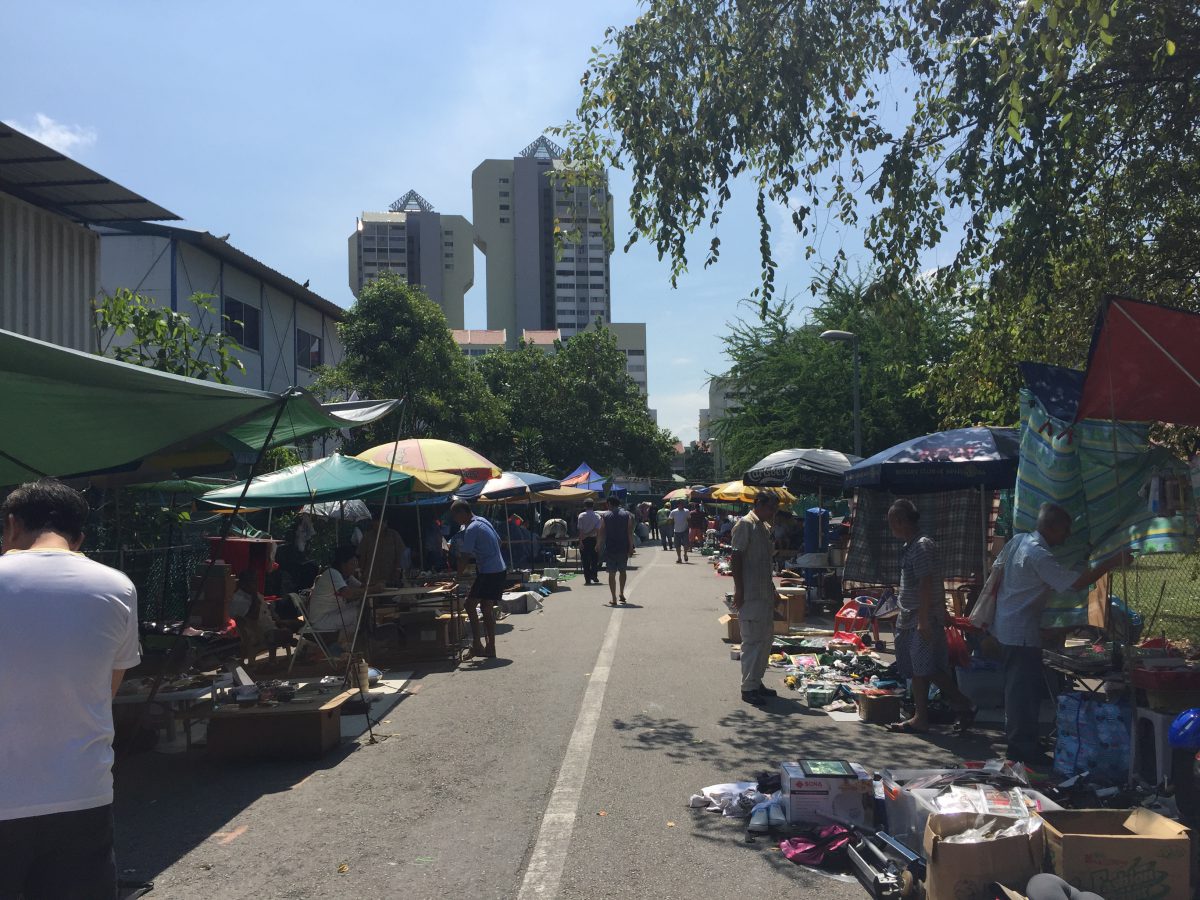
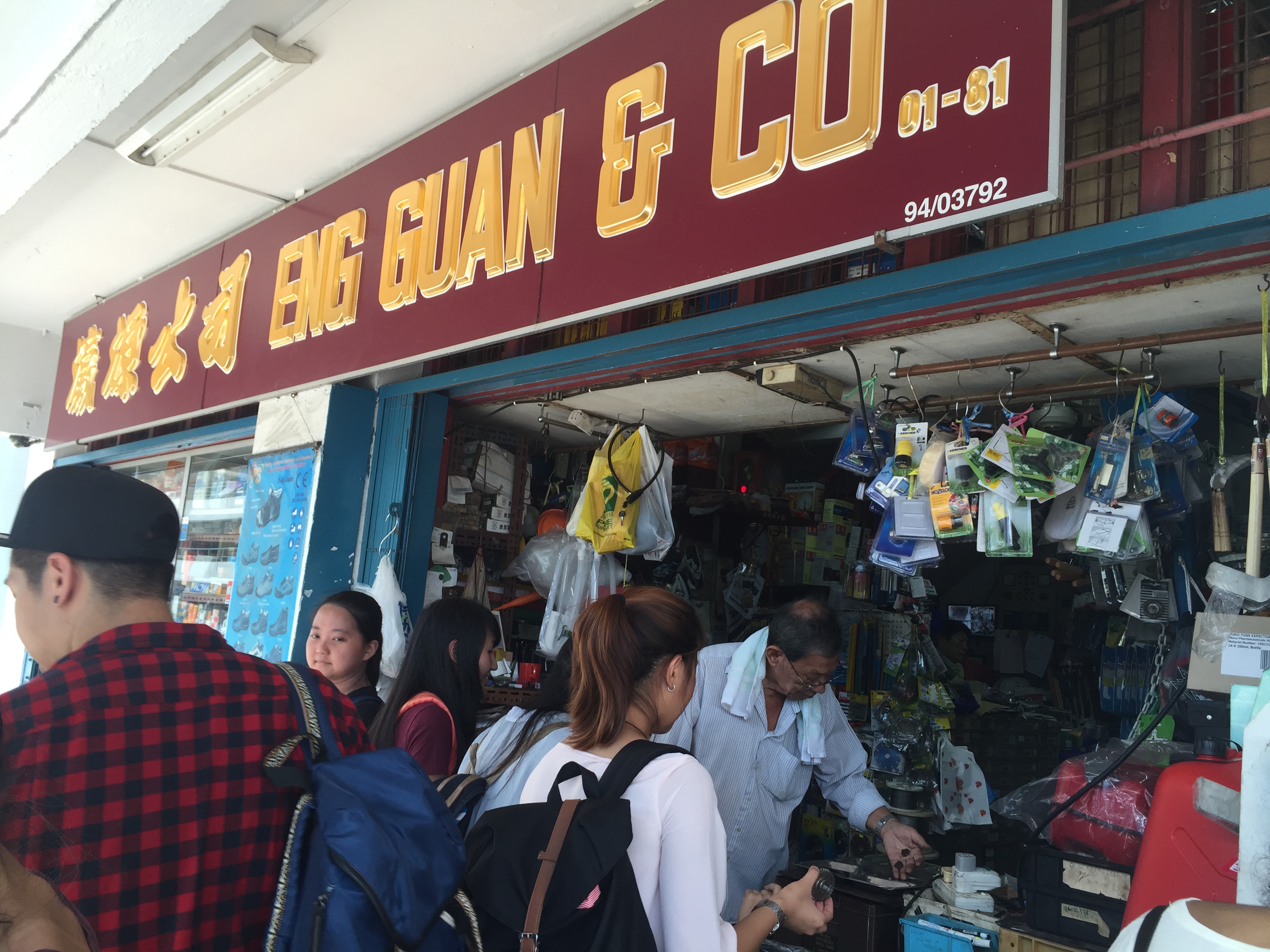
BLK 30 Kelantan Road + Project 01
Day trip to Kelantan Road! I caught a 800CP Golduck and 700+CP Electabuzz there but more importantly, I got some good stuff from the Thieves’ Market and the provision shop.
PROVISION SHOP ENG GUAN & CO.
I got some springs, screws and a bunch of random stuff from the provision shop.
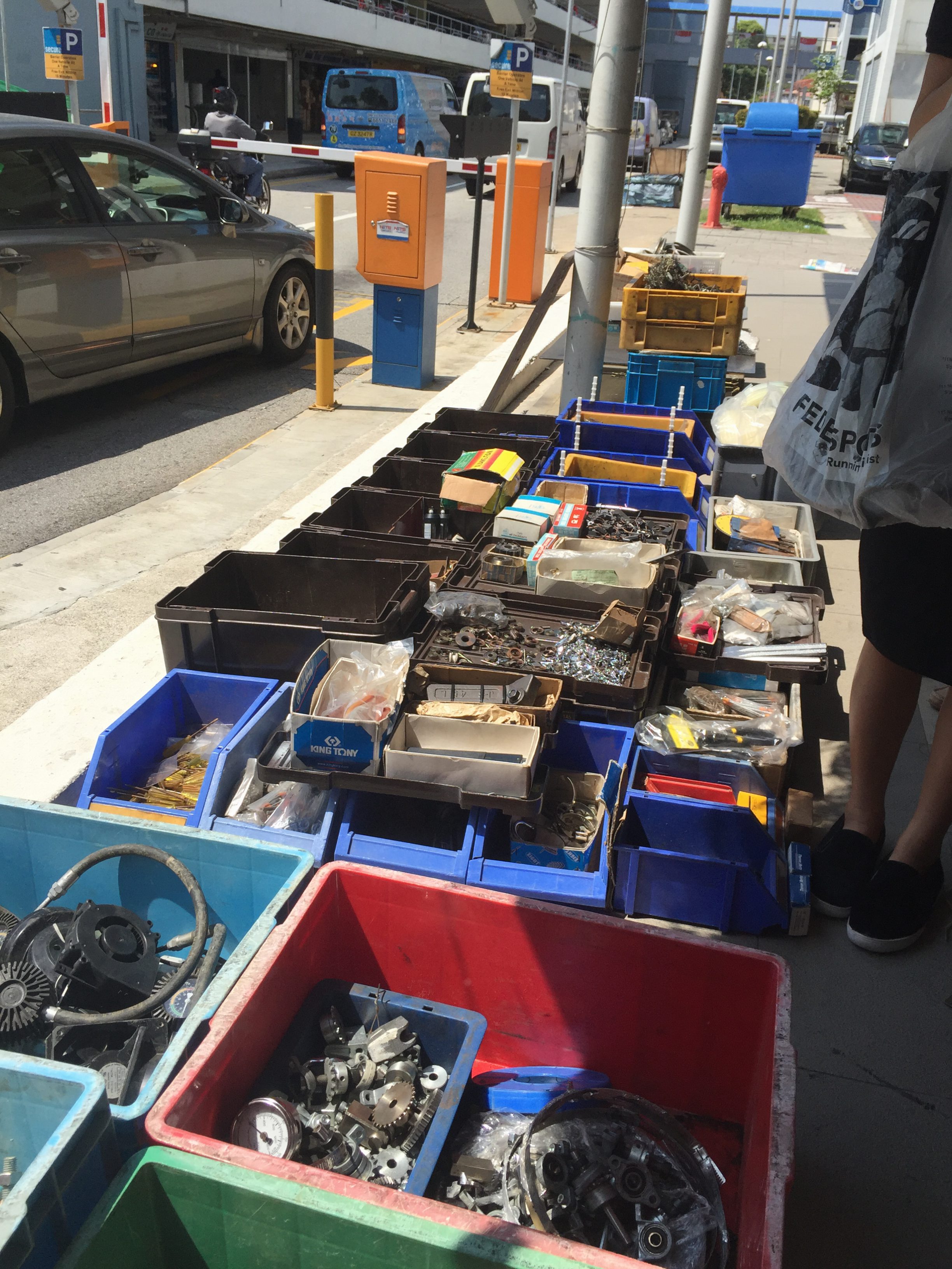
KELANTAN ROAD
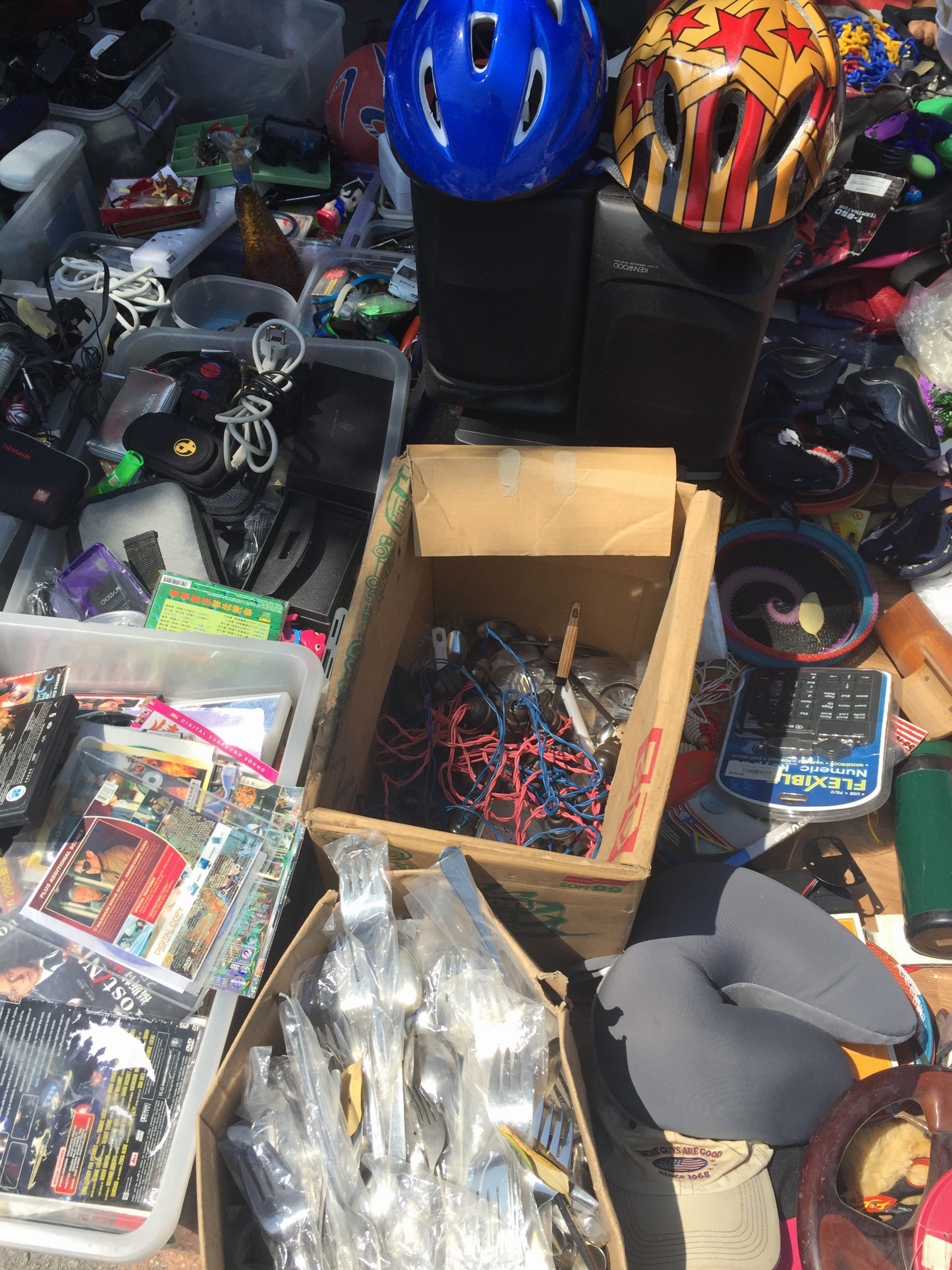
Here, I got some more stuff.

I bought those blue and pink wire stuff in the cardboard box. They’re supposed to be those miniature light bulbs that’s used to decorated pasar malams, but here I got them with the metal piece without the light bulbs.
PROJECT EXECUTION
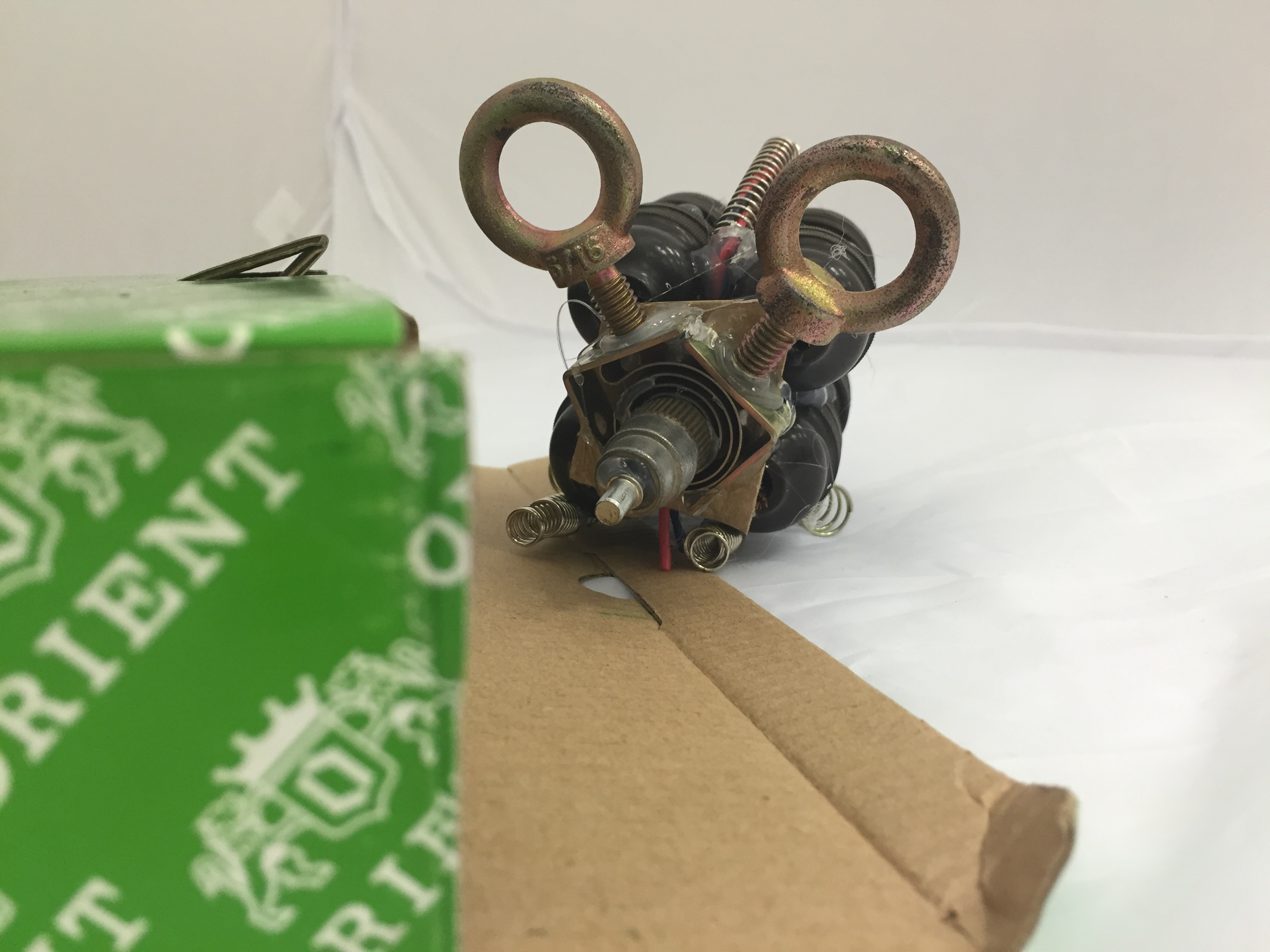
My original intention was to make two bull figures fight each other on a platform (thus the green box), but the finished product turned out rather differently…
TOOLS USED: hot glue gun, and the items below.
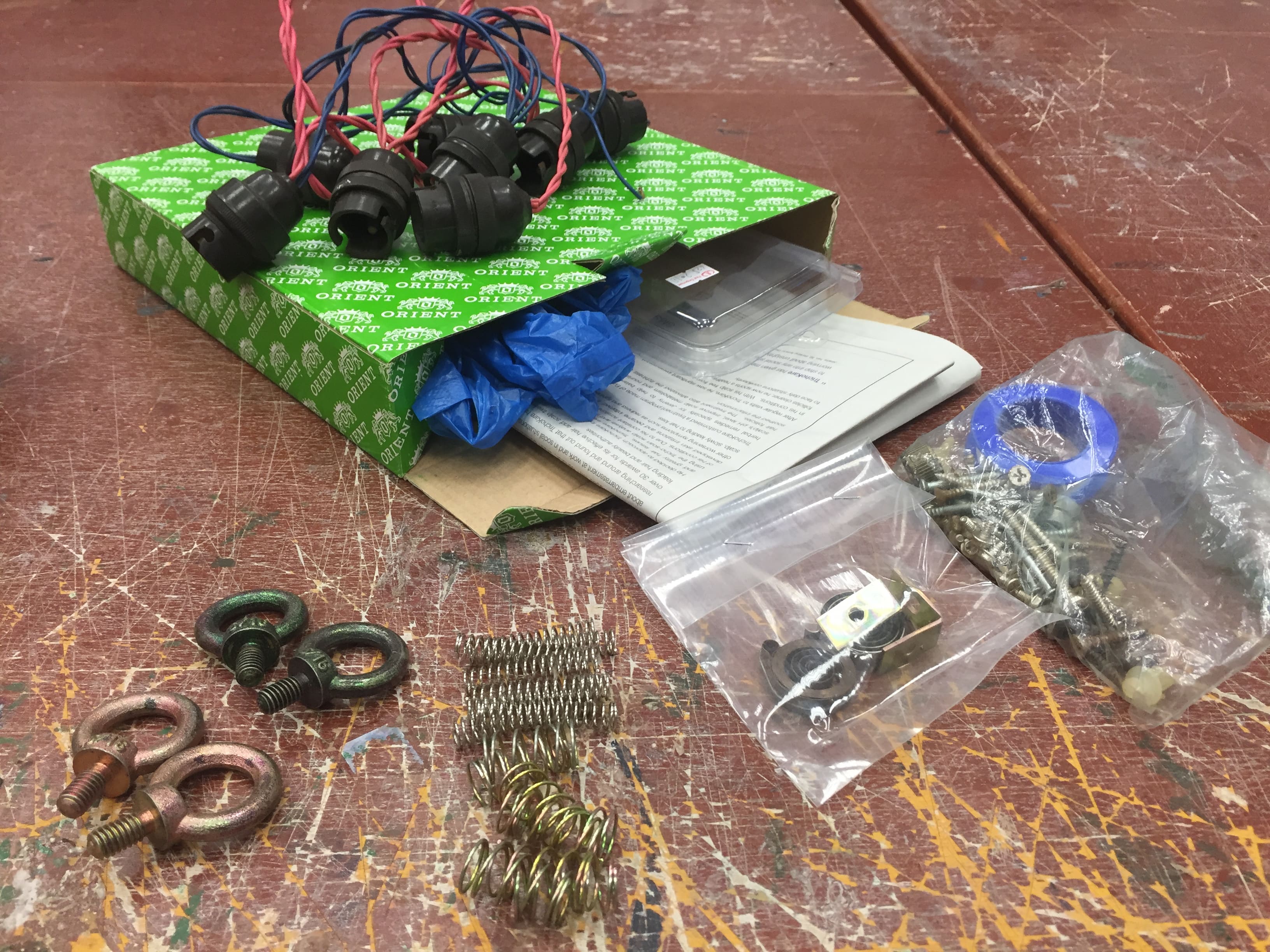
After creating the body of the bull, I realized that it was very difficult to attach the head piece to the body. So I dismantled it after this picture.
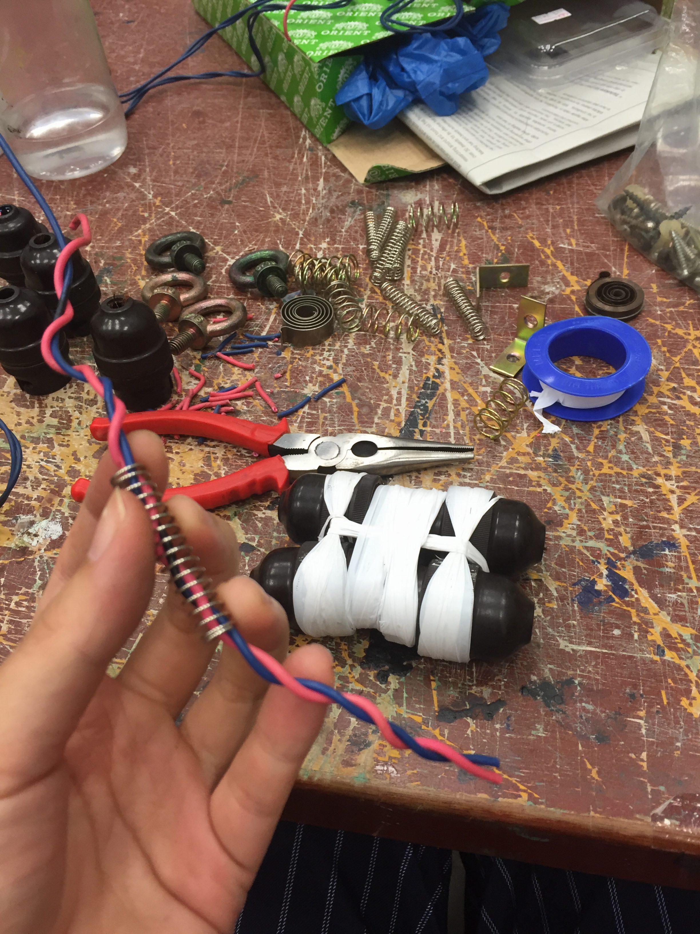
Afterwhich I combined the rest of the metal pieces (from the miniature lightbulb wires) to form a more compact body. I didn’t know what do to at this point, but simply put the metal rings to other pieces and eventually formed a mouse-like head piece. Then, I attached it to the body and produced a mouse! The coiled tail piece were the blue and pink wires which I removed from the miniature light bulbs.
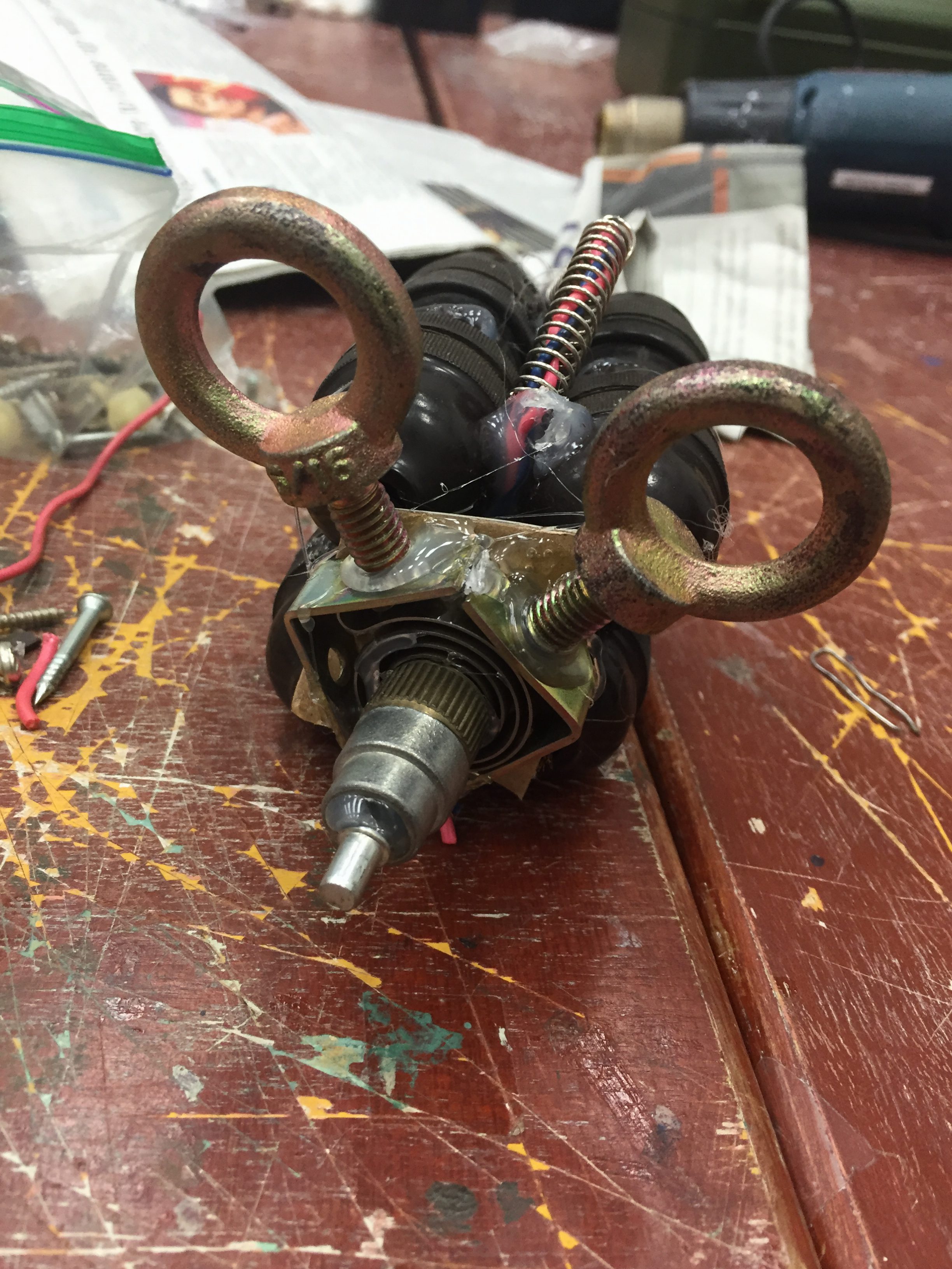
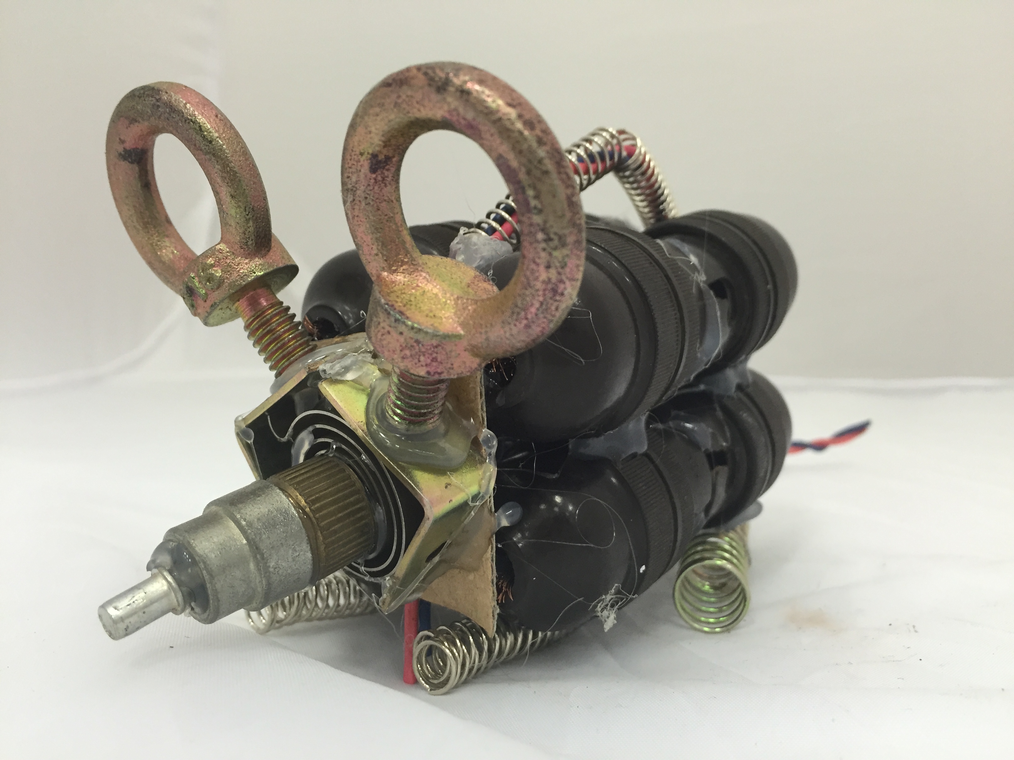
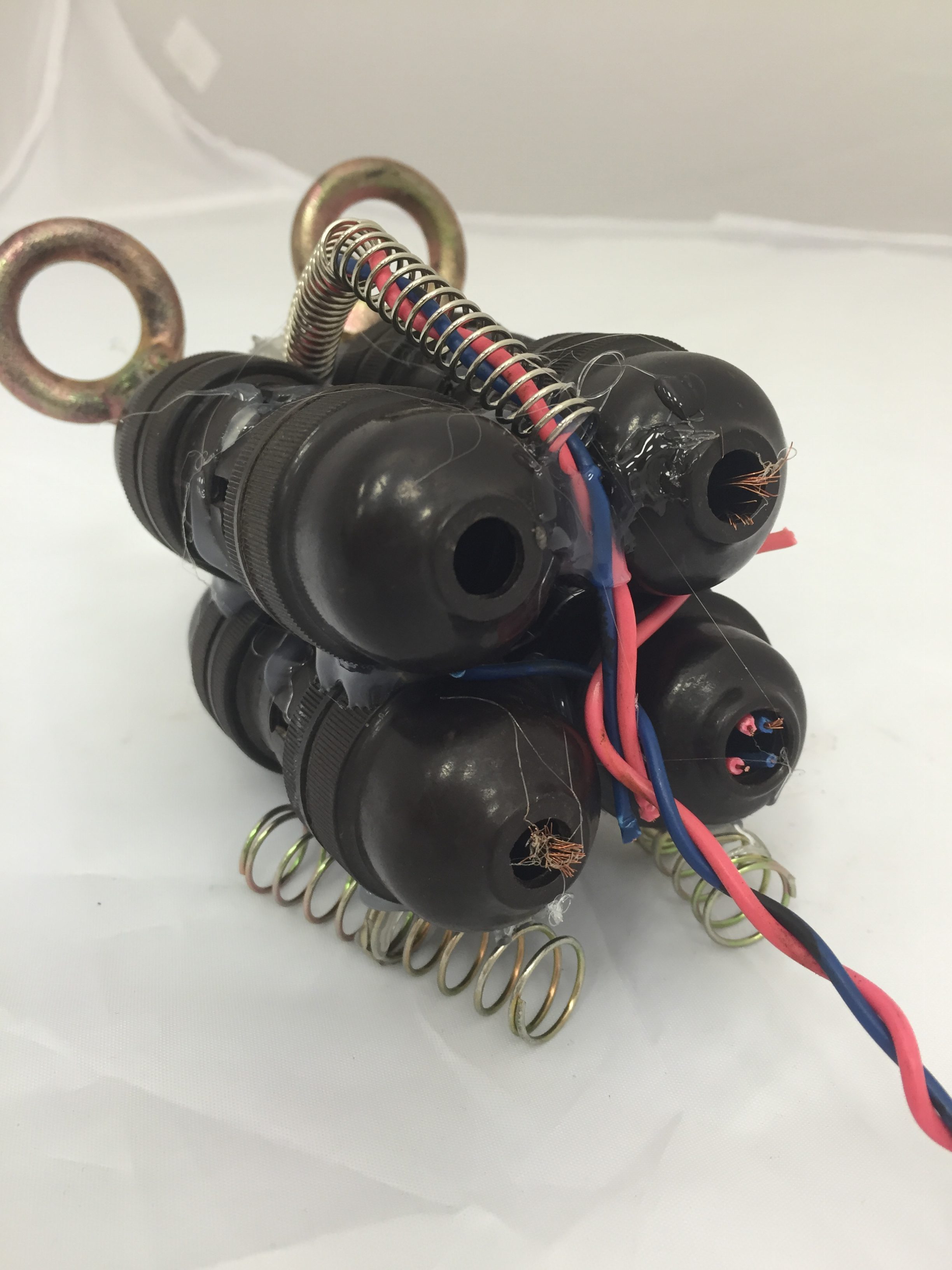
There are springs with wire through them to form a backbone, and also to give the mouse a curved back for realism. I used two thicker springs (compacted together) for each hind leg and 3 thinner springs (also compacted together) to form each rear leg.
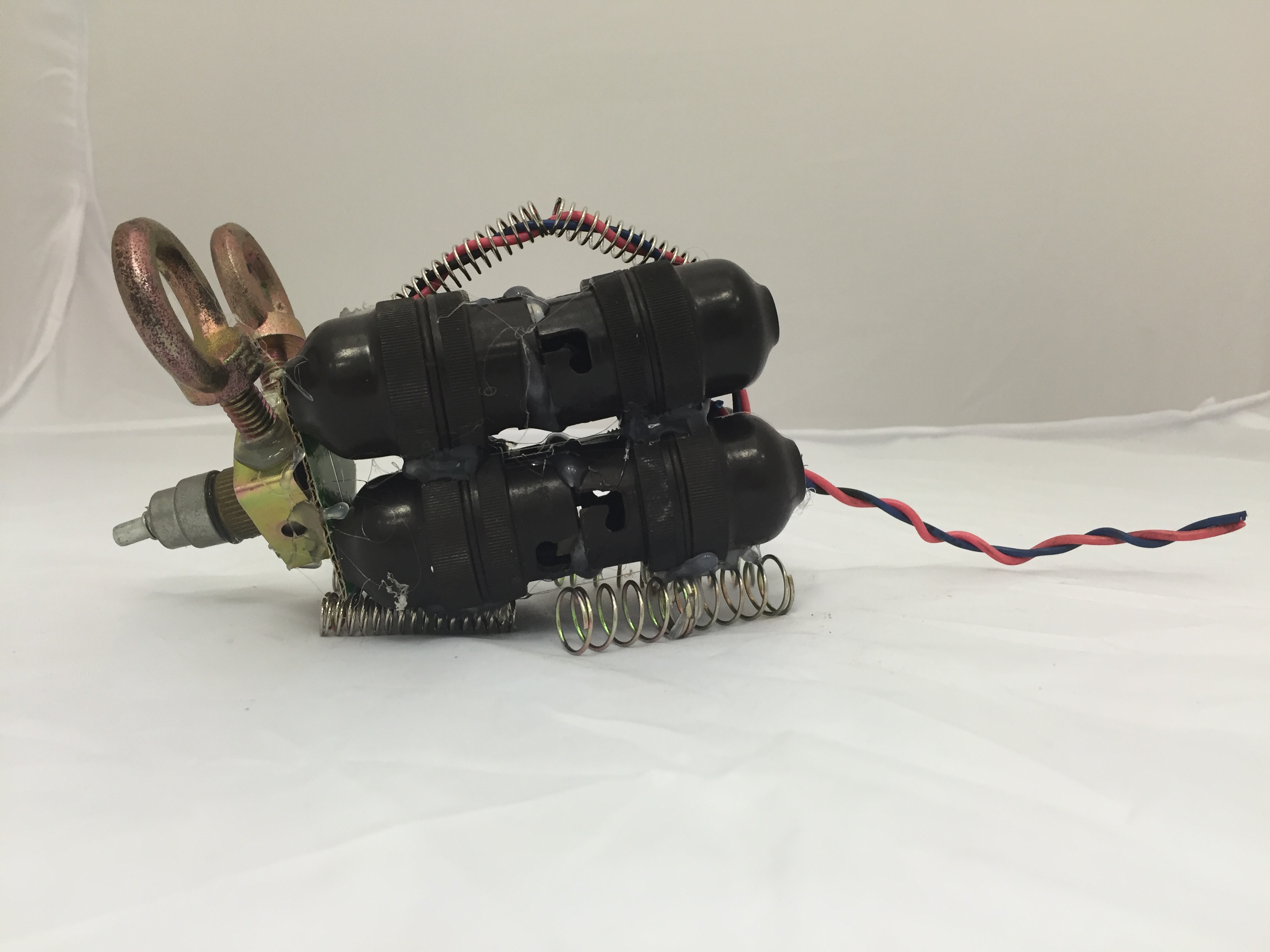
Rather unexpected finished product but I’m very happy with it!
Afterwards, the professor told us to make a simpler sculpture with our leftover pieces. I used the white tape that I dismantled from the original bull body piece to form tentacles of a jellyfish! Used a expanded metal coil to form the top curved part of a jellyfish.
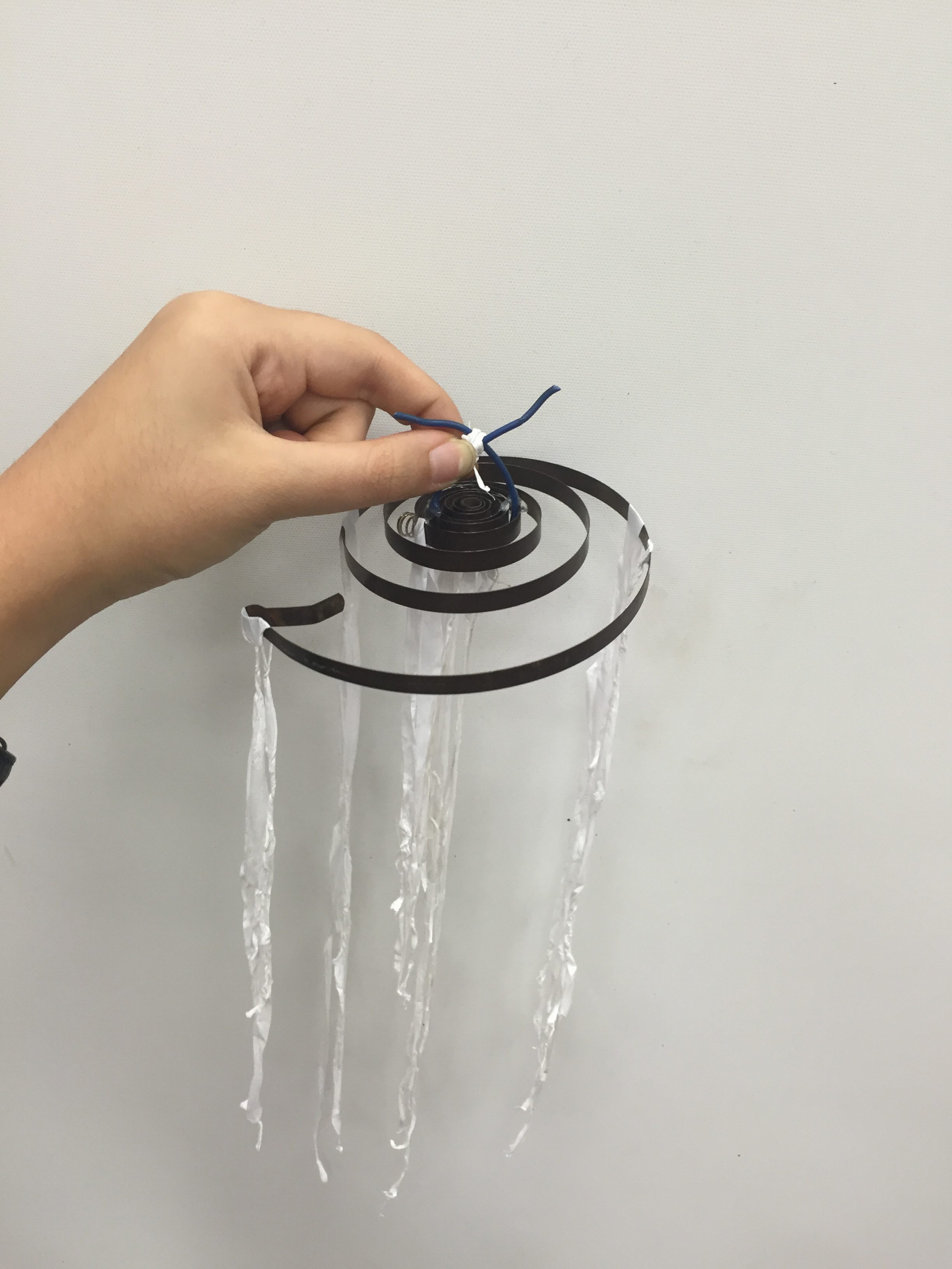
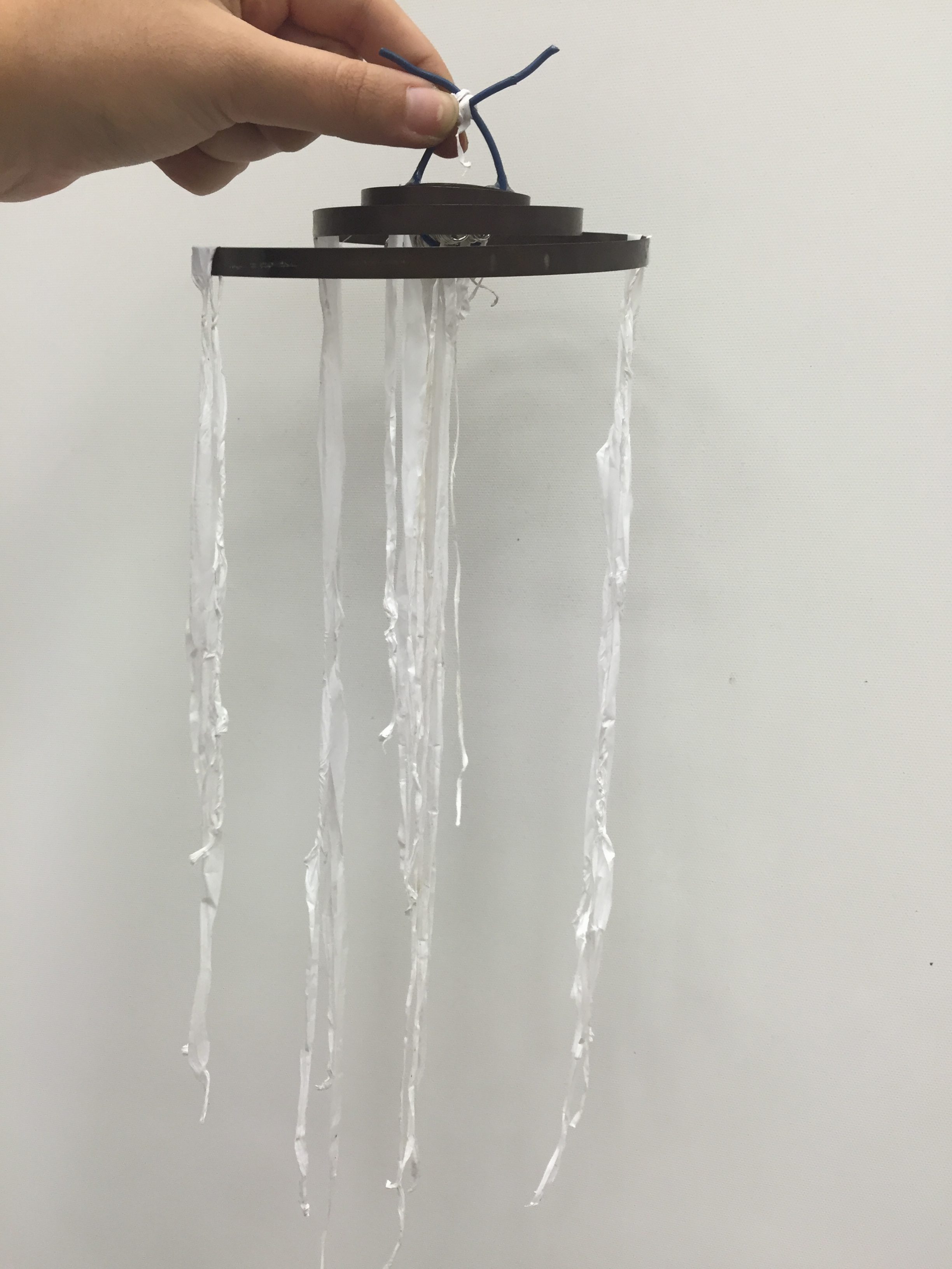
PERSONALLY…
This was a really fun project! I enjoyed making that trip to Kelantan Road to scavenge for the sculpture’s pieces and executing the project was exciting. Even though my original idea did not work out, I do like the unexpected finished product.
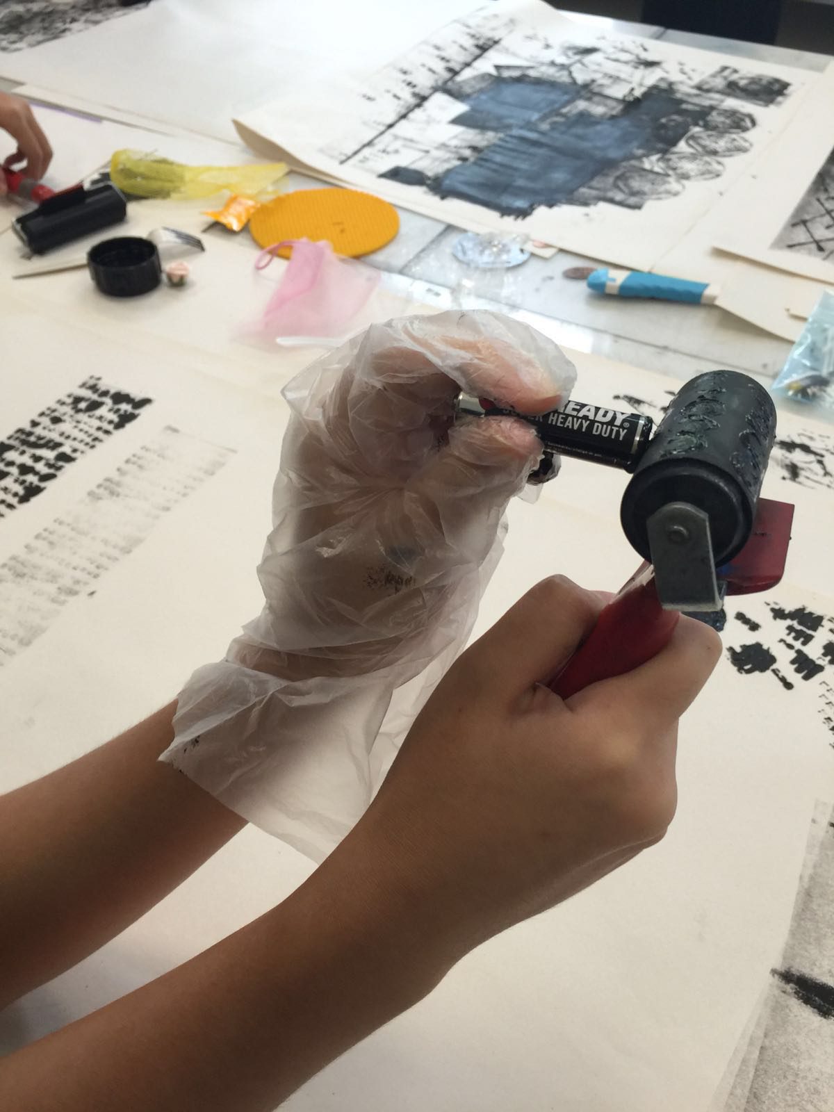
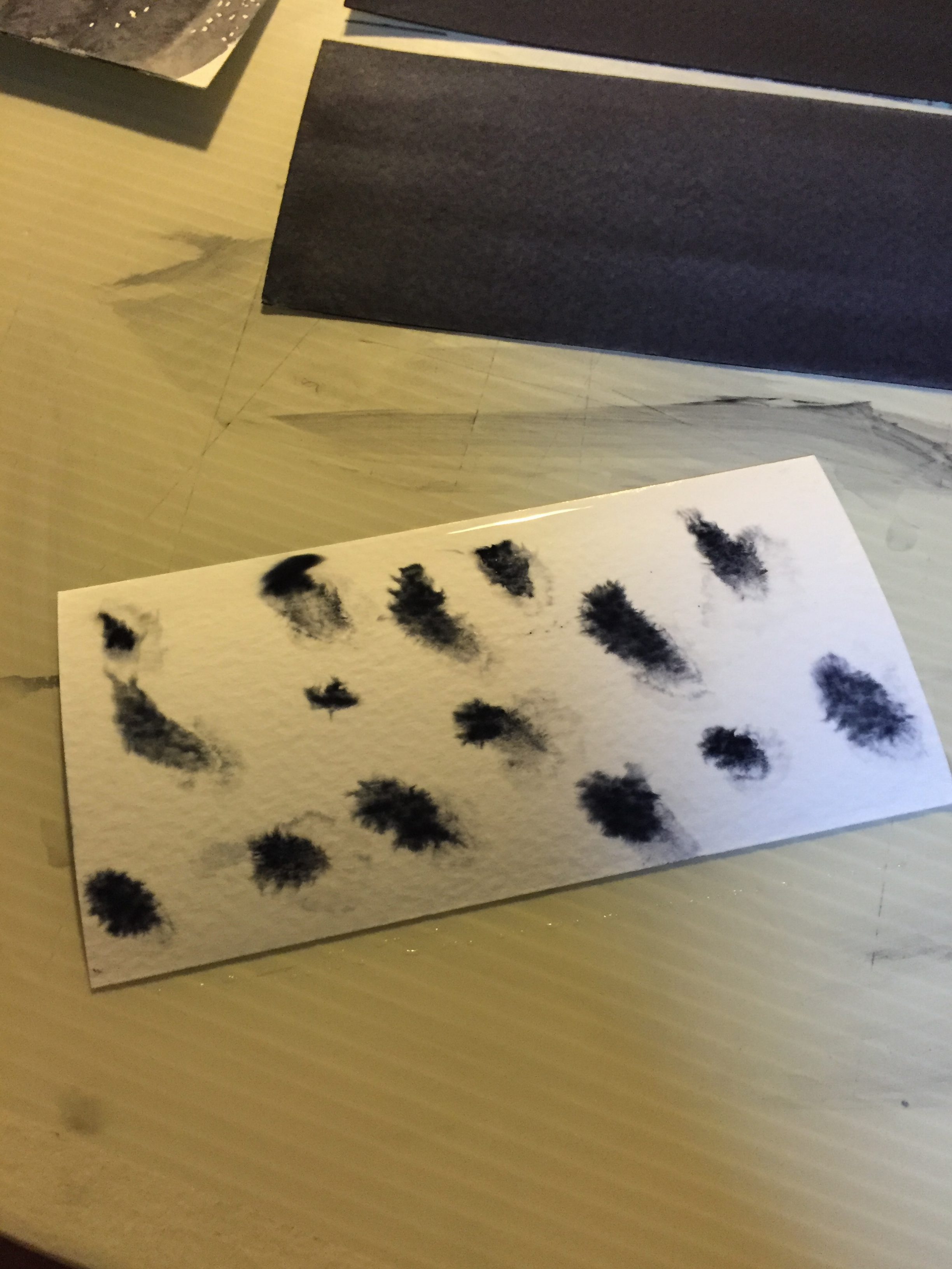
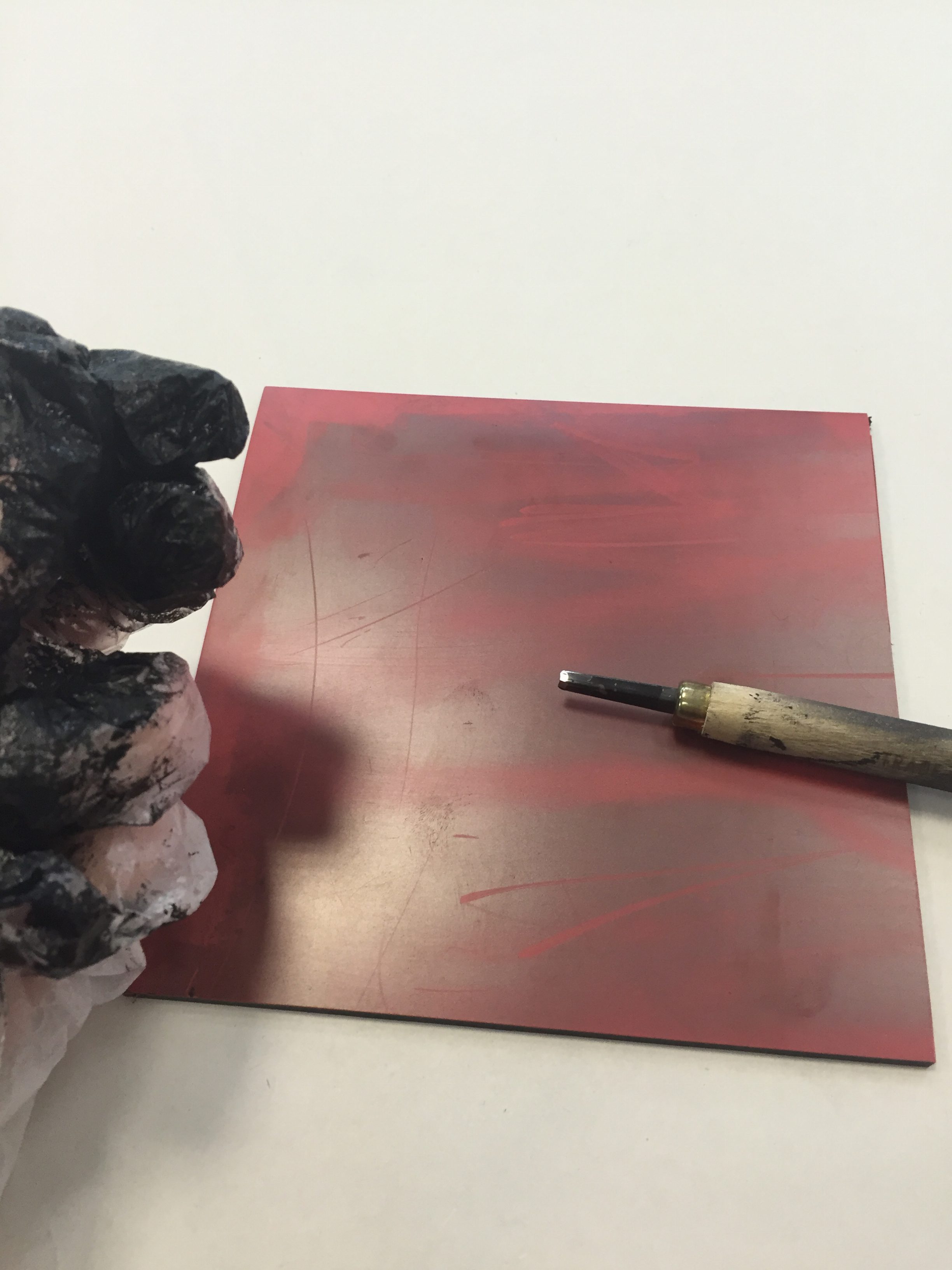
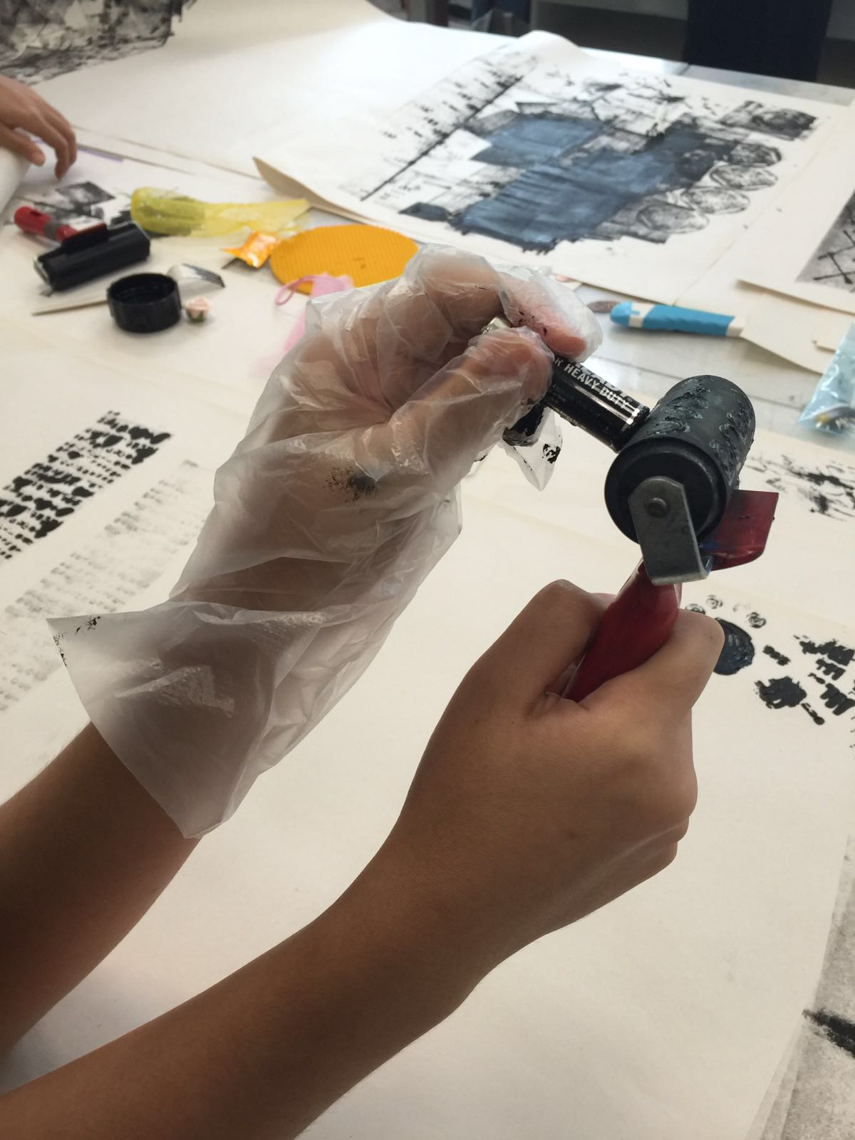
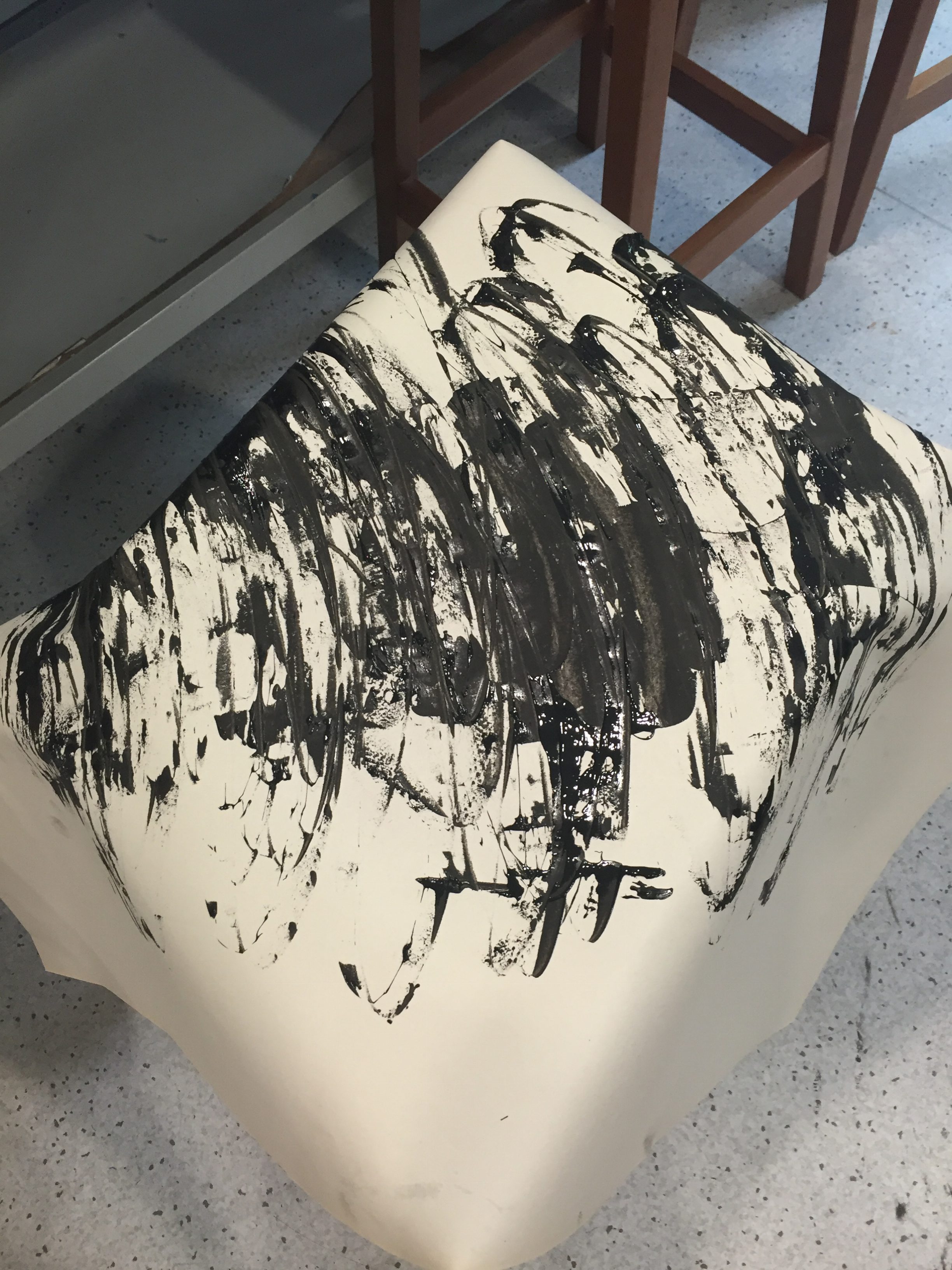
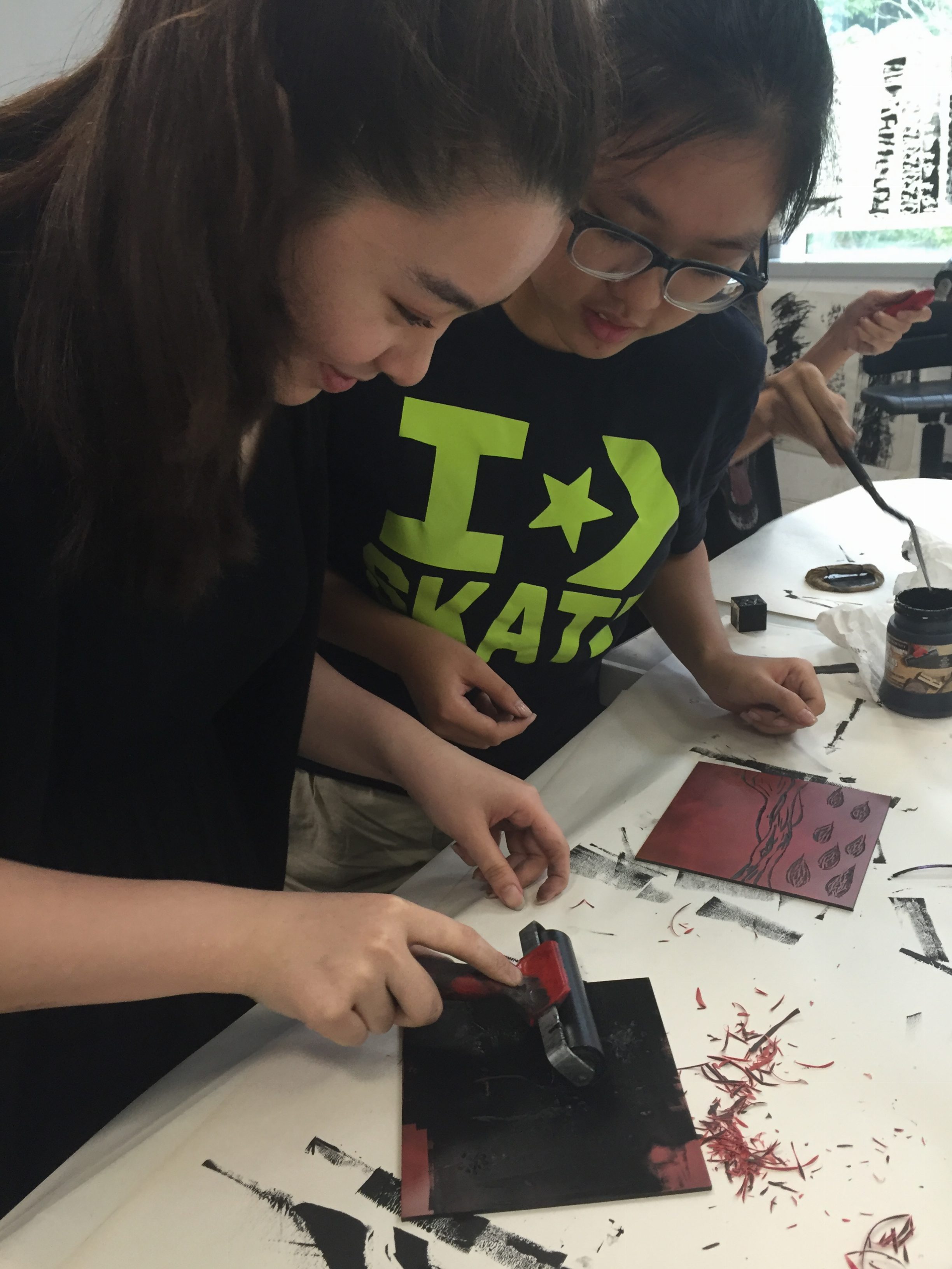
“My Line is Emo” Process I
For 2D class, we played around with black ink, rubber paint rollers and a bunch of mark making tools that we brought from home.
TOOLS USED: AA Battery, mini binder clip, big binder clip, spoons, and a bunch of stuff borrowed from classmates
PROCESSES
We also started on lino! (There’s nothing on that picture yet). Personally I don’t enjoy using lino.
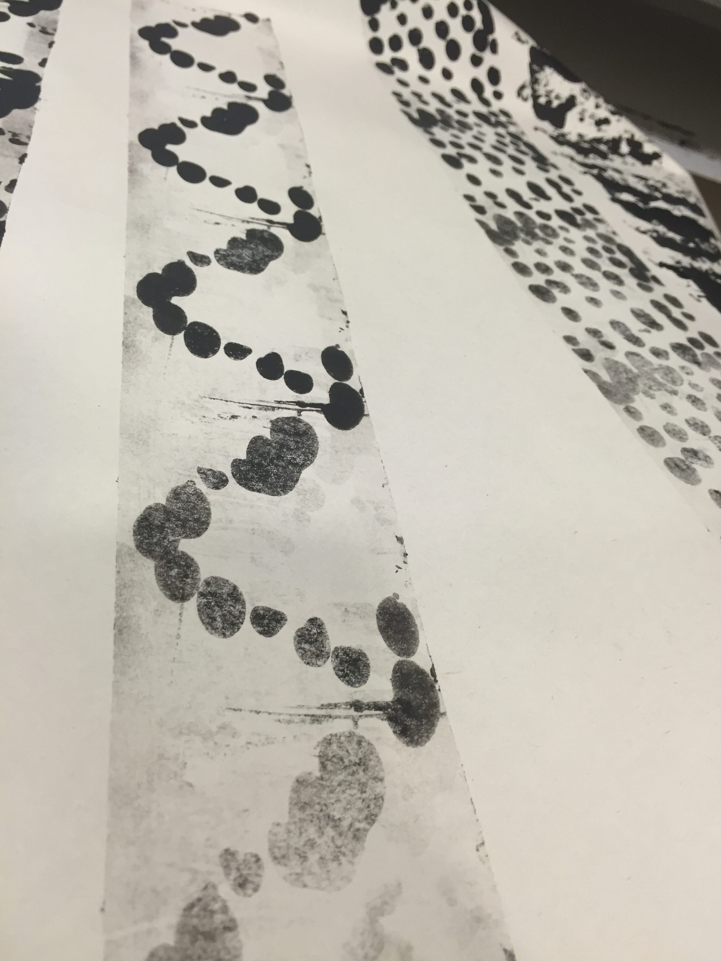
The flat bottom of the battery creates a pretty rose-like mark on the paper! I tried putting them in rows on the roller’s surface so it’ll have a repetitive pattern.
And the finished products!
I achieved this zig zag dotted effect by placing ink on the roller’s surface using a spoon.
As for this one, I tried to mimick Jackson Pollock’s work by using a palette knife and lots of black ink.
I REALLY LIKE THIS ONE! I used the bottom tip of a mini binder clip and smeared ink on the roller’s surface. Reminds me of how cafe plate their sauces with their food.
More prints.
I placed ink on the roller’s surface using the whole bottom of the mini binder clip to get this double dotted zig zag.
Then I turned to my left and saw a very happy Sammi and Vanessa working on their linos!!
PERSONALLY…
I quite enjoyed this class. I’ve never worked with a rubber paint roller and didn’t know what a lino was until then! Even though my mark making tools looked “basic”, they did bring out some really lovely patterns.