The first thing I did was reviewing every lines I chose for the first inked draft. The review was performed with conversation between me and myself. Sounds depressing, but I found this quite useful in terms of concentrating. So I wrote out every verbal description of my lines. (The good thing about describable work is I can know what am I doing. haha.) Next, I commented on each of the description and determined whether they should leave or stay. Feels like the judges on any reality shows.
What’s next? Back to the thinking chair. In this case, the visual journal.
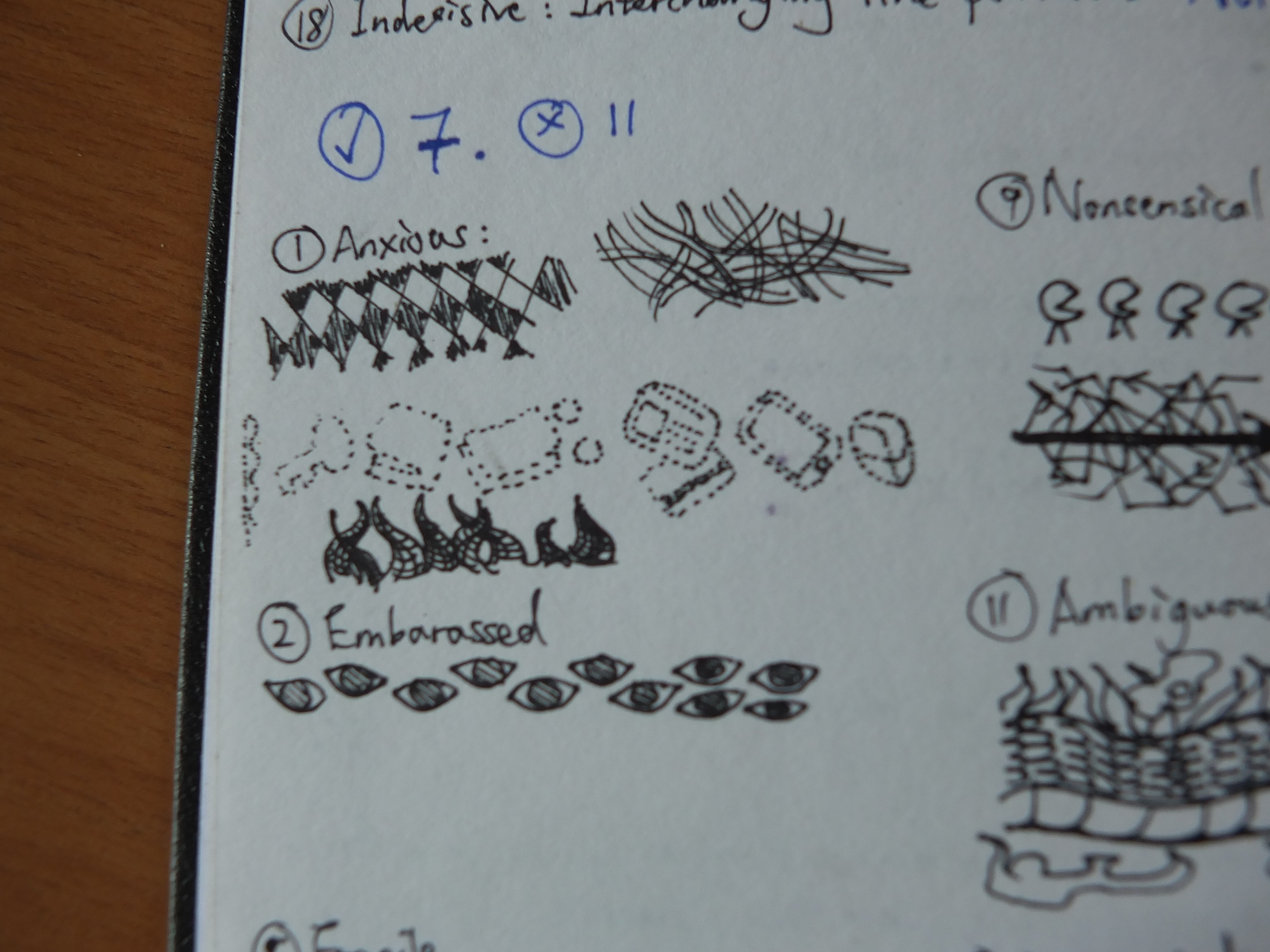
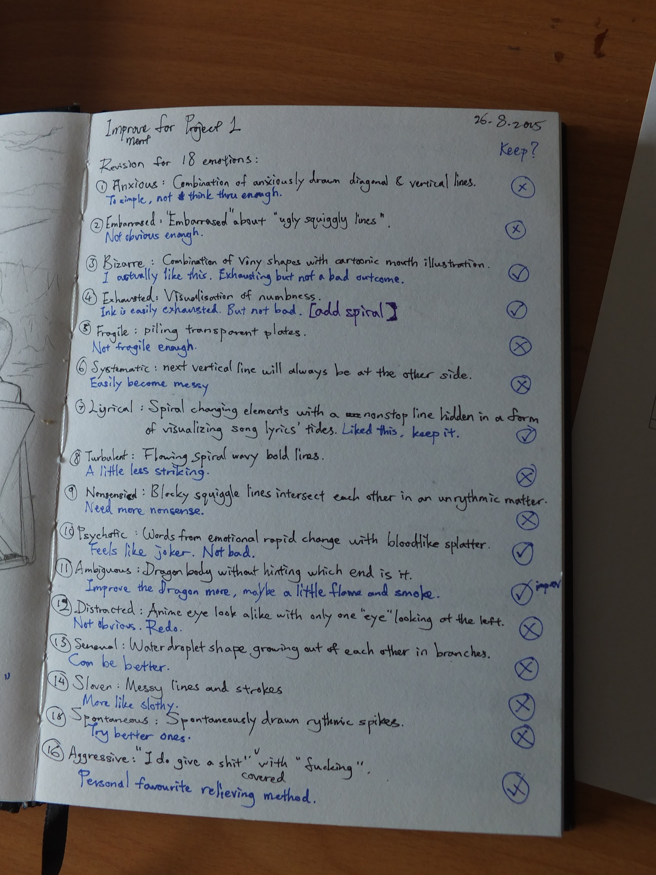
Anxious: Missing stuff might cause anxiousness yet not serious and obvious enough. Embarrassed: Finalized.
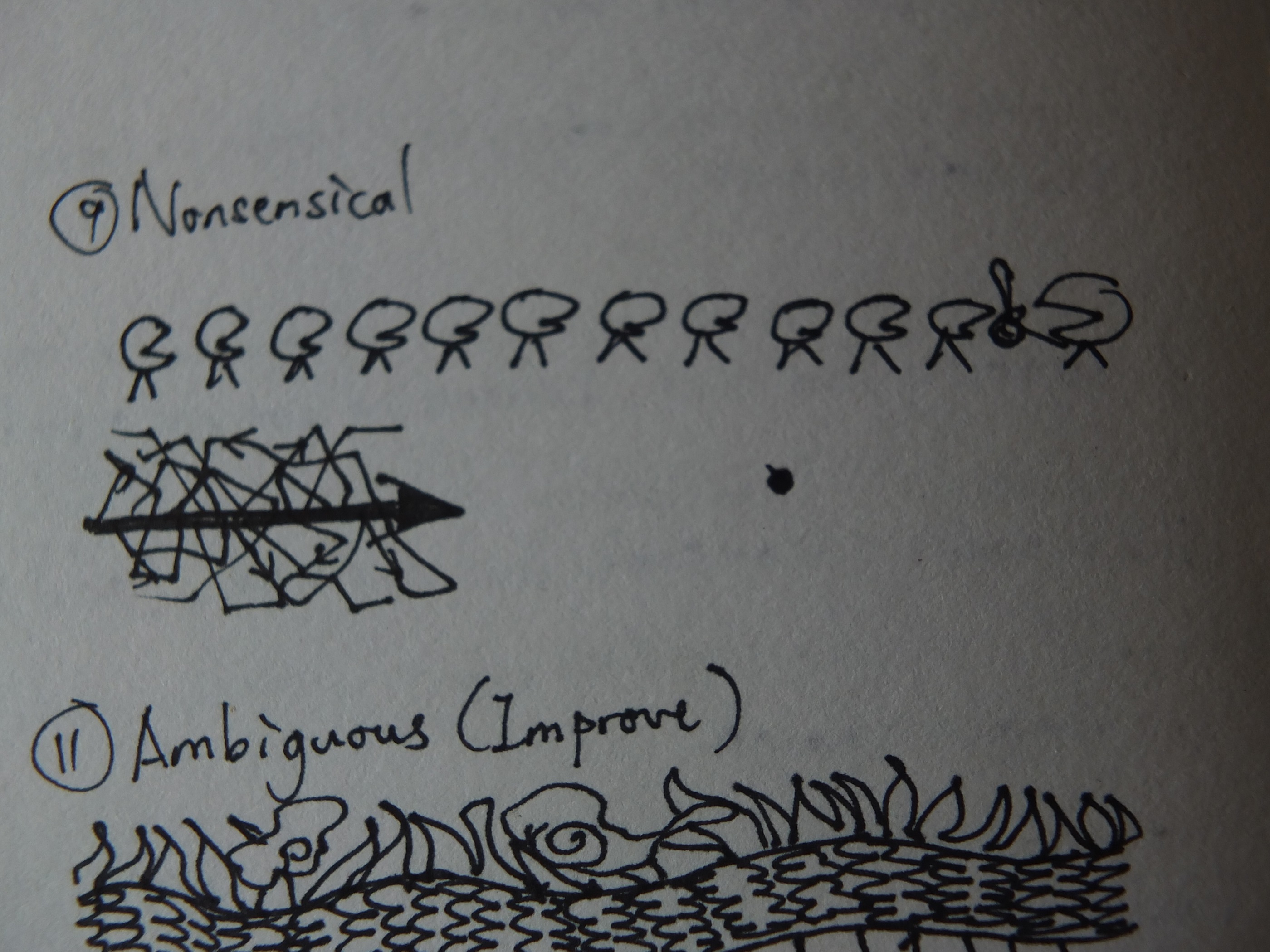
Nonsensical: First I thought of politicians but this concept is more of a picture than a line. The arrow with messy vectors signifies the messy side-plots in nonsense movie and yet again not in favor.
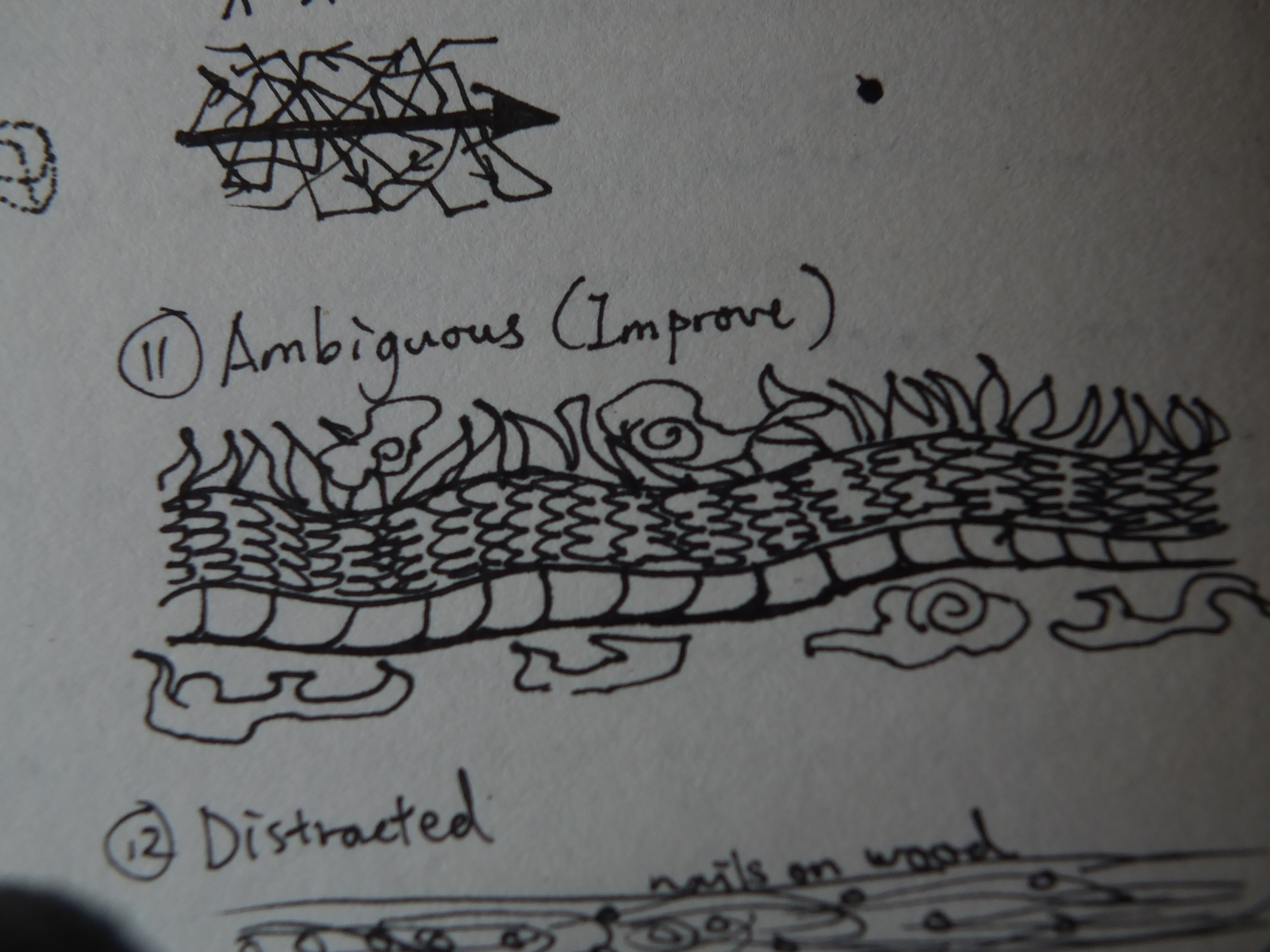
Ambiguous: The dragon body was finalized with a room of improvement. The flames and clouds can be the hint of direction but it did not function like I expected.
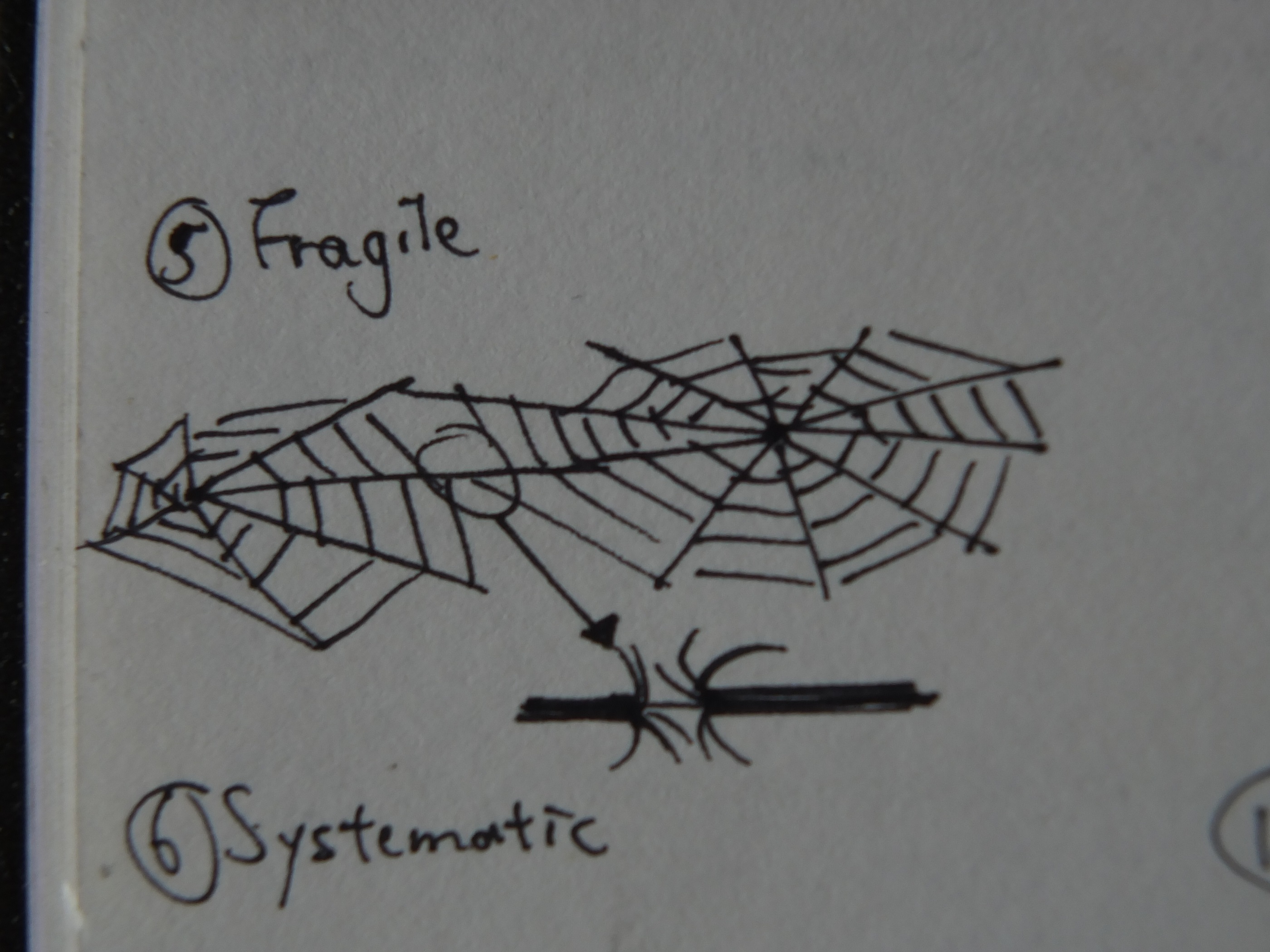
Fragile: It got its new inspiration from Exhausted’s spider web, with some little details added in the finalization.
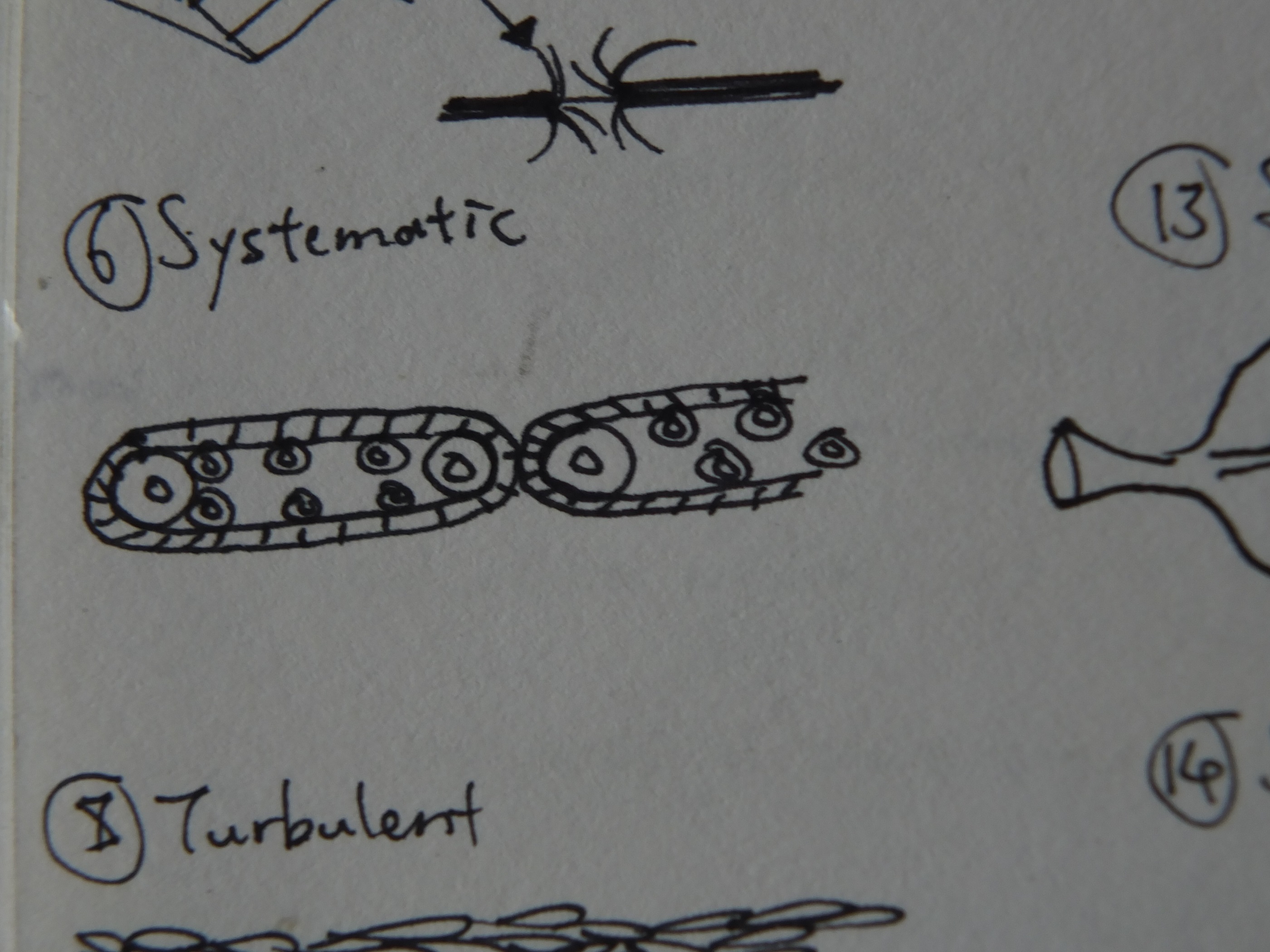
Systematic: The original line didn’t worked out as I hoped. So the line was revised and got a new symbolic answer.
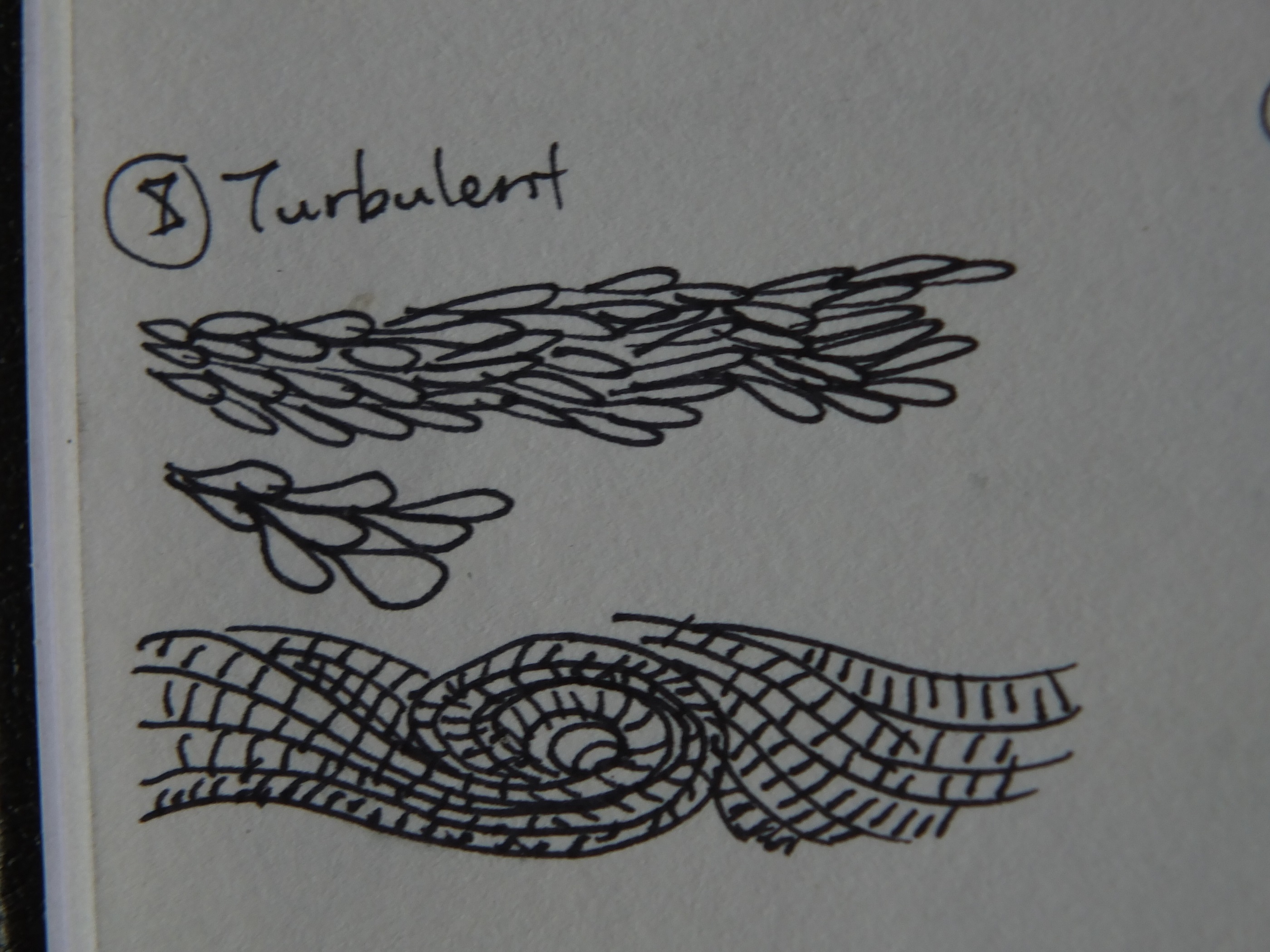
Turbulent: The new version is tricky to think because not much of fresh representation came into mind. These designs also lack subtleties.

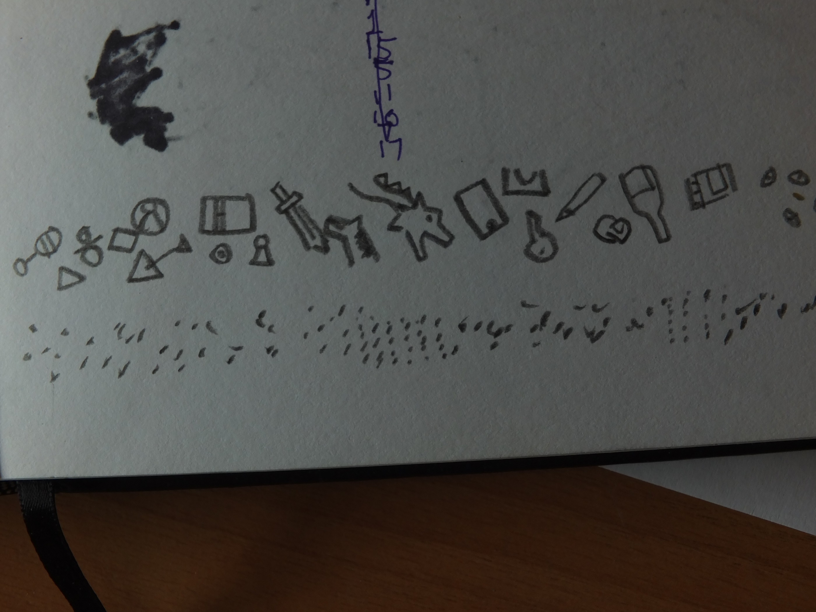
Distracted: What if someone got distracted when drawing crosses? Exaggerated and reluctant.

Sensual: This is a finalized idea but it would only work if the branches are completed in full size.
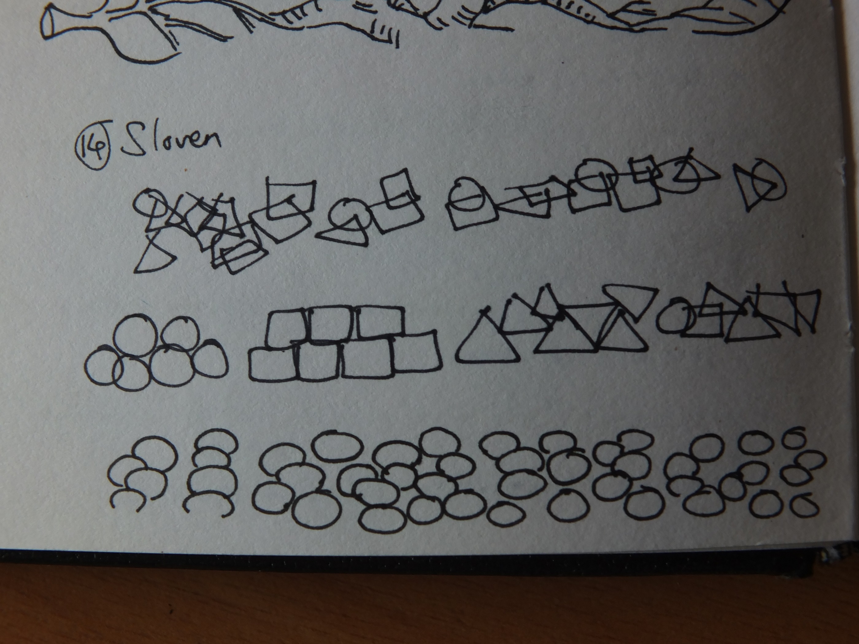
Sloven: The idea is tough as its definition can only be seen in a larger picture. Yet I don’t want it to be too simplified.
Sloven: This was done by pencil sometimes later.

Spontaneous: Finalized idea.
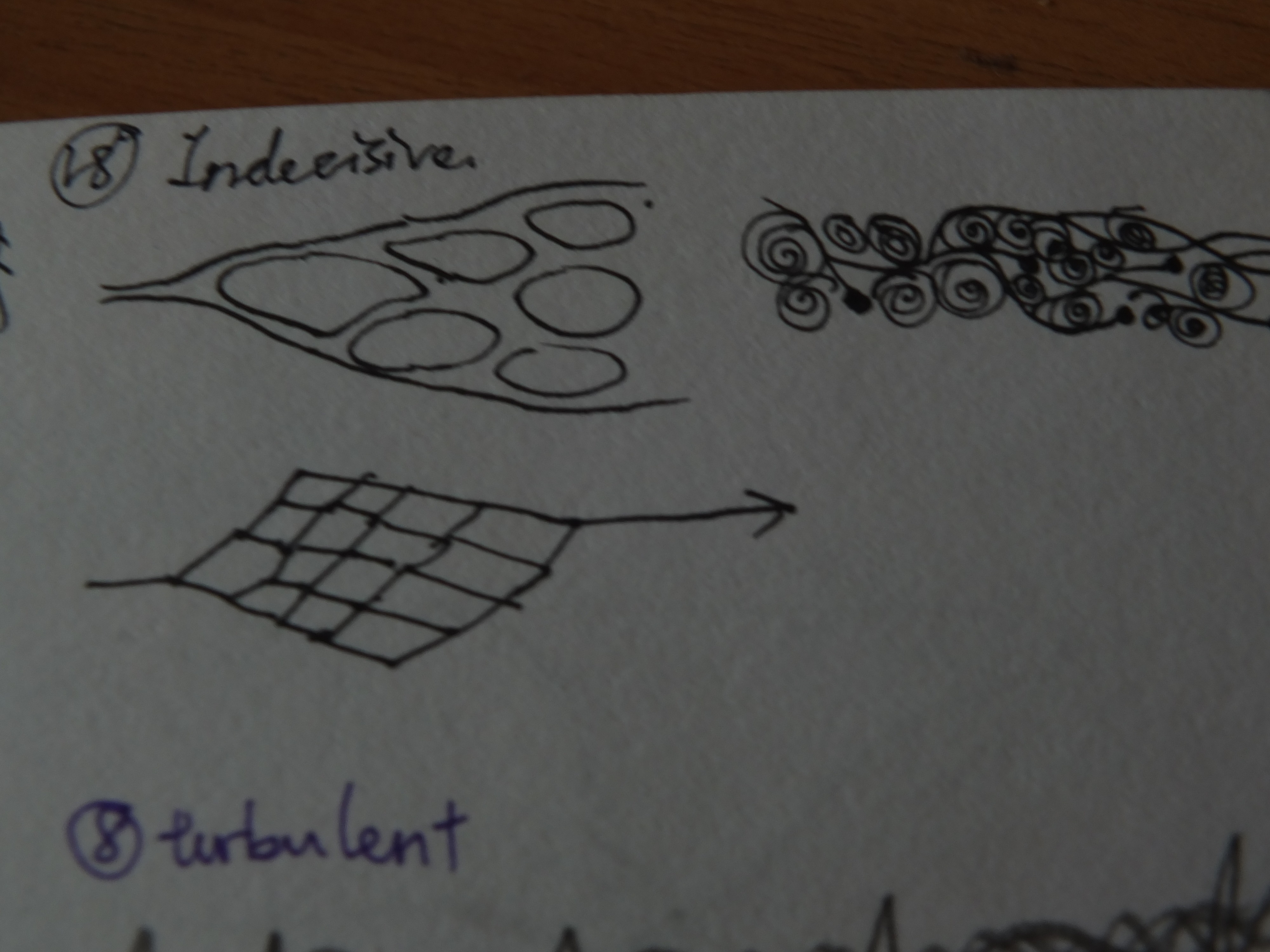
Indecisive: I’m indecisive about this as well. The main inspiration comes from the theory of multi-verse and story plot possibilities.
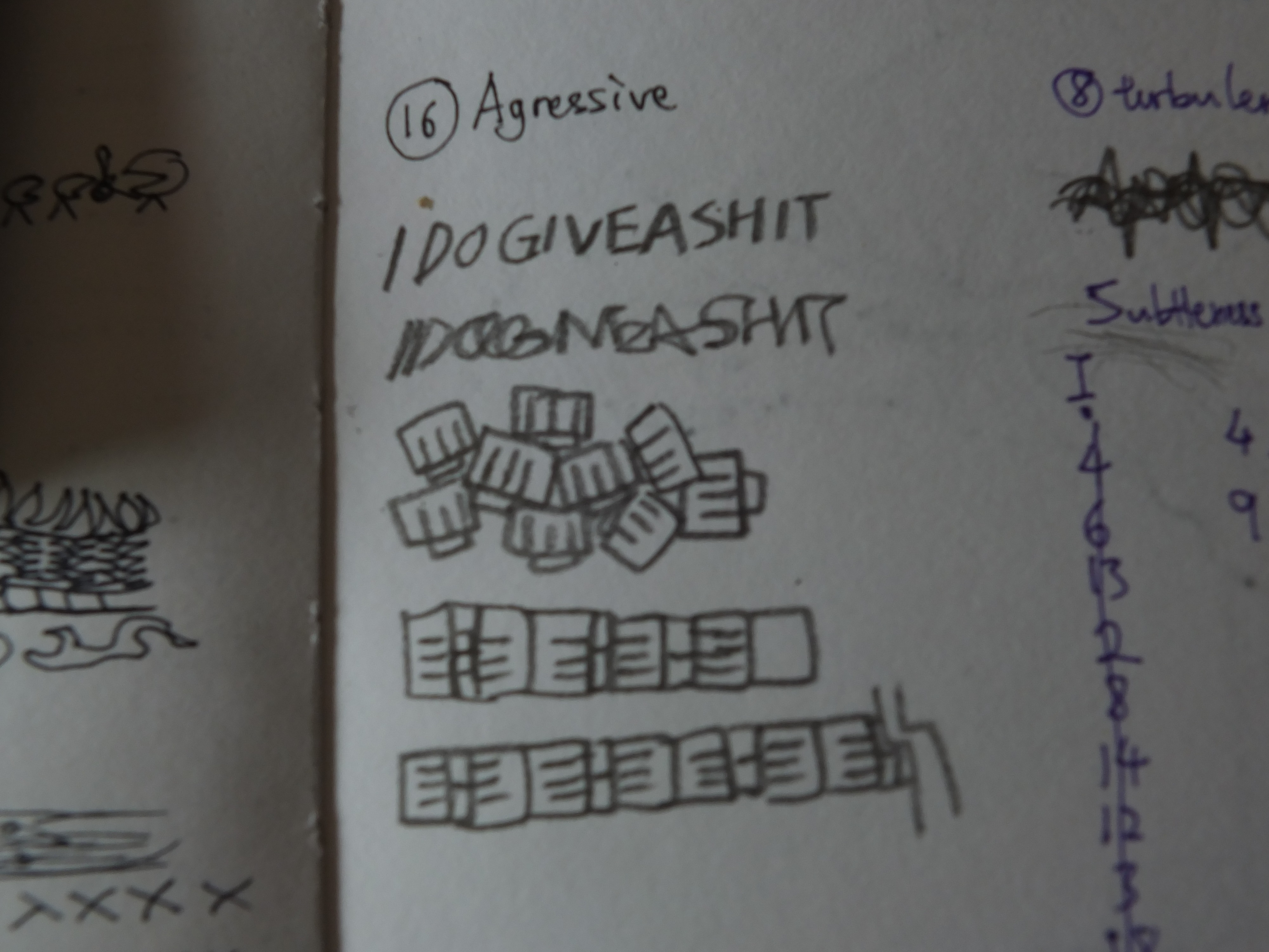
Aggressive: The emotion can be easily defined with lacking of depth. So the phrase was discontinued although it’s expressive for me.

Turbulent: It was revised again at this point.
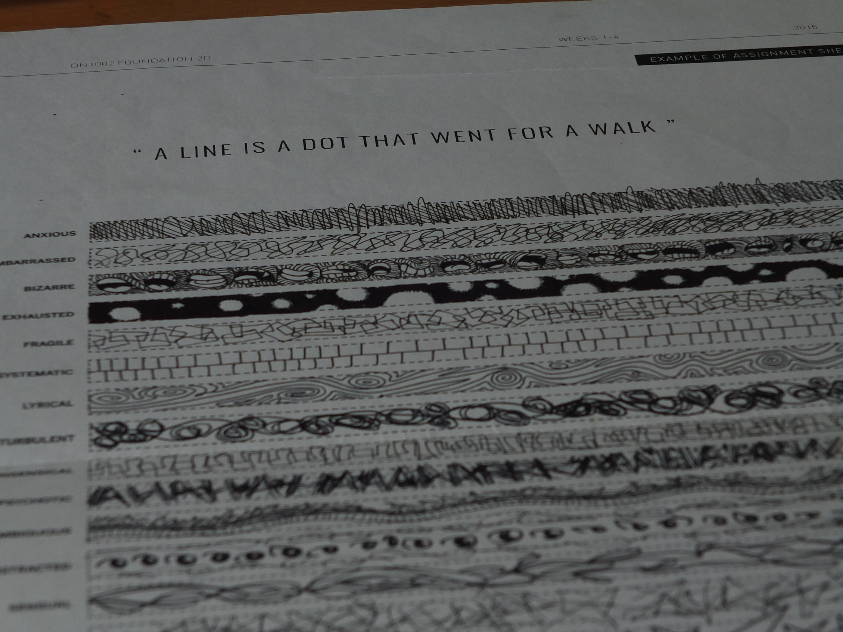
After listing out the ideas, I recalled one of the suggestion Ms.Joy gave. Since the depth of the lines are not equal, viewers might found it not interesting as it contains sudden drops of subtlety. Therefore, I can make a spectrum of subtleties to give out an ascending impressions of my work, hence the rearrangement in the last photo. This is also one of the reasons that I chose the A1 format. Moreover, the my concept doesn’t not consist of pairing and comparisons. I intended to show the whole picture in one so viewers can read the lines one by one.
[To be continued]