Like, how the heck its inventor came out with a word that sounds so rad and futuristic??

The final project of this semester is a 8-paged ZINE. For me, this sort of looks like a project that requires us to compact everything we’ve learned in 2D into a small book, with the space of trying new stuff as usual. The project enables us to insert any recent projects we did throughout the academic year into the zine. Obviously under the spirit of holy market spoiler, no one is going to just copy and paste their recent work into the zine. Till the time this is composed, I’ve already saw a few of my fellow classmates posting complete research on the ZINE itself. Imagine what they can do by just introducing their title sequence!

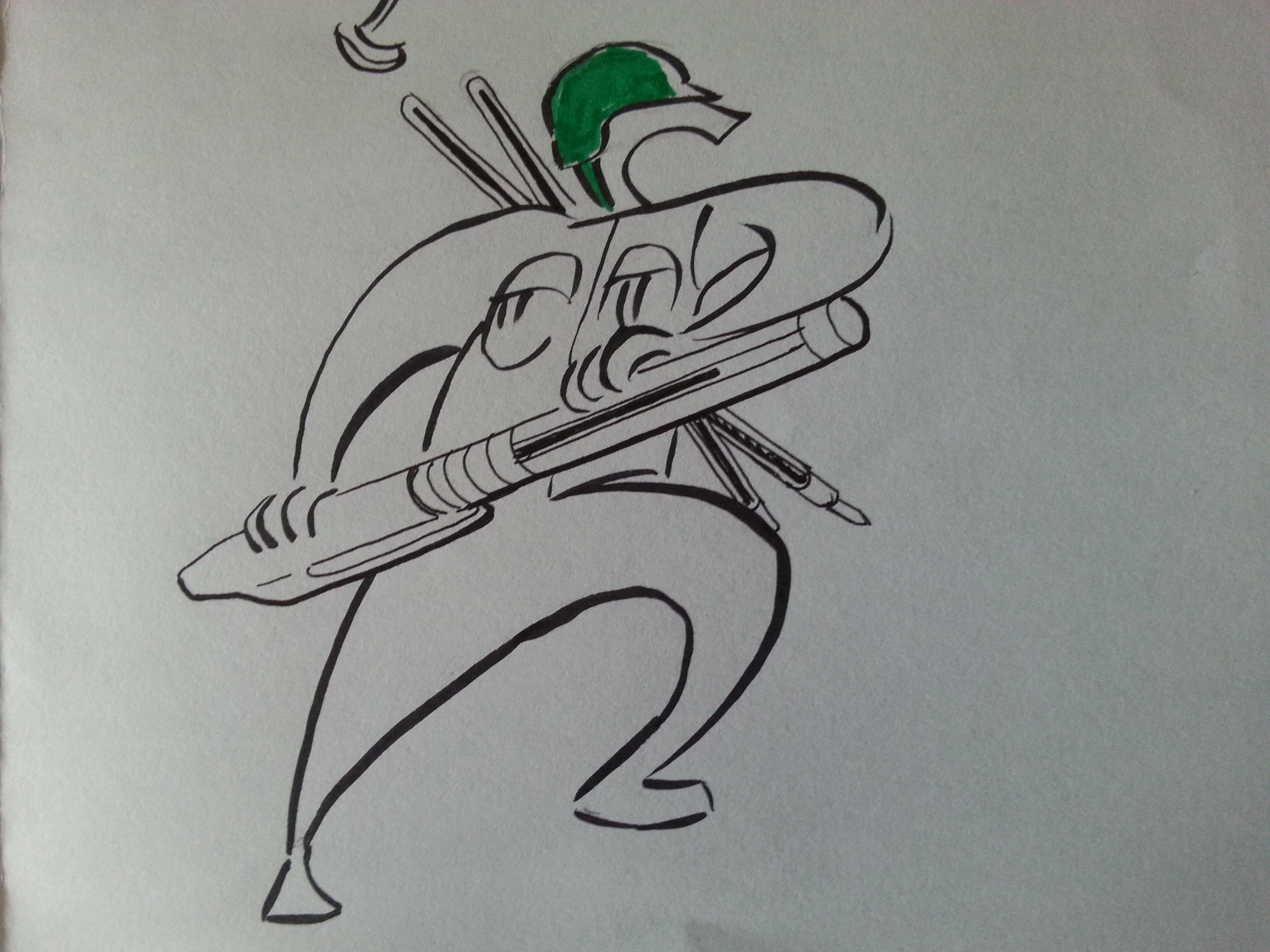
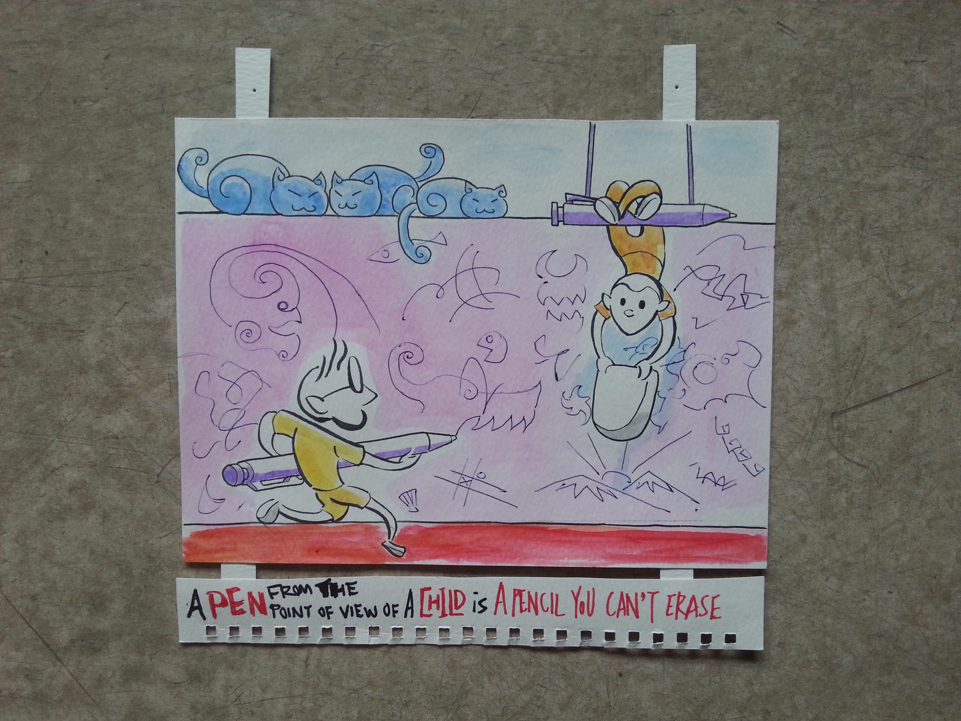
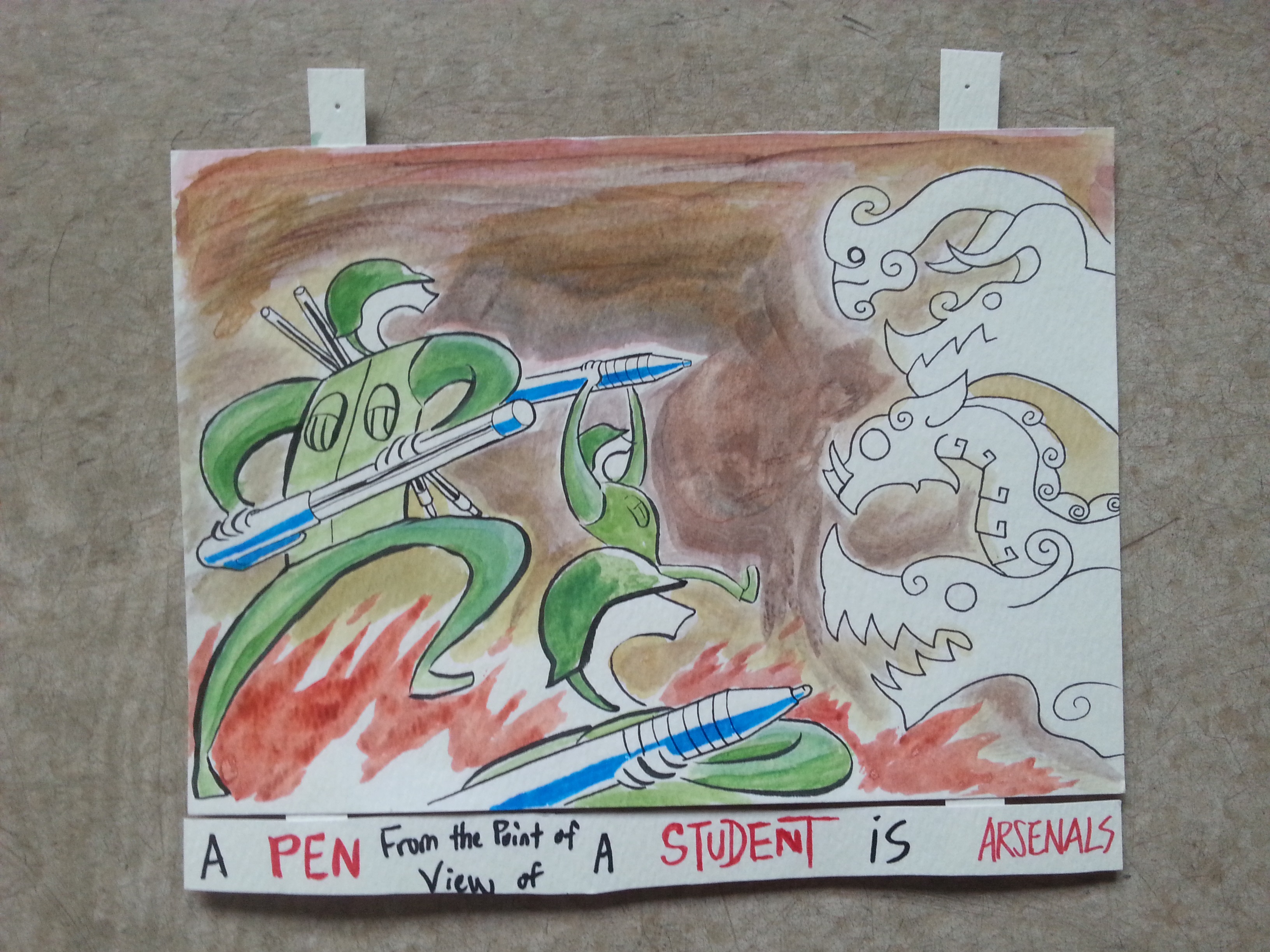
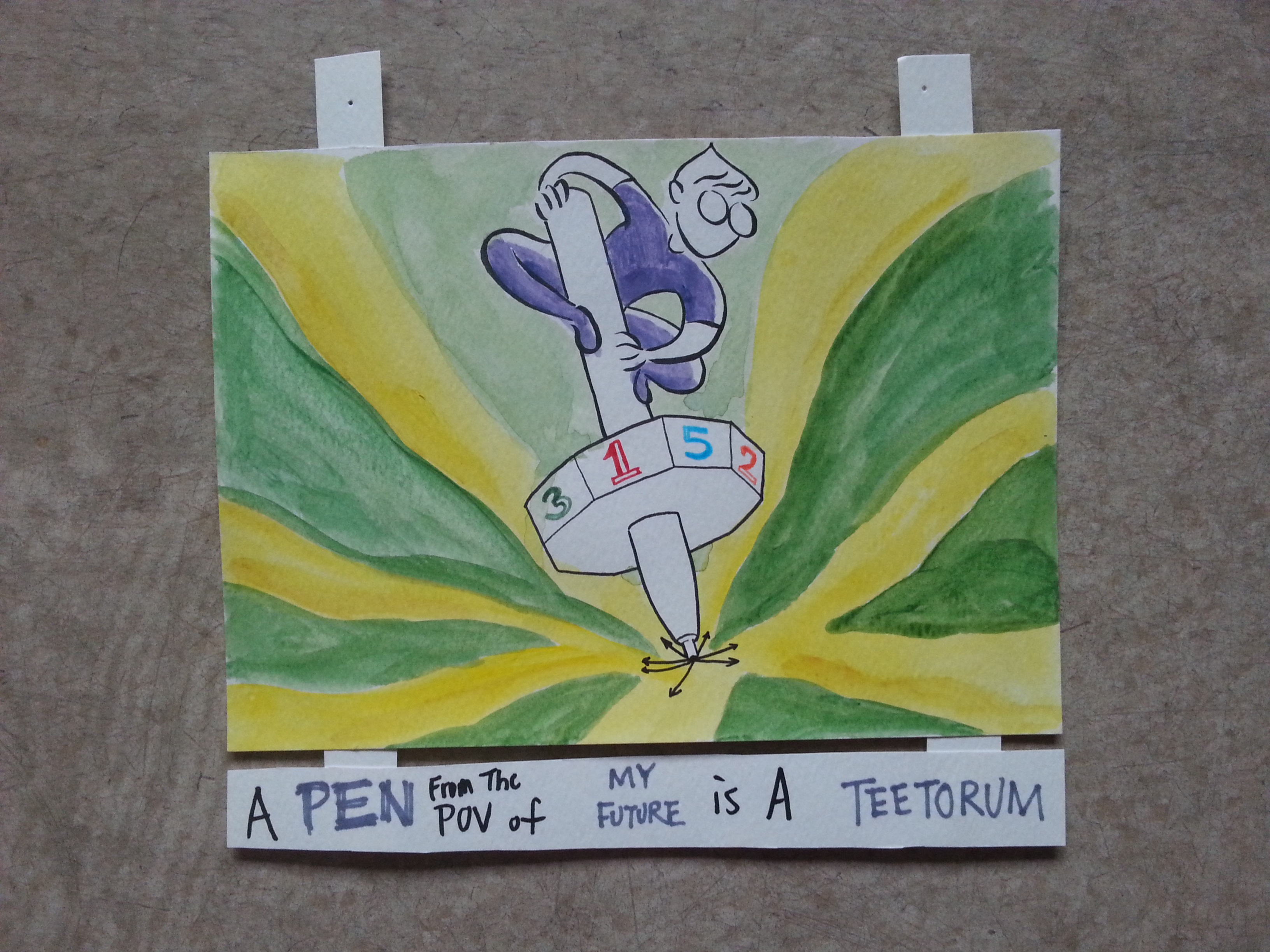
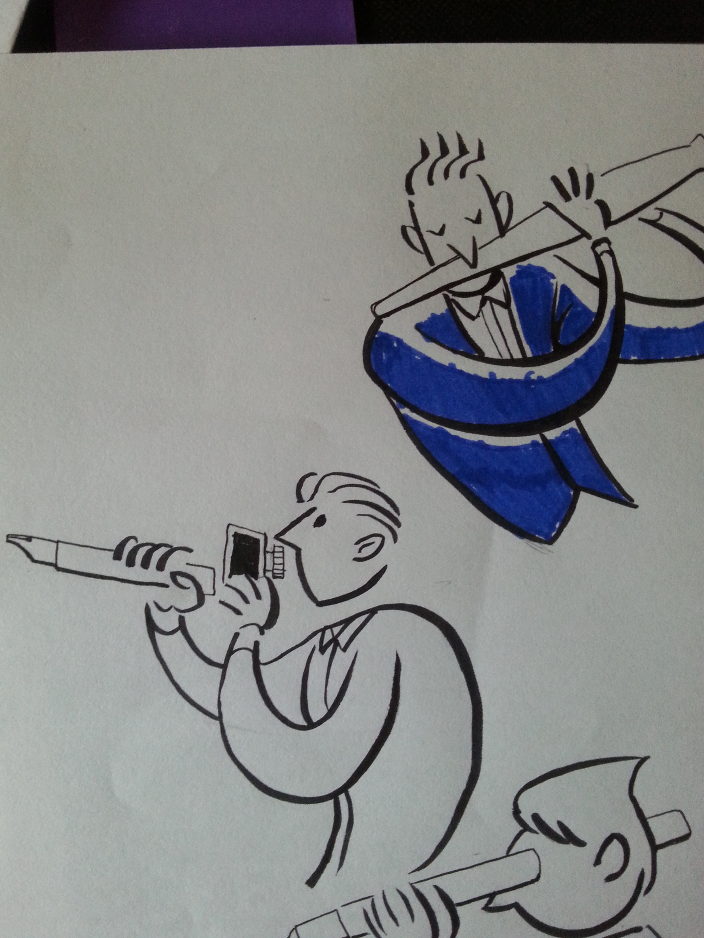
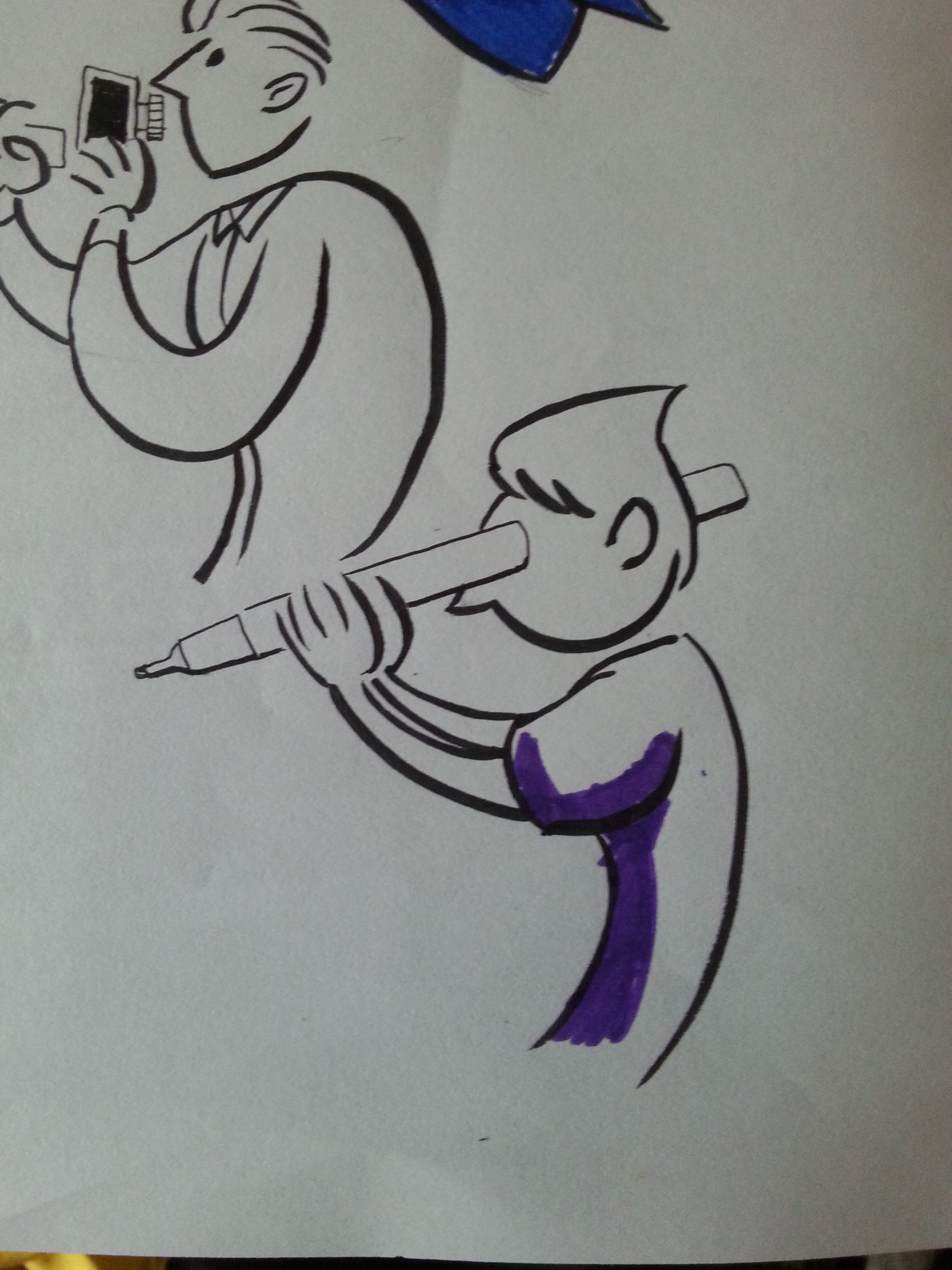
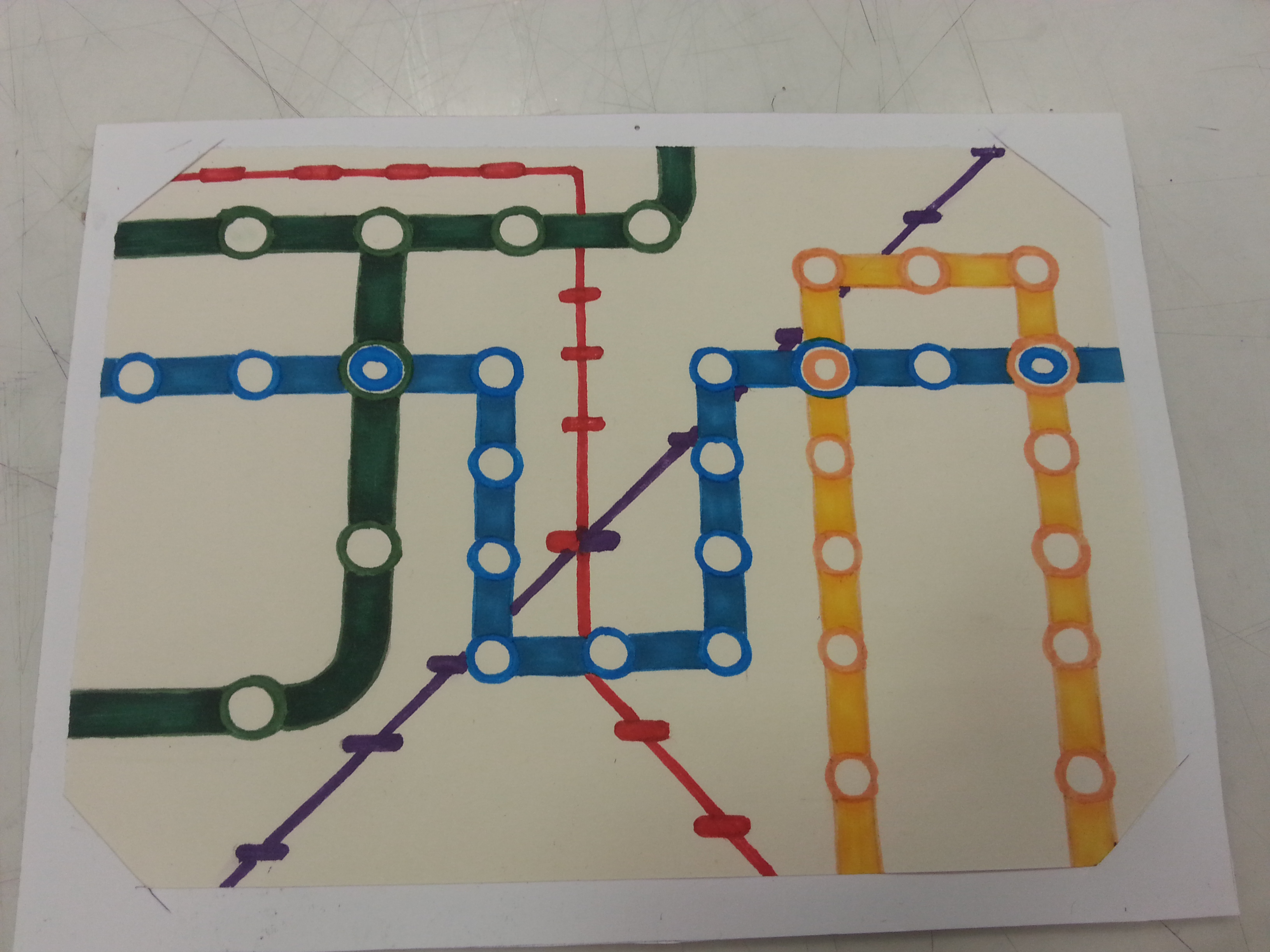
Therefore, I’d not like to waste your time and tell you what a zine is. I meant a book with such rad name should have got you google it a while ago. What I’m going to show is the idea I’ve developed for the project. As we are able to insert recent projects into the zine, I was thinking this might be a chance to make use of the composition I left out in my last project, Point of View. The zine is my chance to expand and extend my ideas about the PEN. I view this as an opportunity to make something that’s finally not assignment-based work. (Yasss, this project is damn free to work around.)

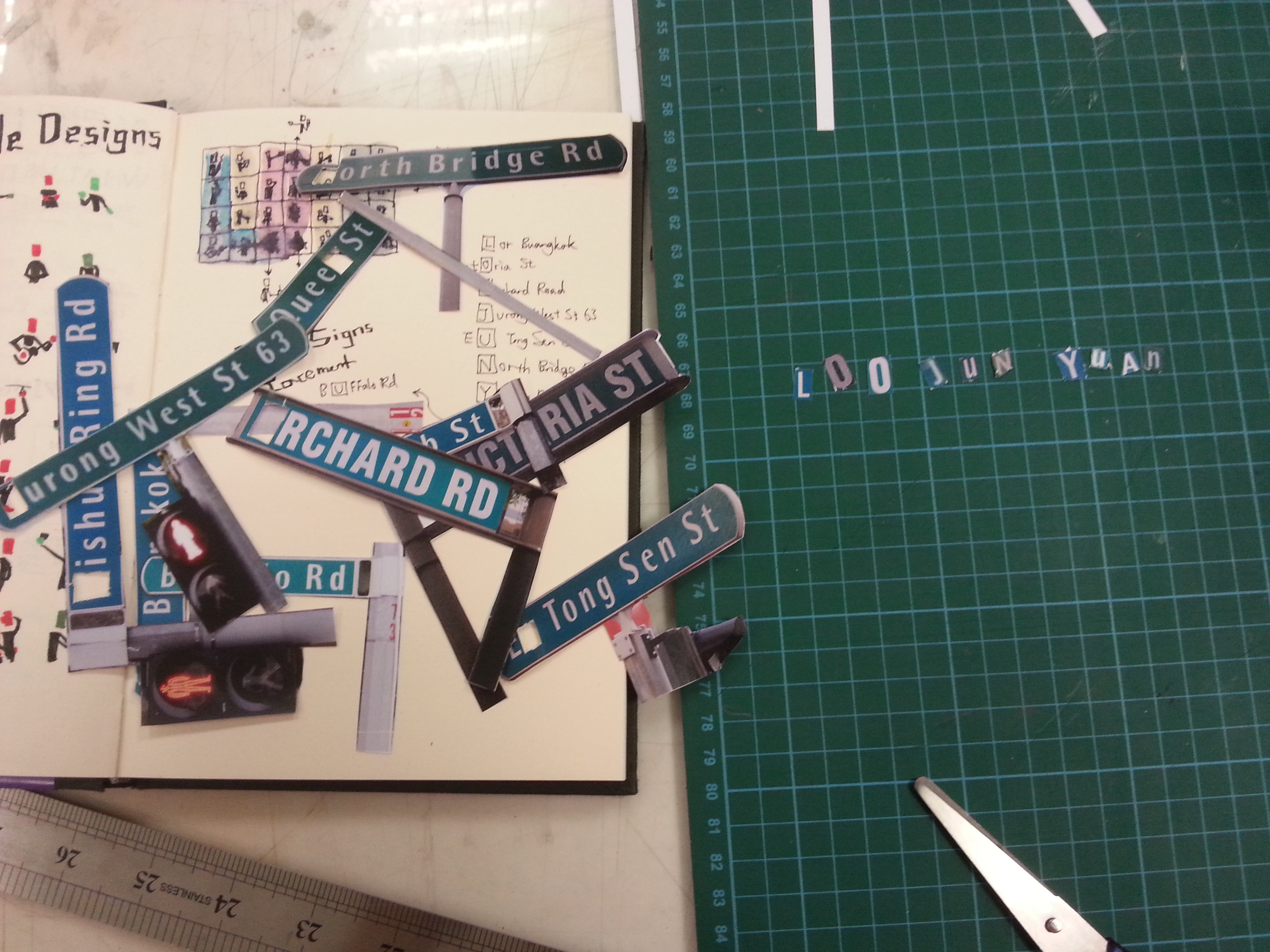
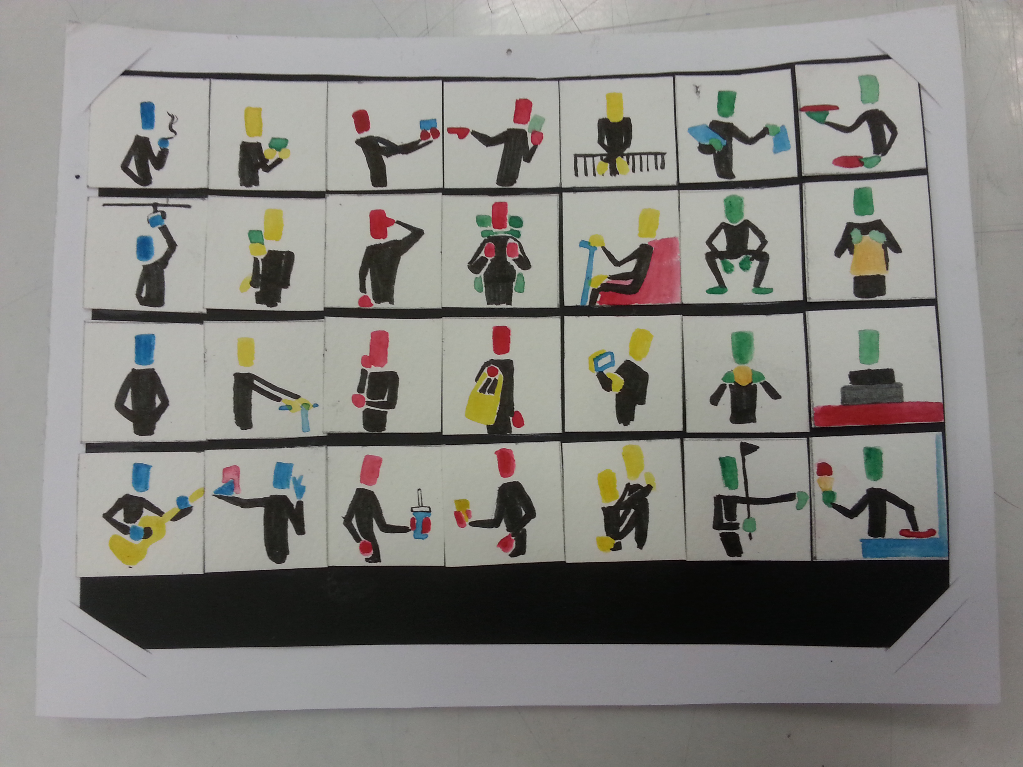
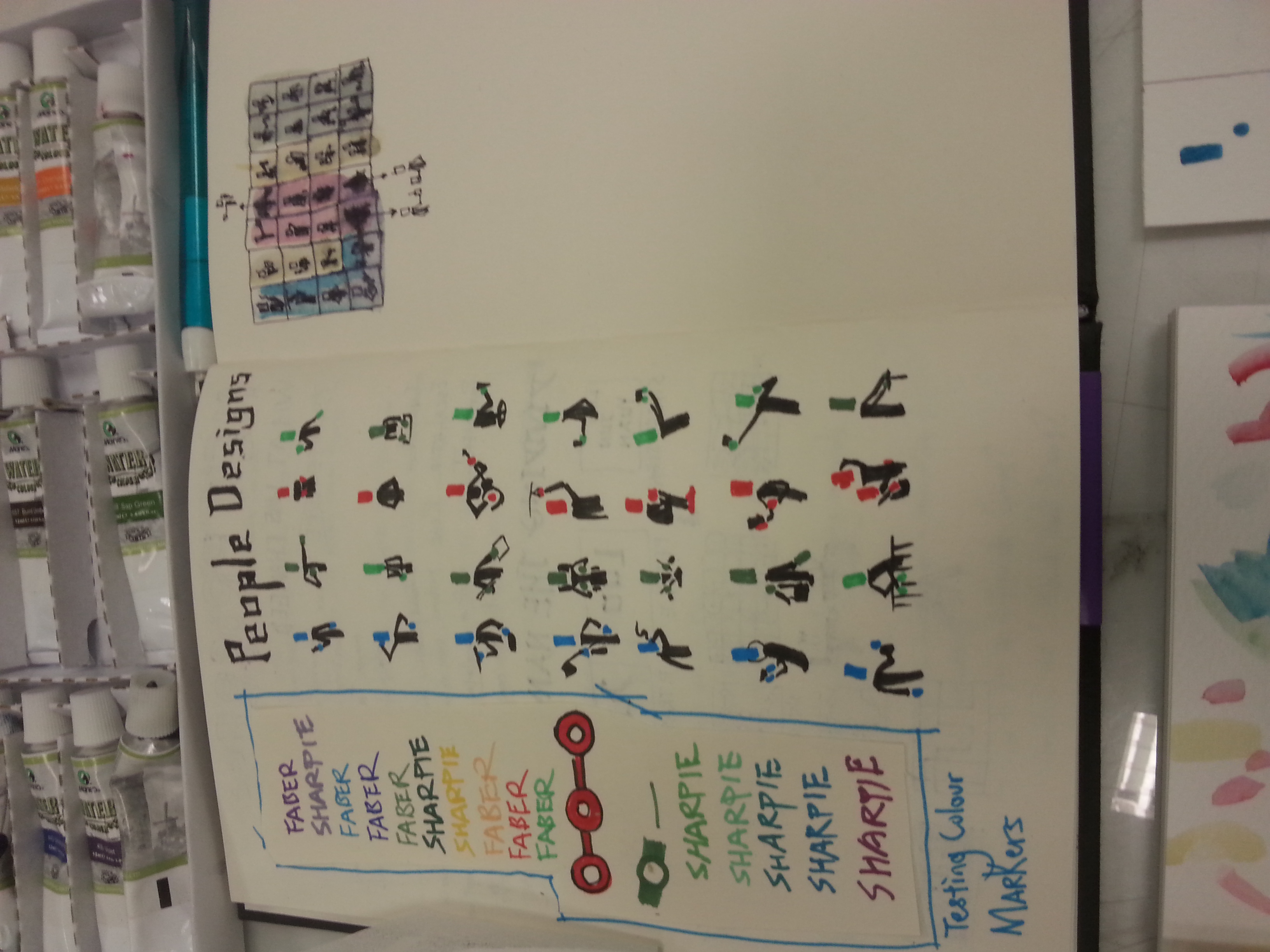
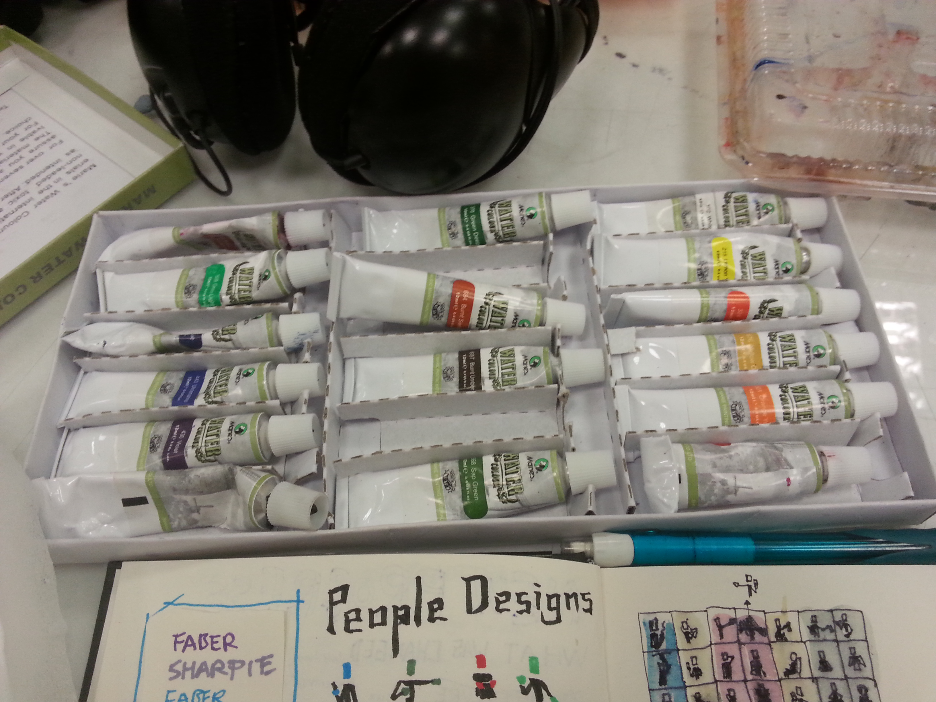
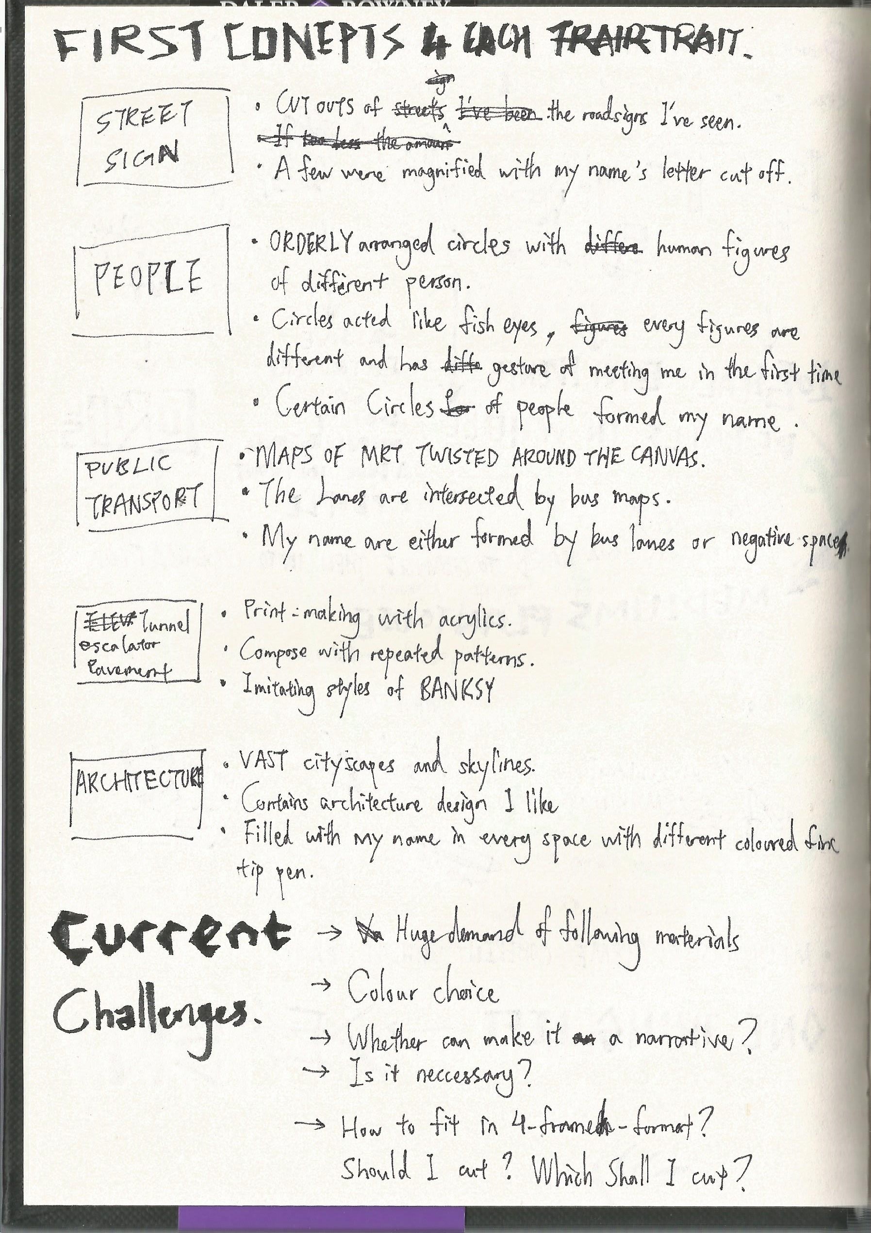
My current concept: Create the world’s thinnest narrative book with simple eye-catching illustration style with the tone of children books. What differs this work from the recent project is that the compositions’ orientation are partially altered and the medium of coloring will be shifting to digital coloring as well. Due to it’s narrative nature, I’ll be facing challenges of fluent narration and planning that makes the book worth re-reading. As many of the composition is enlarged, I would like add more interesting element. Not to mentioned I’m now required to add words to the work which made it a typography work, too.

20160403_211558

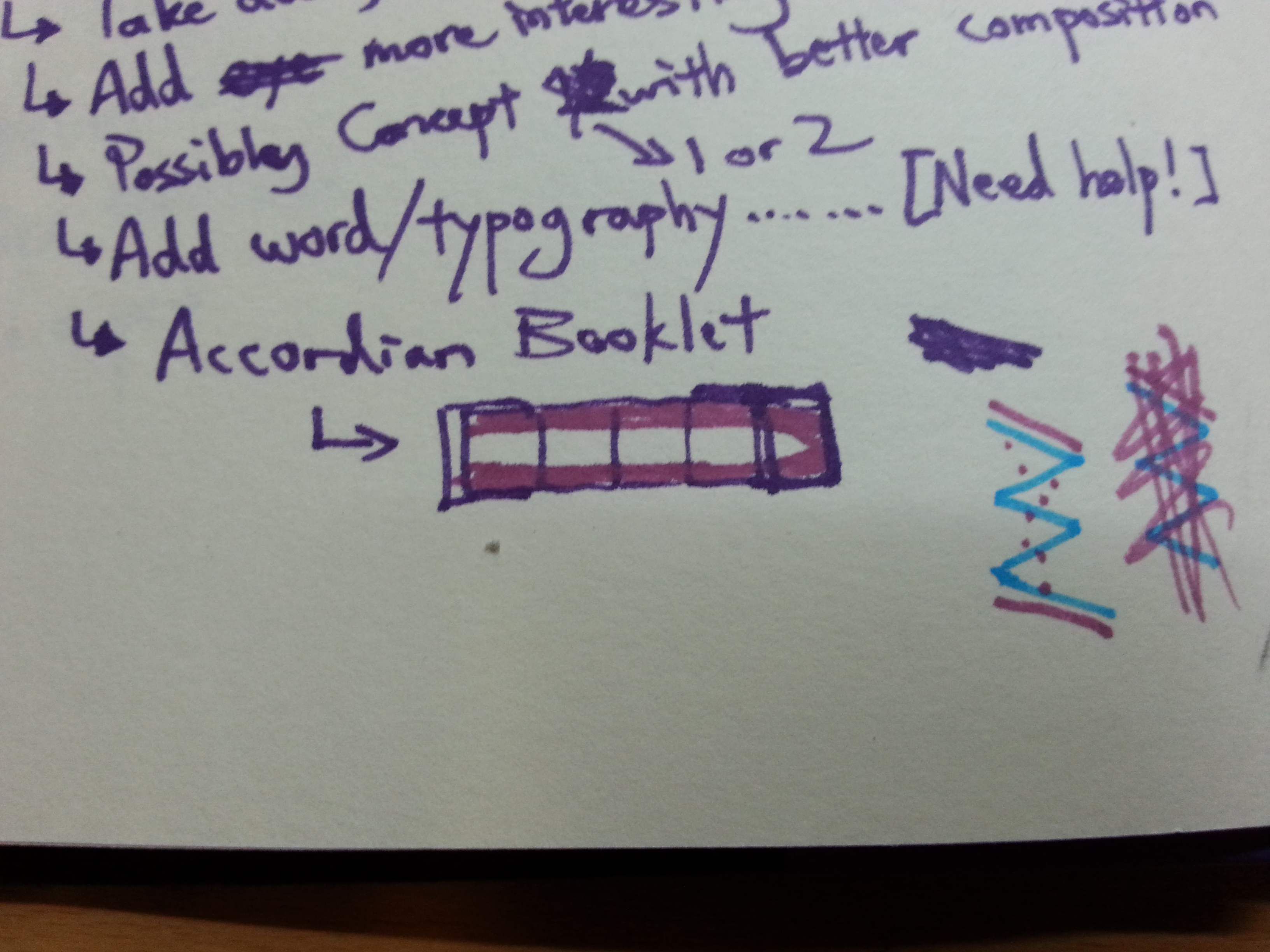
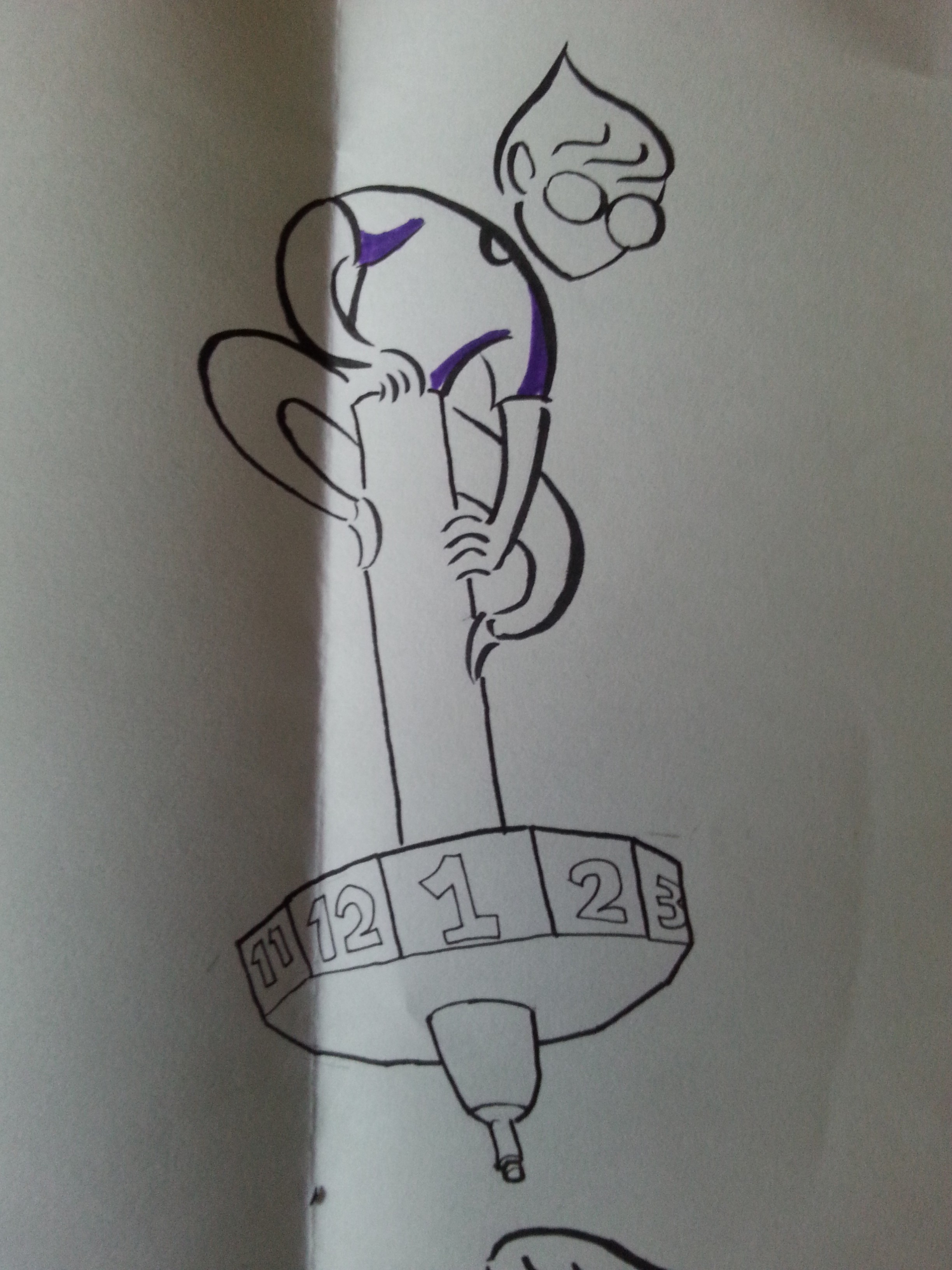
This time, I’d like to make it more relevant to the public therefore I will be removing the ME elements from the previous project. This decision will leave out many spaces for unused or new compositions, expanding its potential to become a fresh new work itself. With a children book tone in mind, I need to declare that the book was not made for children who haven’t grasp on the concept of an accordion booklet layout, which is the style I am going after. The layout will extend the total length of my zine and potentially resembles the shape of a pen. (The same consideration I did in the teetorum idea.)

Originally I was going after the art direction of Dr. Seuss or the illustrators style I found on previous project. Then I came across this artist which was shared by my high school classmate on social media.

wakemeupathappyland_00 thegirlwithoutaringfinger_07-08 lyraswhisper_17-18

The artist’s name is Josef Lee and he writes and illustrates what he claimed “Bedtime Stories for Adults. Stories about Life, about Love, about Stuffs.” I have to apologize to Ms. Joy who tried to search “adult bedtime stories” after I described his work without remembering the artist’s name. The mentioned keywords are pretty risky to lead us to unwanted sites. Resume to Josef Lee. Not only the artist’s storytelling is so random yet compels emotionally, the artist changes his illustration style drastically after every work, giving his audience a fresh new look every update. What Josef Lee inspired me is his narrative, illustration styles, and also his willing to change in every new update. This prompts me to include such quality into my zine.

I’m currently pausing in compositing stage, there’s so many to considered before jumping to execution, so please wait patiently for further updates of this Zine project! See you soon and thanks for reading!


Since everyone was so far ahead of the updates, I am gonna do a quick summarized update for my project 3 – The Library in ONE post.

Thinking of an installation art about the library is no easy task. This location is very common to anyone who has been a student, yet many of the library visitor has different perspective of the place. The ADM library is rather the most special library among our universities library. This can be due to its special layout design, use of spaces, functionality of different region, and also the research materials it contains. It’s pretty obvious for ADM library’s specialty so I won’t talk too much about it.

When it comes to conceptualizing, I’ve always like to start from my point of view. For me, the library is a place for homework, individual concentration, research paper brainstorming, and research materials searching. I always spend my extra time in the library. (only if I waiting for certain event to start and I have no sustainable leisure alternatives such as my laptop around me. ) What I like to do in the library is surfing through the shelves, and see if there’s any book titles on their spines that catch my attention. It’s kinda like surfing the internet without intentions but you do it in the real life.

SO most of my ideas originate from the act of surfing the bookshelves.

1. see through the shelf 2. obstacle 3. obstacle 2 4. I rather 1 5. I rather 2 6. blind search

(From top left)

I thought about the views we’ve missed when we search for the books, the layers of space formed by the holes that’s formed by the books and the shelves. And then there’s the inevitable obstacle set by people who were too focus on their chosen books and unintentionally blocked the pathways. The space I’ve mentioned in the first one also caught my attention and I wonder if I can express how certain series of books have lost their timeliness due to constant technological upgrades. I’ve also wanted to play with searching action by deliberately covering the paths to increase the difficulty of my “bookshelves surfing”.

The responses from I got from Mr. Michael Tan, is that these works can be improved in terms of directed perspective, importance, and relational attributes. Several artist works are also introduced such as Michael Lee Hong Hwee and Robert Gober,

Finally I’ve chosen the idea of placing little figures around the shelves that stimulates my idea of bookshelves surfing. The decision is based on removing the installation ideas that isn’t manageable, completely curated, and relevant to the whole 4D modules. The little figures concept is inspired by Michael Lee Hong Hwee’s work as he printed out many scaled down versions of him and set them “free to play around”. I wanted to try the concept with my own interpretation and context.

The challenges of the work is the consideration I needed to take on about the work’s detailed presentation. This includes the amount of the little figures, their presentations, and their consistent actions to fit my theme. I will have the mock ups completed within the following week.

Thanks for reading and please look forward to my updates!

Project Point of View is over and it’s been fun. To show how much fun I’ve been, let me show you my whole final work and progress. Click in, scroll down, do what ya need to do.

The theme I’ve chosen is concept number 3, The Journey of the Pen, with ME. The reason I chose this theme is not only it’s complete but also how thought-out the composition is. A hypothetical transition from the past to the future, categorized in 3 periods of time, two for each. This transition shows how the PEN has accompanied me over the years, and how I hope it continues to do so.

A traditional pen is hard to be replaced as long as handwriting is still cool. A traditional pen, sure, leaves the mistake on, but we are able learn from these mistakes as long as it stays appeared to remind us. IT shows our process of thinking, proving our humane improvement. Okay, I sounded like a person who denies technological advancement, but these pen still has its value until the day Apple pencil doesn’t need to be recharged.

Let’s start walking through my final work, shall we? So the first journey from the past of the PEN with ME, is being through my childhood.

A PEN from the point of view of A CHILD is PENCIL YOU CAN’T ERASED

20160320_165732

I won’t represent myself to everybody’s childhood, so I’ll just show my own version with my first meeting with the pen. After I learnt how to hold a pencil as a child, I love to doodle in the papers with my bad handwriting and my juvenile drawings. When I first picked up a pen, I was excited and drew so much stuff with it. My curiosity was shown in my naive strokes. I was shocked by the fact that how pen marks can’t be erased. If I make a mistake, it will be there forever. Thus I was very careful with the pen till the day I discover correction tape. However, I find correction tape ruins the papers so I started use strikethrough. Since, I have no fear while using a pen. (But we still can use our pens till secondary school years.)

A PEN from the point of view of STUDENT is ARSENALS.

20160320_165755

I got my inspiration from a popular manga called “Assassination Classroom”, which stated no matter what our ultimate targets or dreams are, we shall always have our “second knife (weapon)” ready. Even though I wrote “manga artist/filmmaker” countless in my essays, I was living under the hood of a rather strict-about-academics family. I’ve never regretted striving for good academic results as they’ve lead me far enough till now. University is the furthest a good report card can take us to, but I’ll never forget the hellish war we’ve been through in the examination halls. (I said it in the critique session, I’ll say it again. Our real soldiers fight in more hellish war and training, and they fight harder.) The pen is our only offense in exams, and we should never walk into the halls without extra ammunition (extra refills as shown in the illustrations.) Initially, I was going to insert textbook formulae into the white monster on the right, but then I decided, leave it to simplicity and imagination.

A PEN from the point of view of ME is MIND PROJECTOR

20160320_165846

Most of the time, my brainstorming only starts when my pen (especially my ARTLINE fine tip pen, as illustrated.) touches my visual journal. That’s how all my project started since the last semester. Not only it’s my motivator to my procrastination, it also made me take a look about what popped in my mind before revising. For instance, this gruesome composition popped in my head and my pen visualized it. Perhaps this is the best way to show how mind is projected through the pen, in terms of my style.

A PEN from the point of view of MY FACE is A FACE MASSAGER

20160320_165901

In present times, as ADM student like every other ADMers, I have tons of assignments to brainstorm, and my mind is not a firecracker that can pops idea every minute it burns. Therefore, there’s definitely times when my mind is as blank as a paper. What does it do whenever I can’t think anything? A face massager, of course, as it pokes every acupuncture points I can assume in hopes to boost creativity. Whoever learnt science here is going to confirm, it won’t work. Poking my skull through layers of meat definitely describes my current state as a learner.

A PEN from the point of view of MY FUTURE is A TEETORUM

20160320_165917

Why a teetorum? Pronouncing makes me giggle too. I doubt that I pronounced it correctly. Teetorum is the given name of a spinning dice. I chose spinning dice as it is a fate decider/diviner that resembles a pen with its stick-like figure. Thus I combined the two together and formed the one in the illustration. As I am unsure of where my future go because things don’t go 100% with plans. But that doesn’t mean I can’t control my fate of where’s my career heading. I believed not only the pen helps me determining my future, but also gives me the authority to do so. Many of my fellow dreamers might holding different version of pens, but I’m sure our ambition about fate will likely be the same.

A PEN from the point of view of FUTURE ME is A BELL JAR.

20160320_165930

The future is like a ball of unwove thread. Knowing myself the best, I believed my future will need a fortress of solitude under the possible pressure of my future jobs. Thus my own version of terrarium is formed. Even in my present days, I find my time-to-time fan art ink illustration meditating and relaxing. The pen shields me from all mental disturbance ever since and I hope it will do so in the future. And what’s not a better way than placing the pen as best inanimate buddy in the last panel to wrap this all up?

I decided to go with diluted acrylic because it greatly resembles the effect of water colors and acrylic is the most abundant art material I have. Diluted acrylics to me is like a pen to my childhood. Why? Acrylics can be corrected in its oily state but once a mistake is made in its dilute form, a saturated form is needed but it will then destroy the effect I intended. Fortunately, they all worked out like a charm. This is probably the first I resisted the urge of fully covering an illustration with colors because I found there is an effect of dragging attention to those blank space by not coloring them. The work also trained me well in using brush pen as the main inking tool.

Overall, my fellow classmates like my use of the thick and thin ink strokes. Even though I’ve used the character style of Adam Lurkam and the attempted imitation of Jacqueline Bissett’s strokes, the viewers in the critiques agreed that the work projected my personal attributes. Moreover, it does succeed the children illustration look I wanted. I am satisfied with the outcome and the traditional medium I’ve challenged.

I have to mention everyone else in my class did a splendid job in their work as well. I am going to miss the times we get to spend in such eye-opening critique sessions. Looking forward as usual to everybody’s zine works!

Thanks for reading!

Yes, the current progress I’m gonna show is my concepts. Through the brainstorming of the point of views, I found I’m easily restricted by the 18 points I brought up. Well, it’s the easiest to start from, which soon enough caused me some trouble.

types of pen

Selecting a suitable pen for each compositions.

Concept 1

First concept I thought up is based on the professions. After rereading my POVs in the previous presentation, I found some of them could not easily visualized with illustrations, especially from the subject RED. The PEN is rather visual to express as I compared it as other objects. Therefore I’ve filtered the 18 points into 8, not only because they can be visualized but also because that they are from my daily observations, comprehensions, and imaginations.

I listed out the following subjects and their POVs towards a pen that would likely to be in the final project.

  • A PEN from the point of view of CHILD is PENCIL YOU CAN’T ERASED
  • A PEN from the point of view of CALLIGRAPHER is MUSIC INSTRUMENT
  • A PEN from the point of view of WRITER is PAINTBRUSH
  • A PEN from the point of view of DRUMMER is DRUMSTICK
  • A PEN from the point of view of PENTURNERS is ART
  • A PEN from the point of view of LAWYER is GUN
  • A PEN from the point of view of STUDENT is ARSENALS.
  • A PEN from the point of view of ME is MIND PROJECTOR

Reason to select a PEN: A pen to me is ambiguous as it shows what I think. Either an image, a story, an answer, or a plan can’t be confirmed until the tip glides through the paper.

20160312_155745

Material contain spoilers. (If you can read it ;P)

I’ve paired them up in order to see if there’s any comparisons or contrasts shown, in such that

  • Children vs Students (They’re stages of growth everyone must’ve been through.)
  • Calligraphers vs Writers (They create things beautiful to the eye and the mind respectively.)
  • Drummers vs Penturners (One uses it not for its original purpose, the other made it as an art.)
  • Lawyer vs Me (This pairing make no sense, at all.)

The problem with concept ONE is it lacks a convincing theme, and it’s difficult to think of something to tie them together. Based on past experiences, it’s better not to push too much into a concept that can’t work or only work reluctantly. Therefore, I had to brainstorm another concept.

20160312_155649

Spoilers alert!

Concept 2

Perhaps I can direct the project into a narrative or transitional? This is what I thought. Ms. Joy suggested building my concept on current affairs, using pens a metaphoric medium. However, due to my lack of sensitivity on the mentioned theme, a self-exploring theme might be a more suitable theme that I am able to handle.

Focusing on stages of growth in the first concept, I based this concept on the object: CHILD, STUDENT, and ME. Thus, the new concept: EVOLUTION OF ME (Maybe) is formed. Why the bracketed maybe? This is because my current stage stop on ME, it’s only half way there. (NOT in terms of biological life-time.) The next half has to be hypothetical, hypothetical about what comes after ME?

I wrote ARTIST first under the obvious reasons. The word ARTIST is generic, it can be painter, designer, musicians, calligraphers, performing actors, and so on. Meanwhile, feeling the previous statement for ARTIST isn’t suitable, I came up with a new statement:

A PEN from the point of view of ARTIST is A SWISS ARMY KNIFE.

Then, I added WRITER in a generic term. It’s an alternate term for creator, any ideas: a film, a piece of music, literature, installations, or biopics, they all started with writing. Therefore, this stage of our creative career is the stage when we are creating our legacies, or masterpiece. The fun part is, this stage can coexist with the ARTIST stage.

What follows is TEACHER, an educator. Not only we’re leaving something behind, we have to leave our skills, ideas and wisdom, things that are hard to be inherited completely. What can we do about it? We teach, we pass it to the next generation. Thus:

A PEN from the point of view of TEACHER is STICK & CARROT and A WAY TO PASS DOWN OUR WISDOM AND KNOWLEDGE.

However, even in such concept, there are some composition created aren’t consistent with the whole project. Some of composition created left me uncertain as I felt they did not do the statement justice. The uncertainty worries me, so I created another concept on the same transitional theme.

Concept 3: The Journey of pen WITH me.

A theme with a hypothetical transition for the future, this future is more realistic, and less philosophical. (Am I philosophical for the previous theme……?? HAHA) Parted with three time periods: past, present, and future, this theme focused more on myself personally instead of the generic profession. (Which kinda opposed to what I said in past posts.)

New components are added such as new object: MY FACE and FUTURE ME. With the new objects, new statement are formed:

A PEN from the point of view of MY FACE is A FACE MASSAGER

A PEN from the point of view of MY FUTURE-SELF is A TEETORUM

A PEN from the point of view of FUTURE ME is A BELL JAR.

The concept was said to be more curated, but the theme is still young and there’s a lot to think in terms of presentation and compositions.

I try to be secretive for my statement explanation as not only I try not to spoil everything in case the statements are selected, and also I wanted to let the illustrations speaks for themselves.


EXECUTION

For style, I’ll be referring to the artists/illustrators I’ve found for the previous presentation. I’ve experiment with the styles and with the tools I find interesting, a brush pen. I’ve would wanted to try different types of pens for the work too just to emphasize my works.

art style attempts

Art Style Attempts

The project will be a combinations of various artists’ styles that can be seen in first glance. I’d love to try an illustration with

  • Jacqueline Bissett strokes for the main character.
  • Adam Lurkam’s style for the main character designs, and Mia Nilsson‘s for the supporting ones.
  • Chrissy Lau and Rohan Eason styles with detailed background illustration.
  • Maguma’s or Alexandra Ball’s 2 dimensional compositing.
  • Andy Gellenberg’s solid coloring if required.

They either can be done with wet mediums or digital post production. Perhaps it’d be like the decision of my previous project, regarding mediums attributes.

20160312_155815 20160312_155822 20160312_155834 20160312_155848 20160312_155854 20160312_155811 20160312_155838

After the group consultation, some composition attempts, and the execution trials, I was advised to not adding too much complicated components in the works to make my main characters stand out more. Simplicity is the best brilliancy I supposed. We’ve also decided that computer scanned watercolor medium can be used to avoid any technical issues.

Next week, the project will be completed, so I have to keep it spoiler-free, but please look forward to my selected concept.

Thanks for reading!

It’s difficult to talk about a residence in a deeply manner without staying more than a day. In my case, however, a total of 4 hours after three visits is what I get. I can’t complain about the 2 hours of traveling which required switching between 3 transportation lines as this kampong is the subject I chose, and I have to find the theme out of it.

So I think the third trip kinda proofs that ideas will come to you by itself. I kept getting something new in every trip. When I try to investigate some aspect of the kampong, the kampong put me down at some point and came up with another point for me to make. Long story short, the idea for the video is born.

The whole video format is inspired by video essayists on Youtube who narrate their subjects and sometimes interact with what they edited. So, it’s my first self-narrating video, please pardon my tones and accent.

When a type place became rare, people are ensured to make a big deal about it. This is my answer to what I try to contribute for the kampong’s overdone status. This video focus mainly on one random interviewee, and usually the representative, Auntie Sun is the one who do the explaining. When a random villager has the same issue with their as what the representative said, this issue can be proven kampongwide. (Auntie Sun told the same zoom-in-to-a-grandma-house story on my second kampong trip.)

I hope that it came out sort of like a public announcement, not to leave them alone, but respect them as a residency of Singapore. They don’t mind their kampong is famous, but worried that their peaceful life style is affected for the rest of their retirement.


When it comes to 18 of them, which one should I add the s? POINT? Or VIEW?

How to think of 18 point of views of any subject? First, start with something not specific. Then, find something everyone can related to, so perspective ensured to exist. Followed by something I have different point of view from the common point of views. Thus, I came out with something I extremely relied on as much as my computer, le PEN.

My definition of a pen is, it produce lines of any ink, it can fill up any given 2-dimensional space, it has a hard tip for user-friendly, and it is not a pencil. Yeah, this is somehow a little unnecessary explanation but I just want it clear before I put out my list of POVs. Feel free to read and I’ll see you at the bottom of the list.

A PEN from the point of view of CIVILIZATION is TOOL OF COMMUNICATION

A PEN from the point of view of CHILD is PENCIL YOU CAN’T ERASED

A PEN from the point of view of CALLIGRAPHER is MUSIC INSTRUMENT

A PEN from the point of view of WRITER is PAINTBRUSH

A PEN from the point of view of MONK is MEDITATION

A PEN from the point of view of DRUMMER is DRUMSTICK

A PEN from the point of view of PENTURNERS is ART

A PEN from the point of view of CRITIC is SWORD

A PEN from the point of view of PHILOSOPHER is ENGINEERS TO SCIENTISTS

A PEN from the point of view of PAINTER is CHISEL

A PEN from the point of view of BUSINESSMAN is SEAL OF APPROVAL

A PEN from the point of view of LAWYER is GUN

A PEN from the point of view of STUDENT is BOW AND ARROW

A PEN from the point of view of GAMBLER is CHANCE

A PEN from the point of view of SCIENTIST is CAMERA

A PEN from the point of view of POLITICIAN is WMD

A PEN from the point of view of INVENTOR is IGNITION

A PEN from the point of view of MUSICIAN is ACRYLICS

A PEN from the point of view of PROCRASTINATOR is MOTIVATOR

A PEN from the point of view of ME is MIND PROJECTOR

Had fun? You may heard of some of the sentences as they are universal facts. What I am trying to do express is I focused on human occupations since pen is such an important tool to these particular aspect require a civilized system of communication we called written language. IT is fun to explore and conclude generically how such small tool can be a great deal when different users is holding it.

Since we’re in a course that emphasized on conceptual results, it’s never too troubled to think of another idea. I thought of the most used color in human civilization, or rather this continent of the world, RED. Due to how much man-made culture had utilized it, red is almost everywhere. As a matter of fact, RED is in our blood. So, spare some time to read through my POVs of the color, RED.

A RED from the point of view of KID is LEADER

A RED from the point of view of TEACHER is AUTHORITY

A RED from the point of view of CLOTHING LINE is UNISEX

A RED from the point of view of TECHNICIANS is DANGER

A RED from the point of view of PARENTS is VIOLENCE

A RED from the point of view of CHINESE is PROSPERITY

A RED from the point of view of ALCOHOLICS is WINE

A RED from the point of view of FEMINIST is STRENGTH

A RED from the point of view of DOCTOR is BLOOD

A RED from the point of view of NATURE is SEDUCTION

A RED from the point of view of ADVERTISERS is EYE-CATCHING

A RED from the point of view of CHEF is DELICIOUS

A RED from the point of view of DESIGNERS is FF0000

A RED from the point of view of EYE is ATTENTION

A RED from the point of view of FRUIT LOVER is SWEET

A RED from the point of view of FOOD LOVER is HOT

A RED from the point of view of SCIENTIST is 620-750

A RED from the point of view of LOVERS is COMPASSION

This time the POVs are covering different aspects in cultural phenomenon instead of focusing on human occupation. This is because I found RED was already part of the universal, therefore I inserted other object to interact with the color, like the nature and eye. I’ve also included specified groups of people like alcoholics, feminist, advertisers, and lovers to give it a different tone to the collections.

However, as an unspoken and unexplained law of the human mind stated, when you are able to think it, someone else must’ve thought it. Apparently, there are other fellow course-mates had the same idea. So, in order to let my work stand out, and not a “just-another-similar-thing”, the style of execution is vital.

20160228_153131

In terms of style, I’ve looked through the web with websites like 9gag and a modern artist related site call the Illustration Web, which is like a dating site, except, this is for freelance graphic artist/illustrators and commissioners.

(Feel free to google the names in the collages.)

stylised characters

The medium I have in mind are illustration, which was greatly (almost over-)used by everyone else. Perhaps it is because many point of views included human characters, and illustration is the most practical to express human figures. So, I would like to try some stylized designs of my human characters. The styles I found interesting is these particular artists, as they did their characters in an unconventional ways to prove their styles are unique and hope that they’re recognizable. Although like how classical art were considered common in their time, (I heard there are plenty of artist had the same styles as Vermeer in his period.) their names hardly stand out, but their efforts and attributes of creating a special characters are worth to learn.

attractive lines

Next I have to consider about lines and how to shape out my compositions. There are plenty of illustrators love to used insanely intricate lines to wow their viewers, and yet some of them can do by performing instant strokes to form a figure. Less is more? It can’t be decided objectively.

interesting composition

Compositions is the key to this project. There’s a need to be abstract yet able to communicate with audience instantly. Even if the work cannot show a literal context, it must at least keep the audience interested. At least, this is what I see from the art above.

unique coloring

Lastly, the color. For either subjects I had in mind, I planned to use different coloring methods. For PEN, I planned to use digital coloring, or the complicated coloring styles from the images. As for RED, I intended to make the compositions black in white and only color the red objects, or maybe VICE VERSA.

In conclusion of my research, there are still a lot more to test and possibly I can decide once I came up with the experimental drafts. My fellow classmates have given good advice that ended up into my explanation above. Since I love illustration works too so I am excited to see what will be the end results, or at least, end decision.

Thanks for reading and see you next time!

You’re God**** right. —- Walter White, Breaking Bad. (Not a fan yet, just because it kinda fits.)

Project 1, TYPOGRAPHIC Portrait Problem has finally ended, and there goes my first presentation of the semester.

So, to make up the whole progress, I’m gonna start from where I stopped.

20160215_204502

I’m not a big nerd on architecture, so I decided to stay as an interested audience of the art of buildings and cut off the composition from my set to fit the 4-frame-project. Moreover, filling up the building’s shape did not work as strong as my other compositions in terms of subtleties, and fine tip pens are not challenging enough either. Cutting away the pedestrian paths and underground tunnels are due to the potentially overcrowded components. Since its idea was started from the escalator itself, so I just simplified it as the medium is a tough tool to control as well.

TYPOGRAPHIC PORTRAIT PROBLEM

My Name is

20160218_182525and I’m a logical person.

During my city exploration, I was unable to use internet data or GPS due to my financial restrictions. Thus, all I can rely on from getting lost are the locality maps from the MRT stations, and the STREET SIGNS on my way. This method of navigating shows my logical attributes when finding my way in the city.

20160217_202406 20160217_210626

Once I am familiarized with addressing format of a town, I won’t worry about not finding the certain locations as these street signs aided me big time. Also, I think I got my directional sense from my dad, so retracing my route was never a problem either. (Unless the scale and complexity of the city was too overwhelming.) I’ve paired the idea with collage making, the medium used by DADA when they first establish. Therefore, I considered it as a form of real life photoshopping as it requires certain amount of logic to piece every component together. The street signs are chosen based on all the streets I’ve been during my stay in Singapore. Some were photographed on the spot, some were screen-shot from the blessed Google Street, therefore resulted the major difference in their brightness. To find my name, just simply spell out the missing letters that were replaced by the white boxes, and you’ll be logically reading my name, just as the piece intended to be.

20160217_230055

However, it certainly has flaws. From the feedback of my fellow classmates, they were distracted by the sign posts thinking that my name hide between the negative spaces. After my clarification, they liked the idea of hiding what I wanted to show in this typographic portrait.

My Name is

20160218_182512and I’m not afraid to be weird in front of the citizens.

Why the caption? This is because I often (not always) ask stupid questions when I’m exploring around the city. I am thankful to every pedestrians who’ve helped me when I was confused or oblivious about the directions. (Yes, despite how confident I sounded just now, that do happens.)

20160216_221417 20160216_221350 20160216_221435

There are different faces in every trip, and I definitely can’t remember how they all look like, that’s why I chose to design them in monochromatic black-clothed figures, which symbolized how rare we meet each other again. I wanted to present many identities, therefore I scratched through all my memories on the streets, in the train, or in certain locations. The figures are designed with identifiable common gestures. There are arranged in a way that you are able to see my surname LOO for a certain distance, which achieved how unrecognizable I was in a big city. The medium I used for this piece is water color. Mistakes made by water color can be easily covered or blended out, thus suiting my piece of not afraid to ask the wrong questions. (Mainly also because I am less likely to see these individual again.)

How my classmates mistaken it as a printed work was a compliment to me, even though some have commented that this was a little out of place among my whole project. Moreover, not everyone are able to see the hidden surname in it. Perhaps a better design need to be implement for a better effect next time.

My Name is

20160218_182423and I’m a confident person.

That’s some big words to say. I believe my confidence are shown clearly in my previous piece, but the confidence is difficult to build. It requires many assuring factors and abilities to form my confidence, just like how the Singapore MRT connects the cities. (This is not an advertisement.)

20160215_204449 (1)

Testing for the right hue

I resembles confidence with MRT not only due to they’re confident that no station was wasted in terms of utilization, but also due to how confident they are with their arrival time estimation. Back in Malaysia, it was until the 2010s that our public transport placed the arrival time in their clocks as they are constantly late and delayed in the previous decades. Singapore MRT did not disappoint me with its estimated arrival time almost every time. (Yes, almost, because there was some breakdowns.) I picked the piece to represent my middle name JUN as this attribute only can be seen by people who began to know me.

20160215_205544 20160215_210617

The piece was drawn by Sharpie and Faber Castell’s markers. Their ink penetrates the paper easily therefore it needs to be used lightly. Using it tested my limits in controlling their color tone, perfecting the circles, (I’m still a human after all.)and maintaining the straight lines without any ruler. (Many illustrator are able to do this, so I considered an challenge from my idols.)

20160215_210225

The feedback for this are mostly positive, so I was relieved the whole composition worked out. The bigger challenge is to make it recognizable to the viewers but avoid making it too complicated.

My Name is

20160218_182410

and I’m a curious person.

An escalator form a bird eyes’ view is how I express my curiosity. During my exploration, most of the MRT are either in the elevated or placed underground. Thus much of my exploration time was spent on this particular transportation. It is the fundamental portal I must go through to see a new street, a new surrounding, and a new city. Within half a minute taking the escalator, my curiosity towards the scenery I’m gonna witness elevated as well for the next 30 seconds. For this new found attribute that’s been hidden a long time, I paired it with my YUAN as it probably can be seen by people who knew me well or solely myself.

20160217_215642

To suit such special attribute I found in the escalator and myself, I’ve chose the method of print-making. I’ve cut a template out of a slightly heavier paper and cover a piece of an alphabet shaped paper with the template. I believe my curiosity is not as black as the machine’s original color, so I chose my acrylics as the coloring medium. Acrylics are way thicker that water colors but their saturation resulted a ideal tone for this piece. The thicker they are, the easier it became a disaster. I had to redo a couple of times before I am happy with the end results, and the disaster happened during a desperate times. (the night before submission, my friends.)

20160218_013038

Some of my classmates are intrigued by the idea of taking a new perspective for the neglected machine. The overall project was appreciated and I am happy for what I’m able to do with my new limitations. (not doing the film things.) Ms.Joy has commented that the work accomplished its purpose for leading the viewers to a new perspective of my hobby, and it can be further enhanced by placing the piece in different spots.

The work was a success for me despite the aesthetic aspect of my classmate works are better. However,  I could learn more in contextualized my future work from the beautiful works of my classmates, through this project. (Perhaps a better time management would be good as well.) As always, I am looking forward to everyone’s next project.

Thanks for reading!

As I returned from my hometown village for Chinese New Year, I was curious about whether there’s a similar kampong in Singapore since Malaysia and Singapore shares a similar cultural history. In Malaysia, there’s hundreds of kampongs just for the Chinese, as they were one of the tactics conducted by the British to isolate the Communist military troops from their families and relatives food supplies and medical aids. We called them Kampung Baru as in New Villages.

Once the keywords, “Singapore kampong” were inserted into the search engine, Google showed plenty of web articles referring the “Last Kampong in Singapore”, Kampong Lorong Buangkor. The results did not surprise me much as it was expected for a developed country like Singapore. However, it intrigued me for being the last spot where I can witness a living history of Singapore’s urbanization. Not to mention, the observable contrast of modernization must be so obvious as it is located in the middle of a town.

During the Valentines Day, I began my search through some taps on Google Maps. A train ride to Khatib and a bus ride to Gerald Drive, within 2 hours, I reached my destinations. Unlike Malaysia’s Kampongs which usually have a big gate welcoming the visitors, Kampong Lorong Buangkor has a sign that points towards their one and only surau. (As shown in the video.)

The housing area was unorganized, there’s no finely paved roads, and there’s not much informative locations I can ask about. That’s why for this first trip to the location, I went stealth mode, which was basically filming the kampong stealthily. Fortunately, no one was standing in the outdoors at 12 noon but me. So, all the from the lorong to the end of the kampong, it was just me with my camera, walking through awkwardly. I did see some villagers on the way but I didn’t establish any conversation. This is because I was wandering about my topics for this project.

The second topic I was considering, was the buskers in Singapore, mainly concentrated in Orchard area. I’ve only found three of the frequent buskers by the time I visited the locations provided by the Internet. It was a raining afternoon which caused many of the buskers stayed home. Few of them who do street performing for living or publicity stayed around their spot while others didn’t show up. There’s another factor that my buskers didn’t go well. It is because I relied on articles and information on the Internet for past times. Many of the sources are at least one year old. Thus, some may have change their locations and did not have a platform to confirm their updates.

Therefore, there’s a few challenges for the future of my Singapore Diaries. Which theme I’m doing? In what format shall I present my narratives? What would be my content and context? And how should I establish them?

There are lots of questions worth brainstorming. So stay tuned….

My concept for typography portrait has finally progressed and an idea worth anticipating is formed. YAY! My new concept is: CITY-BOY, where my personalities are shown in the forms of urban facilities illustrated by various traditional mediums.

City culture is one of the things that KL and Singapore had in common. It shows how far human being had advanced and how human community thrives for a better living. The city shows a more distinct variation of forms and views for me. Don’t get me wrong, I like natural sceneries as well but natural landscapes shows the trails left by the elements; cityscapes shows the trails left by the human society. Therefore I find the city interesting when you can deduce human nature in through their physical creations.

I wanted to explore subtleties again in this project after inspired by Ji Lee’s “Word as Image”. Subtleties wasn’t shown in my last concept even though Ji Lee was one of the artist I’m trying to refer. Therefore I want to make sure that his subtle manipulation of words was in my new concept. While doing so, I also want to try out more traditional mediums since the LINE project in order to step out from my photography media.

vernacular typography

Vernacular Typography

I searched for a few sites related to my new ideas. Most of the city/urban typographies shown are the ones produced by citizens for occupation/marketing purpose. Vernacular typography.com and The Journal of Urban Typography tumblr documented many handwritten signs, sprayed signs, billboards, and gold signs in NYC.

tjout

The Journal of Urban Typography (tjout@tumblr)

There’s a form of city typography created with special fonts on beautiful city photos. These Instagram-worthy photos did not fit my concepts very well. Later, I caught a glimpse of collage typography which impressed me with its dada-ish and constructivist style.

city typo 3 city typo 2 city typo 1

collage typography

Collage typography, advanced? version of Constructivist Typography

Some of the G-1 folks also gave me some instant suggestions. (As in what pops up in their head after hearing my title.) Since my arrival in Singapore, I’ve always feel that every outing trip to the cities is like going into a new world. There’s a different atmosphere for each city so I have to think of something that conclude my explorations along with traits I hope to show. I shall choose the aspects of the city that I approached the most. Therefore I picked the following aspects.

visual journal 1

  1. Street signs
  2. Public transport
  3. Architectures
  4. People
  5. The public paths: Pedestrian roads, escalators, and tunnels.

street signs escalator

These aspects are the ones that show up in every of my trips, and they represented some new traits I’ve never presented. I’ll explain their relevance in the future.

I match these new traits with the traditional mediums’ specialty. Collage making is paired with STREET SIGNS; Sharpie art with PUBLIC TRANSPORTATION; water colors will be the execution for PEOPLE; fine tip suits best with ARCHITECTURE; and print making is matched with THE PUBLIC PATHS.

visual journal 2

I wrote the properties for the designs only as I haven’t figure out the details until I have enough resources and experiments. Other problems included my demand of traditional materials, (tools and paper types.) how I plan the color choices, (again) and how to fit/cut my concepts into the newly announced 4-frame-format. Despite all of the above, trials and execution time will be the greatest challenge for this project. Perhaps my future post for this project will include a lot of my fails attempts. Hope not. (Crossing fingers.)

Thanks for reading my renewed conceptualizing stage. See you in my next progress post!

How This Is NOT My Home (Yet)

8 A4 size photos on plain papers.

So this was the original title I had in mind. Although not as far as from China, my hometown is far enough to stimulate homesickness. I adapted the hostel living with my own set of routine in order to help me stimulate how I lived in my home sweet home. Yes, home is a comfortable place, but is not always the most exciting place. To show and tell, I decided on using a first person view to let the viewers see what I see. I found using my most wide-angled lens won’t achieved the stimulating effect I wanted, therefore I thought, I should include my arms into the shots as we don’t always put our arms behind our backs. It also created the effect of impossible POV shots, which later responded during the presentation in January 18th.


DSC_0735

This is not my home because I woke up knowing my family members is not under the same roof.

DSC_0740

This is not my home because my breakfast is almost the same everyday and I can surf the internet while eating without being nagged.

DSC_0753

This is not my home because I am paranoid about whether if I locked my door. I invented a way to keep my future-self reminded by leaving a red mark that will last at least 30 minutes with the blades of my keys after I double checked my lock.

DSC_0744

This is not my home because this is not the most comfortable place for my personal business.

DSC_0796

This is not my home because I have to buy my own meals and definitely having people to eat dinner with isn’t guaranteed. Therefore buying a takeaway to my room is justification of the later.

DSC_0057

This is not my home because I get to see my friends whenever I wanted and tend to be more available for hanging outs. Friends have always been the family from outside, they’re the ones that get me through the strangeness in new environments.

DSC_0878

This is not my home because I don’t have to maintain the decent tidiness in my bedroom. I developed the habit of throwing my keys on my bed whenever I enter my room. Although it’s a small gesture, but this shows I’m gradually adapting this new HOME-to-be.

DSC_0894

This is not my home because taking a shower indicates the end of my day while at home, a shower is a preparation for a trip. A shower have became the moment to recap my day.

For task 2, I edited the photos into a slideshow, accompanied with sounds I’ve collected with my phone, in order to enhance the imitation of my life experiences.

However, there are many limitations in my work, such as what I described for my task 1 are tough to be seen in the photos noted composition without my presentation. In the video, the lack of variation of still images make it hard for viewers to stay through. I intended to show the silence I adapted with sounds but without further informative signs, it can be misinterpreted as showing my loneliness with daily life. I admit there was loneliness in the first few months but I later found being alone isn’t always an unendurable situation. Yet I was not able to convey this message through my slideshows, proving it’s not enough with simple sounds and limited amount of still image. There are many more signs to add for my video to be understandable. As the reviewing of my class said, “A layer of me, my context and content is needed.”

Thanks for reading.