Pattern Applications
Pattern Swatch Book
Other Links :
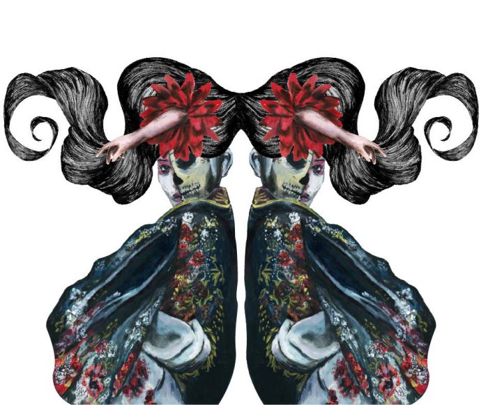
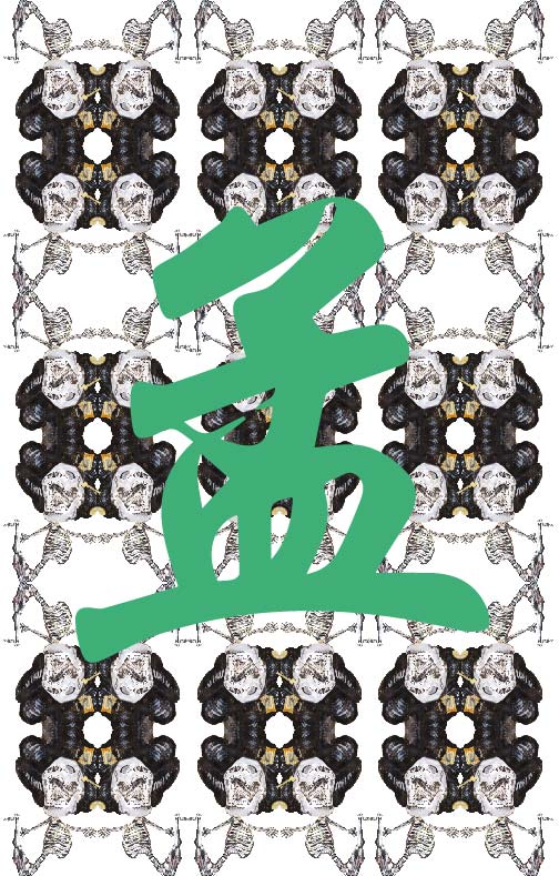 Through the past couple of weeks I have experimented with different motifs and trying to tie my concept together with the idea of vainity as a circle of hell. I went with the underlying motif of red and incorporated that into the illustrations. Hair, a symbolic representation of vainity, is the main motif used in the banner. I decided to expand on that and experimented with the layout of the banner with the following motifs.
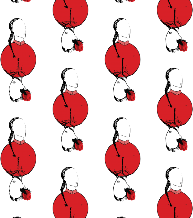
This past week I’ve been experimenting with arrangement of motifs and what I would want my motifs to be. Starting out with a few basic motifs, I’ve started to play around with the patterns and it was so much fun. It was like watching your child grow up right before your eyes.
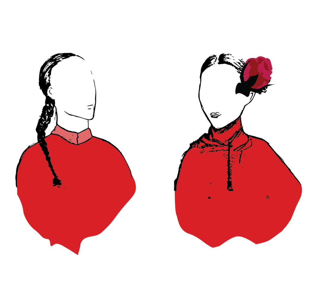
Faceless motifs. The image of people who have passed. We remember the impressions they have left on us. Right now I’m experimenting with the styles and still trying to find a style that ties in with my concept.
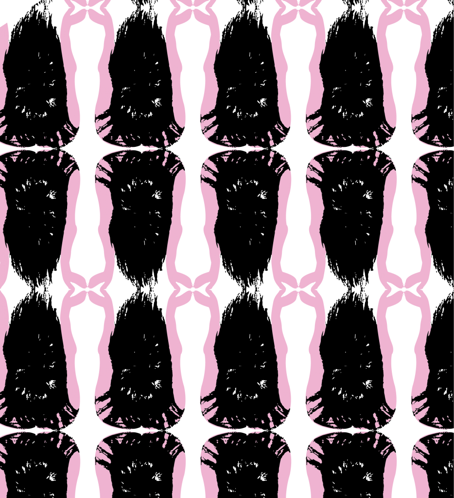 Right now I am still experimenting with the style so I would like to expand on the sketches.
The research on this project brought me to an array of different styles that I would like to explore. The concepts I have researched on are a mix of Western, Eastern and local beliefs and stories and I feel that the style I ultimately choose should reflect the eclectic nature of the concepts.
Image Links :
https://www.pinterest.com/explore/dantes-inferno/?
https://www.pinterest.com/pin/423549539926771159/?
http://www.pbs.org/parents/adventures-in-learning/2015/03/
http://imgur.com/gallery/

This semester’s painting was really one of the most enjoyable modules I have taken. It was like being able to take a break from the hectic life of everything else and just being in a calm space with just music and paint. I loved the assignments week to week and being able to try out different techniques and methods and not being afraid to go out of exact realism with the help of Miss Kelly. Surprisingly, at the end of sem show, all the paintings seemed to mesh together really well in terms of the theme and style. I felt that all the paintings had a sort of still and deathly look to it (Which I was not sure how to react) but I guess I kinda like that deathly look.
Self Portrait: Selfie
Going into this self-portrait painting, I wanted to do something which captured motion but not do something too experimental until it becomes an abstract version of myself. I decided to do a selfie portrait because I love selfies.
Spirit Self : Spiritual Self
I painted myself as a monk because I believe I was a monk in my past life since I’m so kind-hearted. Anyway I loved painting the aura behind the head and I felt it really gave it that extra pop. The drips were happy accident and I felt like it worked well.
Portrait Painting #1
For this painting, I decided to do an impasto styled painting which I used thick slabs of paint and scratched it out to give a sort of textured movement to the skin. I thought it gave him a 1960s look which I loved. Miss Kelly and I agreed that the green background wasn’t really working out and so I tried out different cool colours and felt that a black background still works the best.
Portrait Painting #2
For this painting I wanted to blend and make everything smooth and also capture the details on the face. I felt like this was the more realistic painting which I painted.
Portrait Painting #3
I LOOOOVEEE this painting of Wuyou. I departed from the previous styled and went for a more light-hearted animated style and I thought it came out really well. With the pink polka dots and the light yellow background and the contrast on the face. I loved all of it. This is my favourite portrait painting.
Portrait Painting #4: The Warhol Inspiration
This was unexpectedly fun to paint. Although I was a little worried at first trying to paint the model as she kept moving and sleeping, her decision to fall asleep was able to give this painting a sense of zen (coincidentally her name) and calmness yet still have a great sense of evil and menace. I didn’t know I would be able to capture two opposing emotions at once but I learned that it was the contrast between subject and colors. For this painting, I decided to try a more graphic technique using the colours and create a sort of 3D model of the model and use contrasting colors and I was really happy with the result because not only did it turn out looking different from my other portraits, it was striking in appearance. I decided to play with the colors to come up with a series and all of them worked really well and I felt like it resembled Warhol’s prints.
Vanitas : Life After Death
I worked on this vanitas over the recess week and loved working on it. It was a painting which I really wanted to spend time on and I had to plan before execution because I did not want to miss out details. This was also my first time painting reflective paper and it was hard to see the shapes in the reflected light but in the end I felt I managed to capture it. The concept behind this painting was the Chinese traditional offerings in which I grew accustomed to growing up. Whenever me and my family would go and visit our ancestors we would set up the offerings for the deceased and I thought I’d inject some culturally inspired set-ups into this still-life painting to exude death.
Experimental #1 : Still Energy
The painting before was very different from the final outcome. The consensus I got was that it portrayed a sense of misery and depression from the dullness and stillness of it. After adding a splash of contrasting colours I felt it really popped.
Experimental #21: Burning Serenity
I loved the colours in this. How the warm colour juxtaposed with the cool serene pinks and purples really made this calm yet energetic.
Still Life #1
The first still life was exciting for me because it was one of the first time touching oil paint and surprisingly I like it more than acrylic because of the smoothness of it and I really learnt how to deal with the paint in the first lesson. The important notes I needed to take which differentiated oil from acrylic was that it was easily smudged (good & bad) and that the textures were smoother which I loved to be able to handle shadows.
Still Life #2
The second still life once again featured my favourite red shoe. This lesson I tried to learn how to incorporate the background to make it look less dull. I felt that the first still-life had more life in the background than this but I tried many variations but it just didn’t seem to match the stillness of this set-up so I kept with the brown.
Night Landscape #1:
The ADM carpark. LOVED THIS because of that one light and in the end I loved how that one light source gave life to this painting.
Night Landscape #2:
This was the hardest painting for me because of the many details in the window sill to the different variations in lighting. I think there were about 7 layers to this painting because everytime I added a colour I had to wait for it to dry before I could do the appropriate tweaks for the next colour/layer. But I really loved the outcome.
I really enjoyed this class and sadly I can’t take it again but would love to join future lessons.
Painting was awesome!
In Staver’s paintings, he combined various techniques to draw the viewer’s attention to certain subjects and takes you on a visual excursion through the painting and in a sense he is giving you puzzle pieces in chronological order to allow the viewer to make sense of the scene depicted within the painting. He uses colours to emphasize light which immediately draws the viewers to a certain area of the painting and contrasts that with dark, bold colours which allows the subjects ot be defined.

Kyle Staver, Prometheus, Oil on Canvas
In this painting, my eyes are drawn to the cool colours of the sky and there is a stark contrast as he juxtaposed an almost black figure of the eagle and that sillouette is easily identified as an eagle in motion. With the motion depicted downwards, the eyes are then drawn to the nude figure perched on a rock. What is interesting to me in this painting was that the background and foreground are mostly sillouettes with not much detail but we are able to make out the idea of depth and space and even that the scene is taking place outdoors. The use of light and shadow juxtaposed with the harsh, dark lines not only creates a three dimensional space but also guides the eyes from point to point in the painting, creating a narrative.

Kyle Staver, Leda, 2015. Oil on canvas
Once again, Staver creates emphasis on the swan with the contrasting light colours to suggest a light source and defines the sillouette of the swan. Our eyes are then guided around the painting which creates a context of the figures being within nature. Again, I noticed that he uses a lot of cool, natural colours to depict nature and the figures being nude also give a natural, almost liberating feel to the painting. Our eyes are then guided to the sleeping lady in the background and then down again to the cool blue mat. In this painting our eyes move in a top-down motion.
Kyle Staver, Adam and Eve and the Goats, 2016, oil
Once again, Staver uses cool natural colours and light colours to highlight a light source, drawing the eyes to the central opening of a dense forest.The eyes are then drawn to the sillouette of the female nude in the foreground, then to the tree and the apples. The eyes then move down to the animals and then right to ‘Adam’. In this painting, I felt that the eyes moved in a circular motion with the male figure on the right being the last to be seen.

Giorgio Morandi, Still Life, 1951, Oil on canvas, 28,4 x 48,9 cm, Hirshorn Museum and Sculpture Garden, Smithsonian Institution, Washington
The sense of depth can be seen through the lines segregating the table top from the wall at the back. Not only do the lines suggest the amount of empty spaces on the table top, they also separate colours of the various objects painted, acting almost as a shadow and shape.

All That Life Contains, Contained, Still Life, 1941, Oil on canvas, Met
This is cute. The lines also act as shadows in this painting and I found it interesting how the objects at the back had more faded lines which kind of mimicked brunelleschi’s linear perspective.

Giorgio Morandi, Still Life, 1948/ 1949, Oil on linen, 26 x 35 cm, Museo Thyssen-Bornemisza, Madrid
In this painting the lines to me seemed to serve more as to define the objects in the forefront from the objects at the back. Creating a separation from the dark objects and the light.
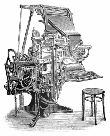
Linotype Machine
The development of moveable type and printing press in the 15th century changed the letterpress game in the modern world. However, the industrial revolution breathed a whole new lift into the world of typography.
The industrial Revolution impacted the way in which typography was created, designed and produced through the invention and manipulation of mechanized type-setting machines. Two areas which were affected in a major way was print communication (Commercialised typography used and wasThe way in which it was affected was the
Before the Industrial Revolution ( 476 AD – 1500 )

The Book of Kells, c.AD 800
The medieval times saw the rise of the handwritten illuminated manuscripts. Before the industrial revolution, typefaces were not practical, catering to the needs and wants of the writer. Being dramatic and extravagant in style. Letters were placed one by one, placed accordingly in a tray. This took a long time for the printers to assemble each metal type to be printed.
Letter-press were first carved and __ Process of type-setting cast in metal.
During the Industrial Revolution ( 18th Century )

In 1886, Ottmar Merganthaler created a Linotype machine in which allowed a whole line to be casted. The Linotype Machine improved the rate at which the type could be set. It was a mechanized print machine that functioned as a typewriter which could print with lesser manpower needed compared to the moveable type. This gave way to mass printing and contributed to mass production which also affected how typefaces were produced and designed
Something else introduced during this time was the style of bold face. Serifs were morphed, deformed and manipulated to create a bolder appearance.
Aesthetically, the design for typefaces changed dramatically to create more practical and decorative typefaces as the speed of printing increased. The increased speed of printing meant that typography shifted to cater to the needs of the masses, taking on a more commercialised and bold aesthetic.
After the Industrial Revolution (19th Century – Present)

The invention of the mechanized letter press machines allowed for further refinement which allowed for prints of 10,000 sheets per hour. This gave rise toLithography which merged art with way typefaces were designed which gave rise to the International Typography Style (I.T.S) also known as graphic design.
Personal
It was really interesting to learn the origins of different typefaces and how it evolved along with technology especially the decorative typefaces. I always thought that decorative typefaces were really tacky but now contextualising it made me have a little more respect for it.
Sources
S. J. (2015). The Evolution of Typography: A Brief History – Print Magazine. Retrieved August 29, 2016, from http://www.printmag.com/typography/evolution-typography-history/