Typography :
I am really interested in using what we’ve learnt about the colour wheel last semester and apply it to Project 1 this semester. I feel that Dada works play a part in this project as Typography art also has a sort of arbitrary yet controlled way of placing and combining various subjects together to form an overarching concept through similar styles and tints and hues whereas typography uses the font design, lettering, colours, and placement to create a sense of flow when composition is seemingly arbitrary.
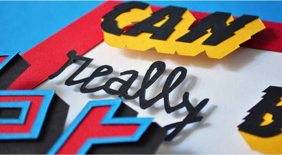
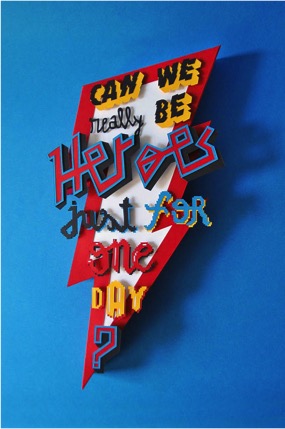
For example, in this composition, I felt like there is a flow in the composition eventhough every word uses a mutually exclusive font. However, all fonts possess a certain ‘casualness’ and fun in the sense where the fonts are ‘messy’ and seemingly random. But what I can take away from this is that the kerning plays an important part in determining the balance in the entire composition and that there can still be a sense of system and flow in a typographic composition with entirely different fonts and sizes and colours and designs for every single word. The background also brings the whole typographic composition together.
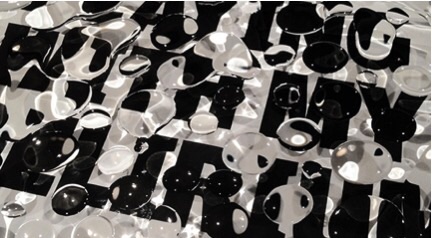
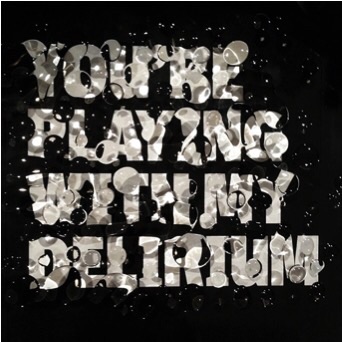
Another form of presentation of typography includes photography of live hand-made types. This allows the background and text to become one whole composition. For example in this work, the submerged text in water allows a blurry texture to be created which emphasizes thee word ‘delirium’ which has a ‘blurred’ conotation behind it. This shows how the background and the natural textures it creates in real time can be incorporated into the work itself.
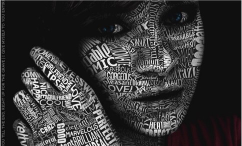
I am also interested in words forming images as it incorporates traditional realistic styles with typography and allows the image formed and the words within the image to converge to convey a message.
Overall the things that I have learnt from the research include :
- Background and text can come together to form an even more impactful and clearer message
- Take note of the balance within the composition and to ensure that there is a sense of consistency even in inconsistent elements. To allow everything to flow.
- Space(Kerning) between letters also can affect the neatness and the overall look of the typography.
- The font visuals and mental relationship has to be coherent. E.G : a formal invitation with comic san ms font would be inappropriate. Well, actually comic san ms on anything would be inappropriate.
- Words that require emphasis could be visually manipulated by altering the size, colour and fonts and the background.
The ‘I am’ that I have decided to go with are :
Psycho
Vegetarian
Impulsive
Vain
Adrenaline Junkie
Rule-Breaker
I am still finalising on the concepts and sketches and will be updating more over the weekend!