Ego Final Project

board


Reference Artists :

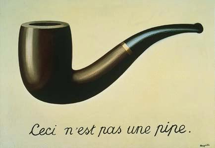
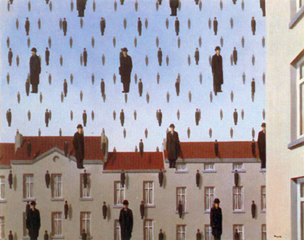
Surrealism was a major inspiration in this project as I wanted to incorporate aspects of Rene Magritte’s surrealistic works. He played heavily with scale and isolation of subjects and the use of backgrounds to convey a sense of ‘silence’ within the work and I felt that Magritte was able to use warm and cool colours effectively to bring out the mood in his paintings.


rene3 rene2 rene1


Amy Williams was my inspiration for paper cutting since my paper cuts focused on intricate details of nature and animals. Her work shows great attention to detail and allows the colour of the paper itself to create the shape of the subject. I thought paper cutting would effectively bring out colour theory in this project as the background colour of the paper cuts and the colour of the paper cut itself would be able to work together for colour harmony.


peacock rabbit


Medium

I wanted to use traditional mediums in every composition as I really feel like since this project was about me I wanted to showcase my hand-made styles as I felt it would contribute to the flow of the simple narrative each equation had.

Techniques

Paper cutting allowed me convey the ideas behind each composition more effectively as having an entirely different plane allowed me to bring in other subjects into the concept and to allow the 2D plane to interact with the 3D dimension.


Overall Concept

I really wanted to incorporate nature and the use of papercuts as a representation of ‘nature’ since paper comes from tree and I feel like being vegetarian with an appreciation for nature I could take different aspects of nature to portray who I am ( Like that of a horoscope). I also wanted to utilise colours of nature (Cool colours exuding serenity while warm colours exude a sense of tension and danger). I wanted to also step out of the usual 2D and experiment with different mediums to strengthen the idea I wanted to convey using interactive media and also shadows. I also wanted the colours to start out vibrant at the top and as it approaches the bottom it becomes more muted to show how the vibrancy is only a façade and that I want to be able to appreciate my reality behind the colours.


board1

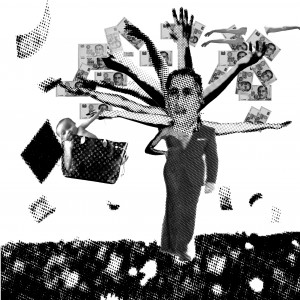
Confident + Vulnerable = Me


Concept

I feel that I am a confident person but sometimes it is not natural but it comes from a place of hurt. Sometimes I hide my true firestorm of emotions underneath my exterior so as to portray an emotionally strong character. As a result of the walls I have built, I selectively show different facets of me and I could appear vibrant and open but on the other hand I could also be emotionless and closed off.


Confident

I chose to use the peacock as a symbol of confidence as the saying goes ‘As proud as a peacock’. I also realised that the peacock feathers resembled eyes and I was so excited I wanted to show duality in emotions by using 2 planes. Peacocks also have naturally cool colours and I wanted to enhance the idea of serenity and calmness by lightening the cool colours. I used papercutting in this as I wanted to show a plane within a plane. Where within the peacock feather held a different plane of my emotions which is not apparent but when viewed up close and when physically interacted with(Representation of when people interact with me I tend to open up and show my true emotions). I used warm colours below the cool colours with my eyes in warm colours to create a contrast between the exterior and the interior, showing that confidence to me may not be a sign of strength but instead, a projection of weakness. The use of papercuts coming out of the 20cmx20cm dimensions was to show how stronger/intense emotions tend to be harder to cover-up and that the larger(more intense) the emotions I feel inside me, the more confidence I have to exude to cover up.


Vulnerable

I wanted to show vulnerability of me as I feel like harsh words may not get to me now, but this strength was built up through years of insecurities that I’ve managed to overcome. I am vulnerable in the sense that I tend to sacrifice myself for the people I care about but they are the exact people who would hurt me the most. I used a warm red colour to create a sense of danger and being that it is the colour of blood, also a symbol of critical condition. The lamb (a sacrificial animal) is used to show how I sacrifice but the vultures(a representation of demons around me) jusst picking off at the meat tillI lose sight of myself and that is when I could differentiate between good and bad(Like the story of Adam and Eve when their eyes opened to good and evil) and thus I wanted to show the loss of my innocence and ‘beauty’( the sense of beauty within me) through the use of white floral papercuts. I used the vulture papercut reliefs to show that they are actually on a different plane than I am and the only way they can penetrate me is if I allow them to break down my walls and actually enter into my mind (into the plane).
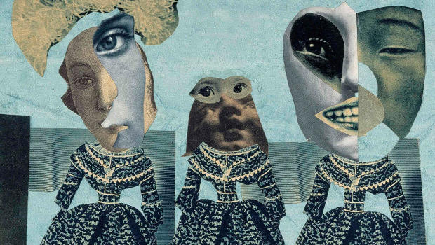
 

Me (Multi-Faceted)

Because of the walls I have built up to cover up my vulnerability and the confidence I exude to protect my true emotions, I have many facades to me which I may or may not choose to reveal to people. The use of angular paintings where the left shows a vibrant face while the right shows a monochrome (Black and White) exterior depends on interaction with me. Once again I wanted to create an interactive piece that allowed the viewers to be a part of the work as their interaction with the work causes it to change (Showing how I change when different people interact with me). Although I may show a confident front (Represented by the lion), upon closer inspection you coul see that the confident exterior is actually made out of holes (Holes within me) and that looking beyond the holes shows meat. (I did a grayscale meat texture as the background for the papercut) to show that my confidence is created by holes and underneath I am vulnerable upon closer inspection. I used all colours of the colour wheel on the vibrant side as the colours combine form white which to me conveys a sense of openness and purity (Being real) while the other side shows an emotionless B&W façade that is almost unapproachable.


board2

Optimistic – Insecure = Me (Getting out of limbo)


Concept :

I feel like I am a very optimistic yet insecure person who could really excel if I lacked insecurities. Being optimistic, I tend to look out for the best and the positive aspects of everything but yet if I felt insecure it would only stop me from achieving the best results I could achieve. Therefore I wish to eliminate insecurities so as to be able to break down the barrier that seems to prevent me from achieving my goals and being stuck in limbo.


Optimistic

I used the rose to show my optimism as I really see life as a bed of roses eventhough there are hardships, why worry about what you can’t change but worry about what you can. I wanted to use scale to blow up the rose to engulf most of the composition to show the magnitude of positivy. The black papercuts around the rose show the thorns and holes within life (representing the hardships that we all go through) but even beyond that I see cool colours of the sky (representing peace and serenity) as the saying goes ‘Every cloud has a silver lining’. By using the complementary colour scheme I chose red and cyan to complement each other as their vibrant contrast against the negative thorns overshadow the dark negative aspects of life.


Insecure

I once again used roses to show how sometimes I feel others around me have a more vibrant life while I am stuck in a shell, insecure and unwilling to open up and reveal my colours. Every rose was given a split complimentary colour scheme and done in colour pencil to show the harmony of the lives of others and I used papercut butterflies to represent how I see some people as beautiful and evolved while I am still stuck in a cacoon stage. However, if one were to actually interact with me and try to bring me out of my shell, then I may actually have a chance of being like the rest of the butterflies and to embrace the colours I hide underneath. Once again I used the colours of the colour wheel to create a vibrant exterior to the cacoon -> Butterfly.


A Better Me (Getting out of Limbo)

I feel I could only be better if I am able to break down the barriers which prevent me from achieving my goals. Because of my insecurities I have built up a wall which prevents me to get to ‘the other side’ and it is only when someone is able to shine a light on me then I am be able to project my paradise. I used a transparent acrylic sheet to etch out floral patterns so that when light is shone on it, it would cast a shadow which also brings out the shadows of the ‘stuck’ butterflies and weeds that cannot go past the barrier. The light represents an enlightenment of self and that can be achieved through external help (Light source). I used a black and white colour scheme as I see ‘A Better Me’ as a projection and I wanted to keep it simple and I felt that leaving the paper and papercuts white with the black shadows conveyed this idea the best.


board333

Introvert x Exrovert (Aggression) = An Ideal Me


Concept

I feel like the multiplication sign actually symbolises a balance between two entities and that one has to compliment the other. Thus, I decided to choose two characteristics which I am trying to balance in my life which is to balance my introversion and aggressiveness. I feel like I need to be more aggressive to fight for what I really want but at the same time I would also want to be able to appreciate the traits of an introvert of being able to observe and listen and not just charge ahead like a brainless zombie. I decided to apply strong colour theory contrast in this work and I felt like this equation best utilised the colour theory for me in terms of flow in the equation and this equation focued mainly on complementary colours. I also wanted to show how different colours (opposite colours) when applied would allow the viewer’s eyes to create a whole new perception of the same subject(papercut) that they see.


Introvert

I used the mouse as a symbolic representation of the quiet side of me where I would just want to stay behind the warm winds(Orange papercut). The mouse is also placed in a fishbowl as I feel like sometimes I am in my own world and I would rather drown in my thoughts than participate in what is going on outside of my mind. I used cool light blue colours for the mouse hiding behindthe warm winds and I wanted the bright orange to dominate the entire composition and used the complementary colour theory of blue and orange to show how the warm colour (representing heaviness and hardships) overwhelms the introvert (the cool blue mouse in the fishbowl).


Extrovert(Aggressive)

I would like to be more aggressive in what I want to achieve in whatever I do and I thought the shark best represented this. I wanted to show the shark breaking out of the flow (literally) and actually coming out of the currents and not actually just going with the crowd(represented by the fishes swimming in the same direction underneath the blue papercuts). In this composition the cool blue colour dominates the entire composition as the orange aggressive shark attempts to break free from the flow. The flow represents my unwillingness to change and to just go with the flow of life while the shark represents the side of me that feels I should actually fight harder for better results. The lack of fins for the shark also represents how my attempts to break out of the water is futile as I haven’t gained the ability to break out yet. Using the cool blue colours on the same papercuts as that in ‘Introvert’, I wanted to show how it transforms the papercuts from a strong warm wind to a cool blue tide, both opposing elements in nature.


An Ideal Me

The ideal me would see the balance of both introversion and aggressiveness and I used the toned down shades of the lion to represent the aggressive side of me. Now not as contrasting, I wanted to give varous shades of warm and cool colours to show a diffusion of contrast and how both characteristics actually reach a consensus. I used blue tinted flowers drawn with colour pencils to show that there is beauty in both remaining cool and calm and yet also be able to hear and observe and to think before I speak or act impulsively (shown by the covering of the lion’s mouth and only showing the ear and the eye). I wanted to show a sense of harmony with both the warm and cool colours balancing and not actually have one of either to dominate the entire composition.


board4

Maturity + Embracing Flaws = Me in 5 Years

Concept

I would like to both mature in terms of knowledge and age and also embrace my flaws and to see that not all of my so-called flaws are actually flaws but are just perception in my own mind. If I am able to combine my maturity and to embrace my flaws and see them as beautiful, I would really be able to reach a ‘Me’ where I could truly appreciate me for me and I feel that once a person is able to love themselves, there is really no stopping them at achieving the best results in whatever they do.


Maturity

I used the sea turtle as a representation of maturity as it is an animal which could live to 150years and combined it with the sillouette of a tree (tree of knowledge). I decide to keep it monochromatic in grayscale to show how maturity in me is able to find a balance between light and darkness. The contrast of white (purity) against the black (darkness) and shades of gray(tainted innocence) show how I am able to block out the darkness yet still maintain shades of grey and be aware of its presence.


Embracing Flaws


I wanted to show how I am abe to embrace my flaws through a halftone composition of my face with overlaying papercuts of split complementary colours to show harmony. I chose to use red,blue and orange as the split complementary colours throughout to depict myself as a blooming flower and the black and white (showing the fading of identity and being trapped in black and white) contrasted against the harmonious vibrant colours show how I want to be able to see colours (beauty) even in my black&white(flaws). The floral papercut was really hard to do because I wanted to cut many small details and I used cloth for the floral collar and inked it with copic markers to give a sort of blooming effect that reall jumps out of the frame.


IMG_3014

Me in 5 Years

This coposition is basically a summary of the rest of the equations and I wanted to overarching topic to be embracing myself and to learn and grw. I see the me in 5 years as someone who would be able to get past his fears and embrace himself fully. I wanted to show duality in the current me compared to the me in 5 years as one side showed a butterfly with split complementary colours of blue,red and green to show harmony but when I am putting up a harmonious exterior when if it’s not genuine, it would slowly melt away and create holes within me. I used wax to create a melting effect( wax being a medium which is easily destroyed by small heat) to show how fragile is the façade that I put up. The holes in the butterflies were created by burning using matchsticks to create the burnt hole effect. On the other side, the monochromatic papercut butterfly has different elements of the entire presentation such as the peacock feathers and the lion head to show how I don’t want people to see all the facades that I put up and the monochromatic colours placed upon the ‘vibrant’ coloured holes within the papercut actually draws the viewers eyes towards the holes instead of the facades that I put up. I want people to see me as a whole, flaws and all, and to actually see vibrancy in my flaws.


Other Ideas

Some ideas which did not come to fruition include the more elaborate use of shadows. Time was a problem as I kept piling up concepts on top of concepts and did not consider the time required to execute it. I wanted to play with shadows more to create apparitions from mundane objects.

IMG_2796 IMG_2800


What I enjoyed the most

Being able to indulge in papercutting is one of the most calming processes as it allows me to listen to music while just going about with my work. Almost like a dance actually. Although it’s really annoying sometimes when a thin line breaks unexpectedly or when I accidentally cut myself or when I cut a wrong hole, I feel like producing these intricate details really help with training my eyes. Compared to the other mods I feel like this is the most conceptual and it really pushes me to combine aesthetics and concept which I feel goes hand in hand in every artwork.


Problems I have faced

The biggest problems in 2D or actually anything art related is that I always feel like I require a strong concept before I start executing. My problem is that I don’t want to waste time working on something which I feel is weak aesthetically or conceptually since what actually drives me to work is to reach a final product that I can actually love. So time management was an issue for me as I’m always like thinking of how to improve a concept but not executing it and in the end I might have a strong idea but with lack of time to execute (Such as playing with shadows as I wanted to incorporate more shadows and light into the work.


Advice

Joy said that in future projects I should also dwelve deeper into the medium I use such as not just using paper but consider natural papers vs synthetic papers and the textures and how I can manipulate that to convey what I intend to convey.


Overall I really really enjoyed 2D so much this semester. Thank you Joy for pushing all of us with our own styles and allowing us to develop and grow as individuals!


Ego Progress

Finalized concept :

So I have decided to use different aspects of nature to show how I am. We are after all animals and we all have primitive instincts and I feel that all our characteristics can be represented by nature (animals/plants/earth) such as the horoscope where animals represent a certain personality trait.


Reference Artist :

I love the surrealism of Magritte’s work and also the paper cut works of Claire Brewster who also considers her choice of paper and also the shape of the subject.

claire3


I’ve also decided to go with paper cuts as I want to show void in beauty.

Why?

Papercut – Showing voids/flaws in me that doesn’t have to be filled in order to be beautiful. I want to show how I can be flawed and beautiful at the same time.


Problems I faced was that I have a hard time incorporating colours int the concept and I overthink the aesthetics and concept on its own. So each composition actually takes me quite a while to try and make everything (Colour,concept and aesthetics) work for me because I feel like I can’t neglect one or the other.

IMG_2982

One of the compositions : closed off I used the cacoon as a symbol of being closed off

IMG_2984 IMG_2985 IMG_2988


EGO

Ego has been so far so good. Having fun chatting and embracing the freedom to explore and do whatever. Been experimenting with paper cuts and trying to incorporate it into this project. I’ve also settled on the concept of nature to show myself as I feel like different aspects of nature (animals/plants) can be appropriated to show different characteristics of myself like in the horoscope.

Experimentation with paper cuts :

IMG_2693

Peacock feather paper cut. Showing ‘confidence’ even through different emotions.

IMG_2696-2

Rose representing positivity

IMG_2695

Butterfly Papercut


IMG_2694

Vulture papercut


Still working on other traits though. With the extension I can also expand some ideas that I wanted to! 😀


2D Colour Research

IMG_2125


IMG_2126 IMG_2127

I thought the class activity was really fun and I got to confirm that I am actually an amazing person! Okay not really.. Everyone just used euphemisms like ‘unique’, ‘one of a kind’ and ‘in the leon category’, which I’m just gonna take it as positive. 😐

On a side note, I’m excited to start on this new project! With this open concept and only restricted by the colour theories (even though I feel like it actually helps me to learn about which colours give what effects), I feel like I can just experiment with many different mediums! I’m also really excited to finally get to use colours!!! 🙂

colour-wheel

The colour wheel is important in the design world to use colours to convey a feeling of what the artist wants to portray


Colour Harmony :


Complementary Colours :

IMG_2128 

Complementary colours are colours which are opposite each other on the colour wheel. Uses of this theory include giving contrast to a certain subject matter by placing two opposing vibrant colours to really strike the viewer. One example I found online about this is The Hulk.

2d1

The key colour of the hulk is green, thus its opposing colour on the colour wheel would be purple. This gives a sort of unifying look to hulk and both colours actually complement each other and not one actually stands out as both colours compliment each other, allowing the character as a whole to stand out.


Split Complementary :

IMG_2129

Split Complementary Colours are like complementary colours but instead of just 2 colours, there are 3 colours involved. The colours are directly adjacent opposite creating a sort of isosceles triangle. This colour harmony theory also creates the same effect as the complementary colour theory except it allows the vibrancy of the subject to be more ‘spread out’ and not so concentrated. One example I’ve found is the Superman logo.

2d2


Analogous Colours :

IMG_2130


Analogous Colours are a set of 3 colours along the colour wheel. These colours when put together in a composition allow smooth flow and transition through the composition, creating a serene feeling with little tension. These colours are often found in nature


2d3

Warm analogous colours make use of ‘warm’ colours and you can see it transitions really smoothly

2d4

‘Cool’ analogous colours make use of cool colours and are often serene in intensity


Monochrome Harmony :

IMG_2131


Monochrome harmony makes use of a single colour within a composition of a subject and varies in hue and saturation. Allowing a single colour to dominate the entire subject. This allows the artist to impose a ‘feel’ of the object by using preconceived notions of colours. By using cool colours, it gives an overall feel a serene, depressing feeling while using warm colours give it a vibrant, lively feel with more intensity in emotions.


2D Rhymes Progress to Final Work


Initial Dingbat Creations :

Initial dingbats were based on materialism. Inspired by modern day pop songs, I wanted to use superficiality to create something which had deeper meaning as I felt that ‘in your face’ materialistic dingbats could be used to create better impact in whatever concept I was going to settle on.

DN1002_P2_LEON_9 DN1002_P2_LEON_7 DN1002_P2_LEON_6 DN1002_P2_LEON_52leon

3leonDN1002_P2_LEON_8

chanel bagarm4


Crying-baby-013 copy


Initially I thought we could combine rhymes so I wanted to combine both London Bridge and Rock-a-bye Baby as both nursery rhymes contained elements of falling and I wanted to expand on that as initially I wanted to emulate Rene Magritte’s falling effect. I felt like it gave the work a surrealist and impactful look. I thought his work also managed to achieve spatial depth by playing with scale and so I wanted to emulate this effect initially.golconda-renc3a9-magritte-1953


magritte

Experimenting with Magritte’s style

But I felt like it was too ‘in your face’ so I wanted more symbolism in the work. So I tried to explore the tree motifs and how to take one object out of it’s context to form another object and to bring out a deeper meaning behind it.

IMG_1965


I also was inspired by Hannah Hoch’s style of dismembering and reassembling to form a whole new form. I also loved how she played with scale and how she juxtaposed images of different sizes to form a coherent image.

3024729-poster-p-hannah-hoch-modenschau-014 HH001 HH006


For this project I felt that experimentation on Photoshop would be better for me so I did fast sketches for ideas and did the rest on Photoshop.

IMG_1959 IMG_1958


Some collaging that I did :

IMG_1967 IMG_1966


Works That Didn’t Make It but were initial ideas on Photoshop :


rockabye baby

Initial ideas were trying to find out how to use arms within a tree motif

Screen Shot 2015-10-18 at 2.32.53 pm

Money Tree


Screen Shot 2015-10-15 at 9.18.17 pm

First draft of a tree. Wanted to show career men and women alike reaching for money and the baby’s cradle is a Louis Vuitton bag


Screen Shot 2015-10-15 at 9.18.36 pm

Inspired by Guan Yin Ma, I wanted to show money as a form of religion. But realised that it didn’t flow as a tree. I really loved this one though

Screen Shot 2015-10-15 at 8.37.04 pm

Idea of a stork piercing the pregnant belly in a desperate attempt to acquire a baby. Felt like it wouldn’t work because it didn’t fit my idea of having a tree as a motif


Screen Shot 2015-10-15 at 8.36.23 pm

Early exploration of babies and money

Screen Shot 2015-10-15 at 8.35.57 pm

Thought of using the ATM to show the ‘wind’ blowing the cradle down. Wind representing money and how money caused the baby’s position to fall.

Screen Shot 2015-10-15 at 8.35.40 pm

Merlion + baby + stork. I don’t really remember why I did this. Probably because I was trying to find out how to create a tree-like structure

Screen Shot 2015-10-15 at 8.34.59 pm

Baby in money diaper

Screen Shot 2015-10-15 at 8.34.22 pm

Stork dingbat with a baby in a ferrari

Screen Shot 2015-10-15 at 8.32.44 pm

Exploring how to use the Singapore flag to show contrast in grayscale. I hope I don’t go to jail for this.

Screen Shot 2015-10-15 at 8.32.03 pm

Baby silhouettes

Screen Shot 2015-10-15 at 8.31.48 pm

Creating my baby note

Screen Shot 2015-10-15 at 8.31.10 pm

Oh this was a very early stage of research when I wanted to combine the falling of London bridge and birthrate in Singapore

Screen Shot 2015-10-18 at 2.44.34 pm

I was so excited when I finally realised the shape of Singapore looks like the top of a tree!!


Screen Shot 2015-10-15 at 8.30.32 pm

Baby Silhouette and pipe


Screen Shot 2015-10-15 at 9.24.49 pm

I wanted to show how after death, materialistic possessions don’t matter as much as a life which leaves a legacy for you. But decided to look at a bigger picture

Screen Shot 2015-10-15 at 9.23.58 pm

Baby in ferrari

Screen Shot 2015-10-18 at 2.30.59 pm

I also wanted to capture the feel of propaganda posters


Rock-a-bye Baby

Rock-a-bye baby, in the treetop
When the wind blows, the cradle will rock
When the bough breaks, the cradle will fall
And down will come baby, cradle and all


Final Work :

composition 1 done2

First Line : Rock-a-bye baby, in the treetop

The first line really stood out to me as I felt that it conveyed a sense of security for the baby. Singaporeans in the 1960s felt that children provided a sense of security as they could take care of them when they got older and thus, having a child was a great priority and babies were placed on a pedestal with families wanting a child to provide them with a sense of security. I represented the baby in the form of a rattle and a crown to show the importance of having a baby. The rattle is framed by the lion and the tiger (Representing the lion and the tiger on the Singapore coin) and how Baby = Money. The ‘Japanese sun’ background was inspired by propaganda posters as I wanted to give emphasis to the rattle in the middle of the composition.

Use of classmate’s dingbats :

Ziyaad’s Crown : Representation of how people back in the 1960s regarded having a baby as ‘king’ and providing financial security for them


Screen Shot 2015-10-15 at 9.04.56 pm

Second Line : When the wind blows, the cradle will rock

I interpreted the wind as Singapore’s economic development and how it caused people to grab money and live the luxurious life. I saw the cradle as Singapore itself and the baby’s position as a priority in people’s lives. The ‘cradle’ which is Singapore, being a safe haven for the baby, has now put the baby in a precarious position and now people are weighing the advantages and disadvantages of having a baby and leading to the intervening of the government who introduced schemes such as baby bonus in  to persuade people into getting a baby. But having a baby came as a form of ‘credit’ as the baby would contribute to the future of Singapore’s economy and also as a form of credit for parents who would raise the child as they would have to use money to feed and raise the baby. I also explored the contrast of the Singapore flag as the background as I wanted to show the nationalistic idea of how the state promotes birthrate for their own economic progress.

Use of classmate’s Dingbat :

Cloud : Giving Lee Hsien Loong an identity of a ‘higher being’ in the clouds trying to tempt citizens to have babies.

Jun Yuan’s Justice Scale : Showing how Singaporeans started to weigh the advantages and disadvantages of having a baby and that the baby bonus caused them to reconsider pursuing their careers instead of having a baby.


composition3 done

Third Line : When the bough breaks, the cradle will fall

This line stood out to me as Singaporean’s thought of throwing away the idea of having a baby. The cradle, being a safe place for babies, has now been broken and is now leading to the decline in Singapore’s economy. This work shows the draining out of babies as well as the economy due to the falling birthrate. It also shows the panic and fear in Singaporeans’ faces. I wanted to use the Merlion dingbat to represent our social culture and how, with the declining birthrate, will all go down the drain. The storks (symbol of delivering babies in popular culture) are now trying their best to carry the entire nation, hoping to be able to cling on to their jobs of delivering babies. The arms are now holding up the country as now there is a decline in economy due to the birthrate.

Use of classmates’ dingbats :

Line’s Merlion : Representation of Singapore’s society and culture and the pipe attached conveys how our economy and birthrate are going down the drain.

Shannen’s Panicking woman : Representation of our society’s panic when we realise that our society is deteriorating due to the diminishing birthrate.


composition4 done

Fourth Line : And down will come baby, cradle and all

I interpreted this as the future of Singapore when economy is deteriorating with an aging population and society still wanting to chase cash and monetary items, placing the birthrate at a precarious position. The hands are in the shape of an hourglass which showed that time is running out and his situation was caused by our own hands and that regret is too late already (shown by the crying woman on either sides). I added wings to the baby because if this situation continues with the declining birthrate, it’ll be hard to get out of this situation and it resembles a trapped butterfly in a web. Even with wings it would not be able to escape. The flames at the bottom show how the economy is dying as the birthrate continues to plunge.

In this composition I used elements of my classmates’ dingbats as I felt that it conveyed a sense of darkness and death.

Clara’s Skull : Conveying death. The future is now bleak with the declining birthrate and it represents death of society, culture and economy.

Clara’s Money : Showing how the force of money(materialism) is pushing the baby down the hourglass.

Shannen’s Gun pointing at the baby : The baby is now in a precarious position as it clings onto the mid-section of the hourglass shape and the last baby is now falling into the pit of death.

Fire : Burning of our economy, society and culture

Shannen’s Woman by the side : Representation of regret and how it is now too late in the timeline to turn back

Wings on baby : Even with the slightest amount of hope for the baby to escape, it is still trapped and death is inevitable

Hands : Time is in our hands but yet we(society) are the ones who caused this (in our hands)


LAYOUT :


IMG_1961

I had 3 ideas for the layout in mind. The first one being a cyclical pattern (suggested by Joy) to show how it is a cycle where birthrate declines when a society’s economy progresses. The second one was a timeline format where each composition represents a certain time period in Singapore ranging from the 1960s to the future. The third one being that the first three pieces flowed in order while the last 4th one dropped (symbolising the baby ‘dropping’).

After thinking about it I felt like the second layout would fit the best because the last composition talks about the future and I felt that this layout would be the most fitting.


Processed with VSCOcam with c1 preset

I wanted to arrange it in a timeline format so it flows from one era to the next. I left a gap between the 3rd and 4th composition as I wanted to show the 4th one as a concept in the future of Singapore.


Arrangement

Arms : The arms are a consistent motif in all four works as I wanted to show how this situation was caused by our own greed and desire for self-progress in this economic society. In the first work, the arms are reaching out for a baby( showing desire for financial security for themselves). In the second work, the arms are now weighing the financial costs needed in raising a baby and questioning if corporate progress was more important. In the third work, the arms which caused the plunge in birthrate is now realising the situation at hand and are now trying to support the country, hoping to be able to save it. The final work shows that time is running out and caused by our own hands and that once ‘the bough breaks’, it’ll be too late to salvage.


Tree : I wanted to create a tree motif for the first three works as I wanted to reflect the poem’s main subject of the tree (other than the baby) as the tree represents (to me) the cradle in which the baby could safely rest and in this case it was Singapore. Thus, for the first three works you could see that the main centrepiece is in the shape of a tree. For the final work, I wanted to break away from the tree motif as the cradle has now been broken and the baby has already fallen off, and thus there’s no safe haven for the baby now.

Symmetry : I wanted to have balance in all works so that it not only flows but also able to guide the viewers’ eyes to the centrepiece which is the main focus on all 4 works.

Propaganda : Inspired by propaganda posters, I wanted to inflict the same effect across the four works as I wanted strong contrast to show central figures and also give a sense of nationalism to reflect the whole nature of the concept revolving around economic, personal and nation interests. I felt that the propaganda posters convey a sense of ‘selfishness’ as it showed how a group of people want to convey a message for their personal benefits.

Overall I actually really enjoyed this project because it allowed me to experiment easily with collaging and mistakes could just be ctrl z away(If only we could do that in real life). I’m really happy and now it’s time to move on to the next project! 🙂


2D Rhymes Progress

I finally solidified a concept – thanks to Joy. At first I wanted to simply comment on the decline of birthrate from the 1960s to 2000s and the future if this continues. I’ve decided to use the entire poem (of just 4 lines) as I feel like it really talks about the decline in Singaporeans’ mentality of having a baby.

Rock-a-bye Baby

Rock-a-bye baby, in the treetop
When the wind blows, the cradle will rock
When the bough breaks, the cradle will fall
And down will come baby, cradle and all


composition 1 done

First Line : Rock-a-bye baby, in the treetop

The first line really stood out to me as I felt that it conveyed a sense of security for the baby. Singaporeans in the 1960s felt that children provided a sense of security as they could take care of them when they got older and thus, having a child was a great priority and babies were placed on a pedestal with families wanting a child to provide them with a sense of security. I represented the baby in the form of a rattle and a crown to show the importance of having a baby. The rattle is framed by the lion and the tiger (Representing the lion and the tiger on the Singapore coin) and how Baby = Money.


Second Line : When the wind blows, the cradle will rock

I interpreted the wind as Singapore’s economic development and how it caused people to grab money and live the luxurious life. I saw the cradle as Singapore itself and the baby’s position as a priority in people’s lives. The ‘cradle’, being a safe haven for the baby, is now in a precarious position and now people are weighing the advantages and disadvantages of having a baby and leading to the intervening of the government who introduced schemes such as baby bonus to persuade people into getting a baby. But having a baby came as a form of ‘credit’ as the baby would contribute to the future of Singapore’s economy.


Third Line : When the bough breaks, the cradle will fall

This line stood out to me as Singaporean’s thought of throwing away the idea of having a baby. The cradle, being a safe place for babies, has now been broken and is now leading to the decline in Singapore’s economy. This work shows the draining out of babies as well as the economy due to the falling birthrate. It also shows the panic and fear in Singaporeans’ faces.


Fourth Line : And down will come baby, cradle and all

I interpreted this as the future of Singapore when economy is deteriorating with an aging population and society still wanting to chase cash and monetary items, placing the birthrate at a precarious position. The hands are in the shape of an hourglass which showed that time is running out and is made out of hands as this situation was caused by our own hands and that regret is too late already.


2D Project 1 Visual Journal

Concept :

My overall concept revolved around me and my environment. I wanted to separate the two boards into emotions which I feel and into emotions which translate to me visually. So it was basically what I see vs what I feel. The first board represents emotions which were inspired by feelings and not inspired by anything tangible in particular and the latter shows lines which were inspired by tangible objects and bodies around me. By combining the two sets of emotions I wanted to showcase who I was as a whole as I felt that emotions and how we express them are affected by our identity and our environment and that the two boards represent me.


Fragility :

My intention was to use bolder lines to juxtapose with weaker lines to show visual fragility in structure inspired by the textures of angular glass. By using lines to create triangular forms of different sizes I wanted to show visual fragility. I then chose the medium of shaven chalk to press it under the monoprinting machine because I realised that it creates micro-cracks and so I combined it with the lines to make it seem as though the fragile chalk is being held by the weak lines. I then used plastic to go over it to mimic the texture of glass.


FullSizeRender 15

Exploring the fragility of objects (glass) from angular forms and comparing it with the fragility of the human heart

FullSizeRender 29

Exploring mediums (Plastic & Chalk) to convey fragility


Distracted/Psychotic & Aggressive :

Spirals were the main characteristic of distracted and psychotic as I felt that spirals show a person in a hypnotic state (not conscious) and thus, distracted. Aggressive was more of a dynamic exploration by exploring motion blur and movement in a fast action (aggressive action).


FullSizeRender 4

Exploring spirals and aggressive movements (stabbing motion)

FullSizeRender 2

Experimenting with different 2D line textures and also with the sharpness of the knife and creating motion on a 2D plane.


Spontaneity :

I wanted to explore the visual elements of spontaneity such as that in nature and of the human body. To translate into the final work the spontaneous blooming of flowers and spontaneous body motions.

FullSizeRender 23

Exploring spontaneity in nature. using lines to show outward ‘exploding motion’

FullSizeRender 21

The explosive visuals of spontaneous outward body expression. Using the silhouette and lines to show explosive movement and trying new mediums


Ambiguity :

By using objects around me, I wanted to show ambiguity of personal objects (To represent ambiguity of my identity). By printing only one side of the object, it creates an ambiguous pattern which is hard to decipher and attempted to combine both themes.


FullSizeRender 26

Ambiguity of objects around me by printing one side of the object

FullSizeRender 16

Ambiguity of the human identity. Creating a smoky texture using chalk over prints of objects.


Awkward :

For awkward I wanted to use staring as a form of awkwardness as having your appearance being scrutinised causes discomfort to me. Thus, I experimenting with different methods of bringing that awkwardness out


FullSizeRender 17

Sea of stares

FullSizeRender 8

Creating a 3D ‘bulging’ effect to intensify awkwardness


Sloven :

As I identify as a sloven person, I wanted to show untidiness in my character. I also wanted to show that there is a system in sloven and vice versa.

FullSizeRender 20

Using thumbprints to create a visual mess but at the same time maintaining system with repeated patterns

FullSizeRender 9

I was being a Jackson Pollock. A straightforward visual mess using my fingers as the tool


Systematic :

I wanted to show rigid patterns and also incorporate the medium of wax into it as I wanted to show system even in the medium. Thus, I created patterns using wax to show that even if there’s a mess of paint around it, with a system it could still turn out as planned

IMG_1491

System in chains and also exploring wax as a medium

IMG_1492

Creating patterns with wax and watercolour paint

Turbulent :

Inspired by the turbulence of waves, I wanted to show up and down motion with violent movements. I explored using threads to simplify and almost abstract the motion of the waves

FullSizeRender 19

Exploring motion of waves using lines and contrast

FullSizeRender 18

Trying different mediums and different shapes to form the bigger picture


.

Lyrical :

I wanted to use the lyrical motion of birds in nature and the lyrical motion of dance. Both visual aspects of my life and thus I wanted to abstract both subjects. Also explored how the fluidity of lines can create flow and smooth transitions for the whole composition.

FullSizeRender 28

Exploring lyrical nature of music and dance. Combining body movements and musical notes. Also wanted to explore fluidity of lines to bring the whole composition together

FullSizeRender 6

Experimenting with motion of music and motion of birds. Combining lines of musical notes and the motion of birds in flight


.

.

.

.

.

.

Exhausted :

Being exhausted I just feel drained and my energy level fading away. Thus, I wanted to translate that into visuals

FullSizeRender 25

Drained battery/ Drained energy. I wanted to show a fading texture to show energy slowly fading away

FullSizeRender 7

Experimenting with the straw blowing technique


Anxious :

I wanted to explore the tensing of muscles. Thus the exploration of lines and contrasting colour to intensify the visuals of anxiety

FullSizeRender 24

Translating the tensing of muscles into abstraction

FullSizeRender 22

Contrasting mono prints over lines to create an extrasensory visual


Nonsensical :

I explored mandalas as they possess visual impact but with no meaning to the viewers and only to the artist themselves if any meaning at all

FullSizeRender 5

Collaging of mandalas to intensify ‘nonsensicality’

Sensual :

Sensual was more of exploration of the two colours black and white (negative & positive) and the smooth merging of the 2 colours.

FullSizeRender 14

Abstracting the human body and touch. Using colours to represent touch

FullSizeRender 33

Experimenting with the smooth merging of black and white


Bizarre :

Exploring bizarre shapes that would not be naturally occurring

FullSizeRender 13

Weird hybrid shapes

FullSizeRender 32

Manipulating splatters of paint to create shapes that are not naturally occurring from splatters


Embarrassed :

Bringing out the motion of ‘stay away from me’. With palms facing outwards to block my face and to create a barrier from me

FullSizeRender 12

Don’t look at me

FullSizeRender 31

Using plastic as a medium to create a barrier between me and the outside. Using hands as a medium once again


Indecisive :

Exploring the mediums of liquid paper (epitome of indecisiveness) and varying the mediums to show indecisiveness

FullSizeRender 3

Creating patterns using liquid paper


Miscellaneous :

FullSizeRender 30 FullSizeRender 11

IMG_1509

Random scribbles of thoughts (sorry but I don’t think anyone can read my thought process handwriting >.< ) :

FullSizeRender 10 FullSizeRender 27


Final work :

So for the final layout I wanted to arrange the emotions by 2 categories. What I feel vs What I see around me.

Thus, the mediums and techniques used for the emotion directly beside each other were similar for the emotions which I felt had almost opposite yet similar characteristics.

Bizarre : Bizarre was inspired by weird shapes that are not naturally occuring. I decided to use a different coloured paper(yellowish tint) from the rest of the emotions so it stands out and looks ‘bizarre’. From the drops I shaded different shapes that wouldn’t occur when paint is splattered. I put Bizarre beside spontaneous as I felt like the most spontaneous things seem bizarre and used the method of splatter for both emotions.

Sloven : I identify as a very sloven person but I also want to show that there could also be system and details in slovenness. So I used my thumb, dipped in ink, and created a ‘visual mess’and then used a pen to trace my thumbprint and show the details in the thumb. I then spray painted over the prints with black spray paint to intensify the mess. I wanted to emphasize on the details of the thumb prints to show that there can also be details and systematic patterns in Sloven.


Turbulent : Inspired by waves, I wanted to show turbulent movements of lines and I used small circles to create mini water molecule-like forms and I intersected it using threads. I wanted to use threads for turbulent as I wanted to show intersection of lines and loops to create visual movement . By using threads for both lyrical and turbulent, I wanted to show that both emotions are fluid and are only differentiated by the aggression of the flow and that the flow is not interrupted, just of a different frequency.


Anxious : I wanted to use thin lines of anxious as I was inspired by the tensing of muscles. So I used pen to create very thin lines resembling muscles and then drew lines on the lino print ink to create a contrasting texture between the pen lines on the paper and the positive lines created by the mono-print. I wanted to show the random jitters you get from anxiety. By using rough and thick density lines in both anxious and aggression, I wanted to show that the two emotions possess very strong negative traits and both emotions are filled with aggressive movement.


Ambiguity : I used objects around my house like leaves, pen, cardboard, coins and keychains for this as I felt like if I show only one side of the object, it is very hard to figure out the identity of the object (reflective of our own identity). So I used them for mono prints to create random ambiguous textures and then went over it with chalk to resemble smoke and how it can conceal the identity of an object and create a visual distraction. I wanted to placed ambiguity beside exhausted as both show fading characteristics. The blurred ambiguity in objects and for exhausted, the blurred energy levels.


Embarrassed : I wanted to use my palm prints for embarrassed as I feel like the outward palm motion shows the thought of ‘stay away from me’. So I used my palm prints dipped in ink and then covered it with a piece of plastic to show the imaginary barrier you would wish to have from yourself and the outside world when you are embarrassed. I wanted to show that we are most fragile when we are embarrassed and thus the plastic barrier placed on top of the emotions. For embarrassed it serves as a barrier from the outside world and for fragile it serves as medium to hold the fragile object together.


Distracted : Spirals were the main inspiration and I felt like it shows distraction and affecting the flow of thoughts. I wanted to use smooth flowing lines below the spiral to show the smooth train of thoughts and the spirals interrupting the flow of lines. I went over the spirals with wax and then dripped paint downwards so it covers the smooth lines and avoid the spiral to show interruption in the flow of thought. I used lines for both as I wanted to show the connection between being distracted and indecisive as both go hand in hand when focus is being taken away.


Nonsensical : Nonsensical was inspired by mandalas as I feel like mandalas only have meaning to the creator as the shapes are inspired by the mind of the creator themselves. So I drew mini mandalas and cut them up to intesnify the nonsensical natue of it and then glue them together in a random order to show randomness. Both emotions of nonsensical and awkward possess traits which are very psychedelic and whimsical as I wanted to show the whimsical nature of being nonsensical and awkward.


Psychotic : I used a thick layer of Acrylic paint (Black & White) as I see psychotic as an emotion which is very heavy and thick in layers of personality. I wanted to create a swirling texture and turbulent blend between black and white to show the clashing of positive and negative emotions as the negative takes over the positive. Inspired by the yin and yang I wanted to show how the lack of balance can lead to psychocism.


Spontaneous : Spontaneous was inspired by the blooming of flowers and the explosive movement of the human body. I wanted to show explosive textures and thus I splattered black paint and from the splat I used pen to trace out lines to show the outward motion of the splat and also mimicing the shape of blooming flowers.


Systematic : I wanted to show a straightforward concept of system but using more of the medium to portray my idea. I feel like as long as there is a system, you could be messy and still achieve your goals. So I used wax to draw lines from equal distance and then splashed paint on them and eventhough the paint is messy around the lines, the wax lines are still clearly visible.


Lyrical : Lyrical was inspired by the birds as their smooth movement in the sky is similar to the smooth transitions in music. Thus, I monoprinted sillouettes of birds (cut from paper) from small to big and finally showing that it is bursting out of the confines of the box to show crescendo in music. I also added threads as I wanted to juxtapose it to turbulent as Lyrical has more smooth flowing lines which do not intersect.


Aggressive : Inspired by aggressive movement and the knife, I wanted to create sharp forms and also show aggressive movement. I decided to use the medium of paint and brush to show aggressive brush strokes and to go over it with pen in repeated angular motion to increase the density of the brush stroke to show the sudden ‘outburst’ of aggression. Surrounding the aggressive strokes are micro triangular forms to show pent up anger and how it could lead to sudden outbursts.


Exhausted : For exhausted I wanted to create a fading gradient texture (Showing fading of energy). I started uses dense paint and used a straw blowing technique to guide the water droplet and show the crawling texture on paper(To show exhaustion). I then diluted it to create the faded texture from dark black to a light grey.


Fragile : My intention was to use bolder lines to juxtapose with weaker lines to show visual fragility in structure inspired by the textures of angular glass. By using lines to create triangular forms of different sizes I wanted to show visual fragility. I then chose the medium of shaven chalk to press it under the monoprinting machine because I realised that it creates micro-cracks and so I combined it with the lines to make it seem as though the fragile chalk is being held by the weak lines. I then used plastic to go over it to mimic the texture of glass.

Indecisive : I used different mediums such as copic marker,colour pencil, pen, pencil and paint to create incoherent line patterns to symbolise indecisiveness. I also used the medium of liquid paper(epitome of indecisiveness to me) to show break patterns and random splotches of changed decisions.


Awkward : Awkward was inspired by awkward stares as I feel that staring can lead anyone to feel awkward. I used the medium of tissue as the bumpy textures ultimately lead to an uncomfortable feeling when it resembles the eye. I dipped in glue and white paint to create round balls and then added the pupils(black paint) on top and placed them altogether in two rows.

Sensual : Sensual has a similar concept with Psychotic as I wanted to show balance and smoothness with the two colours of black and white. As I feel like the lips are the most sensual part of the body, I wanted to use it as a tool to create smooth lines between the two colours to show touch and ultimately merging together as one.

What I see :

board1EDITTED

What I feel :

board2EDITTED


What I see vs What I feel :

Mediums & Techniques


Bizarre vs Spontaneous : Splatters of paint to show how the most bizarre things are usually the result of spontaneity

Sloven vs Systematic : Using my thumbprints as a tool and pen to go over the thumbprints, I wanted to show that even though it may look like a visual mess, there is still a system in it and for systematic, from far it looks like it has a very rigid and fixed form, but up close (using the wax and paint) there is also mess in it, showing how both seemingly opposite emotions can co-exist

Turbulent vs Lyrical : I used threads for both emotions as both emotions I feel are about flow. Although seemingly opposite, both emotions possess qualities of high and low and movement and are just different in frequency to me. I feel like whether turbulent or lyrical, it’s all about going with the flow.


Anxious vs Aggressive : I used pen for both emotions and I also wanted both emotions to possess contrasting qualities. Both emotions to me are very ‘out-of-body’ in a sense where you are not your normal self and I want to showcase that using contrast.


Ambiguous vs Exhausted : Both emotions to me possess ‘fading’ qualities. Fading of identity vs fading of energy. Thus, I wanted to use very light, gradient colours for both emotions.


Embarrass vs Fragile :  I feel like you are most fragile when you are embarrassed as you are vulnerable to judgement.Thus I used plastic for both emotions to show how having a barrier could protect you but at the same time cause you to be more broken on the inside if that barrier’s integrity is jeopardised.


Distracted vs Indecisive : Both emotions have flowing lines using pen as I wanted to show the similarities in both emotions. By using wax on the spirals in distracted, I wanted to show the break in thought process (paint) and for indecisive I showed the break in thought by using different mediums and techniques for the patterns.


Nonsensical vs Awkward : I wanted to show the randomness or haphazard qualities of both emotions by using arrangement of the mediums. By collaging the mandalas and placing a sea of ‘eyes’, I wanted to show how both emotions can co-exist.


Psychotic vs Sensual : It’s all about the balance in emotions to achieve peace. When negative and positive emotions mix in a turbulent manner, it produces psychotic results and when they mix in a smooth and harmonious manner, it produces sensual.


Initial early artist’s reference:

Jackson Pollock

autumn-rhythm

I really liked how Pollock managed to capture energy and movement in his artworks using contrast and unconventional methods of splattering paint. This was used in early conception of my ideas as I wanted to capture the style that each emotions possessed in a physical form.


That’s about it! Really enjoyed this project but glad it’s over!

2D Rhymes Progress

rockabye baby

I have been working around the concept of Rock-a-Bye Baby for the Nursery Rhymes Resarch.


Rock-a-bye baby, in the treetop

When the wind blows, the cradle will rock

When the bough breaks, the cradle will fall

And down will come baby, cradle and all


I want toe explore the themes of declining birthrate in Singapore due to ‘paper chasing’ where people just want to further their careers and earn money for tangible possessions. I wanted to combine the nursery rhyme and this concept together as the rhyme revolves around a baby falling in the cradle ; Reflecting the falling birthrate in Singapore and I want to composite a money tree of sorts.

compositing testing man + womanoss


I want to show the grabbing of money with arms stretched out and neglecting the baby for material possessions. I would also like to continue to play with proportions.


money baby silloette


Showing how having a baby = spending money

money tree

Idea of baby on a money tree. : Neglecting the idea of having a baby and go for money instead.

I also plan to incorporate materialistic objects into the tree. Such as branded bags, cars, jewellery and to show how the baby is so insignificant compared to the entire tree.

neverfull bag halftone DN1002_P2_LEON_7


Also getting some inspiration from Buddhism using the tree-like posture of Guan Yin Ma to further portray my concept


religious arm with money head


Like Hannah Hoch’s work, I wanted to overlay and create new images that were whimsical, nonsensical but had a deeper meaning and concept at the same time..


3024729-poster-p-hannah-hoch-modenschau-014

Dismembering & reassembling is what I want to emulate from Hannah Hoch’s works.


Still in the midst of coming up with the final composition but I am currently working around the nursery rhyme ‘Rock-a-bye’ baby and also working on final concepts and will be updating!

Research on Dadaism & Rhymes


Chosen Nursery rhyme :

  • London Bridge Is Falling Down
  • Rocka-bye-baby


Outline of Dadaism

Dadaism was an artistic and literary movement that began in 1916. I feel that this art movement has many of elements of the succeeding Pop Art movement which I really love but has more symbolism behind it and actually provides social commentary through the dadaist works. Aesthetically, dada artworks had no restrictions and it was up to the artist to determine what medium and technique to use to ultimately produce a work that was unconventional but having a social message.


Outline of Constructivism

Constructivism was a movement which rejected the idea of artworks having independent meanings according to the artist. To me it seemed more of a philosophy as it encouraged artworks to be produced for social purposes.


Both movements seem to go hand in hand having emerged at around the same time period, they were heavily influenced by the socio-poilitical happenings of that time. They reject the the conventional ideas of Art as Dadaism rejects the conventional aesthetic value of art while Constructivism rejects the As the movement emerged around the time where World War I and the Russian Revolution occurred, its artistic roots stemmed from a view that rejected autonomous art and held the belief that art should be used for voicing social messages. To me, both art movement reminds me of the chinese propoganda posters, but also in a sense are polar opposites. The messages embedded in the art of these two movements are much more subtle and it’s aesthetic value is what catches the viewers’ eye first and that is what attracted me to the artworks of the two artists I have researched on.


These two movements also appropriate their subjects through various means such as magazines, photography, scenography and typography which really shows how the many mediums and techniques could come together to form the final output and that the messages that the artists’ themselves would like to convey could be hidden in those mediums and techniques itself, strengthening the intended message.


I was quite afraid at first when it was announced that we had to research on dadaism as I have never liked the movement because it’s so segmented and ‘messy’ to me. But I have realised that it’s a very fun movement which allows you to take bits and pieces of images and appropriate them to your own context which is the point of this assignment. After looking up works of different artists I felt that Hannah Hoch’s and Rene Magritte’s works really spoke to me as the truemeaning of their works don’t lie in the aesthetic quality but the hidden meanings behind them. I also liked how both artists play with scale and create a sort of surrealistic environment with their subject matters.


Hannah Hoch also had a certain style of photo montage. This style, blended with the altering of scale and proportions and by carefully cropping out their intended subjects, creates a sort of whimsicality and a parallel world where surrealistic qualities are the reality.


Some of Hannah Hoch’s works

HH009 HH006 HH001elramo

Hoch plays a lot with scale and proportion and distorts the conventional forms to create new images and meanings.

Although Rene Magritte wasn’t necessarily a Dada artist but more of a surrealist artist, I feel like he successfully used various images such as using birds and apples to convey different meanings. By placing an object infant of a painting of himself or another, he manages to ‘hide’ what is behind and that in itself provokes thought of whether what we think is behind the subject truly is what is behind the subject. Also in his work ‘This is not a pipe’, the work takes away the identity of the object, the pipe, which we imposed on it and make the viewers question the real identity of it. I feel like Magritte’s work would help in this project for me as I try to use different subjects to form a new one, thus taking away the original identity of the object.

dada-magritte_treachery1305263183361


I would like to explore the areas of scale and proportion in my work to enhance certain messages or effects I would like to bring across and using careful placement of objects I want to be able to form the composition in a systematic yet seemingly messy manner to reflect how the dada artists seem to haphazardly place their subject matters but have messages in them. I would also like to expand by including symbolism in my composition.

I feel that Dadaism is able to find that balance between abstraction and surrealism as it still has recognisable subject matters but placed in a very abstract manner. That to me is interesting and useful in this project.


Ren? Magritte, Golconde, 1953, Restored by Shimon D. Yanowitz, 2009 øðä îàâøéè, âåì÷åðã, 1953, øñèåøöéä ò"é ùîòåï éðåáéõ, 2009

Rene Magritte, Golconde, 1953

I have decided to use London Bridge and Rock-a-bye-baby as I wanted to play with the concept of things falling and breaking apart. I also had an idea of having some surrealistic elements such as incorporating Piet Mondrian’s repetitive effects in his surrealist works to enhance the image of falling and being frozen in time such as that in Golconda. I like the repetitive nature of that work and how,by placing his subjects infant of and behind various elements such as the building and how he creates visual space by playing with scale. Thus, I feel like proportion and scale plays an important role in this project and I would like to explore these themes and how to use certain objects to convey messages.


Do you ever feel like a plastic bag?

In The Wind.JPG


Drifting through the wind, wanting to start again?

Do you ever feel, so paper thin.. like a house of cards, one blow from caving in?

Do you know that there’s still a chance for you. There’s a spark in you, you just got to ignite the light and let it shine, just own the night like the fourth of july…cos baby…


#youreafirework