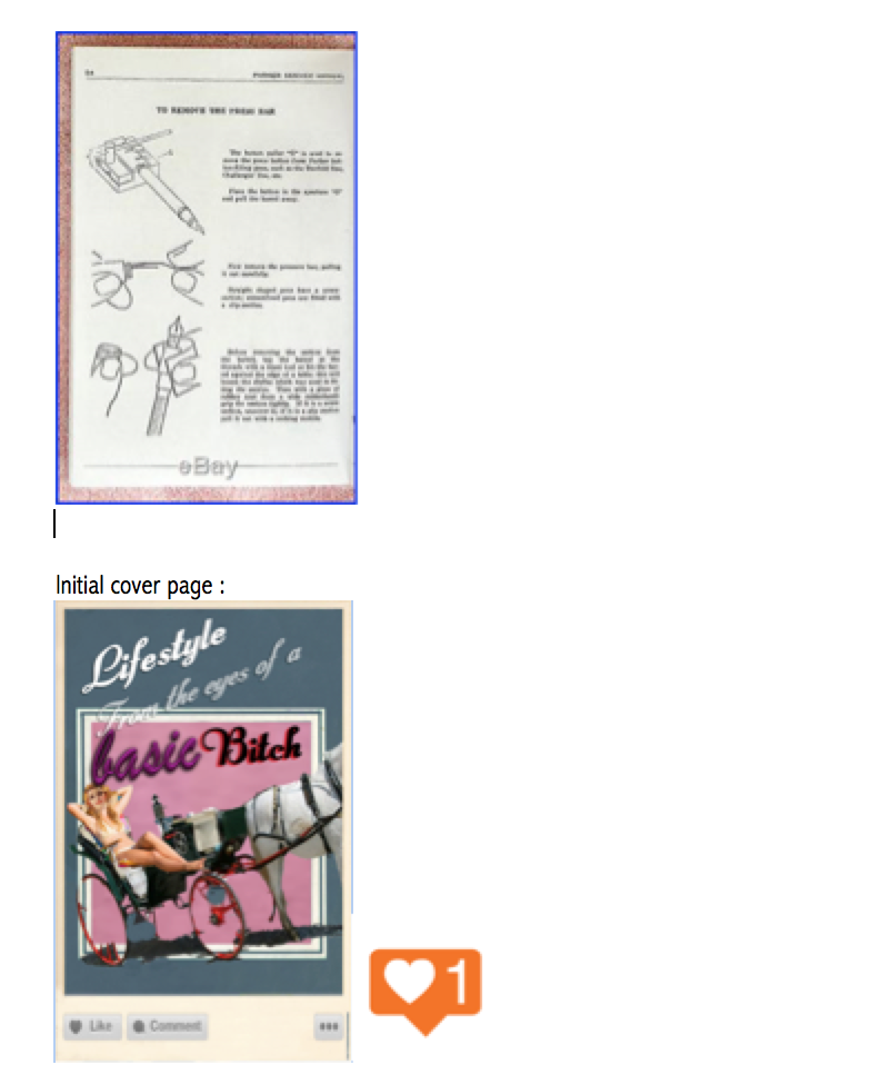
-Oh my gosh I realised I saved this as a draft without posting it-
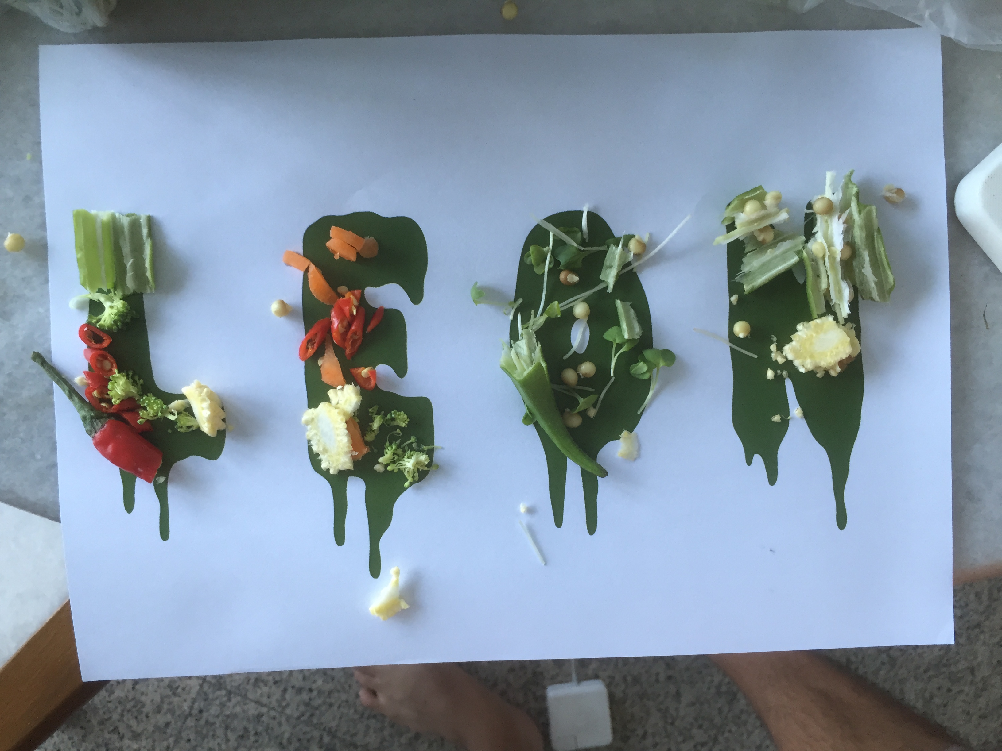
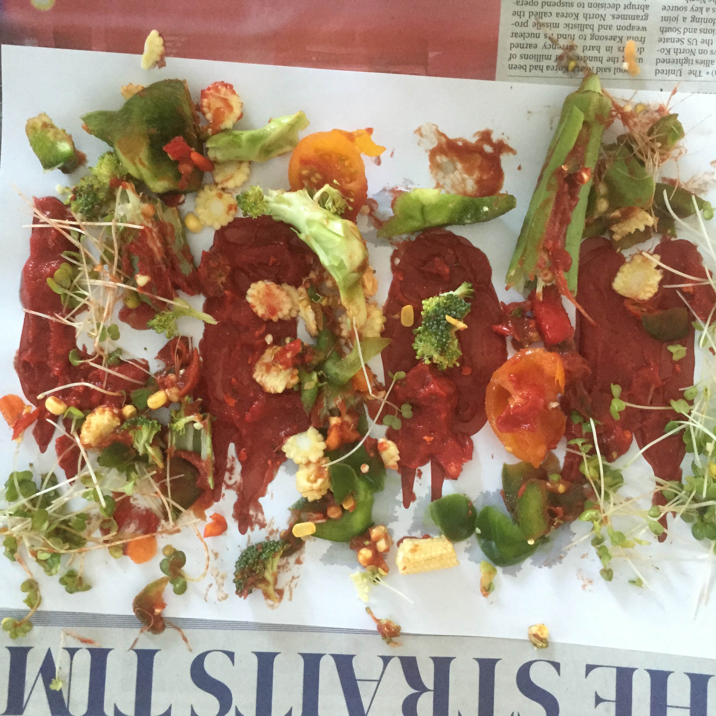
The first thing that came to mind when I was researching on this project was the idea of angles and how certain angles could bring out a different perspective of an object/subject matter. So I began researching on angled/optical art. But when I thought about it I realised that I didn’t have to be limited to optical illusions but I could also lay layers over so that once moved it could reveal a different image.
My initial explorations led me to exploring the female breasts. Initially I wanted to take on a more light-hearted and comedic tone but then i realised that if I could balance that with a message behind the comedy it would be more effective that way.
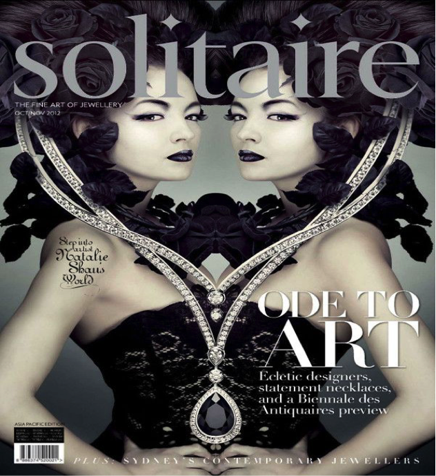
I wanted to create something that was visually similar to Banksy’s artworks where there is a sense of grim comedy that really gets to you.

Initial Ideation :
Boobs from the point of view of a grandmother
Boobs from the point of view of a pervert
Boobs from the point of view of a baby is food
Boobs from the pov of a bra
Boobs from the point of view of a teenager is transformation/change
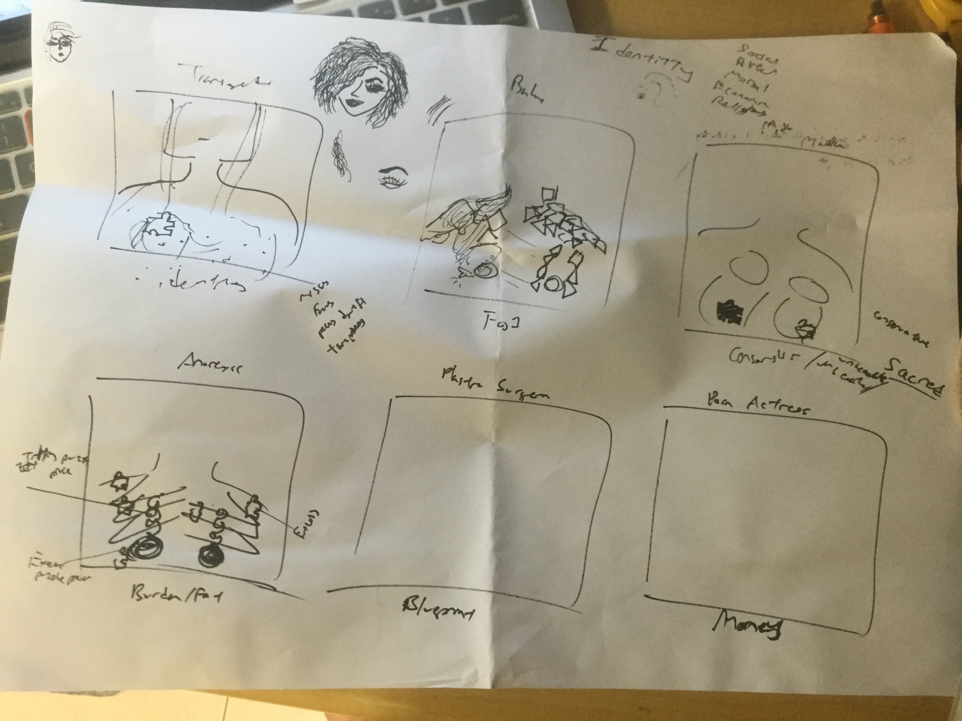
Boobs from the point of view of a transgender is identity
Boobs from the pov of a porno film maker
Boobs from the pov of a butch
Boobs from the pov of a gynacologist
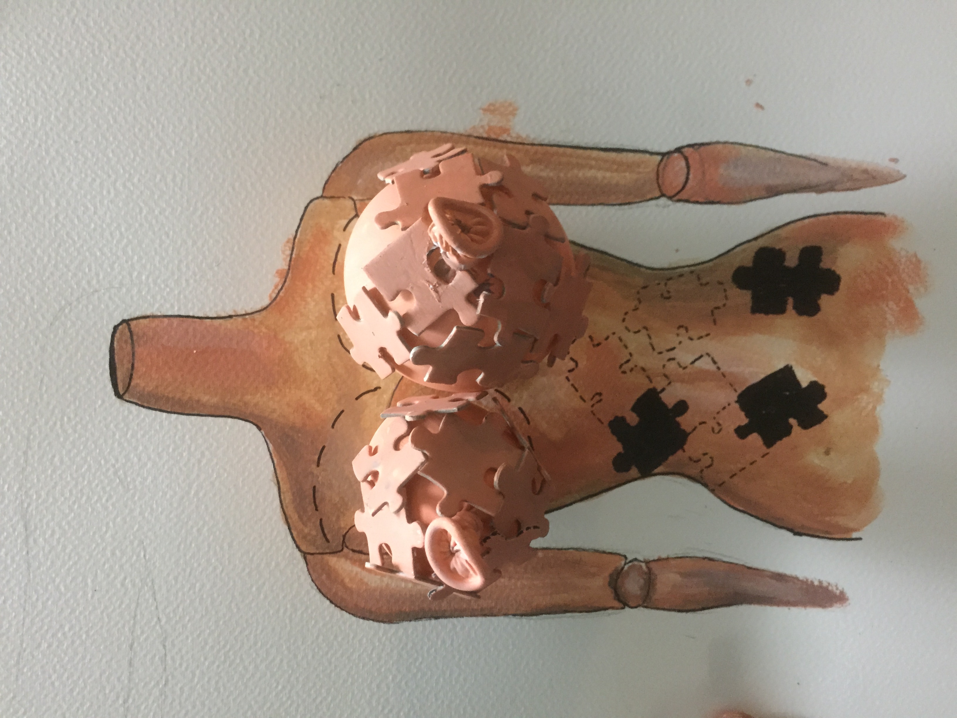
Boobs from the pov of a plastic surgeon is a blueprint/work of art/clay
Boobs from the pov of a sculpture
Boobs from the point of view of indian buddhism
Boobs from the point of view of an anorexic is fat/burden
Boobs from the point of view of a fashion magazine
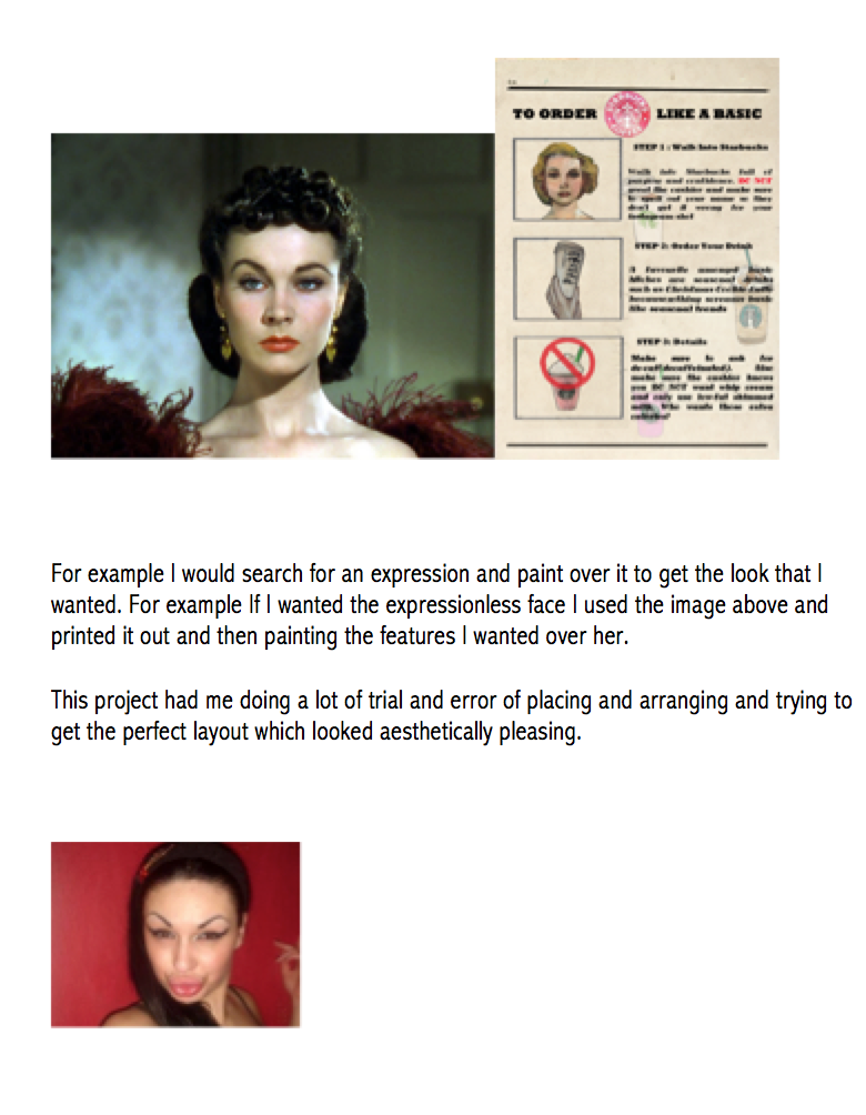
Boobs from the point of view of pop culture is photoshop
Boobs from the pov of an american
Format/Layout :
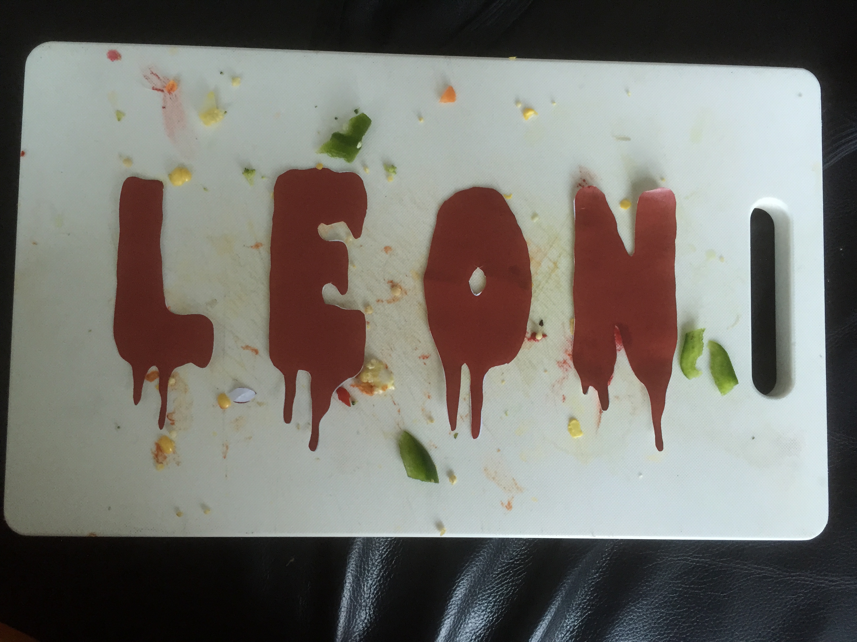
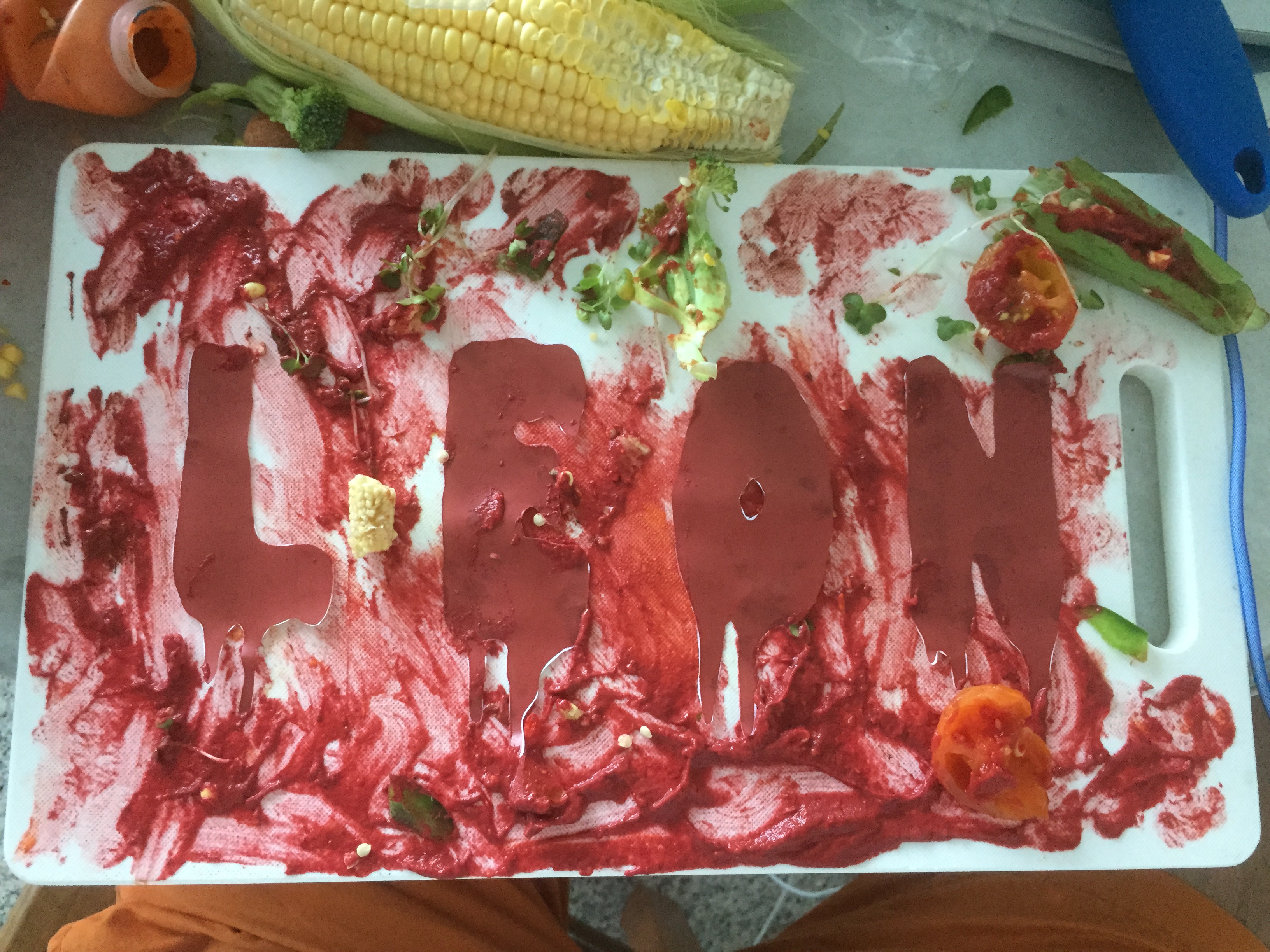
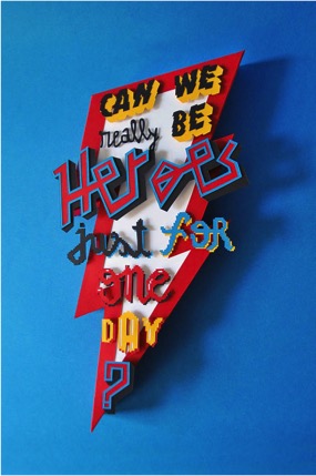
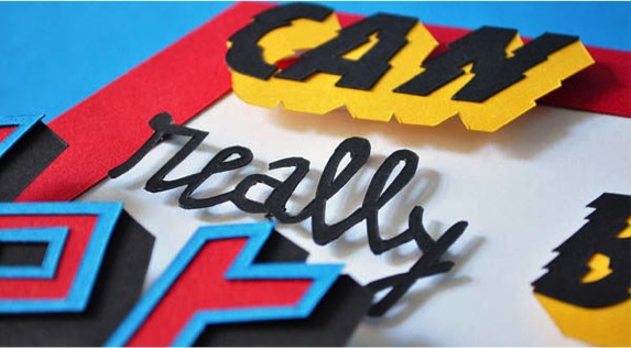
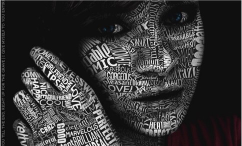
For Layout I would like to present it in a book/magazine format and was thinking of incorporating typography in the works to further enhance the message.
Something like this. But I wanted to go for an illustration style where the subjects are not photographed.
Initial Plans :
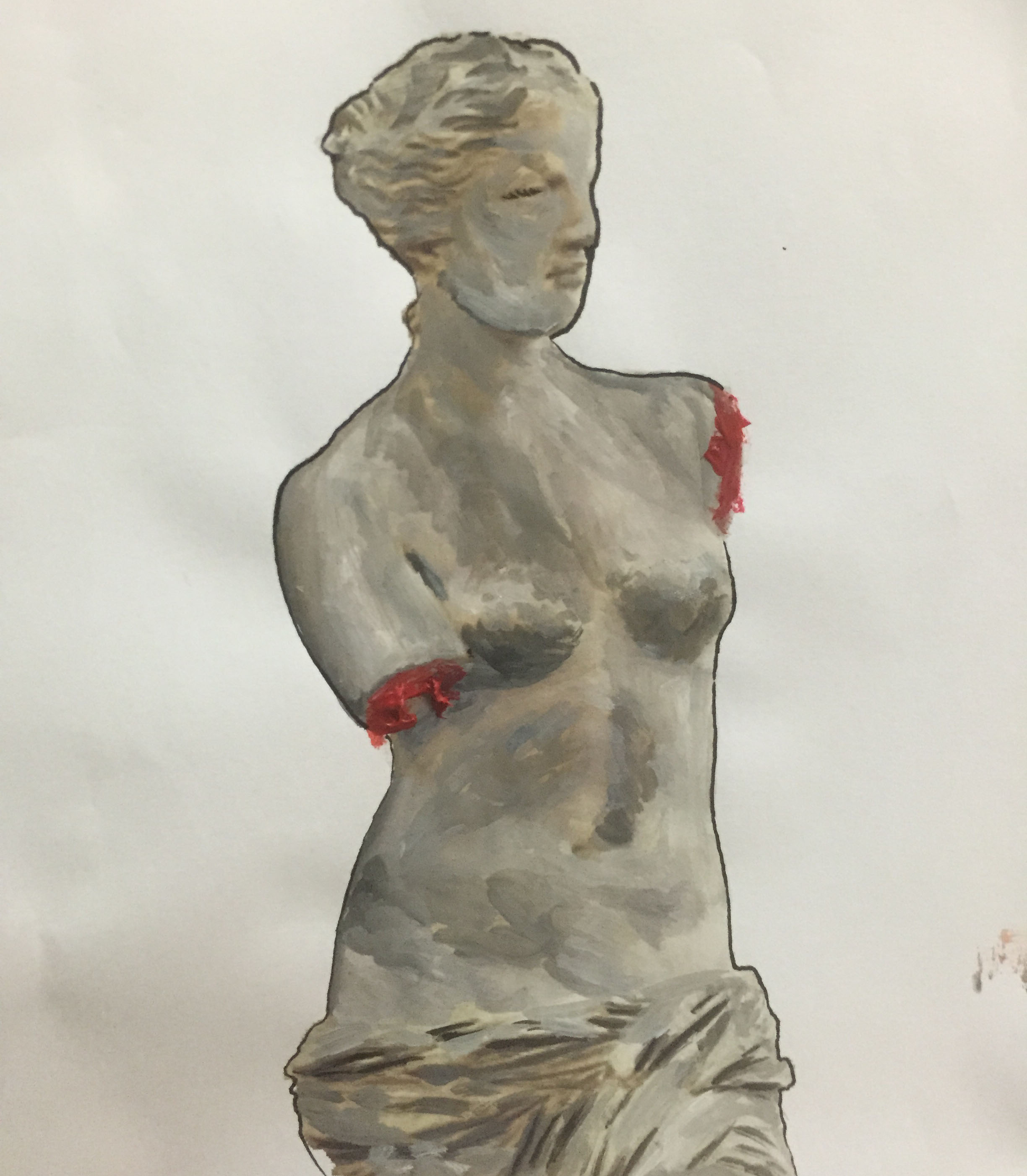
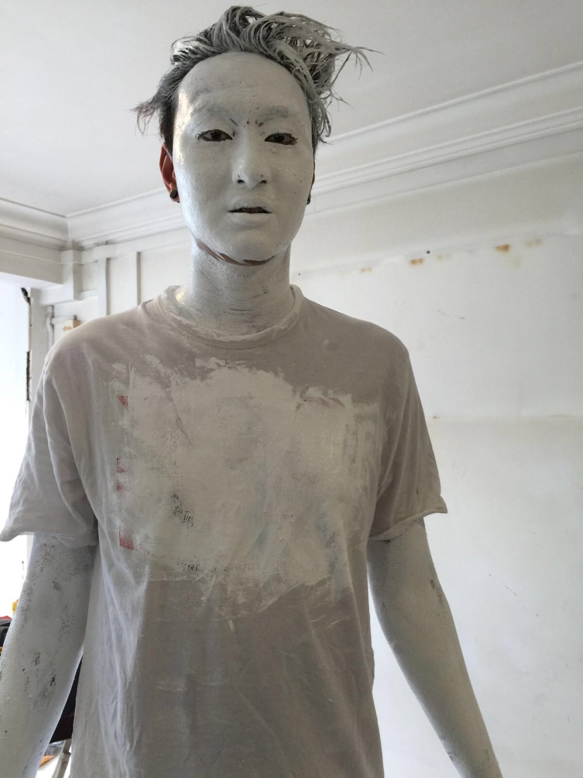
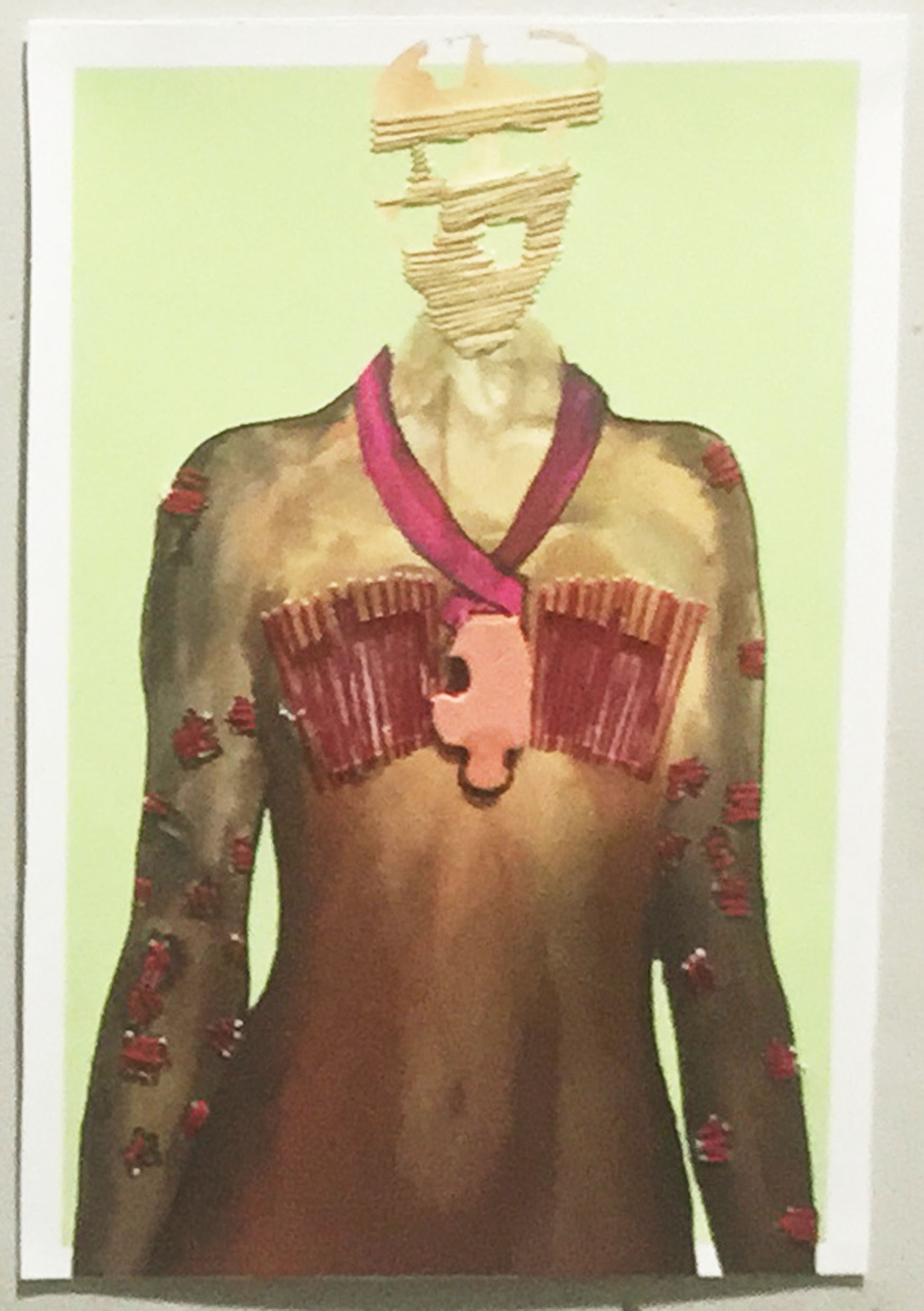
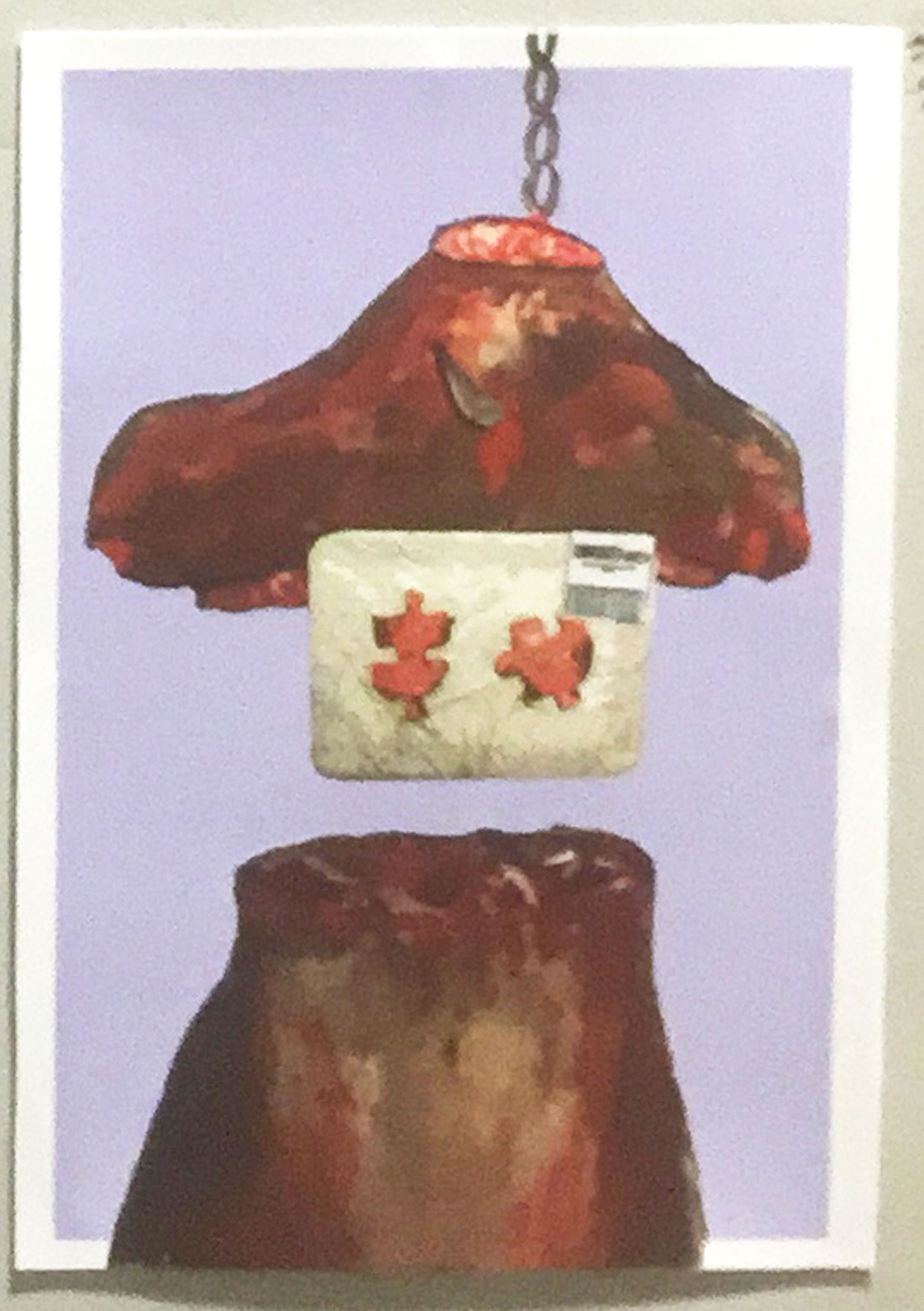
Boobs from the point of view of a transgender is identity
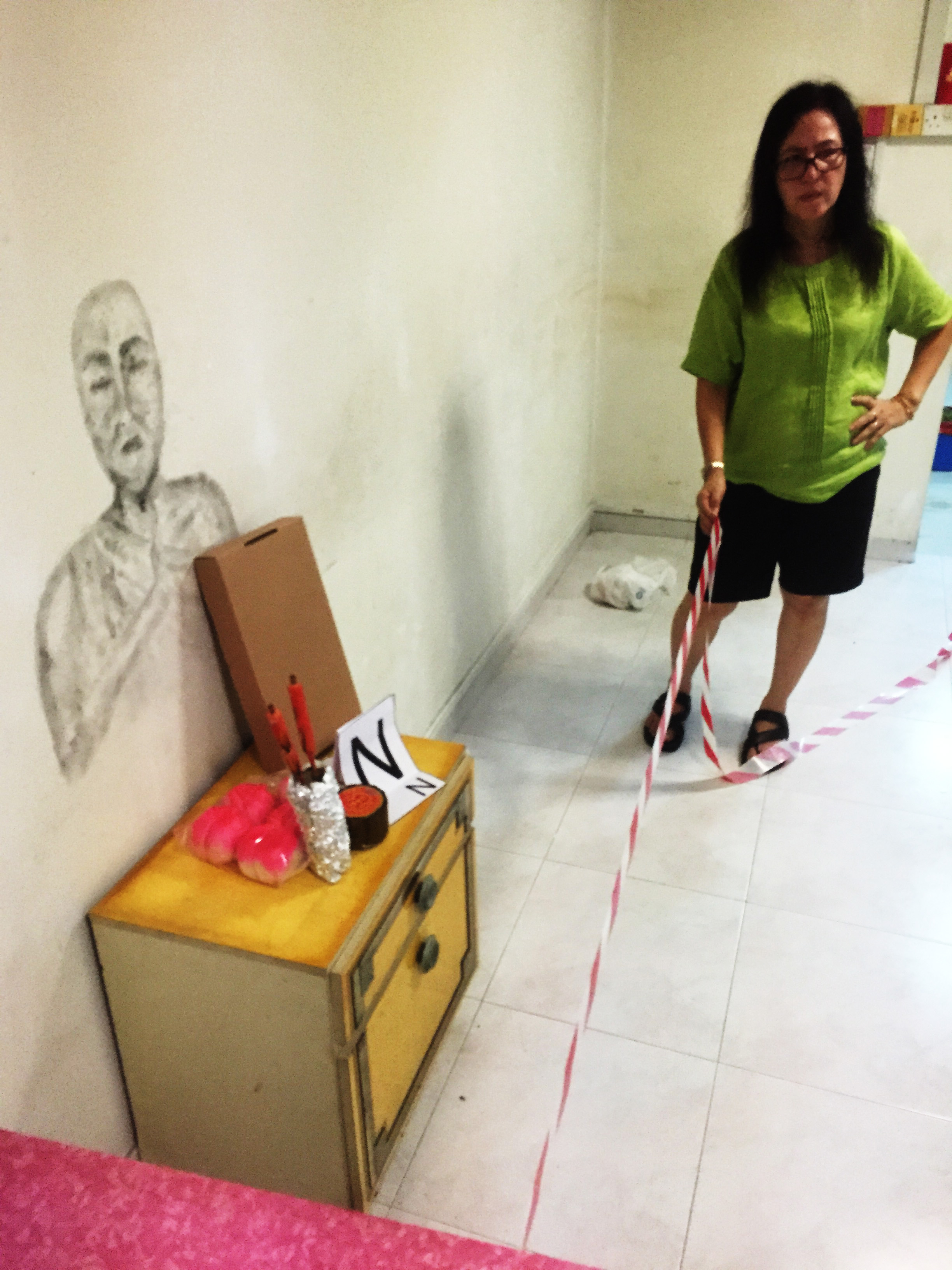
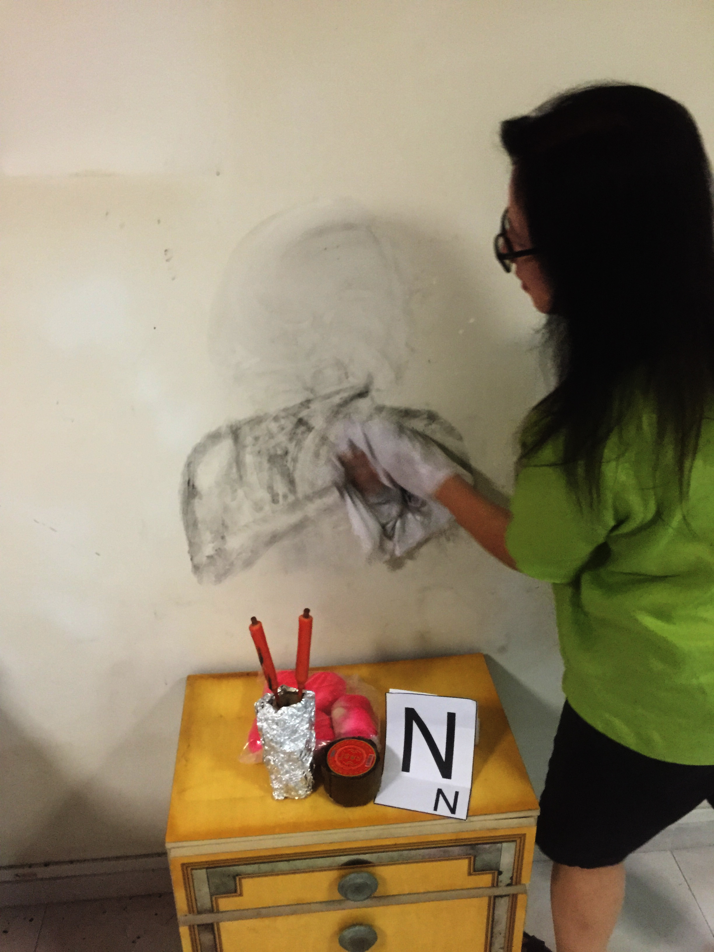
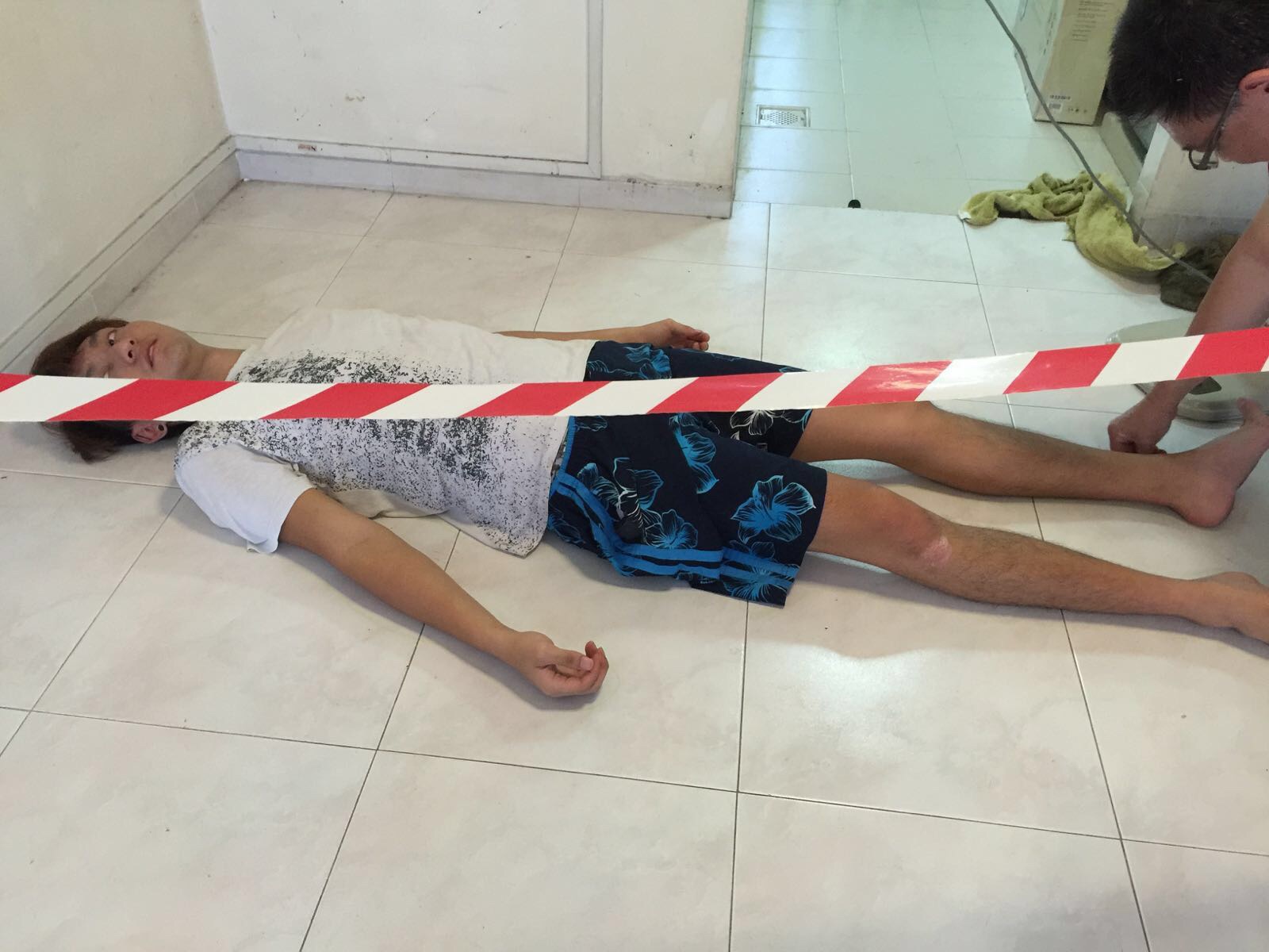
I wanted to mount a male head on top of a female mannequin’s body to show how eventhough the body and head are separate they still come together to form the identity of a person
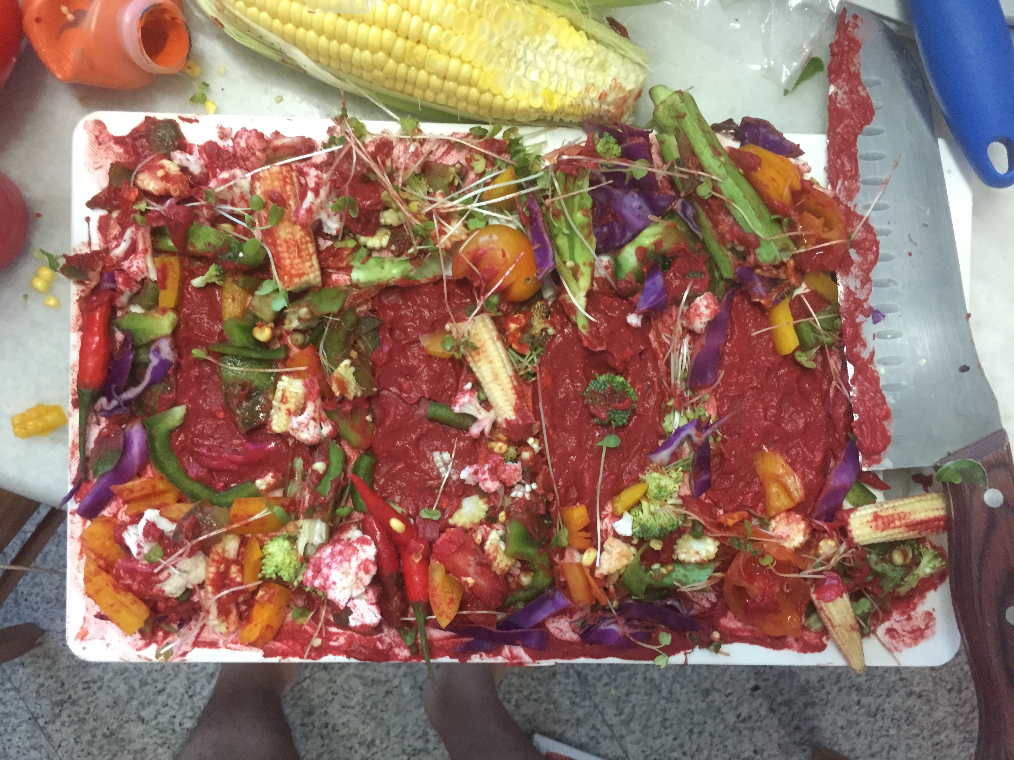
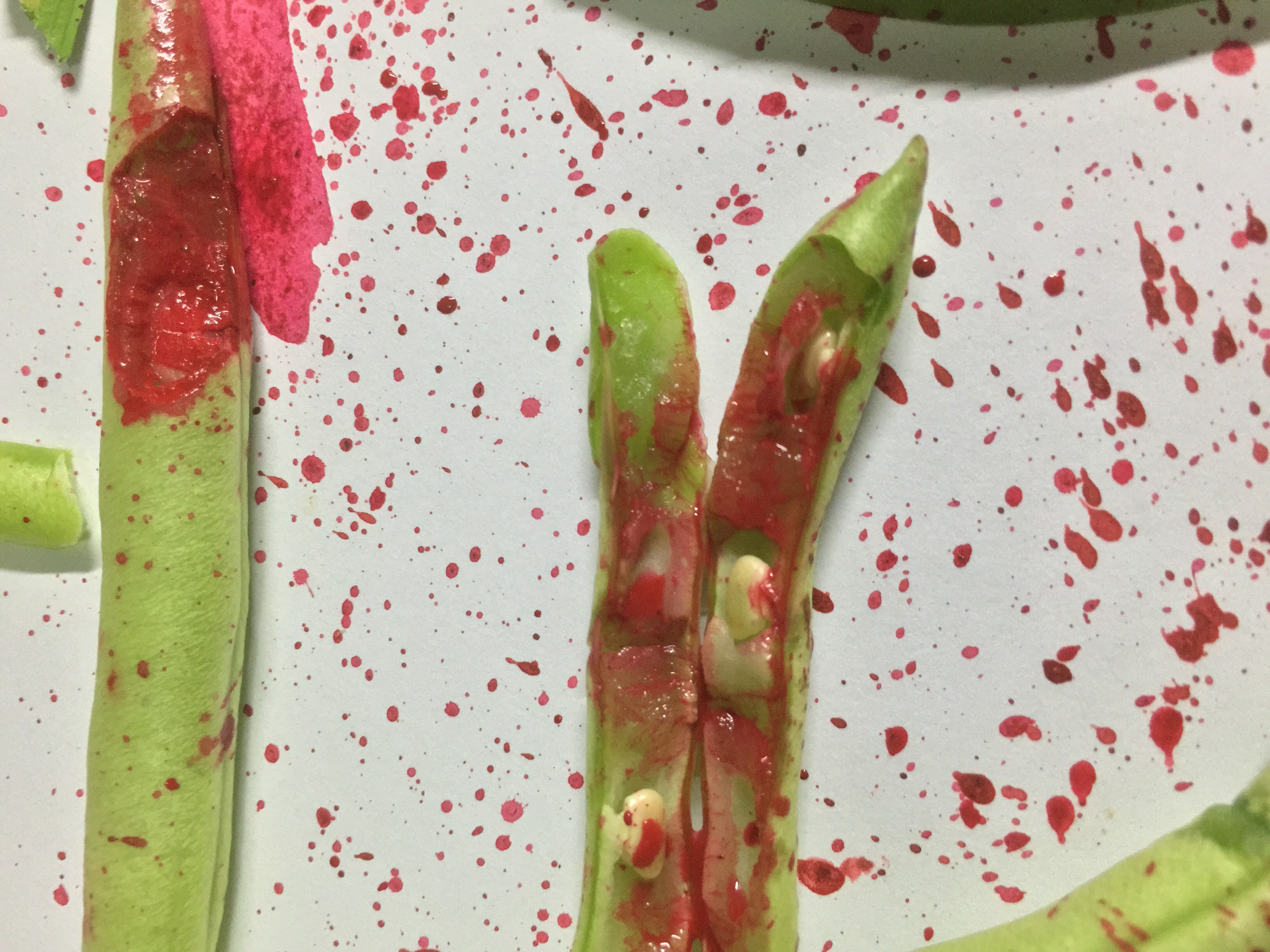
Boobs from the point of view of a baby is food
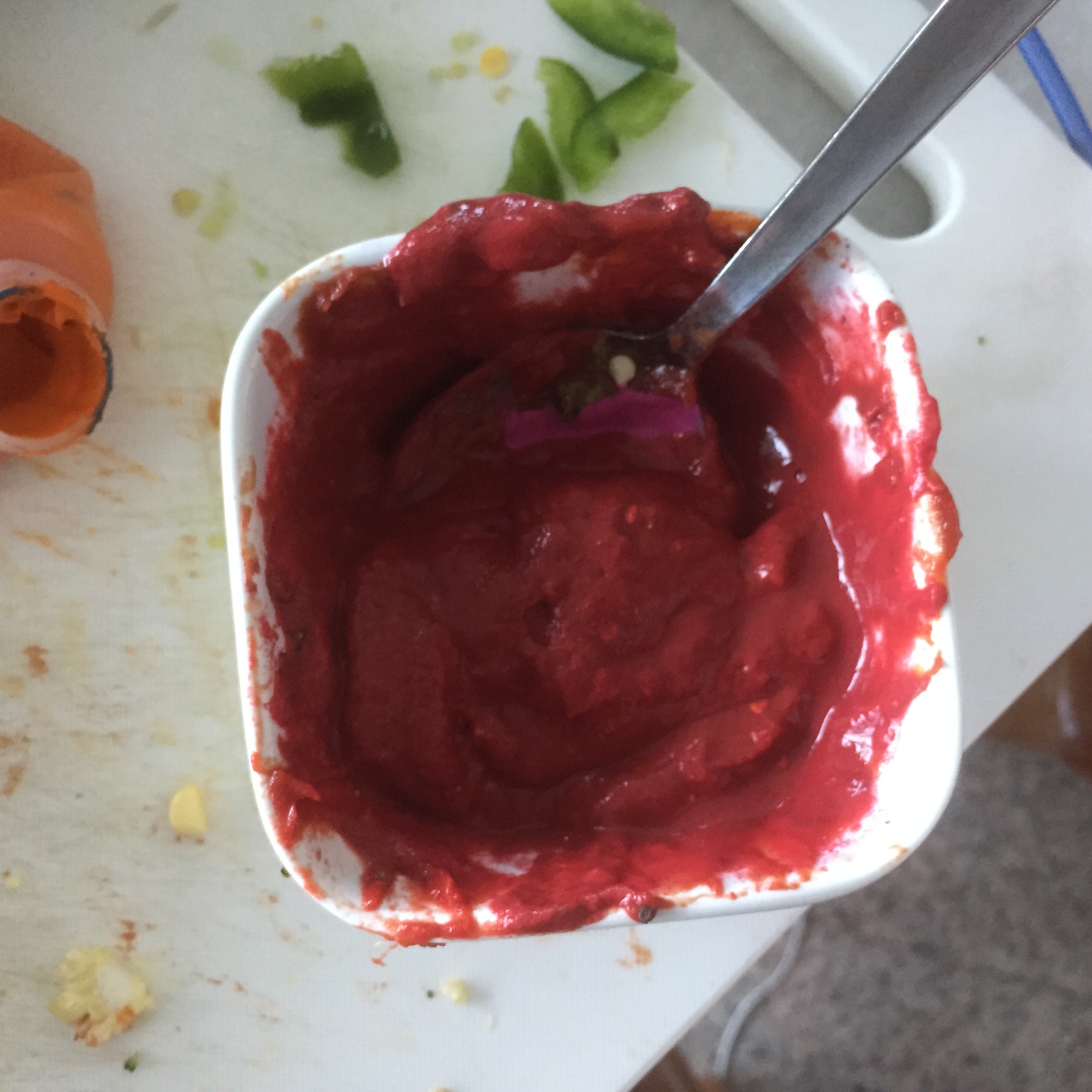
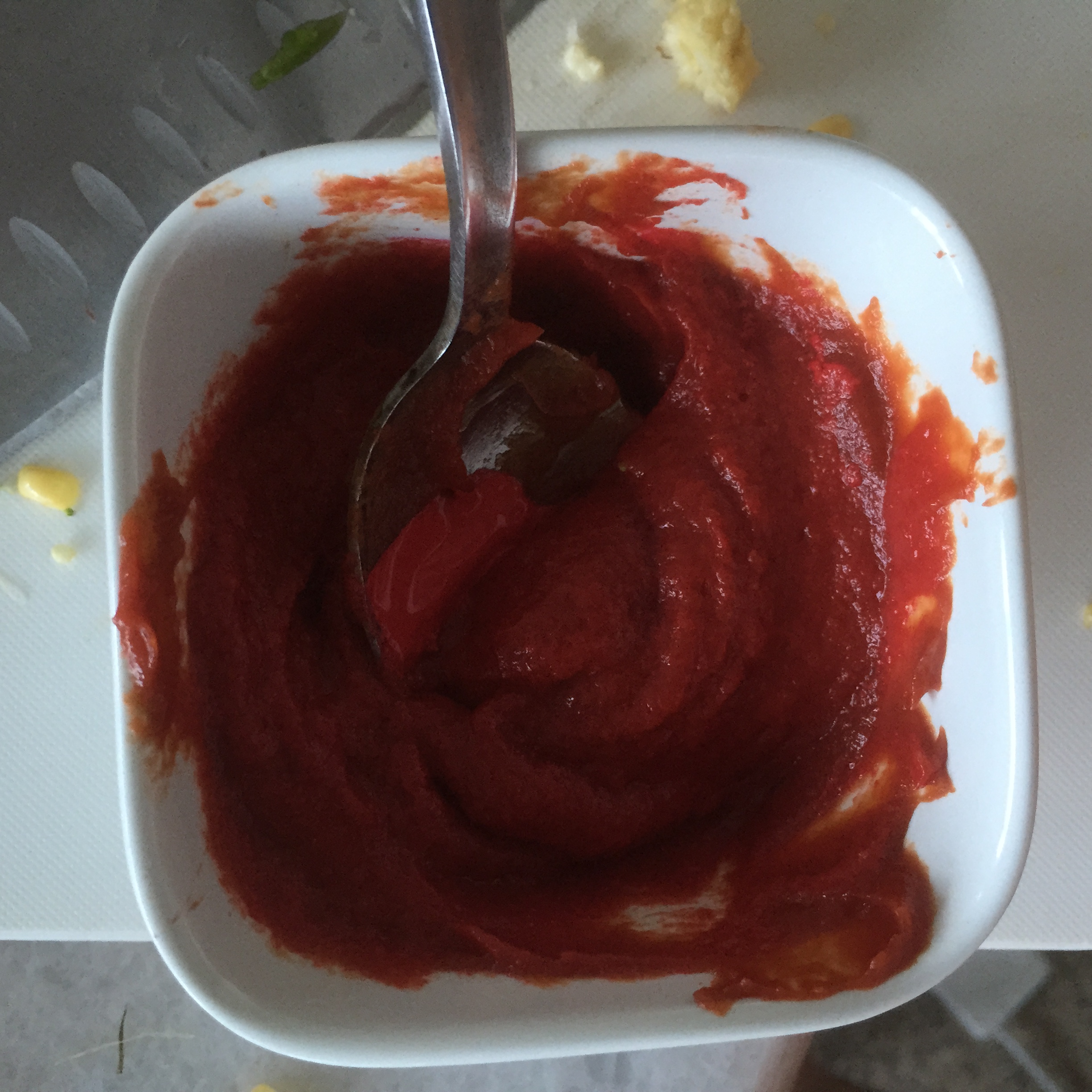
For this I wanted to use a milk bottle to represent baby’s food but replace the feeding rubbery part with a breast.
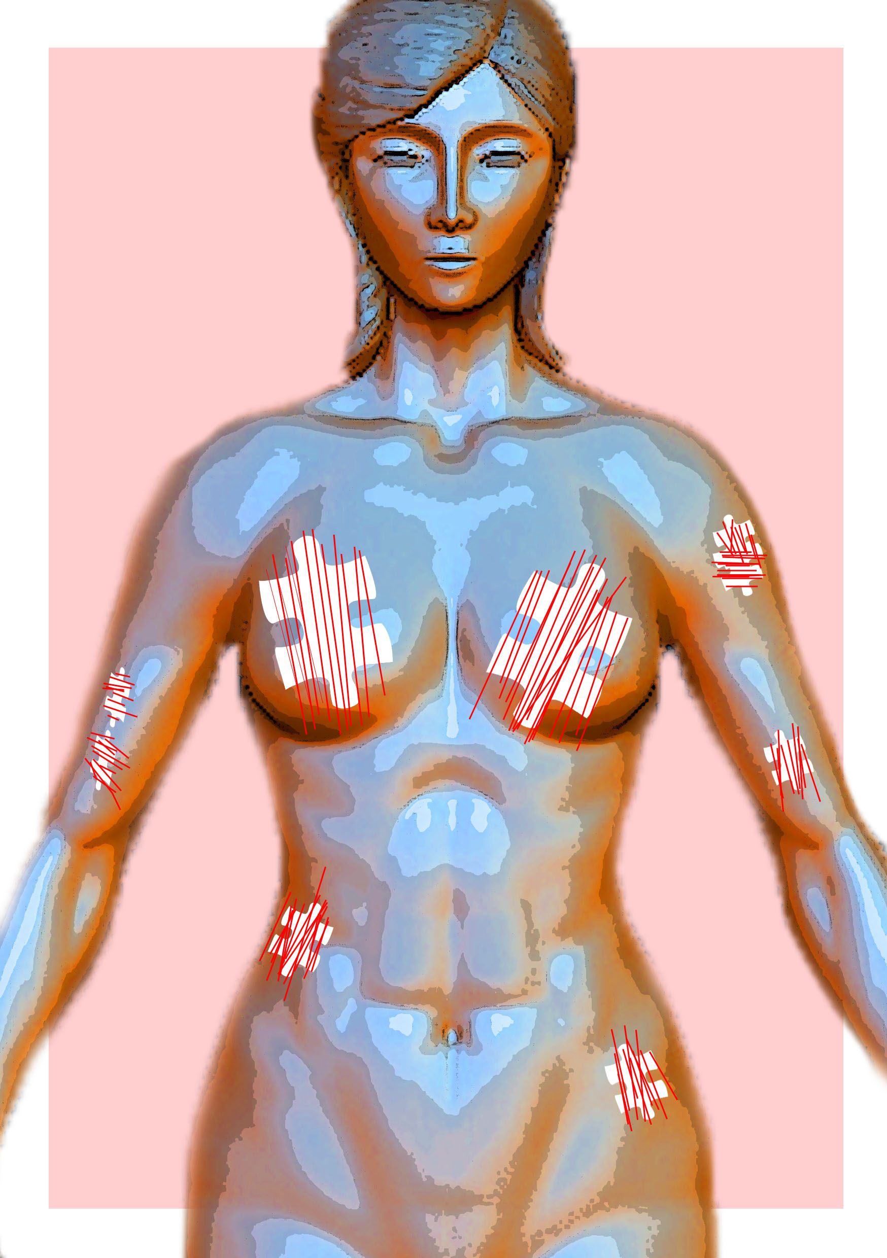
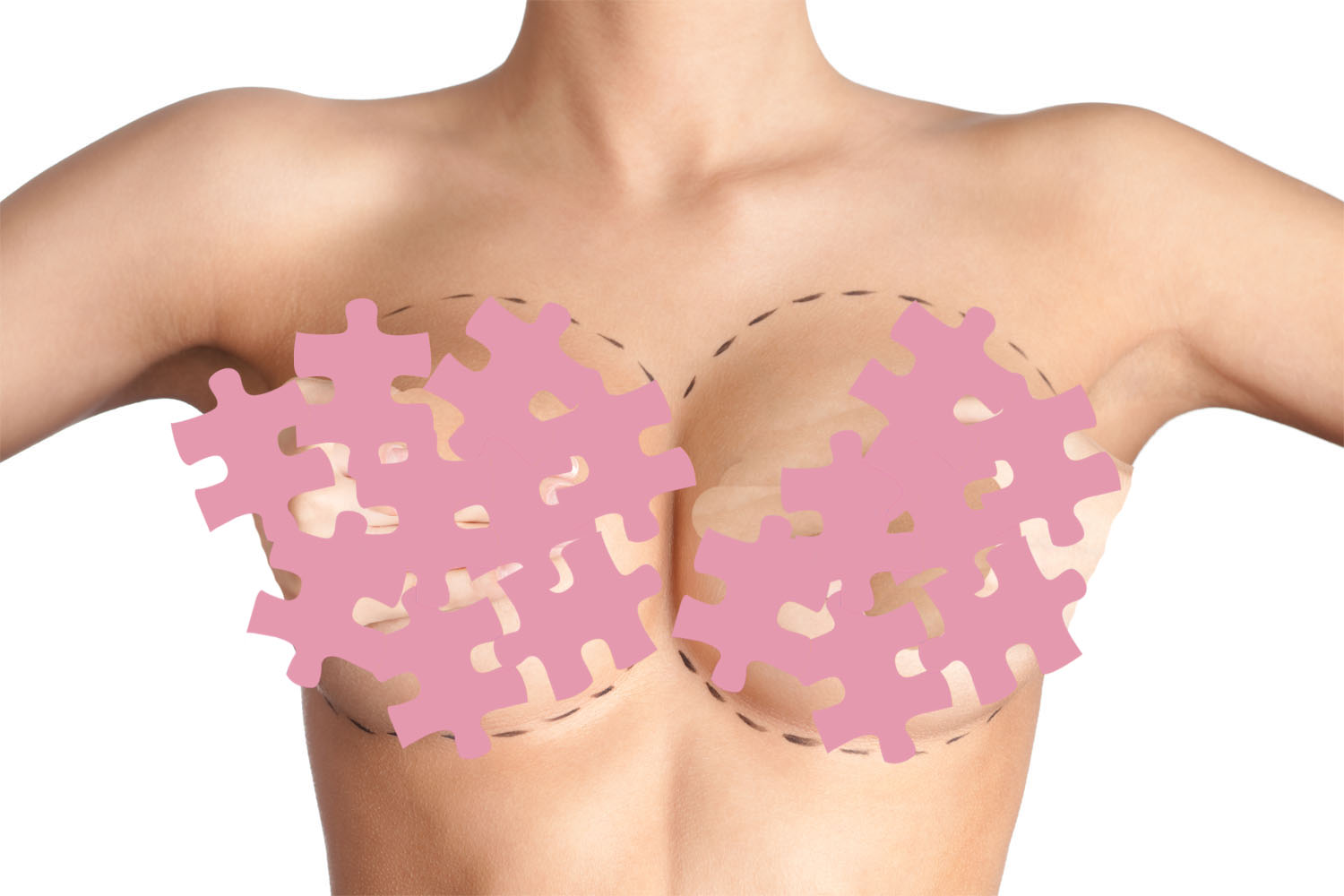
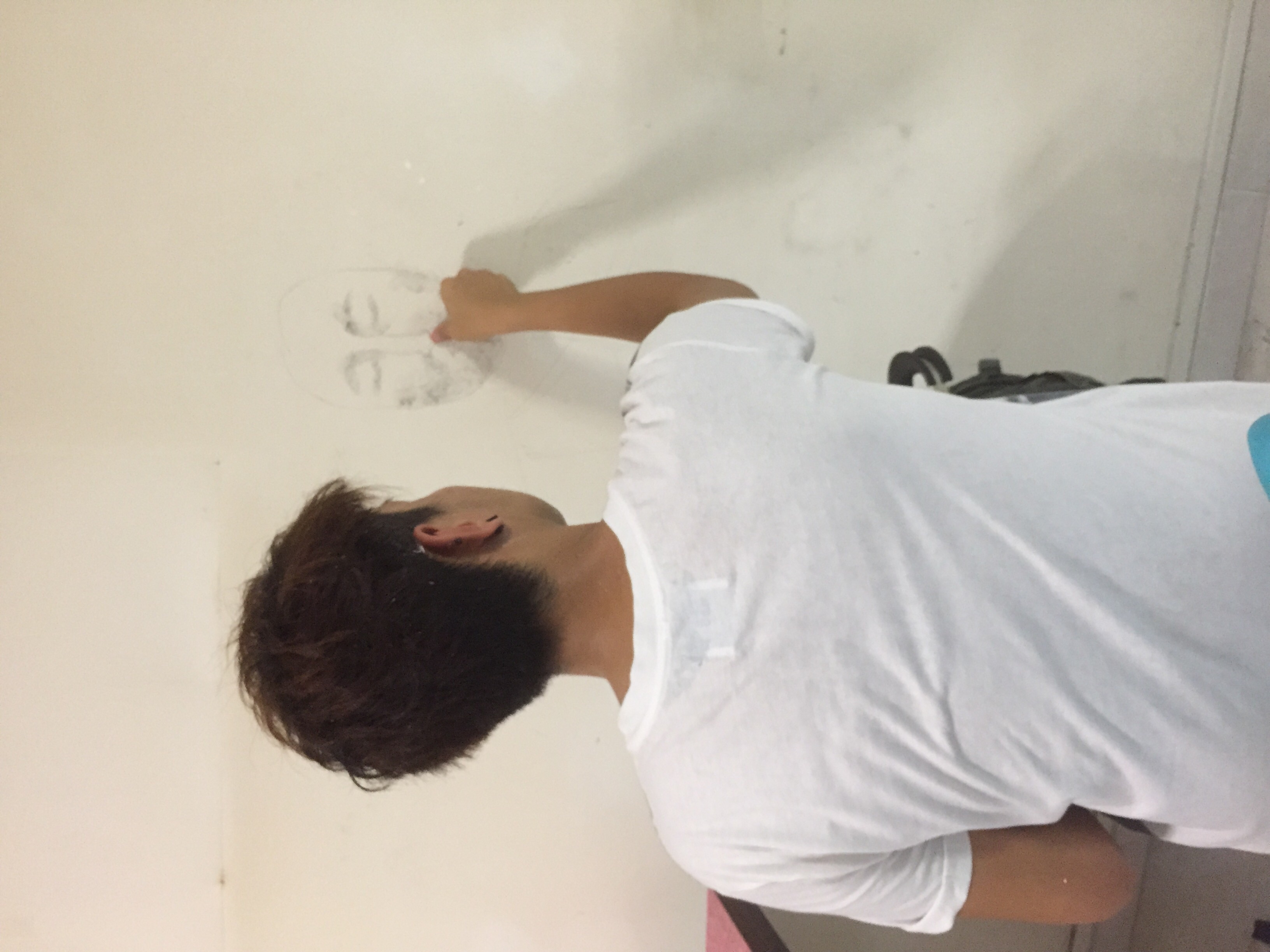
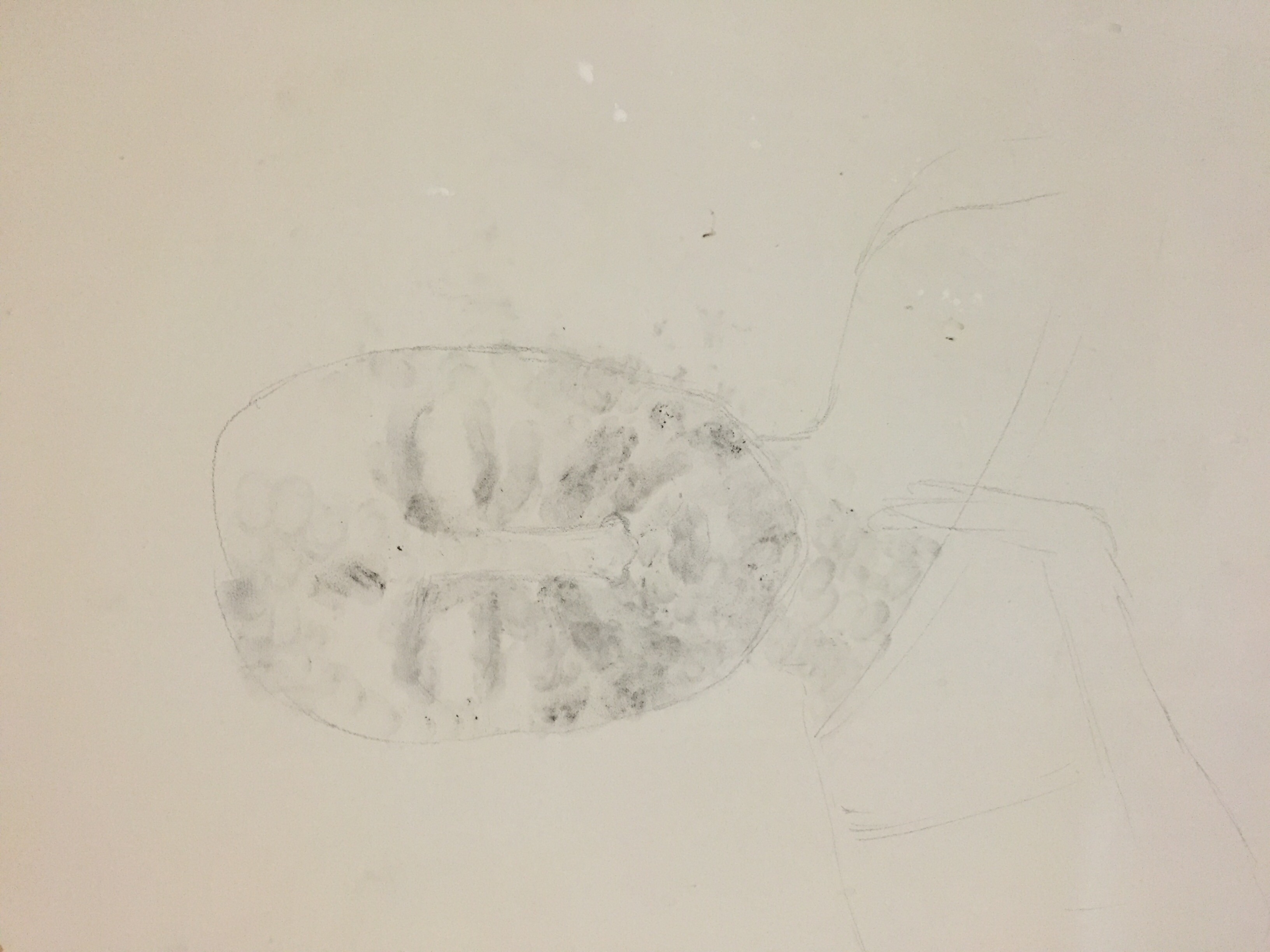
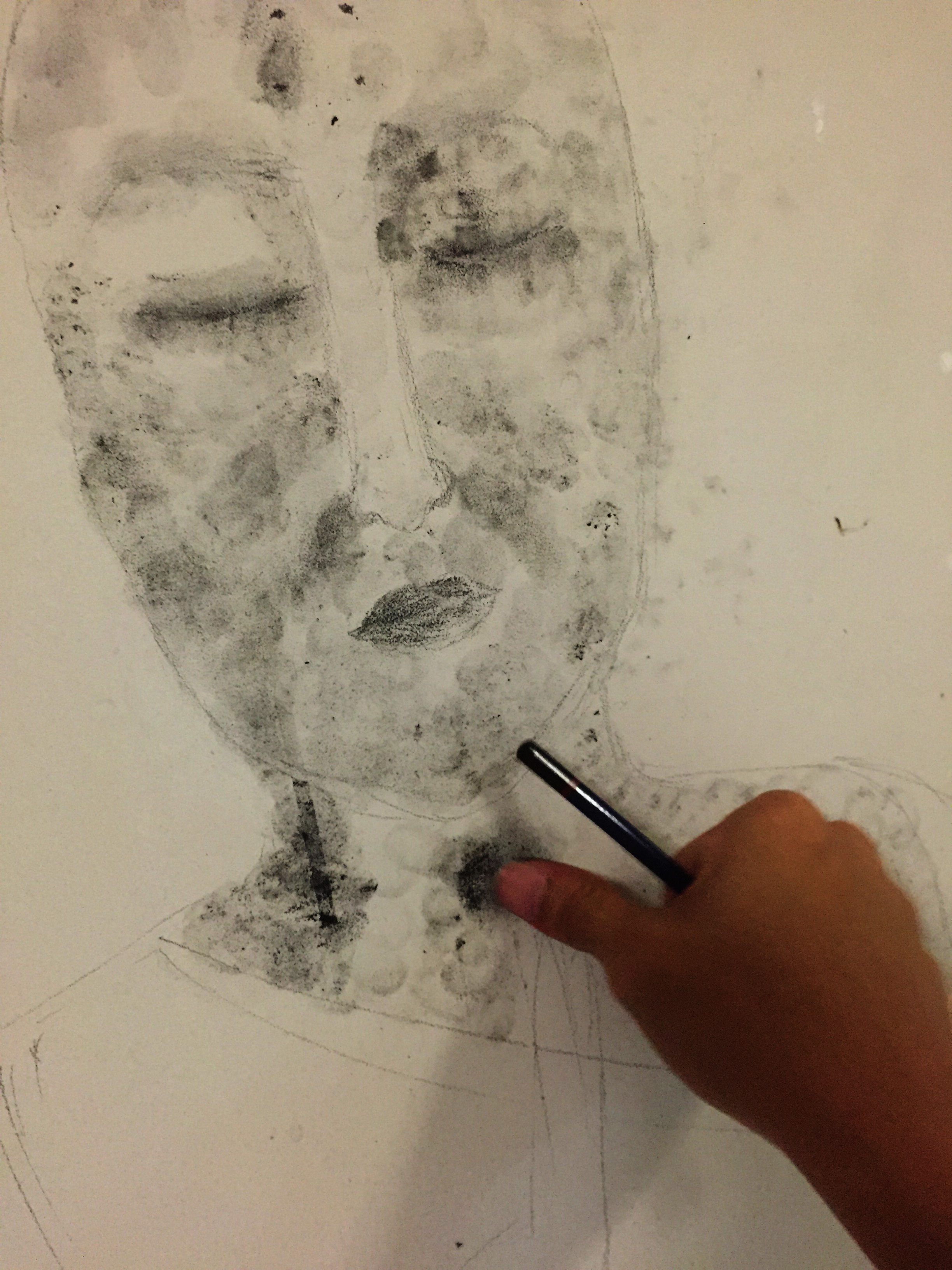
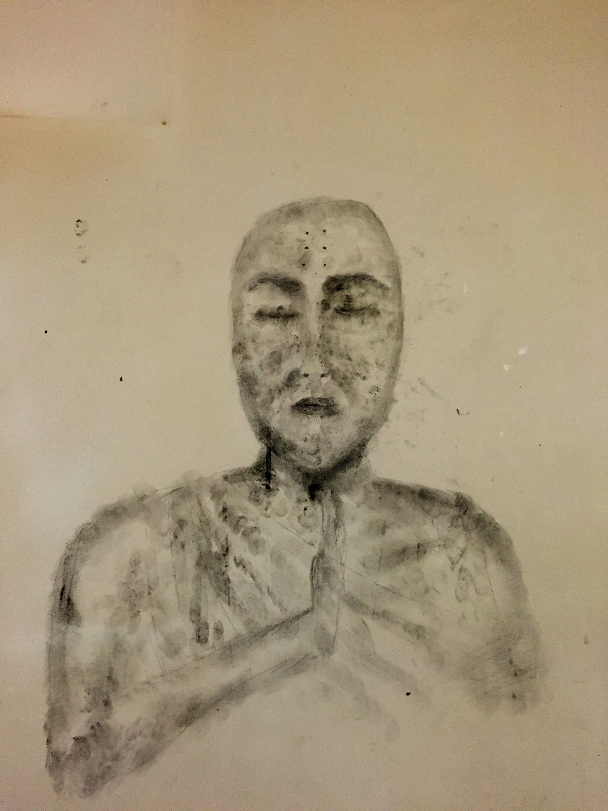
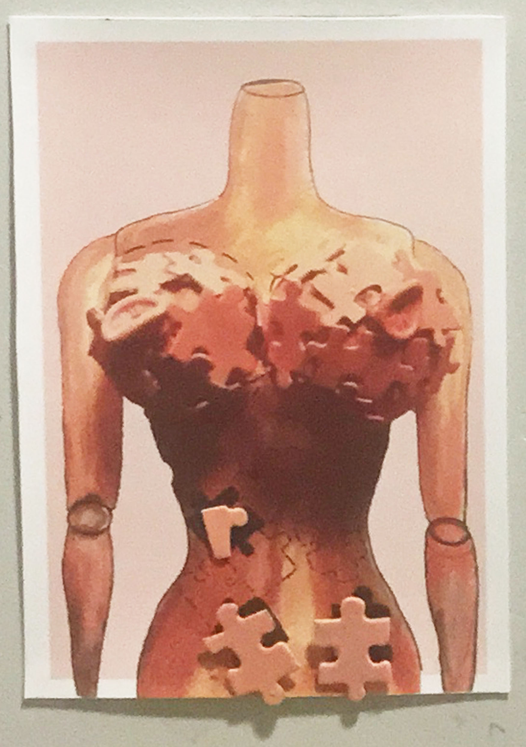
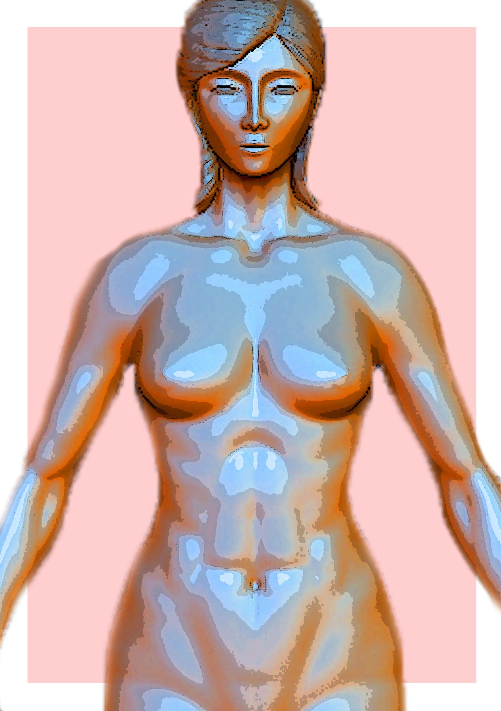
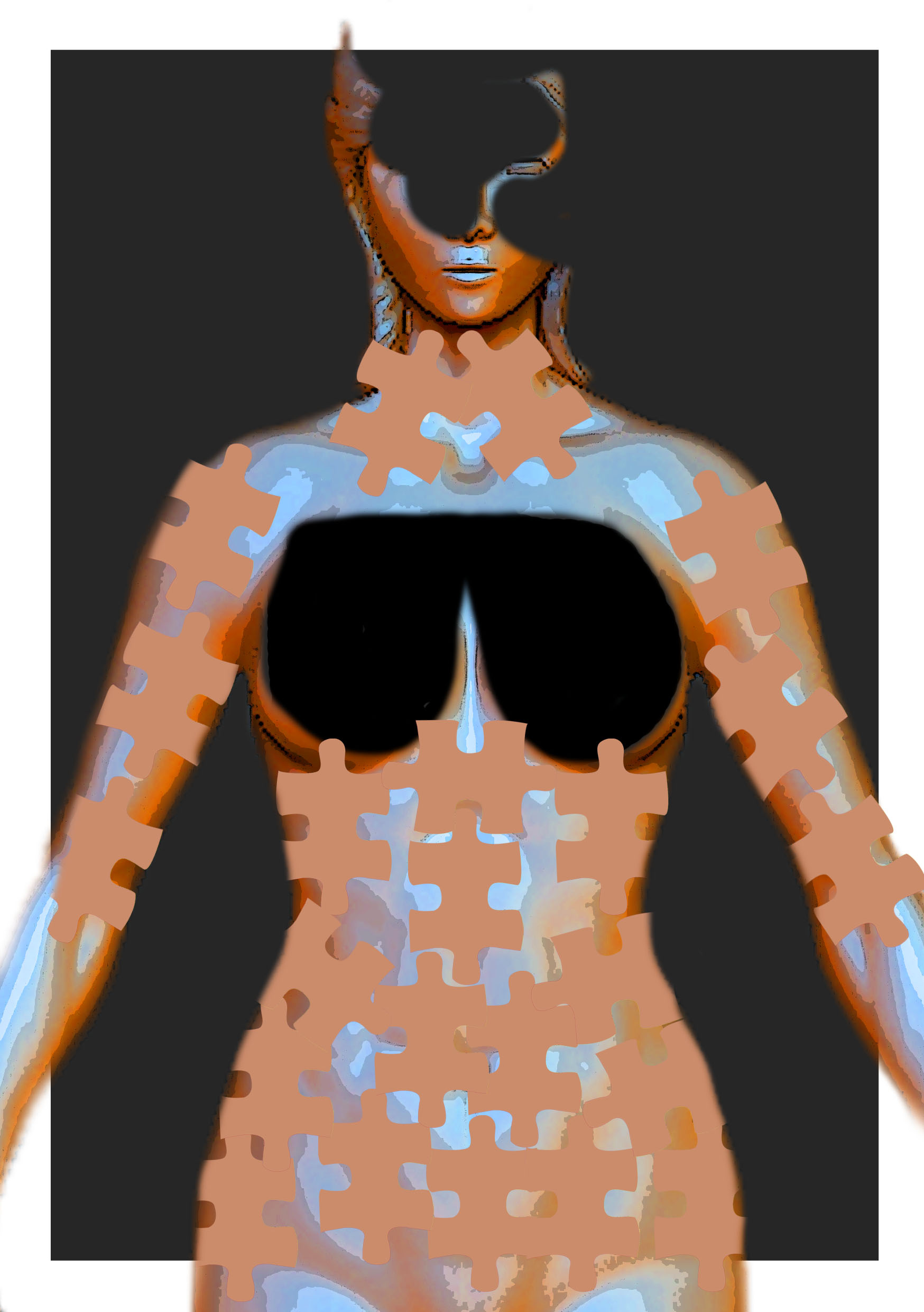
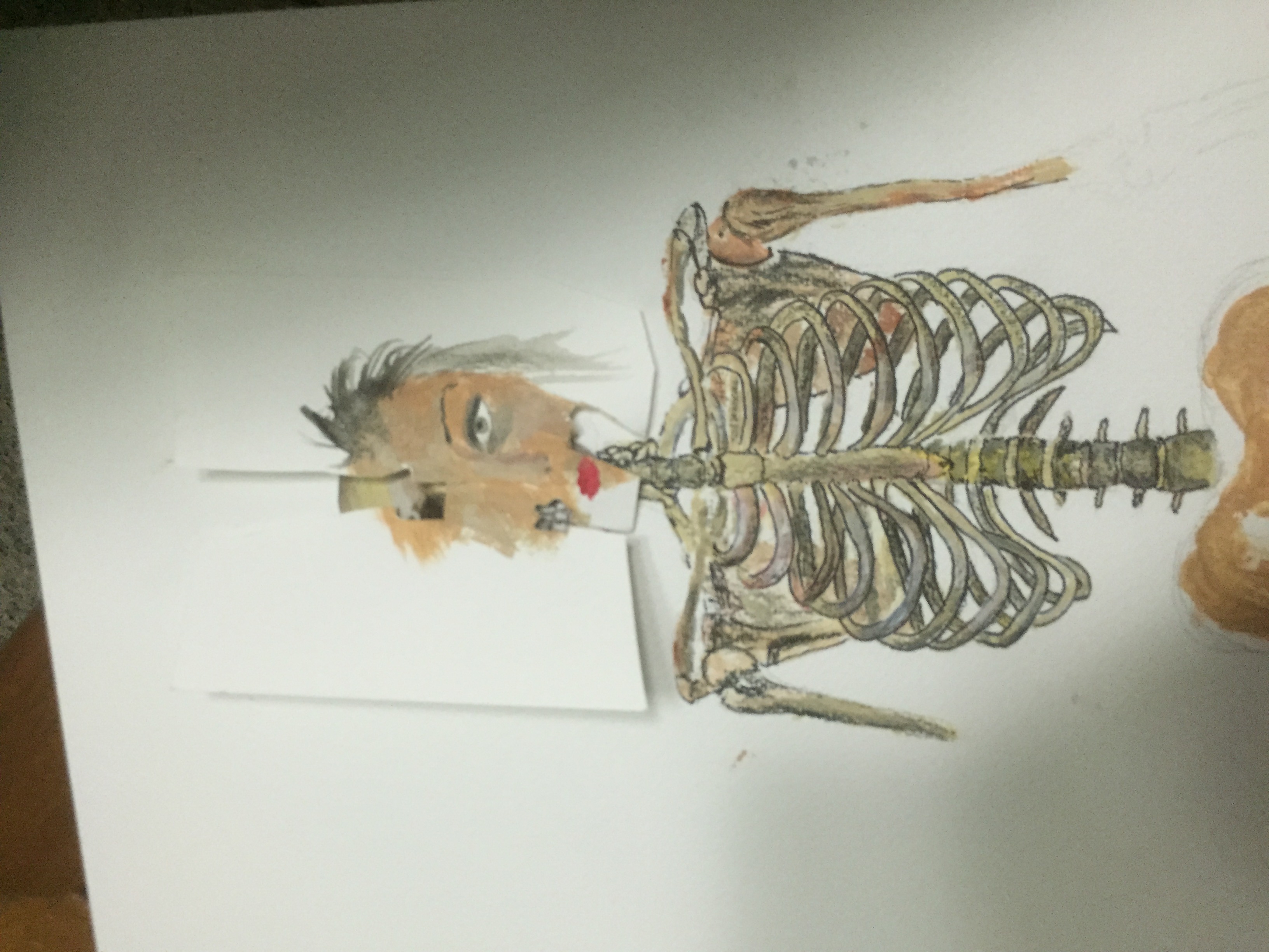
Boobs from the pov of a plastic surgeon is a blueprint/work of art/clay
Thinking of overlaying blueprints over the body.
Boobs from the point of view of a teenager is transformation/change
Not so sure about this idea yet
Colour :
Colours also play an important role for me because the mood i want to suggest also heavily relies on the colour since I will be illustrating. So I would probably contrast the colours with the image. E.g if I am presenting a gory image maybe I could use vibrant colours or if I am presenting a comedic image but with dark, desaturated colours. I feel like this balance would also contribute to the dark humour I want to portray.

In Banksy’s works there is also an apparent high level of contrast and I feel like this adds to the grim atmosphere of the work.
Symbolism/Depiction of Subject Matter :
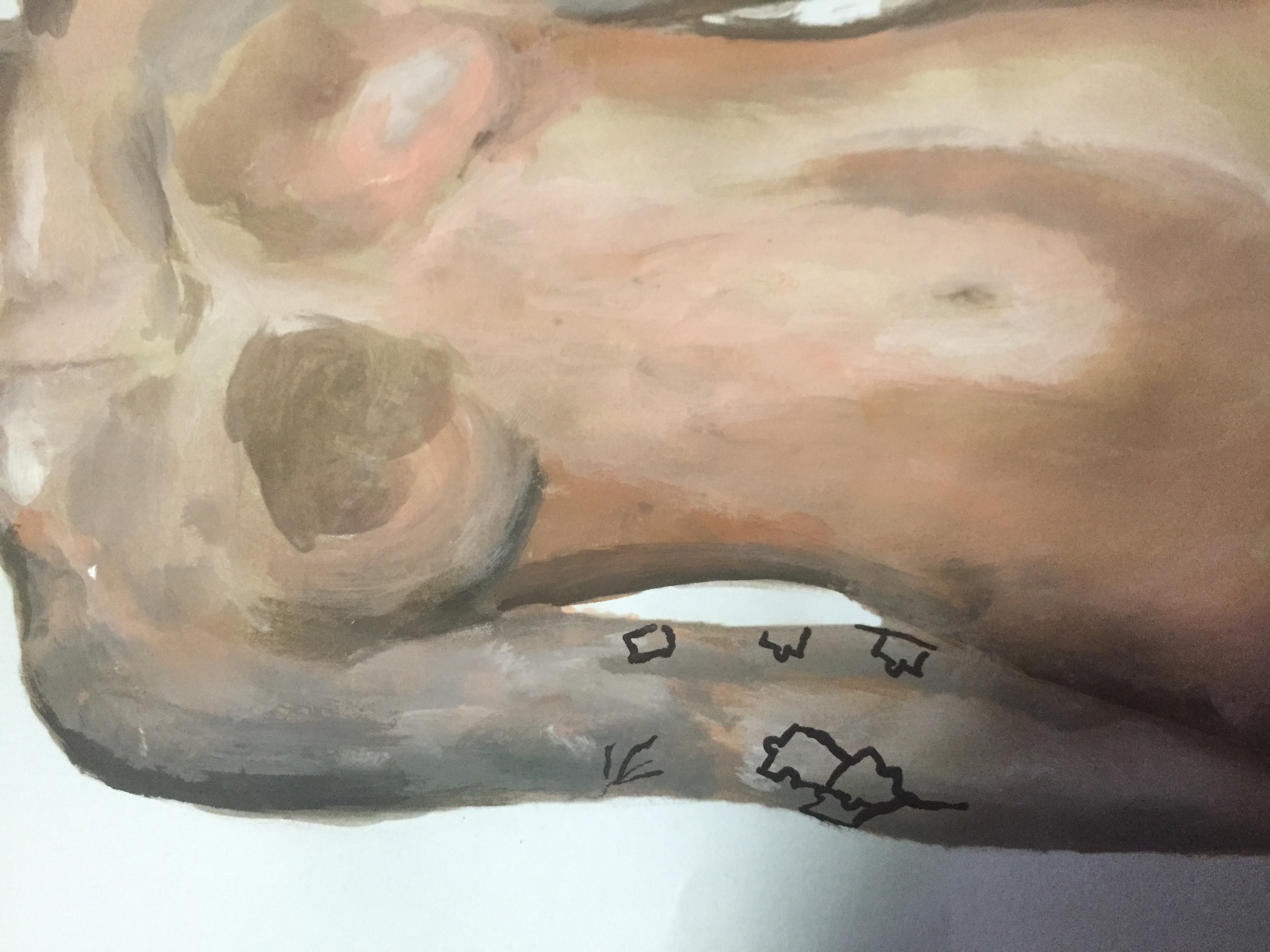
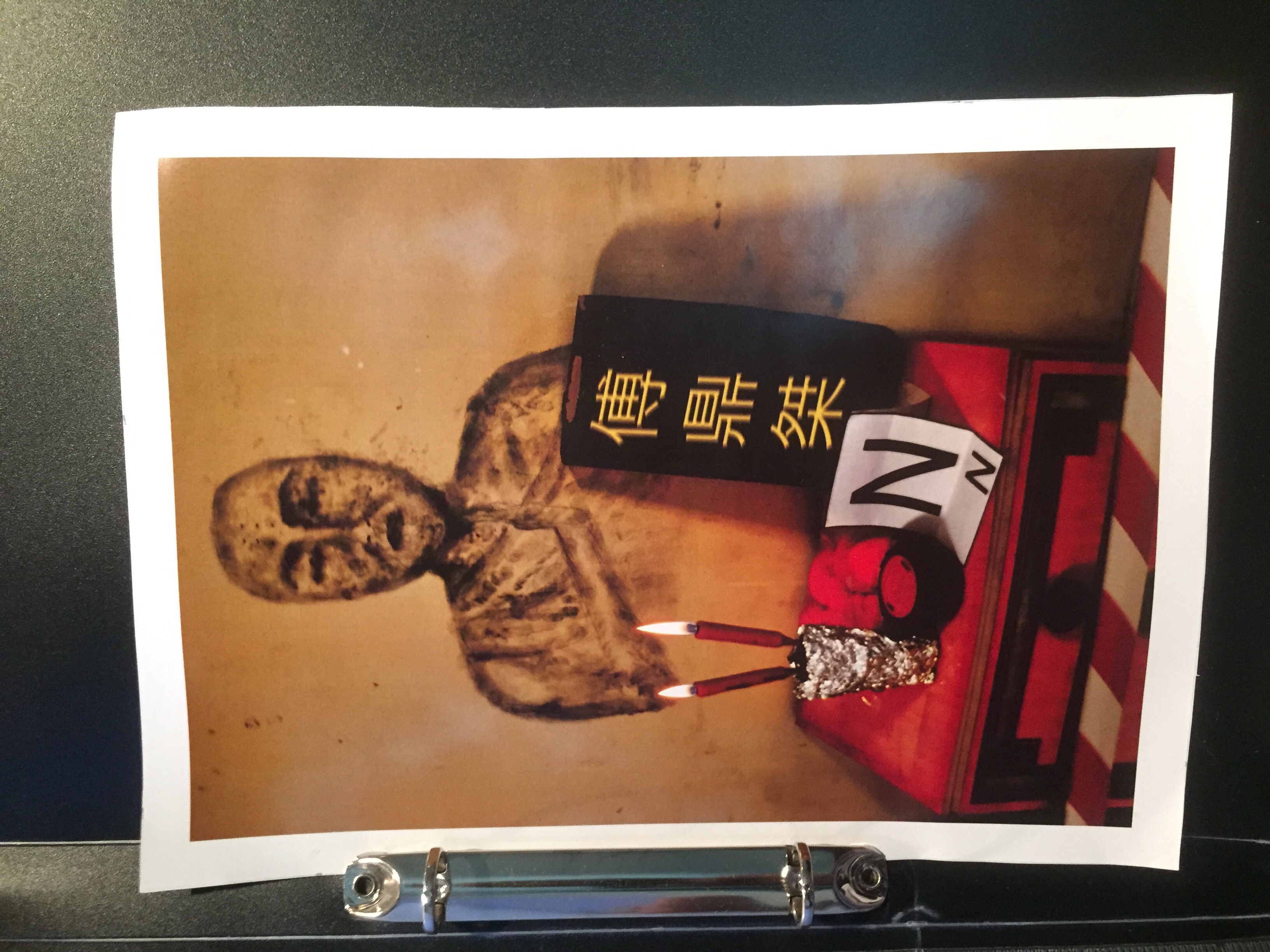
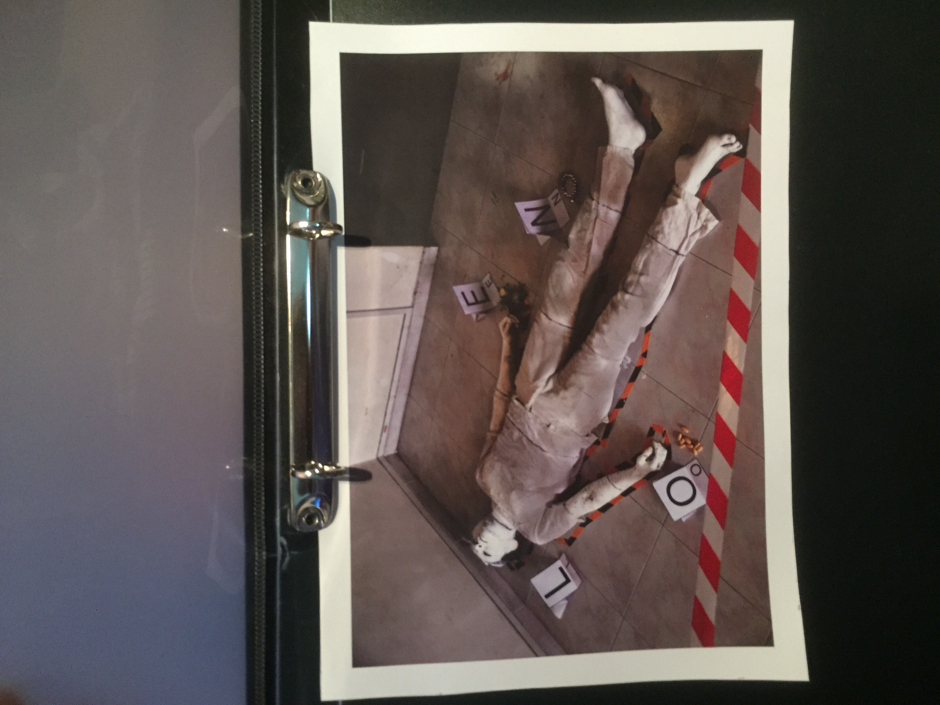
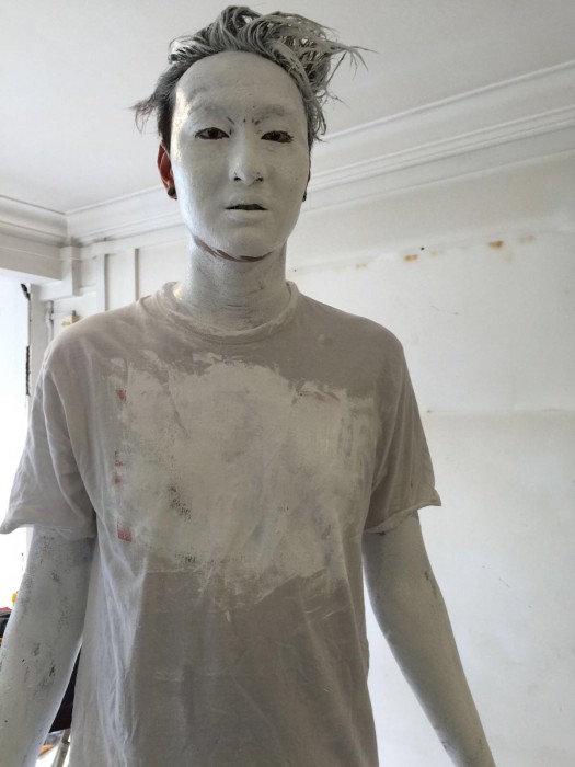
I felt like with my subject matter, breasts, I had to be careful because I did not want it to end up crude and tasteless and at the same time I did not want it to be a work which did not visually convey the subject matter clearly.
Like what my classmates said in class it cannot be portrayed too ‘in your face’ and it turns out looking cheesy and cheap and it can’t be too symbolic either where the entire subject matter is not communicated through the work.
So I began looking for things that resembled my subject matter.
I’m still exploring so hoping I find a path
I feel like the these 3 components would be important to me in this project :
Colour/Contrast
Layout
Something rom the pov of a blind person
KFC from the pov of an animal lover
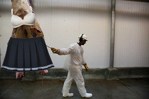
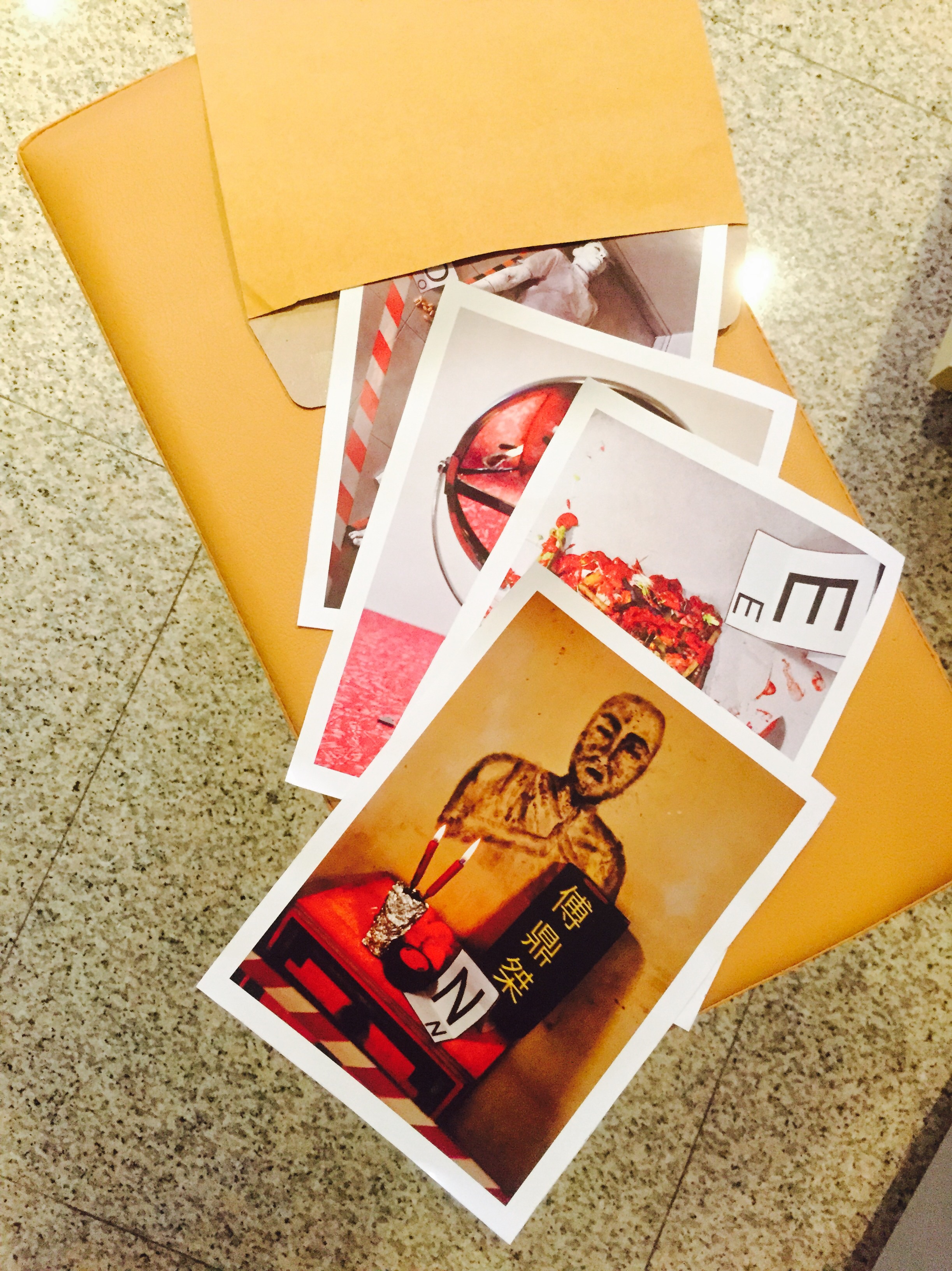
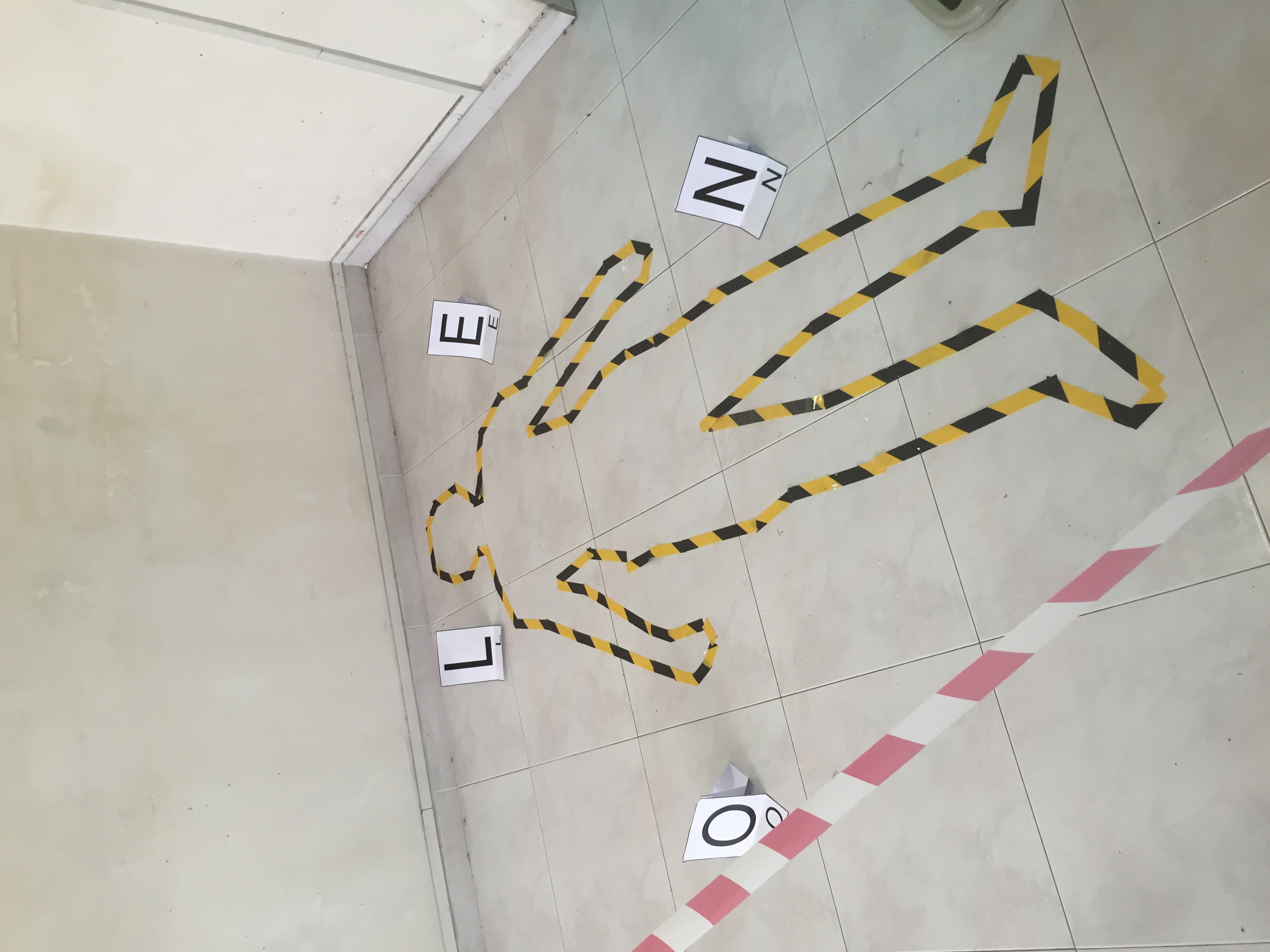
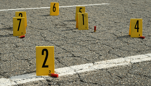
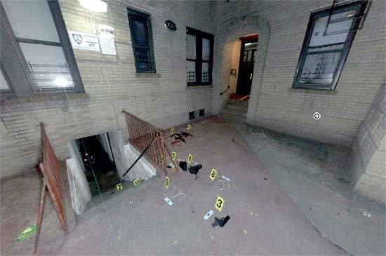
School in the point of view of an American is a shooting range
School in the point of view of a student
From the point of view of a terrorist
Fashion from the point of view of a guy
Book from the point of view of a dyslexic
Book from the point of view of a nerd
Book from the point of view of a tree
Book from the point of view of a cat
Book from the point of view of an escapist
Book from the point of view of a bimbo
Book from the point of view of an illiterate
Book from the point of view of a tree
Book from
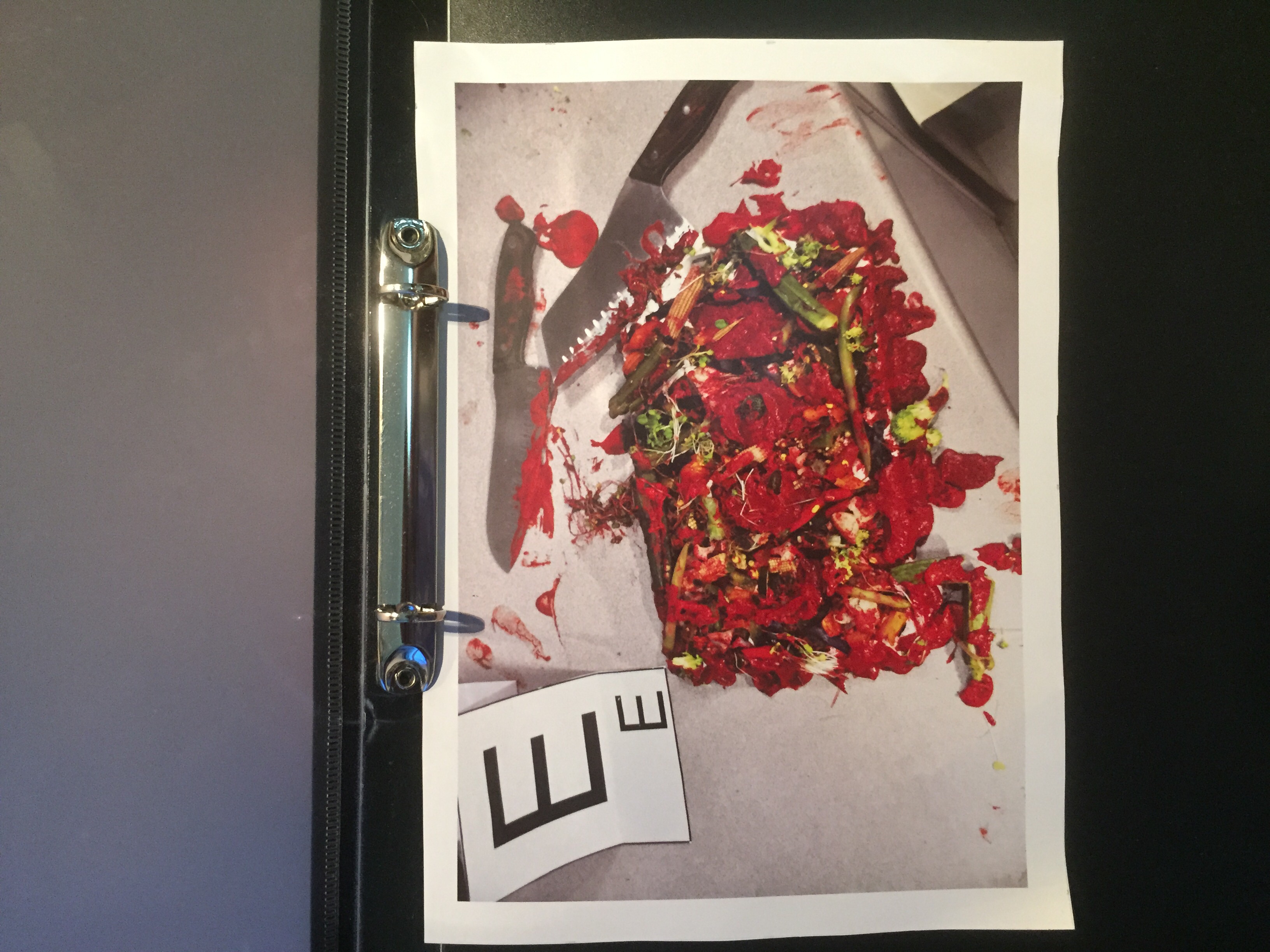
Food from the point of view of an artist is an instagram photo
Religion from the pov of an atheist
Beauty from the pov of pop culture is anorexia
Beauty from the pov of pop culture is anorexia
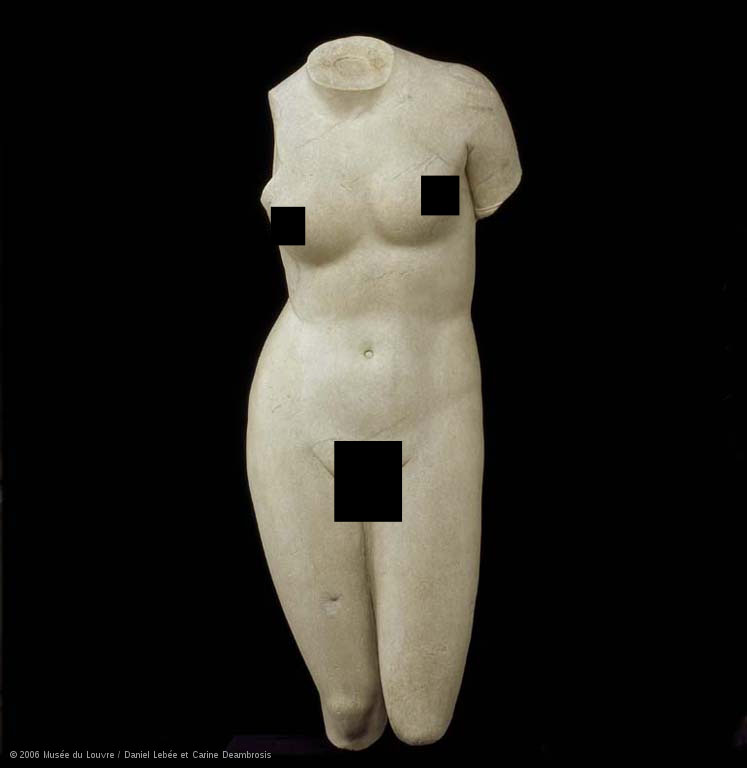
Beauty from the pov of feminist
Beauty from the pov of a plastic surgeon
Beauty from the pov of a
Breasts from the pov of a transgendered person
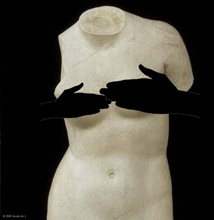
Breasts from the pov of a plastic surgeon
Breasts from the pov of a baby
Breasts from the pov of a bra
Breasts from the pov of an anorexic
Breasts from the pov of a woman
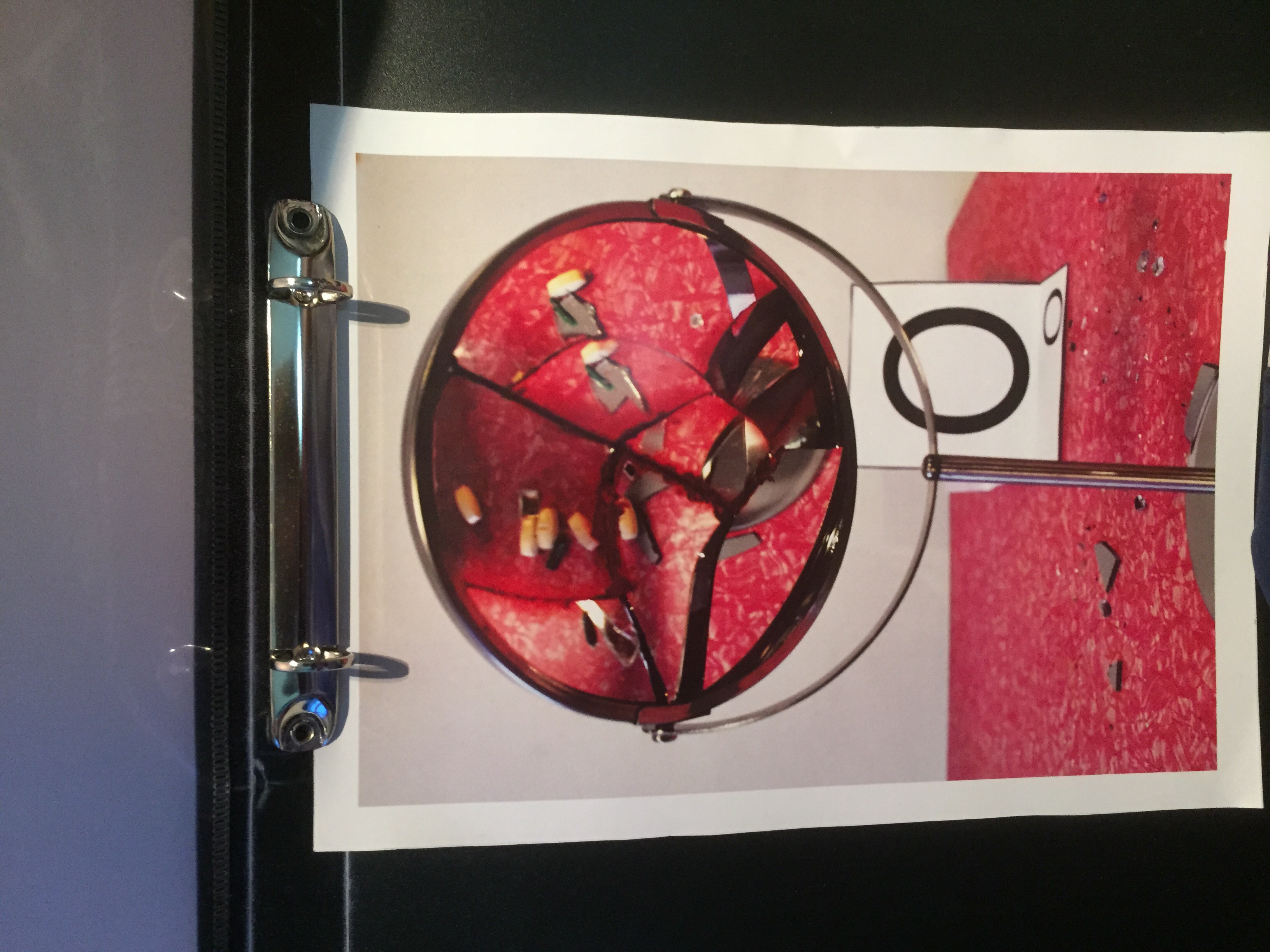
The glasses show different standards of beauty
Animals in the pov of the fashion industry is clothes
Animals in the pov of KFC is food
Animals in the pov of a zookeeper
Animals in the pov of
A book from the point of view of a tree – murder
layering background to change the meaning
arrange things in a mass gestalt
gestalt theory. Looks like smtg
the mind’s eye
negative spaces
push the image on its own
colours also to make something seem like smtg
image has to look closer
I was thinking about
Animated vs photographs vs drawing
Something rom the pov of a blind person
KFC from the pov of an animal lover
School in the point of view of an American is a shooting range
School in the point of view of a student


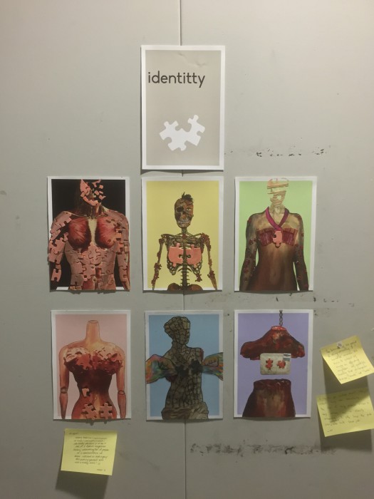


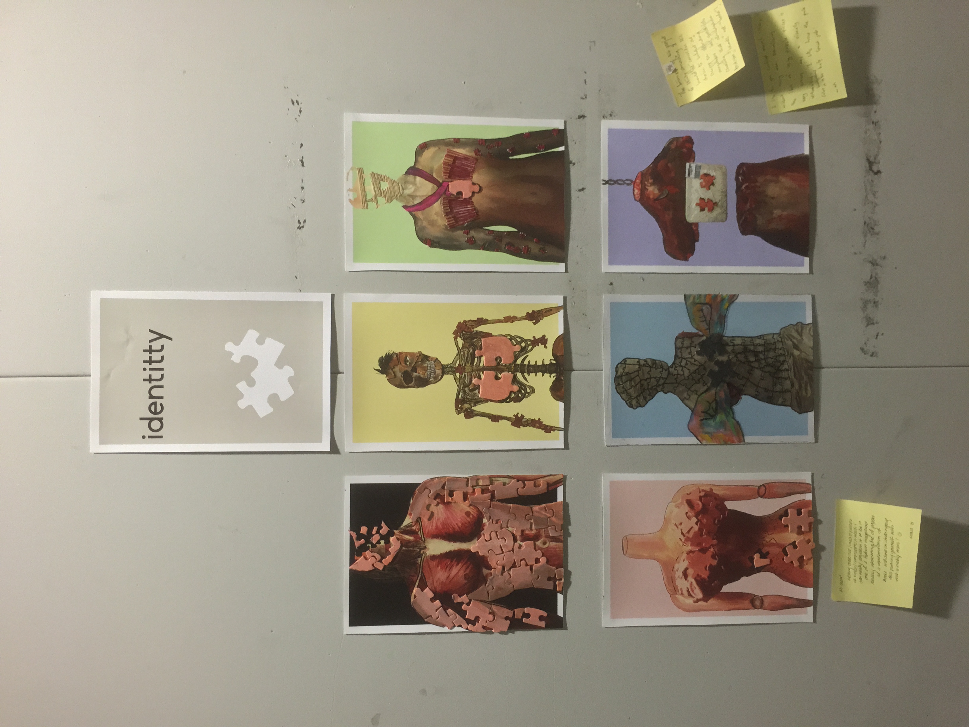

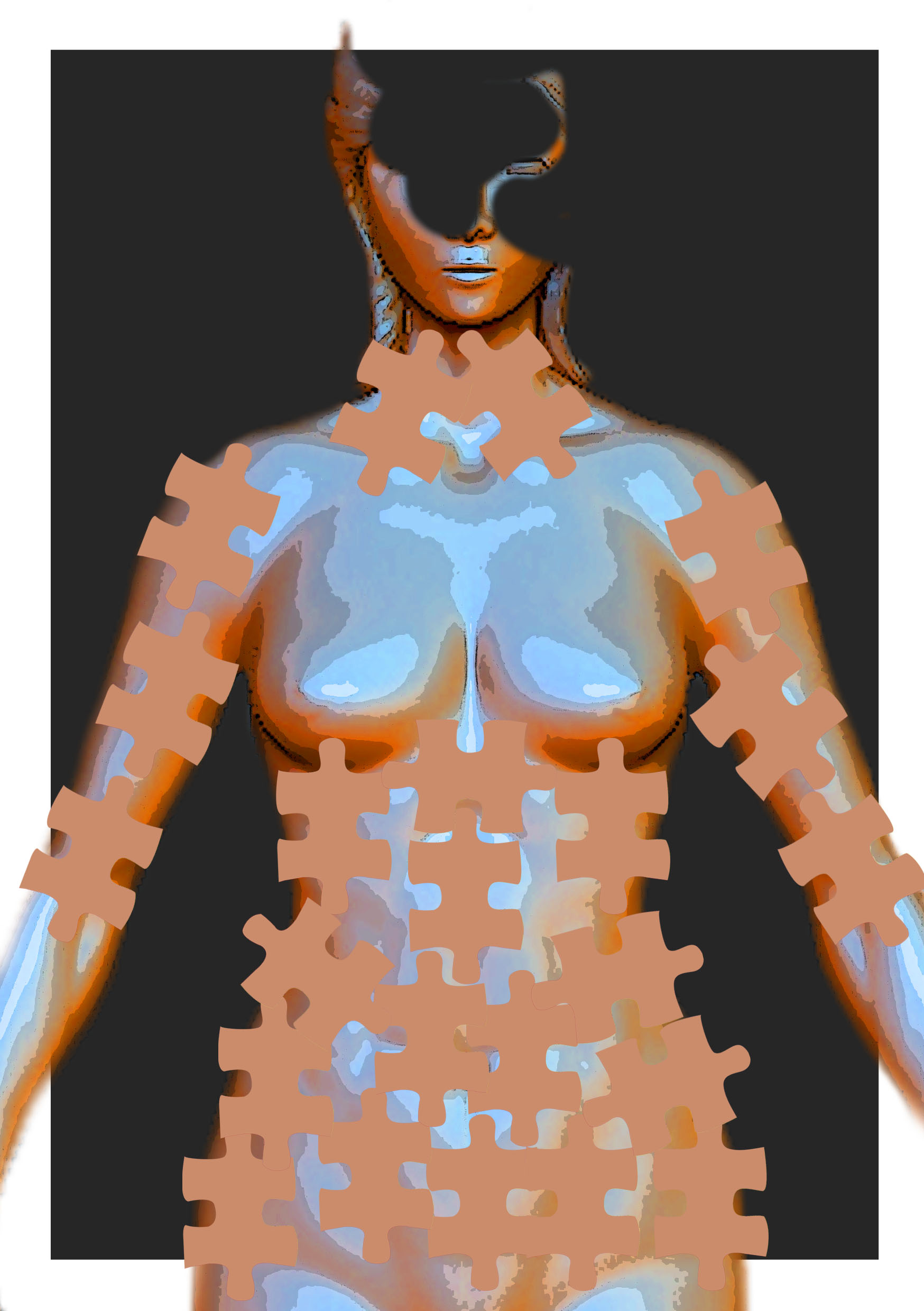
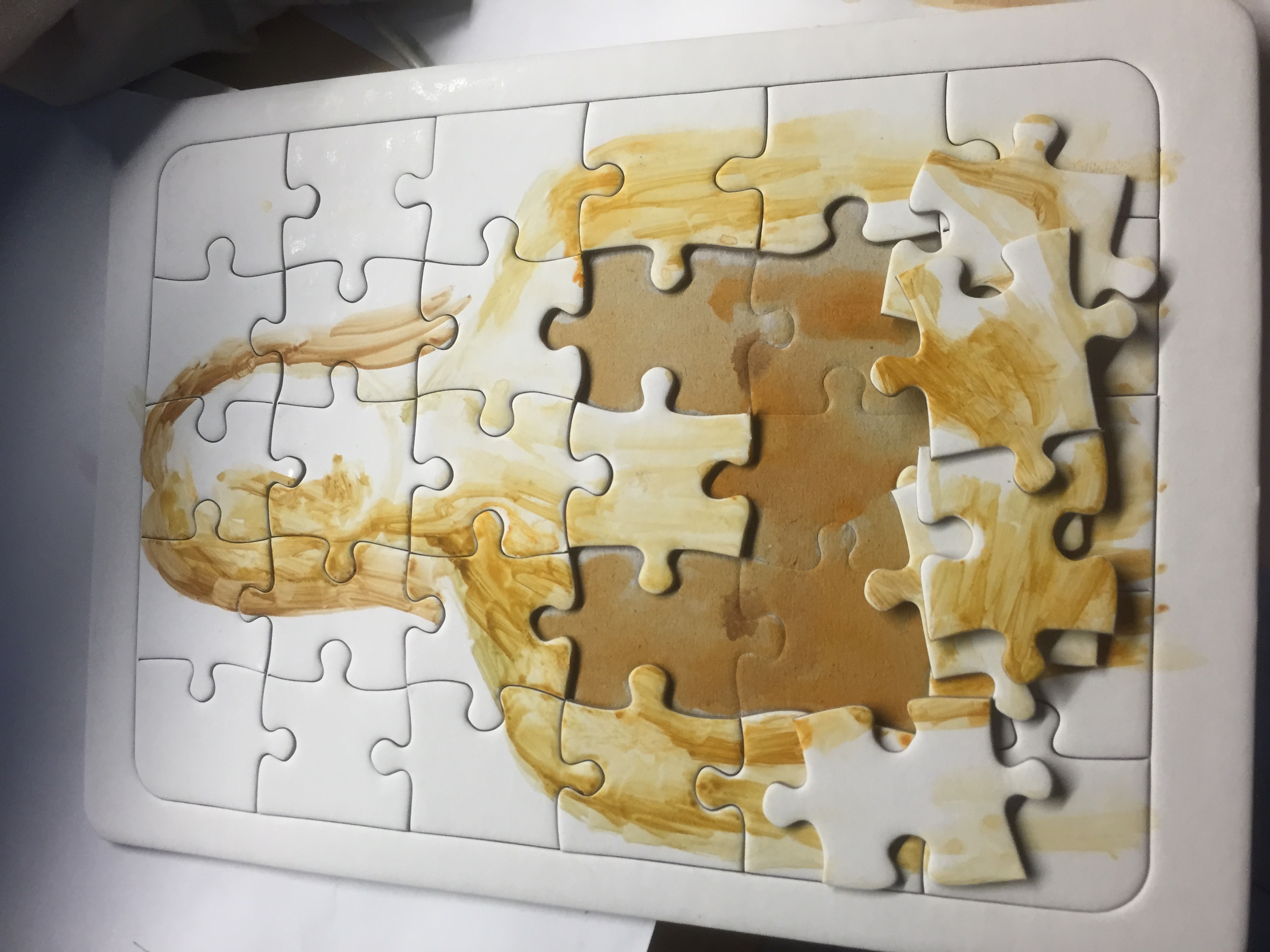

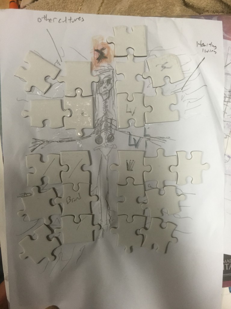
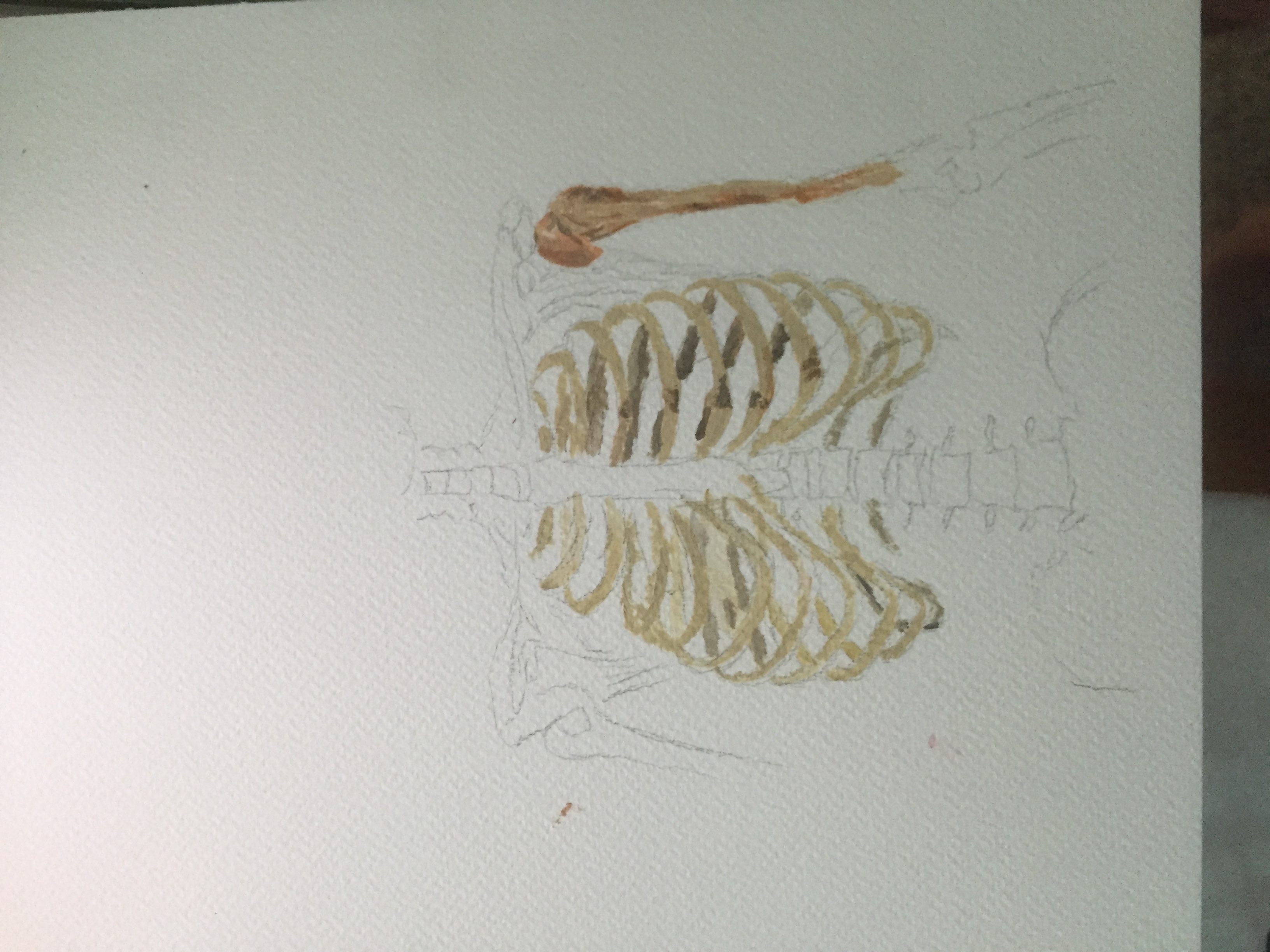
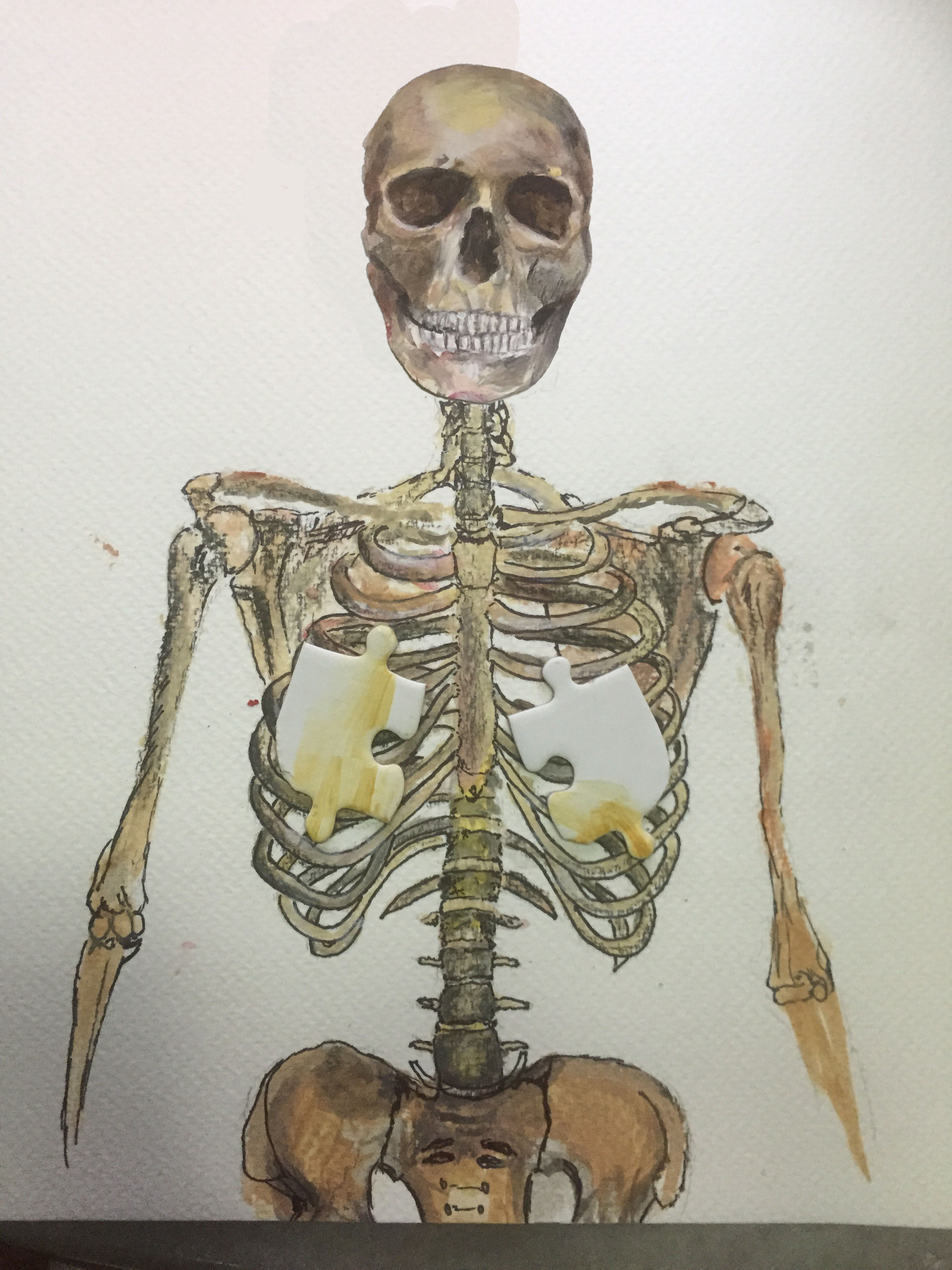
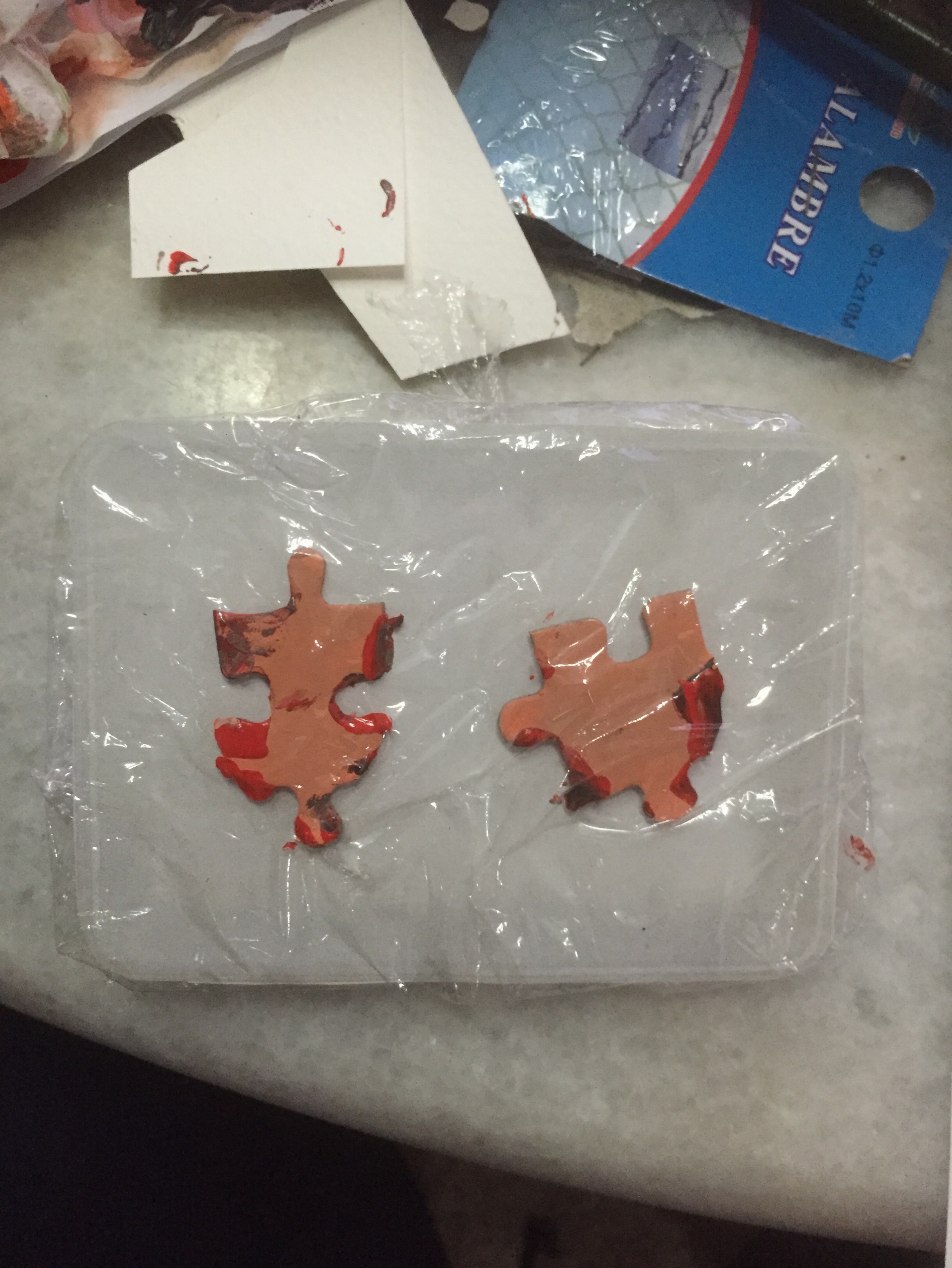
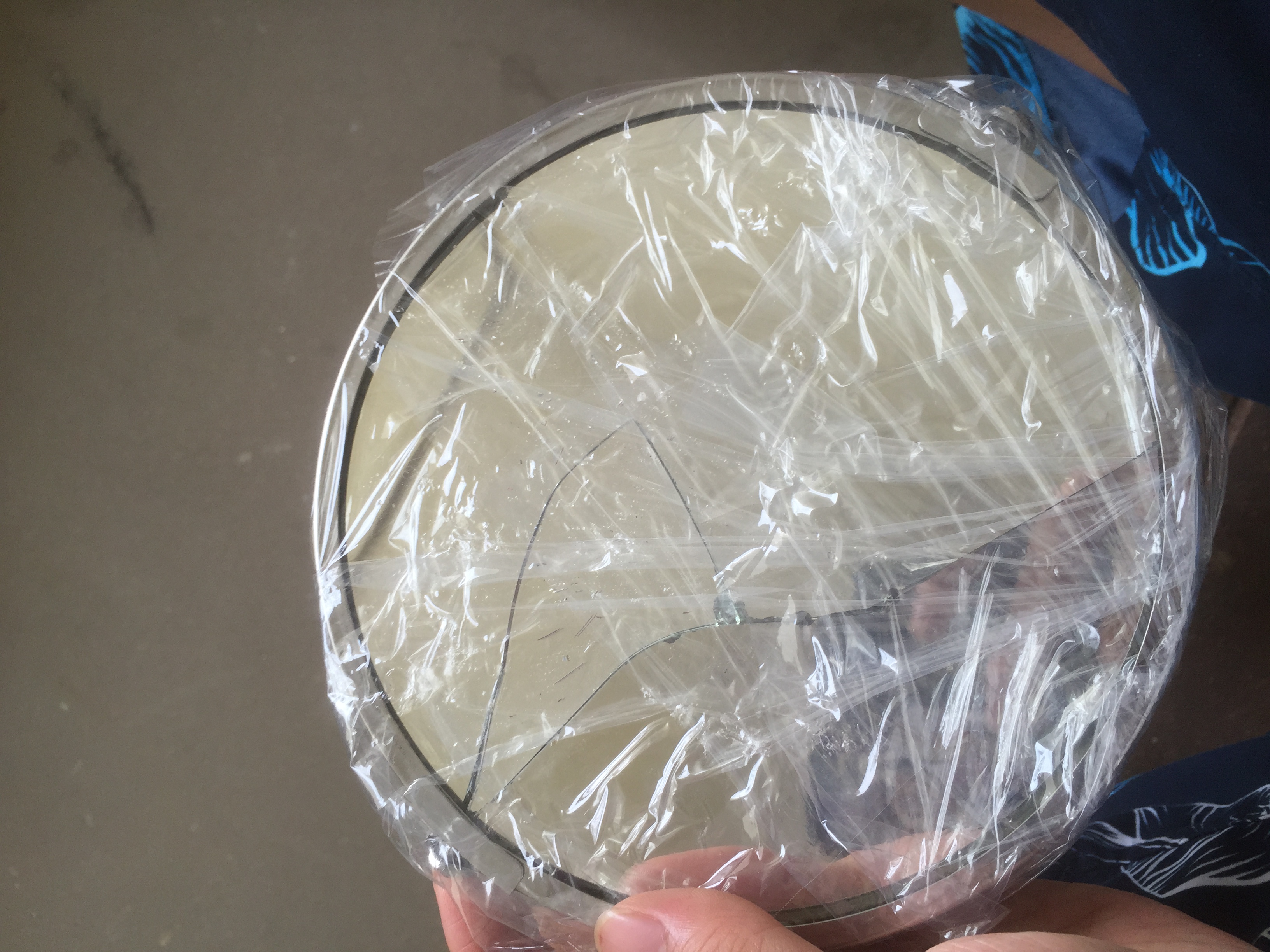
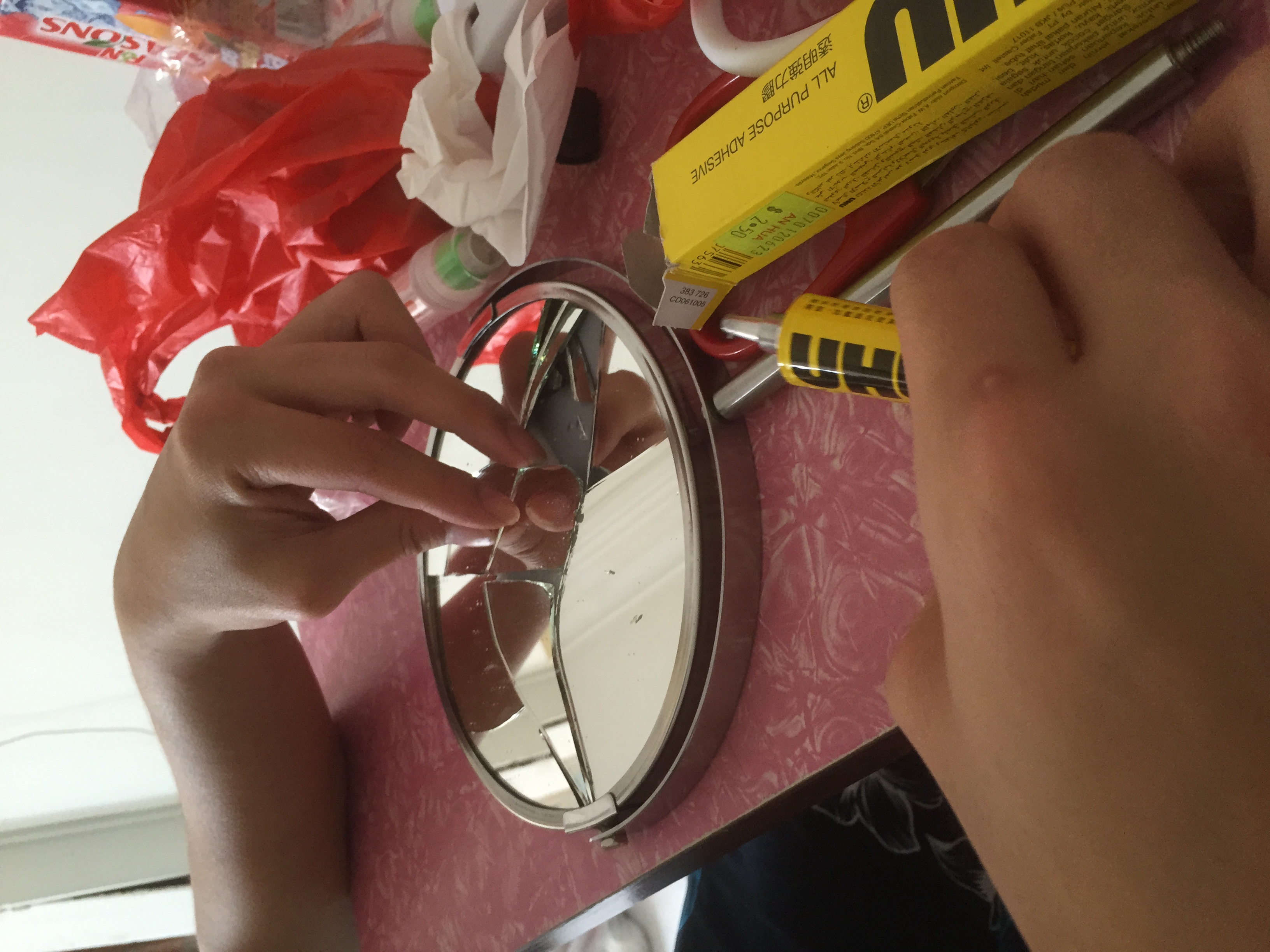
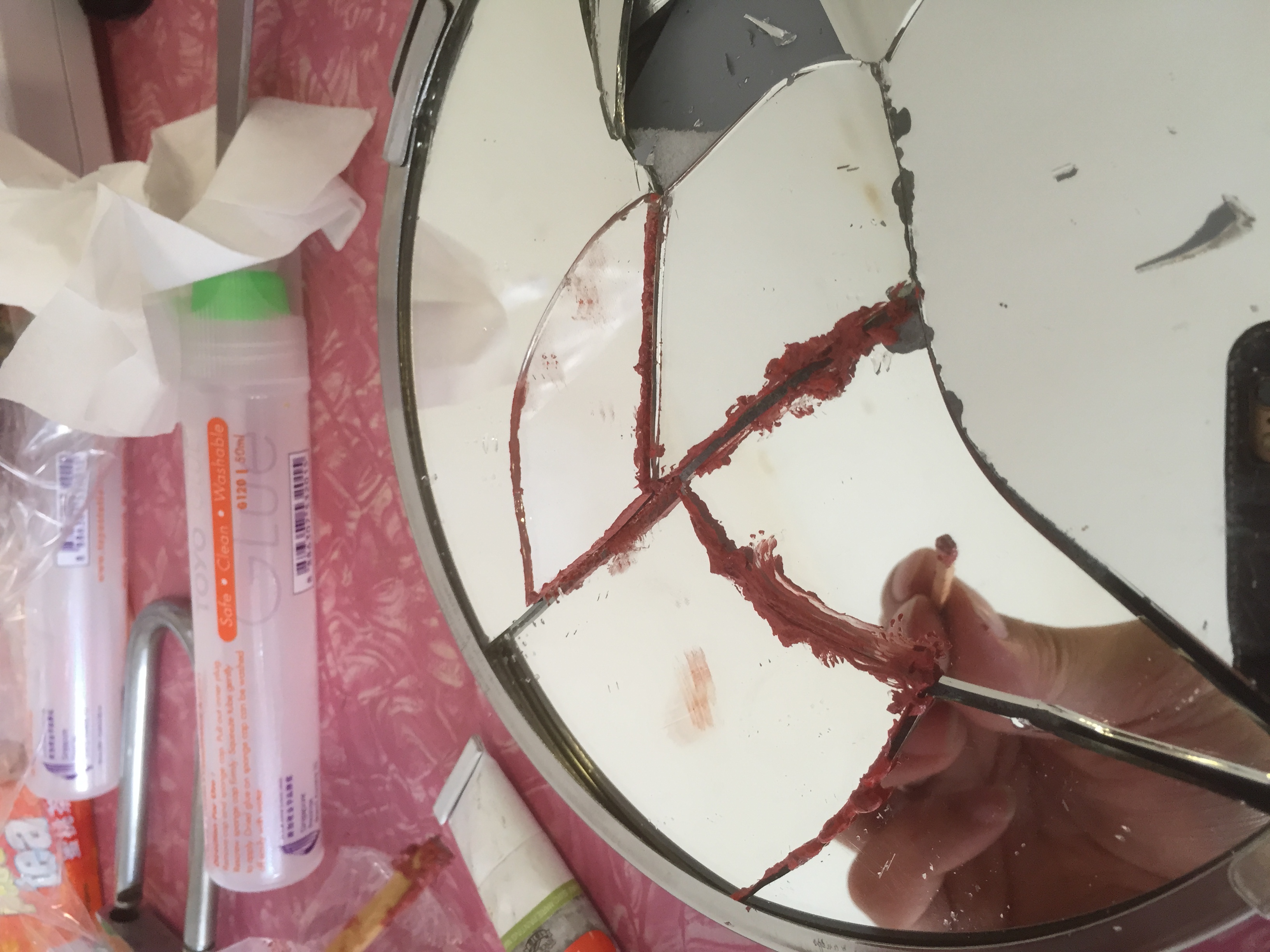
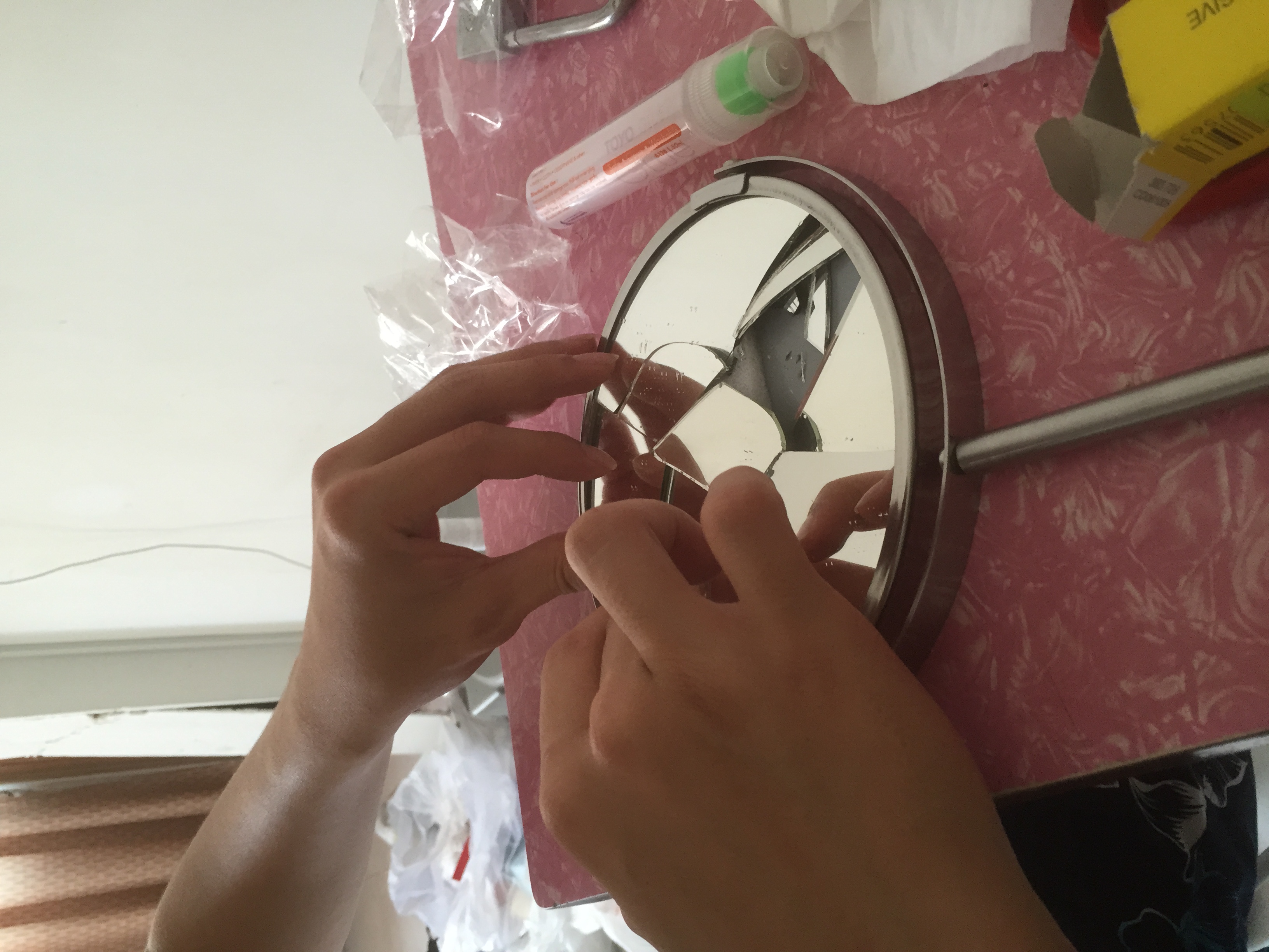
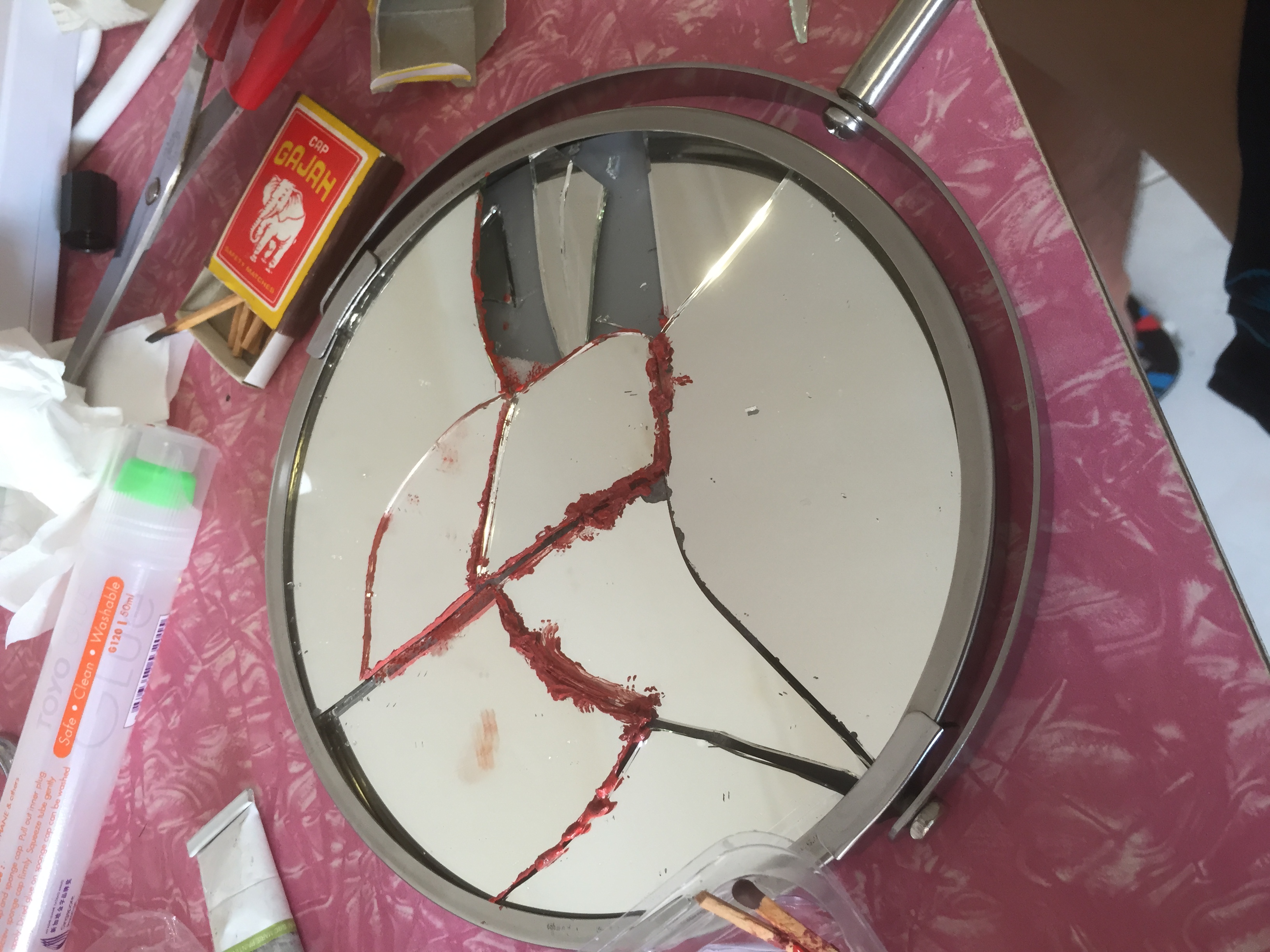
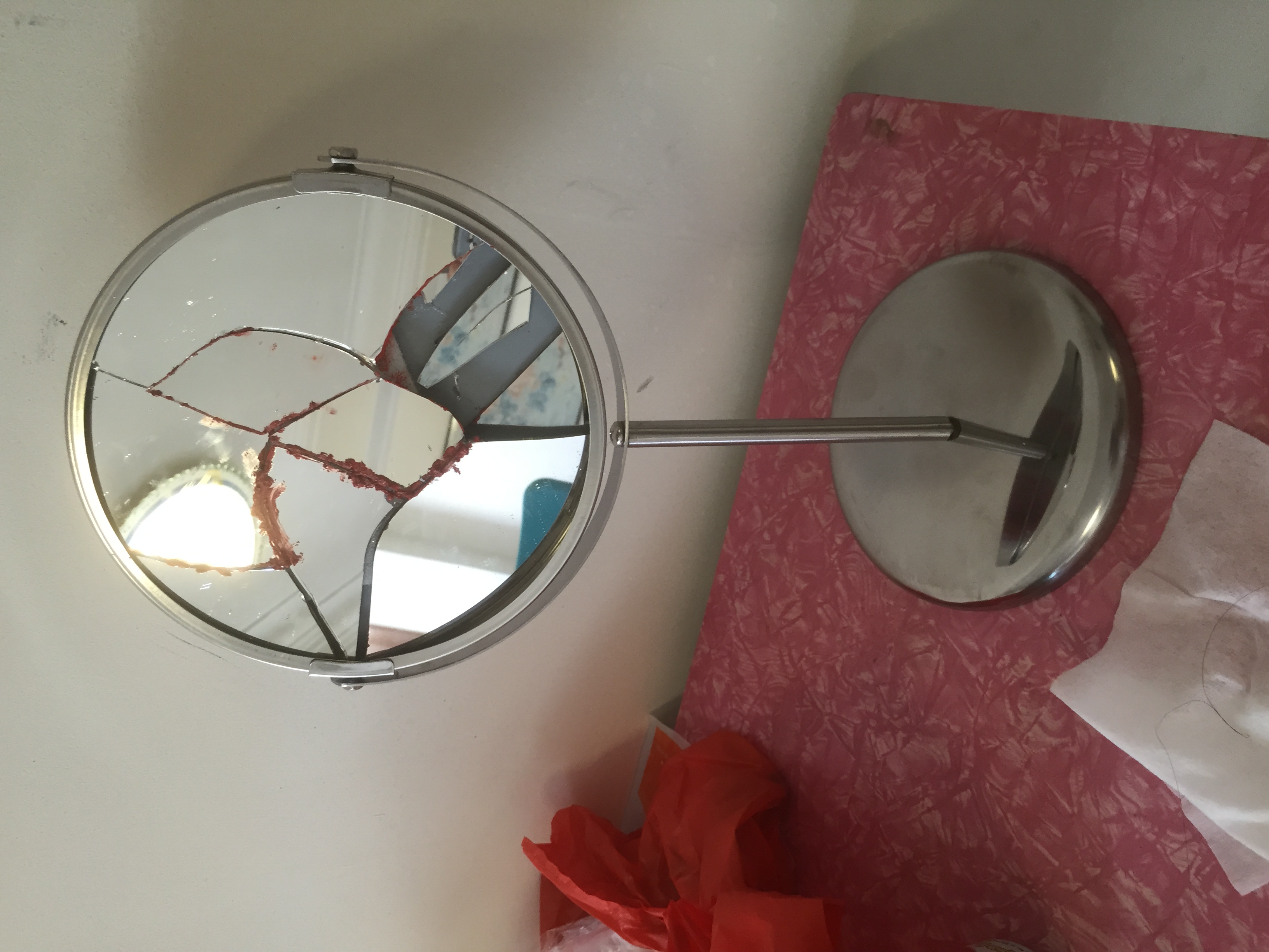
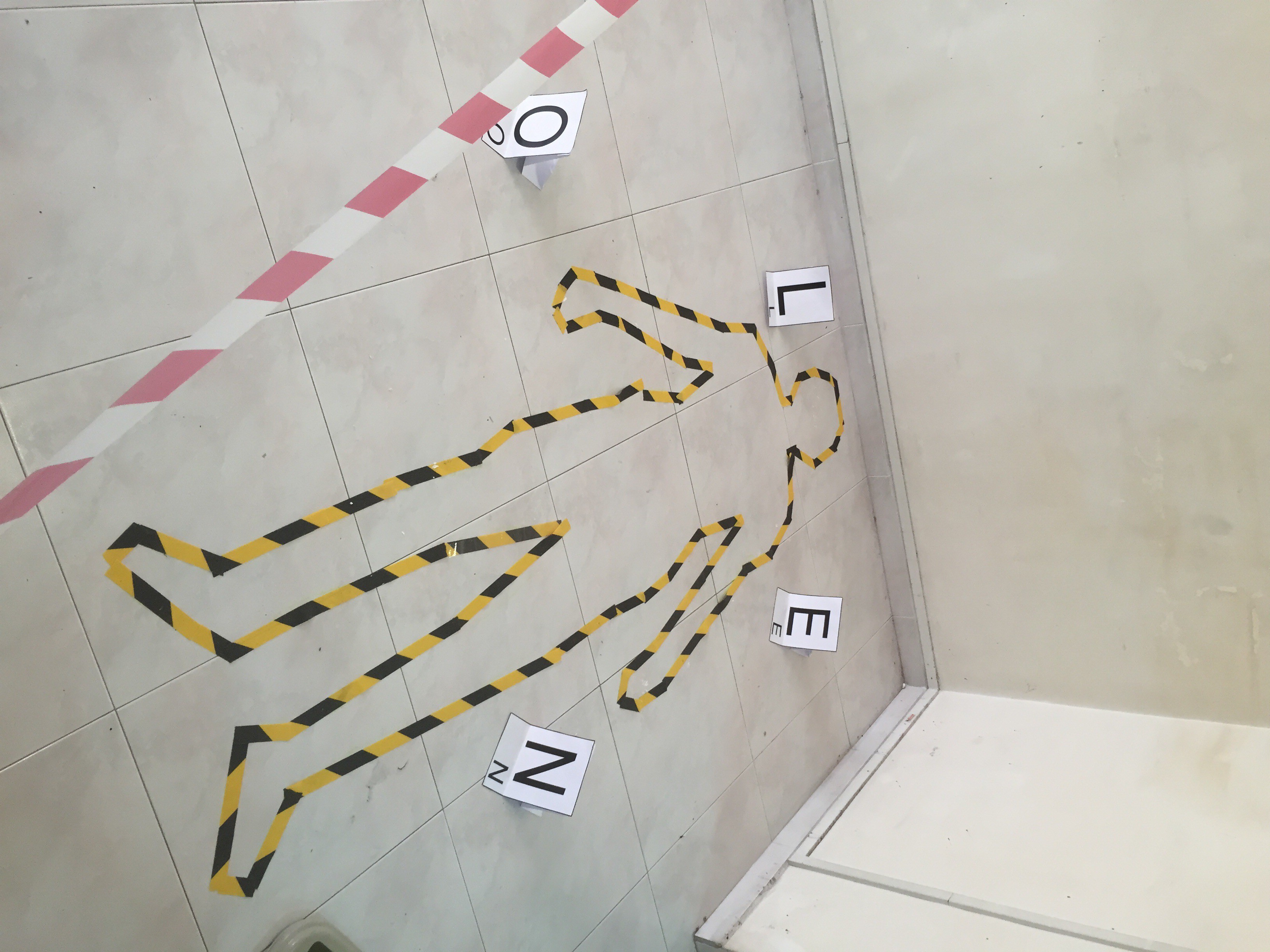
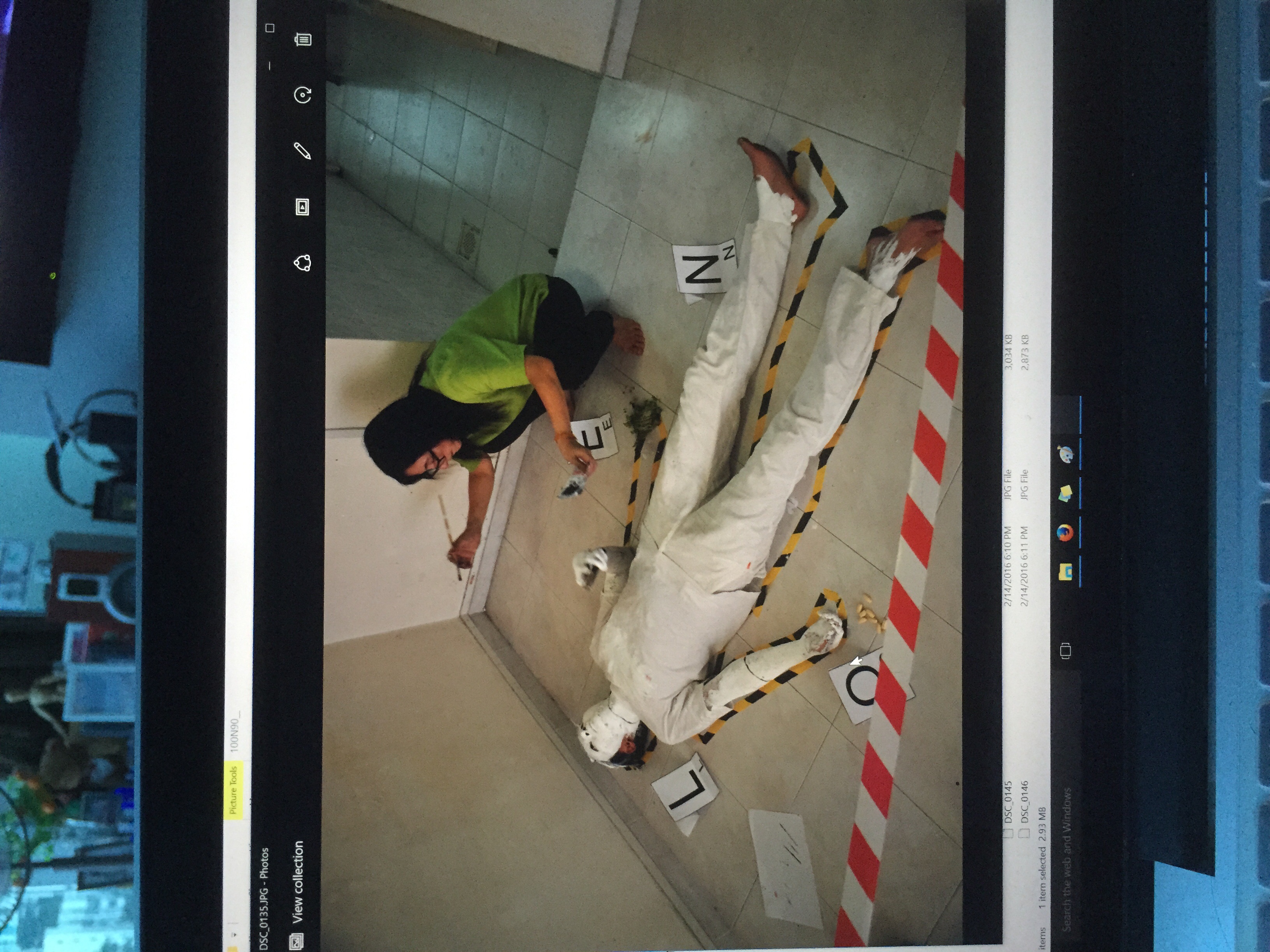
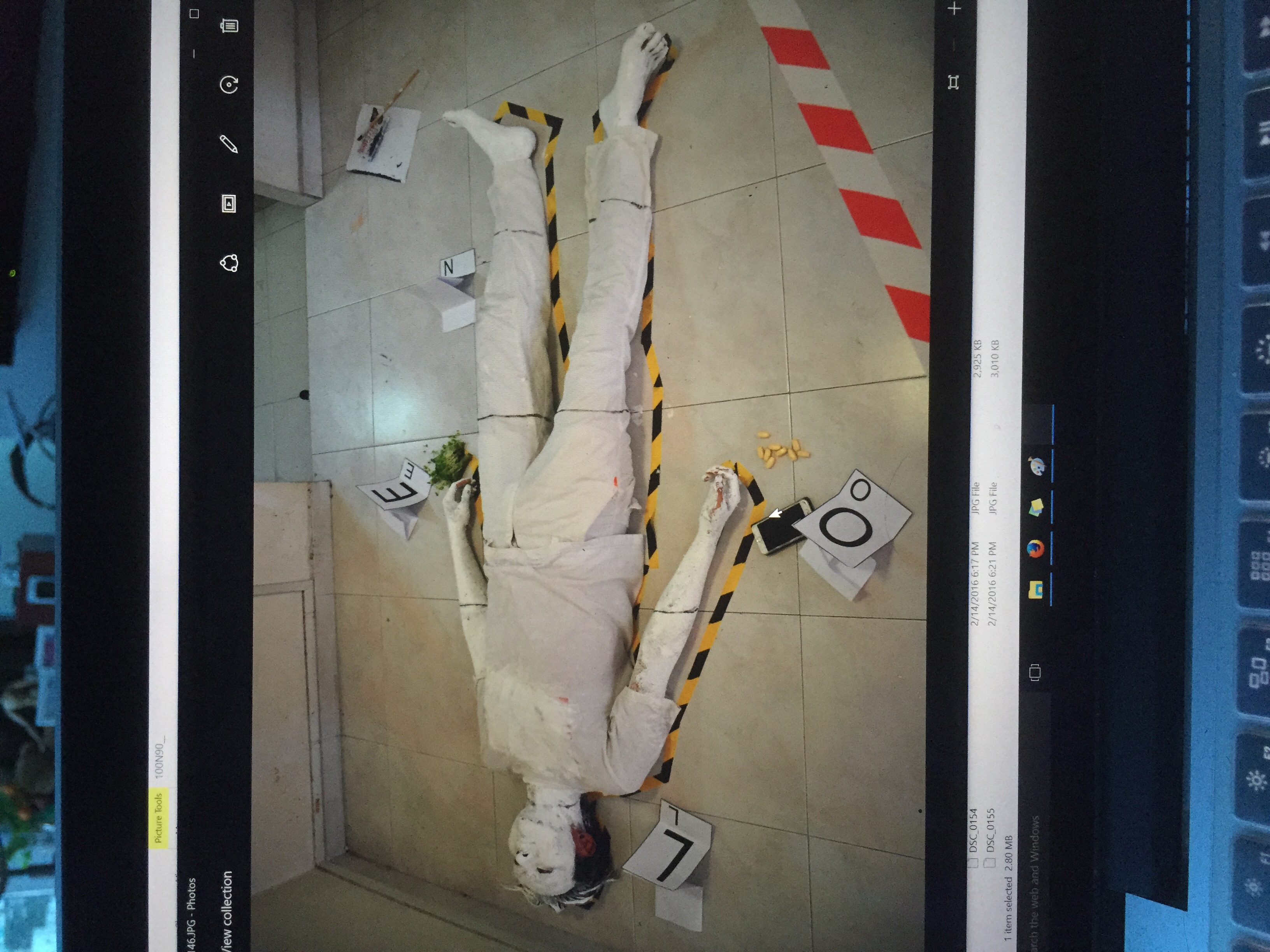
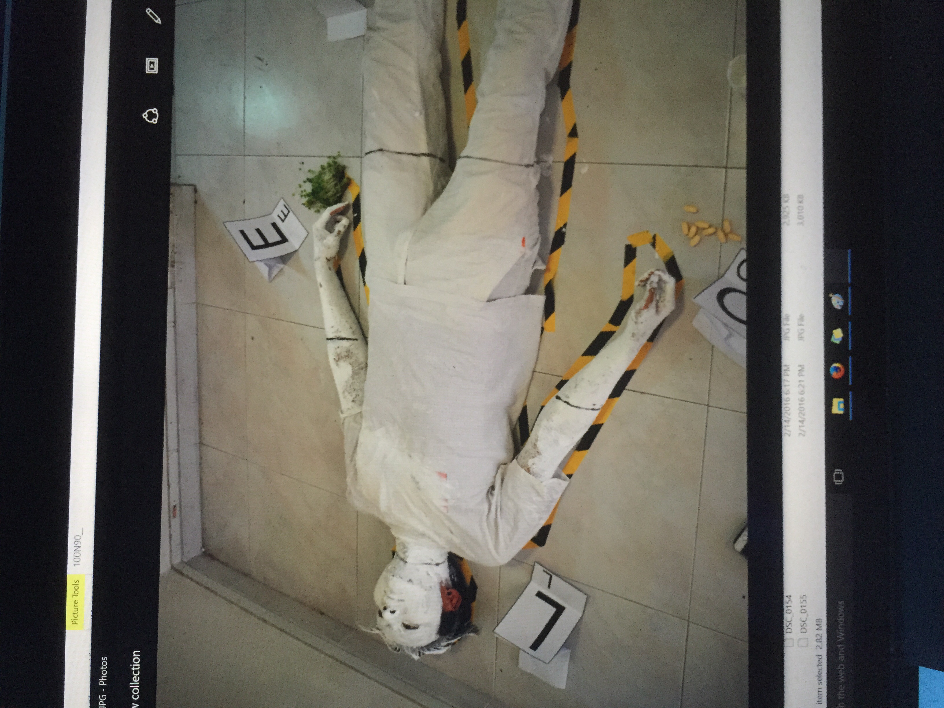
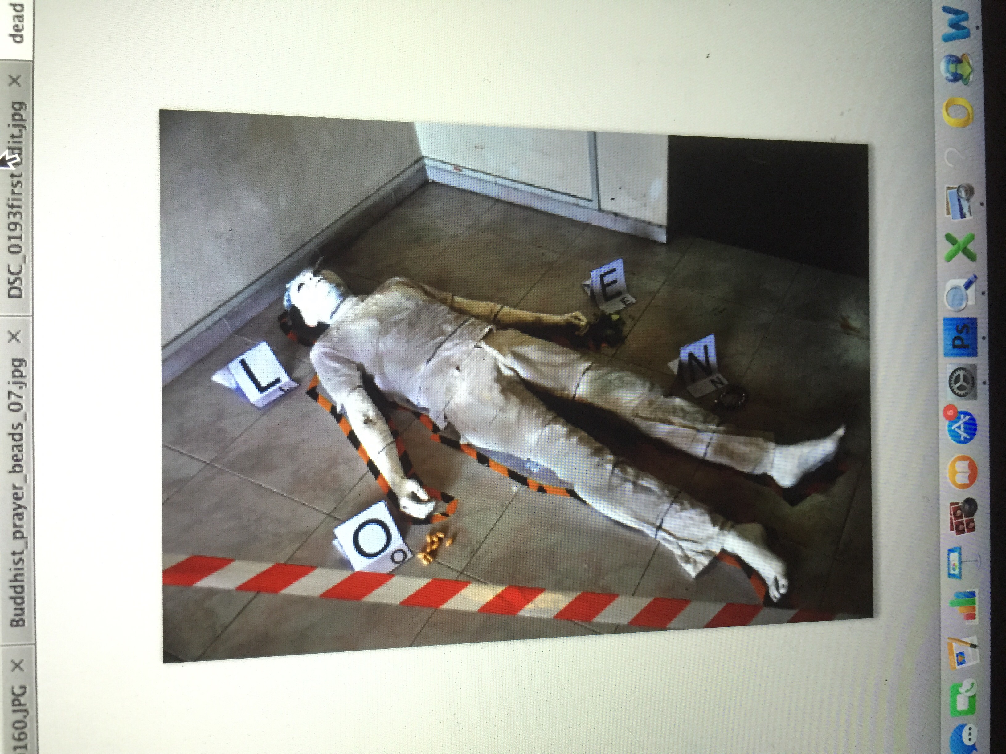
 Final arrangement of the puzzle pieces on the skeletal figure